Tag Archives: landscape maps

Hearing through Maps: London’s Hidden Waterways

We do well to see through maps, Denis Wood enjoined, urging us to detect the “human landscape” that lies superimposed upon the land in maps, and uncover the ways that the landscape has been changed–and orient ourselves to those changes that have been wrought by the “huge arrogance” that “we can name and we can claim.”  Maps demand to be interpreted by scratching their surfaces, as if we could uncover how one might best “see through them,” to explore the landscapes that lie underneath the layer of words that lies on their beckoning if often all too opaque surfaces.  Webmaps allow this level of interaction, often by playing on the conceit of the paper map.  Indeed, the symbolic surface of the paper map–and the London Underground map in specific–have been used in a variety of web maps to suggest different notions of the “underground,” and to suggest the power of maps to alter one’s relation to place and space in provocative ways.

To take stock of how maps work by asking us to go about imagining the landscape that lies beneath those words is a way of uncovering their arguments about territories.   The format of the audiofiles linked to a map of London’s Tube provocatively invites readers to explore its surface, in the clever pun advanced in the web-based maps of the London Sound Survey. For its links invite us to explore soundscapes that would otherwise lurk beneath cellulose surfaces, treating it less as the modern relation to space and place that the Tube Map advanced in its early twentieth-century iterations–than as a sort of recovery of a lost sense of the sense-base experiential waterways underneath the expanding city, that the paved city has in many ways repressed.   The river that snakes across London today, mapped for its sludgy muddiness in many Google Earth terrain imagery, marginalized if not expelled from London’s built urban landscape. If the sinuous light blue line of river returns as a sonic reality as it laps along old unused docks and concrete pillars as one approaches its banks, its sounds letting the city disappear for a moment, the sounds of the Thames returns int this may that adopts the form of the underground Tube line of the built environment of the twentieth-century resurfacing of the city.

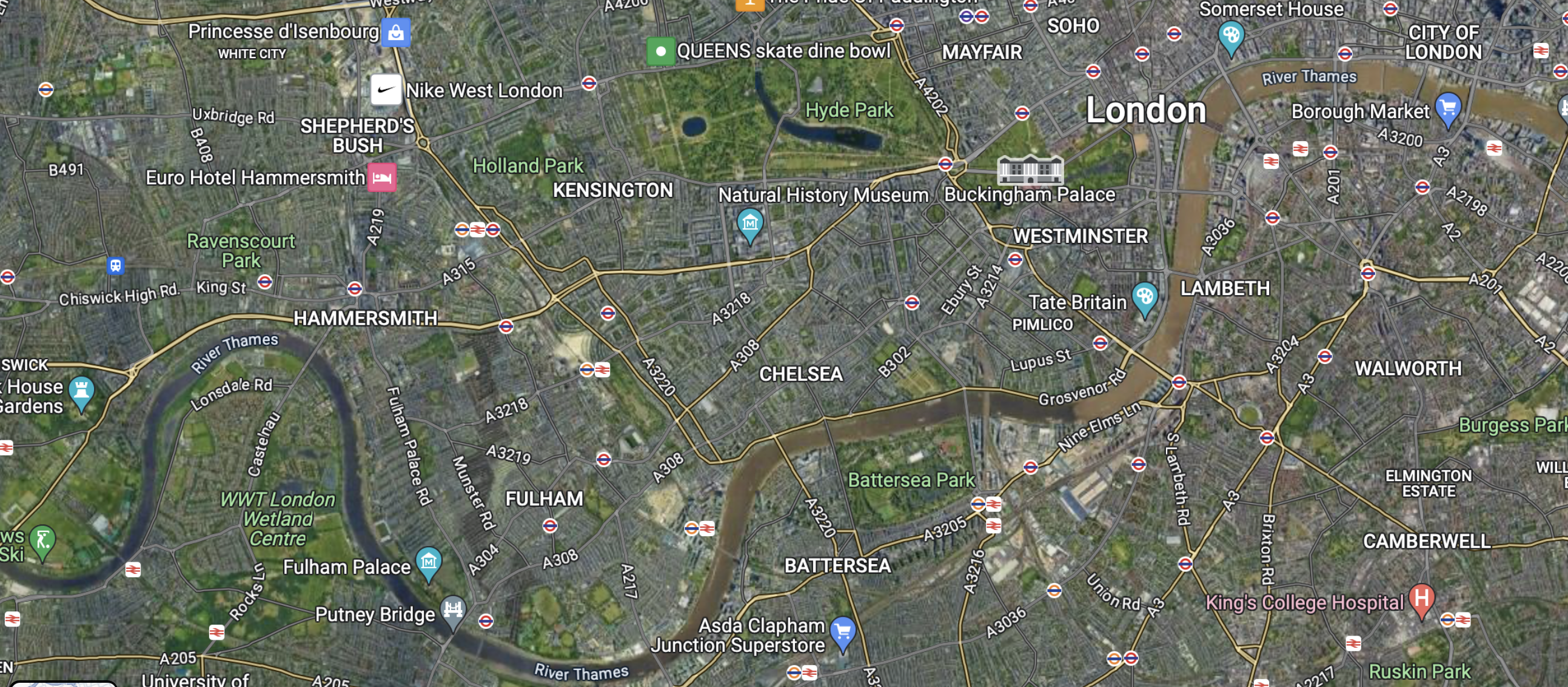
Web-based maps such as Sound Survey of London’s waterways indexed offer modes to remap the known environment of the city in new ways:  the choice to map the riverine network that is rarely seen in London seem specially suited to the conventions by which Harry Beck‘s almost universally recognized diagram of its Underground specifically invited users of the London Underground to re-see their own environments, offering a way to encourage map-readers to navigate the built space and neighborhoods of London as able to be readily accessed by the Underground.  The striking modernity of the circuit-like 1933 Tube Map that invited users to so successfully read the access to space the Underground offered at a distance from lived space, yet in ways that its simple form foregrounded utility, it offered an icon of the modern urban plant.

It was, of course, as it happens a radical revision of the attempts to picture the London Underground. The space of the tube was not only a new way of understanding place, but time, in strikingly modernist tones by artist Hans Schlegel–he signed the lithograph as “Zero”–suggested, as a new way to navigate space, adopting icon of the Underground to a map, as it offered an ability to negotiate urban time,–

–as the surrealist invited on to experience space by a new tool that “gets you there” in ways never possible before, warping space-time in ways that were entirely to the modern citizens’s advantage, a user in this case typified by the new subject of urban space–a man in a suit, bowler hat, and white gloves–who meets the demands of his job by the circuits that lie beneath the city that allow him to arrive on time. He is checking his watch in ways that suggest the timepiece had been replaced by the Underground to affirm its utility beyond only navigating a built space. London Transit used graphic arts to promote the new Tube as a basis to experience the city in many ways, and indeed experience to navigate the Thames, just a few year earlier, that suggest not only their investment in graphic works to reorient viewers to space, but to remap urban space by the river–the most important, perhaps, orientational path of the city’s neighborhoods, even as they were replaced by city blocks: streets were organized in relation to the Thames, historically, but the underground, in this lovely 1933 poster, proposed its utility as a way to access views of the river–

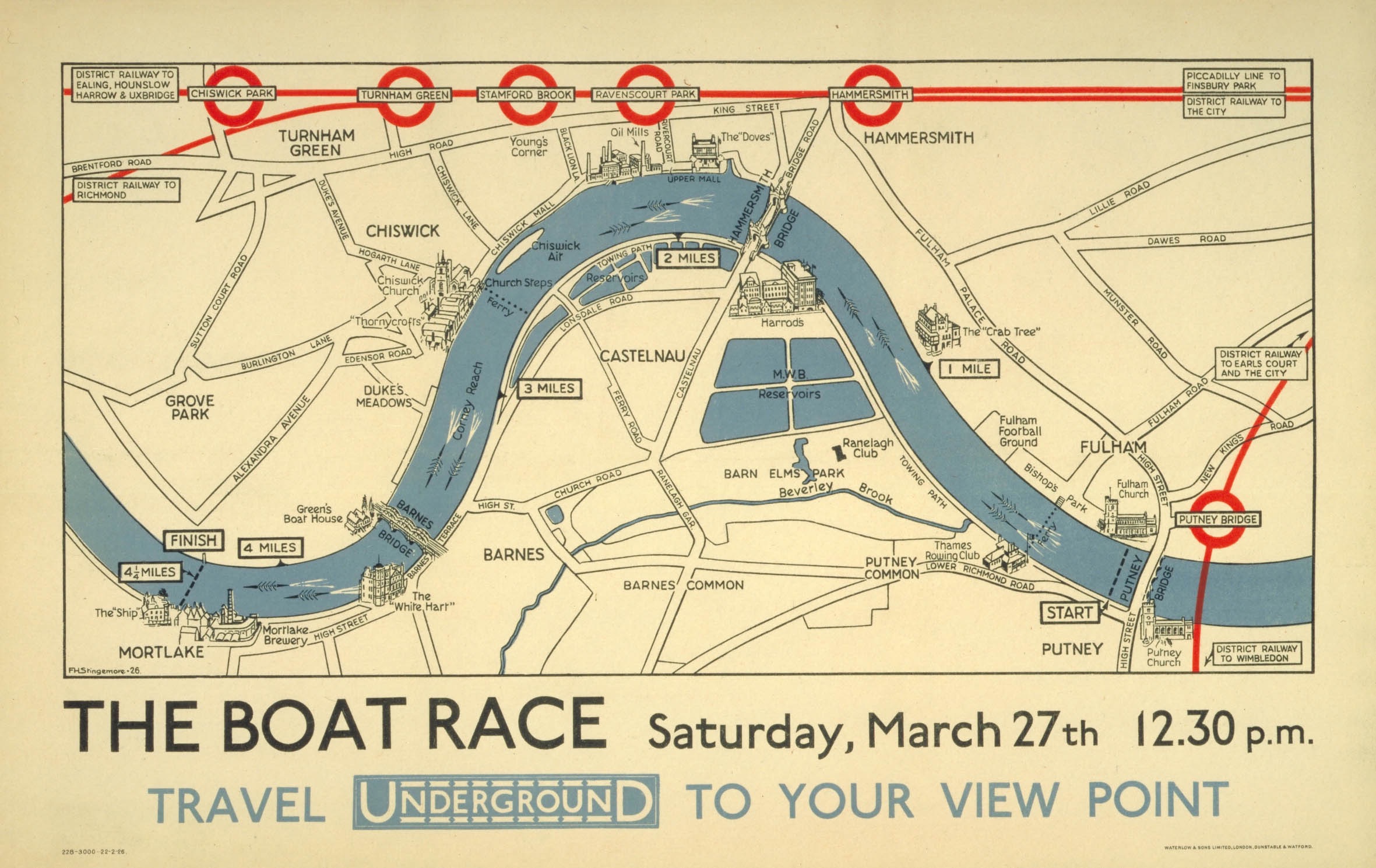
The Boat Race: Oxford-Cambridge Boat Race Map, 1926

–and specifically of the Cambridge-Oxford Race that was run annually on London’s Thames in one section–that in 1926 mapped the stations of the Underground to “travel to your view point” to watch the race–but took the river as the main course by which the riders of the underground would need to be oriented. In contrast to a map of taking public transit to watch a race–or to arrive at place on an urban river’s course–the new Underground map that was designed some seven years later after the diagram of electronic circuitry elevated its geometric form above the urban topography or indeed the urban sensorium. Beck’s innovative design for the map printed in January 1933, took as its logo and model, in many ways, the novel emblem of the underground tube–the Underground, as it was called, or Tube–as a geometric creation that replaced the urban soundscape, and a utopic idealization of space. 

This was a new way to understand how one could experience the river that the Sound Survey may have not known, but offered something of a symbolic foil to in asking us to view the river–or The Boat Race–in new ways via the access points the Tube provided to out-of-towners who arrive for the popular sporting event, akin to later campaigns to use public transit to access football stadia. The actual boat race–The Boat Race, as it were, founded in 1845, beginning half an hour before high tide on the River Thames, which has been from its founding timed to start on the incoming flood tide, and allowed numerous viewing points on piers, breweries, football clubs and taverns that lie along its 4.2 miles, or the steps that front upon the river, for crowds of spectators to gather and assemble. But the distortion of the river was, already by 1926, the point. The race between Oxford and Cambridge teams for which an umpire provided a running commentary for the first time in 1927, perhaps to accommodate the larger crowds who took the London Underground to preferred viewing points, accommodating the river’s course to the transit stations’ locations–even suggesting the degree of punctuality of arriving at a station to view the winding paths that the boats actually took on the river, comparing the directness of the transit line against the course that were taken by the crew teams.

The Boat Race Map: Oxford-Cambrdige Race, 1926

It’s no surprise that the Underground map from the late 1920s distort the path that the Thames takes between bridges, as Londoners well knew, was actually a far more sinuous course–navigating the bend is the point of the course!–on the four point two mile course running between Putney Bridge to Chiswick Bridge. But to illustrate how the Tube accommodates to its path, the straightness of the lines of tube track are privileged far above the actual riverine path in the 1926 map , , to which the tube accommodates.

But the attempt to reconcile the tube’s course to that of the river may have been a question of epistemic orientation by the 1930s, as a new geometry of the Underground first proposed by Beck in 1931 redefined the space of the underground. Beck used a geometry of 45 degree angles and diamonds to illustrate interchanges and stations that invite observers to reorient themselves to urban space free from the river’s course–indeed to focus their orientation to the network of tubes on which public transit ran. The map conceals massive effort of labor of building an underground infrastructure where immigrants laid track and dug ditches beneath the city, but the infrastructure soon became far more prominent for many Londoners in future generation than the map of the city’s landmarks, and was intended as an icon of British engineering if not the urban metropole.

The Sound Survey Map of waterways offered a sonic counter-map on in online form, as an attempt to reverse the building of anthropogenic space, by examining the sonic sites where the river returns to audible presence. In orientng its users to the presence of the Thames over the urban hubbub that defines London today, it shifts atteniotn from the anthropogenic built space, providing auditory evidence of the presence of the water that the Beck map overlooked. If the oval emblem that served as the key in the circuit-like map at forty-five degree angles that cast interchanges as diamongs and stations as notches was proposed to shock and consternation, remapping the built city for users of public transit in utopic ways in then following years–

Harry Beck, Tube map (1933; designed 1931)

–now akin to a Union Jack as an emblem of pride in English engineering ability to provide the smoothing of space in an infrastructure of smooth movement, both to escape urban congestion and arrive across the city in record times for work, as the lithograph by Zero–Hans Schlegel–affirmed in stark modernist terms in 1935. The promotion of the Tube as affording (and promoting) a modern form of urban space suggested a revision of all earlier urban maps–“All that is solid melts into air . . . “–as the known form of the city melted into the geometry of a circuit map, untangling the tangled streetpaths of modern London in crisp terms readily navigated by its perfectly symmetrical and smooth routes, a technological progress that was a sort of symbolic metaphor of the smooth modernity of the smooth ride that the Tube offered its passengers. (The aptness of the visual metaphor made the form so much more effective, promoting the Tube as offering a new way to move through urban space, in ways that the Sound Survey Map–and we will come to it soon!–seems to seek to pull back for its users, uncovering the lost sounds that the built city plant sought to erase.)

The images of the Underground break form the alluvial settlement of the expanding city from its past in definitively modern ways. While in a day when the London Transportation Authority offer City Mapper, an the ability to track one’s place on the London Underground on handheld devices, without every really needing a map, the smoothing of space has been accentuated–even as the actual lines of transit infrastructure has become considerably more complicated and tangled, both with the exponential expansion of the city that sets new standards for urban growth and neoliberalism. Perhaps the greatest sign of neoliberal achievement is that the map devolves onto our handhelds, as if consigning paper to the past; but the old pocket transit maps are given new life in the web maps that folks as the London Sound Survey have devised to bring the river before our ears, and invite us to reconsider the benefits and losses of mapping urban space.

Of course, the point of such interactive maps is to orient us as urban residents to the surroundings that the built infrastructure has long elided, and increasingly threatens to obscure. There is something remediative and restorative in a map of London’s everpresent river, that reorients us to the river of the riverside city. The Sound Survey Map asks us to use our ears to acknowledge the iconic map’s utopic nature, as it asks us to reorient our sense to the river waterway that the tube replaced, by excavating the sounds of buried waterways. Indeed, wherea pocket guides to the London Underground sold by UER before Beck’s design were startlingly sinuous, as in 1908, displacing the river from attention, in favor of an alternative infrastructure of railways–

–but almosty investing the tubes of the Underground Railways with a sinuous aspect of its own, respecting urban topography, if acknowledging the new transit web lay beneath, apart from, if ancillary to urban streets.

Whereas Beck’s iconic map promoted the primacy of the drafting table and the engineer, a form of engineering that might have well seemed overly radical and ecxessive in the lived environment of pre-war London, the web-based map is a sensorial register reminding us of the presence of water that the underground displaced.

In the Sound Survey, all “transit” lines are shown in their entirety, as if to return tthe river to a prominence it long held in London’s plant. Indeed, save the District line which is only shown as far as Mile End, the rest of the stat image offers an apt way to invite viewers to excavate audible aspects of the city absent from a drawn map, in a truly phenomenological map of the circuit of hidden waters beneath London. If subways are often noisy, the sounds that the Survey has compiled offers a somewhat synesthetic compilation of the hidden waterways that might be seen as corresponding to metro stations, less as a disembodied circuit–as Beck’ map–than as the subsurface lying underneath the engineered world. Beck’s map sanitized the subways in streamlined fashion to attract Londoners to the Underground, readers are asked to explore the waterways that emerge only in its parks, bridges, and channels linked to watery paths which we rarely see which run under and about its surface before they enter the central artery of the Thames.  

Rather than by mapping the  city’s space in reference to its individual  streets or intersections, but by placing the rivers of the Survey maps waterways’ sounds in ways that recuperate their perhaps forgotten presence.  Wood remapped the lived community of Boylan Heights so that is not only as a place in Raleigh, North Carolina, but charting the “metabolism” of the community in maps of the light street lamps cast, lit jack o’ lanterns placed on porches at Halloween, paper routes Wood ran with a tightly knit cohort in his youth, or “squirrel highways” of aerial wires, which collectively serve to unpack the often invisible ways of “how it works.”

Halloween in Boylston Heights

One might compare to this set of maps the ways in which maps in the London Sound Survey invites readers to enter an overpowering pointillist accumulation of local details, and similarly serve to map a setting in which everything sings–or at least we can enter its audible surface at distinct points.

Continue reading

3 Comments

Filed under environmental mapping, London, Thames, transit maps, urban environment

Up in the Air

Guy Lussac en Ballon
The balloonist Joseph-Louis Gay-Lussac, who set a record for ballooning of 7,016 meters in 1804, flying in his hot air balloon beside the Himalayas, in Andriveau-Goujon’s 1834 Tableaux Comparatif et Figuré (Paris 1834).  The ballooning record was only broken in 1862.

The crisp condensation of an array of multiple mountains and rivers by their magnitudes in a uniform scale and imagined plane represents an image of the coherence of scientific knowledge by its transformation of nature into a single reference tool.   The etched “comparative map” reveals an exquisite conflation of legibility and the cartographic surface: it contains not only a database of Humboldtian proportions, but information about the nature of the world’s tallest mountain ranges, volcanic eruptions, longest rivers, and even some waterfalls in Peru–although not the waterfalls in Yosemite, which were not yet discovered or surveyed, or Andes.  The map, if prosaic, is a register of the first age of globalism, before maps of air-travel or internet bandwidth, but processing and echoing a new taste for global aspirations in a post-Napoleonic era, in the elegance of lithographic form.

Containing, and finding a unique way of dominating the increased expanse of the natural world, the popular comparative chart of rivers, mountains, and waterfalls of the world first printed by Bulla & Fontana in 1828– based on Darton’s far more stodgily titled “New and Improved View of the Comparative Heights of the Principal Mountains and Lengths of the Principal Rivers of the World” (1823)–offers more than an episode of cartographical entertainment. The landscape that it opened for viewers suggested something like a popular panorama, in cartographic detail, a prospective view of global scope the likes of which was on the cutting edge of popular entertainments and sophisticated cosmopolitanism of a global map.

As it was redesigned to accommodate increased information and encompass a greater global purview in its qualitative imagery, the map became something of an assertion of the unboundedness of post-Napoleonic levels of global knowledge, and a celebration of data.  Encyclopedically growing through the complex 1834 chart of Andriveau and Goujon celebrated the addition of new claims of knowledge as a domestication of the natural world by indices of scale, even if it abandoned the orientation of the viewer to their geographic locations or spatial relations in a purely idealized record of the mastery of global proportions–the illusion of a growing global mastery illustrated by the comprehending a proliferation of local qualitative detail in its frame in encyclopedic detail.

bulla and fontana
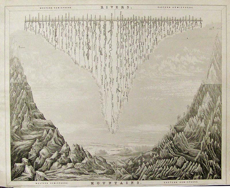
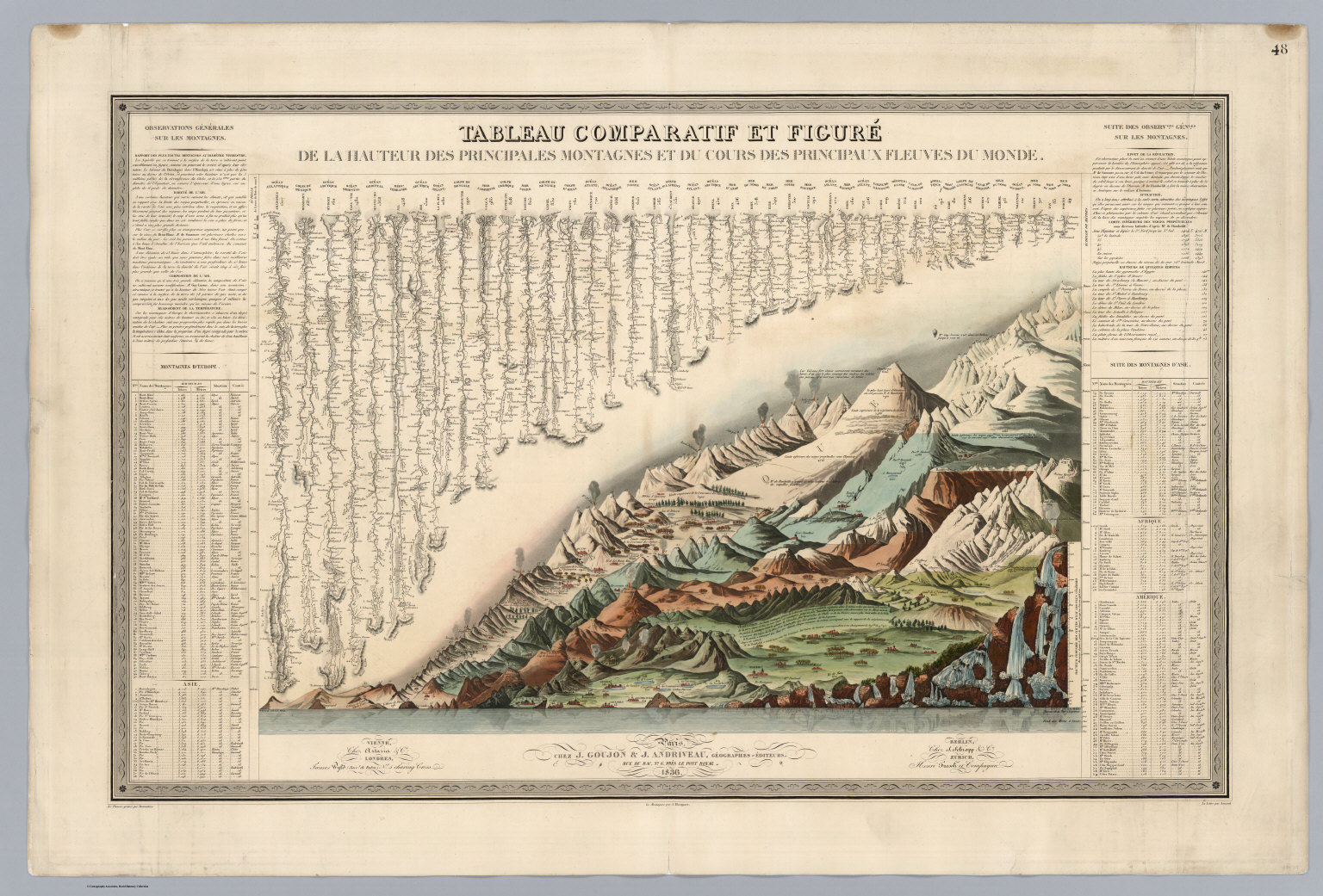
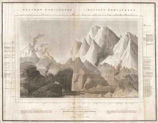
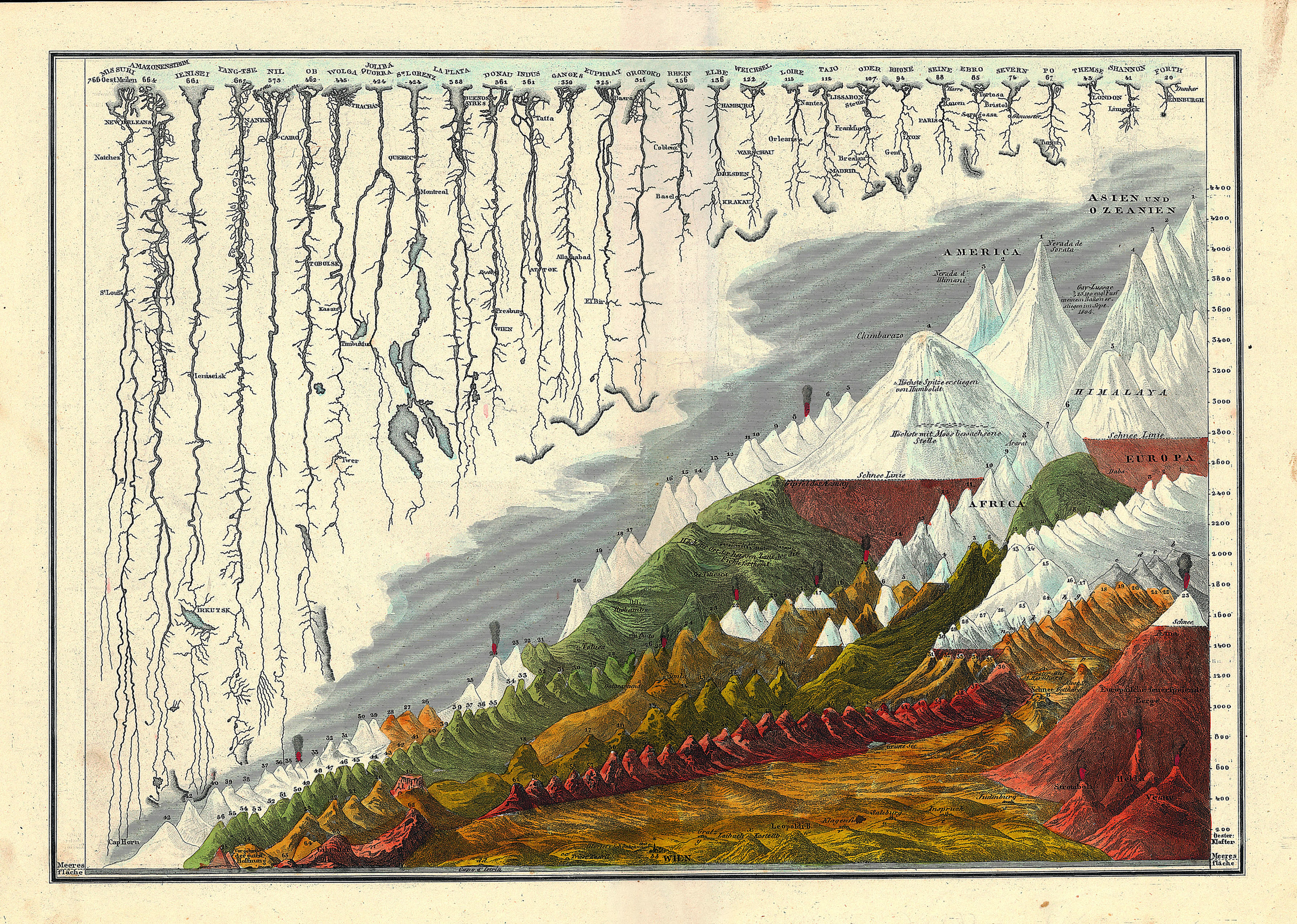
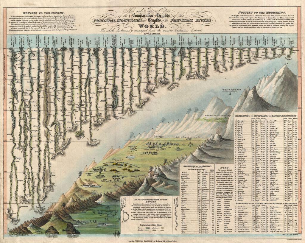
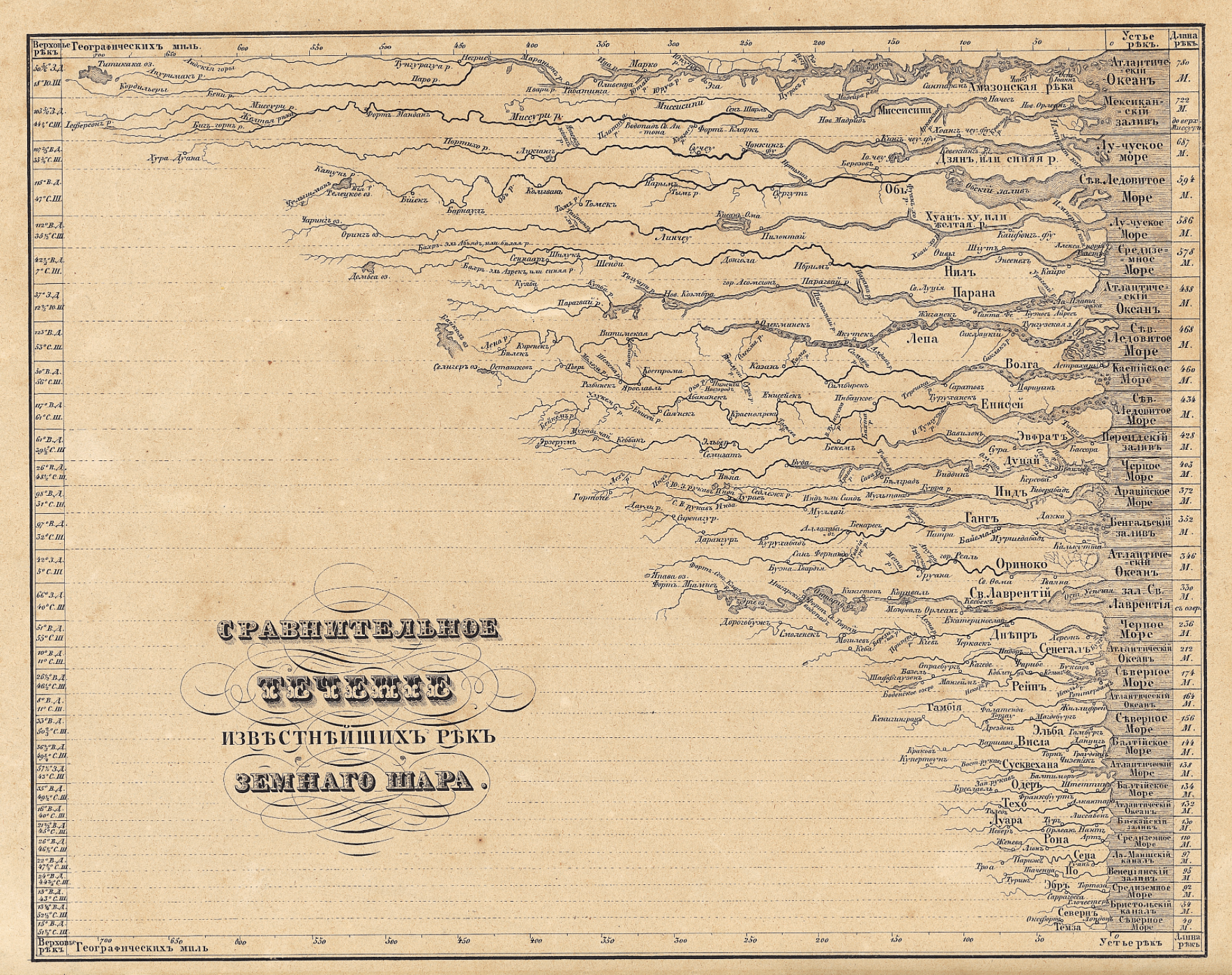
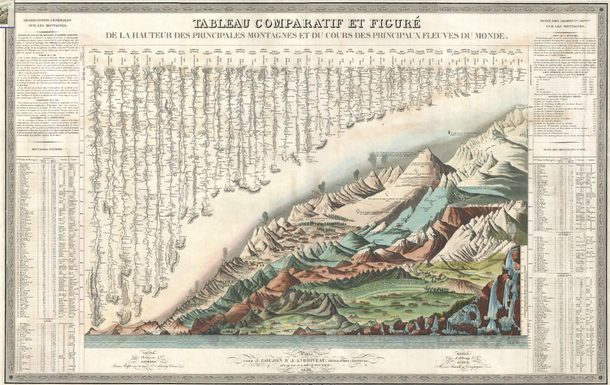
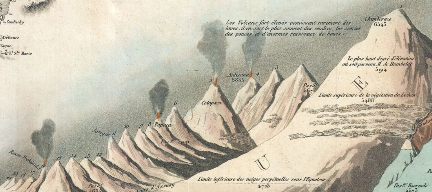
Bulla & Fontana, Tableau Comparatif des principales montagnes, des principaux fleuves, et cataractes de la terre

The vertiginous pleasure of the lithographic map lay in the combination of metric precision and exactitude with utter abstraction from place. The marvels of the world were presented, as it were, in a mental landscape of the geomorphological features of the known world, abstracted from territoriality or national divisions, in a gloriously unified view of the world.

The terribly successful genre of mapmaking essentially offered an elegant compilation of human achievements as well as of the natural world–from the pyramids, to the tallest buildings in cities, and highest ascension made by a voyage in a helium balloon.  Despite its encyclopedic scope and the range of data it processed, the “table” is human-sized, a large wall-map abel to be readily scanned, in order to digest spatial immensity to a scale designed at a human dimension for exploring a virtual record of the natural world that seemed to distill a global atlas to one sheet:  the findings it collated derive from first-hand observations, each concretized in a clearly pictorial fashion so that it can be immediately recognized and understood.  If the aerial triumph of ballooning as a transcendence of the everyday was well-known from the late eighteenth-century aerial flight over the English channel by a French-American team, accomplished in 1785, the celebrated flight of the hot-air balloon was an emblem of the national transcendence offered in the comprehensive map, breaking the bounds of national survey.

1785 British Channel crossed by balloon.png

The most striking single detail that dates the map is the place it accords Gay-Lassac’s recent triumphant ascent to 7000 meters in a hot-air balloon of 1808, noted in the sky of the Tableaux, just above the mountain range of the Himalayas.  Perhaps more importantly for readers, the height of the balloon was just above the highest elevation that Humboldt himself had climbed (5914 feet), as well as the highest levels at which vegetative life–for lichen, 5488.  As it rises above this barrier of living vegetation, and beyond the furthest height of the German explorer, the lone balloon is a triumph of the modern world, and an exploration of the unknown that was great as the ascension of peaks or waterfalls.  The balloonist suggests a sort of French victory in the transcendence of previous bounds of knowledge, and a sign of national pride for the Andriveau-Goujon workshop (fl. 1805-94).

Readers of the map could not only recognize the transcendent flight of Gay-Lussac, but could project themselves into a range of comparable adventures.  The map is not in any familiar sense a projection–or a uniform transference of a conformal expanse to fixed bounds.  There’s not even a pretense of uniformity in the map, because the assembled landscape discards usual cartographical operations that ensure continuity, fix orientation, establish directionality, or claim exact measures of adjacency.  All are sacrificed for one criteria of scale–height–that provides a lens by which the cartographer’s fantasia of representing how space can be viewed.

The notion of such a mental transcendence of space-and idealization of the basis of knowledge–was of deeply Humboldtian spin, and rested on his neo-Kantian comparative categorization of the relative height at which he scaled Mt. Chimborazo to place it in the context of the scaling of Mt. Blanc, Vesuvius, and the elevation of Quito. The scaling of mountains provided a sense not only of worldly retreat–as, for example, Petrarch, who ascended Mt. Ventoux for a new look on life and worldly vanity–but of global triumphalism of geographic plates, trumpeting natural knowledge of the Andes as a register of global sophistication by tallying a comprehensive compendium of all terrestrial mountains of in a panoptic survey of heights.

GeographiederPflanzen-humboldt-1806

Unlike Humboldt, however, the atmospheric ascension of the balloonist implies an imagined prospective of an actual landscape, where the pictorial embraces, domesticities, and processes the comparative, and presents a pictorial unity of comprehensive scope–in ways that echoed how the prospect of ballooning was long associated with maps.

The synthesis is truly cartographical because of how it “writes” space against uniform indices to offer a domestication of geographic diversity and variety within the inhabited world–even while abandoning actual inter-relationships.  A fantasy of mapping, stripped of coordinates, enlists the familiar repertory of cartographic conventions of accuracy to offer a compendium of statistical knowledge.  The cartographer abandons the usual cartographical conventions of noting spatial orientation, directionality, or adjacency, as well as cartographical signs, but transfers statistical measurements to a pictorial view in which heights can be viewed in relation to one another.  This popular format of mapping uses our familiarity with mapped space to sacrifice the need to record or establish location to fashion a comparative collation of known topographic variations.  Optimistically, it shows the world as a unity and unified landscape, without divisions of nationality, in a project in which knowledge about the world is curiously disembodied (in numbers) and re-embodied in a single tableaux of global synthesis.

Gilbert’s Modern Atlas (1840)

The elegant steel plate from Gilbert’s Modern Atlas, 1840 arranged the world’s rivers and the heights of its mountains by length across an imagined chasm, juxtaposing Western and Eastern Hemisphere, running off from the spine of the bifold plate, even abandoning indices in a prospective view of the globe’s natural splendor that suggest a reduction of natural philosophy to one triumphal prospective view: akin to an unveiling of a natural harmony of revealed knowledge, the cleverly combined plate of Rivers with Mountains is not only an economic illustration of information but encourages an imagination of how rivers descend from the mountain ranges that flank them–including the now-iconic figure of Guy-Lussac’s aerialist feat as a way of entering the tallest heights ascended by man in the upper left and upper right as an index of human achievement before this natural splendor, as if to ask the reader to imagine achieving a view over this imaginary landscape from an awesome prospective, if not the landscape that it might afford.

Although there are no recognizable cartographic indices in the, the Tableaux comparatif reveals a familiarity with the collation of information in mapped space, rising above the range of important cities that formed points of spatial orientation on most maps–including, but by no means limited to, Paris, Rome, London, Geneva, Mexico, Bogota, and Quito, among others, that were noted prominently in the various maps and pocket atlases that its printers also produced, Whereas most maps map itineraries, routes, pathways, or memorable sites of human interaction, the Tableaux is a compendium that draws from different human experiences, correlated with one another in a space that does not exist, but assembled in a single whole.  It is a sort of surrogate for the totality of what we know about the inhabited world and its bounds, and the victory of the diffusion of a form of cartographic writing:  its readers were able to place each of the world’s greatest rivers in their geographic situation,–but now afforded a chance to measure (or rank) the Nile beside the far longer Amazon and Mississippi, in order to decontextualize and historicize the limits of global knowledge, and afford a transcendent view.  

As the ascension of the balloonist occupies a crucial pride of place in the 1834 map, verticality is the implicit theme of the map, which registers heights and lengths, to be sure, but focussed on the collation of knowledge by elevations, including forest lines, barometric readings of the elevations of cities, and heights of mountain ascents to make it a repeated object of visual curiosity that merits intensive scrutiny to local landscape detail.

elevations

The Tableaux stands as the culmination of known science, and the triumph of the map–and Geography–as a subject able to comprehend the physical sciences.  One might take the map may be a final redaction of the Ortelian ecumene (the inhabited world),  which it processes for the mind’s eye, but takes the idiom of a pictorial landscape to decontextualize the abstracted record of geographical knowledge.  And also to the observer’s eye:  for the data accumulated and synthesized is clearly both “figured” and “represented” to be readily recognized by viewers familiar with maps. The synoptic register of mountains, rivers, waterfalls and rivers that exploited the four-color potential of maps.  The image was based on a map first assembled in Paris during the 1820s, before being widely reprinted in schoolbooks or atlases through the century as a compendium.

Inscribing the landscape with remarks on vegetation and marking the turning points of ports on rivers, which the cartographer has straightened for adequate comparison as if from a laundry line, the picture is a representation of the use of the inhabited world as well as of the limits of its inhabitability, and a condensation of all that needs to be known about the world and all one shall, presumably, ever know.

bulla and fontana
5796000
ComparativeMountains-thomson-1817

The collage-like landscape, if impossible, placed global features for the observer in a way that reflected their own competency and sophistication, boasting its accuracy and transparency in the manner of a geographic map.  

Rather than constitute a new genre, the assembly of the world’s principle mountains had become a sub-genre of geographical knowledge, echoing the French taste for lists, perhaps, and the mastery of geomorphological features in ways ways that suggest an imaginary landscape, and the power of placing the world’s known mountains beneath the viewer’s eyes, as the hemispheric division of principle mountains of note suggested, in this 1825 atlas that abandons territorial bounds, but presents the romantic mountainous landscape as divided between the hemispheres,–with the ancient Egyptian pyramids, topics of huge touristic attraction that were almost included in a French patrimony in the post-Napoleonic period, if by erudition alone, front and center–

Carte des principales montagnes du globe. Hauteur comparative des principales montagnes du globe. Fonderie et Imprimerie de J. Carez. (Paris 1825)
“Montagne du Globe: Hémisphère Occidental/Hémisphere Oriental,” Bossange/Carez 1825

–between both hemispheres, as if in a signature of French erudition. The synthesis of global triumphalism in a pictorial landscape is the triumph, as it were, of pictorials over borders, in a graphic synthesis of volcanic and ice-capped glacial mountains arranged for the viewer in a landscape panorama of sheer verticality, measured on a scale rooted, at its base, by the limits of human achievements–the Egyptian pyramids.

Instead of offering any spatial or directional frame of reference, the Tableaux is strikingly framed by statistical tables that serve as the basis for its ordering of space–an imaginary space, that compiles locations in relation to one another, without correspondence to actual directionality or adjacency.  Adjacency and orientation are sacrificed in the hope of registering human measurements and achievements of measurement, conducted “après les observation des plus savants voyageurs” with the truth-claims familiar from geographic maps, but by expanding its level of synthetic view and the scope and range of its qualitative content o a degree that few earlier geographic maps had ever dared.  By collating these measurements in a truly utopic map, the cartographer transformed these multiple observations into a single scene that viewers could readily survey–in a supremely confident of compendium of collective observations that demand our trust, and promise to enlighten ourselves about the world’s entire form.  The arrangement of these observations in a map allow us to measure distances in ways that were not possible, moreover, in a simple map:  in a map, we see a river, like the Nile, as difficult to measure given its many twists and turns to its source, but all–even the Amazon–are now laid out in their relative lengths for easy measurement.  

This format of mapping, both for its synthetic scope and pedagogic utility, was extremely popular. Indeed, the genre was so popular as a synthetic view of space that it was widely imitated–if without the detail of the French balloonist.  An undated German reprinting grouped ranges of mountains not only by size, but actual geographic location in continents, as if the map was somehow an image of the members of different continental families–elevation of mountain ranges trumping coextensiveness of global expanse:

The imagined landscape of global topography, newly indexed for ready consultation, imagined the landscape as a library catalogue.  A contemporary Russian chart comparing rivers expanded on the genre in its own manner, displaying rivers as if their estuaries lined up to open to a contiguous body of water, to facilitate their comparison:

Russian Rivers

More often, this variety of map disembodied rivers or topographic markers from its surrounding landscape, oddly tracing the outlines of aqueous bodies alone:

images

All exemplify a recognized cartographical imaginary; the geographical compendia became popular tools to synthesize information for schoolchildren at their fingertips. The abstraction of the Ortelian globalism that reconciled topography with political bounds was dismissed, with a French wave of the hand, in a sort of cartographical magic trick that reduced space to a flat surface of the engraving, and hierarchalized rivers by size.

Abraham Ortelius, Typus Orbis Terrarum

To be sure, John Thompson’s earlier undated “Comparative View of the Heights of the Principal Mountains and other Elevations in the World,” dated to 1817, presented a composite prospect of mountain tops from different hemispheres, in something of a cartographic collage that took advantage of the aesthetics of landscape to abandon the principles of coherence or spatial proximity that paramount in most geographical maps.  Thompson, a Scottish cartographer, united the relative heights of the mountain tops of the eastern and western hemispheres, comparing the presence of buildings, cities, vegetation limits, and even fauna in an aestheticization of empirical observations that bridged Ecuador’s Mount Chimborazo, beside which flies an Andean Condor at an altitude of 21,000 feet, and figured Alexander von Humboldt himself scaling the peak, as well as Lake Toluca, Quito, Caracas, and Mexico City, in the same frame as Nepal’s Dhaulagiri, 27,677 feet–promising a global prospect if without either the Chilean peaks or Himalayas. 

ComparativeMountains-thomson-1817

If the map of mountains echoes Humboldt’s maps of mountains, Thompson had issued the first comparative atlas of rivers–“A Comparative View of the Lengths of the Principal Rivers of Scotland” which had a purely choreographic intent, in 1822, in one of the first comparative river chart of the century, just after his inclusion of the comparative chart showing the height of global mountains for the 1817 edition of his “New General Atlas” (Edinburgh), which built on Humboldt’s 1805 work–and also acknowledged that dependence by including Humboldt in his map, scaling Mt. Chimborazo.  The map of Scotland’s rivers offered an even more pictorial rendition of the many rivers that watered Scotland’s heaths–and is striking for representing the same sort of Kantian transcendence that inspired Humboldt’s own work.

Comparative Veiw oft he Lengths of the Principle Rivers of Schotland

“Comparative View of the Lengths of the Principal Rivers of Scotland” (1822) (Courtesy Rumsey Associates)

But the esthetic appeal of the composite map’s original designers and cartographers, Bulla and Fontana, had designed it in the 1820s as a landscape for viewers to enter and explore in ways that Thompson did not fully exploit, so careful was he to preserve and synthesize the newly arrived data of naturalists.  The slightly later Bulla and Fontana Tableaux comparatif retains the four-color format of printed maps; the original Bulla and Fontana from 1826 was exquisitely hand-colored in a range of manners that spectacularly heighten its coherence as a landscape that is inviting to the eye:  the warmth of these hand-painted colors is hard to ignore, and contributed to how the map was cast as a landscape picture.

The set of impressive rivers that emerge from the upper edge of the Tableaux extend, for example, from a grassy region near their mouths, the waterfalls are thunderously crashing with white spray, the snowy peaks with their blueish hues imposingly weigh heavily upon the stoney landscape beneath them:  the mountain ranges indeed fill up the yellow frame of measured indices, which serves as a pictorial frame for the scene, unlike the neo-classical border that frames a band of white in the later Tableaux.   In Bulla and Fontana’s map, the icy light-green valley underneath the mountain ranges invites eyes,and suggests a reserve of ice from which one can believe the set of lengthening waterfalls contain the freezing cold run-off of icy plateaux.  It seems that this wonderful post-Enlightenment map not only synthesizes measurements, but presented to the post-Napoleonic Europe the harmony of a state of total geographic knowledge as another green world, in true Renaissance fashion, in a sort of bucolic land that was both richly irrigated, filled with waters indicated by the synecdoche of waterfalls,and ready to be cultivated by man, even as Europe had been dissolved by wars and the migrations of soldiers and military campaigns planned in military maps.

Comparatif, 1836.png

Goujon and Andriveau, Tableau Comparatif et Figure de la Hauteur des Principales Montagnes et du Cours des Principaux Fleuves du Monde (1836)

The 1836 expansion of the comparative chart of mountains, rivers, and waterfalls engraved was produced by the prolific cartographic partnership Goujon and Andriveau, and proved particularly popular–meeting a clear demand for the investigation of natural spectacles such as volcanos, whose synchronized explosions are rendered on the visual center of the map that claims one’s visual attention in almost all of its parts, echoing the memory of the global influence of the eruption of Mount Tambora during the Napoleonic Wars, perhaps illustrating a sense of the climatological inter-relations even in a map that abandoned the rendering of accurate geographical relations:  volcanoes almost provided an acknowledgment, almost, of knowledge of the ecological complexity, after actual inter-relations had been abandoned in the name of the economy of map-engraving.

Volcanos

Both include the easily overlooked detail of the balloonist who surveys the landscape. The balloonist seems to be something of the hero of this scene, who has not only entered into the picture but, in one’s imagination, is able to survey the entire expanse that lies below.  His view would be what would look more like a map, even though what we see reflects the range of geographic knowledge that we can collate through our own unsurpassed cartographical abilities.

Leave a comment

Filed under air travel, fluvial maps, mapping nature, natural history, pictorial maps