New markets of maps are always emerging, and we seem to have our own interest in making maps for an growingly de-centered globalized world. But perhaps one of the oddest markets is for the rehabilitation of the itinerary in a globalized age, a rehabilitation that seems not only against the grain but designed to bequeath greater familiarity to a space often felt to shift beneath one’s feet: where one is as one watches the landscape unfold in the most current flight maps almost undermines the position of the viewer as if to reinforce whatever queasiness one might feel while suspended high above the earth in a crowded flight cabin.
In an attempt to create a sense of individuality in the in-flight experience that seems safely guided by a captain piloting the plane, the in-flight maps omit the range of other planes crowding the airspace of the world, and indeed the possibility that the plane is steered remotely or by an automated program, giving a sense of collective participation in mapping the steady course of the airplane’s flight-path in a proliferating variety of formats. Whereas airline-based in-flight tracking maps are generated for paying passengers for apparently utilitarian ends, the fairly antiquated medium of spatial representation is compellingly abstract–and often can prove as disorienting as much as orienting. Increasingly, the tools for envisioning the path of your plane on a Mercator projection–serendipitously fitting in the frames of video screens inset above most tray-tables in Economy flights–which allow us to imagine the global context of airplane flight paths in unique ways.
Wildly out of scale and based on estimated representations of flight paths, the maps displayed behind tray-tables on the backs of seats claim an odd sense of exactitude designed to increase confidence, the maps convince us that we are in good hands, and suggest that once we have entered on our course of air travel we have entered into a unique relation to the land but also a position of safety, in which we will be safely guided to our eventual destinations.
Is it any coincidence that the map is viewed as one has little sensation of moving, and needs to be reminded of progressive trajectory of global motion across it? The inclusion of a directional set of arrows, resembling an early modern wind rose, atop the rather detailed bathymetry of the ocean floor suggests a reminder of global travel. If there is a superfluity of detail in mapping the ocean in a ramp of bright iridescent blues, the map also serves somewhat as an invitation to future destinations–
–that reflect the increased expansion of air travel from a time when plane rides seemed to sketch something like a single transcontinental highway in the air with a few turn-offs:
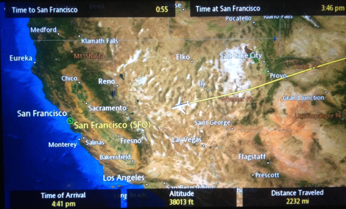
The proliferation of airspace in recent times is well-known. But less scrutinized or contemplated is the value of retaining or communicating a personalized map of the travel of the individual plane across an empty cloud-free sky, as a distillation of the personal experience of flight. The disorientation of these personalized maps consulted above tray tables provides the clearest reminder between snatches of sleep or airplane reading that we are indeed in motion at that very moment, providing a register of distance travelled, height, and arrival time as well, in the upper left-hand corner, time remaining in flight–and the depiction of the magnified presence of a plane over the land that lies contracted below, wildly out of scale with the perspective of the plane that moves across its surface.
Edward St. Aubyn nicely described the odd nature offered by the constant counterpoint of the disembodied relation to maps for passengers faced with the cartographical options of geolocation in rapid-fire succession. If the provision of data seems to revel in informative abundance, the information overload easily loses coherence for many viewers, so carefully crafted are the maps to command attention over the short-term, as if to compensated for the limited attention-spans that is assumed of most airplane passengers. The dizzying disorientation with which the shifting scale of the map, showing a child “their plane hovering near the Irish coast, south of Cork,” suddenly “expanded to show London and Paris and the Bay of Biscay,” only to morph yet again to an “informational feast” that “[at] the next scale included Casablanca and Djibouti and Warsaw” in ways that immediately undermined any comfort of its color-saturated informational content. If airline companies may hope to present to its passengers a form of reassurance, the abundance of maps, apparently exulting in the possibilities of representing a course of transit, and as a result communicated “told you everything except the local time on the plane.” If St. Aubyn sees the superabundance of information on the map as deeply alienating, it is also a reminder of the alienated nature of the in-between space of transit. For one is in an intermediate place in the plane, which remains outrageously magnified on the map, but also outside of it, moving across time zones with the apparent potential of moving to any place on the map, and indeed eventually moving outside its frame, as one shifts among maps that seem to lack any indices, but hurriedly create or improvise a sense of place as long as we are in the air.
With the crowding of the paths of the airways, the itineraries overhead are not only an “informational feast,” but a progressive sense of the unfolding of the flight path that one can watch, while seated, from an empyrean point of view, that is truly satisfying to frame not one’s sense of where one is, but of how much flight time remains. For if the seated passenger is removed from any sense of place, during the course of transit, the map allows one to be a spectator of where one is flying and enlists the most recent mapping graphics to do so, foregrounding the varieties of visual entertainments of map reading while we are in the air compounding the iconography of the cloud cover of a weather map, the remove of the plane from the ground foregrounded by the ridiculously out of scale rendering of the aircraft.
The plane is in a sense part of but not part of the map, a sort of talisman that gives us a sense of direction and markers of distance as we are removed from the earth.
The medallions that map the routes taken by airplanes to the world’s metropoles on the first floor of San Francisco’s International airport offer curious artifacts of the first Jet Age, when air travel provided something of a miracle of linking the world’s cities in a vision of post-war harmony, even if they were only included in 2000. For without imagining their exhaust, fumes, or the inevitable aural disturbances that are created by flight paths in the urban spaces that they boast to connect, the eloquent maps including weather isobars of inlaid brass in the terrazzo of the International arrivals terminal show the locations and arrival routes at international airports worldwide, spanning some 12,000 square feet of floor space.
They promote a triumphal vision of global interconnection, and an image of air-space that airline companies have defined, tracing the approaches to individual airports from the air.
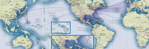
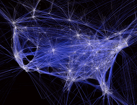
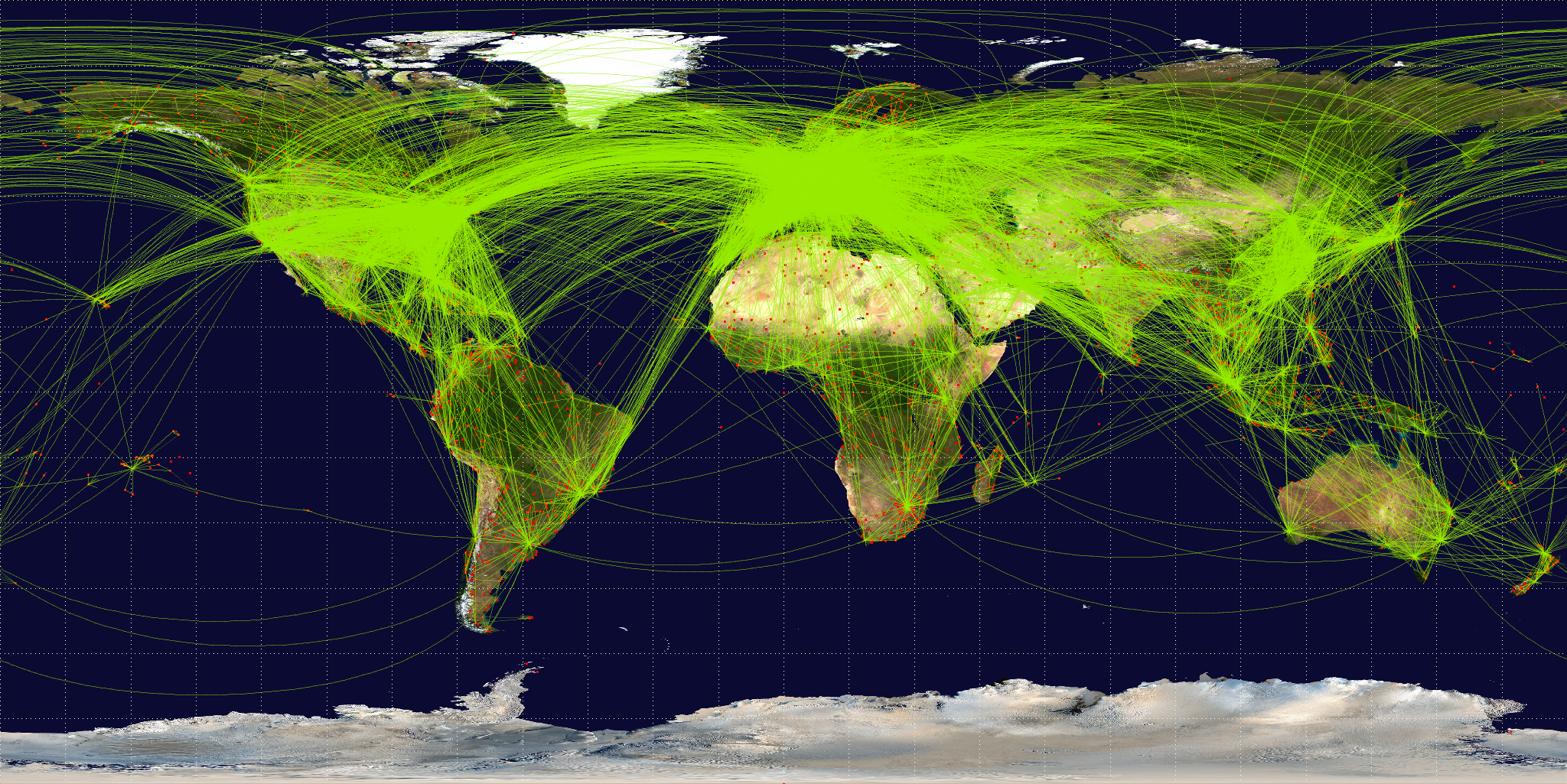
Today, the density of airplane flights across the world is so fantastic that the collective inscription of routes that now carry an estimated 77 million passengers a day, or a billion and half a year, placing a sizable portion of folks in the air at any given time. The range fo flight paths that serve an estimated 3.6 billion passengers in commercial flights is so dense that OpenFlights.org, an open source logging, tracking, and mapping commercial airplane flights, map online, displace the inhabited world with a curiously organic constellations of densely overlapping paths: the repo for storing flight informaiton offer ways to render flights on multiple projections, in ways that knit together space in fundamentally new ways. Does the constellation of flight paths create a new organic mode of modeling spatial relations?
Open Flights
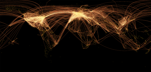
It is quite conceptually challenging to map actual overhead flight traffic–and even to visualize routes of national air-traffic, given their complexity and difference from most forms of travel, but reliance on similar needs to correlate flight paths, heights, and plans. It is hard (and unfamiliar) to map sonic disturbances, even if it is familiar to map supersonic flight. But it is fascinating to map how flight-paths impact the ground in the course of take-offs and descents: the zones where airplanes descend over cities have only recently begun to be charted. Indeed, the multiple interests in charting airspace have only begun to be evident as airspace threatens to encroach urban space. Indeed, if it is more accurate to map the paths of flight by the distance between global airports, the distorting crutch of a Mercator projection seems to be more recognizable–even if the density between airports so intense from Europe to America as of 2012, shown below, so as to render the contours of continents illegible, and almost erase Europe from the map–but seems so much more immediately satisfying as a way to show spatial linkages on formal grounds–if only since its curves suggest the terrestrial globe’s curvature–perhaps even more when the routes are rendered is drawn without satellite imagery of earth cover–or indeed any base layer, and focussing on airports locations alone.
Both suggest the increasing warping and shrinkage of space, but do so in ways that are oddly abstracted, given the range of data that they marshal, from the interests at stake in mapping flight paths–or in rendering the unique perspective that being in flight offers.
The very terminology we use to map flight patterns in the liminal landing areas around air strips reveal competing interests at stake in their definition, and might expose the lack of clear terminology to express the different interests of mapping flight from the position of the ground: “fly-over” areas precede landing paths near airports; “overlay zones” around airports try to regulate the relation buildings near airports, establishing limits for building inhabited space; “noise contour maps” map impact and impingement of sound; “overflight zones” animal sanctuaries’ exposure to flight-paths. The “fly over zone” oddly suggests the remove of the airplane to lived space, even as such maps map the impact that flight landings have on residential areas. We used to refer to the “fly-over zone” in dismissive tones as the area between the coasts led them to hop between New York, Los Angeles, San Francisco, Seattle or Boston with little contact with those areas between–but also to conceal some anxiety at the limits of this constrained geographic awareness–increased density of air-traffic that threatens to max out runways make overlay zones into potentially contested areas in need of mapping.
The interests are at stake in the commercial expansion of airports and the determining the criteria for the limits of acceptable levels of environmental noise and pollution. While maps locate specific sites of population in a universal matrix, the impact of the descent and take-off of airplanes on urban space suggest a troubling overlap of navigable airspace, a wooly and capacious category that conceals its overcrowded nature, and inhabitable land, focussing on the grey zone on the margins of the airport. To get our heads around airspace, whose considerable scale is almost unfathomable, let’s try to examine the impact of its contours on urban space in this post. The sociologist Henri Lefebvre drew a distinction between the production of representations of space, of social spaces, and of individual mental representations of space in The Production of Space, when he sought to capture the diversity of spatial production within the city’s everyday life: Lefebvre argued relations between the production of social, the representation of space, and the space individuals represent to themselves demanded attention as distinct tools or “spatializing practices” in urban space, if not the political character of the social production of urban space.
But Lefebvre didn’t consider airspace within this constellation–a space that exists outside but on the margins of social space–but it is a qualitatively different image of a commercial space that has been increasingly imposed upon lived space or inhabited space without much planning or regulation–particularly when it comes to take-offs and descents, the main focus of this post. The mapping of the incursion of airspace on lived space It’s perhaps not only a coincidence that since Lefebvre’s book appeared in the early 1970s, inter-city airline travel has boomed as a social sphere, if not a space in and of its own right, often removed from urban space but on its margins.
And paths of flight have only begun to be mapped in their diversity. The density of air-traffic indeed may have even changed our perception of space in complicated ways, with both the rise of faster planes and long-distance flights and the common nature of air travel and of plane arrivals as common ways of entering cities or departing from them. And landings and departures, from commercial airline travel or air transit to air transport to unmanned flights, has begun to impinge in increasingly perceptible ways on lived space. The lived space below the webs of air travel, take-offs, and landings suggests a persistence of place in a geography of flight, as in places that are crisscrossed with air routes, airplane flight is too often naturalized as white noise. “[The noise] bothered me until I realized that, when I hear the planes, it’s always a reminder that there is life out there, and people are traveling, and traveling is a big part of me,” noted a Turkish immigrant living by the San Diego International Airport with some stoicism in 2005, trying to look at the upside of this rumbling that then punctuated her day in 15 second interruptions, coming roughly often every minute and a half. “So even if I can’t go home to Turkey and visit my family,” she reasoned, “I know that there’s this possibility that one of them could get on a plane or that I could get on a plane and go back.” Most flight travel in the United States are primarily supervised not by localities, but the Federal Aviation Administration. The legal status of restriction to these paths is limited or constrained by the fact that no general policy seems to exist–indeed, the FAA is slightly compromised in its interested in fostering commerce, as much as protecting the safety of urban space or local rights, and has limited ability as a national organization to mediate between local residents’ desires as it negotiates the interests in maintaining commercial hubs to foster the expansion of commercial national airspace.
When I was in San Diego last weekend, the close proximity of the airport to the harbor and marina made me think of the huge growth in airspace in past decades, and difficulties of mapping airspace in American cities. The huge expansion in air traffic since the initial growth of airports in the 1950s, combined with recent growth in belts around cities and in formerly extra-urban areas have led to a common phenomenon of living in or on the margins of an overlay zone, in cities like San Diego. Although issues of noise were not a problem in the early age of airports in the United States, dominated by smaller-sized planes and far fewer flights, since the expansion of non-stop nation-wide flights in the 1960s, commercial cargo services have created a new geography of air flights and air use, and an increased intensity of air travel at hubs, as well as the consequent expansion of a huge web of air travel, with attendant plane landings and take-offs, that create a virtual web of crisscrossing flight-paths across the country. Mapping the navigation of individual routes is far more direct.
Yet the image of a nation bound by flight-paths of different carriers already seems to wrap itself in a serpentine fashion around the geographic map. Basing his work on a mine of FAA data, Aaron Koblin’s “Flight Patterns” uses data to track flight-paths to map of our active airspace–an image of which we are rarely conscious and constitute a maze difficult to spatially comprehend, but whose ghostly network exists around nodes of airline hubs and links arcs of aerial paths. (This is a hard balancing act: NASA indeed predicted in 2007 that allowing computer software such as Terminal Sequencing and Spacing to remotely coordinate the flights of the aircraft that simultaneously course across the skies would not only increase the regularity of landings and take-offs at airports but allow airplane companies–perish the thought!–to be a blue to manage an increased density up to twenty percent by utterly banishing human controllers from the scene.
In a finding appealing to cost-cutters, NASA forecast that the combination of more autonomous planes and increasingly automizing traffic control would bring a significant savings to airplane companies; the prospect of switching to automated copilots alone might reduce labor costs in passenger aircraft by some billions of dollars every year.) The wonderfully organic image of the flight paths across the country seem to render something like an Indonesian stick map.
Our awareness of the rapidly growing density of flight paths may be masked by the mental images we receive from personalized in-flight tracking maps, which perpetuate an illusion of navigating the airways or wile away hours by mapping progress to a destination one rarely registered consciousness of traveling toward, sitting in an isolated cocoon at 60,000 feet, as if we were pilgrims bravely undertaking a cross-country trek, accentuating our experience by wildly magnifying the plane out of any relation to the map on which it is super-imposed.
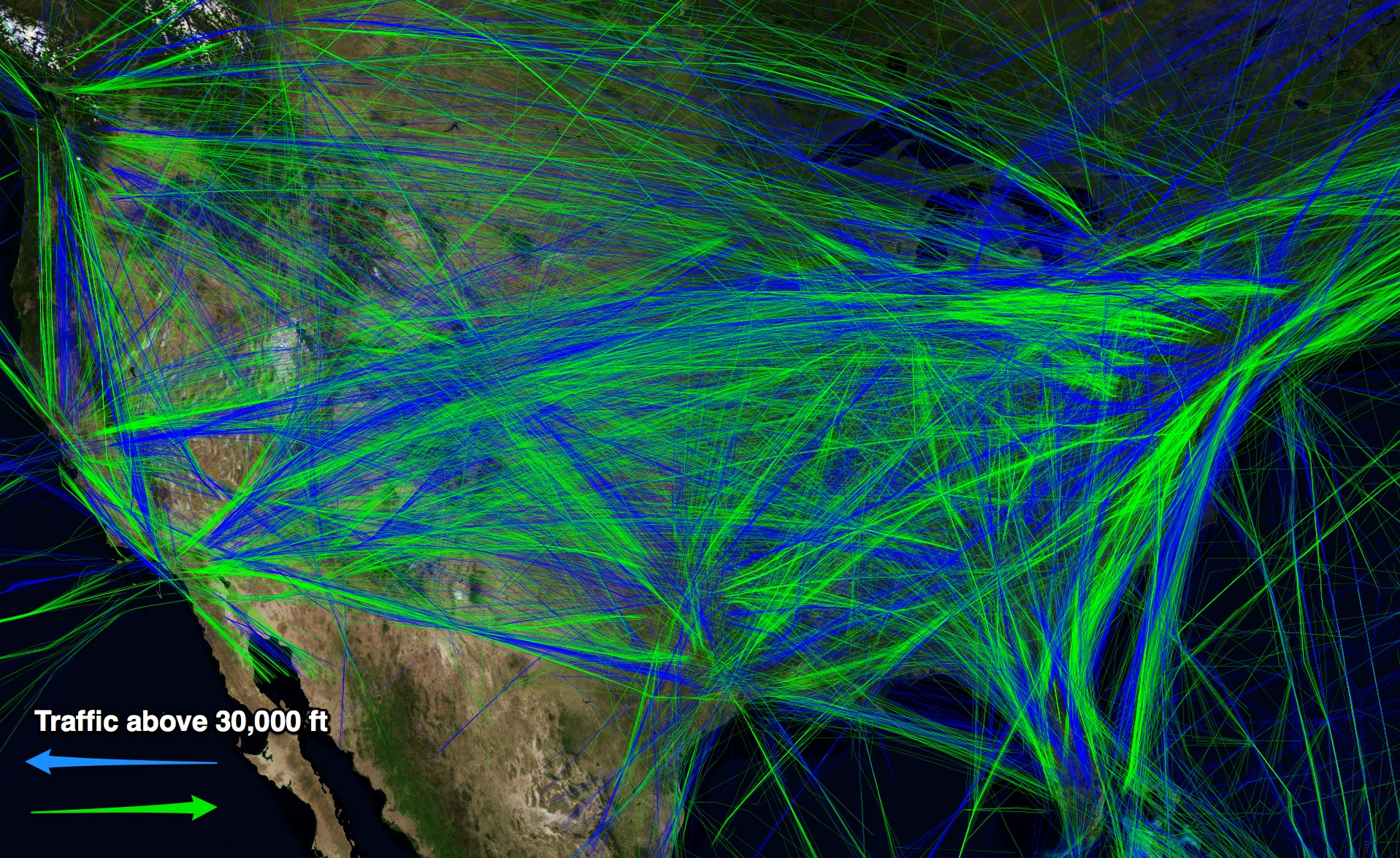
This map has a wonderful ability to place us in a sort of relation to a local environment: we are the bright green moving icon, launched on a dotted line across the country, as we try to equate our perspective with the projected flight path over the screen of a static map. Contrast this, say, to the sort of snapshot that Anthony took at the National Air and Space Museum in Washington of the planes in flight above the country at a moment in 2006, that led him to “imagine the pressure of Airport control conductors . . . at major airports” as they managed flights’ course:
Of course, the icons of individual planes, which seem about the size only slightly smaller that seen by observers on the ground, wildly out of scale in relation to the background map of the United States, so that they seem to crowd the skies like buzzing flies. It is somewhat reassuring that there are directional corridors of national travel across the country, we can see in a map of flight paths; the density of the lines boggle the mind even when we distinguish flight paths at over 30.00 feet, and we face only a ghostly spider’s web of blue and green streams that designate the arcs of inter-city flight paths:
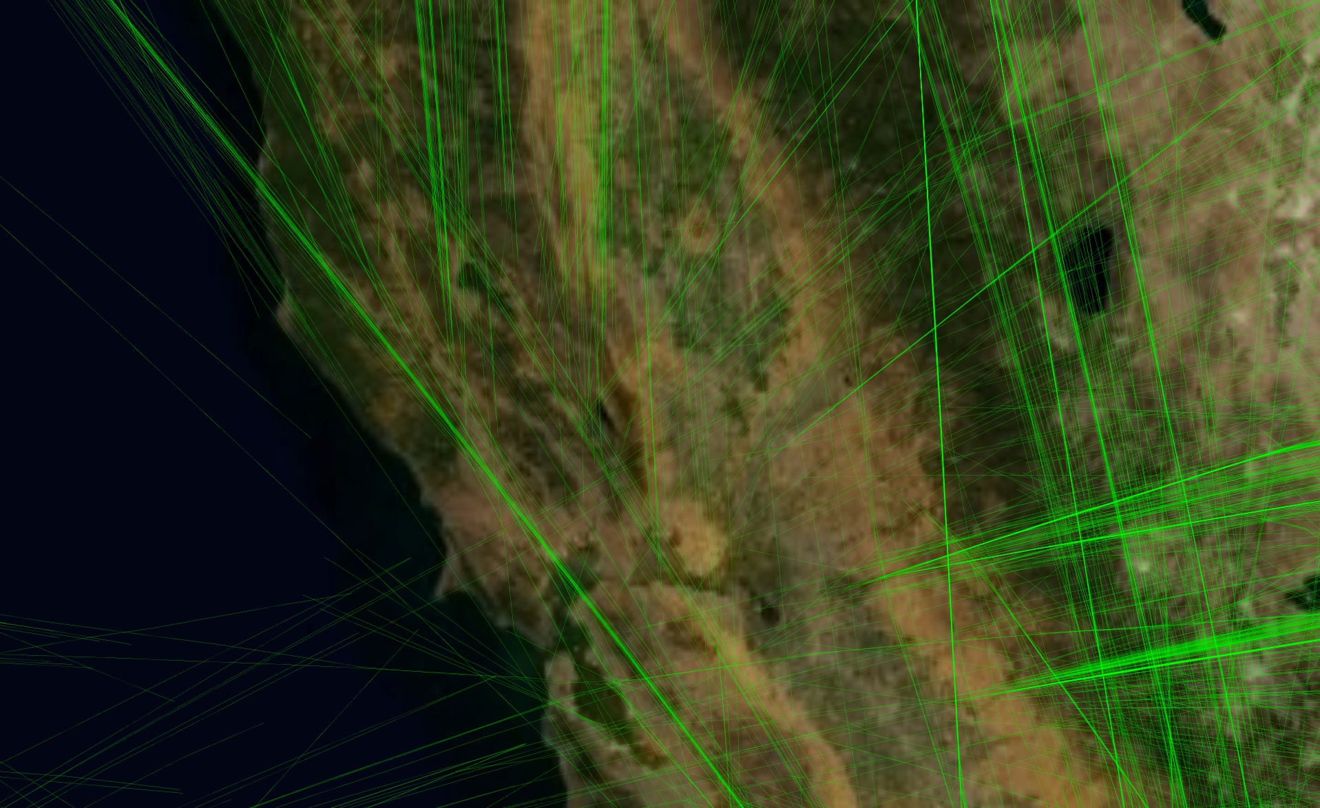
Even looking at the Bay Area alone, it’s hard to get one’s mind around the inhabitation of the sky above 30,000 feet, marked as they are by streaks, and contrary to the idea of inhabitation as well as covering a space greater than most can intellectually comprehend:
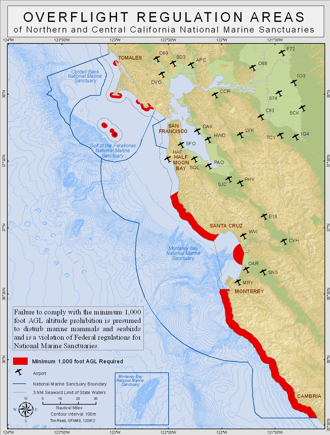
Given the need to maintain protection for wildlife sanctuaries, there is a considerable body of maps regulating overflight altitude above protected populations of marine species.
Such maps don’t address urban space, but they do suggest the problems of defining similar overflight regulations of areas human residents inhabit.
It’s less hard to comprehend crisscrossing paths of air-travel from outside the passenger seat. We can imagine and track the divergence of commercial airspace from a ground-bound perspective as it impacts a city’s social space. The government-sponsored expansion of airspace has in many ways created an odd and un-natural urban geography between pathways of flight and urban residences: fly-over zones are mapped over and on top of social space, and airspace as mapped over lived space. The relation of fly zones to personal is not only figurative; fly-over zones impinge in concrete sensory ways on the mental space of the individual, which is now permeable to the unnatural rumble of the turbines overhead.
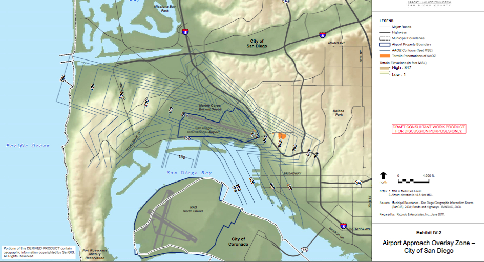
What’s it like to live under a flight path? The protection of airspace by the FAA makes it not the best government agency to represent how planes impinge on the ground: the mapping and protection of flight paths creates a bit of a super-jurisdictional commercial space with limited attention to how flights permeate the mental space of nearby residents. As if some would naturalize the rumble of a nearby volcano, a sandstorm, or the Santa Ana winds, there’s the knowing acknowledgement, with a shrug, at the convergence of the airplanes overhead. (This is a soundscape that is worth recording in its entirety, of which the YouTube video below offer a more condensed time-stop spliced condensation that doesn’t really capture the improbable regularity with which cruises intrude on the sunny street-scene.) Let’s examine the ways airspace is mapped. Indeed, the FAA has recently been required to publish a set of “noise exposure maps” or NEMs for public notice, as the 1969 National Environmental Policy Act omits airplane noise. They hope to provide an open forum or acknowledge public input to the environmental impact of increased air traffic, responded to local resistance to the adverse environmental effects of expanding airports in Wisconsin, Florida, Toronto, Charlotte, Arizona, Sacramento, and elsewhere, given the conflict of interest for the FAA in negotiating local noise regulations and improve commerce through air traffic as they seek to prevent the expansion of commercial areas around airports that are increasingly becoming engulfed in extra-urban space. But it is the impacting of areas of inhabitation with air-space that creates perhaps the stickiest situation for mapping flight travel for the FAA, and poses the deepest problems of how we expand our airspace at the same time as curtail the impact of that airspace on something we might call quality of life, but has much larger consequences and implications than that numinous and intentionally generic term implies. Fly-over zones near San Diego exemplify air-traffic appears about to max out , as expanding airspace impacts residential space. The frequent the flights at San Diego International Airport over residential space at a distance as close as 400 feet does not seem a great feat of modern urban planning: nestled near the port of Coronado, right by Highway 5, the airport is a stone’s thrown away from the city’s Marina and three miles from the Pacific. Perhaps this relates to the fact that the city is a long-time base for the military, with it’s own frequent air-shows and culture of naval and air-force bases. But the expansion of the city around the town of Coronado has paralleled a transformation of the former Lindberg Airport to a three-terminal sprawling cluster of buildings, maximizing its use in response to economic development of the city, apparently naturalized within the coursing freeways that surround it, while dealing with only two runway zones.
Planes fly overhead at a distance that seems roughly equal to a football field. In a manner that provides limited negotiation between local inhabitants and the regulation of airspace, we find only the most general stipulation in Part 91, Title 14 in the Code of Federal Regulations about maintaining a minimum altitude of 1,000 feet for air travel over “congested areas,” which is waived in the event of take-off or landing. And any restriction on airport use or control of flight paths depend on the approval of the FAA, according to the Airport Noise and Capacity Act of 1990 (ANCA), an approval that must rest on demonstrating that any restriction isn’t a curb or impediment to interstate commerce and is “not inconsistent” with “safe and efficient use” of “navigable” airspace:
The airport restricts or “disallows” take-offs in the wee hours of the night between 11:30 pm and 6:30 am but with over 600 departures and arrivals each day and growing, the distinctive combination of a rumble and high-pitched reedy whine from planes that literally fly over apartments at a distance of as close as 400 feet create an inescapable part of the aural environment of urban spaces–with noise levels averaging 150 dB at 100 feet. The delineation of precise paths of approach airplanes must take to the runway creates the working framework to descend over six-lane freeways to enter the area ringed by palm trees right by San Diego Bay and the old Marina. It all seems pretty disordered when one enters on commuter plane, but the pathways of arrival are mapped in detail, allowing one to enter along the following elevations, which seem designed to encourage a slow approach from the ocean or inland into the two runways, avoiding the City of San Diego or Mission Bay area, for which landing would require a far more precipitous route of descent, and would anyway be discouraged by the orientation of the field’s two major runways:
These points of entry overhead are in a sense defined. But the dramatically rising number of flights that land or take off to the East create a sizable amount of traffic, rumbling as they do. While the restriction of the heights of buildings in the pathways of flights are legislated to be no taller than forty feet, there seem to be a way to guarantee safety by not impinging on residential areas in region where 10,000 houses and over 20,000 residents are packed, in a combination of rental apartments and condos. Of course, most residential areas in California are made up of houses of less than forty feet, anyways, so while this dedicated to the safety around airports and clear runway views for pilots, the restrictions on elevations in the above map–a sort of contour map of the minimum elevation of flight paths–try to map the boundaries that determine relations of airspace and lived space. Overlay zones protect the more verdant Mission Bay area, the more desirable ocean residence, the mid-century area around the city of Coronado–now a suburb whose harbor just getting its first restoration of buildings ringed by palms–creates the backdrop for approaching flights whose entry zones offers an eery aural backdrop oddly incongruous with a harbor populated with small boats sailing at full sail. The approach of large airplanes over the bay is encouraged, with access from the west, over the Pacific, while restrictions limit flights over San Diego itself. Guidelines of air travel encourage pilots to descend from the Pacific or over the harbor by two routes of approach, avoiding low travel over the protected Mission Bay area and making convenient two access lanes:
But Lindberg was expected to exceed its capacity for air travel by 2015, and there is now no clear alternative to remapping flight density or flight paths in sight. The mapping of air travel around the city, as it were, reflects the constitution of layover zones where flights are restricted over more inhabited areas. In such maps, routes of flight are granted near-legal precedence over the priorities of folks who live under flight-paths, since commerce must be protected over all. (This might include, for example, the importation of high-grade Sushi from Japan, on its way with JAL cargo jets for consumption in high-end restaurants in Las Vegas, or a slew of FedEx planes ready to depart, as well as all those commuter flights to Los Angeles.) While privileging commercial needs seems reasonable, one would not of course expect landings or take-offs to occur in densely inhabited areas anyway, so the stipulation seems bureaucratic legalese, with limited ramifications. Yet since “neither the City of San Diego nor the State of California can regulate the altitude, speed, location or direction of aircraft in flight,” the road is literally open to free market expansion of flight routes, especially if market forces dictate the creation of airstrips situated cheek by jowl beside residential areas. In much of the nation, the original sites of airports built and constructed some fifty to seventy years ago were planned in areas then outside of the city limits, outside of settled zones.
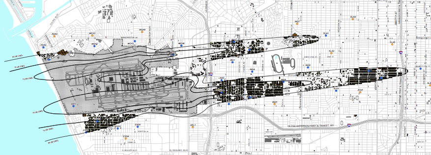
The expansion of the airport as a hub has led to further construction of buildings in the seventies and eighties, even as their location is increasingly taken over by urban sprawl to such a degree that they’ve been swallowed up in the city itself–if still not in what constitutes its most “congested areas.” Since it was legally stipulated no buildings be constructed within fifty feet of FAA-established approach paths to the airport, with the exception of those less than 40 feet in height, a large number of relatively short buildings cluster around the flight approach paths at San Diego International Airport’s Lindberg Field. In other areas of the country, the FAA has turned its attention to the impingement of “development creep” around airports formerly located at a remove from populated areas, but now more ringed by malls and housing developments and residences, creating a need to impose overlay zones to protect “public investment in airports,” as much as safety–several airports less economically important have been forced to be closed because of development creep. The FAA, meanwhile, has been legally required to make public limits of permitted airport noise on the internet in a set of “sound contour maps,” to map the neighborhoods and residential areas impinged by airport noise, as this map of the area around LAX, which restricts approaches to from the east and west, in an attempt to reduce noise pollution in more affluent areas whose property value could be compromised, and only marginally create intrusive noise pollution from residential inhabitants, cast here as if the mitigation of noise exposure imitated the orientation of runways, and conveniently sidestepping issues of noise pollution below the approach corridors of most flights in poorer neighborhoods:
The desire to “make [available] noise exposure and land use information from such noise exposure maps [prepared under 14 CFR part 150] . . . in an appropriate format” created a neat set of contour maps for Oakland in 2006, which took advantage of the planning of the airport along the Bay over which it places the greatest square footage of noise, and effectively removes anything over 70 dB–the sound of a car engine from fifty feet away–from all but a few inhabitants:
Yet is the distribution of noise is difficult to steer from urban areas, mapping the impact of noise impingement has led to some dramatic improvements in levels of airline noise in some residential areas, as around Midway Airport, a small one to be sure, which suggests a considerable reduction over time of the level as of fly-over noise from planes in Chicago:
The selection of maps raise questions about the monitoring, measurement, and dissemination of models of noise-reduction, to be sure. The FAA seems to clearly desire to project an image of making these maps available for easy download and consultation, as if to give a sense of transparency to the problem of noise pollution in overhead flights, and to convey a degree of public trust. But there is a countervailing tendency to naturalize the map, and to naturalize the overhead flight zone, which stacks the cards against any attempt to effectively monitor the impingement of flight zones in areas of urban life, or prevent an idea of the importance of reducing ambient sounds from the social space of urban areas. Once the threshold is established, to be sure, acceptance is on the way. Unclear local means of redress exist, despite the availability of maps online, and we still haven’t assessed acceptable limits for airport noise or the elevation of overhead flights. Sure, in San Diego there’s a lot of pleasure in seeing the planes enter the urban airspace for some air shows– –that echoes how my mother was taken by her parents in the 1940s to watch the planes land and take off at La Guardia Airport on the Flushing Bay waterfront in Queens New York, then the New York Municipal Airfield. But there’s a danger we naturalize airport noise not in the environment, among the quite variegated sound map of urban life from motorcycles to tow trucks and diesel trucks.
And, more deeply, there’s the criteria question of whether one means sounds, or the potential other effects of airplanes flying close overhead, and entering inhabited residential areas that are filling up the areas around extra-urban areas. Isolated motorcycle sounds are the greatest dB count on Saturday morning in the mission, and the neighborhood is spared the sonic intrusion of flight paths. The effects of that much noise pollution around LAX or SAN have already been removed from the table, perhaps as demand for airspace remove public input for the design of a map of urban airspace off the map. Such planned flight paths that skirt the crowded or more affluent areas of urban residence doesn’t, of course, even start to take into account the density of a map of unmanned flights across the country. At the risk of caving into the fears of the right wingers, the pleasure many CIA operatives took in their use of drone flights as a relatively error-free incursion into foreign airspace seems an odd extension of the resolution of problems of mapping air flights by legitimizing rising air traffic over residential areas. There are, of course, entirely other way of raising questions about the pretty clouded ethical issues of occupation of airspace by unmanned objects–but the uses of attack planes to arrive at positions that cel phones or GPS locates suggest an expansion of their coverage of airspace.
Remotely piloted aircraft are so densely flown over the country, if this chart is to be believed, that one can’t but wonder about the ways that our current process of mapping flight “overlay” zones around airports relates to the bartering for access to foreign airspace–or the legal wrestling with the notion that a government can barter or grant off rights for sending unmanned drones into populated areas. We have coerced the ISI into agreements that all drone flights over Pakistan operate under covert US authority, in other words, and silence be preserved over the invasive nature of their entry into foreign airspace with a mission to kill. In the process, we’ve ceased to defend or see as legitimate a process of open local negotiation about the organization of airspace, even though many of the casualties are nearby residents in the wrong place at the wrong time; the Central Intelligence Agency presumes or assumes airspace rights and flight zones as legitimate tools to target individual inhabitants, in ways that would have little legal justification fifteen years ago. There seems some parallel in the trade-offs with which we’ve decided, rather than boost the local economy, to protect increased commercial traffic, and to legislate permissible zones of approach, and let the residential market take its own path. To do so may map an inevitable collision course between airspace and lived space by affirming the exposure or vulnerability of our spatial situation in the face of air traffic above.
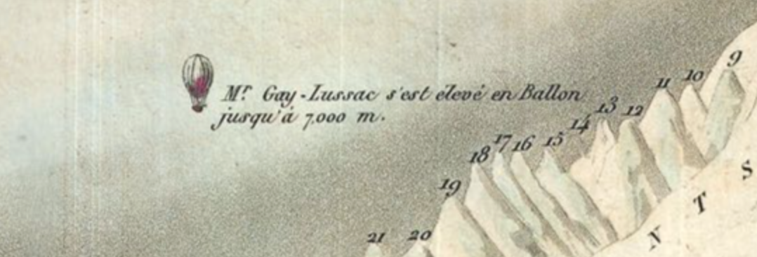
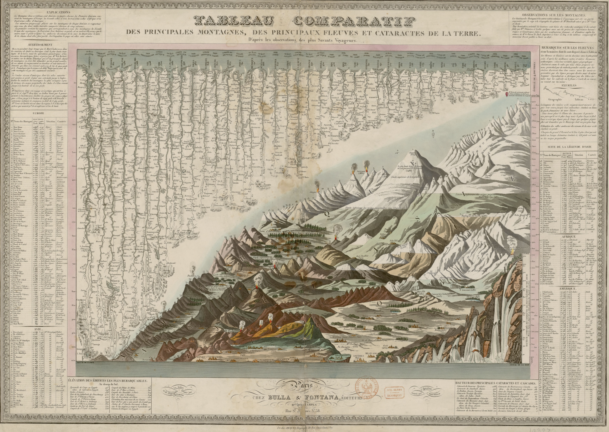
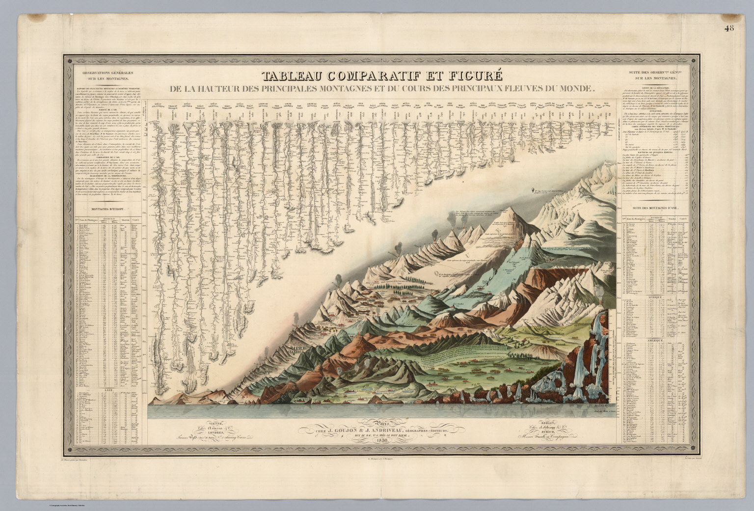
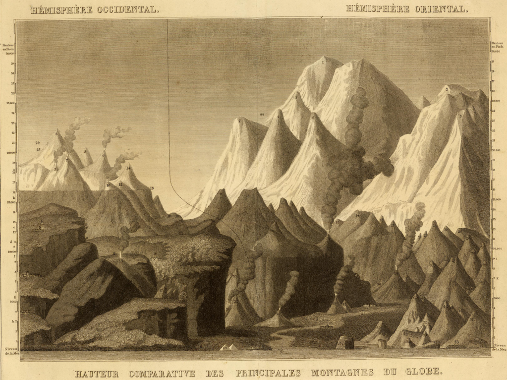
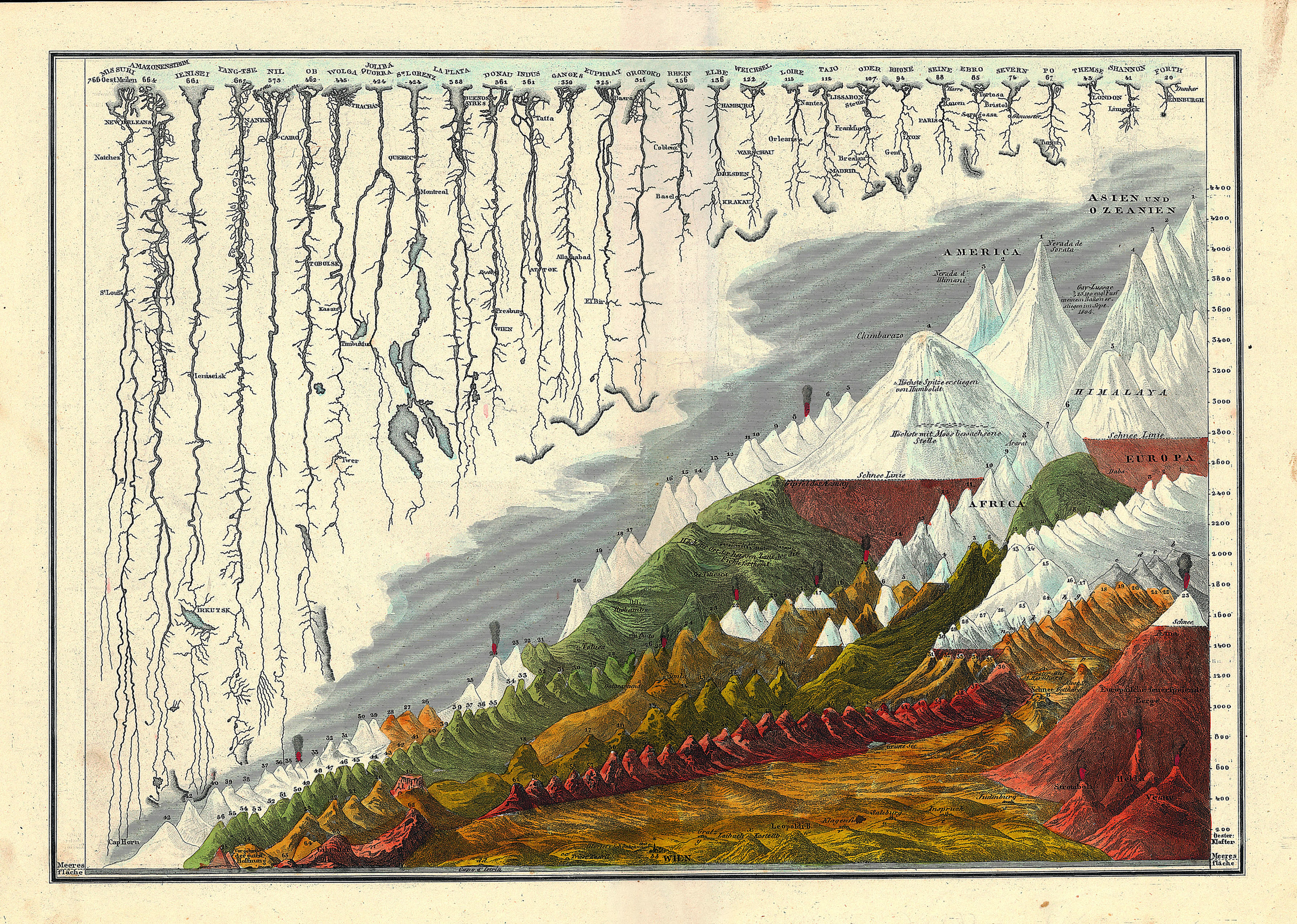
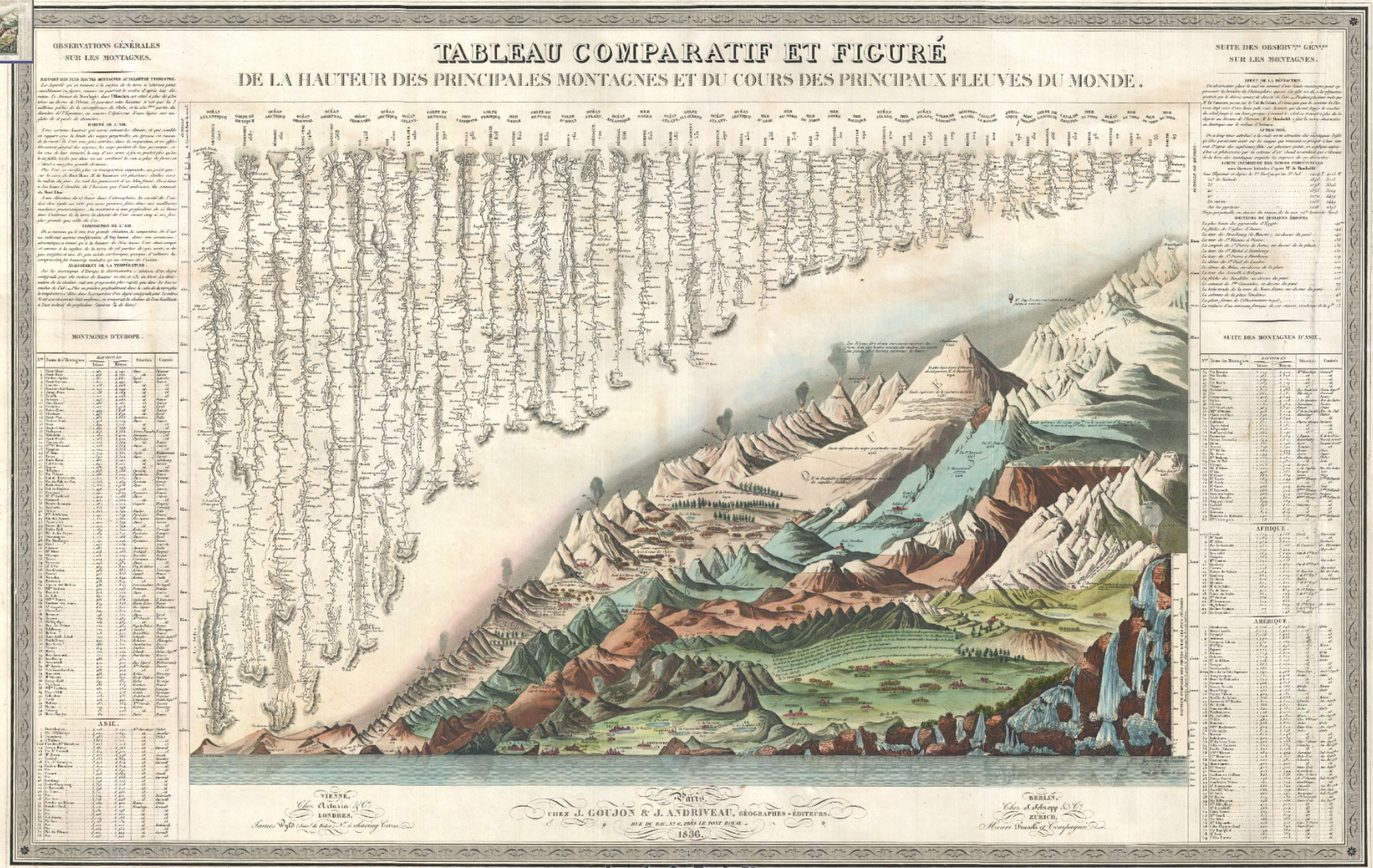
The balloonist Joseph-Louis Gay-Lussac, who set a record for ballooning of 7,016 meters in 1804, flying in his hot air balloon beside the Himalayas, in Andriveau-Goujon’s 1834 Tableaux Comparatif et Figuré (Paris 1834). The ballooning record was only broken in 1862.
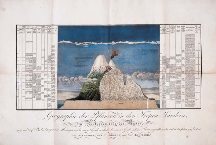
The crisp condensation of an array of multiple mountains and rivers by their magnitudes in a uniform scale and imagined plane represents an image of the coherence of scientific knowledge by its transformation of nature into a single reference tool. The etched “comparative map” reveals an exquisite conflation of legibility and the cartographic surface: it contains not only a database of Humboldtian proportions, but information about the nature of the world’s tallest mountain ranges, volcanic eruptions, longest rivers, and even some waterfalls in Peru–although not the waterfalls in Yosemite, which were not yet discovered or surveyed, or Andes. The map, if prosaic, is a register of the first age of globalism, before maps of air-travel or internet bandwidth, but processing and echoing a new taste for global aspirations in a post-Napoleonic era, in the elegance of lithographic form.
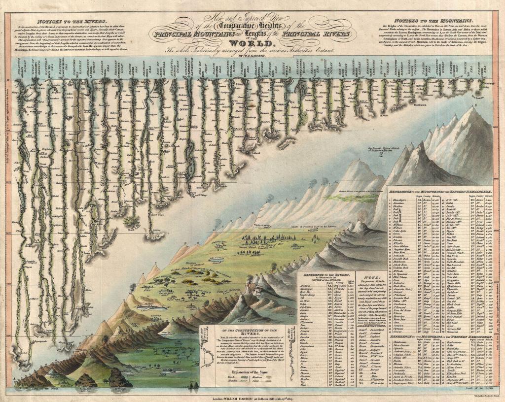
Containing, and finding a unique way of dominating the increased expanse of the natural world, the popular comparative chart of rivers, mountains, and waterfalls of the world first printed by Bulla & Fontana in 1828– based on Darton’s far more stodgily titled “New and Improved View of the Comparative Heights of the Principal Mountains and Lengths of the Principal Rivers of the World” (1823)–offers more than an episode of cartographical entertainment. The landscape that it opened for viewers suggested something like a popular panorama, in cartographic detail, a prospective view of global scope the likes of which was on the cutting edge of popular entertainments and sophisticated cosmopolitanism of a global map.
As it was redesigned to accommodate increased information and encompass a greater global purview in its qualitative imagery, the map became something of an assertion of the unboundedness of post-Napoleonic levels of global knowledge, and a celebration of data. Encyclopedically growing through the complex 1834 chart of Andriveau and Goujon celebrated the addition of new claims of knowledge as a domestication of the natural world by indices of scale, even if it abandoned the orientation of the viewer to their geographic locations or spatial relations in a purely idealized record of the mastery of global proportions–the illusion of a growing global mastery illustrated by the comprehending a proliferation of local qualitative detail in its frame in encyclopedic detail.
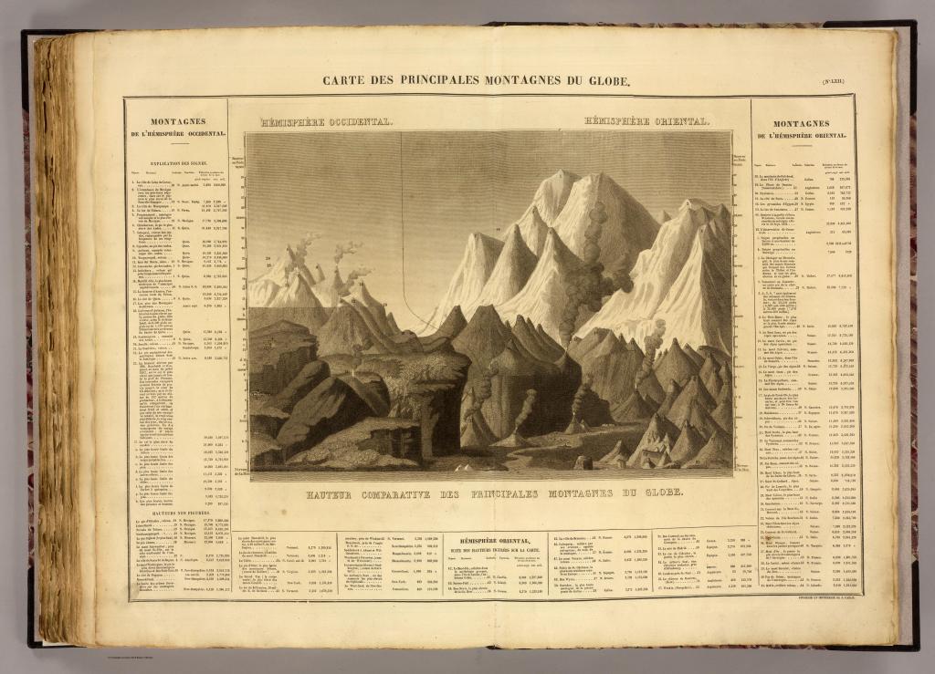
Bulla & Fontana, Tableau Comparatif des principales montagnes, des principaux fleuves, et cataractes de la terre
The vertiginous pleasure of the lithographic map lay in the combination of metric precision and exactitude with utter abstraction from place. The marvels of the world were presented, as it were, in a mental landscape of the geomorphological features of the known world, abstracted from territoriality or national divisions, in a gloriously unified view of the world.
The terribly successful genre of mapmaking essentially offered an elegant compilation of human achievements as well as of the natural world–from the pyramids, to the tallest buildings in cities, and highest ascension made by a voyage in a helium balloon. Despite its encyclopedic scope and the range of data it processed, the “table” is human-sized, a large wall-map abel to be readily scanned, in order to digest spatial immensity to a scale designed at a human dimension for exploring a virtual record of the natural world that seemed to distill a global atlas to one sheet: the findings it collated derive from first-hand observations, each concretized in a clearly pictorial fashion so that it can be immediately recognized and understood. If the aerial triumph of ballooning as a transcendence of the everyday was well-known from the late eighteenth-century aerial flight over the English channel by a French-American team, accomplished in 1785, the celebrated flight of the hot-air balloon was an emblem of the national transcendence offered in the comprehensive map, breaking the bounds of national survey.
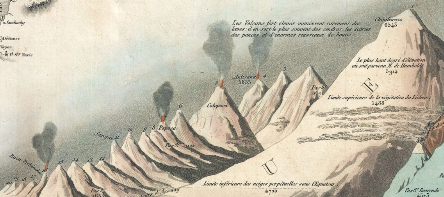
The most striking single detail that dates the map is the place it accords Gay-Lassac’s recent triumphant ascent to 7000 meters in a hot-air balloon of 1808, noted in the sky of the Tableaux, just above the mountain range of the Himalayas. Perhaps more importantly for readers, the height of the balloon was just above the highest elevation that Humboldt himself had climbed (5914 feet), as well as the highest levels at which vegetative life–for lichen, 5488. As it rises above this barrier of living vegetation, and beyond the furthest height of the German explorer, the lone balloon is a triumph of the modern world, and an exploration of the unknown that was great as the ascension of peaks or waterfalls. The balloonist suggests a sort of French victory in the transcendence of previous bounds of knowledge, and a sign of national pride for the Andriveau-Goujon workshop (fl. 1805-94).
Readers of the map could not only recognize the transcendent flight of Gay-Lussac, but could project themselves into a range of comparable adventures. The map is not in any familiar sense a projection–or a uniform transference of a conformal expanse to fixed bounds. There’s not even a pretense of uniformity in the map, because the assembled landscape discards usual cartographical operations that ensure continuity, fix orientation, establish directionality, or claim exact measures of adjacency. All are sacrificed for one criteria of scale–height–that provides a lens by which the cartographer’s fantasia of representing how space can be viewed.
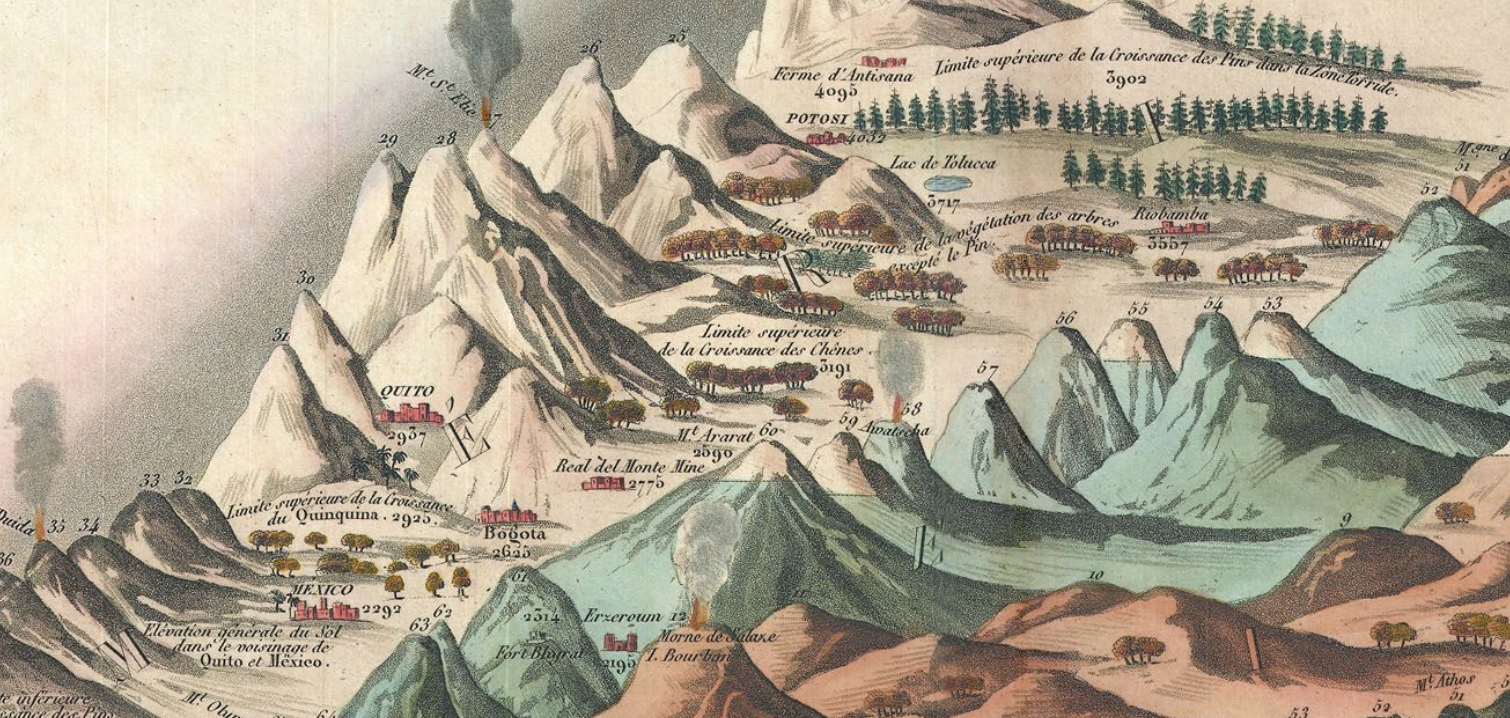
The notion of such a mental transcendence of space-and idealization of the basis of knowledge–was of deeply Humboldtian spin, and rested on his neo-Kantian comparative categorization of the relative height at which he scaled Mt. Chimborazo to place it in the context of the scaling of Mt. Blanc, Vesuvius, and the elevation of Quito. The scaling of mountains provided a sense not only of worldly retreat–as, for example, Petrarch, who ascended Mt. Ventoux for a new look on life and worldly vanity–but of global triumphalism of geographic plates, trumpeting natural knowledge of the Andes as a register of global sophistication by tallying a comprehensive compendium of all terrestrial mountains of in a panoptic survey of heights.
Unlike Humboldt, however, the atmospheric ascension of the balloonist implies an imagined prospective of an actual landscape, where the pictorial embraces, domesticities, and processes the comparative, and presents a pictorial unity of comprehensive scope–in ways that echoed how the prospect of ballooning was long associated with maps.
The synthesis is truly cartographical because of how it “writes” space against uniform indices to offer a domestication of geographic diversity and variety within the inhabited world–even while abandoning actual inter-relationships. A fantasy of mapping, stripped of coordinates, enlists the familiar repertory of cartographic conventions of accuracy to offer a compendium of statistical knowledge. The cartographer abandons the usual cartographical conventions of noting spatial orientation, directionality, or adjacency, as well as cartographical signs, but transfers statistical measurements to a pictorial view in which heights can be viewed in relation to one another. This popular format of mapping uses our familiarity with mapped space to sacrifice the need to record or establish location to fashion a comparative collation of known topographic variations. Optimistically, it shows the world as a unity and unified landscape, without divisions of nationality, in a project in which knowledge about the world is curiously disembodied (in numbers) and re-embodied in a single tableaux of global synthesis.
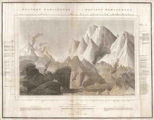
Gilbert’s Modern Atlas (1840)
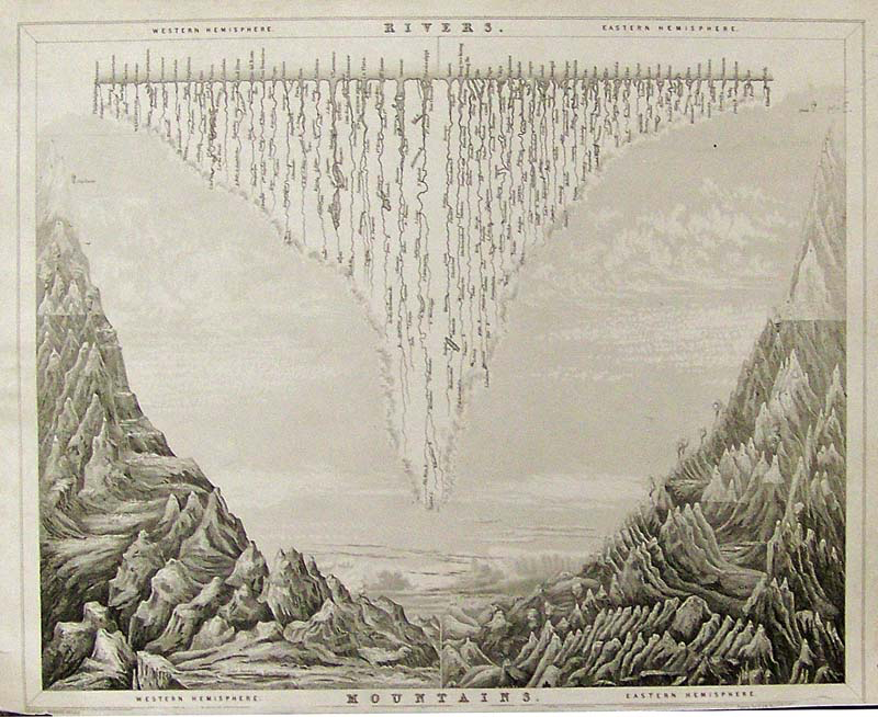
The elegant steel plate from Gilbert’s Modern Atlas, 1840 arranged the world’s rivers and the heights of its mountains by length across an imagined chasm, juxtaposing Western and Eastern Hemisphere, running off from the spine of the bifold plate, even abandoning indices in a prospective view of the globe’s natural splendor that suggest a reduction of natural philosophy to one triumphal prospective view: akin to an unveiling of a natural harmony of revealed knowledge, the cleverly combined plate of Rivers with Mountains is not only an economic illustration of information but encourages an imagination of how rivers descend from the mountain ranges that flank them–including the now-iconic figure of Guy-Lussac’s aerialist feat as a way of entering the tallest heights ascended by man in the upper left and upper right as an index of human achievement before this natural splendor, as if to ask the reader to imagine achieving a view over this imaginary landscape from an awesome prospective, if not the landscape that it might afford.
Although there are no recognizable cartographic indices in the, the Tableaux comparatif reveals a familiarity with the collation of information in mapped space, rising above the range of important cities that formed points of spatial orientation on most maps–including, but by no means limited to, Paris, Rome, London, Geneva, Mexico, Bogota, and Quito, among others, that were noted prominently in the various maps and pocket atlases that its printers also produced, Whereas most maps map itineraries, routes, pathways, or memorable sites of human interaction, the Tableaux is a compendium that draws from different human experiences, correlated with one another in a space that does not exist, but assembled in a single whole. It is a sort of surrogate for the totality of what we know about the inhabited world and its bounds, and the victory of the diffusion of a form of cartographic writing: its readers were able to place each of the world’s greatest rivers in their geographic situation,–but now afforded a chance to measure (or rank) the Nile beside the far longer Amazon and Mississippi, in order to decontextualize and historicize the limits of global knowledge, and afford a transcendent view.
As the ascension of the balloonist occupies a crucial pride of place in the 1834 map, verticality is the implicit theme of the map, which registers heights and lengths, to be sure, but focussed on the collation of knowledge by elevations, including forest lines, barometric readings of the elevations of cities, and heights of mountain ascents to make it a repeated object of visual curiosity that merits intensive scrutiny to local landscape detail.
The Tableaux stands as the culmination of known science, and the triumph of the map–and Geography–as a subject able to comprehend the physical sciences. One might take the map may be a final redaction of the Ortelian ecumene (the inhabited world), which it processes for the mind’s eye, but takes the idiom of a pictorial landscape to decontextualize the abstracted record of geographical knowledge. And also to the observer’s eye: for the data accumulated and synthesized is clearly both “figured” and “represented” to be readily recognized by viewers familiar with maps. The synoptic register of mountains, rivers, waterfalls and rivers that exploited the four-color potential of maps. The image was based on a map first assembled in Paris during the 1820s, before being widely reprinted in schoolbooks or atlases through the century as a compendium.
Inscribing the landscape with remarks on vegetation and marking the turning points of ports on rivers, which the cartographer has straightened for adequate comparison as if from a laundry line, the picture is a representation of the use of the inhabited world as well as of the limits of its inhabitability, and a condensation of all that needs to be known about the world and all one shall, presumably, ever know.
The collage-like landscape, if impossible, placed global features for the observer in a way that reflected their own competency and sophistication, boasting its accuracy and transparency in the manner of a geographic map.
Rather than constitute a new genre, the assembly of the world’s principle mountains had become a sub-genre of geographical knowledge, echoing the French taste for lists, perhaps, and the mastery of geomorphological features in ways ways that suggest an imaginary landscape, and the power of placing the world’s known mountains beneath the viewer’s eyes, as the hemispheric division of principle mountains of note suggested, in this 1825 atlas that abandons territorial bounds, but presents the romantic mountainous landscape as divided between the hemispheres,–with the ancient Egyptian pyramids, topics of huge touristic attraction that were almost included in a French patrimony in the post-Napoleonic period, if by erudition alone, front and center–
–between both hemispheres, as if in a signature of French erudition. The synthesis of global triumphalism in a pictorial landscape is the triumph, as it were, of pictorials over borders, in a graphic synthesis of volcanic and ice-capped glacial mountains arranged for the viewer in a landscape panorama of sheer verticality, measured on a scale rooted, at its base, by the limits of human achievements–the Egyptian pyramids.
Instead of offering any spatial or directional frame of reference, the Tableaux is strikingly framed by statistical tables that serve as the basis for its ordering of space–an imaginary space, that compiles locations in relation to one another, without correspondence to actual directionality or adjacency. Adjacency and orientation are sacrificed in the hope of registering human measurements and achievements of measurement, conducted “après les observation des plus savants voyageurs” with the truth-claims familiar from geographic maps, but by expanding its level of synthetic view and the scope and range of its qualitative content o a degree that few earlier geographic maps had ever dared. By collating these measurements in a truly utopic map, the cartographer transformed these multiple observations into a single scene that viewers could readily survey–in a supremely confident of compendium of collective observations that demand our trust, and promise to enlighten ourselves about the world’s entire form. The arrangement of these observations in a map allow us to measure distances in ways that were not possible, moreover, in a simple map: in a map, we see a river, like the Nile, as difficult to measure given its many twists and turns to its source, but all–even the Amazon–are now laid out in their relative lengths for easy measurement.
This format of mapping, both for its synthetic scope and pedagogic utility, was extremely popular. Indeed, the genre was so popular as a synthetic view of space that it was widely imitated–if without the detail of the French balloonist. An undated German reprinting grouped ranges of mountains not only by size, but actual geographic location in continents, as if the map was somehow an image of the members of different continental families–elevation of mountain ranges trumping coextensiveness of global expanse:
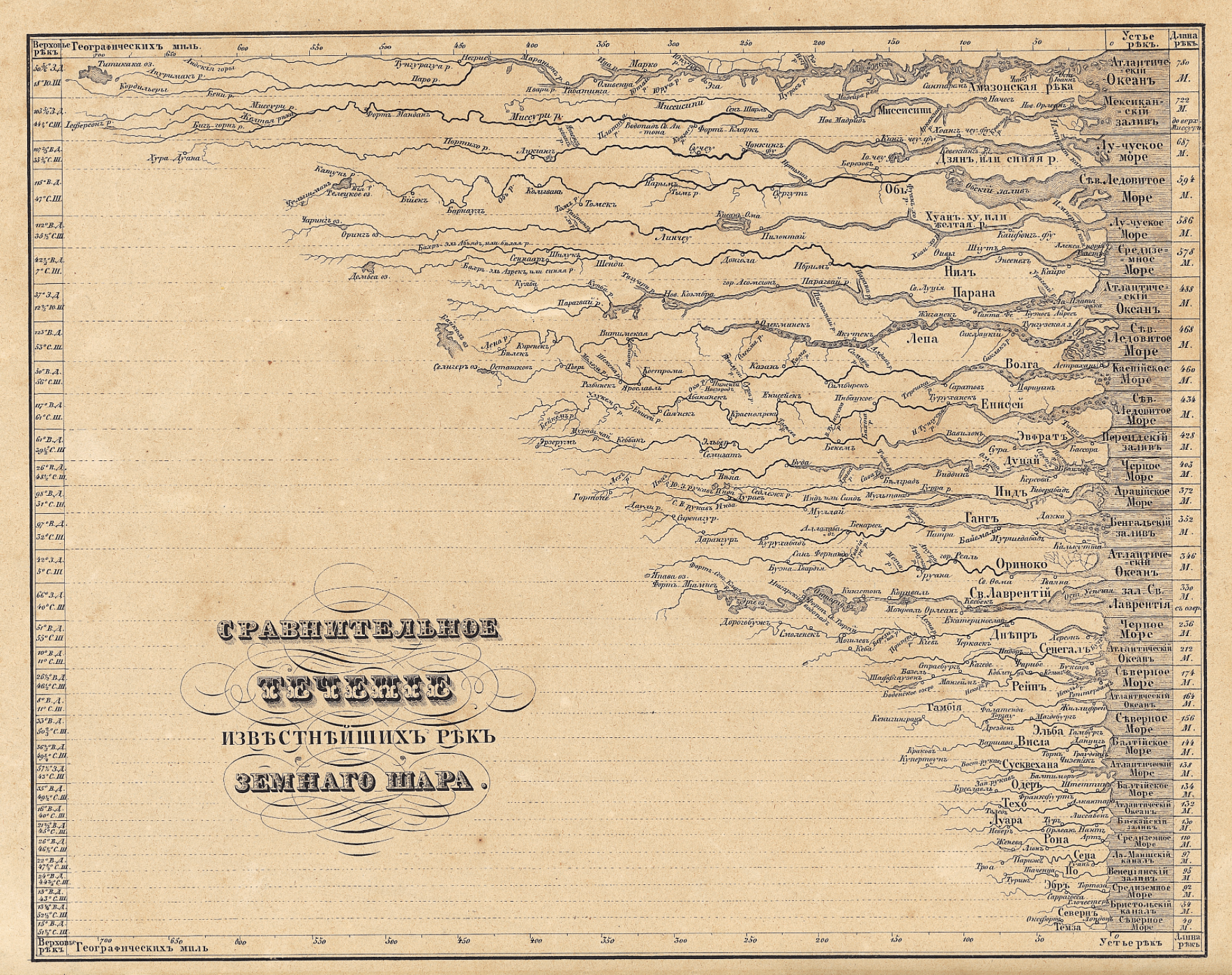
The imagined landscape of global topography, newly indexed for ready consultation, imagined the landscape as a library catalogue. A contemporary Russian chart comparing rivers expanded on the genre in its own manner, displaying rivers as if their estuaries lined up to open to a contiguous body of water, to facilitate their comparison:
More often, this variety of map disembodied rivers or topographic markers from its surrounding landscape, oddly tracing the outlines of aqueous bodies alone:
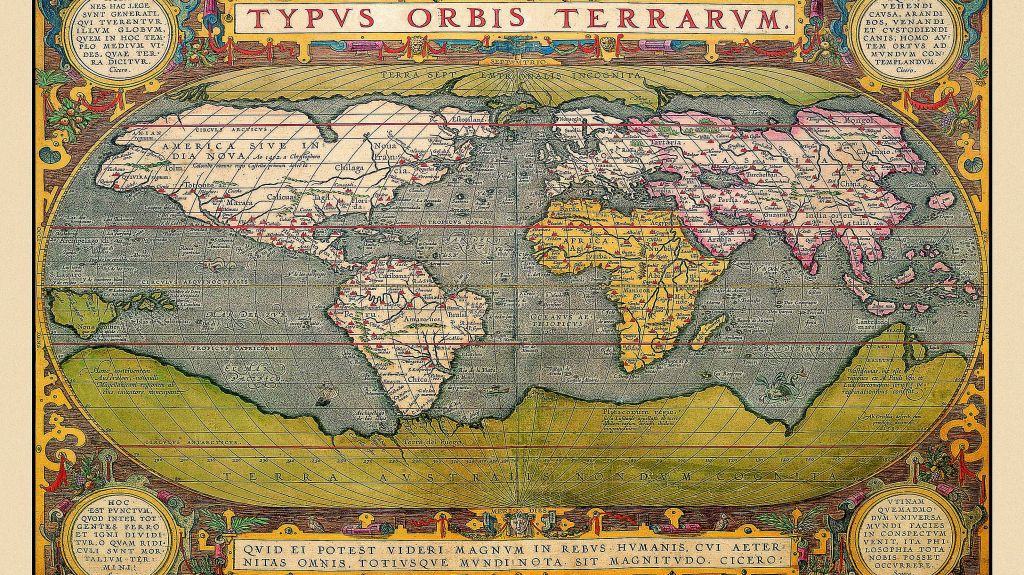
All exemplify a recognized cartographical imaginary; the geographical compendia became popular tools to synthesize information for schoolchildren at their fingertips. The abstraction of the Ortelian globalism that reconciled topography with political bounds was dismissed, with a French wave of the hand, in a sort of cartographical magic trick that reduced space to a flat surface of the engraving, and hierarchalized rivers by size.
Abraham Ortelius, Typus Orbis Terrarum
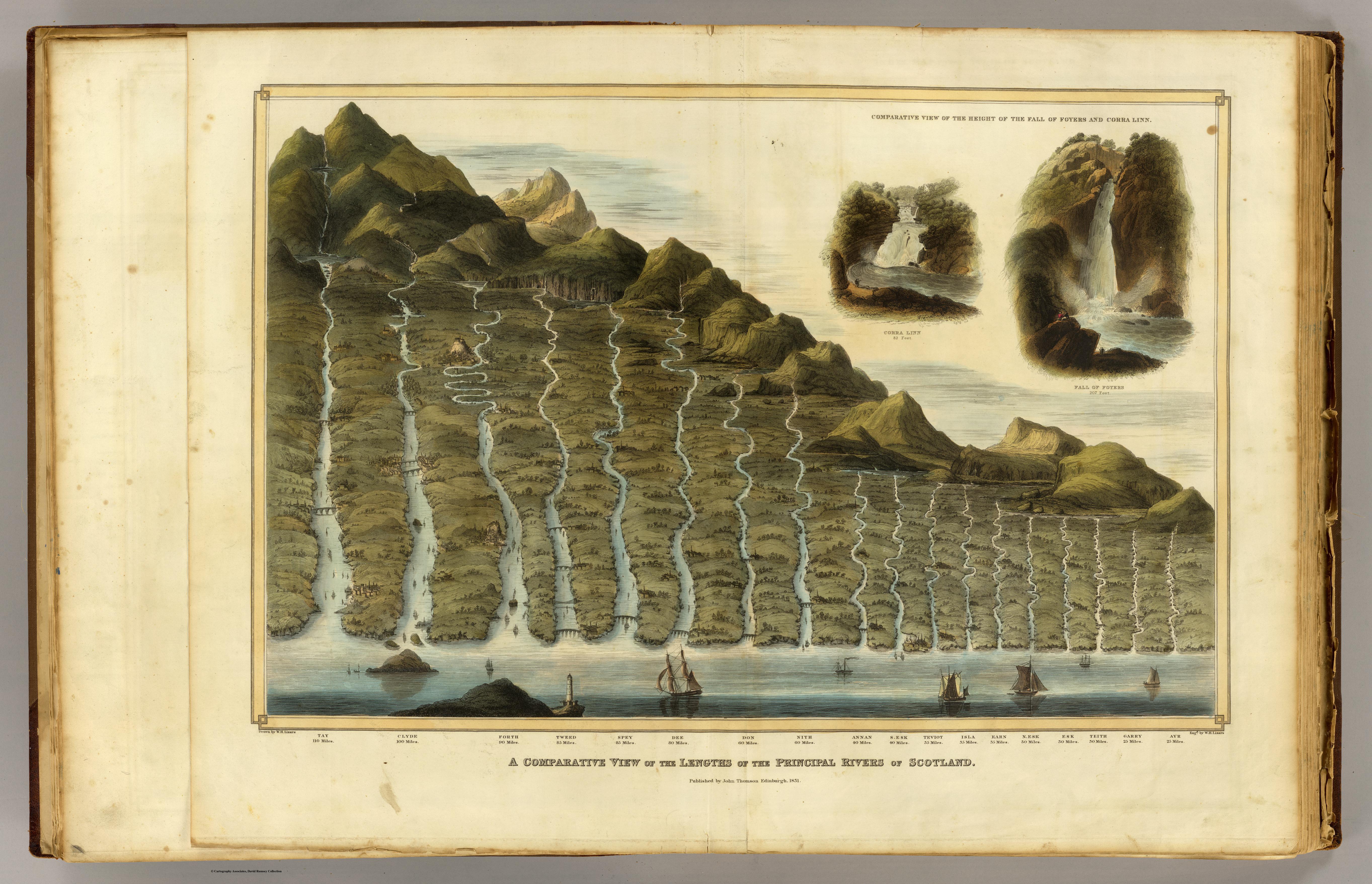
To be sure, John Thompson’s earlier undated “Comparative View of the Heights of the Principal Mountains and other Elevations in the World,” dated to 1817, presented a composite prospect of mountain tops from different hemispheres, in something of a cartographic collage that took advantage of the aesthetics of landscape to abandon the principles of coherence or spatial proximity that paramount in most geographical maps. Thompson, a Scottish cartographer, united the relative heights of the mountain tops of the eastern and western hemispheres, comparing the presence of buildings, cities, vegetation limits, and even fauna in an aestheticization of empirical observations that bridged Ecuador’s Mount Chimborazo, beside which flies an Andean Condor at an altitude of 21,000 feet, and figured Alexander von Humboldt himself scaling the peak, as well as Lake Toluca, Quito, Caracas, and Mexico City, in the same frame as Nepal’s Dhaulagiri, 27,677 feet–promising a global prospect if without either the Chilean peaks or Himalayas.
If the map of mountains echoes Humboldt’s maps of mountains, Thompson had issued the first comparative atlas of rivers–“A Comparative View of the Lengths of the Principal Rivers of Scotland” which had a purely choreographic intent, in 1822, in one of the first comparative river chart of the century, just after his inclusion of the comparative chart showing the height of global mountains for the 1817 edition of his “New General Atlas” (Edinburgh), which built on Humboldt’s 1805 work–and also acknowledged that dependence by including Humboldt in his map, scaling Mt. Chimborazo. The map of Scotland’s rivers offered an even more pictorial rendition of the many rivers that watered Scotland’s heaths–and is striking for representing the same sort of Kantian transcendence that inspired Humboldt’s own work.
“Comparative View of the Lengths of the Principal Rivers of Scotland” (1822) (Courtesy Rumsey Associates)
But the esthetic appeal of the composite map’s original designers and cartographers, Bulla and Fontana, had designed it in the 1820s as a landscape for viewers to enter and explore in ways that Thompson did not fully exploit, so careful was he to preserve and synthesize the newly arrived data of naturalists. The slightly later Bulla and Fontana Tableaux comparatif retains the four-color format of printed maps; the original Bulla and Fontana from 1826 was exquisitely hand-colored in a range of manners that spectacularly heighten its coherence as a landscape that is inviting to the eye: the warmth of these hand-painted colors is hard to ignore, and contributed to how the map was cast as a landscape picture.
The set of impressive rivers that emerge from the upper edge of the Tableaux extend, for example, from a grassy region near their mouths, the waterfalls are thunderously crashing with white spray, the snowy peaks with their blueish hues imposingly weigh heavily upon the stoney landscape beneath them: the mountain ranges indeed fill up the yellow frame of measured indices, which serves as a pictorial frame for the scene, unlike the neo-classical border that frames a band of white in the later Tableaux. In Bulla and Fontana’s map, the icy light-green valley underneath the mountain ranges invites eyes,and suggests a reserve of ice from which one can believe the set of lengthening waterfalls contain the freezing cold run-off of icy plateaux. It seems that this wonderful post-Enlightenment map not only synthesizes measurements, but presented to the post-Napoleonic Europe the harmony of a state of total geographic knowledge as another green world, in true Renaissance fashion, in a sort of bucolic land that was both richly irrigated, filled with waters indicated by the synecdoche of waterfalls,and ready to be cultivated by man, even as Europe had been dissolved by wars and the migrations of soldiers and military campaigns planned in military maps.
The 1836 expansion of the comparative chart of mountains, rivers, and waterfalls engraved was produced by the prolific cartographic partnership Goujon and Andriveau, and proved particularly popular–meeting a clear demand for the investigation of natural spectacles such as volcanos, whose synchronized explosions are rendered on the visual center of the map that claims one’s visual attention in almost all of its parts, echoing the memory of the global influence of the eruption of Mount Tambora during the Napoleonic Wars, perhaps illustrating a sense of the climatological inter-relations even in a map that abandoned the rendering of accurate geographical relations: volcanoes almost provided an acknowledgment, almost, of knowledge of the ecological complexity, after actual inter-relations had been abandoned in the name of the economy of map-engraving.
Both include the easily overlooked detail of the balloonist who surveys the landscape. The balloonist seems to be something of the hero of this scene, who has not only entered into the picture but, in one’s imagination, is able to survey the entire expanse that lies below. His view would be what would look more like a map, even though what we see reflects the range of geographic knowledge that we can collate through our own unsurpassed cartographical abilities.
We read more maps than ever before, and rely on maps to process and embody information that seems increasingly intangible by nature. But we define coherence in maps all too readily, without the skepticism that might be offered by an ethics of reading maps that we all to readily consult and devour. Paradoxically, the map, which long established a centering means to understand geographical information, has become regarded uncritically. As we rely on maps to organize our changing relation to space, do we need to be more conscious of how they preset information? While it is meant to be entertaining, this blog examines the construction of map as an argument, and proposition, to explore what the ethics of mapping might be. It's a labor of love; any support readers can offer is appreciated!


 Open Flights
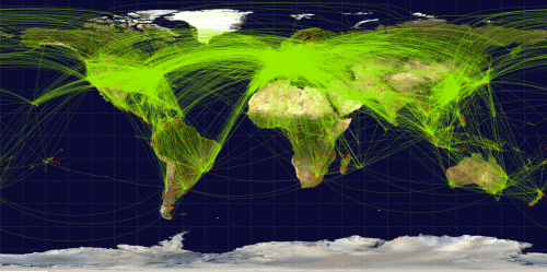


 Bulla & Fontana, Tableau Comparatif des principales montagnes, des principaux fleuves, et cataractes de la terre
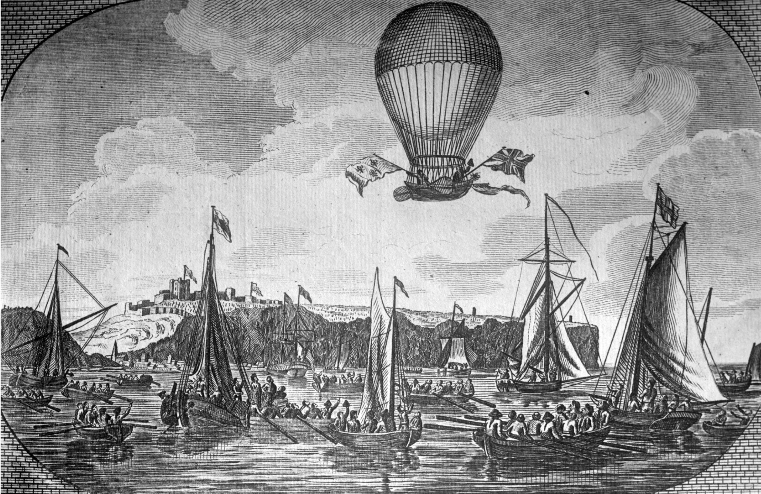


