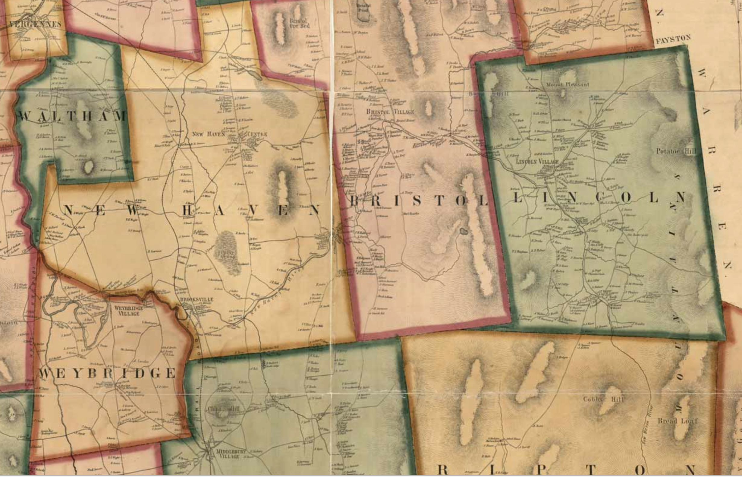
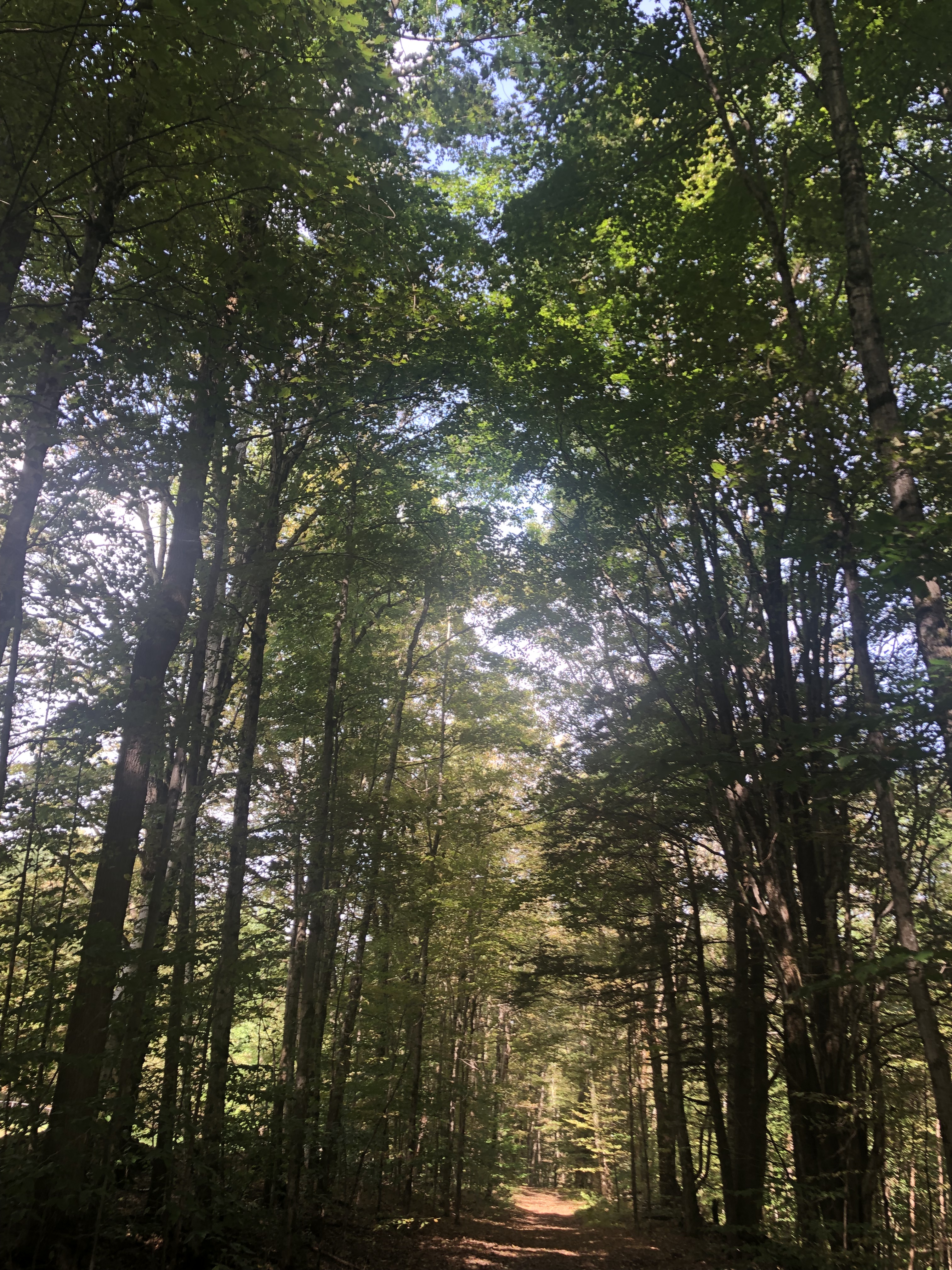
What’s the significance of names on a map? Do they register roads that belong to the territory or only reflect continued use? What sort of authority does a mapped road, byway, or highway retain in common law–and for how long must it be recognized as a road? The existence of place-names and routes on a map have become an increasingly contested way to preserve a sense of place, and the survival of the “sleeping roads” of Vermont, the “Class 4” roads that are not maintained by towns, even if some receive some limited maintenance, suggest a historical network of the past, still partly visible and indeed rarely used, but providing a vanishing network of the past inhabitation of rural space and its organization before the introduction of the interstate system.
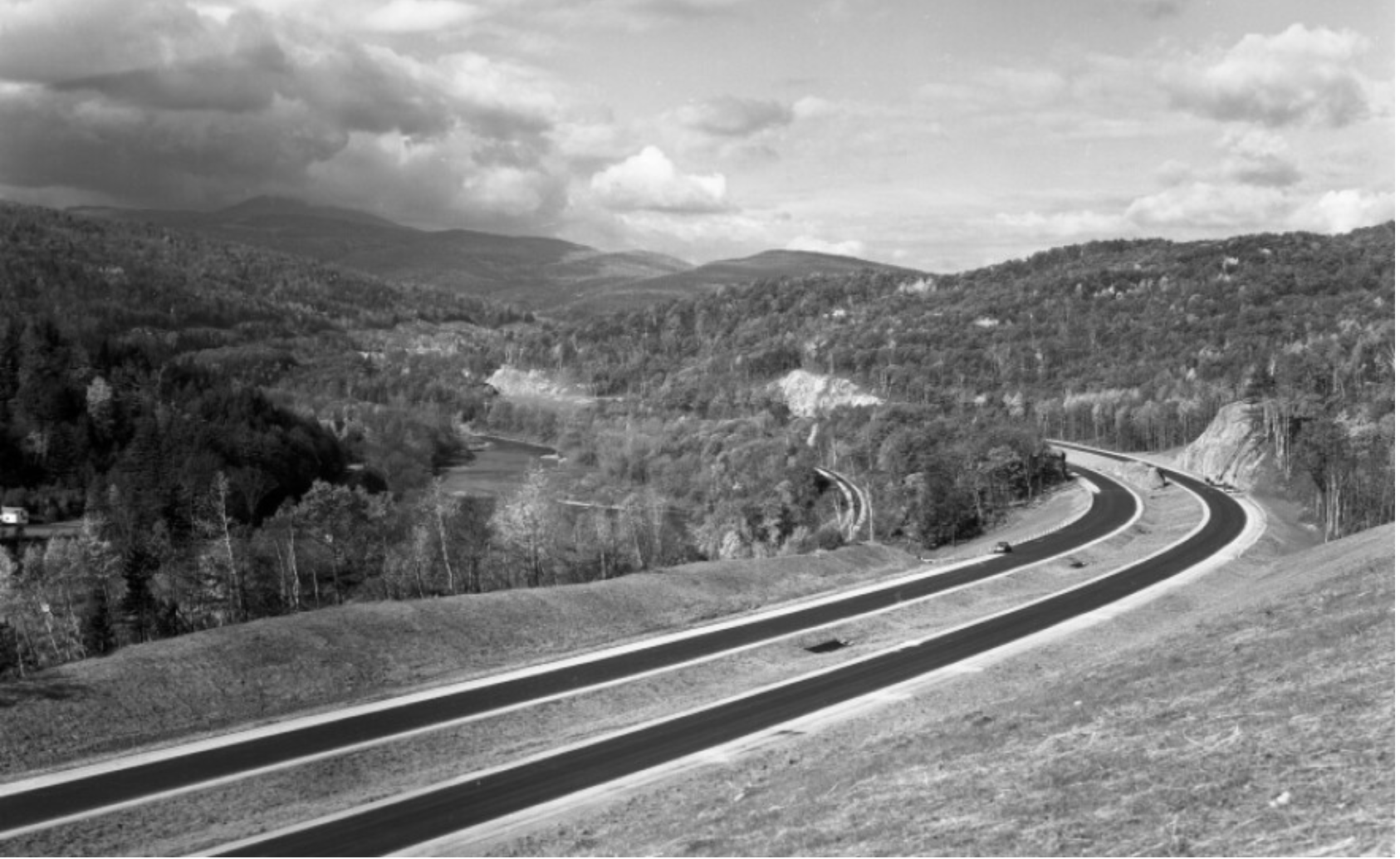
“If you walk down that road,” a Vermont farmer gestured at the end of Lavender Road in Central Vermont, “it’ll be like you’re walking into the past.” Meaning that the flat stone walls bordering the path, now overgrown with ferns, fallen logs, exposed granite, and an abundance of mushrooms and twigs, not to mention suspicious looking poison ivy, was an earlier system of land management and division, as well as an earlier route of access among the private property that divided Central Vermont hills, Long before I-89 ploughed through the countryside of central Vermont as a central artery of automotive traffic, cut through dark bedrock of metamorphic Cambrian and Ordovician eras, seizing thousands of acres across the state and displacing houses and farms, the roads we now see as arteries that cut through old forests and Silurian and Devonian metasedimentary rocks displaced the roads that once defined travel, reducing once luscious habitats of oak forests to the veils of Potemkin forests. Those illusory strips of six to ten trees deep to create the illusion of forest for tourists and motorists on the highways that cut across New England, vestiges of an earlier arboreal ecosystems living only in the minds of motorists on paved roads from which they rarely deviate or depart.
Two Thousand Acres Seized to Make Way for I-91/Vermong State Archives and Records
Newly Paved Interstate Curves through the Waterbury/Middlesex region, circa 1960/Vermont Historical Society
The very same roads that are no allowed to afford prospects of the fall foliage for which the same landscape is so well known were, of course, creations of an earlier area of land-movements and massive landscape shifts. What roads lie beneath them? How can they be seen or even mapped?
Interstate 89
The survival of so many earlier “sleeping roads” are increasingly threatened in an age of the road. The increased division of the long predominantly rural state on property lines, driven by a market of construction threatens to obscure local knowledge and a long-valued sense of place that the cutting of highways had long altered. If the preservation of dirt roads without much gravel in Vermont towns was an early development, which contributed recently to the real fears of erosion with flash floods and inundations, the drainage problems of the considerable number of municipal roads in the state have remained largely unpaved–about 75% in 2018, of municipal roads that comprise some 70% of total road miles–the problem of best drainage practices are an inheritance of the longstanding protection of the states rural character in its towns. But the landscape of the interstates brought a deep local resistance to the remapping of interstates and federal roadways that Vermont towns were quick to protect their local character in keeping with a longstanding agrarian economy, rooted in pasture and the production of cows’ milk.
Yet the increased presence of paved miles, even despite the increased danger that the state faces from stormwater damage and erosion in cases of increased stormwater and river inundations, has threatened the value of local roadways. The rapidity with which many roads were re-graveled, and provided with new culverts, ditches, and drainage systems after they washed out in the massive rains of the summer of 2023 led to a sense global warming as the latest threat conspiring to wash out the old lattice of historic roads in the state, and a quick and rapid defense of the local roads that were so much of the tourist industry depends. The deep sense of injustice in the prospect of loosing the legal status of “ancient” and long-pathways preserved in records of in local townships face possible obliteration in the legal memory as such unpaved roads–often more tacitly known than still used for commerce–are going to be reclassified. Indeed, as the state’s legislature has decided to reclassify common law roads to homogenize property records across the state, the outburst of local mapping seems not an act of antiquarian obscurantism, but a defense of local knowledge in an age of globalism and satellite mapping, where few of the older roads might appear from the sort of satellite-based mapping systems on which we increasingly depend. While many of the “class 4” roads might be sought out by mountain bikers, eager for off-road experiences, or back roads where they can snake around mountain farms, but only maintained if deemed necessary for the public good. Yet the rediscovery of these “ancient roads” that are still able to be found on some edges of historic farmlands open up prospects of the topography of the past, evident in the gaps between tree tops and the old stone walls of the edges of the pathways, rather than their navigability or use.
The plan for a massive reclassification of “ancient” highways on the books but actually dormant in much of the state of Vermont may be a pro-development land grab, but suggests that the struggle for designating once common lands as private property (and resistance to it) are waged on maps. The recent promise to reclassify registered but unnamed byways in the state–a mass of roads which were at one time used or previously surveyed as common-law byways, but have since fallen out of use to different degrees–has unintentionally generated a set of local storms about public memory. In a state where many current town roads remain unpaved, and many more have faded into the largely forested landscape, their traces still in evidence in the midst of a somewhat bucolic space of passage, tree growth impeded by the stones and often muddy road between old flat stone walls that had once been built to separate famers’ bow long overgrown fields.
The drive to reclassify the diversity of unpaved roads and common law byways once preserved in local jurisdictions reveals the rise of property development for whom the retention of old systems of spatial classification obfuscates the exchange of private lands. And if the preservation of old farmlands in Vermont provided a rare historical perspective of longue durée for early twentieth century historians as George Perkins Marsh, who rote long before the rise of environmental history or of the Annales school focussed on land management practices as a lens to observe long-term changes in social history. And in a fascinating illustration of how local collective mapping practices provide a unique point of resistance to mapping software systems that are primarily oriented to paved space, rather than the commons, or, as it is now known, the closely connected right to wander.
The Vermonter developed a broad history of the dialectic relations of what we call the Anthropocene between “man” and “nature” avant la lettre. He dis so out of a deeply American vantage point on world history, as he contemplated the “destruction wrought” on his native state’s local landscape in 1864, about twenty years after Henry David Thoreau lamented the presence of the intrusion of railway lines in the idyllic space of Walden Pond. He offered a global perspective that took its spin from his deep impression by the effects of the retreating and shifting landscape of Vermont, where he had been born in a farmhouse, the vantage point from which Marsh defined his perspectives on human destruction of the global landscape. After travels in Italy and study of the deforestation Mediterranean basin, he bemoaned that the case of Vermont’s loss of native trees as a similar global historical shift of consequence; in the introduction of his massively learned work, Marsh affirmed that “The earth is fast becoming an unfit home for its noblest inhabitant, and another era of equal human crime and human improvidence . . . would reduce it to such a condition of impoverished productiveness, of shattered surface, of climatic excess, as to threaten the depravation, barbarism, and perhaps even extinction of the species.” In his metahistorical masterwork, Man and Nature, Marsh contemplated the “wide a circle of disturbance we produce in the harmonies of nature when we throw the smallest pebble into the ocean of organic life” and watch it send ripples across the surface of a body of water, offering one of the more prescient images of the cascading effects of anthropogenic change in the Anthropocene.
Vermont’s deforestation was so accelerated and traumatic in scope that–long before the expansion of its interstate that destroyed farms, homes, and an agrarian economy–the state offered an important perspective for articulating an early environmental vision of the planet’s dire state that in 1874 Marsh found it to carry “the force of revelation.” As immersion in the resettlement of dustbowl refugees prompted historical reflection of self-made environmentalist Clarence Glacken, about man’s relation to the habitable environment; his experience of resettling refugees forced from farms by a lack of rain prompted sustained reflection on the relation of “man to environment” that resulted in the synthetic surveys he taught in the 1950s, which culminated in Far From the Rhodian Shore, a compendium of classical to enlightenment thought that was in the course of being complemented by a second volume when it appeared in cloth in 1976. If Glacken viewed the interaction of humanity and the environment as a baseline for humanism, the devastating experience of deforestation provided for Marsh a baseline for the dangerous rewriting of relations to the natural world; the scale of the deforestation witnessed in Vermont as a circumscription of access to natural worlds provoked a terrifying resonance with the deforestation of the Mediterranean he witnessed, leading him to view environmental change as a altering one’s relation to the world, when the logging industry clearcut oak, birch, below 2,000 feet in a massive harvesting of wood, producing 375 million board feet of wood by 1889, and leading the treeless slopes of Mt. Tom near a town known as “Woodstock” to experience massive soil erosion with hard rains that it altered its shape in Marsh’s own line of sight. His own reflection on “man [as] a disturbing agent” able to turn natural harmony to discords wherever he arrives generalized the land-altering consequences of clearcutting without constraint as a force of history: and whereas metahistorical interpretations of Hayden White and others may smell of the libraries where men like Michelet, Burckhardt, Marx and Vico worked, we might well map the alteration of lived environments provided the optic by which Glacken and Marsh structured pessimistic historical dialectics of their own.
Log Drive on the White River Near Sharon, VT/Vermont Historical Society
The massive rewriting of Vermont’s once rich arboreal landscape by the 1890s was so extensive to alter the economy of the land and man’s relation to it. The scope of devastation was not without resistance as the old map of a relation to landscape was preserved, in no small part by th donation of a Middlebury legislator who incarnated local ideals of environmental stewardship by decrying devastation of “timber butchers”: as soil erosion was devastating local tourism, legislators founded a Forestry Commission, similar to the Board of Agriculture, leading Middlebury legislator Joseph Battell to act preemptively to purchase and donate a thousand acres of forested land comprising Camel’s Hump, Bread Loaf Mountain, and other peaks of the Green Mountains to the state so that they preserved their form–and later donated lands from Hancock to Fayston, to his alma mater, Middlebury College, a land grant that provided the nucleus of the broadleaf trees in the Green Mountains National Forest.
If the extraction of wood from the state’s lands reshaped the soil as the cutting of trees on many hills was accompanied by rise in quarrying to mine slate, granite, marble, and copper; often, smelting left wastelands behind in place of forested lands–leaving old growth trees to act as wayfinding signposts for a drivable road network created on cleared land, paved or graded to allow increased automotive traffic unsuited to dirt roads from 1908.
Did not the rebuilding of paved roads as Interstate 89 not encourage the growth of a fossil fuel economy in the 1960s as it cut across once forested terrain, forcing the vision of Marsh’s coherent landscape further into the receding past, as automotive space shifted the function, use, and scope of a local infrastructure of roads?
New Gasoline Station Signs placed along Interstate 89 (1964)/Vermont History Museum
The local resistance to such a reclassification of roads in the rural state, which has attracted its share of fierce defenders of the local rights of communities long granted precedents to federal or state law, make the proposed elimination of “Ancient Highways” from local law a matter of contention. The proposed reclassification of a multiplicity of roads poses a problem of having ceased to reflect the sort of use of landscape that developers want to encourage and private home-owners want to ensure. Given the shifting nature of land use in Vermont, where older houses are increasingly on the market, as smaller agricultural farms close and die out, a premium has developed for the clear definition of ownership without any liens or qualifications. Hence the increasing tensions between local municipalities in the state and any move by state government to abolish roads they long oversaw. In a sense, the increased interest in helping demand for fungible residential properties that can be sold without qualification have run up against the multiplicity of roads that have continued to remain on the books.
As the real estate market in Vermont seems poised to heat up in much of the state, and smaller towns face a demand for brisk sales and a large pool of properties arrive on the market, the state seeks to remove any obstacles to development or become notorious for arcane property laws, remapping the “ancient” roads of Vermont opts to treat them as ancient, and, far more than unpaved, not part of its future landscape. Yet the quilt of county regulations of roads that existed for most of the eighteenth century and was retained in most local maps before World War II reflected a local landscape of counties and townships rarely challenged before the arrival of interstate federal highways across the state during the 1970s, erasing the varied paths, trails, and common-law roads, long overseen by local city Selectboards and regarded as parts of the local landscape.
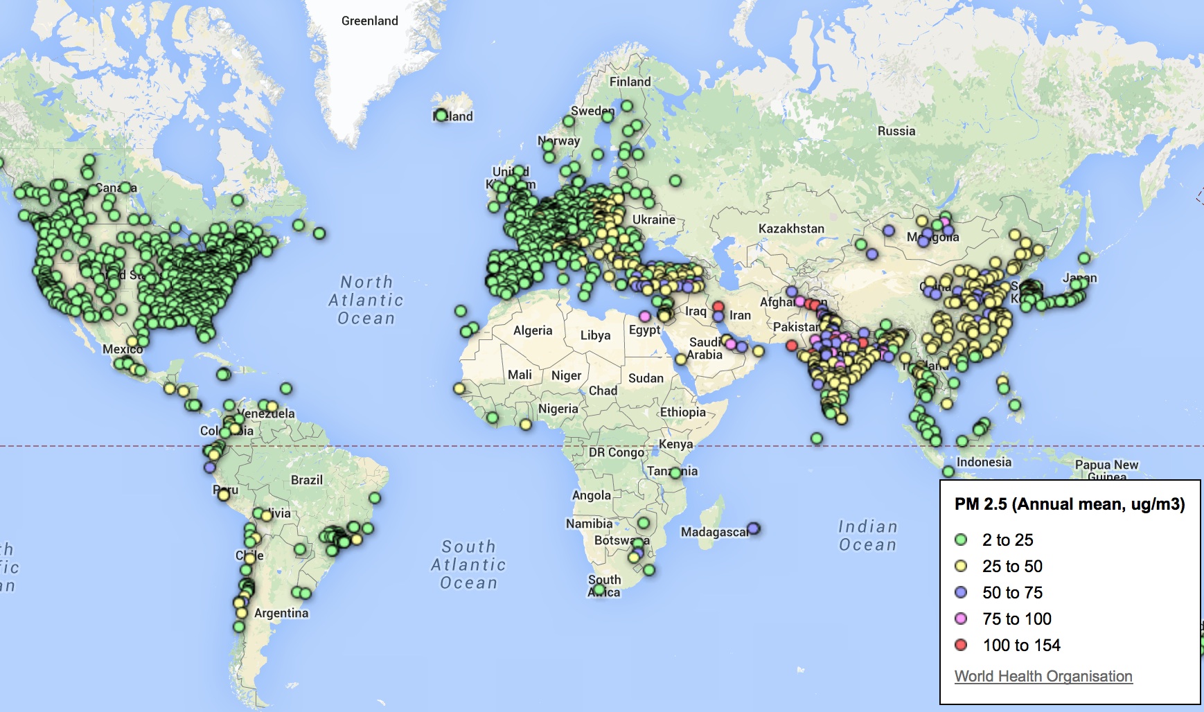
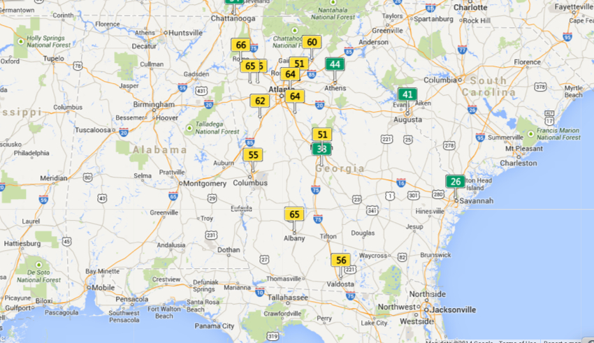
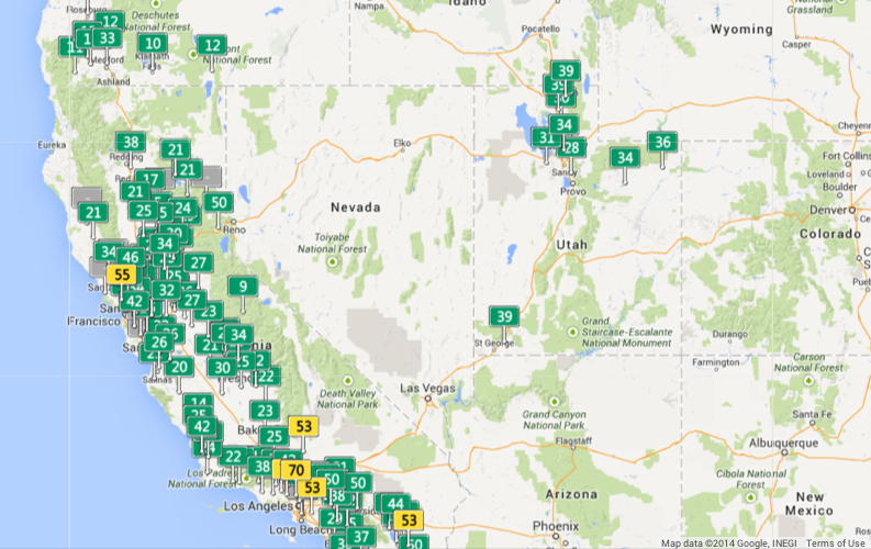
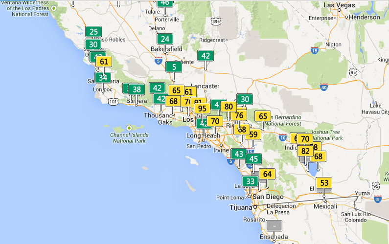
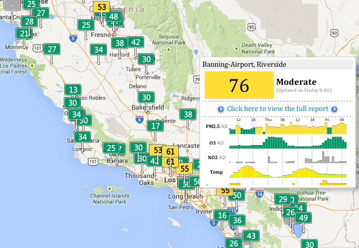
The notion of the Age of the Anthropocene has inspired an attempt to pinpoint the thresholds of contemporary environmental change. The recent maps that register the shifts in the Air Quality Index at specific sites offer a way to register the impact of anthropogenic impact on the breathed environment that are especially compelling in tracing the momentous impact that man-made industry–and specifically the burning of coal–has in propelling global inhabitants into an age of the Anthropocene, and indeed in impacting local environments. The changes of global climates pose peculiar difficulties of mapping by placing ourselves as viewers outside of the momentous changes they describe. For the notion of mapping the arrival of the Anthropocene–or the signs of the visible impact humans left on the environment raises questions of how a map can trace the footprint humans have left on the earth’s biosphere. If the epoch of the Anthropocene challenges one to position oneself outside the very processes in which one knowingly or unknowingly takes part, or indeed capture the consequences of a geological change in the biosphere to human life.
Do the differences of the AQI provide a sufficiently compelling map of the local dangers of potentially catastrophic environmental change? Recent “revisionist ecologists” or self-styled pragmatists have called for forging or discovering possible “Paths Toward a ‘Good’ Anthropocene,” as Andy Revkin discussed at his New York Times Dot Earth blog, which stresses not the ecological evils of a narrative of global pollution, but the potential that values determine necessarily tough choices, striking debate that has reverberated in the Twitterverse as a perilous promise or a necessary evil under the hashtag #Anthropocene. Revkin’s “Paths to a ‘Good’ Anthropocene,” has struck a nerve as subverting the core beliefs of Environmentalism by tweaking it with the prefix New, under the banner of eco-pragmatism. One part of the basis for such “eco-pragmatism” seems to be the tired nature of the narrative of environmental ecology–or rather, of the alarmist hue that, for Keith Kloor, has morphed over the years from talk of a plundered planet a sixth extinction, and a baked planet to characterizing a planet under severe ecological pressure from multiple directions. The narrative of the anthropocene, an odd term adopted in common parlance, narrates less a disaster than a widespread constellation of impacts of the human on our notions of nature, of sexual reproduction and differentiation, of genetic transmission, and on the geological record or livability of the atmosphere.
Can maps help this debate, by charting a differentiated view of “impact” and its geographical differentiation and spatial distribution, or in other words tracking anthropogemoc changes in hopes to mitigate its effects?
Can practices of mapping offer means to capture and conjure that constellation of changes, or tools visualize the momentous mechanisms of climatological change in which the human is folded into the environment–and economic activity inscribed in nature–that might most effectively communicate its arrival? Can effects of the Anthropocene be tracked over space? As Shakespeare imagined “his cheeke the map of daies out-worne” in Sonnet 68, as if the face were a map of temporal changes wrought by time, so that “when beauty liv’d and dy’ed as flowers do now,/ Before these bastard signes of faire were borne,/ Or durst inhabite on a living brow,” the maps below of local levels of air pollution bear the scars of time and global capital. To track the disparities that mark the close of the Holocene is to trace the introduction of previously unforeseen limits on the expansion of human activities and indeed the sphere of human freedom. While the entrance into the Anthropocene has been laid at the footstep of industrialized nations with considerable justification, rather than being understood only as a category of geological time, the odd currency of the geological term with a geography of the earth’s habitabilty.
The difficulty–if not near-impossibility–of returning to a healthier presence of CO2 in our atmosphere “from [current levels] to at most 350 ppm” voiced by climatologist Dr. James Hansen–and the organization 350.org– might be less easily solved than they hope, and might even risk orienting discourse on the Anthropocene toward remediation and restoration of equilibria. Indeed the hope for such a return to a level of safety from current levels surpassing 400 ppm are not only a huge change from early eighteenth-century levels of 275 ppm, may distract attention from the deeper consequences of the enmeshing of the human in the biosphere: the deeper inequities of our globalized economy are revealed in a more variegated map of our entrance to the Anthropocene. The disproportionate contribution of industrialized countries to carbon emissions create well-known ethical questions of the distribution of shared responsibility for a crisis in climate change given the unequal distribution of the anthropogenic origins of climate change, emblematized by the disparities in fossil fuel emissions worldwide–which most ominously ballooned from the mid-1960s to the present day.
Despite the use of maps to localize disparities in fossil fuel emissions, map smog map smog or define localized ozone holes, no greater detail is available in maps than disparities in air quality. As we struggle undertake to trace such disparities, it is especially striking web-based maps reveals deep discrepancies in how levels of pollution have constrained questions of habitability at local levels, already evident in the imbalances revealed in data taken from the World Health Organization of the variations in the distribution of local means of small particle matter less than 2.5 microns across the earth.
The challenge of translating changes in the biosphere to a static map is not easy. Even visualizing the range of changes runs the risk of reducing or distracting the intensity of their impact. Dipesh Chakrabarty has aptly observed how environmental change constitutes “as a geophysical force, [a situation where] we now wield a different kind of agency as well – one that takes us beyond the subject/object dichotomy, beyond all views that see the human as ontologically endowed beings, beyond questions of justice and human experience.” For the very reason that we are immersed in its changes, we are challenged to read the record of massive changes and shifts in global environment of the sort registered in a map.
But the regional distributions of variations in that manmade environments have been recently readily synthesized on a Google Maps API to provide a scary spectrum of how we alter polluted air quality in real time: the shifts in select areas of the world–even if these areas which release pollutants that of course disperse worldwide–reveal one image of the uneven distribution of our entrance into the era of the Anthropocene. And although the ethics surrounding the degree to which over-industrialized countries have over-contributed to the advancing of markers of the dawn of the Anthropocene–from global warming to increased CO2 emissions to ocean salinity–the spectrum of the local distribution of air pollutants demands to be read. The coding of such pollutants in the AQI keys each region by its departure from acceptable levels of health–and indeed the departure from standards of the Holocene, based on different levels or parts per million of contaminants able to lodge in the lung.
If the dawn of the Anthropocene presents itself as a counter-discourse to a globalized economy, raising the multiple specters of the risks and dangers of unfettered economic development and growth, it reflects inescapable constraints on those very practices and presumption of human liberties: for it articulates “biogeochemical processes which [not only clearly] imperil the human species’ life-support system; it is also the antithesis of a politico-ontological condition central to modernity: freedom,” as Ben Dibley has observed in his Seven Theses on the Anthopocene, and articulate the parameters or constraints in which human freedom must henceforth now be re-understood–constraints in which mechanisms of the market might be able to secure and to perpetuate livable conditions of an easily habitable space.
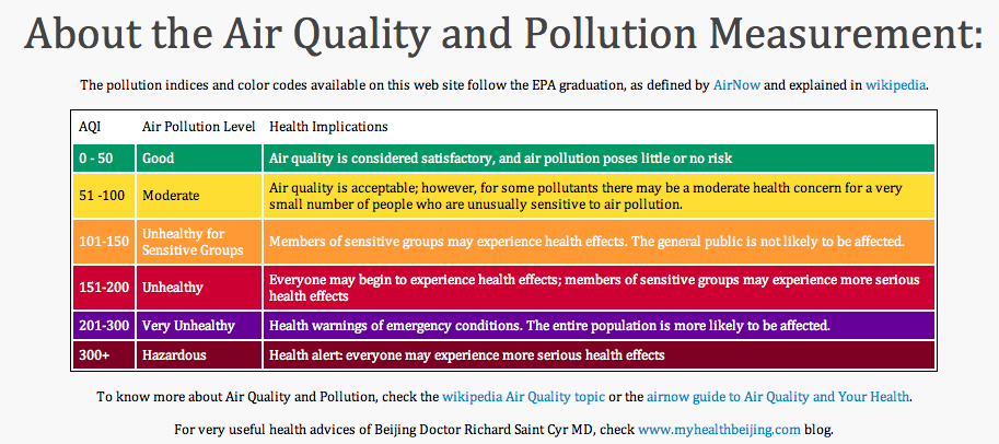
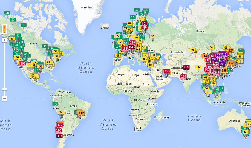
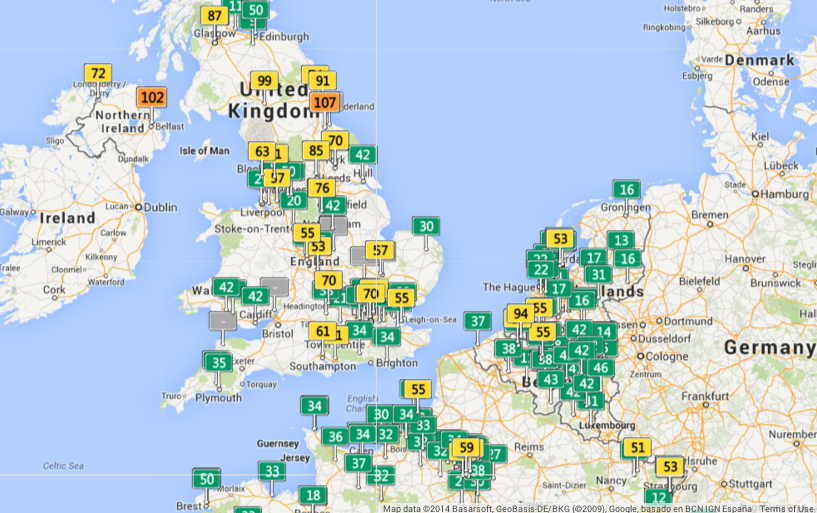
Mapping real-time concentrations of pollutants offer snapshots of specific moments, rather than images of a geological “deep time” or defining a single tipping point of long-term ecological flows. But the discrepancies in global air pollution registered in a real-time air quality index map charts reported measurements of airborne pollutants in a Google Maps API to trace a shifting canvas of how we are now engaged in the alteration of the environment. While misleading to some, in its claim that “Good” levels of pollution exist in many regions, the distribution raises stunning divisions in the levels of local atmospheric contamination based on air quality indices. As of today, the map suggested particularly localized pockets of pollutants, with a surprisingly large number of sites marked red (Unhealthy; 151-200 AQI, as defined by AirNow) and violet (Very Unhealthy, 201-300 AQI), and three sites in Delhi, Finland, Austria, and Coyhaique, Chile viewed of Hazardous air quality levels of over 300, which qualifies for a health alert. This sort of mapping of the man-made environment, where discrepancies in air pollution can be readily registered, offers something of a map of anthropogenic effects. Variations in pollutants offer blunt tools to trace the disparities of anthropogenic impact on the global atmosphere–or to register a “local” distribution of the geophysical forces of the impact of Anthropocene.
As one scrolls across or zooms in to discern the different distribution of colored placards that dot the map’s familiarly and largely light green surface, one readily flags something like environmental divides across both large regions of the global atmosphere, as well as specific noticeable differences of place, no doubt relating to industry, and shifting standards that raise the question of whether entrance to the Anthropocene is indeed the other side of the coin of globalization, or how much local, regional, and indeed striking national differences persist in this mapping of inhaled air, clustering in individual countries’ different standards of emissions for industry or automobiles.
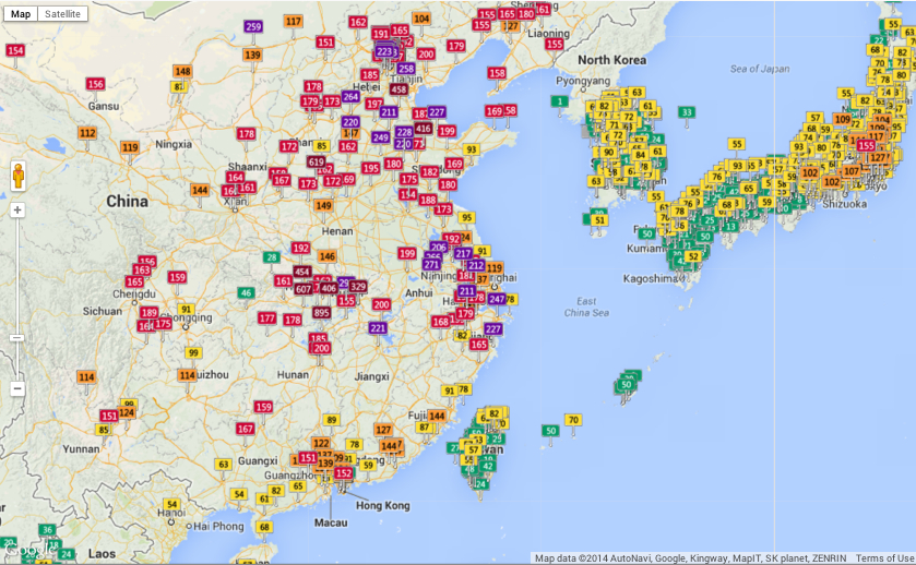
The cartographical labels in the above map tracking air-pollutants offers a new grounds for the label “Red China” by the density of its clustering of unhealthy levels of air pollution as of this May 22:
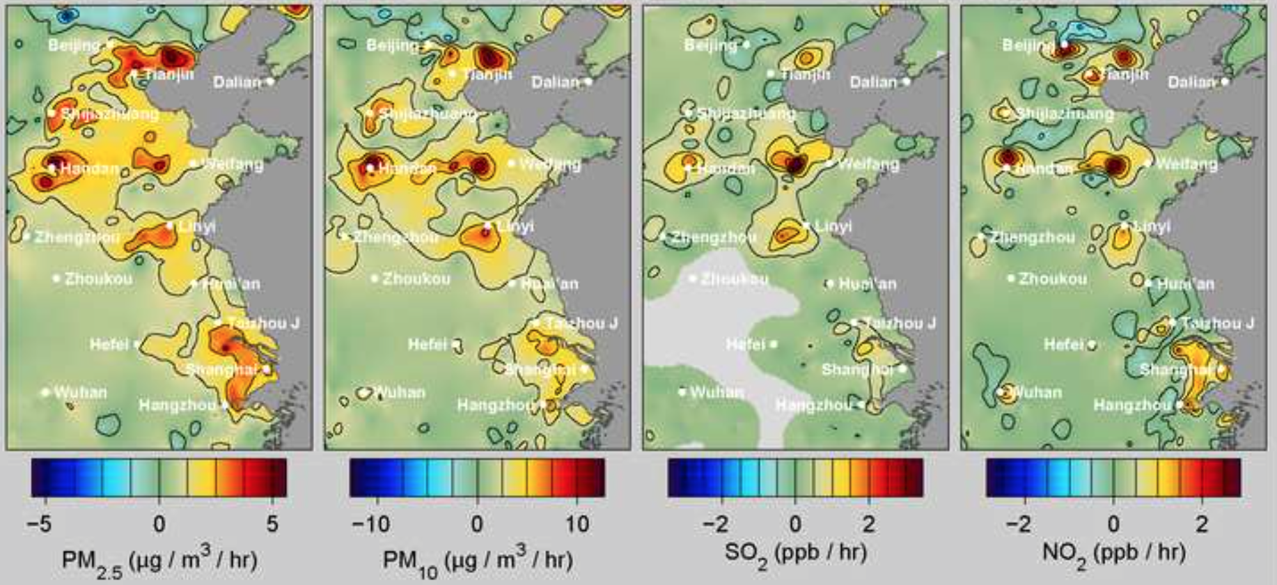
A recent study from the researchers at Berkeley Earth has measured the devastating effects of such levels of pollution, caused mostly by coal-burning, on China’s population, and does better by discriminating the levels of specific pollutants: the lack of restrictions on coal-burning contributes a devastating number of deaths of 4,400 Chinese each day, totaling some 1.6 million annually, on account of the diffusion of airborne particles of less than 2.5 microns in diameter–able not only to lodge in the lungs, but be absorbed into the bloodstream, in ways that t take the notion of the Anthropocene to the level of the embodied. Based on hourly readings at some 1,500 stations in mainland China, Taiwan and Korea, the distribution of almost entirely man-made pollutants can be tied with relative certainty to increasing rates of asthma, strokes, lung cancer, and heart attacks. And the numbers are shocking, from the concentration of particulate matter in the particularly pungent sulfur dioxide, released by burning fossil fuels, or nitrogen dioxides, a toxic pollutant emitted from the widespread combustion of petrochemicals:
Alarmingly high levels of pollutants greater than 2 ppb/hour.
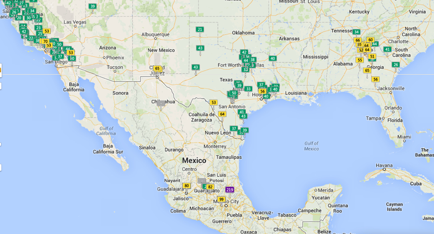
It is no surprise that sites of industry where coal-burning is allowed offer more clearly defined sites of concentration of Sites of industry divide and readily distinguish air quality dramatically worldwide and in North America, revealing the local impact of the human on the biosphere:
The largely “green” California, whose ocean rim encourages a high quality of air, even with its own well-known pockets of pollution in its Southlands:
Piled up green rectangles don’t all equally signify healthy air quality, one should again note, but the discrepancies from Los Angeles to Tijuana, Mexico are nice to place in relief.
Given the increased amounts of small particulate matter of a radius of less than 2.5 microns in much of southern California, whose clickable feature show the somewhat overly bulky embedding of data in this world map–
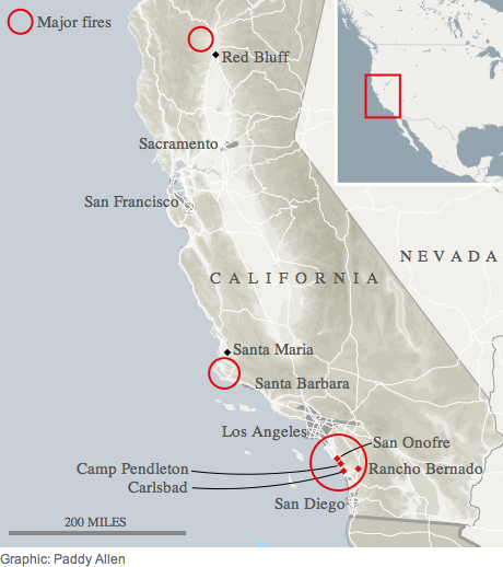
the proportion of this particularly pernicious pollutants to entering and lodging within human lungs can’t help but recall a current rash of uncontrolled fires searing southern California’s coastline this mid-May, themselves tied to the effects of human presence:
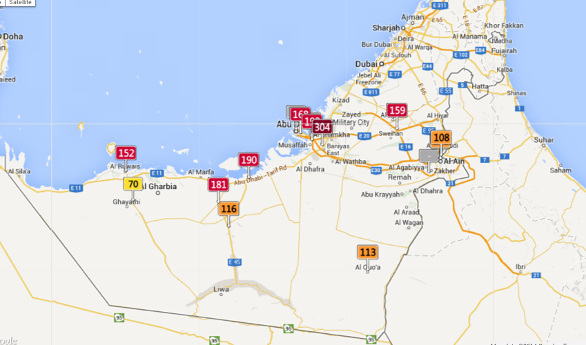
Such considerably broad variations in air quality force one to wander more broadly over the slippy map’s surface, exploring ties, evoked in how Ben Dibley’s characterized the Anthropocene as newly emerging global apparatus folding global economic relations in the geographic that creates the “terrestrial infrastructure for global capital.” The arrival of an Anthropocene, Dibley clarifies, “signals a geological interval since the industrial revolution, where, through its activities, through its numbers, the human species has emerged as a geological force now altering the planet’s biosphere,” evident in the exponential growth of the human population and the arrival of new geographical strata of Anthropocene rock built to serve the needs of ever-expanding inhabitants: concrete highways, sidewalks, parking lots, airports and landing strips, or Superfund sites of toxic waste or garbage patches and trash vortices, steel shopping centers, loading zones, or the earlier mines, garbage dumps, and railroad depots that collectively signify the remaking of the inhabited world, but whose totality comes to create parameters for future growth. The changing global apparatus to the earth system in which the human is an agent appears the underside of a narrative of modernization, whose inescapable telos is not emancipation from natural forces or limits, but entrapment by them: freedoms to pursue economic development become the primary threats to the support system enabling human life. Despite difficulties in relying on Google Maps as a measure of the constraints on that freedom, the measure of atmospheric pollutants lift a corner on the increasingly circumscribed limits that actually curtail individual freedom. Its measurement is particularly compelling for what they suggest about how economic development tied to the project of modernity come to constrain the world’s continued inhabitation by human life–as the pernicious nature of the development of Abu Dhabi throws into relief.
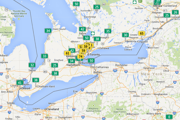
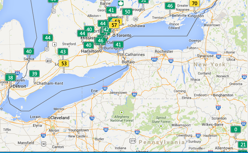
This sort of a map is predicated on the numbers on which it is based. The variations in measurements of air quality are striking on the Canadian border, perhaps revealing different standards or sampling practices.
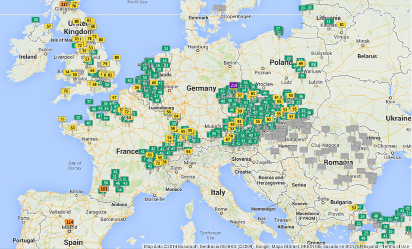
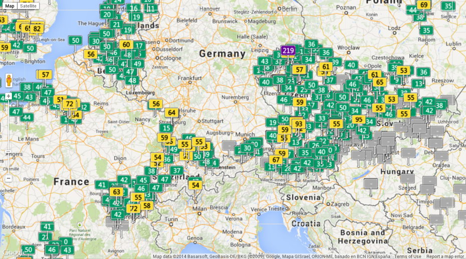
Europe offers interesting variations in quality of healthy air, with most danger signs located in the UK and North Sea:
Central Europe, thought a bear of industry and coal, seems both highly monitored and at the same time roughly comparable to England:
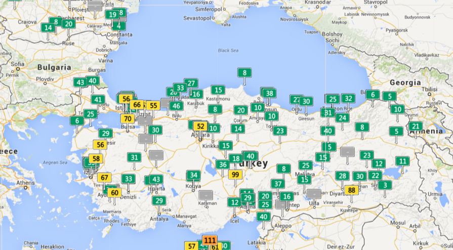
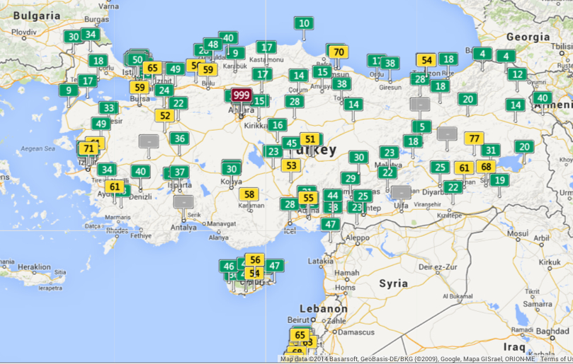
But the pocket of air quality that is literally off the charts one day near to Ankara–999–raises questions about how relatively low readings are in cities quite nearby.
To be sure, Anatolia can also, in other real-time maps, seem quite green on other days:
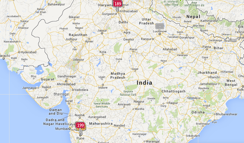
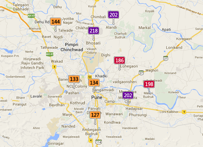
Real-time air pollution seems egregiously under-reported in South Asia, however, despite real high readings in two concentrations that seem quite situated at first glance:
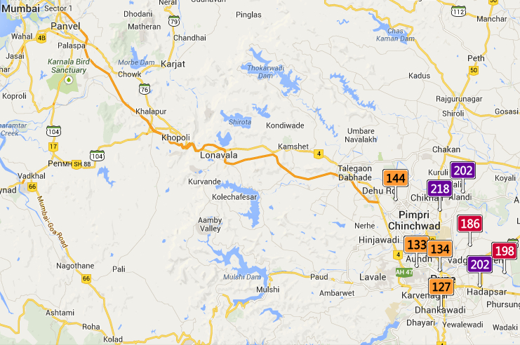
But a slightly magnified scale reveals greater local detail in a polluted zone:
Even if the readings of unhealthy air quality around Pune and Mumbai, if concern for alarm, are not comparable to Ankara:
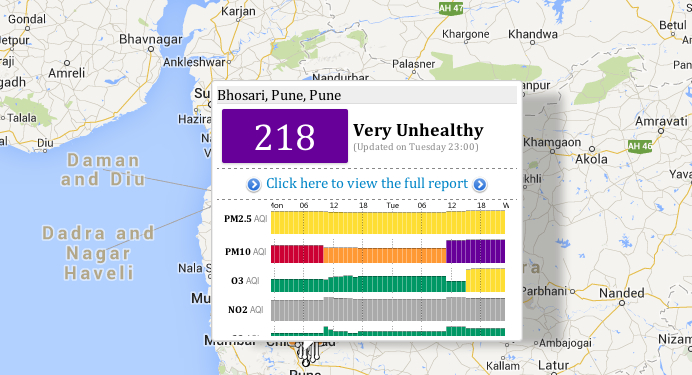
The accessibility of a full report of air quality of any place on a pop-up screen suggest a level of detail, to be sure, that this post does not do justice. But one is impelled to marvel at the stark inequities in the Anthropocene, both surprising and unjust, from Mexico City to Ankara or China:
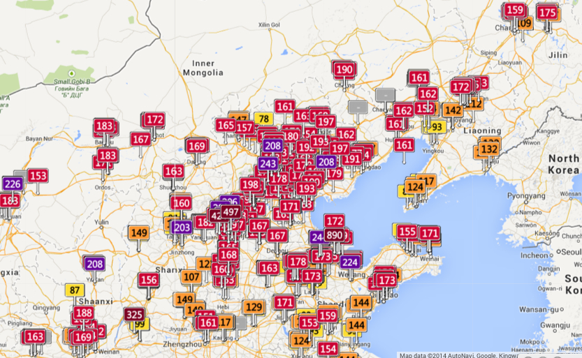
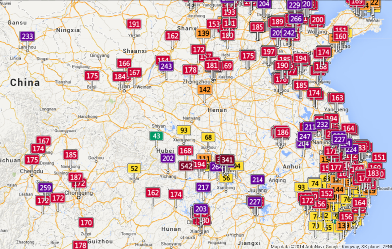
The striking global inequalities of concentrations of air pollution that seem particulate endemic across China cannot, however, help but give pause for the hazardous concentrations of particulate matter that they indicate.
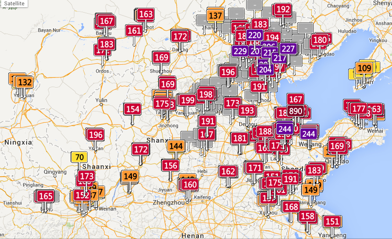
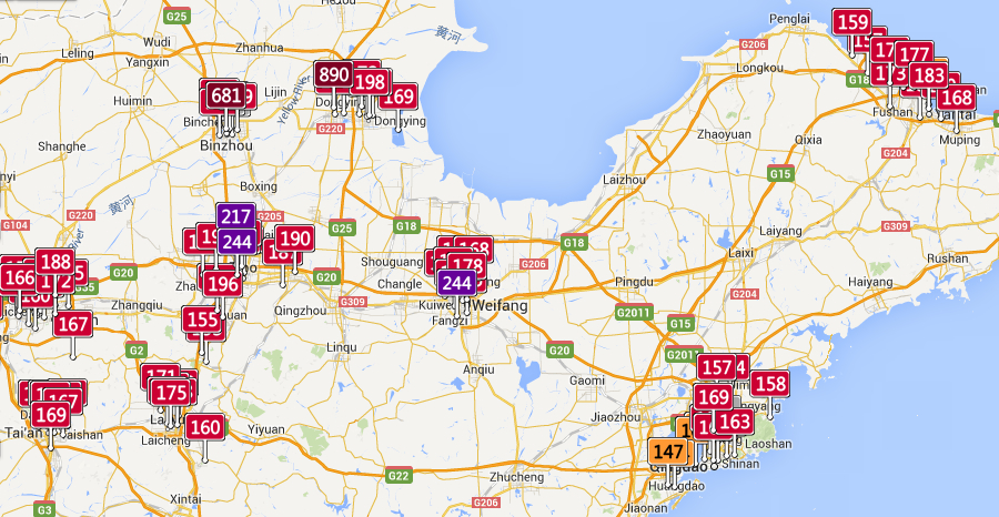
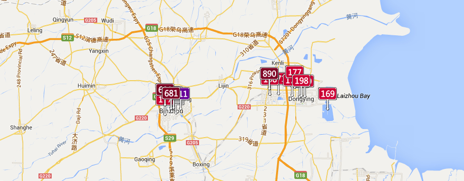
Despite a dangerously uniform measurement of particulate matter (AQI) verging on or surpassing 200, the concentration in Shanxi provide is particularly striking near its shore, and reaches an apex of 890 in Shangdong province, despite poor air quality of particular unhealthiness in the gulf:
The remarkably high levels of air pollutants along the Yellow River is particularly alarming and striking, since pockets of particulate matter of less than 10 microns, particularly dangerous to the respiratory system, approach hazardous levels in Shangdong (890), and even finer–and more dangerous–clusterings of much more dangerous particulate matter of diameter less than 2 microns, able to lodge more deeply in the lungs, reach hazardous levels in Bizhou. Have the health risks been conceived?
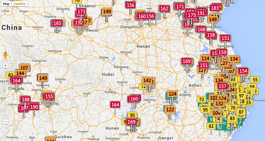
In the south of China, from Chengu to Hubei to Anhui provinces, one can trace a stream of red flags along rivers, and multiple regions of unhealthy air quality deep in the interior:
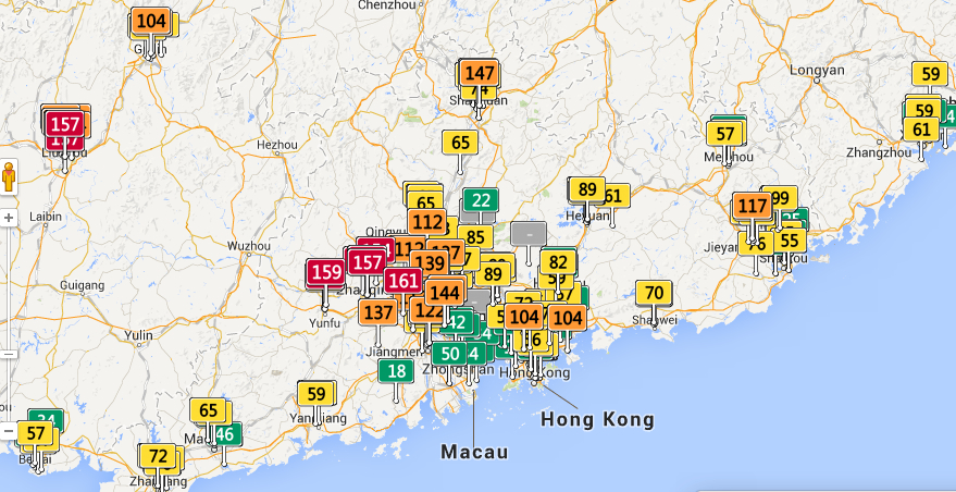
The far better air quality in the Guangdong region, in sharp contrast, reveals concentrations of airborne pollutants outside of the port of Hong Kong.
But what to make, on the eve of the accord between China and Russia on natural gas pipelines, of the apparent absence of limits on air pollutants in so very much of the PRC?
The commercial tie-in is rather obvious, and the map may be a marketing device for masks made to filter out particulate matter, in a wonderful example of cartographical product placement:
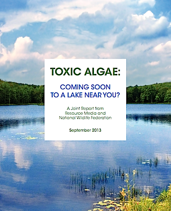
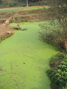
Access to pure freshwater seems an innate right, and freshwater lakes conjure pristine landscapes. But the twinned threats of global warming and industrial farms threaten to alter the geography of watery world in an apparently definitive fashion, as rivers, ponds, and lakes across America–and the world–have been found to be teeming with toxic algae. In what seems to be a brazen photoshopping of photographs of the Great Lakes, the apparent aquatic “greening” of formerly fresh waters in fact carries quite sinister associations. The abundant algal blooms in the Great Lakes recall the modern miracle of the annual greening of the Chicago River each St. Patrick’s Day, but are of much more anthropogenic origin. Appearing at regular times and places, they raise a corner on a changing relation to the worldly environment.
But they are also–in the manner of all “offshore” events–both particularly challenging to chart or to measure by fixed or clearly demarcated lines so often employed in terrestrial maps. Rather than being photoshoppped, the satellite maps make points difficult to interpret or decode, even if they trigger immediate danger signs of the dawn of a different world, and a quite different national map of the extent of our potable water. They prompts questions of how to map man’s impact on the shifting environment of the Great Lakes.
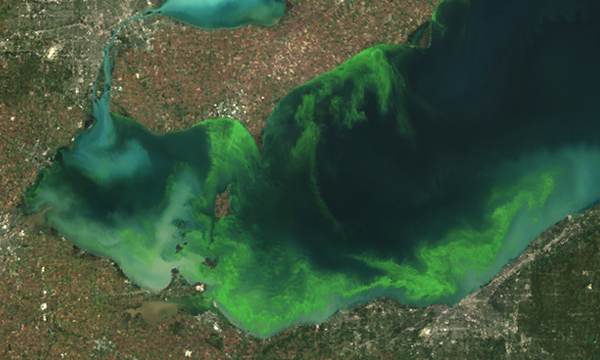
Populations of algae move with the currents of local waters, as the blooms of pools enter rivers and rush down streams, as a weirdly alien presence in water supplies that have impacted fish in many ways, and stand to impact humans as well. As we start to chart our relation to their presence, their emergence in select spots of the US and other countries demands to be connected to one another, or placed in a causative web geographic as much as environmental. The nature of this greening suggests a new presence of the bacteria in the world. For Northrop Frye, the “green worlds” in Shakespeare’s plays connoted a pivot scene of action–an extra-urban environment producing to reflective individual insight of a personal nature but also a setting to overcome natural challenges that stood for inner obstacles. The argument that Frye formulated in 1957 paralleled the earliest ecological movement–one thinks of the founding of the Nature Conservancy (1951), as well as the Wilderness Society (1935) and Defenders of Wildlife (1947), but also of the success of blocking the damming of the Colorado River at the entrance to the Grand Canyon National Park, and the fruits of many volunteers in the Civil Conservation Corps that, before the war, put many men to work on conservation projects. The critical moment of the appearance of green algae in waters across midwestern America suggest not only an environmental challenge, which in 2011 cloaked one-sixth of Lake Erie’s surface, but prompt needed reflection on both a local and a global struggle with environmental change–linked not only to rising temperatures, but to the increasing over-saturation of nitrate-rich fertilizer in agricultural run-off.
Algae populations are not usually mapped as the populations, but the recent spread of algae in what was once called American freshwater lakes and rivers has not only generated significant media attention and concern. For it posed problems of locally mapping of algal growth in compelling ways–not only for fishing or swimmers, but for communities and regarding the potability of water piped into public circulation. While algal blooms are the concern of environmental studies or marine biologists, more than geographers, their inescapability as part of the impact of humans on the environment force us to include them within our spatial experience and geographic horizons: it is as if the very bucolic settings we had known are being reconfigured as nature, and dramatically scenographically redesigned, and their origins remain ineffectively mapped, even if they are often bounded by vague warning signs. Where did these blooms arise, and can we relate their inland flourishing to the mapping of their marine migration? Can they be placed, more importantly, not only in a given set of waters that are polluted, but within a web of land-use that unintentionally geographically redistributes nitrates and phosphorous so that they tip the crucial quotient of algal populations and bacteria in the waters that lie in rural areas, near to farmlands? The abundant greening caused by rural pollutants pose a major ecological imbalance still neither comprehensively acknowledged nor assessed.
Ages before online memes circulated about dating of the anthropocene in the guise of critical thought, George Perkins Marsh declaimed the widespread environmental changes effected by human actions as anthropogenic in scope. Back in 1860, Marsh bemoaned dangers posed to mountaintops and deforestation and evoked the losses that were the result of dried water channels, reducing meadows to parched infertile stretches and creating sand- or silt-obstructed streams where irrigation occurred, poetically lamenting the shifting ecology which “converted thousands of leagues of shallow sea and fertile lowland into unproductive and miasmatic morasses”: Marsh’s 1874 The Earth as Modified by Human Action was written in the hope “to suggest the possibility and the importance of the restoration of disturbed harmonies and the material improvement of waste and exhausted regions.” It set the template for Paul Crutzen’s later dating the “anthropocene” and its diffusion as a critical concept and a form of global introspection about our environment: and as that impact becomes ever more apparent, the recent appearance of toxic algal blooms. Algae blooms offer one measure for mapping the advent of anthropocene. Can one map the dawn of the anthropogenic in cartographical terms? Actively mapping such population in freshwater and marine bodies of water are as visually striking an index as any of the impact of poorly agricultural planning and practices on living geography. In a sort of stunning irony or counterpoint to the nosedive of the worldwide algal mass by 40% over the past sixty-five years, a huge reduction of biodiversity of marine ecosystems altering the marine food web, the appearance of algal blooms is less linked to human impact on the environment. Could expansion of the ozone hole, and global warming, be easier to render compellingly in a graphic map, and toxic algae harder to register in compelling cartographical forms? Or is the appearance of blooms just too overwhelmingly entangled in multiple circumstantial factors that already assume inevitability–from global warming to chemical fertilizer–that the map seems a fait accompli?
Marsh was also an active champion, of course, of a more custodial relation to the water, forest, and the land. The problem of mapping algal blooms in a coherent or compelling manner is problematic, even though the data is there, and the visualizations in snapshots of lakeside scenes arresting. The recent rise of “toxic algae” are, while apparently visible to Google Earth, difficult to decipher on maps, or even in satellite images, which carry ominous signs of a changing global geography with immense impacts to human and animal life alike–the effects of whose shifting bacterial populations radiate out from local ecosystems to human disease, but are rooted in a deep uncertainty that something in our bodies of water is either just out of kilter or deeply wrong. But the hardest question is how to compel attention to these maps, which provide a basic charge for understanding and communicating how the blooms spread, as well as the networks of causation that contribute to such strikingly hued waterborne algal populations.
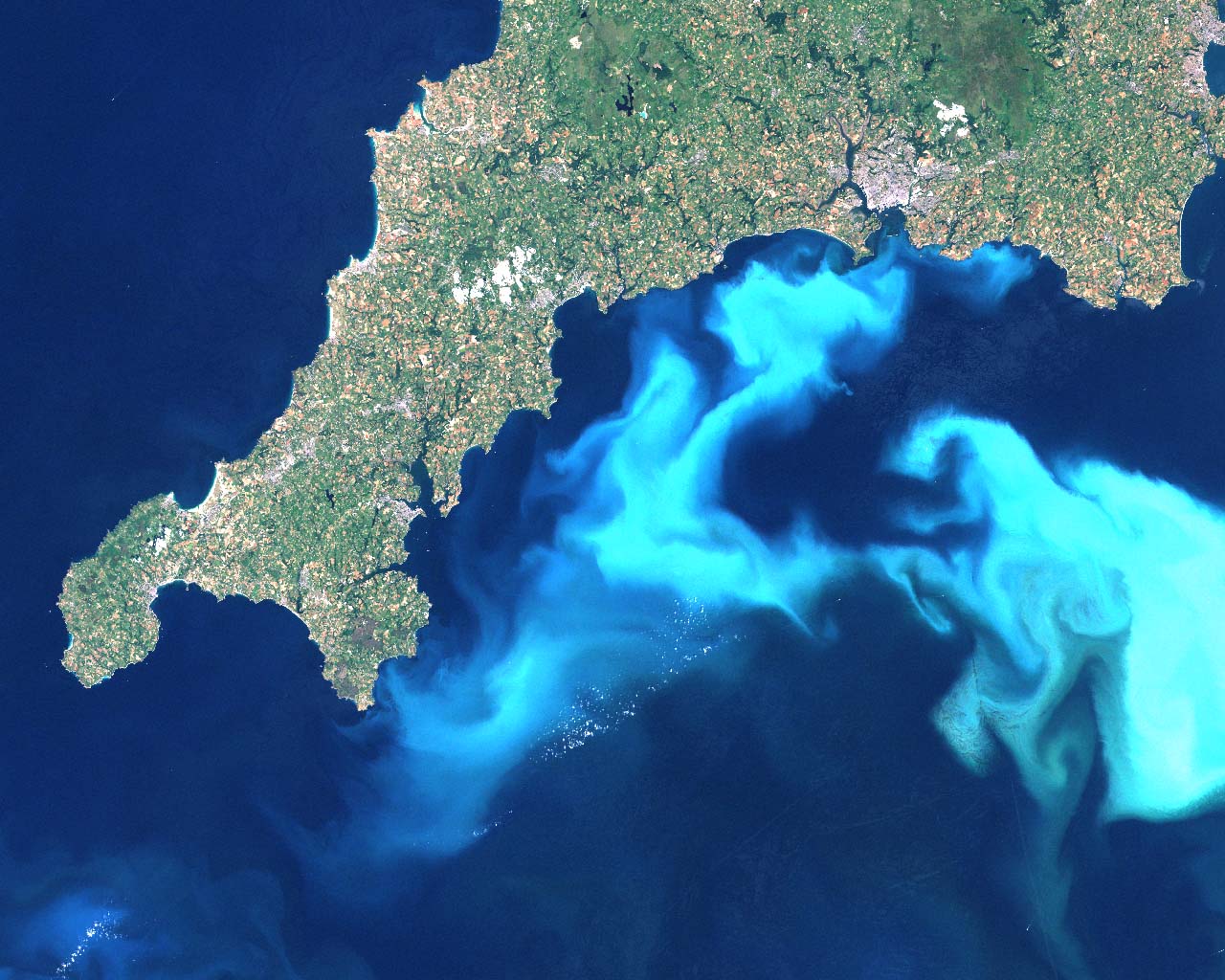
This 1999 image of algal blooms off the southern coast of Devon provides a visualization of the spread of harmful blooms of toxic algae that have hurt the whales and dolphins who have ingested them, as other fish. Dissecting data visualizations of the prominence of such toxic algae or “harmful algal blooms” in oceans or inland raises pressing questions about their nature and causation, and about the salient mechanics that might be revealed in how such blooms might be better or more clearly mapped in web-based platforms. In an age of the omnipresence of Google Earth, or satellite views of significantly high resolution, as well as MODIS, as well as the imaging spectrometer MODIS aqua of high resolution launched in 2002, the measurement of water populations should not be difficult to define: but the presence of algal blooms requires increasing introduction of data layers based on local detection, in ways that the surface appearance of all aquatic environments just cannot register alone. Algae provides a case for looking at the unmapped, and mapping the sort of rapidly reproducing migrant bacterial populations in aquatic environments that are otherwise particularly difficult to detect by superficial observation–until they have already rapidly progressed or bloomed.
Algae’s presence in lakes was rarely a mapped population or identified as a species until the spread of toxic “harmful algae blooms” (HAB’s) and alarms over cyanobacteria: algal populations have recently gone off the charts, and the explosion of their accumulated biomass has created huge alterations both in food web dynamics–and sucking off most of the oxygen in waters on which fish depend–as well as increasing the growth of bacteria that themselves pose dangers to human life, best known in the bacterial spread of the so-called “Red Tide” of Karenia brevis that flourished in ocean waters off the coast of Florida during the late 1970s–but more terrifying, and considerably more difficult to track, across the freshwater lakes, ponds, and rivers that are often sources of drinking water. Mapping and charting the presence of bacteria in waters is notoriously difficult, born as they are by currents, weather, water-depth and amount of refuse that locally enters waters, and the alarming visuals of chromatic variations caused by algal presences in aquatic environments poses practical challenges to visually represent in maps that combine dispassionate distance and analytic engagement.
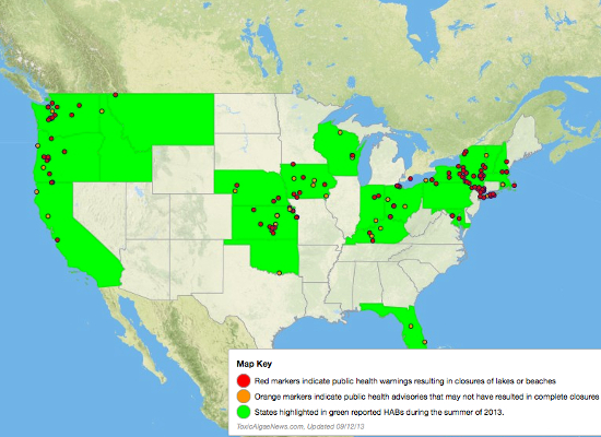
These maps are less fun or enjoyable to read, if only because they so often bear bad news. The adverse effects of algal blooms on local animal populations and food webs are even more difficult to track along clear analytics, although a varied range of metrics and maps–from MODIS satellite views of remote sensing to GIS plotting of specific readings to Google Earth views and aerial photographs. Even as folks are downing Spirulina and eating Kelp, the pernicious cyanobacteria of green-blue algae blooms, The effectiveness of the beauty of mapping algae is difficult to effectively use as compelling narratives, however, whether about that danger, or in ways that overcome the difficult distaste of the un-kelp-like sludge of algal blooms, about the alarming spread of Harmful Algal Blooms (HAB’s) either off the shores of the United States or as effectively clogging food webs in its lakes. As of 2013, health authorities issued advisories and warnings on algal blooms at 147 different sites and untold cost and environmental impact due to such harmful blooms, of which no systematic collation seems to exist.
Only now is the huge efflorescence of algae blooms being linked both to the production and broadcast dispersion of industrial fertilizers. One back story that demands to be mapped is the effect of the longstanding encouragement that farmers in the United States have received to minimize plowing of their lands, less the huge carbon mass that regularly tilled lands release not only erodes the atmosphere but degrades the soil itself; tilling costs more to pursue in a systematic way, and, especially in large farms, has been discarded as farms have shifted their equipment for tilling to a program of “no-till planting” that uses machinery to drill seeds into undisturbed soil, and scatter fertilizer atop in prepared pellet form that needn’t be entered into the soil by tilling machines–even though such pellets depend on rains to enter the soil, and up to 1.1 pounds of fertilizer per farmed acre enter rivers directly in rainwater, as a result, rather than serving to fertilize the soil, working to effectively unbalance ecosystems far beyond the bounds of farmed lands.
Harmful algae blooms’ explosive off the charts growth responds to a confluence both of high usage of fertilizer in crops and lawns, intensified by rapidly rising temperatures that foment their spread in freshwater and seawater alike: the expansive growth of algae seems something of a by-product of our current global warming trends, as the increased summer heat provides an optimum occasion for spurts of algal growth, nourished by streamed-in phosphorous and other animal wastes, in ways that change the microbial populations of freshwater lakes. And the world of rapidly growing algae has deep consequences for public health. For rather than the edible sorts of seaweed, the toxicity of algae in freshwater systems is all too likely to foster bacteria-levels in human drinking water and fish that are not usually seen, making the mapping of stagnant water algae of increasing concern in much of the midwest and northeast–especially nearby sites of large-scale or industrial agriculture. What are the best ways that algae can be mapped, or that the mapping of algae can be a proactive safeguard on the responsible stewardship of the toxicity of agricultural and lawn run-off?
Even when not toxic in nature, the problem of uncontrolled algae blooms lies in their absorption of all oxygen from the body of water in question. The predictive maps of expansive algal blooms specifically in Lake Erie, where aerial photographic visualizations recorded the record levels of 2011, warn of the spread of toxic blue-green algae–a harmful algal bloom (HAB), focussed on the lake’s western basin, based on the careful reading of the nutrients that flow into the lake. The new levels of algae that have steadily increased in recent years, hark back to the algal blooms of the 1960s and 1970s in the same region of the lake. But the blooms have recurred with a new intensity, spurred by hot weather and an increased amount of phosphorous, sewage, and manure into Ohio lakes and streams, boosting the blue-green cyanobacteria to new levels last summer that more than doubled previous years–increased by the accepted practices of broadcasting fertilizer on fields without tilling, and the reluctance of the Environmental Protection Agency to issue any warning on cyanobacteria in these waters–even after the algal blooms broke previous records in the summer of 2011–although we know that colorless odorless carcinogens like microcystins can linger long after the blooms have left. Mapping the blooms proses a problem of going beyond geo-visualizations or aerial photography as a way of mapping the flow of bacteria and subsequent algae blooms that deoxygenate waters in an easily legible form, or linking the toxicity of blooms to set intensities.
Are we even close to cultivating the ability to read the levels of toxic agents like microcystins in algae blooms, or able to find reliable ways of transcribing their potential harmful side-effects? The specific case of Lake Erie, specific both since it is one of the densest sites of such blooms and on account of its low water-level, may itself be predictive of the danger of algal blooms in future years.
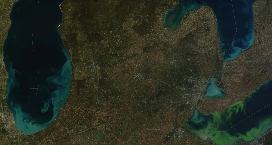
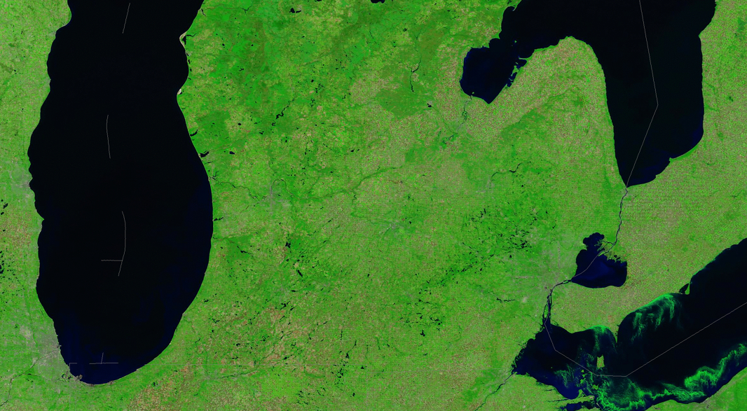
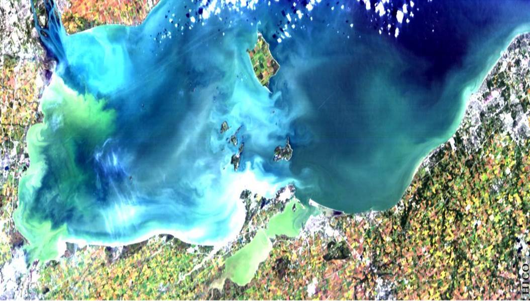
The 2011 bloom was rapid and sudden, as is apparent in two aerial photographs of the lake snapped just five months apart, between June 1 2011 and October 5, which illustrates the blossoming of the algae under the summer’s sweltering sun:
New York Times; source: NOAA Centers for Coastal Ocean Science; data from NASA MODIS sensor
If not a map, the green coloration of the algae highlighted the frontiers of its expansion so effectively as if to isolate that one feature within the aerial photograph. Such local photographic “mapping” of the density of toxic algae blooms is perhaps the most compelling chart of their impact. But the expansion of algal blooms, if similar to that covering 300 square miles in 2003, now threatens to spread across the entire southern shore, has been closely tied to new levels of toxicity, producing liver and nerve toxins, and creating a dead-zone of oxygen-depleted fish. If not as severe as it was in 2011, when remotely imaged by MODIS satellite revealed a particularly disturbing concentration of cyanobacteria close to Detroit and along several spots of the lake’s shore, before extending from Toledo to Cleveland in 2011.
The existence of sediment in the Great Lakes revealed a distribution of particularly thick portions of algal spread, no doubt particularly notorious due to its low average depth of just 62 feet. At the same time as Western Lake Erie continues to experience a fairly unprecedented resurgence of toxic algal blooms, health advisories and “do not drink” orders have been issued by the state of Ohio, although Michigan, which lacks a formal monitoring program to monitor waters’ purity, has not issued any: the current debate on the Farm Bill has led to a jeopardized program of Conservation Stewardship and fails to include controls to encourage farmer’s to monitor their effects on water quality–or even to set uniform standards for the toxicity of HAB’s to drinking water, local ecosystems, or lake life.
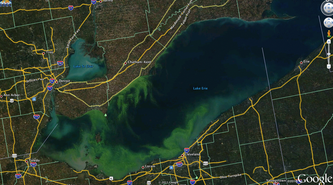
The spread of their population in the lake was visible on Google Earth:
The intense concentrations of algal blooms can be likewise revealed due to remote sensing of the absorption of light in the lake’s water, to image the toxicity of the most polluted of the Great Lakes. based on data from the International Space Station.
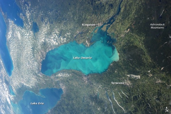
Looking at lake Erie provides something of a well-mapped test case of algal blooms. Most of the blooms are typical of the over 200 toxic blooms in the United States, due to run-off of fertilizer and manure in rivers and lakes, often carried by heavy rains, often confined to the northwest, but spreading throughout the high farming regions of the midwest, where phosphorous no doubt increasingly leaches to water supplies–leading to public health warnings and closures of lakes or beaches. Rainfall has increased the flow of agricultural run-off and nutrient-rich storm water into rivers and lakes, providing food for algae to grow to toxic levels. Indeed, the National Oceanic and Atmospheric Administration has developed an early detection and forecasting system for the Gulf of Mexico by using remotely sensed data to monitor harmful algal blooms beyond the Great Lakes and Chesapeake Bay–some of the largest repositories of freshwater in the United States–and in over one hundred and forty sites as of the summer of 2013. And the clean-up of many Minnesota lakes has led to a call for reducing the use of nitrogen-rich and phosphorous-based fertilizers by some 45%, although no realistic ways for achieving the goal–which might not even be as high needed to reduce algal blooms–has been defined. The difficulty that occurred when a satellite photograph of Lake Ontario suggested a similar efflorescence of blue green algae blooms of cyanobacteria in that large body of water led an overwrought panic-attack to be voiced on Twitter, as the photograph that ostensibly boded the local arrival of an onslaught of heptatoxins, already problematic in Hamilton Bay, to have metastasized to the lake as a whole.
But the “bloom” was a boom of plankton–mostly plankton like diatoms, and chrysophytes, dinoflagellates, in other words, which are often mistaken for blue green algae in remote sensing, although blue green algae blooms just a small amount of it, and little cyanobacteria–was an optical illusion. The apparent errors in the imaging of algal blooms suggest a greater difficulty in its accurate mapping, and makes us rely on self-observations by water-sampling for certitude.
This is not to minimize the danger. But only to warn of the limitations of tracing by superficial observation. The actual potential for the sudden spread of HAB’s in the continental United States is in fact quite serious, however, as is the need for ensuring water-quality standards in many rural regions–from questions of potability to the eventuality of die-offs of fish.
The interest of this very broad-scale map is the proximity of blooms to large-scale farms raising cows and pigs: such concentrated animal feeding operations (CAFOs) generate unduly concentrated amounts of livestock waste in precise locations–termed “liquid lagoons”–thee liners of whose storage tanks regularly leak in heavier rainstorms, creating a manure run-off from poorly regulated sites into lakes. The EPA estimates that over half do not have Clean Water Act permits, creating deep problems of local stewardship that becomes evident in the efflorescence of toxic algae blooms–but only long after the fact–in ways that reveal the ingrown nature of poor standards of agrarian stewardship. Living in the right town, we might see such headlines as Citizens of the Town of Lincoln, Kewaunee County are concerned that the Kinnard Farms Inc. plan to manage 70 million gallons of untreated animal waste doesn’t protect groundwater from contamination, or How Big Meat is taking over the Midwest, describing the widespread multiplication of permits for such “poo lagoons” in the landscape to hold the refuse of the 19.7 million pigs raised annually in that state alone, and the return of a booming industry in 2011.
Lying down water of such overflowing containers of animal feces creates a possibility of toxic contamination that is particularly difficult to contain–especially when fueled by an unnatural abundance of phosphorous and nitrates that has all too often been insufficiently or ineffectively tilled into agrarian lands. The contamination of so many of Minnesota’s lakes offers a sad case in point. The striking case of green waterfalls in Minnesota suggests something like a direct inversion of the rural picturesque–and a compelling need for new standards of river pollution or run-off, as well as intensive attention to the tilling of fertilizer so that it remains buried as much as possible underground.
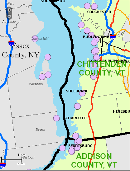
Somewhat more ecologically conscientious states, like Vermont, removed from the landscape of the factory farms, have begun to provide interactive local maps to measure and track the intensity of algal blooms, of “blue green algae tracking,” as this map recording the blossoming of green by the shores of Lake Champlain–a tourist destination–that are considerably interactive and detailed, as well as allow a considerable fine-grained detail of local reporting that are incorporated into visual overlays for ready consultation each day.
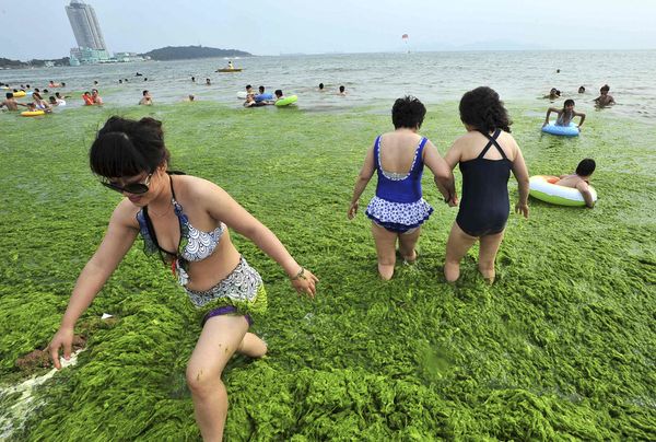
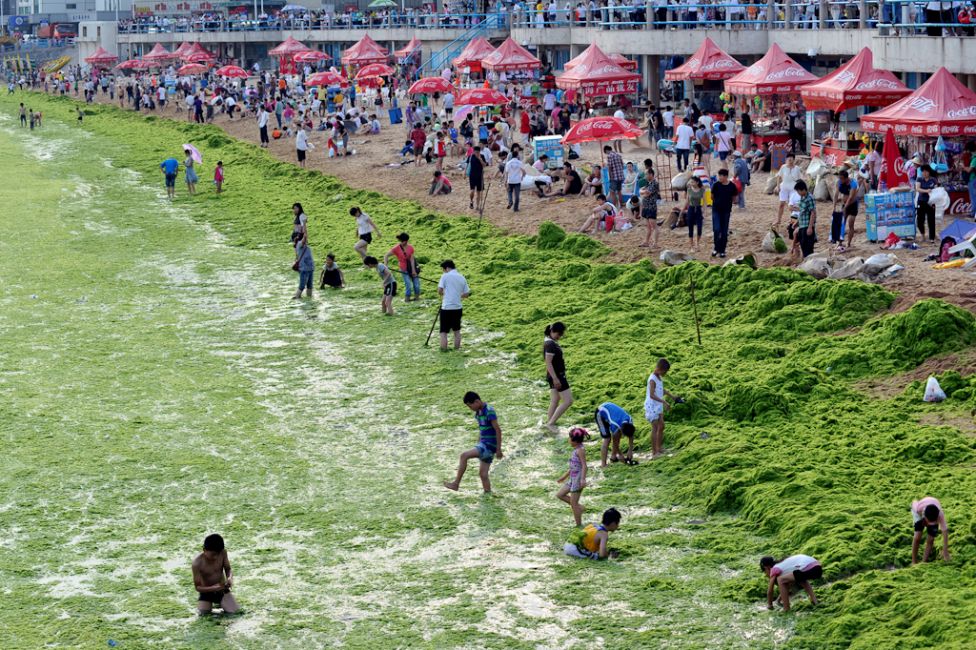
Others, like Florida’s inland waters, have seen massive toxic algae outbreaks that have killed manatees, fish, and birds, as well as dolphins in the Indian River Lagoon, where fluorescent green slime filled the river this past summer, leading to widespread health warnings. Of course, such a menace is not only localized: the actual specter that is haunting the mapping of algae comes from China–where, coincidentally, few controls exist on fertilizer or greenhouse gasses, and algal blooms fill large, slow-moving rivers like the Sichuan.
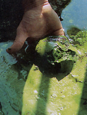
In the course of preparation for the 2008 Olympics that the Chinese government pulled some 1,000,000 tons of green algae from the Yellow River, famously, relying on some 10,000 soldiers in the project to remove the waste, leading folks to just negotiate with algal blooms as they appear, and their relative toxicity not to be tested.
The disquiet conveyed by the images of raking algic scums off the Yellow River, or of swimmers happily standing waste-deep in the light green blankets of what looks less like fresh parsley than artificial coloring can only be viewed with the alarm that Bartholomew Cubbins witnessed the arrival of Oobleck in the Kingdom of Didd. (We might reconsider the assumption that the last printed work in the Dr. Seuss corpus, The Lorax, was the one most directly about the physical environmental.) Indeed, the comparisons of Oobleck to HAB’s seem unavoidable given their sudden ubiquity across so many of the changing climates of the United States and world.
Mapping something as imaginary as Oobleck might be an apt association, if intentionally slightly ridiculous if evocative comparison, but the odd appearance of green toxic slime in freshwater deposits evokes the sudden omnipresence Oobleck quickly acquired in all Didd.
The fear of self-generated Oobleck seems implicit in much literature. Indeed, Qingdao’s 2013 summer scourge of “surf like turf” meant the arrival of what locals called “sea lettuce.” Perhaps from the farms of Nori on Japan’s Jiangsu coast, or from irresponsible farming in China itself, the consequence of a massive failure of marine stewardship created currents of harmless-to-humans algae running toward the center of the Yellow Sea. The blooms, given the run-off of nitrate-rich fertilizers from farms and industry, didn’t seem to threaten beaches often used as centers of tourism, but created an odd sight of bathers luxuriating in the aquatic lettuce they were told had not toxicity. The algae are often regarded as harmless to humans. But harmless to fish they are not: the algae serves as a ravaging of the aquatic ecosystem: bright green beds of algae were deemed a “large-scale algae disaster” by the Shandong province, and 19,800 tons of it cleared as it started to decompose, releasing noxious fumes of toxic hydrogen sulfide gas, at a cost of over $30 million. The relation between harmful algae and the local ecosystem or food chain has not been fully explored to map, despite the wide ramifications of its impact on the greater food chain.
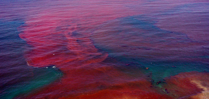
The explosion of algae blooms has been linked to the rise of the so-called red tides in the Gulf of Mexico, has already hit our coasts as well: southern California coast and Florida have both placed a new premium on mapping the density of algae that flourish in these warm ocean waters, which have long been worried to disrupt local ecosystems and food chains, before the toxicity of fertilizer-fueled algal blooms started to appear inland. These tides have largely been treated as dangers to marine life, and specifically to the shellfish regularly harvested there, however, and were consequently charted and mapped in relation to water currents, salinity, and winds, to get a picture on their sources of origins of these concentrations of dinoflagellates of reddish hue that so rapidly accumulated along the Florida coasts from purple to pink, and which seem–despite their name–to be entirely independent of tidal flows, but were toxic to birds, fish, and mammals, and potentially harmful to human beings when consumed in shellfish. The awareness of this vector of transmission has led to the monitoring of these early HAB’s, which have disrupted fisheries along the Atlantic as far north as Maine, and, according to some were witnessed in Canada as early as 1793 in British Columbia: but far more recent measurement of red tides in northern California, where they created a massive die-off of shellfish, the Gulf of Mexico, the Southwest Florida coast, Malaysia, Maine, and Massachusetts, killing fish, manatees, and shellfish like abalone, has led to increased NOAA alerts and concerns of respiratory irritations at beach shores.
Is such efflorescence due not only to lower rainwater that flushes the system of oceans, and increased warming, but also to the nitrate-rich outflow of fertilizer from Florida plains, and indeed the Mississippi? The lack of tilling in larger farms, driven by the needs to produce more crops in their growing seasons, has encouraged the dispersion of high-grade fertilizer across the Midwest, most of whose runoff enters the same waters. Indeed, the inland growth of HAB’s echoes historical documentation of the approach of “red tides” that endangered shellfish and fish living along Florida’s western coast in recent decades.
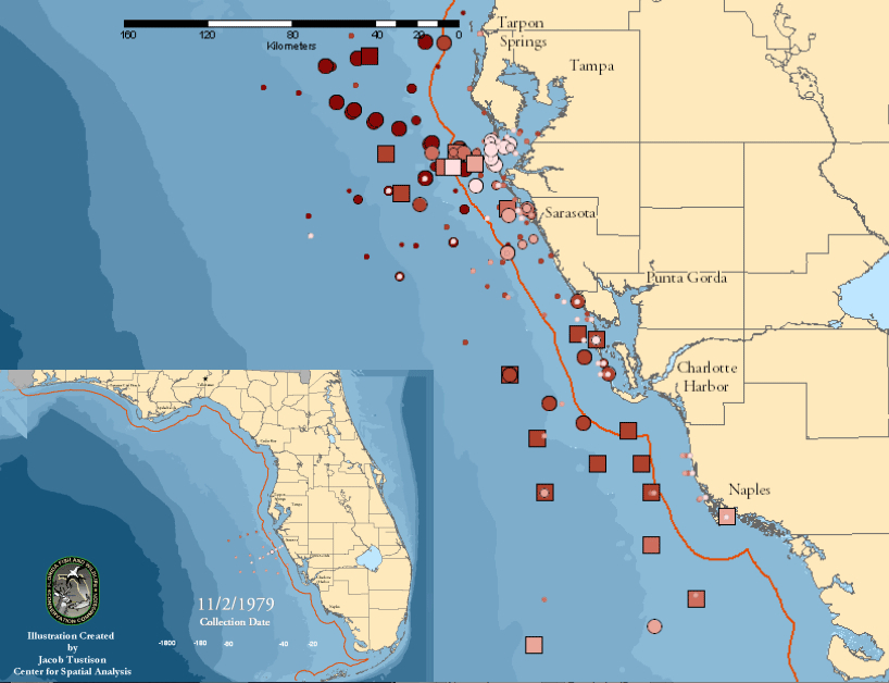
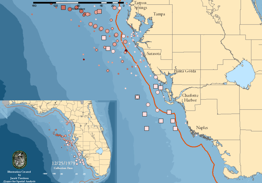
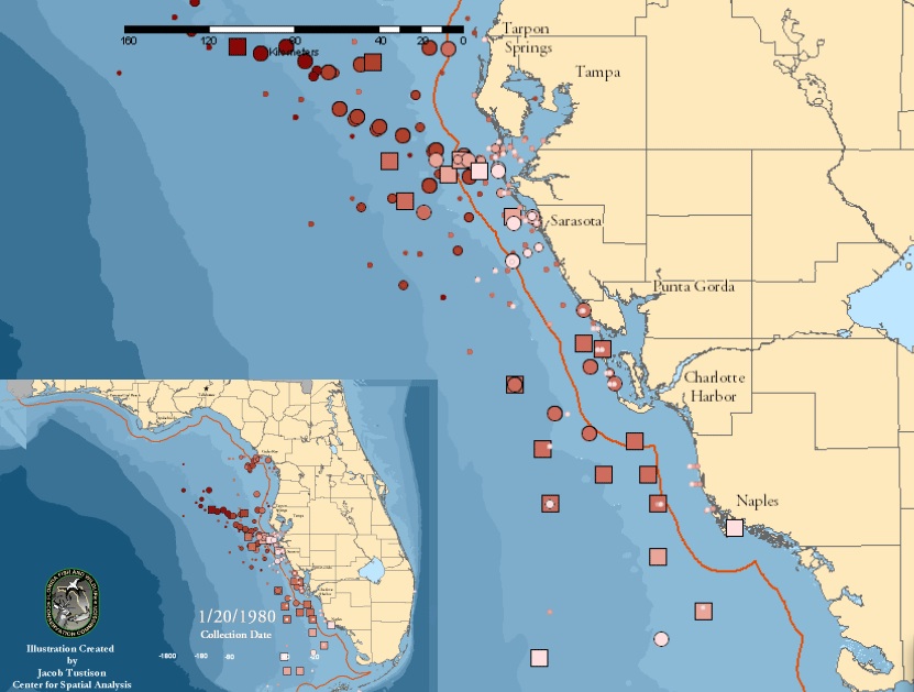
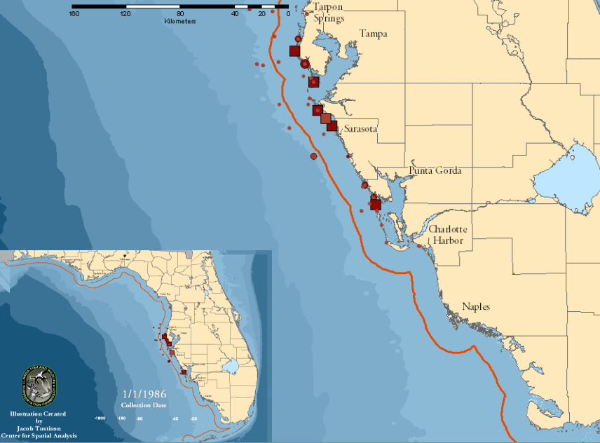
The ability to survey the massive growth of Karenia brevis organisms in the warm shallow waters of Florida’s western coast, and the dangers that they posed to local fish and marine life, benefit from the extension of data and record-keeping along the Florida waters since 1954 by multiple agencies. The data creates a context for data visualizations of the expansion of the “red tide” of HAB’s in ocean waters near to an exceptionally rich and endangered ecosystem, but also one huge stretches of whose coast falls under environmental protections for endangered species, and whose waterfront economy enjoys far greater protection than most inland lakes. By exploiting the largest continuously recorded database of Harmful Algal Blooms in the United States–and world–we can examine the spread of sites of the Red Tide of 1979 in relation to ocean currents, which appear, based on data from Florida Marine, clearly clustered in shallower waters by the ocean coast: maps track the abundance, intensity, and duration of growth of Karenia brevis by color, switching to rectangles for the largest, and the extent of their presence by shape-size, based on data collected on November 1979, Christmas 1979, December 20, and January 20, 1980. They reveal the algal spreads as moving quite rapidly from being concentrated around Tampa Bay along the coast to Naples in dense brightly colored blooms that flourished for the longest time near bays, often in the shallower waters sometimes within the red line marking a distance of 18 kilometers off the coast, where they have most contact with shellfish. The evolution of these animated static maps provides a temporary solution, based on intensive compilation of water data by the Florida Coastal Commission, but provides an exception of the degree of successful visualizations of algal presences in aquatic environments.
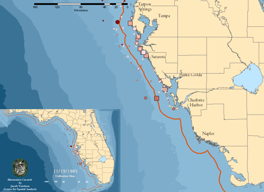
The “tide” returned in 1985 to the shallow waters off the beaches and coastal inlets of western Florida, pictured with a key of the local density of blooms which is also applicable to reading the above images, and the increased presence of blooms on New Year’s Day 1986:
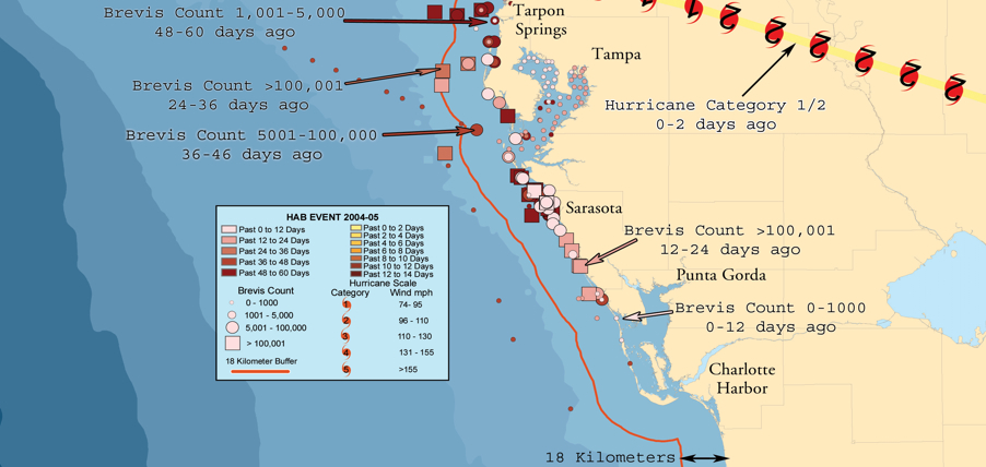
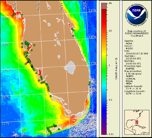
More recently, Florida’s Fish & Wildlife Research Institute charted the same coastal waters of its coasts. By using readings that were based data for the NOAA Ocean Service and Satellite Information Service, who registered high levels of marine chlorophyll by MODIS Aqua imagery, bacteria clearly hovered especially, when present, around the Floridan shores and coves in which they multiply. Does this suggest that they are specific to shallower, warmer waters, or more likely densest at the very point when they enter the seawater in such high concentration from the land? Commonly known as “red tides,” these off-coastal aggregations of algae, again Karenia brevis, seem largely in decline on Florida’s southwest coastal waters for the present, but had long flourished on its relative shallow ocean shelves.
Or, in October 2013,
But the bacteria and algae are focussed not so much offshore–notwithstanding the so-called Red Tides–but rather in the very estuaries and inlets where freshwater leaches out into the surrounding seas, evident in this self-reported data of algae via Google Maps, where sightings were crowded upstream the inlet of the St. Lucie St. Park Preserve, with a congestion that travelled up the course of its river.
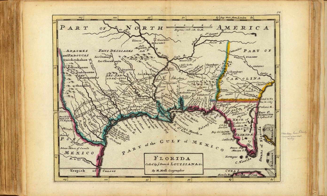
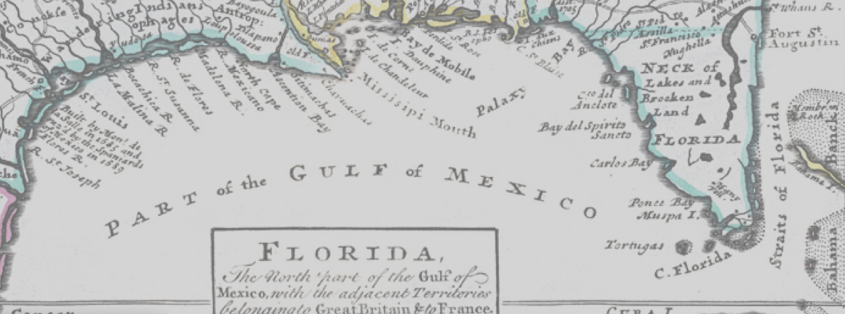
Indeed, the particular porousness of these offshore waters in the below engraved map, which shows a region characterized and distinguished by circulation of rivers in wetlands and estuaries, so long characteristic of Florida and much of the American south, struck early cartographers as so distinct by its density of estuaries. The map, in the context of this blog, provides a striking contrast as Ooblek-free, even if its territory was far more submerged and coasts follow far more irregular lines. This early eighteenth-century map–possibly 1720-30–this version courtesy of the expanding on-line collections of David Rumsey, offers the start of something like a cartographical archeology of the region, whose coves and inlets evoke a pristine Gulf of Mexico, fed by multiple rivers from the southern plains still inhabited by Native American Peoples:
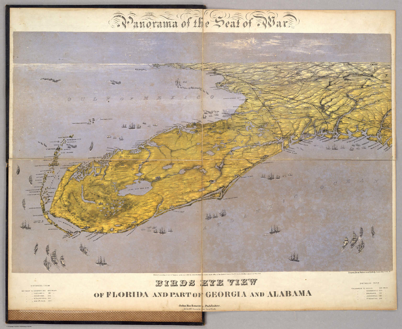
Florida at that time was described by the cartographer as a “Neck of Lakes and Broken Land, surrounded by man-eating Indians, whose Straits were nourished by streams, before being included in Herman Moll’s Atlas, with its rendering of glorious irregular shorelines, inlets, and islands that suggest a Florida before the expansion of landfill and filling in of much of the southern state. There is something akin to a raining of Oobleck in Florida, the sudden and widespread appearance of HAB’s in modern maps of different states offers a point of entry into how the map can be taken as a rendering and record of man’s impact on and relation to the land, or of how our maps of human knowledge provoke questions of how to map man’s own relation to the remaking of the environment, less by setting the benchmark of a given date, but by how it slowly started to be filled up with lots of sorts of shit, all of human origin or introduction. To look at the elegant bird’s eye map that John Bachmann designed of Florida, among his many images of the southern states of America of 1861, printed as a collective “Theater of War,” the mapping of the water surrounding the peninsula shows a much more clearly integrated web of land and water. In the panorama the peninsula is colored a light green oddly reminiscent of the algal blooms, but the green land, fertile with rivers crisscrossed with estuaries and permeated by lakes where brackish waters surrounded archipelagoes of islands, each its own flourishing ecosystem, and shipping docks, suggest an interpenetration of green land and water in a settled land.
Northrop Frye coined he notion of travel in and to the Green World as a dramatic device evoking a crucial passage, which the protagonists must survive in order to restore balance to the actual world and to the plot. One could argue that travel to old maps, rather than being only a form of antiquarian indulgence, provides and affords something of a parallel site of reflection on our environment. The Green World that they present is an “other world,” and a world that seems increasingly distant as our own bodies of water are polluted, and we might look back to maps to see the lived environments we are in danger of loosing–and loosing sight of. Viewing old maps like that in Moll’s Atlas after reviewing the above data visualizations and overlays is chastening and ethical, in ways, something like returning to a site of meditation on a relation to a world we have lost, and perhaps a way to turn back the tide of inevitability that informs our relation to the mapping of algal blooms. Whether we can restore balance to our world may seem another story, assembling a coherent map of toxic blooms of algae that recur around the world, we can map its distance to the world we knew, and ask what sort of balance lies in our own.
But it is the “other world” of blooms of green algae that the run-off of industrial agriculture appears to have bequeathed that is the world that seems, for the moment, far more likely to be left with us. Without mapping the growth of such recurrent aglal blooms, and tracking their mechanisms of causation and varying intensity–feared only to increase in an age of global warming–the other world will become our own.
We read more maps than ever before, and rely on maps to process and embody information that seems increasingly intangible by nature. But we define coherence in maps all too readily, without the skepticism that might be offered by an ethics of reading maps that we all to readily consult and devour. Paradoxically, the map, which long established a centering means to understand geographical information, has become regarded uncritically. As we rely on maps to organize our changing relation to space, do we need to be more conscious of how they preset information? While it is meant to be entertaining, this blog examines the construction of map as an argument, and proposition, to explore what the ethics of mapping might be. It's a labor of love; any support readers can offer is appreciated!


![The back of this 1964 photograph reads, "Unvailing [sic] of new gas signs on I-89." An exhibit at the Vermont History Museum features historic photos from before, during and after the construction of the state's interstate highway.](https://www.vpr.org/sites/vpr/files/styles/medium/public/201311/interstate-signs-2.jpg)