Since we use the conventions of map making to endow solidity, or reify, even the most abstract ideas, it is interesting to examine how the ‘Polar Vortex’ has spread across the mass media as both a meme and icon of the current weather patterns of the new millennium. Rather than map place by a matrix of fixed locations alone, maps of the Vortex offer a visualization of temperature variants that reveal an anomalous weather conditions that track the Vortex as it moves, intersecting with place, across the stratosphere into our own latitudes, tracking not only a “cold front” but, globally, the disruption of the path of the circumpolar winds, or splitting of the vortex from the north pole. We are most likely to “see” the Vortex as an incursion into our own map, effectively dividing the country (yet again?) this summer into regions of cold and heat. The currency of visualizations of the Vortex reveals not only a meme, but a model for encoding multi-causational weather maps. Indeed, the mapping of the divergence from usual temperature range reveals the anomaly of a north-south weather front with the solidity of a national divide, raising deep questions of its forecast of extreme weather throughout the year more than offering something like a “poor man’s vortex.”
As the term has gained wide currency as a challenge within data visualization world for throwing weather systems into legible relief, it set a new bar for producing visualizations that are challenging to fully comprehend. The Polar Vortex is mapped as it moves, as if on its own, across the stratosphere into our own latitudes, condensed in a range of data visualizations of stratospheric or tropospheric low-pressure fronts, in ways that map onto current quandaries of atmospheric and climactic imbalance. The animated superimposition of weather patterns condensed in a range of data visualizations of stratospheric or tropospheric low-pressure fronts themselves map onto concerns about climate change, and conjure narratives of global atmospheric change and climactic imbalance: the disruption of the usual harmony of the polar jet stream perhaps maps onto both notable rises in polar temperatures or torrential rains off the coast of Japan, but whether due to a spike in northern pacific offshore typhoons or openings in polar ice cover, the markedly increasing waviness of the vortex has allowed increased amounts of cooler air seep south once again, in an eery echo of last January’s mid-winter chill, that has lead weatherpersons to scramble for clarifying narratives about the return of that green blob. (To be sure, back in January, the naysayers of climate change parsed weather maps as counter-evidence to global warming, allowing them to indulge in alternate meteorological realities, before they were batted down in two minutes by the President’s Science and Technology Advisor, Dr. John Holdren.)
Offering a marvelous array of vowels and pattern of assonance, with a name befitting a Marvel comics super-hero as much as a weather pattern, the Vortex is a touchstone of climate change and a great case of how we have yet to ken the global as intersecting with the local. But we have unfortunately trended to oscillate, as it were, in our maps between national weather maps, where the Vortex made such a splash as a newsworthy low-pressure pattern, to maps of patterns in global environmental change, that might better direct attention to changing meteorological realities.
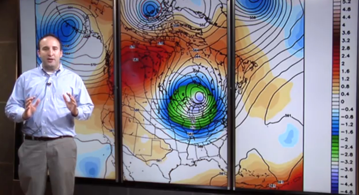
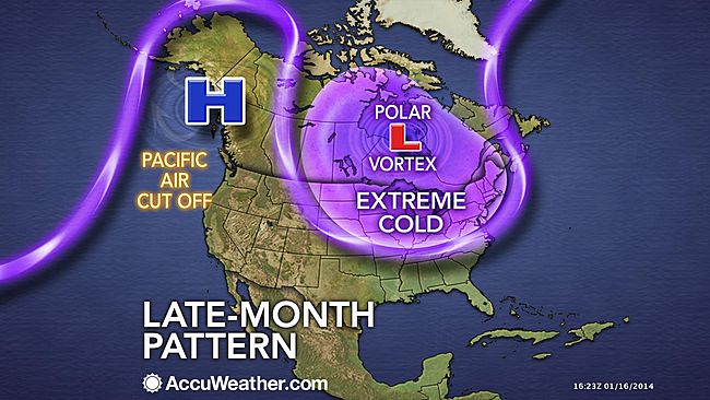
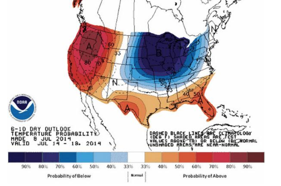
Part of the problem is adopting a point of view on the weather that we are tracking–or of viewing the Vortex as a stratospheric phenomenon around the polar regions, or charting a weather pattern forecast as occurring within our nation’s bounds. The reprise of the spill of northern air into the upper United States returned the Vortex into national news this July has provided a basis of the latter, to judge by this new visualization that projects the cooling temperatures in the northern United States, as a deep wave in the Jet Stream brought colder air to the Northeast. Even if the cooling air that arrived was not arctic, the pattern of its arrival to the continental US this summer has prompted some significant debate among meteorologists who have glossed the map in alternate ways, almost entirely still focussing, oddly enough, in a reprise of the mid-January news blip on the Vortex, on the unit of weather in the United States in isolation from a global context. The anomaly of the “Vortex” has become something of shorthand for a southern swing of cold air from north of the Great Lakes, produced by a decreased disparity between polar and sub-polar continental temperatures that lower the latitude of the jet stream, according to some research that has been endorsed by the National Academy of Sciences, and increased its waviness as the Arctic warms. The maps serve to embody the increasingly newsworthy weather in the Northeast, reaching down to the southern states as if an invading army as much as a meteorological cold front, placing the anomaly of the displacement of cold air against the screen of an iconic national map on which it has been superimposed.
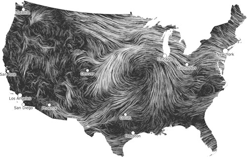
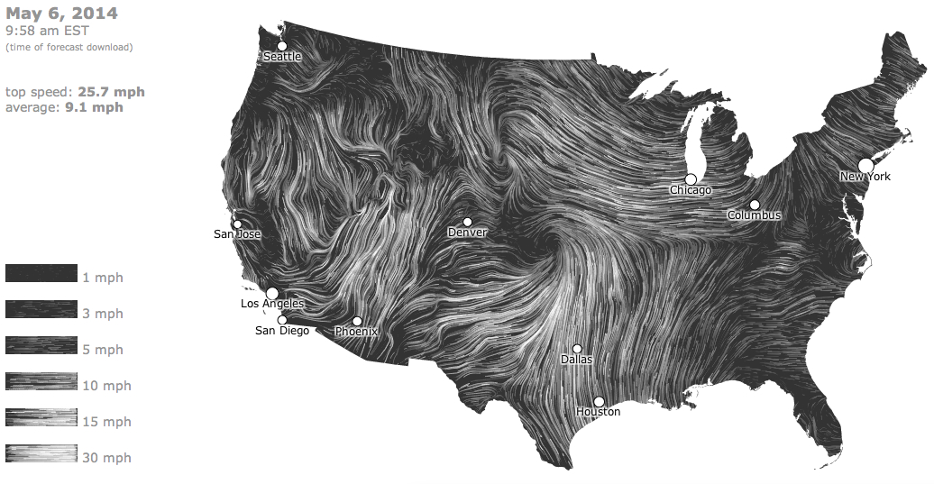
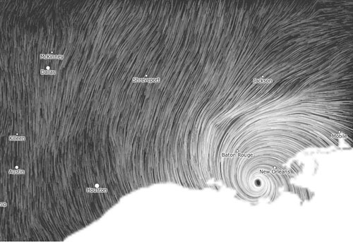
 AccuWeather.com
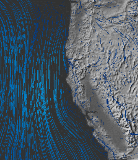
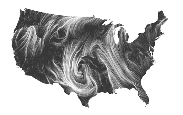
The map recalls a similar dispersion of circumpolar winds from the arctic into the lower forty-eight already called the “most upsetting” data visualization of the winter of 2014. The drift of circumpolar winds at stratospheric levels offers a compelling means to understand the arrival into the Midwestern states of cold air once more from the north during the mid-summer of 2014. Rather than only being a meme of the media, or being coined as a manifesto a group of avant-garde modernist meteorologists who found energy in the abstraction of weather forms, the term tracks the dispersion of the circumpolar whirl usually uniformly swirling about the pole offer both a rogue arrival into our national climate and a sort of emblem of an imbalance of circumpolar stratospheric harmony by pushing down the arrival of winds from the Pacific ocean.
 AccuWeather.com
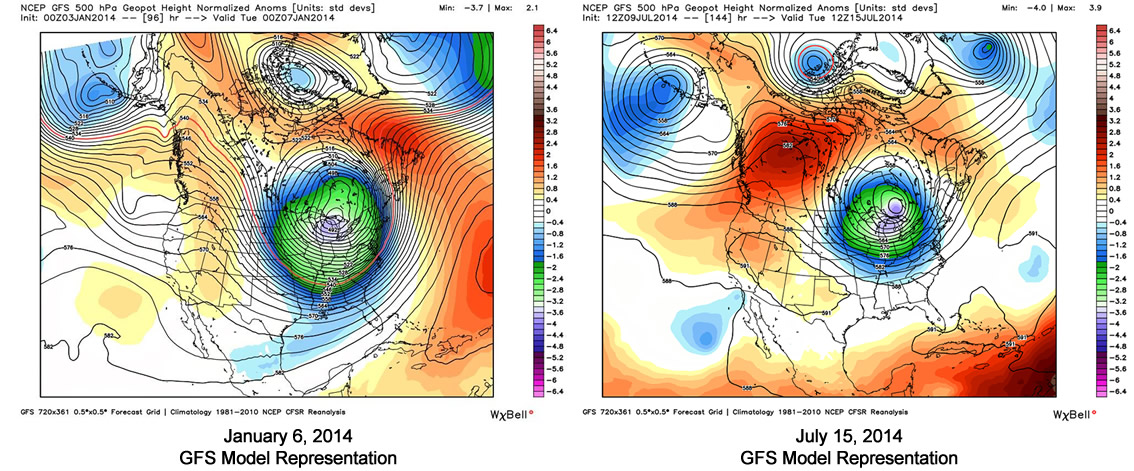
The benefits of shifting iconography to the global are immediately apparent if only because they reveal the divergence of the weather system from a meteorological status quo. The cycle of wind, usually located in the mid- to upper troposphere, has apparently begun to split or splinter from it usual centers above Baffin Island and Siberia as its air warms, and moves below the arctic regions. The displaced vortex, which migrates below the arctic circle in the stratosphere, reflects the warming of temperatures at the poles, creating currents able to funnel the figurative migration of arctic air currents to sub-arctic latitudes, even if the air in question this July might more likely be northeast Pacific more than arctic in its provenance.
 Earth.com
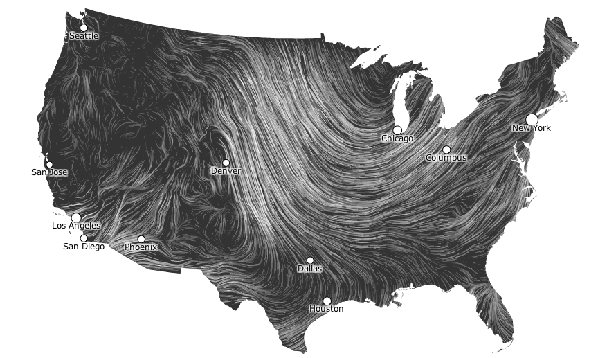
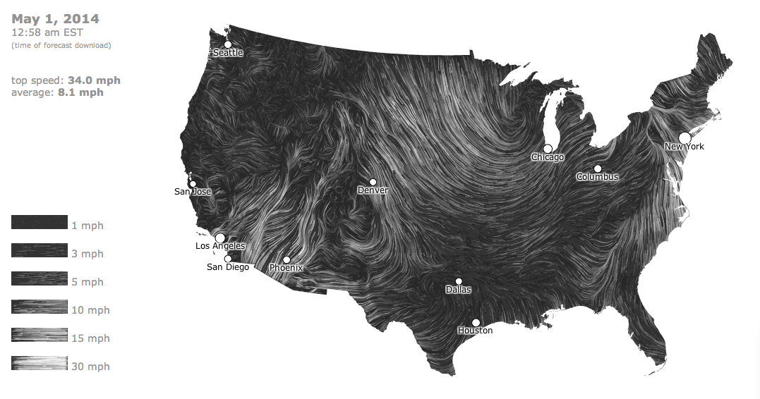
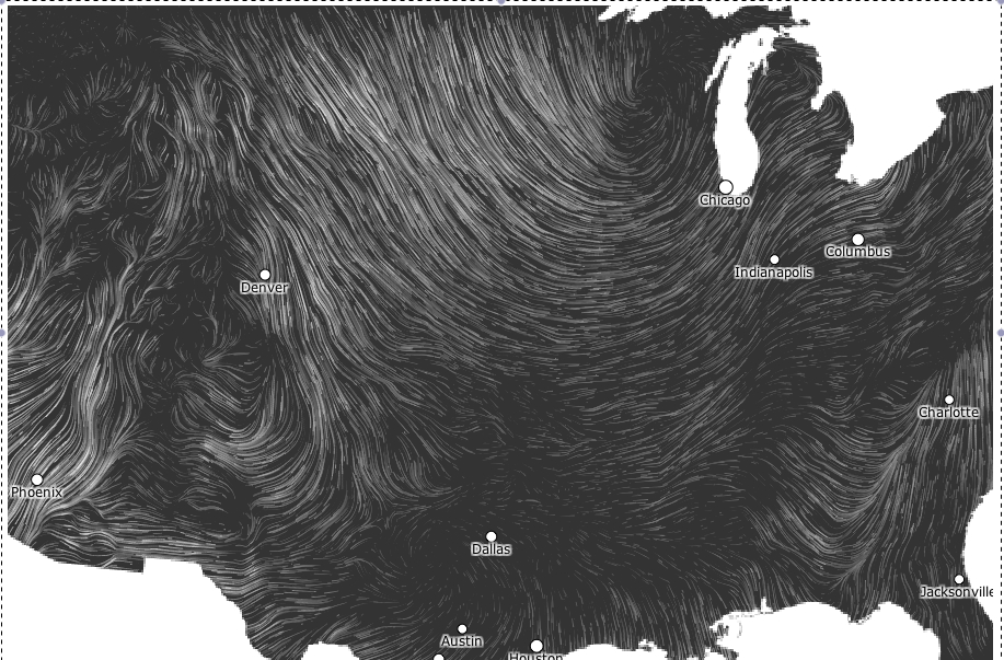
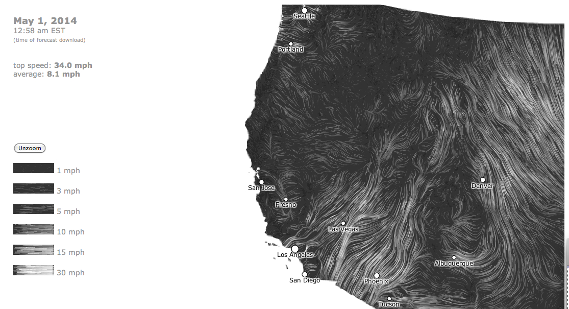
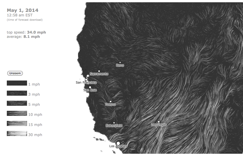
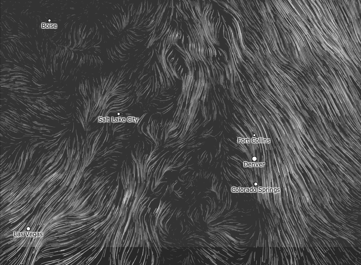
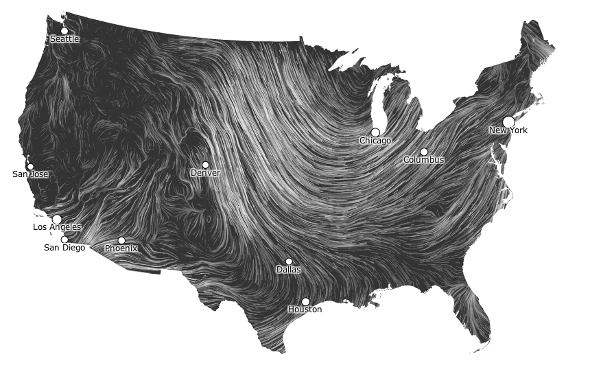
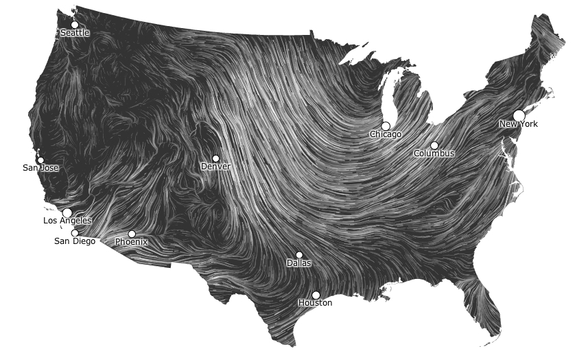
The local is, however, far more easily digestible for viewers of The Weather Channel, and the Vortex is shown as an intersection of the global with the regional weather map. Collating data from divergences or temperature anomalies from a database covering local temperatures in 1981-2010, the spectrum of a “heat map” tracks currents of cold across the backdrop of the lower forty-eight in an easily digestible manner that packed so big a punch for folks trying to puzzle over the freezing over of roads, local lakes, or back yards:
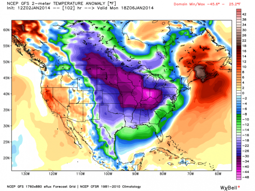
Once more thrown off-balance, it sends cooler air below the lower forty eight and forty-ninth parallel, making it national news as a dramatic aberration that marked the entry of intense cold. Data visualizations provide new tools of making the meteorological concept legible in ways that gain sudden particular relevance for audiences familiar with weather maps, for whom immediately powerful associations of shifts in the measurements of regional temperatures will pop out at viewers of a forecast or weather map, forcing them to pay attention to the meteorological imbalances they portend.
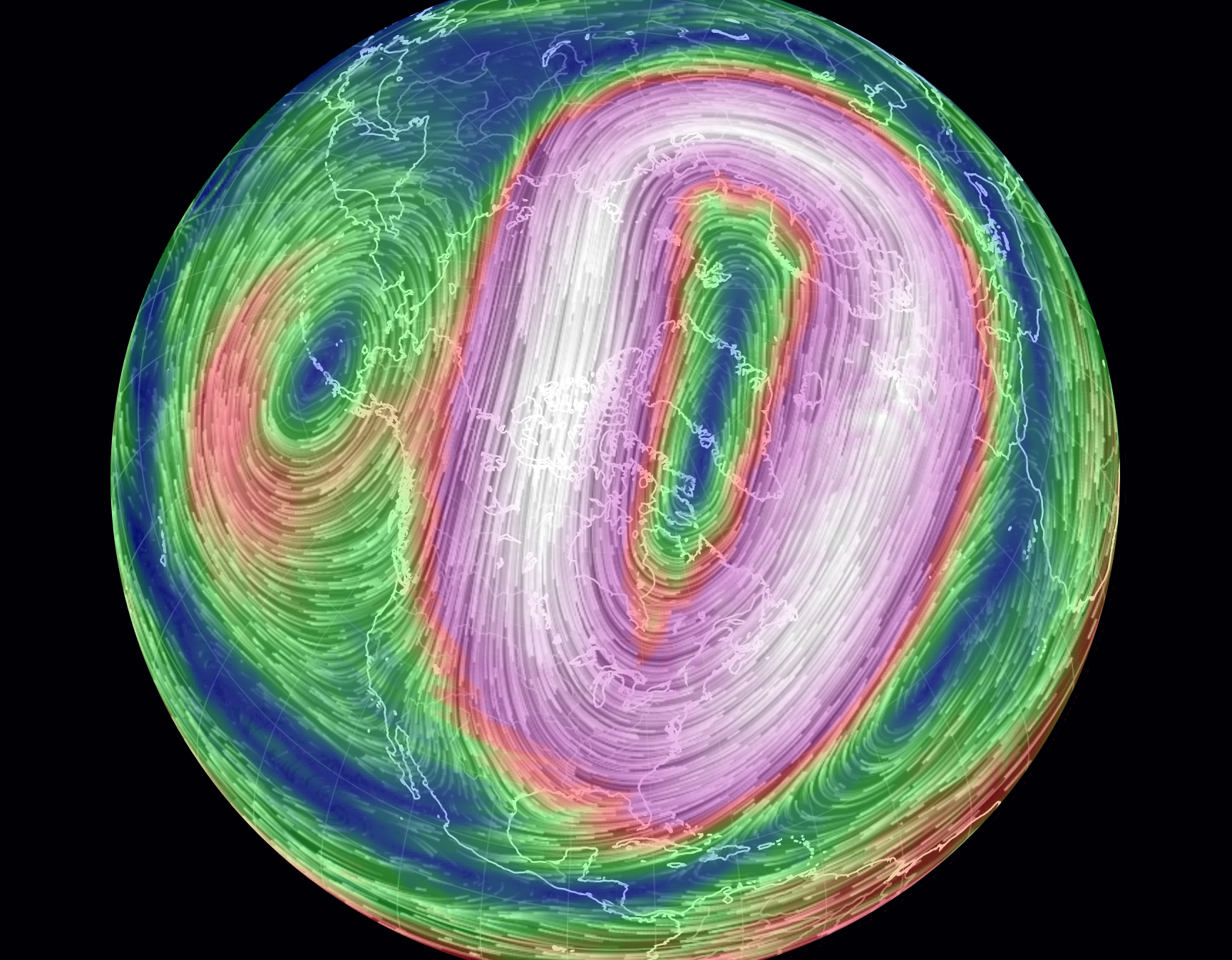
Recent global maps of the Polar Vortex offer more than an icon of the transcendence of territorial boundary lines systems, by processing and portraying the Vortex as an expansion and breaking off of cold air outside the restraints of an arctic air system.
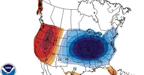
The dramatic splitting of the arctic jet, due to atmospheric pressure anomalies, was mapped by NOAA in this data visualization of July 2014, of a splintering of the vortex, in apparent response to the warming of our poles, hastened by the diminishing snowfall and ice-cover that create new chilly islands or microclimates on the ends of a warming pole we often seen as lying so far away:
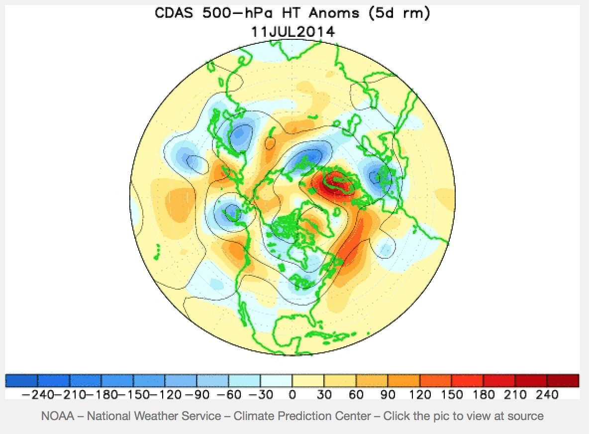
The disruption that results brings the displacement of arctic winds that most often sit anchored around the polar region. A “weak” polar vortex, interacting with arctic ice-cover decline and reduced snow cover, was some time go modeled as resulting in a meandering arctic jet stream and occasional detachment of a polar weather systems and consequent decline or weakening of pressure gradients of the vortex, and consequent reconfiguration of the arctic jet stream:
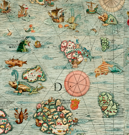
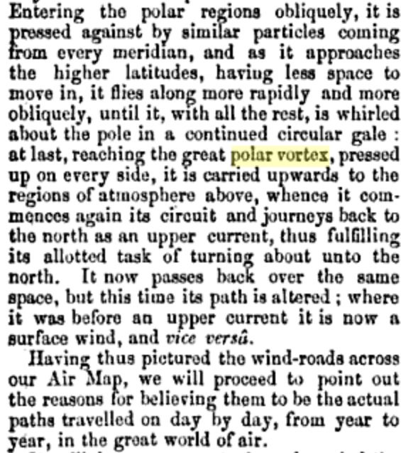
Has something like this occurred? The dynamic visualization of weather maps in five colors and striking contour lines provide clear tools to visualize its speed and energy, in ways that might even have helped resurrect a term that had languished in meteorological lexicons from at least 1853, when the “continued circular gale” was described as flying “more rapidly and more obliquely . . . carried upward to the regions of the atmosphere above,” as lying in the ambitions of a “great Air Map” but based on the recent 1851 NOAA mapping of “great undulatory beds of the oceans . . . for all practical purposes of navigation.”
But now we have a recognizable image that can be tracked over a recognizable terrestrial map that concretizes the Vortex in ways that its winds can be understood as extending over a region of truly global expanse.
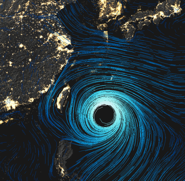
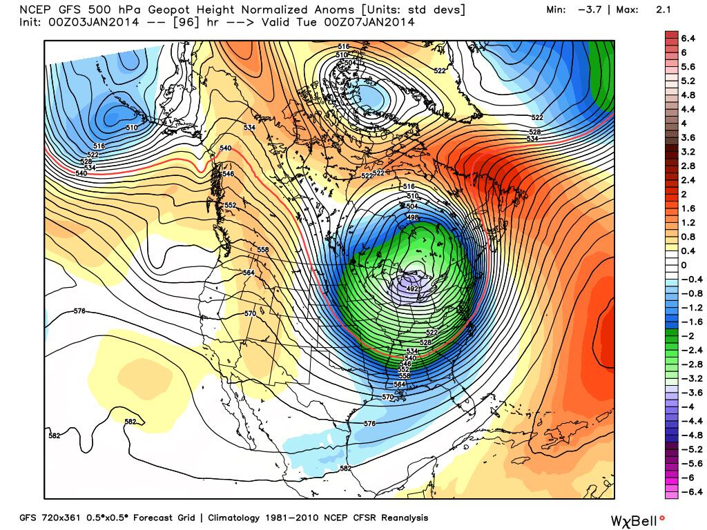
Tracked in terms of actual temperature anomalies, in the winter of 2014, when newscasters and NOAA (the same agency) mapped the migration of cold air southwards of the pole into our frontiers, far outside the usual path of the jet stream, in a disturbance of the weather systems worthy of national news last January, in a data visualization which tracked a green (or purple) blob whose forced migration of frigid air from the polar regions that disrupted weather patterns with national consequence as it migrated out of Canadian airspace.
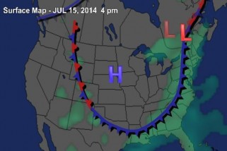
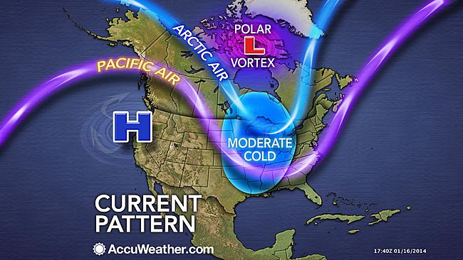
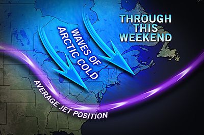
In the dramatically eye-catching graphics of television’s mass-media, as the bulge of purple and magenta of detached low-pressure systems migrate south, crossing the very same borders to which we are increasingly sensitized in our national news media, albeit at tropospheric altitudes no fence or border guards could ever patrol. Indeed, the map suddenly suggests the increasing vulnerability of our delicate weather systems, echoed by the language with which the Polar Vortex’s “EXTREME COLD” loops invasively southward across our northern border, cutting off Pacific Air:
 AccuWeather
The apparent incursion of its jet stream into the bounds of our national airspace, as in this image of cold air migrating across the northern border, results in the proliferation of metaphors all too often violent in tone: Climate Central may have only adopted the robust rhetoric of sportscasters when it described high pressure systems in quite athletic terms that “block the eastward progression of weather systems, like an offensive lineman protecting the quarterback from the other team,” allowing the air that circulates around the arctic to start “spreading tentacles of cold southward into Europe, Asia, and North America.” Less dynamically interpreted and understood once cast in global terms, rising temperatures at the poles–the very sites where, we should note, global warming is occurring at a rate twice the global average–displaces the previously concentrated flow of a jet stream of cold air from its arctic abode.
Of course, few seem ready to tie this to the diminishing ice-cover of the north pole, which still seem a leap too far to be made logically. Oddly, the meteorological mechanics of the expanding split-off of polar winds is modeled as an incursion of weather patterns echo the metaphorics of a military situation map of fixed borders, a historic hold-over for national weather organizations like NOAA: the global image of wind velocities around the pole, depicted below, is oddly absent from what is actually a global phenomenon.
But we are all too used to interpret and read weather maps with both a sense of voyeurism for our friends and relatives, but from a subjective lens.Despite the adoption of globalized images from our friends at National Geographic, who used Mass FX Media’s animation to visualize circumpolar air flows, and despite the continued live monitoring of wind-flows at “Earth,” the isolation of the nation in the maws of the vortex is so readily discussed as the “most upsetting map of the winter,” as if the migration of the pool of arctic air into the northern United States were best understood as a disturbance of national temperatures.
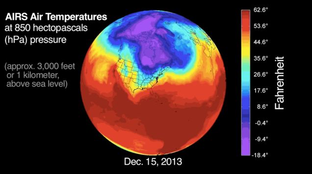
The similar narrative about the Vortex in national forecasts stands in contrast to the maps of rising temperatures, but create a visual modeling of a meteorological distribution that almost resembles an invasion. Even though the distribution and speed of the Vortex in summer is usually slow, the polar air however seems to be arriving from across the border with unstoppable velocity, the below global visualization, also based on a similar distribution of deviations from average temperatures craft a similarly compelling large-scale weather pattern–albeit one occurring some 3,000 feet above the earth’s surface–in which, rather than reveal a lack of equilibrium, arctic air dips south across the forty-ninth parallel and past the Mason-Dixon line, confirming its occurrence as a shift of national consequence.
Because the “most upsetting map of the winter” tracks the pooling of arctic air into the northern United States created a disturbance of national temperatures into the Eastern United States and much of the central region of the country.
Wasn’t it once more reassuring to understand the polar regions, its topography unknown, as somehow removed from the atmospheric currents than being mapped around the world?
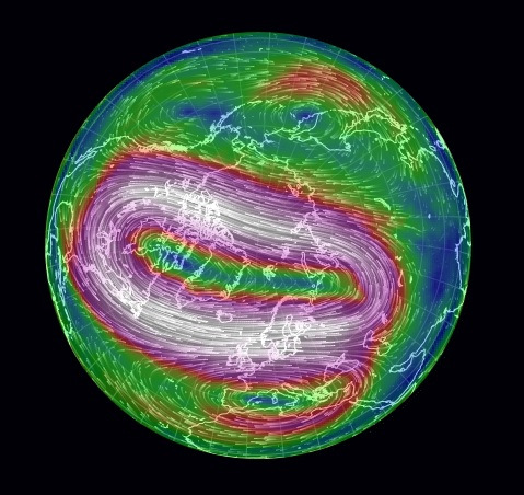
The wonderfully protean animated map of disequilibria in the harmony of stratospheric currents of cold polar air within the jet stream opens breaches across national boundaries, albeit at considerable elevation, and also offers a way of tugging at one atmospheric phenomenon to unpack a web of inter-related phenomena. Unlike maps of habitation or land-surface, the map traces a low-pressure system at high altitudes far above the settled or occupied land, but intersecting with it in ways that conjure a failed ability to contain colder air over the polar regions. (Taking the iconography of weather maps as transparent, the blogosphere has suggested the adoption of charges of circumpolar intoxication.)
The distribution of stratospheric air whose flow is charted in global map as an irregular anomaly of temperatures’ spread, is perhaps most concretely rendered by the iced-over bodies of water it left in our own upper latitudes. The striking freezing over of the Great Lakes, covering some 88% of the lakes’ surface area by mid-February, a greater proportion of seasonal ice-cover than ever registered, and surpassing the 82% record of 1996, according to Caitlin Kennedy of NOAA, which render the striking concentration of ice in frozen lakes a concrete map of the local effects of truly polar weather.
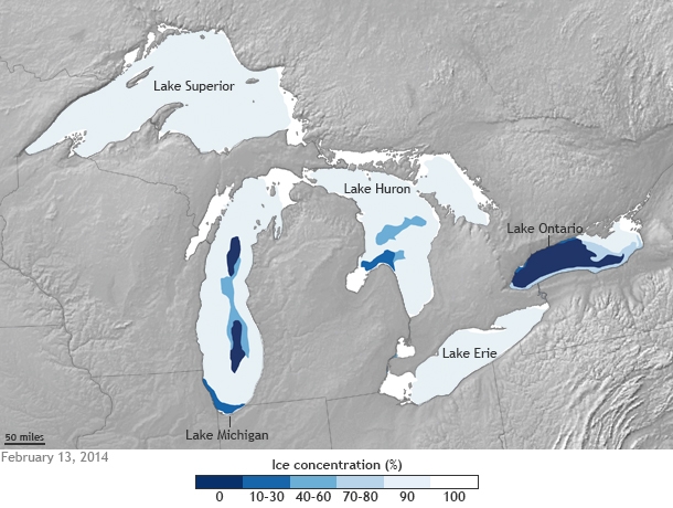
The material manifestation of the cold on the surfaces of those five lakes–all frozen solid, to appearances, save Lake Ontario, seem as concrete a result of the consequences of climactic change one might have in a chart, by placing the ice-covered lakes in a local landscape.
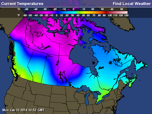
What seemed the displacement of the frigid polar air to the Great Lakes became something like a confusion of the local and the global in the news media that was played out in weather maps. Of course, the meteorological mapping of this winter’s Polar Vortex in Canadian outlets seemed more the status quo, with most of the country facing sub-zero temperatures:
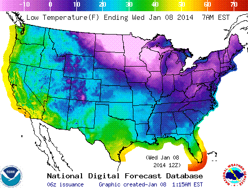
The US “low temperature map” used a slightly different temperature spectrum, but preserved a more alarmist image of anomalous weather conditions even in the National Digital Forecast:
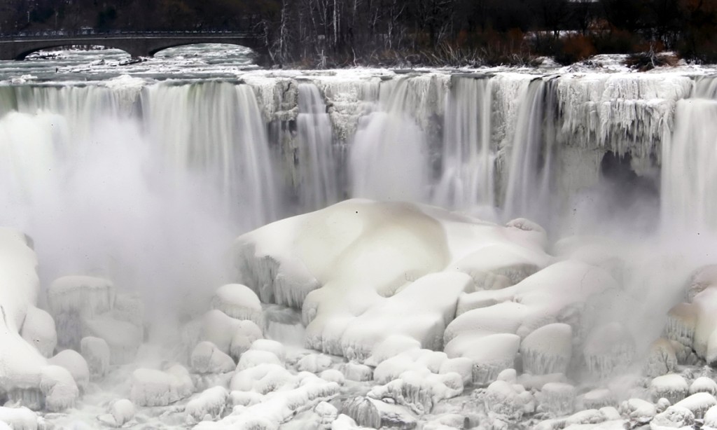
The striking visual by far was from a site located exactly on the US-Canada border, an eye-catching a frozen Niagara Falls, that icon of liminality:
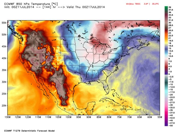
The distributions that charting the mid-July summer chill newly arrived in the Midwest and much of the East coast of the United States from Canada is less striking, even if it will bring dips of twenty to thirty degrees form the normal. NOAA omits Canada completely from its prognostications of the arrival of the coming cold, as befits its role as a national agency, and restricts its purview to United States coastal territories, even though it would make the graphic far more credible to offer a greater coverage. It provides something of a summertime counterpart, however, in which the probability of lower temperatures than usual seem to create a ring about the same lakes, radiating almost to the Atlantic coast:
Where is the center of this new system of cold air? With roots in Hudson Bay–where else?–the polar air will be spinning southwards at the upper levels of the atmosphere, spinning southwards toward the United States. There were past migrations of arctic air over Quebec and Maine, back in late January, 1985:
The Detroit Free Press even seized on a recent NOAA projection of a similar displacement of arctic air, that locates the center of cool air migrated toward Michigan, forming a pool of air that had descended into the central United States, as if to cast the event as something like local news, even as it suggests the rise of two weather systems:
The occurrence isn’t strictly polar, or arctic, in its origin.
But the results are the consequence of a sort of distorting decentralization of the polar cold air outbreak that hovers around the arctic circle, running around the pole and allowing or protecting cold air from drifting south, containing cold air or not it its high altitude low-pressure system. (Of course, the west coast is poised for a dryer and hotter-than-normal week.) The decline of snow and ice around the Pole, combined with the warming of the wobbly gulf stream, will allow the chilly polar air to spill southwards to the plain states, covering not only Canada but spilling outside the low-pressure system and over to the seaboard, in a sort of nervous breakdown of meteorological model behaviors.
The disturbances of equilibria in our weather maps makes it worthy of more than symbolic note. The increasing variability that the waviness of the outer line of the low-pressure system, or jet stream, related to the declining snow cover in the far north, in the a “warm Arctic-cold continents” pattern, where the compact containment of colder airs was broadly breached.
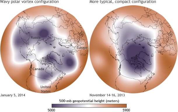
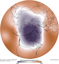
The lack of equilibrium in the stream of polar winds–distinct from the widening polar ozone hole–opens up more of the terrestrial surface to chilling shifts in temperature. As much as the embodying a low-pressure system, the map is a narrative of the disruption of climactic harmony, and view toward the future of weather systems world-wide. The results of the wavy polar vortex, joined with rising world temperatures, create a map of bizarre spottiness in average world temperatures that is difficult to conceive or map, precisely because its high-altitude distribution is difficult to transfer from a spherical to a flat surface, and because its distribution unfairly privileges the tracking of cold air in ways that seem, misleadingly, to fly in the face of the maps of our overheating world. This past January, NOAA crafted a digital globe that displayed the distortion of local temperatures distorted beyond the norm, with cold displaced from its polar resting place, resulting in a cognitively useful modeling of a disjointed jigsaw of cold and warm air, where the warmer deviations of global temperatures spick not only over western Russia and Alaska, but at the polar regions itself.
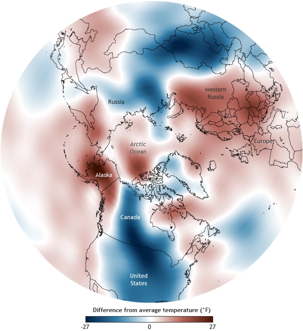 NOAA Climate.gov
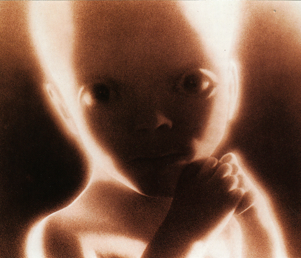
The result is a jigsaw reveals the breaching of cold air from the cap of winds that encircle the polar cap has a enough of touch of biomomorphism to echo ecofeminism; the forcing of warmer air patterns resembles a blurry sonar image of curled-up embryonic twins resting in a womb as if evoking the shape of future weather systems, offering a biomorphic visual metaphor for something like an eery augur of a future holding limited possibilities for an afterlife–and of the unknown future of our planet’s atmosphere.
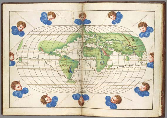
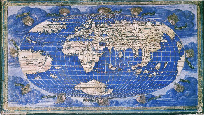
2001