
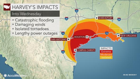
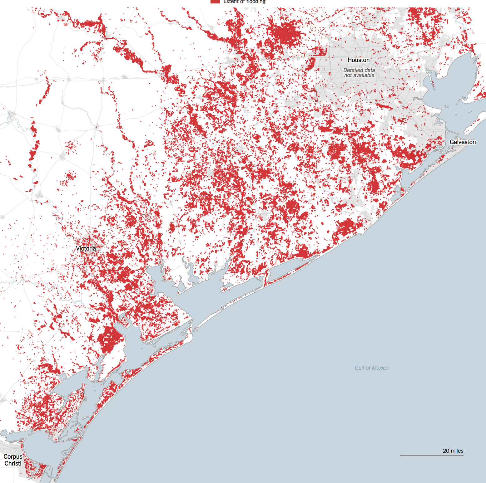
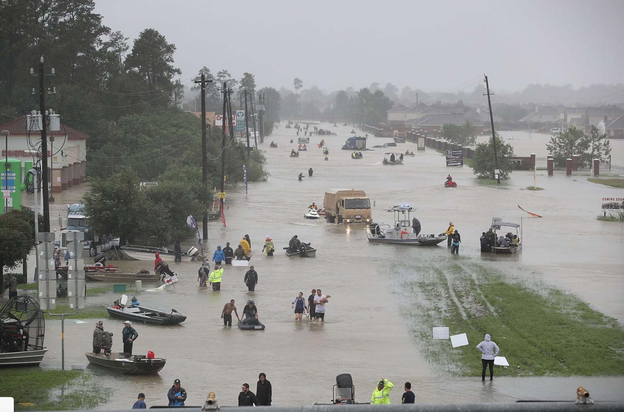
There is almost no trace of the human, or of the extreme overurbanization of the Texas coast, in most of the maps that were created of the extreme flooding and intense winter rains that hit Galveston and Houston TX with the windfall of Hurricane Harvey. While maps serve to orient humans to the world–and orient us to human processes and events in a “human world,” as J.B. Harley and David Woodward put it, the confused nature of relations between the human and natural world, is increasingly in danger of being mipmapped. Data visualizations of extreme weather that erase the modification of coastal environments provide a particularly challenging means of orientation, as news maps are suspended between registering the shock of actual events–and trying to contain the natural emergencies that events of extreme weather create–and the demand for graphics that register natural calamities and the ethics of showing such calamities as “natural”–or even what the category of the natural is in coastal regions that so heavily modified to modify actual weather events.
The ethics of orienting viewers to the rainfall levels that fell in Houston after the landfall Hurricane Harvey Part of the huge difficulties lies in adequately orienting viewers in ways that register a changing natural world–how we are mapping rainfall, for example, or the approach of hurricanes, or are rather mapping the new relation of rain to built surfaces and landcover change that lack permeability for water, facilitating flooding by storms whose potency is changed by the greater atmospheric content of a warming Gulf of Mexico, which the ground cover of Houston, Galveston, and the Texas shore are less able to absorb and return to the Gulf. The area is, itself, something of an epicenter of the increased number of hemispheric tropical cyclones–which demand warm water temperatures above 80 80°F / 27°C and a cooling atmosphere and low wind shear–often led to the Gulf coast.
–those that come ashore at Galveston hit a seashore that is eminently unprepared to accommodate an influx of water that the paved surface has rendered all but impermeable. If the problem of global cyclones that can become hurricanes is truly global–
–the intersection between cyclones and areas of paved ground cover is problematic to the southwestern states, and most of all to Texas, Louisiana, and Florida, where water absorption has been anthropogenically reduced in recent decades. At the same time, few other areas of the inhabited world are so widely “tracked” as the destination of tropical cyclone formation..
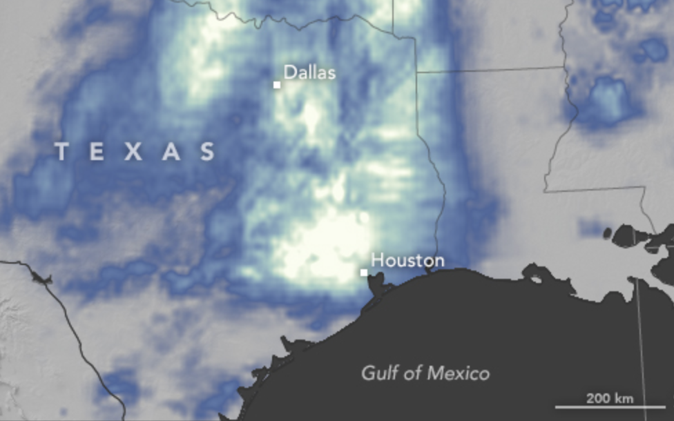
The problem is partly evident in the choice of new color ramps that transcend the rainbow spectrum of measuring the intensity of rainfall in the recent arrival or ground fall of Hurricane Harvey, which condenses the great difficulty of using old cartographical categories and conventions in order to capture or communicate increasingly extreme weather conditions. in an era of climate change. But the cartographic problem goes farther: for it lies in the difficulty of registering the changes in relations f how rain dropped meets the ground, mapping relations between complex processes of warming and atmospheric warmth that lead to greater humidity across the gulf region to ground cover permeability that leaves regions increasingly exposed to flooding.
The relentless logic of data visualizations based on and deriving primarily from remote sensing are striking for rendering less of a human world than the threat of allegedly “natural” processes to that world. Perhaps because of the recent season of extreme weather we have experienced, weather maps may be among the most widely consulted visualizations in our over-mediated world, if they were already widely viewed as the essential forms of orientation. But the pointillist logic of weather maps may fail to orient us well to extreme events as the hurricane that dumped a huge amount of water on overbuilt areas to include the human–or the human world–seem a tacit denial of the role of humans in the complex phenemona of global warming that have, with the warming waters of the Gulf of Mexico and ever-increasing ozone over much of the overbuilt southeastern Texas shore, created a perfect storm for their arrival.
This failure to include this role haunts the limited content of the weather map; including the role of humans in maps of extreme weather events indeed remains among the most important challenges of weather maps and data visualization, with the human experience of the disasters we still call natural. And although the subject is daunting, in the spirit of this blog, we will both look at the communicative dilemmas and difficulties of eye-catching color ramps and their deceptiveness, and poetic difficulties of orienting oneself to shores. For as the disaster of Harvey is depressing, it compels raising questions of the orientation to the shifting shore, around the national epicenter of Galveston, where the landfall of Hurricane Harvey focussed our attention on August 27, 2017–
–and the meaning of place in an saturated shoreline, where the sea is somehow part of the land, and the land-sea divide blurs with a specificity that seems as if it may well be increasingly true in an approaching era of climate change. And as we depend on the ready generation of maps based on remote sensing whose relentless logic is based on points, we risk looking sight of the role of place in determining the relations of rainfall to shoreline in maps of coastal flooding that remove remote observations from the built environment that flooding so drastically changes, challenges and affects, in ways that may elide specificities of place.
At a time when we are having and will be destined to have increased problems in orienting ourselves to our shores through digital maps of rainfall, the unclear shorelines of Galveston sent me to the bearings that a poet of an earlier age took her bearings on the mapped shorelines of the place where she had been born, and how she was struck by a bathymetric map to gauge her personal relation to place, and saw place in how the changing shoreline of the northern Atlantic were mapped in the maritimes, in a retrograde form of print mapping in a time of war. For the way the mapped shore became a means by which Elizabeth Bishop gained bearings on shores through a printed map of coastal bathymetry to access the spatiality of the shore–how “land lies in water” and the blurred relation of land and water that the bathymetric map charts–in an age when the materiality of the map was changing, with the introduction of aerial composite maps from the early 1930s, as the rise of aerial composite maps removed the hand of the mapmaker from the map in an early instance of remote sensing–
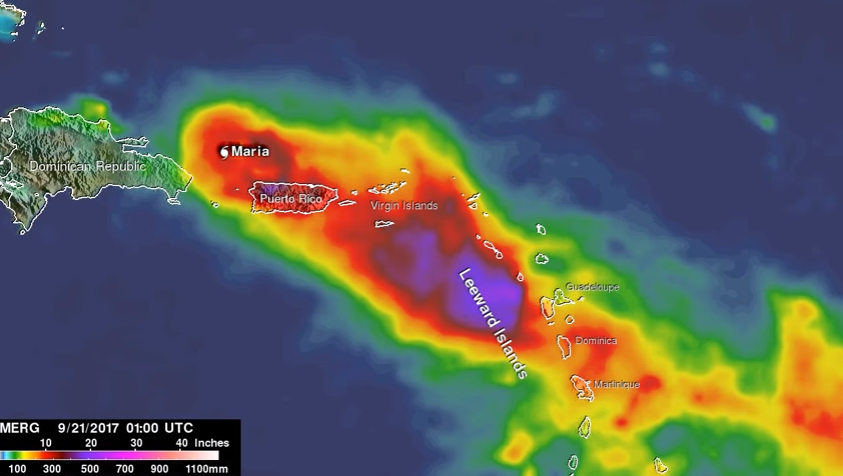
–in a medium of aerial photography that focussed on land to the exclusion of water, and that all but erased the relation between water and shore just a few years after Bishop quickly wrote her poem in Christmas 1935 about coastal “edges” of land and sea. Ryker, who developed techniques of aerial photography used in the mapping of the shores of Puerto Rico for the Fairchild Aerial Camera Company, as well as photographs of the devastating Berkeley Fire of 1923, went into business in 1938–the year of his map–as a map publisher, with a patent for the stereoscope used to interpret aerial imagery, and must have performed the massively detailed mapping of San Francisco in one hundred and sixty for images taken from airplanes from 1937-38 as a sort of calling card, soon after Bishop wrote her poem, before manufacturing a range of stereoscopes of pocket and desktop versions for military ends that were widely used in World War II by the US Army.
Before war broke out, but in ways that anticipated the coming war, the printed bathymetric map must have resonated as a new reflection on the impersonality of the aerial view; Bishop was suddenly struck when she encountered the materiality of a print map on Christmas 1938 as the art of cartography was already changing, responding to the drawn map under glass of the Atlantic as a way to recuperate the personal impact of place. Her poem powerfully examined the logic of drawn maps utterly absent from the digitized space of rainfall maps of a flood plain, deriving from data at the cost of human inhabitation of place–and in envisioning data to come to terms with the catastrophic event of flooding distancing or removing the craft of mapmaking from the observer in dangerously deceptive ways. And so after wrestling with the problems of cartographic representation using remote sensing, while recognizing the value of these readily produced maps of rainfall and the disasters they create,
1. For weather maps are also among the most misleading points to orient oneself to global warming and climate change, as they privilege the individual moment, removed from a broader context of long-term change or the human alteration of landscape. They provide endless fascination by synthesizing an encapsulated view of weather conditions, but also suggest a confounding form of media to orient audiences to long-term change or to the cascading relations of the complex phenomenon of climate change and our relation to the environment, as they privilege a moment in isolation from any broader context, and a sense of nature removed from either landscape modification or human intervention in the environment, in an area were atmospheric warming has shifted sea-surface temperatures. The effects on the coast is presented in data visualizations that trace the hurricane’s “impact” as if its arrival were quite isolated from external events, and from the effects of human habitations on the coast. The image of extreme flooding is recorded as a layer atop a map, removing the catastrophic effects of the flooding from the overpaved land of the megacities of southeastern Texas, and the rapid paving over of local landcover of its shores.
.
Such visualizations preserve a clear line between land and sea, but treat the arrival of the rains on land as isolated from the Consuming such events of global warming in color-spectrum maps. The data of rainfall translate data into somewhat goofy designs represents a deep alienation from the environment, distancing viewers in dangerous ways from the very complexity of global warming that Gulf coast states encountered.
Such data visualizations seem dangerously removed notion of how we have changed our own environment, by describing a notion of “nature” that is immediately legible, as if it were removed from any human trace or of the impact of modification of the land, and by imaging events in isolation from one another–often showing a background in terrain view as if it has no relation to the events that the map describes. Although weather maps and AccuWeather forecasts are sources of continual fascination, and indeed orientation, they are are also among the most confounding media to orient viewers to the world’s rapidly changing climate–and perhaps among the most compromised. For they imply a remove of the viewer from space-and from the man-made nature of the environment or the effects of human activity form the weather systems whose changes we increasingly register. By reifying weather data as a record of an actuality removed from human presence at one place in time, they present a status quo which it is necessary to try to peel off layers, and excavate a deeper dynamic, and indeed excavate the effects of human presence in the landscape or geography that is shown in the map. We are drawn to tracking and interpret visualizations of data from satellite feeds in such weather maps–or by what is known as “remote sensing,” placed at an increased remove from the human habitation of a region, and indeed in a dangerously disembodied manner.
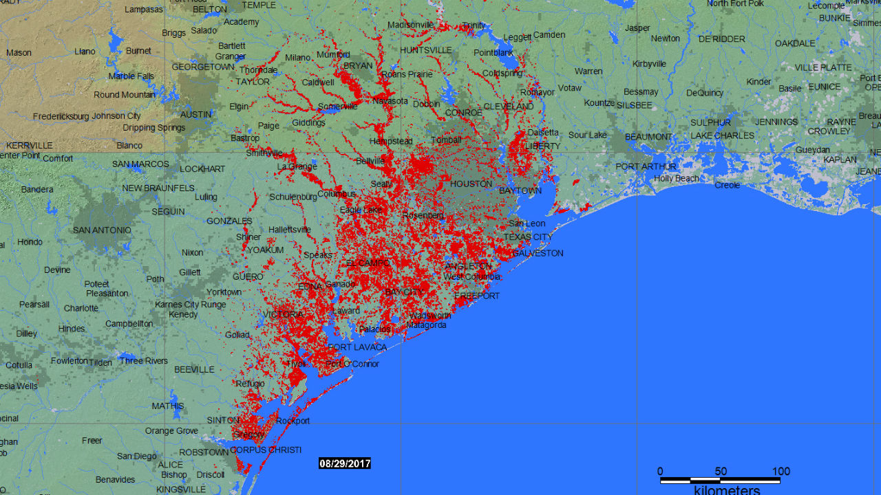
Visualizations resulting from remote observation demand taken as a starting point to be related to from the human remaking of a region’s landscape that has often increasingly left many sites increasingly vulnerable to climate change. But the abstract rendering of their data in isolation from a global picture–or on the ground knowledge of place–may render them quite critically incomplete. The remove of such maps may even suggest a deep sense of alienation form the environment, so removed is the content of the data visualization form human presence, and perhaps from any sense of the ability to change weather-related events, or perceive the devastating nature of their effects on human inhabitants: their stories are about weather, removed form human lives, as they create realities that gain their own identity in images, separate from a man-made world, at a time when weather increasingly intersects with and is changed by human presence. While throwing into relief the areas hit by flooding near to the southeastern Texas shore at multiple scales based on highly accurate geospatial data, much of which is able to be put to useful humanitarian uses–

Dartmouth Flood Observatory/University of Colorado at Boulder, August 29. 2017

–the reduction of floods to data points creates a distorted image of space renders their occurrence distant from the perspective of folks on the ground, and places their content at a considerable remove from the complex causality of a warming Gulf of Mexico, or the problems of flood drainage by which Galveston and Houston were beset. Indeed, the multiple images of that report rainfall as an overlay in a rainbow spectrum, at a remove from the reasons for Houston’s vulnerability to flooding and the limits the region faces of flood control, in broadcast Accuweather images of total rainfall in inches advance a metric that conceals the cognitive remove from the dangers of flooding, ora human relation to the landscape that the hurricane so catastrophically affected. Can we peel under the layers of the data visualization, and create better images that appreciate the human level on which the landscape stands to be devastated by hurricane rains, as much as tracking the intensity of the growth of rainfall over time?
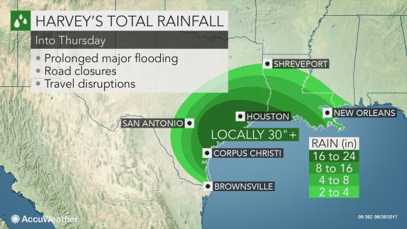
AccuWeather, Rainfall levels by Thursday
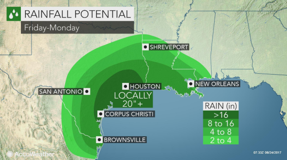
AccuWeather, Friday to Monday
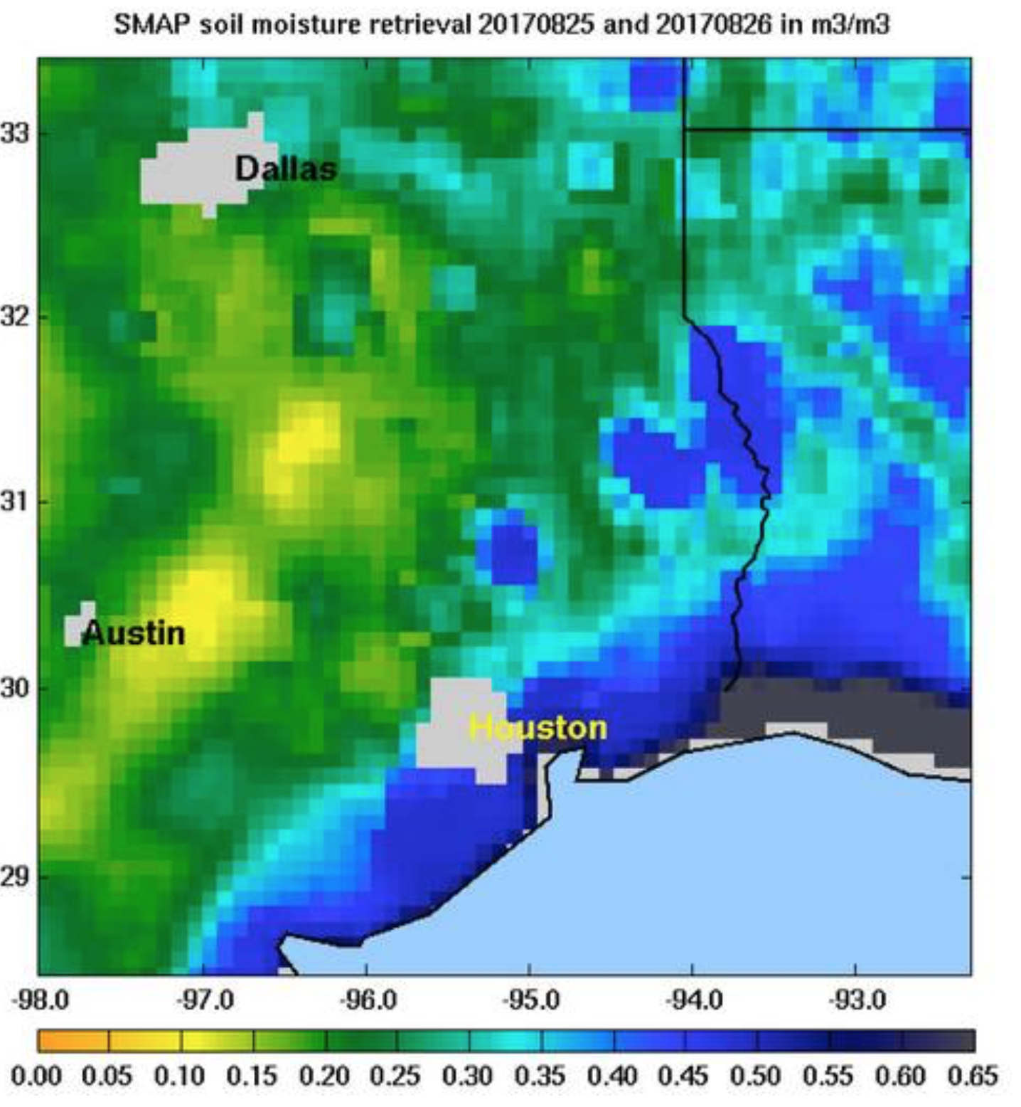
Such layers of green, meant to suggest the intensity of rainfall that fell over land, reveal the concentration of water in areas closes to the Gulf of Mexico. Even the most precise geographical records of the dangers of flooding in the floodplain of southeastern Texas with little reference to the historical modification of the region by inhabitants–

Dartmouth Flood Observatory at University of Colorado, Boulder/August 29, 2017
–and conceal the extent to which the landscape’s limited ground cover permeability has left the region far more susceptible to flooding, and elevated the risks of the emergency. The problem of reading any signs of human presence into these “images” of precipitation provoke problems of disentangling remote sensing data from knowledge of the region’s recent urban growth and the consequent shift in local landcover.
The perspective of our relation to these events is often as fleeting and as existential as they flood us with data, which we viewers have little perspective or tools to process fully. The onrush of recent remote sensing maps batter us with an array of data, so much as to lead many to throw up their hands at their coherence. Even as we are still trying to calculate the intensity of damages in Puerto Rico–where electricity is so slowly returning that even even after four months, almost a third of its 1.5 million electricity customers still lack power–and the cost of fires in southern California. We look at maps, hoping to piece together evidence of extensive collateral damage of global warming. Yet we’ve still to come to terms with the intensity of rainstorms that hit southeastern Texas–deluging the coast with rainfall surpassing the standard meteorological chromatic scale that so misleadingly seems to offer a transparent record of the catastrophe, but omits and masks the experiences of people on the ground, digesting swaths of remotely sensed data that take the place of their perception and experience, and offering little critical perspective on the hurricane’s origin.
The rapidity with which rain challenged ground cover permeability provides both a challenge for mapping as a symptom of global warming and landscape modification: the mapping of “natural” levels of rainfall blurs the pressing problem of how shifting landcover has created an impermeability to heightened rains, and indeed how the new patterns of habitation challenge the ability of the coast of the Gulf of Mexico to absorb the prospect of increased rain in the face of decreasing groundcover permeability, and the extreme modification of the coastline that increasingly impeded run-off to the Gulf.
2. Across much of southeastern Texas, a region whose growth was fed by the hopes of employment in extractive industries, real estate demand and over-paving have unfortunately intersected with extreme weather in southeastern Texas in ways which dat visualizations have had trouble exposing, but which raise a curtain on the coming crises of a failure of ability to accommodate increased levels of rainfall If the lack of precedent for the intense rainfall in Galveston Bay generated debate about introducing a new color that went beyond the rainbow scale employed in weather charts, what seemed a problem of the cartographic color-spectrum suggested a problem of governability and indeed government response to extreme weather conditions. How to register the dangers of rainfall that goes of the scale or standards of measurement?
One must consider how to orient viewers to the intensity of consequent flooding, and to its consequences and better prepare ourselves for the arrival of deluging rains without falling back on the over-freighted metaphor of rains of biblical scope. How many more hurricanes of increasing intensity can continue to pound the shores, by whipping precipitation from increasingly warming waters and humid air? The cumulative pounding of tropical cyclones in the Gulf stands to create a significantly larger proportion of lands lying underwater–temporarily submerged lands–with radically reduced possibilities of drainage, as hurricanes carry increased amounts of evaporated water from the humid air of the warming gulf across its increasingly overbuilt shores. in ways that have changed how the many tropical cyclones that have crossed the land-sea threshold since NOAA began tracking their transit (in 1851) poses a new threat to the southeastern coast of Texas, and will force us to map the shifting relation between land and water not only in terms of the arrival of hurricanes, or cyclonic storms–

–but the ability of an increasingly overbuilt landscape to lie underwater as the quantity of the Gulf coast rainfall stands to grow, overwhelming the overbuilt nature of the coast.
Most maps that chart the arrival and impact of hurricanes seem a form of climate denial, as much as they account for climate change, locating the hurricanes as aggressive forces outside the climate, against a said backdrop of blue seas, as if they are the disconnect. Months after the hurricane season ended, the damage for hurricanes caused have hardly been assessed in what has been one of the most costly and greatest storm damage since 1980 in the United States,–including the year of Hurricane Katrina–we have only begun to sense the damage of extreme weather stands to bring to the national infrastructure. The comparison to the costs of storm damage in previous years were not even close.
But distracted by the immediacy of data visualizations, and impressed by the urgency of the immediate, we risk being increasingly unable to synthesize the broader patterns of increased sea surface temperatures and hurricane generations, or the relations between extremely destructive weather events, overwhelmed by the excessive destruction of each, and distracted from raising questions about the extremely poor preparation of most overbuilt regions for their arrival, and indeed the extent to which regional over-building that did not take the possibility of extreme weather into account–paving large areas without adequate drainage structures or any areas of arable land–left inhabitants more vulnerable to intense rains. For in expanding the image of the city without bounds, elasticity, or margins for sea-level rise, the increasingly brittle cityscapes of Galveston and much of the southeastern Texas shoreline were left incredibly unprepared for the arrival of hurricanes or intense rains. Despite the buzz of an increased density of hurricanes to have hit the region,
the questions of how to absorb hurricanes of the future, and to absorb the increased probability of rainfall from hurricanes in the Gulf of Mexico and its shores, suggests questions of risk, danger, and preparation that we have no ability to map. What, indeed, occurs, as hurricanes themselves destroy the very means of transmitting on the ground information and sensing weather, and we rely exclusively on remote sensing?
To characterize or bracket these phenomena as “natural” is, of course, to overlook complex interaction between extreme weather patterns and our increasingly overbuilt environments that have both transformed the nature of the Southeastern Texas coast and have made the region both an area of huge economic growth over time, and have paved over much of the floodplain–as well as elevated the potential risks that are associated with coastal flooding in the Gulf Coast. To be sure, any discussion of the Gulf of Mexico must begin from the increasingly unclear nature of much of our infrastructure across land and sea, evident in the range of pipelines of gas and oil that snake along a once more clearly defined shore charted by ProPublica in 2012, revealed the scope of the manmade environment that has both changed the relation of the coastal communities to the Gulf of Mexico, and has been such a huge spur to ground cover change.
The expansive armature of lines that snake from the region across the nation–
ProPublica, Pipeline Safety Tracker/Hazardous liquid pipelines are noted in red; gas in blue
-and whose tangle of oil pipelines that extend from the very site of Galveston to the Louisiana coast is almost unable to be defined as “offshore” save as a fiction, so highly constructed is much of the national waters in submerged lands in the Gulf of Mexico–
ProPublica, Pipeline Safety Tracker/Hazardous liquid pipelines are noted in red
They indeed seem something of an extension of the land, and a redefinition of the shore, and reveal a huge investment of the offshore extractive industries that stand to change much of the risk that hurricanes pose to the region, as well as the complex relation of our energy industries to the warming seas. Yet weather maps, ostensibly made for the public good, rarely reveal the overbuilt nature of these submerged lands or of the Gulf’s waters.
Despite the dangers that such an extensive network of hazardous liquid lines along the Gulf of Mexico, the confusion between mapping a defined line between land and water, and visualizing relations of extreme weather disturbances as hurricanes in the Gulf of Mexico and local infrastructure haunts the extremely thin nature of the sort of data visualizations that are generated about the dangers of hurricanes and their landfall in the region. For all too often, they presume a stable land/sea divide, removed from the experience of inhabitants of the region and how we have remade the shore.
3. How can we better integrate both a human perspective on weather changes, and the role of human-caused conditions in maps of extreme weather? How can we do better by going beneath the data visualizations of record-breaking rainfall, to map the human impact of such storms? How could we do better to chart the infrastructural stresses and the extent to which we are ill-prepared for such extreme weather systems whose impact multiplies because of the increased impermeability of the land, unable to absorb excessive rainfall, and beds of lakes and reservoirs that cannot accommodate increased accumulation of rainfall that stand to become the new normal? The current spate of news maps that provoke panic by visualizing the extremes of individual cases may only inspire a sort of data vis-induced ADD, distracting from infrastructural inadequacies to the effects of global warming–and leaving us at a loss to guarantee the best structures of governability and environmental readiness.
Indeed, the absence of accurately mapping the impact and relation between landcover, storm intensity, rainfall, flooding, and drainage abilities increases the dangers of lack of good governance. There need not be any need for a reminder of how quickly inadequate mapping of coastal disasters turns into an emblem of bad governance. There is the danger that, overwhelmed by the existential relation to each storm, we fail to put them together with one another; compelled to follow patterns of extreme weather, we risk being distracted from not only the costs but the human-generated nature of such shifts in seasons between extremes of hot and cold. For as we focus on each event, we fail to integrate a more persuasive image of how rising temperatures stand to create an ever-shifting relation between water and land.
Provoked by the rhetoric of emergency, we may need to learn to distance ourselves better from the aerial views that synthesize intense precipitation, tally hurricane impacts, or snowfall levels, and view them less as individual “strikes” or events and better orient ourselves to a broader picture which put us in a less existential relation to extreme weather.
The Weather Channel
We surely need to establish distance to process syntheses of data in staggering aerial views on cloud swirl, intense precipitation, and snowfall, and work to peel back their striking colors and bright shades of rainbow spectra, to force ourselves to focus not only on their human costs, or their costs of human life, but their relation to a warming planet, and the role of extreme of weather in a rapidly changing global climate, as much as track the “direct strikes” of hurricanes of individual names, as if they were marauders of our shores: their creation is as much tied to the changing nature of our shores and warming sea-surface temperatures, and in trying to create a striking visualization, we deprive ourselves from detecting broader patterns offering better purchase on weather changes.
The Weather Channel
If patterns of weather maps epitomized by Accuweather forecast and projections suggest an exhilaratingly Apollonian view on global and regional weather patterns, they also shift attention form a broader human perspective in quite deeply pernicious ways. Such maps provided the only format for grasping the impact of what happened as the hurricane made landfall, but provided little sense of the scale of inundations that shifted, blurred and threatened the coast of the Gulf of Mexico. They provide a format for viewing floods that are disjoined from victims, and seem to naturalize the quite unnatural occurrence of extreme weather systems. Given the huge interest in grasping the transformation of Hurricane Harvey from a tropical storm to a Category Four hurricane, and the huge impact a spate of Category Four hurricanes have created in the Gulf of Mexico, it’s no surprise that the adequacy of the maps of Hurricane Harvey have been interrogated as hieroglyphs or runes of a huge weather change: we sift through them for a human story which often left opaque behind bright neon overlays, whose intensity offer only an inkling of a personal perspective of the space or scale of their destruction on the ground: while data maps provide a snapshot of the intensity of rain-levels or wind strength at specific sites, it is difficult if important to remember that their concentration on sites provide a limited picture of causation or complexity.
All too often, such maps fail to offer an adequately coherent image of disasters and their consequences, and indeed to parse the human contributions to their occurrence. This post might be defined into multiple subsections. The first actions suggest the problems of mapping hurricanes in the Gulf of Mexico in relation to flooding in data visualizations of the weather and the overbuilt region; the middle of the post turns to an earlier poetic model for considering the relation between land and sea that visualizations all too easily obscure, and the meaning that the poet Elizabeth Bishop found in viewing relations between land and sea in a printed map of the Atlantic; after returning to the question of the overbuilt shore compounds problems of visualizing the Texas coast, the final section, perhaps its most provocative, returns to Bishop’s reading of a map of the Atlantic coast.
What such new weather maps would look like is a huge concern. Indeed, as we depend on weather maps to orient us to place ourselves in the inter-relations of climate change, sea-level, surface temperatures, and rain, whether maps cease to orient us to place, but when best constructed help to describe the changing texture of weather patterns in ways that can help familiarize us not only to weather conditions, but needed responses to climate change. For three months after the hurricanes of the Gulf of Mexico caused such destruction and panic on the ground, it is striking not only that few funds have arrived to cover costs of rebuilding or insurance claims, but the judgement or understanding of the chances for future flooding have almost left our radar–perhaps pushed rightly aside by the firestorms of northern and southern California, but in ways that troublingly seem to forget to assess or fail to assess the extent of floods and groundwater impermeability along the Texas and Louisiana coast. The problems that preparation for future coastal hurricanes off the Gulf of Mexico raise problems of hurricane control and disaster response that seem linked to problems of mapping their arrival–amd framing the response to the increasing rains that are dumped along the entire Gulf Coast.

Indeed, the chromatic foregrounding of place in such rainbow color ramps based on GPS obscure other maps. Satellite data of rainfall are removed from local conditions, and serve to help erase complex relations between land and water or the experience of flooding on the ground–by suggesting a clear border between land and sea, and indeed mapping the Gulf of Mexico as a surface as if it were unrelated to the increased flooding around Houston, in maps prepared from satellite imagery, despite the uneasy echoes of anthropogenic causes for the arrival of ten hurricanes in ten weeks, in ways that suggest how warming waters contributed to the extreme inundation of the Gulf Coast. Despite NOAA predictions of a 45% likelihood of ‘above-normal’ activity for the 2017 Atlantic hurricane season, with, a 70% likelihood of storms that could transform into hurricanes, the images of inundated lands seem both apocalyptic and carefully removed from the anthropogenic changes either to the ocean or land that intensified their occurrence so dramatically on the ground.
Dartmouth Flood Observatory/August 29, 2017
Is it possible to recuperate the loss of individual experience in such data maps, or at least acknowledge their limitations as records of the complexity of a changing climate and the consequences of more frequent storm surges and such inundations of rainfall? As we seek better to understand the disaster relief efforts through real-time maps of effects of Hurricane Harvey as it moved inland from the Gulf of Mexico, shifting from Category 4 Hurricane from a tropical storm, we tried to grasp levels of rainfall that spun out of 115-mile-an-hour winds across southeastern Texas that damaged crops, flooded fields, ruined houses, and submerged cars, we scan stories in hope of clues to assess our position in relation to increasingly dangerous weather systems whose occurrence they may well forebode. At a time of increased attention to extreme weather has long developed, the gross negligence of climate change denial is increasingly evident: it recalls the earlier denial of any relation between hurricanes and climate change, when increased hurricanes were cast as “the cycle of nature,” rather than as consequences whose effects have in fact been broadly intensified by human activity.
Current attempts to map the toll of record-smashing hurricanes focused almost exclusively on point-based data view rainstorms largely as land-based records; even as they intend to monitor the effects of Harvey’s landfall by microwave censors, they risk seeming to isolate real-time rainfall levels from the mechanics warmer air and sea-surface temperatures which result from human-caused global warming, not relating increased storm surges or inundations to achanges in coastal environments or climate change. To render such changes as natural–or only land-based–is irresponsible in an age of reckless levels of climate denial. Indeed, faced by the proliferation of data visualizations, part of the journalistic difficulty or quandary is to integrate humanistic or individual perspectives on the arrival of storms, rendered in stark colors in the increasingly curtailed ecosystems of newsrooms which seek simplified visualizations of satellite data on the disaster, which fail to note the human contributions to the travails that are often reserved for photographs, which increasingly afford opportunities of disaster tourism in the news, emphasizing the spectator’s position before disasters, by images that underscore the difficulties in processing or interpreting the proliferation of data from MODIS satellite feeds: we can show the ability to measure the arrival of torrential rains, but in offering few legends, save the date and scale, but offering few keys o interpret the scale of the disaster.
The looming portent of human-made climate change, however, underlies the poor predictions that NOAA offered of perhaps 2-4 major hurricanes this Spring, and the lack of a new director for NOAA–on which local and state agencies depend to monitor the nations shores and fisheries–suggested the, from June to September, which left states on their own to make decisions and plan for disaster mitigation programs and better flood maps. (The danger of appointing a newly nominated director, Barry Myers, who is a strong supporter of the privitization of weather maps and an executive at the private Accuweather mapping service, suggests the difficulty of determining the public-private divide in an era of neoliberalism, and a free market of weather maps that were once seen as central to national security and standards of safety.) There are two hidden scales on which we read these opaque maps of global warming and globalization and local inundation are triply frustrating. For all the precision and data richness of such point-maps of largely land-based rainfall, local temperature, or flooding, the biases of such instantaneous measurements seem to fit our current governing atmosphere of climate change denial, and dangerous in erasing how such storms are informed by long-term consequences of man-made climate change. (As the mapping tools of coastal weather seem destined to change, what sort of change in direction for NOAA coastal maps do we want: the appointment suggests the terrifying possibility of a return to the Bush-era proposal nominee Myers supported that prohibiting the agency from producing any maps already available in the private sector then threatened federal weather lines to go dark–lest they literally compete with ad-supported websites private providers–and shift federal information offline?)
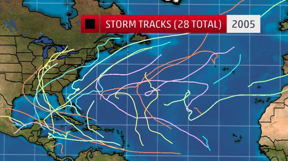
For making moves toward the future readability of weather maps may well be at stake in critically important ways. The 2005 proposal that Myers backed would have eliminated the National Weather Service, even while exempting those forecasts needed to preserve “life and property,” would in essence have returned the weather services to a pre-internet era, even as the most active hurricane season including a record breaking fifteen hurricanes and twenty-eight storms began in the gulf coast, including the infamous hurricane Katrina. The proposed bill would have prevented NOAA from posting open data, and not only readily available to researchers and policymakers, in ad-free formats, free of popup screens, but allow them to make their own maps on the fly–ending good practices of posting climate data would work quite dangersously to prevent development of tools of data visualization outside commercial models of rendering storms and hurricanes as if environmentally isolated.
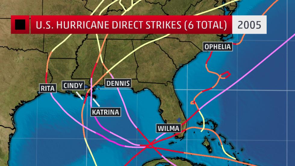
A deeper problem of providing such limited weather maps of tropical storms may be the subtexts about the relation of human causes to weather they convey, and the absence of a greater narrative of the transformation of a global ecology or of the ecology of the Gulf Coast. The curtailed images of “nature” they present by symbolizing rains, winds, floods, or submerged regions in appealing hues as natural–raise questions of the odd simplicity of the absent storylines: cheery colors erase or bracket complex questions of climate change, the human contribution to extreme weather events, or the human experience of suffering on the ground: Rita, Cindy, Katrina, Dennis, and Wilma seem not part of the environment, epiphenomenal interlopers moving across a static deep blue sea, in an apparent dumbing down of the mechanics of hurricane or storm formation in a rainbow spectrum removed from a human-made environment.
Visualizations of the rainfall of Hurricane Harvey similarly compress a massive amount of data into elegant chromatic images, but focus attention on the levels of inundation that overwhelmed the gulf coast in ways that the land could not absorb, drain, or adequately process, they ignore critical pieces of the picture of Harvey’s landfall, from the unprecedented ocean heat just days before Harvey made landfall near Galveston–
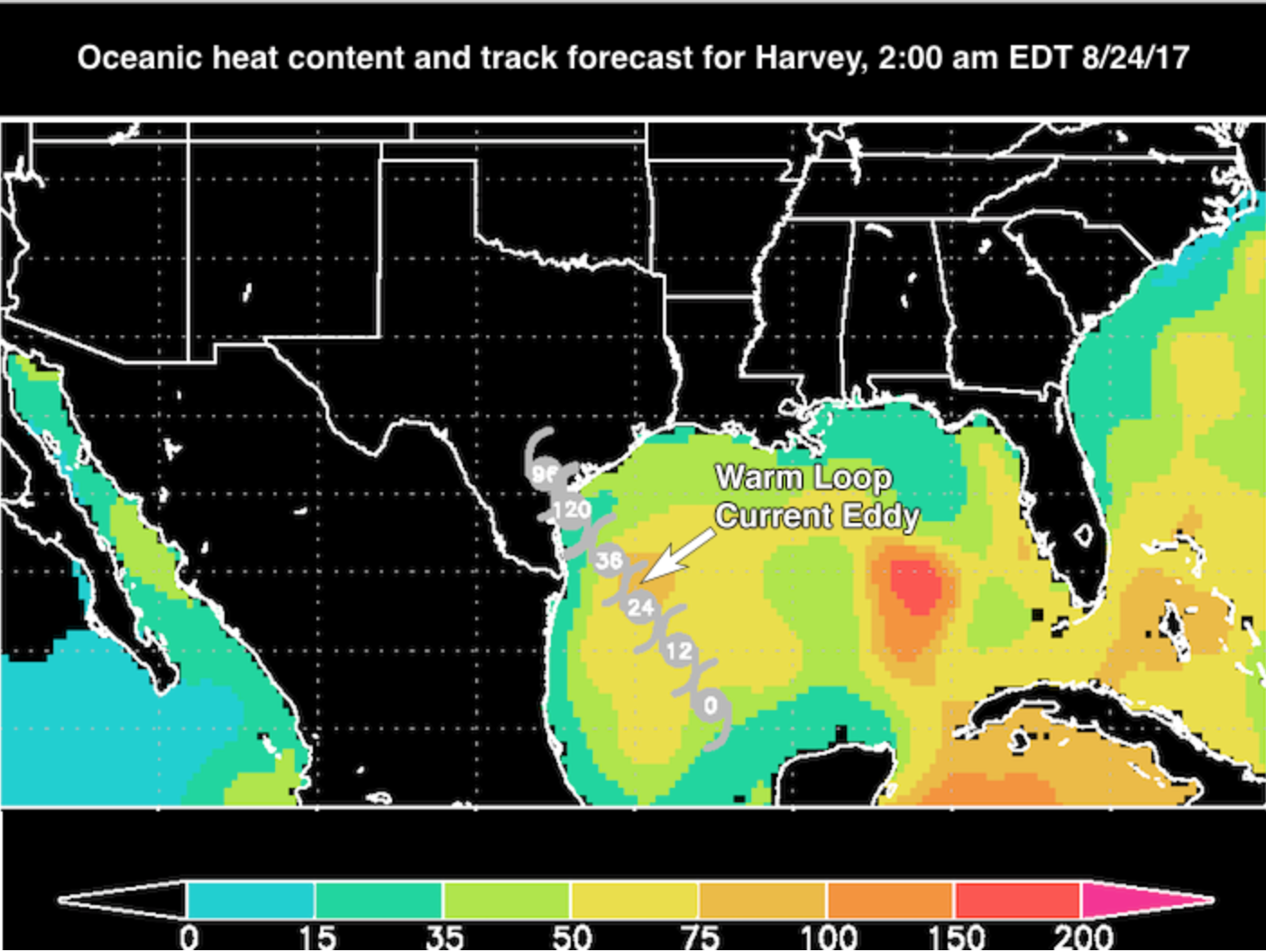
Weather Underground/RAMMB @ CSU/CIRA
–to the surprisingly warm patches of the Gulf of Mexico across which Harvey crossed as it rapidly grew in size–
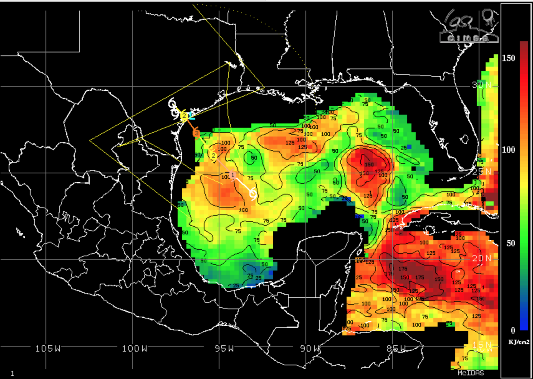
University of Wisconsin-Madison-CIMSS Satellite Blog
–as we treat the ferocity of southeastern Texas’ inundation by rainfall as an isolated question of the extreme amount of rain that arrived on land and sea by mapping the amount of rainfall we can register at a place in isolation from a broader picture, rather than contextualizing the intensity of rainfall within the causation of the Category Four hurricane, or mapping the failure to accommodate such extraordinary levels of rainfall, which have been argued to justify to create a need for seawalls or dikes to preserve the cartographical division between land and sea, to prevent the danger of surge flooding, rather than the new weather patterns that this hurricane season has inaugurated.
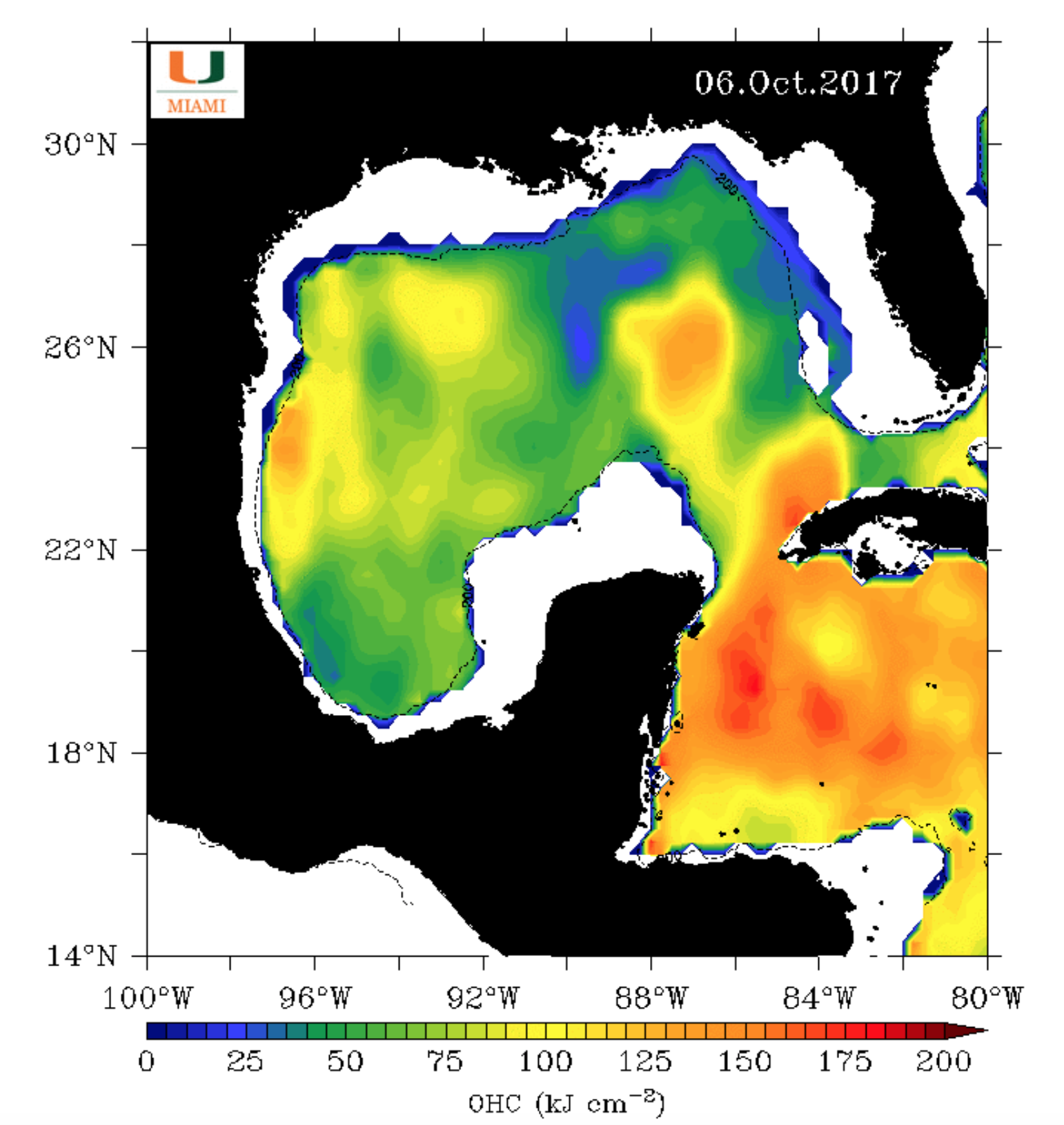
Ocean heat content in western Caribbean and Gulf of Mexico on October 6 (U Miami)/WaPo
5. We are perhaps conditioned to be mesmerized by readily generated weather maps that convert satellite observations of rainfall to reveal unprecedented weather patterns–but are slow to take stock of the mechanics of the dramatically changing nature of a hurricane season in which Category Four hurricanes are making landfall in the United States that in any other, even as their occurrence challenges scales of measurement and putting new stresses on disaster preparedness. The busiest recored season of hurricanes and the simplicity of the ways that we map their transformation and landfall raises compelling questions of how to best map weather maps and coastal surges in an era of climate change–and how to represent the increasingly destructive potential of tropical storms, cyclones, or hurricanes without succumbing to climate denial.
Whereas point-based visualizations suggest the ability to track rainfall, wind velocity, or the path of hurricanes over time, their limits must be acknowledged as presenting a sufficiently dynamic or situated picture of the increased sensitivity of populated coasts to extreme weather, to better grasp the intensified acceleration, or accumulated cyclone energy, which for 2017 is already, in mid-October, twice the average of previous seasons, as warming waters generate more intense storms–but are omitted from their landfall, as if we desire to curtail the abilities we have to better map. While the current NOAA nominee insisted quite adamantly that “we don’t have enough data [yet]” to attribute these changes to climate change, noting the potential influence of other cyclical changes in water temperature, and a northward retreat of Atlantic high pressure systems, yet the probability for hurricane increase across the board with higher water temperature and an expansion of warm waters–increasing the humidity of the storms–that it is the ethical responsibility of the cartographer to capture, even if it is blanched from MODIS data or most visualizations that render the “sites” of hurricane landfall in isolation.
It may be that the time-sensitive nature of the rich data in weather maps focus attention on the present moment with such immediacy to makes it increasingly difficult to move from such real-time records to devote attention to evaluating deeper long-term changes in weather systems–or indeed consider weather patterns as natural, and removed from man-made changes in coastal environments or carbon emissions.
The question of how we are best able to read and process the proliferating maps of hurricanes and rainfall extends beyond tracking any single weather system, to the stories maps tell about hurricanes and their landfall, and the new age of weather that they may both announce and exemplify. Do the color saturated data visualizations that have burned Harvey in our collective retinas and memories herald a new age of weather maps, as much as the actual record-setting levels of rainfall Harvey brought? The complex cognitive relation to the these maps may be part of the problem, as is the levels of meaning that we try to read into them, not only in the rainbow-spectrum images of rainfall levels, but the difficulty of assembling a coherent picture of them. We need to more clearly relate that picture to a landscape mark by human intervention and to man-made climate change–moving from datasets mediating select points in space, to an ability to assemble their coherence or better appreciate their specific context and the scope of the natural disaster. Despite clear limitations inherent in point-based data visualizations, we need to peel away the constraints of overlays to better discern the hidden mechanics of storm surges and their consequences.
For where their sense of continuity lies is as opaque of the sort of causality we might be able to be attached to them: they place us in an existential relation to datasets, and erase human subjects. Although rich with information, the proliferation of weather maps of literally off-the-charts rainfall levels raised eyebrows far outside the communities of limnologists, hurricane experts, and meteorologists, as the constant production of datamaps for the micro-economy of newsrooms seemed particularly disjunctive with a coherent narrative, and hinted at more apocalyptic visions by not clearly mapping onto experience and all but erased humans by creating a narrative about extreme weather, if not of nature out of whack. Even as Hurricane Harvey was three miles south of Corpus Christi, it was feared to be a Category Three hurricane–bringing three feet of rainfall!–as it shifted from a tropical storm to a Hurricane long before it reached Houston.
But to read such instantaneous maps as a model for coastal stewardship or disaster response, we need to attend to how the city’s man-made landscape has changed, sinking due to long-term soil subsidence with increased water withdrawal created sinkholes increasingly deformed the surface of the low-lying city that would themselves soon flood, their extreme subsidence acting as a multiplier a multiplier of the intensity of flooding around the greater Houston area that was not recorded in rainfall charts, but that was in large part determined by the impermeability of the landcover, from the concrete banks of bayou to the absence of wetlands by the bay.
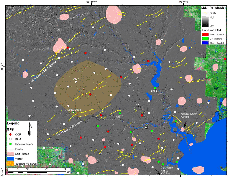
LIDAR Hillshade map of Houston/Dr. Shuhab Khan, 2012
–at the same time as much local and regional landcover alike dramatically lost absorptive qualities, especially in proximity to the shore, as well as map the consequences of changes in ocean and air temperature to the acceleration of hurricanes.
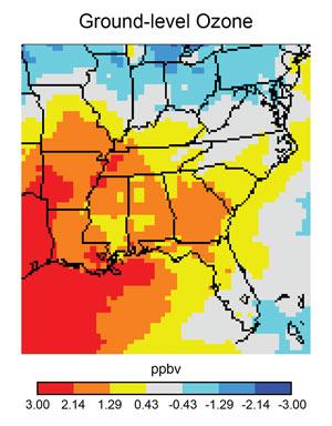
6. The result is a cognitive disconnect in maps that impressed viewers by their intense colors, but seemed The maps elicit fears that they eerily prefigure a landscape marked and shaped by the regular escalation of hurricanes growing rapidly before landfall that go on to drop unprecedented rains–and raise questions of whether new weather systems can be meaningfully measured against gauge-readings of rainfall or stream flow from earlier times. Indeed, the potential of a tipping point in the extent of coastal hurricanes is suggested by the multiplier effects of global warming on the peaking of the intensity of Gulf Coast weather. To be accurate, instead of continuing to map the separateness of the land from the sea–and anxieties of the relation of land to the sea in an era of climate change–we may be better off mapping the impermeability of local surfaces, the erosion of coastal offshore islands that buffered storms, the presence of clouds of ozone, and the consequences of the rising surface water temperature of the Gulf of Mexico.
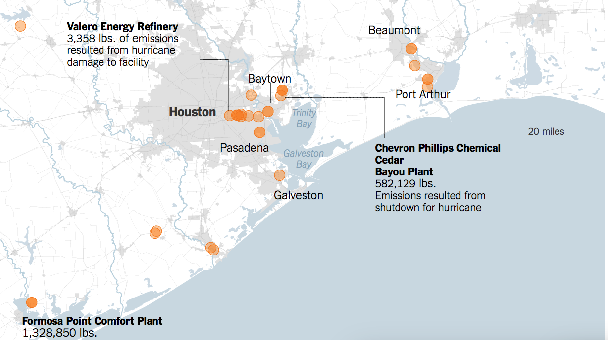
The information relayed in these images overwhelmingly privilege point data–rather than communicate a continuous landscape of assistance in environmental governance or a policy of monitoring coastal protection over the long-term. They pose questions for the management of the shoreline, as a result, not even taking into account the many chemical plants and refiners that are crowded along the Trinity Bay, Galveston Bay, and Port Arthur, whose spillage poses increased risk during flood that governments would not be able to manage or coordinate with the intensity they deserve: the problem of not mapping such contextual information lies in the deeply superficial information contained in the rainfall maps calculated by government services and relayed to news rooms where they pass as news, replacing ruined crops, flooded residences, and toxic waste flows by a rainbow.
COOS/Jeffrey Paine (2007)
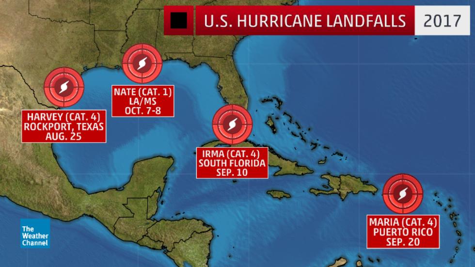
For whatever reasons, the failure to be able to forecast the arrival of Hurricane Harvey, until the day before it made landfall–with the storm being a “tropical depression” as late as the evening of Thursday, August 24. The lack of predictability or of an accurate forecast–although the site of landfall near and the wind velocity of Harvey were forecast immediately before it reached Rockport TX, on August 27, and the rise of its velocity and classification from a Category 1 to Category 5. The speed of the transformation mirrors how Hurricane Maria quickly intensified from a Category 1 storm to a Category 5 over fifteen hours, its winds reaching speeds of 160 mph, has already led to six Category Five hurricanes making landfall in 2017, Irma and Harvey both making landfall in the US as Category Four Hurricanes. And even as one is shocked by the sudden impact and uneven predictive powers of maps of hurricanes to drench much of the coastal United States–
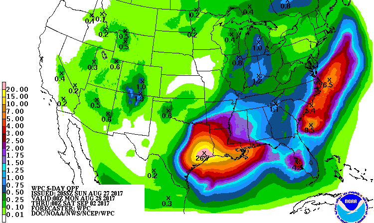
Five Day Precipitation Forecast (NOAA/NWS/WPC)
–one is stuck by a need for mapping the growing proximity or intimacy between land and sea, and the dangers of the settled regions of the shore in an era of increased fluidity of land-sea divides, and the difficulty of developing a more humanistic perspective on the data map.
Data is designed by men–if it is meant to distill nature, as a rainbow spectrum implies. The poetics of mapping that can be more sensitive to this human perspective must try to record the relation of the human to the monolithic mechanisms of the anthropocene, by locating the human creation of place within the layers of intense precipitation of such striking weather maps. Before the opaque layers that blur land and water, one thinks of the engaged way Elizabeth Bishop interrogated the same formal divide between land and sea of a framed map of the northern Atlantic in 1934; the need to map “land under water” and the ways “mapped waters” adequately rests on the ways that water, whose waves “lend the land their conformation”–shaping its structure and organization–and will continue to do so with the arrival of future storms: Bishop described an engraved map, but her reflection on the poetics of the coastal map occasioned this post. For the sorts of claims of providing an exact and accurate record of the landscape of the ocean contrast to a cartographical epistemology that is not rooted in seeing space, and erases any clear subjective relation to their cartographical space.
For these reasons, and many others, the deeply personal history that Elizabeth Bishop brought to reading that map–not explicit, to be sure, but evident in the impact of the coast of Nova Scotia and New Brunswick she knew so well, and felt so far removed from in New York on that Christmas of 1934, as she used its limited tools of world-making to place herself in relation to its making of a palpable space, contrast to the resolute objectivity of the rainbow color ramps of hurricane maps that register measurements in ways that are so oddly alienated from on-the-ground experience. While Bishop remade the map’s world, stripping it of measure, direction, and national divides, to reshape its signifying power, by using it as a basis for her own sense of literary form and to describe the world it creates, investigating its surface as a sharp-eyed observer, considering its contents without interest in its legend, but looking beneath the constructed nature of its form in an experience of map-reading that questions accepted conventions.
If Bishop is said to read the map before which she stood or sat as a poem, focussing on imagistic elements of its shorelines, tidal basins, or the outlines of peninsulas and landmasses, it could be argued that her engagement of the cartographical details in the engraved map–the crowded eastern bathymetry on the ledges, green layers of land underneath the sea that seem to lift it, or the sand bars on its shore: was the active role of the elegance of the map’s design and cartographer’s colors as important as Bishop’s own sense of place in triggering her reaction to it’s surface, and the close proximity she implied–intimacy, for some readers–the land had to the sea? Lastly, the deep meaning that Bishop responded to the map’s surface and conventions as a record of world-making to which she so successfully relates to her own life and sense of time that leave the present-focussed measurements of hurricane maps particularly impoverished.

The map combines relatively recent coastal geodetic surveys with a quite delicately hued bathymetry, that quite lovingly rendered an otherwise hidden marine landscape. Bishop seized on how the colors, forms, and shades of the map foreground complex questions of the relation between land and sea in ways that seem to bear on the expressive nature of data visualizations today: while her deeply emotional relation to the map’s surface is intensely personal in nature, the personal levels of depth that she imparts to its surface reminds us of the need to unpack the presence of humans in data visualizations and the human impact they describe.
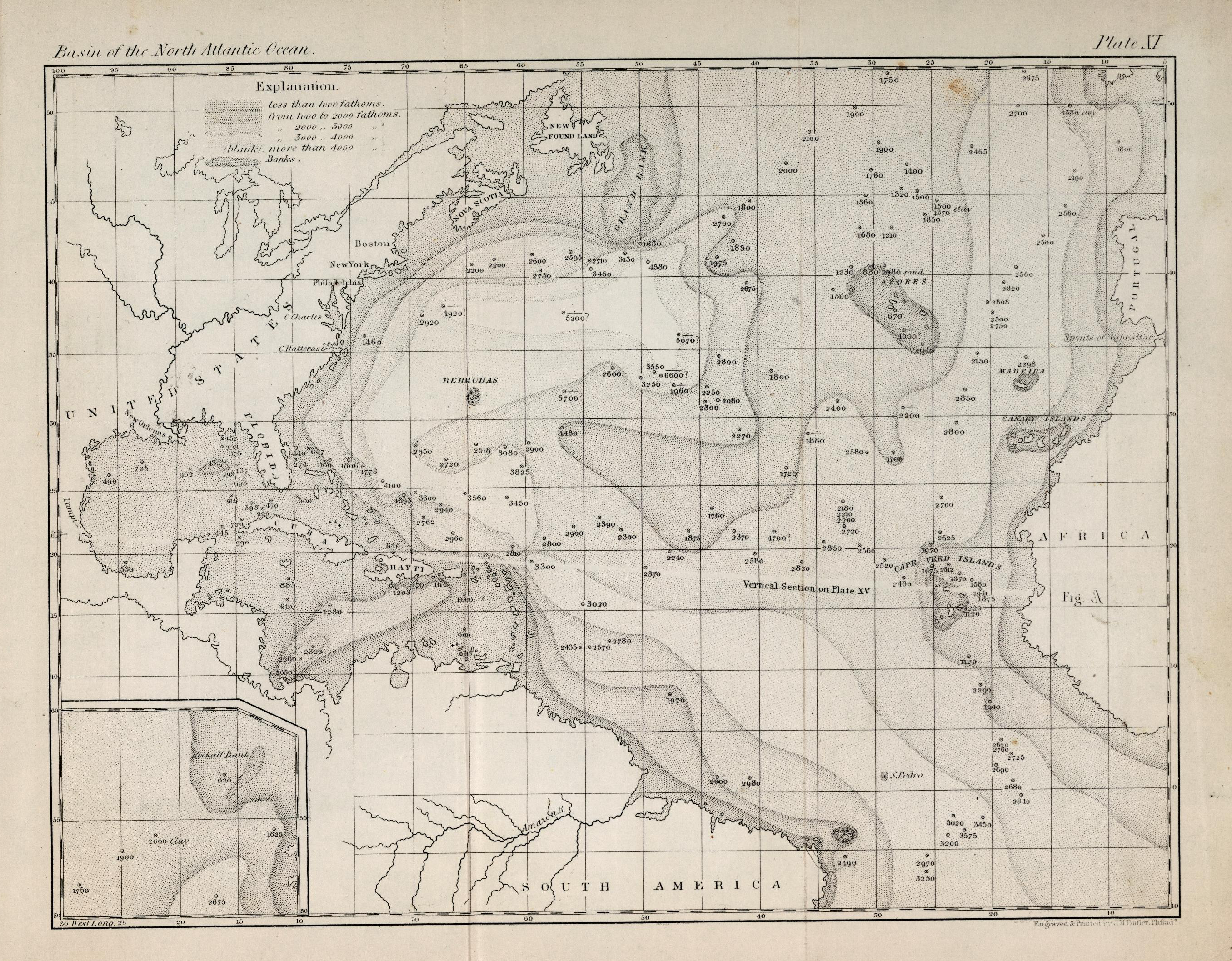
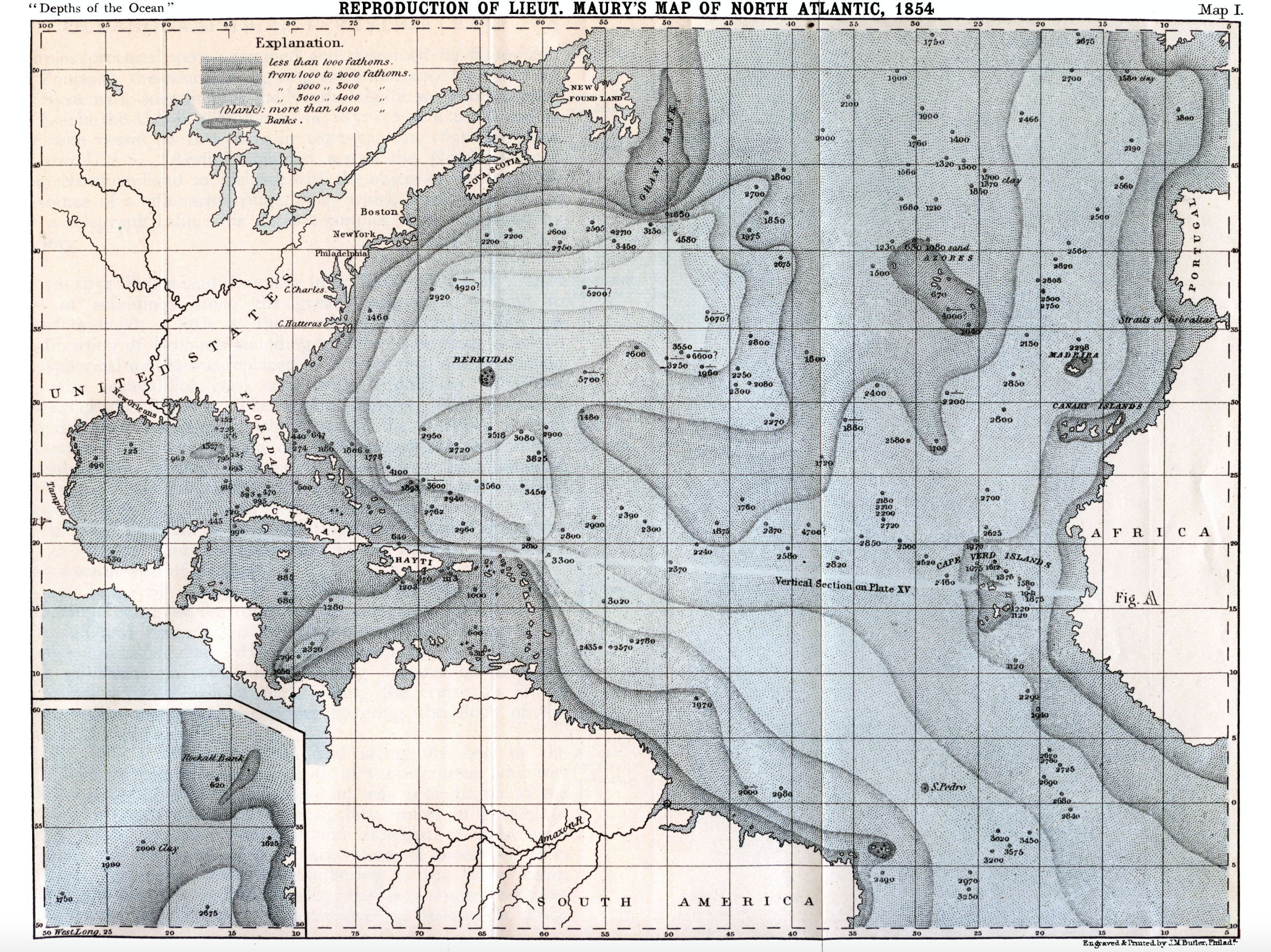
Bishop’s response to the map reflects the novelty of the recent creation of bathymetric maps of the Atlantic rendered a dynamic image of coastal depth in three dimensions, typical of the tinted marine maps pioneered by the mid-nineteenth century Mathew Fontaine Maury, assiduous cartographer of the ocean and apostle for southern secession, whose coastal survey provided the basis for the National Oceanic and Atmospheric Administration to map a coherent image of coastal America. The claims of the southerner Maury’s formally elegant maps used delicate colors to create accurate correspondence to nature by poetic claims. The delicate relations between land and sea are antiquated today, but survive in the very map that one night in snowy New York City so attracted Bishop as formal statements about nature, compelling her poetic response.
Can the resonance of the map of the Atlantic Bishop found in the map displayed under glass in the room where she convalesced as the snow fell outside on New Years eve offer a basis to better grasp the computer-generated colors of a data visualization of rainfall along the coast, or the shifting relation between sea and land in our own era of surging seas? The basis for placing their viewers in space cause us to question the ethics of an endless accumulation of data in maps of hurricanes, in contrast to the palpable detail that Bishop would have confronted in her coastal map, and the deep resonances that its record of place and of coastal places would provide.
The continuity of the offshore marine landscape, even when not tinted, created in their shades of grey a sense of the underwater regions that sustained the sea whose bathymetric detail would have given the poet pause, as they invited her to question coastal boundaries, and survey their rendering of offshore regions.
The Maury maps gave the seas such a sensuous and tactile solidity, investing the oceans with a such crystalline concreteness, limpidly rendering them with dimensions as if seen from below, to create a truly sensuous relation of land to sea that Bishop almost need not have projected through her imagistic description of peninsulas extending to the seas as fingering cloth in her poem.
For the eminent map of the North Atlantic, rich with ledges and imagined edges, was evident in the tinted bathymetric map, showing ocean steamer routes to Europe that was created by the Edinburgh Geographical Institute for the Times‘ Atlas, a global gazetteer, by John G. Bartholomew, in which frenetic steamship lines suggest nervous excitation of the sort of bursts of unwarranted emotion Bishop described the offshore extension of place-names of coastal towns.
5. By projecting the sea as an absent surface on which storms move, weather maps and data visualizations of rainfall and landfall fail to address how Bishop investigated the divide between land and sea in “The Map,” her very early poem of 1934, and one that prefigured her continued exploration of the seashore, and sensitivity to land and sea–and the register of place-names at the start of her first book of poems, North and South. The opening poem was almost a point of reference for the volume’s several map-like poems, tracing an inhabited world of several sea-shores, following Keats in evoking “the moving waters at their priest-like task/of pure ablution round earth’s human shores.” Bishop’s awareness of the centrality of “The Map” to her work is often noted by critics–her interest in the precise language of geographical writing and long-term contemplation of the spaces that maps, globes, and sighting lines may open on a very personal space, and her dexterity of balancing the scope of the external world against an interior one,–

Elizabeth Bishop, Geography III (1976)
–as her use of the map and of geographical writings to maintain a distancing balance on the world, but it might also as well be noted that the discovery of internal space which may be marked in “The Map” was provoked by the tactile qualities of a cartographical record, and in the traditional sorts of cartographical records As the coastal map of the Atlantic became a basis for orienting herself, while sick on New Year’s Eve in New York, where she felt uneasy, the map provided a hidden partner for her work that Bishop prominently if coyly referenced on the cover of a later book of poetry, Geography III, as tools that direct us to the world as we know it, by juxtaposing the tools of sighting, media of mapping and format of the globe. The distanced if measured words of the nineteenth century geographical primer whose chapters serves as its introduction–“Lesson X. What is a Map? A picture of the whole, or a part of the earth’s surface”–leads her poetry to help us consider the limitation of the precision of the point-based nature of data maps of coastal hurricanes and their impact, and the impact of their false continuity on viewers.
The current attempt to visualize the inundation of shorelines by a spate of storms offer an occasion to read her poem as an exploration how Bishop situates her personal relation to the ocean against the cumulative records of coastal knowledge in “The Map,” whose final line’s brilliance–“More delicate are the cartographer’s”–reveal the suggestive invitation that the cartographer’s choices offer, and the sort of recognition of places–“Heavens, I recognize the place! I know it!/ . . . We both knew this place, this literal small backwater,/ looked at it long enough to memorize it”–whose mental operations and measurement against memory and her internal world to which Bishop loved to gesture. In composing “The Map,” Bishop read gaps observed or sensed in its arbitrary conventions as if spaces for exploration, and indeed points to map against an internal landscape of loss and outwardness, at a vulnerable period in her life. Although we do not in fact know the map of the northern Atlantic whose arbitrary lines, colors, and conventions Bishop investigated under glass in 1934, the failure to map local perspectives on storm surges that challenge the coastline’s fixed divide exclude the local or personal perspective on space Bishop explored in the engraved map.
While long predating data visualizations or layered maps, Bishop’s early poem interrogated the accumulated synthesis of meaning in maps to raise questions about how their privileging of point data exclude both the human perspective of space. The poetics of her poem “The Map” raise questions about how our current maps orient us through data visualizations, and offer a limited way of taking stock of our own position in relation to the landscapes they describe by masking the extent to which human modifications drastically reduced absorptive abilities of the land as they have multiplied the risks of storm surges and threatened the stability of shores–raising questions of how we can come to depict the increasing effects of extreme weather conditions on the coast and its changing contours with a similar degree of materiality.
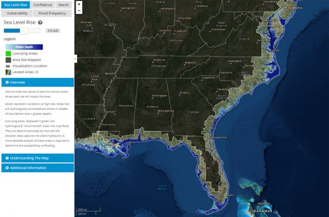
NOAA Sea-Level Rise Map
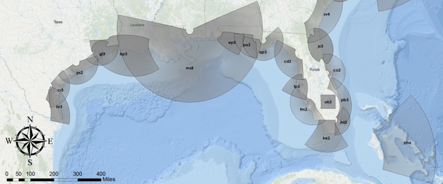
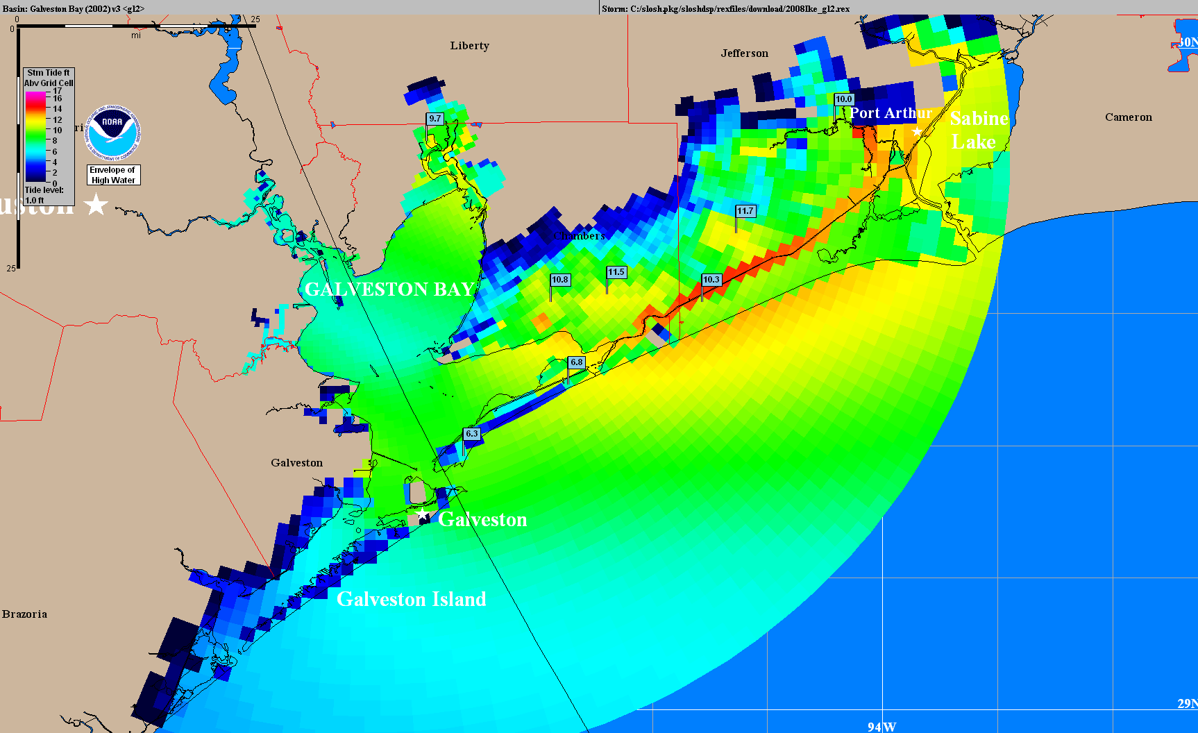
NOAA, National Hurricane Center SLOSH map for Hurricane Ike
Elizabeth Bishop’s intent reaction to the glass-framed map directed herself to its forms as if to orient herself to her personal past: her reading of its content balances its authority against her own knowledge of oceans, reading less for accurate measurements than with its illustration of marine space. If the ocean seems represented as an apparently tranquil space, less marked by colored divides than land, it is pregnant with close interrelations of land and sea. Bishop read cartographical conventions if mapping unclear relations between land and sea only by “shadows” on the edges of its shores are shallows or “sea-weeded ledges,” whose indeterminacy opens an invitation to explore the dynamic between land and sea that it fails to show.
The intensely personal relation to shore and seascape–Bishop’s story about a custodian of the seashore, with a name recalling her own, who keeps the shore free of printed matter–staked an attachment to the space of shores that undergirds “The Map” which data visualizations unfortunately lack as a landscape of meaning, marking out a space to explore, where waters shape the shore as the land reaches down to meet the ocean, and fails to privilege the land or the deeply sensuous relation between land and sea, attracting attention by its delicate colors, unlike the maps of Rand McNally. While Bishop was most struck by the colors of Newfoundland, Nova Scotia, and New Brunswick which she knew, she measured her own sense of place against the map–
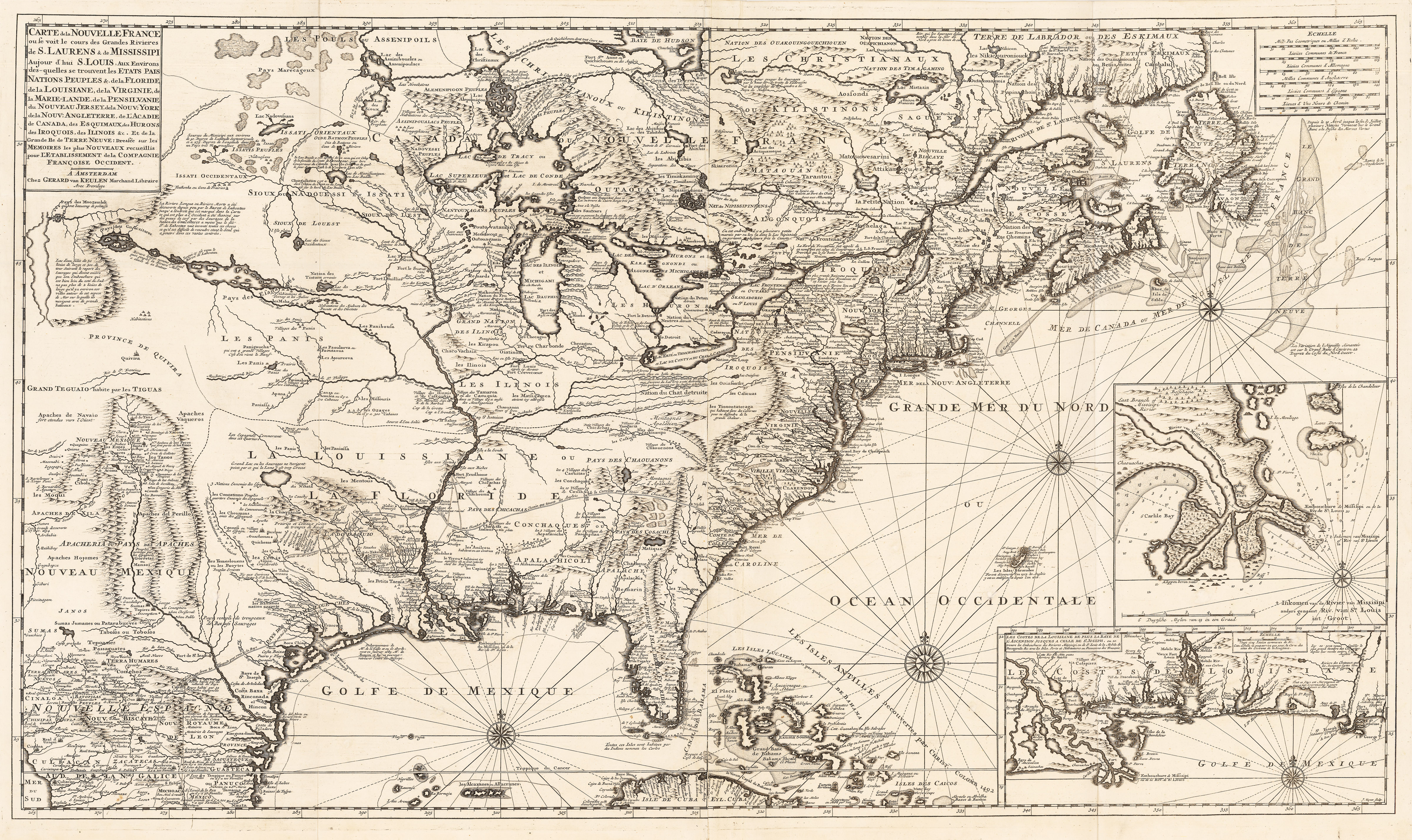
Johannes van Keulen, Carte de la Nouvelle France on se voit le sours des Grands Rivieres de S. Laurens & Mississippi . . (1720)
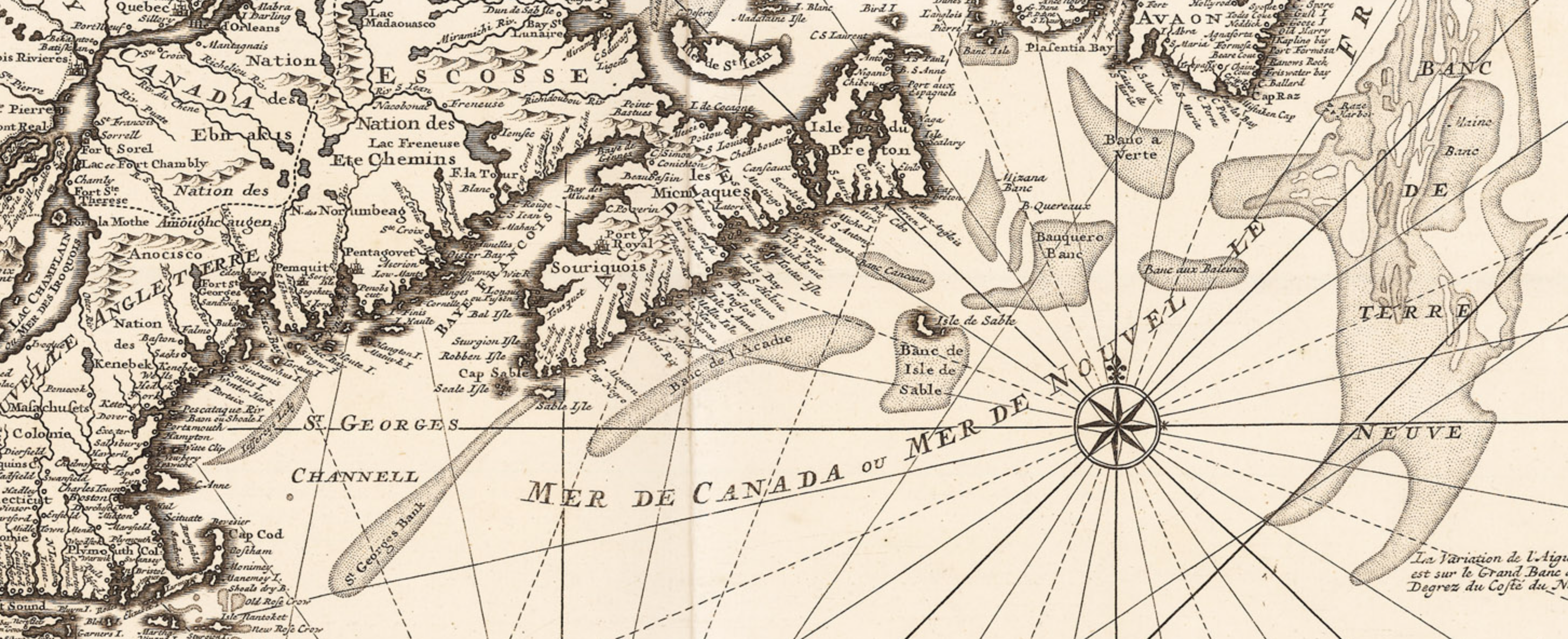
van Keulen (1720), detail
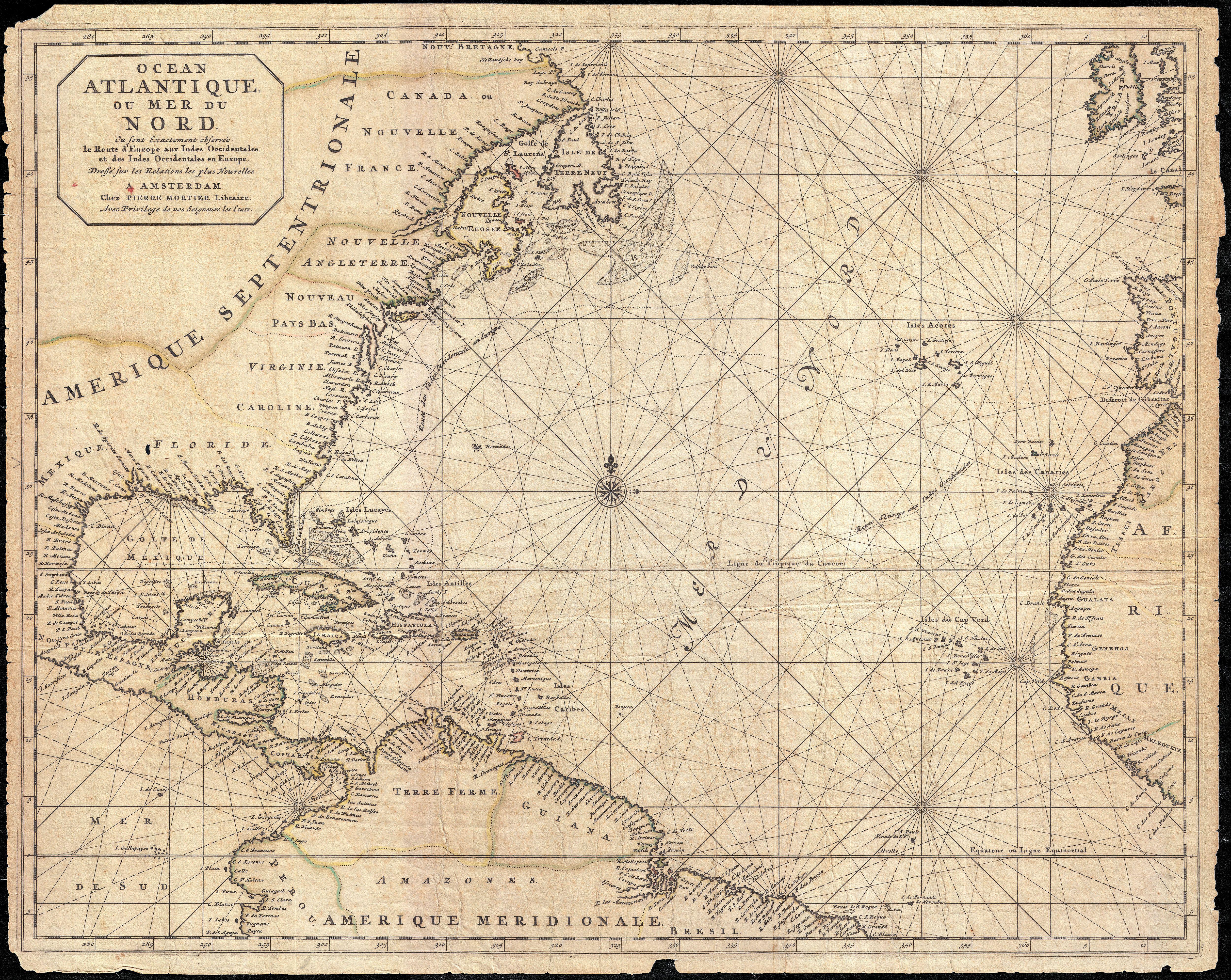
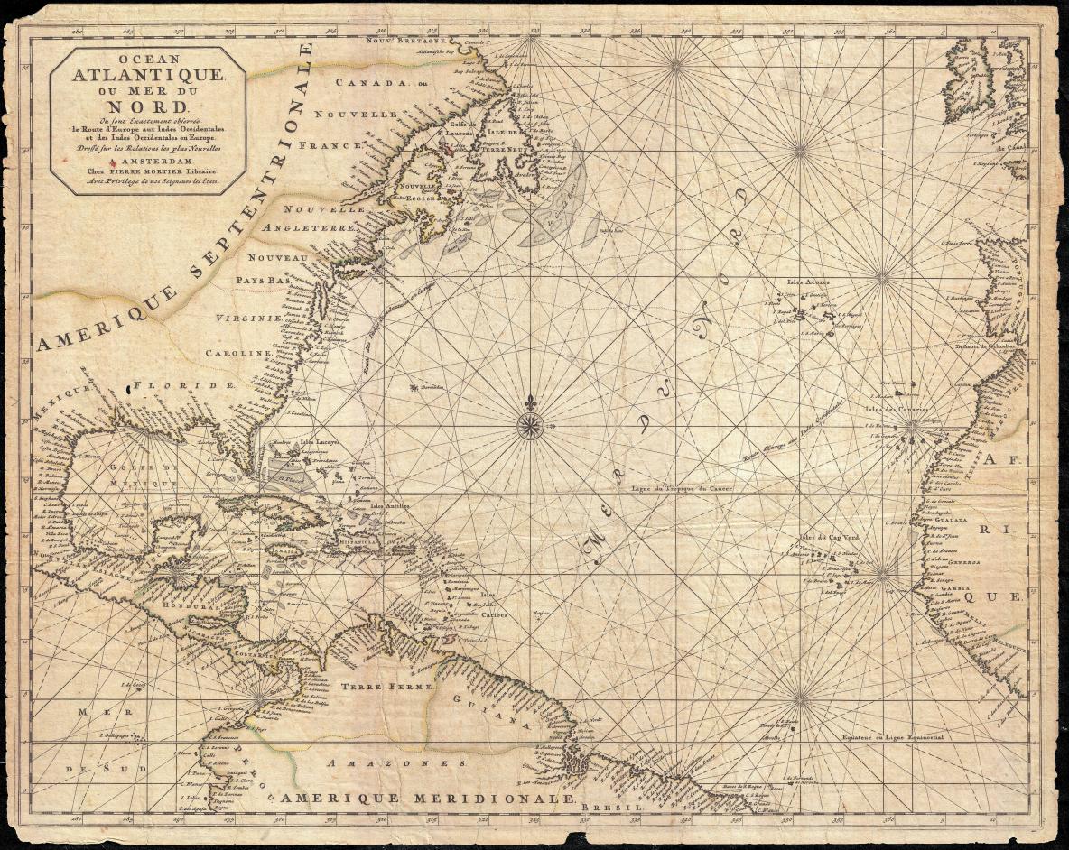
Mortier, “North America, West Indies, and Atlantic Ocean” (1683)
The deep resonance that an engraved map of the Atlantic, set in a frame under glass, had for Bishop gains poignancy in light of the persistent difficulties we have looking beneath the colored layers of the weather maps of the United States. We can’t help but be struck by the near absence of the seas in these NOAA maps, which “map” rainfall as an on-land event, not the expression of a newly dynamic and interactive relation of land and sea. In the manner that Bishop sensed the intimate relation between land and sea in her reading of the contents of a map of the north Atlantic ocean in “The Map,” we demand more information about how land is related to the sea in such weather maps, whose data visualizations, compiled from land-based registers or satellite imagery, remain removed from the sea, leaving viewers puzzled by the arbitrary nature of their cartographical divides,–which do a poor job to orient us to such disasters’ scope and to the expansion of the threat of violent storm surges above sea-level in the Gulf Coast.
As the term “natural disaster” obscures climate science in order to dispel awareness of the causes for renewed intensity of tropical storms which are effectively removed from human agency, the maps of hurricane impact confirm such a remove from human agency. By externalizing the course of hurricanes, they become interlopers in a stable shore, rather than signs of disruption of weather systems. The focus on the present and the instantaneous readout of weather conditions obscures the terrifying increase in the number of Category Four and Five Hurricanes in recent years: the warming waters of the gulf waters have encouraged a rise in storms with higher surface temperatures have meant not only more Category Five hurricanes making landfall in 2017, constituting a full quarter of Category 5 landfalls on record in the Atlantic since 1851–there is no precedent for striking land with such intensity, or ability to deal with their over-157 mph winds. Mapping the arrival of storms conceals mapping of property and crop damages in storm surges, lost in the oscillation between satellite views of the eye of the hurricane and trajectories, which remain oddly separated from the lost lives, flooding, or scale of property damage, often only noted in the subordinate text but poorly quantified in dollars, outside the map; the incidence of death, disease, and extensive destruction are perhaps so easily ignored in reporting based on maps that barely suggest adequate on the ground perspectives or on a massive humanitarian crisis, despite its data-rich layers.
6. Coastal observation stations have long obscured the growing risk of storm surges on the coastal population which are only destined to continue to increase, even despite increasing settlement of America’s coasts have fed an inflated property market. Risks of future flooding are absorbed, and the costs inundation hidden. Increased risks incurred by coastal populations, who are drawn by the waters they seek to enjoy–and coasts that constitute a large part of California’s economy–are collectively denied by federal disaster relief that has effectively subsidized such risk, detering infrastructure preparation that might better ready us for the growing risk of flooding climate change has so dramatically multiplied. The multiplier effect of sea-level rise and the warming of ocean waters in is concealed in insurance rates. NOAA continues to map storm surges in Storm Surge Maximum of the Maximum (MOM), or “SLOSH MOMs,” that repeat the conceit of coastal resilience able to be remedied by building strategies and projects of construction. However, the absence of attention paid to surface impermeability of coastal regions, the multiplication of flooding risks, or the buffer areas of coastal islands and wetlands erase the subjective position in relation to the ocean in maps whose stark chromatic divides regularly present clear divides between land and sea–and imply the uniform nature of coastal lands.

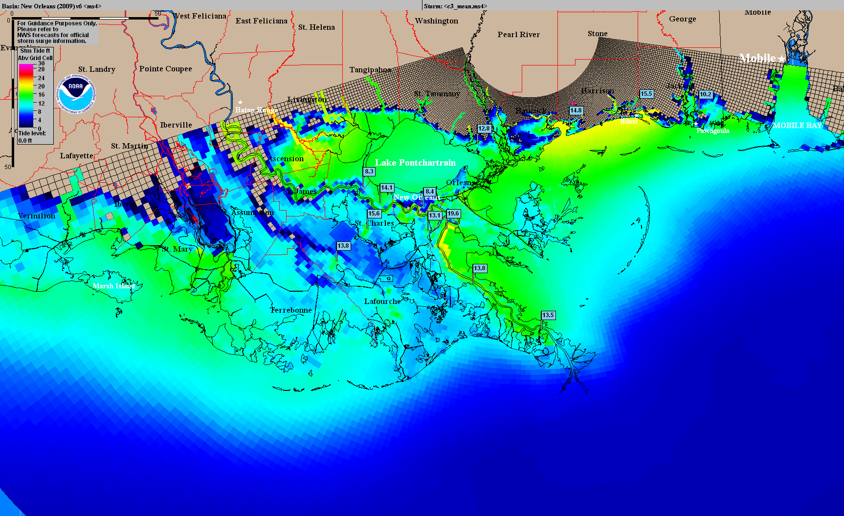
Storm Surge Maximum of the Maximum (MOM)/National Hurricane Center – National Oceanic and Atmospheric Administration
While rising sea-level provokes greater storm surges and warming seas, and increasingly humid air in warmer climates such as the Gulf Coast, creating wetter hurricanes and more violent winds, we watch weather systems at a remove, without coming to terms with those at risk–as well as the risks to transit infrastructure, residents, and innumerable health risks of submerged chemical companies.
Hurricane Harvey recently spun off such an unprecedented amount of rainfall from its winds as it approached land, as if prefiguring a major change in weather patterns and conditions. What became a Category 4 hurricane seems to have both pushed against the limits of cartographic description in ways both known and which we are still discovering, as we work to integrate the rapid transformation of weather systems–and to remove our relation to them from the map. Despite the proliferation of maps that barraged viewers assessing probabilities of the storm’s course, our orientation to their dangers seem diminished. Partly, this is because the sorts of maps we have generated about its arrival and that map rains against current floodplains may offer a poor perspective of the impact of weather systems in relation to a shore in a more humid atmosphere far more apt to generate storm surges: if anything, the related frequency of category five hurricanes and disastrous storms has called attention to the related sequelae of their impact–surging flash floods, disease outbreaks, submerged superfund sites leaching into waters, deep disruptions in health care–that sites of impact cannot fully map or even suggest. Indeed, in the economy of newsrooms, and the desire for immediate information from maps, the data maps so readily reproduced disorient us more deeply from the shores, asking us to view a graphic assembly of data points that call attention to the accumulation of rainfall at a given point, removed from a landscape or a man-made setting, or without a clearly critical relation to the construction of space.
7. The absence of a fixed perspective on the space of the shoreline or settled shore perhaps makes us pause over the meaning of these data visualizations, uncomfortable at the inability to discern the human story underneath, or untangle the natural form the man-made in the data distributions that they provide. For better or worse, the demand for readymade maps in the micro-ecology of newsrooms has encouraged broad recycling of databases in visualizations that masquerade or pose as maps that offer perspectives–or appear to be maps of a recognizable and inhabited landscape–but offer few guides of orientation to allow them to be viewed. The distribution of data at discrete points raises an ethical questions of appreciating the relation of floods, winds, and rainfall to the ecology of the city or of the over-inhabited coast. In part, we are also we are faced by a problem of representing the intensity of rainfall in sufficiently tactile ways to place their relation to space into perspective beyond the confines of a data map.
Indeed, the weather maps raise the question of how much maps are indeed a subset of data visualizations, or rather communicate something important about our sense of space and ability to come to terms with such moments of unprecedented weather, when rainfall and wind level is no longer mundane and conforms to our previous experience. While we fail to register fully hurricane winds, water and weather systems, so hard to capture in tactile ways–or to represent as tactile on a map, the demands to include tactile elements in hurricane maps of the elements are especially absent from most renderings–which fail to record the deep consequences of an increasing impermeability of the land: the over settlement of Houston, and overpaying of wetlands that were once of greater absorptive abilities before tropical storms, contributes to the dramatic problems of drainage across the city, as does the concrete banks of the bayou and rivers in the city.
Amidst the near-constrant generation of datamaps for new audiences, have we lost an ability to view or appreciate the results of ecological change on the shore. Although we see the abilities of mapping its course as a power of clarification of the storm’s path, an onslaught of readily produced maps tracked its landfall or increased rainfall in data visualizations that failed to provide adequate perspective on the relation between land and sea in the Texas Gulf. For the rise of storms suggests a permeability of the sea and the shoreline in low-lying areas, but fail to suggest the presence of the sea or pose the increased relation between land and sea that Elizabeth Bishop noted long ago in exquisitely tactile materiality. Bishop was struck by the appearance of the sea and how it lay before a map of the Atlantic Ocean under glass, from how “the names of seashore towns run out to sea” and peninsula’s “profiles investigate the sea,” perhaps inspired by how “mapped waters are more quiet than the land is.” Do we need to develop a deeper sense of the proximity of the coast to the ocean in an age of global warming, that the data visualizations which foreground a solid and continuous coastline seem to ignore?
Don Raedle, Getty Images
The maps only raised questions about how to place our relation to the hurricane-either in terms of local anthropogenic changes and activities, or to global climate change. While we focus on the scale of its destruction and the need for efforts of rebuilding, it is difficult to scale the impact of climate change on the Gulf Coast in existing maps, and almost impossible to gauge the resilience of the existing shore. The possibility of preserving or strengthening the shore is not cast in terms of the map, or orienting observers to the growing risks posed by anthropogenic changes of shoreline development or broader effects of heat-trapping greenhouse gasses on the region, or the disproportionate risk of sea-level rise on a low-lying region: the diminution of high quality freshwater and increased soil subsidence across major urban areas like Houston, degradation of ecosystems, and erosion of existing natural barrier islands, and the particular vulnerability of shoreline areas to sea-level rise in the Gulf Coast–especially in Galveston, as in the Chesapeake Bay and eastern coast.
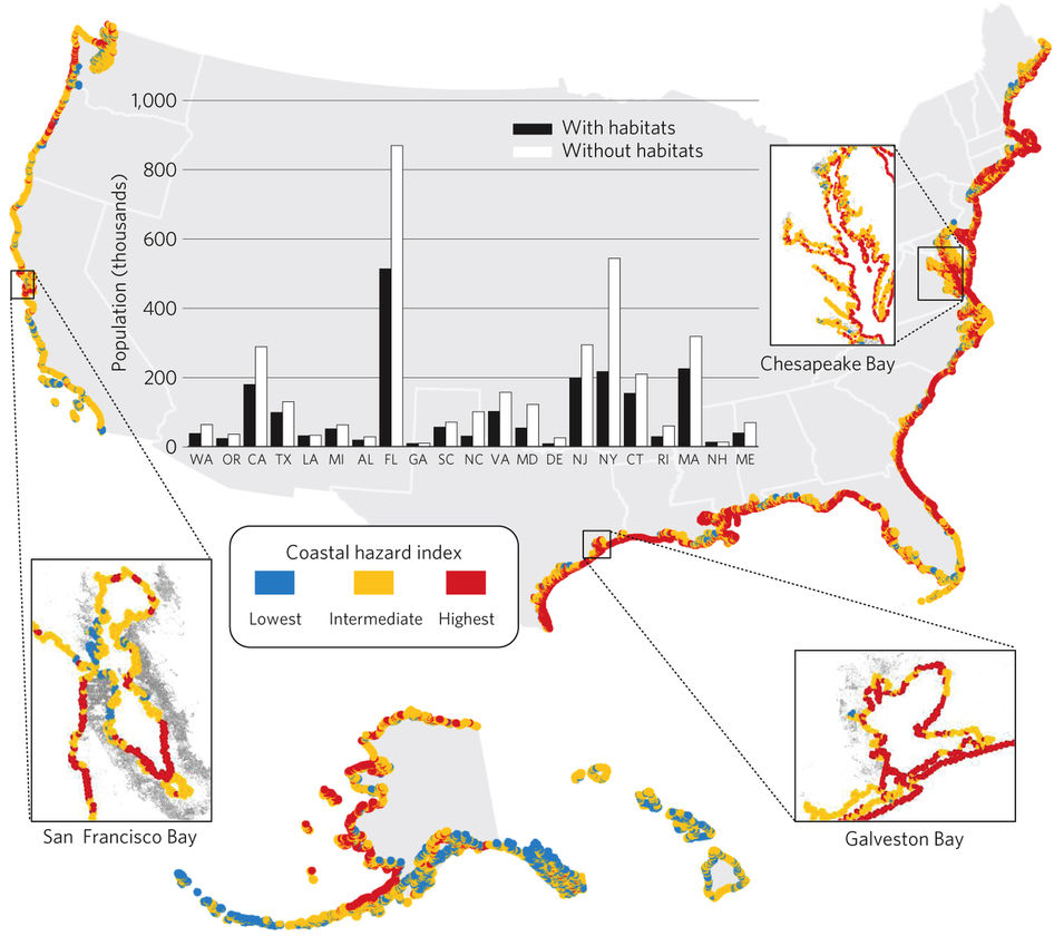
Exposure of US Coastline to Sea-Level Change and Storms by 2100 (A2 Scenario)
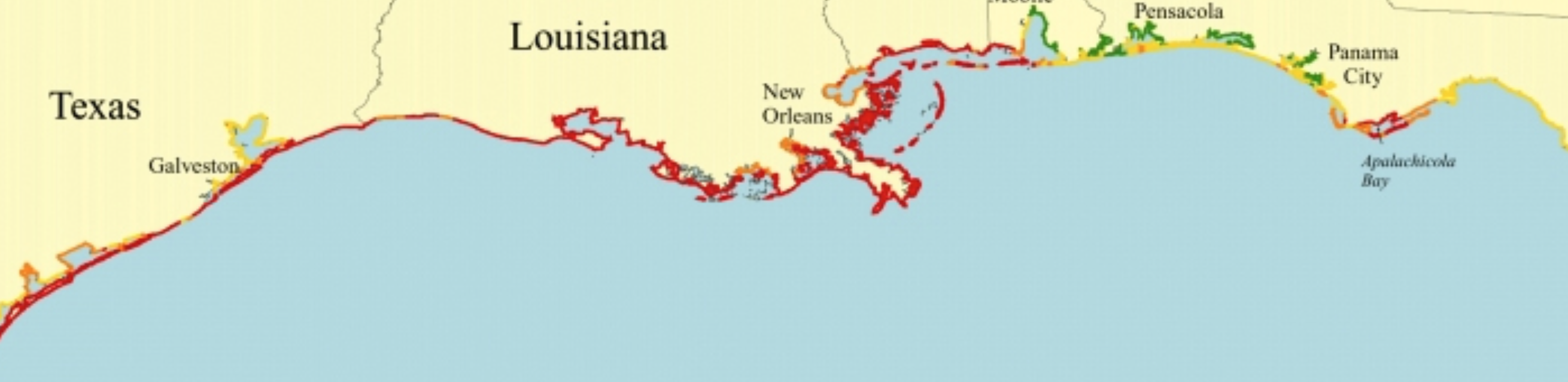
The elevated hazard index poses a continued threat from storm surges in a region of tempestuous weather. Quite recent USGS long-term models from the Gulf Coast Ocean Observing System, which monitors water temperature and quality through regional providers, set alarms about the dangers of the frequency and intensity of tropical storms near Galveston’s coast and disappearing New Orleans bayou–red showing very high-risk areas.
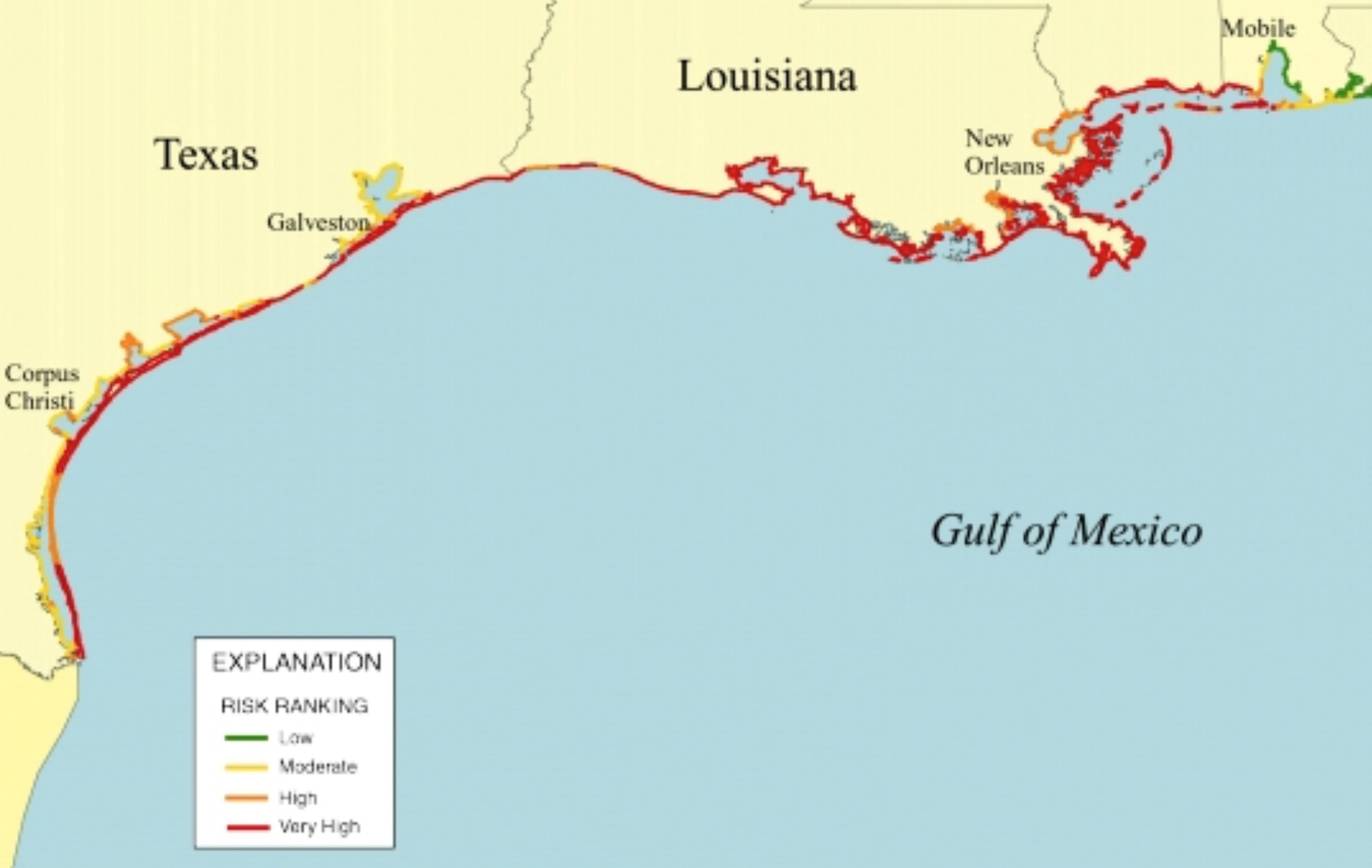
Retreating Coastline in Texas Gulf Coast as of 2007 GCOOS/Jeffrey Paine
8. Most maps created about the hurricane and extensive local and associated regional floods are data visualizations: they force us to try to map our own relation to the disaster and to future forecasts of hurricanes, but offer a frustratingly limited perspective on the storms’s effects or their dynamic nature. Maps of Harvey’s landfall and impact implicitly ask pressing questions of whether the weather it tracks is a new normal, and our relation to these storms. It’s unclear whether the maps naturalize the increasing levels of rainfall we might now expect from a tropical storms or coastal flooding, in ways we are not yet beginning to confront. When we watch maps of the effects of Harvey or of the course of the Category 5 Hurricane Irma and Hurricane José to plot their position, we are struck by the martial tenor of their symbology of charts that track hurricanes threatening to cross our boundaries as if invasive forces.
Although weather systems in the Atlantic approach our shores with renewed intensity in hurricane season, the oddly enthusiastic rhetoric of spectator-in- chief, President Trump, applauding their size as if glorious, but denying any relation to climate change, casting them as occasions to affirm resourcefulness, not to take stock of future dangers. His role as Denier-in-Chief has resonance throughout our government, supported by the entire administration he has assembled. Or delegate at the United Nations, when Governor Nikki Haley, famously mischaracterized and misunderstood the nature of hundred year floods, and as the current Secretary of Energy argues “it’s insensitive” to consider any “cause and effect of these storms” as we confront the disasters of Hurricanes Harvey and Irma, and Trump himself shrugs “we’ve had bigger storms than this,” even in the face of hurricane scientists and climatologists who find the duration of Irma’s high wind speeds as unprecedented as Harvey’s rainfall. And the breadth of policy moves that are made under the pretense of climate denial have meant that basic policy decision–as well as regulations–are no longer informed by climate science.
This level of alienation is not helpful, but we are perhaps badly served by maps that fail to correlate ocean temperatures and levels with coastal danger. The sudden intensification of current storms, which change from tropical storms or depressions or Category 1 hurricanes to reach the intensity Category 4 or 5 hurricanes transform with unprecedented speed over a manner of days, makes hurricanes less adequately mapped as lines, or forecasted the possibility of their course–even if they were communicating uncertainty, the demand for predictive power of such visualizations was mistaken as exact as it was shown on a map, although the “cone of uncertainty” only capture a two-thirds probability of the range of the possible courses of a hurricane’s center, based on past hurricane courses–
–which themselves are uncertain, and change over time day by day, despite the degree of certainty folks may be tempted to attribute to them as if they were accurate maps of the course of the storm–so much as a range of probabilities, analogous to the hundred-year flood, which lacks the sort of exact reference to space a map’s surface implies.
This broad range of probability of course assumes the same weather systems in the past, the same water temperatures, and the same behavior from tropical storms.
In adopting the metaphorical symbology of an onslaught to our borders, we lend the storm an identity as an interloper into our national waters, and plot its course without any relation to the specific notion of place, or the mutable threshold of the shore. In doing so, we privilege a divide between land and water that is, at best, unhelpful to render how weather formations interact with the land or how we may better react to them in an era of shifting shorelines and rising seas: it may be that the apparent interchangeability of place on a weather map has the effect of erasing local knowledge of the site of landfall or the point of the shore where a storm hits–save its population. To track the path of the hurricane in a line or within the apparently expanding cones of uncertainty–smoothed records of the potential paths “Harvey” or “Irma” or “José” or “Maria,” make due on anthropomorphism by giving the storm an entity on the map, but ignoring the specific nature of the site of landfall, its onshore permeability to rain, extent of coastal vulnerability, local subsidence, or, more broadly, flooding risk.
9. Such visualizations pose questions of the nature of the hurricane that arrives from offshore, without attending to how its arrival will be impacted by ground cover change. They seem to help plot our position to their possible paths, but fail to raise questions about the shift in hurricanes in an age of climate change, and may obscure our perceptions and collective positions in relation to the storms. For in an era that seems to challenge the descriptive possibilities of maps in tracking weather systems, one indeed in visualizing their occurrence in order to make evident new problems. The tracking of storms off the shores of the Gulf coast are particularly difficult to visualize because they imagine clear breaks between land and water–the perspective of the land-dweller, and the traditional preference of Ptolemaic maps–but erase the gently graduated bathymetry of so much of the Gulf coast, which makes the distinction between land and sea is defined by such a shallow continental shelf.
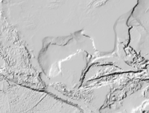
Raw elevation map of the Gulf of Mexico, erasing land-water divide/rendered ©Stamen
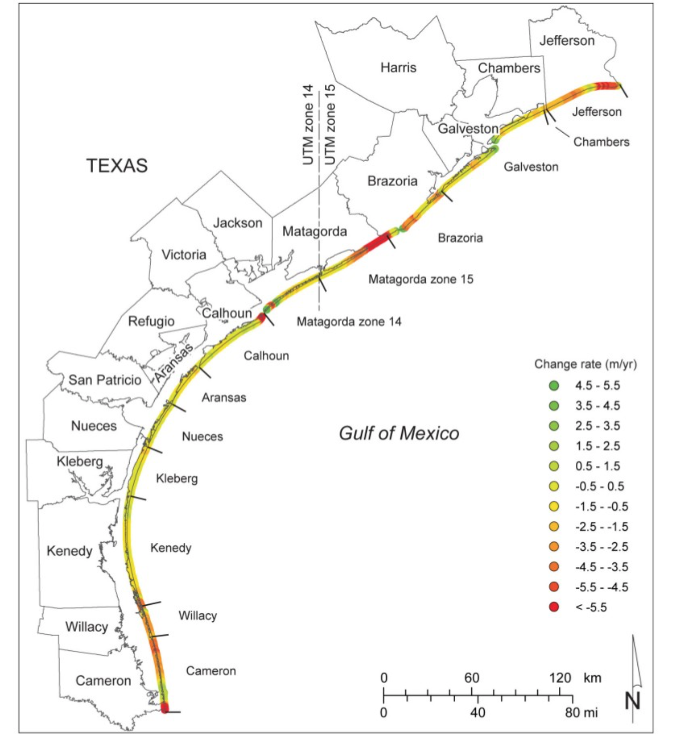
The lack of a prominently defined land-water divide on the slow rake of coastal land across the southeastern Texas Gulf coast raises questions about visualizing hurricane landfalls that can help pose the question of preparing for their increased eventuality. NOAA–the National Oceanographic and Atmospheric Administration–cautioned ominously increased erosion of wetlands that had acted as a natural buffer with rising seas, transforming the coastal profile that had withstood storm surges: the rapid retreat of the Texas shore’s sensitive ecosystem since the 1970s, over 1.5 meters retreat per year on average and 4-5 meters in many places, discounting the barrier islands eroded due to human development, not yet adequately quantified; lack of sediment replenishment of the shores, as declining water-levels of the Great Plains aquifer led to the broad soil subsidence, has eroded the relation of land to sea, as the widespread paving of Houston’s landcover encourages rapid runoff of rainwater. As a result of such anthropogenic remodeling of a land-sea divide, some 80 sq km in Galveston are now permanently flooded long before Harvey made landfall, and made the city into the site for a perfect storm of the impact of global warming on the local.
We’ve only begun to orient ourselves to relating the heightened rains and increased frequency of Gulf hurricanes point to problems of relating the local and global. Despite the compelling power of data visualizations to render the storm and a huge amount of data on shoreline change, the narrative of invasion that sees the storm as a force of nature that approaches the shore is oddly removed from it in most infographics. At a time when information about vulnerability to storm surges and the inundation of wetlands have been less compiled in public fashion since January 19, 2017, the importance of rendering images that raise new questions, as opposed to resolve concerns, seem especially pressing and of the moment.
Although one could argue that these maps are made and designed by humans, one can see these digitized images as non-human agents that shape our relation to the storms, acting on and filtering out our reactions to their arrival, prioritizing their status on landfall and their paths over the country, with huge implications on how we treat both the hurricane and its rains. Part of the danger of such data-rich maps, generated most often from computer models and machine readable data, may lie in the lack of artifice or artfulness of their objective images of the tropical storm as another independent actor, with an identity its own, whose lack of craft threatens to erase the perspective of the viewer on the storm. They indicate the storm’s intensity and its cone of uncertainty, or help process its position, rather than its strength to rising ocean levels or temperatures. We map the “direct hits” of weather systems and their course of arrival, their relation to the seas, or to the shoreline, without ability to capture the inundation of coastal communities, or the risks and dangers of the shifting relation of land and sea for cities–and Houston is now not only the fourth largest city in the nation, but the most rapidly growing, and home to the site of one of the world’s busiest shipping lanes–whose poor preparation for flooding Texas’ land commissioner claims continues to keep him up at night.
Watching Harvey strengthen in the Gulf before it made landfall, however, and strike the shore at peak intensity evoked the huge impact of future levels of rain, and challenged the ability of forecasts that did not account for its interaction with a changed world. Harvey’s heightened intensity at landfall seemed justified to question with credulity what it means to have the third 500 year-storm arrive on the gulf shore in three years, and if current classification are outmoded in the “new normal” of Gulf coast weather.
The apparently regular recurrence of the arrival of what are billed as “1,000 year storms” seems truly unjustified hyperbole, poorly mapping them in time. With far less coverage than warranted, extreme monsoons have displaced over forty million in India, Nepal, and Bangladesh as flooding killed over 1,200, as rains that already dramatically intensified since the 1950s, and revealed new record rainfall in 2005, that suggested a new level of unprecedented vulnerability of crops and people to global weather, and the warmer summers and increased storms in urban heat islands create new levels of risk. Before readily generated maps and remote monitoring, we seem forced to watch the arrival of weather storms in our vicinity as spectators, with President Trump, watching data maps provide possible immediate forecasts from the range of computer-generated possibilities, rather than assembling long-term shifts to better manage the relation of rainfall to land, and climate warming to coastal flooding in an area of continued groundsoil subsidence. The rainbow map of rainfall poses a poor mirror of the risks of global warming and climate change, darkened metro area under inches of unabsorbed rainfall, magnified by rising sea-level, a warming Gulf and submerged shoreline–
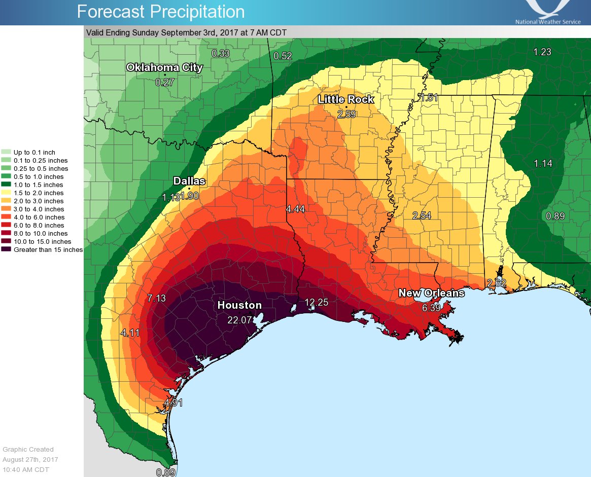
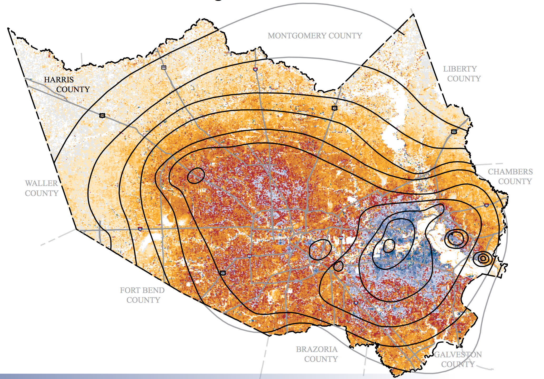
Water Level Altitidues and Changes in Houston-Galveston (2012)/USGS
Subsidence in Houston’s Harris County, 1915-2001/John D. Harden USGS data
–as that shore is increasingly challenged by rising water-levels, and by the arrival of storms from warming seas and more humid air that have hastened their intensification. The results are already challenging cartographers. The shock of unprecedented rainfall levels that flooded much of southeastern Texas not only created a demand the National Weather Service devise a new color scheme to render local rainfall levels, but led us to question the agency of the maps that overlay data layers in rainbow schemes to provide the best image of the dangers of hurricane or convey the accurate perceptual records of the intensified flooding of much of Houston created by the sudden arrival of its rains totaling some 732 billion gallons–three times the rainwater pumped from New Orleans after Katrina–in ways that compel us to the floods that it brought, as much as the strength of its gale winds, though these are clearly bound together.
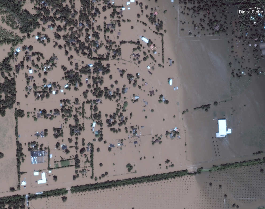
Digital Globe
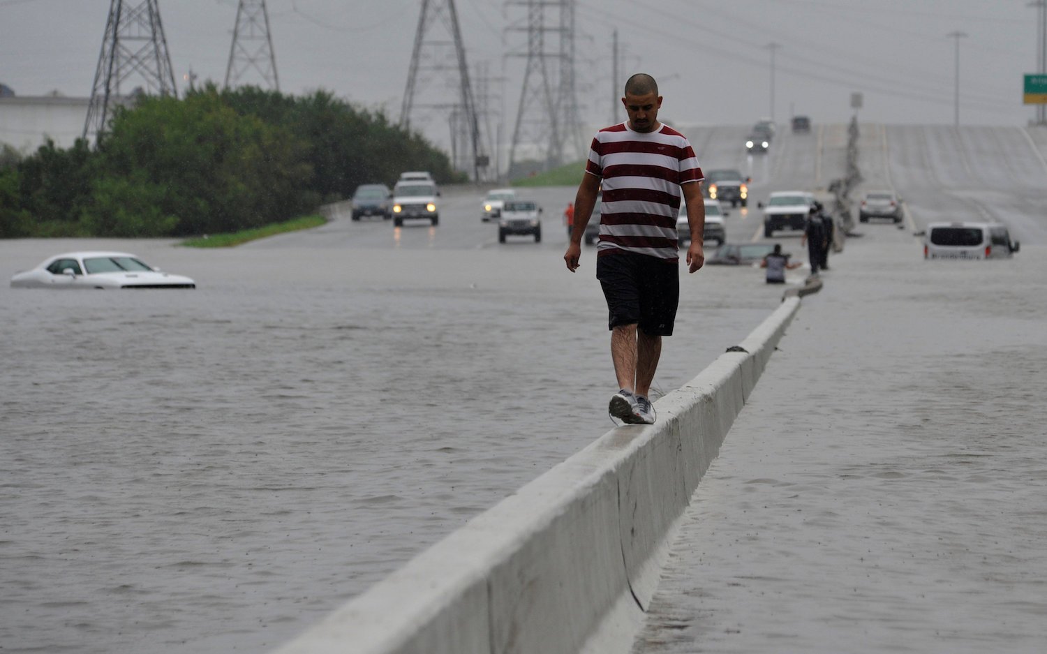
Reuters/Nick Oxford

Rinsy Xieng
How can we deny, or fail to represent, a perspective on the curiously displaced relation of water to land in the face of hurricanes and their aftermath?
Even as washed up Texan evangelists self-interestedly urge their followers that Harvey’s landfall remains a form of divine punishment “from God” for a mayor that has subpoenaed the sermons of ministers, or voices from the past like Rush Limbaugh, claim Irma is only pure liberal media hype to “advance this climate change agenda” in the “fastest and best ways,” the disasters after Category 5 hurricanes struck cities in red states led many to link their near-biblical proportions to divine intervention, if not calls to abandon the coastal settlement, the visualization of their data is able to pose some stark if clarifying questions.
10. While maps as the above serve to lend greater agency to the storm, it seems high time to invest greater agency in the maps that track it, which filter what we see and how we understand what is insistently portrayed as a “natural” event within its actual context. The layers that are quickly superimposed over the Texas landscape or gulf coast may all too often daze us by their colors, in ways that suggest the alienating nature of mapping tools, as much as the huge threats that hurricane pose to our coastal regions, and render the land and sea as static backgrounds, on which an alien miasma lies.
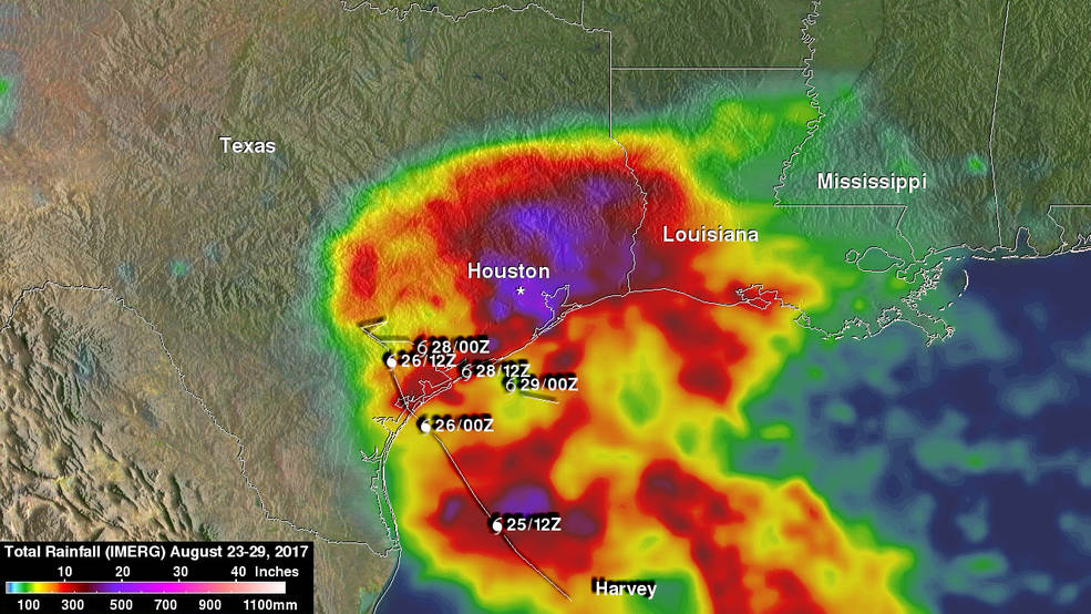
The repetition of the rainbow spectrum of rainfall patterns was repeated in Maria, as if the datasets alone–even if preliminary–could hope to come to terms with the deep infrastructural damage and destruction of crops that the heavy rains and winds were about to create, and contrast to the deep suffering of local populations.
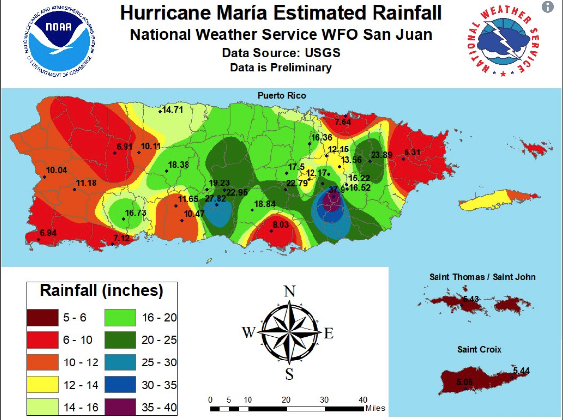
We all too often take people out of these maps, even as we suggest the visualizations are a record of natural events which we must gain greater infrastructural resilience to face. The growing risks for storm surge flooding across much of the Texas coast was mapped in multiple hurricane forecast maps published in interactive form for the Gulf coast in previous years. In that sense, and in the sense of its extended forecast, there was perhaps no surprise of abilities to forecast weather. But the hurricane’s catastrophic impact stretched the descriptive abilities of maps. For one, it pressed against the implicit search for objectivity that has led cartographers to repeat a clear coastal divide-or render the coastline as a line–in the architecture of maps and data visualizations. Even as the damages are being tallied, we should ask to what extent that seem dangerous in a time when it is increasingly important to model the heightened nature of coastal risk, in ways that do not suggest any change in the waters of the Gulf of Mexico, or a possible shift in the coast, whose shoreline suggests a clearly defined break from light blue.
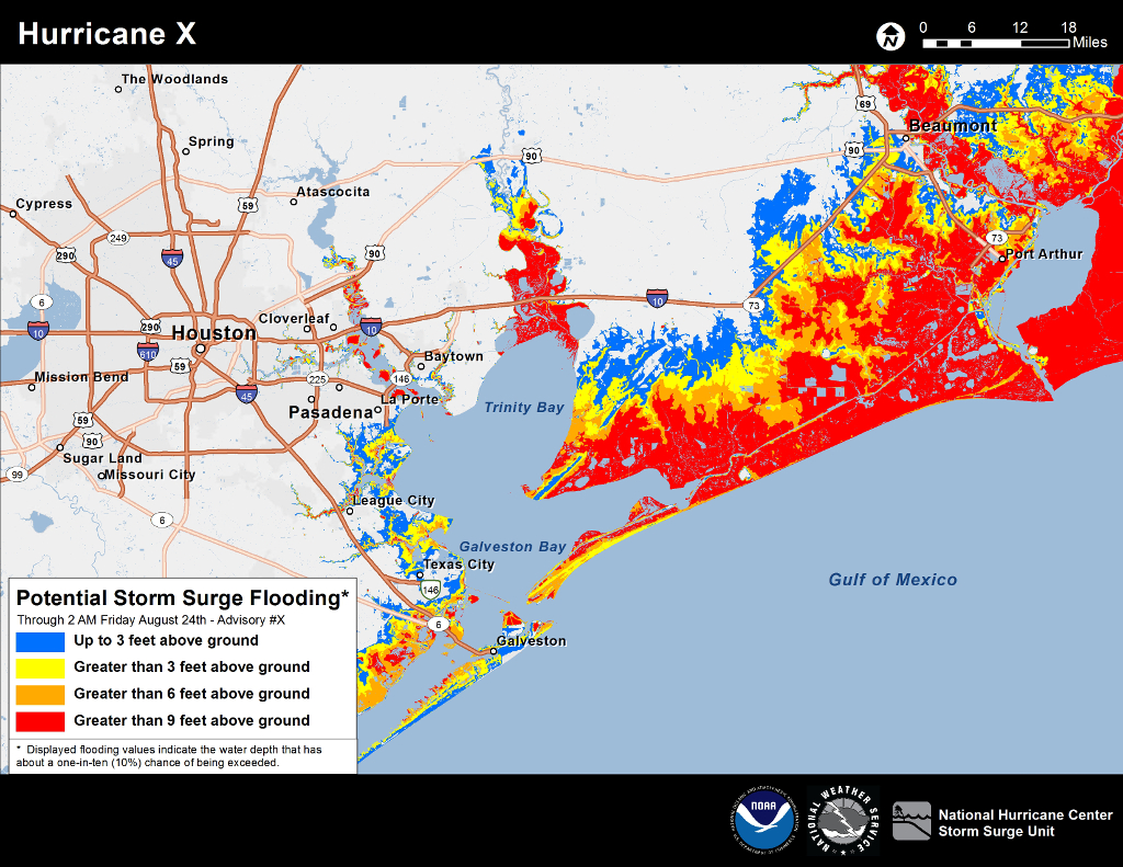
National Hurricane Center/Storm Surge Unit
But the agency of these maps, notwithstanding their informative nature, raises a problem beyond data visualization of how the nation perceives its shores. If fears of coastal inundation were already high in previous years along much of the entire Texas-Louisiana Gulf coast, the shorelines that are still used as primary divides to model relations between land and water suggest a reliance on formal cartographic tools to show relations, although the proposition of a fixed shoreline is far from clear.
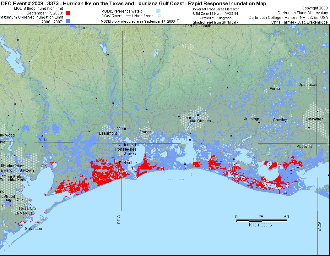
Hurricane Ike famously led by Texas A&M University to propose the building of a massive coastal surge barrier in 2009–a “coastal spine” to increase local resilience in ways that would better define the barrier between land and sea. President Trump is a noted fan of massive projects of national infrastructure, but the $15 billion Congress has approved would be consumed by a project, designed to protect coastal areas where oil refineries, chemical plants, and chemical facilities are located–the region’s “industry”–rather than its inhabitants: the misguided project to affirm an existing shoreline would ignore the massive flooding damage which stands only to increase in more humid atmosphere, and the Gulf’s warming waters will bring more water in its air, or better reservoirs: the coastal barrier clings to a misguided map without climate change.
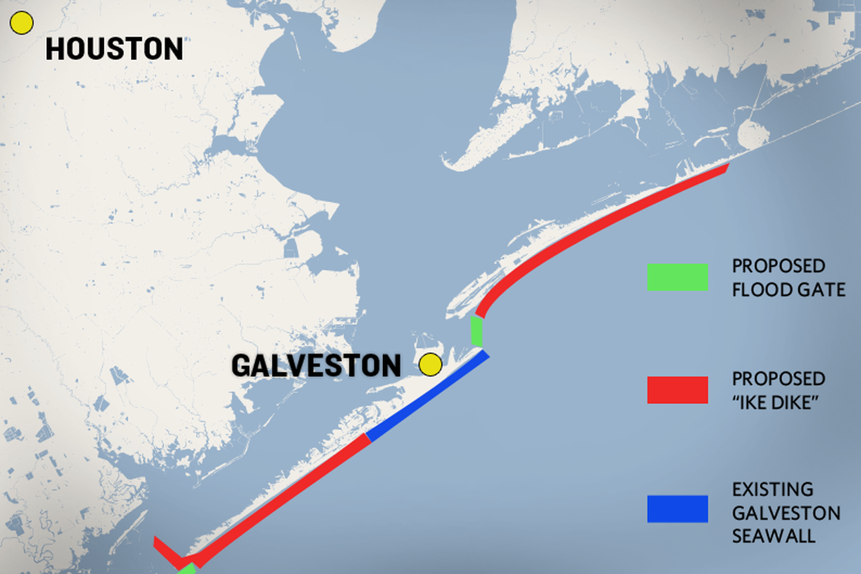
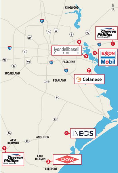
11. The formal space of most rainfall maps of the Gulf coast adopt a fixed boundary between land and sea, rather than suggest changes in the fluidity of their interrelations. Even if it has been a decade since a large hurricane has struct the Gulf of Mexico shore or coastal Atlantic, and the first Category 4 Hurricane to make landfall in Texas since Hurricane Carla in 1961, there’s little reason for the inadequate preparation of the Texas coastal cities–especially given the growing risks of global warming and rising sea-temperature, but the acutely unregulated overbuilding of natural landcover on the Texas shore that reflected the undue optimism of petroleum-based industries. But the recent decisions to not mandate the preparation for coastal flooding for all buildings built on the coast to protect against storm surges suggests a tendency to leave buildings unprepared that, even in the light of the recent storms, has occasioned little preparation in other potential flood plains–despite the rush of refineries, sandbags, as by Thursday, August 24 Harvey was predicted at landfall to have the “potential for up to three feet of rain on FOX news, and as it became a Category Three and then Four Hurricane between the evening of August 24 and August 25, issuing a hurricane warning of up to 300 miles, and predicting a surge of six to twelve feet, fearing limited rainfall, until they were urged to leave on August 25 in “the strongest possible terms,” even as they feared flash flooding and heavy rains at it escalated considerably in velocity.
Yet the absence of good means of managing local drainage of runoff or water storage in such heavy subsided lands seems an example of the results of unregulated coastal building gone amok; much of the damage from Harvey lay outside high risk flood zones, and in areas where insurance penetration was low–leaving literally thousands of properties uninsured in some of the most low-lying areas. Despite the need to attend to the new nature of coastal areas in a time of rising water temperature and sea-level change, we map hurricanes by weather overlays or sites of hurricane landfall,–as if their impact began where the land met the sea, and did not depend on shore conditions, or the ability to absorb rain spinning from the hurricanes inland.
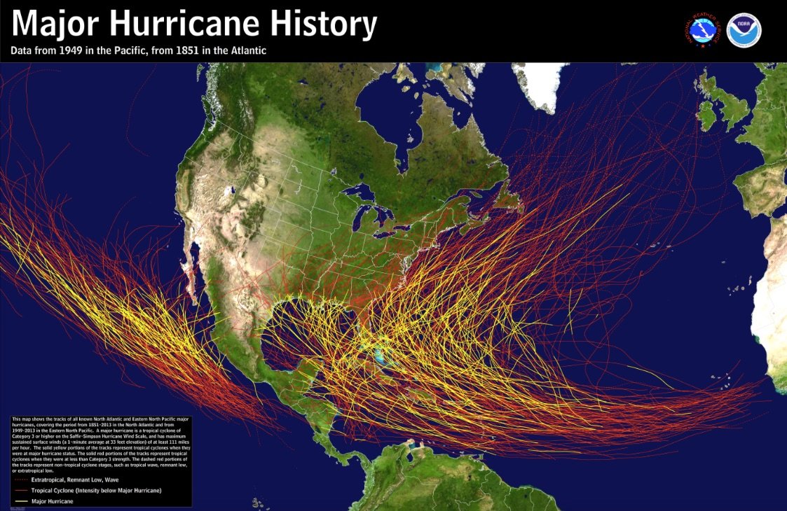
To continue to trace the course of Harvey’s landfall–or to plot the historical sites of the landfall of hurricanes along the coast of the Gulf of Mexico–tells a story that is now outdated by global warming, and that fails to examine how the land meets the sea–or how the land will meet the sea in increasingly violent ways in the not distant future. The impact of the hurricane cannot be seen only as a single vector, or traced as one line, so much as be seen in relation to shore conditions and preparedness, rather than placed atop a layer of what seems a clearly bounded territory. For without planning for increased abilities of drainage, water absorption, and water storage, how can the effects of later hurricanes ever hope to be mitigated in what is still a young season?
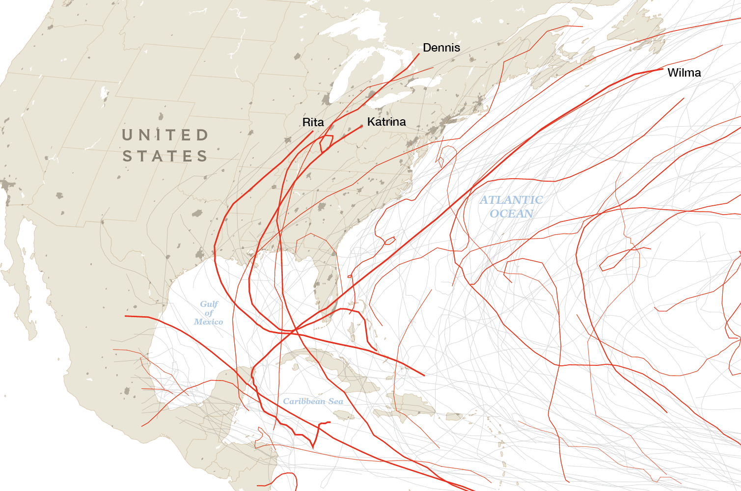
Mapping hurricanes as simple vectors only perpetuates misconception of the limited interaction between land and sea, and from the need to attend to problems of the preparedness of our coasts and shorelines, by rendering them as a line whose traversal brought or generated unforeseen costs that we associate with their names–
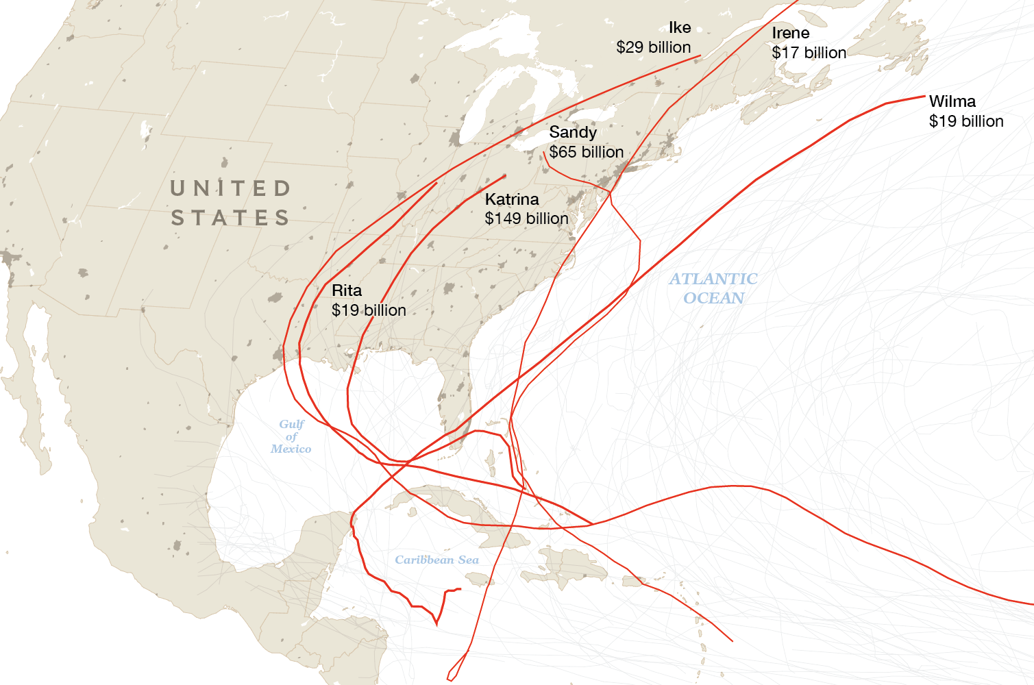
–and continue to focus on sites of hurricane landfall, and their past past cost only terms of the intersection of the hurricane and the coastline, rather than turning attention on the complex question of the ability of the land to accommodate and absorb increased levels of rainfall and flooding–or envision the interaction between local landscape and hard, driving sheets of rain that erase the clear lines of division between land and sea.
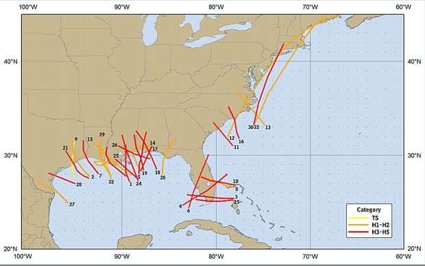
Indeed, only by grasping the increasingly ecotonal character of the shoreline in maps–as raising questions of the relation between land and sea, and place to the absorptive character of regions adjacent to the shore, can we prepare for the eventuality of future floods. Continued debates on the building of a future coastal barriers at a significant cost–the concrete barrier or so-called “coastal spine,” a massive seawall suggested to cost $5.8 billion for Houston alone and yet another $11 billion for the entire region of six counties–suggest imprudent focus on huge projects of constructions that fail to acknowledge global warming but seek to manage the shoreline by building a levees, gates, and floodwalls that Houston’s mayor seeks Congress to fund since 2008 in the hopes to protect Galveston from storm surges, and to protect this large center of petrochemical corporations so prominent in the US economy, and focus on the Houston shipping channel for which it seems to create a protective buffer, removed from the city.
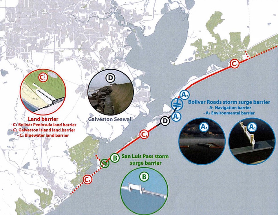
Calls for constructing the “Ike Dike”—first proposed after Hurricane Ike, the 2008 tropical cyclone that swept through Texas after making landfall in Galveston, with winds of over 110 miles per hour that brought widespread coastal flooding–with a connective floodgate focus on keeping the sea out, rather than accommodate the increased number of hurricanes or rainfall that warming waters will generate, or the rising sea-level that will create more invasive storm surges in years ahead. Rather focus on the need to create a prophylactic against the greater threats of floods, and protection of the shipping lane, we might do far better to note that seawalls do not often work, eroding and and needing regular repair as well as hurting ecosystems, more attention must be paid not only widening the concrete-walled bayou or accelerating long-delayed argumentation of the infrastructure of Houston’s reservoir–gaining renewed attention only post-Harvey—and urban transit infrastructure, but a rethinking of the land-sea divide. Such more drastic policy changes must address the uneven nature of urban landcover, mandating better drainage policies for future construction as well as better storm preparation. Even if Harvey only made landfall as a tropical storm–even as rains spun out from the Category Four hurricane that flooded much of the area of greater Houston and Galveston.
The investment in a barrier may just not be looking at the results of the disastrous deluge and the surge in rainfall the Harvey and future storms will create: the problem will in large part lie in the need to allow better and expedited drainage by fashioning and building a more fluid boundary between land and sea, to decrease vulnerability to widespread flooding, not in building a protective wall. As the use in many maps of the rainbow color-scale to register cumulative rainfall–unlike the saturated landscape used by the New York Times, by using shades of blue to illustrate rainfall accumulation, possibly the conservative traditions of graphic design created unclear choices–see #endtherainbow–that led to a weird, if darkly ominous deep crimson, bordering on an apocalyptic black, to denote the massive flooding in much of the Houston Metro Area suddenly flooded, leaving apartment buildings underwater.
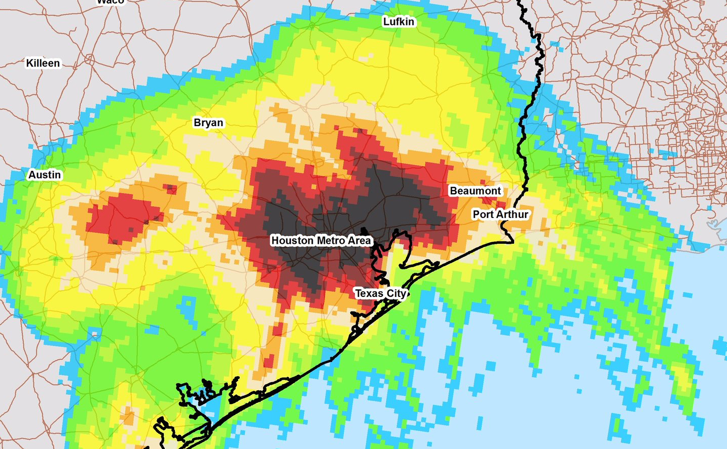
For the mapping of such hurricanes should challenge us to see the coast as where the sea comes to meet the land–where the hurricanes and tropical storms born on warming seas migrate to the land, as much as map the sites where they make landfall. If we map the coast as a line, as much as a meeting place, the weather maps of rainfall and coastal flooding raise questions about how we map the difference between land and sea, and the irresponsibility of building on the coast as if it were not in increased interaction with ocean weather. Scanning the brightly arresting rainbow ramps of rainfall maps as, we hopes to pry beneath their rainbow spectrum to find stories of those living in regions who lie below them, as if to move from the objective formal space of the data visualization to the perceptual and experienced space they conceal.
We resist a sense of disaster tourism or voyeurism, but can’t help but revisit the sense of a new epoch that this map of Houston reveals, and the conditions of weather it heralds, even as it introduced a new different epoch of mapping weather and of the wort of disasters whose danger will only grow in coming hurricane seasons. For the maps of rains spinning of Harvey’s 115 mph winds, as much as challenging color ramps, reflect the more humid airs of a hotter climate and winds of warmer seas. The difficulties of mapping the hurricane’s landfall and its torrential downpours in adequate ways–as in previous hurricanes and tropical storms–suggest the remove of their formal space from the perceived space of individuals in the Houston area, and the implications of Harvey’s landfall for the relations between land and sea in the low-lying lands of the Gulf coast where shoreline erosion is matched by ever-increasing inland subsidence.
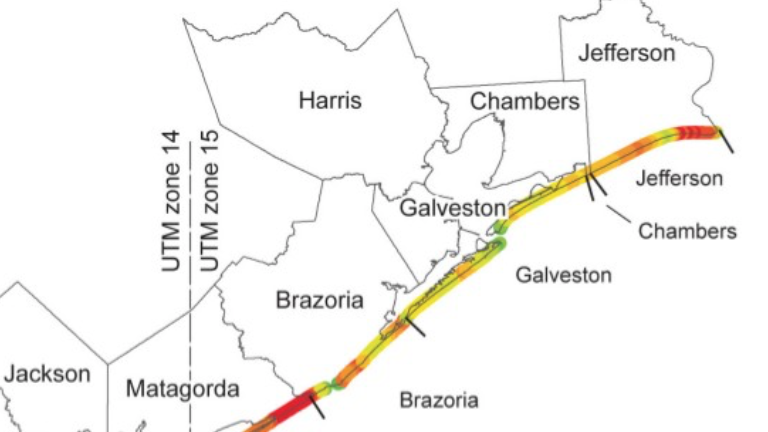
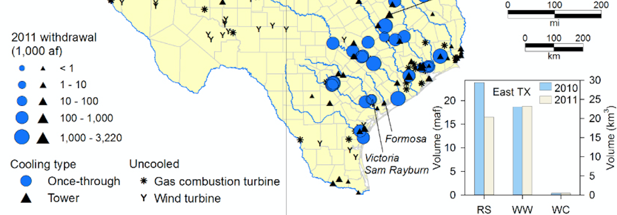
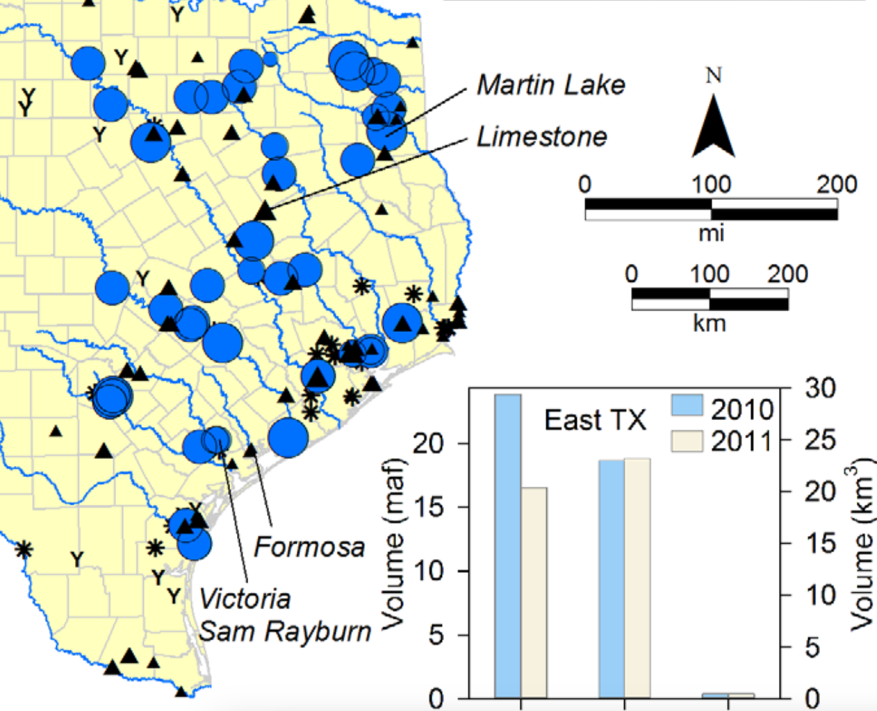
Water Withdrawals in Eastern Texas near Gulf Coast, 2010-11
14. When we look at such maps of unprecedented rainfall, we are struck by the burning of the intensity of the reds and violets whose abundant rainfall over the week seem removed from past weather systems–even as most media has mapped the rains in terms of the areas weather history. But as the layers on the below MERG projection are clearly removed form the topographic base-map against which they are projected, no doubt to suggest the region’s relative flatness, its unnatural light green glow suggest an alien nature from the landscape that we would do well to contemplate.
The formal structure of the rasters of maps of rainfall raise questions about the relation of the formal structures of mapping and mapped space and the perceptions of spatial relations between land and sea–and indeed the sense of the stay of relations, as much as formal space, that is rooted in experience or on-the-ground perceptions. The disjunction between the symbolic structures of categories of formal space and the comprehension of perceived space may have special resonance as we try to frame a theory of the relations between land and sea such maps might better seek to describe, and the huge range of absences of local relation to rainwater–and the anthropogenic landscape in which it has arrived so suddenly–MERG maps fail to reveal or orient their viewers to in full.
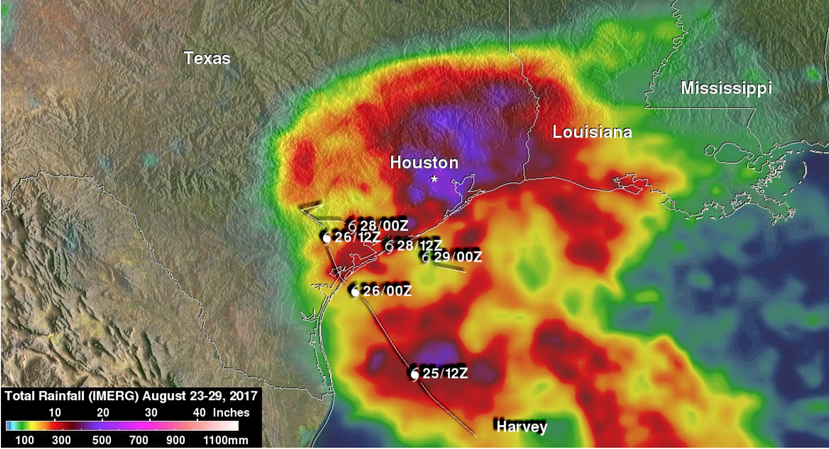
The rainbow hued color-drenched rasters of maps of rainfall press against the geometric space of the map, and its more familiar formal conventions, atop a topographic overlay of the Gulf coast, to capture cumulative rainfall in the Houston region as if striving to come to terms with the unfolding the disaster of the flooding. There seems a sharp if repressed sense of disjuncture between the formal logic of maps as defined records of spatial relations and the subject matter we seek to understand: if weather maps are always blurred, the intensity of the colors that register rainfall seem to try to capture its extreme experience. Such attempts to map saturation by rainfall suggest something of a fuzzy logic pressing against the edges of objectivity, and pushing against the geometrical forms used to describe spatial relations, even if it is based on measurements–and registrations of local precipitation: but the appearance of a miasma of weather, situated above an otherwise sunny topographical map, seem to suggest a a disjuncture between systems of reference. The focus on chromatic bands to show rainfall levels is oddly abstracted from the sea, and removed from the coast, even if it suggests flooding from a tropical storm from the Gulf of Mexico. Their absence of artifice suggests a sense of objectivity, but the clear limpid waters seem alarmingly calm, given the complexity of the interaction between water and land they seek to describe.
The geometrical forms of cartography fail adequately to capture the fluid nature of future relations between land and sea, and the increasingly uncertain relations between land and sea so important to creating future hurricane disaster maps. The perspective on such a data map may even be irresponsible in its use of forms–not only the rainbow spectrum of water intensity, unlike the more chromatic shades of light blue-green to deep blue and violet in the New York Times elegant visualization, but in its use of a fixed and immobile shore, removed from the new experience of weather that we need maps to orient ourselves: hewing to familiar outlines and cartographical forms from maps which have become the base-maps of data projections suggest an all too firm reliance on the coasts.
Yet the increasingly threat posed by the fluid nature of coasts–the disaster was in large part a failure of absorption of the rains to seep or flow into the Gulf of Mexico, evident in the subsequent plumes of sediment flows from the inland area out into the Gulf–
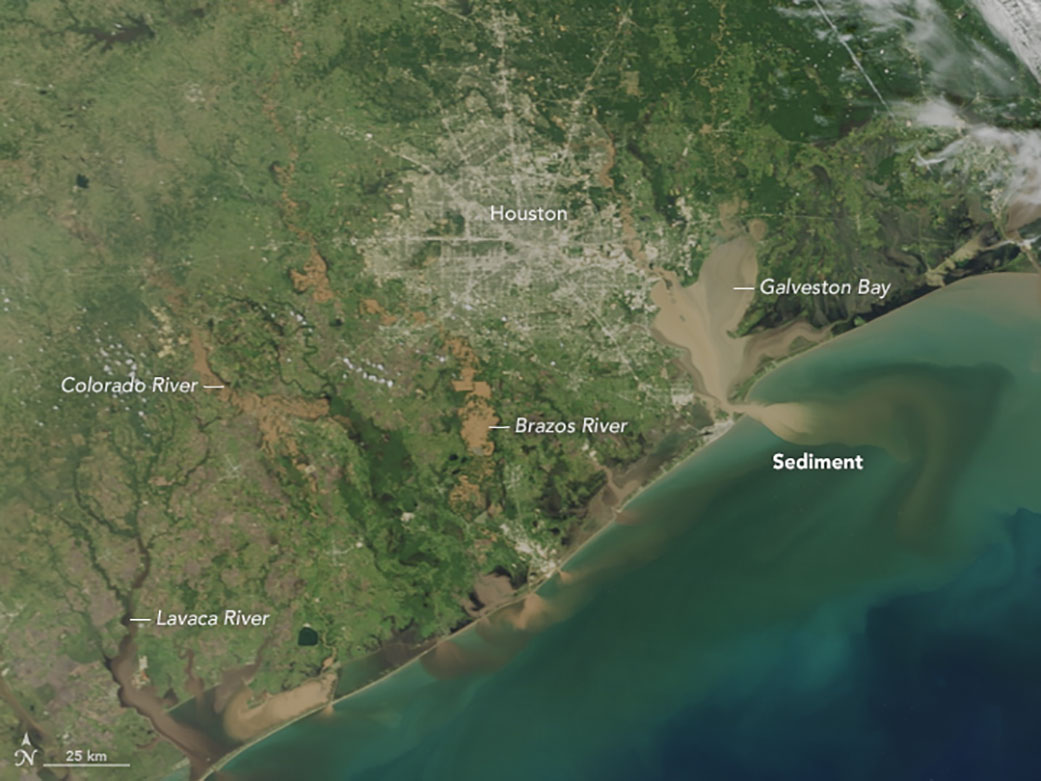
NASA, Sediment Flow to Gulf of Mexico, September 1, 2017
is particularly difficult to map in the familiar formal terms, but is increasingly irresponsible to ignore. The importance of coming to terms with the fluidity of the shoreline–and the drainage of the land–is only partly helped by the MODIS satellite images, which focussed on the flooded inland areas in isolation from the sea, but suggest the danger of the failure to absorb rainfall in much of Houston, showing as they do the increasing superficial saturation of the ground with water, but not suggesting the need for the greater permeability of the shore, despite perpetuating a clear land-sea distinction through their misleading base-maps which suggest the storm met the same land-sea divide as earlier storms did.
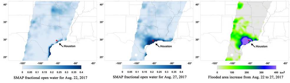
Surface Flooding from Harvey, NASA/JPL-CalTech/GSFC//University of Montana; SMAP website
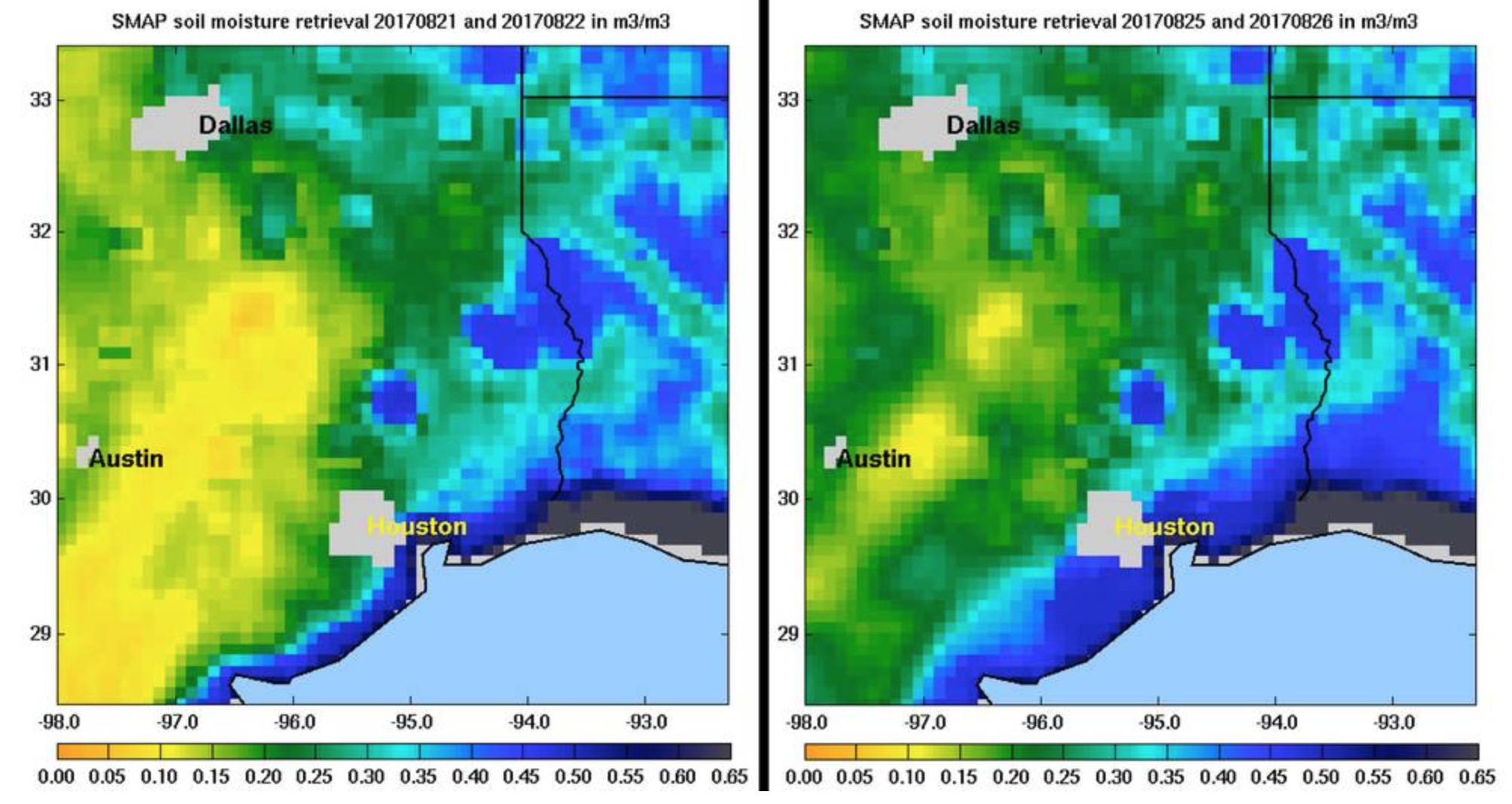
Soil Moisture before and after Harvey Made Landfall (NASA/JPL)
The objections able to be raised with these maps are rooted not in issues of design or objections to these color ramps–although the rainbow color scheme is a misleading ramp for rasters indicating cumulative rain-level and counter-intuitive as a descriptor to say the least–so much as the problem of their fidelity to experience–and in their removal of people or the effects people had on the land. Their exclusive focus on rain fails to place its effects on people in maps to register experience on the ground, or to acknowledge the effects of man-made modification of landscape mediated the effects of extensive rainfall in the greater Houston area. And as we try to peel away the effects of what may have been and now seems to have been the .rainiest downpour in U.S. history–with some regions of Texas receiving 55 inches of rainfall over a week, three inches over the previous record–we need to suggest the ways that maps act not only as a simple subset of data visualizations, but act to orient viewers to a sense of the new spaces of weather systems and which they engage.
This is a broader question of ethics of cartographical representation, to the extent that disasters of flooding were created by the excessively limited permeability of the land. Anthropogenic modification of the landscape not only increased the chances of rainfall, but helped trap water across the region that impacted the experience of the rains spinning off of the hurricane or tropical storm–limiting the use of map of experience, or as a response to disaster. But to attend to the conditions that intensified the catastrophic nature of flooding, one would need an unflattening of the map. As we try to unpeeled the effects of what may be the dangers of such expansive rainstorms whose rapid intensification and intensity is not easily able to be predicted,
14. The place of the map between a perceptual space and physical record is the theme of “The Map,” a poem so rich in recuperating personal meaning in how the sea lies on a map, inflected by the place she lived on Nova Scotia coast as a child–across from the New Brunswick shore, on the Bay of Fundy–with her mother’s family. Bishop’s relation to the map framed in her residence gained greater meaning as her mother had only recently died in a Nova Scotia sanatorium, and her revisiting of the trauma of their separation–Bishop always read the poem publicly, and included it at the start of published collections of her poems, as if it were central to understanding her work, and indeed mapping herself. For although we do not know the precise map, the impact of the map of the Atlantic shore presented a challenge to its descriptive abilities: the map’s form prompted a personal relation to space, as to the glass, and the descriptive abilities of its conventions become the subject of the poem.
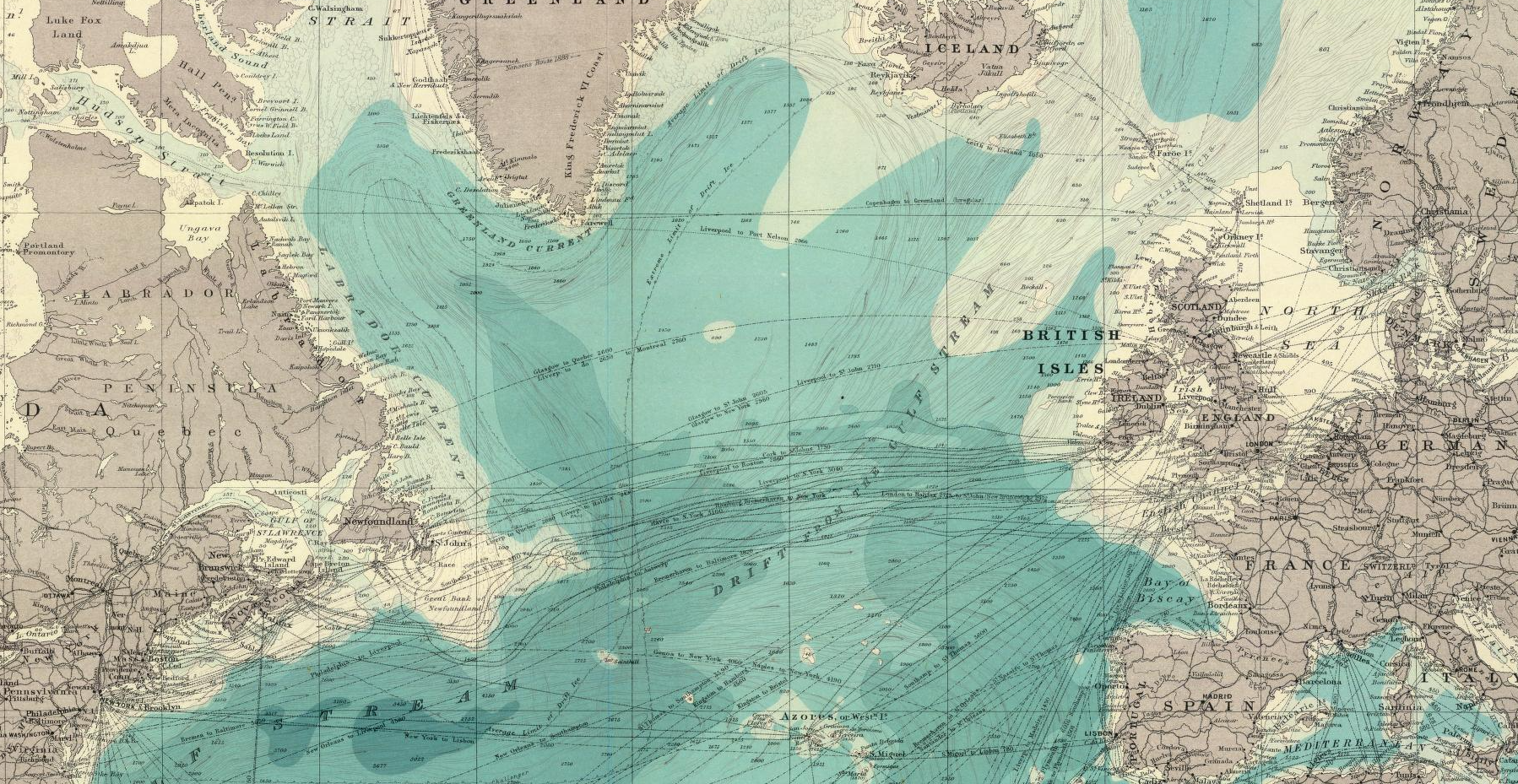
Indeed, its composition define a personal as much as tactile relation to its tactile space, on the surface of the map, in ways that strike our reading of hurricane maps because of their surface and its rendering of space. Bishop’s close reading in “The Map” to the attendant meaning of shorelines, and her superimposition of layers of personal and geographic space–or combination of space, time, words, and the texture of the map–seem to unflatten the limited perspective most maps of Hurricane Harvey offer to orient their readers to its overlapping of land and water, both through the landfall of water-driven weather or the rains that flooded Houston and its shore.
Bishop describes “The Map” for less as a synthesis of measurements than a formal architecture. She questions the descriptive conventions of the map as a perceptual space, however, through precision of her language, in ways that seem to unravel the very sort of land-sea divides in most maps. The poem Bishop wrote in Christmas 1934 explore how we elaborate a perceived space in maps that exists primarily through perception and imagination–and the insight they allow, as much as empirical findings about a physical space–as much as its dissonance with her sense of the shifting nature of the shoreline. She exposes the close relations between geographies of landscape, space, and time to language by unpacking the descriptive space of the map and its expressive syntax more as a composition than a cartographical form. By attending to its descriptive terms and conventions, Bishop is struck by the perceptual space within the map, whose arbitrary conventions reveal their descriptive limits as much as offer an objective image. The unintentional result is to offer a needed counterpoint to the authority of the indelicate chromatic shades of rainfall maps that were widely disseminated after the landfall of Hurricane Harvey after it had so rapidly intensified in the Gulf, and as we started to register the unprecedented nature its downpour.
For Bishop, the printed coastlines become a foil for a radically subjective surface, shaped by tidal currents and interaction with the sea. The conceits of map offer occasions investigating the meaning of shores, edges, and oceans resonant with meaning as textures to be read against the poet’s personal perspective, that invite a personal response. The declarative first line–“Land lies in water; it is shadowed green“–poses questions of how shadows, or shallows, are edges, or places that lift the sea, raising sequential questions about its representation of offshore shelfs, or sea-weeded ledges, treating the shoreline as a proposition to interrogate how inlets and bays interact with the sea, and to reflect on the curiously sanitized version of space it describes, the land that lies beneath its bays, and the sea in which she waded. For the poem evokes the play of land and water in the landscape of the Bay of Fundy in Nova Scotia whose geography, bore tides, and tidal rise of eighty feet, she continued to take her personal bearings, and to read against its conventions. If it prefigures Bishop’s lifelong attention to shifting shorelines, it only hints at her local knowledge of the low-lying coast of the tidal flats of the Bay–where the largest ebb tide and tidal range in the world ranges fifty-five feet or almost seventeen meters–and how its low-lying marshlands informed an acute sense of the transitional nature of shores.
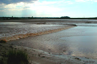
Bishop invested the map’s surface as a tactile record of space, whose surfaces of water the land holds up and across which words move, far more than hurricane maps place on offer. Her meditative poem may instinctively respond to a flawed illustration of the shore, whose shadows she returns to as much as its lines, interrogates its clear divisions and their adequacy as symbols. She turns to invest its surface with tactile qualities that run against denotation from the declarative line–“Land lies in water; it is shadowed green“–of its opening, grabbing attention through the artifice of the map-maker and through her words, and creating a sense of depth its surface lacks. The result enriches its expressivity with her sense of the shore as a meeting place, rather than a line; such sensitivity to the shore as a place where the sea meets the land–or an ecotone–evidences a dynamic relation of exchange hardly perceptible on this map’s surface, but particularly resonant in the flooding and hurricane maps that we must read not only as one-off news items, but to prepare for the changing relation of land and sea.
Bishop developed an increasingly subjectively encounter with the map’s surface, focussing on its conventions not as a map of political national boundaries–even on the eve of World War II–but the coastal Atlantic it exposes, from Newfoundland to Norway, and its access to the experience of land’s relation to the sea. On the eve of World War II when many, including the Pope Pius XI in his Christmas homily, prayed for peace and feared the outbreak of another disastrous war and national conflicts between Germany and France; Bishop instead looks to its sea’s surface as a site of sustained engagement with the land that the maker of this older printed map helps her to explore. In attending to limits of the map’s description, Bishop read its content through her own relation to space and place, shortly after her mother’s death on Nova Scotia, and her family history, less as a mirror on current events, despite its evocation of the site where her mother had been held in a sanatorium since she was five and died, than a surface explored as a description of place from her past, and which she was to reclaim as central to her life as she repeatedly returned to the Maritimes, and included the poem The Map in collections and in most public readings.
In ways of resonance to the lack of artifice in machine-drawn weather maps, and their lack of artifice, Bishop paused over the divide between land and ocean, reading the map’s surface as a record of the cartographer’s art and mimicking it in the precision of her own words. “The Map” responded to her encounter with a map of the Atlantic ocean and Maritimes encountered in New York in 1934, and its presentation of a known landscape; it became an invitation to explore the ways perceptual space is embodied by the material surface of a map kept under glass, which creates a sense of the vital purpose of navigating the map’s contents on its surface as a way to access its sense of relating land and water along shore by straight lines. By exposing the map’s essentially arbitrary relation between land and shore, speaks to the visualizations of Hurricane Harvey’s landfall and ensuring floods provoked by truly epochal rainfall levels that erased any clear divide between water and land.
Bishop’s poem may even help us critique the persistence conventions of hurricane maps, despite its highly subjective construction by exposing the formal space of a map so closely. Bishop’s sense of subjective experience is strong: she reflects on the creation of a world in a map, starting from her intense memory of how land meets water in the Maritimes. Bishop’s observations of the shoreline’s fluctuation Bishop was powerfully struck by the composition of a coastal map of the Atlantic, and the difference between these divisions and the relations between water and land, become a figure of Bishop’s familiarity with the shore it describes, and investigation of it’s form, and the mutability of the sea’s shoreline and the open nature of marine expanse, which she seems to become attentive to in relation to the artifice with which the mapmaker described its shorelines and the names of towns that ran out excitedly from the land to the sea, and the contrast between the unperturbed nature of the sea and the agitation of the land.
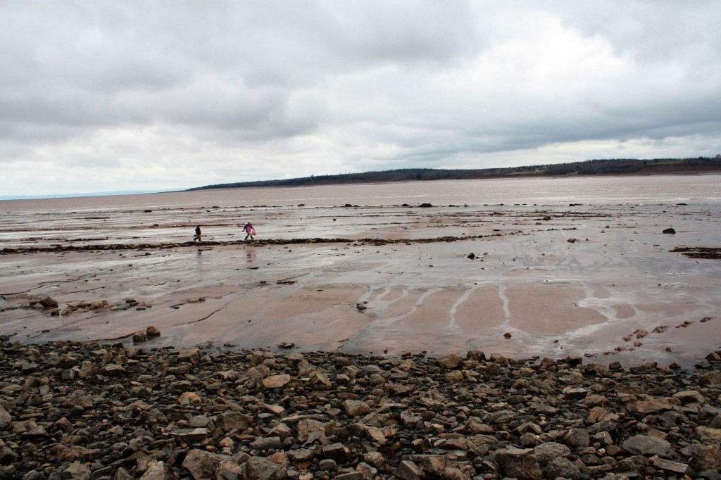
We perhaps can’t know which map Bishop so strongly reacted to. But the map that survives in words is more to the point Bishop may have developed a specific sense of the descriptive limits of shores in such a map, and mapping the expanse of water seen from the shore or a clear division between land and sea. She saw both on the shoreline in The Village on the Bay of Fundy; the awareness of the access to the quiet waters of the map of the Atlantic may illuminate how rainfall maps make a curiously firm division between land and sea, and her long love of sands exposed in the ocean shrunken by low tides. Querying relations between land and sea, and evoking how the lands look out to the sea on the map, seems informed by a perceptual relation to the sea.
In ways that might interrogate a cartographical focus on keeping the sea outside the coast, demarcating land from sea as if each were foreign to the other in the format familiar from hurricane maps, Bishop appears to regard land and sea as imbricated in the shoreline’s ecotone, and dynamically tied to one another–an absent aspect of most all weather maps which take as an unfortunate postulate a divide between land and sea, despite the importance of maintaining a focus on flooding and rainfall levels.
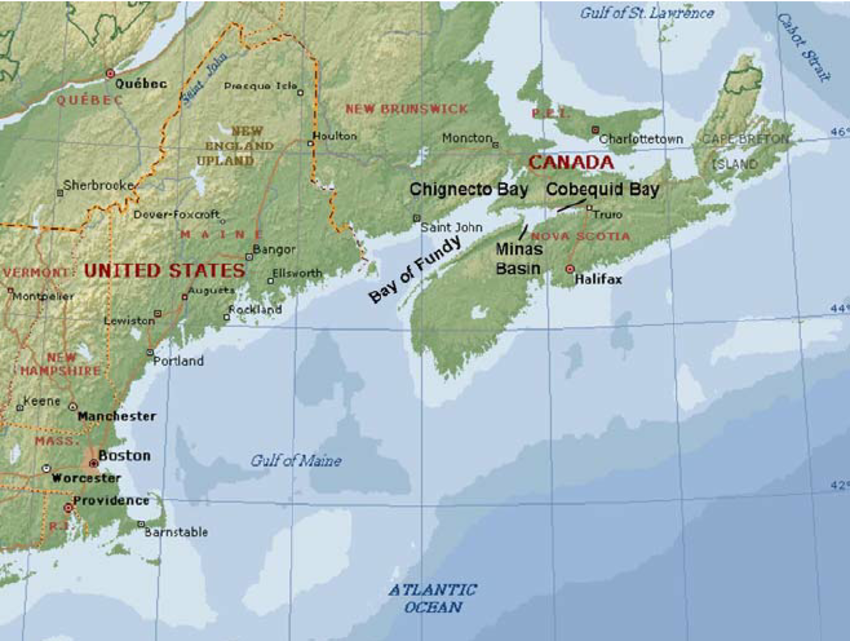
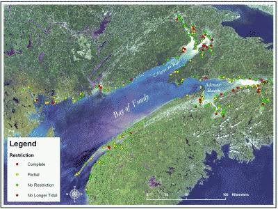
15. Bishop described her perception of space as absorbing her attention and imagination in 1934 in the “The Map” by turning from the land to examining the lines and edges of a coastal map had personal resonance, investigating the specific resonance of the mapped shore as meeting place of land and sea. The three-stanza poem was not only the first she published, but gained a figural status in her work as a sort of trope, reappearing in her later volumes and collections, and featured in her reading, as she increasingly became a sort of cartographer of a mental geography and moved along coasts, defining her self in relation to the coastal experience of her early years that she privileged as a familial space. One is struck by Bishop’s longstanding sensitivity to the ecotonal nature of how land meets sea in a map–and in the Nova Scotia shore, near the village that she always regarded as home in her itinerant life, located on the Bay of Fundy whose landscape she later returned to map in prose, may help provide a model for considering the profit of contemplating how the sea will come to meet the land, rather than how the sea might be kept out of it, or to demarcate the sea from the land: as much as distinguish the ability for seeing through the map, as it grasps something similar to a perceptual space, accessed through perception and imagination, as much as describing empirical reality, and raises the question of how the perception of mapped space rests so much more on experience than on what appears in the map as an objective record.
If “The Map” was published in 1935, it one that stayed with her most of her life, reprinted in her collections of 1946 and 1969 and read as late as the 1970s, coming to be a trope central to her endeavor as a poet; the confrontation with one specific map of the coastal Atlantic including the Maritimes focussed in the apparent quiet of the seas off the coast seemed more secure the fears of wars along national boundaries. The sea’s mapping affirmed a tactile record of the openness of expanse, in almost erotic ways: in the map of the ocean, provided an opportunity to process her relation to space on a New Year’s Eve in New York’s Greenwich Village in 1934,–and a possibility of reorienting herself not only to the Nova Scotia’s relation to the Atlantic shoreline she remembered as a home, shortly after her mother’s death, to take it as a model of the artifice of mapping a new world for herself around the divide between land and sea. Although the tightly controlled poem focussed attention on the contour of the shores of a broad Atlantic, from Newfoundland to Labrador to Norway, it was no doubt the waters where her great-grandfather sailed off Nova Scotia, and Bay of Fundy where she watched the tides recede so far out as a child, which provided a sense of navigating its bathymetry and the disposition of place names that run with excitement in the sea, revealing the ways that the waves and water determine the land, as much as the shoreline of the land providing a borderline to the ocean.
Acknowledging the arbitrary way water lies in relation to the land in life and on the map become an occasion to explore the map’s relation to the real world or to her world, in ways that offer a counterpoint to the maps of flood surging NOAA ha produced. In contrast, the sharp divides by which we discuss coastal risk of hurricanes, and the flooding of land we imagine can be prevented by floodgates, concrete walls, wider bayous, and reservoirs, to prevent the land from lying underwater in the future.

The radically subjective way in which the surface of the map provided the poet with a way of synthesizing and reorienting her relation to a known world, moving across the Atlantic from Newfoundland and Labrador to Norway, Bishop’s description of her navigation of the map’s surface and its layers provides a critique of the difficulties of moving along and between the superimposed layers of many coastal maps of flooding from Hurricane Harvey in ways that would allow inclusion of personal experience of the unprecedented impact of the storm.
The ways that Bishop explores the surface of the map reflects a sensitivity to how a drawn map embodies meaning, and preserves a distinct relation of the cartographer to the map which mediates the physical world. This is a theme of several stanzas in the poem, which begins from the perceptual acknowledgement of the unclear nation of the shore. A focus on how waters lie in relation to the land seems to clarify her meditation on the boundaries and colors imposed by the cartographer upon the land: “invisible fish” live in its “clean age, trapped under the glass case of the map and in its conventions, whose experience her own imagination as a reader of maps–a meta-cartography, if you will–recuperates. The map ceases to be an occasion not to measure spatial relations in a physical world, but to reflect upon the arbitrariness of their representation, and her own ability to map space prose, returning our attention to the ways that maps themselves order space, and orient us to the landscapes they describe to reveal the limits of the conventions with which they open a new space for her to explore. The inheritance of clear limits–and bound constraints–hinder us in our hope for disaster preparedness, as to do the formal space of the lines that they draw: only by being attentive to the provisional nature of the shore, or the provisory nature of their formal constructions, can we start to map the sea not as foreign to the land, and demarcated from it, but describe the advance of the sea upon the land.
Bishop wrote not as a cartographer, of course, or in admiration of cartographers: she rather wrote as a poet writing an alternate cartography, attentive to the surface of the map as a perceptual space. She coyly described her fascination with a printed map that attracted her attention, but whose authority she does not accept, but whose material and formal surface offers, even under glass, new perspectives on travel and on her own place in space. While not reading the map for a sign where she is, Bishop’s poem locates her sense of herself in its abstracted content–as it reinforced the superficiality of its conventional organization. Rather than focus on its measurements, or synthesis of observations, Bishop was struck by the made artifact as a means to measure and contemplate her own relation to the world, and even to try to map her place in the world. If Bishop worked in later poetry to create something of a cartographic record of her relation to Nova Scotia and New Brunswick, and measured her own relation to them over time, The Map recounts an intense confrontation with a printed map that led her to measure her relation to the formal choice of separating the blurred boundaries of land and sea in maps. The excitement she found in encountering the map’s surface, and its blurred boundaries where “names of seashore towns run out to sea,” “names of cities cross neighboring mountains,” and the division of land from water reminded her of the difficulty of reducing a divide between land and water on two dimensions.
She turned her poetic attention to the impossibility of any map’s intended objectivity the might help us fashion our own visualizations of drawing a relation between land and sea in maps, however. Bishop’s close observation of their very forms–“can the countries pick their colors?“; names of towns “run out to sea,” as if the emotional excitement of their cartographer that “too far exceeds its cause,” and “over mountains;”peninsulas finger inlets and bays–suggest a perceived space rooted in imagination and perception, which undermines the false constraints of the delicate colors that divides land and sea or of the objectivity of a removed narrative. The search for objectivity of in the rainfall maps of Houston seem in need of departing from a similar sense of objectivity, to capture the new relation between land and sea. The cool relation to the surfaces in the map in Bishop’s poem are lacking in the harsh imposition of spectrums of color that obscure the disaster that lies beneath, and can’t help but distance our perception of the maps that don’t offer any perceptual space.
Even though it is subjective in tenor, rather than empirically derived, Bishop’s extreme ecotonal sensitivity in The Map illuminates our own need to climb beneath the surface of the data visualizations of catastrophic flooding in Houston, and to recover a sense of the experiences of places that it describes, or the residences, lives, hospitals, industry, sewers and buildings that are trapped under extreme rainfall levels, and the lack of absorption of the intense rainfall by the city’s man-made ground cover. Because the appreciation of the material surface of the map of the Atlantic shores in Bishop’s short poem underscores her own personal relation to the sea and its movement, and to go beneath its chromatic layers to reach the people it affects, and how they perceive space, it stands as a model for the very sort of sensitivity to the fluidity of experiential realities that visualizers of National Weather Service datamaps rushed past when they scrambled to map Harvey’s catastrophic flooding into the spectrum of rainbow ramps. As we look at these maps for disaster preparedness, we will need a broad picture of environmental experience than the reality of these maps seems to describe.
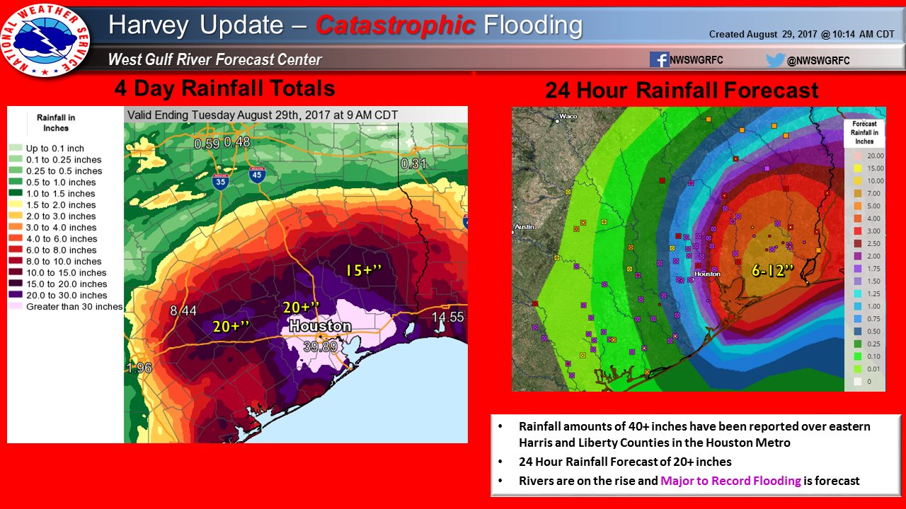
The saturated colors of the data visualizations of Harvey’s impact that register the saturation of southeastern Texas after it made landfall as a tropical storm on Friday, August 25, represent how the weather system dumped an astounding trillions of gallons of water on the coastal region of greater Houston in ways that will continue to offer a record and model for disaster relief.
16. We might turn to the poem in wondering how wthese maps help orient us to future efforts of disaster relief. For exceeding the Texas landfall record fails to provide a meaningful gloss or interpretation of the trillions of gallons of rainfall and their local impact, save in terms of the unaccustomed nature of the inundation–although that should not excuse the lack of preparation of local drainage systems and unprecedented expansion of ground cover impervious to water that have been constructed in recent years with construction over wetlands, prairie, forests, coastal marshlands and natural landscape in the greater Houston area–at a transformative pace of development for which we have no clear monitoring, since as the lack of regulations on development have led it to be not monitored, the last comprehensive study of paved areas in greater Houston dates from 2011, and fails to capture the expansion of its suburbs. Yet with 54,000 acres of wetlands built over from 1996-2010, and developers not required in many counties to plan to store, drain, or mitigate runoff, and problems of the contamination of waste storage.
Instead, apparently credible bloggers and social media exploded as a ridiculously photoshopped image of a shark went viral on social media, reprising its appearance in Hurricane Irene and Hurricane Sandy. The pirated image was recycled to affirm the terrifying proportions of the natural disaster of the hurricane: presence in Houston’s highways of a great white shark photoshopped faked evidence of how the flooding created a confusion between marine and urban areas by a pirated image of 2003 of a great white swimming in shallows off South African coast, widely presented on social media as an epitome of climactic dysphoria.

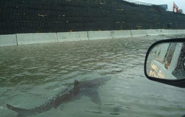
The story of the regular recycling of the shark image in the course of sequential gulf hurricanes reflects the relative spatial alienation of much of the American twittersphere, but also a search to capture a confusion between nature and culture that repeatedly became a concern during the hurricane season in the face of greater tropical storms. The re-use of the image illustrates a nightmare of the approaching confusion between land and sea.
Although it is “false” forgery, or a stolen image, the displacement of the shark to the waters in San Juan or Houston or even New York oddly it offered an apt gloss on climate change. For even as its retweeting and circulation as visual evidence of the degree of disaster repressed climate change as a factor in Gulf hurricanes, it circulated as an end of times image that suggested the dislocation of weather systems and the conflation of the wild and the urban as if the conflation between nature and culture as the consequence of hurricanes: by transposing the great white from the warm waters of South Africa to warming waters of the Gulf of Mexico suggested the effects of a global mipmapping of climate and a confusion of regional water temperatures, gesturing to the consequences of climate change rarely openly addressed. The readiness with which concerns around urban flooding–of Puerto Rico or of New York– adopted on the cinematic image of the shark as its totem offered a more satisfying and sanitized image of the extent of the problem, and an item of infotainment more palatable for all its disturbance than the health dangers of gut diseases, flammable chemicals, and compounds from oil refineries,–or the growth of dengue, mold, and high E. coli bacterial levels from overflowing sewage of which high levels were discovered in the underwater public housing apartments in downtown Houston–or of the cocktails of hazardous pollutants released by forty sites including chemical and plastic plants in Houston–after at least forty of the 1,129 sewage treatment plants not working after the storms subsided.
The continued life of the urban shark introduced an imagined subject–a great white swimming in the city streets–rather than acknowledge the floods as the perfect ambient and vector for the communication of illness that would have tragic consequences for an array of human subjects. The dangers posed by massive urban flooding in an era of climate change demands to be accepted as the result of the poor drainage and floodwater management in the city, which also released multiple air pollutants across the city, we focus on the shark as an emblem of how the overflowing coastline breached the Gulf of Mexico and city,–in so doing, confusing nature and culture and bridging land and sea in apparently definitive ways. The apparent widespreadstiffling of public availability of data on the storm, as data from the Center for Disease Control (CDC), EPA, and USDA are increasingly difficult to access in the Trump administration, and as government agencies’ investigation of pollution levels are not being conducted for the public good–no doubt partly because the failure to respond to requests for information and the desire to clamp down on any “leaks” about pollutants in the water would be critical of the many industries that make their home in Houston, and whose coolants would have leaked into the urban flood.
There are steep costs for not publicizing known data on the levels of pollution of the waters, air, and soil around Houston that were all brought about by the problems with which the rains spun out by Hurricane Harvey across southeastern Texas were drowned in the greater epiphenomenal buzz about the storm as a disembodied phenomenon, removed from consequences on human settlement or health. As Trump played the role of joyous spectator of unprecedented weather extremes as a sports announcer, rather than a leader–“Historic rainfall in Houston and all over Texas. Floods unprecedented . . . “; “Even the experts have said they’ve never seen anything like this!”–a vision of leadership was absent, and focussed on censoring the dangers of their employee’s speaking with the press, in ways that have raised deep concern for the lack of open communication of the agencies. “I am monitoring the path and doings of Hurricane Harvey,” Trump announced on his favored medium of Twitter from the safety of Camp David, admiring the size of the storm at the same time as seeking to inspire confidence from the nation, while gushing “125 MPH winds!” As he noted its sudden growth as “much bigger and more powerful than projected,” “Federal government is on site and ready to respond. Be safe!” he enjoined his twitter followers, before signing off after marveling at its unprecedented size, with nary a mention of global warming.
While removed from the on-the-ground experience of the storm, Trump was left admiring its size, as if it was removed from human presence, “Hurricane [Irma] looks like largest ever recorded over Atlantic!” Wow. “Be safe and get out of its way,if possible [sic]” he tweeted eagerly of the “epic proportion” of Hurricane Irma, “Federal G is ready!”–hoping to tamp down worry and justifying a removed hands-off attitude toward government disaster supervision. The Trump administration seems to have made sure that there would be no pubic record, even as he acted as a sort of promoter for the hurricane as if its size were a sign of American greatness, or as if he were the Weather Channel’s spectator-in-chief. The inexcusable failure of federal agencies to compile data about local levels of ground pollution, contamination of waters, and sanitary conditions–encouraging recent private attempts to test water quality by the New York Times–suggests an absence of necessary data on the scope of the disaster, which we can only hope to grasp partly from the deeply stained visualizations of rainfall precipitation and flooding. The interruption of the provisions of needed health services in Houston hospitals–from pharmaceutical supplies no longer on hand, to ongoing therapies, to medical records–suggests a deep interruption of well-being that the rainfall map barely begins to communicate; the decision to reject the Affordable Care Act in the state of Texas suggests deep difficulties in coping with the large numbers of uninsured in the state.
Indeed, the degree to which the map provides only a superficial reading of the consequences of the storm, deriving from data that is translated to rasters, creates a strikingly colorized if startlingly opaque map of the region, whose inhabitants are as absent as the central problems of draining the catastrophic unprecedented levels of rainfall. The graphics offer little but astonishment at the level of Donald Trump–“storm turned Hurricane is getting much bigger and more powerful than projected!”–as the deep violet that spread inland from the bay, as if leeching on highly absorbent blotting paper, in a rainbow spectrum that seemed all the more distanced from the central problems in greater Houston of the increased impermeability of the ground. Is it not ironic to use a rainbow to obscure the levels of suffering, and man-made consequences of the intensification of flooding, while casting it as a “1,000 year rainfall” seems to remove it from all human agency?

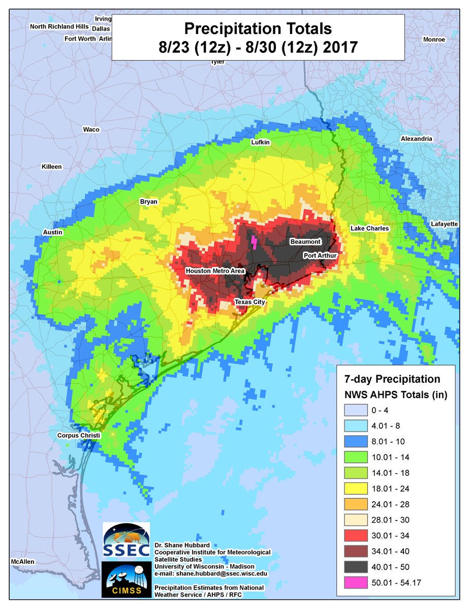
The expressive limits of these maps have been roundly criticized for relying on rainbow spectra, but the expressive limits of such color ramps need to be understood as areas of concern–if not cognitive dissonance about why an impending disaster would be best represented in technicolor by the hues of a rainbow, as Kenneth Field nicely observed.
17. Can we reach under maps of precipitation, to reveal the high toxicity of water that flooded homes, with astonishingly high levels of fecal contamination, and shockingly high levels of arsenic and heavy metals, not surveyed yet by the EPA or federal agencies, by unflattening these maps?
We have been shocked by the extraordinary images of level of precipitation, wind velocity, and flooding that Harvey brought to landshore raised questions about its damage of the submerged landscapes left after landfall, and the possible property damage of the untold levels of rainfall the struck the region–whose most intensely hit sights were described regularly as of thousand year levels, with the probability of occurring once in a thousand years–yet barely acknowledging the new era of breaching divisions of land and shore in an era exacerbated by global warming and climate change. Weather maps of Hurricane Harvey have compelled us collectively to ask where we stood, however, not so much in relation to Harvey as a weather system but the new nature of weather systems, and their disruption of land and sea, as well as of the levels of rain that forty-mile-an-hour winds whipped over the shores.
We linger over the colors of the maps as an illustration of the disaster, hoping to better orient ourselves to the storms of Harvey, Irma, and José by reading their levels of rainfall that revealed areas of twenty-four hours rainfall that are estimated to have occurred only once every thousand years–as if the previous standards of recorded history are comparable to the intensity of rainfall or impermeability of the overpaved ground of Greater Houston. The composition of the data visualization of four days of rainfall, when as the hurricane some hundred miles southeast of Houston spun rainfall levels of just under forty inches of rain by the morning of Tuesday, August 29, or ten inches beyond current indices of rainfall measurement, seems a sign of the weather systems not of the past but a premonition of the meteorological disasters to come, focussed in all their intensity at one point or region on the map. (he need to introduce a new lavender, or light pink, to render rainfall above thirty inches was an odd design choice, mostly since it failed to suggest the relation between flooded waters, groundcover impermeability, and surrounding waters of the Gulf of Mexico, which seemed set apart from Houston.
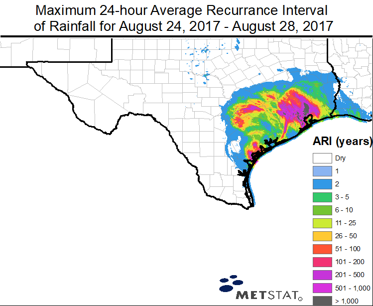
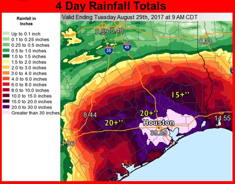
The story of the failure of drainage to the Gulf, or from the urban areas, was however the deeper story to which readers of the news stories these maps often accompanied, or provided the data to manufacture less rainbow-dependent versions of local flooding and the consequences that it had on residents and on local property.
The traditions of mapping coastal waters by bathymetry might provide a point of reference, and pose a deeper problem of cartographic design than the color-transitions of data visualizations like the NWS weather maps. For if the choice of the rainbow spectrum suggested a shorthand to visualize graduations in rainfall in a poetic manner, the aesthetic distractiveness of the inverse rainbow suggest a problem of not relating land and sea, or of confronting the very questions of rainfall intensity to rising sweaters and sea water temperature that informed the intensity of the storm, and promise to return repeatedly with pressing intensity in coming years. Looking backwards, it is striking to remember how Elizabeth Bishop engaged the composition of the map of the Atlantic coast as a visual field, a peaceful configuration of forms on the eve of war between nations. The difficulties of mapping disjunctive personal memories were somehow resolved in the continuity of the map and its multiple realities: if Bishop’s final sentence of the poem, “More delicate are the colors of the cartographer than map,” as she registers the personal meaning she is able to process in the map and in its multiple realities, and the invitation it brings to map her self in relation to space, and calm herself in relation to its illustration of tranquil waters.
18. In “The Map,” Elizabeth Bishop described the encountering an image that reminded Elizabeth Bishop of the limited nature of cartographical forms. The map of the Atlantic coasts, it’s been suggested, was perceived as a way to relate her lost Nova Scotia childhood–a region she from which she departed when she was forcibly taken from her grandparents, to live in the United states. It returned to the map’s surface and its power to orient herself to a network or field of personal meanings, and indeed a set of conventions she was able to transcend. Bishop surveyed the composition of the map to explore her own relation to the world–her final, cyrptic pronouncement of the final line, “More delicate are the colors of the mapmaker than the historian,” may compare her own verbal gloss of the coastal map to the objectivity of historical description, as much as to oppose showing and telling.
Its structure serves to relate the particular sites located in the map–Newfoundland; Nova Scotia–to the broad purview of the nations that bordered the Atlantic ocean, and to move from the meaningful location of the Great Village, where Bishop long lived and which held such a prominent place in her mental imaginary, to the future course of her life. Bishop’s reading of the map seems inflected by her tie to Nova Scotia’s coast through which she read the map. The poem’s ostensible focus on the map of the Atlantic offers an occasion to reflect on the mapping of relations between water and land, its reading seems to take its sense place from a specific point–the Great Village on the Bay of Fundy where Bishop was raised, and which she mapped as her home in a geography of affection–as much as of the entire ocean.
Bishop seemed compelled by the fictions of landscape maps when, at the end of her life, in moments of inescapable melancholy she imagined being a painter–“none of this fiddling about with words,” finding solace in a reassuringly rich palette of expressive color. It is striking the art of painting offered tools to describe her own close relation to the moving sea and shore in some of the several paintings she left, but unsurprising given her sensitivity to their relation in Nova Scotia’s Bay of Fundy–the departure of tides form the shore seem to have provided a point of reference for reading the map. Although the waters in the Gulf of Mexico are not the space of peacefulness and repose as the mapped sea for Bishop, mapping its warming waters might provide a point of orientation orienting us to climate change. An image of the bay Bishop painted, impressionist in tenor, betrays a loving relation to the land holding a liberating sea flecked with streaks of violet to suggest its churning motion close to shore, focussing the beholder’s attention in a similar manner on the sea coming to meet the land, as much as a bound by a coast: the same brown provides a field over which to paint the lavender waves flecked with black.
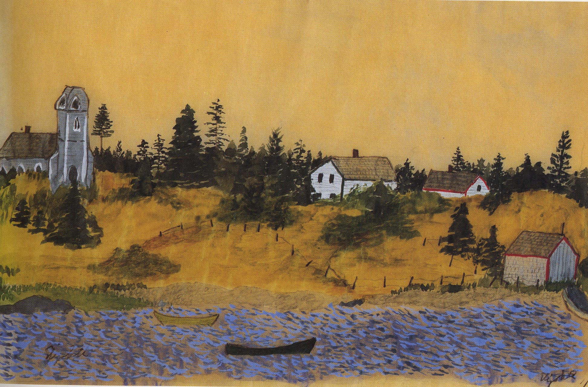
The poem’s meditation on shorelines in the map may anticipate Bishop’s own identification with the coast and on islands in the Bay of Fundy, if it prefigured her deep relation to geography; the landscape she always recognized, if she left it when young before World War I, provides a place to read the map. The Bay provided a basis to read by its displacement of water and the unique refilling –“home of the long tides/where the bay leaves the sea/twice a day and takes/ the herrings long rides/where if the river/enters or retreats/in a wall of brown foam/depends on if it meets/the bay coming in/the bay not home.” Regular withdrawal and refilling of the bay would have reminded her of the ambiguity of the shoreline in Newfoundland and New Brunswick, as the bay’s high tides must have shaped sensitivity to the sea’s relation to the land she looked for on the map. The sea lies “perturbed” on the map, unlike the “flat and still” land, which “lean[s] down to lift the sea from under,”–its boundaries a basis for the beholder to appreciate the artifice of the map’s surface, its relation of open seas to defined land.The map’s focus on shores reflected Bishop’s attachment to her childhood home on the Bay of Fundy, where tidal oscillation between Nova Scotia and New Brunswick recedes every twelve hours, stranding docked boats on the ocean floor, as horizontal tides expose vast areas of the ocean floor, before the tide rushes in at a rate of over ten meters per minute.
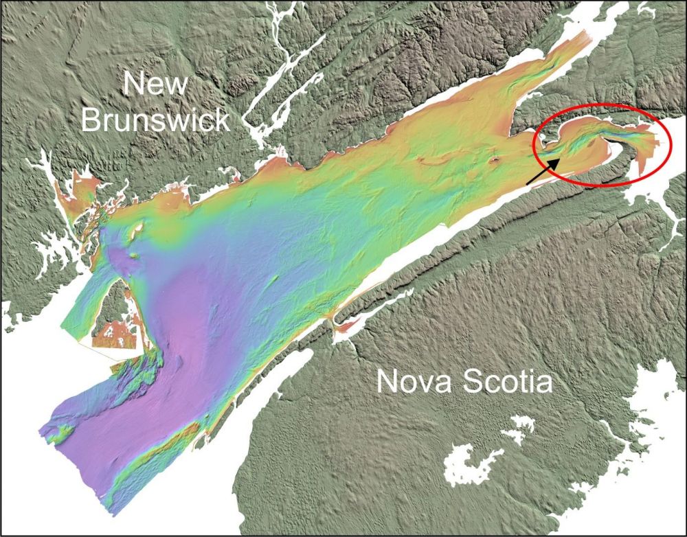
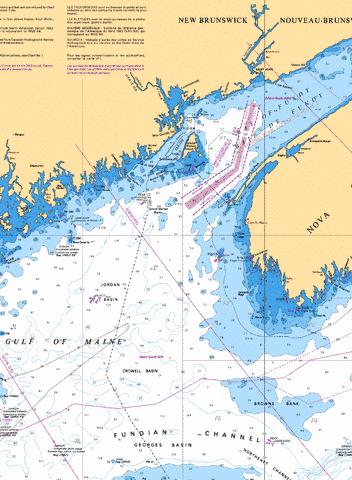
The experience of than tan land extending to the water was in a sense recorded in her somewhat impressionist rendering of the site to which she would often return later in life.
Elizabeth Bishop, painting of Chignecto Bay in the Bay of Fundy
Bishop described the map’s artifice as a way to map her own shifting relation to the world in a poem from her childhood in coastal Nova Scotia, her remove from Canada, and the site of the Nova Scotia Hospital where her mother had recently died in Dartmouth seven months earlier–where Bishop was raised, her coasts she loved, and which she regularly visited through 1931, and whose landscape she reclaimed when it seemed less painful in her later poetry. Bishop would reflected “wrote itself” as her viewing of its apparently arbitrary patterns provided a basis to consider her shifting place in life shortly after her mother died, and a field to try to map her own life, from her treasured childhood on the Nova Scotia shore, to the Nova Scotia Hospital her mother Gertrude was long confined, apart from her daughter, to Elizabeth Bishop’s place in it in New York and in Greenwich Village: the map of the Atlantic coast’s expanse related these particular places to the opening of the sea that fears of a disastrous war threatened on land. By linking disaster to impending fears, we meditate on the limits of fixity on the arbitrary form of hurricane maps. For Bishop, the difficulties of mapping disjunctive personal memories seem resolved in the continuity of the map and its multiple realities: in the famous final sentence of the poem, “More delicate are the colors of the cartographer than map offered multiple realities for her to inhabit simultaneously,–but only as it compelled one to seek out the limits of its own expressive forms.
19. How to explore the indelicate colors of the hurricane maps or rainfall maps, to offer a more compelling personal perspective? In the face of a tendency to view the symbology of the hurricane season as martial, we would do well both to acknowledge and to press against these maps’ expressive forms. Whether we want to or not, we inhabit the map of the floods of Houston, which have come to capture fears of warming waters and rising tides, but have all too often mapped the catastrophic rainfall, flood, and hurricane as if natural–rather than as a disastrous onslaught that was magnified by the poorly design of the man-made structures and the problems of impermeable ground cover that was exacerbated the flooding of greater Houston. It has been broadly estimated that some at least a third of the tropical storm’s rainfall, according to atmospheric scientist Kevin Trenberth, with far more water vapor in the air today than just fifty years ago, and a warmer Gulf of Mexico creating more storms than in previous generations, creating a unique storm whose intensity only continued to grow before it made landfall,–and influencing the occurrence of multiple cases of so-called “100-year flooding” since 2015, according to the meteorologist Eric Holthaus, the city has not accommodated for flooding risk, and” so called “500-year floods” in 2009, 2015, and 2016. If the clay in Houston’s soil makes it impermeable, man-made construction increased the impermeability of the ground in the region and the scope of the disaster, as rivers and bayou are not only walled by concrete, blocking drainage, with asphalt and concrete replacing wetlands, effectively disabling the ability of the coastal region to cope with the water that Harvey dumped.
In a somewhat similar way, when we look at the ostensible object of the NWS maps–Houston, or the progress of Hurricane Harvey–is it also the changed relation between land and water on a much more broad canvas of coastal geography that we see. It may seem quite a stretch from the engraved map to the digitized maps of unprecedented rainfalls in the Southeastern Texas coast immediately intimated the effects of climate change through what was the most extreme rainfall a major city in the United States ever experienced, the result is to force us to recalibrate or remap our relation to the world, and map our sense of the particularity of disaster impending or actual in it. The difficulties of mapping disjunctive personal memories resolved in the multiple realities of the map by which Bishop was struck: again, the final sentence, “More delicate are the colors of the map-maker than the historian,” affirmed the multiple realities of the map as a site for relations between imagination and reality, outside of an established factual narrative, subject to the observer who reads the map.
The subject of personal contemplation Bishop describes in “The Map” becomes a fertile surface to connect reality with the imagination, not by measurements, if in an ordered and controlled way, but in a sensuous relation to the map-maker’s disposition of space, which almost intuits the excitement a tactile relation to the mapped world in the map of the Maritime provinces, North Atlantic, and Scandinavia as an active attempt to grasp its embodiment of space, as if to travel in its waters, and how land meets water on the shore, as opening an imagined and introspective as much as real landscape, as the real landscape seems to slip off the surface of the map. A geographic primer that Bishop quotes in a later book of poems describes the map as a description of the earth’s surface, before asking “Of what is the surface of the world composed? Land and water.” The artificiality of the map is the basis for our investigation its reality.
In ways that were determining of her own identity as a poet, and long staid with her, Bishop was struck by how she processed the arrangement of land and sea in a framed coastal map of the Atlantic ocean one night on New Year’s Eve, 1934, when, newly graduated from Vassar college, the striking image of the green land covered by water seems to have invited its exploration as a surface whose cartographical rendering of land and sea opened a far more sensuous landscape than many printed maps possess. “Mapped waters are more quiet than the land,” Bishop wrote, and cover long sea-weeded ledges. In the mapping of Harvey, of course, the sea could cease to lend the land conformation of its edges, and land, tugging at the warming sea no longer quiet, but filled with agitation, was overflowed not only by rising tides, but by floodwaters, erasing our ability to find fixed boundary lines that raised questions about the permanence of land-sea divides whose very arbitrariness Bishop asks we examine.
The inadequacy of NWS visualizations of rainfall and distribution of flooding after Hurricane Harvey’s landfall, open the shoreline and coast in scary ways with tragic consequences. The arbitrary distinction of the colors of the map for Bishop offered an epiphany to map her sense of her personal identity, and to interrogate her relation to place, as well as seek some sense of resolution in a troubling time in the recognition of the arbitrary colors and illusory peacefulness of mapped space. The unsettling nature of the images of hurricane landfall and extreme inundation are only partly opaque. Even the houses in Galveston and the greater Houston Metro area are now no longer permanent, and the impending uncertainty of land and water in the Gulf and Caribbean make maps difficult to look away from in the last few map-saturated weeks.
“The Map” described a network of arbitrary relations in the map viewed under glass, the mapping of the weather systems of Harvey, Irma or other tornadoes and hurricanes raise question of the networks that they are mapping between land, sea, and storm more than the discreet object of one weather-system–but rather the ability to try to synthesize the consequences of ever-changing weather conditions in a map able to measure their human costs. As record-setting amounts of water were dumped by the entity we treat as Hurricane Harvey even before it made landfall in the shore of southeastern Texas, upsetting the distinction between coast and shore, and making us return to the abundance of maps regularly to track the record levels of rainfall across the shore, in hopes of a less disastrous set of consequences than the all too familiar narratives of disaster of hurricanes making landfall in the American south.
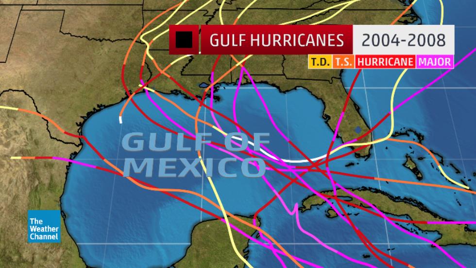
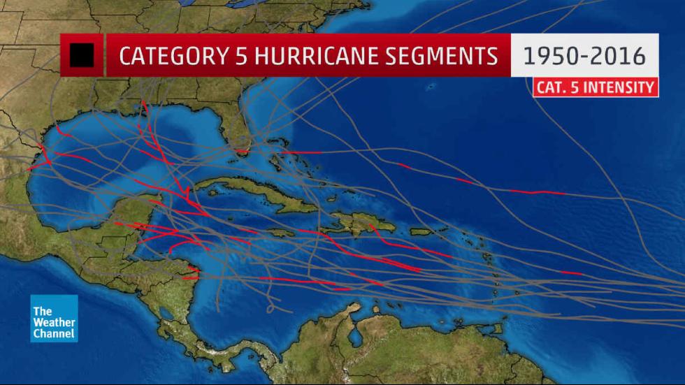
As a poet, Elizabeth Bishop seemed immediately struck by the coasts mediated in a map as creating arbitrary divisions between land and sea. The nature of arbitrariness returned again as we were forced to ask what the same divisions meant again, in an era of global warming where warmer waters drove increasingly violent tornadoes and extreme rains, almost obscured in the buzz over whether the weather systems could bring Donald Trump’s “Katrina moment,” as if disaster responses were also able to be reduced to partisan terms. The rationality of any divide between land and water and the instability of coastal boundaries appeared front and center again in the maps of Houston’s epic inundation with unprecedented rainfall, and its inability to absorb the downpour of the hurricane as it made landfall, which compels we ask new questions of the map, much as Bishop interrogated the stability of its separation of land and sea, the cities whose names run into the ocean as place names cross into mountains, peninsulas seem to grasp water, and countries are assigned colors that render them less perturbed than the sea.
Oceans and rainfall have their own colors across shores in the images of the greens and blues that fill the land from Galveston and beyond the Houston metro area, in ways that break from the pictorial aims of cartographic description, as if to register in their new colors the indelible changes of global warming.
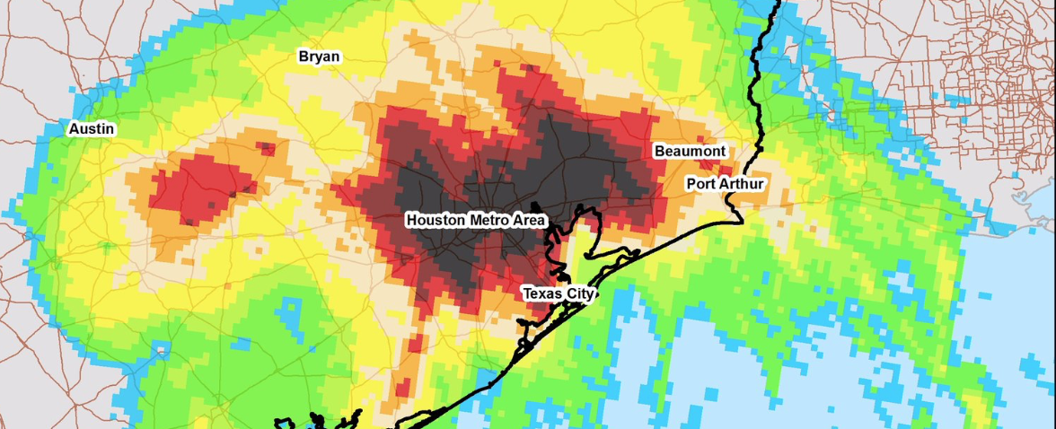
How we measure coasts in such data maps or engraved maps depends on what questions you are asking of the map, but if when Bishop looked at how “Land lies in water; it is shadowed green,” as if recognizing illusionistic coloration of a framed map of the Atlantic seaboard under glass, negotiating its rendering of a landscape in which she saw her relation to a personal landscape laid out and barely submerged, the alien nature of the maps of the inundation of the Houston area with rain suggested an unnatural foreign landscape that seems to force us to confront a landscape soon to be increasingly face. The goegraphy lesson continued to hold fascination for Bishop, and it was an image of learning from maps or reading maps is one to which she would later return,
20. Even if they lack people, and less directly map sites of habitation, or perhaps because of it, the formally exact maps of rainfall in Greater Houston raise questions about the levels of response to disasters we are soon to face. They offer lessons for facing disasters of extreme weather that is not only “weather extremes” or “intense weather events” that demand resilience, or rebuilding. As much as they have been cynically spun for bringing a promise of boosting investment in economic redevelopment, in an eery form of disaster capitalism that global warming prompted, as if warming might boost growth of a new industry, akin to solar, when we know extreme weather disasters provoked by climate change are only poised to widen growing gulfs of well-being of the marginalized and well-off, according to the World Bank, and stand only to force millions more into poverty as well as disproportionately hurt those poor whose assets, homes, and livelihoods are immediately destroyed.
Desiring meaning, we look, in short, at the data maps that show the saturation of the southeastern Texas coast for their meanings for ourselves. This is not for selfish reasons or a lack of empathy, but as they become a premonition of the natural disasters, windstorms, floods, tsunami and ever greater powerful hurricanes of as yet unmeasured categories bound to hit coastal towns, more whose levels of classification have not been yet coined beyond five, lashing more rain in increasing heat as they continue to make landfall on peninsula. Even in developed nations as the United States, hurricanes making landfall in low-lying areas of poor drainage and limited abilities of water absorption–as Houston’s slow-draining bayous, or its highly overbuilt areas and paved landcover prevented easily processing the intensity of storms that saturated the landscape. In fact, the unsupervised and unregulated overbuilding of one of the most rapidly developing areas of the United States, left the Houston area “super-prone to flooding” poorly prepared for rain-levels that forced the U.S. National Weather Service hastily to include a new color to chart rainfall in its visualizations. And indeed, in an era of increasing hurricane seasons-
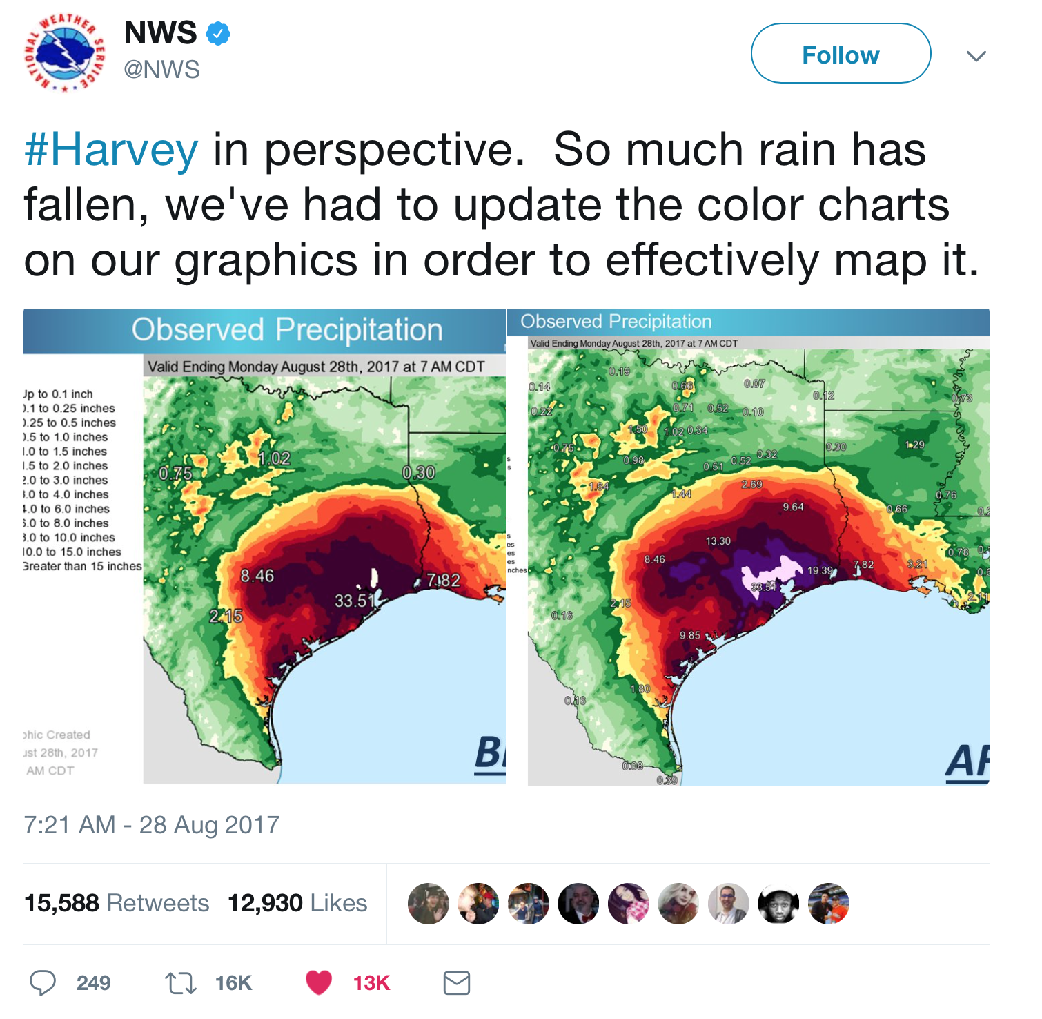
And indeed, in an era of increasing hurricane seasons, with more tropical storms transforming to hurricanes due to the warming of the ocean and climate, the increased temperature of the Gulf of Mexico puts much of southeastern Texas, an area of huge population growth, at special risk, with northern Houston suburbs the fastest-growing city in the US, growing at over 11 times the rest of the nation, and one of the most rapidly paved regions over the past eight straight years on account of its oil production, which attracted people constantly, if in-migration begun to slow after eight years of rapid in-migration and expansion, with high birth rates and a boom of building and construction that seemed without limits, as its expansive urban sprawl contain 2.2 million, but expand over the paved expanse of Houston with a footprint extending beyond the plants of five American cities,–an unvelievalbe expansion of impermeable surfaces, far away from what Christopher Alexander called “positive outdoor space” and his precepts of architects avoiding damage to a natural landscape.
The relentlessness of the sprawl provided a perfect storm for its own inundation, as if a disaster that was waiting to occur. The expanse of buildings in Houston’s sprawl–even without Trump’s decision to roll back requirements that federal funds spent to rebuild structures take into account the most up-to-date scientific predictive models of future floods in the same areas–creates a problem of adequate drainage, only partly to be resolved by widening bayous, While Trump presented this reversal as a question of “streamlining” construction projects to allow a focus on rebuilding infrastructure, the very Federal Flood Risk Management Standards that Trump has acted to repeal, which dates from 2013, stipulate the use of federal funds to meet local standards for building resilience that in themselves seem very weak in greater Houston, whose stretches of non-absorptive impermeable surfaces were part of a looming problem. As Trump long disdained the extra costs he saw as imposed on building to meet standard models of global warming, which he described as a ruse and a scam, the pretext of abandoning future plans for rebuilding would only deepen the difficulties of Houston.
“”
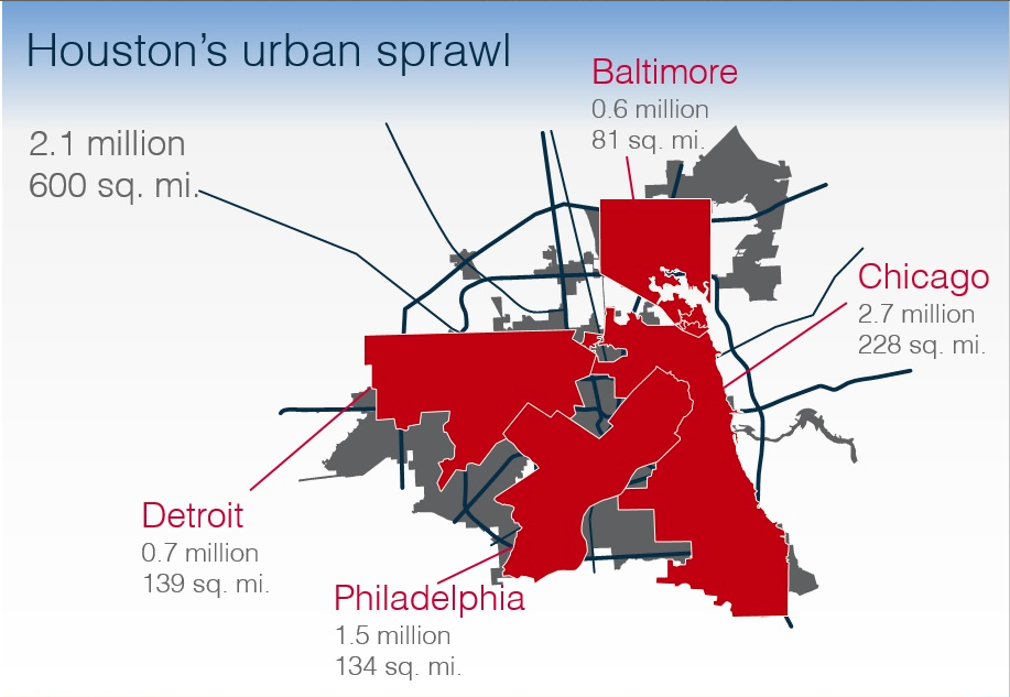
The result makes its expansive impermeable ground cover almost unprecedented among gulf coast cities, and in odd contrast with its many lakes, rivers, and bayous.
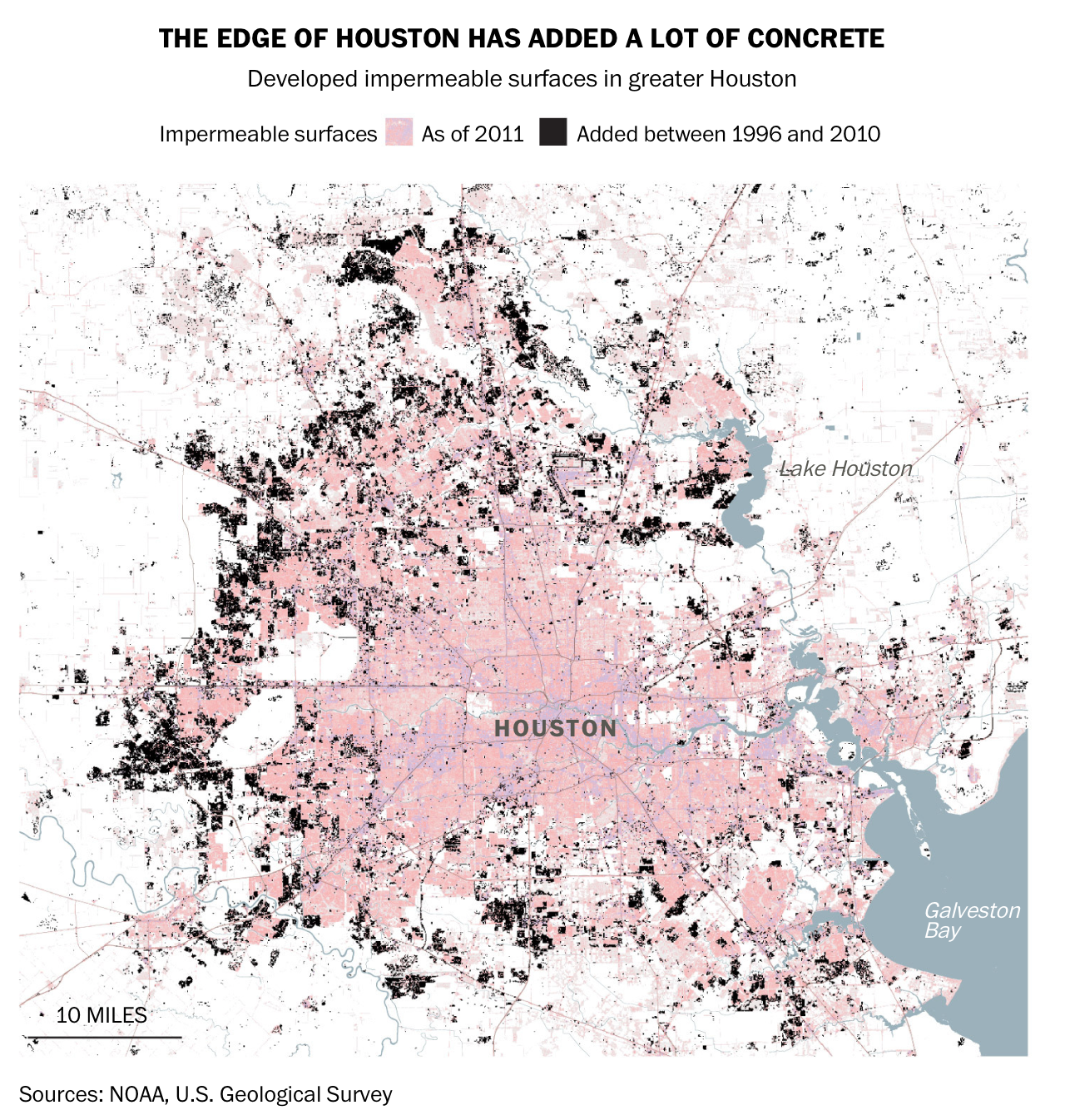
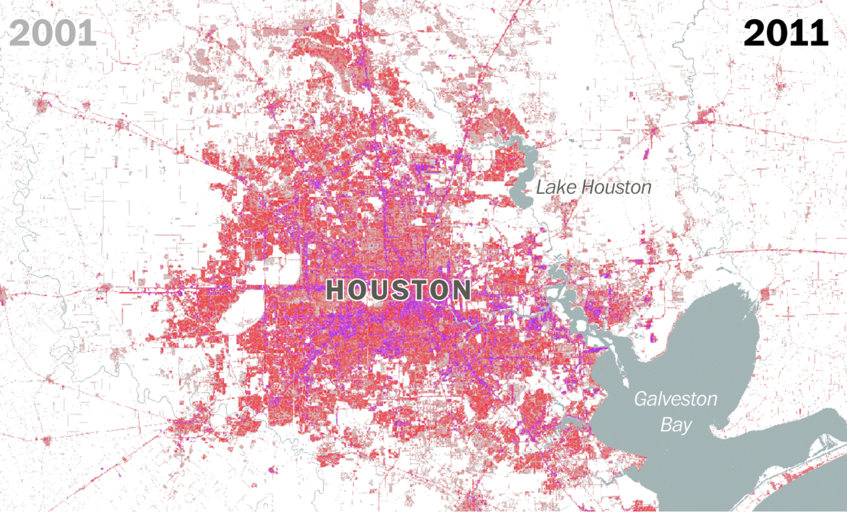
The absence of this open space or permeable ground–or of any ground that Alexander might value as the healthy parts of the environment, or the ecosystem of the building site that Alexander believed the architect must work to make more healthy–made the landfall of the Category 4 Hurricane in Houston a perfect storm for the residents, as the unfettered expansion of urban real estate markets led to a massive development to accommodate population influx in the previous fifteen years, when the explosion of the greater city produced an incredible expansion of paved space, in ways barely revealed in a weather map and not fully accommodated in rainfall charts.
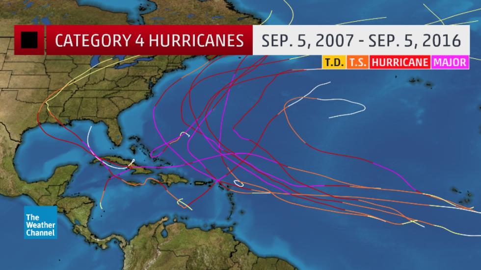
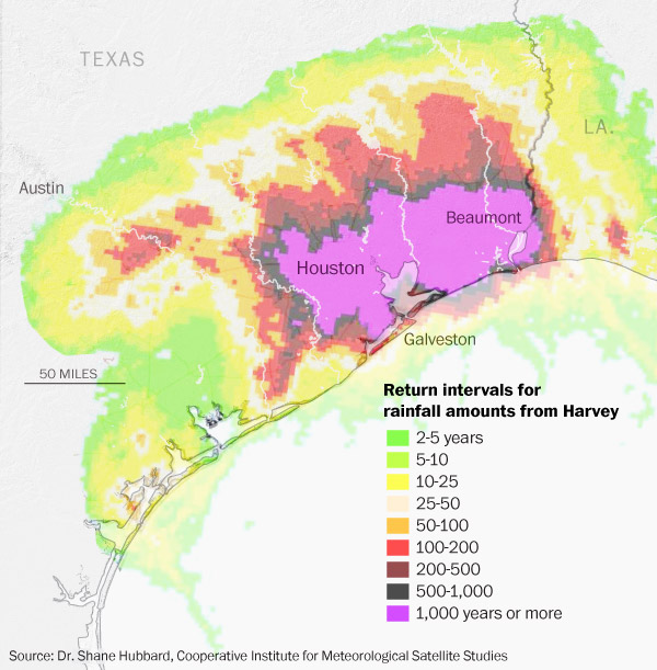
21. The pronounced pooling of rainwater in greater Houston was due to an unprecedented level and intensity of rainfall, but its increasingly populated low density sprawl is less and less able to absorb the greater levels of rain from a Category Four hurricane landfall in ways we have only begun to map, and probably will only finish mapping after the event has departed from the headlines.
The relation between the meteorological maps description of the reality of landfall and the situation on the ground depend largely on our own imaginations. Indeed, the colors measuring the intensity of rainfall suggest not arbitrary shapes so much as images removed from the residential situation on the ground or place of inhabitants, and poorly capture the agricultural devastation of rice and cotton crops in what was the second largest cotton-producing region of the city, including already harvested bales of what promised to be a bumper crop, two thirds of which still lay in the fields; the region is also entrepôt for the shipping of cotton feared damaged or lost–as well, potentially, as much wheat. Bits of cotton are hanging in trees, and modules of harvested cotton were left drenched and smeared across the fields, and whose impact has yet to be tallied but could rise over $190 billion, with an estimated 400,000 bales of cotton, about a quarter of the expected harvest, totaling an estimated $150 million, and some 1.2 million cows and calves in the areas affected by intense rain.
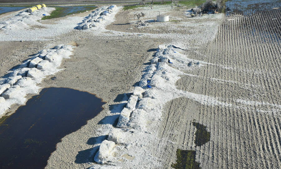
Joseph Floerke/USDA
And while global warming posed deterioration of crop from corn to cotton, the pressing question of whether crop insurance will be able to be afforded by the government, without measures taken to ensure losses from such extreme weather systems, heavy rains, and high temperatures, and a resistance to introduce cover crops to sequester carbon in the ground, and make soil less vulnerable to erosion.
On the maps on screens and monitors of the torrential rains that spiraled out from Hurricane Henry as it crossed the coast of southeastern Texas, spiraling out rainstorms at high speed winds of over 130 miles per hour, but we must try to imagine the nature of its costs, and the increasing intensity of further storms this hurricane season and in future years. The spectacular data maps of regional inundation was not only a may now be but a harbinger to the levels of flooding in a region whose waters are warmer and higher than before, and a vision of the new landscape of flooded areas near coasts–especially if new drainage infrastrctures are not . The visualizations of the National Weather Service synthesize precise and objective measurements of guagues, created an unforgettable picture of land lying underwater: the lack of clear lines and divisions in the coloration of most maps of the landfall of the class four Hurricane hardly marked the quiet of underwater reaches of the offshore that only recently breached the shore to saturate the downtown of Houston and the surrounding regions, forcing the Weather Service to introduce a new color to designate “unfathomable” flooding in its weather maps.

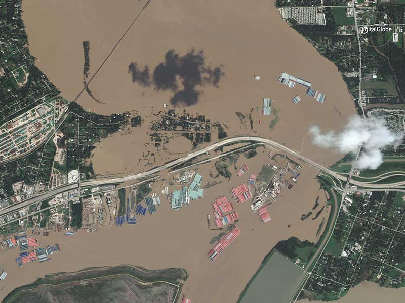
22. Bishop knit together a sense of self in the landscape of the cartographer as mediated by the engraver: in looking at the map, she collects the fragments of self she may well have felt dispersed over space. Bishop evoked the elegance of the bathymetric depiction of coastal elevation change as where lie “Shadows, or are they shallows, at its edges/Showing the line of long sea-weeded ledges/Where weeds hang to the simple blue from green.” If the rhumb lines of the offshore strikes Bishop suddenly as the depths of the recovery of a personal past for Bishop, as much as provoking a recovery of the landscapes of the past, the maps of submersed lands suggest a premonition of the future nightmare as much as the nature of surging seas and shrinking shores: rather than attract a meditation on how engraving mediated the experience of the shores of Nova Scotia Bishop knew well, as a site from childhood, and depths of its unperturbed seas, the luminescent colors of the data vis echo if not underscore the pooling of rainfall across the expanse of man-made groundcover of greater Houston from Galveston inland, and the warming Gulf of Mexico and rising sea-level in our era of global warming. As much as a familiar shoreline, the density of total rainfall erased the extent of their habitation, in visualizations that foregrounded the contours of the topography of flat, low-lying lands as much as its coastal shore and that the hurricane wildly spun across.
If the Renaissance encyclopedic cartographers Braun and Hogenberg had promised that the engraved city views they compiled in the Civitates orbis terrarum that in 1581 described it compendium of city views as rendering cities so clearly to the human eye so as to “remove the deep haze that obscures the individual gaze and obscures human sight,” and render their buildings, churches, and landscape in terms so clear that “the reader seems to be seeing the actual town or place before their eyes.” The topography of Houston is indeed obscured by the merged data of rainfall sensed by multi-satellite sources, whose microwave readings of local precipitation patterns calibrated via satellite to provide an accurate count of the inundation of the region over the week after Harvey made landfall.
The estimates the inundation of land with water was registered in weather maps of Hurricane Harvey in loops of green, yellow, orange, red, crimson, and even deep carmine to register the depth of water ashore as over 27 trillion gallons of rain spiraled from Hurricane’s Harvey across the southeastern Texas seaboard, turning interstates into islands, extending reservoirs across residential neighborhoods, leaving shark swimming up freeways and leaving downtown Houston underwater, erasing divisions between land and sea and leaving us vicarious observers of land unable to absorb what spun off Harvey’s high-velocity winds, and the earth carried downstream with rising water levels of overflowing lakes.
If we often feel like voyeurs or distanced observers from even the most horrific maps of greater Houston’s flooding, our boundaries of empathy are pressed by them: we are barely able, most of us, to encounter the experience of such levels of flooding, and also have little sense of connection, despite the value of DigitalGlobe time-specific maps, which can detect the effects of the rising water that redefined the shores and direct the needs for disaster relief. The poet was struck by the resonance of the printed map she saw on Christmas 1934, finding an immediate resonance of the map of the coastal Atlantic to in how intensely overwhelming the contours of the map represented the shores she new so well, which as mediated by the engraver seemed to allow a new sense of discovering herself in the landscape by the arbitrary coloring of its shores, and the boundary of land and sea.
The confusion between these boundaries of landscape and seascape can bring recognition of arbitrariness seems symbolic of the inability we will increasingly confront of a confusion between storms arriving from warning, rising waters, and the disasters created by the coming confusion between land and sea. The confusion of reading the map as a relation of territoriality–although the counties and nations lay delicately and the waters seemed to draw the waters unperturbed around themselves, Norway had only recently gained its autonomy from Sweden some thirty years earlier; Newfoundland, if lying still and flat on the map, had gained a new status in relation to the Empire by 1934 and was not yet part of Canada.
Bishop attended to the ties between the habitation of the the boundaries between territories and between land and sea, remapping them in her poem “The Map” in ways that make them seem to invest their surface with deeply meaningful personal associations. As if the surface of the map that she evoked spoke directly to her in the poem of 1934, asking her to interrogate the clear boundaries between land and sea, Bishop described the measured intervals of rhumb lines in the offshore bathymetry of Newfoundland as a deep repository of submerged memories; green submerged land hugs the shore provide a means that might be akin to contact with submerged memories that she confronts in unpacking the boundaries between water and land on maps and the boundaries between countries, to uncover their underlying instability: if “mapped waters are more quiet than the land is/lending the land their waves’ own conformation,” as the land’s “profiles investigate the sea,” the abiding calm that Bishop invests in the water on the map Newfoundland was recently compromised as a Crown Colony, it had not yet rejoined Canada; in 1927 ties of Labrador to Canada were acknowledged to resolve contentious territorial disputes, remaining Crown Colonies on the map in ways settled only in 1949, with the Maritimes reluctant to leave the British Empire. Both were separate as such from the mainland; the arbitrary nature of their marking on the map as part of the British Crown Colonies would have been evident to readers as a convention of mapping, and map coloration, as the historical maritime links between Norway to both Labrador and Newfoundland, revealed in an early map of a transatlantic telegraph line from Newfoundland to Ireland of 1866, and or in the memory of Bishop’s grandparents in Nova Scotia, with whom she had lived.
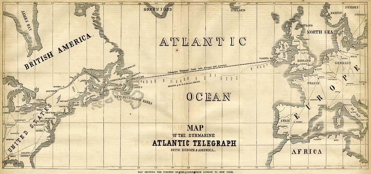
Atlantic Cable & Submarine Cable (1866)
23. It seems impossible to know what rigid territorial abstractions the colored map of the coastal Atlantic that Bishop described in fact showed. But if the image proclaimed the proximity of the Maritimes to the Northeast where she was located, and traversed the open ocean to Norway and the Netherlands , unlike the objective contours of the political space of the historian, it invited introspection by its surface, showing the Bay of Fundy which Bishop long regarded as her first world of affection, if she had been born in Massachusetts and remained tied to American poets–even if it was the site of childhood trauma of her mother’s violent scream and breakdown, the primacy of its landscape–“the Bay of Fundy and its tides, . . . which go out for hundreds of miles, and then come in with a rise of eighty feet,” “where they bay leaves the sea twice a day”–led her to identify the arbitrariness of its shoreline quickly in the Atlantic map. “The poem wrote itself,” Bishop famously remarked of her first published poem, and absorbed her attention when sick and alone on New Year’s Eve in Greenwich Village that may have helped discover a part in her, as it allowed her to access places she knew in childhood–where the sea seemed to retreat from the land so as to leave it, before returning–and the coasts her family had sailed and her to map conflicted memories of her recently departed mother, no longer present in the world. The presence of the peninsula of Nova Scotia on the map, with Newfoundland, where she had lived, provide a personal rectifying of space at a difficult time when this object, under glass, became particularly poignant, even as the depth of these emotions were concealed or lay beneath the disposition of place-names on the map, and the “more delicate” colors of the mapmaker–the land “shadowed green” under water; yellow of Labrador, part of the British Empire; the colors of countries as of the newly independent Norway, now colored as apart from Sweden.
The arbitrary organization of space on the map provided a sense of extraordinary excitement of what was hidden beneath its colors, and a sense of how the poem was the actual world. Although the arrival of Hurricane Harvey was widely mapped, it was the sudden mapping after the landfall of the Category Four Hurricane that led to sudden attempts to try to negotiate land and sea, and understand what lay beneath the intense colors that marked, as if to obscure the land beneath them, the intensity of rainfall of up to fifty inches. Maps provided the main means to negotiate the unprecedented rainfall that left one of the most damaging “natural” disasters in the United States. Maps both tracked its progress or course as it made landfall or struck shore as a category four hurricane, but revealed the unstable boundaries between land and sea as the inundation of the cityscape left it without clear edges at all, as we wondered what the boundaries of the rising waters would be. and the relation of the torrential rains that were spinning off of the hurricane to the cities and ground cover below.
Although Bishop contemplated a static map–a drawn map of the Atlantic coast behind a frame–its craftsmanship focussed her attention in ways that led her to excavate meanings that lay beneath its cartographic description. Perhaps the surface of the map that wa suggestive to Bishop, seven months after the death of her mother, who lived on the shore of the sea, which Bishop saw as so wonderfully quiescent and undisturbed, as the land seemed to draw it “unperturbed around itself,” as if “tugging at the sea from under,” gave the map qualities of evoking the depth of long-submerged memories of her mother, even as its description raises questions about the changing relation between land and water that was mapped as the Hurricane struck shore, and the access we can gain to the newly disturbed areas of the southeastern Texas coast.
24. To be sure, such a focus cuts against the synthesis of measurements in National Weather Service maps, the colors of whose forecast were indeed not so delicate at all on August 28, the maps that were produced over the course of the following hours suggested similar problems of drawing clear lines or distinctions between land and sea, and the problems of describing how the land increasingly lay under water, shadowed different colors, and how it is shadowed in the course of the torrential rain, its edges no longer defined by rhumb lines–“shadows, or are they shallows, at its edges/showing the long line of sea-weeded edges,” land no longer “taking water between thumb and finger,” as Bishop imagined peninsulas, but being overwhelmed by it, overly saturated, and unable to process its arrival and fall.
Although it may be the usual case that “Mapped waters are more quiet than the land is,” as Bishop put it in her third stanza, and peninsulas offer “profiles [that] investigate the sea,” the rising warming waters of the Gulf of Mexico left the land with little possibility of investigating the waters with which the hurricane overwhelmed the land, so saturating low-lying levels to overflow most of the urban landcover to prevent easy drainage by bayous.
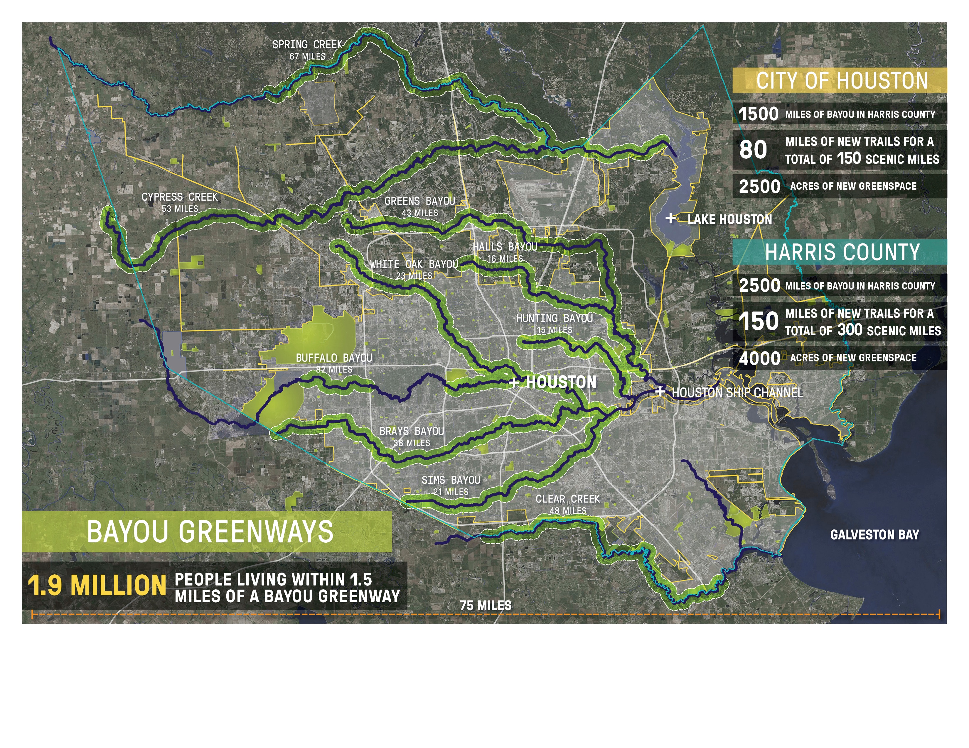
Whether the maps below inspire their own poets is unclear, but the scenario that they sketch provide an image that begs the question of placing more people in them, mapping the presence of anthropogenic contributions both in Houston’s landcover and the man-made structures that reduced ground absorption of water, and the impact of human activities on global warming– 30% of the rise in global sea level between 1880 and 2010 resulted from emissions traced to the 90 largest carbon producer–would press the boundaries of the map even more. Much of the industry the has produced high levels of carbon are in fact –despite the Paris Accords–maintaining earlier business models which rely on modeling of continued global reliance on the very products that drive heat-trapping emissions, even thought many claim to support such standards.
Can we better integrate the presence of water in such maps, which seem to project layers of rainfall onto a Galveston coastline that does not change?
The history of the class four hurricane’s arrival For the shading of registered rainfall recolored the land. And as much as the disaster was tied to be made into a “natural” event by maps, the tools of mapping suggested how it was impossible to treat in comparison to other storms or rainlevels, and left the flatness of the land unable to to touch or negotiate the reating massive evacuations, rig shut downs, and property damages across the region in ways that have shut down oil production, the disaster is wrong to treat in comparison to other storms, or indeed in a purely historical perspective: if the economic impact stands to surpass any in American history in terms of its clean-up costs, standing at almost $200 billion, or beyond the costs of damages from Hurricane Katrina, the man-made landscape that received the disastrous historical rainfall and flooding around Houston and inland after the Hurricane, or from August 28-31, created a windfall of water that was as man-made as “natural” in the level of its devastating impact, in a region not built to process or absorb rainfall or prepared to drain to the ocean, and whose intensity so demands to be examined in terms of the new natures of disasters of intense thunderstorms in a warming world can’t only be called “natural.”
25. For this was no normal storm, and created new challenges to image the extreme saturation of the coastal region of southeastern Texas. As rising sea levels caused the in the Gulf of Mexico caused the storm to surge a full foot beyond previous decades, and the already rising surface-sea temperatures of the Gulf created 3-5% greater levels of humidity in Austin’s air, again intensifying the storm. Indeed, the different descriptive categories and anthropogenically generated circumstances in which Harvey hit the shoreline as a category four Hurricane raise questions about the commensurability of earlier standards of measurement to judge the challenges of rainfall, and raise questions about the levels of preparedness other coastal cities might need to adopt to prevent a similar flooding of the shore, and indeed to map rainfall: the maps of rainfall intensity are, even for audiences habituated to watching and interpreting the Weather Channel as a form of vicarious travel a record whose colors and indices were so hard to get one’s mind around to test one’s empathy.
The division between blocks of a spectrum of colors perhaps even to remind one of Bishop’s evocation of the arbitrary colors that divided land and sea on a framed map of the Atlantic seaboard, if only by noticing just how much land was left underwater from Texas City to the Galveston Bay to the downtown area of Houston to Beaumont.
If the visualizations that compress regional rainfall plot the saturation of the landscapes and cityscape, the disastrous effects of the pooling of undrained water, and the overflowing of the concrete banks of rivers and bayoux suggest, as the destruction of offshore rigs and refineries, a much deeper range of damages because of man-made structures and inadequate ability to prepare local inhabitants for the arrival of the amounts of rain so intense that the National Weather Service was compelled to add a new level of chromatic intensity of rainfall–lavender, indicating what are actually “unfathomable” quantities of rain–that literally stretched the cartographical tools to chart the rainfall brought by the category 4 Hurricane that exceeded previous recorded precedent for rain, as rain levels were predicted and were indeed observed to crest above fifty inches in Houston on Monday, August 28, removing it from previous criteria of judgement.
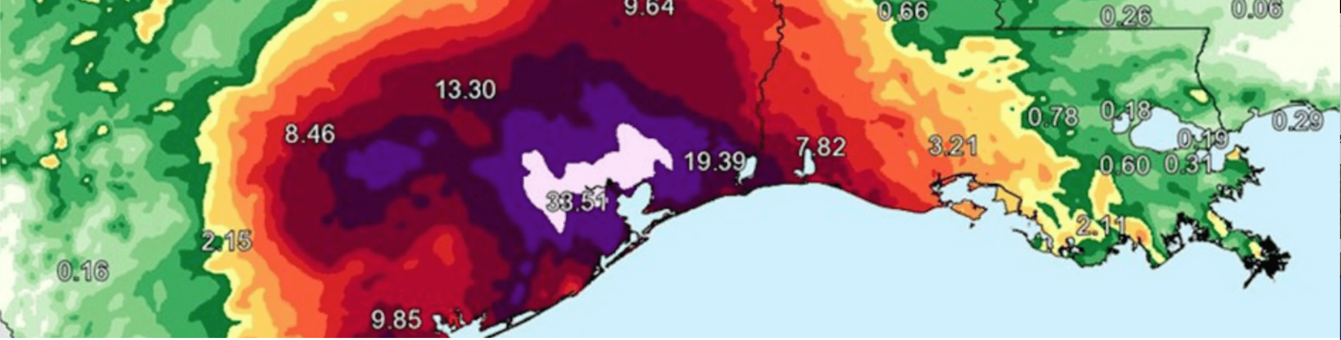
We looked to maps to try to contemplate the immensity of the trillions of gallons falling on Houston from Galveston to Port Arthur to Beaumont long before contemplating the extent of property damages or toxic chemicals the downpour helped release, looking to maps for signs of the ability to place the event in a historical context–even though it was pretty clear that the extent of condensed water dropped on in the first week inaugurated a new era of extra rainfall; even as the the storm that stalled over southeastern Texas might be able to be described in relation to earlier rainfall patterns, what made landfall as a Category 4 hurricane set a standard for the need for new drainage infrastructures if we seek to preserve a viable relation between land and sea in the increasingly overpaved areas of the coastal United States: even as calls to head for higher ground in the largely level areas of southeastern Texas resounded from the National Weather Service on August 26, and up to a foot of rainfall fell over much of the area, saturating many regions with over twenty inches in but a day. And as Irma advanced past the Bahamas, the low-pressure system at the storm’s center so drew water upwards into itself to draw all local wager away from its surroundings, revealing in temporary fashion the water into the hurricane “bulge” in a sea temporarily gone dry.
The new symbolic categories of mapping rainfall that the NWS introduced to describe the observed levels of precipitation in its colorized charts suggest the new nature of storms run in the face of the Trump administration’s decision to orient American cities to “climate change adaptation”–preferring the terms “resilience to weather extremes,” a new coinage of neoliberal origins, removing “severe storms and flooding” from any discussion of the need to acknowledge new weather conditions warmer temperatures. Even as the Trump administration refrained from using the term “climate change,” and opted instead for the less than clarifying term “weather extremes”, to discourage judgement or analysis, compelling the World Meteorological Organization to underscore the tie of such catastrophic levels of rainfall from slow-moving storms to climate change: the rasterized images that burned into our retinas raised questions of the disproportionate scale of rainfall that incurred tremendous damages to homes and industry–an unimaginable scale of losses and pollution–and couldn’t but remind us of the widespread inability to process such an influx of water presented to the region and its inhabitants, as it was saturated with water in unprecedented ways, as the below rainbow-spectrum suggests.

Doppler estimated rainfall through from Harvey through Saturday evening. (National Weather Service)
Even despite the need to acknowledge the difficulties of the paralysis of the oil extraction industries which runs over 3,700 platforms that the path of the class 4 hurricane will pass, as it moves toward the shore,
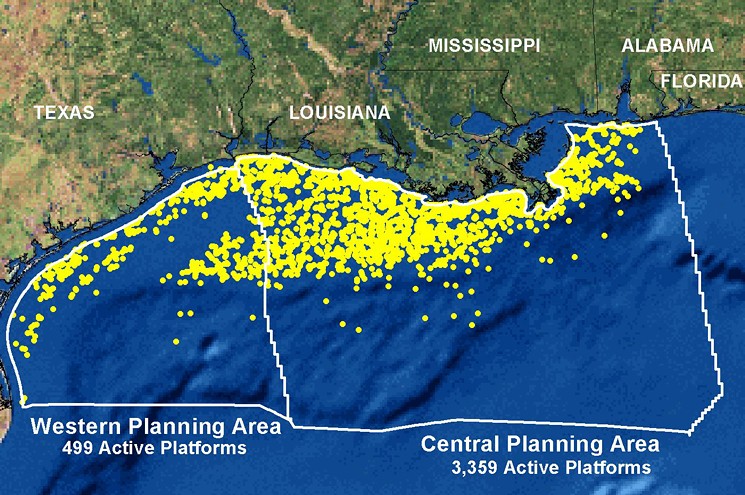
NOAA
the inland damage that the twenty-mile-an-hour winds will cause in the trillions of trillions of gallons of water it will drop were destined to saturate and overload the land-based resources onshore where they seem most unprepared by far.
The breadth of inundation of the region of greater Houston after Harvey receded resembled the damages of other tropical cyclones in the region, but reveals a broad flooding of the plateaus of flat, paved, or rebuilt earth in the region, and a failure of drainage–and of local absorption of rainwater as much as its deluge.
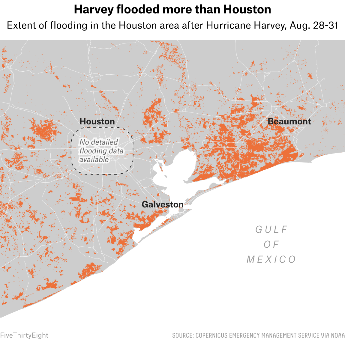
We have all too often mapped the inundation of Houston and southeastern seaboard of Texas as a question of precipitation–and the record levels of precipitation were record, with trillions of gallons of water falling. Yet in mapping the record rainfall of water on land, we capture only part of the story of the failure of the ground to absorb rainfall, and the difficulty of how water accumulated across the city, after it crested rivers, bayous, chaannels and streams, using the paved roadways of the city as something like an alternate set of pathways to travel across the overpaved supercity. whose rapid pace of growth proceeded without adequate drainage. For if we talk about the saturation of the overbuilt Texas landscape, from August 25-6–
–or from August 21-2
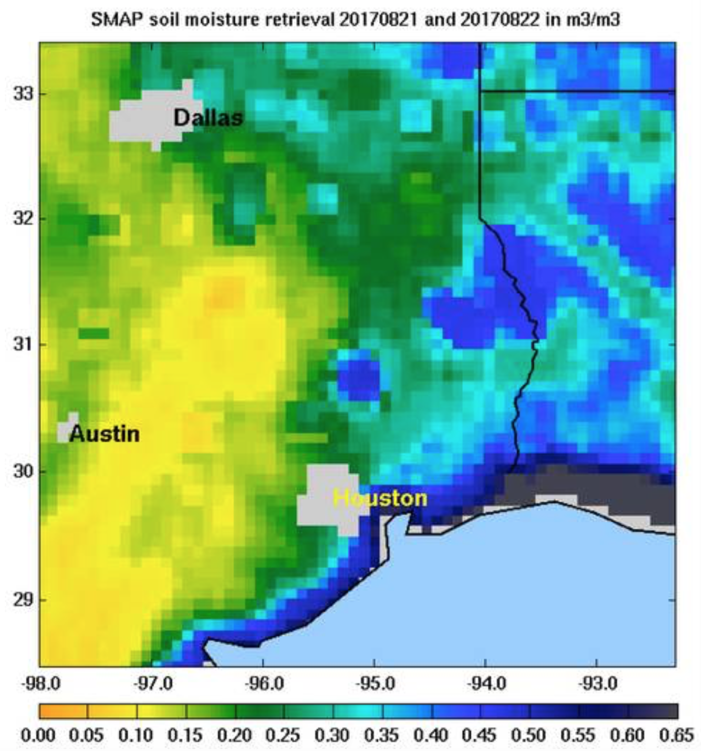
–the absence of where water went as it hit the land, and intense levels of rainfall puddled without adequate avenues of absorption in the land is one of the real stories of Harvey. And even if we have mostly focussed on the biblical scope of the rainfalls, and intensity of the distribution of rainfall in Houston, the complexity of mapping the local incidence of the flooding to global processes such as climate change and ground cover change prevent us from focussing on it only in local terms.
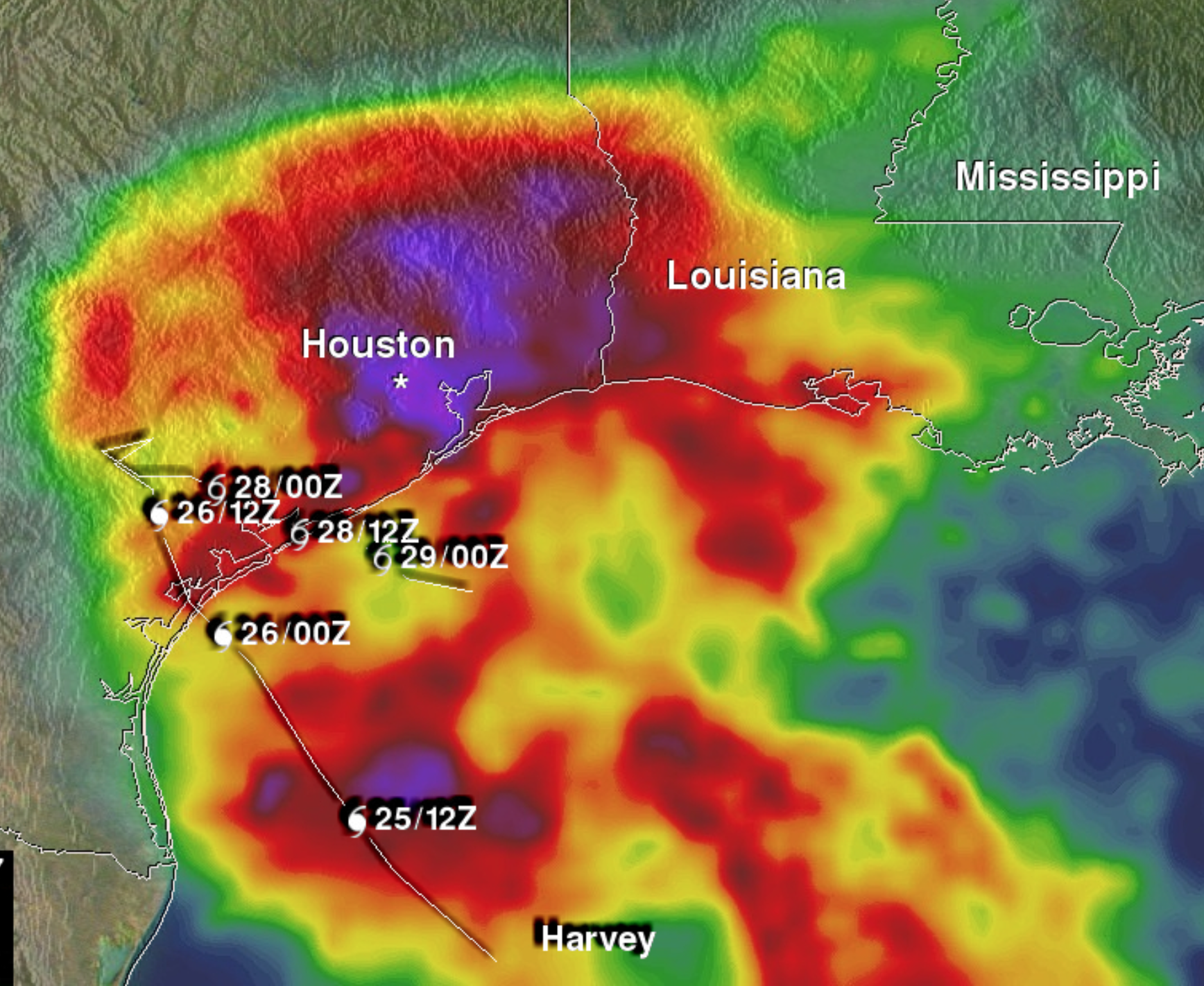
The city of Houston is built on some of the country’s least absorbent soil, and even before the rapid landcover change of the previous decade paved most of the city with concrete, the dry land of the region made it susceptible to high levels of rainfall and conducive to flooding.
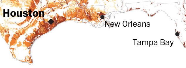

The shrinking green space on the edge of Houston–and the number of once open areas filled by concrete in new developments around the upper areas in the city in greater Houston–created a problem of ground absorption that the unexpected inundation of the city after the arrival of Hurricane Harvey found little area to be absorbed by, exacerbating the problems of intense rainfall in ways that are not easily registered in maps of rainfall alone.

Although much of the land of greater Houston became submerged in the arrival of hurricane Harvey along its coast–whose strength may have been indicated by the assignment of a male name to the Hurricane for the first time in recent memory–the dry ground around Eastern Texas was even less able to absorb the pounding deluge of rain. The increased expansion of the city, which as it spread into the prairies and green space gained far fewer possibilities of absorbing regular rains, is suggested in an image of soil subsidence from Galveston to Brazoria to Montgomery County, as the compression and sinking of land on account of increased oil speculation has exposed coastal areas to storm surges all the more dangerously, with widespread practices of withdrawal of water by pumping and gas refining has led to ground levels as much as ten feet, radically changing drainage patterns in ways that have never been adequately addressed.
Subsidence not only made it more difficult for land to absorb the rains, as it suggests the increasing density of much of the city’s overbuilt grounds–the increasing levels of soil subsidence in Houston locate many of its impermeable surfaces below sea-level, making their drainage all the more difficult and impossible: despite reductions in groundwater pumping stations in recent years, with the development of planned reservoirs, Houston was left quite unprepared for floods, with areas of Montgomery County, Fort Bend, Harris County, and Downtown Houston below sea level.

Mark Kasmarek (2013), USGS/Texas Landscape
Many properties on the same lands were uninsured: the absence of insurance for properties in Houston that are not adequately insured, some 71% in areas impacted by Harvey, and perhaps as high as three-quarters, when full damages are assessed, according to Syndeste, have left literally thousands of properties in areas near the coast without adequate property insurance, as well as inadequate drainage. (The similar distribution of large numbers of uninsured properties in the hundred year floodplain in Florida, lands that were most affected by Irma, and the number of uninsured extend beyond 90% in central Florida and in the panhandle, Beyond Floods has also mapped–finding that more than a fifth–4.4 million out of 18.8 million Floridians–live in properties that can be identified as high risk flood zones subject to the greatest risk in the “hundred year flood zone” of 1% annual risk of flooding, or a one in four chance of being flooded in a thirty yer mortgage.)
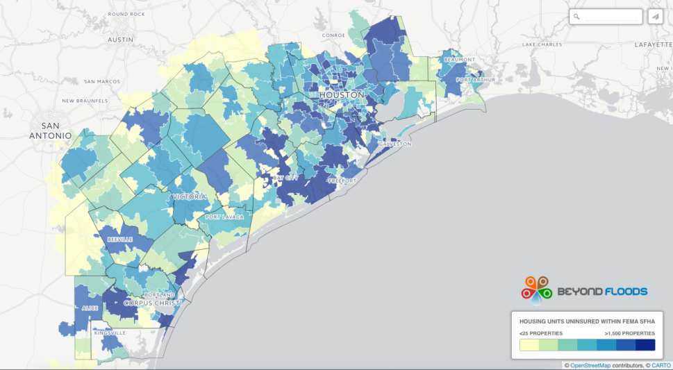
For although we map the difference between land and water as if it were a straight line, rather than, as Elizabeth Bishop intuited when watching a framed map of the Northern Atlantic form her sick bed in 1934, in New York City, shadows, shallows, and seaweed edges, in ways that lift the sea, or allow the water to lean into it in ways whose colors are not always in fact so strictly assigned or need to be. The huge quantities of rains from the hurricane that became a tropical storm as it arrived in Houston–first measured as 9 trillion gallons, with another 5-10 trillion predicted by the week’s end, but then measured as totaling 24.5 trillion gallons–an unimaginable number or amount, beyond what would fill the Great Salt Lake five times over–or just under fifty-two inches, which is better read as four and a third feet–in rainfall totals that cannot be grasped, but also had no sense of where to flow or ability to seep. The almost iconic images of rainfall intensity along Harveys path demand comparison with the areas where absorption of water was impeded or intensified.
25. The initial rainfall over southeast Texas suggested isolated pockets of up to 18-20 inches, but didn’t provide a clear picture of the intense inundations of later days.
From the initial impact of those 9 trillion gallons that Harvey unloaded over Houston over four days, it made sense to use rasters to track rain dispersed by a Hurricane, the awe of the water spread by the storm tended to fail to register that Harvey had hit hardest places where 80% of residents lack insurance–a point that only later emerged, and is still left salient in most reportage on the flooding that present the event as a natural event. The impact of such extraordinary amounts of rainfall provided a powerful emblem to help process not only the tragedy, but also the relations between a changing climate and place, as if we could stare into the black hole of a future climate scenario in which what were presented as hundred- or thousand-year floods were the new normal–and offered an emblem of the ineluctable effects of globalization from climate change to the overpaying of our cities and extra-urban space that offers few surfaces for ground-absorption of water–as place provided a particularly compelling condensation of global processes in weather maps–
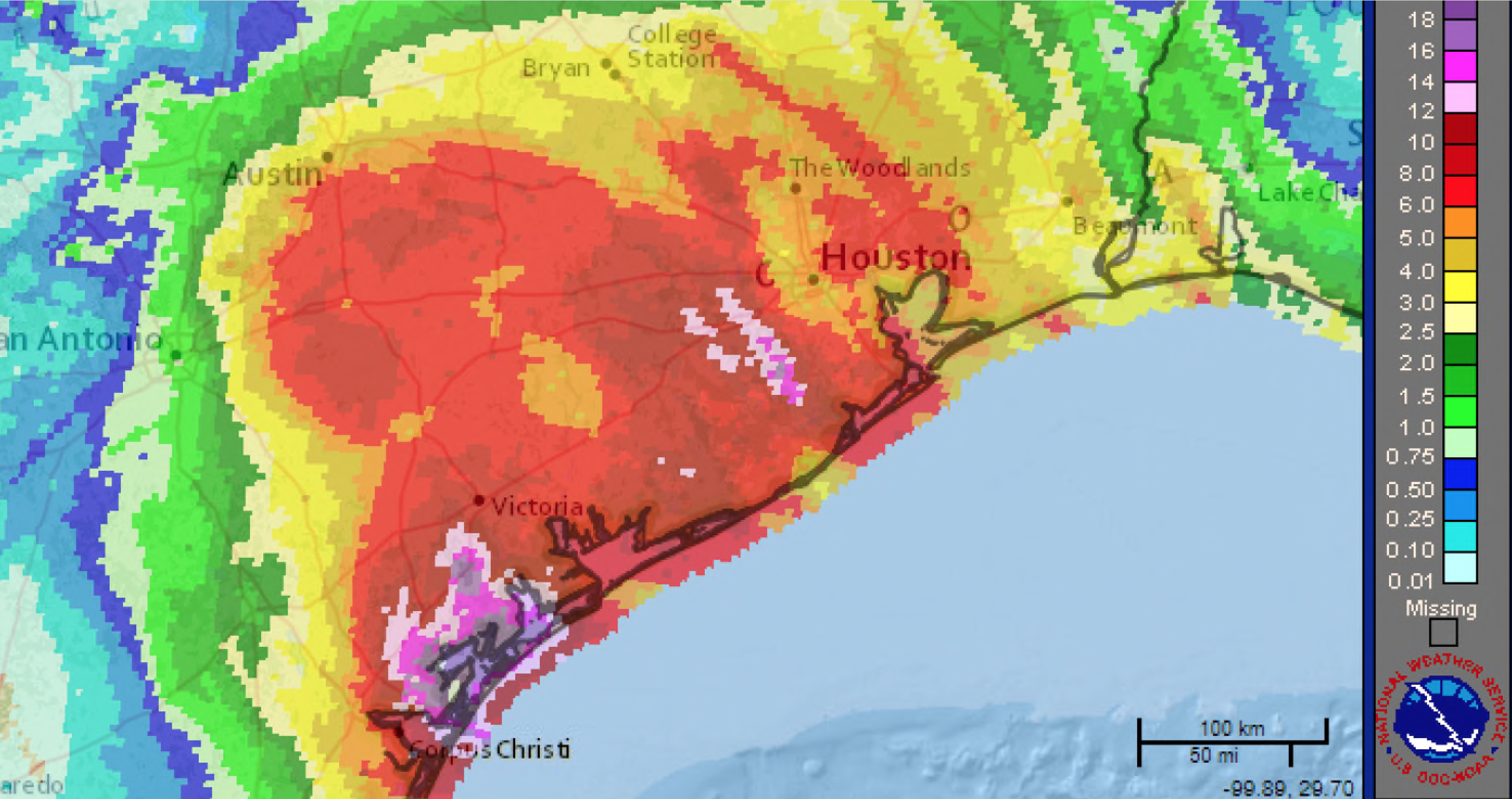
–even as the more nitty gritty detail of the on the ground situation of an anthropogenic disaster could be accessed more readily, in the aftermath of the flooding, on crowd-sourced mapping projects like U-Flood helped map flooded roads in Houston and surrounding areas in a clickable zoomable map to access updated street level information on 4,645 inundated roads for residents and relief workers to navigate the scope of the disaster.
U-Flood, / see also Points of Interest Mapbox blog
If the crowdsourced mapping of flooded roads in Houston and the surrounding areas suggest a clearer street level view of inundated roads in U-Flood for residents and relief workers to navigate the scope of the disaster, there is less of an ability to balance the effects of more water vapor present in the air–and able to dump buckets of unprecedented rainfall–and warming water temperatures in the Gulf of Mexico that are bound to help generate more high grade hurricanes like Harvey, dumping condensations of water vapor on low-lying lands, will only accentuate over time.
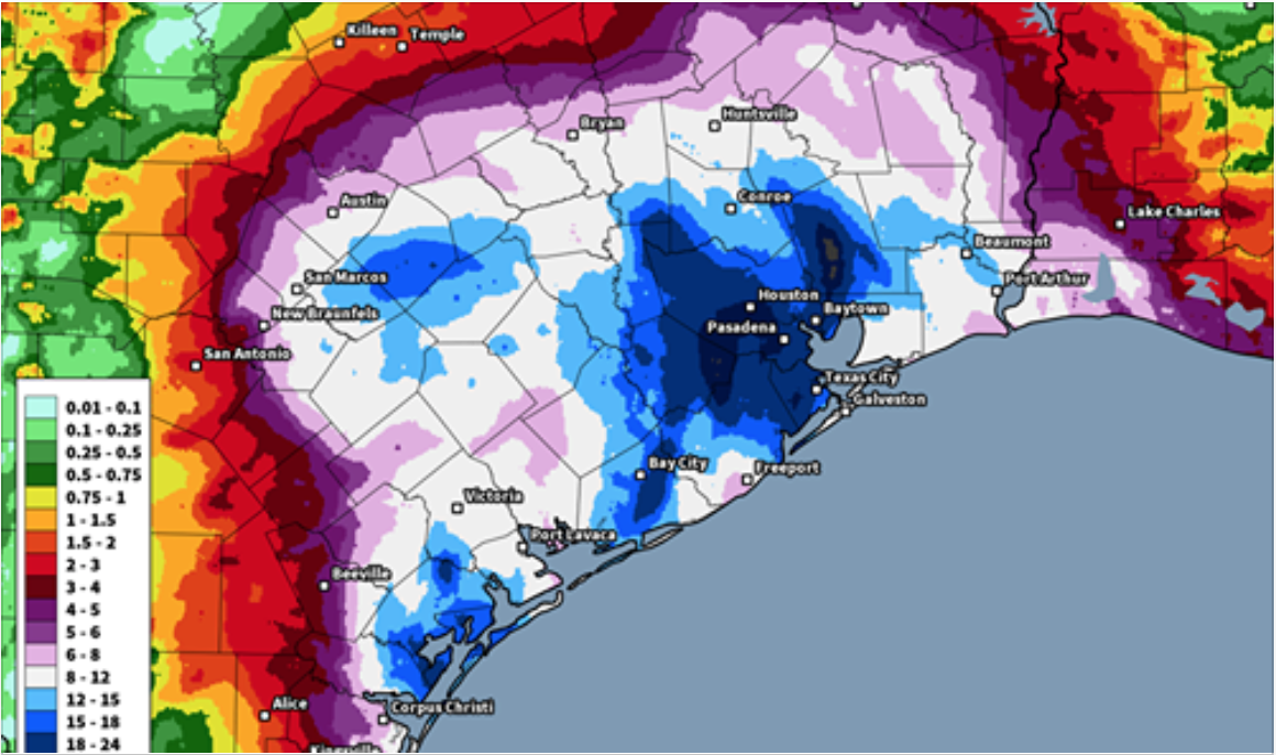
The anticipation of rainfall after one day from weather maps had already predicted over fifteen inches in ways the region would have problems trying to process, as the path of the hurricane crossed over the coast the first day.
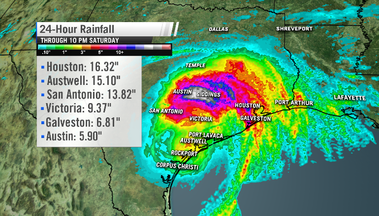
But the cumulative amount of precipitation over the region–relative to the amounts of land-based observations–soon revealed an intensity that was born out in data that exceeded expectations, overwhelming a huge section of southeastern Texas with a huge area covered with at least forty inches of water (over 3,6000 square miles, shown here in deep purple), with in current weather models there being .1% probability of such intensive flooding occurring in a given year, according to o Dr. Shane Hubbard–although this assumes that the same probabilities of storms’ arrival has existed in modern times, rather than that we are in fact entering an era of increasing likelihood of aggressive storms dumping increasing amounts of water on land. The chances of future occurrences that dump unprecedented levels of water on land demand new structures of drainage and better tools of water management that are deserving to be prioritized in our infrastructure, especially in areas as overbuilt as our coastal cities that have created heat islands–measured in terms of the greatest concentrationes of impermeable surfaces, as measured by NASA’s Earth Observatory–one of the agencies targeted by Trump’s America,
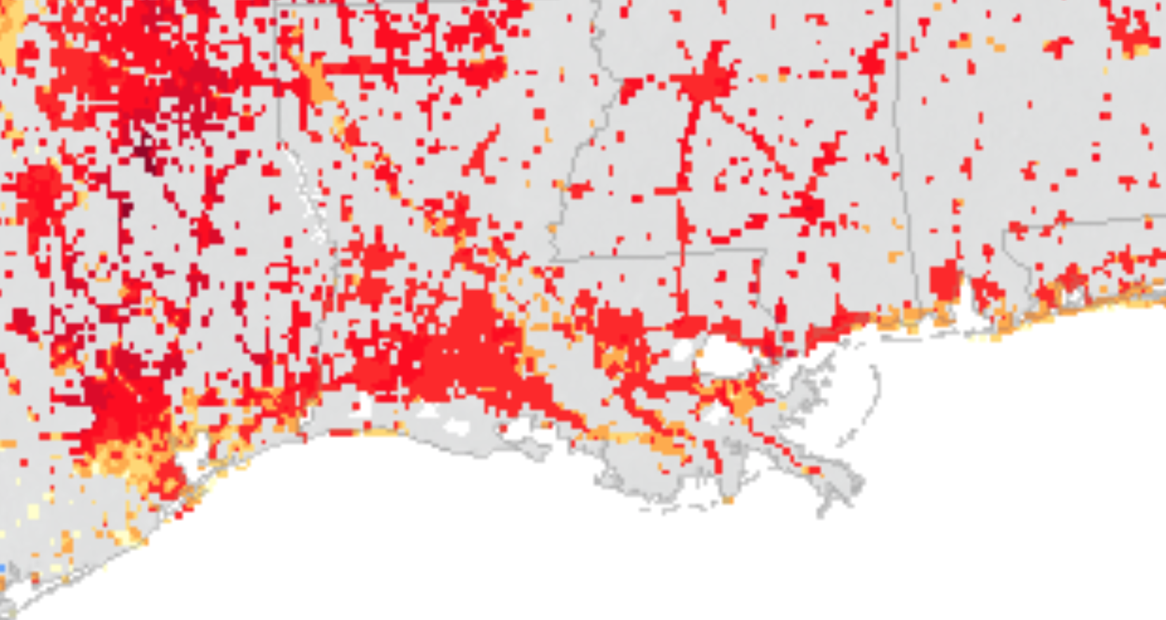
NASA Earth Observatory (detail)
The same region is unsurprisingly destined for hotter weather as recently so elegantly mapped Solomon Hsiang, visible at Impact Lab, suggesting the high temperatures paved regions and reflective surfaces will no doubt only accentuate–but already predicts 82-4° to be the median June-July-August temperature for future summer months in Houston.
Solomon Hsiang, Impact Lab/Climate Impact Map/New York Times
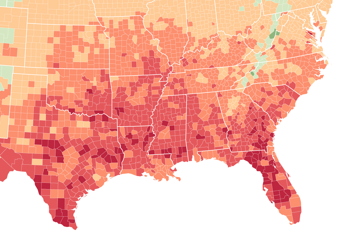
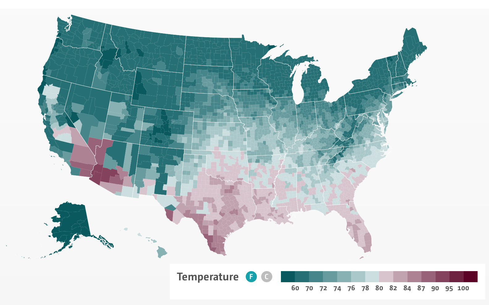
ImpactLab (mouse over the linked interactive version in a slippy map)_
The story of the rising temperatures in the Gulf Coast in future years will be tied to an almost predictable escalation of the Hurricane Season and its unpredictability, and the escalation of storms that are making landfall along low-lying lands of southeastern Texas and across much of the Gulf Coast.

The broader picture of the presence of paved regions in urban areas across the lower forty eight, created by intense concentration of asphalt, concrete, and impermeable surfaces that obstruct processes of natural cooling, stands to rise local temperatures by some ten degrees: the preponderance of impermeable surfaces helps create a sent of increasingly non-negotiable “heat islands” that can create twice as much rainfall in trapped weather systems across the country.
Houston, as is well known, happens to be one among many coastal concentrations. And if all gulf cities are challenged, Houston is particularly challenged when it comes to drainage, and heating the surface temperature independently from greenhouse gas emissions-caused global warming, but demand to be seen in concert with such climate change: the hotter temperatures stand to create hot-air currents above the city, drawing moist air from the nearby Gulf of Mexico as an “urban pump.” meteorologist J. Marshall Shepherd cautioned over a decade ago. The particularly intense concentrations of impermeable surfaces on the northeastern coast of the United States, where the increased surfaces that absorb solar heat and radiation create surface-temperature anomalies registered by NASA/U.S. Geologic Survey’s Landsat 7 Enhanced Thematic Mapper Plus (EMT+), which shows a sort of perfect cocktail in the Gulf of Mexico between southern state and overbuilt area in the region of southeastern Texas:
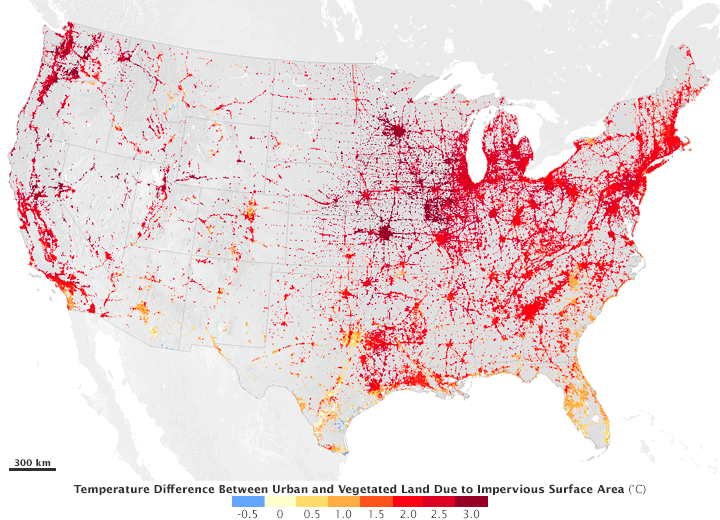
Has the hotter air currents above Houston already begun to trap more summer thunderstorms? Already, the range of impervious surfaces in the Houston area were threatened repeatedly with flooding in recent times, including, as shown by the Global Precipitation Measurements registered by NASA’s Earth Observatory, in 2016, when rain levels of almost twelve inches inundated the region, leading it to be named a state of disaster in April 15-18, 2016, when thunderstorms delivered intense rainfall as moisture moving north from the Gulf of Mexico stalled and condensed in a high pressure bubble, in what was the wettest April ever measured, creating false flooding on roads and riverbanks.
:
Telling the story of levels of rainfall in the context of a normative standard of quantities of rainfall likely to fall in Houston–or in any site–is in a sense beyond the point, given that the real narrative is one of imprudently and improvidently overbuilt landcover, despite the persistence of the mapping of concentration of maps whose rasters registered the intensity of rainfall amounts relative to previous years:
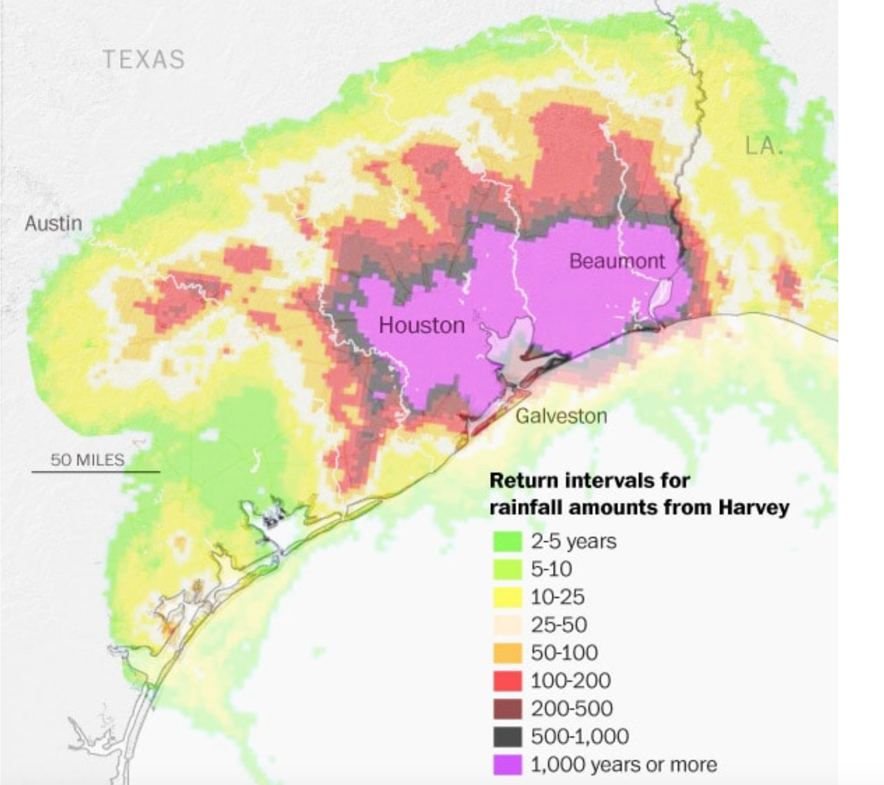
For despite the many rivers, bayous, and creeks around the city of Houston, the absent avenues of water finding its way into the grounds and to the rivers increased the points of overflow–marked in orange–and record-setting gauge readings of water heigh–in red–that prevented absorption and led to increased problems of flooding, and not only within the floodplain.
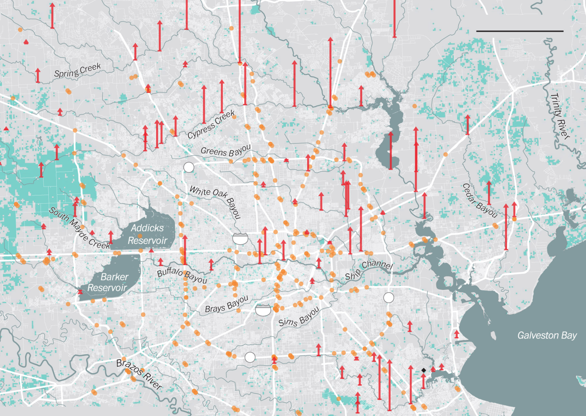
The precipitation totals suggest a huge area of inundation so massive that much of the water failed to escape or run offshore, or even to saturate the land of an area that had been increasingly overbuilt, conributing to an onrush of water that pooled in many sites,–
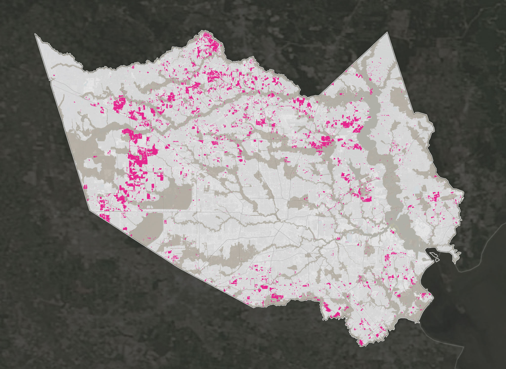
–making the retention of water in flooded areas is more anthropogenic in nature than can only be called a natural event, given the ground cover changes that left Houston unable to process even the initial floods of over four feet of rain, and left it able to process less than the 12-13 inches of rain it was able to drain in twenty-four hours, in a city which has among the least regulated drainage systems in the country, and the most overbuilt groundcover. While the bayous are built to allow water of flow from west to east, into Galveston Bay, the absence of greespace able to absorb water–or prairie that is able to absorb only eleven inches of rain/hour–meant that expanding subdivisions lacked the drainage or absorptive abilities for the incoming hurricane. But to view the precipitation only as the result of water arriving from the coast–
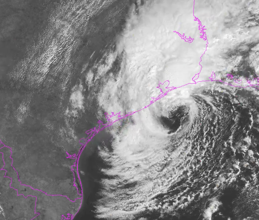
–is to deny the deep impact of the over expansion of the city on its ability to adequately drain to the coast, particularly in a largely flat regions between the reservoirs and Galveston bay, where the opening of dams that contained water in many of the wealthier neighborhoods were opened, leading the downtown to be flooded, in an image that reveals only part of the costs of an outdated drainage system, but can be usefully placed against the crowded landscape of chemical facilities and plants that have increasingly crowded in downtown Houston during the past decade alone, without any more taking into account of the poor regional drainage facilities or infrastructure that would prepare the city for the potential damages unleashed by heavy rainwaters from a trapped storm.
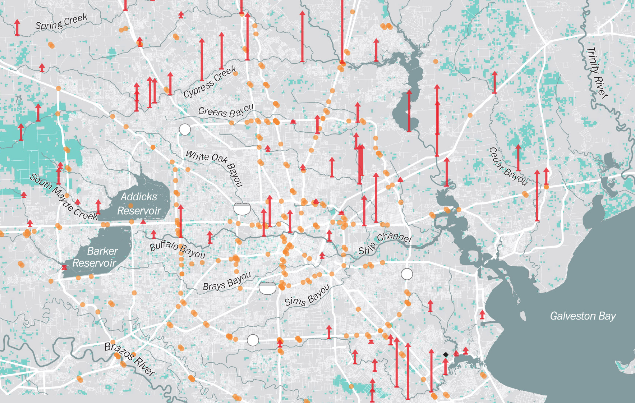
Flooded Bayou and Rivers in Downtown Houston based on gauging stations
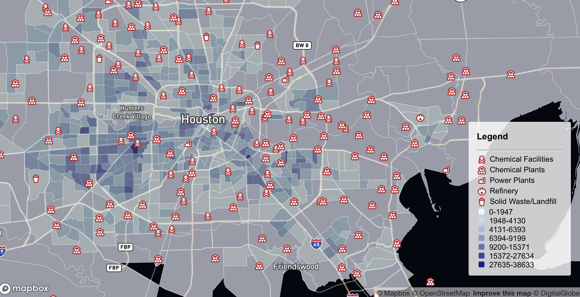
Mapbox Interactive also viewable in full-screen
Indeed, despite the dense concentration of chemical plants in much of the bay and downtown city that would be susceptible to flood damage and potential explosion–
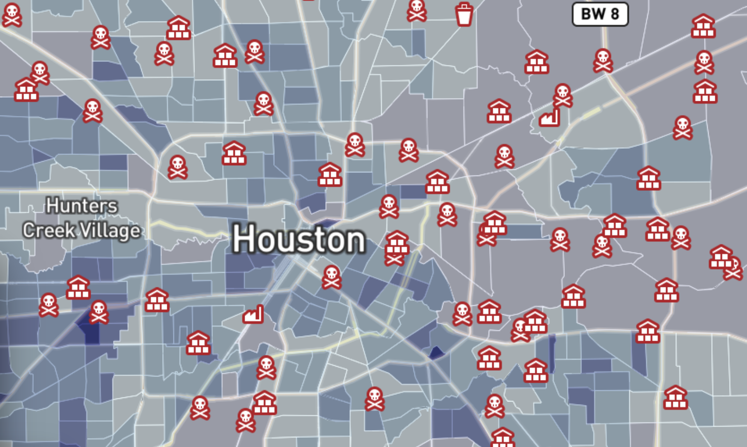

16. For the suddenly shifting topography of flooding of almost all greater Houston that results form the absence of absorption in the landcover responded to where it was most paved over–and where the differences between land and sea, in an area of bayous where that distinction is in fact particularly difficult to draw, save by blurring boundaries in a cumulative map of rainfall—which might be begun to be measured by local flooding of lands that failed to be absorbed or enter the ocean again, so quickly and intensely did it fall this August with the arrival of Hurricane Harvey across the Gulf of Mexico.
As much as flooding suggested the depths of stagnant water, the processual arrival was measured by local gauge testing stations on roads, that may reflect the addition of concrete in much of the urban edges, now stripped of any ability to absorb water, as the area of road-building and landcover change in much of the greater Houston area provides a surface for water to pool..
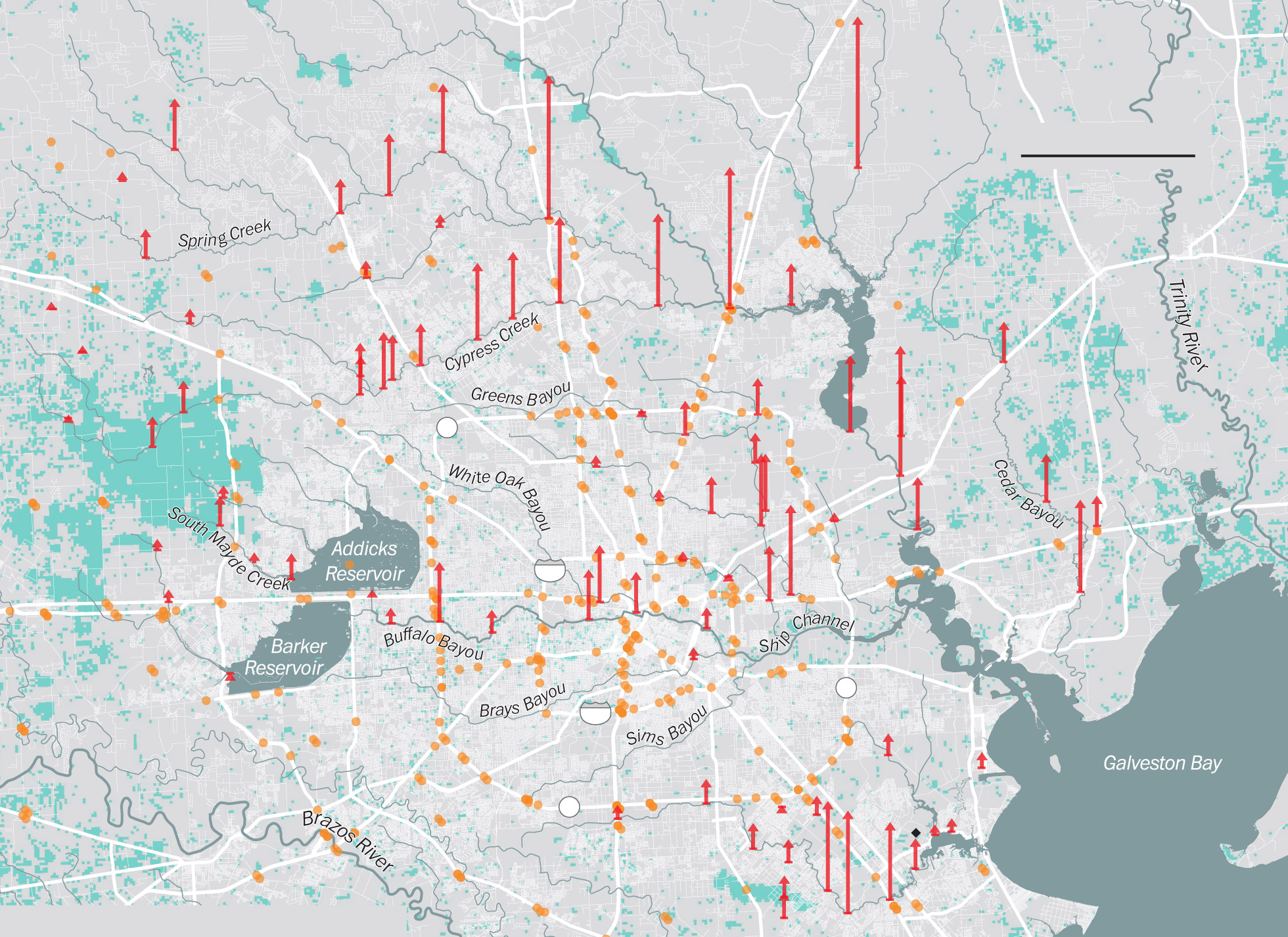
Far from improving drainage facilities that could compensate for the increased heat island in greater Houston that has helped trap precipitation and trap hot air over the city, as well as prevent water from being absorbed in the ground.
The New York Times
In this context, the record levels of rainfall with Harvey over a week cannot be measured only by total precipitation over time–but the trapping of waters in the city that is over-saturated with water, and without any easy drainage system for the increased stormwater generated in the heat island into the Gulf of Mexico–a problem that stands only to grow with the lack of building regulations in the city, not to mention in other coastal cities. If the mapping of precipitation totals suggests the intensity of rain, the trapping of water and the overflowing of riverbanks and bayou in the land stand to create an increasingly challenged divide between land and water, dangerous not only for chemical plants and storage, but for the divide between land and sea.
How to map the over-saturation of the landscape created by the hurricane’s arrival led the landscape under water to be colored, as Elizabeth Bishop had it, when contemplating a framed map of the Northern Atlantic when she lay sick in bed on Christmas Eve in New York City in 1934, green? If Bishop responded so eloquently to the landscape of the imagination that the choices of color and shape that the cartographer who designed the map prompted by its colors and names, treating its tactile and sensory experience of the land that “lies in water . . . shadowed green,” shows “shadows, or are they shallows, at its edges/ Showing the line of long sea-weeded ledges” call into question the impossibility of clarity in its demarcation. Bishop was quite to suggest that “mapped waters are more quiet than the land is” as “profiles that investigate the sea,” the water that falls from the heavens fall across the border line between land and sea in the maps of precipitation, flooding, and, raising questions of the failure of the man-built environments to preserve the bound between land and sea, or offer a safe territory to look out to the sea from land, as actualities catch up with the divisions that were once drawn on the map. As the prefatory epigraph of her final book of poems, Bishop cited Monteith’s Geographical Series’ 1884 “First Lessons in Geography,” lessons six and ten, from “What is Geography? A description of the Earth’s surface” to “Of what is the Earth composed? Land and water” and “What is a map? A picture of the whole, or part, of the earth’s surface,” as if the map provided a basis to organize her thoughts and attention.
What sort of maps can best serve to organize our attention to the impending danger of future weather changes that will continue to blur land and sea?
26. As much as the graphical blurring of total rainfalls communicates the saturation of the Houston region with water, as the path of Hurricane Harvey coursed along its coast, depositing a huge volume of water, whose tabulation of fifty-two inches approaches the sixty inches cited in textbooks as a once-in-a-million year occurrence–but which most of the surfaces of an increasingly overbuilt city had difficulty absorbing–
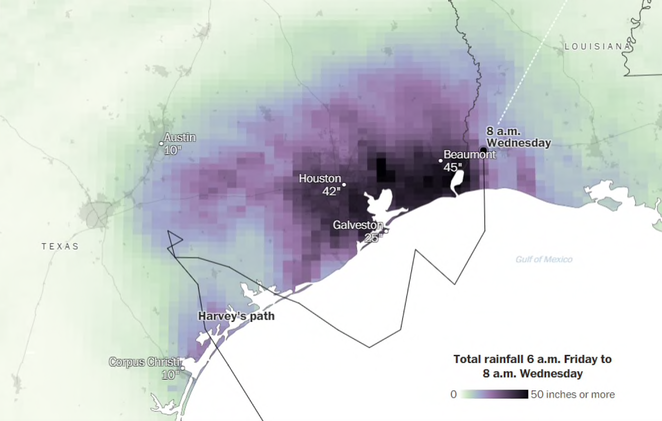
–although perhaps being numb by the extent of the rainfall that erased any clear distinction between land, rivers, reservoirs, lakes, and shoreline is perhaps hard to map save but remind us of the impermanence of almost all the qualitative features of a map.
While the extent of rainfall inundating the region might be better visualized by the blurring of land, water, and atmosphere in the cumulative data registered of rainfall which settled over the Houston area, without flattening the contents of the map.
The story of overbuilding, as much as of epochal five hundred year rainfalls, reminds us of the necessity to understand the week of Hurricane Harvey less in terms of the likelihood of rain in previous years, and not in terms of past models of climate projection, but in terms of the new immensities of drainage and water absorption we will increasingly need to accommodate, even as the overpaved landscapes of globalization permit less ground absorption, more hot reflective surfaces, increasing sea surface temperatures, and greater moisture in the air.

