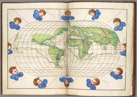
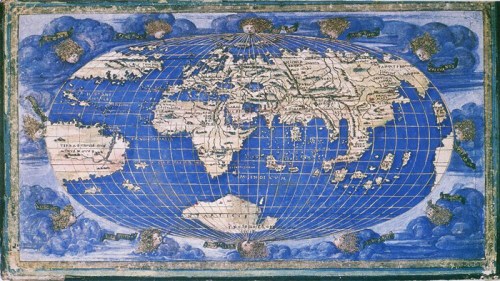
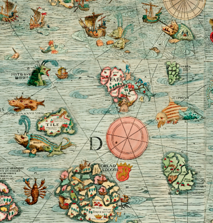
Warm wins that rise in the high plains have increasingly driven the fires that have devastated California, hurricanes battered our costs, and driven unprecedented showers that have flooded southeastern Texas. But winds are rarely mapped, or even perceivable in maps, although winds were once a central part of the maps known as portolan charts designed when the primary means of long-distance voyaging was navigation. But data now stands to integrate the winds–once shown as heads that buffeted human history or at least human travel–
00but are increasingly able to be incorporated into our own maps of disasters, if only to fully understand the fluidity and vulnerability to which we are exposed by high winds. Indeed, it is increasingly clear that we are better able to read the relations of geographic locations and the information of data visualizations only by including the winds in their surfaces, at the same rank, or level, as the sites of human habitation that maps have long prized. But if the winds shown on global maps are confined to its margins as embodied personifications, less quantifiable than the graticule of longitude and latitude but vestiges of an older traditional of nautical charting where the provided directionality as well as the force of gales that would provide a basis to orient one’s sails,
the place of the winds are able to be inscribed on the surfaces of many recent data maps.
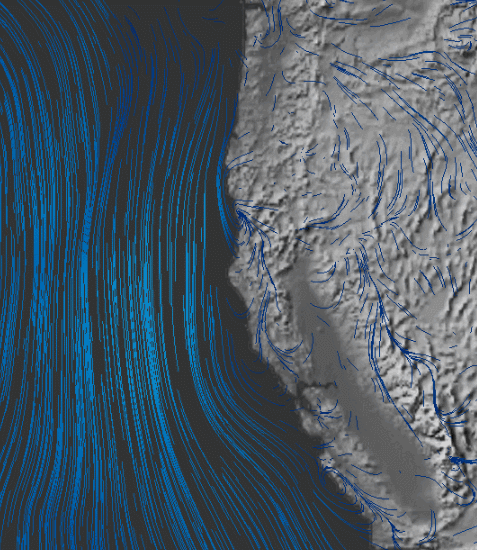
The ready availability of huge datasets about wind-strength indeed offers multiple formats for modeling an increasingly dynamic relation to space, and perhaps to incorporate them within the legibility of the map . Indeed, the processing of remotely sensed data allows for frighteningly rapid condensation and synthesis of what can be called information within a single map. And the recent NOAA based on modeling weather conditions in a real-time wind map is particularly neat in how it invests the currents of air that swirl above land and sea with a hue of their own, as if to invest them with character as a subject of mapping and give them a new level of visibility. Set against a night sky, where details such as topography or ocean currents are conspicuously silenced, the lines of winds appear in neon blue relief off the California coast, showing an elegance of serpentine motions are tracked with far more wonder than the static terrestrial map:
The flowing electric blue lines used to render wind move with a sleekness as if to promise immediate access to meteorological actuality that seem to blend the screen with current wind conditions, and provide that most fantastic of illusions of a map of the present-day that almost sends tingles up our neck in providing a map of events that seem actually to be transpiring. The maps have in fact led reporters to gush thanks to the US government for its funding of the project with tax dollars, creating new conditions for the visibility of currents of air to which we are ineluctably drawn in an almost zen manner. The GIF suggests a mapping that is based on looking at the overlooked, or rendering the smoothest of airborne sensations with cartographic legibility. It echoes the recent ability to encode data from sensing stations in a transfixing image of swirling gusts that seems far more animated than the flat topographical base map that lies beneath.
The attraction of these maps is more visual, in fact, and somehow more seriously phenomenological, than having to do with geographical information, save as it suggests the increasingly fluid nature of all information flows.
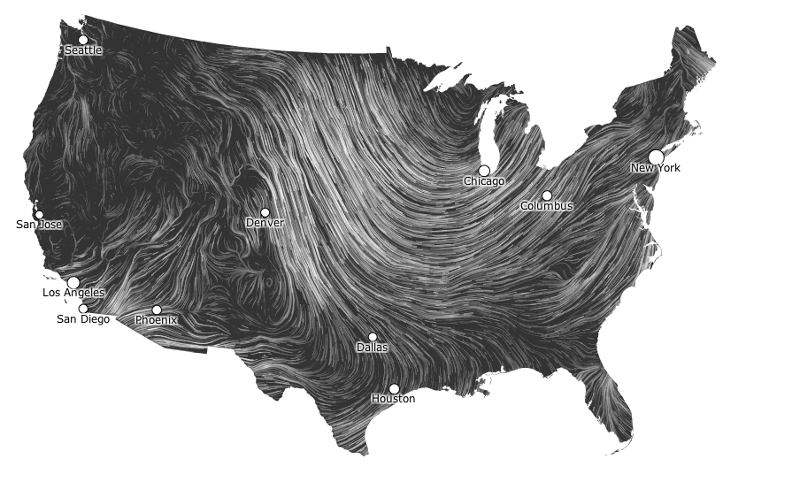
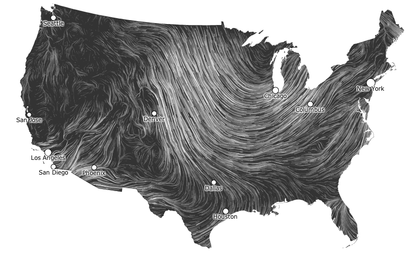
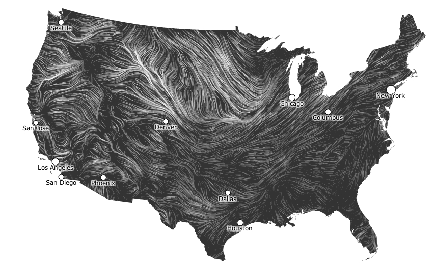
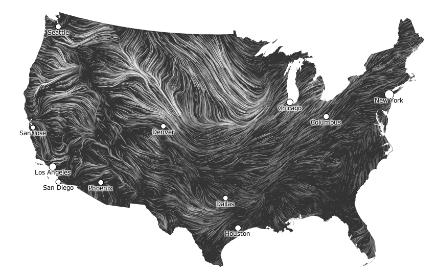
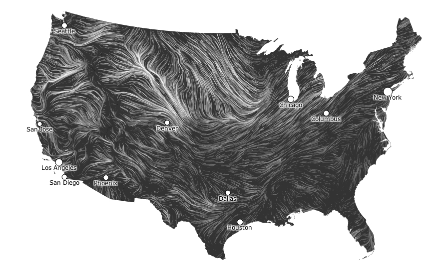
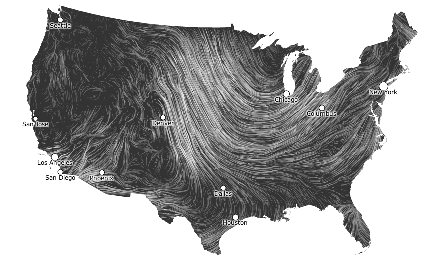
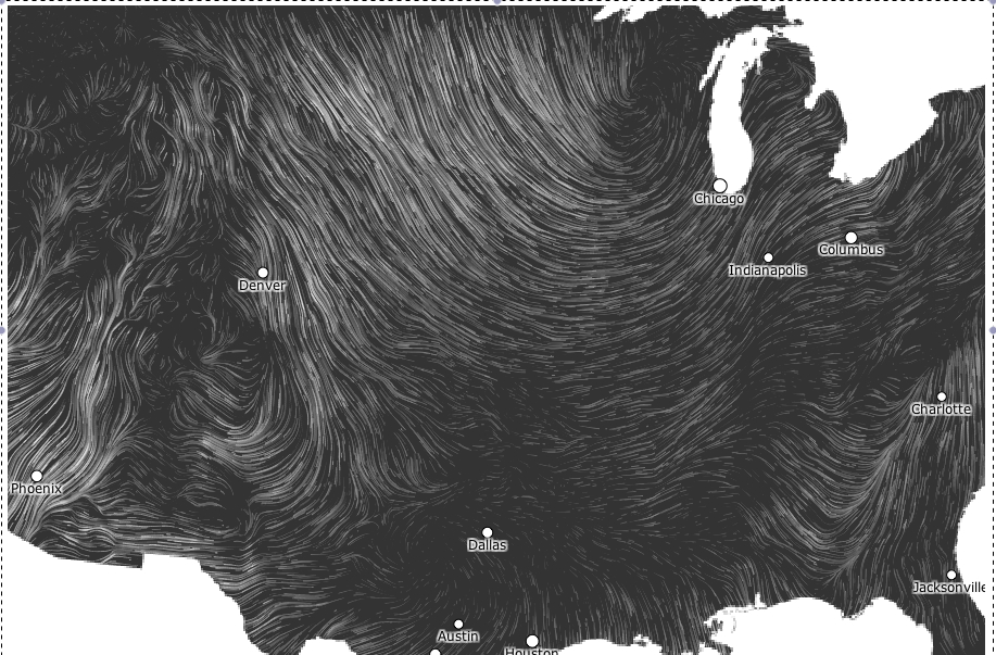
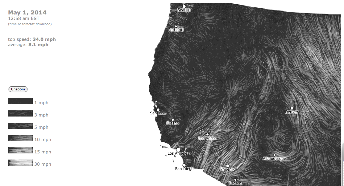
The dynamic nature of wind maps renders an idealized perspective whose content asymptotically approaches a view that is almost entirely abstracted or removed from the inhabited world, based on the mathematical models for projecting and tracing the currents and intensity of wind over land: indeed, in the marvelously idealized data-driven maps, wind currents create whirls of whorls over the lower forty-eight. The website hint.fm uses real-time images of the inroads winds make across the territory of the United States, distinguishing gradations of gustiness by wisps of differing intensity to describe a space not only removed from the inhabited world, but whose elegant tracery enacts an aerial drama across in an artificially demarcated mapped space too vast to comprehend, but offers a sort of atmospheric ballet of the wind’s shifting directionality and intensity, as if traced by a multitude of individually situated geographically dispersed weather vanes oriented by the shifting winds across the lower forty eight.
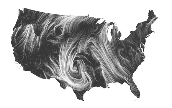
If the image recalls something like a smoke-filled room, it is more of a wind-filled continent, where blowing winds cross borders, rivers, and plains in an image of the bounds of the contiguous forty-eight states. The cartographers, or artists of technological visualization, Fernanda Viégas and Martin Wattenberg are dedicated to “work [that] explores the joys of revelation” and in converting local data to suggest natural currents that existed before highways carved the continent into itineraries–like the “blue roads” of rivers run across the land–but their constantly shifting trails mark a weirdly curved space in a situated perspective rarely able to have been captured before. Even on a “mild day,” the winds give a sort of dramatic intensity to the organization of space oddly removed from the cartographer’s art, which is quite passive in the sense of offering a surface to be inscribed by the movement of the air, as wind curves around the nation’s great plains in currents of a recognizable patterns or flows that approximate stop-action photography.
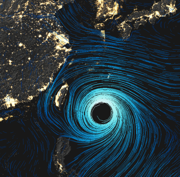
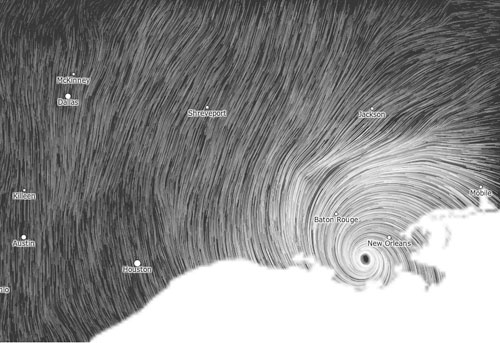
Sure, there are specific moments of meteorological intensity when winds line up in a recognizable pattern–a tornado or hurricane–in ways that define a geographic focus of interest or attention, as in the vortex of Hurricane Isaac as it approached New Orleans,
but all too often the dispersal of attention is the rule, as one watches the patterns that winds themselves generate.
This charting of currents is one of the most precious dreams of early map-makers: to chart the very presence of winds across the land and sea, early symbolized by the rhumb lines that were so important for nautical navigation in early modern and medieval charts, where they communicated the basis of projecting travel across oceans otherwise rarely noted or known how to be represented in the surface of the map itself: even the lines surfaces of the waves on which ships gently rock and sea monsters rear their heads is only a suggestion of the winds that run across their surface.
The wind-map is abstracted from territoriality in a sense, as were the oceans: its formal focus on the United States, derives from its synthesis of predictions of the National Digital Forecast Database. Laura Kurgan has suggested how much the big data of cartographical operations like Google Maps or Google Earth were not only enabled but indebted–and informed by–the declassification of satellite views during the Clinton administration, which created something of a boondoggle of available data for American mapping firms, if it also informed the very strategies of global surveillance that Google inherited: the delicate wind-maps Viégas and Wattenberg conceived and coded suggest less of a governed land than a territory inhabited by air, in which the unfurling curling currents of wind estheticize the bounded nature of territory: migrations of flows of air that course above the terrain, tracing inroads of whitespace into the blackened map of the lower forty-eight until, over a sufficient amount time, the entire region would be wiped white or erased by air currents, and present only where wind-velocity was nil, in an atmospheric vanishing act of a truly windswept land, where winds course across by crossing out space and inevitably white-washing inhabited lands.
In another sense, the wind maps register the messiness of local interaction, so absent from the idealized rendering of the map, even if that interaction and specificity lies above where human interaction occurs, and creates a network of a sort that is constantly reconfigured before our eyes as it is drawn and redrawn in trajectories with comet-like tails.
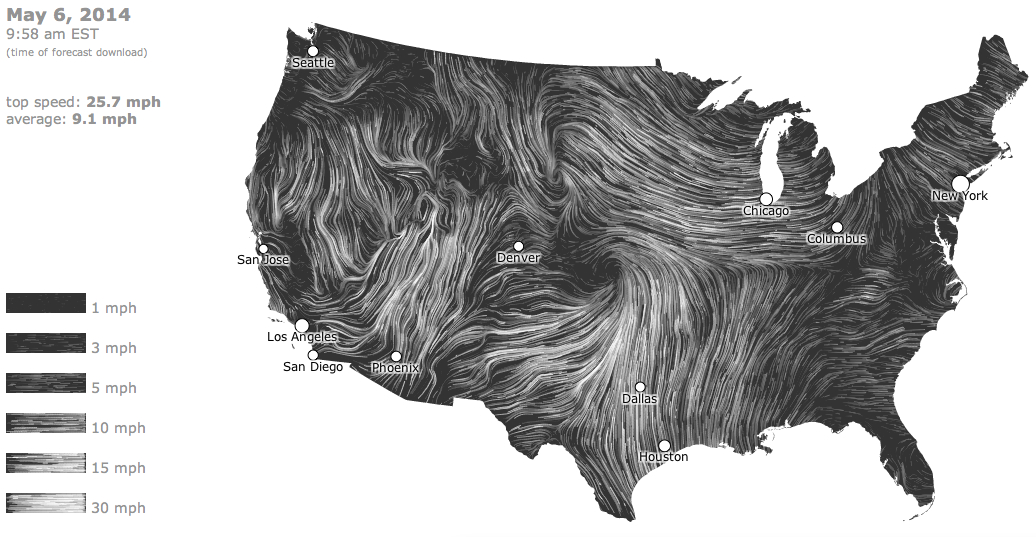
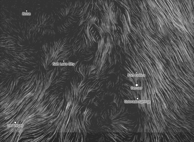
The modeling of wind gusts across the contiguous United States suggests a new sense of the spectatorship of the D3 map, although real-time of the map qualities maintain an illusion of an actual meteorological surveillance of the skies. Just as we cannot watch the unfurling of wind-currents of different velocities over the space that is mapped, they define the dispersal of wind currents across space as if at a remove from actual habitation: the fine lines that recall stop-action tracing of six levels of gustiness across the nation are extraneous to sites of habitation, because habitations are not what is being described, or included in the data that drives the map: the conventions recall streets or waterways or rivers, but follow a set of mathematically modelled swirls and whorls that render air apparent over the land that we more usually map, in a view to currents far above the ground. And yet the mesmerizing drama of modeling data of wind currents is so elegant and engaging that it is hard to stop watching: its ambitious organization charts a record of our world at a remove from the categories of mapping that we are more habituated to scan. In a way, the windmap is the most elegantly estheticized of terrestrial or worldly maps, because it is also the most etherial.
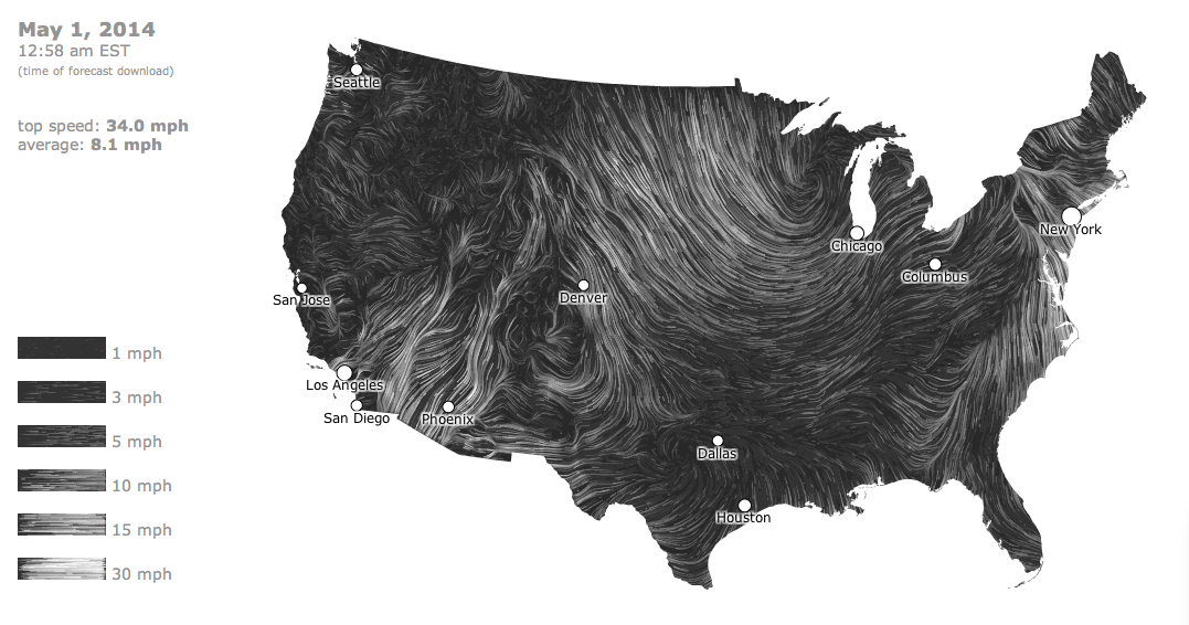
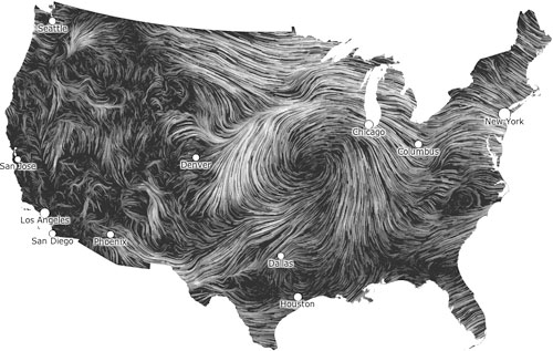
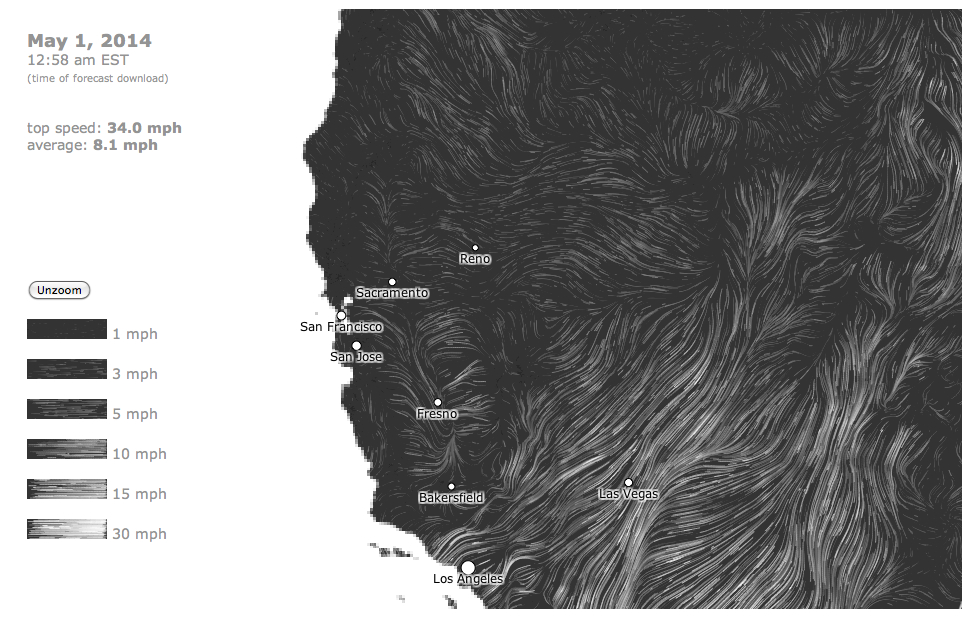
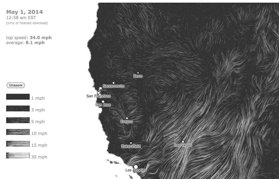
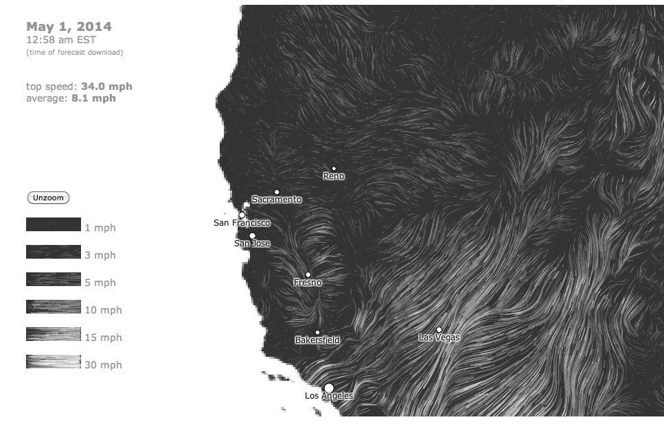
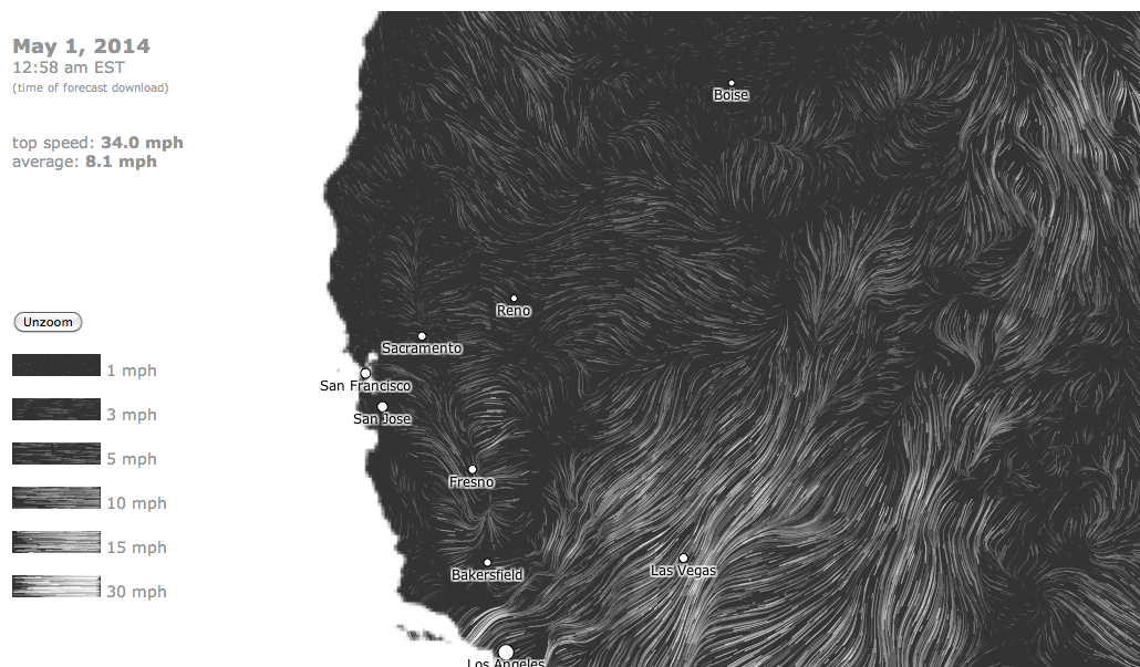
What is the subject of the map is the flow of data that is so oddly anthropomorphic, casting the map as a hirsute surface and second skin, even as it describes the velocity of air currents above the land abstracted from any view of place? Do the wind-currents create or seem to sculpt a sense of place in their whirls and eddies, giving a concrete palpability to the map’s surface that somehow runs against the flattened isotropic surface of a map? Is it still a map, now that any sense of spatial indices are erased, and centers of habitation are dramatically reduced? Or is it a screen? One of the beauties of this projection is that as one zooms in to the ground, further cities appear in the map, providing the needed points of reference that would be too busy in the larger scale versions, where they would obscure the beauty and drama of the inroads made by the winds that circulate across the lands.
There is specific period eye that is attracted to the data visualization, familiar with reading data distributions rather than describing a topographic space in naturalistic terms of portrayal. If the United States seems a shaggy dog, the most mesmerizing of D3 tricks in the book is to watch the ongoing expansion of wind currents across the Rocky Mountains, Desert, and California, from an imagined t-zero at which the calculations are assumed to begin, as winds begin to be inscribed, as if on an etch-a-sketch in reverse, and give contours and form to the blank black area that the first screen seems to map, suddenly giving it a texture that is specific to a date and time when the download of whether data began, until it gains something of a meteorological image of wind flows.
Is this sort of data visualization, as attractive as it is, a map? The processing of the distribution of air currents is difficult to stop watching because of the elegance with which it makes us look at the winds that we notice but have such a hard time collectively grasping, and because of the currents, eddies, whirlpools and lines of different flow that the wind map increasingly reveals, so that it gains a coherence in itself that it initially lacked. The idea of mapping air is intensely appealing, because it acts, as a map, to make visible what is so easily overlooked or otherwise has no concrete identity by which to be grasped. The parallel currents, if approximating a familiar natural appearance of a hirsute coat, are nonetheless quite conceptually difficult to envision in their relations to one another or totality. The best reaction is one of wonder–wonder at being able to find a visual residue tracking the unrelated sensation of wind: this is mapping, in a sense, as an exercise in synesthesia, where sight replaces the sensation of wind on skin.
There are elements of translating sense-based observations to a format of visual modelling in all maps, but the oddity of removing the array of wind-velocity from sense-peception of course seems odd because one rarely thinks of spatially locating winds with precision or fixity. With closer examination of the trajectories of gustiness one notices, first, the odd pockets of calm across the land, oddly coincident with some cities, and probably not only because their buildings block the velocity or intensity of air flow, in what can appear like racing currents or overlain strands:
And then the country, as it is inevitably drawn by an invisible hand of the forces of the winds, cumulatively gains the contours that it originally lacked: