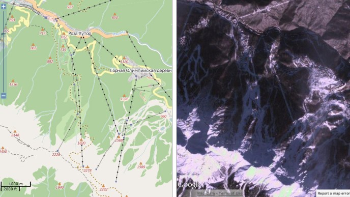
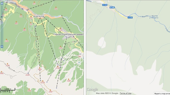
A battle-cry of the ages goes out over the internet–“Crowdsourced OpenStreetMap Trounces Google Maps!“–in a banner New York Times headline so shocking it evokes the battle of David and Goliath of the Information Age. The battle-cry hinted at the victory of not a company, but of the members of a mapping community who slung myriad shots from the slings of multiple local mappers in Sochi,most of whom we only know by their monikers, to topple trust in the corporate behemoth’s maps at the same time as the whole world was watching. And the basis by their cartographical diligence is evident in the juxtaposition of two visuals of the ski runs at Sochi that we’ve been watching on TV, since we can easily contrast it to the terrain on which we’ve already watched so many ski events–and use them to track the skiers whose slalom courses we might was better placed in space. The on-site demand for maps is so acute that the divergence from the now nearly ubiquitous Google Maps engine is striking, and has caused a bit of a shockwave in the mapping micro-world–“In Sochi, Open Source Maps Beat Google”–as if this was a not-to-be-unnoticed Olympic event, when the “Wikipedia of Maps . . . has bested the corporate giant” at its own game.
The mapping of the Olympic games marked not only a symbolic victory, but a dent in what Adam Fisher aptly terms the “Google Maps-based ecosystem” that has grown out of the widespread reliance of a small and growing sector of the economy on the Google map making machine. The reliance on map-providers is evidence that even now, in an age of satellite maps and extensive geovisualization, mapping is a marketplace and a business to best orient viewers to an image of the ground in some very interesting ways: rather than exercising the dominance of organizing “all the world’s information” through a monopoly geo data, fast on the heels of some rather nasty accusations that some yahoos caught using Google IP addresses had set out to vandalize OpenStreetMaps from India, entering false information in their competing images to undermine trust in their accuracy by things from reversing the directionality of one-way streets and altering script in order to dissuade users of expectations for OSM’s accuracy.
As much as an act of random hooliganism, this is a sort of trade-war waged by undermining the credibility of the opposition–a huge change from the days when Google might have sponsored OSM’s annual conference. Alas, no more, as the two generators of landscapes are at one another’s necks: at the very time that Google is trumpeted as inevitably on its way to charting a road-map to world domination, cracks in its geo location armor appear. And the interesting part was, in part, that rather than finding weaknesses or inaccuracies within the many photographs that Google engineers thread together to create a database of terabites that allow us to flip through an apparently seamless photograph of the world, the absences lay in the value of selectivity in labeling the sites, routes, and courses that athletes took, and their exact levels of elevation: information absent from the outdated photographs Google used in its Earth View.
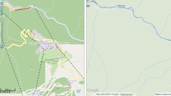
The two media of mapping provide essentially different landscapes–and a different access to the surroundings that they described. These contrasting visions of landscape are so readily generated by the Map Compare tool designed by Geofabrik, which actively promotes the commercial use of open-sourced maps. Designed to suggest the difficult selectivity and clarity that the Google offers on the environments it maps, the juxtaposition of the ski runs from the Google Earth view and OSM map are a triumph in the value of embedded signs and measurements of elevation, as well as potential routes of skiing on the slopes of Sochi.
Despite the authority of the Google Map view, the rhetorical power of this juxtaposition between these forms of mapping shows the extent to what Open Source allows in the recently built environment of the Olympic village: one is immediately struck by the absence of the Skiing Pavilion on the less-often updated Google Maps views, where not only the routes of skiing on the local slopes are less often noted, but the structures built for the Olympics remain entirely absent, and the far limited points for attending to the landscape and its elevation. There is less data in the Google View, even when one goes outside Google Earth.
Indeed, the comparison and turned up many more signs of orientation than the blank spaces of Google Maps which so strikingly recall the “terra incognita” covered by cartouches in early modern maps of the New World or the icy uncharted regions of polar expanse.
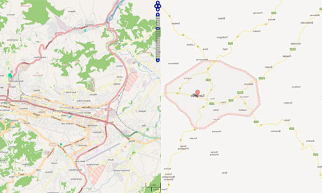
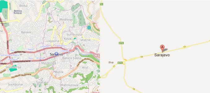
What seem open areas marked by the faintest of trails or icy frost engage viewers in concrete ways in the OSM maps, raising questions about how they effectively invite us to see, and what constructions that they use to invite us to contemplate space from eight models of the same landscape. In an age of the huge expansion of Geographic Information Systems and geovisualization, it is amazing not that different modes of mapping circulate–that’s to be expected–but that their contents will continue to be so diverse, or that the very multitude of information that they’re designed to visualize are available in so many competing models. The ‘Map Compare’ function devised, in ways that recall the classic art history course’s comparison of two slides side by side each other, provide a slippy-screen template to compare any regions with the boast that the open-sourced OSM version will both be more complete and inclusive in its details, and a better commercial model for anyone interested in mapping any city, anywhere, on demand, on account of the multiple modifications OSM users have made. The story of the more complete coverage of OSM is anything but new, but the recent focus on the demand for better maps in the Olympic games is a great news story, making the lack of information on Google’s map browser comparable to the shoddy quality of the ready-made rudimentary hotels in Sochi in quite potentially embarrassing ways. Despite the copious Street View detail, Google’s maps of Sarajevo were lacked in the information and visual detail that OpenStreetMap could readily provide to its users.
For all the innovation of push-pins mapping cities, Google seems to have neglected the Bosnian and Herzegovinian landscape, and the very elements of regional mapping we need for detailed spatial orientation. The mapping of green space, rather than the Olympic village and the architecture of the skiing slopes, that OpenStreetMap provides a distinctly different approach, which makes it more valued so often by hikers or outdoorsfolk, rather than the streamlined images of roads of Google Maps that so often cast geographical surroundings only as lightly colored muted blocks. Is OSM a more geographically ethical mapping of space, in ways that reflect how its composite character derived from a community of mappers, as much as a collective crowd-sourced medium whose users have championed it as an anti-corporate mapping model of map making?
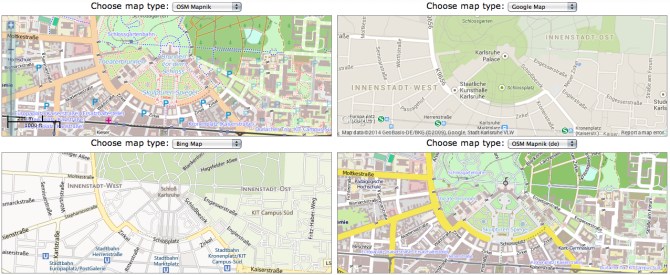
The differences in local mapping are evident in the sextet of views that Map Compare function offers. Starting from Geofabrik’s local town, Karlsruhe, which seems the default starting place for Map Compare, one can scan the different levels of information they supply, in a massive time-suck and complex compare-and-contrast exercise, moving a nice view of the area around the town’s central castle, that invites visitors to compare what sort of map they’d rather use to navigate the city’s groundplan and to do so with the grain and detail that best illuminate or shine a light on the fabric of its urban planning:
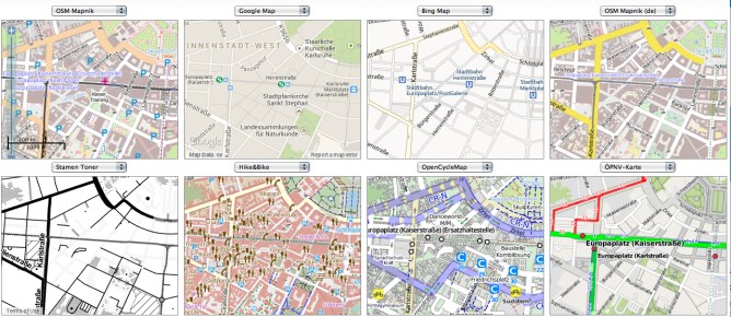
Moving around Karlsruhe, away form the castle, one can compare alternate mapping views, which offer their own alternative glosses on the fabric of urban space, and their own points of entrance to it:
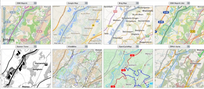
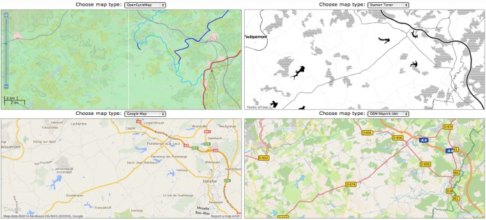
There’s a neat abundance, underscored by a healthy pinch of relativity, in this crowding of a variety of perspectives. Although there is an association of certainty with the map, each of the above images, using different databases which are often protected by copyright, offer different tags to recognize and navigate exactly the same environments, some focussing on the greenery and paths through it, or the road maps and the presence of the national border near Durmersheim, and others letting the national borderline slip into barely detectable gray. There is a certain healthiness in this plurality–a plurality underscored, in the case of OpenStreetMap, by the varied contributions individuals have made over time, a la Wikipedia, to its contents. There is a crossroads at which each stand, between data and design, that reflects an attempt both to give and to parse the most useful information in attractive form, and to create a selective map that give each meaning: as far as selectivity of its record of urban space, the Stamen Toner map in the lower left gives it the most prominent definition by far: it is something like a bleached version of a diagram of urban design. The notation of walking-friendly regions of the city in the “Hike and Bike” map offer something like an index of walkability; the OSM De map, made by local German mappers, provides the clearest model to navigate the network of the largest driving streets in Karlsruhe.
And we can follow each into the nation, at a similarly close scale, toward those regions on the French-German border, near Durmersheim. The maps foreground the different natures of indicating not only country roads and trails, but the nature of national boundary lines, suggest fairly radically different selective views of the local landscapes. Are roads more important, or is green space?
Or, in a clearer juxtaposed context, closer to home, but with similar concerns for the mapping of green space, contrast the highlighting of lakes, freeways, or greenery of the countryside, which the German OSM details in its lakes and countrysides, whose rather picturesque palette of lakes and greens that contrasts with the blah matte of Google maps, in whose flattened 2D color scheme the lakes stand out, but paths to navigate the landscape are annoyingly muted:
Even if the map in Stamen Toner offers the sharpest contrast, as a strictly road map, the German OSM offers a clearer–or crisper–reading of the autobahn’s highway system and its levels of classification–important to drivers, but mute on Google Maps. The relatively unprocessed nature of the OSM platform, which after all privileges the local detailing of a landscape in ways that are argued to recover the craftsman like nature of remapping space, albeit in a digital format, and after all process the viewer’s relation to place in ways that champion the individual agency of the locally situated mapper’s techniques. Rather than deriving form LandSat imagery, even if including the backdrop deriving from Bing to ensure its global coverage, thanks to the new friends it gained at Microsoft, or satellite imagery, the structure of OSM uses a form of illustrator that seek to rehabilitate the familiar values of accuracy and open debate in the creation of a local map: we are all, OSM users say, digital mappers, and can take back the overdetermined datasets all too often passively read and interpreted via GPS.
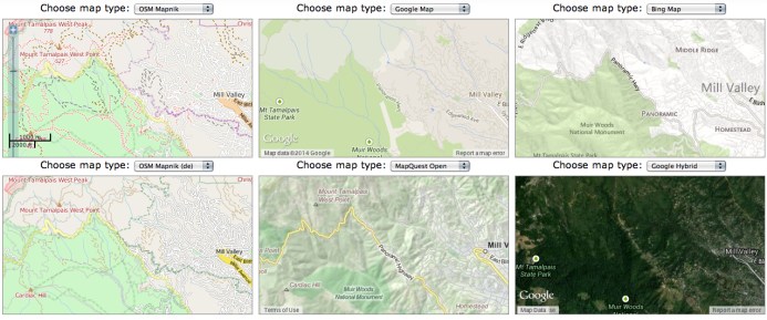
It’s well known that the detail put into the OSM maps offer a less synoptic view point on areas without roads–or where one might be more likely to travel as a pedestrian or hiker on a dirt path. Close to my home, OSM is widely favored by hikers in National, State or Regional Parks. Moving to one of the world’s most strikingly beautiful areas, around Mt. Tamalpais in Marin, the pronouncedly different views of space offer distinct ways of negotiating place and terrain, from the relatively blanched Google Map view of the terrain of the State Park to the mock-lithographic topography of MapQuest or Bing to the comprehensive detail of OSM–more busy, for some, but extremely relevant to orient oneself to the world-famous green space: the density of the trails around Mt. Tamalpais in Marin are perhaps extreme, but this isn’t information that one would want absent from one’s world mapping system (or data) and suggests an erroneously vacant image of the park: and the absence of points of elevation from most all mapping platforms, even if all GIS data is always “imperfect,” reminds us of the importance of finding criteria of selectivity that are comprehensive enough.
The question of cartographical comprehensiveness in a sense resonates with the perennial fantasy of mapping a complete view of place or region, trumping the difficulties of distortion with which mapmakers have perennially struggled. But comprehensiveness–or accuracy–is less the point than the filters on data that exist in the structures (and databases) of certain GIS platforms. Questions of accuracy are relative to the sort of point of view that one wants to measure, to be sure, and elevation points or nature walks might not be relevant to some–or ski runs. But the features of the landscape surely are, and so are the role of maps as tools by which we attend to those features. Something of the distinction that French theoreticians like Jean Baudrillard made between media of film and television in relation to the human imaginary seems to offer an apt point of distinction between the collective visualizations of OSM and the muted visuals in Google Maps, derived from LandSat photographs: there is no trace of the imagined relation to the place or region in the platform, which offers far less of a basis to imagine one’s own relation to the places that it maps.
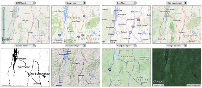
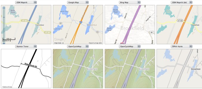
Moving to the greener space of the northeastern United States as a test case, I wanted to examine in some detail the different features of each platform a region that I know well, using the scalable functions of each to zoom into a specific place in the green space of central Vermont.
The distinct landscapes of different mapping media nicely foreground the benefits of Geofabrik’s own Topo map, and the OSM counterparts that suggest even greater detail and differences in the options of roads, paved and unpaved perhaps–for long an important local question–as well as variations of landscape green. While MapQuest provides some important basic detail here, OSM offers a better view of the greenery and scenery, encrypting more information at a great density, especially in contrast to the generic light greens of Google or Bing. (Sure, you have the Google Earth function to toggle to, but having a single sheet–either on a screen or paper print out, is an important navigational and orienting tool.)
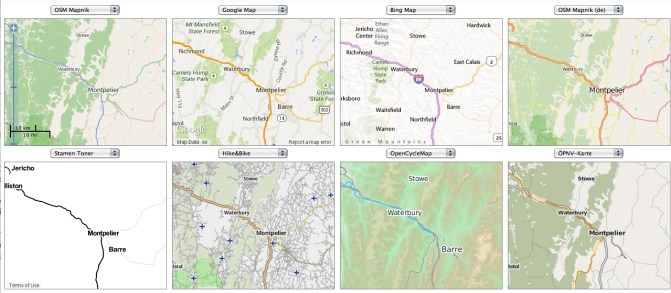
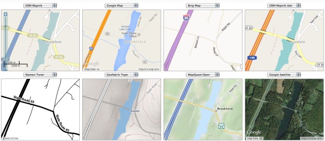
As we focus on a clustering of lakes further south on the Interstate, scrolling down at a greater scale, the clustering of three lakes offers a specific point to contrast mapping styles and the different data they embody and store, out of which we might focus on the somewhat notorious bridge across the lake that occurs in six of the following eight maps, but which I can confirm exists, a bridge which, while on the other six maps, it’s never noted that one cannot drive across:
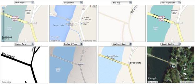
The contrast in mapping styles grows more evident around the smaller town of Brookfield proper, where the variety of map-signs offers a sharpened difference in perspectives on place: the eight different conventions of noting the interstate are not only surprisingly different in color scheme to differentiate their source, but the mapped data seems surprisingly distinct in these images: OSM Mapnik suggests a bridge, lined in black, and overpass, but both disappear in Google Map, and in Bing Sunset Lake disappears, while in none of them is the fact that the bridge is wood, floating, but mostly submerged, and closed much of the year to driving noted. Not only is the coloration and breadth of Interstate 89 distinct in each, but so is the presence–or absence–of the small lake, the old wooden Floating Bridge that cuts across the Sunset Lake, and the foliage that surrounds Brookfield village itself. But the inability to traverse that Floating Bridge, either in winter, when it is covered by snow, or in summer, since it has been blocked to all but foot traffic, made me smile at the multiple absences in the map engines arrayed below. And, perhaps as important for motorists, which mapping renders the transformation of paved to unpaved roads?
What is the best way for a map engine to engage its viewers? A slightly tweaked variety in another grouping of maps of the entrance to the floating bridge one can’t traverse by car, at magnified scope, suggests the range of arranging information in only one small intersection, and the need to constantly compare mapping forms for their different level of detail: from the differences among dirt and paved roads, to the range of topographic detail, to the view that the so-called Floating Bridge is in fact perpetually sinking in Brookfield, VT. At the end, it will all depend on what we want to see in maps, and the array is simply and increasingly boggling.
For while Google has gobbled upwards of six million miles of streets for Street View, the interest in offering an accurate survey of the land surrounding seems to have eluded, as the aim of completing a complete set of photographs of place–as if to seduce us to allowing Google to maintain a system of location-awareness through it–may be removed from what we want to see when we trust the selectivity of the map. For a generation weaned on video, and gratified by the dazzling display of visuals, the sunny streets of Street View and panorama of Google Earth may be enough eye candy for some, but the need for selective filters and for improving semantic legibility in maps might well lead the best maps to be those that are most carefully iteratively refined.

