Tag Archives: open data

A Socially Distanced Franchise?

While I was phone banking in Texas, Nevada, and other states in months before the 2020 election, I fielded a surprising number of questions of access to absentee ballots and mail-in voting, as well as being assured by many voters that they had refrained from mailing in ballots, and were planning to drop their ballots off directly in polling stations, or brave the lines, to ensure their votes counted. I’d like to think they did. (The woman I reached in Texas who had moved from Nevada and was awaiting an absentee ballot to arrive two days before the election, past the deadline of registering in Texas, may have not.)

Even as we repeatedly review”Trump’s final days of rage and denial,” and charges of fraudulence and the robbery of red states from the Grand Old Party’s self-appointed King haunt public White House pronouncements and social media posts, the electoral map that provide the formal reduction of how votes were tallied is cast as a contested ground, questioned on the basis of voting machines, absentee ballots, and socially distanced voting practices, as if these inherently distance the franchise and undermine democratic practice. Donald Trump invites the nation to squint at the map, examine its mediated nature and instability, querying the resolution of any election as, shockingly, only a handful of congressional Republicans admit he lost a month after voters cast seven million votes for his opponent, whose victory 88% of Republicans in Congress refuse to acknowledge.

Unlike other elections, for a month after Election Day–November 3, 2020–the nation waited in eery limbo, uncertain about the legitimacy of the election so that even by December 2, CNN was projecting victors in several “swing” states. Although the New York Times and AP projected the conclusion of the election on paper, announcing late-arriving news of electoral victory almost a full week after Election Day, seeking to invest a sense of conclusion in a protracted debates–if oddly channeling “Dewey Defeats Truman.”

New York Times, November 8, 2020

The inset map still indicated three states still “not called.” But the new President Elect appeared boosted by the classic alliance of Democratic voters that Donald Trump saw as unlikely, and had failed to align in 2016.

Months after Election Day, CNN was still “projecting” Biden’s surpassing the electoral vote threshold of 270, shifting two midwestern and one southern state to the Democratic column, with Arizona: the delay of verification in a range of legal gambits still being followed by the Trump campaign, which raised over $170 million to press its case for recounts, investigations into allegations voter fraud through the Save America PAC, disorientingly stubbornly refusing to admit the validity of the electoral map, and even repeating, into December, hopes that  an opening for a Trump victory materialize if one state select electors, to reassemble the swath of red that flooded the national map back in 2015 as if playing a puzzle: “If we win Georgia, everything falls in place!” The electoral map was something of an idol of the Republican Party, as Donald Trump’s hopes for electoral victory faded, but refused to recede into mid-December.

CNN, December 2 2020

Weeks after Election Day, we entered into a weirdly protracted attempt to game the electoral map, long after the initial tallying of votes had ceased. A range of recounts, hand-counts, investigations of absentee ballots and even querying of the legitimacy of voting machines have been launched to challenge the representational validity of the electoral map in ways that should give us pause for how it aimed to undermine the representational value of the voting practices. In querying the functions of the map as representation–by querying the tabulation of votes that comprise the electoral map–Trump has stoked tensions in representational democracy. With unsettling abandon, Trump stoked national tensions by refusing to acknowledge he did not win the election, as if determined to break with Presidential decorum for a final time, as if seeking to leave a legacy of disruption in his wake.

To be sure, gaming the electoral college has emerged as a recognized campaign strategy in 2020, increasingly distancing the franchise of the nation, as campaigns focussed with assiduity on the prospect not of “swing state” voters as in the past, but in flipping or holding a slate of states, that left the electoral map rendered as a sort of jigsaw puzzle that would add up to 270 votes from the electoral college, as the Wall Street Journal reminded us by mapping the Republican “game plan” that Donald Trump long knew he faced for holding onto tot the states where often slim majorities put him in office, as Democrats aimed to flip states to their column: the rhetoric of “gaming” the map to create the victorious outcome was echoed in the news cycle,–and not only in the Journal–in ways that seemed to have dedicated the distribution of public rallies that Donald Trump held long before announcing his candidacy officially, almost as soon as he entered office, in an attempt to solidify the bonds of the red expanse he celebrated as America’s heartland with his political charisma.

If Trump may have wished he didn’t take the southern states so much for granted, he had targeted Pennsylvania, Florida, and Montana–as well as Arizona and Nevada–by staging rallies, in those pre-COVID years, as if to shore up his support as if investing in the electoral votes of 2020.

https://www.npr.org/2019/06/18/733505037/trump-set-to-officially-launch-reelection-but-hasnt-he-been-running-all-along

If that map from National Public Radio, based Cook’s Political Report and the White House, only takes us through 2019, the campaign stops of Biden and Trump show a density to Pennsylvania, Michigan, Wisconsin, Florida, and North Carolina that suggest the depths of commitment to the gaming of the electoral map, and a deep battle in Arizona between the population centers in Phoenix and its suburbs and more rural regions.

The metaphor of “gaming” the map was hard to stop, and its logic seems to have inevitably led to the endless endgame that may result in clogging the nation’s courts with suits about the circumstances of mail-in voting in multiple states. Trump’s insistence in claiming the election not “over,” as if unfamiliar with someone else setting the parameters for television attention, speechless at the unfolding of a narrative shattering conviction of his inability to lose–that “in the end, I always win“–is not only a deepest reluctance to admit losing.

The logic of the gaming of the electoral map clearly has him and his campaign in its sway. The deeply personal sense of the election as a referendum on him and his family may have been rooted in a sense o the legal difficulties that his loss might pose: among the many emails that were sent to his base, pleading for campaign donations to the “Save America” PAC, which seemed the last line of defense to Make America Great Again,” supporters were begged to do their part in “DEFENDING THE ELECTION” and hope they hadn’t “ignored Team Trump, Eric, Lara, Don, the Vice President AND you’ve even ignored the President of the United States” given how much was on the line. The sense of impending alarm reminds us of the confidence that Trump lodged in preserving the red electoral map of 2016, a confidence that seemed almost born from his ability tot game the electoral map yet again, and overcome the polls even after they pollsters had tried to recalibrate their predictive strategies and demographic parsing of the body politic.

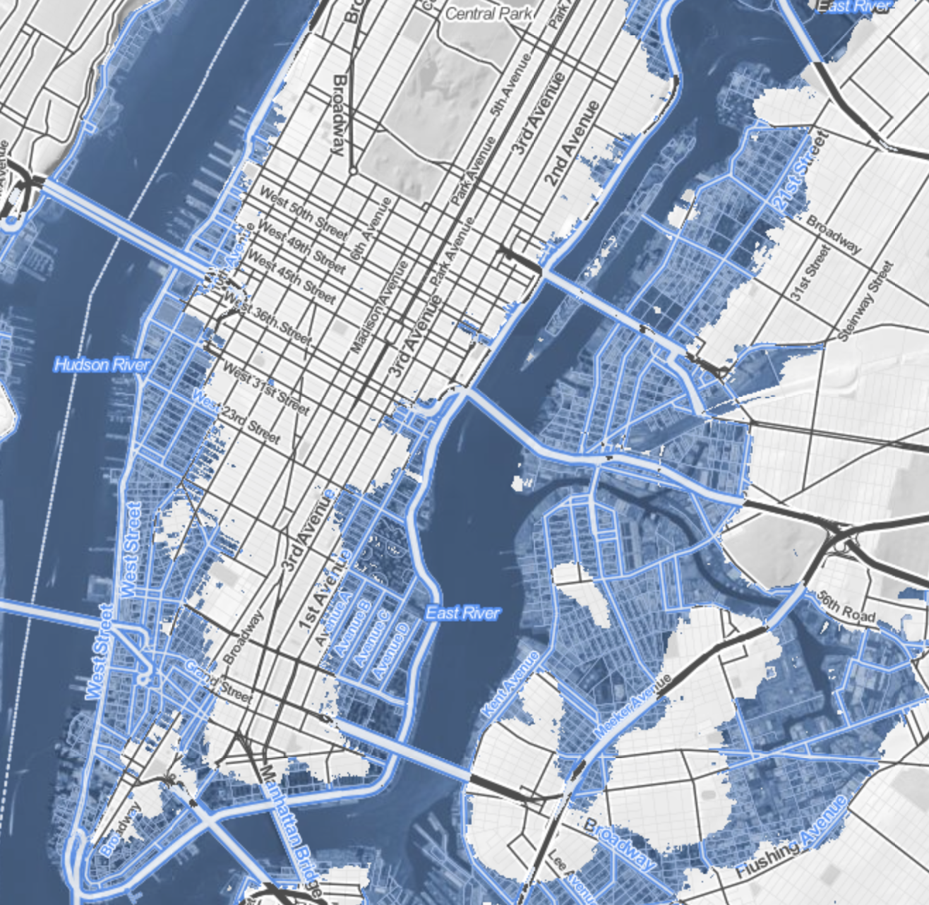
1. The very close margins voting margins suggest we narrowly escaped an alternative history of a second Trump term, and can explain the tenacious grip that Trump seems to have had on an alternative outcome, an outcome that he has tried to game in multiple ways and strategies that eerily echoes with the strategies of gaming the electoral map that seems to have occurred through the orchestration of telling postal delays, delayed returns of absentee ballots, and the strategic gaming of the distribution of a distanced franchise. It forces us to contemplate the counterfactual history of the far darker reality of a scenario where his expectations came true. Indeed, it should make us consider the closeness of overturning democracy. In was as if the reporting of the timestamped electoral map of Saturday, November 7 that was an inset of the Times only encouraged resistance to admitting the failure of Trump to preserve the “red swath” of 2016 across what coastal elites long bracketed as “flyover country,” where the effects of economic recession had never stopped.

New York Times, November 8 2020, “Results as of Saturday at 10:30 Eastern/ Map Shows Maine and Nebraska statewide vote

It had almost happened. In Trump’s White House, a boisterous watch party was underway, crowded with FOX anchors, watching the big screen that FOX results showed to the audience, anticipating the reality of a second Trump term. But all of a sudden, Trump was so incredulous he refused to admit seeing Arizona called at 11:20 as a Biden victory, shouting to no one in particular, “Get that result changed!” Hoping to calm her triggered boss, who must have been catapulted into alternate scenarios of having to leave the White House where he had expected to encamp, former FOX employee Hope Hicks fretted about the newsfeed.

Could the map be changed? Trump was frustrated at his in ability to manipulate the news, and already apprehensive at what endgame was in store. At this point, it seems, Trump’s every-ready servile son-in-law, Jared Kushner, hurriedly placed a direct call to Rupert Murdoch to rectify the call, assuring better data would arrive from Arizona’s COVID-denying governor, Doug Ducey (R), to restore the state’s redness on the electoral map, in desperate hopes of jerry-rigging his electoral fortunes. Back in 2016, Trump had indeed only won Arizona by the narrowest of margins–by about half of the margin by which Romney won in 2012–and only third-party candidates’ popularity concealed that Democrats boosted margins of victory in precincts beyond Republicans, flipping seventy precincts to their column–perhaps as Maricopa County featured a PAC that attracted millions of dollars to defeating Sheriff Joe Arpaio’s bid to consolidate an anti-immigrant agenda.

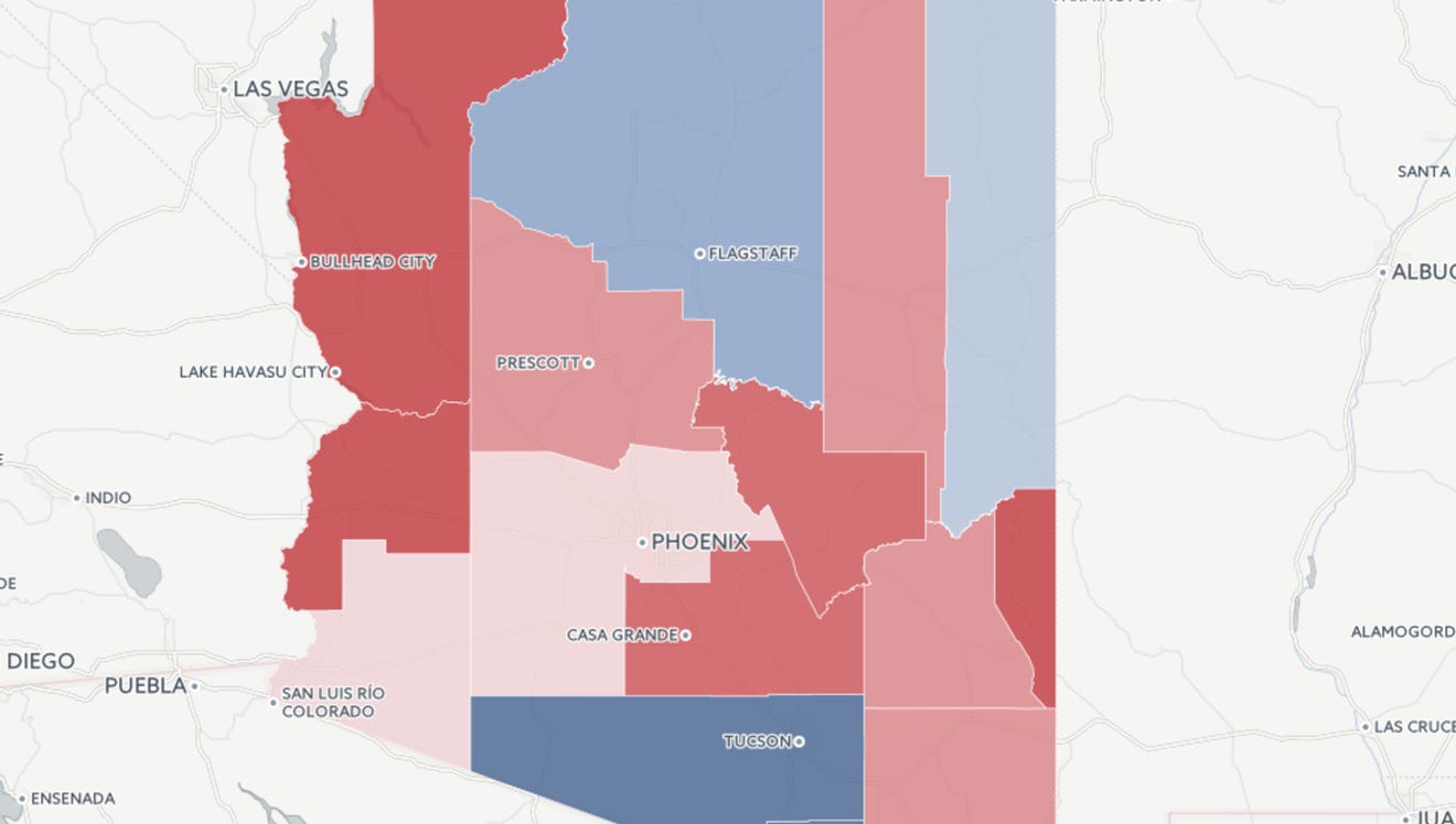
Trump quickly recognized the danger a flipped state posed to hopes for another red swath, as the contestation over the state that he had hoped to pry from the Democratic map was a poor omen of the election, and needed to be stayed.

In 2017, Trump was so enamored of the expanse of his electoral victory to given paper copies to White House visitors–until he framed a version for the West Wing, five months after the election. And if the state is visibly fragmented in an identical mosaic in the map that Trump framed in the White House, the brilliant red of nearby Nevada and bright red diagonal suggest the state was more firmly in Republican hands than we might remember. After hoping that The Washington Post might celebrate his hundredth day in office by featuring the “impressive” the electoral map on its front page, his pride in the map led it framed the map in the West Wing, a reporter from One America News Network obligingly showed.

This alternate world of electoral victory created what must have been a prominent counter-factual map that had dominated the Trump team’s plans for victory in 2020. The White House watch party must have been haunted by the very same map of which Trump was so proud.

Trey Yingst (ONN), May 11, 2017/Twitter
Continue reading

1 Comment

Filed under 2020 election, data visualization, Donald Trump, electoral maps, Presidential Elections

Freezing Time, Seaweed, and the Biologic Imaginary

We can all too easily lose sight of the centrality of seaweed plays in coastal habitat–even in Northern California, where seaweed washes up regularly in clumps and beds along the shore. Bull kelp and other marine plants on the sandy beaches of northern California seem otherworldly representatives of a removed marine world, but their proximity is revealed in remote mapping that promises to remap the role of seaweed in coastal ecosystems, and offer a picture of the terrifying prospects of ocean warming and climate change.

The relatively recent contraction of kelp forests across much of the offshore where they long provided such dense habitats may soon start to contract in ways never before experienced. The remapping of kelp forests, and the problems of their contraction of treasured habitat, reveal how much coastal waters demand to be seen not as so separate from the land, but part of a complex ecotone–a region where land and sea interact. Underwater species impact a large ecosystem that provides atmospheric oxygen, integral to coastal biodiversity that imparts a specific character to the California coast, and a sense of where we are–as well as makes it a destination for countless Pacific pelagic, shorebirds, and insects, as well as shellfish and fish. But the decimation of kelp forests, tied to an absence of predators to urchins, but more broadly to the ocean warming of coastal waters, as well as potentially an unprecedented increase in coastal pollution, makes both the mapping of the shrinking of kelp forests and the deciphering of that shrinking pressing problems of mapping, destined to impact a large variety of ocean and land-dwelling species.

The need for such mapping underscores all of our relation to the vital ecosystem of the shores and coastal ocean–even if we too often bracket it from our daily lives. While beached kelp may be present before our eyes, the problems of mapping of kelp forests with any fixity complicates how we process the disappearance of offshore kelp beds in an amazingly rapid timeframe. And the failure of creating an actual image capture registering the extent of kelp forests poses limits our awareness of their diminution off coastal waters. The observations of the shrinking of coastal spread of bull kelp is based on local aerial surveys, over a relatively small span of time, the accelerated roll-back of a once-vital region of biodiversity is both global, and demands to be placed in a long-term historical perspective of the way we have removed the underwater and undersea from our notion of coastal environments and of a biosphere.

Bull kelp forest coverage at four sites on the North Coast of California,from aerial surveys (California Dept. of Fish and Wildlife)

What was first registered in the plummeting of abalone, and the wasting disease of sea stars, afflicting stars from Baja to Alaska in 2013, suggest a condensation of a radical change in near-coastal environments of global proportions, paralleled by the arrival of warm waters that are not conducive to kelp growth, even before El Nino, and before the the arrival of purple urchins whose levels stars controlled, as if the result of cascading effects of a tipping point atmospheric change.

The quite sudden growth on the ocean floor of “sea urchin barrens,” where the near coastal waters are cleared of seaweeds and kelp, is a global problem. As global oceans absorb warmth of increased global warming, near-shore environments are particularly susceptible to species changes that create large disequilibria–from the bloom of phytoplankton to the rise of purple sea urchins and the dearth of shellfish–that stand to change coastal oceans. Yet the same creatures are often ones that fall of outside of our maps, even if the presence and scale of massive kelp beds and submerged forests are hard to map. And even if we see a shrinking of the large undersea submerged beds of kelp off coastal California, it is hard to have clear metrics of their shrinking over time or past extent–or of intervening in their reduction, which we seem forced to watch as inland spectators.

NASA Earth Observatory., image by Mke Taylor (NASA) using USGS data

Indeed, if the presence of coastal seaweed, and the distinctive kelp forest of California’s coastal ocean seems the distinguishing feature of its rich coastal ecology, the holdfasts of kelp forests that are grazed down by sea urchins and other predators are poorly mapped as solely underwater–they are part of the rich set of biological exchanges between the ecotone of where land meets sea, and ocean life is fed by sediment discharge and polluted by coastal communities, as much as they should be mapped as lying offshore, at a remove from the land. Yet the death of beds of kelp that is occurring globally underwater is cause for global alarm.

For from Norway to Japan to but the decline of natural predators of urchins in California has made a rapid rise of urchins on the seafloor along the coast have contributed to a shrinking of once-abundant kelp forests that produce so much of our global atmospheric oxygen. And these hidden underwater changes seem destined to rewrite our globe, as much as climate change, and threaten to change its habitability. Even as large clumps of seaweed are removed by powerful waves, that deposit piles of offshore forests ripped from holdfasts on beaches in northern California, the narrative of large coastal kelp deposits, their relation to climate change and coastal environment demands to be better mapped, as the transition of kelp to barrens afflicts so much of the coastal waters of the Atlantic and Pacific, at so many different latitudes and across such a variety of local cold water ecologies.

While the decline of kelp forests seems as radical as the clear-cutting of redwoods, it is both far more rapid and far more environmentally disruptive, if far less visible to the human eye.For in recent decades, increasingly warming waters and out of whack ecosystems have led to a massive decline of seaweed, decimated by a rise in the sea urchin population to by 10,000 percent off the California coast over only last five years, shrinking kelp forests that stand to catapult us to a future for which we have no map. The long-term decline in sea otters and sea stars, natural predators of the urchins, have removed constraints on urchin growth, which warming waters has encouraged, reducing a historical abundance of kelp in the near coastal waters across California.

This has perhaps been difficult to register due to the problems of mapping seaweed, and indeed registering kelp forests’ decline. The advance of sea urchin populations that have created barrens in coastal waters stands to disrupt and overturn some of the most abundant ecological niches in the global oceans. How has this happened under our eyes, so close tho shore and lying just undersea? We have few real maps of seaweed or kelp, lurking underwater, rather than above land, and leave out kelp from most of our maps, which largely privilege land. But the abundance of kelp that produce most of the global oxygen supply live in underwater ecotones–sensitive places between land and sea, in-between areas of shallow water, abundant sunlight, and blending of land and sea–an intersection, properly understood, between biomes, on which different biological communities depend.

Looking at the offshore seaweed near Santa Cruz, CA, I wondered if the predominantly passive registration of location–onshore registration of sites remotely by satellites, familiar from the harrowing images of the spread of fires, provided a basis to register our states of emergencies that was spectacularly unsuited to the contraction of coastal kelp, despite the huge advances of mapping techniques, and left us without a map to their contraction, or to register the subtle if radical consequences of kelp loss, and the almost as devastatingly rapid progress of their advance as populations of urchins have mowed down underseas kelp beds. For even as we strike alarms for the the decline of global kelp populations and seaweed forests as a result of the warming of offshore temperatures that place the near offshore regions at special risk of atmospheric warming–

Paul Horn, Inside Climate News/Source Wernberg and Staub,
Explaining Ocean Warming (IUCN Report, 2016)

–we lack maps of the place of seaweed and kelp beds in their ecotone, and indeed have no adequate maps of seaweed populations under threat.

Continue reading

Leave a comment

Filed under climate change, global warming, oceans, remote observation, seaweed

Mapping Our Shrinking Shores

Coasts have provided the primary cartographical invention to understand the risks that erosion pose to property:  the coast-line is the boundary of the known land, and determines the outer bound of the real estate.  But the coastal fixation of the landlubber privileges the illusion of the fixity of the shore.  More than ever, assumptions about the fixity of shorelines must fall away.  Perhaps the most haunting take away from the Surging Seas web-based map of global shorelines forces us to take into account the inevitable mutability that must be accepted with the rising of ocean-level associated with climate change.

The web-map presents itself as a set of tools of analysis, as much as cartographical techniques, by which the rise of sea-level that has already risen globally some eight inches since 1880 stands to accelerate–emphasizing the alternate scenarios that the acceleration of sea-level rise stands to bring over the next hundred years, introducing a new concept of risk due to coastal flooding.  The availability of accurate GPS images of the elevations of homes have provided the possibility of sketching scenarios of sea-level rise to create readily zoomable maps of elevated ocean levels that confront us with at least the image of the options which we still theoretically have.  The contrasting futures created in this cartographical comparison shocks viewers with a salutary sort of operational paranoia only increased as one fiddles with a slider bar to grant greater specificity to the disastrous local consequences of rising sea-levels world-wide.

shanghai

In ways quite unlike the wonderfully detailed old NOAA Topographic Surveys which map shorelines at regular transects, or T-Sheets, recording the high waterline of tides across 95,000 coastal miles and 3.4 million square miles of open sea, the coastline is less the subject of these web maps than levels of potential inundation.  In a negative-mapping of possibilities of human habitation, blue hues invade the landscape in a monitory metric emphasizing the regions at risk of being underwater in a century.  Whereas scanned T-Sheets can now be viewed by a historical time-bar slider, the fixity of space or time are less relevant to the web maps than the gradients of possible sea-level rise caused by carbon emissions might force us to confront.

Surging Seas forces us to confront the possibilities of the future underwater world.  The infiltration of a deep shade of blue commands the eye by its intensity, deeper shades signifying greater depth, in ways that eerily underscore the deep connection that all land has to the sea that we are apt to turn our backs upon in most land maps, showing the extent to which a changing world will have to familiarize itself to water-level rise in the not-distant future.  It’s almost paradoxical that the national frontiers we have inscribed on maps has until recently effectually made impossible such a global view, but the attraction of imagining the somewhat apocalyptic possibility of sea-level rise seems almost to map a forbidden future we are not usually allowed to see, and has a weirdly pleasurable (if also terrifying) aspect of viewing the extensive consequences of what might be with a stunning level of specific and zoomable local detail we would not otherwise be able to imagine, in what almost seems a fantasia of the possibilities of mapping an otherwise unforeseen loss, not to speak of the apparent lack of coherence of a post-modern world.

For the variety of potential consequences of disastrous scenarios of sea-level rise posed can be readily compared with surprisingly effective and accurate degrees of precision, in maps that illustrate the depths at which specific regions stand to be submerged underwater should sea-level rise continue or accelerate:  zooming into neighborhoods one knows, or cities with which one is familiar, the rapid alteration of two to seven feet in sea-level can be imagined–as can the fates of the some 5 million people worldwide who live less than four feet above sea-level.  For if the shores have long been among the most crowded and popular sites of human habitation–from New York to London to Hong Kong to Mumbai to Jakarta to Venice–the increasing rapidity of polar melting due to climate change stands to produce up to a seven feet rise in sea-level if current rates of carbon emissions, and a mere four degree centigrade rise in global temperature stands to put the homes of over 450 million underwater, which even the most aggressive cutting in carbon emissions might lower to only 130 million, if rates of warming are limited to but 2°C.   (If things continues as they stand, the homes of some 145 million who currently dwell on land in China alone are threatened with inundation.)

The recent review of the disastrous consequences of a rise of two degrees Centigrade on the land-sea boundary of the United States led Climate Central to plot the effects of a-level rise of at least 20 feet on the country–and foreground those regions that were most at risk.   The webmap serves as something like a window into the possible futures of climate change, whose slider allows us to create elevations in sea-level that the ongoing melting of the polar ice-cap seems poised to create.  As much as offer compare and contrast catastrophes, the immediacy of recognizing the degree to which places of particular familiarity may soon stand to lie underwater performs a neat trick: for whereas a map might be said to bring closer the regions from which one is spatially removed or stands apart, making present the far-off by allowing one to navigate its spatial disposition in systematic fashion, the opacity of those light blue layers of rising seas obscures and subtracts potentially once-familiar site of settlement, effectively removing land from one’s ken as it is subtracted from the content of the map, and charting land losses as much as allowing its observation.

The result is dependably eery.  The encroachment of the oceans consequent to rising sea-level propose a future worthy of disaster films.  But the risks can be viewed in a more measured ways in the maps of sea-level on the shores of the United States calculated and mapped by Stamen design in the Surging Seas project that allows us to imagine different scenarios of sea-level rise on actual neighborhoods–the set of interactive maps, now aptly retitled Mapping Choices, will not only cause us to rethink different scenarios of shifting shorelines by revisiting our favorite low-lying regions, or allow us to create our own videos of Google Earth Flyovers of different areas of the world.  Mapping Choices provides a way to view the risks and vulnerabilities to climate change made particularly graphic in centers of population particularly low-lying, where they testify to the clarity with which web maps can create a vision of imagined experience as we imagine the actual losses that global warming is poised to create.  And although the recent expansion of the map to a global research report, allowing us to examine possible global futures that are otherwise difficult to comprehend or process the potential risks posed by the inundation of low-lying inhabited regions for a stretch of thirty meters, the potential risk of inundation is perhaps most metaphorically powerful for that region that one best knows, where the efficacy of a simple side-by-side juxtaposition of alternate potential realities has the unexpected effect of hitting one in one’s gut:  for debates about the possibilities of climate change suddenly gain a specificity that command a level of attention one can only wonder why one never before confronted as an actual reality.

Alternate Scenarios

Maps are rarely seen as surrogates for observation, and web maps often offer something like a set of directions, or way finding tools.  But the predicted scenarios of sea-levle rise allows one to grasp the local levels of inundation with a specificity that allow risk to be seen in terms of actual buildings–block by block–and wrestle with the risks that climate change portends.  The lack of defenses of populations in many regions are definitely also at great risk, but to envision the loss of property and known space seems oddly more affecting in such an iconic map of Manhattan–and somewhat more poetic as an illustration of the fungibility of its hypertrophied real estate and property values.

Of course, the data of Climate Change allows a terrifying view of the future of four degrees centigrade warming on low-lying Boston and the shores of the Charles, as the city is reduced to a rump of an archipelago–

Boston

or the disastrous scenarios for the populations in the lower lying areas of Jakarta–

Jakarta

or, indeed, in Mumbai–

Mumbai

Viewers are encouraged to imagine the risks of the possible alternate futures of just two degrees with an immediacy that worms into one’s mind.  The possibilities that GPS offers of instantaneous calculations of shoreline position and elevations allow one to view a potential reality where one can focus on individual streets with inspirational urgency.

But such scenarios seem somehow particularly graphic illustrations of risk for those regions where there has been a huge investment of human capital, as New York City, where it might seem credible enough to be mapped that they are poised to melt not into air but vanish beneath ocean waves.  For if Marx predicted with spirited apocalypticism at the very start of the Communist Manifesto that capitalism would destroy value to money as it expanded into future markets, as market forces abstracted all things into money–and “all that is solid melts into air”–the twentieth-century expansion of possibilities of environmental and human destruction have lent unprecedented urgency.  While for Marx the metaphor of melting of inherent value was the product of the capitalist system, the capitalist system bodes a strikingly similar image of sinking into the seas.  For huge expanses of the old industrial city–the piers and the old manufacturing zones, most all of the Jersey shore and area around Newark, Long Island City and the Gowanus canal seem sink apart from the shoreline in the future New York that Surging Seas creates, in ways that seem the consequence of industrial production and carbon surging far beyond 400 parts per million (ppm), with the addition of some 2 ppm per year, in ways that make it a challenge to return to the levels deemed healthy–let alone the levels of 275 ppm which the planet long held through the mid-eighteenth century.

That drought, hurricanes, disappearance of arctic ice (up to 80% in summertime) and rising sea levels are tied to the growth of greenhouse gasses hint how global capital might be closely linked to the sinking into the seas, and suggest the surpassing of a tipping point of climate change that is the counterpart to melting into air might be viewed, in New York City’s economic geography, as if to offer a poetic reflection of the migration of capital into the financial centers of the city downtown from its piers or areas of industry–

NY:NJ

–although half-hearted joking references to Marxist maxims (or geographers) is hardly the topic of this post, and the island of high finance that would be created in downtown Manhattan would hardly have ever been planned as an island.

Lower Manhattan Island?

What one might someday see as the lopping off of much of lower Manhattan might be far better tied to the runaway markets of a free-trade economy, rather than rational planning, and has no clear correspondence to property values.

lopped off lower Manhattan

Indeed, the mapping of the prospective loss of those residential parts of the city “where poor people dwell” (as do minorities) is undeniable, if one looks at the 2010 American Community Survey, regarding either in the city’s distribution of ethnic groups or households earning below $30,000, who remain the most vulnerable to the danger of rising ocean levels.

ACS 2005?

Income under 30,000American Community Survey (2010)/New York Times

But the disappearance of the Eastern Parkway and the Jersey shore are a blunt reminder of the extreme vulnerability of the built environment that lies close to sea-level–

Eastern Parkway and Atlantic Avenue above the seas

–and an actually not-too-apocalyptic reminder, but the mapping of consequences of man-made change that goes under the rubric of anthropocene, and is most apparent in the increasing quotient of carbon dioxide in the atmosphere and the warming that this may bring.  For if it has been approximated that there has already been a rise of sea-levels by some eight inches since 1880, the unprecedented acceleration of that rate, which will increase the dangers of floods from storms and place many of the some three thousand coastal towns at risk, are likely to increase as the sea level may rise from two to over seven feet during the new century.

350ppm-chart-300_fixed

The distribution is by no means uniform, and more industrialized countries, like the United States, are producing far more particulate matter, although they have been recently overtaken by China from 2007, and have atmospheres above 380 ppm in the Spring, making them more responsible for rendering higher temperatures–although the lower-lying lands below the equator may be most vulnerable to the consequences of climate change.

Screen Shot 2015-07-13 at 8.20.11 PM

Screen Shot 2015-07-13 at 8.21.44 PMScreen Shot 2015-07-13 at 8.22.35 PMVox– A visual tour of the world’s CO2 emissions

The increasing levels of particulate matter are attempted to be more locally mapped in Surging Seas.

The changes extend, in a nice dramatic detail, into the Central Park Meer rejoining the East River with the predicted inundation of much of the posh residential area of Manhattan’s East Side, all the way to Fifth Avenue.

Truncated NJ and absent upper East side

It is difficult not to compare the scenarios sketched in Surging Seas maps to some of the maps of those future islands of New York that Map Box and others allowed Sarah Levine to create maps of the heights of buildings from open data after the pioneering maps of Bill Rankin’s 2006 “Building Heights.”   When Rankin remapped Manhattan by taking building height as an indirect index of land value, he saw the island as clustered in distinct islands of elevation above 600 feet:

manhattan-heights

Radical Cartography (2006)

Levine used similar data to chart the fruits of Mammon in buildings above sixty stories.  Maps of skyscrapers beside the gloom of Surging Seas suggest those towers able to withstand the rising seas brought by global temperatures jumping by just two degrees Centigrade.  If one moves from the map of the bulk of lowest sections of lower Manhattan–

Two Inches in Lower Manhattan

with reference to Levine’s brilliantly colored carmine mapping of the highest buildings in the Big Apple, above forty-seven or fifty-nine stories, which one imagines might provide the best vantage points that rise above the rising waves, especially when located on the island’s shores.

Mapping NYC by Sarah

Sarah Levine Maps Manhattan

There’s a mashup begging to be made, in which the tallest buildings of over fifty stories at the tip of the island peak up above the cresting waves, and the rump of buildings in lower Manhattan offer contrasting vistas of the city’s contracting shores.  The buildings that create the canyons of urban life, the buildings of elevation surpassing sixty stories might suggest the true islands of Manhattan’s future, as much as the points that punctuate its skyline.

Sarah's Lower Manhattan

The realization of this possible apocalypse of property made present in these maps offer the ability to visit impending disasters that await our shorelines and coasts, and imagine the consuming of property long considered the most valuable on the shore–as rising seas threaten to render a whispy shoreline of the past, lying under some six meters of rising seas.  The prospect of this curtailing of the ecumene, if it would bring an expansion of our nation’s estuaries, presents an image of the shrinking of the shores that suggests, with the authority of a map, just how far underwater we soon stand to be.

Eastern USASurging Seas: sea level rise after 2 degrees centigrade warming

All actual maps, including Levine’s, provide authoritative reporting of accurate measures with a promise of minimal distortions.  But visualizations such Surging Seas offer frightening windows into a future not yet arrived, using spatial modeling to predict the effects of a rise in sea-level of just five feet, and the potentially disastrous scale such a limited sea-level change would bring:  the coasts are accurate, but their inundation is a conservative guess, on the lower spectrum of possibilities.  For in a country in which 2.6 million homes are less than four feet above current sea-levels, the spectral outlines of chilly blue former coastlines peak at a future world are still terrifying and seem all too possible, as much as potential cautionary tale.  The concretization of likely scenarios of climate change remind us that however much we really don’t want to get there, how potentially destructive the possibility of a several degree rise in ocean temperatures would be.

Leave a comment

Filed under Climate Change, coastal flooding, data visualization, global warming