
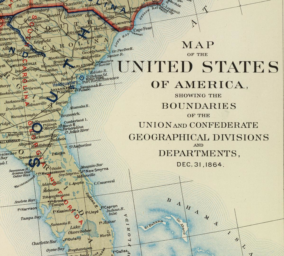
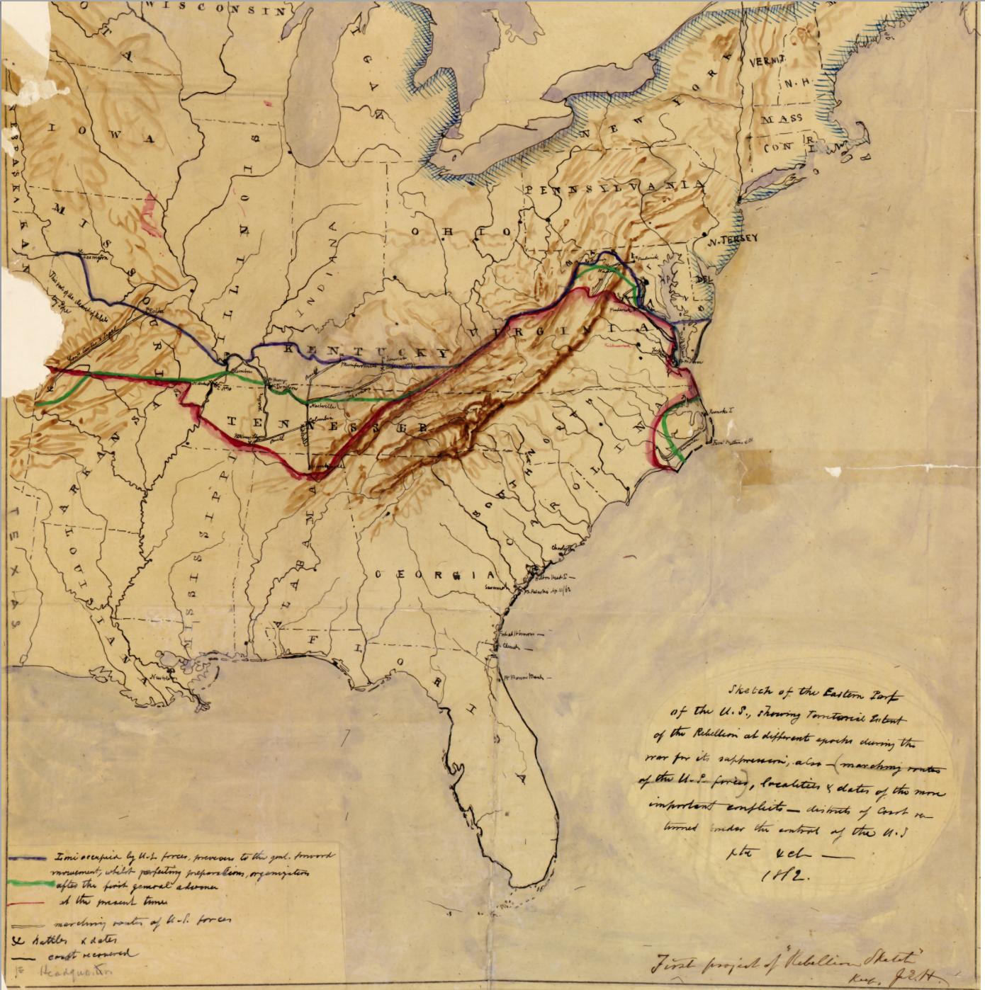
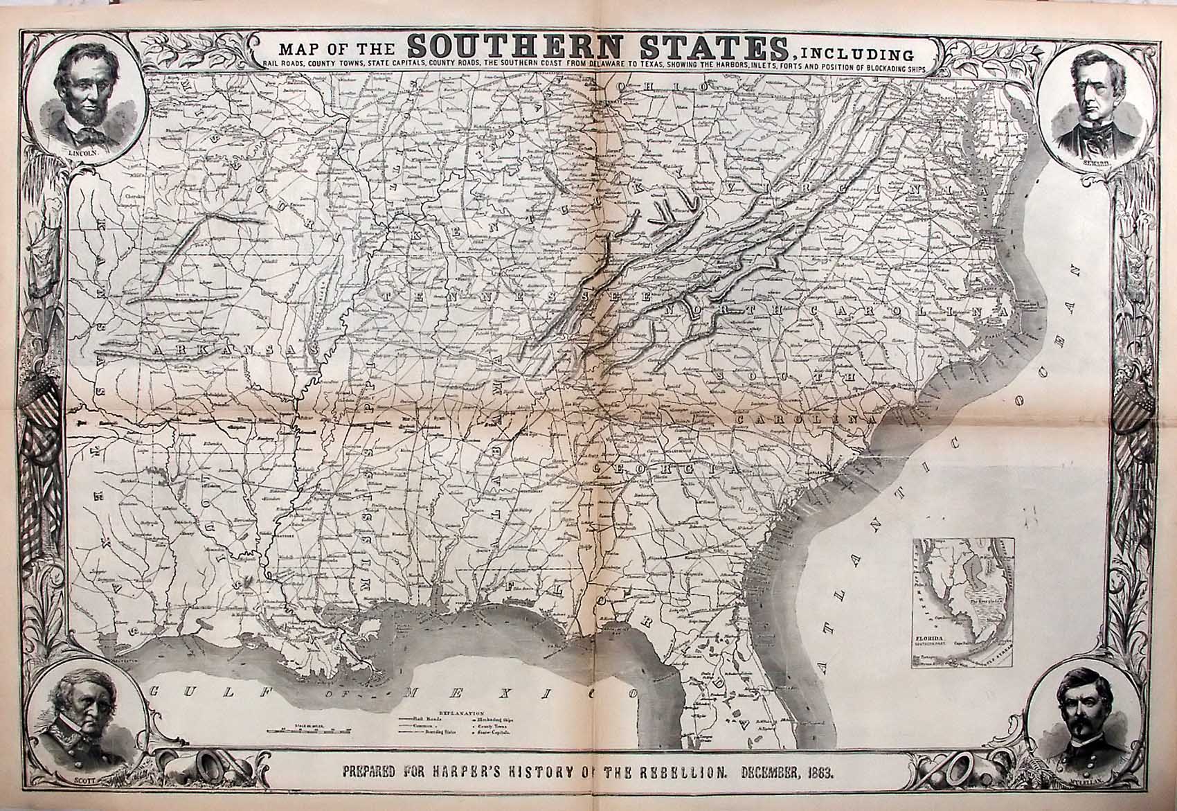
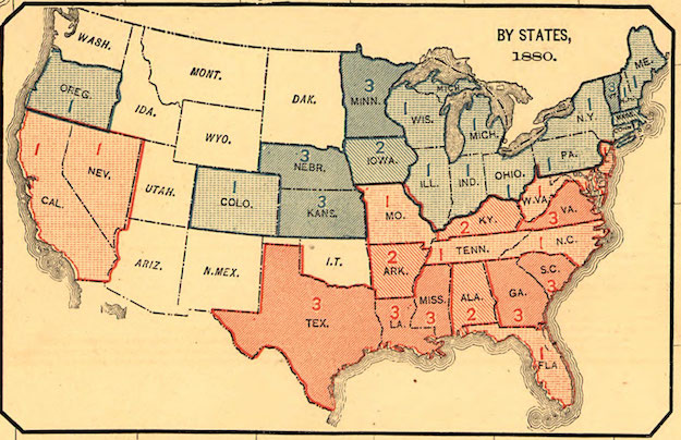
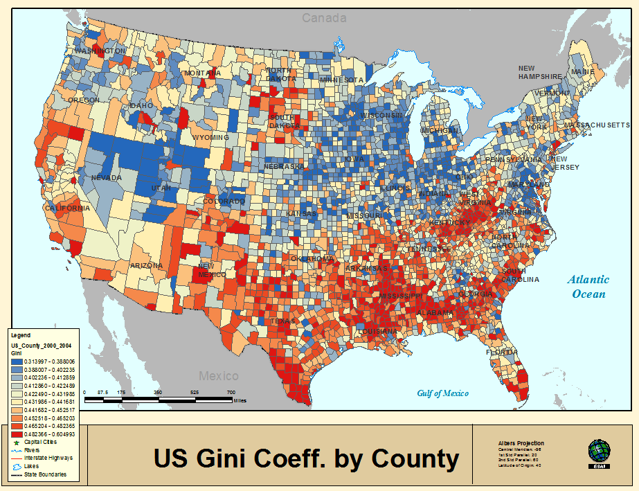
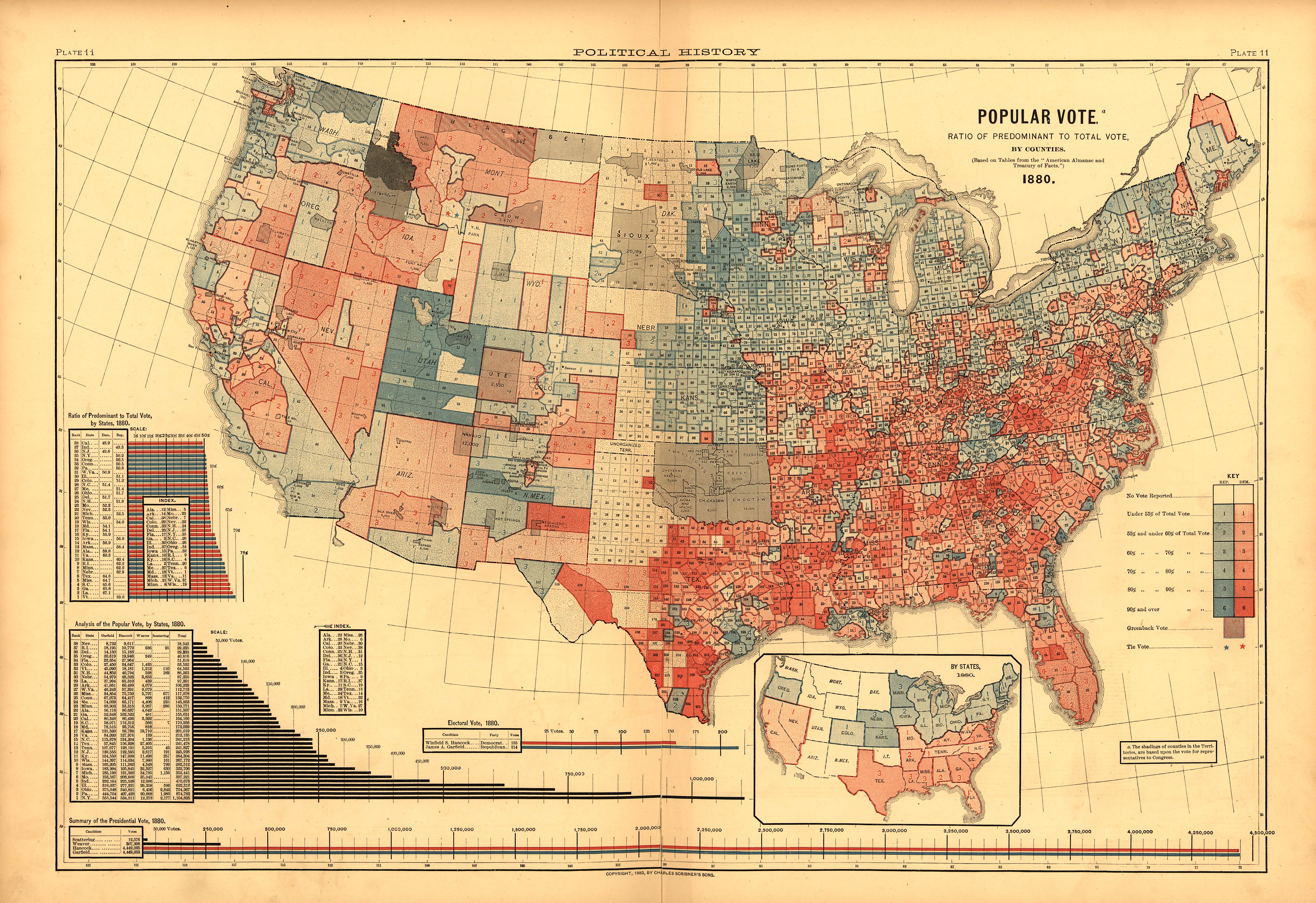
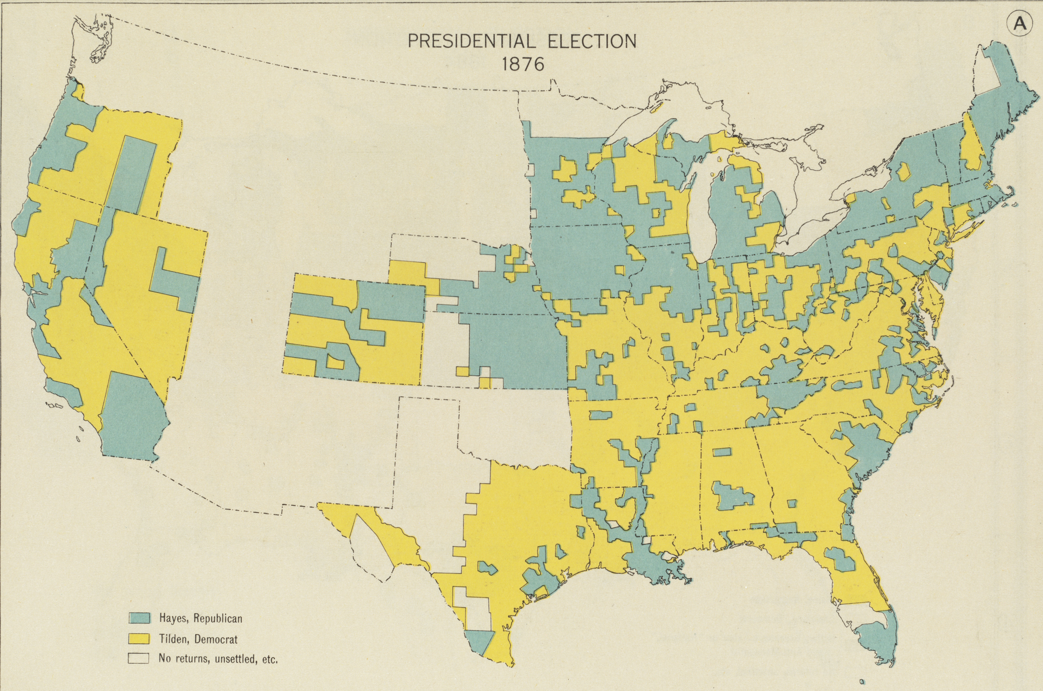
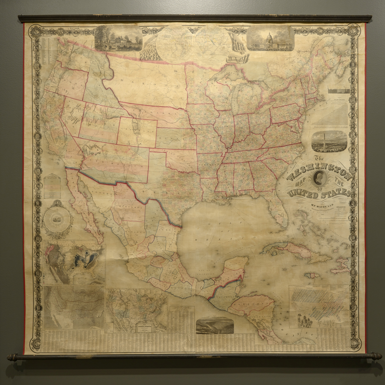
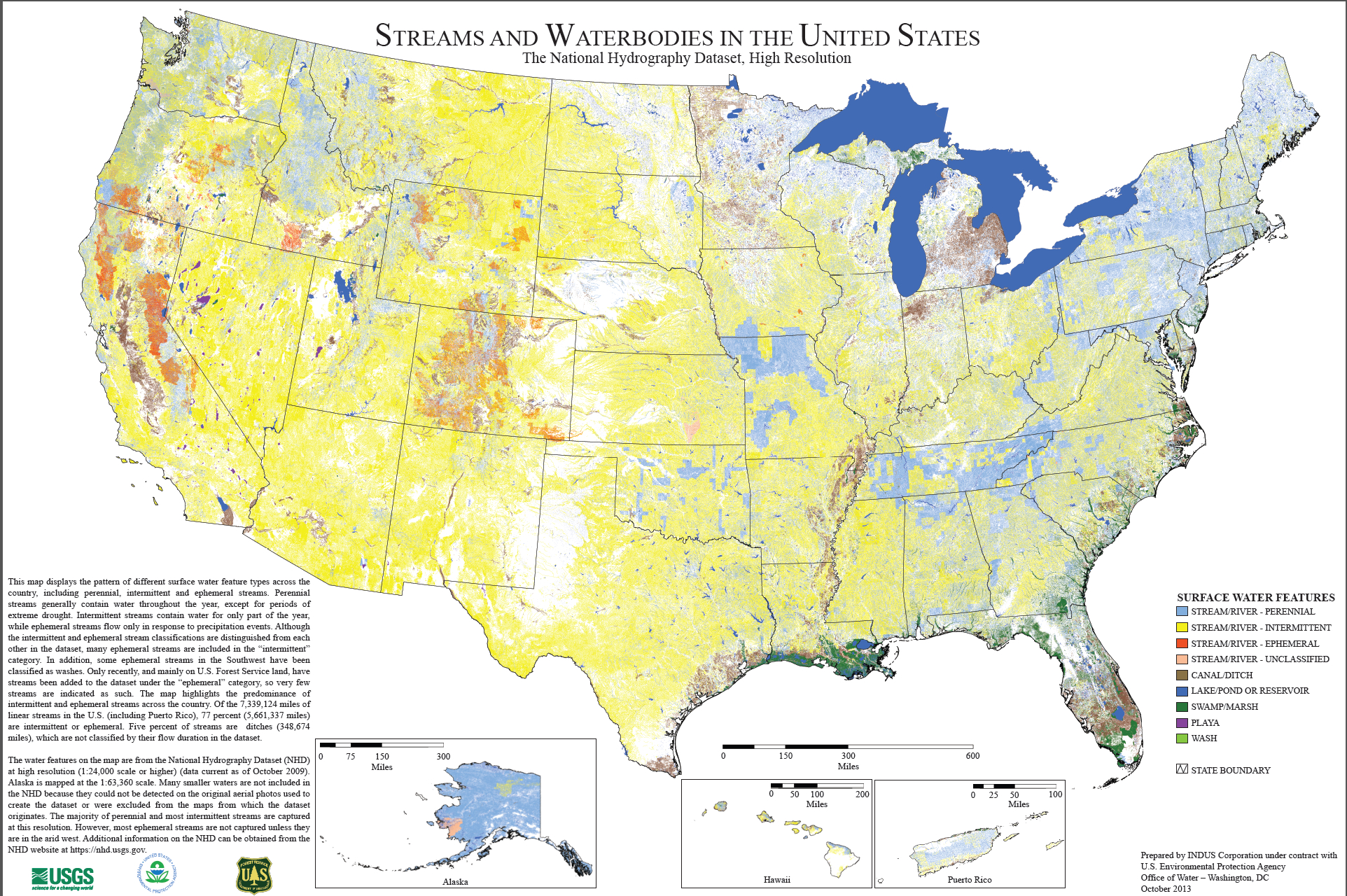
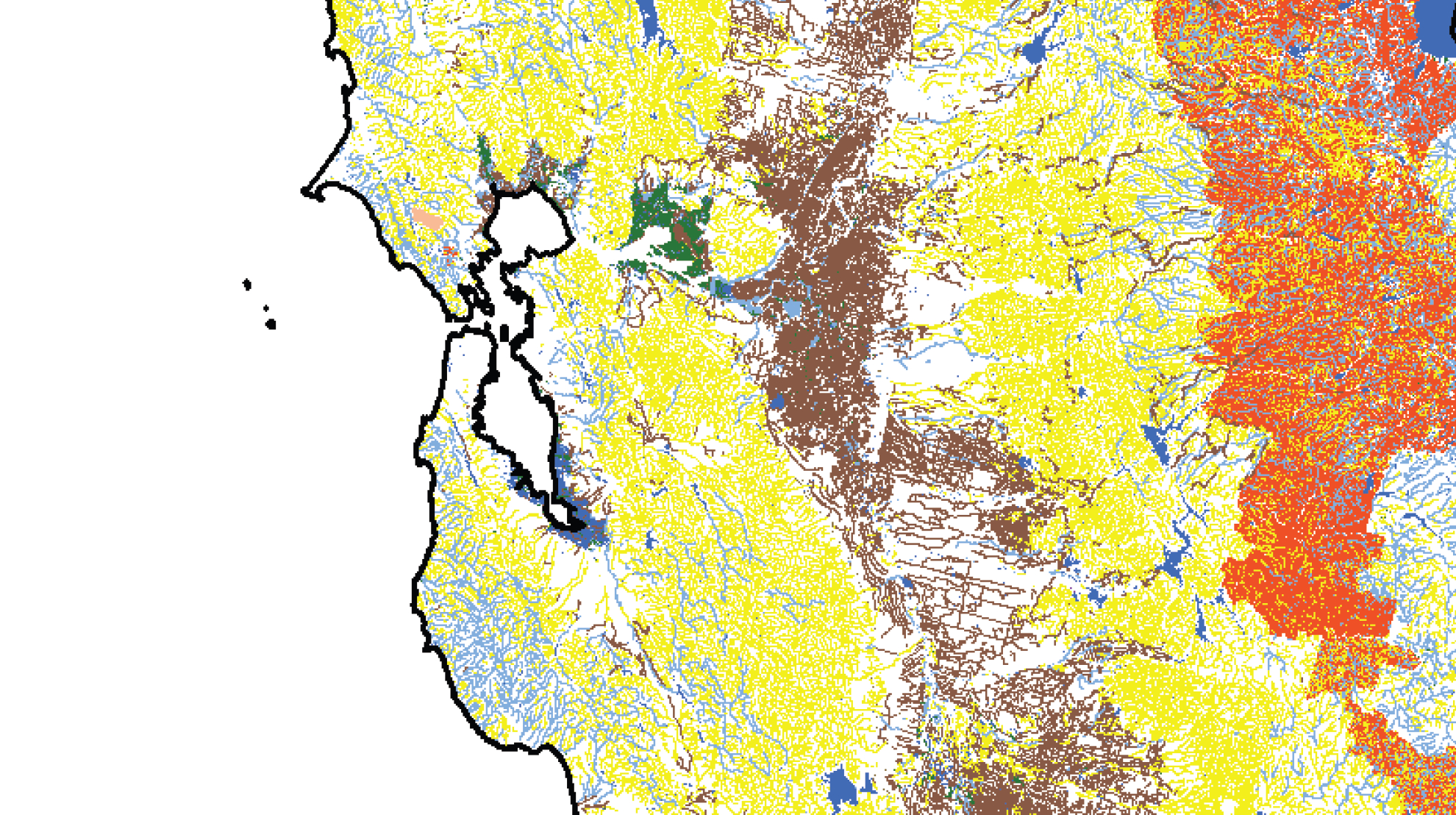
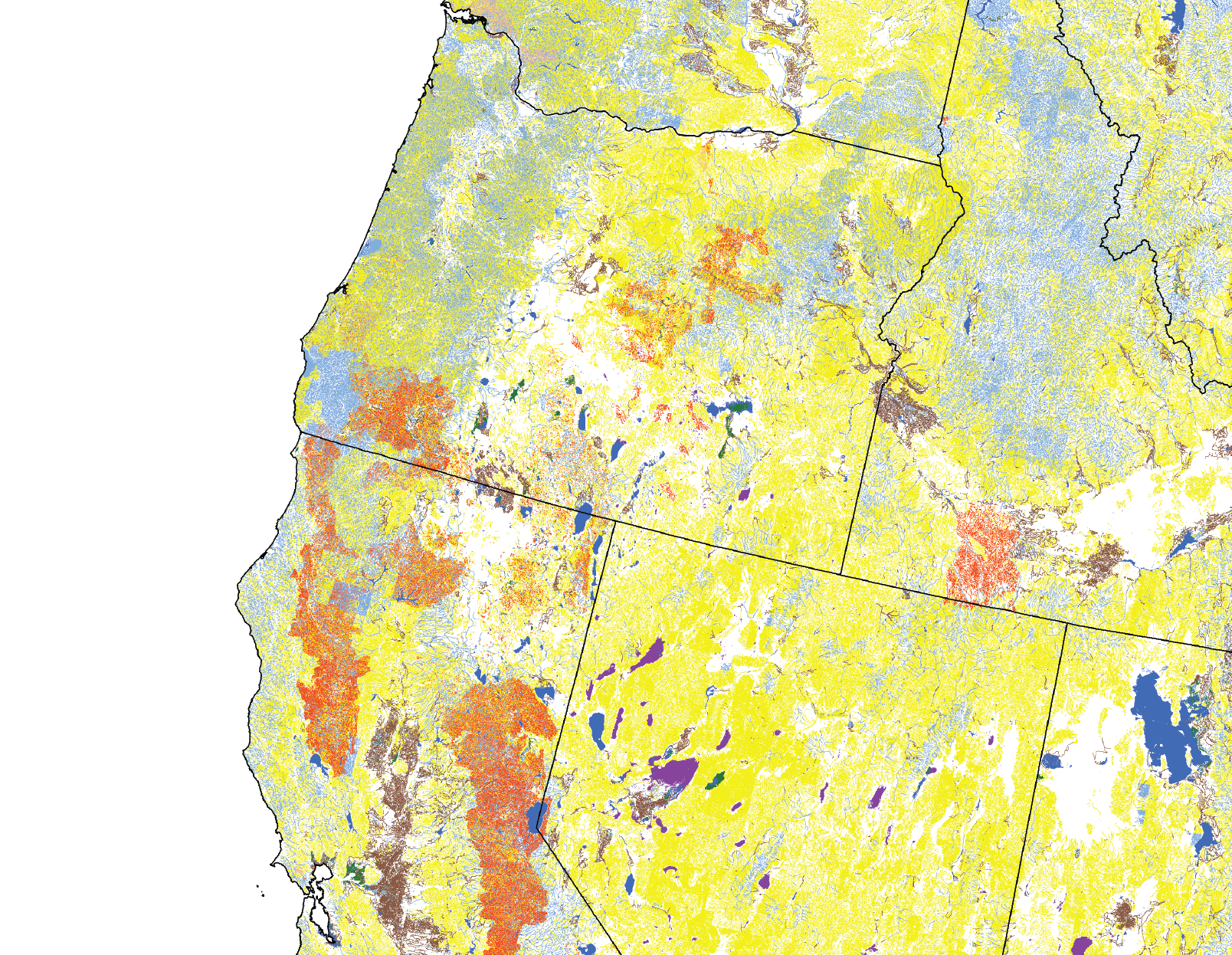
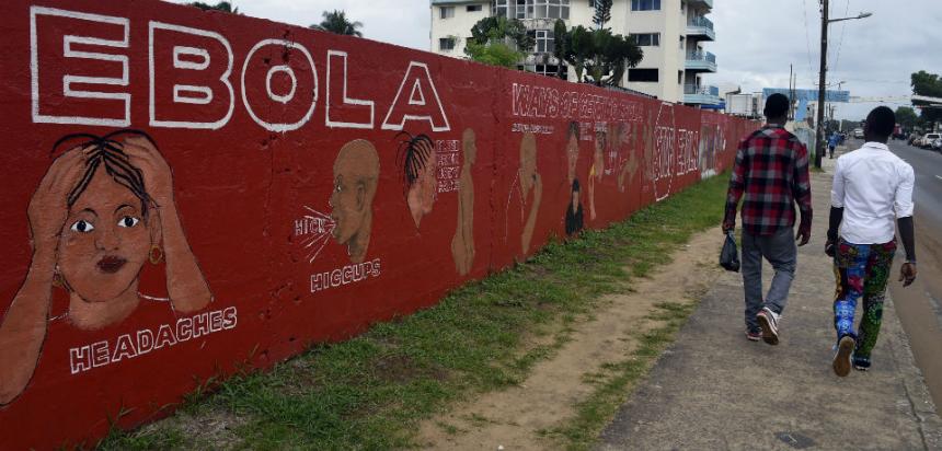
Mapping the nation gained wide currency as a way of performing national identity with the rise of the readily printed maps. Outfits such as the U.S. Election Map Co. that were founded in the mid to late nineteenth century to provide readers a legible record of the nation. Scribners was fortunate to be able to invest money in their appearance and legibility continued them in works such as the maps of presidential elections in Scribner’s Statistical Atlas in spectacularly modern form– including such maps as the masterful county-by-county survey that clarified results of the highly contested presidential election of 1880, where Republicans and Democrats divided around the contested question of the continuation of Reconstruction. These images echo the statistical maps that applied the principles Francis Amasa Walker first developed in the 1874 Statistical Atlas to visualize varied spatial distributions from population density to wealth to ethnicities for the U.S. Government–“clothing the dry bones of statistics in flesh and blood,” so that, in Gannett’s words, “their study becomes a delight rather than a task.”
The volume dedicated to Walker showed itself particularly sensitive to the possibilities of the visual delight of arranging information for viewers in data visualizations, using graphic tools developed with the German immigrant mapmaker Edwin Hergesheimer to wax poetical about the scope of visualize geographic variations as aids by which “not only the statistician and political theorist, but the masses of the people, who make public sentiment and shape public policy, may acquire that knowledge of the country . . . which is essential to intelligent and successful government.” These sentiments–continuing those of Walker, but announcing the new purview of the info-graphic in a culture where maps had become, in Martin Bruckner‘s words, a new form of performing the nation that built upon increased geographic literacy to narrate national identity but one that extended dramatically beyond the role printed maps played in the eighteenth century. In the aftermath of Civil War, the body of maps that Gannett and Hewes assembled provided nothing less than a new way to embody the nation in visual form.
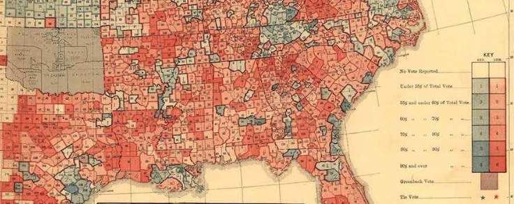
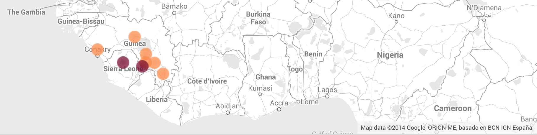
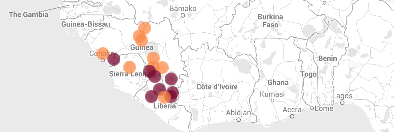
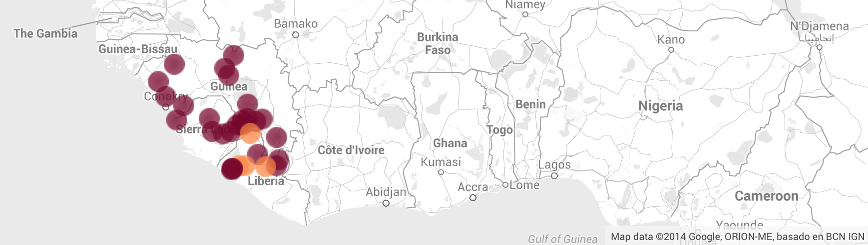
Good government was the final endpoint of showing the deep divide in national consensus within the popular vote in his 1883 mapping the geographic distribution as a two-color breakdown or divide, and not suggesting the conundrum that the government must faced–or a sign of the lack of legitimacy of the government, and impossibility of governing well. In showing a historical survey of not only the “physical features of the country” but “the succession of [political] parties and the ideas for which they existed,” Walker knew that Gannett’s map suggested the different divides revealed, and his pre-Tufteian precept that “simpler methods of illustration are, as a rule, more effective” to summarize and bring together the “leading facts” was done with “care . . . taken to avoid over-elaboration,” so that “by different shades of color, the maps are made to present a bird’s eye view of the various classes of facts, as related to area or population,” including political economy, church membership, mineral deposits, and electoral returns. The notion that the reification of electoral returns constituted a map provided a new way of envisioning the polity that Walker saw as particularly profitable for mass-readership. We’re now often the readers of info-graphics of far greater historical poverty, far more used to parse the political electorate of the country in ways that cast the viewer as the spectator to something approaching the naturalization of insurmountable divides.
 Library of Congress
The new flatness of the divide is disquieting, if not false. The maps in the Scribners’ innovative Statistical Atlas were the product of the adventurous tastes of newspaper and magazine editors who worked with new confidence to reach new numbers of readers, investing in graphics to appeal to a new eye and a new desire to envision the nation, in ways we have only begun to reach in the far flatter visualizations that we distribute online and even in print. In the lavishly produced periodicals of post-Civil War America, multi-colored maps raised questions about the legibility of a unified national space. They suggested fragility in the union from the government’s point of view. But they challenged viewers to find how that unity might be read in a particularly engaging ways–as well as being preserved, and provide far more subtle texts–and statistical knives–than the pared-down infographics that appear so often on our handhelds and screens today. In ways that suggest a new standard for the historical depth of the infographic, the map used statistical “facts” to embody the nation so that one can almost zoom in on its specific regions, in a manner that prefigure the apparently modern versatility the medium Google Maps, but that do so by exploiting its folio-sized dimensions as a canvas to read the nation’s populations.
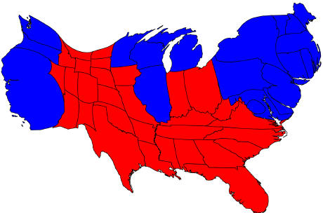
In ways that graphically processed the tabulation of the popular vote that it lay at the reader’s fingertips, the map’s author, Henry Gannet, delved into the question of how clearly the divide between north and south actually mapped out onto the clear enclaves and redoubts of Republican partisanship that are located in Baton Rouge and the South Carolina coast, and much of Virginia and Texas, that challenged the dichotomic division between “northern” and “southern” states. An antecedent to GIS, in Walker’s designs for the maps, the striking color scheme presented pockets of Democratic resistance with a clarity that made them pop out and immediately strike viewers’ eyes as a way to grasp the political topography of the country in especially modern ways, as if to map the meaning of its Republican consensus. The map represents the heights of good design that the New York newspaper industry had pioneered after the Civil War, enriched by advertising and graphic design, even if it was designed by the statistician who helmed the United States Census in Washington. Its pointed argument on the difficulty of taking the electoral map that resulted–shown as an inset–as a reflection of an actual divide raises questions about the current tendency to naturalize “Red” states versus “Blue” states, if it seems devised to answer questions about how the national fabric was rent by opposed divides during Reconstruction.
How the map, very much in the manner of contemporary graphics, came to synthesize political history in legible form by embodying them–Walker’s “flesh and blood”–seem premonitions of contemporary market for info-graphics. But they were removed from the increasingly unavoidable divides that recent info-graphics suggest but seem designed to perpetuate, or the readily improvised graphics of the short-term that are consumed in made-for-television maps viewed largely in living rooms on television screens. If the unified color blocks of much data visualization is sadly designed to discourage reading or interpretation, in ways that almost seem destined to limit our political vision for the future of the country, the opportunities that Gannett’s map allows to delve into the palimpsest of the popular vote might help to remove what seem blinders on our shared sense of the political process. The market for the new info-graphic is quite distinct, and designed not for an Encyclopedia, but created for the short-term–and indeed valued as a short-term image of the contemporary with its own expiry date.
The needs of mapping an image national continuity were quite distinct, and might be profitably historicized in ways that would be foreign from the current market for or demand that info-graphics fill. For the rationale for creating such a visualization of the popular vote’s distribution, if contemporary to a range of new maps for visualizing and processing the nation, gained pressing value after the Hayes-Tilden contest–as it would after the recent defining Presidential contest between Bush and Gore, or for the race between Obama and Romney–for their critical explanatory role to resolve the nation’s symbolic coherence.
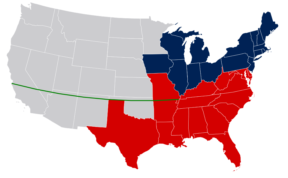
The resemblance in the divide revealed in info graphics seems far deeper than political partisan allegiance, and the culture of this divide difficult to pinpoint–although the anti-Republican sentiment of the South was fierce in the election of 1880 seems a likely point to begin to map the local resistance to the continued presence of federal troops. The divide between north and south echoes the division redrawn on Wikipedia between slave-states and free states circa 1849, and enshrined in a latitudinal divide across the southwest of America in the so-called “Missouri Compromise”to permit slave-holding in the south and prevent its expansion to the north at the same time the country expanded–
Wikipedia Commons
–and seems to continue, almost but only somewhat humorously, in the confidence with which the ex-KGB operative Igor Panarin in 1998 forecast the future fragmenting of the United States circa 2010 into four Divided States, in a somewhat silly graphic that transposed the fall of the Soviet Union in 1991 to the other side of the Atlantic. Panarin’s image has gained currency as a meme of failed unwelcome futurology, describing the “Texas Republic” whose northern boundary recuperated the same latitudinal divide, and gained a new readership, ironically, among readers of the internet eager for new infographics to compress living history to paradigms, but suggest his own study of nineteenth-century history, as much as futurology:
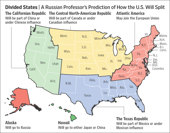
And it raises questions about how we have begun to use and disseminate maps on the internet to stand as symbolic surrogates of the political divisions about which we’ve become increasingly concerned because of the worries they create about the continued smooth institutional functioning of representational democracy, and of the images we retain of how the popular vote can continue to translate into an effective Congress, rather than one dominated by gridlock. (The ex-KGB agent’s prediction generated considerable interest in mapping the fracturing of the Republic along analogous regional divides in our own country, as the common practice of remapping cross-pollinated with GIS software and the rise of attention-getting maps.)
1. GIS offers new modes to visualize statistical distributions and modeling national divides in the electorate, often warping actual geographical divides, in ways that have encouraged the increased role of the info graphic as a speech act. The increased authority of picturing the nation in electoral maps have spun out from the night-time coverage of elections to remain burned in many of our cortices as evidence of a divided nation. As much as these colors have come to accentuate national divides, they create a differentiated landscape that the format of mapping seems to naturalize, and become a site that occasioned repeated glossing and interpretation for the evidence of national divisions that they appear to encode. (Indeed, the sharing of two-color projections to forecast the outcome of the 2014 elections was both a cottage industry or diversion, so widespread was interest in adapting tools of forecasting to provide “flesh and blood” for making potentially compelling political predictions by slicing up the nation in different ways.) Often seeming to evade the sort of issues that indeed continue to divide the United States, the widespread currency of such practices often perpetuate the very notion of a chasm of colored blocks as the best visual metaphor for the nation, in ways Walker and Gannett would find a remarkably different notion of a map.
Compelling translation of the popular to the electoral votes invoke the red v. blue divide in particularly graphic terms, and filled with a growth of a number of purple states that make the oppositional divide between Republicans and Democrats much less clean than it once was. (While the Republican party had long assumed the color blue in the nineteenth century, as the party of Lincoln, and blue was used to designate regions voting Republican the newscaster Tim Russert is credited with having first used the color-coding of the electoral choropleth to describe the prominence of the electoral divide in the United States presidential election of 2000 on a single episode of the Today show on October 30, 2000–although he denies having introduced the term as an opposition, and colored maps were long used to depict voter preferences in states.) Back in the days of the innocence of 2000, the hues took hold to parse the nation with urgency during reporting about the results of that presidential election–and entered common parlance after the conclusion of the fourth presidential election in which the victor failed to win a plurality of the popular vote.
The apparent cleavage of the nation into two regions–more populace blue states with large electoral votes, and many red states with fewer, save Texas and the contested Florida, whose electors may have been erroneously awarded to Bush–and the map of a division of the states into what seemed a red “heartland” and blue periphery expressed a somewhat paradoxical national divide that appeared two different nations–or one nation of continuous red, framed by something of more densely populated blue.
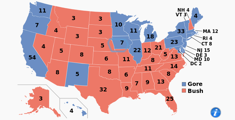
The far more broader expanse of a sheet of uniform red, the color specific to the Republican party by 2000, drew a clear dichotomy drawn between Blue States versus Red States, that appeared less an emblem of sovereignty than of a deeply running national divide in a country whose political process had almost lost familiar geographical moorings: the familiar geographic map was warped by the outsized role of certain states in the electorate, and the consequent often disproportionate tussling over winning their electoral votes of “swing states.”
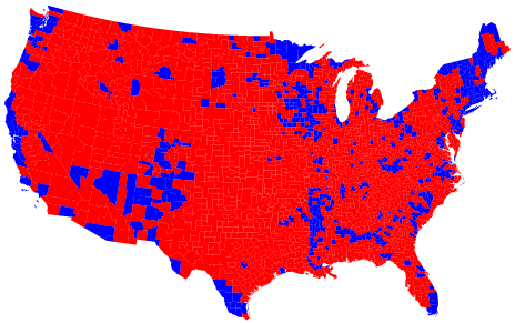
Unlike Henry Gannett’s statistical map, the image of a contiguous region of “Red States” in the above infographic seems to divide the union, as much as offering clues and cues to get one’s mind around a divided electorate. The below cartogram of the 2004 election warps the national territory to reflect the distribution of electoral votes in each state–and the mosaic of victory that the “red” states constituted in total electoral votes revealed several divides in the nation, or the hiving off of the northeast, west, and Great Lakes states from the majority–or, alternatively, the concentration of Democratic votes in dense pockets of urban areas–that reveals two republics, all the more evident from the continuity of the U-shaped red stretch of disquieting uniformity that emerged when the popular votes is translated to a map of electoral votes.
We have become especially accustomed to interpreting the contours of such national divides in the electorate with strategic urgency in the age of Obama, although the battle for electoral victory were more likely to be resolved in cartograms than the finely-grained county by county distributions that Gannett had devised. The appeal of cartograms lies in part in how they offered an apparent opportunity to gain clarity by the almost compulsive remapping of electoral votes to decode the alliance of victory in the 2010 election in two-color cartograms: warping the divide to suggest the dissonance of terrestrial continuity with electoral votes or money spent per voter, to suggest both an accentuation of its divides, as if to pose questions about the existence of continuity among the nation’s regions and states, and a deep divide that lay in the areas where campaigns devoted the greatest attention–and ask whether this skewing deriving from distorting electoral stakes bodes well for the democratic process.
The geographical distortions of infographics seem to clarify how electoral results run against the continuity of a terrestrial maps in similar terms. The representation of current electoral division have continued to aggravate the country’s continuity long after Obama’s two presidential elections: both electoral results have been often parsed across the country to explain the divide between red and blue states, especially in the 2012 election, as if to try to discover continuity a country that seems divided into blue states and stretches of bright red: and if, until 2000, both Time magazine and the Washington Post colored Democratic majorities in red, the opposing colors of red and blue have become an image of contested sovereignty, and of articulating regions’ political differences and divides. Rather than suggest generational continuities in political allegiance over space, the divide within the country reads more clearly in Gannett’s county-by-county census, but the proliferation of cartograms respond most effectively to the problem that “these maps lie,” morphing the fifty states into rescaled distributions.
Adam Cole doesn’t claim to argue that this reflects a bit of a crisis in democratic institutions, but one can’t but consider how the current gridlock in government may stem from its failure to adequately reflect the demographics of the country, or at least the economics of the Presidential election. Despite increasing attention to the mobility of individuals outside “blue” states to other, formerly “red”-state regions, the divide was increasingly focussed on a diminution of red states, but a concentration of Republican majorities in the central regions of the country, lying largely below the Gas-Tax Latitudinal Divide–with some notable exceptions. Even if much of the country seems happily purple, the intensity of two triads of red states strikes one’s eyes immediately.
 Adam Cole/NPR
(Such maps, of course, in their interest to provide info graphics that involve “purple” shadings of a mixture of blue and red may not take into account the neurological disposition of the eye to more readily read a purple state surrounded by a sea of red as red, and fail to distinguish the degrees of purple of a region as an intensity not independent from the spectrum of the colors of nearby states: the interest in providing a more complexly qualified picture of variations in this map, introducing shades of “purple” to a map, if constructive in the abstract, according to Lawrence Weru creates misleading interpretations that rather than profit from such proportional blendings lead the purple region to appeal more blue or more red depending on the chromatic context where it appears.)
2. The compelling nature of such cartograms no doubt the maps that express the views of political parties, and provide a basis for imagining the continuity in how campaigns dedicate attention to the nation. Despite their explicit warping of continuity, cartograms help get one’s mind around the nature of the apparent lack of continuity across the country, and understand the depth of electoral divides and to explain the country’s composition than the mapping of electoral votes onto spatial divisions on a map, if not to project the results in far more dynamic ways of translating the “map” to practices of political representation, as much as territorial manipulation. The cartogram seems to translate spatial divides into a system of political representation that fits imperfectly on a uniform mapped space or rendering of territorial expanse, and seems particularly compelling to analyze the way that the electoral process translates the nation’s geography into institutional terms.
The most telling translation of this political process is revealed in the warping of the nation by disproportionate expenditures per state, reflected by the distortion of electoral politics–and the nature of political divides. Parties have been compelled to devote disproportionate attention to individual states, out of sync with their electoral votes, but as a reflection of the calculus of receiving a majority in the electoral college. A compelling twist to the electoral cartograms parsed political parties’ relative expenditures in the most recent Presidential election as a distribution of funds in dollars spent per voter, grotesquely warping the scale of states in the country according to the political spending in millions of dollars–which keeps a lot of purple states, but suggests that one area of the nation has almost left the attention of either party, as if they were discounted as foregone by both parties–and received but a begrudged smidgen of millions of dollars from the GOP or Republican National Committee, so clearly were their political preferences already decided and minds just made up:
 Adam Cole/NPR
An even more warped image of the republic is produced by warping the fifty states to reveal the disproportionate number of dollars spent per voter, in a warping which has the effect of shrinking the red states in much of the south and southwest to reveal the extent to which they are simply less the terrain in which recent elections were determined: one learns even more about the deep commitment of many of the voters in the southern states in the below graphic, reflecting the returns that each campaign had on the amount of money invested locally. The map reveals how little Romney even invested in the solid Republican voting base of the south, not seeing the need to disseminate the candidate’s message in states where he held such a clear advantage that they were conceded by the Democrats: it shows the relative inefficiency of Republican expenditures in New Hampshire, Iowa, and Nevada by an off-message candidate, and the balling amount spent on political media in each state from April 10 to October 10, in which many southern states are all but squeezed out of relevance, because their outcome remained–save North Carolina–something of a fait accompli, and absent from the volley of the barrage of ads that have only recently ended with mid-term elections of 2014:
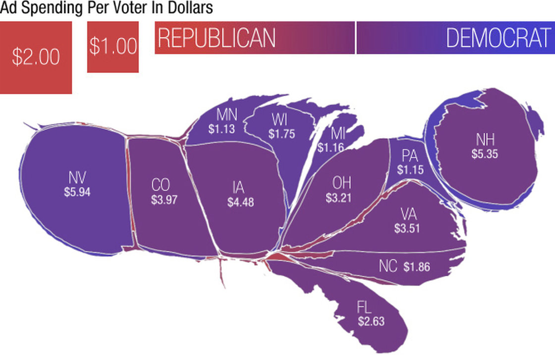
Adam Cole (NPR)/Kantor media data
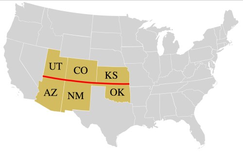
It can’t be “fair” to absent a good portion of the country below a single line of latitude form the state of national political debate that on-air advertisements have to be considered as forming part. What does this mean for our Republic raises questions: but is this a form of secession itself, coming back to haunt the map of political parties’ distributions of their own expenditures? The cartogrammic shrinkage of the southern “red” states with those west of the Mississippi scarily suggests a region of the country has all but vanished from the contested regions of the electoral map, its electoral votes all but written off as a contest, and Texas shrunk to an unsightly narrow peninsula or appendage off the territories where political parties struggle: the geographic contraction of the areas below the thirty seventh parallel, which defines the “four corners” intersection of Utah, Colorado, Arizona, and New Mexico effectively privilege the more urban areas over the “exurban” southern states that were so much less of a contest or struggle for political attention.
The troubling depth of the division across the United States is less a mirror of the affiliation to different political parties, however, than they reflect different images of America that often reflect urban v. exurban perspectives–as in this topographical projection of peaks of population in the lower forty eight.

Presidential elections offer a major rush of disaggregated data that one can assemble in exciting ways, the inflow of data creates a flood of information that make it difficult to select specific criteria to foreground. One might find in the above sufficient grounds to interpret the growing chasm of political divisions in the nation as between states between those with large urban centers, and “exurban” areas of less density. The tendency to group states which tended to vote or lean Democratic–as New York, California, Florida, Ohio, Colorado, Wisconsin, Minnesota–apart from more exurban or rural areas, and to map the distrust of collective government as lying within exurban areas that lie at a spatial remove from social investments that seem compelling to areas of greater disparities of wealth that define cities–and the distance at which these “red” regions feel themselves as lying from urban areas or issues seem rendered compelling against social density.

3. However tempting it is to parse the differences among the electorate’s behavior in the Obama and Romney’s contest as a mirror of deep cultural divides that seem geographically determined, this quite unsatisfactorily poses the question of how likely they can be ever bridged. Such a reinterpretation is compelling precisely because it pays less attention to the “after-image” of secession, and reveals a new political landscape of the nation, rooted in population changes. The divides between the urbanized and unorganized, or “exurban,” also reveal deep attitudes to the nature of national space, and the role of government in space–which this post wants to suggest we examine as an underlying map of voting preferences, but that can’t be revealed by voting preferences and electoral returns.
The differences between voting preferences across the nation lie not only in terms of relative urbanization, but attitudes to the economics of moving through space difficult to quantifiably map, but all to evident on the map. For in ways that define a cultural continuity that is hardly rooted in the physical land, the map embodies a divide, similar to the Gannett map, of the role of government in one’s life, and the presence of the government in economic activities, as well as the prominence of a consensus on social welfare needs.
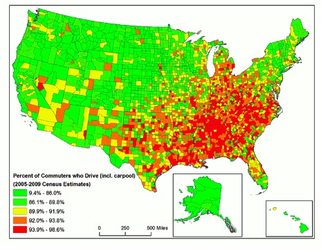
Parsing the election of 2012 in another way by democratic v. republican gains per county, one might note the Democratic electoral gains are strikingly concentrated in urban areas, while Republican gains dominate the exurbs that are red–a distinction that clearly correlates to driving practices and willingness to tolerate more highly priced taxes for gas–and the Republican gains group together in clear clusters and runs, predominantly in the inland central southern states and inland northwest. This data visualization eerily reifies the very divides that Gannett’s almost hundred-and-thirty-year-old visualization of polarized voting preferences first set forth:

What can explain this shift across such a firmly defined latitudinal divide, which seems a crease across the country, as well as a refusal to hamper what is taken as the inalienable right to keep low the cost of free access to take a seat behind the wheel?
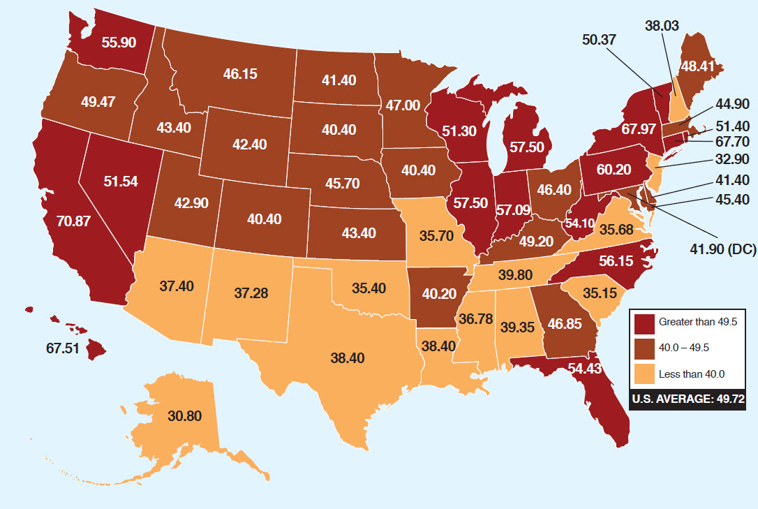
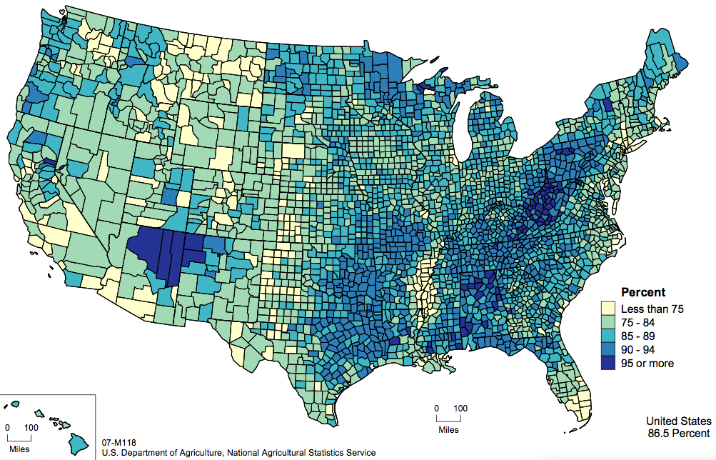
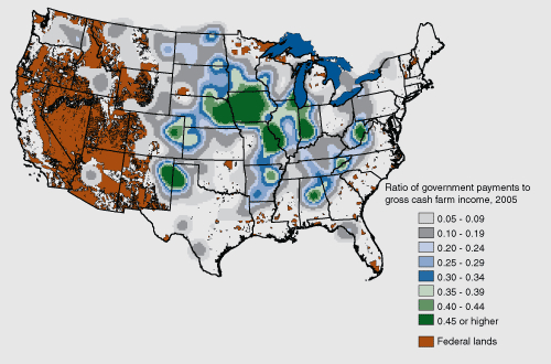
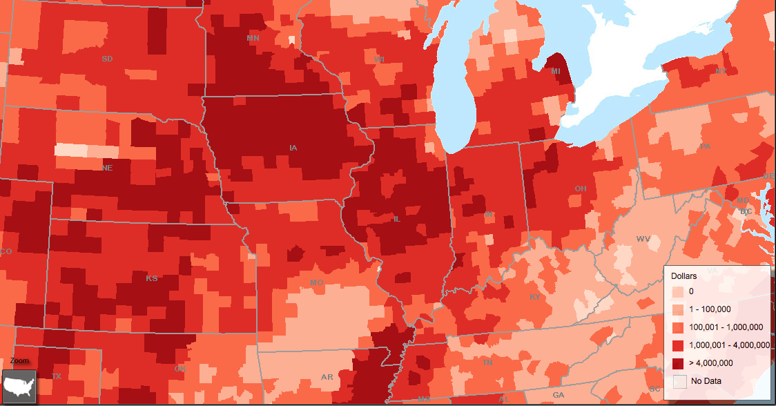
4. The data used to parse these moderns electoral maps are invested with significance, but may not reveal clear “after-images” of earlier landscapes precisely because the priorities of parties have so dramatically shifted, and the range of issues addressed in the political landscape have left it to be polarized in ways that have far less to do with the polarization over issues such as, say, Reconstruction of the south. Despite the greater amounts of data that presidential elections offer to parse a picture of the country, local legislative institutions provide just as significant a “map” of the traces of autonomy from national standards. The mapping of levels of gas taxes was meant to register the affront of impeding open access to the cheapest mileage. But the map of the distribution of gas taxes in the United States may say much more.
Exxon Mobil’s blogger Ken Cohen boasted that the map “explains a lot”, as a suggests clear division in local variations from the federal gas tax that exist across the country as if to show the inequalities in how local, state, and city taxes collect from forty to sixty cents per gallon–creating an inequality of cost that is itself far beyond the total federal tax imposed of 18.4 cents a gallon, creating unwarranted variations in the costs that drivers payed at the pump across the land able to be examined in greater detail at an interactive version of a map of the United States which displays the relative divisions of taxes by hovering over localities.
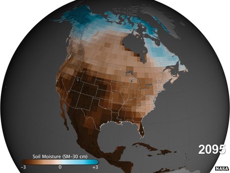
The differences in regions’ relative acceptance of gas taxes may indicate less the toleration of government’s invasiveness, but instead a huge shift in attitudes to space extending across exurban areas. The acceptance of a gas tax–or its ‘toleration’–reveals tendencies to reject as invasive the presence of government–and throw into almost topographical relief a considerably deep division within the local legislatures responsible to voters and local opinion. In ways that seems mirrored with surprising clarity in the below distributions of local “toleration” of taxes on gas–a sensitive barometer of regional autonomy, if one hardly comparable to the withdrawal of federal troops–the nation seems starkly divided that reveals difficulties of arriving on national consensus of its own, if on a topic of apparently less dramatic significance. If such taxes can be described as imposed by the government, the tax might be best construed not only on the toleration of taxes, but consensus if not agreement as to its collective benefits of something akin to a value-added tax. Indeed, the political divide in the country seem to have instantiated a divide along roughly the thirty-seventh parallel that reflect distinct national priorities, allowing the American Petroleum Institute to describe the disparities of the taxation on petroleum as if it described an unwarranted degree of government–state or federal–interference in the average American’s access to a full tank of gas.
A surprising divide emerged in this far more simple visualization, whose divides may parse different attitude to the economics of occupying space, based on states’ relative willingness to accept and tolerate taxes on gasoline, as much as chart the unfair nature of differences in how costs are deferred to drivers at the pump. The admittedly interested map makes its point about the uneven national “gas tax burden” along the thirty-seventh parallel, foregrounding a deep divide in refusing the role of local or regional government in daily life. Rather than reflect a distribution of draconian levels of taxation on gas, the map charts consensus to accept levels of an additional gas tax. While it does not perfectly translate into electoral preferences, it reveals a deep divide across the country that seems to fold the populace in ways perhaps not basically political,so much as in the degree to which each state’s populace would accept or suffer additional taxes as a means to meet public needs: it almost seems as if the reluctance to sanction the sort of imposition of taxes at the gas pump was seen as an analogous affront to regional honor.
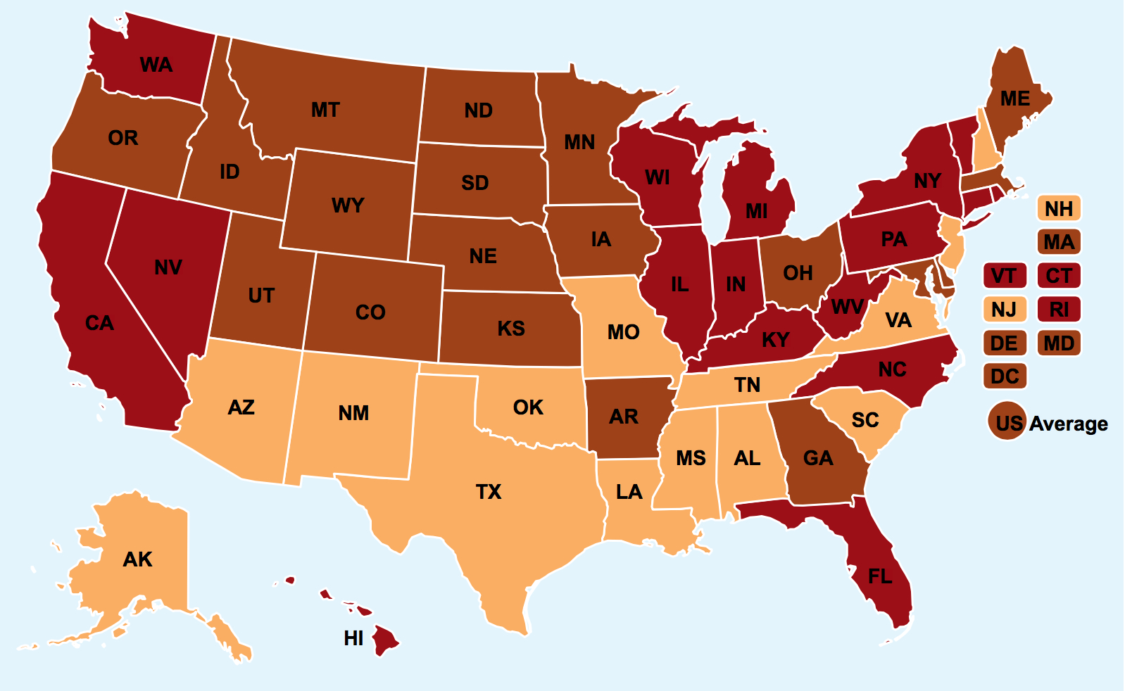
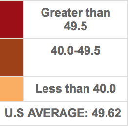
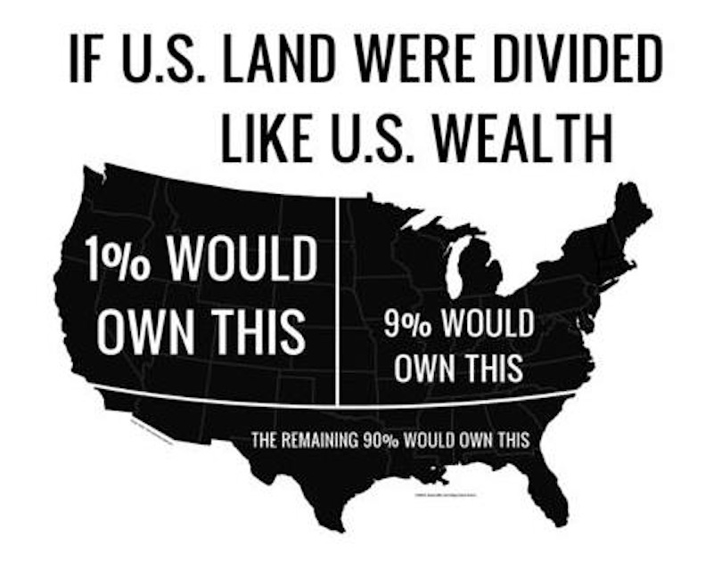
Thanks to the appearance of a map that first appeared on ExxonMobil’s “Perspectives” blog, we have a useful way to parse the spectrum of the country’s attitude to government–and to the involvement of government in regional differences to the economics of moving through space. For the refusal to raise taxes across the southern states-and indeed the apparent rejection of most anyone with a foot below the thirty-seventh parallel, almost carve the country into two halves, with the exception of Virginia, North Carolina, Georgia and Arkansas. It is striking that a cartoon that carves the country, or lower forty-eight, into a map that approximates the polemic division of wealth in the US by which Susan Ohanian assigned that very same region the 90%. Her map echoes the divide, her cartographic take on the lower 48 assigning the the lower 90% percent of American wage-earners the region lying below the latitudinal divide, echoing the association of the region with a far less developed social infrastructure than either the east or west coast or to the north–only somewhat subliminally and slightly nastily pointing out the shifting per capital income across the land:
The divide that perpetuates lower gas taxes–or the “tax burden” on how freely gasoline flows at the pump–maps nicely onto a region with markedly less public transportation and transit. The very same states’ governors, from New Jersey to to Florida, made something of a pact with the Devil to tank interconnected high-speed rail corridors proposed by President Obama, who championed alternative transit routes early in his presidency in hopes to rebuild a decayed infrastructure. If creating such corridors could have both encouraged local job growth and economic stimulus–as well as setting the basis for future economic growth–the refusal of and Scott Walker, that reflect the largely “exurbanite” populations of red states in exurbs. (Low gas prices serve to compensate for poor transit systems, and work to discourage their use, reducing demand: only one top-ten rated US transit systems lie in the states–Austin–although a ranking meeting local “transit” is unclear, given that transit needs are by definition locally specific, and difficult to quantify.) They are now a thing of the past, and Exxon-Mobil seems to turn its sights to the gasoline taxes that might enable their construction in the rest of the country–as if the lack of attention to the public good might be the new norm we could all be so fortunate to possess.
The two-color new flatness of the info-graphic seems complicit in how we perpetuate this view.
5. What appears to perform a regional consensus exists may in fact register the primacy of accessibility to highway driving, or access to ‘automotive freedom’ in a region. For it seems that the degree to which the individual right to drive through space is accepted as inalienable, or not having any possible contradiction with the public interest, in ways that might have much to do with the tanking of public projects for planned high-speed rail in some coastal corridors, if not an animosity to the project of expanding choices in public transit Obama long ago sought to enact–but whose projected corridors in the south were resisted and never completed.

The absence of transit corridors has led to the growth of private taxi-like shuttles for patients in areas where ambulance carriers cover wide areas without clear transit corridors.
Did the recent resistance to enacting such corridors of transit help to intensify the sort of divide we can witness in Ken Cohen’s Gas-Tax map? The 2009 Stimulus Package was intended to include a planned Southeast High Speed Rail Corridor, designed to change transit’s playing field in the South and Gulf Coast.
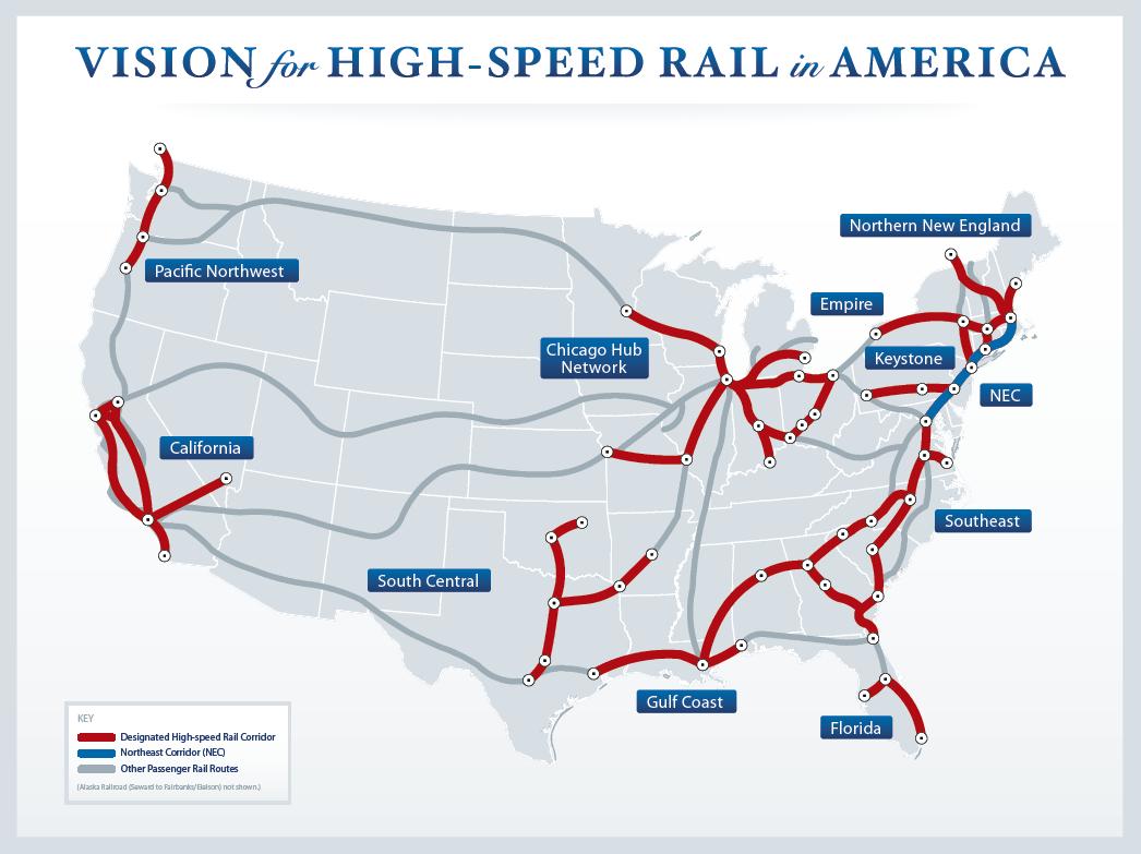
Such plans were already, of course, in the works since 2002, in the Bush Administration. But their defeat, in no small part due to the apparently lesser geographic population density, was encouraged by the perception of a national divide of transit needs.
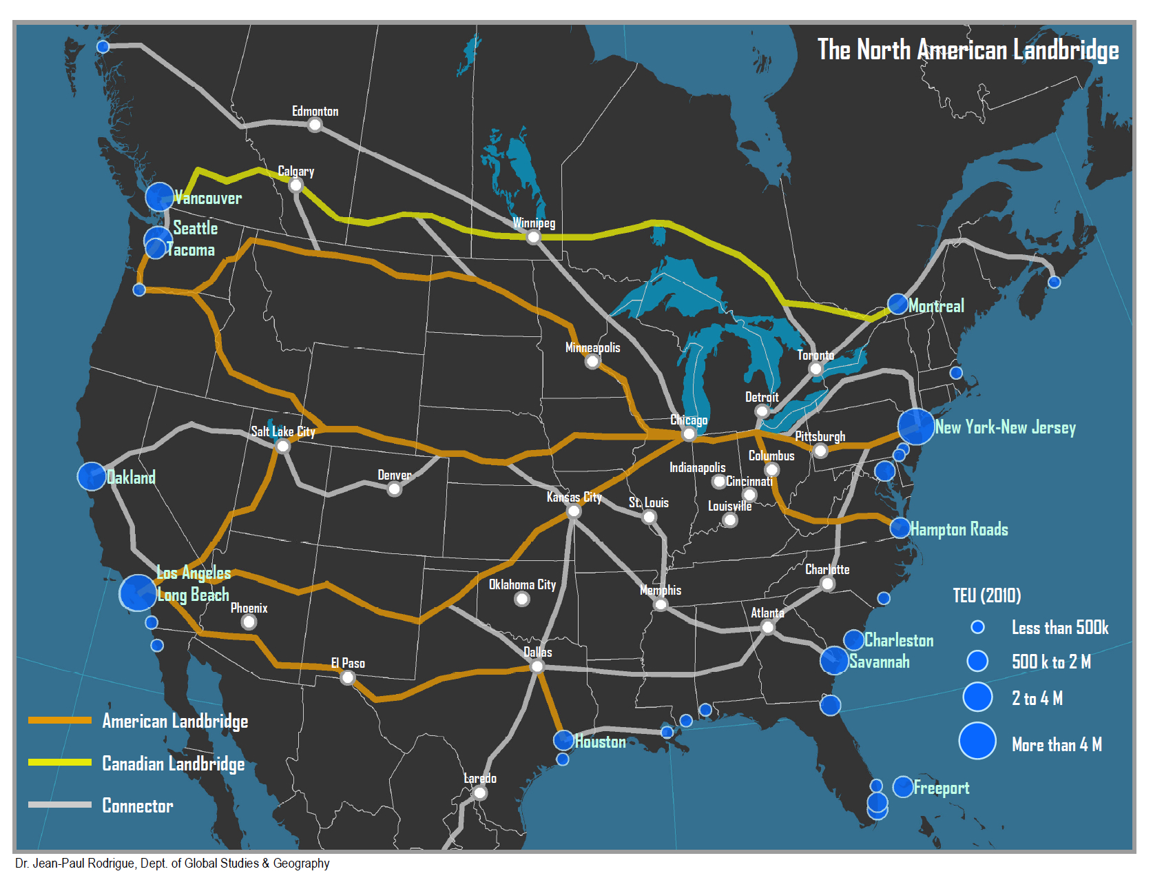
It prevented greater integration of a North American landbridge in much of the South, to supplement the lack of a crucial lattice of corridors of highway integration.
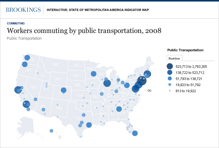
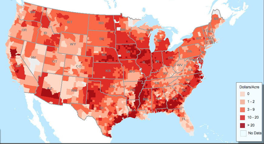
6. We can make inferences about the lack of success of such transit programs, in part thanks to the consolidation of local, state, and federal taxes on gasoline provided by the American Petroleum Institute. If the map derives from varying forms of taxation passed on at the pump, including local costs of fuel-blending that increase the costs of refining, a national divide to throw into relief of tolerating the imposition of an additional gas tax. While the map does not track the prices in taxes paid at the pump, and the cost for gasoline reveals considerable geographic variation by market and supply, the API plotted the total “fuel-tax burden” in a national map that reveals more about a national latitudinal divide than they had intended: the clear color scheme suggests that the 37th parallel creates a cliff in ‘superadded’ gas costs–and augments the sense of this divide by placing Alaska beside Texas–some fifteen cents below the national average in the U.S. It mirrors the regions worst served by public transit in the US, to judge by the concentration of workers who relied on public transit for their commutes circa 2008.
The missing information from other maps may suggest a quite grounded rationale for the absence of accepting taxes on gasoline: not only the reluctance to accept taxes, given the reliance on automotive travel as a primary means of transit and transport, but the absence of a network of public transit that would provide an incentive and rationale for the readiness to accept a tax on gasoline in exchange for other public benefits.
Seen another way, one can link the sense of spatial movement in the region of significantly decreased gas taxation on the rise of a single-driver culture of access to roads, rather than public transit–a trend that Streetsblog found to correlate not only to more restricted and curtailed transport choices, with little but circumstantial basis (and in a pretty cheap shot), to national obesity trends across the nation:
7. Although the flatness of infographics oddly seems to obstruct further inquiry into the distribution it reveals, the differences in how the land is habited suggests divides that are difficult to surmount, and by no means only political in origin. While it might be seen as leading many to move south for cheaper gas, the consequent lowering of the perceived “fuel-tax burden” to below forty cents per gallon–sometimes by as much as five cents/gallon–across state lines indicates a refusal to let the government interpose themselves between driver and pedal, or pump and tank. It suggests a shifting sense of taxation structures and investment of local priorities of dedicated tax revenue that strikingly mirrors the very regions at the presence of government in local life, but is often tarred as yet another instance of the invasive nature of government’s presence in public life.
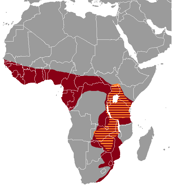
The map echoes the more prominent manifestation of local resistance to the apparent federal invasiveness long mandated by the Department of Justice’s “oversight” of enacting changes in local electoral laws, based on historical presence of policies deemed discriminatory, first enacted in the 1965 Voting Rights Act. Under the logic of the autonomy of “states’ rights,” such “pre clearance” was abolished, although an alternative proposal the issue of “pre clearance” was framed as triggered by successive voting rights violations in four states–Texas; Georgia; Louisiana; and Mississippi–rather than fifteen. The VRA’s original provisions, widely deemed “for half a century the most effective protection of minority voting rights,” or fourth article, was approved as recently as 2006 by the US Congress. But widespread resistance to the federal policy grew with keen regional separatism among many of the same “southern” states, or the configuration of the South–minus Florida, North Carolina and Arkansas, with the addition of Arizona and Alaska–who pushed back against oversight of changes to voting laws as redistricting or Voter ID as undue interference as local policies–even as the ability of entrusting states to develop their own policies of redistricting has been recently open to challenge in Mississippi and, in Alabama, for the rigid use of explicitly racial quotas, echoing early charges of partisan gerrymandering in Texas–but raising questions of how much race or partisanship is at stake.
 Areas Covered by VRA-and additions
These coincidence between these maps isn’t entirely coincidental. Indeed, one is struck by the striking “family resemblance” to the infographics we use to represent the nation’s complex composition in a map.
8. How much are we overly habituated to visualize a divide that we seem to have a difficulty looking outside its two-color classification? It bears remark that the afterimage of secession is rehearsed in quite rhetorical manners to raise the specter of national dissolution–by now imprinted on the collective consciousness–if expanded to include a few ‘swing states’ to suggest the recent expansion of the “old South.”
It’s ironic that the iconic image of secession is rehearsed in maps imagining secession from paper currency, which employ strikingly similar visualizations to forecast a coming shift in monetary policy and practice that would be brought by BitCoin. Although its eye-grabbing vision of secession is deceptive, the below “hoax”-map distributes thirty-six cities in twenty states where one can pay bills in Bitcoin as if they were poised to “dump” paper currency, or abandon the US dollar and withdraw from the closest to a common convention to which all fifty states adhere: the map of secession–perhaps based on states that have accepted applications for exchanges in the digital currency that originated on the Deep Web on the TOR browsing network and on hidden sites of illicit exchange as the Silk Road–is of course not an actual map of secession. But it is designed to pose as a visualization of “the rebellion [in currency] that quickly spread to main street America” with antecedents in a system of currency devised by Thomas Edison, which would immediately provide financial returns as it replaced the dollar, as if it recaptured the past stability of a lost gold standard in the face of the fluctuation of value of American currency. Lack of internal differentiation in the below of urban and non-urban areas in the below perpetuates an image of legal secession of states that are shown by big monochrome color blocks that seems to prey on viewers’ eyes by its introduction of a familiar dividing line.
The mapping of monetary secession, launched by Money Morning–Your Daily Map to Financial Freedom and diffused to alarm viewers on sites such as http://www.endofamerica.com, is not really explained carefully, and seems to lack its own legend but was intended to depict a collective rejection of paper money as if the “red states” were wise to a growing financial trend. In this barely disguised desperate push for Bitcoin digital currency–“now accepted by dentists in Finland!“–the data vis stokes fear in the survival of paper money in America, and a specter of monetary separatism, echoing fears of dismantling the remaining monetary union of the United States by the rejection of a federal currency–extending a language of states’ rights by its rather preposterous design of a fanciful future national fracturing as some states dispense altogether with paper money: states once divided by the institution of slavery now seem divided by farce. (How maps mislead: California is colored red, due to the fact that one city, Menlo Park, has moved in such a direction, not the entire state–and cities elided with states.)
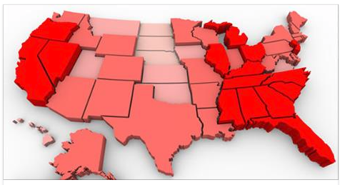
The afterimage of secession is here, rather improbably, immediately recognizable, but raises a recognizable specter in monetary terms, stoking fears of a new national disillusion that has emerged along sharp lines. One doesn’t usually imagine the digital divide to include the majority of states in the deep South–if in ways that address the viewer who is tried to be wooed to Bitcoin, rather than an offer an image of the nations health. But if the map is a bit of a hoax, the use of something like a secessionary map to depict the rejection of paper money that the U.S. Government has unwisely continued to sanction cannot be much of a coincidence. The cities that push for the ejection of paper money were not by all means concentrated in the southern states, according to the map–which stages a hoax, but one that also reveals the country as broken into two halves by the abandoning of paper money which actually maps the sites of companies that will pay salaries in non-paper Bitcoin.
The recurrence of the very same fold across the nation’s center, roughly along a latitudinal divide to scare viewers–with California added in for good measure, based on the city of Menlo Park.
Although a hoax, the “map” of the impending abandonment of paper currency shows a fracturing of the nation along the lines of the adoption of Bitcoin. If it echoes the abandonment of the gold standard as a monetary system–or the amount of silver used in dollar coins and actual currency, the map is most striking for breaking down the divisions in the nation in a state-by-state way that has particular power as it is so often used in political visualizations of electoral returns. What else might explain the persuasive power of this meme of national division? The status of Oklahoma, a familiar icon of frontier freedom, shows it has recently moved to move away from paper currency to accept, with bipartisan support, gold and silver as currency. The rejection of a common federal paper currency seems the ultimate standard of secession, echoing the dismay at the abandonment of the gold standard or the withdrawal from a cash-based economy.
An eery footnote to this atlas of symbolizing the nation is the proximity with which the map mirrors (or maybe recycles) the Democratic vote in 1880–although it stretches some credibility to imagine the former constellation of seceding states on the cutting edge of accepting Bitcoin. It is tempting to universalize or essential the latitudinal divide that recurs in these maps, but makes sense to cast the region’s apparent distancing from majoritarian consensus as not only something of a different economic culture, but a different culture of moving through and occupying space. The confounding of that culture with independence within the states’ rights movement–and deep distrust of federal government–existed long before Obama’s election.
Viewed through special lenses, alert to the after-image of secession, each of the maps define variations in the continuity of a cultural divide phrased as a reaction to the absence of continuity that was registered in Gannett’s earlier 1883 info-graphic–but that now seems to be replayed both as tragedy and a farce. The question that this set of posts pose, perhaps, is how we can create more engaging info-graphics of the nation whose visual consumption would sustain and drive further attention and exploration of local variations–or at least not reduce us to a stupor of oversimplification that is an excuse for orienting us to the oppositional tactics of political debate through the pretense of showing us the actual lay of the land. What compelling mapping of local variations might better command attention as a record of divides worthy of our attention?


 Library of Congress


 Library of Congress
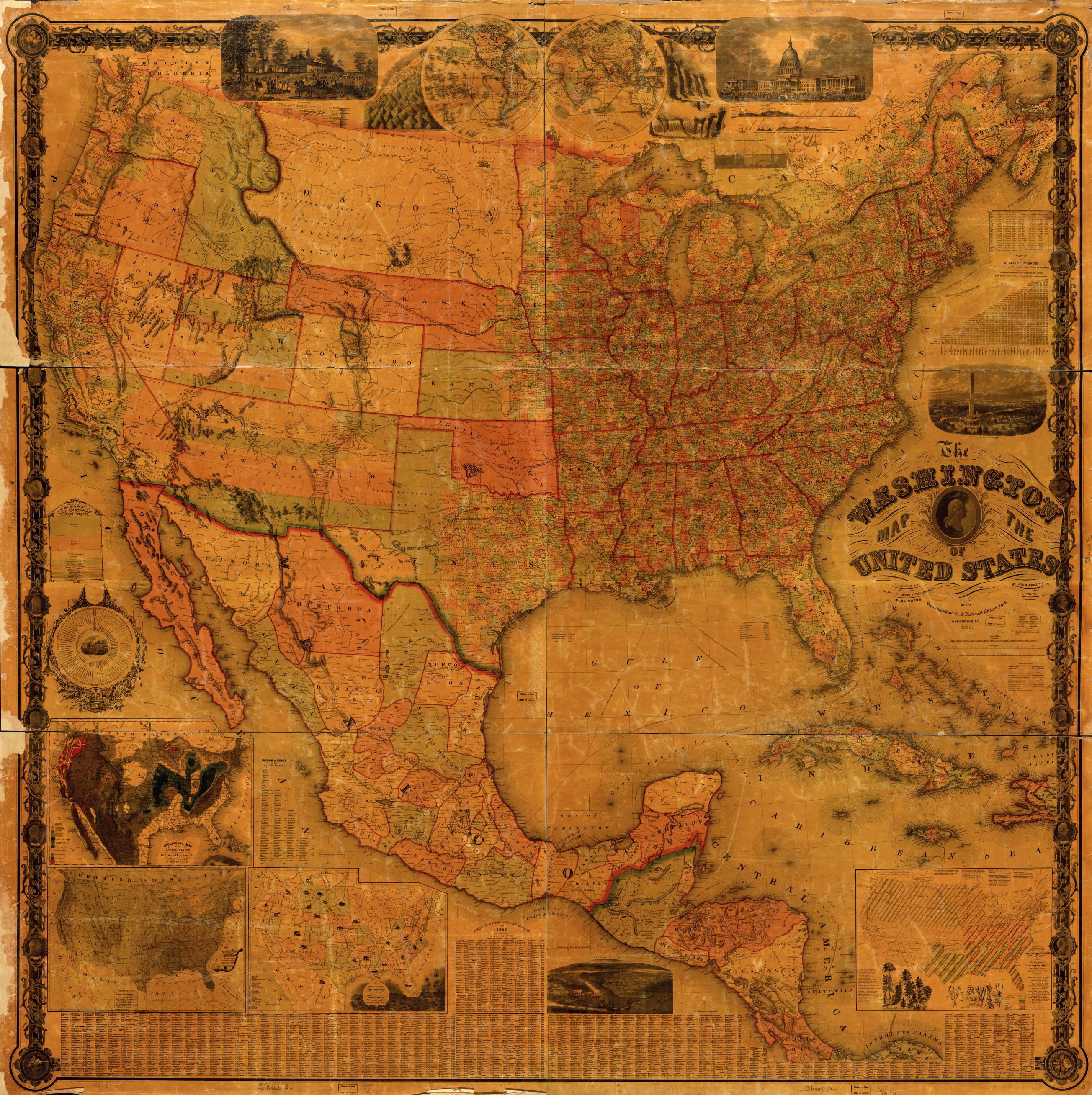


