Tag Archives: Stamen design

Green Urbanism? Blue Urbanism?

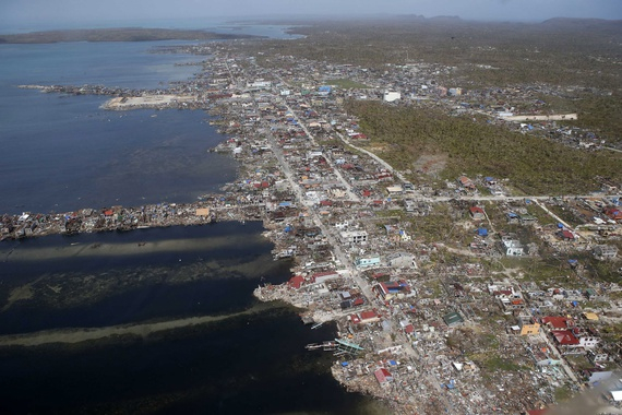
Since maps invite their viewers to enter an image of the natural world, as well as to relate places to the broader geographic context in which it lies, they offer increasingly useful perspectives to relate the ocean to the land.  The perspective they offer on all regions has long been rooted on the land,  however.  And the coasts–and indeed the dangers–for adhering to such a “landlubberly perspective” on our rising oceans are increasingly apparent.  A perspective that privileges mapping inhabited lands –and orienting viewers to a set notion of place–places us at a particularly disastrous disadvantage when assessing questions of climate change, or reacting to the increasingly lethal storms, tsunami, and typhoons encountered as the inevitable consequences of climate change, and that coastal cities–from New Orleans to New York to the devastated Philippine coastal cities of Tacloban, Ormac or Baybay–seem condemned to repeat.

In continuing to rely on maps whose perspective denies that of the future expansion of oceanic seas, we threaten to lose perspective on our changing relation to the sea.  We have long found threats of the invasion of ocean waters difficult to integrate in an inherited image of the city as a bounded entity, and continue to draw clear lines around the cities in which we dwell:  our maps draw clear lines between land and water.  Perhaps this is because waters seem so difficult to circumscribe or bound, and the fluid relation between land and water difficult to render accurately or draw.  When an influential movement of urban architecture and planning calls for a greater integration of the natural world–so often bound outside of cities or city walls–within urban entities, they retain the notion of the bounded city.  Recuperating the term the entomologist and biologist E.O. Wilson coined, “biophilia,” to express the “innately emotional affiliation of human beings to other living organisms” in human nature that demanded attention, they argue that cities need to promote contact with nature, since, Wilson argued, such contact provides a spur to creativity, productivity, and well-being.  The planning of “biophilic cities” is dedicated as a movement of urban design to “contain abundant nature” in their structure.  The championing of “model cities”–such as Perth or Singapore–are promoted as examples of the “biophilic” age of urban architecture.

Yet are these models (often located in semi-tropical climates) not limit cases where we can most easily integrate oceanic waters into a built environment?  For by isolating the city as a unit in which to restore nature, there seems more than a bit of bio-fetishism in singling out new spaces where blue waters can enter an urban environment:  the optimism of its evangelical tenor as a movement of urban planners, dedicated to reframing the reintegration of cities with the watery surroundings has gained a broad charge and dedicated following, including partner cities that border on water such as San Francisco, Portland, Milwaukee, Vitoria Gastiez (Spain), Birmingham (England), and Wellington (New Zealand).  While the benefits of such urban architecture appear considerable, the challenges for expanding the role of the ocean in the horizons of city-dwellers seem only the start of restoring the historical isolation of the city from watery life, or integrating the oceans within our future urban planning.

The movement of blue urbanism is an illustration of courageous dedication to a project of reintegrating aquatic and urban environments–at least, presumably, before the shores of cities will be redrawn by ocean waters.  The considerable cognitive benefits claimed for these more enriched urban networks build on movements for integrating networks of urban “green-spaces”–including not only parks but green-belts and even forests is a reasoned reaction to urban sprawl and overbuilding and way to take charge of the built environments we create.  “Blue urbanism” would comprehend a watery frontier, offering opportunities for immersing children in rivers, urban parks, watery excursions, and underwater ambients which surround cities.   Blue urbanists espouses an improved integration among the fauna and flora lying near aand around cities within something like a green belt–and espouse the value of an analogous “blue belt” as a way to foster a new attachment to the waters and their shores, rather than seeing them as limits of built city.

Yet does emphasis on the human benefits of such contact carry a all too narrowly restricted notion of what a watery surrounding might be?  The watery oceanic borders of cities are in themselves rarely mapped, though the shifting waters of the Gulf Stream and other currents determine the shoreline inhabitants of North America, but might a map provide a fuller perspective on the interchanges and ecosystems lost by drawing firm barriers between urban and ocean life?

1.  The “blue urbanism” that Timothy Beatley advocates wields the rhetoric and best practices of green architecture’s “integrated network of urban space” to invite us to re-imagine cities’ relation to the shores on which they border.  Yet there is concern that such projects of rebuilding turn away from the depth of our historical remove from the waters that surround our cities–an increasingly pragmatic concern after the very fragility of this divide has been so traumatically revealed in recent decades, from damages inflicted on US cities by Hurricanes Katrina and Sandy or, afield, the Indian Ocean Tsunami and super-typhoon Haiyan.  The ecology of biophilic design, for all its benefits, could benefit from a broader global ecology, basing itself less on the benefits of human friendship with the biosphere, and being more oriented to global contexts of the cost of climactic shifts by looking back to the geography of the past–lest the affections of biophilia border on the bio-fetishism of the philistine.  The precepts of adaptation and resilience to mitigate bad policy decisions are of intense importance; historic maps offer base-lines to qualify the alienation of cities from their shores that compliment the need to build green and blue belts.  The maps we have drawn about urban areas may provide a basis to recuperate the integration of life along the shorelines we have lost, in short, and the nature and settlement of life along the city’s shore–as well as the ways that oceans serve less as a barrier to than interface with the shore.

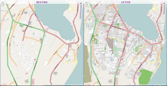
While we map the trespass of waves over the finely drawn boundary lines of territories, measuring incursions across demarcated shorelines and property lines, and mourning the scope of damages and loss, we seem to remediate via maps–much as how OSM-mappers have begun to chart buildings and routes in the Philippines for delivering humanitarian supplies, as a way of rebuilding, if at first in virtual form–to restore urban infrastructures in digital form.

Mapping Tacloban via OSM

Yet these maps do not comprehend, for lack of a better word, the sea.  The terrible human costs of each of these events serve as something of an intimation of the threats global warming poses to urban environments, and invite rethinking notions of ‘planning’ replacing the imagined stability of  a built frontier of urban society with a more permeable line of inter-relations, even as we come to appreciate how little conscious “planning” went into the drawing of earlier boundary lines.  Both the human and material costs of these events compel an appreciation of the role of the shoreline, as well as intimations of the threats global warming poses to urban environments and indeed the world we have built.

Homes in Samar provinceReuters

Naturalists have recently begun to realize the power of maps to invite reexamination of our relations to place, however–often by using historical maps to excavate the shifting historical relation to the natural world that have led us to draw such finely parsed lines between planned urban environments and their surrounding waters to assess the costs of these sorts of fantasies of spatial distinction:  if we don’t build on the water, we cannot ignore it but at our collective peril.

Map offer a particularly precise if plastic means to situate place that are able to register deeper, less easily visualized, chronological changes and global contexts, or shifts within a regional ecosystem that would be otherwise difficult to conceive.  In age of rising oceans and global warming, maps draw relations between local settings and global changes to help assess the extent to which global warming threatens to obliterate or erode the stability of our concepts of place.  Maps of the circulation of waters around specific cities compel us to rethink an inherited oceanic boundary.

2.   Can a “blue architecture” invite us to re-imagine bifurcated schema of ordering of space to which we have reduced the relation between land and sea to a simply drawn line?  Or have we lost a relation to the land that a new building project cannot recover without clearer lenses to view the relation between water and planned environment, and to be invited to appreciate a clearer register of the relations between coastal cities and the surrounding sea, and, indeed, of the delicate interdependencies that are the basis for our sense of place, and underwrite how we imagine “place” as a category?  A historicized art of mapping stands to call attention to the ecosystem that might lurk beneath the threat of climactic change, and understand the changes they pose to local ecosystems.  The art of mapping provides unique tools to invite viewers to consider local settlements, and develop tools to re-imagine a relation to the sea new building projects alone cannot foster.

Sanderson's Base Map

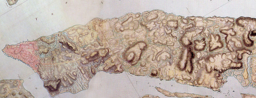
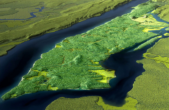
We can appreciate the huge changes wrought in a relation to the shore by how a cartographical reconstruction of Manhattan island revealed in this stunning 1782 British Headquarters map drawn at the painstaking scale of 6 1/2 inches per mile reveals the island’s coastline as it was experienced by Lenape tribespeople.  Using the watercolor map as the base-map for his digital reconstruction of the local environment, landscape ecologist Eric W. Sanderson of the Wildlife Conservation Society worked over five years to create GIS database, geo-referencing landmarks and sites to reconstruct the forgotten landscape based on 200 control points.

Sanderson’s completed map has a beauty that invites viewers to explore a computer generated landscape’s verdant arboreal landscape and rich wildlife, moving with amazing apparent precision over a web of lost streams, rivers, and hills that agricultural and urban development erased over time–most all of the more than 570 that distinguished the island Lenape members to give the name “Mannahatta,” the ‘island of many hills,’ and to map over 627 varieties of plants in the island, and the 233 types of birds and 24 different mammals who lived in its delicate interstices of interlaced ecosystems, in its swamps, ponds and the estuaries of its shores.

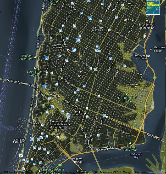
The older shoreline strikingly engages one’s mental map of Manhattan’s shore.   It jar one’s notion of place, and shift the stability of shorelines, streets, and riverine banks within one’s head.  Superimposing data from a Google map visualization of the verdant forests, ponds, streams, and marshes before four centuries of landfill shrunk its coastal geography, the map reveals a huge change in place in a powerfully persuasive graphic form.

Indeed, the superimposition of the shifted maps–the street grid and coastal drives laid above the earlier contours of the island’s expanse– is compelling by the complex cognitive dissonance it creates, placing multi-lane expressways and drives on the expanded edges of the island, so that they run across the marshland estuaries of the Lower East Side or cut into the blue waters around the island, suggesting the actual de-naturing of the landscape even more than the de-naturing of place that all Google Mapping templates seem to afford–and far more eerily reminding us of the extent to which we’ve effectively distanced ourselves from the expanse that the island once occupied as well as the ecosystems that it held.

Welikia 1609 Map of Mannahatta

3.  The remove of the world of this island situated on merging saltwater and freshwater, and with a dynamic verdant ecology is apparent from Markley Boyer’s stupendous digitization, which recreates the island seen by Henry Hudson in 1609, and which, if not a map per se, compels us to both explore its content by mapping them against our own experiences and spatial imaginaries.  The almost palpable landscape invites us to explore its content, as if as it invited Henry Hudson and his men in:

Mannahatta's verdant paradise 1609
These now absent beaches, marshlands, and estuaries in the landscape offer a striking contrast to the current shore.

Mid-Manhattan
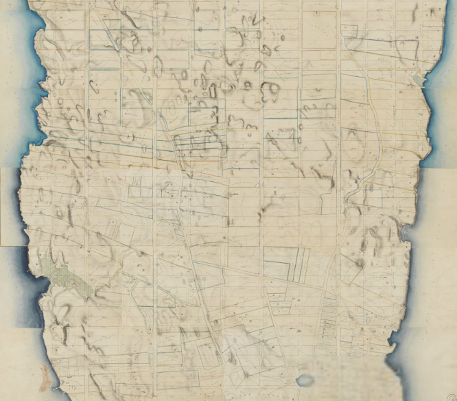
The integration of its coasts to the river echo the shorelines that John Randel, Jr. famously mapped in delicate watercolors in a detailed rendering of its many hills between 1818-20, even as the grid of streets was lightly traced and projected above a far less level urban topography, where the city descended in differently manners to the rivers and estuaries on its shorelines, most of which have been erased by time:
Randall Farm Maps

Boyer’s glorious digital reconstruction recreates the shimmering presence island of hills, rivers, and trees that Lenape knew in its speciated glory, mapping the messiness of that shore in ways that inspire a vision of or compelling case for the optimistic dream of restoration of these shores:
Mannahatta:Manhattan from south
4.   Maps offer persuasive forms to re-think cities’ relations to oceanic shores, perhaps more compellingly altering deeply set attitudes than new practices of planning to integrate more fluidly and esthetically water and land.  Although Beatley calls, at http://www.biophiliccities.org, for new attitudes to the surrounding world, and fostering a new culture of lifestyle, curiosity, and an integration of the tactile presence of the seas in “blue urbanism,” we  might better appreciate the nature of the frontier created between city and water not only in the benefits of immersive aquatic environments in cities, but respond to the absence even of registering seas in urban planning by examining how we came to map a disconnect between cities and ocean– and the cultural divide that has emerged between shore and urban space that was elaborated from the mid-nineteenth century, and is now deeply established by zoning, districting, EPA standards and urban planning texts.

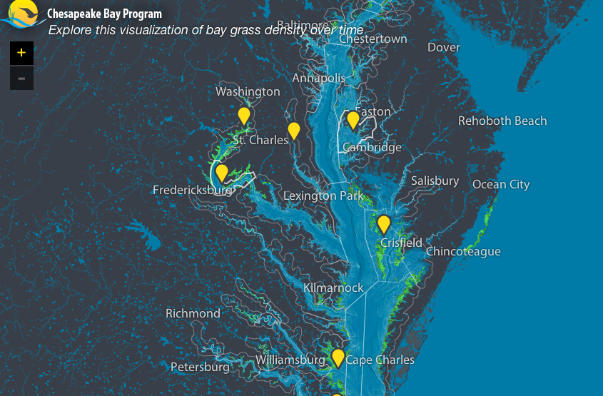
In asking to extend our concepts of cities to the oceans that surround them, we might work not only to make new maps, but use old maps to be mindful of the need to extend our sense of place through the refiguration of urban spaces–noting how maps mark and register the depths of the cultural divide between urban and oceanic space, and examining maps to chart the losses of a shifting historical relation between the city and ocean.  Such a remapping of the city’s relation to the land is echoed in the recent interactive mapping project of Stamen Design, Surging Seas, which tracks rising sea-levels caused by storms or flash-floods, mapping sea levels in relation to the inhabited land–and visualizing a nine foot rise in sea-level of nine feet, here in lower Manhattan, based on data from Climate Central.

Stamen-TriState Submerging Seas
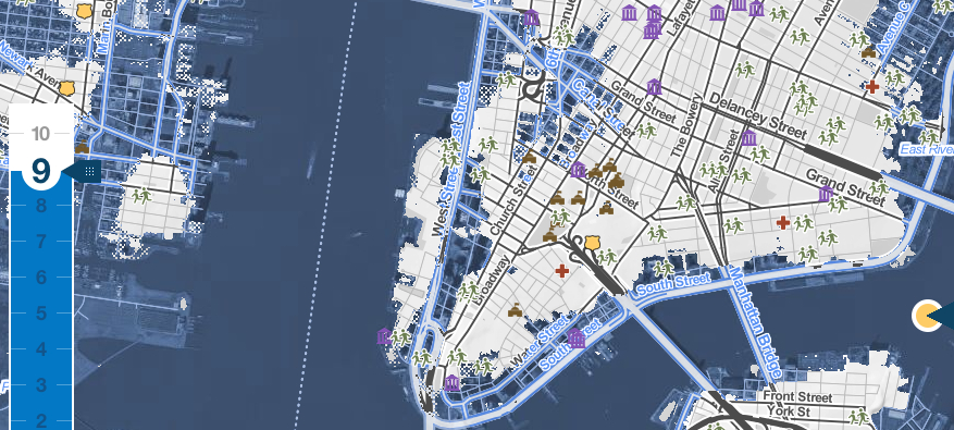
And the interactive site allows one to track what changes would happen if the sea-level were to rise it to a ten full ten:

Surging Seas--NYC, 10 Feet

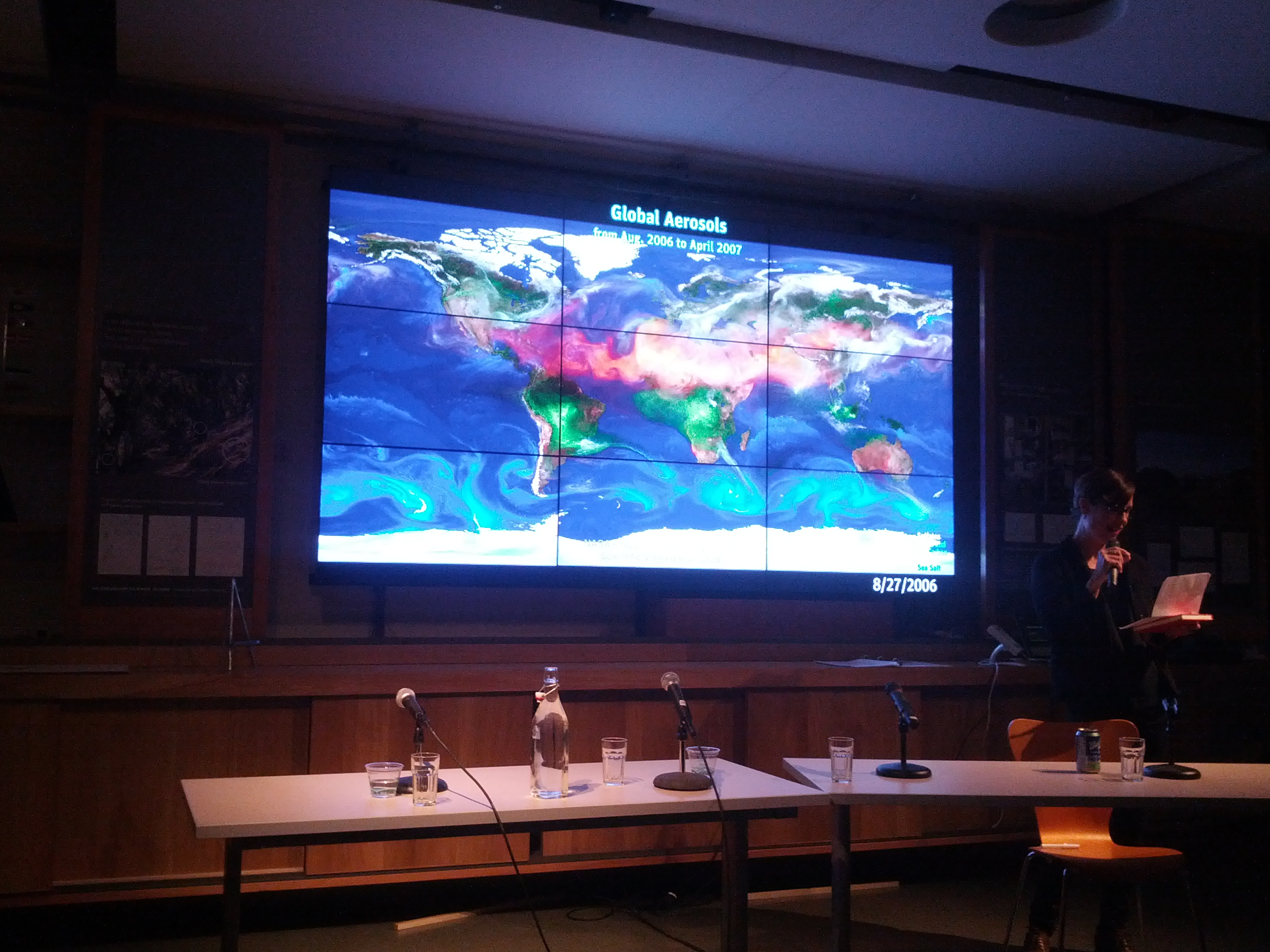
5.  At a recent discussion in San Francisco’s Exploratorium about relations between land and sea promoting such a “Blue Urbanism,” the relations between place and global change rightfully gained considerable attention.   Most presentations focussed on specific examples of cities, but the problem was pressingly (and depressingly) relevant given the recent typhoon.  Occurring in a room exhibiting such splendid shifting nine-panel global color video projections, courtesy NASA’s LandSat satellite photographs or the Goddard Flight Center, of Global Precipitation Levels, Sea Surface Currents and Temperatures, Ocean Currents, or, below, Global Aerosols, they seemed to provide a unique context for rethinking the presence of the local in relation to the sea.  For only in rethinking built relations between land and sea, and the compartmentalization that led to the diffusion of aerosols, the shifting of water temperatures, and  changes in the level and salinity of oceans over the past one hundred years, can we measure the human footprints already left on environment.

Global Aerosols Exploratorium

One such remapping of such relations and attitudes might begin from maps, it began to appear–and from the inspiration maps might provide to remap relation around San Francisco, not only by seeing how space was filled by the city–or the urban conquest of space–but rather how the negotiation of the boundary with the sea was based on spatial practices of such longstanding nature, entailing and perhaps rooted in the representational practices of defining space as an area of settlement and urban planning–and a practice of planning that sees space as filled up by housing projects that cut off the marine space of the sea.

The projected maps on plasma screens raised questions of how to rethink the sedimentation of such deeply set cultural practices, if only by providing a context for the dramatic remapping of urban environments at a remove from the ocean’s ebb and flow–or relate place to a far broader context of environmental change.   When Rebecca Solnit recently offered a haunting analogy between global warming to the processes of gentrification that threaten the fabrics of urban neighborhoods–both occurring with blinders to the overall structure and coherence ecosystems, whether the social ecosystem of urban space or global ecologies, and of removing oneself from our role in creating a scenario of global warming or urban change.

6.  The history of spatiality and of spatial practices that define the city may suffer, one soon realized, from the separation of such “spatial practices” from an appreciation of urban environments.  The circumscription of the spatial is partly inherited from the conceptually pioneering–if idealizing– strain of thought in the work of the French sociologist Henri Lefebvre, whose notion of in The Production of Space was rooted in an Aristotelian or Kantian categorization of space as a human creation.  For when Lefebvre distinguished forms of apprehension among social practices, representations of space, and symbolic models of spatial representation, he refined how Aristotle cast position as a category of human apprehension and Kant affirmed space as an attribute of human judgement–rather than an ecological space of multiple species’ interaction, or indeed of biological overlap.  Instead of commodifying space from a human point of view, we fail to register either local specificity or the density of coexistence around place:  maps can return attention to all too often forgotten margins of settlements, and effectively reconstitute place in a greater environment.  A similarly broad sense of the sea-shore as a “primeval meeting place of the elements of earth and water, a place of compromise and conflict and eternal change,” as much as opposition, was suggested by Rachel Carson, who suggested the basis for understanding the shorelines by “the long rhythms of earth and sea that sculptured its land forms and produced the rock and sand of which it is composed”–and the biological communities specific to each.  She chose a map of the Gulf Stream as a sort of emblem for the situated knowledge of the shore, using a version of the 1769 chart of Benjamin Franklin based on the working knowledge of a Nantucket sailor, Timothy Folger, that is the end-paper for her 1950 The Sea Around Us; Carson praised the map for transmitting understanding of ocean currents–and for the first time locating the course of the equatorial Gulf Stream, or “Gulph Stream,” on a map, in ways that embodied a tacit familiarity with the flow that many sailors well knew, but which Franklin, as Postmaster General, was frustrated to find absent from any chart.

seaarndusop2
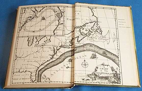
The recovery of the rare original Franklin-Folger map showed a pointedly less centrally defined Gulf Stream than the composite map reprinted above, but illuminated a new need for mapping oceanic expanse–in this case, for the postmaster general to elucidate the greater time needed to traverse the Atlantic from England, which world maps or charts had long excluded, in failing–or, more accurately, not knowing how–to map the seas.

Franklin- Map

7.  The question then becomes how to adequately map the seas, as much as urban space.  The ability to register and communicate familiarity with place–and with a watery space–is particularly lacking in most urban maps.  The absence is a considerable difficulty for adequately registering knowledge of the sea on its own terms, or the shoreline and its inhabitants.

Or can we use maps to register a shifting knowledge of the ocean’s shore?  One charge for spatial history would be to excavate the construction of space in different environmental contexts.  If it is to extend beyond the recapitulation of space as a human construction, “space” might be more adequately placed in a global–and less of a human–context by recognizing and affirming space as an ecological category.  One place to start would include the negotiation of deeply set cultural categories of division and differentiation that are framed in maps, taking the map as a human artifact–rather than a representation or a practice, a model of interaction that conditioned and provides evidence of lived experienced.  For the tendency to idealize space at an Apollonian remove–an image perpetuated, to be sure, in maps which subject the cognition of space to human understanding–abstracts space as a category of apprehension, rather than registering the density of interaction through a suitably “thick mapping” across boundaries, borders, and regional change that recuperate buffer zones, watersheds, and shorelines we have lost–in ways the art of mapping is uniquely suited to portray.

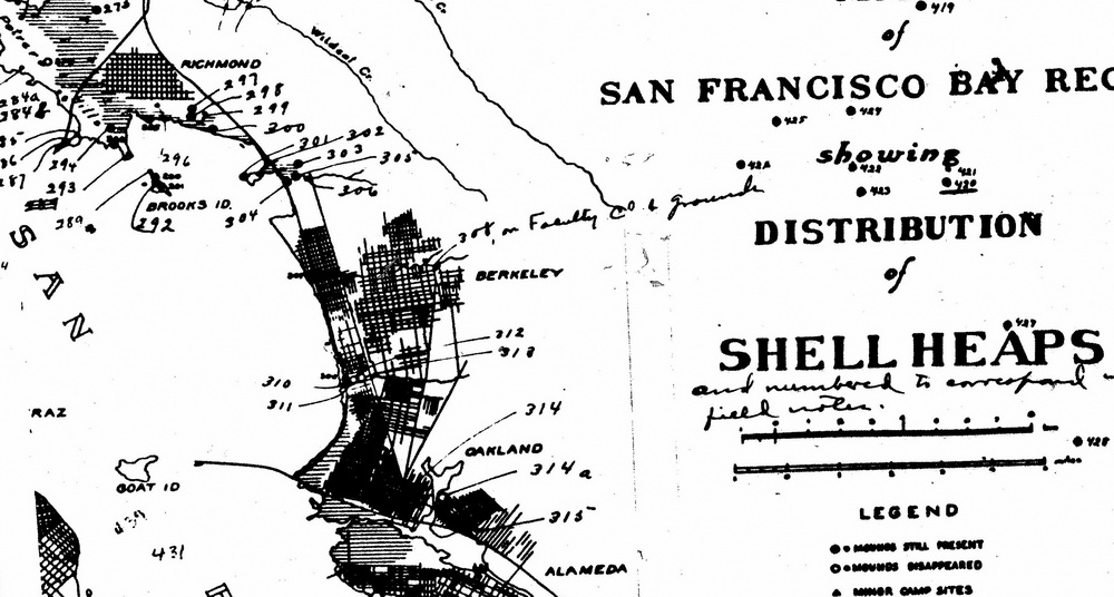
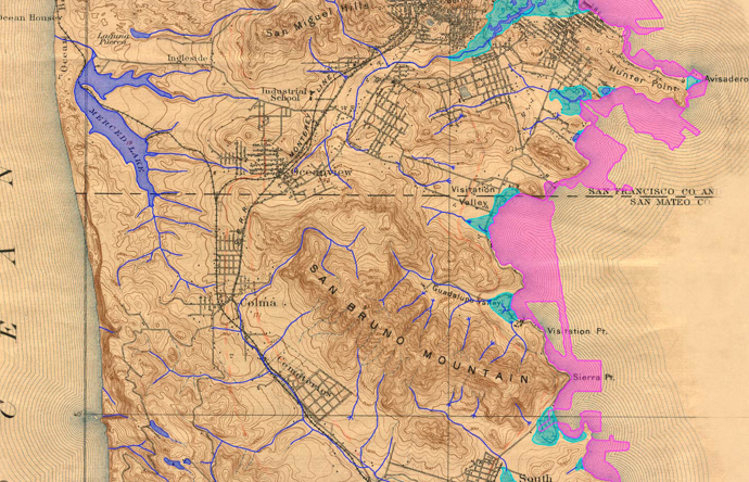
The challenge of recuperating the network of estuaries and streams that once surrounded the low-lying areas around the San Francisco Bay, for example, might negotiate with how we constitute the terrain for urban life by drawing a clear divide from the surrounding waters–or the perpetuation of the fantasy of drawing a clearly demarcated line dividing water and land.  Rising seas once flooded a river valley to create San Francisco Bay, whose many inhabitants  long existed in relation to a less clearly defined shore.  Maps can reveal how humans have interacted with the Bay over time that created deep mental barriers to interaction.   One can trace the shoreline moving in hundreds of feet inland, and slowing in past centuries to but a millimeter a year, or a city block over the last century, as a  shape-shifting feature with which bay residents have negotiated in different ways since a time when people lived near the bay, and negotiated with its salty marshlands, as a map of native American Shell Heaps that ring the bay eloquently reveals by noting the clear buffer zones that inhabitants created on beaches to meet rising tides.

BayShellmounds 001

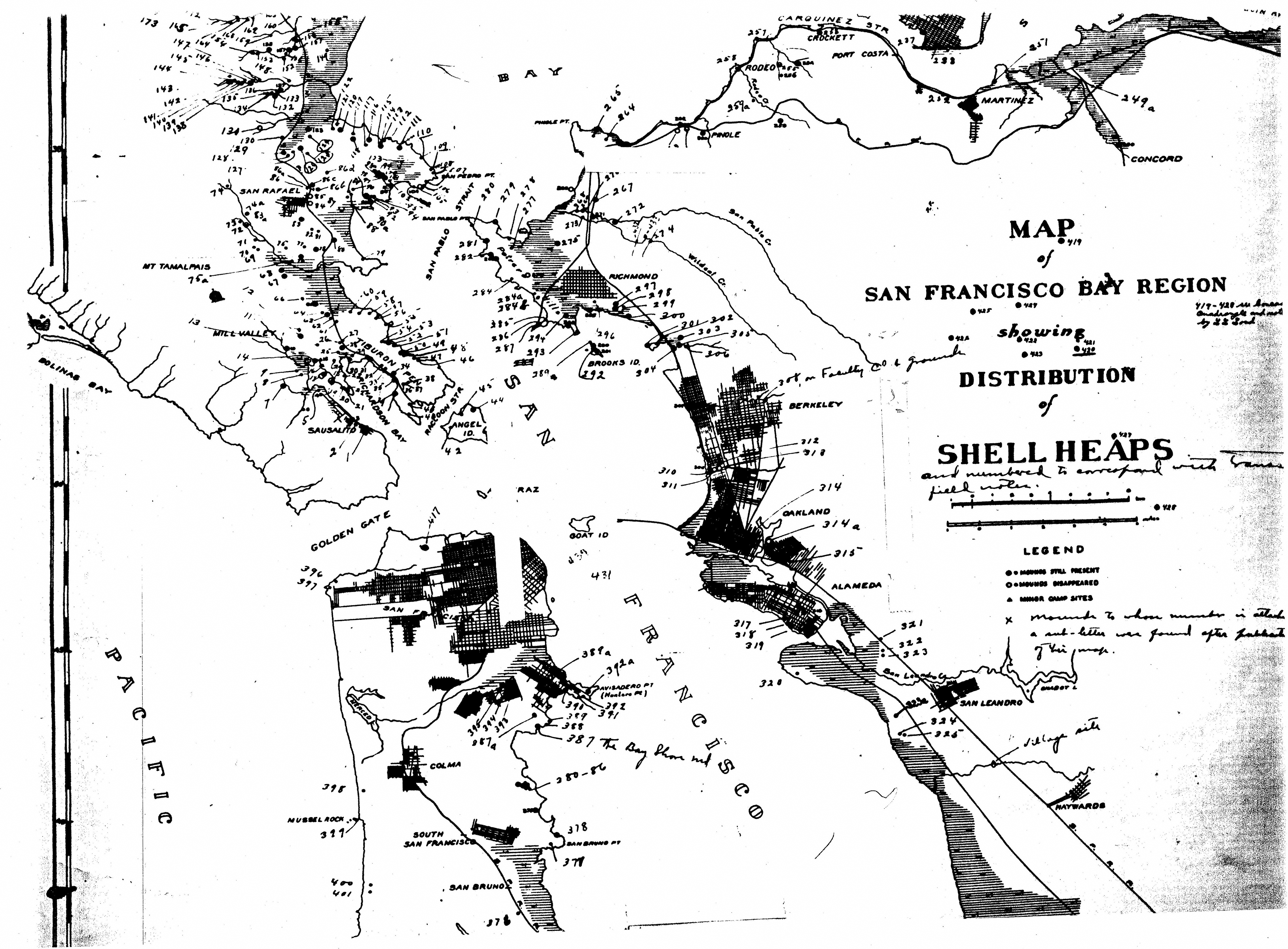
The maps registers crucial details of the negotiation with marshlands and wetlands now lost or recently restored, outlining an image of interaction with the sea that is not immediately recognizable, and difficult to negotiate with our own changed landscape.

The particular coastal region near El Cerrito indicates the building up of these mounds to create a permeable barrier from the resident crustaceans along the marshlands running from north of Albany Hill to behind Point Isabel–now landfill, then a remote rock in the Bay.

BayShellmoundsCerrito)

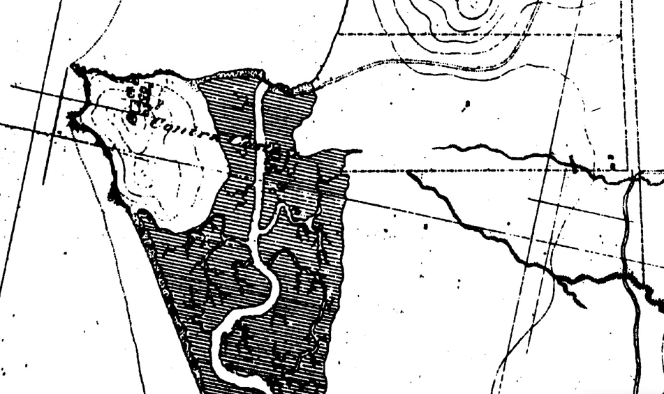
The salt marshes, and the five creeks that fed them, are evident in this detail of the 1856 US Coastal Survey:

Salt Marshes

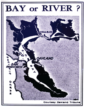
Yet as people moved inland from an 1850 shoreline was reduced by almost a third all of a sudden in last fifty years in a quite rapid and decisive manner, to create a new sense of the stability of the shoreline that segregated land and sea which will be particularly challenging now with the rise of sea levels projected global warming.  The illusory stability of the shoreline is however inevitable . . .  and the bay on track to expand again by 2100, to return to its size of 1850, in ways that pose disastrous consequences for such overbuilt regions of low elevations.  All low-lying areas are threatened by this projected expansion of the ocean, from Foster City to the treatment plants near to the Bay, to Oakland and San Francisco’s low-lying airports . . . and Oakland’s port.  In cities with waste facilities, oil tanks, refineries, ports and airports lie close to the water, as in Richmond, Oakland, the Carquinez Strait and Albany, ocean waters pose very real environmental threats illustrated by the tsunami’s breaching of the Fukushima Daini power plant.

8.  Can we redesign the shoreline differently?  Observing these low-lying areas that stand in close relation to the water in this map of 1850, we might consider the importance of beaches that can constitute a natural buffer to the shore, and the need for restoring their role as transitional zones and regions that has been so precipitously eroded in our environment.  For the erosion of such transitional spaces–and the overbuilding of the shores–has rendered more vulnerable low-lying areas such as Albany, Emeryville, Oakland or El Cerrito, encouraging blinders about the potential possibilities of future risk.

Sandy beaches that once circled San Francisco similarly served as barriers to the encroachment of the sea.  The loss of beachfront corresponded to a huge expansion of reclamation by landfill, and a resulting loss of estuaries, widely known around the Marina, and evident in the expansion of the city’s shores from an 1895 USGS topographic survey:

Lost Land SF-Historical Creeks and Shore marina detail

The loss of estuaries, creeks, and rivers in the entire peninsula of San Francisco since 1895 is less well-known, but even more dramatic:

SF Built Out:Loss from 1895 Topo

Will the process of getting to know the shoreline again provide a way to make them stable barriers once again?  Will we be able to provide natural resources by fluvial deltas, and support the growth of these buffer zones to do better on a second chance, by expanding an estuary system linking to the ocean that was so drastically mis-designed in the 1950s, when it was even proposed–if the proposal was reversed–to pour more landfill into the Bay, and re-zone the estuary, in order to fill an expanding housing market?

Bay or Rivewr

While it was not so prominent as the urban planners had proposed, the dramatic loss of such crucial buffer zones as tidal wetlands is evident in a comparison of first coastal survey of 1850  in this overlay of coastal maps, courtesy the San Francisco Estuary Institute, detailing the configuration of the coastline as it was and as we have made it,  over the century and a half of urban growth throughout the Bay Area–and the dangers that this poses:

baynature_829

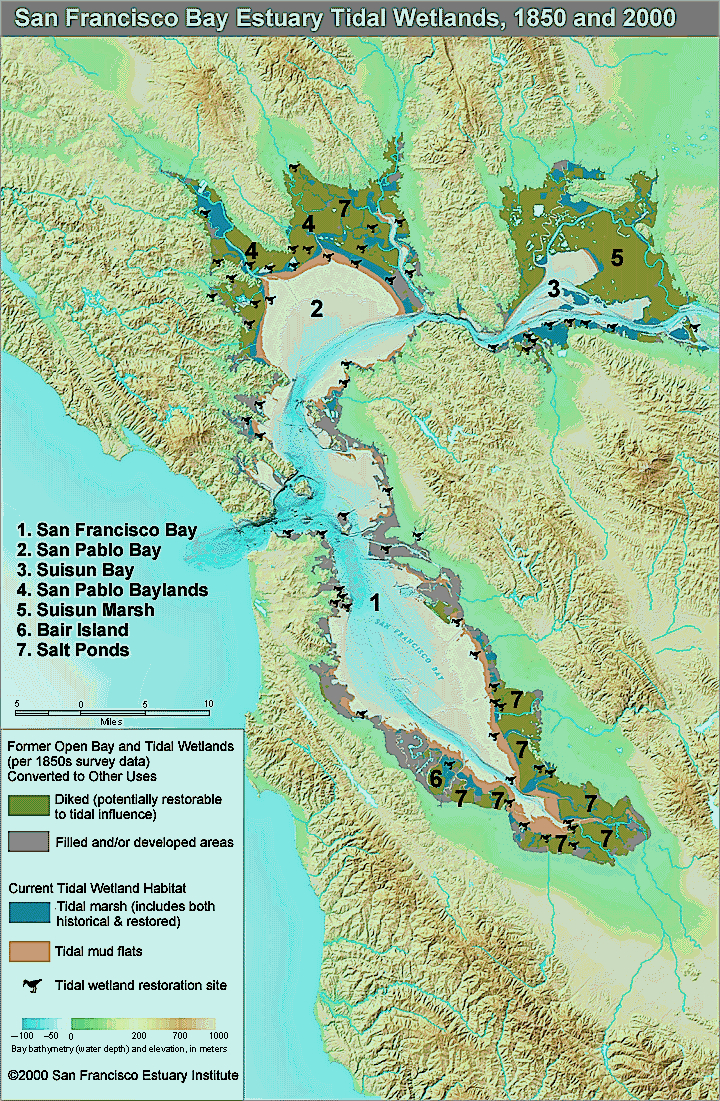
The map cannot begin to conjure the shifting dynamic within the landscape and ecosystem we have lost–although the system of dykes and landfill suggests the beginning of the possible excavations of a lost shoreline.

This image of the expansion of the city’s urban claims to housing derives from a cultural and deeply anti-ecological view of the city as a site of stability–and ocean was seen as a site of antagonism on which, in the domesticated image of the bay, the city could rightfully expand–and the estuary be recast as a river to accommodate housing needs.   In starting to change our attitudes to our shorelines, and to view them as sites for other residents and as permeable barriers, we might start from changing our attitudes to the sea:  and remember, with Rachel Carson, that it is through our expansion of the “artificial” nature of cities that we have forgotten and somewhat brazenly rewritten our relation to the shoreline and the sea.

florida-coastline

Maps, of course, forge bridges between nature and culture in provocatively engaging ways–and engage viewers by mapping these relationships.  If we are starting to remap place in provocatively interactive ways, the challenge is to best map the shifting relation between place and the global changes that call for an extensive remapping of place within the world.

Leave a comment

November 14, 2013 · 10:19 am

Encoding Narratives in Maps

In surveying artists’ maps at the recent symposium “Mapping and its Discontents,” Katherine Harmon celebrated how “creative cartographies” oriented viewers to a narrative about place.  If most of the presentations made viewers re-think the nature of map making as an art and science, Harmon’s attention to how the art of mapping create narratives about place at the symposium sponsored by UC Berkeley’s College of Environmental Design suggest the inadequacy of separating  “cartography” and “art” by examining the map as an art of orientation–by how maps invite viewers relate lived space to the space that they create.  In a symposium that raised questions about the seductiveness of the ability of how better-defined datasets can make maps that better capture processes we want to describe, it was refreshing to shift focus to how cartographical arts register an individual relation to place.  Indeed, if several papers in the symposium struggled over how to bridge map and narrative–do we need to depend less on maps?  to be seduced less by its promises of truth?–each artist returns to the dialogic relation map instill between viewers by orienting viewers to their content in ways that pose questions about the lack of personal detail in an undifferentiated record of space.

In a sense, the survey of artists’ maps on which Harmon organized and explored exposed the artistic values in which all cartographical practices are embedded.  But they also pointed up the narrative ends to which cartographical forms were so particularly suited as joint representations and explorations of space.  All maps engage their readers’ appetite for knowing a place, and even revise it, by creating a relation–a “map”–between personal knowledge and the residue of collective knowledge distributed in the design of their surface.  The narrative possibilities for registering personal knowledge of space are particularly inviting in such an ostensibly objective framework of geographical denotation:  Harmon called attention to the particularly eloquent transformation or adaptation of how the framework of mapping offers both a compelling and legible text by the forms of “deep mapping” that technology now allows–and the expressive form for deeply personal narratives they offer even as they threaten to lose specific details in the very process of generalizing a record of a uniform space.

In an age where we are deluged by maps in all sectors of life, the tracing of these artistic strategies of mapping seems a recuperation of maps as orienting tools and arts of orientation, and this post surveys some of the maps that she presented, some known from other works, as serving to orient viewers in a practice of mapping that is often too removed or alienated from individual experience.  For the ways that cartography can serve as a practice for engaging our different understandings of space in particularly inventive ways maps both feed cognitive by orienting viewers to place in revisionary (and potentially liberating) ways–by engaging viewers n how they uncover meanings about spaces one already thought one knew or believed to have been recorded in existing maps, by creating dialogue about spatial relations as much as to generalize a record of space.

Harmon’s presentation showed less interest in how to tell stories in a map than in using mapping to register personal familiarity with place, by orienting viewers to the multiple personal networks in a mapped social space.  The “creative cartographies” recuperate the artistic basis of mapping as arts of individual and collective orientation that exploited the structure of synthesizing spatial knowledge in a combination of ways.  The narratives each cartographer creatively located in maps exploit the innate curiosity maps invite by orienting viewers.  Harmon distinguished the narratives that several maps create; the “creative cartographers” all draw connections between the specificity of individual narratives plotted in maps and their structural designs.  If the “discontents” of mapping lay in the anonymity of the maps of public space that were universalized for their readers in many digitized mapping projects and by government planning agencies from Rio di Janiero to Beijing to Ho Chi Minh city to Zagreb to the Google Earth platform, creative cartographers exploit the inventiveness invitations of maps place oneself in space by the power of making meaningful cartographical spaces by balancing them with a personal reading of place.

Harmon invited the symposium to follow how creative maps buck the conceit of large data samples to inscribe maps with the personal meaning from a particular perspective–and in so doing, turn the abstracted nature of cartographical practice on its head, reminding us how such “scientific” practices are embedded in a discourse on the arts.  Indeed, as they engaged scientific practices of cartography, they adopted the tools of mapping in as tools to chart a distinctively individual relation to a known space, rather than a universalized one–or, rather, they novelistically use the format of map-making to universalize the particular situated perception of space that maps rarely include or note.

Harmon emphasized in her own visually stunning and compelling presentation the narrative content in these creative maps as setting into space individual stories about space that pointedly contrast with the de-personalized map and emphasized their own personal knowledge.  She showed a set of creative cartographies that exist in a dialogic relation to our own knowledge of a place, moreover, and, more deeply, out knowledge of objective–as well as subjective–renderings of it, making creative maps particularly neat ways of opening up new perspectives on a space that fence in interesting ways with our own.  Indeed, maps have a unique power to illuminate the relation between our story and our surroundings, as much as to tell stories of their own about how we understand place.

The cognitive webs of connections that maps both embody and render visible and concrete have the effect of never seeing ourselves as isolated.  They rather allow us to map our place in a set of other stories and narratives about place, in ways that are deeply social as well as rooted individual cognition.  And perhaps the most problematic subject of mapping such an individual narrative–or restoring its centrality–is in as frequently a re-mappped event as the September 11 tragedy, whose multiple mapping has accreted more meaning on the event–as if it needed this injection–to erase its personal narratives, and imposed meanings on the event that have almost obliterated our memories of its occurrence, and our relation to its immense tragedy.

It is interesting how she began from 9/11–an event that illustrated the tyranny of the map in the public imagination, and a touchstone for how a local event effectively mapped a geopolitical relationship to the world, albeit a quite distorting one.  The event is not only ripe for re-mapping, but demanded a resourcefulness in using mapping forms to forge new networks of meaning in an over-rehearsed geographic conceit.  The artist Karin Shneider effectively re-mapped our cognitive understanding of events of 9/11–and the cognitive space of the twin towers–that  re-framed memory of their destruction and the death of their unfortunate occupants in plate-glass maps inscribed with the commuter routes those who were tragically killed had taken on that morning as they arrived at work.  The sounds of breaking plate-glass were inseparable for many observers of the twin towers’ collapse on September 11.  In Shneider’s commemorative map, individualized etched glass plates restore both the fragility of their lives, and the integrity of each life that overlapped that day, providing a commemorative cognitive map of the event that viewers to consider how the event tied these lives together so tragically, tracing the routes each took to remind us of the voyages each performed that day.   The set of maps commemorate the deaths of some 2,752 individuals by distilling the circumstances of their spatial intersection, giving specificity to that over-photographed and documented event by emphasizing their now unrecoverable perspectives with the evocation of personal letters or diary entries, so unlike the opacity we usually identify with maps, inviting us to see through their commutes to remember the loss of individual life.  The map of approaches to a final intersection replaces the all too familiar rendering of collision courses of two airplanes on September 11.


9:11 flight paths mapped


Shneider’s composite of overlapping maps remind us of the very difficulty of recuperating individual narratives in such an over-narrated event–mapping the mess of lives that intersected fortuitously that morning, and which will no longer be with us.  They reframe an event too often framed as a war on “terrorism,” “clash of civilizations,” or a sign of barbarity and civilization in distorting and exploitative ways, moreover, giving transparence to the very surface of the map.  The absence of a one narrative that unites these paths is, indeed, a great part of the effectiveness of capturing such multiple individual itineraries within one map.

The decided lack of spatial narrative–but a snapshot summary of the lives that intersected on that day in early September–is evident in a quite different map that, oddly, interestingly emphasized the international origins of those who lost lives that day, perhaps in an attempt to remove its violence from a narrative of opposition, and disturbingly cast the loss of lives in terms of the quite different-order abstraction of individual nations:


wtc world map flags

That map’s argument is disquieting because of how it erases individuality.

Mapping can be a clarification of such tragedy, however.  The far more delicate set of superimposed plate-glass maps Harmon described stands in contrast to the anonymity of this map, or the very disembodied and abstracted map of the routes that these hijacked planes took, by inscribing their paths at a complete remove from individual lives.  Indeed, even the inscription of names of those killed in the event at the site itself on a granite plaque, evocative of the Vietnam Veteran’s Memorial, oddly strips them of individuality–unlike how the reflecting stone surface of the Vietnam War Memorial designed by Maya Lin invites viewers to touch individual names on its surface, as if to try to map abruptly curtailed lives.


VVM-TouchWall


The inscription of the names of the dead of 9/11, unlike Maya Lin’s monument, offers no attempt to embody the event–or to express the multiplicity of narratives that that event so tragically condensed.

At another extreme of mapping the 9/11 tragedy lies the grotesque dis-humanized blood-flecked map, so sensationally printed by the New York Post, allegedly based on a map fire-fighters compiled of human remains, as a broadside intended to vilify plans to construct a mosque nearby the site–a map so shockingly dispersive in its energies that rather than embodying the 2,752 deaths it seems to chart, aggressively alarms its viewer with an explosion of meaning impossible to process save by recoiling in horror from its tabulation of human remains near the scene of impact:

Blood-specked map WTC

For if the violently voyeuristic map seeks to dignify the site’s sanctity by delineating the violent loss of life, its superfluity of meaning is something of a recapitulation of violence, attempting to shock the viewer as does the inset photography, by providing some access to the history of the event.

Scheider’s creative cartography also stands in eloquent counterpoint to the abstract cartography of that emptiest of maps, of PATH commuter routes, which she adopts as something of a basis to trace a palimpsest of commutes:


PATH_system_map


The problem of how maps evoke or shift a familiar narrative motivates the inventive ways itineraries are combined with maps to upend their abstraction, or the spatial oppositions that they create and reify.  Daniel Zeller recuperated the itinerary as a unit of spatial knowledge in imagined maps linking two sites of worship in two different religions by imagining their proximity, and almost delineating an imagined route of pilgrimage that might link their footprints.  Zeller used his deep study of topographic maps and satellite imagery to forge an imagined spatial tie between the Vatican and Masjid al-Haram, the mosque at Mecca, as if to bridge ties between two sites removed from one another in such popular and political discourse alike, by connecting them as if on an individual footpath.  By tracing the footprint of each in graphite, and imagining a windy route of pilgrimage that might actually connect them in “Vatican/al Haram,” using the extreme precision to actively embody and create real spatial ties–


Vatican:Al Haram


–with attentiveness to precision evident in this detail of the links he creatively mapped between both houses of worship.
Zeller Vat al Haram--detail

Departing from digital simulations that often create information overload,  Zeller’s craft-like remapping places with the symbolic continuity that maps create to all too improbably link two sites so often separately segregated in the global imagination.

Bridging divides through a pathway that itself unites or crosses cultures is the theme of Asma Ahmed Shikoh’s beautiful acrylic “Van Wyck Boulevard,” part of her project “Home.”  Shikoh’s art maps her status as a Pakistani artist trained in Karachi who moved to New York:  “Home” brilliantly reclaimed the craft traditions of mapping, recasting the NYC subway map as an Urdu manuscript and within a geometrical design borrowed from the Islamic Al Hambra, in Spain, to reexamine its functional status, and its role as an icon of urban belonging at the same time as mapping a Muslim diaspora–precisely by casting the map of the path of the MTA’s “F” line that took her to her first home in the city.  Shikoh reconfigured the map in a painted form of distinct coloration, engaging its form as well as using language as a tool to assert my identity and make the new place my own.”   The widely reproduced and iconic subway map served as a template to assert and recreate the familiar embodiment of the subway lines as a constellation of meaning invested with a narrative intent that the location of stations on this diagram rarely possesses: only by  “transliterating every stop, was painstaking, repetitive, and yet therapeutic for a newcomer” that traced a narrative through a process of remapping and making the city her own– using the subway map to transcend the increasing construction of a dichotomous divide between East and West, and re-center her identity (and immigrant identity) in the mobile paths of New York City’s subways.

Van Wyck Blvd


Cross-generational mobility was mapped through the shifting degrees of access or familiarity with space across generations in a map of the town of Sheffield, Harmon noted, when Dr. William Bird traced i the limits of known space created across generations living on an aerial view of the city that redefines the mapping of “city limits.”  The chart of the boundaries of a “known world” where children were entitled to walk unaccompanied in Sheffield provides a far more general (and very poignant) map of a demographic group’s relation to space, investing the map with particular narrative and expressive properties beyond that of a spatial register.

How Children Lost the Right to Roam in Four Generations (2007) employs the format of aerial photography to map the ambits at which children were allowed to walk on their own in the same neighborhood in one family.  The result of comparing the increasingly restricted spaces parents tolerated wondering illustrates and documents the daramatic contraction of the consderable freedom eight year old George Thomas enjoyed in 1926 in Sheffield.  His parents, not able to afford the tram’s fare, let him to walk six miles to fish on his own.  The erosion of the English commons is a trope of the enclosures of the early nineteenth century, and the lack of urban exploration a more contemporary concern for city-dwellers who find their children less adventurous in making the out of doors their own.  But the more recent specificity of Bird’s roaming map shows the harrowing circumscription of space up to the present:  George’s great-grandson Edward, on a tether of some 300 yards, and with few liberties to roam at will unsupervised, possessed less of a spatial narrative of his relation to the far more industrialized region of Sheffield today, as his mother’s was far diminished from that of his Grandfather Jack or the wide range of space George was trusted to personally navigate.  The narrative of a restricting relation of the person to space in mapped by the narrowing boundary lines in Sheffield:


How Children Lost the Right to Roam


As much as describe the changes in Sheffield’s geography and the story of its expanding industrialization, the map presents a strikingly local microhistory which echoes and encapsulates frequently expressed concerns about the lack of exploring a safe urban space.

It was made in the capacity as health officer to Natural England, to substantiate a concern for Bird’s belief in the benefits access to grassy areas, ponds, and trees brought to kid’s behavior and school work, and question the healthiness of the narrowing relations of space from George, his son Jack, his daughter Vicki and the eight-year-old Ed.  The creativity of these practices of cartography bucks basing maps on their synthesis of a large data sample, by questioning how maps can be creatively rooted in a narrative of individual experience, even in ways that preserve their value as a collective register of the experience of space–and how a Google Maps template might be distinctly personalized as a record of spatial knowledge.

Discontents with Google Earth maps lie precisely in the deeply problematic recuperation of a cartographical art that they perpetuate for their users.  And so Jeff Sisson focussed on the spatial meanings and consequences of the threatened disappearance of the Bodega as an institution and anchor to urban communities in New York by crafting an interactive Bodega Map within the city’s expanse.  In charting the survival of a store central to communities across different neighborhoods, the map almost anticipated the recent turn against Mayor Michael Bloomberg’s New York that the recent De Blasio victory seems to portend.  In tracing the footprint of the institution of the Bodega, Sisson selects stores pressed out of existence in the absence of rent control for shops in the city’s expansive real estate market, and provide evidence of a vanishing urban culture of diversity.

Sisson’s website invites all visitors to place Bodegas in local neighborhoods to elevate the individual discovery of a community store, in an exercise of collective crowd-sourced participatory mapping that displaces the archipelagic city’s usual contour lines by rather trying to map the local meanings of these distinctive and useful stores within local communities, in ways that invite one to insert one’s narrative connection to the colorful local Bodega so long an urban fixture situated at odd street-corners, combining such mapping resources as Google Earth, Google Maps, and Flickr snapshots of facades and marquees of individual family run stores.

Bodega Map

gkjarvis


The project “Mapping Bodegas” tracks processes of micro-urbanism, by marking sites of interaction and stages to which communities respond, to reflects on the danger of their erasure from the city’s map and its neighborhoods, as well as to preserve meaningful “hot-spots” of collective memory within outlines of the specific neighborhoods they nourished.  This infusion of narrative content is, to be sure, one reaction or response to the universalized abstraction of an anodynely marked places of interest in the space of Google maps, with something approaching a zero-degree of the denotative signs of registering affect or place.  It is in reaction to this lack of narrative that Adam Bartholl staged his public sculpture “Map,” creatively appropriated the blandly uniform “inverted tears” of a Google map push pins by placing these physical objects in the very center of Arles–on the hexadecimal longitude and latitude GoogleEarth uses to denote Arles.

The discontent with the abstraction of our knowledge of place in Google Earth led Adam Bartholl to remind us of the increased distance between iconic cartographical markers Google employs so blithely in its tiles and knowledge of places they denote.  By the co-option or appropriation of the sign of place in geolocation practices in the public square of Arles, Harmon argued, Bartholl reminded us how the marker shapes (and fails to capture) our sense of place, as we use it to make our narratives of travel:  by placing a larger than life physical embodiment of such a dayglo pushpin in the exact center of Arles’ public square on the altitude and longitude where it occurs in Google Earth, Bartholl asked us to confront a physical embodiment of a sign we too often internalize without interrogating its affectless muteness as a sign as itself a denaturing of place.


map-arles-2-600

map-arles-1-600

Arles?  It happened right here . . .

map-arles-3-600

On a more political level of the silences concealed in many maps, and the environmental consequences of these silences, Harmon turned to the failures of mapping ecological disasters of Bonga oil spill and  transformation of the Niger delta.  What are the limits of Google maps in tracking the multiple levels of ecological disaster within the Delta, seat to a preserve of some 600 million barrels of recoverable oil mapped in 2001, but whose mapping silenced the complex narrative of regional toxic pollution that has spun out around those platforms and oil rigs.

bonga3


The delta, an oil-rich area long plagued by irresponsible levels of annual oil spillage greater than in the Gulf of Mexico Deepwater Horizon disaster of 2010, is a site of widespread flares on rigs, and, as a very poor area where oil was found close to the surface, of dirty DIY oil refining and extraction have created deep-set ecological disasters through the Delta–over 7,000 spills from 1970 to 2000, some spewing at least 9 million barrels of crude into wetlands that sustain millions of local trades from fishing to agriculture, and where consistently poor clean-up of spills have eroded increasingly fragile local communities and economies in an image that, viewed from space, appears both ecologically fragile and remarkably pristine.


600px-STS61C-42-72

How to map the devastating ravages to the local environment, whose production the Nigerian government is economically dependent, is particularly problematic since the oil-rich delta is the source of 90% of the country’s foreign earnings.  Regular under-reporting of spills by NOSDRA–the Nigerian Oil Spill Detection and Response Agency–to keep in line with corporate claims led to a failure to register the escape of up to 60,000 barrels of oil in 2011  from one Floating Production Storage and Offloading Facility at the Niger delta’s mouth by Shell oil (Nigeria’s major client) in Bonga, or 1979 spill of 570,000 barrels of crude, also by Royal Shell–eroding the environment all up the Delta, by the devastating toxic effects of acid rain that are only starting to be mapped–from the ruin of coastal livelihoods and fisheries to deadening formerly plentiful fields of kola nuts.

How to map or embody the narrative of the destruction of an ecosystem?  This time-lapse map seems as disembodied as Vassily Kandinsky’s “Einige Krise,” but charted decade-long oil flares in surrounding coastal waters spewing crude into the air, in color-coded fashion since the expansion of oil drilling in the Deepwater Bonga project since 1993–blue from 1995; green 2000; red 2006–as the outlines of an ecological disaster since deepwater drilling began–and whose mapping almost defies narrative:

nigerian_satellite_photos

Several Circles


If the agglomeration of colored dots in this time-lapse map suggests pattern, the distribution mirrors the division of the Delta and surrounding waters by prospecting leases for locally administered oil fields since 1993, but only starts to map the disastrous consequences for the environment of this massive release of crude into the ecosystem and its local economy:


Deep Prospect Nigeria Oil and Gas Concessions Map - Deep-Prospect

While the slick produced at Deepwater was not at first mapped, it occurred on a 2011 Google Earth view charting oil slick on the ocean’s surface:

Bonga Bongo Delta in Niger Delta-Nnimmo


This map provided one of the few media sources documenting the Bonga spill not provided by Royal Shell Oil itself.  Indeed, it only starts to track the implications of the spills, fires, and leaks in the Delta that constitute the largest wetlands in all Africa rich with swamps, estuaries, rivers and streams, and can only suggest the extent to which forests and mangroves are being polluted by spills from a network of pipelines, acid rain, and water-borne or rain-borne oil slick–rain regularly returns drops of crude oil to formerly fertile region–where oil is relatively close to the surface has led to a distortion of the environmental perils of oil extraction–and over one thousand abandoned oil spill sites in the over-drilled Delta, with huge environmental consequences–often blamed on the ships that regularly illegally siphon crude from the pipelines that criss-cross the delta.


nigeria_gas_1979


Google Earth views used by Sky Truth to map the 2011 Shell Deepwater spill barely chart the environmental devastation on the Delta rivers.   The map that almost leaves one speechless in how the beauty of its sinuous detail chart the slicks of oil that have contaminated a once-healthy delta’s agricultural wealth; this NOAA aerial photography created by the United States Navy rebut the oil multinational’s silence as to the spill’s scope or devastating consequences, whose silences have only recently been targets of international blame, and obscured some 474 spills in one area during 2012 alone.  Perhaps  the recent expansion of Nigerian crowd-sourced mapping projects may shift these cartographical silences, but the burden for mapping the disaster has not been met.


Deepwater Spill Nigeria

Shell Deepwater Spill

_70948662_3fb361eb-02d8-417c-aeaa-1e42c23e8ef4


The narratives that these aerial image of considerable beauty recover present a counter-narrative to that of the corporations that distanced themselves from the Bonga spill, and perhaps a case of maps speaking truth to authority.  These maps begin to tell a story of the transformation of the land–and the destruction of the environment they map.  These maps foreground new narratives about the Google Earth format that invite a broader story to be told about the event, and to fill the silence of Shell’s official narrative about the quantity or causes for the massive spill–and the blanket denial that any of the oil ever reached the coastline, and all barrels were successfully dispersed in the ocean waters, and seek “unconditional license to contain and disperse the Bonga oil spill” itself.  Without these Google maps, Shell Oil would have retained a monopoly about the production of truth about the devastating Bonga spill.


Sleipner A


Can a narrative emerge of this event from the perspective of those who dwell in the Delta, to capture the consequences of the toxic transformation of the land they live and work in, or those for its non-human inhabitants?

Some semantic possibilities of expanding the ecological narrative of place were suggested in the tracking of growth of Chesapeake Bay grasses,  in a mapping project using data to track changes in the growth and density of grasses around the largest estuary in the United States particularly illustrative of the subtleties of overlaps to achieve the sort of deep mapping that Google Earth would not allow.  The Stamen interactive map frames a unique narrative of the restoration of the estuary ecosystem incorporating data from over forty years across some forty years, redirecting data to create an image of where the estuary might later develop:  the time-sensitive visualization of data about salinity, water-temperature and bathymetry with the restorations of bay grasses who are the subject of this narrative of ecological restoration, to offer a powerful–and positive–interactive map about the local recuperation of environmental health, by synthesizing a wide range of data from the EPA officials and local institutions about an area to reverse effects of chemical pollutants on wildlife and grasslands that viewers can read or virtually explore as unfolding over time, in ways that press against the technological boundaries of cartography as an art.


Chesapeake Bay Program


If this graphic visualization of the watershed appears a document only of the growth of grasses, as we unpack the map we realize the expanse of the effects of the possibly narratives of human interventions in the landscape that it presents–both on the ecosystem of the estuary and to possibilities of our future relation to that very dynamic environmental space–a space we better know through our more multi-leveled representations of it.

The art of registering knowledge of place has expanded to comprehend new personal individual narratives of fine grain by a GPS revision of the Google Map view of a city.  Indeed, the maps of Christian Nolde and Ingrid Burrington both seek to recuperate the density of specific narratives of encounters in urban space that echo and engage the emerging forms of mapping by which Google seeks to plot points of interest for its users on the maps of cities that they visit, so that they might include selected points of interest, sites of beauty to visit, or local stores and commercial districts of interest judging by one’s web history.  Both Nolde and Burrington used GPS to create a synthesis of these individualized maps of the city in ways that anticipated the announcement of Google’s plans.

Christian Nolde employed GPS technologies to register of feelings related to place in his emotional map of San Francisco (2007), created during a tenure at Northern Exposure.  After collecting on data gathered by a galvanic skin response by which participants’ physiological responses, he keyed them to places that he transposed to a GPS map of the city’s locations, as if to trace itineraries in a city usually mapped by city blocks or along district lines.  The maps seeks to register responses to a location or geographic environment on individual emotions, in a sort of counter-map synthesized individual responses into something like an encounter with places of specific individual resonance in the city, in a record “visualizing the emotional space of the city” by objectively tracing an alternate topography in 2007.


Emotional Map SF


This map has a texture of accommodating the individual storyline or narrative that makes its reading an active part of its enjoyment, by engaging individual storylines in a dazzling if fragmentary novelistic detail, challenging the legibility of the map’s surface of significant local depth for readers who can take the time to delve into the map to read the actions that its maker associated with a specific place, but which would be ‘overlooked’ by scanning the broader path of his itineraries across the city:


detail SF emotion map

GPS was used, in other words, to contextualize multiple narrative fragments in a composite view of the emotional significance of urban space  by tracing if a residue of collective emotions on its surface.  The completed artifact combines multiple spaces of reading, augmenting the notions of position that he noted in GPS at specific way stations by his own transient or apparently ephemeral personal reaction to the city at a specific place–“beautiful street with lovely houses”; “went into my house and got my mail”; “This is where I had the bike accident”; “i was remembering a person I had a major relationship with whose parents lived here”–that foreground the personal in ways GPS cannot alone register.

The practice of GPS creates a synthesis of discrete meanings rarely associated with geospatial mapping, and puts a premium on emotional or associative precision, as much as the abstraction of terrestrial locations.  A similar desire to base a map on personal narratives to record the city as an emotive space led Ingrid Burrington to take data from Craig’s List “missed connections” as the data to reveal a hidden distribution of the desire for half-glimpsed connections in her “Loneliness Map” (2009-11), included in an earlier exhibit of personal maps Harmon earlier curated.

The map’s unique pinpoint form focusses observers’ attention on mini-moments of “missed connections” in the course of the day against a map of physical topography and street intersections, as if to present the variations among missed connections as an emotional terrain or urban psychogeography, creating a new sense of reading mapped data to register a notion first used by situationists such as Guy Debord.


burrington-ingrid-online-image-main

Burrington--Missed Connections


Such collected ‘mini-moments’ trump the topography of the city, tracking personal attachment to selective moments in urban space as more meaningful than the mapping of the outlines of its streets that create a new experience of reading the map’s surface.  They recall the Mappiness (LSE) smartphone app, which disrupts the relative abstraction of space in a GPS framework by registering our own states of happiness on a map.

The map becomes a site to register individual travels through the city in a collective document, or a capacious holder of narratives, as tangible with resonance as any map might ever be.  And the very tangibility of this record of encounter that maps allow, even with limited qualitative content, suggest the underlying basis of cartography as an art.

1 Comment

Filed under 9/11, Art and Cartography, Chesapeake Bay, Google Earth, Google Maps, Guy Debord, Jeff Sisson, Karin Shneider, Katherine Harmon, Mapiness, Mapping and its Discontents, Mapping Bonga deepwater drilling, Masjid al-Haram, Niger Delta, Stamen design

Mapping Friendships? Facebook Maps Social Networks

The recent growth of web-based “social networks” inspire maps no longer rooted in terrestrial relations, but stand to become vertiginously unmoored from them:   maps often help us to grapple with the distance between them, as much as to orient us spatially to their relationships, but the blobs on this series of maps oddly disaggregates the inhabitants from the land, focussing less on their spatial situation than their relative degree of web-presence.   Indeed, in ways that very inventively rewrite the map as a throbbing surface, rather than a static interface, the attachments of folks to the interactive space of Facebook becomes cast as the subject that is being mapped–as well as being the datasource from which the map’s dataset derives.

Thanks to the creative folks at Stamen design, we have a beautiful interactive global map of Facebook users, whose bold colors offer a neatly clickable index of social networking over space.  The map is not an innovative ordering of space, but illustrates the network’s global reach in a twist on the project of mapping the inhabited world, shared by Ptolemy and Abraham Ortelius alike.  But let’s ask what’s at stake in crafting a visualization culled from archived data gathered from users’ profiles–as much as celebrating the virtuosity of the clickable map as a chart of the social network’s reach, as if it were able to map as previously unquantifiable (and indeed ultimately almost ephemeral) value as ‘friendship’ might be.

World's "Friendships" on Facebook

Many maps employ self-reported data.  In a sense, the map of Facebook use–or the self-identified “Friendship Map”–charts global inter-relations, like the global maps of national distribution of GDP, provenance of coffee beans or even pathways of the migrating whales, both discussed in earlier posts.  But whereas  maps objectively mediate terrestrial inter-relations–and inter-connectivity–the notion of connectivity has been re-appropriated in the images of “Friendship” that Facebook commissioned, as has the meaning of the word “Friendship” itself.  On the one hand, this map is a celebration and triumphal illustration of Facebook’s near-ubiquity.  But it is also with clear limits, even if they are unacknowledged.  Anyone not on Facebook is absent from the map, since connectivity is generated from profiles that are registered online.

Facebook connections allowed the folks at Stamen to generate instantaneous images of web-use, making this sequence of clickable maps a truly interactive treat, as well as a visual feast.  But the effect is also to present the data generated from Facebook use as endowed with the allegedly objective criteria of maps, and to normalize Facebook’s criteria of “friendship” in apparently objective terms.  Although the very notion of geographic connectivity is fundamental to map making, the maps that are used as the templates to indicate the “connections” of friending in the Facebook platform invest a sense of objectivity and meaning in trends of friending that elevates the medium as the basis to generate further information to a degree that boosts Facebook’s criteria of meaning, as much as provides analytic tools:  if “the medium is the message,” the medium is not cartography, although the multiple images echo the authority of cartographical forms, but Facebook itself.

This is particularly pernicious, and bears some examination.  The maps on this site visualize aggregate friendships on Facebook as quivering blobs of connections that pulsate as with life of their own.  Although claiming objective authority of a map, the aggregates map “friendship” as Facebook has defined it, and embody and reify the data FB use itself creates and generates:  this is a map of FB use, in other words (rather than of web use in general), and a vision of the interconnectivity Facebook promises and the very “Friendships” that it creates.

Take a look once again at the snapshot of the connectedness of the Marshall Islanders who use Facebook:

World's Friendships on Facebook


Such a map is decidedly not a territory–nor could it be confused with one.  But if “all maps are arguments,” in Harley’s words, and conceal interests, as much as show meaning, the interests concealed in these “Maps of the World’s Friendship” demand considerable unpacking.  For to me, the multiple maps that Stamen design unveiled last September 12 are something like post-modern versions of earlier corporate emblems.

The aggregate views of information born of Facebook use essentially trumpet the inter-connected world that Facebook promises as a matrix achieved by corporate interconnectedness, in other words, in ways that update the familiar stream-lined modernist logo of global unity Pan Am once used to promote itself as the “world’s most experienced airline,” able to provided air service to all regions of the world by airline jets.  The Pan Am emblem emptied the familiar format of projection from toponyms or places, as if to illustrate the lack of obstacles to air travel and the global surface that its flights promised to link.  The logo owned by Pan American World Airways erased places in favor of the latitudes that link the world bridged by flight paths and no longer in need of land maps, no doubt intentionally offering the new map the airline corporation promised to provide to its users.


277px-Pan_Am_Logo.

The interactive map of Facebook connectivity are constantly evolving and generated at a given moment, and, unlike the static emblem, as if living independently from the viewer, but embodying actual FB use.

The contrast is interesting on iconographic grounds as well as stylistic ones.  The generation between these visions of global interconnectedness has led to a map of greater sophistication and persuasiveness of interactive form, and one that seems, like Facebook, user-friendly and value-free:  but the map of Facebook users is particularly insidious, as ‘friending’ and connections are rendered by the web-based platform itself.  In comparison to the Pan Am logo, rather than merely provide an illusory image of the promise of global unity, the map is a triumphant image of the actual interaction that the web-based platform promised: “friending” provides the metric of global interconnectedness and the sole standard of national interconnectivity.  Although the map can be re-centered at a click in order to map the connectedness from a different point of view, the “point of view” does not really change. In the text above the map, “friendship” doesn’t appear in scare quotes:  it in fact normalizes Facebook use as the sole index of contentedness and inter-connection.

Let’s examine specific cases to ask what is revealed or viewable in these multiple maps, which represent a proliferation of different data visualizations as much as providing a basis for geographical or spatial orientation. To do so, return to the “map” of Facebook connectivity in the Marshall Islands, which maps Islanders’s global connectedness via Facebook friendships:

World's Friendships on Facebook


The notion of mapping an emotion or state of mind–friendship–suggests the sort of positivism of early twentieth-century phrenology, or the comic maps of lands of contentment, like the early modern “Carte du Tendre“–an imagined geography described as a “topographic and allegoric representation” by Mme. de Scudéry in seventeenth-century France–as a geography of Love, complete with a river of Tenderness that runs through towns named after different stages of tender affection.

There’s a wonderful paradox of mapping the intangible as concrete, or mapping the ineffable–how often do we invest deep significance in the word “friend” after fourth grade?–in graphic terms, as if to make manifest the good-will that exists as if it were a physical topography.  (The notion of such mythic lands is re-inforced by dividing the map into color-coded continents, as if an emotional Olympic games between different parties.)  But it is more the hubristic belief of Facebook in their own metrics, doubtful in any event, than a positivistic belief in the ability to locate sites of well-being in the body or on the planet.

What’s the metric here?  Hopes of visualizing interconnectedness among Facebook’s users is more of an advertisement for their web-based platform than a visualization of disinterested data, and it’s not at all certain that this converts to a metric of well-being:  the huge number of connections boasted by residents of the Marshall Islands, Guam, Fiji, and the Philippines may derive from a sense of disconnectedness among the American populations in these regions, and a reliance on FB as a platform to remain in contact with their relatives in a different time-zones.  Although the Marshall Islands were only occupied by the United States until just less than thirty years ago–American forces left in 1986–the 10% of the population of American origin maintain extremely close ties to the US, and, more tellingly, the top destination for Marshallese ex-pats is the US.  “Technology bridges distance and borders,” Mia Newman boasts from Stanford on the FB website itself, as, due to the grace of this platform, “Individuals today can keep in touch with their friends and family in completely new ways — regardless of where they live.”  In a world characterized by dislocation and isolation, Facebook provides social ties.

The appeal of the map is of course to advertise how Facebook trumps geography, and one might do well to return to the interested nature of this map as a corporate logo:  “Immigration is one of the strongest links that seems to bind these Facebook neighbors,” the website informs us, if this was a discovery that the platform allowed; having (and maintaining) a lot of FB connections isn’t that surprising given the dislocations caused by such out-migration over recent years.  Flipping to the site itself,

[http://www.facebookstories.com/stories/1574/interactive-mapping-the-world-s-friendships#color=continent&story=1&country=MH],

watch with awe as color-coded aggregate bubbles quiver with connectivity,  as folks update social profiles, making new connections, adding “Friends”, or, as I happened to do last night, de-Friending others.  Clicking on the variable of ‘language’ on the site, we can see or imagine close ties between the Marshallese and the Philippines, and note with some surprise that the dominance of red (English) on the map, the improbability that non-English speakers in the islands nonetheless register the greatest number of connections.  This omits the different uses of “Friending” or “FB Friendship” among each region, of course, we failed to add, as it assumes that use of Facebook conventions is as universal as Facebook’s global reach.

The deepest attraction of the site is its interactive feature by which the map at a click newly configures itself from the perspective of dfferent FB users.  The movable centering of the map doesn’t change the geographic distribution of place, but rather  reveals how connectivity is centered in the globe from different national aggregates, which can also be segregated by language.

Experiment at the link here, to explore the fluidity of this new mode of mapping the world’s population, and abstracting one’s web-presence from the world.

[http://www.facebookstories.com/stories/1574/#color=continent&story=1&country=HT]

In this case Haiti, the “map” correlates the number of Facebook connections in the country and numbers between countries in ranked order that are a bit surprising, given the prominence of Canada, until one imagines the number there of Haitian refugees:

Learn Which Countries Share

The links among active FB users, cast here in terms of language groups, ostensibly responds to the question of who “shares the closest friendship connections,” although the reasons for those connections are not able to be clarified–although the illumination of linguistic ties clearly helps.  The huge prominence of Haitian ties to the Dominican Republic and Canada is not a big surprise; if the slightly lesser ties Haiti enjoys to the United States may be, it is not surprising that the proportional ties to France rank a close fourth.  This is a map, however, of dislocation, and attempts to bridge physical divides, as much as it is of friendship ties–or even a measure of friendship per se–so much as the type of “friendship™”  that Facebook seeks to market and be able to offer:  friendship that is less in, as it were, meatspace than cyberspace.

In contrast, the close ties of Russia to the Ukraine, Kazakhstan, and Belarus might be better explained by their recent division from a formerly united regional territory, albeit one that was ethnically diverse:

Russia's %22Friends%22

These maps display salient ties of economic and linguistic relations, to be sure, yet filtered through the economy of Facebook use.  The dramatically interactive map measures different perspectives of the world through the sum totals of FB users in one region or nation–a self-selected group–based on the criteria that that group imposed on the map.  Unlike other maps, where the data is cherry-picked and chosen and balanced by the mapmaker to conceal or pinpoint interests in an objective manner, Facebook has culled the data for this map–created and devised by Stamen Design–based on data that is not only essentially self-reported, but represents not only a portrait, but Facebook’s ability to mine the data archived by user-preferences and to assemble its own data of the aggregate of regional Facebook communities.

The result is a fantastic vision of totality through the eyes of the Facebook network, in which we can “click” on any country to view its population’s “connections” to other areas of the world.  What else does the map tell us?  Little more than the economic ability to dedicate large amounts of time to FB, or the state of emotional dependence on expanding one’s connections–or, more accurately, the acculturation of FB as a way of maintaining ties.  “Economic links, through trade or investment, also seem to be strong predictors of country connectedness,” Mia Newman informs us as she seeks to interpret the map for readers who have stumbled upon it and seek to understand this new configuration of the globe online.

Since we’re championing interconnectedness, let’s look at the potentially more isolated country of Pakistan:

Pakistan 1

The ever helpful text panel–as the legend that must always be read with care in any map–calls special attention to Pakistanis’ ties to Bangladeshis, an effect of their unity in colonial times, but is less than illuminating about what are the classes of Facebook users in the former South Asian colonies, or what are the groups using the platform:  perhaps the emphasis on the fourth largest aggregate site of connections distracts from the comparable ties to users in Afghanistan, or the surprising permeability of the Indian-Pakistani border.

The multiple FB connections of inhabitants of Greece, however, and the generous radii of countries in Eastern and Central Europe, belies the notion that interconnectedness is a metric of economic vitality.

Greece.

There’s a lot of FB activity in Micronesia–but are Bulgaria and Serbia hotspots of economic vitality or cooperation?  Are Chile and Argentina sites of stability, or is Mexico?  Is Argentina really a center of stable labor relations and a model of free markets that we are instructed to read the map as providing evidence of?

Argentina's Friendship and Labor Market

The arrangement of a configuration of bubbles of different colors are beautiful, and the pulsation of colored blobs dramatic, but the group of users are particularly difficult to identify, as are the habits by which they might “friend” their “friends”–or the networks they create.

Does–to chose a limit case–an absence of FB interconnectedness in China really reveal that the country is moribund economically?  In the manner that North Korea drops off Google Maps, although we all know that North Korea is not known for its open-access, there is no point of reference on which to click or metric to view for the largest of the world’s economies.

The limits of mapping FB use as a form of “friendship” rests on a combination of economic benefits, security, and desires for companionship that jointly contribute to online “friending” and the archiving of “friends.”  Not only is there a uniform level of “friending”–so that the necessity of economic “friendship” is equated with the ties of countries of origin among immigrant communities–but the homogenization of these different gradations of “friendship” obscure the potential benefits of legibility in this dramatically interactive map of Swedish FB users’ ties to geographically proximate and distant members of the FB community.

As the test notes, it shows the close ties of the Swedish market to Norway-not surprisingly–Denmark, and Finland, but also the ties of refugees who have arrived in Sweden, a preferred site, from both to Serbia and Iraq.  These recent settlers in the region, unlike the Scandinavian nexus, document a “friendship” to parents, schoolmates, or extended family– the database FB has culled suggests a deep desire to continue an imaginary with these faceless “connections,” and the lack of ability to make easy contact with these ties among immigrant communities, rather than the depth of their connections.

sweden's friendships

In the end, these are wonderful maps of our own making, whose indices are a better reflection (or projection) of what connectedness means to us–connectedness now being a relation that Facebook has now both defined and designed.  Whereas the old Pan Am logo surely maps geographical interconnectedness, as do all maps, the series of user-generated maps of Facebook connectedness map the extent of networked interconnectivity:   they are less truly maps, in some sense, than data visualization schema, that render in pictorially iconic form the data that Facebook is able to collect.  All maps reflect their makers to be sure; the maps of Facebook connectivity, more than perhaps anything else, illustrate the range of data Facebook is able to mine.  Perhaps this is the real function of the maps, which parade the range of information and “closer looks” that Facebook has access to.

For what goes unsaid–and remains unsaid–in this endless sequence of maps is the variations among the penetration of Facebook within each country–it is assumed to be complete, and to rester anyone that one is interested in taking measure of, as if it were the metric of Who Really Counts.  Yet the wide disparities within the extent of Facebook’s currency (or, if you will, adoption) in different countries not only widely varies but might be itself mapped, as something like a corrective to the data streams that the above maps claim to oh-so-conveniently organize.

The distribution of the differential sin Facebook’s adoption in the population at large might be usefully remembered in this far yet brilliantly colored but useful bubble map, which chats the intensity of Facebook’s penetration in the population, based on site-registered active users around 2012 from a variety of sources, from a project of Elvin Wyly and Larissa Zip, which attempts to map the more socially-networked world that Facebook boasts it can offer access to.  Although the ranking of urbanization of countries is problematic–given the local variation in a largely rural nation as India that possesses large cities–the huge size of connectedness that was privileged in the urbanized areas of brazil, the United States, UK, Uruguay, Chile, France, Columbia, Turkey, Argentina, Malaysia and the Philippines, as well as highly urbanized Singapore and Hong Kong–irrespective of actual geography or population size.  (India is the outlier of a largely unorganized country with high FB users, but the undoubted majority of its users are concentrated in cities or urban areas–Facebook does not release or record precise geophysical location; the relatively small user numbers for Iraq, Ukraine, Afghanistan, Ethiopia, Uganda, or China seems to show regional poverty.


paste74

The outsized boast of mapping “The World’s Friendships” conceals the very absence of the non-networked, the new disenfranchised who the ideology of Facebook erases from the map–and who are poised to become the unnamed hordes of the inhabited world, whose lives are less visible in a globalized world, although we absent India, Kenya, China, Rwanda, Ethiopia, Nigeria, Nepal and Uganda at considerable risk.

Unurbanized Low-FB presence

The “Maps of [Facebook] Friendship” are fundamentally ways to advertise the very sort of datasets that Facebook is able to sell to companies that want its records of page-views, if by orienting folks to the very metrics that Facebook has at its fingertips.

What we get is a sense of the reliability and credibility that the data Facebook possesses to orient us to the webspace that Facebook has created, using the trademark of being a “friend”–that crucial desideratum in an economy when credibility seems hopelessly confused with web presence and social connectedness intertwined with virtual contexts and contacts mediated over Facebook and LinkedIn–is able to be mapped with apparent accuracy, of an almost positivistic tenor, albeit allowing for the fluidity that is itself so characteristic of the web as a medium and of Facebook as a virtual interface.

Leave a comment

Filed under bubble maps, data visualization, Facebook, Facebook Friendship Map, Facebook Urban Penetration, FB users, Interactive Maps, social media, social networking