
Immediate access to images, maps, and other information makes us wax nostalgic for postal delivery on a 24-hour clock, and stamped snail mail six days of the week. Even the labor of licking and affixing a stamp seems antiquated now.
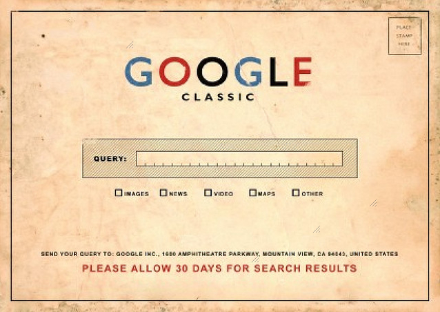
If the notion of allowing a thirty-day wait in red bold letters is the best addition to this artificially aged virtual post card, the app “Historic Earth” offered touchscreen reminders of the pastness present in a landscape that was ever mapped for a short time, in a neat if cautionary collaboration between university libraries and iTunes.
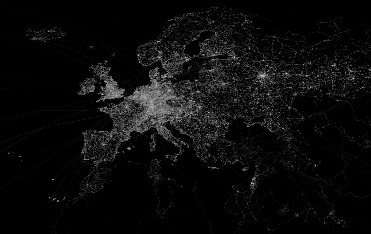
The re-use of maps that this app encouraged provide an interesting case of the circulation of older maps that digitization allowed. It’s as if Google Earth teamed up with an expansive archive of older maps, allowing us to summon on screens images of place which retain feel and detail and of paper originals, which were georeferenced to modern maps of the actual positions where one stands, using the background of an OpenStreetMap to suggest a layering of a map of actual space. (OSM is a crowd-sourced alternative to Google Maps that provides a platform to load maps inspired by Wikipedia, whose over 600,000 contributors offer GPS readings, often taken with simple handheld units, aerial photographs, and other geospatial data, in the largest collective mapping project on Earth; the non-proprietary notion of the map OSM uses lends itself especially well to “Historic Earth.” The service is also popular as an alternative to default backgrounds in GPS receivers.) The astoundingly large trace-density of OSM in Europe alone make it a perfect model for providing a background for older maps, as is made clear in a map Eric Fisher plotted of its specificpoint density:
The value of such a comprehensive open-source database facilitated the very features of geolocation “Historic Earth” boasted as its central selling point–providing an easily adjusted template of even broader scope than the uploaded maps covered. The concept of geoindexing a variety of older maps for daily reference is exciting, but the curiosity in older maps of all places was not uniform for all sites even the marketers realized that the interest of split-screen historical maps of few places were as compelling as those of the built environment of New York City, and even these poorly translated to an iPhone’s small screen:
The contrast of a cut-screen overlay was :

How did the OSM background help “Historic Earth” work to view local landscapes through the screens of old maps? On the one hand, the app “Historic Earth” provided a great way to appreciate the map as a human artifact–as well as, more obviously, an earlier sedimentation of human space. The maps that were made available in the app–formerly available from iTunes at bargain basement prices of $3.99 (£3.99 in the UK), uploaded from digitized images of the Osher Map Library, synchronized to one’s own GPS-determined position. Rather than map actual space, or presume a single point of view, the app offered users a form of virtual time-travel through scanned media: the experience of looking at an archive or junk store (or glove-compartment) is collapsed into the real-time consultation of a range of maps of wherever you are; the maps rotate in synchrony with your current location–so long as that location has been mapped. (The availability of maps of North American cities is evident in the below screen, for example, especially of the Northeast, LA, and Midwest, as well as parts of the Northwest around Seattle: urban views, one would guess, would work the best on this sort of app.)
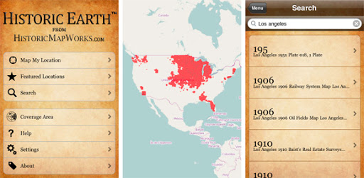
Representations of a geographic space were geo-indexed for viewers, who could choose the epoch, from among the available years! The strikingly high-res app reflects the large collection of digitized maps of Historic Map Works, which already boasted a “geographic time machine.” The app goes further than digitization by providing a crucial element of geocoding to index this sizable virtual archive of over one million property maps, old road maps, antiquarian atlases, nautical charts of oceans, star maps, and views of place. Their digitized collection constitutes something of a veritable grab-bag of images–predominantly focussing on North America and including England and Ireland, and while this is not able to provide the universal coverage one would like, the collection mirrored a considerable market-share. In short, the app provided access to the world’s largest single collection of geocoded maps, both to “map the history of cities, times, buildings and landmarks” and “watch the landscape change over time.” Historical Earth offered viewers readily accessible proof that all landscapes had a history.
Whereas Historical Map Works grew out of the internet ancestry industry, with the somewhat interesting demand to ‘visualize where your ancestors lived,’ albeit in schematic form, the app offered a counter-map to Google Maps, or anti-Google map, at the same time that app’s coverage grew, by exchanging a standard or uniform Google Earth visualization for the proliferation of a multiplicity of maps from historical eras–raising questions, I suppose, of where the market lies. The expansion of this app at a heady time of the expansion of totalizing catalogues of images on-line mirrors the extreme optimism of a widely usable web interface for digitized maps. But the range of time that folks seemed interested in looking at old maps was limited, in comparison to other mapping software. Unfortunately, the app launched in October 2009 received mixed reviews, and folded the following year, despite the 32,000 high-resolution images of American cities and multiple antiquarian maps it promised to correlate. But the app deserves examination as a response to the widespread digitization of images.
Historic Map Works met the antiquarian in us all with the desire for a material record of place, by allowing us to order our own “personalized maps” of place suitable for framing above the fireplace or in one’s library, a ready-made family heirloom. In contrast, the app would allow one to flip through a variety of maps at any site, through views oriented relative to your actual position, providing a record not only of space but, documenting “changing space perception” as Urban Tick put it, by comparing the changing manners for representing the salient features of a place where one is actually located. The special feature “lock frame when browsing maps” allows one to select a demarcated frame of reference–and a rubric for placing one’s position relative to areas of the maps one might want to consult–to make it far easier than dealing with originals that might demand a similar practice of orienting oneself to each map as one goes through the requisite period of initial orientation to gain one’s bearings.
But is this really not a diminishing of what one might call map literacy, or the ability for reading information from maps? In a kind of antiquarian’s Google Street View, one can look through sepia-colored lenses at the past, condensed at a safe distance and with only an aura or hint of materiality, arrayed on the screen of one’s tablet or phone, adjusting the map by a slider in the same way that one reads Google maps, panning and zooming on a touch-screen, and in essence forgetting how maps are read. It creates, as well, some wacky hybrids, so that one can imagine oneself keying one’s position to a mid-19th century map while strolling in lower Manhattan, by the same iconography of a Google Map:

That could be fun. Or, if it would be any use, while driving in a landscape that you thought was familiar, but might want to see exactly how upper Manhattan looked and was mapped a hundred and fifty years ago:


Pingback: Who Doesn’t Love Maps? « Two Different Girls
Russian Standard lie