While we’ve been driving ourselves to distraction with the distortion of the electoral maps, projecting the failure of our system of government in the specter of “tied” electoral contests in which the vote is thrown to the House of Representatives, rather than anyone having a vote, we as if realizing the real fears of disenfranchisement that are all too palpable in the current status quo. The possibilities of choosing a President in a polarized nation have led, not only to consecutive weeks of polling so closely within the margin of error to be set many to rip out their hair, but also inevitably ratcheting up the fears of violence–and violent confrontation–at the polls.
As if a concrete version of swinging, the fears of fists swinging at the polls seemed all too real, perhaps in the memory of January 6 still fresh in some minds, and the major actors, decentralized and all-male actors seeming to respond to Trump’s rhetoric, claiming that they would “show up” at the polls, as Ohio-based groups posted “the task is simply too important to trust to regular normies,” legal norms, or boards of election. All ratcheted up fears that the election would be stolen, amplifying anxieties about the authority or legitimacy of the election. by taunts that “FREE MEN DO NOT OBEY PUBLIC SERVANTS” on alt right social messaging platforms before Election Day. The Proud Boys, famous for having been told by Donald Trump in past Presidential debates to “stand down and stand by,” now stood “locked, loaded, and ready for treasonous voter fraud.” The demonization of public servants and the civil service, only to be amplified by the Trump White House in later months, was indeed launched within the election.
The feared violence did not happen, but a violent shock seemed present as votes were counted in a new electoral map, as the battleground states that had long been contested seem to have folded, and shifted red. But Trump’s ties to the Proud Boys–or the ties that were not only seen on January 6, but even back to the “stand down and stand by” remarks in the Clinton-Trump debate that curried so much favor with the radical alt right group. Indeed, they raise the question of whether, even if violence at the polls or voter intimidation did not occur, it still makes sense to map the electors in purely partisan terms, in this most polarized of ages, and how much that polarization rests on the personal power that Donald Trump has gained. But we have retained the map of “red” and “blue” states as a visual shorthand, dating twenty years ago on the television news, that has dominated our understanding of partisan divisions, and indeed been naturalized as a shorthand of political brand, able to take the metaphorical temperature of the nation and “decide” its leadership–even if the cartographic shorthand may be outdated in the era of the strongman. And we have forgotten how narrow the election was, as Trump has claimed a “mandate” while in fact loosing the popular vote, on the basis of winning six swing states–as if those close margins of victory, and a failure to gain a majority of the votes in what was for all practical purposes a two-candidate race, led to an electoral map that was rather divided–and offered little consensus–despite an illusion of a continuity of red states, rooted in the less educated and more economically disadvantaged ones, who bought Trump’s deceptive assurances of the arrival of lower prices on food and gas.
Have we allowed our minds–and our journalists’ minds–to become too filtered by the distorting principles of electoral maps? William Galston, an observer of elections and insider who worked for four presidential campaigns, ran with this cartographic metaphor, noting that if political parties had gained and lost ground in states and regions in earlier eras, we “live in an era of closely contested presidential elections without precedent in the past century.” As one candidate promises to divide us like we have never been divided, we are divided by the smallest of shifts in voting patterns, the electoral map of “the contemporary era resembles World War One, with a single, mostly immobile line of battle and endless trench warfare”–that reflect the increasingly and unprecedentedly sharp partisan tenor of our politics. Galston argued this was increasingly true in 2020, the election when states’ partisan opposition seemed to harden over forty years–if not sixty?–despite the interruptions of the Clinton and Obama years, the rare excerptions. But this divided landscape gained a terrifying sharpness that crystallized in how seven “battlegrounds” decided the election in 2024, justifying outsized attention from Presidential campaigns in the 2024 election.
Even as the United States Justice Dept. monitored twenty-seven states–and some eighty-six jurisdictions!–to ensure compliance with federal voting rights laws, prevent voter intimidation, and law enforcement agencies were braced for violence, no cases occurred–despite tangible fears of violence or intimidation. But the shock of the red map lead to existential worries of a story that ended in the wrong way. If 77,000 votes from Wisconsin, Michigan, and Pennsylvania put Trump in the White House the first time, in 2016, a big push from all three states did the trick by promises to a Christian Right. Even if Harris cut Trump’s lead in the battleground states, Trump continued his advantage in battlegrounds of the light blue Democratic victories of 2020. And so the first returns in the Election Day scenario of the 2024 suggested a shift in the landscape rightwards, a mass shift Trumpwards, in fact, that had not been seen before, a shift in collective action and identity voters adopted en masse–as if rejecting partisan allegiances to run against the polarization of the past–
CBS News/November 7, 2024
–that provided a new landscape by the evening of November 7 of increased margins of victory from 5% to as much as 20% among for the party that had undeniably become, as many fretted, the Party of Trump, in ways that tested the carving up of the electorate into demographic groups or genders.
The array of arrows lurching red seemed to blanket the nation appeared nothing less than a major electoral paradigms. And the victory of Trump was not a victory of the GOP, but a confirmation, in some sense, of the full takeover of the Republican Party by Trump’s promises of making things right again, promises that seemed more concrete in its details–even if they were largely vague assurances, moral victories of slim benefit like the restoration of values and end of access to abortion–promises at well in exurbs, far from cities and urban disturbances, from private equity to prisons to gaming to casinos to gun advocates, finding a gospel of mall government and low taxes, a salve to anger at pandemic restrictions, an exurbia on the edges of cities, fleeing all disturbances to an elusive status quo, believing hopes of bracketing costs of global warming and near gaining a critique of Trump’s abundant lack of any actual economic plans.
CNN, November 7, 2024
The sudden parsing of the flow of margins erased the red state-blue state electoral map, with a precinct- or county-based tally of margins from the previous election, seeking to size up candidates by socioeconomic or other groups, but confronting an apparent large-scale shift of the electorate. Trump’s victory was not overwhelming in its margins, but re-mapped most large stretches of the country red left the notion of “red” states in the past, to augur a new landscape for the United States–not only in domestic policies, but, of course, its relations to the wider world. But it was more than decisive, and the “break” in many districts once dependably mapped as Democratic voters to Republican suggested a wake-up call, even if the election was by no means a landslide: it felt like one, and that nagged one’s mind and would in days to come. And, perhaps more importantly, the perception of a landslide–even if it was by small margins–was exultantly viewed as a license to remake the government, remake the presidency, and redefine the role of government.
The bitter truth Trump did well among, non white voters, lower-income Americans, and women cannot be explained easily, and surely not by class-based disaffection from Democratic candidates.
Red Shift across American Landscape Showed a Decrease in but 240 Political Counties/New York Times
Despite fears of violence, the eery absence of any disturbances paralleled the rightward swing of the American electorate, evident in the rightward swing of voters not only in those seven “swing states” but the great majority of counties across the nation evident as the first votes were tabulated on election night. This was a punch to the right, a lurch right save spots in Georgia, South Carolina and Michigan–once considered swing states, to be sure, but now trending red. How did all the so-called “swing states,” uncertain in their voting practices but which we had been reminded from the summer, would, in fact, be selecting the President as much as the country, swing red in ways that seemed more overdetermined than seeming news?
The map hit viewers like a slap in the face, a rude awakening of heart-breaking disconnect with America, but was also cause for a recognition of deep-lying and relatively dark undercurrents that found grounds to turn away from a convincing female candidate, even in favor of a convicted felon. The bomb threats on election across swing states provoked fears of a conspiracy of Russian origins, but the lurch seemed terrifyingly home-grown and domestic, and seemed profound. It was only as more votes came in, early results revealed a shift of over 90% toward Donald Trump, a terrifying landscape indeed, but as the votes continued to be tabulated nationwide, the electoral map and the tally of votes suggested a narrow victory, in many senses, as more votes came in from California–but revealed the stubborn draw of this year’s Republican candidate, former President Donald Trump, who attracted voters across many of the states once thought in play. Candidate Trump currently only leads the vote count by 2.5 million votes nationwide, but the large turnout paradoxically benefitted him, suggested the special draw that he had as a candidate among many voters, from a far more “diverse” background than Republicans had indeed ever assembled.
The light pink areas that were not so dominated by Republican voters presented a fractured landscape that broke the wrong way, and did so by small margins and very much perhaps for not the right reasons. But the break in votes was striking, as if able to be mapped as continuous regions. We are still haunted and traumatized by the mapping of the way the national population had split in 2016,–of siloed blue towers, removed from he rest of the land, a hived off vision of politics that we faced with frustration as Trump entered the White House for the first time–winning the backing of the interior forty-eight with an intensity not reflected in any earlier polls.
We had pored over those maps that haunted our minds with endless precision as data arrived on county and district level, to search for signs of the anatomy of the loss, hoping to grasp the gaping division of the national vote. Did Trump’s continued appeal redraw the political landscape, or was there something wrong baked into aggregating the general will? Did tailored talking points about access to abortion and an attack on price-gouging fail to motivate voters, or provide a convincing narrative of steering a more vital economy, or at least a convincing trust in the law?
Or, the voting map almost seems to beg the question, were we relying on the wrong maps as we focus on electoral maps, and ceaselessly made new maps for electoral prediction, seeking to craft multiple scenarios for how electoral votes would fall out this time, scenarios whose endless proliferation seemed a suspension of agency? The real maps of the election lie far outside demographic metrics not mapped by demographics or class or race or gender divides, but a space of a lost community, where the battle cry to Make America Great Again exercised undeniable appeal.
The massive scale of the red shift evident by the morning after Election Day was a wake-up call that suggested a changed landscape. The red arrows lurching right seemed evidence of a disconnect of Democratic campaigns and candidates that provoked an immediate introspection and conveyed the shock many felt in he nation. Amazingly, rather than the election being close in any way, it seemed, the election that was long said to come down to thin margins of voters, per the polls, were upended. Trump’s margins built on 2020 and significantly grew in 2,367 counties nationwide. The red arrows overwhelmed any of the fears of heightened violence in Trump’s political rhetoric elected, with the demonization of opponents, or indeed just suggested they were meaningful rallying cries far more successful than polls had showed or political junkies had expected.
Can we believe anything from the office of Governor Ron DeSantis? It was the height of irresponsibility, but one that should make Jack Dorsey breathe a sigh of relief that at last he is no longer responsible for Twitter: the Florida Secretary of State used bad data about the rates of COVID infection around the nation to trumpet the peninsula as a vacation land as a safe space in the pandemic, using an utter absence of ethics to promote disinformation about viral spread in the peninsula that almost echoed the denialism Governor DeSantis long promoted in bashing vaccines, masking, or market constraints as a way of combatting viral spread, even if his assertion ran against established ideas of contagious disease and viral transmission. Florida is facing numerous existential threats, from sea-level rise to saltwater flooding of coastal areas, but promotion of the state as a site of safety from the global pandemic was the height of duplicity.
Exercising the prerogative DeSantis long claimed to guard the health practices of Florida, apart from the nation, his office and press secretary must have been thrilled at the latest pre-Thanksgiving COVID data vis that the issued by the CDC, that showed Florida as lying apart form the nation in a bucolic preserve of blue of low coronavirus transmission rates. The announcement by Florida’s Dept. of Public Health on June 8, 2020 of the first twelve deaths due to COVID-19 in the state of Florida 0, when just over 63,000 were testing positive in the state, led the DoH to promise to “provide more comprehensive data,” releasing daily reports on COVID-19 cases in Florida on the DOH COVID-19 dashboard is also providing updates once per day for every Florida county, “available here,” of new positive cases, that state residents and the nation watched rise. If folks had become habituated to dashboards as a way of accessing up-to-date data on viral transmission and public health, the tweeting out of a map that integrated outdated data on infections in Florida with shifting national picture as even as the arrival in the United States of an Omicron variant put a chill on national travel over the Thanksgiving weekend, but year-end travel was predicted to see a rise in air-travel that would approach pre-pandemic days.
The Age of COVID has encouraged an amplification of graphic story-telling about the hot spots and safe spots of viral transmission or local virulence. And the infographic appearing to label Florida, the nation’s storied vacationland, as featuring far lower community transmission seemed ripe for a retweet. Caroline Pushaw, Florida Governor’s social media savvy press secretary, seems to have issued it as an invitation to the state’s winter beaches, as if Florida policies had, despite anti-vaccination campaigns and few masking mandates, gone beyond other states in reversing the high rates of COVID-19 mortality that once afflicted the state per public dashboards of years past.
COVID-19 RIsk Rate/Harvard Global Public Health/Talus Analytics July 2020
Gov. DeSantis was a huge denier of the infectious nature of the virus, even resisting Trump’s own calls for Americans to stay at home when possible to contain virtual spread, arguing that imposing any “lockdown” and “shutting down the country” was an excessive response. DeSantis’ prominent place in Trump’s inner circle of response to the pandemic increased his profile in the COVID response, and inflated his own sense of national responsibility, as well as causing his pro-business policies to shift in March 2020 by closing Florida schools in the end.
The national map of community transmission rates attempted to bolster Gov. DeSantis’ national credibility. The arrival of the Omicron variant, boasting over three times as many mutations as the delta variant, became an opportunity to boost perceptions of Gov. DeSantis’ public health creds. Despite the Governor’s vaccine denialism and diminishment of public health risks–and utter lack of interest in vaccine equity–low rates of transmission offered a useful icon of peninsular identity to promote the governor on the national news, from FOX to OANN, as if to suggest that “as winter approaches,” Florida was doing something right–as if in an invitation to the nation to make travel plans to consider visiting the sunshine state.
It must have been clear quite immediately to DeSantis’ press secretary, who tweeted it to her 22,000 Twitter followers as evidence of an ethically dubious ethical invitation to the Sunshine State for future travelers–per what seemed currently reported transmission levels. Strikingly, low levels of community transmission in most counties south of the Mason Dixon line would obviate the need for mask-wearing even in public after the arrival of new variants, although not the bulk of the nation, colored red for high levels of transmission that merited masking in the all counties colored red for high levels for which the CDC recommended masking in public to contain potentially very dangerous COVID-19 transmission in the form of new variants.
But the map “lacked” a legend and was in many ways cherry-picked–or based on cherry-picked data, as the statistics for infections in Florida were decisively from an earlier date than the rest of the country, artificially rendering its community transmission rates low. It seemed as if the apparently real-time picture was evidence of a stark change of events that talking heads debated as if it were proof and evidence of DeSantis’ underestimated smarts in pushing back against national health policy. Yet the story is far more complicated–and far more Machiavellian–as the pristine blue image of the state–a blue aquamarine that handily recalled those beaches and sun’n’fun for which Florida was long celebrated in the national imaginary-was based on counts from a different time than the dates of cases in all other states, conveying the appearance of salubrity when that was not the case.
Did the state’s office really fudge the public data on its case rates, which it had long ceased releasing daily, using outdated numbers to showcase an apparent contrast sharply evident on state lines? The meaningful legend that might be juxtaposed with the “snapshot” that the delayed reporting of statistics of coronavirus transmission in Florida shaped might be the way that the state had in fact earlier been rocked by successive waves of coronavirus infections, a roller coaster of infections of which the state Governor, who had only recently unveiled a new image for the separate task force of the state that showcased its unique health policies, seemed oblivious, but whose bursts of new cases of infection seemed the bête noir against which DeSantis was forced to tilt in the public eye.
For in taking the emblem of an alligator fiercely guarding its territory, must have loved the data visualization that “mapped”–if deceptively–the improbable case his unique health policies not only separated Florida from national guidelines, as a paradise free from mask-wearing and vaccine mandates. It was a perfect case of how maps lie, which removed him–or his press secretary–from any liabilities, as the map gained a robust afterlife on social media, free from the constraints of real public health data or true comparison of COVID case counts.
October 21, 2021 by @GovRonDeSantis
Modeled after the Gadsden flag, the image radiated a stubborn sense of obstinacy as the omicron variant lead to renewed fears of a new spike of coronavirus in Florida, worry that found an odd counterpoint in the map the press secretary took comfort in tweeting out. Yet by Christmas, the gift of the CDC data vis seemed not the gift that keeps on giving at all, as Omicron infections had hit the Sunshine state, proving that its barriers were hardly fixed frontiers.
Although most all Florida had been colored red for much of the summer–amidst concern for the Delta variant, and for “breakthrough” infections–and the new tracker map seemed a lucky break. As the omicron variant leading to rising fear of a new spike of coronavirus in Florida, DeSantis’s press secretary took comfort in an opportune recently issued CDC map to suggest that, low and behold, things had changed, and current COVID visualizations showed “low transmission rates distinguished the panhandle and peninsula, as if the state public health policies had in fact, contrary to recent pandemic history, been doing something right all along.
The crisp borders of low community transmission that seemed to define Florida seemed to be a tip-off, even if the image that was tweeted out was picked up on FOX-TV and other “sources” of right wing or alt right news. The image of a combative alligator defending its territoriality, as a sign of local resilience before fears of rising rates of infection and hospitalization, and is now available at PatriotFlags.
The image of defending a swamp fit DeSantis’ promotion the ports of the Sunshine state as the logjams in ports on the east coast and west coast created problems for transportation hubs in California, Washington state, and New York. “We’re also seeing increased costs, inflation, and higher food prices,” he added. “We in Florida,” DeSantis ventriloquized for the state, showcasing his mastery of boosting public health with the bona fides of a newly minted pro-business eecutive, “have the ability to help alleviate these logjams and help to ease the problems with the supply chain,” with little care for vaccine mandates: In Florida, “At the end of the day, you shouldn’t be discriminated against based on your health decisions.”
When Christmas did come, it didn’t seem that the state of Florida was particularly bad off in relation to the rest of the nation–but the rising death rates related to COVID-19 dramatically grew across the peninsula in truly terrifying ways, drenching the peninsula pink, and belying those low transmission rates about which Gov. DeSantis’ office was so eager to tweet out.
The level of disinformation is rather without precedent, but speaks in many ways to the hyper-reality of maps of COVID-19 infection that were based on rather dubious and incomplete data providing a rudder in an age of uncertainty. DeSantis’ press secretary tweeted out the CDC map to bate the anti-vaccine commentariat. Arriving pre-Thanksgiving, it seemingly celebrated the arrival of a new state of salubrity: the boundary lines of Florida popped bright blue of unearthly nature not because of what Florida was doing right, but was based on data of community transmission rates at days behind the rest of the nation: state data days out of synch with the national norm created the impression of statistically low transmission rates in the state, and south of the Mason-Dixon line, affirming how things were always better in Dixie.
DeSantis had been comparing the low rates of per capita COVID mortality in Florida, despite its large share of elderly, from March, 2021, claiming higher mortality rates for seniors in forty other states had offered evidence that his policies were indeed far more effective than those states that mandated lockdowns and suspended schools, insisting on the benefits of helping businesses and keeping local commerce flow. As FOX news commentators spun the CDC map of community transmission rates as evidence of nothing wrong with fighting masking mandates, or vaccinations.
Yet by mid-December, 2021, reality had reared its ugly head. Skyrocketing rates of infection from the Omicron variant proved the folly of asserting any containment of the coronavirus that any policy of one state might so easily fix, as the high rates of infection shifted the panorama of the pandemic, with the fifty millionth case of COVID-19 recorded, and deaths due to the virus across the country topping 800,000–far more than the deaths of the US Civil War, by recent estimates, and more than the current population of Seattle. And if Florida was increasingly as red as the nation, the rise of COVID death rates by the month’s end had effectively eroded all of DeSantis’ suggestion of the benefits of adhering to alternative models of public health care.
CDC Dashboard, December 2, 2021
If the arrival of the Delta variant had led to the growth of mortality by another 100,000 in two and a half months, the advance of the more transmittable Omicron would stain the whole map red, bridging boundaries and state divides, as thirty three states hosted large infections, with little clear relation to their health policies–save perhaps low population rates and density. By Christmas 2021, national dashboards of infection rates made it clear that Omicron infections advanced not only through the northeast but along the sandy beaches of the Sunshine state.
National COVID Infections/Mapbox December 20, 2021
Yet that single CDC map in the header to this post suggested low COVID transmission rates in Florida was suspiciously more than opportune. For it suggested, lo and behold, starkly lower transmission rates across the panhandle and peninsula, as if the state public health policies had in fact, contrary to recent pandemic history, been doing something very right all along, as DeSantis continued to fence with Joseph Biden’s attempts to devise mandates of mask-wearing and vaccines, all but defining himself as a sort of shadow-government in opposition to the White House, in the manner, say, that now-disgraced Governor Andrew Cuomo and California’s own Gavin Newsom played to Donald Trump, as if voices of stability in the time of need. DeSantis had provided an alter-reality of risk-free no masking or vaccines, freedoms at work and at school, refusing to limit the social interaction and tourism that Florida needs–even accepting cruise lines and offering to provide shipping ports–arguing that reopening was indeed in everyone’s interest, variants be damned: could it be that the CDC was offering a map validating that his policies were working well after all?
Florida boasted low transmission rates, putting the past history of the pandemic in the past, and effectively inaugurating a new news cycle that made this the map to count on and trust–the one dated that very day!–and putting lack of COVID vaccination out of folks’ minds as they booked their family travel plans for late 2021-2. Florida regained its storied status as a site for healthiness and well-being, unlike, it looked at that moment, like the rest of the nation, leading FOX commentators to spin new stories about the long-term success of DeSantis’ absence of clear public health plans.
For although Gov. DeSantis had pulled the plug in June, 2021 on a public-facing COVID-19 dashboard tracking daily updates on cases, deaths, and open hospital beds across the state, inviting those glued to their computers to take two giant steps back from the spate of emergency preparedness that seized the nation from March 2020, the CDC data vis plotted handily outdated data, skewed from rising rates of Omicron that were spooking the nation. As there was no public source of infection rates in the state that was available anymore, the disturbing orange dots that crowded the Florida beaches on the COVID dashboard of the past seemed like it was dispensed with, and the seas calm and skies rosy in a bright blue of low transmission levels–despite DeSantis’ longstanding opposition to vaccine mandates or even public masking across the state.
Instead, the spokeswoman of the DeSantis regime tossed to right-wing news sources a rosy picture of the calm waters of Florida–he must have loved the blue azure that the state was tinted to proclaim low community transmission rates over the Thanksgiving weekend, as if it was a sea of tranquility in a nation that was revving up as word of Omicron spread. (“I hope you make it through Omicron,” the man behind me in Whole Foods said as if a neighborhood sage, finger of the pulse of the rising national pandemic anxiety that had recently seemed safely in the rear-view mirror.)
The CDC image of transmission offered a useful icon of peninsular identity for DeSantis’ media savvy press secretary, who tweeted it out to her almost 22,000 Twitter followers as a dubious ethical claim of the health that the Sunshine State held for all future travelers, according to the current community transmission levels. Indeed, as this detail of the data vis shows, the lower than substantial levels of community transmission in most counties south of the Mason Dixon line would obviate the need for mask-wearing even in public after the arrival of new variants, that the CDC had advised for all counties colored red for high level of transmission.
David Schultz/Orlando Sun Sentinel from US Center for Disease Control Data
The striking if deceptive visualization that Ron DeSantis’ press secretary tweeted out on Thanksgiving morning had the benefit of depicting the desired “low community transmission” rates that seemed to confirm DeSantis’ attempts to bolster confidence in his public health policies, even if his longtime war on vaccination was not the success story that the map showing the state as an island of relative salubrity was based on an outdated tally of infection rates in the state whose public health policies seemed a concerted effort to sew fears of vaccine safety. DeSantis’ press secretary, who has cultivated a broad presence on twitter since gaining the job, aimed to promote public perceptions of the success of the Governor’s bellicose strategy of vaccine denialism and scoffing diminishment of public health risks.
The data vis was important to tweet out at 6:30 am to hit the national news outlets, because it helped begin or frame a narrative that Christina Pushaw, who had long questioned the value of a “piece of cloth” and long defended the Governors’ criticism of mask mandates. The low transmission rates that cast the peninsula as an island of salubrity amidst national rising fears distinguished Florida as a rare area in which the CDC was not returning to recommend mask-wearing even among those vaccinated–at least per appearances, or a superficial reading, endorsing the exemplary nature of its public health protocol. Unlike most all counties in the nation, prominently colored high-risk red to indicate the return of high transmission rates, Florida (a “red” state) was bright blue as a safety of haven as it had, conservative media argued, weathered out the storm of masking hysteria. All of Florida had been colored red for much of the summer–amidst concern for the Delta variant, and for “breakthrough” infections–and the new tracker map seemed a lucky break.
But the data was off, way off. In fact, the data vis used cherry picked numbers of a previous days that concealed the hight rates of transmission that existed for southern Georgia and all of Florida–as an updated vis of community transmission for the very next day revealed. The shifting image of transmission rates suggested the lag in data that the state was providing the CDC, as well as the greater risk for variants the nation now faces as a whole. But the data vis, entered into the media cycle of the nation, threw many off ground, in its apparent objectivity. Perhaps that was the job of a press secretary: to distribute any image that provided cover for the Governor who had faced criticism for his handling of COVID-19 by fashioning a new media cycle.
So intertwined is travel with the identity and economy of the state, that it was no surprise that the Florida beaches already made it grounds for public health concerns, and the measures during Spring Break, 2021, gave rise to a spike of COVID cases from new variants. In Spring, 2020, infections in Florida had just begun as its beaches filled, and rose again in the summer; but this Spring seemed the textbook case of exactly “what a lot of public health folks have been afraid of.” Increased partying brought rates of infection of a magnitude six times greater, with up to five variants, in the second spike of infections in the state.
The Governor came under fire for his resistance to mask-wearing, social distancing, and toleration of partly open restaurants and beaches, as the coronavirus literally ate into his popularity, and he became something of a “mini-Trump” as Trump’s popularity slid, and many questioned if his positions reflected political expediency and short-term gain, rather than Florida’s interest. But by May he was proclaiming “landmark legislation” banning “vaccine passports” in the state, boasting that the state had, unlike others “avoided protracted lockdowns and school closures in Florida because I have refused to take the same approach as other lockdown Governors,” boasting that the legislation forbade the danger of arbitrary school closures or shutterings, and that “In Florida, your personal choice regarding vaccinations will be protected.” A year after school closures rocked the nation, calling for a rededication of state funds to pay parents for home schooling on FOX, the economic nightmare of state over-reach replaced fears of infection.
March, 2020
DeSantis’ sense of himself as a savior grew in public statements and edicts denying any government overreach, his national ambitions were evident. Arguing that while many other states were just beginning to re-open, Florida was responsibly opening up. He cast the new COVID surge as but a summertime blip, as he embraced “freedom” as a choice of parents by keeping schools open, refusing policies of masking in public, and questioning the wisdom of masking or vaccines, even threatening to not pay county officials who enforce mask mandates, trusting the survival of FLorida’s tourism industry would consolidate his status. Governor DeSantis stood his ground as an ardent supporter of his anti-masking policies and a Trump legacy. He attracted admiration and interest of the communications professional, Christina Pushaw, whose admiration of how DeSantis stood up to “persuasive . . . false narratives” begun in the public press. Pushaw all but publicly identified herself as a new press secretary for the beleaguered governor, whose admiration of his public heath policies, landed her a job but helped to transform the press secretary to an alternative news source, to remap the risk of COVID-19 by a new public health narrative–a narrative that, until recently, had only lacked the right data maps to treat her office’s social media as a new news source.
The rise of infections in Florida echoed the first opening up Florida to tourism in early May, 2020 that continued through June. The recent promotion on social media of the low transmission rates in the state suggest difficulties in balancing a parallel calendar of tourism on which Florida has long relied to the accurate tally of community transmission–a tension that may go back, for Governor Ron DeSantis, to his office’s extended tussles with the GIS analyst at the Florida Dept. of Health who first constructed the dashboard of daily and cumulative infections in the state.
While the Governor had claimed that he would “follow the data” in his opening plans, there were deep concerns that the data was not transparent. When Pushaw wrote a set of attack pieces on the GIS analyst who felt that figures of infection rates were being manipulated, massaged or suppressed infection rates, DeSantis’ Lieutenant Governor promoted it as evidence of “one of the biggest media fails during the pandemic.” DeSantis soon gained a new press secretary, who had essentially applied for the job by praising the skill with which the Florida governor had resisted public masking and vaccines, working to combat the “devastation caused by socialism . . . happening in our country,” and assailed the “big lie” about corruption that a GIS analyst had charged the state. The woman who had worked as an attache in Georgia for Mikheil Saakashvili, now working in Ukraine, might not be a common itinerary to Florida’s Governor’s office, but Pushaw wrote, “If there are any openings on the governor’s comms team, I would love to throw my hat in the ring.” Having assailed the GIS architect of the Dept. of Health COVID dashboard, she offered her services to Florida’s embattled governor to shift attention from COVID-19 infection rates.
After taking the post, Pushaw cultivated a broad social media presence by tweeting some 3,800 times in her first month on the job,–including one arguing watching one’s weight was more protection against COVID-19 than “a piece of cloth” or mask, and promoting the state’s organization for Florida residents of free “antibody infusion treatments” across the state.
State-Run Monoclonal Clinics for COVID-19/@GovRonDeSantis, August 28, 2021
While the map of “state-run treatment sites” seemed to counter the data visualizations of local infection, it tried to set a counter-map to images of level infection or mortality. The notoriety of COVID-19 cases in Florida must have encouraged De Santis’ press secretary to retweet a CDC map dated November 25 that appeared to document low transmission rates in almost all state counties–offering evidence of the healthiness for Christmas visitors. Notwithstanding its Governor’s longstanding resistance to masking and infrequent masking in public spacearding one of the biggest media fails during the pandemic.”. The map retweeted early morning on Thanksgiving Day a shout-out for shifting public perception of the state, as it paints the state as the being sole site of “low” community transmission in the nation, and followed the calls for more praise for DeSantis’ brave strategy of handling the pandemic, since Pushaw became press secretary, both from the Wall Street Journal (Media Ignore Florida COVID Recovery,” October 31, 2021) and Fox News, on which DeSantis echoed Pushaw’s points as he claimed poor media coverage in relation to COVID-19 “deadly” in mid-November, after a rough summer in which 60,000 deaths related to COVID-19 afflicted the state. In early November, One America News Network promoted a special report from this summer (“America’s Governor and Florida’s Grit”) about DeSantis’ guaranteeing of increasing access across Florida of “a life-saving COVID-19 drug” that reduced severe illness.
It was hardly surprising with such lead-up of an alternative narrative on Conservative news that Pushaw seemed to seek to boost the narratives that were launched in conservative media when she retweeted a new data map of COVID community transmission news on 6:30 a.m. Thanksgiving morning as if to target Christmas travel plans to be discussed at the harvest feast that rather highlighted the far lower transmission of COVID-19 relative to the rest of the country as fears of COVID variants multiplied nationwide. The map with national imprimatur showed a drop of community transmission levels in Florida alone, and seemed to offer some back-of-the-envelope evidence that the spikes of previous years in the southern states and in Florida had created local resistance to the coronavirus and its new variants.
The bifurcated image of the nation that showed Florida as, essentially, the sole site of low COVID transmission, would be sure to attract attention and conversation, political ethics be damned. Flying in the face of the longstanding resistance of Florida Governor Ron DeSantis to curtail out-of-state tourism that encouraged him to keep the state open to travel, DeSantis’ new press secretary used the map to show Florida open for tourism, after having weathered three waves of spiking coronavirus infections. Perhaps the state’s poor planning for public health in the past by lifting guidances ofr mask mandates might, DeSantis ventured, create safety in the beaches of the Sunshine State in a winter of variants, as the ‘conservative’ media–Wall Street Journal and FOX–had hinted might be the case.
DeSantis’ groundless claims of safety found somewhat predictable support from FOX commentators in sustaining “natural resistance” to COVID-19 from past exposure, a “natural” immunity better than vaccination, was a data-based strategy, although what sort of data they were using is unclear. (The CDC finds those who had recovered from COVID-19 but were not vaccinated were five times more likely to contract it again than the fully vaccinated.) The conflicts DeSantis’ office seemed to manage between a state economy dependent on tourism and the calendar of increased community transmission suggests a lack of transparency, but also a duplicity based on improvised off-the-cuff diagnoses of a dangerous disease.
The lack of COVID-19 transparency that had been a continuing issue in the state since 2020 had reared its ugly head again, and just in time for post-Thanksgiving Christmas planning. Indeed, the absence of transparency was particularly troubling as we increasingly depend on dashboards, tracing, and positivity rates in grappling with the virus and its ongoing mutations. As the self-declared attack dog of the GOP, Governor Ron DeSantis was by 2021 boosting the dubious concept of “natural immunity against COVID-19” as the forefront of a fight against mandating vaccines for large businesses, exempting from vaccination all recovered from Covid; with full vaccination rates in Florida about 60%, around the national average, Florida ranked twenty-first among states providing at least a single shot to residents. Those already vaccinated in Florida were mostly elderly–a demographic on which DeSantis had dutifully concentrated to provide the vaccine. But many residents in the state, liberated from mask-mandates, were partying, barhopping, hitting the beaches, as masking was unenforced at schools, kept open five days a week, or on cruises–DeSantis promised cruise ship companies that in Florida, they wouldn’t need “vaccine passports.” Bahamas Paradise Princess Cruise Company promised that “safety, fun, and vaccines” were all priorities as it docked in Palm Beach on June 25, having suspended per CDC regulations on March 14, 202, and the fireworks festivies cancelled the previous July 4 due to COVID restrictions were planned again, now with a Cuban reggaeton as a featured guest for the festivities, voluntary masking, as Florida as a state checked out from updating its COVID-19 dashboard, tracking updated cases and deaths across the state.
Governor DeSantis, amidst COVID spikes, emerged as a Trumpian cheerleader standing steadfast in against a “biomedical security state” as COVID infections spiked yet again: “Florida, we’re a free state–people are going to be free to chose to make their own decisions.”
Daily Cases of COVID-19 Reported in Florida by State and Local Health Agencies/New York Times
At the same time, a DeSantis spokesperson and press secretary retweeted a rather striking map with CDC imprimatur made rounds on Twitter: the striking data visualization suggested that rates of community transmission plummeted in comparison to the lower forty-eight. While the image depended on the outdated data Florida provided the CDC, a symbolically powerful image as rising alarm about rising rates of transmission injected fear in holiday plans.
DeSantis’ energetic and telegenic press secretary, Christina Pushaw, whose Twitter profile shows her pushing her hair over her head with a smile as if seeking to embody Florida cool, seemed all but to channel a vacation advertisement in her retweet. In promoting the alleged decline in COVID-19 cases from it appeared that Florida had been granted a reprieve as folks were finalizing winter vacation plans in the face of worries about increased infection rates. Pushaw’s tweets had been flagged for vacuuming up right-wing media–a constituency to which she had belong–and had already been suspended once from Twitter in the past. But she retweeted a CDC data vis to promote the apparent decline in rates as evidence that the state provided the secure vacation spot to soak in sunshine this winter after a stressful year.
@ChristinaPushaw
The bright blue expansed that so conspicuously appeared to isolate the peninsula in a sea of high rates of community transmission of COVID cases appeared to promise Florida offered some sense of shelter from the storm. Yet in spite of all its apparent objectivity, the CDC data vis Pushaw tweeted out on social media didn’t really prove the assertion of Keesman Koury of the Florida Department of Health that low cases of community transmission the data vis registered reflected the “result of our innovative and strategic COVID-19 response that focuses on prevention and treatment,” as if that included no mask mandates or social distancing. As if providing evidence of how much the global pandemic was fed by local bad messaging and toxicity, Pushaw boasted of its safety as if promoting a healthy vacation site in the tradition of the State Tourist Board: “Florida still has the lowest case rate per 100,000 in the entire country and this continues to decrease,” as if the data vis provided cutting edge news, sufficient to rethink the state’s ham-handed response to preventing the virus’ spread.
The tweet amounted to outright disinformation–and showed sense of the media savvy of a National Interest journalist turned DeSantis spokesperson known for offensive and off-topic tweets of scurrilous content. Few out-of-staters may have known that she had been accused of stalking the Florida Dept. of Health geographer and data analyst Rebekah Jones, the geographer responsible for having publishing and curating data of COVID-19 infections daily tracking infections, hospitalizations, and deaths related to infection across the state–having built the COVID-19 dashboard to track cases and deaths. Jones had been terminated by Florida’s Department of Health for “extensive, unauthorized, communication” about the dashboard–where she was in charge of answering public questions–and unceremoniously fired May 18, 2020, after raising questions about changes in the publication of data and functionality from May 5, including the combination of tallies of total negative COVID tests and positives, perhaps to lower the calculation of COVID positivity on the dashboard she designed, and the re-tallying of deaths certified as due to coronavirus infections.
As the beaches of South Florida were readying to re-open, Jones, fearing the state fudged public health data irresponsibly, unethically adding negative tests in a false aggregate–even if conducted for the same person–to diminish the ranking of positivity, even as DeSantis proclaimed he was “following the data” in re-opening. Months earlier, Jones had created the dashboard and apologized for the lowering of mortality rates announced per Florida’s Dept. of Health, in the course of reclassifying many coronavirus-related deaths, as the Dept. and adding fewer deaths despite rising mortality rates in Florida to deaths verified as related to COVID-19. The state argued it would “continue to provide the most up-to-date information to arm Floridians with the tools and knowledge necessary to flatten the curve,” but seems to have shifted the nature of its total counts of deaths or indeed of positive cases of infection. But, unlike the state dashboard, Jones showed the density of confirmed COVID infections and the few Florida counties which, by her count, ready to reopen.
1. The data aggregated on Jones’ alternative dashboard suggested that rather than the curve flattened, only two of sixty-seven counties in Florida met the state’s established criteria for re-opening. She complained Florida’s Dept. of Health had wanted her to delete the report card of infections per county, as it showed “that no counties, pretty much, were ready for reopening;” FDOH didn’t want that visible on the dashboard in ways that would “draw attention” to an inconvenient truth, she said in mid-June. (At the same time, the state had witheld data on deaths certifiably related to COVID-19 at nursing homes and assisted living facilities, unlike other states, to keep figures low.)
As the data guru in charge of publishing the data, Jones would be expected to be central to any public health work that was based on the data. But she alleged her refusal to lower the state’s positivity rating to allow it to meet its target for reopening led her to be dismissed: as the state became an epicenter for infection in March 2020, the state faced increasing pressure to meet goals to be “ready to open” for the summer.
Rebekah Jones at Florida Dept. of Public Health/Photo Courtesy Rebekah Jones
Despite noting the “dramatic changes” on the data portal of concern back in May, 2020, Jones, whose dashboard had long been trusted as a source, seemed to feel it had swung beyond her control: she would only say in early May, “I helped them get it back running a few times but I have no knowledge about their plans, what data they are now restricting, what data will be added and when, or any of that.”
The long familiar site which Florida residents had used to orient themselves to daily updates of county-by-county breakdowns of new and total positive cases of COVID infections, virulence, hospitalizations, and deaths had shifted,–about a month before infections would peak–
April 22,2020
–and infections in the state broke previous records, adding nearly 9,000 new cases in a new daily record by June 22, 2020, before the arrival of the Delta variant.
Screengrab via Florida Dept of Health, for Friday, June 26 2020
The numbers of positive cases for state residents grew, as hospitalizations, during that very summer, when they ballooned, and multiple counties in the state grew deep blue.
As if in response to what she contended was an unmerited ouster from Florida’s Dept. of Health for failing to fix datasets, Jones quickly founded her own alternative “rogue” informative COVID-19 dashboard, Florida’s Community Coronavirus Dashboard.
2. While DeSantis had outlined, under the approving eyes of then President Trump, plans to re-open the state by placing “public health-driven data at the forefront” along fixed “benchmarks,” his data guru insisted her refusal to be part of promoting “misleading and politically driven narrative that ignored the data;” she constructed an alternative dashboard showing only one of the sixty-seven counties in the state revealed sufficiently low positivity to warrant reopening or easing restrictions on social distancing. The exclusion of positive antibody tests on the Dept. Health website was clarified on the new site, which aimed to be far updated daily and far more user-friendly when it appeared in June, 2020, and tracked the rise of positive cases that summer, adding increasing features of legibility and of tracking change over time.
Florida’s Community Coronavirus Dashboard, June 2020
The new site foregrounded total “COVID Positive People” detected in both PCR and Antigen tests in running tallies, listing new positives from the previous day, running counts of recoveries, and available hospital beds beside a county-by-county breakdown, the dashboard offered a far more synthetic fine-grained map of the COVID-19 ground-game of public health to grow public trust. The rival dashboard that debuted in mid-June aimed to show accurate geodata of “what’s going on in a straightforward, nonpolitical way,” FloridaCOVIDAction.com synthesized publicly available open data, mined from state reports but not reported straightforwardly on state-run websites.
As it became clear that the data for which Jones and a group of epidemiologists had been never incorporated in DeSantis’ vaunted plans to rely on the data in plans for re-opening the state; reopening brought a five-fold surge in COVID infections by mid-July. The expansion surpassed the rate and number of Covid-19 infections than any other state in the pandemic, breaking records for the highest number reported in a single day–15,300–or in New York in early April, during the worst outbreak in the city. The wave, which might well have been prevented, strained hospital and treatment by antivirals. It called into question the logic of DeSantis’ reopening plans, or how much he had relied as promised on health-driven data, but a blind adherence to the sense of “best practices” that could allow the economy to be open, beaches and restaurants stay open with adequate distancing, and schools not be closed–meeting short term demands and needs for the summer economy, but sewing skepticism.
April 23, 2020/Drew Angerer
The state in fact seemed to lack even sufficient testing to measure the scale of the outbreak, even as he reopened the state at a far faster clip than New York or California, re-opening all gyms, bars, indoor dining at restaurants, schools, pools and salons and ending stay-at-home orders but a month after they went into effect, to welcome tourists to the state from Memorial Day, increasing the risks to the state’s older residents greatly, before closing the bars in late June. By November, after an other rise in COVID cases ran through the state, Jones’ public message to the Florida Dept. of Public Health to “speak up before another 17,000 people are dead” as the dashboard stood at 17,460 COVID-related deaths in the state, law enforcement served a search warrant at Jones’ home, guns drawn, seize the laptops from which the former GIS manager of the Division of Disease Control and Health Protection ran the alt dashboard–“all my hardware and tech”–seven months after her firing from the Dept. of Public Health.
The dashboard of rising COVID infections released on an ArcGIS platforms was a bombshell that placed her in the public eye–and was regularly updated. The alternative website seems to have led to her attack as a discontent “rogue” rather than a whistleblower in the national news. Its release lead to subsequent national media slamming of Jones in conservative media as a serial social media abuser, as outlets tagged the former public health official as a “super-spreader of COVID-19 disinformation,” to defuse her own charges of community transmission. Jones was charged of being guilty of having openly invented lies “about Ron DeSantis’ Press Secretary” using social media to pedal pandemic falsehoods. @GeoRebekah temporarily de-platformed on Twitter, Pushaw crowed that her suspension revealed Jones’ untrustworthiness and abuse of the medium, calling it “long overdue.” No doubt infuriated and flustered by DeSantis’ own consistently relax and dangerously reckless policies on keeping schools open and removing COVID protection policies, Pushaw must have been not only frustrated, but a target of DeSantis’ ire.
Pushaw went further by attacking the GIS systems manager as nothing less than “the Typhoid Mary of COVID-19 disinformation,” echoing the bombast of the DeSantis regime. DeSantis and his office dutifully applauded Jones’ temporary suspension as evidence for her duplicity, as guilty of “defamatory” statements and a “COVID super-spreader,” happy to see her public profile reduced. Comparing the systems manager to an Irish-born cook whose asymptomatic infection spread to her employers what was known as Salmonella oddly served to demonize her as an immigrant carrier of disease, echoing Trump’s obsession with “foreign” origins of COVID-19; it shifted attention from dangerous mortality levels in the state, and gestured to an era when the pathogenic transmission of salmonella was not understood, more than inadequate responses of the Governor’s office to three waves of COVID-19 in the state. A leader who had and would repeatedly cultivate “strongman tactics” in a dangerous time, as Ruth Ben Ghiat recently noted as this blog was first written, DeSantis performed a version and vision of leadership that seemed to establish himself as an autocratic leader of Florida, with a proposed a new Florida State Guard to assist the National Guard in public emergencies, that he would oversee as a state militia, that could act “not encumbered by the federal government” or federal regulations, from federal masking policy to vaccination mandates, and banned vaccine mandates or masking in public as unsafe and unscientific.
DeSantis chose another official to be an attack dog to step up vaccine disinformation. The campaign of disinformation continued DeSantis had appointed a surrogate “State Surgeon General” who stood beside vaccine skeptics who encouraged misinformation from claiming the vaccine altered your genetic RNA to a lack of scientific consensus in its value. Surgeon General Ladopo spread dangerous COVID denialism, instructing the public “to stick with their intuition and their sensibilities,” demeaning the public health value of the vaccine a misguided “religion” and emphasizing the monoclonal antibodies treatments DeSantis has vigorously promoted in the place of vaccines–and indeed as an alternative public health policy. In so doing, he mimicking the public health maps like Alabama’s “COVID-19 Dashboard Map” that foregrounded Monoclonal Antibody Therapy (mAb) therapy as a counterpart to Vaccine Distribution in an ESRI Story Map; Alabama’s Dept. of Health boasted a 60-70% success rate at “preventing high-risk patients” from being hospitalized–a strategy of off-loading any public health care policy or plan.
Alabama COVID-19 Dashboard;Non-Hospital Providers of Monoclonal Antibody Therapy
If we are approaching a time in the history of COVID-19 when our fears of catching the disease may soon be replaced by an acceptance that we may become infected, and will manage that infection, the hope to navigate infections that would be more severe among the unvaccinated populations suggest a tinderbox that will require an armed guard of the sort DeSantis has imagined as running when he announced in Pensacola his plans for a military unit with uniforms tagged “FLORIDA” rather than “U.S. ARMY” from a podium bearing the sign “Let Us Alone” that echoed the “Don’t Tread on Florida” sign displayed at a special October session of the state legislature to counter federal COVID-19 vaccine mandates. The curious unveiling of a “civilian volunteer force that will have the ability to assist the national guard in state-specific emergencies” seemed design either in case of another surge, or to support DeSantis’ distinctive public health policies. The banner “Let US Alone” first displayed in the 1841 inauguration of Florida’s first Governor, William Moseley, was a cause for celebrating the independent health policies in the state, which had by then reached the third-highest number of infections in the nation–3,730,395.–and the third-highest number of deaths, 52,647.
The image shard of a combative alligator defending its territoriality, Florida’s own Gadsden flag was unveiled at a press conference speaking out against vaccine as the new logo of the state: the alligator with gaping jaws, ready to attack or defend its ground, was tweeted out on October 21, 2021 by @GovRonDeSantis as a sign of resilience and power in the face of the fear of rising rates of infection and hospitalization, and is now available at PatriotFlags. The image of defending a swamp fit DeSantis’ promotion the ports of the Sunshine state as the logjams in ports on the east coast and west coast created problems for transportation hubs in California, Washington state, and New York. “We’re also seeing increased costs, inflation, and higher food prices,” he added. “We in Florida,” DeSantis showcased the pro-business benefits of his health politics with the confidence of a newly minted executive, “have the ability to help alleviate these logjams and help to ease the problems with the supply chain.” In Florida, unlike Biden’s America, DeSantis proclaimed as a rallying call, “At the end of the day, you shouldn’t be discriminated against based on your health decisions.”
Gadsden Flag
The Gadsden Flag, beloved by separatists–and displayed at the door of a neighbor of mine in Berkeley with the slightly menacing words “Don’t know what it is? Look it up!”–has of course become a treasured emblem of the right, and Patriot groups, as well as militias, and was flown on the U.S. Capitol briefly on the morning of January 6, 2021.
3. Pushaw and Jones had a long history of entanglement. The ways that their fraught relations determined the battles over the local messaging on the pandemic remind us of how its global spread was brewed in the toxic channels of local miscommunications about public health. Governor DeSantis had only hired Pushaw as a press secretary, per WaPo, after realizing public messaging on COVID-19 crucial to his public image. The Florida Governor seems to have been especially keen on Pushaw’s exposé of Jones’ “big lie” about DeSantis’ reticence in releasing total counts of positives, long before he restricted state dashboards to weekly updates of limited information by June, 2021, as total cases of infection surpassed 1,7783,720, creating a crisis in calm as the state faced a second spike. By then, Florida ceased reporting deaths or infections daily to the CDC, making them hard to tally with regularity, and shifted the format to weekly tallies of vaccination and infections, as the “surveillance dashboard” radioed staying away from the beaches around Daytona Beach or from Fort Lauderdale to Miami Beach, even as new cases seemed to decline, and hospitalizations grew, as the daily tabulations of resident deaths and COVID positive suddenly ceased.
June 4, 2021
The articles Pushaw had written attacking Jones’s whistleblower status may have encouraged a long-running conflict that led her to be charged with “computer crimes”; Jones’ charged the press secretary with having stalked the GSI analyst obsessively and aggressively, slurring her reputation after she was fired, allegedly for insubordination for refusing to undercount infections and magnify the number of people tested. The vindictive attacks on the data analyst obscured the problems of reduced clarity of replacing the daily updates on which viewers had relied with weekly tallies.
Florida Covid-19 Dashboard and Surveillance Dashboard
June 24, 2020/Florida Dept. of Health Public Dashboard
The Surveillance Dashboard offered a comprehensive running count and cumulative tally that Jones was charged with having crashed before her dismissal from the Dept. of Health, six months before the police entered her house in December, 2020, weapons drawn, to seize her computers as the novel coronavirus was spreading widely across the state.
Despite the value of allowing state residents to orient themselves to the spread of COVID-19, Jones disturbingly suggested the state was playing fast and loose by manipulating data of infection rates by slimming counts of positives by omitting almost 10,000 antibody tests from its tally. Yet by June 22, 2020, twice broke records for single-day infections in a week: the state dashboard of daily data announced a new record of nearly 8,000 infections and 13.5% positivity rate–a critical number just over the early baseline for re-opening of 10% positivity–even if the WHO baseline for reopening was set in May, 2020, in preparation for summer, at 5% or lower for two weeks. Playing fast and loose with time-stamped data in troubling ways, DeSantis assured the public in mid-June as positivity grew that journalists should realize the past was more important than the present in his allegedly data-driven response, rather than the policies he had adopted: “the main thing is just for folks to look, in May, if you remember end of April, May all the way through, you know coronavirus was relatively quiet in Florida. You had manageable cases. Our positivity rate was 4 or 5 percent consistently.”
Only in late June, 2020, was a Public Health Advisory issued that back-tracked on Governor DeSantis’ longstanding objections to preventive measures like public mask-wearing, social distancing, and caution. In fact, some 20 million cloth masks distributed statewide that “all individuals in Florida should wear . . . in any setting where social distancing is not possible” and social interactions limited for all over age sixty-five. The cautionary tone was not alarmist, keeping bars and restaurants open in the sixty-four counties it defined as in “Phase 2,” and allowing all retail businesses and gyms to operate at full capacity, entrusting their clientele to practice social distancing from one another, as part of a “plan on public recovery.
June 24, 2020
Yet the Governor, in his wisdom and care for his pubic perception , issued an Executive Order Affirming Freedom to Choose emulating the then-President, by June 2021, after school boards considered adopting mask-wearing mandates for their students, as a part of schools being “open for instruction” since the summer of 2020, noting how “masking may lead to negative health” and the CDC “guidance . . . lacks a well-grounded scientific justification.”
By August, as the weekly counts of new infections surpassed 110,000, according to CDC data the most in any state of the country, Floridians missed getting daily updates on the counts of infections per county. The old regularly updated dashboard has became a focus of public attention in what seemed a laboratory case of an unfolding public health disaster–DeSantis had phased out county-by-county daily breakdowns as he issue weekly tallies, having argued that the state had rounded the bend, and removed the regular daily updating of dashboards on which Floridians had long relied on to orient themselves. Age breakdowns and a geographic distribution by county–features of the old dashboard–were no longer available, even as schools were reopening, parents deciding on vaccination and masking, and public trust frayed.
June 22, 2020, via Florida Dept. of Health (screengrab)
Since the escalating records of early summer cases in 2020, the state dashboard had provided a familiar breakdown of infections, offering real time information based on age in a county-by-county breakdown that all of a sudden wasn’t there as a guidepost for local decision at a critical time, once it had been removed.
More crucially to this post, the constraints over how much information of COVID transmission was publicized–and how accurately it was compiled–suggested that DeSantis’ office commitment to ensuring the calendar on which the state’s economy for tourism depended had displaced the monitoring of a calendar for community transmission. By June, 2020, the Florida Dept. of Health substituted weekly COVID tallies in place of the daily breakdown and count that Jones had worked, explaining that the state wanted to streamline information and reported daily case data to the CDC. The new weekly dashboard failed to orient users to a geographic distribution of COVID-19 or what counties infections had occurred, so prominent in the old dashboard; it provided little data that could be drilled down into, by abandoning a county-by-county distribution and dropping the stark visualization of state counties as a “third wave” of COIVID-19 infections hit in 2021, and DeSantis mused that the county-by-county breakdown might be useful to some.
July-August “Third Wave” of COVID-19 infections in 2021 in Florida/New York TImes
DeSantis proclaimed the state had turned the bend. But as Florida led the country in newly confirmed cases in early August, 2021, folks wondered why the daily dashboard of old was no longer readily available as a tool of visualization, worrying that the daily updates were pulled by the Governor’s office prematurely in June, as the pandemic led to more hospitalizations in the state than ever before, but the Governor’s office, rather than offering public health data to state residents, asked for patience “in returning to normalcy”–even after twenty-four days with over 1,000 new cases discovered daily. And in tweeting a map of low transmission rates in the post-Thanksgiving days, claiming COVID cases had begun to “bottom out in Florida,” while they started to peak nationwide, Pushaw seemed to seek to clean up Florida’s public image, by directing attention on social media to an alternative reality that may have benefitted a map that rendered rates of community transmission taken, albeit a map that had benefitted from the new timeline at which Florida was releasing data to the CDC. Indeed, the release of figures of community transmission at different times from the country seemed to offer evidence of how clear-headed policies had kept local transmission rates low, even if the data ws comparing apples and oranges.
The tweet seemed to seek to erase memory of those dashboards of the recent past, that might well have kept tourists away from Florida, due to high positivity rates. The apparently credible picture showing low risks of viral transmission statewide was a retrospective reprieve of sorts for the inexcusably poor public health policies of the past. Although the CDC had updated data on community transmission for the nation, the state received a rather convenient break: for local data had ceased to be updated with much regularity for Florida, compared to the rest of the union, rendering its counties an almost continuous bright blue. Pushaw’s early a.m. tweet was the perfect graphic for her smiling Twitter profile, which recalled the vacation ads of old that promoted the salubrity of the state’s sunny beaches.
The imaginary fault-line that seemed to isolate the panhandle and peninsula as a sight of purity and safety was itself a creation of the lag in the reporting of state data, rather than reflecting a break in community virulence or the “bottoming out” of COVID cases. But the implication that Florida had suddenly become an area of low community transmission reflected cherry-picked data crafting a false comparison between apples and oranges, so to speak, since the state’s data had stopped updating as the rest of the country suffered from rising rates of COVID-19. Was the absence of inclusion of available data on the national COVID data tracker a mistake, or a convenient untruth of deeply unethical nature?
The maps of cases, infection levels, and fatalities, had been if only six states have mask-wearing mandates for the vaccinated and unvaccinated, whereas in 2020, forty-three states had adopted them, the low levels of transmission seemed to promote an image of azure seas across the peninsula that was oddly akin to the images promoting the Vacation Land U.S.A state from the mid-1950s, presided by a beneficent smiling sun, whose rays boded health for all–where the sun was able to be drunk to good health daily in the state’s unofficial elixir, fresh orange juice. Concerns about the continued popularity of winter beach destinations during the rise of the new Omicron variant may have been leading many to rethink their vacations, but the data vis was dropped at a strategic time to plug the beaches’ open space as a space for rejuvenation, a ready get-away for those seeking escape from COVID stress.
“Come on Down to Fabulous Florida,” State of Florida Tourism advertisement placed in National Geographic, 1952
The couple romping through the surf promised escape in a “lovely peninsula, with its 30,000 lakes and 1,400 miles of mainland coastlines, which is continuously cooled by refreshing [ocean] breezes” is removed from the fears of coastal erosion that recently reared its heads in the collapse of the Seaside FL towers. But the coast beckoned as a site of sociability, for many who had been spooked by the rise of COVID-19, the beach offered an image of health in ways that rehabilitated the classic cinematic myth of the sunshine state of ocean fun.
The past imaginary was one of all carefree abandon, promising a year-round vacationland, outside of the normal flow of time or the seasonal change–as the 1954 advertisement put it, “WARM in Winter–COOL in Summer!“–that would produce “a fabulous state of well-being.”
1954 State Travel Advertisement, “Fabulous Florida . . . WARM in Winter-COOL in Summer!“
The “extra special” nature of Florida as “one of the world’s greatest concentrations of fun facilities” was tied to its beaches, but stretched “border to border,” mapping a vacationland free from worry. Was Republicans’ not readiness of to nix the federal budget over mask mandates, and resist previous mandates on vaccination that would buck the federal advisory that folks “resume activities without wearing a mask or physically distancing” in areas of high or significant transmission risks, mandates for the unvaccinated only existed in reliably “blue” states–California, Connecticut, and New York–where they did not face legislative pushback, and the mask mandate for all only applied to those island territories with uncertain public health infrastructure–Puerto Rico, Guam, and the U.S. Virgin Islands–where an outbreak could be devastating, and where Democrats acknowledged the public costs as critical, from Hawaii to New Mexico to Nevada to Illinois, where the COVID scare remained fresh in memory.
Florida was long an outlier of mask-wearing, especially on its beaches, per this classic Mapbox data visualization of the likelihood of meeting masked friends in public from mid-July 2021, that reflected the split sort of realities with which the nation had been confronting COVIDThe rarity of spotting mask-wearing in midsummer 2021 was super spotty in the Sunshine State, especially on its beaches, in a state seemingly torn by parallel realities.
Wat is the Likelihood of Encountering Groups of Five People Following Mask-Wearing Mandate in the United States? New York Times/July 17 2020
The stark local divisions of adopting masks in public space won world-wide attention early in the pandemic. No masking regulations on beachfronts were a sort of albatross for the state governor DeSantis, famous for issuing a forceful Executive Order later in the month, resisting school boards trumpeted the absence of “well-grounded scientific justification” that mask-wearing reduced transmission and finding an absence of sufficient evidence masking could reduce community transmission in the state schools, had openly run against national opinion and allowed “all all parents have the right to make health care decisions for their minor children” affirmed patients’ “rights under Florida law” and vowed to protect all Floridians’ constitutional freedoms. By the time that the new CDC visualization dropped, anxiety was growing the rebound of COVID-19 both in Delta and omicron variants would kill the tourism industry for Christmas Vacation 2021, and DeSantis’ spokesperson must have been primed.
The flimsily persuasive nature of the cherry-picked data of the data vis can be handily spot checked on the CDC website itself, by stepping back just one day for a better view of the risk levels of putting caution aside and heading to the beach. For the lag of a few days of renewing data reminds us of how important the daily release of accurate data is, and how easily it can skew a national image of community transmission that seems to provide a “snapshot” of national levels. Florida’s rates of infection didn’t remain an island from the nation, so much as a lag in reporting failed to show comparable rates of infection to the rest of the nation. The differences were not so pronounced: indeed, the previous day–November 24–mapped the state as being a site of moderate and substantial transmission that could not have suddenly shifted in but one day, so much as the new visualization fit the “narrative” about DeSantis and COVID-19, more than the situation that Floridians experienced on the ground.
And flipping back just a few days previous, the stark divides of low rates of transmission and the substantial to high rates in other states offered little grounds for off the cuff collective diagnoses of the greater hardiness that exposure to COVID due no mask mandates offered a benefit to the state’s population, or might in fact be considered a viable public health policy: a month earlier, transmission seems roughly equivalent on the Florida or Texas coast, and relied on uniform assessment and tallies–but we may have reason to suspect Florida of undercounting to keep its numbers low.
The lay of the land was basically not at all that clear-cut. One can only hope that few made travel plans after seeing that bright blue peninsula on social media: a better bet, it seems, would be Puerto Rico, if the mask-wearing mandate could be tolerated by visitors. In fact, the very areas that visitors might be hoping to travel–from Daytona Beach to Cocoa Beach, or the area around Miami and South Beach, down near the peninsula’s tip–suggested areas of substantial and even high risk, save for the area lying in the Everglades.
Indeed, a Moderate Risk seemed the fate of much of the state, if the tracker were looked at with regularly updated data sets. And this is relying on the numbers that the Department of Health provided–numbers that might be well scrutinized, given the complaints their former data guru had raised. All said and done, the “narrative” was not one of the power of a Governor to imagine his ability to purge COVID infections from the state, so much as a burst of virulence that demanded to be mapped and tracked in better detail.
CDC COVID-19 Data Tracker, November 26-December 2 2021
The haunting GIF in the header to this post tracks the rapid return of the Taliban to power as a drawdown of the Forever War. It echoes a sense of inevitable loss–a dramatic ceding of territory, echoing the “loss” of Korea, China, or Vietnam–an un-imagined conclusion to the War on Terror. The terrifying denouement of a collapse of provinces across this virtual Afghanistan seems to suggest a logic deflating bravura of the Forever Wars, in which arms and military materiel were funneled at unprecedented rate to Afghanistan–at a rate that would only be later superseded by the rush of arms into Ukraine. This was hardly, the GIF suggests, the conclusion Americans would have expected from Donald Trump’s promise to “ending the era of endless wars,” but was the end of an era of pretenses to American empire, that sent hundreds of billions of military spending to Afghanistan, inflating the budget for the Department of Defense in unsustainable fashion, and, intentionally suggests an ominous terms a haunting pivot to an unknown future without imperial plans. This is a future where the return of military forces from Afghanistan will upset a global military playing field, where war will no longer be fought in terms of a map of Afghanistan or a level field.
But if the glass can be called half-empty or half-full, its apparently overpowering logic of loss also obscures, by flattening to a few months the long history of post-9/11 period, how wars waged since 2001 has left the United States without any control over the ground game. For by failing to find allies in the ground we’ve been pummeling , unsuccessfully seeking to construct alliances on the ground, the arrival of arms and military technologies have re-written the situation of Afghanistan, or the conflict there in which we were long immersed, in ways few Americans have any memory, and surely won’t be aided in the dramatic GIF that suggests the collapse of the house of cards on which we created a power vacuum filled with only intensified high-powered arms, in what was virtually a powder keg of massive American forces across the Middle East, in an extended military apparatus designed to keep a geo-political map afloat that had no endgame or even game.
It is hard to come to terms with the 9/11 wars without tracking the flow of military technology and tools overseas. Over 9,000 Americans have died, or the hundreds of thousands who returned from the wars, injured in body or psyche, the roughly 6,200 U.S. military personnel, contractors, humanitarian workers and journalists killed in Afghanistan since the U.S. government invaded are left off the map, but the legacy may be greatest for the huge amounts of military materiel shipped into the Middle East–arms that helped in some way to “modernize” the current Taliban, who may have received training from Pakistan intel–as well as the huge losses of population and infrastructure in Afghanistan, where about 71,000 Pakistani and Afghan civilians are estimated to have been killed–a staggeringly disproportionate number in crossfire, bombing raids, drone attacks, suicide bombings in Kabul and other bases, IED’s and night-time raids by NATO or American troops.
The GiF that purports to document the effects of American withdrawal renders the battlefield of Afghanistan as the rapid falling of provinces as if they were a gameboard, or a mock battlefield, creating a sense of causation due to American withdrawl by the proverbial falling of a set of dominoes. But the limited long-term strategy of these wars is handily elided in what seems the result of an immediate retreat of military presence. The retreat was, however, only the last act of a tragedy on a massive scale, the result of funneling arms rather than promoting national infrastructure in a nation that has limited infrastructure–and which even American forces were compelled to cast and indeed to consider as a tribal society that had no social structures that could be trusted or built upon. The increased lack of trust that dominated relations on the ground were more revealed by the map–as well as the lack of effort to foster a functioning government. Donald Trump may have escalated the arms trade into the Middle East to levels far beyond his predecessor, but the frustration of his successor Joe Biden was perhaps more clear-eyed than is given credit, if intentionally so: “We provided our Afghan partners with all the tools — let me emphasize: all the tools.”
But were tools of war ever enough? Biden’s remarks revealed a combination of deep dissatisfaction at returning to government after four years, and finding the same boondoggle on the table from the Bush years, and apparent exasperation. If he was trying to justify his rapid withdrawal of U.S. troops from Afghanistan as a pivot in prioritizing strategy he had long seen as of limited benefit or without exit strategy, it betrays a deep sense of what might have been different in Afghanistan, or how the map of civil government could have been different–if the arms sent to Afghanistan in military aid was not seen as a sufficient basis to forge a civil society. The vague circumlocution “all the tools” may well come back to haunt both Biden and the world. For in the course of training and equipping a military force of 300,000 provided the basis for delivering much military support, America created spiraling costs of a global arms industry, even if the range of arms offered was not as well-suited to Afghani terrain or as protective as equipment offered NATO troops. (Oryxblog notes the poor protection these vehicles offer against feared improvised explosive devices (IEDs) compared to the MRAPs available to NATO forces in Afghanistan, and offered to police departments across the United States, but not offered to Afghan special forces.)
While the messy exit from Afghanistan appeared an uncoordinated relinquishment of control, the reliance on firepower and bombing raids as the sole veneer of stability in earlier maps of the region is revealed by the map, far more than the crumbling of a once united front of control. The GIF dramatically collapses the past four years as they unravelled over the months from May to April 13 to August 16, 2021; if it is only one of the several theaters of war, it seems to offer a compelling, if distorting story of a fall of provincial provinces in the state that the United States and the failure of rebuilding an infrastructure to which NATO committed from 2008, a loss that seems to ratchet up one’s sense of a lost opportunity. The failure of being able to control Bagram Airfield thirty miles north of Kabul–its control ceded to an Afghan army able to provide cover for fleeing Americans–was a final tragic episode in sustained lack of commitment in the ground game over more than two decades of ignoring the level of local trust that might have better created the nation’s infrastructure.
Indeed, the fraught planning of the withdrawal from Afghanistan, too easily blamed on a failure of “listening to those on the ground” who grasped the critical strategically critical nature of operations of drawing down the war rests is imbued with a sense of loss the mock up maps released by outfits as Long War Journal communicated to the viewers that reveal incomplete tactical awareness of a long-term ground game, but cunningly erased the costs of a war that inflicted such sustained damage on the country–and introduced escalating levels of violence and anti-government opposition–that little trust or loyalty remained after intense military efforts over all those years.
The costs of the pursuing of war and of bombarding much of the nation are never referenced in the maps of the advance of Taliban forces across the nation that suggest a strategic meltdown of ground-game. The “loss” of territory in the flip-book like sets of images recorded a real-time reaction to the transmission of power from American military camps, a transfer of power that was so poorly coordinated to not even allow the departing United States troops to secure Bagram Airfield, miles outside of Kabul, and the Hamid Karzai Airport to coordinate departures.
The narrative of Taliban advance is however mapped as an optic of loss. But the loss is almost hidden from visibility in the very same maps. The failure to compel Afghanistan to present Osama bin Laden and Taliban officers or training camps created the false sense of security of a show of power. It was based on and predicated the false concept of a submission of Afghanistan as best achieved by bloody bombing campaigns, drone strikes, and military incursions. For the loss of what we imagine territory held by our troops seems almost to cleanse the bloodiness of that past history. The advance of the Taliban into areas that were allegedly once in “government control”–or are labeled as such–reveal the spread of an ominous wash of deep crimson across the country as the tragic end of the War on Terror, something of a blood bath in the making, a spurt of pink and deep crimson red–as if the bloodshed was not cast by an American show of power.
Yet it erases the effects of a sustained numbers of deaths, violence and loss of blood, and the deaths of civilians that might have been prevented, already destabilized what was left of the civil government. The absences of governmental structures or webs of local allegiance allowed the superficial sense of stability that the provinces had retained, as American air power left them , and as stockpiling of arms and munitions in many former American bases provided the materiel for Taliban forces to advance even more quickly across space than they had ever expected. The insufficient supervision of arms that arrived at American bases suggested a landscape long permeated by naivite about the agency of Afghan people, and the utter the absence of training of local forces, that anticipated local governmental failure across the Forever Wars.
The readiness to point blame at a new President for not listening to the on-the-ground sources is concealed in the maps that suggest an abandonment of areas “under government control” as a betrayal–rather than a culmination of the long-term costs of a failure of effective governance of a land that long lacked centralized governance of the sort that is signified–but not demonstrated–by a map. The very national borders of what was shown to be a “nation” created a sense of false security, belied by the appearance of relatively few areas of insurgent activity across the terrain since 2018, and with little sense of the infrastructure destroyed by sustained bombing campaigns.
Afghan “District Stability” and Sites of Insurgent Activity (2018) SIGAR, January 20, 2019, Quarterly Report to the United States Congress
But the arrival of bloodshed to Afghanistan was something that the United States, of course, brought there on a scale no one had ever before imagined, flooding the nation with arms of a level of modernity as if they would defeat the society we had once called ‘tribal’ and incapable of tactical maneuvering or high-tech weaponry. As the United States assures we are As the area under “Government Control” contracts to an isolated the limited area, leaving us asking how the United States mapped it so badly. As the Government four Presidents promoted military ties contracts to a dot, but the dream of such an independent state now apparently eclipsed and recast into what may now seem more of an inter-regnum between two rulers–Hamid Karzai and Ashraf Ghani–in a Taliban regime. Rather than being cast as a restoration of power, the map illustrated to Americans the fall of an American dream, and an eclipse of the idea of nation-building as a primarily military prospect, that the US Army took over from NATO.
The hope to recreate firm borders of Afghanistan at untold expense fell like a house of cards. The Taliban’s strategic operations for controlling the very roads on which they once attacked American and NATO forces had destroyed the structures long before the troops retreated, as they had paralyzed the country’s movement and flexibility of its soldiers or national infrastructure. The fiction that was long nourished of an Afghan state that America had been able to try to fortify by the importing armaments–the “tools of war”–over more than twenty years. While the map is a visualization that derives from the work of the Foundation for the Defense of Democracies, and poses as a vision charting the erosion or loss of the coherence of a liberal state in the borders of Afghanistan, it both isolates the nation from its broader context in the Middle East and War on Terror–from the United States Central Command (CENTCOM) in Qatar, from the allies of Taliban in Pakistan and elsewhere, or the exit of many Afghan forces as refugees, or the seizure of weapons, humvees, and armored vehicles abandoned by the Afghan National Security Forces (ANSF) who left them behind as they fled north across the border or abandoned their posts. A map of the arrival of firearms and materiel–the procurement of Foreign Military Financing (FMF) and International Military Assistance (IMET) programs that American Presidents are authorized, and with Donald Trump escalated and Barack Obama had previously–would be as helpful, as it would track a vision of a significant increase of security assistance for geopolitical dominance.
Total Drone Strikes in Afghanistan and Somalia by Presidents Bush, Obama, and Trump
The investment in drone escalation as a tactical relation to “space” redefined territorial dominance to replace one of community building, often confusing targets with the territory. Drone strikes not only served to “take out terrorist commanders”–but as if this did not destroy the stability of the fabric of a nation America was allegedly trying to rebuild since 2008–defined a view far from the ground. Over 13,000 drone strikes on Afghanistan alone–a minimum of 13,072 strikes killed in Afghanistan alone over 10,000–conducted by the United States Reconnaissance created a landscape being invaded by foreign powers. The dynamic of incessant drone strikes–conducted by a tool not owned by the U.S. military before the Forever Wars, and now showcased in targeted strikes is an invaluable prism to understand the mapping of the land that appears a hope for peace and end to the Forever Wars, as much as a lack of training, strategy, or American assistance. In ways that make drone strike fatalities pale, the recent estimate of 46,310 Afghan civilians–if below half of the estimated 95,000 dead Syrian civilian casualties of the War on Terror–suggests the way that the United States has benefited form the low presence of reporters on the ground.
The war in Afghanistan was located predominantly in the countryside, and across the many provinces that “fell” to a Taliban newly fortified by the windfall of armaments they accumulated as provincial cities, abandoned by the AFSN, fell. The logic that we had supplied the ANSF with sufficient arms to defend the territory reveals a confusion between the territory and the map–and the theater of combat and the situation on the ground. When Joe Biden marveled at how American-trained Afghan security forces Americans out-numbered Taliban fighters fourfold, and possessed better arms, the 298,000 armed ANSF were thinly spread and at low morale; if trained and armed by Americans, perhaps amounting to but 96,000, they lacked decisive advantage against Taliban force of 60-80,000 whose leaders effectively exploited internal weaknesses off the battlefield.
The real map–or the inside story of the progress of the Taliban across the nation–lay the perhaps not control over districts’ capitols, but the many well-stocked bases, airfields, and army depots long cultivated by American troops. The long-running bases across the country–sites with often mythic and storied names, like Kandahar and Bagram airfield, where tens of thousands of United States soldiers had been stationed from 2001–had posed a site of immense military materiel that the . The Bagram Airfield was a site for drones, of course, but also for storing cutting edge Blackhawk helicopters that the United States committed to Afghan forces, even if they were not well-trained in using or maintaining them, munitions, and firearms, even if the larger American aircraft and drones were withdrawn. As American forces withdrew, the rifles, ammunition, and tactical vehicles–as well as cars–were left at bases that the Taliban had long attacked–as Bagram—and had their eyes and were particularly keen. American commanders, as if intending to disrupt the withdrawal’s smoothness, disrupted the smooth transition by not even telling Afghans before they arrived at the Kabul airport–allowing the looting of laptops from Bagram, as a sort of bonanza, by local residents, before the arrival of Taliban forces.
Over three million items were abandoned by the U.S. Army in Bagram, from food to small weapons, ammunition, and vehicles–presuming that the “tribal” Taliban did not know how to use them–before they down-powered the entire base. Did the generals doubt that the Taliban could ever operate them, or just trust they were secure with Afghan forces? The weapons were poorly monitored. As ammunition for weapons not being left for the AFSN was destroyed, the abandonment of materiel, planes, helicopters and ground vehicles followed departure from ten other bases before Biden took office, often over NATO objections–that bestowed a huge symbolic victory of sorts to the Taliban of having driven foreigners from the land as they long promised, if not one of military materiel as wall. If American military argued “They can look at them, they can walk around — but they can’t fly them. They can’t operate them,” the ludic inversion of Taliban displaying armaments of Americans was profound theater of deep symbolic capital.
Taliban Forces Celebrate American Withdrawal from Kanadahar
If the hundreds of bases that Americans sent soldiers had long declined to dozens, the withdrawal of American forces without clear coordination with Afghans left a vast reserve of symbolic military material ready for the taking. How much was left at the bases closed in Helmand province, Laghman province, or Kunduz, as well as the bases in Nangahar, Balkh, Faryab and Zabul? Did these sites, and the reduction of American presence in Jalalabad Air Field, Kandahar Air Field, and Bagram not provide targets on which the Taliban long had eyes? The seizure of Kandahar provided an occasion for a triumphal procession of sorts, showcasing armored vehicles, as Blackhawk helicopters flying the Taliban flag flew in the skies overhead. In a poor country, the large prizes of American bases stood out like centers of wealth inequality, stocked with energy drinks, full meals, medical care and other amenities, and stockades were impossible to fully empty as the American bases closed from 2020.
Sites Supported by United States Military in Afghanistan, 2006/Globalsecurity.org
Few gave credence to Taliban boasts 1,533 ANSF joined the Taliban by May, or that June saw another 1,300 surrender, but the numbers of deserters only grew, expanding “contested” areas where Government forces lost ground without a fight. All of this crucial information is absent from the map, but we still believe, despite all we might have learned from Tolstoy, that generals and strategists determine the state of play on a battlefield, without knowing how the war was waged, or that the war was never seen as geopolitical–as it was waged–but across borders and rooted much more locally on the ground, as Taliban entered sites of former bases, and amassed arms caches in a drive of increasing momentum to Kabul–one of the only areas that wasn’t bombed so intensively, hoping it would be a reprieve from the violent bombed out landscapes on the ground.
For a war that was long pursued remotely, the image of territorial “loss” obscured the failure of engineering a transition to democracy. We have already begun debating the extent to which an executive decision-making shouldered full responsibility for the folding of the government of Afghanistan that followed the withdrawal of United States soldiers. –and air cover. We like to imagine that an American President has continued to steer global dialogue about the Afghanistan War, the remainder and reduced proxy of the War on Terror. Perhaps it is that we have a hard time to imagine a sense of an ending, and loose the ability to imagine one, and have lost any sense of a conclusion to the War on Terror that was long cast as a “just war,” against evil, and in terms of a dichotomy between good and bad, as if to disguise its protracted disaster. If we could never “see” the results of a an end to the War on Terror, Orwellianly, we were told it was not endless–Americans must have patience, said President George W. Bush as he promised us he had, to pursue a simple, conclusive, and final end to terrorism, assuring us the war would not, appearances to the contrary, grow open-ended, with a “mission creep” even greater than the Vietnam War. Barack Obama, after he presided over the military surge, hoped to “turn the page” on it in 2016. But any “exit” receded, and may not even be able to be dated 2021–as we imagine–but more protracted and indefinite than resolute–as Barack Obama, who presided over the military “surge”–hoped to “turn the page” and wind down by 2016. The logic of the war grew, as if deriving from Bush’s refusal to negotiate as was requested after the eight day of the bombing campaign, or move Osama bin Laden to a third country, but employ military might to force destruction of the camps of the Taliban, and delivery of all Taliban, fixating on the Taliban escalated the war far as an American struggle, far beyond attention to the situation on the ground.
The nightmarish reversion of Afghan territories was seen as the culmination of the withdrawal of American troops at large levels, almost achieved by President Obama in 2016, after the heights of the first “Surge” in 20011, but which was delayed by President Trump. The war that refused to end or conclude was never seen as a protracted struggle–or presented as one–but it was, and perhaps because of this never had any end in sight. “This is not another Vietnam” was announced by the father of that President, President George H.W. Bush in 1990. Americans changed the organizational structure and leadership of Afghan troops with each U.S. President, making it hard to conclude or manage, shifting how Afghans were trained, that must have encouraged a sense of clientelism and corruption of which the Afghan government became increasingly accused–and perhaps introducing a lingering suspicion of corruption and clientelism, more than bringing anything like a modern fighting army or New Model Army. There was never a sense of refusing to leave for fear that the failure that the maps depicted of the collapse of all districts of the new “Afghanistan” depended on continued American investment and support to endure.
Although the rapid reversion of districts to Taliban is far more likely to remain perceived by Republicans as a fiasco in leadership, the poor state of the country and ineffectiveness to work with the increased military materiel it was provided as if the army members did not have to be motivated and organized. The impossibility of mapping the geopolitical interests America felt onto the Security Forces–Lt. General William Caldwell IV reflected Defense Dept. opinion in the military when he assured the world Afghanistan National Security Forces were effective and trained, in fact “probably the best-trained, the best-equipped and the best-led of any forces we’ve developed yet inside of Afghanistan,” by June 2011, after a decade of military training, and only able to get better, even if American Generals were clear they would tolerate a degree of chaos, and didn’t want Afghans to be defining priorities, but only to instill a “particular kind of stability“: by 2016, National Security officials openly worried about the lack of any metrics–levels of violence, control over territory, or Taliban attacks that presented or projected confidence. The distrust, missed assessment and mutual mis-communications between American Generals who promoted and mistrusted Afghan troops whose efficiency they promoted created a disconnect between Americans as they downplayed the military ability of the Taliban, regarded as lacking sufficient air capacity or military prowess to command the nation or pose a threat to the Afghan Security Forces who folded before the Taliban’s military and threats of reprisals.
Is it possible to trace a transfer of military technologies and armaments in the twenty years since the crashing of airplanes into the Twin Towers by jihadist militants and the appropriation of sophisticated arms, night-goggles and humvees of members of the same Taliban who now occupy Baghdad? At the same time as American purchasers of handguns and firearms grew, the transfers of weapons and military firearms to the Afghan areas–UAE; Saudi Arabia; and especially Qatar–in a massive transfer of military technology that paralleled the emergence of the very groups cast as primitive rebels who had commandeered aircrafts to strike the Twin Towers into an efficient user of enhanced military tools and technologies, rather than the primitives who occupied the outer peripheries, but were both trained and prepared to occupy a nation’s center in disarmingly modern ways. Although the image of the plans flying into the Twin Towers presented an image of modernity versus premodernity, a lens through which the protracted war was pursued, as we cast the Taliban as “tribal,” and drove the Taliban into the opium production business, selling “modern” weapons and military tools into Afghanistan, the dichotomy of modern and primitive failed to present anything like a proper lens to pursue the war, although it was one American military had adopted on cue from an American President who had promised a “crusade” in no uncertain terms.
9/11
Perhaps the story of the War on Terror, in both its Afghanistan chapter and in other ways, demands to be written, when it is, as a massive transformation from the perspective of a shift of military engagement on the ground, and the military experience of the soldier, or what John Keegan called “the face of battle,” rather than the grand narratives of a conflict of civilizations in which it was framed. If the experience and strategic outlook Keegan emphasized might well be expanded, following increased awareness, to the long-term psychological and physical costs to those who were fighting, the erosion and fraying of the sense of nation and national motivation for combat must be included in the history as well, but the shift in war experience of the soldier must have shifted far more dramatically for how the “sharp end of war” appeared for the generation of the Taliban who matured in a terrain where American weapons had increasingly arrived in abundance to become part of the landscape of the state, and might be understood in terms of the shifting eras of military engagement from being attacked by bombers, targeted by drones–none of which were owned by the U.S. Army before the war, a telling index of engagement that reflects the way the war was in fact pursued at its sharp face. While in America disdain candidate Obama showed for how his opponent thought the military operated by measuring might by its navy or air force–“we have these things called aircraft carriers . . .,” suggesting one might use cavalry or bayonets as metrics in the Presidential debates in condescending tones–the shifting theater of military engagement of the Taliban, from placement of IED devices to the mastery of roadways and local influence–greater than the American soldiers on the ground.
From IED placement to suicide bombers, to rifles, kalashnikov, helicopters, and humvees, Taliban developed a new mastery of terrain, control of road networks for shipping materiel, to a n increasingly sophisticated tactical and performative use of arms and modern fighting tools that altered its experience and skill at the “sharp face of war” that we ignore, or attribute to outside assistance from Pakistani military, preferring to see the Taliban as primitive fighters without access to the technology America possesses and our provision of military “aid” as destined for “Security Forces” alone, rather than for a theater of war.
1. The current appeal of the clear mapping of the “fall” of Afghan districts to Taliban omits any senses of the line of battle. This is perhaps convenient for the military observers, who digest the war as it is pursued by American interests alone, even the NATO presence was increasingly defined in terms of the development of Afghan forces and democracy, although the “military alliance” shared by America and its Afghan ally is most often understood only in American terms. In mapping the “fall” of districts as if they were of purely strategic outposts in a geopolitical game, the map not only ignores the face of battle, but emblematizes the mis-mapping of American geopolitical interests onto Afghan interests. Despite the continued perhaps overzealous promotion of the skills of Afghan Security and the continued presence of American and NATO military failed to transition to Afghan Security Forces, even if we have continued to equip them with robust “tools of war,” without having trained them fully to fight our wars or to imagine their territorial mastery as anything like a strategic advantage for themselves.
Although the first elected President of Afghanistan, Hamid Karzai, was a friendly figure for Americans, trained in international relations and fond of Islamic philosophy, the promise invested in him as a “transitional figure” uniting “all Afghans” was better received by the British Queen and American President, Americans have been more concerned to map Afghan strategy as if it aligned with American interests, and a global war on terror, which Afghan Security Forces were deputized to adopt. We had long mapped the Taliban Resistance or “neo-Taliban” after the Taliban had been crushed as confined in the mountians, rather than in terms of its engagement with the “sharp face” of battle and its toll on both soldiers and the civilians who lived it. We saw the Taliban as an “insurgency” confined to the mountains as if these were the margins of the nation, and located them in Tribal grounds that were opposed to the vision of a central state–or as the inhabitants of a “Triangle of Terror” they had created.
“Neo-Taliban Insurgency, 2002-6”
“Triangle of Terror”
In the images of Afghanistan’s “fall,” the “face of battle” is conveniently absent. In the visualizations of “district control” that were produced in the maps of the Foundation for the Defense of Democracy and reproduced across Western media, serving lambasted President Biden for some sort of dereliction of duty in concluding a forty-year old poorly thought out war? Democracy becomes something that the United States defends in these maps–or deputized Afghans to learn to defend–but the American President is suddenly seen as asleep at the wheel and not vigilant, the reverse of the image of a powerful Commander-in-Chief we desire, or the necessary and needed military “genius” who can strategically protect the national interests these visualizations reveal to have been tragically imperiled. And so we watch the “fall” of districts that had never gained independent unity, as if they failed to protect themselves from a theocratic opposition. We pretended that the failure was not the entry of increased materiel to the nation, but the global dismay at the levels of arms that are left in Afghanistan–more than are possessed by some NATO countries, and an unknown remainder of the $83 billion of materiel shipped to that nation–and the failure of Afghans to learn to use them against the Taliban, as if they were the exponents shaped by a Triangle of Terror, not affected by the shifting face of battle and “sharp edge” of war.
Increasingly, the promotion of the image of success in containing the Taliban that the U.S. Government promoted was doubted in the press, and seen as not an accurate reflection of the dominant role that the Taliban already had gained and controlled in Afghanistan, but which United States military assessments had rather dishonestly diminished, a scneario in which the maps of the Foundation for the Defense of Democracy provided a needed reality check as the true crowd-sourced story of the limited amount of control that the Afghan Government controlled. The extent to which the misleading military map by which the US government was seen as exaggerating and misleading the public on Afghanistan was US government is exaggerating and misleading the public on Afghanistan reflected the more bracing judgements of the right-wing Long War Journal, which valued its ability to present a clear-eyed view of America’s strategic interests in an unvarnished or not sugar-coated geopolitical assessment that America needed in the Trump era, when the confidence in our own government declined.
We did not ever map the “sharp edge” of war, preferring to view the nation from above, either against a “Triangle of Terror” we sought to bomb and domesticize, or parsed into tribal affiliations that became the preferred means of translating Afghanistan to an American audience, which almost acknowledge the failed imperial fantasy to project Afghanistan as a nation with clear sovereign borders, or to define an objective for Afghan independence that is not backward-looking, and rooted in the cartographic attempts of Great Britain in the nineteenth century, translated into the crucial “buffer” function that might contain Pakistan, and stabilize Central Asia in a geopolitical struggle defined by the War on Terror, and not the situation on the ground, or how Americans altered that situation by their increasing military presence and profile. As the Taliban slowly gained ground over the years, and in which the logic of waging war as a protracted struggle had ceased to be worth the $6.4 trillion American taxpayers have invested in post-9/11 wars through FY2020, in Iraq, Syria, Afghanistan, and Pakistan–and the escalating future costs that the war would mean. As we have lost sight of the logic of continuing the “forever wars” into the Biden Presidency, and the vision of a “just war” has become clouded and polluted in the Trump yeas, we have lost site of any ability to imagine the ground plan for the resolution of the continuation of a War on Terror or imagine at what scale such a conclusion might ever occur.
To be sure, the advance of Taliban was not how we wanted to imagine it as a restoration of “normalcy” or a status quo, and a rejection of a theocratic government for a secular liberal ideal. But perhaps the image of Afghanistan as a liberal state was indeed a failed project, and it only existed in maps that had outlived their usefulness or reflection of the area on the ground. The “fall” of Afghanistan reflects the inability to contain the Taliban from the nation, and the weird blindness that America–and the American military and perhaps military intelligence–have to the effects of war on Afghanistan on the ground, wanting to believe in a clear chain of command, recognizable in other militaries, in the AFSN. The GIF seems to raise as many questions as it resolves of the fall of Afghanistan’s provinces to imagine what that ending looks like. As much as the number of districts that speedily negotiated a resolution of hostilities with the Taliban, the fall of Afghanistan and painful and deadly withdrawal from Kabul has been cast as the final cataclysmic episode of the War on Terror, as if President Joseph R. Biden–and Donald Trump before him–had already decided on a military withdrawal from the region was both long planned, and was indeed a means of cutting losses and leaving a region to re-dimension or re-scale the War on Terror that had been fought.
The mapping of the collapse of Afghan districts to the Taliban, cast as sudden and without any sense of occurrence, seem to justify the continuation of that war, but track the erosion of a territorial war, long morphed into a struggle whose aims are unclear. Maps that suggest a “country” of Afghanistan as land that was lost help us imagine that the authority of US forces might have trumped geography. And so we are retrospectively questioning the reporting of intelligence on the ground, trying to read the records of intelligence, or debate the false confidence projected by U.S. military through the final years of the campaign, as if this were an American decision, and a reflection of American global authority, as a microcosm of the image of the United States in the world theater, and seem to present the reassuring picture of a scenario of global politics in which wars are still fought on the ground, and which the loss of the War on Terror was not a failure of the American military, but the ceding of land by Afghans themselves who lacked ability or conviction to fight the war against theocracy that was largely scripted by American Presidents and military–who were unwilling to share their sense of their mission in Afghanistan with Afghan leaders, certain, as last as 2016, that Afghan “priorities are different from ours”–perhaps making it impossible for Afghans to take charge, as leadership of the nation was less of a gridded battlefield that became the dominant graphic that filtered, processed and mediated the withdrawal of American forces across the mainstream media.
In viewing a nation as a battlefield, we are not looking at the right map, or perhaps not looking at the right maps at all–or at the role that the arrival of military weapons played in the rendering “Afghanistan” all the more difficult to map. Perhaps the exportation of arms to the Middle East and to Afghanistan in the years since the nation’s invasion provides a better legend, and indeed a necessary legend, to map how control slipped out of the increasingly corrupt Islamic Republic of Afghanistan, established in 2004 after the United States as it assumed control of most of the country, which has been ceded–and destroyed–by the advance of the Taliban. The drawdown of troops in the country from the heights of the first surge under President Obama of 10,000 men and women has in fact been declining for years, but we have not noticed, or even looked closely at it. Yet the compelling nature of visualizations of “control” over individual districts by 2020 seemed a sudden loss of the nation, a progression of a fall of provinces culminating in the Taliban taking control over almost all of Afghanistan’s provinces, and entering Kabul, perhaps as Afghanistan seems a fitting theater or field for the master-trope of America’s imperial decline. Indeed, the attention in media maps to the delusion at an apparent absence of groundplan for American extrication or withdrawal.
These graphic visualizations are hardly accurate maps, but conveniently omit all information about the “sharp end” of battle, falling back on the geostrategic place of “control” over provinces–is this by the flags flying in their capitals? what is control in a war-torn area?–that can be understood as an element of a “Global War on Terror,” rather than the ways that the war was fought. As uncomfortable as such images might be, we prefer the “objective” GPS image “mapping” control, not pausing to ask what they miss or distort, or process the war in an episode on the War on Terror, or a lost field of battle for Afghan independence which it has long ceased to be.
The time-lapse visualization in the header to this post, of Afghan provinces shifting from “Government Control” or “Contested” to “Taliban Control” offers an image of dramatic impact, as if it were real-time, compelling as a tragic narrative, but erases the deep roots of the “lightning drive” of Taliban forces, fueled in large part both by absence of administrative unity and a massive uncoordinated influx and abandonment of arms–both left to Afghan Security forces or in caches. So strong was the flow of arms to Afghanistan and Qatar from the United States that the Biden administration only suspended arms contractors from delivering pending arms sales. Caches of arms left abandoned by Afghan Security Forces and, presumably, American military who had left them to be used by Government forces, not only destabilized the landscape of local government, but amplified a landscape by men with guns long fed by the over $40 billion contracts for firearms and ammunition flowing to the Middle East since 9/11. But if Biden assessed the Afghan Security Forces as being “as well-equipped as any army in the world” in contrast to the Taliban–and greatly outnumbering Taliban fighters–the long-term distrust of Afghan priorities and concerns left them with little sense of a common grounds for defense. As Americans were making similar assurances, Afghans were already fleeing in July to Tajikistan, where over a thousand Security Forces had already fled.
The arrival of the Taliban did not embody the victory of a theocratic to a secular regime that Americans have cast the War on Terror. The arrival of the Taliban as an armed infantry group, with its own modern military power, is an unwritten history, but was fueled by the arrival of an increased number of weapon that arrived in the region, and the transmission of military technologies across borders in ways that American governments could not perhaps imagine. Whether they were not exposed to the arrival of high tech arms of US manufacture in previous years or not, the idea that the arms that allowed Taliban members to arrive with speed in Kabul and negotiate a ready capitulation of districts, perhaps with Pakistani assistance, the seizure of of an unaccounted number of weapons caches turbocharged the advance to Kabul, in ways that not registered adequately in daunting images of the shift in districts to Taliban control. Such visualizations map a checkerboard of district that seem to track the government “control” of districts that image the erosion of a secular vision of Afghanistan. The division of Afghan lands into “districts” is almost a shorthand for the localism of Afghan politics, an admission of the difficulty of knitting together a secular state from into a centralized state, was never resolved by occupying forces or the Islamic Republic of Afghanistan. More than confirm the alienation of ethnic groups from the vision of an allegedly secular government, inter-ethnic divisions have dramatically grown in the place of a coherent strategy for forging a multi-ethnic state, emblematized by an unknown CIA analysts’ map of circa 2017, that continued to map a nation bound by the red line of Afghanistan’s historical border–the “Durand” line, negotiated in the last decade of the nineteenth century–a conceit bisecting a region of Pashtun dominance and mountainous terrain that poses questions of Afghanistan’s ‘borders’ as much as it answers them. Was the retention of this imperial cartographic imaginary not suited for the sense that Afghanistan, as Samuel Moyn argued, offered a chance for the “last gaps if imperial nostalgia” in the post-Trump years, that was, improbably, able to play across the political spectrum?
CIA Analyst’s Map of Afghanistan, Pashtun dominance in Blue “Tribal Belt” (CIA, c. 2007)
Is it possible that the among of weapons funneled into Qatar, United Arab Emirates, and Saudi Arabia that have disguised the cost of the War on Terror to some degree have created a huge concentration of arms in Afghanistan.
Stockholm International Peace Research Institute (SIPRI)
If a rationale for the increased ability of Taliban members both to manipulate negotiations may lie in their attention to negotiations at Doha, their use military weapons may lie in the increased arrival of arms in the region. The escalation of imports and sales of arms to Afghanistan–many not registered or under the radar–escalated in the course of the Afghanistan War, and reflect a growing geopolitical significance that the nation was given to the United States, rather frighteningly similar to Vietnam, if the withdrawal from Afghanistan has been most focussed on as the greatest similarity between these two long wars, both fought at considerable hemispheric remove, only conceivable as they were logistically mapped by GPS. In both cases, wars were pursued across a complex and often oversimplified logistic chain, pursuing an elusive vision of global dominance or geopolitical strategy, whose obstacle appeared a lack of geopolitical “vision”: but was the presumption of a possibility of “global military dominance” that mismapped both military projects from a purely American point of view. The flattening of the effects of waging war only seems to have increased, paradoxically, as the geopolitical significance of Afghanistan overwhelmed the well-being of its residents, blotting it out, as the country modernized by force as it became a focus of the arms trade.
2. The investment of American taxpayers’ monies in the region was astounding, and hardly democratic, so much as a tantamount to a massive dereliction of national vision amidst the faulty reprioritization of mission creep that may be attributed as much to the military-industrial complex as to leadership or governance. Over half of all American foreign military financing arrived in Afghanistan directly by 2008, but aid had long flowed to Mujahideen and other insurgents through Pakistan, yet in later years billions of substantial materiel flowed via Qatar, location of the $1 billion CENTCOM headquarters where Americans coordinated all air operations in Afghanistan–a small nation that became the tenth largest importer of arms in the world, after South Korea, Iraq, United Arab Emirates, from 2015-19, largely from the United States, with contributions from France and Germany, jumping by 631% from 2010-14–becoming the eighth-largest market share in arms imports for 2016-2020 behind South Korea.
The absence of attention to the situation in the ground is nowhere more apparent than in the GIF that is the header to this post, which reveals the “fall” of Afghan districts to the Taliban from April, 2021. We map the hasty conclusion of the long war in GIF’s of districts, as in the header of this post, the flattening of a country that has been divided for over forty years, a form provided by the Long War Blog. The division of inhabitants of the land, or the effects of previous combat on the nation’s infrastructure and sense of security, is hardly rendered in the shape-files that flip from one hue to the other, suggesting a “lightning” advance of a militarized Taliban, evoking a sudden loss of a territorial advantage for which Americans long fought, and for which Aghans are to blame. Yet as much as the linked maps of “district control” suggest a traumatic collapse of the Islamic Republic of Afghanistan, the ally of the past five American Presidents, the maps collapse or elide the deep disturbances the war and importation of arms has brought to the territory that lies beneath the map, or oversimplified visualization of regional control.
The quandary of designating Afghan regions by questions of “control” presumed a sense of stability and allegiance more akin to an idealized military map than to the situation on the ground. The checkerboard image of areas of “government” and areas of “Taliban” control became thinly veiled covers for a Global War on Terror in which the United States defined itself on the side of the good, that was current in a variety of maps long after the First Surge. In the context of the broad drawdown of American troops after the First Surge, as US troops level fell below 10,000 and Afghan Security Forces were celebrated for their effectiveness, the Taliban made steady gains on the ground. But the maps that suggested “stability” in government-held areas created a cocoon from which to affirm stability of a regime that never had broad institutional support as if the dangers it faced were from an “insurgency” 2002-6, and promoted an image of government control within the outlines of a national map, arriving from outside of a nation that still had retained its integrity and clear bounds as if they were able to be preserved.
“Neo Taliban Insurgency, 2002-6”
Even as Taliban presence was more clearly established than we liked to map, the image of the Taliban as outsiders in Tribal lands created a sense of justifying a “civilizing mission” that was understood as more pacific than military, underpinned by a myth or conceit that the disciplined bodies of American warriors would beat the undisciplined bodies of the Taliban. This myth was confusing the goals of the military occupation, but creating an increasingly real edge for Afghans who experienced much more fully “the sharp edge of war” both forged increased bonds between the members of the military and the fighters and the landscape among the generations of Taliban fighters, and their logic of responding to a military strategy American generals mismapped on a geostrategic checkerboard–the very checkerboard that Foundation for the Defense of Democracies encouraged us to understand the success, progress, or challenges of combat, and indeed control their fears and responses to technologies of combat imported to the region by the United States.
Fall of Districts by July 1, 2021, documented by Fazl Raman Muzary, from local media and on the ground reports
The deep concern of a lack of “strategic vision” was not the best way to understand military engagement of Taliban forces, or to cast the compact shift of district loyalty after the American withdrawal.
But these terms provided the terms to condemn and bewail the broad geopolitical military failure read into the maps of Taliban advance in August, 2021, apparently confirming that the AFSN had built up as our surrogate was unable to “face” the Taliban militia we continue to cast as “rebels” or “insurgents.” But the negotiated settlement allowed te rapid fall of a number of districts, as while it required the Taliban cease hostilities with NATO and American troops who had negotiated the settlement, the terms allowed Taliban forces to concentrate on negotiating settlements with local regions, exploiting divisions and existing corruption of Ghani’s Afghan government, boosted by the concessions to release 5,000 prisoners in the past, and the opening of jails in districts whose centers they captured or negotiated a solution.
Donald Trump may have escalated the arms trade into the Middle East to levels far beyond his predecessor, but the frustration of his successor has perhaps provided a far more clear-eyed assessment, perhaps more than he is given credit. “We provided our Afghan partners with all the tools — let me emphasize: all the tools,” U.S. President Joseph R. Biden sternly told the nation, in a combination of evident dissatisfaction and apparent exasperation, in justifying his rapid withdrawal of U.S. troops from Afghanistan. The vague circumlocution “all the tools” may well come back to haunt both Biden and the world. For in the course of training and equipping a military force of 300,000 provided the basis for delivering much military support, America created spiraling costs of a global arms industry, even if the range of arms offered was not as well-suited to Afghani terrain or as protective as equipment offered NATO troops. (Oryxblog notes the poor protection these vehicles offer against feared improvised explosive devices (IEDs) compared to the MRAPs available to NATO forces in Afghanistan, and offered to police departments across the United States, but not offered to Afghan special forces.)
It is hard to tally or come to terms with the human cost of post-9/11 wars. Over 9,000 Americans have died, or the hundreds of thousands who returned from the wars, injured in body or psyche, the roughly 6,200 U.S. military personnel, contractors, humanitarian workers and journalists killed in Afghanistan since the U.S. government invaded are left off the map, but the legacy may be greatest for the huge amounts of military materiel shipped into the Middle East–arms that helped in some way to “modernize” the current Taliban, who may have received training from Pakistan intel–as well as the huge losses of population and infrastructure in Afghanistan, where about 71,000 Pakistani and Afghan civilians are estimated to have been killed–a staggeringly disproportionate number in crossfire, bombing raids, drone attacks, suicide bombings in Kabul and other bases, IED’s and night-time raids by NATO or American troops.
Although we imagined that the barbarians crossing government barricades would arrive from the edges of empire, the edges from where the acting President had been mapping threats of their arrival for five years, imagining the crossing of caravans from south of the border with near anticipation, these barbarians arrived from all over the nation, from outside of the gridlock of Washington, DC, but to the Capitol building, to reclaim it for the people. While we focussed on the crowd assembled at the Rally to Save America as an event announced as an event that “will be wild,” on December 19, as if to make plans before Christmas to attend a final rally in Washington, DC, a final event to “swing victory to Trump” on the eve of the inauguration of Joseph R. Biden.
Trump approached the crowd of admirers less as a farewell speech than one energized by being surrounded by MAGA gear, affirming losing the 2020 Presidential election was “statistically impossible” to an assembly he had convoked to affirm “Today is not the end. It’s just the beginning. This might seem the last address he would offer to the nation, or perhaps it was the first address to a new nation the would arise, phoenix-like, from the destruction of old election laws and the fire that presaged the end of an earlier regime that would arise, as an old new America, from its ashes–not only a domestic resurgence of a Christian right, but a revisiting of the tortured reinterpretation of the confused message all but evident in the tea leaves of the electoral map.
Trump’s speech intentionally triggered the onrush of a crowd. His words created a set the stage for a reversal of the election’s results–and led so many of the MAGA crowd to bring election garb and flags to the event organized to stave off a peaceful succession. The January 6 Committee found Trump consciously energizing the armed crowd to charge the U.S. Capitol–a script that echoed Hitler’s instrumental use of lies to undermine the workings of government by appealing to a love of country and nation to the Nazi party. But his energizing of the crowd created an energy among them that ran around the justice of the nation’s governing body. Trump recast the election as invalid, and the incoming President as a criminal, enabled by a corrupt system, and demanding the reform of electoral laws as a legal end-run to secure his Presidency, all but intimating saving the country by an overthrow of the government–“calling on Congress and the state legislatures to quickly pass sweeping election reforms, and “you better do it before we have no country left,” he began his speech by saying, in an End of Times rhetoric, even as he assured the crowd that it was “Today is not the end. It’s just the beginning.” If his speech animated a March on the Capitol that would end in a disastrous fiasco as much as Hitler’s 1926 Munich Putsch, it may have allowed a new theater of the creation of national martyrs–as David Gumpert has argued–it mobilized a politics of grievance that was as steeped in fundamentalism and white christian nationalism and forged in a media ecosystem that whose retaking of the nation from news media that were “the enemy of the people,” as if convoking a personal redemption and a redemption of the nation.
The attention was heightened by what was a final chance and opportunity to reverse the incorrect results of the national election, resolving and a moment of a crisis of state by revoking the election and changing election laws to recognize the true nation he had assembled in the Ellipse. Trump electrified the assembled crowd to ready themselves to advance, as a crowd, united if not recognized by the media, to move across police barriers, past the capitol police, into the halls of governance, in a collective body, trying to fill the legislative chambers to retake the nation. Were they not being given permission to enter teh halls of state from which they had been wrongly exlcuded? Trump would recast January 6 not as an armed insurrection but as inevitable: one of those “things that happen when a sacred landslide victory is so unceremoniously & viciously stripped away from great patriots who have been badly & unfairly treated for so long.” The issue was personal, but far beyond personal, as it reflected the entire question of the security of the nation on which he had entered politics to defend, and with which his entire public service career had been oriented toward protecting: “This is not just a matter of domestic politics, this is a matter of national security.”
How can we question Trump’s responsiblity for orchestrating the attack on the hall of governance? The crowd was energized to assemble as if they were the true representatives of the nation, annointed by their ties to him. Trump had staged an attempted coup–or a half-hearted attempt to improvise one–inviting admiring acolytes to “walk down Pennsylvania Avenue” as a body to halt the joint session of Congress tabulating electoral votes–in an invitation to enter the halls of government with violence to overturn the election on that day, or create a good story of preserving the nation–and capital-“C” Country. The term “Country” invoked over forty times in speech transcripts are not capitalized, but he ad-libbed an invitation supporters to move toward the Capitol, framing the march as an attempt to prevent what “will be a sad day for our country,” urging them to “stand strong for our country, our country [as] our country has been under siege for some time,” invoking opponents eager to “hurt our country,” reminding them, eighteen minutes in, “you’ll never take back our country with weakness.” The “lying media” failed to report even “the magnitude of this crowd”: “Even I, when I turned on today,” identifying him as just another ember of the collective television audience, “I looked, and I saw thousands of people here, but you don’t see hundreds of thousands of people behind you because they don’t want to show that.” The rejection of the story or the judgement that he had lost the election, broadcast on news and by tabulation machines, was also not the full story, but was only a false story that the crowd must reject, as they assumed their true nature to remake the nation, energized by his speech.
Trump had elevated them as the real, true representatives of the nation, able to forestall a sliding of national grandeur that would leave the actual borders of the nation, and the border walls he built, and had campaigned on, vulnerable to the barbarians. He had, he told them, “ever seen anything like it.” They were ready, indeed, to become the new barbarians themselves, lest they invite the barbarians waiting at the border to invade the nation. And they had come, he assured them, as a mirror image of the barbarians or refugees that were waiting at the border, “from all over the world, actually, but they came from all over our country,” ready to reverse the false results of an election which “they rigged . . . like they’ve never rigged an election before,” evoking the fears of a “rigged” election of 2016, rehabilitating the word to which the audience would have cathected, as he converted them into an image of armed barbarians ready to enter the chambers of government. This was a false populism like never before, equipped with a vendetta of betraying the basic promise and function of representation.
Telling the rump of constituents that had congregated at the Ellipse they were “protecting the country,” the master of extended ellipses crafted a speech at the Ellipse rich in innuendo and and suggestion of danger to the nation–and mentions of “Country” that the transcripts of the speech cannot fully capitalize. The identity of the crowd that Trump created was planned over the long term–not crafted in twenty days between the call to assemble in Washington DC on December 19 and January 6. We might well map the arrival of energized participants in the culmination of Stop the Steal rallies across the country, a rally that promised to Save America as if to echo the end of times, by flared arrows, as they migrated down Pennsylvania and to the Capitol, as if on the street directions issued by the outgoing President.
Trump was verbally mapping an image of a dysfunctional country, where other barbarians were standing at the gates, not at the Ellipse. Channeling the rhetoric of hell-fire preachers promising redemption and national will, as if to go back in time to undo the election as Inauguration Day approached, the question of whether the crowd gained its unity as the President spoke, urged on by militant groups on the way to the Capitol may be debated. The master of the ellipsis found his stride at the Ellipse, basking in the display of signage and flags, perhaps, to stray from his Teleprompter to improvise an ad-libbed call to advance to the capitol, directing his followers to advance to the Capitol building as if to sanction their unity as a violent group, before they moved toward the Capitol grounds and moved to breach its perimeter, and the “rally” assumed new organic force.
The almost entirely all-white crowd of men–and very few women–carried signs of starkly ideological bent that seemed to overflow on television screens, as if designed to throw civil society off balance rather than allow the election to conclude. They mapped their own progress in the name of the multitude of flags they bore, dominated by the flags of the election that they refused to admit they had lost, as if to elevate the claims of election fraud Trump promoted as a crusade for the country. The crowd he assembled so provocatively, heard how a “system absolutely, totally rigged” had led to a stolen election was not only marked by “massive, widespread, total fraud,” as he had insisted since November, but had found the moment to “fight to expose this voter fraud and demand transparency and election integrity” by advancing to the Capitol. The call to erase any gap between political representation and voters was a call to arms masquerading as a call for transparency, mobilizing a crowd as truth-tellers who might invade the Capitol while fully armed as one body. When Elias Canetti pondered the force acquired by a crowd as an entity, and the consolidation of a crowd in terms of an elemental power, he addressed fascism, but also raised questions of the responsibility by which a crowd could be invested that seem to remain on the table after the hearings of the January 6 Committee have ended.
If the January 6 Committee after exhaustively interviewing the Trump White House staff and campaign associates found Trump consciously assembled and riled up a crowd to enter the Capitol to prevent the ceremonial transfer of power, creating a crowd as the crucial backdrop of consensus to flaunt the election’s results and to rewrite history. The staged coup was a way of marking a final attempt to retain the Presidency, it may have echoed the prominence that Hitler would assign the Bavarian Beer Hall Putsch in his prison memoirs, the forward to Mein Kampf, a book Trump once kept on his bedside, and that echoed the disgust with which Trump queried the loyalty of the American military while in office–“You f—ing generals, why can’t you be like the German generals?”–as if to model the subservience of the American military he imagined German generals had for Adolf Hitler, shortly after his election, in 2017. Hitler had commemorated the 16 party members killed by state police as he tried to kidnap government leaders by gunpoint became the propaganda victory for the Nazis, calling them martyrs in the preface to Mein Kampf, and burying them in “temples of honor” in downtown Munich where he staged party rallies to their remembrance on the anniversary of the putsch even after he was elected chancellor, celebrating their devotion to Germany. Trump had not only adopted increasingly violent language by the summer of 2020, but was immersed in these speeches: presidential historian Michael Beschloss set off a social media flurry over Trump’s relation to Mein Kampf or a volume of collected speeches My New Order, a sequel of Nazi propaganda repeatedly cited the Putsch as critical point of the Kampfzeit and sacred history of the Nazi Party– Heilsgeschichte–whose martyrs were commemorated in national parades in the German Reich, its “martyrs” buried in sacred temples.
By 2020, the concept of an “insurrection” had suddenly come home to roost, ready to be staged for national television, as the term if it loomed large in people’s minds. The nativist tenor of the March on Washington seemed reflective of a weird, old crazy America, reborn to prevent a stolen election, and the dire consequences that from such theft–as if it were akin to a new Original Sin, might ensue. The advance of barbarians were invented by the founders of democracy, the Greeks, Mary Beard argued, animated by the fears that their conquest, either imaginary or real, would be destined to triumph–from Persia or, later, from tribes living in German lands–but the fears were born from the awareness that the true barbarians lay within their midst, even if the fears were projected beyond the borders of the democratic nation or the boundaries of the city-state.
Barbarians Who Attacked and Destroyed the Roman Empire
Barbarian Invaders Filling the Vacuum of the Disappearance of Late Roman Empire, c. 480 AD
The entrance of migrants into the United States is perhaps a primal fear of globalism or globalization among the Trump crowd, of crossing boundaries, breaking boundary lines, and violating the nation and its sanctity.
We had all been waiting for barbarians for some time. The President had, for over six years, mapped the threat of the barbarians advancing from across borders as a security threat. but these barbarians came not from Mexico. For those ready to accept a wall between the United States and Mexico as a function of good government, it made sense to breach the Capitol, lest that border wall not be built . The fear that the charismatic leader who had been elected against the mainstream media’s prediction, and the interests of political elites, was about to be removed from office, and the borders of the United States in danger of opening to immigrants, gangs, and drugs, in the imagery of Trump supporters who feared the rising tide of globalism that Trump had staunched about to overwhelm the nation. He had declared a national emergency against the threat of the arrival of migrant caravans, and the arrival of “unprecedented numbers” of immigrant refugees at our borders.
The energized crowd surged over barriers to cross the perimeter of the U.S. Capitol lest forces of globalization from entering the nation to undermine its sovereignty, but entered the capitol only to venting their rage and vandalizing the government building. The barbarians entered the gates of government to prevent the erosion of the nation and follow the call to Make American Great Again–national integrity was in danger of being undermined, insisted online misinformation, detailing how nefarious foreign forces had shifted the result of the 2020 vote, as the software of electronic voting threatened to disenfranchise Republicans and end democracy. The danger of the subversion of the vote would require complete auditing of votes, lest ballot counting systems be allowed to maliciously delete over 2.7 million votes by voting systems in twenty-eight states, from Pennsylvania to Michigan to Georgia–causing rioters to arrive from all over the nation to defend the President, if we track those Proud Boys who arrived in the Capitol by their geotagged tweets.
Vigilantes had patrolled the border for years, animated by an ethos of defense of national borders, and mobilizing within the Customs and Border Patrol to find meaning in the slogan to defend deportations of migrants that “we need strong borders,” and “we have no country if we have no border,” as if he were defending American families, and the “blood” of those families, and celebrating his defense of borders and accusing his opponents of open borders. But the border of the U.S. Capitol was rendered open on the morning of January 6, 2020, as the Congress was about to confirm the electoral votes as barbarians entered, as if invited, into the Capitol, to make their voices heard.
This crisis was occasioned by the sudden loss of a charismatic center, and by the consecration of the crowd with new psychic energy to affirm the restoration of the Trump to power. With YouTube channels live-streaming fake projections as maps of election results as polls closed to hundreds of thousands, framing the narrative of the election as a theft of the nation, as self-made maps proliferated and confused all clear consensus and interpretation of electoral results, it made sense to enter the halls of government to force the issue of Presidential succession in a decisive manner that was fully merited by the distortion of the electoral results, and the incorrect tabulation of ballots, lest America was going to just stand by.
The poster and invitation to the event that was disseminated online in December as a last stand of indignation didn’t specify a time or location at first, when issued online, but the meme generated energy from across the nation, with an energy that evoked not only the fear of the end of a Trump Era, but the fears of an end to the collapse of a vision of globalization, maintained by that charismatic center, a wall built around the nation against immigrants more than against Mexico, a defense of unfettered wealth, and white privilege, a call-and-response rally able to generate a massive dynamo of popular wildness and will to secure America’s red, white, and blue whose philosophy was all there in black and white set the terms for the license of January 6.
Call to Protect Election Integrity
Trump sanctified the crowd, as the Preacher in Chief, as an alternative assembly of the nation. This was a nation whose borders we could strengthen by overruning the Capitol itself. Did Trump aim at creating a similar moment of national commemoration, akin to the bizarre National Garden of American Heroes he had imagined on July 3, 2020, while attacking the “angry mobs . . . trying to tear down statues of our Founders [and] deface our most sacred memorials”? The rhetoric of sacralization that was implicit in Trump’s address may well have anticipated a memorial of a scene that was of truly historical proportions, Trump implied, for those who were willing to participate. It was an alternative history in which they could take part, akin the bizarre Garden of American Heroes that had been the closest attempt he had ever made of a positive map of America, rather than one bound by poured concrete walls.
If elites have long harangued lower classes for continuing behavior that continued to spread disease, interpretation of the spread of illness has rarely divided so strikingly along separate interpretations. It is as if life or death matters were open to public debate: rarely have reactions to an infection been able to be received so clearly along partisan lines. While reaction to COVID-19 were long cast in partisan terms by the President, our Fearless Leader of Little Empathy, as far overblown, the surprise was perhaps that even as the data grew, and the exponential growth of infections in American cities began, the decision to announce Shelter-In-Place directives in hopes to “flatten the curve” shuttering non-essential businesses with increased fears of overloading public health facilities. As anti-vaccination movements grew in the United States, the skeptical strain of coronavirus denialism grew with anti-federal government movements, and the weak national public health policies in America created an uneven topography of health care as the mapping of infections provided no real sense of orientation at all: no one knew what to expect, but the uncertainty of prognosis created levels of unprecedented anxiety about disease spread, as we all visualized the worst, and grew more addicted to maps than ever before, and on more insidious platforms, remapping the causes, consequences, and corollaries of Covid’s spread–and trying to “stack” data visualizations, as if we were all experts not only in infectious disease and epidemiology, but of data visualizations–how hard could that be, actually?–too.
Faced by drastically uneven hospital bed capacities in individual states, reflecting existing fears of hospital bed capacities for intensive care units or floor beds, and deepening fears of needs to add increased beds across the nation, to confront a major public health emergency. Using different scenarios of increased needs for beds based on infection rates, a relatively moderate need for beds: infection of a fifth of the population in six months would compel expanding existing capacity for beds in multiple western states already hard-hit form infections, like Washington and California, east coast states, including Massachusetts and New York, and Midwest’s like Ohio, Michigan, and Minnesota, and many pockets of other states, including Louisiana. Actual fears of such an impending emergency of public health emergency —
–grows even sharper if one allows oneself to imagine an expansion of infection rates to 40%–not unheard of for the highly infectious novel coronavirus–over the same six month period:
1. Even as “Shelter-in-Place” measures sought to staunch the spread of infections across the nation, the uneven nature of the measures adopted by state governors, mayors, and counties suggested a fragmenting of the nation, as the governors of many states reacted to the issuance of shelter-in-place orders or stay-at-home directives by declaring their separate rule of law, in the words of Alabama’s Governor, “we are not New York state, we are not California–right now is not the time to shelter in place.”
Shelter in Place Measures Confined to Bay Area/Washington Post, March 15
Yet if the confirmed infections of the novel coronavirus seemed concentrated in preponderance in Louisiana, California, and New York, the virulence of its transmission was far more widely distributed, Philip Bump created a simple overlay to show, and the readiness of imposing measures of restriction were often resistant to accept school closures, or shuttering bars and restaurants as a means to restrain the virus’ spread.
Such choropleths are poor indicator of concentration and dispersion of infection, or of the “hot-spots” early watchers of the novel coronavirus hoped to isolate, folks commuting from counties of identifiable outbreaks created an immediately far more complicated map of viral dispersal, often crossing state lines and state jurisdictions at the very start of March, as work commuting alone bled from 34 counties into 1,356–even into Mississippi!
Despite some a lone call the President impose a national shelter-in-place order, but the response of asking for a collective sacrifice would be hard to imagine. But the animosity that Trump revealed to any governors who tried to impose a policy of social distancing has intensified a new sense of federalism, as the increasing opposition that President Trump has directed toward Governors who have responded with attempts to enforce social distancing led, mutatis mutandis, to a new call for “liberating” states from social distancing requirements, President Trump announced April 21 that “We are opening up America again,” with great content, heralding an “opening” across twenty states comprising two-fifths of the nation’s population, if partial reopening are only slated in eighteen states.
But how could one say that the need for social distancing was not increasingly important, in a nation where health care is not only not accessible to many, but that hospital bed capacity is uneven–and would need to be ramped up to serve the communities–
–but that many areas are distant from ready testing, diagnosis, or indeed the ability for easily accessible health care? What is COVID-19, if not a major wake-up call for disparities in public health and medical access?
New York Times
–and many regions suffer severe health care professional shortages, that have been obscured in the deep shortages of health professionals, according to Rural Health Info, who have revealed these gaps in the following infographic, but many towns in each county remain difficult to get to hospitals in time in cases of emergency or need.
2. The legitimacy offered to “re-opening” states for business channeled a rousing sense of false populism across the nation, courting possible onset of a second wave of infections by easing llocal restrictions on social distancing–although testing is at a third of the level to warrant safe a transition, several governors claim “favorable data” to justify opening shuttered businesses. But when @RealDonaldTrump retweeted an attack on public safety measures against COVID-19 that were enacted in California and other states to slow airborne viral infection that labeled the closures of bars, restaurants, and theaters as revealing local states’ “totalitarian impulses” in the face of COVID-19, as having effectively “impaired the fundamental rights of tens of millions of persons” and flagrantly abrogating constitutional rights and natural liberties: the endorsing of a tweet of former judge, Andrew Napolitano, of an open “assault our freedom in violation of Constitution” demeaning sheltering policies as”nanny-state rules . . . unlawful and unworthy of respect or compliance,” inviting the sort of social disobedience, encouraging the stress-test on our nation that the pandemic poses be generalized?
COVID-19 Infection Rates in United States/New York Times/March 27, 2020
While the calls to prevent violations of the U.S. Constitution have grown in recent weeks from March to April, it makes sense to question the validity of an eighteenth-century document to a public health emergency–or to abilities to respond to a zoonotic disease of the twenty-first century. Never mind that such arguments ignore the reserving of rights of state governors in the U.S. Constitutions Tenth Amendment to protect the safety, health, and welfare of the inhabitants of their territory, is the ability to manage state health not a calculus for public health officers, rather than a partisan debate? There is a despicable false populism and rabble rousing in decrying “nanny-state rules” as “unlawful and unworthy of compliance,” and covers for “assaults on freedom” as a Lockeian natural right. Yet in retweeting such charges and denigrating policies of social distancing as “subject to the whims of politicians in power,” President Trump perpetuated the notion that medical consensus was akin to an individual removed from public concerns. In doing so, Trump echoed the opinion of a member of his own Coronavirus Economic Advisory Task Force, Heritage Foundation member Stephen Moore, to protest “government injustices” echoing false populist calls to “liberate” Michigan and Minnesota from decrees of Democratic governors. As Moore called for further protests, opening a group, Save Our Country, dedicated to agitating for the reopening of states, out of concern for the “abridgment of freedom” of sheltering in place.
The call to arms over a rejection of social distancing emphasized the translation of the pandemic into purely partisan terms, and echoed the partisan resistance to the states-right discourse of a rejection of health care, using the panmdemic to divide the nation along party lines.
3. The weekend before SIP was announced in the East Bay, my daughter’s High School suspended, and I snuck out in the mask-free days for a Monday morning coffee at my favorite café, where my friend Mike caused some consternation in line by ordering through his black 3M facemask. The mood was survivalist and grim, but we stopped outside our local Safeway, as if to provisions before an impending lockdown, looking for half-and-half. Staring me in the eyes, Mike said with some resignation that the massive mortalities in northern Italy were our future in a week at most, as the spreading waves of infections migrated crosscountry, approaching in something like a delayed real time; the question was only when “It’s gonna happen here.”
What was happening across the Atlantic Ocean was trending not only on social media, but was being attentively followed by epidemiologists like Dr. Cody, apprehensive of the state of development of pubic health across the entire East Bay.
The Public Health Officers in the region had been haunted by the vision, alerted by the tangible fears of the Santa Clara Public Health Officer, Dr. Sara Cody. That very day, Cody was convening the coming early Monday morning, gripped by a sense of panic for a need for action, as the public drinking festivities of St. Patrick’s Day loomed, and as Chinese health authorities curbed travel and cancelled New Years celebration, even if its airborne communication was doubted, in hopes to contain an outbreak that still seemed centered in its largest numbers in Wuhan province–
Quartz, January 22, 2020
4. It was if we were watching in real-time image the global ballooning of COVID-19 infections in the Bay Area feared was on its way to Silicon Valley, or the entire Bay Area, as the virus traveled overseas. The lockdown that had begun in northern Italian towns in a very localized manner from late February when a hundred and fifty two cases were found in Turin, Milan, and the Veneto, had, after all, only recently expanded to the peninsula, filling Intensive Care Units of hospitals or transforming them to morgues. Although elegant graphics provided a compelling narrative, with the benefit of retrospect, that “Italy’s Virus Shutdown Came Too Late,” the interactive story of a “delayed” shutdown after the February 24 shutdown of sites of outbreak within days of the first identification of an infection in Milan, across two “red zones” around Italian cities, and the March 3 cordoning of larger areas.
February 24, 2020 Lockdowns in Northern ItalyLockdown in Response to COVID-19, March 8 2020
The reluctance to impose a broader shutdown over the northern economy created a tension between commerce and public health that led to a late ‘shutdown’ of the movement across the peninsula by March 10 to prevent infection risks, haunted by public health disaster.
Multiplication of COVID-19 Cases in Italy, February 27-March 12, 2020 BBC
Fears of the actuality of a similar public health disaster spreading under her nose led Dr. Cody to convene a quick check-up with local public health officers to see if they registered a similar alarm, and what policy changes were available across a region whose populations are so tightly tied. And the need to convene a mini-summit of Public Health Officers to take the temperature of willingness to recommend immediate public policy changes was on the front burner, as one looked at the huge difficulty of containing the outbreak in Italy–often argued to not have been responded to immediately enough, but revealing a full public health response that the Bay Area might not be able to muster, as Italy’s hospitals were flooded by patients with infections and was on its way to become the site of the most Coronavirus deaths.
Vivid fears a growth of COVID-19 filling the hospitals and emergency rooms after St. Patrick’s Day–an event for a far larger audience contracting the aggressive virus–led Dr. Cody to arrange a group call among the Public Health Officers in San Matteo and San Francisco early Monda. Dr. Cody had broad epidemiological training was rooted in an appreciation of contagious disease–including contagious diseases outbreaks like SARS, H1N1 influenza, and salmonella, and had worked on planning for public health emergencies and completed a two yer fellowship in Epidemiolgoy and Public Health, managing E. coli outbreaks as an Epidemic Intelligence Service Officer with CDC. Fears “crystallized” quickly of a scenario of similarly exponential rise in case loads making Silicon Valley a new epicenter outbreak of an epidemic overwhelming the public health services. As she quickly contacted Public Health Officers in San Francisco and San Matteo, to contemplate a response, by March 8, a lockdown in all Lombardy and other states was declared, as COVID-19 cases multiplied, in a chilling public health disaster replicating the lockdown in China.
In contrast to the uncertain public health numbers from China, as the city’s airport, highways, and rail stations, images of massive mortality from health care disasters in Italy were haunting and suddenly far closer in space, even if cases of viral infection were already reported in each province, Macao, Hong Kong, and Taiwan–revealing a global pandemic that linked place to a global space in ways difficult for some to get their minds around. The honesty that came out of Italy was an alarm.
The Bay Area health authorities were looked with apprehension at the arrival of St. Patrick’s Day celebrations, after the exponential growth of infections from COVID-19 in the region: Dr. Mirco Nacoti had just published an eye-catching account of the catastrophic conditions of Ospedale Pap Giovanni XXIII in Bergamo that weekend, describing the levels of general contamination of caring for COVID-19 patients, for whom over two thirds of ICU beds were reserved, and filled a third of 900 rooms in thd peer-reviewed NEJM Catalyst; he described phantasmagoric scenes of a hospital near collapse as patients occupied mattresses on the grounds, intensive care beds had long waiting lines and with shortages of both masks and ventilators, and poorly sterilized hospitals became conduits for the expansion of diseases. The clinical model for private care incapacitated, as patients were left without palliative care; a surge of deaths in overcrowded wards overtook China’s community-based clinics at such higher death rates of 7,3% Italian doctors plead felt incapacitated by the surge of cases overflowing at intensive care units from March 9-11 as a model for mass infection, before COVID-19 was declared a pandemic.
The desperation of a staged re-enactment of Michelangelo’s Pietà of L’Espresso were a few weeks or so off. While the spread of infections in our region had not yet begun, ant eh below photoshoot by Fabio Buciarelli did not appear until April 5, we were still formulation the desperation of confronting the ravages of disease we lacked time to develop any reactions, processing current or impending mortality rates.
Fabrizio Bucciarelli/COVID-19 Pietà. 5 aprile 2020, L’Espresso
The danger of trusting scientific modeling, or data, and fostering deep suspicions of trusting data on confirmed infections, or modeling that suggested the danger of failing to practice social distancing.
5. Decisions to “shelter in place” promised to “slow the spread” of COVID-19 transmitted widely in group settings, and able to create a public health disaster in the Bay Area, and was quickly followed by Santa Cruz county. After the growth of cases in Santa Clara county–whose rates of infection doubled over the weekend to 138 as of Monday–the absence of a any national restraining order save a suggestion to social distance, as Seattle cases of infection had grown to 400–and some 273 cases of infection had appeared over th weekend, despite limited testing availability.
The clear eventuality of a public health disaster, after a directive closing bars, night clubs, and large gatherings, as well as many school closures in San Francisco and the East Bay–where my daughter attends Berkeley High, whose doors shuttered on March 13; Los Angeles’ mayor, Eric Garcetti, closed bars, gyms, movie theaters, bowling alleys and indoor entertainment on late Sunday night, as Gov. Newsom encourage all elderly to self-isolate immediately. The 6.7 million in the Bay Area early agreed on the need for a “shelter in place” order as a basis to control the spread of COVID-19 that had been discovered in the region on March 16, 2020, anticipating the nation by some time.
The closure of all non-essential businesses in the seven counties sprung from the epicenter of Santa Clara county–Silicon Valley–but included affected a much larger area of commuters, no doubt, across an interlinked region of commuting far across the northern state to twelve other counties.
The cases in Italy would only grow, creating a textbook case of the exponential expansion of illness that killed a terrifying number of physicians in hospitals on the front lines against its expansion, as the arrival of medical supplies and medical viral specialists from China increased the logic of the lockdown as a response to its spread.
The evident stresses on the health care system of Lombardy, where a terrifying number of physicians on the front line contracted the virus and died, in the wealthy region of Lombardy, distanced the disease whose effects were projected or distanced onto China, and provided a clear scenario that Cody understood could be repeated, with even worse consequences, in the crowded population and limited health facilities of Santa Clara County: her own close ties to public health authorities in Italy made the exponential growth of cases from February 21 across the peninsula seem a preparatory run-through for a future disaster, as China was sending increasing medical supplies and specialists to Italy in a global story as a pandemic was declared in China March 11; northern provinces were declared under lockdown March 8 quickly extended to the nation, as a spike in 1,247 cases were found on the previous day.
When Cody urgently alerted San Francisco Public Health Officer, Dr. Tomás Aragón, to discuss the fears of a new epicenter of COVID-19 spread in Silicon Valley, they did not start by contemplating their authority to issue a legally binding directive to shutter businesses in the region. But as they discussed consequences of the exponential increase in Santa Clara County and the greater danger of facing an analogous overwhelming of pubic health hospitals as in Italy, haunted by a danger of a similar scenario overwhelming public health, and Cody’s tangible fear, Aragón floated the idea of a shutdown, acknowledging their authority of acting without permission of governors.or mayors or county supervisors; the call touched on a series of calls to debate options, including the most dramatic — a lockdown order–which seemed the only certain means to enforce isolation and social distancing haunted by the image of the increased diagnosis of COVID-19 across the Italian peninsula that would indeed only be publicly released March 18. Two days later, Governor Newsom expanded the policy to the entire state; the time lag meant that by late April, almost half of all infected with the novel Coronavirus in California were found in Los Angeles County, and were facing the prospect of overloading its public health system and hospitals.
Diagnoses of COVID-19 in Italy/ Ministero di Sanitá, March 18 2020
The influence of the health care provider Kaiser Permanente was unseen, but the preventive agenda of the health provider can be seen in a sense in the shadows of this quick consensus among six Public Health Officers. But the qyuick defense of the decision–soon followed by dozens of states since–suggests the prominence of Kaiser Health Care in the dynamic of emphasizing preventive health care, and in anticipating epidemiological spread. Cody’s brave insight into the fact that northern Italy provided a rehearsal for the public health disaster, shifting from the ban on mass gatherings to a concerted effort to isolate millions, was less apparent to the nation.
We read more maps than ever before, and rely on maps to process and embody information that seems increasingly intangible by nature. But we define coherence in maps all too readily, without the skepticism that might be offered by an ethics of reading maps that we all to readily consult and devour. Paradoxically, the map, which long established a centering means to understand geographical information, has become regarded uncritically. As we rely on maps to organize our changing relation to space, do we need to be more conscious of how they preset information? While it is meant to be entertaining, this blog examines the construction of map as an argument, and proposition, to explore what the ethics of mapping might be. It's a labor of love; any support readers can offer is appreciated!

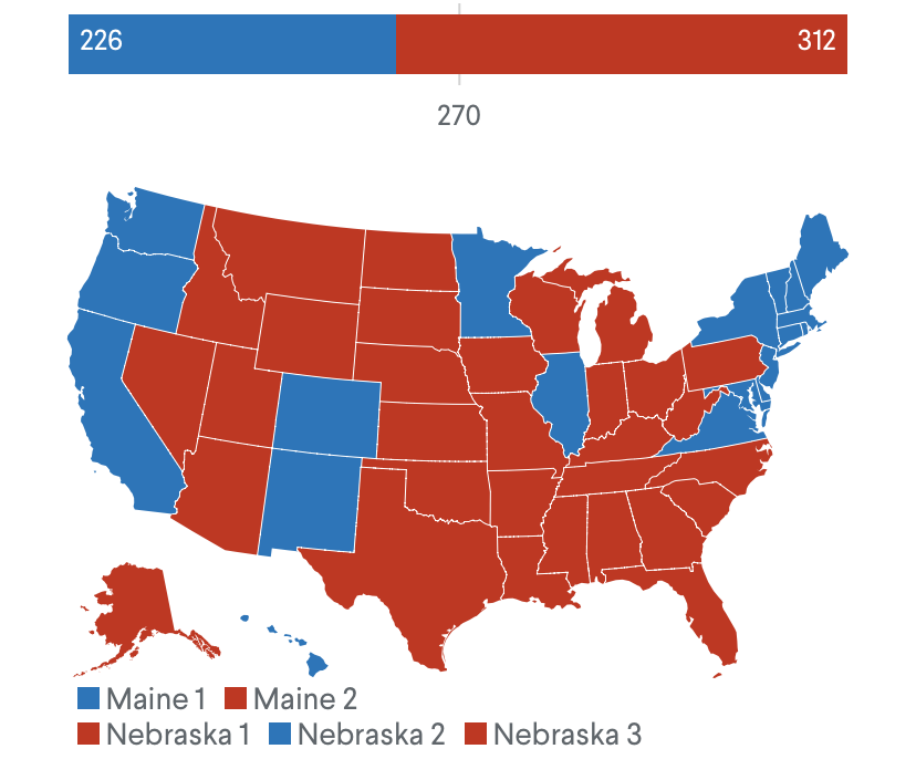

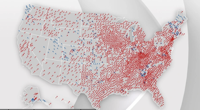


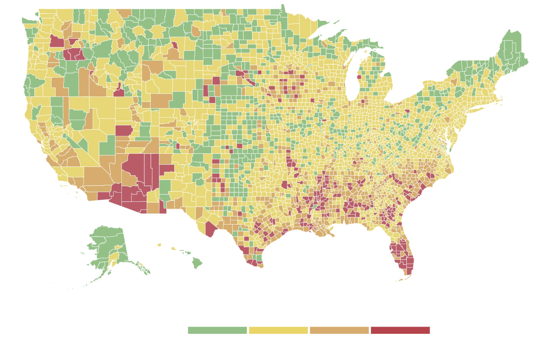

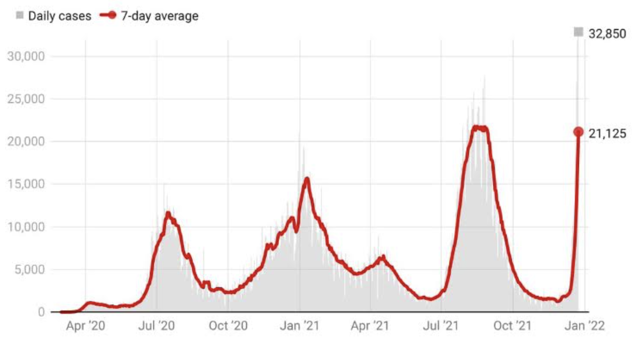


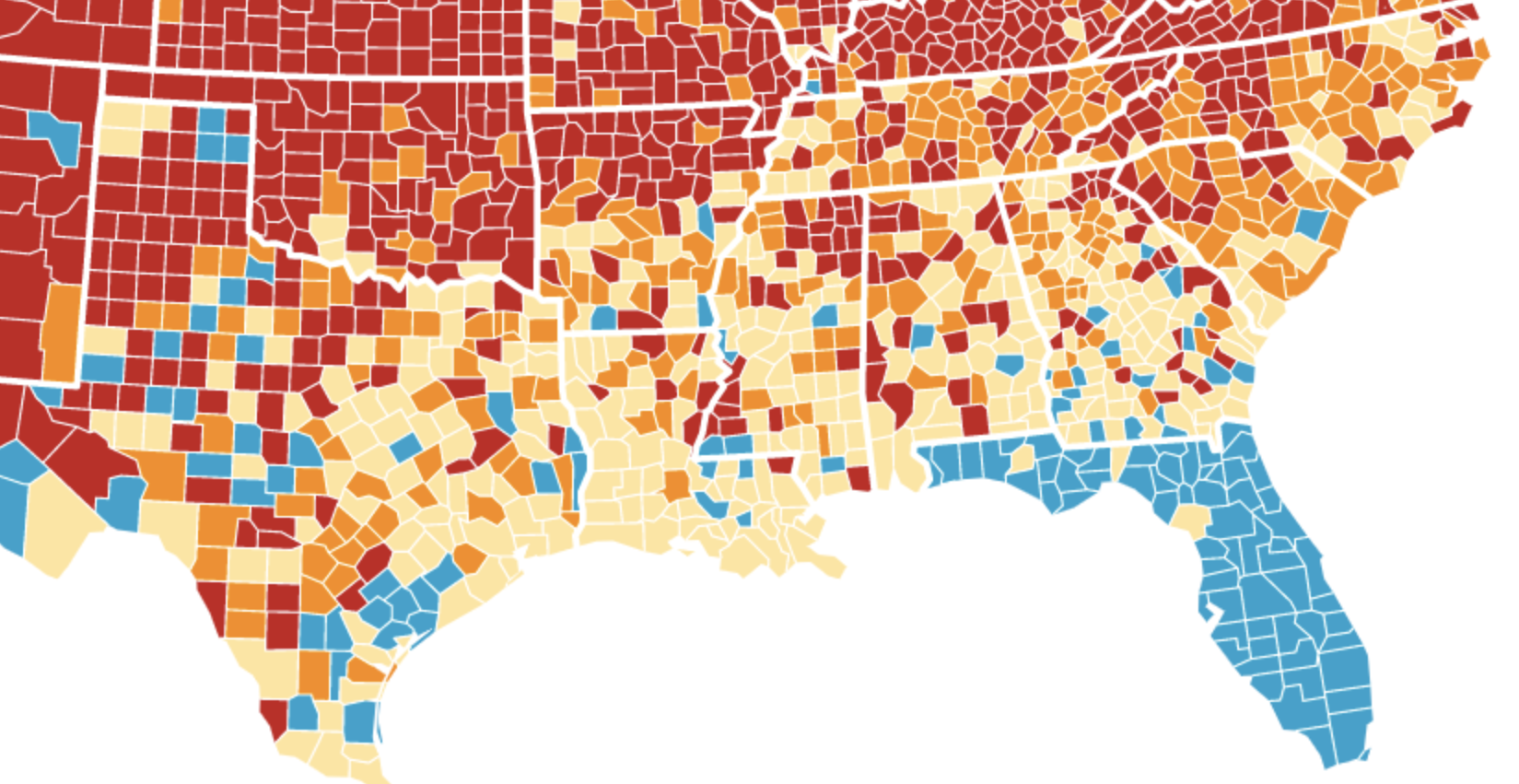


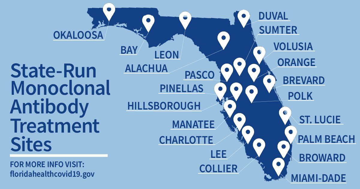
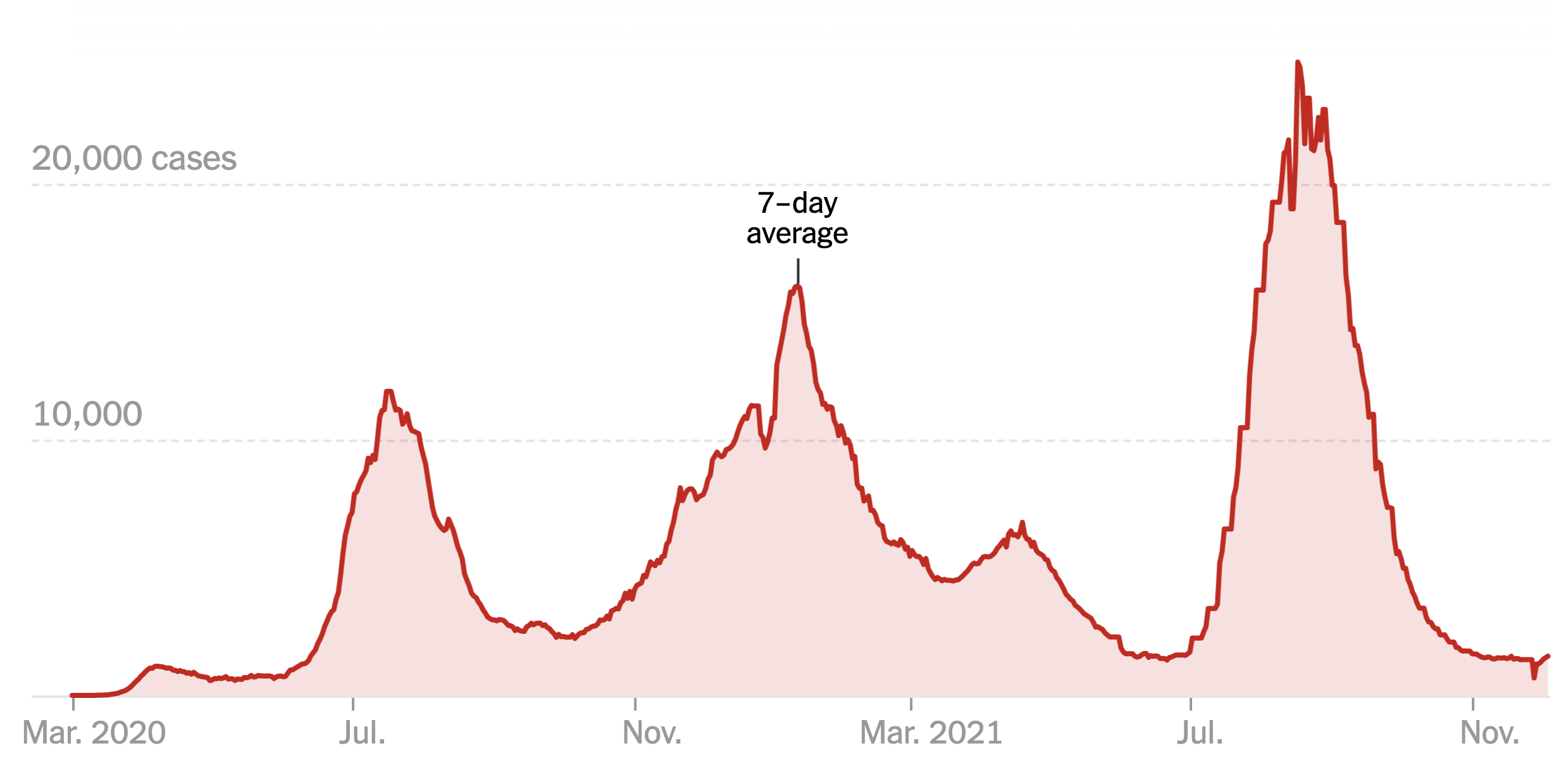
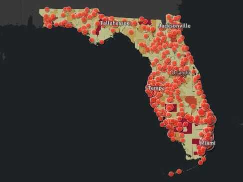

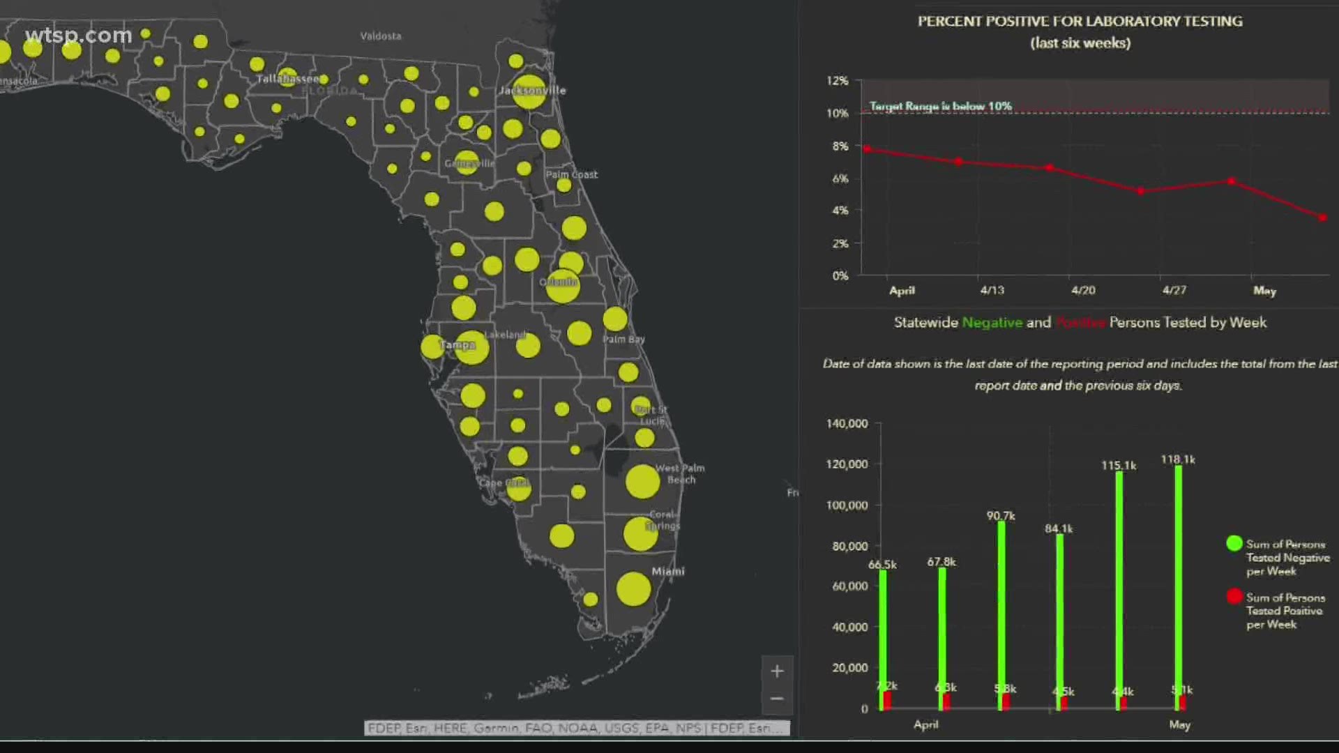
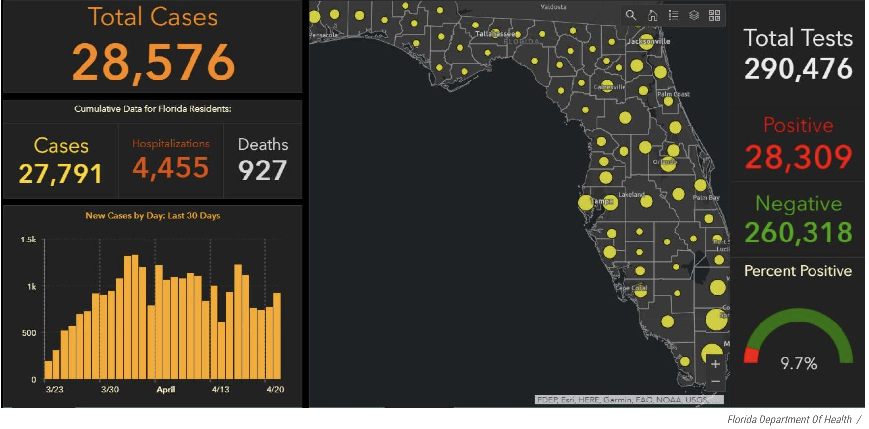
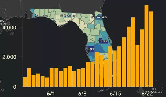
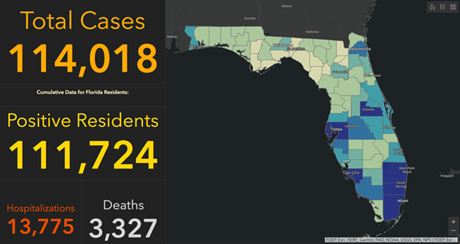


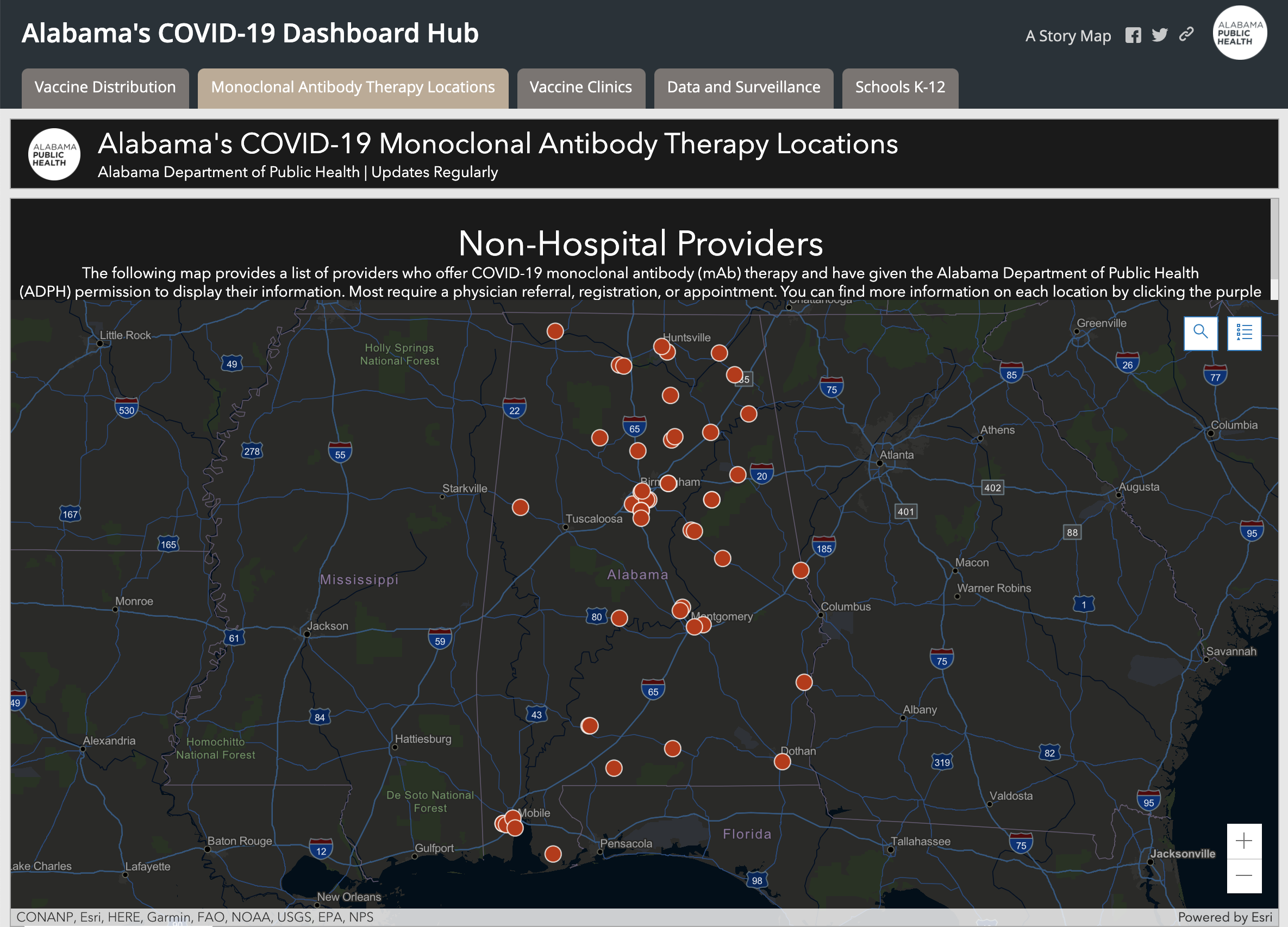


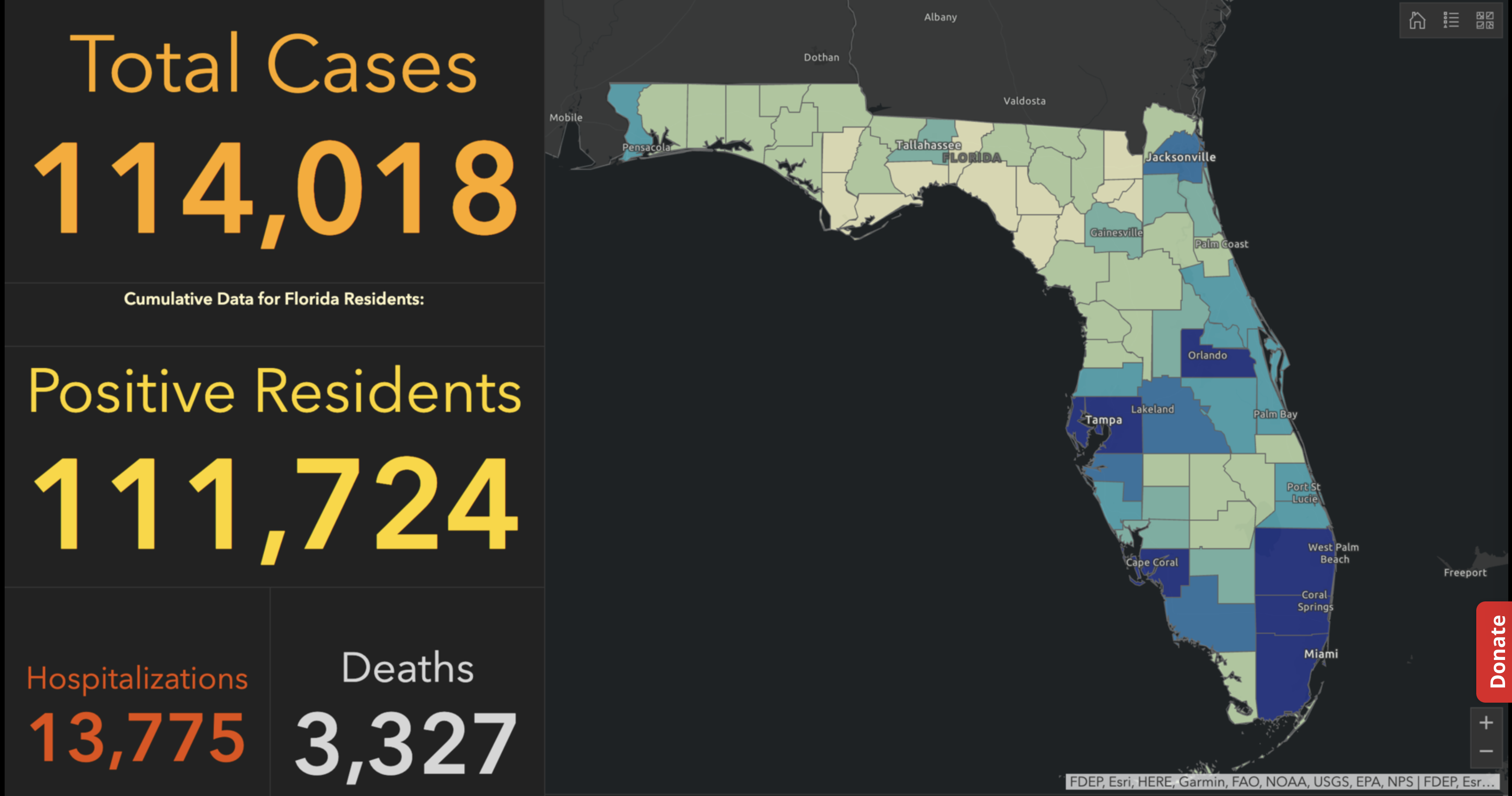


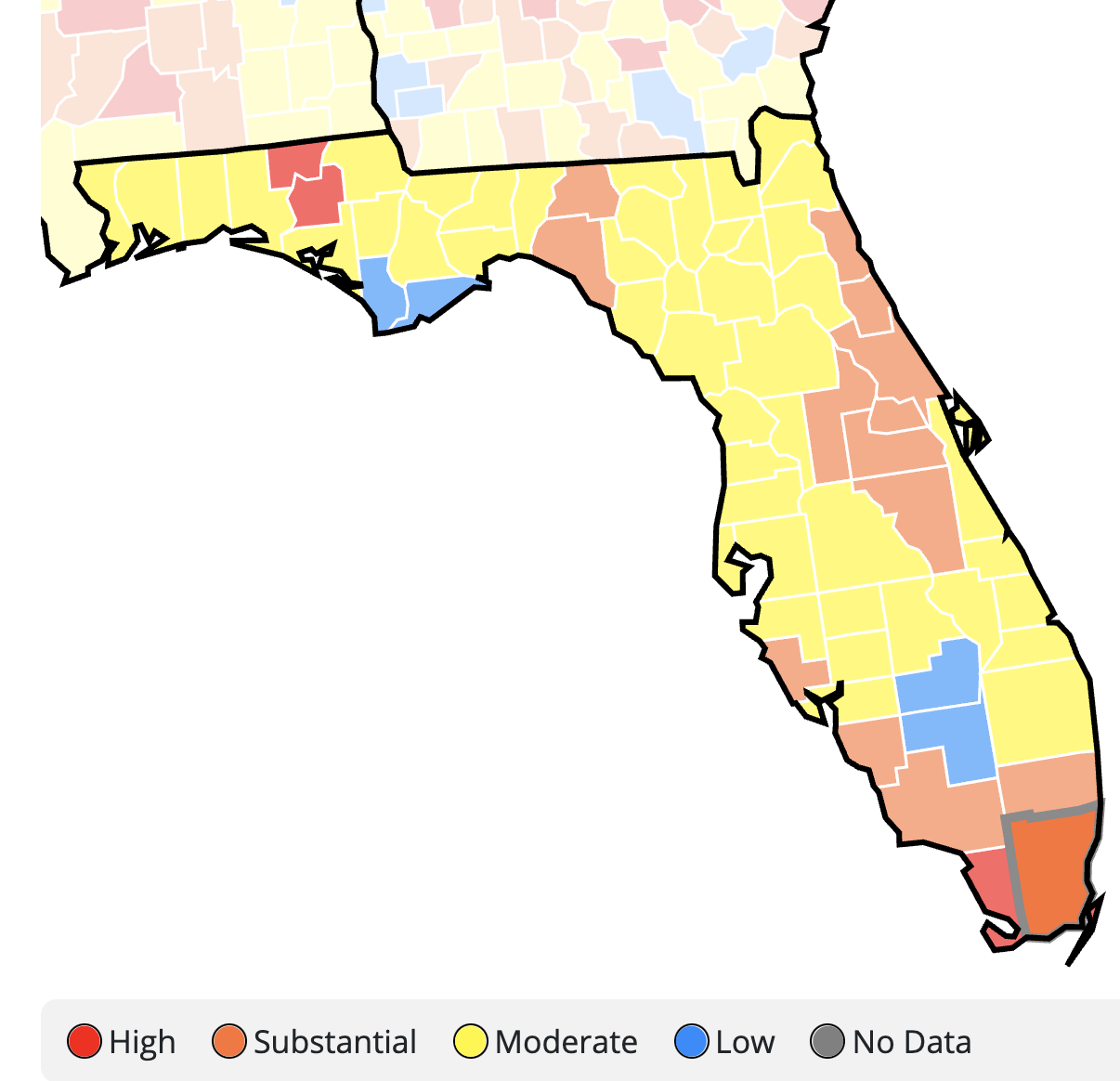


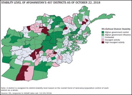


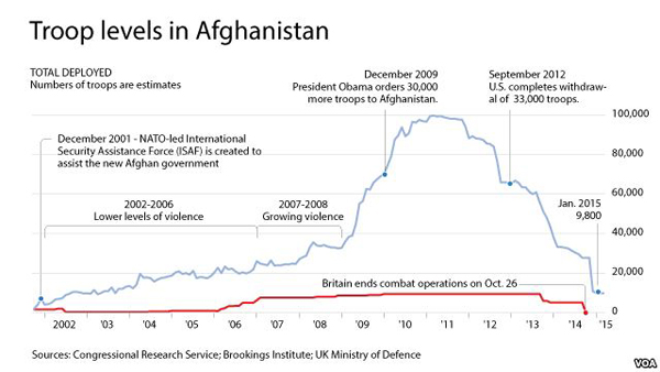
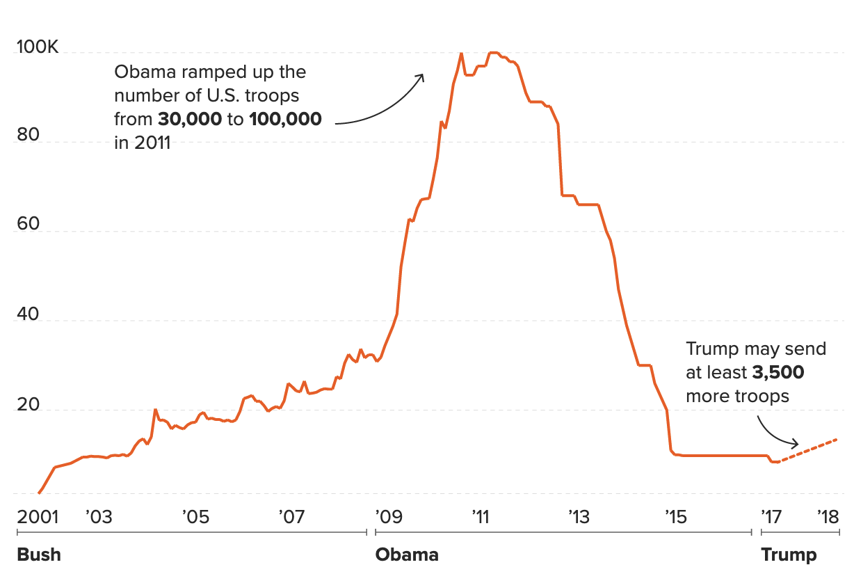
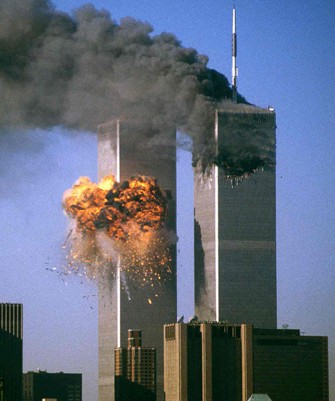


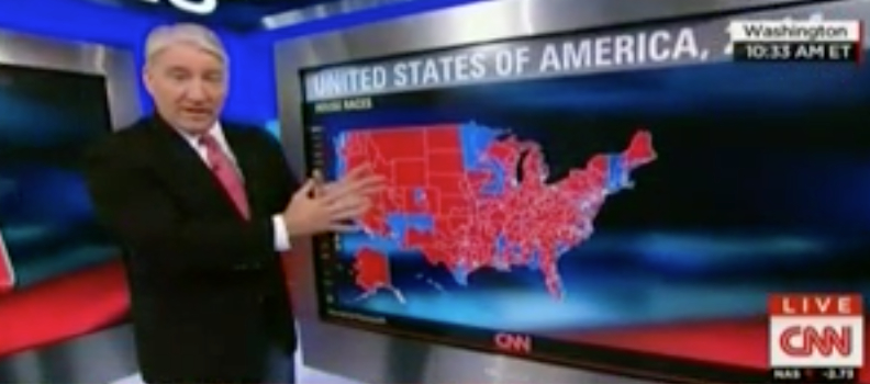


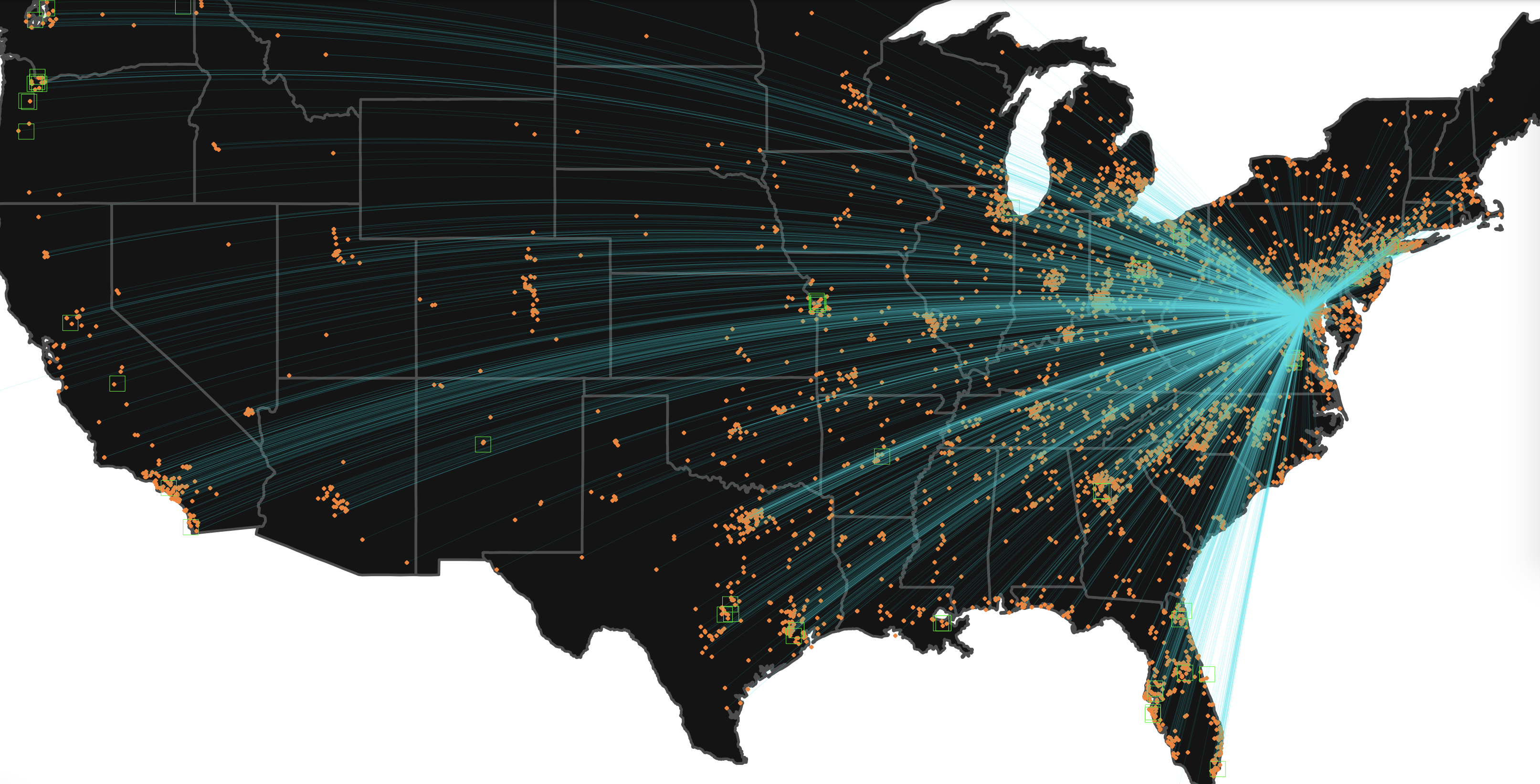

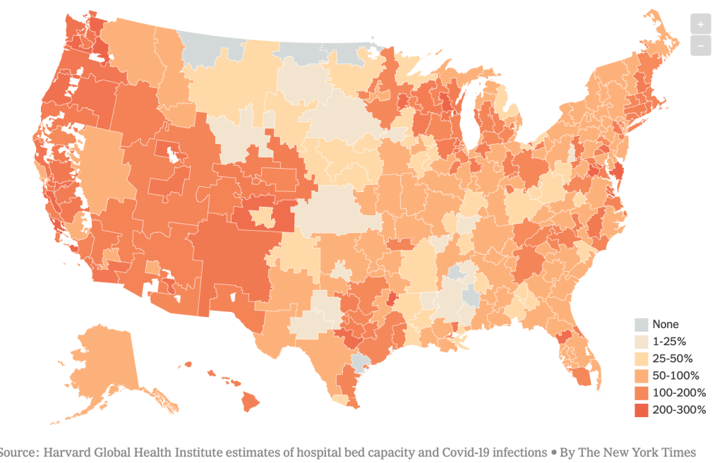
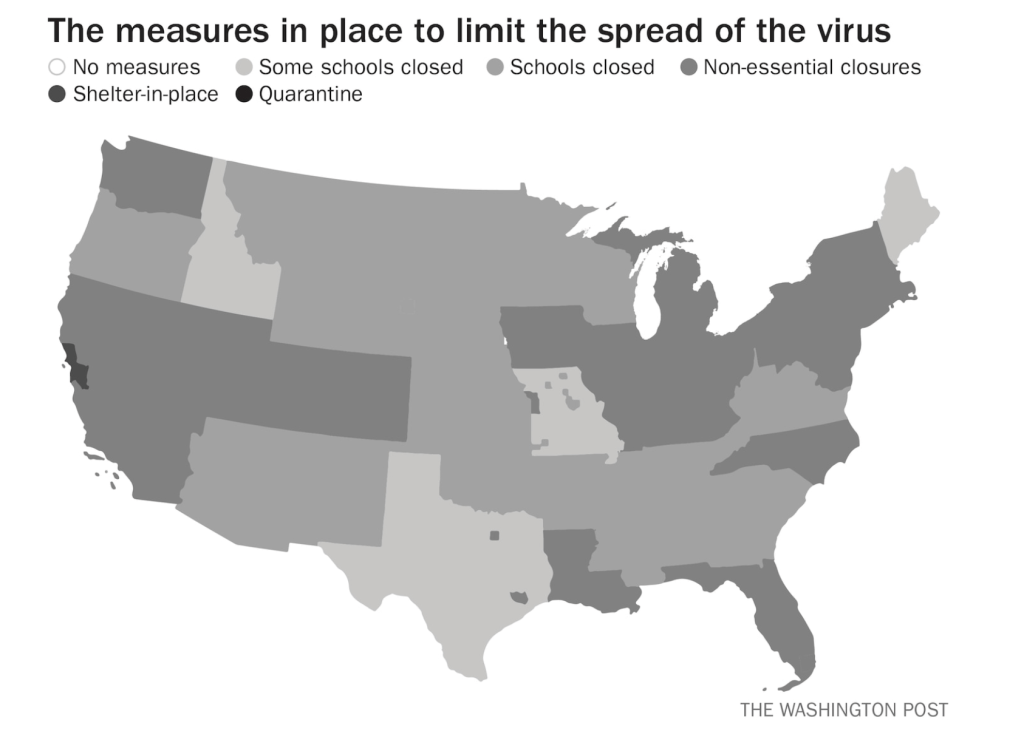
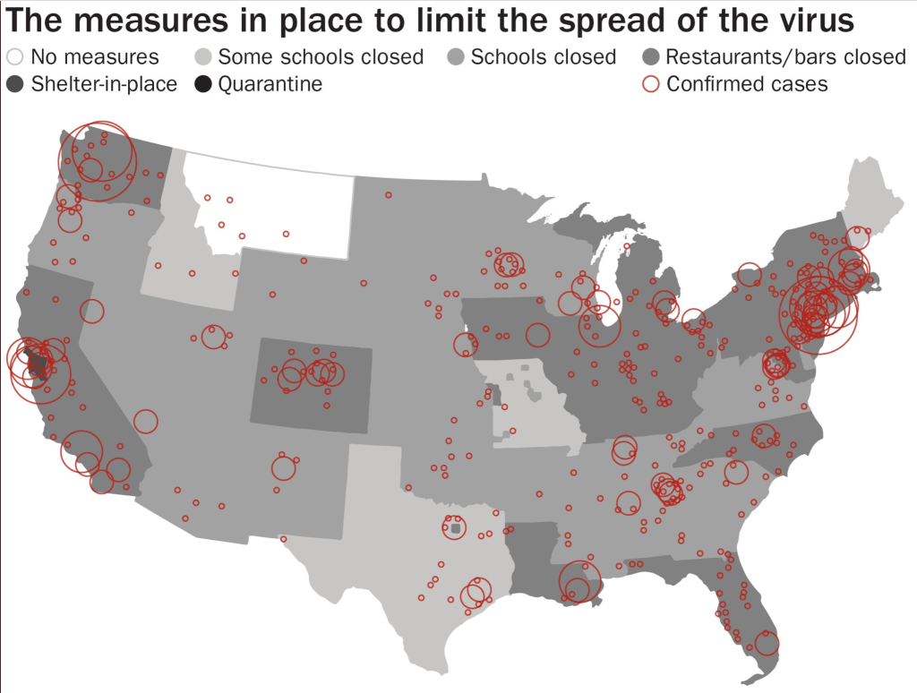
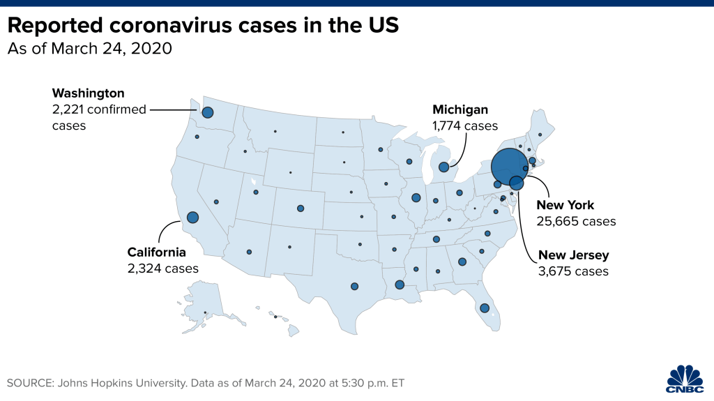
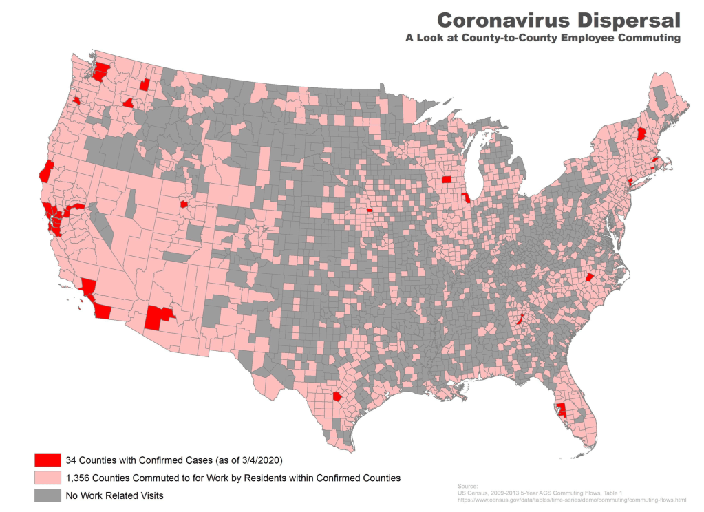
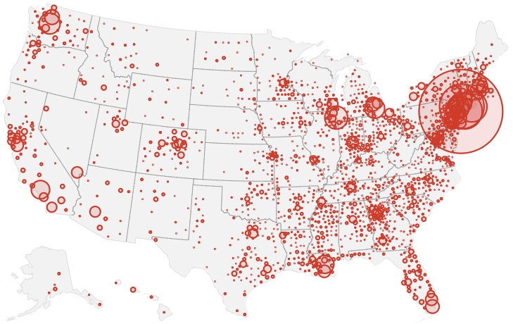
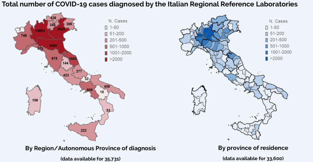

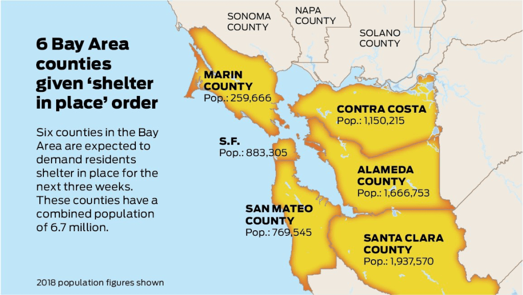
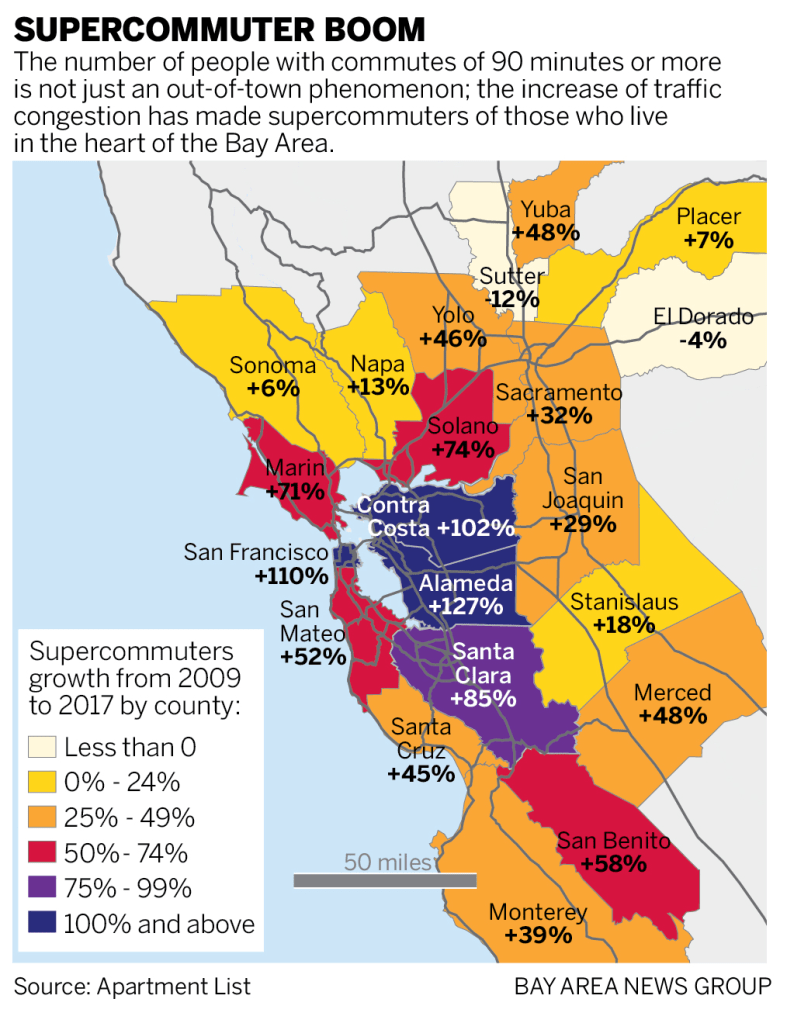
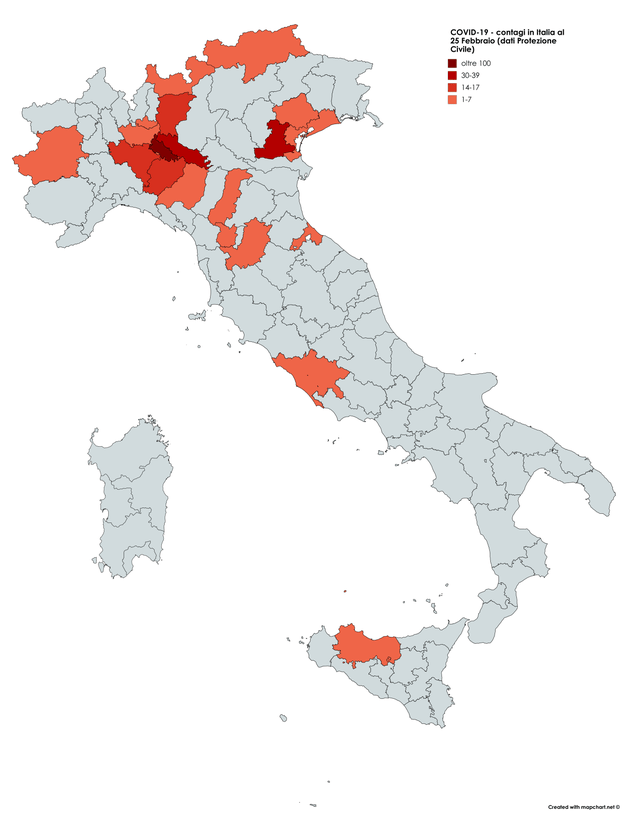

