We do well to see through maps, Denis Wood enjoined, urging us to detect the “human landscape” that lies superimposed upon the land in maps, and uncover the ways that the landscape has been changed–and orient ourselves to those changes that have been wrought by the “huge arrogance” that “we can name and we can claim.” Maps demand to be interpreted by scratching their surfaces, as if we could uncover how one might best “see through them,” to explore the landscapes that lie underneath the layer of words that lies on their beckoning if often all too opaque surfaces. Webmaps allow this level of interaction, often by playing on the conceit of the paper map. Indeed, the symbolic surface of the paper map–and the London Underground map in specific–have been used in a variety of web maps to suggest different notions of the “underground,” and to suggest the power of maps to alter one’s relation to place and space in provocative ways.
To take stock of how maps work by asking us to go about imagining the landscape that lies beneath those words is a way of uncovering their arguments about territories. The format of the audiofiles linked to a map of London’s Tube provocatively invites readers to explore its surface, in the clever pun advanced in the web-based maps of the London Sound Survey. For its links invite us to explore soundscapes that would otherwise lurk beneath cellulose surfaces, treating it less as the modern relation to space and place that the Tube Map advanced in its early twentieth-century iterations–than as a sort of recovery of a lost sense of the sense-base experiential waterways underneath the expanding city, that the paved city has in many ways repressed. The river that snakes across London today, mapped for its sludgy muddiness in many Google Earth terrain imagery, marginalized if not expelled from London’s built urban landscape. If the sinuous light blue line of river returns as a sonic reality as it laps along old unused docks and concrete pillars as one approaches its banks, its sounds letting the city disappear for a moment, the sounds of the Thames returns int this may that adopts the form of the underground Tube line of the built environment of the twentieth-century resurfacing of the city.
Web-based maps such as Sound Survey of London’s waterways indexed offer modes to remap the known environment of the city in new ways: the choice to map the riverine network that is rarely seen in London seem specially suited to the conventions by which Harry Beck‘s almost universally recognized diagram of its Underground specifically invited users of the London Underground to re-see their own environments, offering a way to encourage map-readers to navigate the built space and neighborhoods of London as able to be readily accessed by the Underground. The striking modernity of the circuit-like 1933 Tube Map that invited users to so successfully read the access to space the Underground offered at a distance from lived space, yet in ways that its simple form foregrounded utility, it offered an icon of the modern urban plant.
It was, of course, as it happens a radical revision of the attempts to picture the London Underground. The space of the tube was not only a new way of understanding place, but time, in strikingly modernist tones by artist Hans Schlegel–he signed the lithograph as “Zero”–suggested, as a new way to navigate space, adopting icon of the Underground to a map, as it offered an ability to negotiate urban time,–
–as the surrealist invited on to experience space by a new tool that “gets you there” in ways never possible before, warping space-time in ways that were entirely to the modern citizens’s advantage, a user in this case typified by the new subject of urban space–a man in a suit, bowler hat, and white gloves–who meets the demands of his job by the circuits that lie beneath the city that allow him to arrive on time. He is checking his watch in ways that suggest the timepiece had been replaced by the Underground to affirm its utility beyond only navigating a built space. London Transit used graphic arts to promote the new Tube as a basis to experience the city in many ways, and indeed experience to navigate the Thames, just a few year earlier, that suggest not only their investment in graphic works to reorient viewers to space, but to remap urban space by the river–the most important, perhaps, orientational path of the city’s neighborhoods, even as they were replaced by city blocks: streets were organized in relation to the Thames, historically, but the underground, in this lovely 1933 poster, proposed its utility as a way to access views of the river–
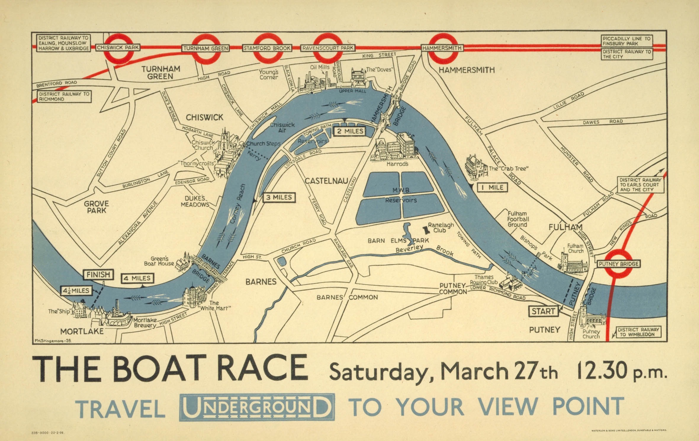
The Boat Race: Oxford-Cambridge Boat Race Map, 1926
–and specifically of the Cambridge-Oxford Race that was run annually on London’s Thames in one section–that in 1926 mapped the stations of the Underground to “travel to your view point” to watch the race–but took the river as the main course by which the riders of the underground would need to be oriented. In contrast to a map of taking public transit to watch a race–or to arrive at place on an urban river’s course–the new Underground map that was designed some seven years later after the diagram of electronic circuitry elevated its geometric form above the urban topography or indeed the urban sensorium. Beck’s innovative design for the map printed in January 1933, took as its logo and model, in many ways, the novel emblem of the underground tube–the Underground, as it was called, or Tube–as a geometric creation that replaced the urban soundscape, and a utopic idealization of space.
This was a new way to understand how one could experience the river that the Sound Survey may have not known, but offered something of a symbolic foil to in asking us to view the river–or The Boat Race–in new ways via the access points the Tube provided to out-of-towners who arrive for the popular sporting event, akin to later campaigns to use public transit to access football stadia. The actual boat race–The Boat Race, as it were, founded in 1845, beginning half an hour before high tide on the River Thames, which has been from its founding timed to start on the incoming flood tide, and allowed numerous viewing points on piers, breweries, football clubs and taverns that lie along its 4.2 miles, or the steps that front upon the river, for crowds of spectators to gather and assemble. But the distortion of the river was, already by 1926, the point. The race between Oxford and Cambridge teams for which an umpire provided a running commentary for the first time in 1927, perhaps to accommodate the larger crowds who took the London Underground to preferred viewing points, accommodating the river’s course to the transit stations’ locations–even suggesting the degree of punctuality of arriving at a station to view the winding paths that the boats actually took on the river, comparing the directness of the transit line against the course that were taken by the crew teams.
It’s no surprise that the Underground map from the late 1920s distort the path that the Thames takes between bridges, as Londoners well knew, was actually a far more sinuous course–navigating the bend is the point of the course!–on the four point two mile course running between Putney Bridge to Chiswick Bridge. But to illustrate how the Tube accommodates to its path, the straightness of the lines of tube track are privileged far above the actual riverine path in the 1926 map , , to which the tube accommodates.
But the attempt to reconcile the tube’s course to that of the river may have been a question of epistemic orientation by the 1930s, as a new geometry of the Underground first proposed by Beck in 1931 redefined the space of the underground. Beck used a geometry of 45 degree angles and diamonds to illustrate interchanges and stations that invite observers to reorient themselves to urban space free from the river’s course–indeed to focus their orientation to the network of tubes on which public transit ran. The map conceals massive effort of labor of building an underground infrastructure where immigrants laid track and dug ditches beneath the city, but the infrastructure soon became far more prominent for many Londoners in future generation than the map of the city’s landmarks, and was intended as an icon of British engineering if not the urban metropole.
The Sound Survey Map of waterways offered a sonic counter-map on in online form, as an attempt to reverse the building of anthropogenic space, by examining the sonic sites where the river returns to audible presence. In orientng its users to the presence of the Thames over the urban hubbub that defines London today, it shifts atteniotn from the anthropogenic built space, providing auditory evidence of the presence of the water that the Beck map overlooked. If the oval emblem that served as the key in the circuit-like map at forty-five degree angles that cast interchanges as diamongs and stations as notches was proposed to shock and consternation, remapping the built city for users of public transit in utopic ways in then following years–
Harry Beck, Tube map (1933; designed 1931)
–now akin to a Union Jack as an emblem of pride in English engineering ability to provide the smoothing of space in an infrastructure of smooth movement, both to escape urban congestion and arrive across the city in record times for work, as the lithograph by Zero–Hans Schlegel–affirmed in stark modernist terms in 1935. The promotion of the Tube as affording (and promoting) a modern form of urban space suggested a revision of all earlier urban maps–“All that is solid melts into air . . . “–as the known form of the city melted into the geometry of a circuit map, untangling the tangled streetpaths of modern London in crisp terms readily navigated by its perfectly symmetrical and smooth routes, a technological progress that was a sort of symbolic metaphor of the smooth modernity of the smooth ride that the Tube offered its passengers. (The aptness of the visual metaphor made the form so much more effective, promoting the Tube as offering a new way to move through urban space, in ways that the Sound Survey Map–and we will come to it soon!–seems to seek to pull back for its users, uncovering the lost sounds that the built city plant sought to erase.)
The images of the Underground break form the alluvial settlement of the expanding city from its past in definitively modern ways. While in a day when the London Transportation Authority offer City Mapper, an the ability to track one’s place on the London Underground on handheld devices, without every really needing a map, the smoothing of space has been accentuated–even as the actual lines of transit infrastructure has become considerably more complicated and tangled, both with the exponential expansion of the city that sets new standards for urban growth and neoliberalism. Perhaps the greatest sign of neoliberal achievement is that the map devolves onto our handhelds, as if consigning paper to the past; but the old pocket transit maps are given new life in the web maps that folks as the London Sound Survey have devised to bring the river before our ears, and invite us to reconsider the benefits and losses of mapping urban space.
Of course, the point of such interactive maps is to orient us as urban residents to the surroundings that the built infrastructure has long elided, and increasingly threatens to obscure. There is something remediative and restorative in a map of London’s everpresent river, that reorients us to the river of the riverside city. The Sound Survey Map asks us to use our ears to acknowledge the iconic map’s utopic nature, as it asks us to reorient our sense to the river waterway that the tube replaced, by excavating the sounds of buried waterways. Indeed, wherea pocket guides to the London Underground sold by UER before Beck’s design were startlingly sinuous, as in 1908, displacing the river from attention, in favor of an alternative infrastructure of railways–
–but almosty investing the tubes of the Underground Railways with a sinuous aspect of its own, respecting urban topography, if acknowledging the new transit web lay beneath, apart from, if ancillary to urban streets.
Whereas Beck’s iconic map promoted the primacy of the drafting table and the engineer, a form of engineering that might have well seemed overly radical and ecxessive in the lived environment of pre-war London, the web-based map is a sensorial register reminding us of the presence of water that the underground displaced.
In the Sound Survey, all “transit” lines are shown in their entirety, as if to return tthe river to a prominence it long held in London’s plant. Indeed, save the District line which is only shown as far as Mile End, the rest of the stat image offers an apt way to invite viewers to excavate audible aspects of the city absent from a drawn map, in a truly phenomenological map of the circuit of hidden waters beneath London. If subways are often noisy, the sounds that the Survey has compiled offers a somewhat synesthetic compilation of the hidden waterways that might be seen as corresponding to metro stations, less as a disembodied circuit–as Beck’ map–than as the subsurface lying underneath the engineered world. Beck’s map sanitized the subways in streamlined fashion to attract Londoners to the Underground, readers are asked to explore the waterways that emerge only in its parks, bridges, and channels linked to watery paths which we rarely see which run under and about its surface before they enter the central artery of the Thames.
Rather than by mapping the city’s space in reference to its individual streets or intersections, but by placing the rivers of the Survey maps waterways’ sounds in ways that recuperate their perhaps forgotten presence. Wood remapped the lived community of Boylan Heights so that is not only as a place in Raleigh, North Carolina, but charting the “metabolism” of the community in maps of the light street lamps cast, lit jack o’ lanterns placed on porches at Halloween, paper routes Wood ran with a tightly knit cohort in his youth, or “squirrel highways” of aerial wires, which collectively serve to unpack the often invisible ways of “how it works.”
One might compare to this set of maps the ways in which maps in the London Sound Survey invites readers to enter an overpowering pointillist accumulation of local details, and similarly serve to map a setting in which everything sings–or at least we can enter its audible surface at distinct points.
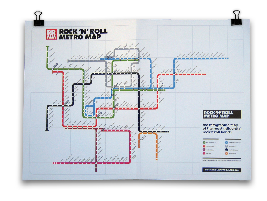
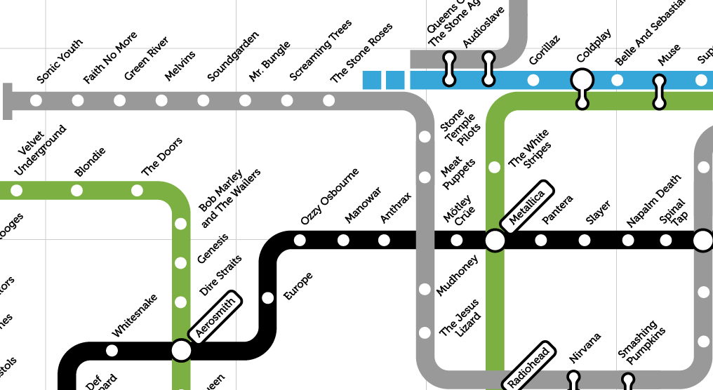
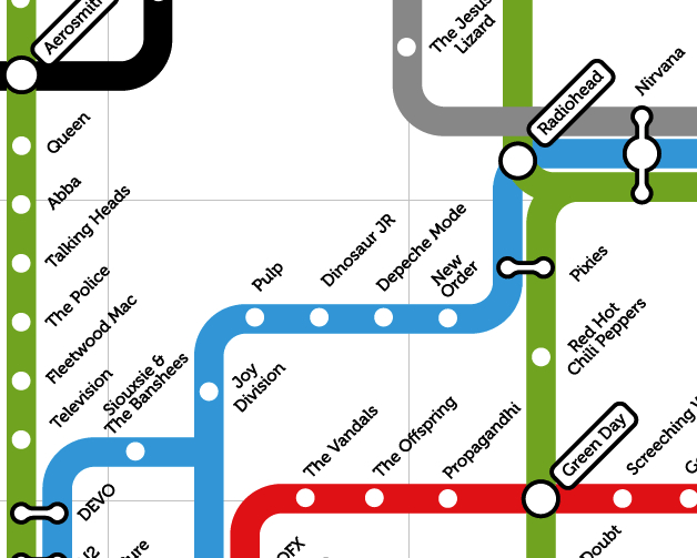
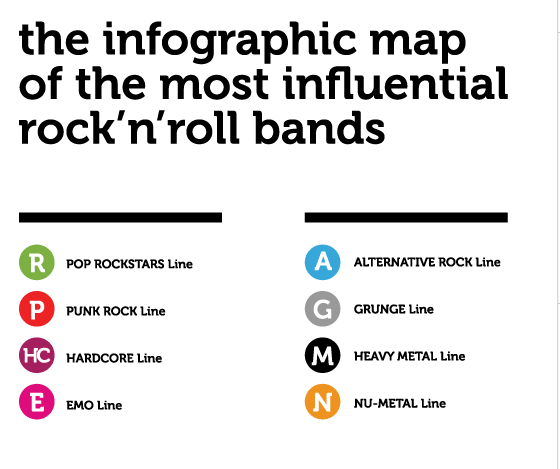
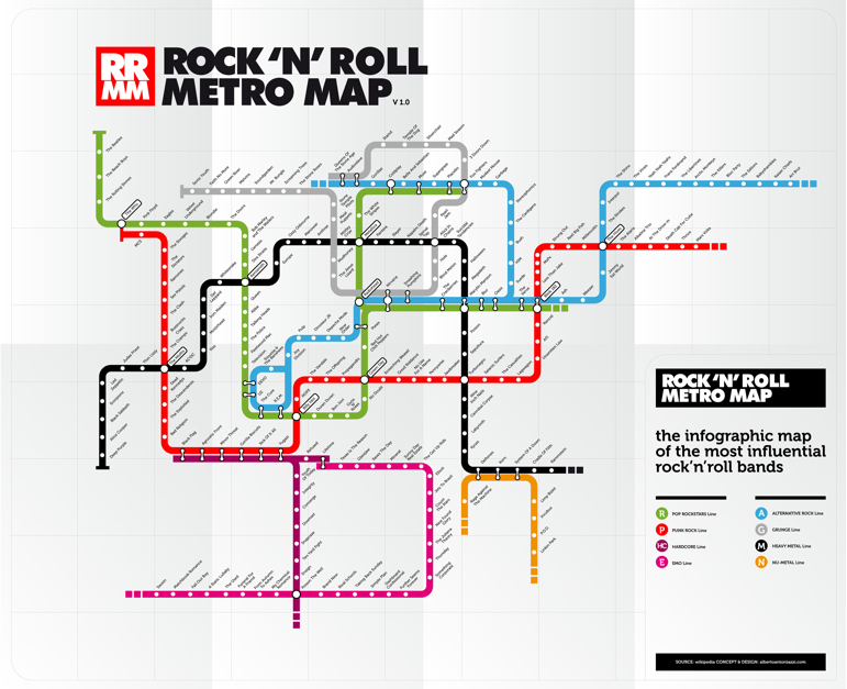
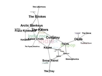
Phrases from “Subterranean Homesick Blues” to “the Velvet Underground” defined a new metaphoric space for Rock music to occupy and create during the nineteen-sixties. It’s no surprise, then, that the London underground map–that icon of Englishness designed by the engineer and draftsman Harry Beck in 1931–has been transposed to define relations among bands with such success in an encyclopedic mapping of genres of rock. By taking the transport map as an inspiration, one can map a network of musical bands and styles, examining both intersections and alternate paths of varied musical groups and the imaginary relationships they have to one each other in easily comprehensible ways. So classic is Beck’s circuit map of the city’s underground that the use of the Tube Map is instantly recognizable as a microcosm of sorting tastes, if an almost ironic analogue of an underground music scene, more rooted in graphic design than sound.
The historic reduction of all surface details in the map, in which Beck accentuated direct routes the tube offered to navigate the city, rather than urban topography, employed a circuit diagram to chart the London subway disregarding geographic relations for a clearly legible network map. The iconic conventions of linkages in an ideal space rather than a geographically correct map, serves well to map musical bands and styles–where Pop Rock intersects with Punk, runs side-by-side with Alternative Rock and intersects every so often with the determined Black Heavy Metal Line–unrooted from geographic reality but graphically displayed in a concise (if blunt) highly readable syntax: as Beck sought to “tidy up” existing maps by “evening out the distance between stations” and “straightening the lines” to “give a needed clarity to exchange information to tube users who were on the go,” the color-coding of its routes created a model for communicating information even when removed from its geographic subject-matter or exact spatial relationships.
Perhaps the formal nature of the spatial arrangement of bands on maps runs against the very improvisational nature of much of the musicians included in the map. But the exercise of decoding seems to be a way of seeking to make sense of the world of music by cleverly streamlined terms. Many of bands which are included as tube stops by which graphic designer Alberto Antoniazzi’s popular Rock’n’Roll Metro Map foreground groups prominent in London’s music scene. In fact, in its focus on London’s underground, the choice of template for the map reminds us in its stretch of prominent bands from the Beatles and the Who to Depeche Mode, or from the Sex Pistols to Radiohead to Coldplay presents an inevitable British hegemony in selecting the London Underground as its focus, although Spinal Tap lies on the far more American-centric Heavy Metal Black Line.
The nostalgic English-ness of the Beck map just seems something of a sign of the transhistorical centrality of London in the music scene–even if it also suggests the degree to which as “the tube maps masks and distorts realities,” in Ian Russell’s words, its modernist space has “become its own reality, entirely abstracted from the work it ostensibly represents,” as a model–Joe Moran has observed–although it is copyrighted by the London Underground, as was discovered by Simon Patterson to his chagrin. But Patterson’s The Great Bear (1992), an elegant four-color lithograph, shifted Beck’s system of classification as “lines” that indicate Engineers, Philosophers, Journalisms, Footballers, Film Acts, Italian Artists, and Musicians in ways that invite the viewer to detect a method in their order.
To return to a map rendering legible a more limited network of contemporary music, there is ample sign of time’s passage in the Rock’n’Roll Metro Map, which consigns both the Beatles and Rolling Stones to the end of the Green Line of Pop Rock Stars, with little differentiation, a status they somehow shared with the Beach Boys: to be sure, all are pop, but relationships are just not clearly mapped or continuities appear jarring. Despite the authority of the map’s model, Antoniazzi informs us that if “the map is just a personal vision of the music history of the past decades and not a real visualization of it, that’s because the number of artists and influences are impossible to be visualized in a 100% objective way.”
But it often reads like an index to someone’s CD’s–not too mention being dominated by men. I like how the red line moves from The Stooges to The Dictators, Ramones, Sex Pistols, Clash, Buzzcocks, and Cramps, but relations among them are often unclear or at the border of suggestibility–the transit from The Who through The Eagles to Velvet Underground is quite a jump on the line of Pop, and the placement of the Ska band The Specials at a major intersection between Reggae, Rock, and Pop, and Bjork occupies a major exchange of her own.
The iconic diagram by which Harry F. Beck re-rendered the London Underground in 1931 has become an icon, with as much nostalgic value as evocation of place. Its popularity extends far beyond what Beck imagined, partly due to the appeal of its modernist simplicity and symmetrical organization of rail space: the arrangement of the web of trains in ways that viewers can readily read has acquired that odd function of a map as both a designation of place and an innovative system of arranging meaning. The Rock’n’Roll Metro Map clearly capitalizes on that identification with place, indeed, to remind us of the centrality of London in the global Rock scene–or map the world of rock onto one place as if it were a microcosm of world music, able to sort out the crowded universe of recorded rock.
Map of the Underground (1931)
The transposition of stations to bands to those of stations can’t help but remind one of rock critic Dorian Lynskey’s ambitious if somewhat similar mash-up of the tube map and music scene by exploiting links of lines to suggest stylistic breadth of influences, in an attempt “to plot the history of 20th century music on the London Underground map devised by Harry Beck in 1933.” The pretty implausible choice in mapping forms not only worked, but Lynskey’s map gained sufficient cartographical respectability to be sold at the London Transport Museum: for Lynskey, who undertook this with sheets of construction paper and magic markers, in a sort o mental mapping of his personal preferences, the map made sense since “The different character of each line lent itself to a certain genre,” and so Pop, which as the common currency that intersects with everything else, here occupies the Circle line, while classical music, viewed as less influential and occupying its own sphere, was appropriately relegated to the Docklands Light Railway by its creator.
Beck’s distinctive and instantly recognizable graphic design is so iconic its choice seems nostalgic for a time when Rock music seemed located in one place–or had an epicenter of its own–and some coherence and uniformity, in an era when music first started being available online–which may very well even more specifically apply to the recent Rock’n’Roll Metro Map. While one might argue that the map of London as a site of rock music erases the black roots of rock music, bleaching a historical background to foreground contemporary white bands with limited sense of history, using a city that claimed Pop as its own as a site for defining a canon of rock, that casts Little Richard as a stop before Elvis Presley and Jerry Lee Lewis, and James Brown and Screaming’ Jay Hawkins as Lins to Buddy Holly, in a map whose flat surface massages critical questions of difference, appropriation or identity in one interlinked system that can be navigated in ways that undergird the city.
The Music on the Tube Map provides a neat spatialization of the music charts, akin to the personal navigation of the lost space of the record store, but with aims to provide a sense of music history.
Rather than providing a space to explore by flipping through albums, and listening to what the store owner decided to play, the classificatory schema provides an invitation to investigate the “rules” and conventions of its ordering of a sonic space perhaps prompting a sequence of triggers to auditory memories that the reader might synthetically experience, to judge by their own tastes: the very objectivity of the map as a record of space is up for grabs in this clever spatialization of recorded music as elective transportation routes.
The Lynskey map offers may rewards as a neat reading of music history, as well as many of the problems of framing the fluidity of musical performance in the formal integrity of the map, even as it provides opportunities for detailed scrutiny. Say, for one, the cool placement of Michael Jackson near Minnie Ripperton, in a totally different line than Burning Spear, whereas the ska band The Specials are rather brilliantly placed an exchange of Reggae, Rock, and Pop.
There is a broad-ranging Catholicism here, as the tube stops comprehend Jazz and Soul, and extend to Country, Funk, and Electronica, and, despite a focus on the British that seems also at times a bit obscure, there’s a respect for lines of Hip-Hop, DJ’s and the avant-garde in the fifteen lines, including the odd amalgam “Classical and Sound-Tracks.”
But there are occasions of mapping that could elicit intense debate from some, like placing Bob Dylan as a mere station on the Green Line, diminished by juxtaposition to the Rolling Stones who albeit rightfully occupy a nearby triple exchange:
To be sure, any map of this sort came in for some intense criticism when Lynskey first posted it, pointing to the absence of numerous bands from lines from the Talking Heads to Joy Division, and some oddities, like placing the British modernist Harrison Birtwistle between Terry Riley and Philip Glass. London-obsessed in its fetishization of the Beck map, one commentator on the Guardian blog found it the work of “the most stereotypically self-indulgent Guardian wank I can think of”–the huge labor of organization is impressive, if the obsessiveness of linking the Kinks to Radiohead seems obsessive, and riding from Mahler through Penderecki to Danny Elfman a waste of time.
But the intensive sort of map-reading and patriotism with which rock journalist and writer Lynskey blends allows a mental indexing and erudition is less assiduously pursued by Antoniazzi in his Rock’n’Roll Metro Map, or at least in Version 1.1, which seems a bit provincial and a bit more nostalgic in its use of a Tube Map. Anthoniazzi also exploits the clever conceit of placing artists crossing two genres or linking music styles at the intersections of imagined sonic tube-lines, to be sure, if these might be quite different–Radiohead is now a major hub, as is Nirvana, Coldplay, and Green Day, and Antoniazzi’s erased twentieth-century precedents of other musical genres in favor of encyclopedism of a somewhat presentist bend that doesn’t have the historical depth that made Linskey’s exchanges amusing.
Despite Rock’n’Roll map‘s claims to authority, it carries far less of a thesis or explanatory heft than Greil Marcus put into his classic “secret history” of the twentieth century–and not only because the map is a bi tongue-in-cheek as a riff on a popular icon: despite the claims to organize musical bands in the manner of Beck’s iconic map as a vision of the navigation of underground culture, the relations it sketches between bands is necessarily unclear. If the transposition of band-names for the familiar infographic of 1931 offers a surrogate for channel surfing or flipping along the dials of a radio, the place Green Day holds at an intersection between tube lines is clever and even compelling. But we lack orientation as we shuttle from station to station, from The Police to Fleetwood Mac to Television before arriving at the joint tube stop occupied by Devo. More prominent bands stand at prominent exchanges, but the map seems to be about switching out place-names more than a guide: the legend withstanding, it’s hard to read this infographic as an ordering device; and though I like the spirit of the acronyms noted in its legend, it seems to rely even more on the nostalgia of the unity of rock in a single tube map.
Part of the problem is indeed of taking the city as microcosm of the world, or pantheon of rock. There’s something going on here about the primacy of the local or London as a music hub; despite some prominent Americans, the map is English-centered, the category of “the most influential” being dominated by groups canonized into British tastes or top 40 beside such somewhat nostalgic acts as Siouxsie & The Banshees, Depeche Mode, Billy Idol, and Duran Duran.
It’s not that the map doesn’t chart “the most influential rock bands” (as claims its legend) but, rather, that despite there being something in the authority with which any map creates as a network of relations, it’s easy to see that its map’s appeal as being based on that substantial grounds–or even as having a staying power that long in the current music scene. It’s a bit of a memory game, however, that employs the nostalgic format of the Beck map to reconcile earlier with more contemporary bands to place them all on the scene with equal authority.
‘What would it mean to try to map music?’ is a question that’s received a number of responses in multiple blogs, however, of which the unfolded Metro Map is one ancestor–an ancestor that suggests the coming of age of musical bands with a newfound legitimacy, as much as it orients the viewer.
Of course, the map maps London as something of a hub, given that claims of mapping the relations among bands are a bit strained since they overlap on an existing structure–as “alternative Maps of the World superimpos’d upon the more familiar ones.”
Of course there are plenty of counter-maps to the notion of placing London as world music capital–in fact, they proliferate. A map of New York’s musical topography, boasting of its riche, roots composers of a far wider musical discography to image the city as site of inspiration, as much as musical community, without venturing underground:
The 2011 project meant to display the vibrancy of the music scene in one place–Seattle–now migrated online, is a worthy ongoing collation/genealogy of Grunge. The detail of that expansive map, obsessively compiled, suggests one massive problem any mapping of the modern music scene creates, as comprehensiveness and crowding create above 40 linkages among bands, and the size raises serious difficulties of being able to display the map so it can be easily read:
There’s not much sense that this is something one could easily ready, but there is tremendous interest in mapping musical links among bands, using the word “map” to plot genealogies of tastes or clarify one’s tastes in digitized form.
Such “maps” create a memory of musical filiation with a new authority. They reveal a cultural metastasizing of the map in recent times in the media and blogosphere, with but a token sense of orientation–as well as a need for processing a huge discography backlog, now demanding explication, elucidation (lest it be forgotten or misunderstood). The map offers something of a clarification both in relation to a burgeoning of musical tastes and styles, sometimes in the hopes of locating music in its geographic setting, or, vice-versa, playing with the remove of music from place.
But is this a cultural studies prostitution of word usage?
That increased remove of music from place is indeed real, and not only market-driven, given the widespread sharing and migration of sound-files. The phenomenon of mapping tastes cannot be said to reflect a simple geographic distinction, moreover, of urban v. rural– at least not in terms of consumption in markets according to this infographic, which Ben Sisario shared, that reveals the huge markets for Country music in both New York and Los Angeles–two huge sites of the music trade, true, but also a testament to the way tastes trump place:
So what does a music map map, and why do we want to map sound? Apart from the interest in mapping genealogies, for a sort of closet erudition and appreciation of music history as well as of the record collections in your imagination or on your wall, the map is a way of investing fixity to the sounds you like, offering not only a library, but illuminating existing relations in a coherent landscape you can survey.
Taking another approach to the phenomenon of mapping music, one might ask how much the 2011 map of Seattle bands so masterfully designed by Rachel Ratner, Keith Whiteman, Golf Sinteppadon is about making a legible map to boast their own expertise in understanding an especially dynamic local music scene.
That maybe doesn’t really matter, given the adoption of the language of “map” as a sort of meme in graphic design–there must be a reason why the notion of mapping has interest here, and it seems to have to do with both a search for legitimacy and authority, as much as a need for clarification, as well as a sort of archiving of the unmapped nature of online music, now removed from the social forums that defined the listening of music since the eighteenth century–the availability of a huge range of music and “if you liked this, try . . . ” algorithms. The self-made ‘Seattle Map’ is after all something like a web, linking bands in up to 30 or 40 connections, of considerable complexity:
The stunning ability to create online algorithms of taste, similar to those used by Spotify or other music providers, has encouraged the graphic visualization of a burgeoning of bands and music that is available online. Part of the problem is selectivity, of course: if we have 80, 000 artists, mapping them creates the question of how comprehensive we have to be, and if we can even create something like a unified map at all, or will require a map as large as a city to record it all.
A focus on smaller sets of relations might be a good way of mapping around central nodes, although this is a fragmentary way of mapping or a fragmentary mapping exercise. The result is more often a sort of sketch, both of influences and commonalities, if one imagines musical “neighbors” in the manner Paul Lamere has:
This makes some sense, although it is approaches a relativistic notion of a map, re-centered in relation to questions of proximity–a useful way of mapping music, given the limited correspondence of taste to place, even if one would like to integrate–or map–the two, even if only in maps of local musical scenes. Relational maps of performing artists are increasingly popular symbolic tools, however, if only as forms of propositions. These “RAMA”–Relational Artists’ Maps provides a way to interact with large amounts of musical data as in the stemma of classical philologists, but which overlie its branches of relations on genres to map the categorical terrain into which new bands migrate in imaginative ways:
If all maps are propositions, this diagram fits the bill perfectly, moving beyond stylistic affinities to suggest the mapping of sound as a soundscape or interrelated terrain.
There are clear benefits of mapping musical style. Paul Lemere has created on his inventive blog Music Machinery something like a generational genealogy of musical style, mapping not only musical space but what he calls the “artist’s space,” clarifying the questions of influence culled from listening to music ranging from a fan’s fifty years of listening in a tree-like graph of influence of the family of the Beatles that respects the space of each individual artist as musician:
Although any map projects subjective preference onto the world, the practice of online mapping musical styles you prefer should not be discounted as purely a map based on individual taste. The System of Gnod features a website, ostensibly developed to “help” visitors find music that they like on the basis of a set of hidden algorithms, interactively, situating themselves on an interactive “Music Map” so as to generate a “map” that places any musician, band, or signer in a map designed to reflect one’s preferences with some degree of definitiveness or certitude: selection of the name of one artist generates a word map that one is invited to pore over with interest as a die-hard fan. The website conjures up a slew of related bands in a word cloud that places the relation to the artist alone to clarify something about one’s tastes, as much as the nature of the music scene or the models of the musician. Part of the coolest part of the maps that this site generates is the swirling around of parts of the word clouds that it generates, as varied lines of relations are busy assuming a distinct onscreen pattern that responds to the value the user enters.
The “Map of Music” is so relative that each frame possesses an extreme absence of continuity (or logical consistency, some would say) by privileging of subjective impressions over anything like objective ends, despite the authority of its word maps. This is perhaps evident in the cloud generated for “Bob Dylan,” which Greil Marcus might select if he ever used this site even though that’s something I can’t imagine: directional orientation means little compared to relative proximity to the artist we see in this map. There’s a sense of likely coteries are created in the clusters that surround Dylan’s name in “his” word cloud–is Bob Marley really closest to Dylan, or is he usually found in an entirely separate aisle of the record store of one’s mind–and even musical categorization–in the record store? And is placing Freddy Mercury on the margins of the map only meant to convey distance, rather than a sense of relatedness?
The “Map of Music” is so relative that each frame possesses an extreme absence of continuity (or logical consistency, some would say) by privileging of subjective impressions over anything like objective ends, despite the authority of its word maps. This is perhaps evident in the cloud generated for “Bob Dylan,” which Greil Marcus might select if he ever used this site even though that’s something I can’t imagine: directional orientation means little compared to relative proximity to the artist we see in this map. There’s a sense of likely coteries are created in the clusters that surround Dylan’s name in “his” word cloud–is Bob Marley really closest to Dylan, or is he usually found in an entirely separate aisle of the record store of one’s mind–and even musical categorization–in the record store? And is placing Freddy Mercury on the margins of the map only meant to convey distance, rather than a sense of relatedness?
And if one maps Radiohead, shown above as adjacent to Bob Dylan, Dylan is suddenly more remote from them than Led Zeppelin, complicating the matter about how one can use this as a way of ordering information instead of negotiating taste:
If one attempts to locate “Bob Dylan” in the word clouds that correspond to Van Morrison, Leonard Cohen, and George Harrison–all musicians who appear in Dylan’s word cloud and are plausibly linked to his work for multiple reasons–it’s striking that he doesn’t appear. Although Bruce Springsteen reliably does and The Band make a show in some, these maps boast being both discontinuous and distinct. (Maybe I don’t know Dylan so well, though.)
And The Band, typical of a whole bunch of 70’s white guys, seems to be a category that Dylan has transcended, even if Tom Waits and the Talking Heads are on the peripheries of.
Let’s not get lost in these maps–a quality that makes them maps, I suppose. But I did, however, find this map of The Clash pretty entrancing, but perhaps because it managed to vividly remind me of my High School:
This is something more than a word cloud in this “map,” since it creates a sort of sonic territory of the imagination. But the process of mapping Music on this site is a bit more of an indulgence of fandom, than a predictor of taste, and might not be worth the term map unless preceded by “preference.”
And what of relations to place, to ask the obvious? An entertaining (and possibly quite profitable) map could be created of the lists of performers in the New York subway. It would probably sell briskly, especially to foreign tourists looking for how to experience the city at low cost.
A creative tweaking of the notion of a “music map” translates maps to formal media of the musical, as in this adoption of the NYC Subway Map, designed by Google programmer Alexander Chen.
There is a sense in which all maps of music run against the Romantic idea of music as the transcendent, giving sounds an objective location by placing them on the map. Chen imaginatively created an animated version of a classic map of the New York Subway system of 1971, and then overlayed the intersection of subway lines with the plucking of viola strings so that the assembly of the map created a local sort of music of its own. The animated video also exists as well in a real-time version even more compelling, since it is generated by the departure of actual subway trains, and is also far more aesthetically appealing. Chen employs the elegant iconography of the historic 1972 modernist mapping of Massimo Vignelli, which formed part of an overhaul of the all subway signage’s graphical design.
Vignelli’s quite modernistic mapping individuated subway line’s paths by bright color lines in the 1970s, illustrating their respective routes by corresponding colors to transform the historical sedimentation of a tangled web into an emblem of timeless clarity–in the way that a map is supposed to do–and then gives it music of its own:
This remaking of this iconic route-map–an icon of design, to be sure, even if, as Aaron Rutkoff noted, “New York City’s subway system has never had just one map” and “beyond the officially approved version, there’s a long tradition of rogue adaptations”–respects the graphic elegance and beauty of the map to make music of its own.
The question of how to map music creatively beyond genealogies may also have generated such burgeoning attention to music maps online. Something like this seems to go on in Laura Cantrell’s map of subway routes in New York, using a modern version of the iconic map with her own soundtrack, in something more like an app, launching songs along subway lines that intersect with her own chosen sites of influence, each song an imagined itinerary of its own.
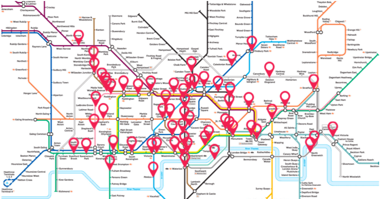
Perhaps it’s only fitting, in an era of found sounds and sound studies, to launch a map that attends to the sounds of those tub states themselves, with the help of the clever and enterprising London Sound Survey, that mediates recordings of the different and distinct soundscapes of some fifty-five of the expanding network’s two hundred and seventy five stations, in the aptly titled immersive virtual map, The Next Station, focussing less on music than on piercing screeches, drips of underground water, and crowds moving on the Tube itself. Gathered by a team of ninety five sound artists equipped with state of the art recording tools, heavy metal gets a new spin in the metal on metal sounds of the interior of the underground and counterpoint of trains’ rumbles beneath the city, in ways that create the sensorium that the smooth lines of the infographic is purified of, preserving the sounds of the whirring wheels of moving down tunnels, jostling, descending or ascending stairs, and screeching halts in ways that transport users to the sensorium of the subway tubelike itself. The pushpins of stations that can be clicked as portals to parts of the London Underground Tube stations is a part of the Cities & Memory, a bold venture of “remixing the world, one sound at a time,” a project now with new purpose in the #StayHome sounds that have gained unforeseen meaning as sites of attachment in the coronavirus lockdown.
Now expanded to a set of portals to most all of Europe, with over 750 artists across 100 countries that has mixed some 4,000 sounds, the web-based art form extends the fiction of an aural portal at the center of Ray Bradbury’s 1950 story, “The Window,” of a dying elderly Colonel who, rooted in one room and dependent on a desire to escape his own displacement, finds comfort only in the sonic transport of “long distance.” His slow days are distinguished by a daily call to persuade his friend Jorge he knew in Mexico City not to talk to him, but ask him to lay the receiver on his window-sill to allow him to hear the vital street sounds that transport him to a lost past of rich memory. So rich are the memories, indeed, that the attending nurse forbids Colonel Freeleigh to continue the technological work-around offers a solution to the isolation of old age, troubled by the heightened pulse of the Colonel as he hears these removed lost sounds, removing the new reality of dependence on others by bathing himself within the bustling street sounds of Mexico City, reaching for the phone to be reminded of his youth by seeking sounds that remove him from the oppression of declining health.
While the recreation of the alternative aural points of access to worlds engineered by the folks at Cities & Memory is of course directed not to only to the sick or disempowered, the promise it offers of transportation from the isolation of sheltering in place or “Lockdown” offers a new ability to access the spaces to which we suddenly find ourselves with less access by a collaborative map of global sounds, akin to podcasts of removed places, that offers the chance to refamiliarize ourselves with places we might feel increasingly removed, as a terrain we can access by a multitude of sound portals, each offering new immediacy that might make our own pulse race.
We read more maps than ever before, and rely on maps to process and embody information that seems increasingly intangible by nature. But we define coherence in maps all too readily, without the skepticism that might be offered by an ethics of reading maps that we all to readily consult and devour. Paradoxically, the map, which long established a centering means to understand geographical information, has become regarded uncritically. As we rely on maps to organize our changing relation to space, do we need to be more conscious of how they preset information? While it is meant to be entertaining, this blog examines the construction of map as an argument, and proposition, to explore what the ethics of mapping might be. It's a labor of love; any support readers can offer is appreciated!