Category Archives: Soundscapes

Deep Blue Openings in an Increasingly Sound-Filled World

The detection of sound provides a primary registers by which we are able to judge spatial relations and experience space.  But sensitivity to auditory sensations may be increasingly compromised to orient ourselves across much of the country; the epidemic of the extinction of “quite places” in the modern world has created a deep alienation form sounds of place, even as we can continue to map place, and a dramatic contraction of auditory horizons by which we perceive the world.   Increasingly impacted by a barrage of anthropogenic sounds, the alienation that is increasingly common from natural ecosystems of sound, and predominance of sound pollution, has led acoustic ecologist Gordon Hempton to devote increasing energies to making sound recordings of areas of natural sound ecologies of the Northwest in Washington State’s Olympic peninsula.  The region, one of the few “deep blue” areas in recent mappings of increasingly elevated sound-polluted areas indelibly shape the acoustic and indeed neurological experience of place across the nation.  Registering the increasing presence of anthropogenic noice along thresholds of decibel levels creates an image of the dramatic contraction of sound horizons that Hempton is so interested in preserving.  The below map, created by computer algorithms, reveal a distribution that has rightly commanded increasing attention upon its release in no smart because of the recognizable mirror it lifts to our own world of a landscape–here, the soundscape is visibly rendered as a landscape that offers few spaces of blue in which to lose oneself–of the shrinking auditory horizons of most.

After synthesizing about 1.5 million hours of acoustical monitoring, the below representation of noise-levels across the nation’s roadways create a portrait of sounds likely to be heard on an average summer day presents an image of the extent of places where one can expect to encounter aural intrusions.  The flyover view illustrates shifting decibel levels across the continuous forty-eight states, but most strikingly reveals the rare places marked by an absence of human-made sound.  The almost inevitable infiltration of anthropogenic noises is only poised to grow further in coming years, standing to change our experience of place and how we inhabit the world.

The unprecedented registration of sound-levels mapped across the country and rendered by computer algorithms is a significant achievement, but a benchmark of human geography.  The shifting hues of blues used to map the registration of sounds at above-average decibel levels reveal a significant diffusion of high levels of background sound across the nation–and suggests the radical changes our national soundscape has experienced in recent decades.  For background noises have become an almost inescapable aspect of daily life.  While registration of auditory differences in ambient sound across space have rarely been able to be charted with such precision, the resulting map shows a national both distinguished by far higher sound-levels than the past, and a diffusion of human-made sounds spreading from megacities to the rural hinterland, leaving diminishing differences between the two:  the near-absence of lands removed from human-made sound across much of the land suggests a radical remaking of our auditory world, as loudness is no longer clearly localized.  Rather than reflecting clear boundaries, the almost inescapable nature of noise-levels across much of the Eastern seaboard, midwest, and west coast lights expanses by a dim sulphuric glow, confining “wilderness”–if by that we mean by that a space where we can listen to hawks cry, hear water running in streams, rustling grasses, the conversation of rainwater with leaves, or insects’ buzz–to a small regions of deep blue that roughly match the largest national parks.  Who’s to say that this is not a shift as significant as climate change?

The rising levels of human-generated background noise across the country may constitute a health risk, given established links between sound-levels and blood pressure; the near-ubiquity auditory interference also suggests a significant compromising of our sensitivities to the particularities of place that seems both particularly troubling and of historical note as a change in our lived environment and auditory atmosphere.

USA sound map in decibelsScienceNews


While reflecting human density, the map is not only a reflection of population centers–although it does map onto them–but of ambient noise.  And it is even more revealing not of where noise is concentrated, than on where it is absent–those deep blue openings on the map.


2000_Population_Distribution.jpgU.S. Census Map/Population Distribution, United States


The rapid expansion of anthropogenic noise has profoundly altered the national soundscape, and indeed made the protected aural environments that suggest the limited success of the management of sound a generation after the 1972 Noise Control Act set a standards of local and regional acoustical management.  The acoustic data was processed by computerized algorithms to exclude local street traffic as well as variable air sounds of jets that predicts spatial differentials in the levels of unavoidable local background sound even without such outside intrusions.  Human-made noise has not only outstripped population growth; the growth in rising ambient sounds has surpassed three decibel levels is perceptible in almost two thirds of the protected regions and National Parks–roughly mirroring that region of greater natural sounds, not accounting for sounds likely to be soon unleashed by the expansion of hydraulic fracking, pipeline construction, drones, and the expanding density of air travel.

The portrait of our decreasingly differentiated auditory environments raises the stakes for preserving secluded spaces that will undoubtedly compromise our own future sense of space.  To be sure, the notion of a comprehensive acoustical monitoring of the entire continuous United States is not possible, and would require far more funds than the National Parks Services has at its disposal.  But the picture that emerged of a shrinking space of silence–and a shrinking space of focussing on “natural” sounds, not generated by humans, is striking.  Even as we receive increasing recommendations from ecotherapists urging us to act to remedy widespread affliction by nature deficit disorder by immersing ourselves in greater sensory engagement, and ecopsychologists note the health benefits of hearing leaves rustling or wind through trees, the map paints a picture of a future of radically reduced horizons for auditory engagement with unavoidable nature of anthropogenic noise.  The illumination of up to half of the nation, if not two-thirds of its inhabited areas, by striking bursts of yellow suggest an encroaching inescapability of noise that may compromise our sense of space:   with refuges to experience soundscapes under thirty decibels of loudness increasingly rare, ecotherapists may be conducting some seriously long distance guided trips.  One’s eyes are drawn to those deep blue spaces of repose in select areas of the inner recesses of national parks, but one is simultaneously struck by their distance from the environment where one lives.

The imagined soundscape without the presence of humans–or filtering all anthropogenic sound–would reveal a national soundscape pronouncedly divided into relatively noisier eastern and significantly more silent western halves, reflecting the greater inhabitation of the half of  the country east of the deserts:  this seems almost an auditory Continental Divide.  When Kurt Fristrup and Daniel Mennitt of Colorado State University of Fort Collins sought to map a landscape of differentials in “natural” sound across the country, they used it as a sort of base-map on which future data levels could be read:  indeed, one can distinguish the deep green swirls of sounds of the Mississippi, silences of mountain ranges, and noisy coasts–but an expansive stretches of silence across most of the region west of the Continental Divide.


scivis_graphNational Park Services Natural Sounds and Night Skies

One can usefully compare it to the contacting regions of the forested United States, based on this 2012 remotely sensed map of the woody biomass of the continuous United States, released by NASA’s Earth Observatory and created by computer modeling, that reveals the growing expanse of those regions permeable to extensive infiltration by sound.

Woody Biomass from NASA 1999-2002

NASA


One might compare it to horticulturalist and dendrologist C. S. Sargent’s 1884 comprehensive mapping of the density of US Forests, now digitized by David Rumsey, which presented the first detailed survey of the sort, to note the decline in tree-cover across the Great Plains and Mississippi, as well as the Great Lakes:


United States Density of Existing Forests 1884

Wired; from Rumsey Collections

The map of “natural” sounds reveals the levels of under 40 decibels marks a threshold in the intrusion of an array of anthropogenic sounds, one that reflects the changes of how we now inhabit the continent, and how we perceive the inhabitation of space, that might be compared to Global Warming in its cascading effects of how sound spreads across its sonic space.

 And in creating a synthesis of sound-levels across the nation, Frist has not only set something of a high watermark in the sound-drenched nature of our landscape.  The marked change across the national soundscape that Fristrup has helped chart based on 1.5 million hours of acoustical monitoring reveals a shift in hearing that seems on the level of that described by visualizations of the alarming local rises in regional temperatures across the nation, which providing apparent evidence of an inevitable process of global warming:  the maps below seems to suggest similarly ineluctible changes of the anthropocene at the nation’s edges that we have only begun to track, although the causation of such environmental impact to a release of greenhouse gasses is less clearly mapped in terms of causation, and human agency less readily determined than the registration of something that seems like climate change.


RISING TemperaturesNew York Times

Rather than consuming the edges of the country, as the above visualization of rising temperatures across the nation as evidence of impending global warming from the New York Times, noise encroaches on the country from the more populated areas more often located on its coasts and eastern shoreline.  The region providing platforms to the world is not organized as a clear workspace or a set of clear property lines, but as corporate entities and logos, and where the bulk of the wealth produced has proved increasingly elusive for many of its residents.  But the expansion across much of the nation’s soundscape by human generated sounds reveals what an analogous trend of man-driven change, if one that one can map with fine grain, and which impacts our perception of local experience in ways that seem more easy to measure and render at fine grain.

For the compromise of the sonic sensorium across much of the country suggests the degraded sonic environment we are transmitting to future generations.  The map of the auditory landscape across the United States suggests the emergence of sizable and rapidly growing rifts on the amount of audible sound to which we are daily exposed that seem as prominent as a Continental Divide:   radically different soundscapes in different parts of the country suggest a country increasingly plagued by noise–middle America or what was once known as the Midwest is distinguished by almost ubiquitous manmade background noise; intense acoustic shocks are rendered as bright corridors of noise run along Eastern seaboard of notably high loudness; only pockets of western parks, rendered as deep blue expanses in the interior, are distinguished by sound-levels of less than 20 decibels.  The Acoustic Society of America used some 270,000 hours of measurements across 190 sites in the country’s National Parks in the contiguous United States to assess an initial picture of levels of ambient human noise that seem all but inescapable in the U.S.  If the 1972 Noise Control Act was directed to strengthen legal protections against “unwanted or disturbing sound” to regulate noise pollution, sound-levels seem  so widespread across the nation to be hard to distinguish how unwanted sounds adversely affects one’s quality of life as unwanted disturbances.  Yet we now have a means to visualize the collective rises in ambient sound in ways that are truly as compelling as maps of global warming.

The change in our aural landscapes has gone largely unremarked, in part because the data is less easily available, and visualizations were long less able to be confidently rendered in such clear detail–or the amount of data not able to be clearly synthesized.  Even at first seeing the map of sound levels in the nation released by workers at the National Parks Services in past weeks, it’s hard not to be drawn to these scattered refuges that lurk inside the map, as we shun the bursting supernovas of  aggressively bright yellow whose streaks across the overstimulated sonic landscape where most of us live.  The brightness of areas in which greater levels of sound were sensed seem to push us to the relatively few remaining quiescent places in the continent:  it is not that they remind us of just how fully the sounds of motorized vehicles have come to penetrate most of our auditory worlds most of the time, but that they seem so ever-present and so visually loud, even when the levels of sound seem to fade miasmatically into the midwest, but reflect the growing population centers across the country that undoubtedly generate the greatest noise.  The map creates a compelling picture about how we can interpret the current distribution of populations as filling the nation’s space.

\

Ex01_Mega-Region-Population_500pxMartin Prosperity


Much of the attention that the map has received respond to just how rarely sound-levels have been so closely integrated–or so clearly shown to overlap–with the mapping of an environmental space, or so compellingly integrated within an understanding of environmental change.

The question of registering an atlas of urban sounds have most often responded to less to subjective or individual perception than public policy issues that surround very specific local levels sonic pollution in urban environments from San Francisco to Oslo, based on visualizing noise levels across urban streets through GIS-based simulations that synthesize variations in decibel levels over time–and reflect a desire to control urban noise that even predate the Industrial Revolution, and which, R. Murray Shafer has found, there is evidence in Bern back in 1628, but which computerized maps provide a basis to visualize the results of such acoustical monitoring today.


SF NOISE MAP

San Francisco

cus_figure18

Oslo

Despite such concern for managing urban soundscapes, less attention has focussed on comprehensively mapping endangered sounds–and even less on the endangering of silence, which have not been often imagined as a comprehensible object of concern.  Attempts at mapping local sound-levels for reasons of public health have focussed on a local level to assess problems of noise pollution and to assess aural impositions in urban spaces–and to measure benchmarks of tolerable sound-levels in urban space.  We more often consider noise abatement in relation to crowded restaurants than open spaces or countryside.   The registration of a varying range of decibel levels across the United States created the opportunity to visualize a color-coded record of ambient sound, grouped according to spatially situated environments, applied a broad palette to geographic space based on a much larger dataset, and one that responds less to problems of placing future projects of construction than measuring the increasing ubiquity of sound-levels often linked to urban environments across the country.

The innovation of the NPS sound map of the country’s less inhabited and more densely inhabited regions presents a particularly persuasive picture of the extent of the growing uniform nature of our aural environments.  Based on the 1.5 million hours of motoring across the country to capture  sound levels sensed on an average summer day, researchers with the National Parks Service have collated an impressive acoustic topography of the continental United States in hopes to map average decibel levels across the country, and found few areas of relative quiet.  The result is particularly striking for suggesting deep scars of sound that radiate aglow from urban agglomerations in a heat map of loudness that registers the diffusion of human-made noise levels across the country, and the extent to which much of its illuminated center is flooded with ever-present background sounds–acoustic pools, as it were, of almost 50 dB, or able to drown most natural sounds from animals.  If the sound map created from algorithms suggests just how urbanized we are today, and how far urban noise-levels extend across much of the country, it offers evidence of the auditory effects of anthropocene from which there appears no turning back.

USA sound map in decibels

The picture does not look good for the future of quiet spaces in most of the coterminous United States.  The stars and streaks of aggressively bright sulfuric levels of smoky yellow–indicating concentrations in urban areas of a level of 51 decibels or more–maps clearly onto population concentrations from the shores of Lake Michigan to Dallas, Atlanta or central Florida.  The noise map reveals huge differences in noise tolerance and indeed background noise that most Americans experience as normal, and indeed the auditory expectations most bring to their days, and the relative absence of silence over a large part of the inhabited country that noise has infiltrated, from a light gauze of yellow that surrounds are largest farming industries to the clusters of noise around expansive urban areas.  In those deep blue swirling patches of the interior lie the most silent spots of the country,abysses of quiet which register the lowest absolute levels of sonic interference, far from the pollution of urban noise which seems to spread like age spots across much of the eastern half of the continent.  (The very deepest deep blue regions designate areas of background noise below twenty decibels, the sound of a ticking watch, far below  the  a refrigerator hum, and very far from the ever-present ring of cell phones, piercing blasts of jack hammers or car alarms, freeway rumble or such sudden spikes as sawing concrete that now seem to so often mark the hubbub of urban life that is often difficult to blank out save by white noise machines.)  A considerable share of the population must be quite habituated to an almost constant loudness of almost fifty dB, or about that of constant traffic–and just below that which is claimed to increase high blood pressure, tension, and heart attack risks.

Remapping the limited areas of low-level sounds top stand out more dramatically in black as isolated islands of greatest quiet gives the map an even clearer urgency as a manifesto for the shrinking spaces of silence across the continuous United States:

150216-noise_0622150367affea5ca3ca361d54b523a.nbcnews-ux-720-600


The map advances a narrative of the shrinking areas of silence in the soundscape of the continental United States that is decidedly not rosy, and in which levels of noise pollution stand to double or indeed triple every twenty years, making this a particularly troubling prospect that challenges the future of silence in America.  Not so surprisingly, it maps well onto a randomized map forecasting air quality across the nation in its contours, although variations in the NPS soundscape in the header to this post show more finely grained variations and seems to exploit a broader dataset.


Feb 20 AQI


The deep discrepancies in decibel levels however bears little clear correlation to the current mosaic of political preference across the continuous forty-eight, however Lamarckian one would like to be about the relation between collective preferences and aural environments.  Despite a tendency to link weaker support for Republicans with louder areas of greater ambient noise, the data just doesn’t bear it out in full at all:  some of the reddest areas are those register considerably greater decibel levels.  (Low support for Republicans in Maine contrast with its predominantly low levels of ambient sound; noisy areas of the South are pretty darn red, despite strikingly diverse levels of ambient sound registered in those states; noise-levels in California’s central valley are roughly equal the blueness of its coast.)


Screen Shot 2015-02-18 at 9.10.13 PM


The narrative that the soundscape implies is far from rosy, however.  What seems most frightening is the lack of any clear map of the future penetration of high decibel levels across much of middle America.  Along the frontier of the decibel divide, much of the nation’s center appears flooded dark yellow; Denver, St. Lake City, Las Vegas and Boise seem beacons in an expanding aural frontier, burning bright already in Seattle and Olympia.  The registration of these ambient sounds include not only vehicles, but from factories, radios, sirens, televisions, construction sites, trains, or mechanically generated sound of any kind, registering the range of overlapping sounds at any space at any time, in a manner more like Zefrey Throwell’s 1,000-car-horn symphony than the heterogeneous ensemble of percussionists György Ligeti enlisted in his Grand Macabre.

But the origins of the shifting soundscape in the nation might be better tracked through the appeal of the Good Roads movement of Charles Henry Davis, that industrious Quaker who lived in South Yarmouth, Massachusetts, but founded the National Highways Association in 1911, promoting the hope for an interconnected National Highway System of 50.000 miles “built, owned and maintained by the National Government,” which while limited at that time to six great “Main Highways,” advocated an image of “a paved Unites States in our day” that has persisted.   The benefits Davis saw in paved roads as an engine of economy that would raise the nation were more than only an infrastructure–“national highways will increase the wealth, the power, and the importance of this country as nothing else can do besides that which has brought civilization to the savage, wealth to the poor, and happiness to all–GOOD ROADS”–but an image of collective benefit.  The continued promotion of their benefits, so removed from views of the benefits of preserving place today, actively promoted the benefit of the ideal of a “paved United States in our day.”   Indeed, if all road maps were promoted in 1912 from South Yarmouth as useful tools that “will prove of inestimable value to the proposed national highways commission, and in addition will be of service in showing the people of each state how the national government can make use of their roads in the proposed plan” as of a piece with a bucolic vision of the nation.


Davis 1912.pngDavis, Good Roads Everywhere (1912)


Maps boosted the image of a national system of highways, and indeed our sense of access to national space, from the 1925 promotional map that synthesized the roadways of the nation as an invitation to their exploration to celebrate the achievement of 250,000 miles of national highway–


WVNZbcsbUGKLuyip_TT


–to the expansion of the “Good Roads Everywhere” movement creating a “paved United States in our day” as if it were “peace in our time.”


6a00d8341c6d6753ef010536249841970b-800wi.jpg


Looking at the nation’s soundscape, it’s hard not to be drawn to the chasms of deep blue where sound levels decrease.  National Parks Services’ researchers took some shots when they compared these areas without background noise to the notion of traveling back in time to the sound-levels before Columban contact–on their apparent ignoring of the dense population of the continent before its “discovery”–one might see it as the sonar landscape Lewis and Clark experienced with the collection of animal trackers and Native Americans which composed the Corps of Discovery,  traveling down the Columbia river or pausing in their portages:  these are the areas distinguished with a sound level of lower than twenty decibels, areas where one can access a pristine auditory experiences characterized by the near-absence of the background noises that we are tempted to screen out of our auditory experiences,–and against which would stand out the perception of local wildlife.

The attractiveness of these seemingly pristine places not only provides a compelling advertisement for visiting national parks during whatever summer vacations one might have, but is a compelling soundscape of a world not likely to return, where decibel levels fall far below the fifty that almost seem low for urban areas, the deep blue recalling something like the cold of oceans’ depths.  Created by the National Parks’ Natural Sounds and Night Skies Division, it reflects their mission statement to create an inventory of sound that seeks to preserve “acoustic and night sky environments unimpaired for the enjoyment of future generations,” Fristrup worries, and provides something of a watermark on our aural environments, but it is also intended as a diagnostic tool to measure the degree to which manmade noises affect owls and bats who depend on locating insects to find food–the somewhat synesthetic record renders an acoustic environment married by bright yellow splotches and sulphuric streaks, and ubiquitous noise levels comparable to hearing a washing machine churn from a distance of three feet away.

The ever-present scars of unwanted sound spread aggressively in almost radial fashion from major population centers and seem diffused across many the rural areas of the country.  The maps suggests the auditory compromises created by the road network which generates ever-present background noise across the continent’s more inhabited areas, even if the algorithm used to generate it discounted traffic, with non-human made sounds of wind and water.  Rather than present a watermark of sound levels, the map bodes poorly for the growing levels of volume in years to come.  If much of this noise-generated hearing loss perhaps on account of noise-levels artificially generated in iPods and MP3 players which funnel amplified sound into directly our ears–and which may have helped elevate the number of five million 12-19 year olds who have compromised hearing thresholds, according to Dangerous Decibels–a site which is full of tips on living with hearing loss and the risks of noise-induced hearing loss–the desensitization to environmental sounds that the map charts creates a landscape where even those without Noise-Induced Hearing Loss (NIHL) have a compromised relation to their environments.

But the map suggests the changing nature of outdoor hearing for most populations, compromised by the rise of background noise, and the deep penetration of what used to be considered urban sounds of mechanized movements across much of the country.

USA sound map in decibels

Reading the stark topography of sound levels across the lower forty-eight, one is indeed almost instinctively tempted to run into its scattered pockets of deepest blues:  these seem the safest areas of respite, as one shrinks from the bright incandescent yellows of even a tolerable amount of ever-present background noise–maybe not to the deserts of southwest Texas, but if not to the national parks bordering California, in the Cascades, the Colorado Plateau, Yellowstone National Park in Wyoming, Dinosaur National Monument between Colorado and Utah, and in the Great Basin.  (It’s perhaps not a coincidence that some of these ecosystems, many home to Native Americans, were to be preserved “from injury or spoliation” by the National Parks, preserved thanks to Carl Shurz, David Brower and Howard Zahniser.  Is the aural intrusion not a deep form of injury?)

One might as well get out a paper map of the greenspace in parks to correlate them with the deep blue lakes of silence .  . .


National_parks_trails_map


It is almost difficult to imagine the experience of those deep blue areas of silence today.

The expansive chromolithographies of Thomas Moran depict deeply hidden, inner resources of nature in sites such as the future Yellowstone or Zion Park, preserved from industrializing life of in ways that raised interest in the hidden landscapes of the United States, after he had accompanied Ferdinand V. Hayden on the 1871 Geographic Survey of the Territories, in ways that created one of the first romantic images to produce a popular movement for the protection of a landscape as undisturbed.  One is struck in Moran’s monumental landscapes by how these awesome environments dwarf their  human visitors, arriving in what seem uninhabited lands, far from the noise of railroads or cities in the industrializing United States:


PW015_18.71.14

Thomas Moran, “The Valley of the Babbling Waters, Southern Utah” (1873) 18.71.14

exhib_moran_GC_18.71.8Lrg

Thomas Moran, “Grand Canyon of the Yellowstone” (1875) 18.71.8


visit_ynp_moran_18.71.1lrg


These are the ideals of We now look at the romance of arriving at deep blue spots in the algorithmically generated soundscape, far removed from Moran’s monumental renderings of geographical formations that first communicated a sense of the natural majesty of the western United States to a large audience of viewers that communicated the wonder of a landscape he saw as both untouched and pristine, in contrast to the ever-present ambient noise that seems not only inescapable in remote regions of Oregon’s Crater Lake National Park but all but inescapable in much of the U.S.

But the levels of noise pollution that illuminate or almost incandescently light much of the country marks the encroaching of an auditory anthropocene from which there will be no turning back, and which has already altered the landscape as well as soundscape of the country.  The spatial collation of audio registrations finds most people live in environments “where night skies and soundscapes are profoundly degraded, Fristrup notes, describing the extent of both sound and noise “pollution” as almost spanning the continent, where median background noise plagues most, out of a desire to “conserve natural sensory environments for future generations” registers his deep and abiding sense of loss and the inevitability of a landscape of increasing auditory degradation that could bring a generation of “learned deafness” destined to dull one to the very soundscapes National Parks seek to conserve–and the notion of such environmentally provoked desensitization to sound seems backed by the datum that some 10 million people in the United States were judged, in 1999, to have permanent hearing loss from noise or trauma.  Are we becoming increasingly hard of hearing or deaf, or in danger of slowly losing a sense by which humans have long interacted with the world and gave meaning to it?

The argument has had special resonance–no pun intended.  The map that was quickly shared upwards of 10.9 K times record penetration of high decibel levels (above 40) across much of the country’s inhabited land–and the rarity of those deep blue chasms that seem to almost fall through the map.  Although the idea that they record the sound environment of the country before Columbus is doubtful, and not only because of the folly of thinking that it was not inhabited before 1492, the absence of industrial ambient background noise over a level of forty decibels is no doubt a pretty modern creation–though anthropocentric presumptions that the noise be generated by humans, rather than animals–stampedes of buffaloes?–seems more unwarranted.  But the map based on measurements of midsummer decibel levels is a unique map of how we inhabit the land, and a nice record of what we might mean now by the “inhabited world”–or ecumene.  It is a record, perhaps, of how we have chosen to inhabit space, and the ways that we have chosen to inhabit it–the landscape scarred with sound bizarrely analogous to the barren scored and spotted pock-marked lunar landscape, and the connotations of un-inhabitability it inescapably provokes in evoking this surface without life.


moon-full-moon-8-30-2012-1

The sterile landscape of the moon is an odd choice of comparison.  The worry that we may be facing the rise of a “deaf generation,” unable to hear the world as men and women once perceived natural sounds, due the growing decibel levels of constant noise in larger cities, and not be able to hear or register the natural sounds in cities, and even National Parks, has led Fristrup to worry about the threats and healthiness due to increases in ambient noise and wonder if future generations might not even appreciate the sounds of nature in cities or National Parks.  If such fears seem alarmist, they are reflected in the deep attraction most observers will have to the deep blue identified with tranquility–and with restfulness or even curl health–an association according with the profound healthful benefits of silence.

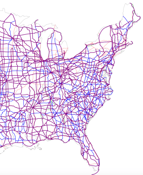
Fears of a growing disconnect with aural experiences makes the strong similarity between the scoring of the national soundscape and the lunar landscape somehow appropriate.  For the scientific synesthesia that results suggests how we’ve filled the continent with sound, from jack hammers to jet airplanes to trucks to power mowers to daily traffic to sanitation trucks to bird-calls.  The sonic landscape closely corresponds to the expansion of manmade environments across the continent, and ignore the level of noise that was made by earlier inhabitants.  The measurement of strong levels of sound pollution claims to screen out the traffic of nearby automobiles, but is appears to echo the very network pattern of freeways and highways that traverse the country and link cities with one another, and were no doubt privileged sites of measurement; where few or no roads exist, it seems that regions of deep blue must perforce prevail–or at least that the grids provide a basis to generate noise:  grids of streets even appear in the noise map, much as the splotches of bright yellow mark cities and sprawling urban areas that have made silence almost inaccessible for large shares of the nation’s populations without considerable geographic mobility, and moved all landscapes of deep silence far west, removed from traffic’s perpetual hum.


2000px-Map_of_current_US_Routes.svg

 Wikipedia


Only in 1970, of course, considerably more open spaces existed across the United States, if one focuses on Interstates alone across the western states:


The apparent density of noise may indeed be partly explained by the density of the network of highways that course across the Eastern seaboard and much of the midwest.


What might be called the “noisier half” of the United States shows an area of almost continuous noise pollution, where the “auditory horizons” have markedly shrunk in most places to but a few blocks of paved space–


Noisier places


reflects the very same region where highways define a distinctly different relation to expanse:

half highways


The expansion of the National Highway System across the nation is perhaps best rendered by a hand-drawn map that tries to project its future and the compromising of place that it implies, with an eye to the shrinking of the auditory human experience of place:


A Highway Map of the USA


For the congestion of noise, roads, and urban areas reveals an image of how we inhabit continental expanse.  We might compare the division of the country, grosso modo, to the imbalance in the density with which McDonald’s restaurants are spread across the contiguous United States, shown here by illuminated dots that reveal the proximity of fast food restaurants across the land, sometimes suggesting strikingly similar highway paths, and no doubt mirror population trends, and indeed the density of businesses:


mcdonalds_us-520x379

Stephen Von Worley 


Does space tend to collapse in interesting ways once one is less able to sense sounds?  Such levels of noise pollution offer a sonorous residue or acoustic remainder of how we have come to inhabit the world’s environment and to remake it, and register the arrival an auditory anthropocene which earlier maps have often been hard-pressed to detect.

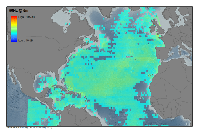
As much as being confined to the United States, the prospect of such elevated decibel levels in areas of dense population and the modern humming of transportation networks across the country find a parallel in the noises of the global traffic networks we have created in the seas.  Indeed, the oceans seem increasingly characterized by constant presence of such noise recalls the “background hum” of oceanic shipping lanes that resounds across the oceans, by modeling a global soundscape seeks mapping the range of sounds ships create in transatlantic voyages, that seem the material reminder of the increased intensity of a global network of shipping lanes.  Such sound levels, to be sure, often obscure the cresting of waves, with the upshot of radically compromising the auditory experience of the ocean for its inhabitants–especially imperiling animals that use sounds to communicate, cetaceans from whales to dolphins, in ways that may mislead the sonar skills they have evolved to map their own courses underwater, in ways that create more than auditory interference with how they experience space.  And with noise traveling some 4.3 faster in the watery medium than in air–and traveling at an unchanging intensity over considerable distances–the gigantic impact of large-cargo vessels that generate more noise than we would often permit onshore from constantly running diesel engines creates considerable ambient noise to which different marine creatures are especially vulnerable.

A map of the auditory intrusions of passenger vessels alone that was recorded and released by NOAA based on anthropogenic noise of cruise vessels alone suggest a shifting in the oceanic environment:


Atl_NL__PV_0050Hz_0005m


Yet the spectrum of noise from the chronic levels of noise modeled from larger commercial vessels was far more chronic:


Atl_NL__0050Hz_0005m

And when summed, the picture that results is of a radically sonically altered and disrupted environment, apparently in ignorance of the disturbances that they create for actual (or any) ocean populations:
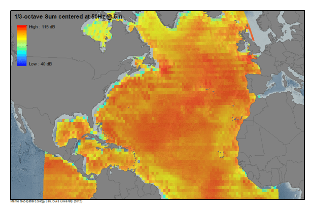
Atl_Sum_0050Hz_0005m_ThrdOct


The map below registers sounds that extend to a depth of 650 feet in a similar color spectrum map–which doesn’t include either seismic exploration or Navy sonar noise that add considerably to the range of ocean sounds that obscure today’s songs of humpback whales.  Indeed, if whales often base their communications over expanses of hundreds of miles through their song, whale space has undoubtedly against such background noise in a a sea with startlingly few areas absent from auditory interference.  Such changes would not only affect the cetacean populations of marine mammals as they navigate underwater transit–if von Uexküll suggests that whales are attuned to other worlds, it might be important to contemplate what they make of the ships’ apparently unavoidable background sounds, or whether they accommodate to their presence.


lead_large NOAA

If one goes to 200 Hz, a slightly different picture of the local variations in background hums emerges:

ocean sea noise global map noaa nasa decibels noise pollution marine animals mammals 200hz_NOAA

But what might be considered more broadly is the very difficulty of erasing the imprint that such ships that travel across the seas exercise over the entire marine environment. The sonorous surroundings characteristic of the oceans were earlier mapped at 400 Hz and a depth of fifty feet by NOAA in 2012, from passenger ships, commercial ships, to seismic surveys in an annual average, present a similarly pronounced offshore acoustic disturbances and an even more pronounced augmentation of background noise offshore, as if hidden from landlocked observation stations, as if ships’ engines are only started at full throttle after arriving in the open seas, where ship captains or automated pilots crank up their speeds and plow full speed ahead:

1211-sci-OCEANNOAA Underwater Mapping Sound Field Mapping Working Group/HLS Research/ NCEAS–Details of North Atlantic Shipping and local noises near Long Island–from the New York Times


The rumors of transatlantic voyages notwithstanding, it is somehow wonderful to move from the noisy oceans to their landlocked counterparts.

The deep blue sites of relative silence, often confined to the areas close to the coast, may indeed obscure the extent of noise we have created far out at sea, far from the increasingly noisy shore, where we cannot hear their hum.  The shifts in the national–as well as the global–soundscape makes one wonder whether, in obscuring some sounds or making other sounds inaudible, one is not changing perceptions of space in ways that the great majority of  data visualizations cannot register.  But both present us with digitized images of sound-levels so strikingly ever-present that we can almost hear them resonate across space.

Like the deepest blue spots on the sound map of the United States, they mark the rare areas of respite in an every-noisier world.

1 Comment

Filed under anthropocene, environmental mapping, national parks, sound maps, Soundscapes

Hearing Through Maps: Mapping London’s Hidden Waterways

We do well to see through maps, Denis Wood enjoined, urging us to detect the “human landscape” that lies superimposed upon the land in maps, and uncover the ways that the landscape has been changed–and orient ourselves to those changes that have been wrought by the “huge arrogance” that “we can name and we can claim.”  Maps demand to be interpreted by scratching their surfaces, aa task of uncovering how one might best “see through them,” to explore the landscapes that lie underneath the layer of words that lies on their beckoning if often all too opaque surfaces.  To take stock of how maps work by asking us to go about imagining the landscape that lies beneath those words is a way of uncovering their arguments about territories.  

The linked map invites readers to explore its surface, in web-based maps of the London Sound Survey by using links to explore soundscapes that would otherwise lurk beneath cellulose surfaces.  Web-based maps such as Sound Survey of London’s waterways offer modes of remapping the known environment of the city:  and the choice to map the riverine network that is rarely seen in London by the conventions of Harry Beck‘s almost universally recognized diagram of its Underground.  

The image offers an apt way to invite viewers to excavate audible aspects of the city absent from a drawn map, in a truly phenomenological map of the circuit of hidden waters beneath London. If subways are often noisy, the sounds that the Survey has compiled offers a somewhat synesthetic compilation of the hidden waterways that might be seen as corresponding to metro stations, less as a disembodied circuit–as Beck’ map–than as the subsurface lying underneath the engineered world. Beck’s map sanitized the subways in streamlined fashion to attract Londoners to the Underground, readers are asked to explore the waterways that emerge only in its parks, bridges, and channels linked to watery paths which we rarely see which run under and about its surface before they enter the central artery of the Thames.  
Rather than by mapping the  city’s space in reference to its individual  streets or intersections, but by placing the rivers of the Survey maps waterways’ sounds in ways that recuperate their perhaps forgotten presence.  Wood remapped the lived community of Boylan Heights so that is not only as a place in Raleigh, North Carolina, but charting the “metabolism” of the community in maps of the light street lamps cast, lit jack o’ lanterns placed on porches at Halloween, paper routes Wood ran with a tightly knit cohort in his youth, or “squirrel highways” of aerial wires, which collectively serve to unpack the often invisible ways of “how it works.”

Halloween in Boylston Heights

One might compare to this set of maps the ways in which maps in the London Sound Survey invites readers to enter an overpowering pointillist accumulation of local details, and similarly serve to map a setting in which everything sings–or at least we can enter its audible surface at distinct points.

The question of what axes indices and axes might be adopted to best orient readers to the ways that the place works are ingeniously organized by the Sound Survey through the colored lines and stops of the transit map that Harry Beck proposed for London’s Underground in 1931, a network-map whose revolutionary simplicity seems to have been devised when the draftsman in its Signal Office, Beck adopted paths of circuits to map the intersecting pathways of the Underground at a time when the city needed to encourage less traffic in its streets:  the powerful success of Beck’s map shifted Londoners’ attitudes to urban space.   A rewritten version of the familiar iconic network of the London Underground appropriately provides the syntax to uncover the hidden network of non-tidal streams, brooks, creeks, pools and channels that run, partly exposed, partly underground, around the river Thames.  Territories are less the question in the map of London’s waterways, which progress from trickling streams to waves slapping against the locks of the Thames.

Soundmap after Beck

London Sound Survey, Waterways 

The result is to conjure not a mythical, lost London, as did James Shepherd Scott’s 1884 History of London, a work concerned to show “the origin and growth of the present condition of the suburbs” of what was the “largest city of the world,” but which began with the tabula rasa of “London Before the Houses”–with two streets running about marshy region in a network of rivers–but to remind us of a watery network that still lives under the city’s paved streets–even though it also echoes Scott’s illustration in recreating a London that is now lost to the senses for most readers.

11168289233_4959c605b9_c

If Scott’s map served as the frontispiece for a volume that described the city whose growth has been “very rapid in modern times,” and “an ever-widening tract of country covered by the buildings of a city already so large that it is equalled by no other in the world” (1), the cosmopolitan metropolis is excavated in the map of the London Sound Survey.  While Scott mused that “as the houses advance, the natural features are obliterated,” and, at the conclusion to his list of changes, “the brooks no longer run” (2), the survival of the brooks and streams as vital parts of a living landscape are documented in the qualitatively detailed survey’s sounds.

In charting paths of the waterways hidden even to London’s own inhabitants, the sound map is especially successful in charting the dissonance between the forms of symbolization and lived experience–and by doing so through the conventions we immediately recognize as indicating London.  While imitating or offering a cartographical homage to the Underground map, the surface of the map is punctuated with sonorous glimpses of the lived space of London today–offering actual stops where we can pause to hear a sound file of a minute or so of the water that trickles between it can be heard from the surface, in evanescent moments the symbology of the map cannot hope to record created by rivers, feeder streams or brooks, and canals.  Each “stop” is an observation station–to perceive or note the gurgling of a brook over a weir near Wimbledon or follow the course of the Brent through a culvert and along a viaduct, beside ambient noise of work, honking geese, and quacking ducks.  That the rivers don’t exist makes the map a recuperation of how London lives beside the water today, and to attune oneself to its changing  environment in which the tributaries of the Thames are more often trickles than rapidly flowing streams.  While dismembering Beck’s circuitry, the paths of rivers, streams, and waterways that flow into the Thames are something of a melancholy look at a world we have lost, but also a snapshot of their survival in an urbanized environment.

The cartographical poetics of the Sound Survey map are immediately recognizable.  By adapting the iconic conventions Harry Beck pioneered in his immensely popular modernist mapping of the circuits of metropolitan transit in his 1931 Underground map, the map needs no identification of where it is–London–and provides something of a counterfact of an image that today is separable from the city, despite its considerable influence as a model of mapping transit networks.  The map’s almost-universal influence on how metros are mapped in urban landscapes has not altered the distinctive iconography of the Underground map:  its conventions establish a quite different perspective than orienting readers to its built underground, however, as it used similar streamlined conventions and colored lines to trace the paths water takes in London’s built environment.  The conventions invite readers to explore the topography of where water rises to the surface of the urban space:  by clicking at the site of any “stop,” to link to audio clips along the indicated waterway, marked, as trains, by curving colored lines almost identical Beck used to diagram the city’s Underground–yet rather than create a unified network, they trace currents that flow into the Thames–the river that runs through London, and sole point of external reference in Beck’s now-classic modernist map of the London Underground.

Ian Rawes has long recorded London sounds to preserve its sensorial world; the map of waterways allows us to enter aural environments at parts of the city by a smattering of precise sensations of water passes whose collective accumulation overcomes its readers:  while mapped as if a site of imaginary metropolitan stops, the stops are in fact spots where waterways aside from the Thames are audible to city-dwellers, as if to synthesize insider’s knowledge how the urban space overlays an unseen web of currents, exposing them in a map as Beck foregrounded the space of transit lines to orient urban travellers.

underground_map_beck

Harry Beck’s original map of the London Underground (1936 version)

When London Sound Survey mapped the city’s hidden urban waterways, it used data from observation stations to revisit formerly overlooked spaces where water emerged, at least aurally, in the city.  These sites are rarely mapped, but the interactive audio files allow users to hear sounds of a watery web which one might have earlier recognized.  Each observation site appears evanescent moments at scattered sites in the city, but reveals, as a sort of historical base-line, the levels at which water flows through multiple sites in the built environment.  The website gestures the organic notion of the flows of circuitry in the Beck map–now iconic–around the flow of the Thames, and perhaps, by orienting itself to the Thames River, so different in its smoothness than the hyperactive transit maps of Japan Rail in Tokyo, whose integrated circuit seem spectacularly stripped of reference to physical landmarks or phenomenological relation to the world.

JR new.jpg
Integrated Circuit.png
tokyosubway2011j

When Ian Rawes sought to encode over 1,500 discrete recordings in the London Sound Survey but in plotting the courses of the audibility of otherwise-hidden waterways plots, the Survey organized what seem curiously subjective perspectives to map what can be heard at different sites in the space of a single map of the hidden streams that run through the metropolis; the act of apprehending the submerged underground network is pleasantly reorienting, focussing our attention on where they reappear and intersect with birdsong, dripping waters, passing individuals, or local sounds of construction and transport in the city:  the discrete sites assemble, collectively, both a map and an aural environment that most maps)cannot capture.  Each discrete sound seems impermanent, but  also suggests, collectively, the ways water briefly reappear in a built environment, as rivers, streams, and canals enter lived life in ways not detectable on an actual map. At each “stop,” we enter an observation-station where Rawes recorded the ambient sounds around waterways.

1.  The resulting mapping of the soundscape of London’s waterways offers a multiple points of entrances to soundscapes outside the city’s built environment. The permanence of the pathways of canals, rivers, and underground waterways rightly map of the sounds of the system of waterways as intersections with a riverine underground.   Explicitly designed as an “auditory tribute” or homage to the circuit-like color-coded design of Harry Beck’s modernist map which clarified complex pathways of the tube for commuters earlier only “about as legible as a bowl of spaghetti” for its riders.  Beck’s draftsmanship elegantly schematized the pathways of London’s Underground to allow their legibility in an icon not only of urban transit but accessibility, but of the city itself:  at a time when the city’s subway had become so geographically far-flung to be a challenge to condense to a legible fashion, the map effectively persuaded commuters of the ease of navigating its totality, while living in its suburbs, by mapping the pathways of its trains by angles at increments of forty-five degrees to increase their legibility, and foregrounding its interchanges.
Ian Rawes cleverly adopted the diagram first designed to promote a readily legible record of commuter rail, by straightening out their course and contracting the distances at regular intervals to allow aural access to sound files through a web-based interfaces.   Whereas Beck’s intent was to expand the utility needed in a transit map for audiences in ways that riders to navigate its multiple lines that was readily appreciated by riders, Rawes’ map is an opportunity for noticing the overlooked, and invite them to follow the paths with which waterways intersect with other lived environments.  The cooing of pigeons and drips of water under the Greenway bridge at “Channelsea” off the Lea complements the hum of traffic overhead, as if an epiphany of the evanescent; the passing train near the Roding at “Alders Brook” suggests a moment watching passing urban traffic on a viaduct, as the trickle of water at “Paddington Basin”–not Paddington Station–almost concealed by the loud whirr of air-conditioning units and an intermittent power-saw from a nearby construction site.  The Brent flows under the observation station “Greenford Bridge” pierced by the referee’s whistle at an amateur football game mixed with players’ cries.  The registration of lived experience sets something of a watermark on the sounds of London circa 2012.

The physical expanse of Rawes’ aural map is an a propos homage Beck’s diagram.  The soundscape map reveals the similar permanence of overlooked waterways that link to the Thames.  By collating short sound-files at points where they emerge from the built environment, preserving a uniquely personal reaction to place of the sort that often eludes city maps.  Where Beck preserved a mental image of the sites at which access to the London Underground was permitted, at a user’s click, a range of ambient sounds peek through the observation points noted by the stubs with which Beck rendered Underground “stops” in his iconic map.  Beck’s map was immediately popular among commuters as a way to re-render the urban space.  It has since gained such sustained popularity as a model for similar subway systems–it encouraged urban expansion in Sydney (just eight years later) and encouraged Beck to submit maps for other cities’ transport systems in future years.  Indeed, the image has become so a successful a symbolic rendering of London’s space for its conventions of colored lines and combining of circular hubs of interesecting lines with stubby stops to orient access to London’s underground.  By using the streamlined circuit-like conventions by which Beck had oriented riders to the expanding Underground and navigate their commutes, Rawes recuperated the lost sounds of the city’s waterways as if to remind readers of the distance at which they stand from them.

The Underground map was, of course, famous as a remapping of urban space, as much as an icon of London.  The diagram placed stations at a remove from actual distances or locations, but replaced an image of the actual geographical relations in the city by highlighting their routes on clearly colored paths that run in uniform lines  to prominently render interchange stations, filtering out any reference to the city’s physical topography save a quite schematic rendering of the Thames; the image was quickly affixed to every station on account of its highly readable ways by which it oriented city-dwellers and allowed them to gauge the crucial question of the number of stops–rather than the actual distances–to their destinations. If Beck’s map collapsed space, the map of waterways orients readers to the transit that water took across its expanse, in ways that seem irrelevant to spatial geography.  Beck straightened the river’s course in the name of clarity in his diagram, in line with the straightening of trains’ routes for readers to allow them to better visualize routes of travel and the exchanges they would need to make.

Such is the conceptual clarity and considerable staying power of Beck’s diagram to navigate London’s underground makes it in fact quite difficult to view the actual pathways taken by Underground trains–yet Beck’s system of reference remains so powerful a symbolic form to conceptualize London’s Underground that it is disorienting to be presented with the actual courses train lines truly take in the city.  As a symbolic form of what Rudolf Arnheim called “visual thinking,” the diagram encouraged Londoners to take to the Underground as a way to navigate their commutes or daily travels with such success that an actual groundplan of the interface between the individual lines and the city’s space seems disorienting in how it reveals the meandering pathways that train lines actually take, the actual sinuous curves of the Thames, and the apparent failure of trains to turn at increments of 45° along their true courses.

Beck's lines mapped on London

We are far more ready to map the familiar transit lines displayed in a reference key and shown in the maps by pronounced paths of colors, as a network that existed as if autonomously from the city, to better find what he called its interchange stations.  The notion that the network was made up of discrete lines proved immensely influential in all later transit maps.

REference

Beck’s Original Reference Key (1931)

For Beck’s crucial insight of simplifying the courses of trains by mapping subway lines in increments of forty-five degrees allowed riders to imagine the paths of trains as a network independent from the street map. It has been expanded, accommodating the multiplication of transit lines reflecting the city’s explosion:

London_Underground_Overground_DLR_Crossrail_map.svg


Beck’s streamlined routes of the diagram offered Rawes a quite fitting medium to map each waterway’s aural settings at observation points.  Each “station” presented readers with a chance to look under the map to hear the sounds that peer out from it, at a click:  linked sound files map unmapped–and perhaps often forgotten–waterways from the River Lea, Wandel, Roding, the New River, Brent to Beverly Brook.   Rawes’ legend link multiple listening stations, linked on a similar spectrum of color-coded lines to orient viewers, even if each sound-file disperses one’s attention to the city’s surface in way that are wonderfully unlike the fixity of Beck’s coherent system–the map individuates specific points where readers can descends to join not the Underground lines, but watery courses below an inhabited surface.  Each waterway is assigned a uniquely colored path that approximates the hues of the current Underground, and are given the names of the actual waterway, transposing the natural and the man-made.

legend of rivers in map

London Sound Survey, Waterways (Legend)

Beck’s diagrammatic streamlining of the Tubelines provided an apt set of conventions quickly identified with underground transit routes of built conveyances.  He used them to chart hidden points at which the constellation of urban waterways intersect with the city’s lived environment.  The resulting soundscape map situated the emergence of waterways in the city.  The result is to suggest the points at which an otherwise hidden network of waterways reveal themselves in the soundscapes of docks, bridges, marshes, creeks, reservoirs and parks that we so often consider the built city to have replaced.

Pushing this avenue of investigation, Rawes invites readers to revisit and investigate a hidden network of waterways running under the city that are hidden from the familiar map’s surface.  In a metageographical terms, Rawes’ sound-map acts as a comment on the folly of conveying an actual level of continuity to the quite specific sites where water appears to be heard, and the relation of the transit of water in the city to the historically built means of transit–from traffic to the sounds of footsteps, joggers, walkers, the drone of airplanes, industry, or as well as ambient birdsong–and allow the unique poetics of an imaginary landscape to emerge that results from the situation of London’s actual hidden waterways.  To be sure, the role of the cartographer is as a disinterested observer–Rawes preserved this role, it seems–but offers archivally dated sound files of each place that the reader can savor in one-minute clips.

2.  The river, of course, runs through it.  The London Sound Survey of Waterways present a palimpsest of urban topography.  The location of the individual urban soundscapes offer a counter-map to urban space, exploiting the ways in which online maps invite us to go beyond this reading of the imaginary in an eery way.  By linking the mapped space of the city in an almost joyously synesthetic fashion with urban sounds, the sound survey of London’s waterways provides a way of tracking urban experiences around is hidden waterways, suddenly bringing them to the surface from the very tools of mapping London that are perhaps the best known.  By inventively embedding sound clips of tickling rivers, birdsong, traffic, droning of substations, cries of gulls or terns, trains, and even boats on the Thames, we see the city in new ways that recreate a map with an almost subjective intensity that is almost always inherently absent from a map’s face. Suddenly–unlike the original–we find the waterways of the inhabited city peeking into the stylized format of Beck’s transit map, as the submerged riverine paths are given a prominence most dwellers of the city ignore.

Beck’s diagram of the Underground intentionally abandons scale or correct proportions for regularity and apparently straight lines in his own schematic rendering of waterways.  Beck’s aim was to produce a quite stylized format to grasp facilitate urban communication and both plan and recognize routes of commutes.  The immediate success of Beck’s formal innovation of how to mediate he underground to its passengers of course now offers not only an icon of London, but served to helpfully map the city’s physical space, even while the diagram sacrificed exact spatial correspondence or measurements:  indeed, many visitors to London are regularly reminded to disregard the plain distortion of the Underground map, much as visitors to New York may need to be reminded that the walking distance between apparently nearby stops is greater than the map implied.  Beck diagrammed the Underground as a record of routes of transit not corresponding to their spatial organization.  Rawes invested similar regularity to the waterways that fed the River Thames, which he gives a prominence in his map, to which each of the waterways linked, though few have commerce with one another:  if Beck streamlined the Underground lines, Rawes “Beck-ified” London’s waterways to better distinguish a network of streams hidden from public view and register their sounds, often overwhelmed by ambient noise.

In appropriating the conventions Beck pioneered for London’s Underground, the course of the city’s hidden but barely heard waterways are mapped to suggest the hidden streams running under the city, and bodies of water from canals to brooks to rivers with which the city’s inhabitants rarely recognize.  Rather than orienting viewers to the course of London’s rails, the map tracks waterways and reservoirs–the natural life and urban life–over which were built roads and buildings and the tube itself–and reducing the Thames to something like a mere geographical marker.  The sounds of the city, not only of its inhabitants, is meant by Ian Rawes to offer something of a more accurately embodied record than a map could offer in words and drawing, or might otherwise go overlooked.  (Despite the clearly modernist–almost futurist–rationality of Beck’s diagram, its circuit-like nature is notably less evident in the 1931 map Beck designed, which gives less prominence to a Circle Line, because it was primarily intended to carry folks to the city’s centers from outlying regions.)

London-Underground-Maps-009

Harry Beck’s 1931 “Underground Map,” courtesy London Transit Museum

Beck’s diagram of the Underground nicely lends its recognizable structure to tracking the submerged waters of the rivers in ways that one can explore their relation to city sounds.  Sounds are removed from the graphic purity of Beck’s modernist design.  A barely concealed aspect of Rawes’ homage to the draughtsman who designed the Tube Map is no doubt that Beck symbolized the Thames to appear innocuous in the Underground map–orienting viewers to the paths of rail-lines of commute that link London’s previously quite discrete neighborhoods, but which echoes the apparent straightness and gently curved lines of laid track, and, reduced to a  light blue abstraction, recedes into the visual background of the mapped field and is, in fact, no longer an obstruction to movement. In Beck’s map, the Thames’ pale blue almost sinuous curves are only as a sign of spatial reference.  In sharp contrast, the River Thames is ever-present as one approaches at different basins or boatyards, the irregularity of the canals and lesser rivers are shown as similarly stylized lines on which the viewer can use to click at a range of sites–rather than stops–to find a range of epiphanies manqués that underscore the incompleteness and selectivity of the map–or any map at all.

In the Sound Survey of London’s waterways, the ways that Beck translated the network to terms passengers might best negotiate relinquished geographic accuracy, but became a basis to negotiate the city’s geography:   the presentation of the clickable map of urban soundscapes of water offers a counter-map of the city, and allows the online viewer to indulge in the multiple dimensions of the natural settings in which the track of the city’s Underground was built–and the sites of confluence of natural and man-made in today’s city.  If Beck’s image was quickly affixed to every station as a shared model for orienting city-dwellers to trace their paths of commute, the success 1931 printed map provided a framework whose popularity has endured, because of its remove from the city’s lived landscape, its interchange stations set against a blank white background to ensure its greater legibility by commuters.  There is something truly telling in that the map was commissioned to reduce the intolerable and untenable density of foot-traffic on London’s streets.

underground_map_beck

Victoria and Albert Museum, “Underground Map” (1936)

3.  The sounds on which one click fill the diagram of waterways with an immediacy unfamiliar to maps.  In way that transforms viewers’ relation to the city, Rawes’ counter-map re-purposes the stylized simplicity of the lines of transit to show the proximity of the waters to urban settings:   the map focusses on waterways relegated outside the underground in Beck’s diagram.  The insight of preparing a set of lines that oriented viewers to how lines link to one another–more than the urban streets above–to suggest the autonomy of the system into which Londoners’ entered, as limiting the lines of rail to angles of forty-five degree increments, indeed oddly naturalized the streams that commuters would ride along and across the Thames:  Rawes organized his record soundscapes on rivers that followed as they entered its path.

The urban observation points, if rendered by Beck’s symbolic conventions, offer a distinct system to orient oneself to the map’s surface–in far less pointedly utilitarian ways.  While Beck’s map presented cues by which the train-passenger can orient themselves to the landscape of London in tacit fashion, in order to better orient themselves to its non-exact spatial scale, the city is absent from the diagram.  One function of the map is to place oneself in a close proximity to the water–on bridges, by viaducts, on a quay, by a lock–that can rarely, if ever, be recreated in a static map or web-based map, as well as to a complexly variegated aural environment of birdsong, workmen, planes,  and passersby.  Viewers of the London Sound Survey can be immediately transported, by one click, to relate to the city’s space in distinctly news ways–and a wonderfully synesthetic manner that few maps are able to offer, inviting a perceptual world into the map that defies its oculocentric organization as a surface that is only scanned.

By clicking at a toponymy quite unlike that of Beck’s classic map, one enters a sonorous site whose power almost asks one to resist the city as a cohesive collective and focus on moments of the transcendent.  For we are struck by a barrage of closely observed sense-based observations, on a gamut of individual sounds cumulatively overwhelming as site-specific perceptions of London’s canals, rivers and streams so as to reveal a “sweet inland murmur” that echoes the revelatory manner that the Romantic poet William Wordsworth evoked, while returning to its banks of the River Wye that he had often remembered as “a landscape to a blind man’s eye.”  Wordsworth’s elegant formulation of the sense of transport as he stood “by the sides/ of the deep rivers, and the lonely streams” led him to apostrophize the “sylvan Wye,” whose sounds seem a form of local transcendence, as a place of blending perception and creation–a pastoral whose “tranquil restoration” lies not only in the perception of waters “rolling from their mountain springs,” but a recognition how at their sound “the picture of the mind revives again.”  Could a map offer similar restoration?

One does not perhaps feel the same ecstasy sort of transport Wordsworth had described at each minute of sound, but all transport us to another place, and to conjure the flow of water beneath the map.  Each station force one to sort out the flood of discrete sense-based perceptions that one registers with immediacy;  Wordsworth described being overcome by the sublime of “sensations sweet,/Felt in the blood, and felt along the heart” in Lines Written a Few Miles Above Tintern Abbey (1798).  The sensations its sounds and sights provoked he knew well, were re-felt as he saw it again as if for the first time.  Although few observation stations in contemporary London offered the opportunity to “hear the mighty waters rolling evermore,” individual “observation stations” offer points of ingress to hone in on places absent from Beck’s map, to access a similar “sweet inland murmur” of waterways and city sounds.  In an age of global warming and the recession of ocean waters, and when the water levels of major rivers have dropped worldwide, it is not that one arrives at a redemptive sublime beneath the map of Wordworthian proportions by listening to the sounds of London’s waterways, or takes stock of being newly attuned to one’s past memories of a sight and placebut that the lived city appears, through the sounds, to one’s mind.

As the names of pseudo-stations in the Sound Survey’s version of Beck’s map provide names linking to Rawes’ sound files, auditory perception is linked to place through the magic of the map in ways that seem a sort of local sublime.  Clicking on stations not only orient readers to place, but transport readers to a mental image of a glimpsed landscape, if in pointillist fashion:  each offers a revelation of the traces of the waterways that fed the Thames or canalized water in the city.  The salient waterways and canals are suddenly made evident, and able to be traced, below what we usually consider the city’s physical plant.  And as the reader encounters equivalents of the “sad music of humanity,” the cries of adults and footsteps of passersby, moving both in and out of the water that flows around the city and birdsong about its canals, rivers and streams:   the “stations” conjure the sounds urban inhabitants might have once recognized, navigating its rivers as they run through and reappear in parks, channels, reservoirs and zoos.

The poetics of the soundscape map seems truly Wordsworthian:  the click of a cursor offers readers the opportunity to revisit the city’s waters, and by revisiting the sonority of settings around the city take stock of their changing relation with its actual environment, but create images of place in the mind’s eye.  While the relatively rapid adoption of the iconography of the “Underground Map” situated rail-riders in London in ways that rapidly habituated them to a new understanding of its expanse, the sounds of waterways access a hidden set of sensations London.  One hears the ducks and gulls that circle above the West Reservoir in North London with a chill, as the roar of traffic recedes, listens to the overlooked but immediately recognizable appearances of sounds of water and nature in the built city.  (The textual descriptors that appear after clicking on each “stop” catalogue the impressions, but cannot fail to capture their experience.  The sounds of coots chasing one another at “Welsh Harp” suggest that Beck’s map, and the project of cartographical modernity, has been directing our attention to the wrong things all the time.)  When one clicks on the sound survey of urban estuaries, rendered at points as if rail stations or stops on the underground, lived moments pierce through the familiar symbolic surface of the map, as lived experience breaks through it surface, as if the offered points of entry ways to an underground station; a click transports one beneath the map, in ways that seem to break through the symbolic surface in ways that remind us of the distance between mapping and the aural environments the mapmakers recorded.  The ecstasies of “dizzy rapture” calls our attention to the often unnoticed flow of waters about the built city, and aural particulars of the environment that escape almost all maps, as “every common sight” delivered seems chanced upon, and as a moment “present pleasure” “upon the banks/Of this fair river” was recast as actually “Apparell’d in celestial light.”

Is Wordsworth in fact an apt reference for the sort of transport that the designers of the Sound Survey Map intended, rooted less in actual spatial itineraries than the sort of reflection on water, place, and perceptions that Wordsworthian poetics had invited readers to focus their attention?

wye-valley-hills-wide-1600x900

River Wye

The intense barrage of imagery Wordsworth’s 1798 poem is evoked in the sound map Rawes designed in 2012.  For the density of detail in Rawes’ recordings suggest the illusion of rendering continuity in a map–and preserves the immediacy of the reality that lies beneath any map.  The counter-symbolization of London’s cityscape in the sound map offers inverts the near-absence of the Thames in Beck’s map, altering the streamlined simplicity of the Tube Map’s circuitry, as it dismembers the circular pathways of interlinked trains to a web of discretely noted rivers and waterways, and suggesting the irregularity of the river’s bends.  Rather than marginalize the Thames as the sole route of water, a wide strip of a set of parallel blue lines, almost external to the mapped system of metro lines, waterways are indeed the system mapped for the London Sound Survey of waterways, Beck’s iconography, tongue-in-cheek, as a way to trace waterways that expand from the Thames as they reveal its feeders:

Soundmap after Beck

The pathways taken by water in London are rendered by the standardized conventions to order the aural environments of the birdsong, bubbling brooks, or the dripping water in London’s creeks and minor rivers effectively pierce the smooth and streamlined diagram of Beck’s modernist circuit-like symbolization of the Underground.  They allow us to engage with the sound world that Beck’s map intentionally omits:  one hears rushing water of the River Lea at “Pickett’s Dock”; faint cries of seagulls at “Camden”, before a train intrudes as it enters Euston Station (not on the map); bird song that arrives from the aviary of the “London Zoo”, with a magpie chattering, adult coots heard in the Reservoir at “Welsh Harp”; “Paddington Basin” (not station) is dominated by the sounds of air conditioning units and powersaws–and puts the sound of trains, traffic, footsteps, human cries, or construction that are heard in the background, as if intruding into a sound environment, as well as being part of it, allowing one to imagine a landscape peeling away layers of history with insouciance for viewers lucky enough to click there.  At a click, an aural experience of the lived world of the city emerges from the map as if leaks out of the surface that Beck’s iconography leaks out from the map’s surface.  Each small sound clip transports one to a sense of place that unfolds in one’s imagination with a physical clarity that is altogether absent–and indeed banished–from Beck’s more utilitarian (and sterile) transit map.  The sound clips transport one to specific sites, rather than allow an infinite number of itineraries to be traced by multiple users, but allow one to explore the city’s aural dimension through a visually and symbolically similar map.

The map invests discrete moments of specifically noted times with new meaning as a collection–and suggest less of an inhabited city than ambient sounds most city-dwellers in London be apt to neglect, which would undoubtedly never be noticed if they had not been recorded.  Indeed, the transient sounds of a world filled with water offer a sense of tactile contact with the place described, through a map, that at the same time, unlike a map, suggest the evanescent nature of place, and its fragile beauty.  At this point, the map is a map, but it is also a portrait more intensely immediate than any map can be:  in the medium of the internet, the immediacy of this map lies in its non-visible parts, which take one down passageways unable to be depicted on paper.  Once one gets rid of the cellulose embrace the interface, the flimsiness of the static designation of place–even the not so well-known places in the Sound Map of London’s Waterways.  As Mutton Brook flows nearby “Hampstead Gardens”, one seems to be knowing the place with a far more acute immediacy than any name could offer.  As one clicks the map, the sounds recorded on specific dates acquire a timelessness.  And one experiences, after repeated clicks, an eery impression that the selected sounds seem chosen so randomly to make one aware of the omission of any information in a map–and the mechanized nature of the possibilities of interaction that the map offers.  This argument may press the notion of the poetics of cartography to a further degree than the London Sound Survey intended, but it hardly seems a coincidence.

In listening to these sounds, one can suddenly recuperate the ambient sounds that stand at odds with the overwhelming aural experience of the underground, long a deafening roar and clang-and-clatter.  We listen, in a focussed and almost Zen fashion, to the rasping of grasshoppers, magnified to be louder than surrounding traffic, at “Tottenham Marshes”, or the birdsong, playing children, and barking dog at “Palmers Green”:   seemingly evanescent local sounds are recuperated, as it were, and offer an entry place to creating an image of each site.  If they seem in constant tension with the totality of the city, showing the foolhardy nature of any hope of truly comprehending a synthesis of the city’s variegated landscape as a continuous expanse, they allow access to meaningful overlays of sound in specific sites.  If reduced to a set of poetic fragments, the city is not only uncomfortably dismantled in the map, reduced to a set of recordings, but the recordings register changing degrees in the presence of water in the built environment and allow us to discover the waterways concealed in most maps.  Through them, we discover space by a completely new toponymy than that which usually appears on maps to better create them by the mind’s eye:  the result is something like a meditation on the poetics of cartographical creation that Wordsworth might have admired, or at least recognized, as a lover of “the mighty world/ Of eye and ear, both what they half-create,/ And what perceive.”

Dual functions of sense-perception embedded in the London Sound Survey of Waterways cannot fail to appeal to the mind’s eye:

[http://www.soundsurvey.org.uk/index.php/survey/waterways/]

Life falls out of the map, in purely auditory form, and map a gap between the map as construction and the lived cityscape.  The minute-long intervals of cascading of water one encounters as one walks beside the Wandle in South London, coots in North London, the Ravensbourne at “Bromley Common”, the faint roar of the Roding at “Woodford”, River Beam at “The Chase”, the trickle of the pools at “Lower Sydenham”, punctuate the monotony of the static form of a printed map, and indeed dramatically shift our perceptions of space:  we hear a car moving, hear voices of adults or children in the background, but these glimpses of the day-to-day offer a sense of the stability of the experiential, in ways that few paper maps can ever do.  We are not actors who determine this environment, than we are passing through it to appreciate it.  Its given names were assigned by humans, but those names, for a moment, actually seem completely beside the point.

3 Comments

Filed under environmental mapping, London, Soundscapes, transit maps, urban environment

Attempts to Map Music

Phrases from “Subterranean Homesick Blues” to “the Velvet Underground” defined a new metaphoric space for Rock music to occupy and create during the nineteen-sixties.  It’s no surprise, then, that the London underground map–that icon of Englishness designed by the engineer and draftsman Harry Beck in 1931–has been transposed to define relations among bands with such success in an encyclopedic mapping of genres of rock.  By taking the transport map as an inspiration, one can map a network of musical bands and styles, examining both intersections and alternate paths of varied musical groups and the imaginary relationships they have to one each other in easily comprehensible ways. So classic is Beck’s circuit map of the city’s underground that the use of the Tube Map is instantly recognizable as a microcosm of sorting tastes, if an almost ironic analogue of an underground music scene, more rooted in graphic design than sound.

The historic reduction of all surface details in the map, in which Beck accentuated direct routes the tube offered to navigate the city, rather than urban topography, employed a circuit diagram to chart the London subway disregarding geographic relations for a clearly legible network map.  The iconic conventions of linkages in an ideal space rather than a geographically correct map, serves well to map musical bands and styles–where Pop Rock intersects with Punk, runs side-by-side with Alternative Rock and intersects every so often with the determined Black Heavy Metal Line–unrooted from geographic reality but graphically displayed in a concise (if blunt) highly readable syntax:  as Beck sought to “tidy up” existing maps by “evening out the distance between stations” and “straightening the lines” to “give a needed clarity to exchange information to tube users who were on the go,” the color-coding of its routes created a model for communicating information even when removed from its geographic subject-matter or exact spatial relationships.

Perhaps the formal nature of the spatial arrangement of bands on maps runs against the very improvisational nature of much of the musicians included in the map. But the exercise of decoding seems to be a way of seeking to make sense of the world of music by cleverly streamlined terms. Many of bands which are included as tube stops by which graphic designer Alberto Antoniazzi’s popular Rock’n’Roll Metro Map foreground groups prominent in London’s music scene.  In fact, in its focus on London’s underground, the choice of template for the map reminds us in its stretch of prominent bands from the Beatles and the Who to Depeche Mode, or from the Sex Pistols to Radiohead to Coldplay presents an inevitable British hegemony in selecting the London Underground as its focus, although Spinal Tap lies on the far more American-centric Heavy Metal Black Line.

RockMetroMap View

The nostalgic English-ness of the Beck map just seems something of a sign of the transhistorical centrality of London in the music scene–even if it also suggests the degree to which as “the tube maps masks and distorts realities,” in Ian Russell’s words, its modernist space has “become its own reality, entirely abstracted from the work it ostensibly represents,” as a model–Joe Moran has observed–although it is copyrighted by the London Underground, as was discovered by Simon Patterson to his chagrin. But Patterson’s The Great Bear (1992), an elegant four-color lithograph, shifted Beck’s system of classification as “lines” that indicate Engineers, Philosophers, Journalisms, Footballers, Film Acts, Italian Artists, and Musicians in ways that invite the viewer to detect a method in their order.

Great Beaer

To return to a map rendering legible a more limited network of contemporary music, there is ample sign of time’s passage in the Rock’n’Roll Metro Map, which consigns both the Beatles and Rolling Stones to the end of the Green Line of Pop Rock Stars, with little differentiation, a status they somehow shared with the Beach Boys:  to be sure, all are pop, but relationships are just not clearly mapped or continuities appear jarring.  Despite the authority of the map’s model, Antoniazzi informs us that if “the map is just a personal vision of the music history of the past decades and not a real visualization of it, that’s because the number of artists and influences are impossible to be visualized in a 100% objective way.”

But it often reads like an index to someone’s CD’s–not too mention being dominated by men.  I like how the red line moves from The Stooges to The Dictators, Ramones, Sex Pistols, Clash, Buzzcocks, and Cramps, but relations among them are often unclear or at the border of suggestibility–the transit from The Who through The Eagles to Velvet Underground is quite a jump on the line of Pop, and the placement of the Ska band The Specials at a major intersection between Reggae, Rock, and Pop, and Bjork occupies a major exchange of her own.

rock-map

The iconic diagram by which Harry F. Beck re-rendered the London Underground in 1931 has become an icon, with as much nostalgic value as evocation of place.  Its popularity extends far beyond what Beck imagined, partly due to the appeal of its modernist simplicity and symmetrical organization of rail space:  the arrangement of the web of trains in ways that viewers can readily read has acquired that odd function of a map as both a designation of place and an innovative system of arranging meaning.  The Rock’n’Roll Metro Map clearly capitalizes on that identification with place, indeed, to remind us of the centrality of London in the global Rock scene–or map the world of rock onto one place as if it were a microcosm of world music, able to sort out the crowded universe of recorded rock.

beck_small
beckmap1

Map of the Underground (1931)

The transposition of stations to bands to those of stations can’t help but remind one of rock critic Dorian Lynskey’s ambitious if somewhat similar mash-up of the tube map and music scene by exploiting links of lines to suggest stylistic breadth of influences, in an attempt “to plot the history of 20th century music on the London Underground map devised by Harry Beck in 1933.”  The pretty implausible choice in mapping forms not only worked, but Lynskey’s map gained sufficient cartographical respectability to be sold at the London Transport Museum:  for Lynskey, who undertook this with sheets of construction paper and magic markers, in a sort o mental mapping of his personal preferences, the map made sense since “The different character of each line lent itself to a certain genre,” and so Pop, which as the common currency that intersects with everything else, here occupies the Circle line, while classical music, viewed as less influential and occupying its own sphere, was appropriately relegated to the Docklands Light Railway by its creator.  

Beck’s distinctive and instantly recognizable graphic design is so iconic its choice seems nostalgic for a time when Rock music seemed located in one place–or had an epicenter of its own–and some coherence and uniformity, in an era when music first started being available online–which may very well even more specifically apply to the recent Rock’n’Roll Metro Map. While one might argue that the map of London as a site of rock music erases the black roots of rock music, bleaching a historical background to foreground contemporary white bands with limited sense of history, using a city that claimed Pop as its own as a site for defining a canon of rock, that casts Little Richard as a stop before Elvis Presley and Jerry Lee Lewis, and James Brown and Screaming’ Jay Hawkins as Lins to Buddy Holly, in a map whose flat surface massages critical questions of difference, appropriation or identity in one interlinked system that can be navigated in ways that undergird the city.

The Music on the Tube Map provides a neat spatialization of the music charts, akin to the personal navigation of the lost space of the record store, but with aims to provide a sense of music history.

Rather than providing a space to explore by flipping through albums, and listening to what the store owner decided to play, the classificatory schema provides an invitation to investigate the “rules” and conventions of its ordering of a sonic space perhaps prompting a sequence of triggers to auditory memories that the reader might synthetically experience, to judge by their own tastes: the very objectivity of the map as a record of space is up for grabs in this clever spatialization of recorded music as elective transportation routes.

The Lynskey map offers may rewards as a neat reading of music history, as well as many of the problems of framing the fluidity of musical performance in the formal integrity of the map, even as it provides opportunities for detailed scrutiny.  Say, for one, the cool placement of Michael Jackson near Minnie Ripperton, in a totally different line than Burning Spear, whereas the ska band The Specials are rather brilliantly placed an exchange of Reggae, Rock, and Pop.

Livesely detail

There is a broad-ranging Catholicism here, as the tube stops comprehend Jazz and Soul, and extend to Country, Funk, and Electronica, and, despite a focus on the British that seems also at times a bit obscure, there’s a respect for lines of Hip-Hop, DJ’s and the avant-garde in the fifteen lines, including the odd amalgam “Classical and Sound-Tracks.”

But there are occasions of mapping that could elicit intense debate from some, like placing Bob Dylan as a mere station on the Green Line, diminished by juxtaposition to the Rolling Stones who albeit rightfully occupy a nearby triple exchange:

To be sure, any map of this sort came in for some intense criticism when Lynskey first posted it, pointing to the absence of numerous bands from lines from the Talking Heads to Joy Division, and some oddities, like placing the British modernist Harrison Birtwistle between Terry Riley and Philip Glass.  London-obsessed in its fetishization of the Beck map, one commentator on the Guardian blog found it the work of “the most stereotypically self-indulgent Guardian wank I can think of”–the huge labor of organization is impressive, if the obsessiveness of linking the Kinks to Radiohead seems obsessive, and riding from Mahler through Penderecki to Danny Elfman a waste of time.

But the intensive sort of map-reading and patriotism with which rock journalist and writer Lynskey blends allows a mental indexing and erudition is less assiduously pursued by Antoniazzi in his Rock’n’Roll Metro Map, or at least in Version 1.1, which seems a bit provincial and a bit more nostalgic in its use of a Tube Map.  Anthoniazzi also exploits the clever conceit of placing artists crossing two genres or linking music styles at the intersections of imagined sonic tube-lines, to be sure, if these might be quite different–Radiohead is now a major hub, as is Nirvana, Coldplay, and Green Day, and Antoniazzi’s erased twentieth-century precedents of other musical genres in favor of encyclopedism of a somewhat presentist bend that doesn’t have the historical depth that made Linskey’s exchanges amusing.

Despite Rock’n’Roll map‘s claims to authority, it carries far less of a thesis or explanatory heft than Greil Marcus put into his classic “secret history” of the twentieth century–and not only because the map is a bi tongue-in-cheek as a riff on a popular icon:  despite the claims to organize musical bands in the manner of Beck’s iconic map as a vision of the navigation of underground culture, the relations it sketches between bands is necessarily unclear. If the transposition of band-names for the familiar infographic of 1931 offers a surrogate for channel surfing or flipping along the dials of a radio, the place Green Day holds at an intersection between tube lines is clever and even compelling. But we lack orientation as we shuttle from station to station, from The Police to Fleetwood Mac to Television before arriving at the joint tube stop occupied by Devo.  More prominent bands stand at prominent exchanges, but the map seems to be about switching out place-names more than a guide:  the legend withstanding, it’s hard to read this infographic as an ordering device; and though I like the spirit of the acronyms noted in its legend, it seems to rely even more on the nostalgia of the unity of rock in a single tube map.

infographic-influential bands

Part of the problem is indeed of taking the city as microcosm of the world, or pantheon of rock.  There’s something going on here about the primacy of the local or London as a music hub; despite some prominent Americans, the map is English-centered, the category of “the most influential” being dominated by groups canonized into British tastes or top 40 beside such somewhat nostalgic acts as Siouxsie & The Banshees, Depeche Mode, Billy Idol, and Duran Duran.

The questions of gender parity are just as large.

It’s not that the map doesn’t chart “the most influential rock bands” (as claims its legend) but, rather, that despite there being something in the authority with which any map creates as a network of relations, it’s easy to see that its map’s appeal as being based on that substantial grounds–or even as having a staying power that long in the current music scene.  It’s a bit of a memory game, however, that employs the nostalgic format of the Beck map to reconcile earlier with more contemporary bands to place them all on the scene with equal authority.

‘What would it mean to try to map music?’ is a question that’s received a number of responses in multiple blogs, however, of which the unfolded Metro Map is one ancestor–an ancestor that suggests the coming of age of musical bands with a newfound legitimacy, as much as it orients the viewer.

Of course, the map maps London as something of a hub, given that claims of mapping the relations among bands are a bit strained since they overlap on an existing structure–as “alternative Maps of the World superimpos’d upon the more familiar ones.”

Of course there are plenty of counter-maps to the notion of placing London as world music capital–in fact, they proliferate.  A map of New York’s musical topography, boasting of its riche, roots composers of a far wider musical discography to image the city as site of inspiration, as much as musical community, without venturing underground:

NYC Musical Origins

The 2011 project meant to display the vibrancy of the music scene in one place–Seattle–now migrated online, is a worthy  ongoing collation/genealogy of Grunge.  The detail of that expansive map, obsessively compiled, suggests one massive problem any mapping of the modern music scene creates, as comprehensiveness and crowding create above 40 linkages among bands, and the size raises serious difficulties of being able to display the map so it can be easily read:

751_big01-1

There’s not much sense that this is something one could easily ready, but there is tremendous interest in mapping musical links among bands, using the word “map” to plot genealogies of tastes or clarify one’s tastes in digitized form.

Such “maps” create a memory of musical filiation with a new authority.  They reveal a cultural metastasizing of the map in recent times in the media and blogosphere, with but a token sense of orientation–as well as a need for processing a huge discography backlog, now demanding explication, elucidation (lest it be forgotten or misunderstood).  The map offers something of a clarification both in relation to a burgeoning of musical tastes and styles, sometimes in the hopes of  locating music in its geographic setting, or, vice-versa, playing with the remove of music from place.

But is this a cultural studies prostitution of word usage?

That increased remove of music from place is indeed real, and not only market-driven, given the widespread sharing and migration of sound-files.  The phenomenon of mapping tastes cannot be said to reflect a simple geographic distinction, moreover,  of urban v. rural– at least not in terms of consumption in markets according to this infographic, which Ben Sisario shared, that reveals the huge markets for Country music in both New York and Los Angeles–two huge sites of the music trade, true, but also a testament to the way tastes trump place:

country-decoder-jumbo

So what does a music map map, and why do we want to map sound?  Apart from the interest in mapping genealogies, for a sort of closet erudition and appreciation of music history as well as of the record collections in your imagination or on your wall, the map is a way of investing fixity to the sounds you like, offering not only a library, but illuminating existing relations in a coherent landscape you can survey.

Taking another approach to the phenomenon of mapping music, one might ask how much the 2011 map of Seattle bands so masterfully designed by Rachel Ratner, Keith Whiteman, Golf Sinteppadon is about making a legible map to boast their own expertise in understanding an especially dynamic local music scene.

That maybe doesn’t really matter, given the adoption of the language of “map” as a sort of meme in graphic design–there must be a reason why the notion of mapping has interest here, and it seems to have to do with both a search for legitimacy and authority, as much as a need for clarification, as well as a sort of archiving of the unmapped nature of online music, now removed from the social forums that defined the listening of music since the eighteenth century–the availability of a huge range of music and “if you liked this, try . . . ” algorithms.  The self-made ‘Seattle Map’ is after all something like a web, linking bands in up to 30 or 40 connections, of considerable complexity:

751_big02

The stunning ability to create online algorithms of taste, similar to those used by Spotify or other music providers, has  encouraged the graphic visualization of a burgeoning of bands and music that is available online.  Part of the problem is selectivity, of course:  if we have 80, 000 artists, mapping them creates the question of how comprehensive we have to be, and if we can even create something like a unified map at all, or will require a map as large as a city to record it all.

A focus on smaller sets of relations might be a good way of mapping around central nodes, although this is a fragmentary way of mapping or a fragmentary mapping exercise.  The result is more often a sort of sketch, both of influences and commonalities, if one imagines musical “neighbors” in the manner Paul Lamere has:

Beatles' Neighbors

This makes some sense, although it is approaches a relativistic notion of a map, re-centered in relation to questions of proximity–a useful way of mapping music, given the limited correspondence of taste to place, even if one would like to integrate–or map–the two, even if only in maps of local musical scenes.  Relational maps of performing artists are increasingly popular symbolic tools, however, if only as forms of propositions.  These RAMA”–Relational Artists’ Maps provides a way to interact with large amounts of musical data as in the stemma of classical philologists, but which overlie its branches of relations on genres to map the categorical terrain into which new bands migrate in imaginative ways:

719_big01

If all maps are propositions, this diagram fits the bill perfectly, moving beyond stylistic affinities to suggest the mapping of sound as a soundscape or interrelated terrain.

There are clear benefits of mapping musical style. Paul Lemere has created on his inventive blog Music Machinery something like a generational genealogy of musical style, mapping not only musical space but what he calls the “artist’s space,” clarifying the questions of influence culled from listening to music ranging from a fan’s fifty years of listening in a tree-like graph of influence of the family of the Beatles that respects the space of each individual artist as musician:

beatles-2-nearest-fam

Although any map projects subjective preference onto the world, the practice of online mapping musical styles you prefer should not be discounted as purely a map based on individual taste. The System of Gnod features a website, ostensibly developed to “help” visitors find music that they like on the basis of a set of hidden algorithms, interactively, situating themselves on an interactive “Music Map” so as to generate a “map” that places any musician, band, or signer in a map designed to reflect one’s preferences with some degree of definitiveness or certitude: selection of the name of one artist generates a word map that one is invited to pore over with interest as a die-hard fan. The website conjures up a slew of related bands in a word cloud that places the relation to the artist alone to clarify something about one’s tastes, as much as the nature of the music scene or the models of the musician.  Part of the coolest part of the maps that this site generates is the swirling around of parts of the word clouds that it generates, as varied lines of relations are busy assuming a distinct onscreen pattern that responds to the value the user enters.

The “Map of Music” is so relative that each frame possesses an extreme absence of continuity (or logical consistency, some would say) by privileging of subjective impressions over anything like objective ends, despite the authority of its word maps.  This is perhaps evident in the cloud generated for “Bob Dylan,” which Greil Marcus might select if he ever used this site even though that’s something I can’t imagine:  directional orientation means little compared to relative proximity to the artist we see in this map.  There’s a sense of likely coteries are created in the clusters that surround Dylan’s name in “his” word cloud–is Bob Marley really closest to Dylan, or is he usually found in an entirely separate aisle of the record store of one’s mind–and even musical categorization–in the record store?  And is placing Freddy Mercury on the margins of the map only meant to convey distance, rather than a sense of relatedness?

The “Map of Music” is so relative that each frame possesses an extreme absence of continuity (or logical consistency, some would say) by privileging of subjective impressions over anything like objective ends, despite the authority of its word maps.  This is perhaps evident in the cloud generated for “Bob Dylan,” which Greil Marcus might select if he ever used this site even though that’s something I can’t imagine:  directional orientation means little compared to relative proximity to the artist we see in this map.  There’s a sense of likely coteries are created in the clusters that surround Dylan’s name in “his” word cloud–is Bob Marley really closest to Dylan, or is he usually found in an entirely separate aisle of the record store of one’s mind–and even musical categorization–in the record store?  And is placing Freddy Mercury on the margins of the map only meant to convey distance, rather than a sense of relatedness?

Bob Dylan

And if one maps Radiohead, shown above as adjacent to Bob Dylan, Dylan is suddenly more remote from them than Led Zeppelin, complicating the matter about how one can use this as a way of ordering information instead of negotiating taste:

Radiohead

If one attempts to locate “Bob Dylan” in the word clouds that correspond to Van Morrison, Leonard Cohen, and George Harrison–all musicians who appear in Dylan’s word cloud and are plausibly linked to his work for multiple reasons–it’s striking that he doesn’t appear.  Although Bruce Springsteen reliably does and The Band make a show in some, these maps boast being both discontinuous and distinct.  (Maybe I don’t know Dylan so well, though.)

Van Morrison
Leonard Cohen 2 (noname)
George Harrison

And The Band, typical of a whole bunch of 70’s white guys, seems to be a category that Dylan has transcended, even if Tom Waits and the Talking Heads are on the peripheries of.

The Band

Let’s not get lost in these maps–a quality that makes them maps, I suppose.  But I did, however, find this map of The Clash pretty entrancing, but perhaps because it managed to vividly remind me of my High School:

The Clash

This is something more than a word cloud in this “map,” since it creates a sort of sonic territory of the imagination.   But the process of mapping Music on this site is a bit more of an indulgence of fandom, than a predictor of taste, and might not be worth the term map unless preceded by “preference.”

And what of relations to place, to ask the obvious?  An entertaining (and possibly quite profitable) map could be created of the lists of performers in the New York subway.  It would probably sell briskly, especially to foreign tourists looking for how to experience the city at low cost.

A creative tweaking of the notion of a “music map” translates maps to formal media of the musical, as in this adoption of the NYC Subway Map, designed by Google programmer Alexander Chen.  

There is a sense in which all maps of music run against the Romantic idea of music as the transcendent, giving sounds an objective location by placing them on the map.  Chen imaginatively created an animated version of a classic map of the New York Subway system of 1971, and then overlayed the intersection of subway lines with the plucking of viola strings so that the assembly of the map created a local sort of music of its own.  The animated video also exists as well in a real-time version even more compelling, since it is generated by the departure of actual subway trains, and is also far more aesthetically appealing.  Chen employs the elegant iconography of the historic 1972 modernist mapping of Massimo Vignelli, which formed part of an overhaul of the all subway signage’s graphical design.

Vignelli’s quite modernistic mapping individuated subway line’s paths by bright color lines in the 1970s, illustrating their respective routes by corresponding colors to transform the historical sedimentation of a tangled web into an emblem of timeless clarity–in the way that a map is supposed to do–and then gives it music of its own:

system_1972

This remaking of this iconic route-map–an icon of design, to be sure, even if, as Aaron Rutkoff noted, “New York City’s subway system has never had just one map” and “beyond the officially approved version, there’s a long tradition of rogue adaptations”–respects the graphic elegance and beauty of the map to make music of its own.

The question of how to map music creatively beyond genealogies may also have generated such burgeoning attention to music maps online.  Something like this seems to go on in Laura Cantrell’s map of subway routes in New York, using a modern version of the iconic map with her own soundtrack, in something more like an app, launching songs along subway lines that intersect with her own chosen sites of influence, each song an imagined itinerary of its own.

Perhaps it’s only fitting, in an era of found sounds and sound studies, to launch a map that attends to the sounds of those tub states themselves, with the help of the clever and enterprising London Sound Survey, that mediates recordings of the different and distinct soundscapes of some fifty-five of the expanding network’s two hundred and seventy five stations, in the aptly titled immersive virtual map, The Next Station, focussing less on music than on piercing screeches, drips of underground water, and crowds moving on the Tube itself. Gathered by a team of ninety five sound artists equipped with state of the art recording tools, heavy metal gets a new spin in the metal on metal sounds of the interior of the underground and counterpoint of trains’ rumbles beneath the city, in ways that create the sensorium that the smooth lines of the infographic is purified of, preserving the sounds of the whirring wheels of moving down tunnels, jostling, descending or ascending stairs, and screeching halts in ways that transport users to the sensorium of the subway tubelike itself. The pushpins of stations that can be clicked as portals to parts of the London Underground Tube stations is a part of the Cities & Memory, a bold venture of “remixing the world, one sound at a time,” a project now with new purpose in the #StayHome sounds that have gained unforeseen meaning as sites of attachment in the coronavirus lockdown.

Now expanded to a set of portals to most all of Europe, with over 750 artists across 100 countries that has mixed some 4,000 sounds, the web-based art form extends the fiction of an aural portal at the center of Ray Bradbury’s 1950 story, “The Window,” of a dying elderly Colonel who, rooted in one room and dependent on a desire to escape his own displacement, finds comfort only in the sonic transport of “long distance.” His slow days are distinguished by a daily call to persuade his friend Jorge he knew in Mexico City not to talk to him, but ask him to lay the receiver on his window-sill to allow him to hear the vital street sounds that transport him to a lost past of rich memory. So rich are the memories, indeed, that the attending nurse forbids Colonel Freeleigh to continue the technological work-around offers a solution to the isolation of old age, troubled by the heightened pulse of the Colonel as he hears these removed lost sounds, removing the new reality of dependence on others by bathing himself within the bustling street sounds of Mexico City, reaching for the phone to be reminded of his youth by seeking sounds that remove him from the oppression of declining health.

While the recreation of the alternative aural points of access to worlds engineered by the folks at Cities & Memory is of course directed not to only to the sick or disempowered, the promise it offers of transportation from the isolation of sheltering in place or “Lockdown” offers a new ability to access the spaces to which we suddenly find ourselves with less access by a collaborative map of global sounds, akin to podcasts of removed places, that offers the chance to refamiliarize ourselves with places we might feel increasingly removed, as a terrain we can access by a multitude of sound portals, each offering new immediacy that might make our own pulse race.

3 Comments

Filed under Alternative Rock, Harry Beck, Mass Transit Maps, Rock'n'Roll, Rock'n'Roll Metro Map, Soundscapes