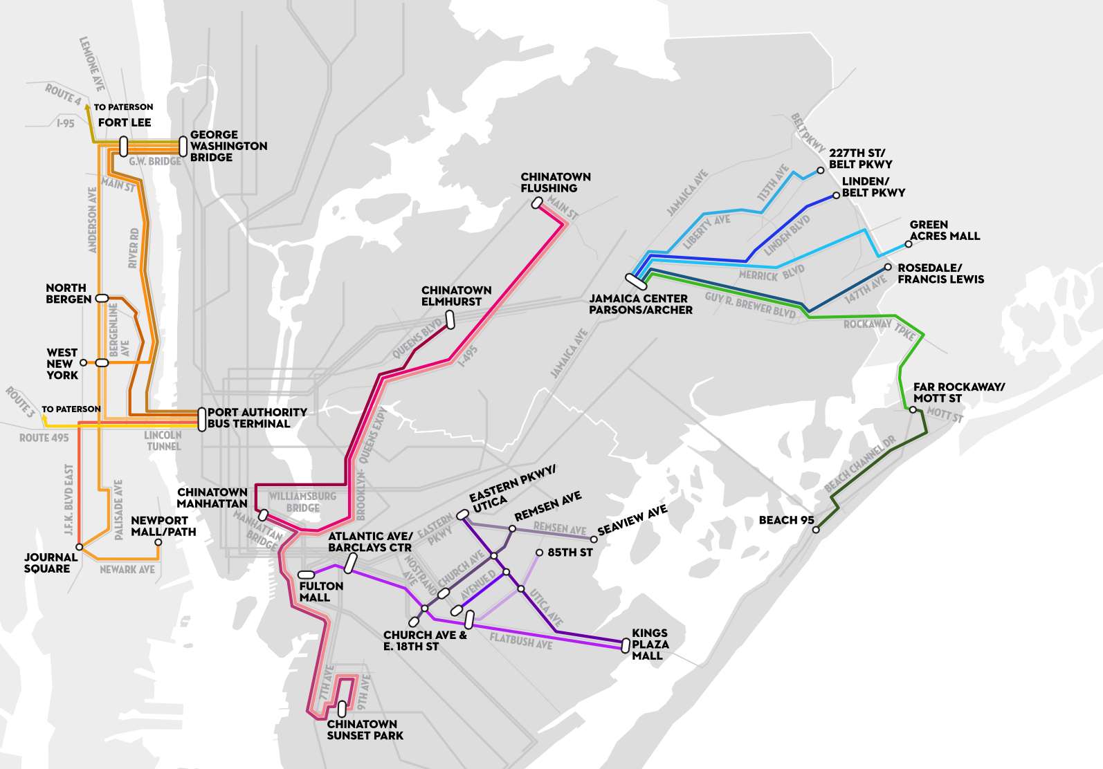
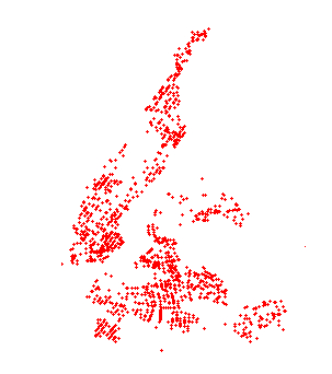
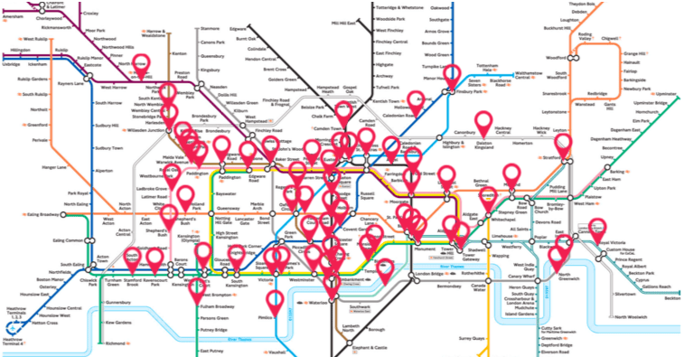
With Manhattan long ago out pricing many who might have lived there in the past, even as New York City’s Mass Transit Authority does good duty as a serviceable means to secure transportation across the isle, the five boroughs are simply not fully linked to the surrounding extra-urban area residents are pressed to move. We needed Aaron Reiss to give voice to the less-mapped history of “paratransit-systems” fashioned from a web of dollar vans linking the city’s residents and constitute a central part of its perpetual mobility.
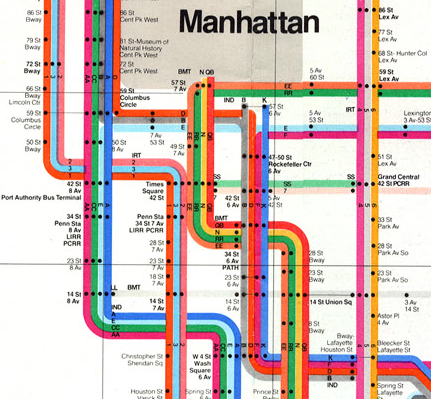
If New York City’s MTA map was a modernist icon of the city that initiated one to a labyrinthine pathways as a right of passage–the long-gone tokens are often worn as necklace, fetish, and a totem of conquering the web of transit–the map showed a preponderance of lines running north and south in Manhattan shortchanged commuters to Queens, and barely served Long Island.
The 1972 modernist remapping lent coherence to the historical layering of a system of subways, organizing its individual lines of the BMT, IRT and IND in a system of streamlined colors so its order seemed intuitively clear. Designed by the late honorary New Yorker Massimo Vignelli, whose graphical craft would rebrand much of New York City in the early 1970s, so indelible has the iconography become that its subsequent iterations continue to respect the constellation’s symbolic form. Reiss appropriated the same iconography and symbolic form to move beyond the service in five boroughs and suggest a system which operates where busses and subways just don’t reach, providing a guide to the routes on which large numbers of Manhattanites daily travel to destinations the city’s “public” transit system doesn’t extend or recognize.
With the apparatus of MTA subway lines left in a ghostly grey that might indicate their supersession, Reiss provides the other map that is perhaps more present to a range of New York’s residents, collating commuter routes across low-income (and often immigrant) neighborhoods that supplement the system of subways run by private companies which offer far more than service to JFK. Working at lower cost than the system of public transit itself, these lines/shuttles, more often known about through employees and networks rather than from printed or paper maps, to render what Reiss calls “New York’s shadow transportation system,” and which he dignifies with an iconography imitating the elegant minimalism of Vignelli’s classic map.
Vignelli’s spider-like tracery of pastel lines improbably festooned a grim New York with candy-colored stripes spreads out from the dense knot of Midtown (Central Park is an improbable squat grey, alerting viewers to the map’s distortion and representational remove), a bow of ribbons from which it serves the outer boroughs.
The real story behind the map is the extent to which this vision of the transit system no longer serves the needs of a wide range of commuters, who have attached themselves to a system of public transit hubs to more easily move among the now-geographically-disparate pockets of ethnic communities by lines of dollar-vans, minibuses or limousines, often to reach places on routes of transit the MTA doesn’t offer–from which it has even, Reiss found, withdrawn as service has contracted. To be sure, the Vignelli map was importantly adjusted in later years, the sinuous routes prepared by graphic artist Nobuyuki Siraisi helped Michael Hertz and Associates design a more phenomenologically elegant version map of New York City subway lines, approaching the subway system in a new light by riding each line with eyes shut tried to capture the motion of cars along the tracks, the better to capture passengers’ embodied experience in his sketchbook; his sketches were used to render the routes of the trains might feel as a way to register their experience in the train–rather than against surface streets or a geometrically elegant symbolic form.
By riding the cars regularly to create the basis for the Herz map, Siraisi sought to try to resolve the discrepancies riders had expressed between the clean lines of the modernist map and their experience, foregrounding the sinuosity of subway lines to capture their paths, and render the lines by a color-scheme that translated easily into words–blue, green, red, grey, Kelly green, tan–to create a more universally accessible map, that other designers were able to complement by including above-ground markers of urban topography that riders would know, and using distinct fonts for parks, neighborhoods, streets and cultural monuments that fabricated a legible palimpsest of spatial registers.
But the different users of subways do not contain themselves to a single ride, and the intersections of subway lines and transit system are increasingly fragmented in a city where social homogeneity is a relic of the past. By providing culturally familiar settings of transit for work, links among ethic enclaves, beyond making trips to airports, cash-only van lines permitted by the New York City Taxi and Limousine Commission continue to serve the working-class underserved, offering an ethnography of immigrant populations in the five boroughs and New Jersey coast and malls in an unofficially improvised response to local needs. If needs are met in ways that arose from informal networks of drivers and dollar vans, Reiss did not imagine affirming these for users, but render a visual ethnography of the improvised economy of urban transit, The result is to offer map-readers a voyeuristic way to look at the emergent economy of dollar vans as if it were an autonomous system of transport of its own,–in ways one imagines would not be so happily welcomed or accepted by the majority of its drivers paying customers.
Reiss’s map more to the point shows the degree to which the aging public transit systems of Manhattan and New York City at large has found itself outstripped by the pressing needs of a larger populace. In ways that reveal the relocation of many immigrants to regions out of the purview or coverage of the existing public transit webs, the improvised sub-economies reflect the city’s shifting social geography, and offers, more than an actual guide to transit, something like a guide to the dispersion of formerly contiguous communities, and indeed often more recognizable (and less costly) modes of travel than the city’s underground subway lines. With the rise of fares for the subway, and inflexible nature of much of the physical plant of subway lines to keep up with the city’s expansion to outer boroughs, the lines provide quick lines of transit able to keep up with the geographical displacement of communities, as well as more culturally familiar modes of travel.
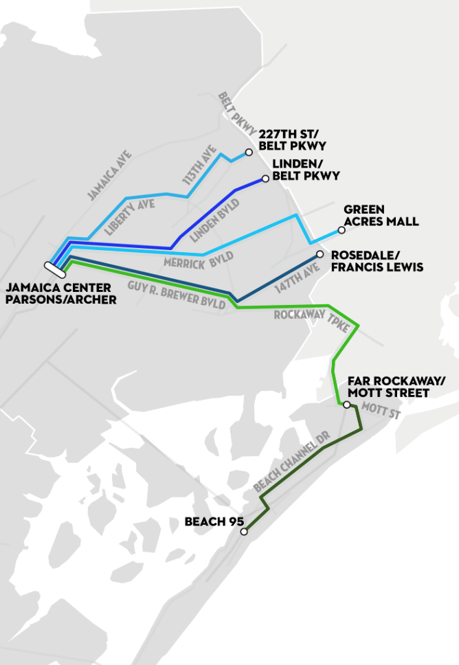
When you read the maps themselves, think less of an interlocking system, than a mode to link the removed, reflecting the subaltern cultures of transit from Jamaica Center to Long Island and Far Rockaway,
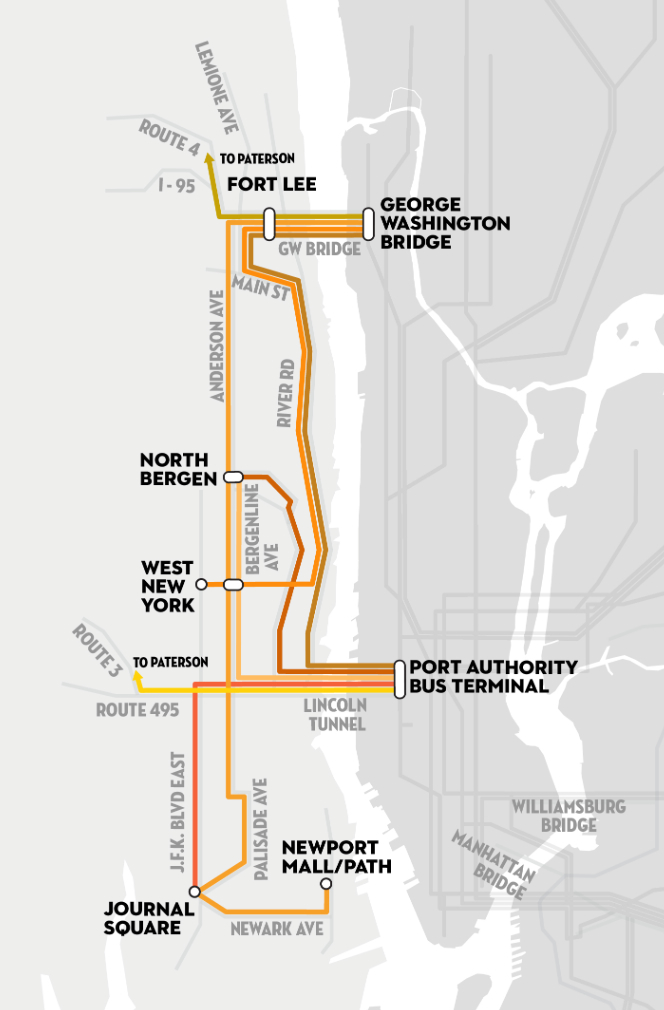
across to work in Eastern New Jersey from the Port Authority,
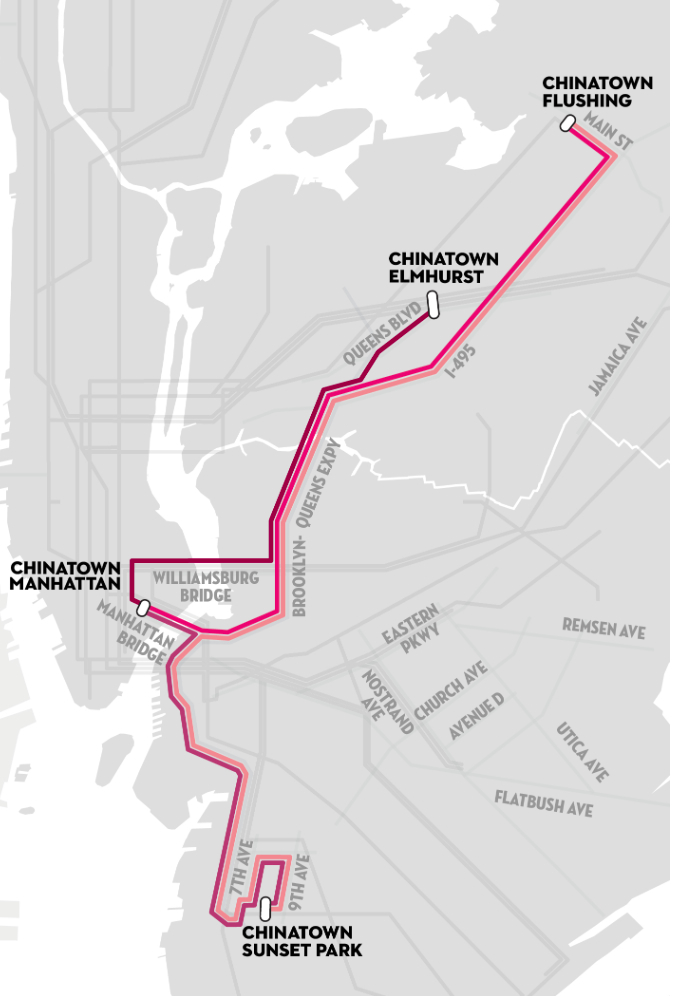
or among New York’s recent dispersed Chinatowns.
If Vignelli’s modernist map celebrated the antiquated system of transit was, in turn, widely celebrated for its untangling of the layers of public transit–adding a contemporary sheen to an outdated outfit and enlivening an apparently creaky enterprise–Reiss’s map untangles how communities have spun off the accepted grid.
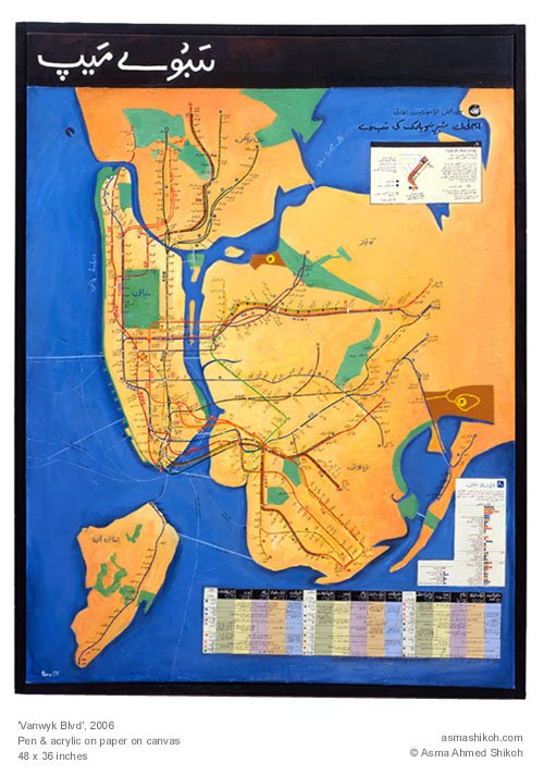
His map recalls Pakistani-American artist Asma Ahmed Shikoh’s elegant 2006 appropriation of Vignelli’s subway lines to her neighborhood in Brooklyn as a cultural microcosm of the city’s expanse as a whole, converting the iconic map to an Urdu manuscript, the maps create a poetics of presence and reuse of urban space–albeit in ways that stretch beyond the circumscribed range of transit the system provided itself.
But if Shikoh deftly showed “Vanwyk Blvd” in a new iconography of her own community, returning the map to the tones of an illuminated manuscript to give it a scriptural status, Reiss uses Vignelli’s symbolic form to give graphic form to the process of dramatic disaggregation of the new New York City that a newly improvised system of dollar vans arose to meet.
In surveying artists’ maps at the recent symposium “Mapping and its Discontents,” Katherine Harmon celebrated how “creative cartographies” oriented viewers to a narrative about place. If most of the presentations made viewers re-think the nature of map making as an art and science, Harmon’s attention to how the art of mapping create narratives about place at the symposium sponsored by UC Berkeley’s College of Environmental Design suggest the inadequacy of separating “cartography” and “art” by examining the map as an art of orientation–by how maps invite viewers relate lived space to the space that they create. In a symposium that raised questions about the seductiveness of the ability of how better-defined datasets can make maps that better capture processes we want to describe, it was refreshing to shift focus to how cartographical arts register an individual relation to place. Indeed, if several papers in the symposium struggled over how to bridge map and narrative–do we need to depend less on maps? to be seduced less by its promises of truth?–each artist returns to the dialogic relation map instill between viewers by orienting viewers to their content in ways that pose questions about the lack of personal detail in an undifferentiated record of space.
In a sense, the survey of artists’ maps on which Harmon organized and explored exposed the artistic values in which all cartographical practices are embedded. But they also pointed up the narrative ends to which cartographical forms were so particularly suited as joint representations and explorations of space. All maps engage their readers’ appetite for knowing a place, and even revise it, by creating a relation–a “map”–between personal knowledge and the residue of collective knowledge distributed in the design of their surface. The narrative possibilities for registering personal knowledge of space are particularly inviting in such an ostensibly objective framework of geographical denotation: Harmon called attention to the particularly eloquent transformation or adaptation of how the framework of mapping offers both a compelling and legible text by the forms of “deep mapping” that technology now allows–and the expressive form for deeply personal narratives they offer even as they threaten to lose specific details in the very process of generalizing a record of a uniform space.
In an age where we are deluged by maps in all sectors of life, the tracing of these artistic strategies of mapping seems a recuperation of maps as orienting tools and arts of orientation, and this post surveys some of the maps that she presented, some known from other works, as serving to orient viewers in a practice of mapping that is often too removed or alienated from individual experience. For the ways that cartography can serve as a practice for engaging our different understandings of space in particularly inventive ways maps both feed cognitive by orienting viewers to place in revisionary (and potentially liberating) ways–by engaging viewers n how they uncover meanings about spaces one already thought one knew or believed to have been recorded in existing maps, by creating dialogue about spatial relations as much as to generalize a record of space.
Harmon’s presentation showed less interest in how to tell stories in a map than in using mapping to register personal familiarity with place, by orienting viewers to the multiple personal networks in a mapped social space. The “creative cartographies” recuperate the artistic basis of mapping as arts of individual and collective orientation that exploited the structure of synthesizing spatial knowledge in a combination of ways. The narratives each cartographer creatively located in maps exploit the innate curiosity maps invite by orienting viewers. Harmon distinguished the narratives that several maps create; the “creative cartographers” all draw connections between the specificity of individual narratives plotted in maps and their structural designs. If the “discontents” of mapping lay in the anonymity of the maps of public space that were universalized for their readers in many digitized mapping projects and by government planning agencies from Rio di Janiero to Beijing to Ho Chi Minh city to Zagreb to the Google Earth platform, creative cartographers exploit the inventiveness invitations of maps place oneself in space by the power of making meaningful cartographical spaces by balancing them with a personal reading of place.
Harmon invited the symposium to follow how creative maps buck the conceit of large data samples to inscribe maps with the personal meaning from a particular perspective–and in so doing, turn the abstracted nature of cartographical practice on its head, reminding us how such “scientific” practices are embedded in a discourse on the arts. Indeed, as they engaged scientific practices of cartography, they adopted the tools of mapping in as tools to chart a distinctively individual relation to a known space, rather than a universalized one–or, rather, they novelistically use the format of map-making to universalize the particular situated perception of space that maps rarely include or note.
Harmon emphasized in her own visually stunning and compelling presentation the narrative content in these creative maps as setting into space individual stories about space that pointedly contrast with the de-personalized map and emphasized their own personal knowledge. She showed a set of creative cartographies that exist in a dialogic relation to our own knowledge of a place, moreover, and, more deeply, out knowledge of objective–as well as subjective–renderings of it, making creative maps particularly neat ways of opening up new perspectives on a space that fence in interesting ways with our own. Indeed, maps have a unique power to illuminate the relation between our story and our surroundings, as much as to tell stories of their own about how we understand place.
The cognitive webs of connections that maps both embody and render visible and concrete have the effect of never seeing ourselves as isolated. They rather allow us to map our place in a set of other stories and narratives about place, in ways that are deeply social as well as rooted individual cognition. And perhaps the most problematic subject of mapping such an individual narrative–or restoring its centrality–is in as frequently a re-mappped event as the September 11 tragedy, whose multiple mapping has accreted more meaning on the event–as if it needed this injection–to erase its personal narratives, and imposed meanings on the event that have almost obliterated our memories of its occurrence, and our relation to its immense tragedy.
It is interesting how she began from 9/11–an event that illustrated the tyranny of the map in the public imagination, and a touchstone for how a local event effectively mapped a geopolitical relationship to the world, albeit a quite distorting one. The event is not only ripe for re-mapping, but demanded a resourcefulness in using mapping forms to forge new networks of meaning in an over-rehearsed geographic conceit. The artist Karin Shneider effectively re-mapped our cognitive understanding of events of 9/11–and the cognitive space of the twin towers–that re-framed memory of their destruction and the death of their unfortunate occupants in plate-glass maps inscribed with the commuter routes those who were tragically killed had taken on that morning as they arrived at work. The sounds of breaking plate-glass were inseparable for many observers of the twin towers’ collapse on September 11. In Shneider’s commemorative map, individualized etched glass plates restore both the fragility of their lives, and the integrity of each life that overlapped that day, providing a commemorative cognitive map of the event that viewers to consider how the event tied these lives together so tragically, tracing the routes each took to remind us of the voyages each performed that day. The set of maps commemorate the deaths of some 2,752 individuals by distilling the circumstances of their spatial intersection, giving specificity to that over-photographed and documented event by emphasizing their now unrecoverable perspectives with the evocation of personal letters or diary entries, so unlike the opacity we usually identify with maps, inviting us to see through their commutes to remember the loss of individual life. The map of approaches to a final intersection replaces the all too familiar rendering of collision courses of two airplanes on September 11.
Shneider’s composite of overlapping maps remind us of the very difficulty of recuperating individual narratives in such an over-narrated event–mapping the mess of lives that intersected fortuitously that morning, and which will no longer be with us. They reframe an event too often framed as a war on “terrorism,” “clash of civilizations,” or a sign of barbarity and civilization in distorting and exploitative ways, moreover, giving transparence to the very surface of the map. The absence of a one narrative that unites these paths is, indeed, a great part of the effectiveness of capturing such multiple individual itineraries within one map.
The decided lack of spatial narrative–but a snapshot summary of the lives that intersected on that day in early September–is evident in a quite different map that, oddly, interestingly emphasized the international origins of those who lost lives that day, perhaps in an attempt to remove its violence from a narrative of opposition, and disturbingly cast the loss of lives in terms of the quite different-order abstraction of individual nations:
That map’s argument is disquieting because of how it erases individuality.
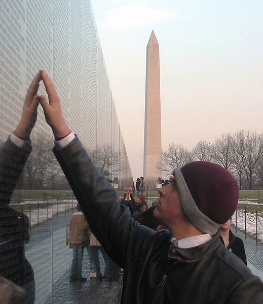
Mapping can be a clarification of such tragedy, however. The far more delicate set of superimposed plate-glass maps Harmon described stands in contrast to the anonymity of this map, or the very disembodied and abstracted map of the routes that these hijacked planes took, by inscribing their paths at a complete remove from individual lives. Indeed, even the inscription of names of those killed in the event at the site itself on a granite plaque, evocative of the Vietnam Veteran’s Memorial, oddly strips them of individuality–unlike how the reflecting stone surface of the Vietnam War Memorial designed by Maya Lin invites viewers to touch individual names on its surface, as if to try to map abruptly curtailed lives.
The inscription of the names of the dead of 9/11, unlike Maya Lin’s monument, offers no attempt to embody the event–or to express the multiplicity of narratives that that event so tragically condensed.
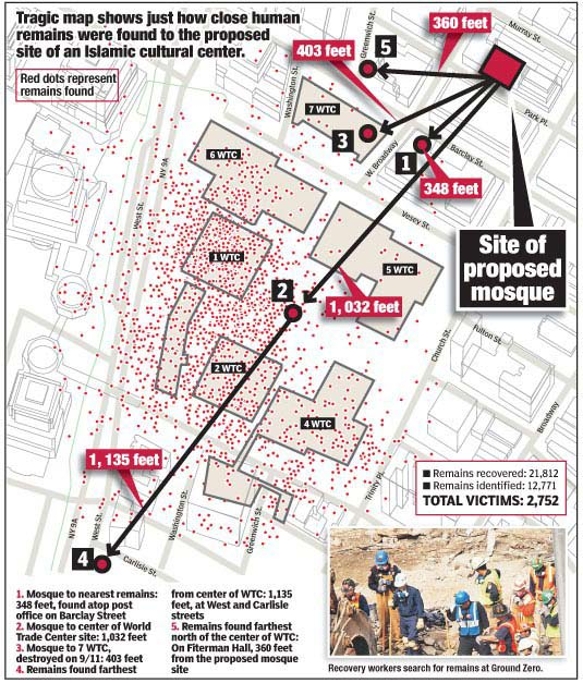
At another extreme of mapping the 9/11 tragedy lies the grotesque dis-humanized blood-flecked map, so sensationally printed by the New York Post, allegedly based on a map fire-fighters compiled of human remains, as a broadside intended to vilify plans to construct a mosque nearby the site–a map so shockingly dispersive in its energies that rather than embodying the 2,752 deaths it seems to chart, aggressively alarms its viewer with an explosion of meaning impossible to process save by recoiling in horror from its tabulation of human remains near the scene of impact:
For if the violently voyeuristic map seeks to dignify the site’s sanctity by delineating the violent loss of life, its superfluity of meaning is something of a recapitulation of violence, attempting to shock the viewer as does the inset photography, by providing some access to the history of the event.
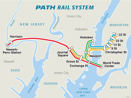
Scheider’s creative cartography also stands in eloquent counterpoint to the abstract cartography of that emptiest of maps, of PATH commuter routes, which she adopts as something of a basis to trace a palimpsest of commutes:
The problem of how maps evoke or shift a familiar narrative motivates the inventive ways itineraries are combined with maps to upend their abstraction, or the spatial oppositions that they create and reify. Daniel Zeller recuperated the itinerary as a unit of spatial knowledge in imagined maps linking two sites of worship in two different religions by imagining their proximity, and almost delineating an imagined route of pilgrimage that might link their footprints. Zeller used his deep study of topographic maps and satellite imagery to forge an imagined spatial tie between the Vatican and Masjid al-Haram, the mosque at Mecca, as if to bridge ties between two sites removed from one another in such popular and political discourse alike, by connecting them as if on an individual footpath. By tracing the footprint of each in graphite, and imagining a windy route of pilgrimage that might actually connect them in “Vatican/al Haram,” using the extreme precision to actively embody and create real spatial ties–
–with attentiveness to precision evident in this detail of the links he creatively mapped between both houses of worship.
Departing from digital simulations that often create information overload, Zeller’s craft-like remapping places with the symbolic continuity that maps create to all too improbably link two sites so often separately segregated in the global imagination.
Bridging divides through a pathway that itself unites or crosses cultures is the theme of Asma Ahmed Shikoh’s beautiful acrylic “Van Wyck Boulevard,” part of her project “Home.” Shikoh’s art maps her status as a Pakistani artist trained in Karachi who moved to New York: “Home” brilliantly reclaimed the craft traditions of mapping, recasting the NYC subway map as an Urdu manuscript and within a geometrical design borrowed from the Islamic Al Hambra, in Spain, to reexamine its functional status, and its role as an icon of urban belonging at the same time as mapping a Muslim diaspora–precisely by casting the map of the path of the MTA’s “F” line that took her to her first home in the city. Shikoh reconfigured the map in a painted form of distinct coloration, engaging its form as well as using language as a tool to assert my identity and make the new place my own.” The widely reproduced and iconic subway map served as a template to assert and recreate the familiar embodiment of the subway lines as a constellation of meaning invested with a narrative intent that the location of stations on this diagram rarely possesses: only by “transliterating every stop, was painstaking, repetitive, and yet therapeutic for a newcomer” that traced a narrative through a process of remapping and making the city her own– using the subway map to transcend the increasing construction of a dichotomous divide between East and West, and re-center her identity (and immigrant identity) in the mobile paths of New York City’s subways.
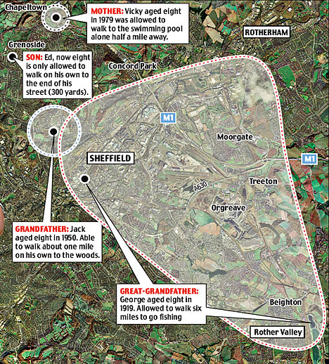
Cross-generational mobility was mapped through the shifting degrees of access or familiarity with space across generations in a map of the town of Sheffield, Harmon noted, when Dr. William Bird traced i the limits of known space created across generations living on an aerial view of the city that redefines the mapping of “city limits.” The chart of the boundaries of a “known world” where children were entitled to walk unaccompanied in Sheffield provides a far more general (and very poignant) map of a demographic group’s relation to space, investing the map with particular narrative and expressive properties beyond that of a spatial register.
“How Children Lost the Right to Roam in Four Generations“ (2007) employs the format of aerial photography to map the ambits at which children were allowed to walk on their own in the same neighborhood in one family. The result of comparing the increasingly restricted spaces parents tolerated wondering illustrates and documents the daramatic contraction of the consderable freedom eight year old George Thomas enjoyed in 1926 in Sheffield. His parents, not able to afford the tram’s fare, let him to walk six miles to fish on his own. The erosion of the English commons is a trope of the enclosures of the early nineteenth century, and the lack of urban exploration a more contemporary concern for city-dwellers who find their children less adventurous in making the out of doors their own. But the more recent specificity of Bird’s roaming map shows the harrowing circumscription of space up to the present: George’s great-grandson Edward, on a tether of some 300 yards, and with few liberties to roam at will unsupervised, possessed less of a spatial narrative of his relation to the far more industrialized region of Sheffield today, as his mother’s was far diminished from that of his Grandfather Jack or the wide range of space George was trusted to personally navigate. The narrative of a restricting relation of the person to space in mapped by the narrowing boundary lines in Sheffield:
As much as describe the changes in Sheffield’s geography and the story of its expanding industrialization, the map presents a strikingly local microhistory which echoes and encapsulates frequently expressed concerns about the lack of exploring a safe urban space.
It was made in the capacity as health officer to Natural England, to substantiate a concern for Bird’s belief in the benefits access to grassy areas, ponds, and trees brought to kid’s behavior and school work, and question the healthiness of the narrowing relations of space from George, his son Jack, his daughter Vicki and the eight-year-old Ed. The creativity of these practices of cartography bucks basing maps on their synthesis of a large data sample, by questioning how maps can be creatively rooted in a narrative of individual experience, even in ways that preserve their value as a collective register of the experience of space–and how a Google Maps template might be distinctly personalized as a record of spatial knowledge.
Discontents with Google Earth maps lie precisely in the deeply problematic recuperation of a cartographical art that they perpetuate for their users. And so Jeff Sisson focussed on the spatial meanings and consequences of the threatened disappearance of the Bodega as an institution and anchor to urban communities in New York by crafting an interactive Bodega Map within the city’s expanse. In charting the survival of a store central to communities across different neighborhoods, the map almost anticipated the recent turn against Mayor Michael Bloomberg’s New York that the recent De Blasio victory seems to portend. In tracing the footprint of the institution of the Bodega, Sisson selects stores pressed out of existence in the absence of rent control for shops in the city’s expansive real estate market, and provide evidence of a vanishing urban culture of diversity.
Sisson’s website invites all visitors to place Bodegas in local neighborhoods to elevate the individual discovery of a community store, in an exercise of collective crowd-sourced participatory mapping that displaces the archipelagic city’s usual contour lines by rather trying to map the local meanings of these distinctive and useful stores within local communities, in ways that invite one to insert one’s narrative connection to the colorful local Bodega so long an urban fixture situated at odd street-corners, combining such mapping resources as Google Earth, Google Maps, and Flickr snapshots of facades and marquees of individual family run stores.
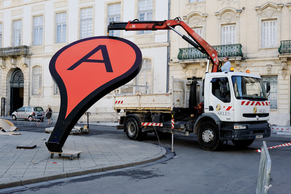
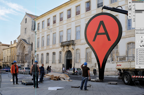
The project “Mapping Bodegas” tracks processes of micro-urbanism, by marking sites of interaction and stages to which communities respond, to reflects on the danger of their erasure from the city’s map and its neighborhoods, as well as to preserve meaningful “hot-spots” of collective memory within outlines of the specific neighborhoods they nourished. This infusion of narrative content is, to be sure, one reaction or response to the universalized abstraction of an anodynely marked places of interest in the space of Google maps, with something approaching a zero-degree of the denotative signs of registering affect or place. It is in reaction to this lack of narrative that Adam Bartholl staged his public sculpture “Map,” creatively appropriated the blandly uniform “inverted tears” of a Google map push pins by placing these physical objects in the very center of Arles–on the hexadecimal longitude and latitude GoogleEarth uses to denote Arles.
The discontent with the abstraction of our knowledge of place in Google Earth led Adam Bartholl to remind us of the increased distance between iconic cartographical markers Google employs so blithely in its tiles and knowledge of places they denote. By the co-option or appropriation of the sign of place in geolocation practices in the public square of Arles, Harmon argued, Bartholl reminded us how the marker shapes (and fails to capture) our sense of place, as we use it to make our narratives of travel: by placing a larger than life physical embodiment of such a dayglo pushpin in the exact center of Arles’ public square on the altitude and longitude where it occurs in Google Earth, Bartholl asked us to confront a physical embodiment of a sign we too often internalize without interrogating its affectless muteness as a sign as itself a denaturing of place.
Arles? It happened right here . . .
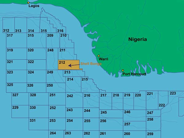
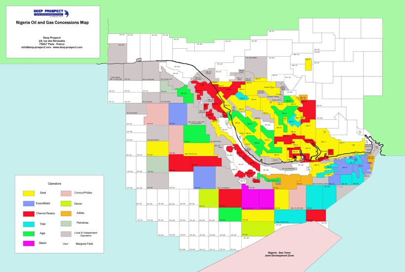
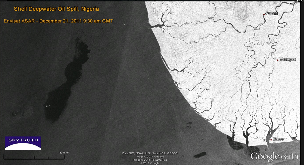
On a more political level of the silences concealed in many maps, and the environmental consequences of these silences, Harmon turned to the failures of mapping ecological disasters of Bonga oil spill and transformation of the Niger delta. What are the limits of Google maps in tracking the multiple levels of ecological disaster within the Delta, seat to a preserve of some 600 million barrels of recoverable oil mapped in 2001, but whose mapping silenced the complex narrative of regional toxic pollution that has spun out around those platforms and oil rigs.
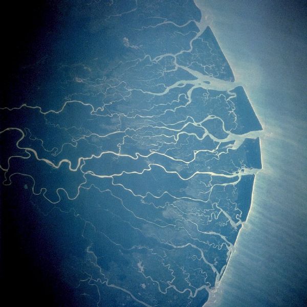
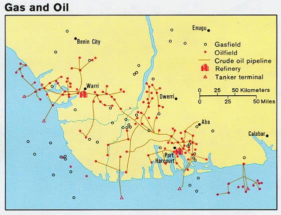
The delta, an oil-rich area long plagued by irresponsible levels of annual oil spillage greater than in the Gulf of Mexico Deepwater Horizon disaster of 2010, is a site of widespread flares on rigs, and, as a very poor area where oil was found close to the surface, of dirty DIY oil refining and extraction have created deep-set ecological disasters through the Delta–over 7,000 spills from 1970 to 2000, some spewing at least 9 million barrels of crude into wetlands that sustain millions of local trades from fishing to agriculture, and where consistently poor clean-up of spills have eroded increasingly fragile local communities and economies in an image that, viewed from space, appears both ecologically fragile and remarkably pristine.
How to map the devastating ravages to the local environment, whose production the Nigerian government is economically dependent, is particularly problematic since the oil-rich delta is the source of 90% of the country’s foreign earnings. Regular under-reporting of spills by NOSDRA–the Nigerian Oil Spill Detection and Response Agency–to keep in line with corporate claims led to a failure to register the escape of up to 60,000 barrels of oil in 2011 from one Floating Production Storage and Offloading Facility at the Niger delta’s mouth by Shell oil (Nigeria’s major client) in Bonga, or 1979 spill of 570,000 barrels of crude, also by Royal Shell–eroding the environment all up the Delta, by the devastating toxic effects of acid rain that are only starting to be mapped–from the ruin of coastal livelihoods and fisheries to deadening formerly plentiful fields of kola nuts.
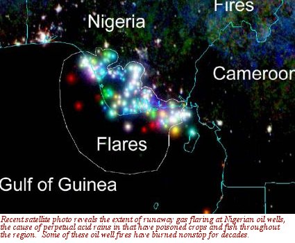
How to map or embody the narrative of the destruction of an ecosystem? This time-lapse map seems as disembodied as Vassily Kandinsky’s “Einige Krise,” but charted decade-long oil flares in surrounding coastal waters spewing crude into the air, in color-coded fashion since the expansion of oil drilling in the Deepwater Bonga project since 1993–blue from 1995; green 2000; red 2006–as the outlines of an ecological disaster since deepwater drilling began–and whose mapping almost defies narrative:
If the agglomeration of colored dots in this time-lapse map suggests pattern, the distribution mirrors the division of the Delta and surrounding waters by prospecting leases for locally administered oil fields since 1993, but only starts to map the disastrous consequences for the environment of this massive release of crude into the ecosystem and its local economy:
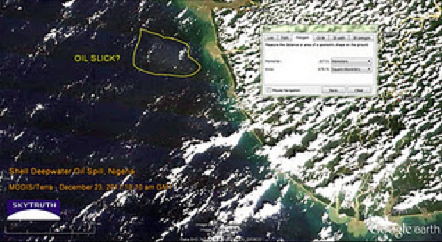
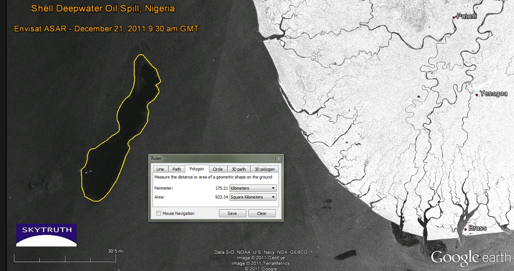
While the slick produced at Deepwater was not at first mapped, it occurred on a 2011 Google Earth view charting oil slick on the ocean’s surface:
This map provided one of the few media sources documenting the Bonga spill not provided by Royal Shell Oil itself. Indeed, it only starts to track the implications of the spills, fires, and leaks in the Delta that constitute the largest wetlands in all Africa rich with swamps, estuaries, rivers and streams, and can only suggest the extent to which forests and mangroves are being polluted by spills from a network of pipelines, acid rain, and water-borne or rain-borne oil slick–rain regularly returns drops of crude oil to formerly fertile region–where oil is relatively close to the surface has led to a distortion of the environmental perils of oil extraction–and over one thousand abandoned oil spill sites in the over-drilled Delta, with huge environmental consequences–often blamed on the ships that regularly illegally siphon crude from the pipelines that criss-cross the delta.
Google Earth views used by Sky Truth to map the 2011 Shell Deepwater spill barely chart the environmental devastation on the Delta rivers. The map that almost leaves one speechless in how the beauty of its sinuous detail chart the slicks of oil that have contaminated a once-healthy delta’s agricultural wealth; this NOAA aerial photography created by the United States Navy rebut the oil multinational’s silence as to the spill’s scope or devastating consequences, whose silences have only recently been targets of international blame, and obscured some 474 spills in one area during 2012 alone. Perhaps the recent expansion of Nigerian crowd-sourced mapping projects may shift these cartographical silences, but the burden for mapping the disaster has not been met.
The narratives that these aerial image of considerable beauty recover present a counter-narrative to that of the corporations that distanced themselves from the Bonga spill, and perhaps a case of maps speaking truth to authority. These maps begin to tell a story of the transformation of the land–and the destruction of the environment they map. These maps foreground new narratives about the Google Earth format that invite a broader story to be told about the event, and to fill the silence of Shell’s official narrative about the quantity or causes for the massive spill–and the blanket denial that any of the oil ever reached the coastline, and all barrels were successfully dispersed in the ocean waters, and seek “unconditional license to contain and disperse the Bonga oil spill” itself. Without these Google maps, Shell Oil would have retained a monopoly about the production of truth about the devastating Bonga spill.
Can a narrative emerge of this event from the perspective of those who dwell in the Delta, to capture the consequences of the toxic transformation of the land they live and work in, or those for its non-human inhabitants?
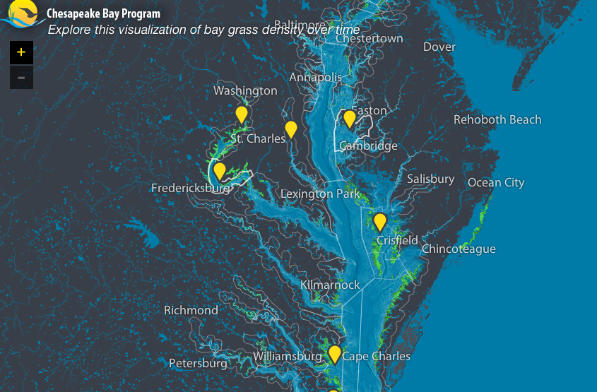
Some semantic possibilities of expanding the ecological narrative of place were suggested in the tracking of growth of Chesapeake Bay grasses, in a mapping project using data to track changes in the growth and density of grasses around the largest estuary in the United States particularly illustrative of the subtleties of overlaps to achieve the sort of deep mapping that Google Earth would not allow. The Stamen interactive map frames a unique narrative of the restoration of the estuary ecosystem incorporating data from over forty years across some forty years, redirecting data to create an image of where the estuary might later develop: the time-sensitive visualization of data about salinity, water-temperature and bathymetry with the restorations of bay grasses who are the subject of this narrative of ecological restoration, to offer a powerful–and positive–interactive map about the local recuperation of environmental health, by synthesizing a wide range of data from the EPA officials and local institutions about an area to reverse effects of chemical pollutants on wildlife and grasslands that viewers can read or virtually explore as unfolding over time, in ways that press against the technological boundaries of cartography as an art.
If this graphic visualization of the watershed appears a document only of the growth of grasses, as we unpack the map we realize the expanse of the effects of the possibly narratives of human interventions in the landscape that it presents–both on the ecosystem of the estuary and to possibilities of our future relation to that very dynamic environmental space–a space we better know through our more multi-leveled representations of it.
The art of registering knowledge of place has expanded to comprehend new personal individual narratives of fine grain by a GPS revision of the Google Map view of a city. Indeed, the maps of Christian Nolde and Ingrid Burrington both seek to recuperate the density of specific narratives of encounters in urban space that echo and engage the emerging forms of mapping by which Google seeks to plot points of interest for its users on the maps of cities that they visit, so that they might include selected points of interest, sites of beauty to visit, or local stores and commercial districts of interest judging by one’s web history. Both Nolde and Burrington used GPS to create a synthesis of these individualized maps of the city in ways that anticipated the announcement of Google’s plans.
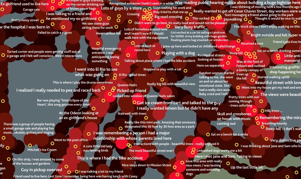
Christian Nolde employed GPS technologies to register of feelings related to place in his emotional map of San Francisco (2007), created during a tenure at Northern Exposure. After collecting on data gathered by a galvanic skin response by which participants’ physiological responses, he keyed them to places that he transposed to a GPS map of the city’s locations, as if to trace itineraries in a city usually mapped by city blocks or along district lines. The maps seeks to register responses to a location or geographic environment on individual emotions, in a sort of counter-map synthesized individual responses into something like an encounter with places of specific individual resonance in the city, in a record “visualizing the emotional space of the city” by objectively tracing an alternate topography in 2007.
This map has a texture of accommodating the individual storyline or narrative that makes its reading an active part of its enjoyment, by engaging individual storylines in a dazzling if fragmentary novelistic detail, challenging the legibility of the map’s surface of significant local depth for readers who can take the time to delve into the map to read the actions that its maker associated with a specific place, but which would be ‘overlooked’ by scanning the broader path of his itineraries across the city:
GPS was used, in other words, to contextualize multiple narrative fragments in a composite view of the emotional significance of urban space by tracing if a residue of collective emotions on its surface. The completed artifact combines multiple spaces of reading, augmenting the notions of position that he noted in GPS at specific way stations by his own transient or apparently ephemeral personal reaction to the city at a specific place–“beautiful street with lovely houses”; “went into my house and got my mail”; “This is where I had the bike accident”; “i was remembering a person I had a major relationship with whose parents lived here”–that foreground the personal in ways GPS cannot alone register.
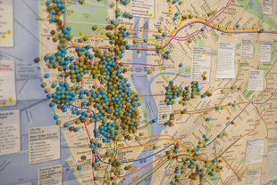
The practice of GPS creates a synthesis of discrete meanings rarely associated with geospatial mapping, and puts a premium on emotional or associative precision, as much as the abstraction of terrestrial locations. A similar desire to base a map on personal narratives to record the city as an emotive space led Ingrid Burrington to take data from Craig’s List “missed connections” as the data to reveal a hidden distribution of the desire for half-glimpsed connections in her “Loneliness Map” (2009-11), included in an earlier exhibit of personal maps Harmon earlier curated.
The map’s unique pinpoint form focusses observers’ attention on mini-moments of “missed connections” in the course of the day against a map of physical topography and street intersections, as if to present the variations among missed connections as an emotional terrain or urban psychogeography, creating a new sense of reading mapped data to register a notion first used by situationists such as Guy Debord.
Such collected ‘mini-moments’ trump the topography of the city, tracking personal attachment to selective moments in urban space as more meaningful than the mapping of the outlines of its streets that create a new experience of reading the map’s surface. They recall the Mappiness (LSE) smartphone app, which disrupts the relative abstraction of space in a GPS framework by registering our own states of happiness on a map.
The map becomes a site to register individual travels through the city in a collective document, or a capacious holder of narratives, as tangible with resonance as any map might ever be. And the very tangibility of this record of encounter that maps allow, even with limited qualitative content, suggest the underlying basis of cartography as an art.
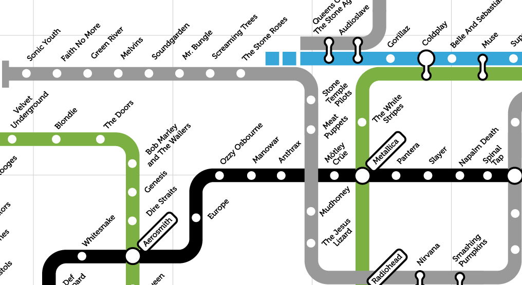
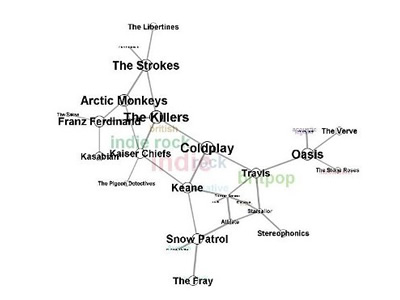
Phrases from “Subterranean Homesick Blues” to “the Velvet Underground” defined a new metaphoric space for Rock music to occupy and create during the nineteen-sixties. It’s no surprise, then, that the London underground map–that icon of Englishness designed by the engineer and draftsman Harry Beck in 1931–has been transposed to define relations among bands with such success in an encyclopedic mapping of genres of rock. By taking the transport map as an inspiration, one can map a network of musical bands and styles, examining both intersections and alternate paths of varied musical groups and the imaginary relationships they have to one each other in easily comprehensible ways. So classic is Beck’s circuit map of the city’s underground that the use of the Tube Map is instantly recognizable as a microcosm of sorting tastes, if an almost ironic analogue of an underground music scene, more rooted in graphic design than sound.
The historic reduction of all surface details in the map, in which Beck accentuated direct routes the tube offered to navigate the city, rather than urban topography, employed a circuit diagram to chart the London subway disregarding geographic relations for a clearly legible network map. The iconic conventions of linkages in an ideal space rather than a geographically correct map, serves well to map musical bands and styles–where Pop Rock intersects with Punk, runs side-by-side with Alternative Rock and intersects every so often with the determined Black Heavy Metal Line–unrooted from geographic reality but graphically displayed in a concise (if blunt) highly readable syntax: as Beck sought to “tidy up” existing maps by “evening out the distance between stations” and “straightening the lines” to “give a needed clarity to exchange information to tube users who were on the go,” the color-coding of its routes created a model for communicating information even when removed from its geographic subject-matter or exact spatial relationships.
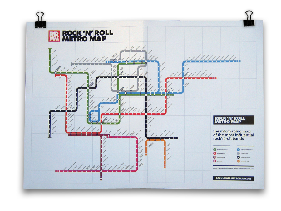
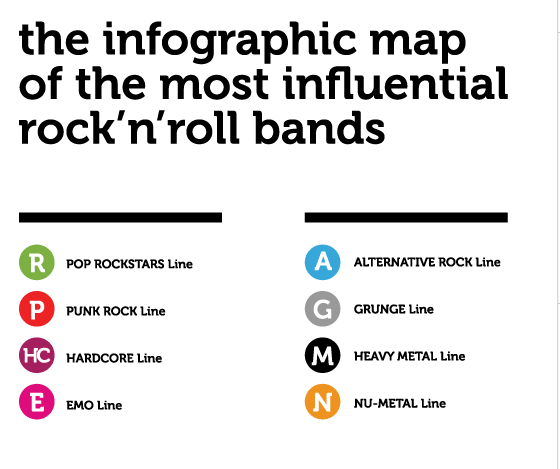
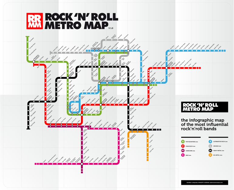
Perhaps the formal nature of the spatial arrangement of bands on maps runs against the very improvisational nature of much of the musicians included in the map. But the exercise of decoding seems to be a way of seeking to make sense of the world of music by cleverly streamlined terms. Many of bands which are included as tube stops by which graphic designer Alberto Antoniazzi’s popular Rock’n’Roll Metro Map foreground groups prominent in London’s music scene. In fact, in its focus on London’s underground, the choice of template for the map reminds us in its stretch of prominent bands from the Beatles and the Who to Depeche Mode, or from the Sex Pistols to Radiohead to Coldplay presents an inevitable British hegemony in selecting the London Underground as its focus, although Spinal Tap lies on the far more American-centric Heavy Metal Black Line.
The nostalgic English-ness of the Beck map just seems something of a sign of the transhistorical centrality of London in the music scene–even if it also suggests the degree to which as “the tube maps masks and distorts realities,” in Ian Russell’s words, its modernist space has “become its own reality, entirely abstracted from the work it ostensibly represents,” as a model–Joe Moran has observed–although it is copyrighted by the London Underground, as was discovered by Simon Patterson to his chagrin. But Patterson’s The Great Bear (1992), an elegant four-color lithograph, shifted Beck’s system of classification as “lines” that indicate Engineers, Philosophers, Journalisms, Footballers, Film Acts, Italian Artists, and Musicians in ways that invite the viewer to detect a method in their order.
To return to a map rendering legible a more limited network of contemporary music, there is ample sign of time’s passage in the Rock’n’Roll Metro Map, which consigns both the Beatles and Rolling Stones to the end of the Green Line of Pop Rock Stars, with little differentiation, a status they somehow shared with the Beach Boys: to be sure, all are pop, but relationships are just not clearly mapped or continuities appear jarring. Despite the authority of the map’s model, Antoniazzi informs us that if “the map is just a personal vision of the music history of the past decades and not a real visualization of it, that’s because the number of artists and influences are impossible to be visualized in a 100% objective way.”
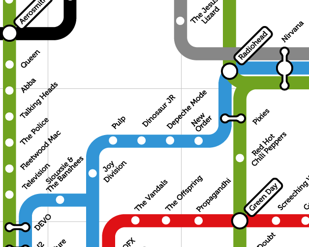
But it often reads like an index to someone’s CD’s–not too mention being dominated by men. I like how the red line moves from The Stooges to The Dictators, Ramones, Sex Pistols, Clash, Buzzcocks, and Cramps, but relations among them are often unclear or at the border of suggestibility–the transit from The Who through The Eagles to Velvet Underground is quite a jump on the line of Pop, and the placement of the Ska band The Specials at a major intersection between Reggae, Rock, and Pop, and Bjork occupies a major exchange of her own.
The iconic diagram by which Harry F. Beck re-rendered the London Underground in 1931 has become an icon, with as much nostalgic value as evocation of place. Its popularity extends far beyond what Beck imagined, partly due to the appeal of its modernist simplicity and symmetrical organization of rail space: the arrangement of the web of trains in ways that viewers can readily read has acquired that odd function of a map as both a designation of place and an innovative system of arranging meaning. The Rock’n’Roll Metro Map clearly capitalizes on that identification with place, indeed, to remind us of the centrality of London in the global Rock scene–or map the world of rock onto one place as if it were a microcosm of world music, able to sort out the crowded universe of recorded rock.
Map of the Underground (1931)
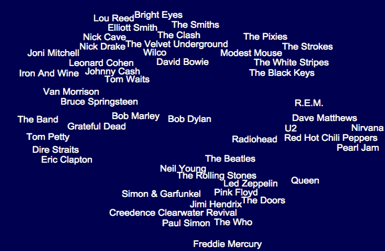
The transposition of stations to bands to those of stations can’t help but remind one of rock critic Dorian Lynskey’s ambitious if somewhat similar mash-up of the tube map and music scene by exploiting links of lines to suggest stylistic breadth of influences, in an attempt “to plot the history of 20th century music on the London Underground map devised by Harry Beck in 1933.” The pretty implausible choice in mapping forms not only worked, but Lynskey’s map gained sufficient cartographical respectability to be sold at the London Transport Museum: for Lynskey, who undertook this with sheets of construction paper and magic markers, in a sort o mental mapping of his personal preferences, the map made sense since “The different character of each line lent itself to a certain genre,” and so Pop, which as the common currency that intersects with everything else, here occupies the Circle line, while classical music, viewed as less influential and occupying its own sphere, was appropriately relegated to the Docklands Light Railway by its creator.
Beck’s distinctive and instantly recognizable graphic design is so iconic its choice seems nostalgic for a time when Rock music seemed located in one place–or had an epicenter of its own–and some coherence and uniformity, in an era when music first started being available online–which may very well even more specifically apply to the recent Rock’n’Roll Metro Map. While one might argue that the map of London as a site of rock music erases the black roots of rock music, bleaching a historical background to foreground contemporary white bands with limited sense of history, using a city that claimed Pop as its own as a site for defining a canon of rock, that casts Little Richard as a stop before Elvis Presley and Jerry Lee Lewis, and James Brown and Screaming’ Jay Hawkins as Lins to Buddy Holly, in a map whose flat surface massages critical questions of difference, appropriation or identity in one interlinked system that can be navigated in ways that undergird the city.
The Music on the Tube Map provides a neat spatialization of the music charts, akin to the personal navigation of the lost space of the record store, but with aims to provide a sense of music history.
Rather than providing a space to explore by flipping through albums, and listening to what the store owner decided to play, the classificatory schema provides an invitation to investigate the “rules” and conventions of its ordering of a sonic space perhaps prompting a sequence of triggers to auditory memories that the reader might synthetically experience, to judge by their own tastes: the very objectivity of the map as a record of space is up for grabs in this clever spatialization of recorded music as elective transportation routes.
The Lynskey map offers may rewards as a neat reading of music history, as well as many of the problems of framing the fluidity of musical performance in the formal integrity of the map, even as it provides opportunities for detailed scrutiny. Say, for one, the cool placement of Michael Jackson near Minnie Ripperton, in a totally different line than Burning Spear, whereas the ska band The Specials are rather brilliantly placed an exchange of Reggae, Rock, and Pop.
There is a broad-ranging Catholicism here, as the tube stops comprehend Jazz and Soul, and extend to Country, Funk, and Electronica, and, despite a focus on the British that seems also at times a bit obscure, there’s a respect for lines of Hip-Hop, DJ’s and the avant-garde in the fifteen lines, including the odd amalgam “Classical and Sound-Tracks.”
But there are occasions of mapping that could elicit intense debate from some, like placing Bob Dylan as a mere station on the Green Line, diminished by juxtaposition to the Rolling Stones who albeit rightfully occupy a nearby triple exchange:
To be sure, any map of this sort came in for some intense criticism when Lynskey first posted it, pointing to the absence of numerous bands from lines from the Talking Heads to Joy Division, and some oddities, like placing the British modernist Harrison Birtwistle between Terry Riley and Philip Glass. London-obsessed in its fetishization of the Beck map, one commentator on the Guardian blog found it the work of “the most stereotypically self-indulgent Guardian wank I can think of”–the huge labor of organization is impressive, if the obsessiveness of linking the Kinks to Radiohead seems obsessive, and riding from Mahler through Penderecki to Danny Elfman a waste of time.
But the intensive sort of map-reading and patriotism with which rock journalist and writer Lynskey blends allows a mental indexing and erudition is less assiduously pursued by Antoniazzi in his Rock’n’Roll Metro Map, or at least in Version 1.1, which seems a bit provincial and a bit more nostalgic in its use of a Tube Map. Anthoniazzi also exploits the clever conceit of placing artists crossing two genres or linking music styles at the intersections of imagined sonic tube-lines, to be sure, if these might be quite different–Radiohead is now a major hub, as is Nirvana, Coldplay, and Green Day, and Antoniazzi’s erased twentieth-century precedents of other musical genres in favor of encyclopedism of a somewhat presentist bend that doesn’t have the historical depth that made Linskey’s exchanges amusing.
Despite Rock’n’Roll map‘s claims to authority, it carries far less of a thesis or explanatory heft than Greil Marcus put into his classic “secret history” of the twentieth century–and not only because the map is a bi tongue-in-cheek as a riff on a popular icon: despite the claims to organize musical bands in the manner of Beck’s iconic map as a vision of the navigation of underground culture, the relations it sketches between bands is necessarily unclear. If the transposition of band-names for the familiar infographic of 1931 offers a surrogate for channel surfing or flipping along the dials of a radio, the place Green Day holds at an intersection between tube lines is clever and even compelling. But we lack orientation as we shuttle from station to station, from The Police to Fleetwood Mac to Television before arriving at the joint tube stop occupied by Devo. More prominent bands stand at prominent exchanges, but the map seems to be about switching out place-names more than a guide: the legend withstanding, it’s hard to read this infographic as an ordering device; and though I like the spirit of the acronyms noted in its legend, it seems to rely even more on the nostalgia of the unity of rock in a single tube map.
Part of the problem is indeed of taking the city as microcosm of the world, or pantheon of rock. There’s something going on here about the primacy of the local or London as a music hub; despite some prominent Americans, the map is English-centered, the category of “the most influential” being dominated by groups canonized into British tastes or top 40 beside such somewhat nostalgic acts as Siouxsie & The Banshees, Depeche Mode, Billy Idol, and Duran Duran.
It’s not that the map doesn’t chart “the most influential rock bands” (as claims its legend) but, rather, that despite there being something in the authority with which any map creates as a network of relations, it’s easy to see that its map’s appeal as being based on that substantial grounds–or even as having a staying power that long in the current music scene. It’s a bit of a memory game, however, that employs the nostalgic format of the Beck map to reconcile earlier with more contemporary bands to place them all on the scene with equal authority.
‘What would it mean to try to map music?’ is a question that’s received a number of responses in multiple blogs, however, of which the unfolded Metro Map is one ancestor–an ancestor that suggests the coming of age of musical bands with a newfound legitimacy, as much as it orients the viewer.
Of course, the map maps London as something of a hub, given that claims of mapping the relations among bands are a bit strained since they overlap on an existing structure–as “alternative Maps of the World superimpos’d upon the more familiar ones.”
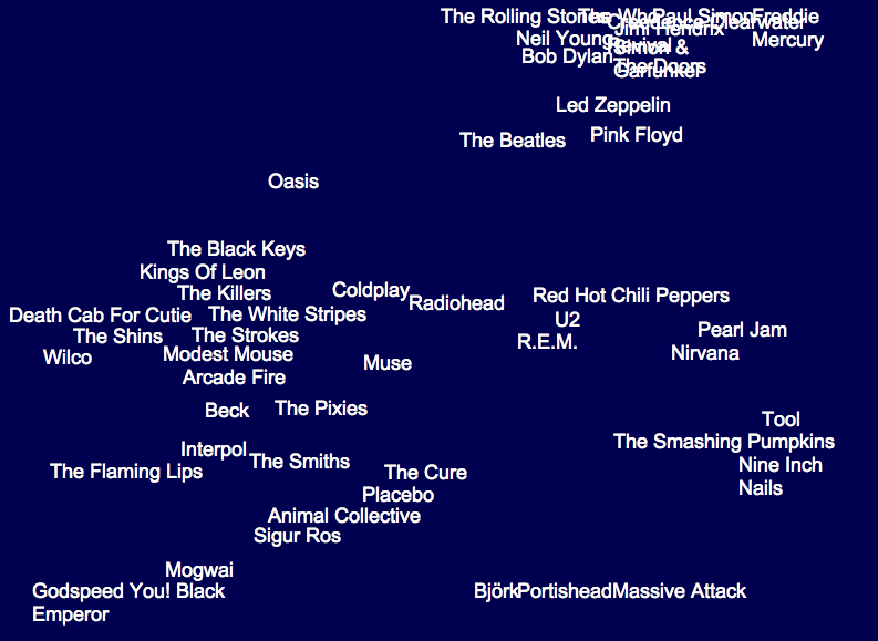
Of course there are plenty of counter-maps to the notion of placing London as world music capital–in fact, they proliferate. A map of New York’s musical topography, boasting of its riche, roots composers of a far wider musical discography to image the city as site of inspiration, as much as musical community, without venturing underground:
The 2011 project meant to display the vibrancy of the music scene in one place–Seattle–now migrated online, is a worthy ongoing collation/genealogy of Grunge. The detail of that expansive map, obsessively compiled, suggests one massive problem any mapping of the modern music scene creates, as comprehensiveness and crowding create above 40 linkages among bands, and the size raises serious difficulties of being able to display the map so it can be easily read:
There’s not much sense that this is something one could easily ready, but there is tremendous interest in mapping musical links among bands, using the word “map” to plot genealogies of tastes or clarify one’s tastes in digitized form.
Such “maps” create a memory of musical filiation with a new authority. They reveal a cultural metastasizing of the map in recent times in the media and blogosphere, with but a token sense of orientation–as well as a need for processing a huge discography backlog, now demanding explication, elucidation (lest it be forgotten or misunderstood). The map offers something of a clarification both in relation to a burgeoning of musical tastes and styles, sometimes in the hopes of locating music in its geographic setting, or, vice-versa, playing with the remove of music from place.
But is this a cultural studies prostitution of word usage?
That increased remove of music from place is indeed real, and not only market-driven, given the widespread sharing and migration of sound-files. The phenomenon of mapping tastes cannot be said to reflect a simple geographic distinction, moreover, of urban v. rural– at least not in terms of consumption in markets according to this infographic, which Ben Sisario shared, that reveals the huge markets for Country music in both New York and Los Angeles–two huge sites of the music trade, true, but also a testament to the way tastes trump place:
So what does a music map map, and why do we want to map sound? Apart from the interest in mapping genealogies, for a sort of closet erudition and appreciation of music history as well as of the record collections in your imagination or on your wall, the map is a way of investing fixity to the sounds you like, offering not only a library, but illuminating existing relations in a coherent landscape you can survey.
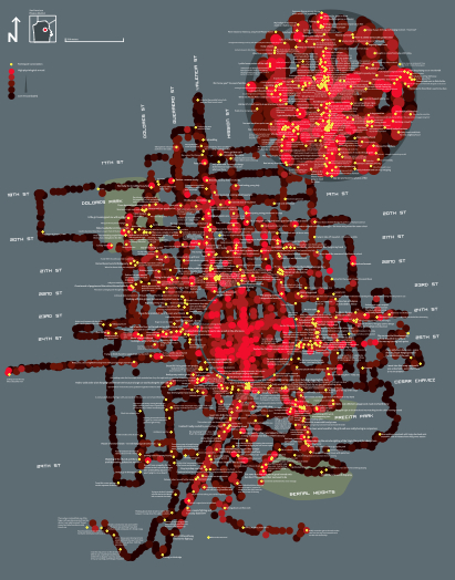
Taking another approach to the phenomenon of mapping music, one might ask how much the 2011 map of Seattle bands so masterfully designed by Rachel Ratner, Keith Whiteman, Golf Sinteppadon is about making a legible map to boast their own expertise in understanding an especially dynamic local music scene.
That maybe doesn’t really matter, given the adoption of the language of “map” as a sort of meme in graphic design–there must be a reason why the notion of mapping has interest here, and it seems to have to do with both a search for legitimacy and authority, as much as a need for clarification, as well as a sort of archiving of the unmapped nature of online music, now removed from the social forums that defined the listening of music since the eighteenth century–the availability of a huge range of music and “if you liked this, try . . . ” algorithms. The self-made ‘Seattle Map’ is after all something like a web, linking bands in up to 30 or 40 connections, of considerable complexity:
The stunning ability to create online algorithms of taste, similar to those used by Spotify or other music providers, has encouraged the graphic visualization of a burgeoning of bands and music that is available online. Part of the problem is selectivity, of course: if we have 80, 000 artists, mapping them creates the question of how comprehensive we have to be, and if we can even create something like a unified map at all, or will require a map as large as a city to record it all.
A focus on smaller sets of relations might be a good way of mapping around central nodes, although this is a fragmentary way of mapping or a fragmentary mapping exercise. The result is more often a sort of sketch, both of influences and commonalities, if one imagines musical “neighbors” in the manner Paul Lamere has:
This makes some sense, although it is approaches a relativistic notion of a map, re-centered in relation to questions of proximity–a useful way of mapping music, given the limited correspondence of taste to place, even if one would like to integrate–or map–the two, even if only in maps of local musical scenes. Relational maps of performing artists are increasingly popular symbolic tools, however, if only as forms of propositions. These “RAMA”–Relational Artists’ Maps provides a way to interact with large amounts of musical data as in the stemma of classical philologists, but which overlie its branches of relations on genres to map the categorical terrain into which new bands migrate in imaginative ways:
If all maps are propositions, this diagram fits the bill perfectly, moving beyond stylistic affinities to suggest the mapping of sound as a soundscape or interrelated terrain.
There are clear benefits of mapping musical style. Paul Lemere has created on his inventive blog Music Machinery something like a generational genealogy of musical style, mapping not only musical space but what he calls the “artist’s space,” clarifying the questions of influence culled from listening to music ranging from a fan’s fifty years of listening in a tree-like graph of influence of the family of the Beatles that respects the space of each individual artist as musician:
Although any map projects subjective preference onto the world, the practice of online mapping musical styles you prefer should not be discounted as purely a map based on individual taste. The System of Gnod features a website, ostensibly developed to “help” visitors find music that they like on the basis of a set of hidden algorithms, interactively, situating themselves on an interactive “Music Map” so as to generate a “map” that places any musician, band, or signer in a map designed to reflect one’s preferences with some degree of definitiveness or certitude: selection of the name of one artist generates a word map that one is invited to pore over with interest as a die-hard fan. The website conjures up a slew of related bands in a word cloud that places the relation to the artist alone to clarify something about one’s tastes, as much as the nature of the music scene or the models of the musician. Part of the coolest part of the maps that this site generates is the swirling around of parts of the word clouds that it generates, as varied lines of relations are busy assuming a distinct onscreen pattern that responds to the value the user enters.
The “Map of Music” is so relative that each frame possesses an extreme absence of continuity (or logical consistency, some would say) by privileging of subjective impressions over anything like objective ends, despite the authority of its word maps. This is perhaps evident in the cloud generated for “Bob Dylan,” which Greil Marcus might select if he ever used this site even though that’s something I can’t imagine: directional orientation means little compared to relative proximity to the artist we see in this map. There’s a sense of likely coteries are created in the clusters that surround Dylan’s name in “his” word cloud–is Bob Marley really closest to Dylan, or is he usually found in an entirely separate aisle of the record store of one’s mind–and even musical categorization–in the record store? And is placing Freddy Mercury on the margins of the map only meant to convey distance, rather than a sense of relatedness?
The “Map of Music” is so relative that each frame possesses an extreme absence of continuity (or logical consistency, some would say) by privileging of subjective impressions over anything like objective ends, despite the authority of its word maps. This is perhaps evident in the cloud generated for “Bob Dylan,” which Greil Marcus might select if he ever used this site even though that’s something I can’t imagine: directional orientation means little compared to relative proximity to the artist we see in this map. There’s a sense of likely coteries are created in the clusters that surround Dylan’s name in “his” word cloud–is Bob Marley really closest to Dylan, or is he usually found in an entirely separate aisle of the record store of one’s mind–and even musical categorization–in the record store? And is placing Freddy Mercury on the margins of the map only meant to convey distance, rather than a sense of relatedness?
And if one maps Radiohead, shown above as adjacent to Bob Dylan, Dylan is suddenly more remote from them than Led Zeppelin, complicating the matter about how one can use this as a way of ordering information instead of negotiating taste:
If one attempts to locate “Bob Dylan” in the word clouds that correspond to Van Morrison, Leonard Cohen, and George Harrison–all musicians who appear in Dylan’s word cloud and are plausibly linked to his work for multiple reasons–it’s striking that he doesn’t appear. Although Bruce Springsteen reliably does and The Band make a show in some, these maps boast being both discontinuous and distinct. (Maybe I don’t know Dylan so well, though.)
And The Band, typical of a whole bunch of 70’s white guys, seems to be a category that Dylan has transcended, even if Tom Waits and the Talking Heads are on the peripheries of.
Let’s not get lost in these maps–a quality that makes them maps, I suppose. But I did, however, find this map of The Clash pretty entrancing, but perhaps because it managed to vividly remind me of my High School:
This is something more than a word cloud in this “map,” since it creates a sort of sonic territory of the imagination. But the process of mapping Music on this site is a bit more of an indulgence of fandom, than a predictor of taste, and might not be worth the term map unless preceded by “preference.”
And what of relations to place, to ask the obvious? An entertaining (and possibly quite profitable) map could be created of the lists of performers in the New York subway. It would probably sell briskly, especially to foreign tourists looking for how to experience the city at low cost.
A creative tweaking of the notion of a “music map” translates maps to formal media of the musical, as in this adoption of the NYC Subway Map, designed by Google programmer Alexander Chen.
There is a sense in which all maps of music run against the Romantic idea of music as the transcendent, giving sounds an objective location by placing them on the map. Chen imaginatively created an animated version of a classic map of the New York Subway system of 1971, and then overlayed the intersection of subway lines with the plucking of viola strings so that the assembly of the map created a local sort of music of its own. The animated video also exists as well in a real-time version even more compelling, since it is generated by the departure of actual subway trains, and is also far more aesthetically appealing. Chen employs the elegant iconography of the historic 1972 modernist mapping of Massimo Vignelli, which formed part of an overhaul of the all subway signage’s graphical design.
Vignelli’s quite modernistic mapping individuated subway line’s paths by bright color lines in the 1970s, illustrating their respective routes by corresponding colors to transform the historical sedimentation of a tangled web into an emblem of timeless clarity–in the way that a map is supposed to do–and then gives it music of its own:
This remaking of this iconic route-map–an icon of design, to be sure, even if, as Aaron Rutkoff noted, “New York City’s subway system has never had just one map” and “beyond the officially approved version, there’s a long tradition of rogue adaptations”–respects the graphic elegance and beauty of the map to make music of its own.
The question of how to map music creatively beyond genealogies may also have generated such burgeoning attention to music maps online. Something like this seems to go on in Laura Cantrell’s map of subway routes in New York, using a modern version of the iconic map with her own soundtrack, in something more like an app, launching songs along subway lines that intersect with her own chosen sites of influence, each song an imagined itinerary of its own.
Perhaps it’s only fitting, in an era of found sounds and sound studies, to launch a map that attends to the sounds of those tub states themselves, with the help of the clever and enterprising London Sound Survey, that mediates recordings of the different and distinct soundscapes of some fifty-five of the expanding network’s two hundred and seventy five stations, in the aptly titled immersive virtual map, The Next Station, focussing less on music than on piercing screeches, drips of underground water, and crowds moving on the Tube itself. Gathered by a team of ninety five sound artists equipped with state of the art recording tools, heavy metal gets a new spin in the metal on metal sounds of the interior of the underground and counterpoint of trains’ rumbles beneath the city, in ways that create the sensorium that the smooth lines of the infographic is purified of, preserving the sounds of the whirring wheels of moving down tunnels, jostling, descending or ascending stairs, and screeching halts in ways that transport users to the sensorium of the subway tubelike itself. The pushpins of stations that can be clicked as portals to parts of the London Underground Tube stations is a part of the Cities & Memory, a bold venture of “remixing the world, one sound at a time,” a project now with new purpose in the #StayHome sounds that have gained unforeseen meaning as sites of attachment in the coronavirus lockdown.
Now expanded to a set of portals to most all of Europe, with over 750 artists across 100 countries that has mixed some 4,000 sounds, the web-based art form extends the fiction of an aural portal at the center of Ray Bradbury’s 1950 story, “The Window,” of a dying elderly Colonel who, rooted in one room and dependent on a desire to escape his own displacement, finds comfort only in the sonic transport of “long distance.” His slow days are distinguished by a daily call to persuade his friend Jorge he knew in Mexico City not to talk to him, but ask him to lay the receiver on his window-sill to allow him to hear the vital street sounds that transport him to a lost past of rich memory. So rich are the memories, indeed, that the attending nurse forbids Colonel Freeleigh to continue the technological work-around offers a solution to the isolation of old age, troubled by the heightened pulse of the Colonel as he hears these removed lost sounds, removing the new reality of dependence on others by bathing himself within the bustling street sounds of Mexico City, reaching for the phone to be reminded of his youth by seeking sounds that remove him from the oppression of declining health.
While the recreation of the alternative aural points of access to worlds engineered by the folks at Cities & Memory is of course directed not to only to the sick or disempowered, the promise it offers of transportation from the isolation of sheltering in place or “Lockdown” offers a new ability to access the spaces to which we suddenly find ourselves with less access by a collaborative map of global sounds, akin to podcasts of removed places, that offers the chance to refamiliarize ourselves with places we might feel increasingly removed, as a terrain we can access by a multitude of sound portals, each offering new immediacy that might make our own pulse race.
We read more maps than ever before, and rely on maps to process and embody information that seems increasingly intangible by nature. But we define coherence in maps all too readily, without the skepticism that might be offered by an ethics of reading maps that we all to readily consult and devour. Paradoxically, the map, which long established a centering means to understand geographical information, has become regarded uncritically. As we rely on maps to organize our changing relation to space, do we need to be more conscious of how they preset information? While it is meant to be entertaining, this blog examines the construction of map as an argument, and proposition, to explore what the ethics of mapping might be. It's a labor of love; any support readers can offer is appreciated!