Tag Archives: pictorial maps

Sneak Attacks?

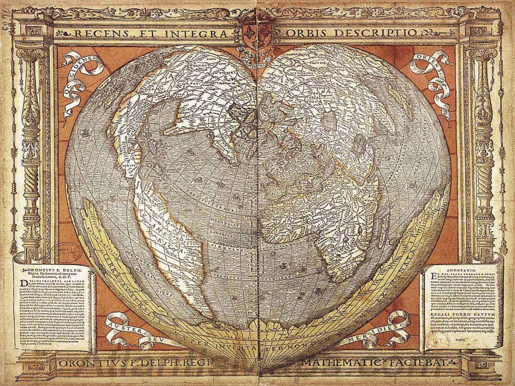
The anniversary of the bombing of Hiroshima gives one pause as it marks the emergence of a world of remote military strikes conducted by GPS, or on a UTM grid that cast agency at a distance from ethics or ethical choice. One thinks not only of the global cartoons of global expanse that seemed to unroll geopolitical spaces for their American readers, but of the new ethics of point-based precision. For the point-based maps created vertiginously elevated the subjectivity of their readers across the 40,000 maps produced between 1941-45 by the U.S. Army Map Service so as to remove most Americans from all sense of a shared ethical framework of humanity as the first atomic bomb was dropped on the city of Hiroshima.

The framing of military invasion as a game of geospatial dominance discounted the massive incalculable loss of human life in campaigns of prolonged fire-bombing and atomic holocaust. While the American military insisted that radiation burns were but “Tokyo tales,” as the government mole in the New York Times, William Laurence, asserted, due to the levels of radioactivity of the Atom Bomb, the cartoon suggested this was but the latest case of action at a distance, asserting a clear causality between the “invasion” of the city in Hawai’i, recently part of Japan, and the drawing and quartering that the explosive man-made catastrophe. The disembodied head miming words of feigned apology invoke a racist stereotype of a hasty apology delivered in pidgin English, disproportionate to the cascading effects it brought.

The oddness of this cartoon rests in its effective displacement of responsibility for the start of the atomic age. Indeed, the narrative this cartoon bears traces of how this new spherical global space suggested suggested a territorial dominance across the new spaces of air travel: the cartoon that appeared after the atom bombs were dropped on Hiroshima and Nagasaki on August 6, 1945 are particularly striking as it appears to remove any sense of the agency of atomic holocaust; it cast the explosive logic of the atom bomb as a delayed quid pro quo response to the “Jap Sneak Attack” of 1941; it asked readers to consider not the effects or impact of the atom bomb, but, rather evasively, who really was “the Fellow who Lighted the Fuse,” as if he were to blame: before any images of the destruction of both cities was described, the Chicago Tribune included testimony of Enola Gay crew members, hailing from Chicago, as an exclusive, with a discussion of the physics of atomic bombs and a reminder that a number of B-29 bombers were posed for further destructive missions.

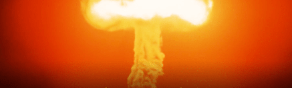
The front-page color cartoon hid the explosion of the Atom Bomb over Hiroshima, offering an occluded view on a spherical globe: in colorfully eye-catching attractive Hearst style, the colorful cartoon map was the sole visual documentation of the bomb’s effects, masking the devastation of its impact by the geopolitical logic that led to dropping an atom bomb. The only sense of agency in the cartoon is that poor fellow, his head now rising into the sky, severed from his body, as his bloody knife, patriotic flag for the Empire of Japan, and his military boots and gloves were imagined to be blasted far above the globe’s atmosphere. While the cartoon surely registered the global significance of the dropping of the A Bomb over a densely populated city across the Pacific Ocean, the responsibility for doing so was identified with a racialized floating head, finally severed not only from limbs but militaristic flag that suggested a rising sun of Pacific domination, but was now distastefully merged with a stereotype of obsequiousness that belies militancy. Is the beheaded soldier who once wielded a now shattered sword sorry for the catastrophe of the atom bomb?

Carey Orr, “the Fellow Who Lighted the Fuse,” American Newspaper Repository

In fact, he is apologizing, or is forced to apologize, for similar stereotypical sneakiness of earlier attacking Pearl Harbor. The informed American reading the cartoon recognizes as clearly traceable to dropping the atom bomb, by a link as evident as the arcing flightpath by which Boeing B-29 Superfortress the Enola Gay carried the 9,000 pound Little Boy to drop 26,000,000 pounds of high explosives on Japanese civilians.

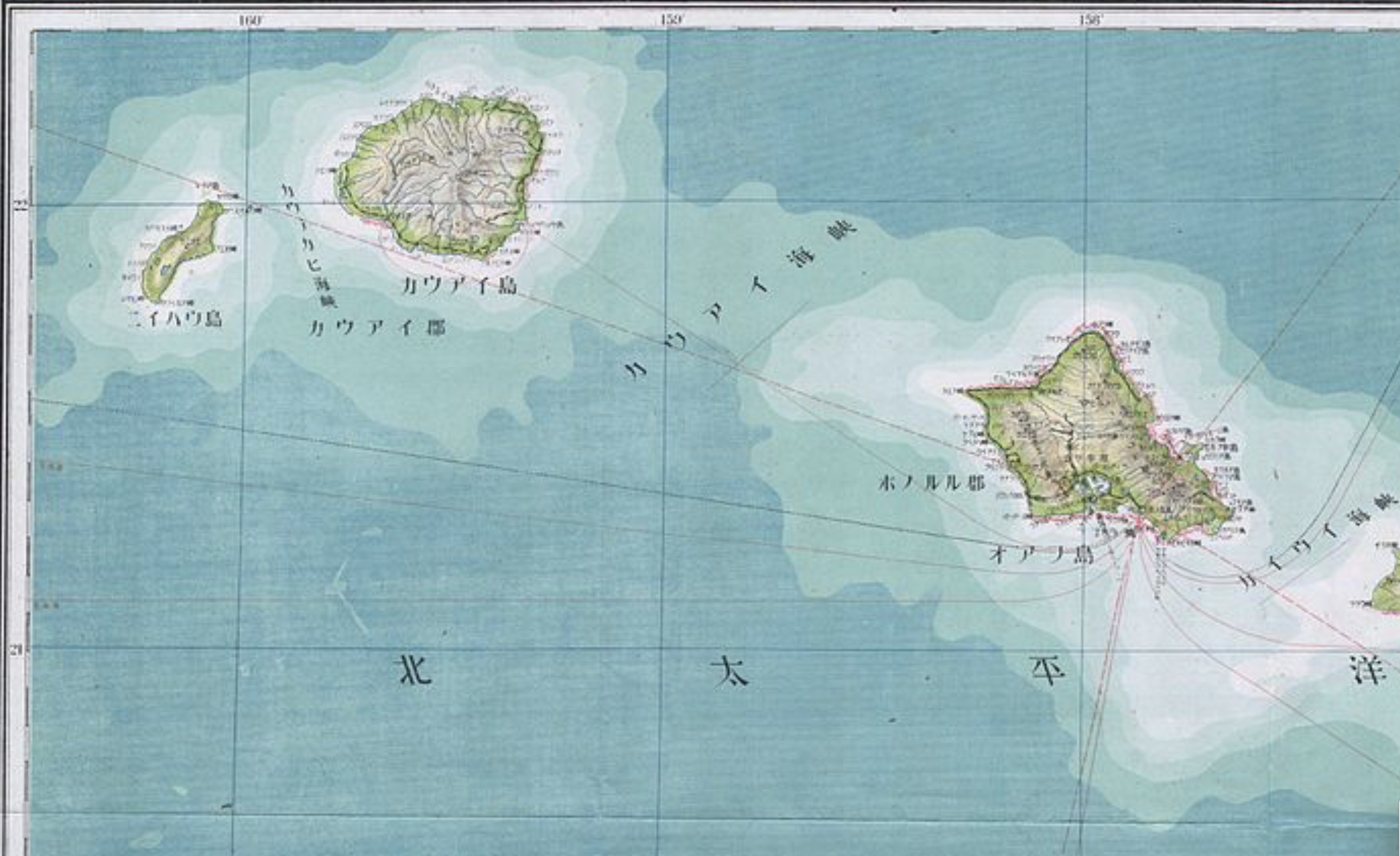
The spent match that lies on the “big island” of Hawai’i marks the site of where Japanese bombers attacked an extra-territorial military base, at Pearl Harbor. The map serves to help process the devastating precedent of aerial destruction. And it shifts the destructive impact of the bomb, incongruously, to a palette of a sunset just removed from U.S. territory, where the curling fuse that we can only see as running across the Pacific theater leads to a land lying behind global curvature of the earth, that almost occludes the global significance of introducing the atomic age. The bomb is an illustration of the end of the war by the victory of military mapping, and an affirmation of the fact that the only map is global now. But the ethics of that map are more than problematic. It carries a clear sense of “out of sight, out of mind,” imbuing the deaths of over a hundred thousand Japanese civilians–in an odd mirror reflection of the fears of Japanese attacking United States territory–with a sense of victory, painted as the conclusion to the war that Japanese single-handedly begun. The cartoon is a rather concerted shirking of collective responsibility for immediately killing 70,000 Japanese civilians and killing another 50,000 by radiation poisoning created a precedent of instantaneous mass slaughter. It must be paired with the sustained campaign of military disinformation that William “Atomic Bill” Laurence drove, downplayed any destructive effects of the atomic blast’s radiation levels as purely “Japanese propaganda,” as if to conceal its own efforts to portray the role of radiation in contributing to particularly painful and gruesome deaths.

As U.S. President Harry S. Truman would explain to the world that the delivery of the bomb had released nothing less than “the force from which the sun draws its power . . . against those who had brought war to the Far East,” in an impromptu lesson of nuclear physics, the payload of greater power than 20,000 tons of TNT, describing the bomb in empyrean terms that took one’s eyes off the ground as an act of “harnessing of the basic power of the universe” against the Japanese empire that had taken the rising sun as its emblem and flag, as if he was righting the natural order of the universe by using the sun’s awesome power to right the imbalance of a natural order and to deliver destruction in a purely retributive fashion. If almost a quarter of Americans stated after Japan’s surrender that they would have accepted the destructive explosive powers of more bombs earlier in the war, press dispatches claimed that the bombing would not leave any greater medical injuries than conventional bombs; as mortal effects of the absorption of radiation became clear, Lt. General Leslie Groves, having directed the atom bomb program, affirmed the same logic, enjoining reporters who “did not like the way we ended [the war], to remember who started it.” How many times had Lt. Gen. Grove, observing the same map, had arrived at the conclusion after contemplating the range of air routes the bombers would take, as a way of rationalizing the inhumanity of the event by reducing its devastation to the military logic of quid pro quo retribution for military deaths.

Lt. General Groves Observes Map of Air Routes to Japan
A journalist stands on the former site of a movie theater in Hiroshima, Japan, in September 1945, one month after the United States dropped an atomic bomb on the city.
Journalist Surveys Damage of Hiroshima Bomb, September, 1945/Stanley Troutman

Who, indeed, was making the sneak attack? If the yellow and orange hued pyrocumulus clouds caused by atomic blasts suggested the fireball of a nuclear or atomic explosion, the cartoon clearly referenced not only the explosion that left 200,000 estimated dead in its immediate aftermath, but the fireball of the atomic explosion as a sunset of the Japanese Empire. The first dropping of an atomic bomb on civilian population by the United States–

–was sunset of the Japanese empire, seen from the empyrean perspective of the navigation of aeronautical space that allowed its delivery at precise global coordinates. Did newspaper readers who smiled at the grotesque cartoon vicariously delighting in the ability of precise targeting on geospatial coordinates to target two cities for atomic devastation, without considering the humanity of their civilian inhabitants? Or did it prepare the consumption of the news of the delivery of the payload

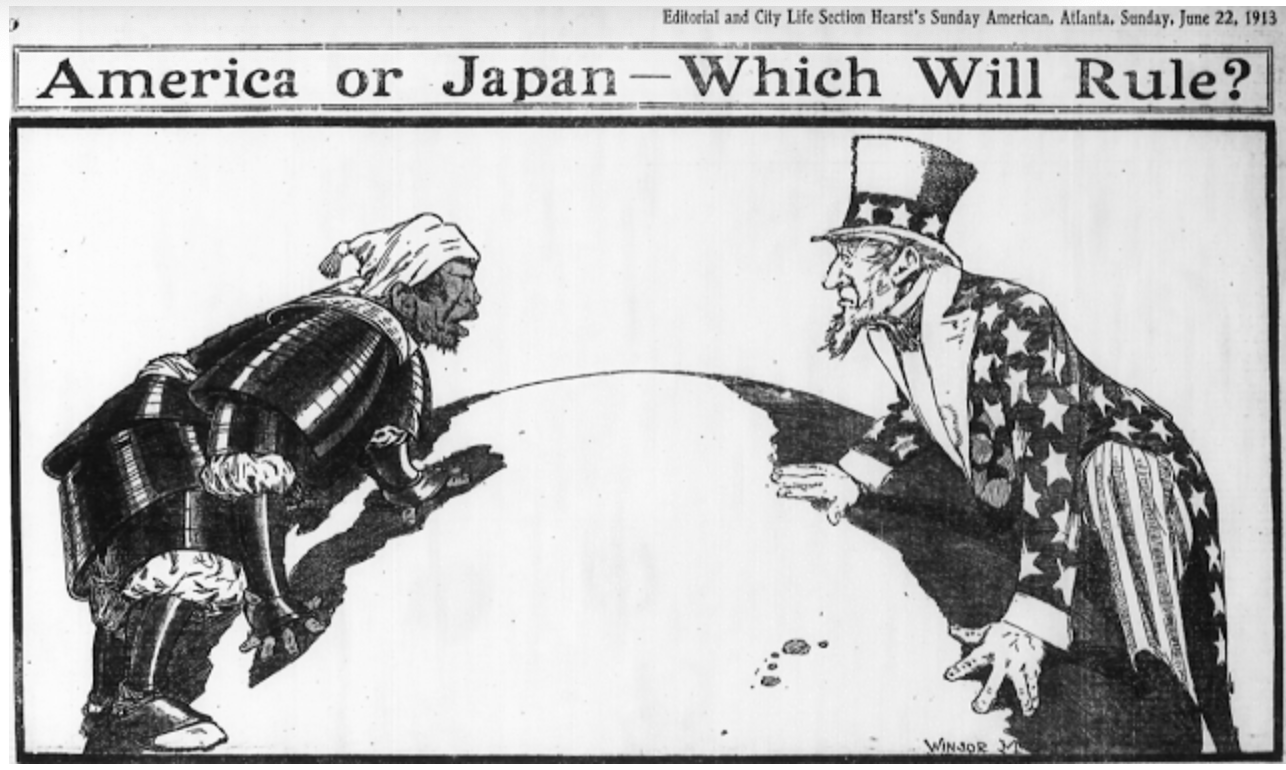
To be sure Hearst Newspapers had long promoted the Pacific as a theater of national jingoism in which the Hawai’ian islands were exaggerated as a potential site of struggle, frequently distorted as of defensible American interests; Hearst Newspapers Sunday Section of comics portrayed the contest in cartoons of racist tenor, as an antiquated samurai in full ceremonial armor confronted a spry Uncle Sam.

Windsor McKay, 1913

But the explicit use of a spherical projection to accentuate the aerial targeting of sites of bombing in Japan–and indeed of Japanese civilian populations–was both an assertion of the mastery of the maps that aviators followed in releasing Little Boy and Fat Boy, and a sense of the logic of the spherical projection as the conclusion of World War II. Early in the Pacific theater’s military expansion, to be sure, the Japanese Empire had carefully mapped the island in the paper maps that the imperial army drafted for all its soldiers to hold in fold-out versions in elegant form to foreground specific aerial and marine routes to the islands historically inhabited Japanese famers–

–the mountainous outcropping of islands righted by oceanic waters were remapped as the target of aerial bombers attack in 1941 in ways that the atomic bomb was imagined to respond as an analogous incursion into territorial rights. The results were far more terribly destructive, but seen as cementing the territorial retreat of Japanese empire across the Pacific. To be sure, the attack on the United States Naval Base had killed 2,300 Americans in 1941, when Japanese planes attacked the Mighty Seventh Fleet, sinking twelve ships and destroying the U.S.S. Arizona completely destroyed and capsizing the U.S.S. Oklahoma. But the logic of the global map creates a terrifyingly false equality of quid pro quo, or an eye for an eye, in spatial terms, linking the continuity of the spherical projection that enabled the American bombers to target Hiroshima and Nagasaki as a commensurate response to the 1941 Air Raid. The logic of the globe smooths over the disproportionate scale of the atomic bomb’s deadly payload and the attack on U.S. territory for American newspaper readers.

Yet in ways that are perhaps impossible to map, or to take stock of in its full consequences, the atomic fireball left massive human fatalities and injuries in its immediate radius, far beyond the devastation at the site of impact where buildings were flattened, leaving third degree radiation burns far beyond its alleged target, striking civilians both more violently and more deeper within the logic of war than was ever imagined. As if treating the sinking of the U.S.S. Arizona and capsizing of the U.S.S. Oklahoma as attacks on the actual landlocked states in the territorial United States, the treacherous logic of the continuity of the map’s surface created a false equivalence for cartoon readers that recast the dropping of an atomic bomb as a glorious imperial gesture.

The popular newspaper cartoon for the Hearst Sunday daily provided a rationalization of the explosion in maps that provide a continued basis for reflection on the scope of aerial bombardment, departing from the maps of worldly retreat of Japanese Empire on which American newspapers had focussed and were created by late August 1945 by the U.S. Army Information Branch, as if to justify the impact of one devastating attack.

Japanese Empire from 1895 to 19 August, 1945/Army Transportation Corps, Aug. 27 1945
University of North Texas Libraries

Many cartoons of the atomic bomb dropped by the U.S. Army were explicitly racist or misguidedly celebratory. This famous front-pager made open reference, perhaps fitting Chicago, where Rand McNally was based, as the spherical projection enabled dominance of aerial space and mastery of the virtual space of air strikes: the globe was now not inhabited by people, but a spherical surface over which one flew. And while the sign planted on the unidentified island of Oahu is suggested to be the site of the spent match that started it all, omitting that the 1941 aerial attack was staged on a military base–Pearl Harbor–rather than on a civilian population. The colors of the apocalyptic conflagration are muted, as we see only harm coming to the scattered limbs and bloodied knife of a caricature of the Japanese soldier scattered in a stratosphere.

Continue reading

Leave a comment

Filed under atom bomb, atomic age, geopolitics, Hiroshima, Pearl Harbor

Cartography, Personification, Figuration

Personification was something of an early modern topos, and a device for how to preserve unity.  When that man of letters Desiderius Erasmus singled out personification as a trope worthy of imitation in De utraque verborum ac rerum copia (1517), a primer on how to vary and embellish writing in an elegant manner.   The use among literate classes and high social orders of forms for amplifying written expression emphasized inventive models of expression, valuing the versatility in inventing and experimenting with combining varied modes of rhetorical accomplishment as illustrations of virtuosic skill and ability.  Far removed from a techne, the art of deploying tropes or figures of speech provided a tool to please one’s audience, employing figures of speech from allegory to synecdoche in order to illustrate the abundance and fertility of forms of public expression and engage one’s audience.

The adoption of standards of amplifying abundance in speech as a form of rhetorical virtuosity was not limited to oratory, but was readily transferred in interesting ways to how nations were embodied in early printed maps, whose formulaic construction lent them to the sort of combinatorial arts by which rhetorical practice had been increasingly understood, both as a form of technical writing by state secretaries and personal scribes described and provided models by which to organize formal written as well as verbal expression by virtue of their plenitude.  Indeed, if the proliferation of early modern maps is often tied purely to printing to meet cartographical demand or a taste for maps, the embellishment of chorographical city-views as well as national maps provided a canvas on which to express settlement as a form of unending abundance to provide confirmation of the nation’s actual and symbolic wealth for readers.  Maps provided particularly apt vehicles for copia, especially through the allegorical personification and amplification of the inhabited land, in ways that merged the purely quantitative tools of mapmaking with elegantly qualitative detail.

Erasmus lent currency to the figure of speech as an exemplary method of expression.  In a book often cobbled together from model passages of classical works of writing and rhetoric that served audiences as a guide throughout the sixteenth century as a model of written communication, Erasmus personified the abstract virtues of a number of ancient writers from Aristophanes to Chrysippus and Horace with attention to how the trope of personification could encompass the virtues of mythical beings–the trope served to make vividly present for the eyes of readers something absent through varied forms of expression.  The evocation of a personified form  seems to have encouraged cartographers to attribute a similar poetics of embodiment to mapped expanse, and indeed helped make such figurations of bodily unity more easily recognized by their audiences as expressions not only of virtues, but as a deeply symbolic measn to mediate surveys that augmented their coherence and power, and convert them to texts that better engaged audinces.

The trope or topos of visual personification informed terrestrial maps’ coherence and continuity has been neglected, in some unintentionally or unwittingly intentional way, however, in a story that privileged the mathematics of cartographical accuracy, and tended to marginalize more clearly allegorical maps as curiosities.  The striking popularity of these device-like images both as forms that encoded information and processed it in a recognizable graphic form was particularly popular in mid- to late-sixteenth century Europe, intersecting with emblematics as well as the quantitative sciences or mathematical learning.  These images reflected the broader currency maps had gained as sophisticated tools to process a cognitive relation to expanse that readers could readily–and almost intuitively–grasp.  Figuration augmented the power of the map as well as its coherence, and indeed served to render maps in a readily recognizable format for their viewers–even if those viewers were not practiced in the arts of surveying or intuitively able to graps the mathematics of terrestrial projection.  For personification helped cartographers use the formats of mapping to bridge the tools of transcription of place and the assertion of their cultural unity.

The corpus of regional maps of France and England alone by practices of surveying and triangulation acquired virtues of embodying national identity for cartographers who presented their maps as images of the nation that analogously rendered the abstraction of royal rule concrete:  the royal mathematician Oronce Finé’s deep pride at the national map of France he went to considerable difficulties to create in the late 1530s, studied by Lucien Gallois and more recently in a collective volume edited by Alexander Marr, extended the poetics of embodiment achieved in his cordiform (or heart-shaped) world-projections–a creative mathematical innovation of global projection departing from Ptolemaic schema, using a model first rendered in diagrammatic form by the Austrian imperial astronomer Johannes Stabius.  But the design that Fine engraved invested the form of the globe–or the surface of the heart-shaped globe–with a joint physical and symbolic presence, using a form had wide significance as a form of Christian devotion among religious reformers as a symbol of devotion and sincerity, as Giorgio Mangani suggested, imbuing the world’s map with deeply spiritual association, even as its design also served to foreground the proximity of France to the New World in an age of global discovery in ways that would delight royal audiences.   The international appeal of the embodiment of the world as a heart-shaped form rendered it an engaging site of contemplation, if not encoded the map with deep significance as a meditative form.

Finé’s elegantly harmonious cordiform projection offers a strikingly material symbolic form of terrestrial unity, organizing words as if on a plastic surface that not only foregrounded the proximity of France to the New World that would be pleasing to a French monarch at a time of global discoveries–but communicating the concrete presence of the legible surface of the globe, as if to render it by a new portrait rich with emblematic significance, framed both by an elegant cornice and armature and against a dark red field:


Oronce_Fine-1-1024x768


The map’s harmony intersected with Christian imagery of devotion–undoubtedly also underscored by the deep red field of its background–as if to treat mapping as a form of piety, as well as provide a satisfying variation of the format for ordering the map’s surface.  The organization of place-names on the curved meridians and parallels of its surface preserve a sense of its perfect smoothness, distorting Antarctica as a ˆTerra Australis” but doing so to lend the organization of what seem four large landmasses or continents far more harmonious symmetry and structural balance.

The 1538 map of France, if far less famous as a symbolization of unity, accorded embodiment to France as a nation that is particularly striking in its attention to record only the sites of population or topography within its national frontiers, which not only received a royal privilege, but was enabled by his charge to take surveying measurements by an instrument of triangulation he claimed was his own device, and which he invited each inhabitant in the nation to submit any reading that deviated from the “portrait” he set forth–adopting a language of personification for the jurisdictional boundaries of its expanse, here including part of current Switzerland:


N53006718_JPEG_1_1DM

This stunning woodcut from the Bibliothèque nationale‘s online collection presented something of an icon of national unity.  As much as providing accurate records based on new instruments, the comprehensive coverage of local detail in maps as that of Fine responded to political exigencies:  even if we can associate the determination of accurate base-lines with Cassini and Turgot, the uses of maps to refigure national unity or to imagine the nation-state that a monarch ruled was actually more of a purely Renaissance affair.  For the French mathematician sought “depingere Galliam insignorem nostrae melioris Europae regionem . . . ad vivum quantum fieri potuit figurate” in an image that knitted the  Cisalpine and Transalpine Gaul into one life-like image, “pour ample et facile intelligence”–and in doing so would bridge the historical divisions in France that Caesar had described in his Gallic Wars.  While this boast was sure to attract erudites and illustrates his intended audience, the life-like notion that he sought to attribute to the map, I would argue, revealed its deeply figural properties, much as does its adoption of a language of cartographical portraiture.

The royal portrait of Elizabeth I by Maurice Gheeraerts the Younger gestured to the role of maps in providing a concrete figuration of national unity in the counterpoint that he drew between the nation as embodied by map and by monarch–the opposition of the body of the nation and the body of the king (or, as it were, queen)–in the 1592 Ditchley portrait standing astride a map of her land recently mapped in detail in Saxton’s 1579 atlas:

Gheeraerts_Elizabeth_I_The_Ditchley_Portrait_c1592

The Saxton atlas was crafted with royal permission to visit private lands, and is not to be opposed to narrowly to a figuration of monarchical authority.  In the portrait painted by Marcus Gheeraerts the Younger of the queen in her sixty-second year, showing Elizabeth as leading her country into the future after a storm, the map re-figured her relation to the nation in vital ways.  The material precedent of the thirty-four highly ornamented maps that Saxton printed of the realm’s counties, issued as an atlas of 1579, afforded a model for this multi-colored map, and presented each county in differing colors, much in the Saxton’s popular county maps, in ways worth viewing in close-up detail:

England's Land


Take, for example, Saxton’s mapping of Kent in his highly ornamental, if also in part practical, colored atlas, for which he had received special royal privileges to enter villages and private properties for the purpose of conducting his surveys:


Di112_kent


The topos of the map provided a powerful symbolic model for the figuration of monarchical identity, and for a new poetics of embodiment, less invested in the trappings of monarchical authority alone, and recognizing the extent to which national identity had become increasingly mediated in maps by the late sixteenth century.

Indeed, the master-engraver and cartographer Abraham Ortelius himself had personified the continents in the frontispiece of his authoritative collation of maps in his 1570 Theatrum Orbis Terrarum, a massively ambitious comprehensive compendium of maps of the known world which became known as the first modern “atlas”:


Ortelius' Continents-Ftspiece


–and gave pride of place to the figure of a crowned female Europe, surrounded by the artifacts of cartographical practice and knowledge distinguishing practitioners as himself, and fabricated European knowledge of non-European peoples–here represented by less regally clothed figures of Asia and Africa that theatrically gesture on both sides of the monumental classical architectural frame on its title-page.


Europe with Globes


In this context, the use of “Europa Regina” provided a new figuration of Europe’s identity when it was reprinted in Sebastian Munster’s Cosmographia in 1586, and enjoyed considerable success in the reprintings of later years.  Similarly, in the cycle of maps of the Italian peninsula that was composed from surveys that the mathematician-catographer Egnazio Danti specially took of papal possessions in six regions of the peninsula that were formally included in papal lands.  The surveys provided a starting point for which the cartographer worked with a team of painters in the Gallery of Maps in the Vatican Palace whcih  refigured the peninsula’s identity as a region embodied by the church, rather than a series of constituent states–and indeed cast the unification of the state by the Reform church as a historical conclusion to the conclusion of the violent civil wars by Augustus, in a symbolic analogy that was potentially fraught if powerful in the authoritative model of peninsular unity:  Augstus’ ascension to his rule was by no means peaceful, but his shoring up of state authority after the Civil Wars was a historical touchstone.

Such maps stake visual arguments about national unity.  They do so by inviting their audiences to linger on the coherence with which cartographical tools embody a coherent record of territorial extent.  The maps mediate a carefully worked record of territorial surveys to present a united field for viewers to scan in particularly pleasurable terms.   The cartographers of each employhd mathematical expertise to express political unity in particularly useful ways:  for they blur nature and culture to mediate images of nations invested with symbolic values of unity and coherence, often doing so by gesturing to the organic unity of the body.   Each map advertised its own  pictorial coherence by taking advantage of the formal unity of mapmaking.  Gheeraerts seems to have adopted this language of personification much as Saxton was engaged in refiguring English identity from the country earlier best known  from the 1564 Mercator’s maps of the country.  The national mapping of France later took on new urgency in an age of confessional divides, for example, as a generation of cartographers sought to knit its divides, and in an age of religious wars create a literal metonym for religious concord and confessional uniformity, rendered as legible in flourishing rivers, forests, and fertile plains, and praising, as Bougereau’s map of France, the many rivers that gave it nourishment.  And Claes Jansz. Visscher’s “Leo Belgicus” (1611)–or “Leo Hollandicus“–


Leo Belgicus.jpgDavid Rumsey Map Center, Stanford University Libraries


The map elegantly embodied the Netherlands as a rearing lion, restored to its symbolic unity, to mark the restoration of integrity and peace region’s liberation from Spain and the truce that brought tranquility to the region–and restored local commerce.  Is it only a coincidence that the “brain” or mind of the lion is effectively occupied by the sea, the site of the compass-rose that remained an iconic tool of orientation in nautical cartography?


HEAD of LION.png


The figuration of the region in the form of a rearing lion celebrated the region’s regained autonomy in a chorographic format of a regional map, ringed by a series of individual city-views of startling detail; situated beside the hirsute lion’s mane and legs, paired views of the peaceful countryside and of the active shipping commerce, to celebrate the benefits of the new age of peace that the treaty inaugurated.


ships


Bucolic NL.pngDavid Rumsey Map Center, Stanford University Libraries


Indeed, if the colored 1648 Fischer map of the Netherlands, Belgium and Luxembourg is better known from postcards, the image derived from a 1583 map that stunningly figured the Netherlands in the form of a lion that the Austrian diplomat and geneologist Michael Eytzinger published in the Civitates orbis terrarium compiled by Ortelius’ friend and colleague Michael Hogenberg:


800px-1583_Leo_Belgicus_Hogenberg


In a strikingly dense period of designing and printing maps, cartographical refiguration provided a persuasive graphic form of material personification, and something of a learned figuration of a fabricated regional identity.  As a figural image, the map became a basis to imagine the future of the region as a nation, but more compellingly to render its history and prefigure its future in vividly persuasive form.

1 Comment

Filed under allegorical maps, cartographic design, copia, engraved maps