We do well to see through maps, Denis Wood enjoined, urging us to detect the “human landscape” that lies superimposed upon the land in maps, and uncover the ways that the landscape has been changed–and orient ourselves to those changes that have been wrought by the “huge arrogance” that “we can name and we can claim.” Maps demand to be interpreted by scratching their surfaces, as if we could uncover how one might best “see through them,” to explore the landscapes that lie underneath the layer of words that lies on their beckoning if often all too opaque surfaces. Webmaps allow this level of interaction, often by playing on the conceit of the paper map. Indeed, the symbolic surface of the paper map–and the London Underground map in specific–have been used in a variety of web maps to suggest different notions of the “underground,” and to suggest the power of maps to alter one’s relation to place and space in provocative ways.
To take stock of how maps work by asking us to go about imagining the landscape that lies beneath those words is a way of uncovering their arguments about territories. The format of the audiofiles linked to a map of London’s Tube provocatively invites readers to explore its surface, in the clever pun advanced in the web-based maps of the London Sound Survey. For its links invite us to explore soundscapes that would otherwise lurk beneath cellulose surfaces, treating it less as the modern relation to space and place that the Tube Map advanced in its early twentieth-century iterations–than as a sort of recovery of a lost sense of the sense-base experiential waterways underneath the expanding city, that the paved city has in many ways repressed. The river that snakes across London today, mapped for its sludgy muddiness in many Google Earth terrain imagery, marginalized if not expelled from London’s built urban landscape. If the sinuous light blue line of river returns as a sonic reality as it laps along old unused docks and concrete pillars as one approaches its banks, its sounds letting the city disappear for a moment, the sounds of the Thames returns int this may that adopts the form of the underground Tube line of the built environment of the twentieth-century resurfacing of the city.
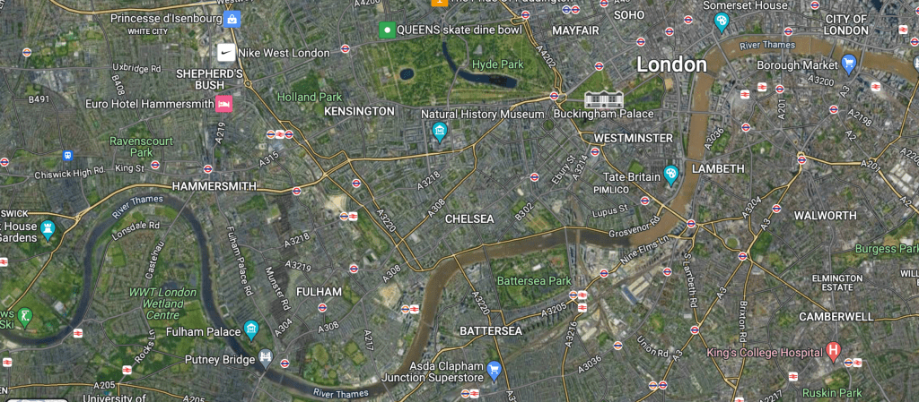
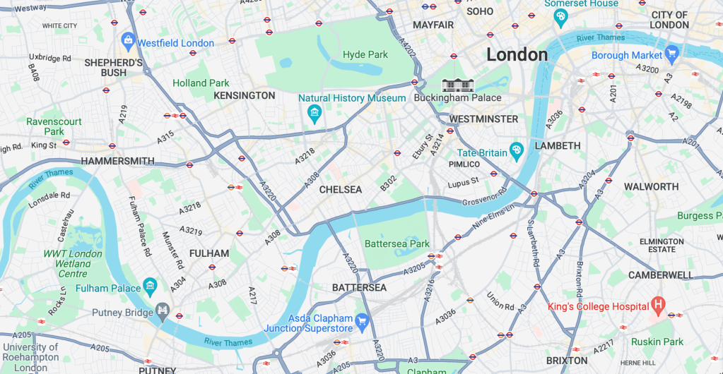
Web-based maps such as Sound Survey of London’s waterways indexed offer modes to remap the known environment of the city in new ways: the choice to map the riverine network that is rarely seen in London seem specially suited to the conventions by which Harry Beck‘s almost universally recognized diagram of its Underground specifically invited users of the London Underground to re-see their own environments, offering a way to encourage map-readers to navigate the built space and neighborhoods of London as able to be readily accessed by the Underground. The striking modernity of the circuit-like 1933 Tube Map that invited users to so successfully read the access to space the Underground offered at a distance from lived space, yet in ways that its simple form foregrounded utility, it offered an icon of the modern urban plant.
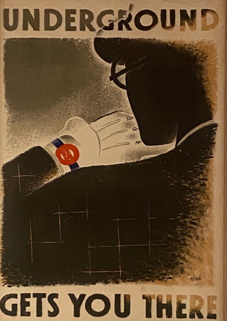
It was, of course, as it happens a radical revision of the attempts to picture the London Underground. The space of the tube was not only a new way of understanding place, but time, in strikingly modernist tones by artist Hans Schlegel–he signed the lithograph as “Zero”–suggested, as a new way to navigate space, adopting icon of the Underground to a map, as it offered an ability to negotiate urban time,–
–as the surrealist invited on to experience space by a new tool that “gets you there” in ways never possible before, warping space-time in ways that were entirely to the modern citizens’s advantage, a user in this case typified by the new subject of urban space–a man in a suit, bowler hat, and white gloves–who meets the demands of his job by the circuits that lie beneath the city that allow him to arrive on time. He is checking his watch in ways that suggest the timepiece had been replaced by the Underground to affirm its utility beyond only navigating a built space. London Transit used graphic arts to promote the new Tube as a basis to experience the city in many ways, and indeed experience to navigate the Thames, just a few year earlier, that suggest not only their investment in graphic works to reorient viewers to space, but to remap urban space by the river–the most important, perhaps, orientational path of the city’s neighborhoods, even as they were replaced by city blocks: streets were organized in relation to the Thames, historically, but the underground, in this lovely 1933 poster, proposed its utility as a way to access views of the river–

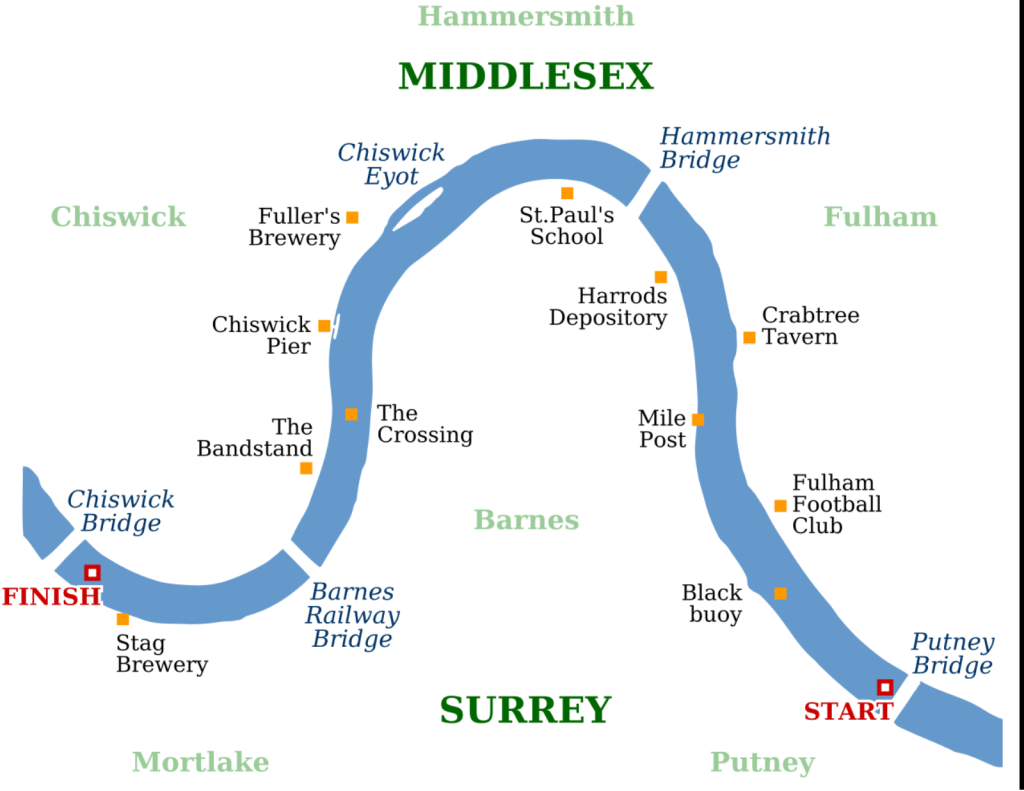
The Boat Race: Oxford-Cambridge Boat Race Map, 1926
–and specifically of the Cambridge-Oxford Race that was run annually on London’s Thames in one section–that in 1926 mapped the stations of the Underground to “travel to your view point” to watch the race–but took the river as the main course by which the riders of the underground would need to be oriented. In contrast to a map of taking public transit to watch a race–or to arrive at place on an urban river’s course–the new Underground map that was designed some seven years later after the diagram of electronic circuitry elevated its geometric form above the urban topography or indeed the urban sensorium. Beck’s innovative design for the map printed in January 1933, took as its logo and model, in many ways, the novel emblem of the underground tube–the Underground, as it was called, or Tube–as a geometric creation that replaced the urban soundscape, and a utopic idealization of space.
This was a new way to understand how one could experience the river that the Sound Survey may have not known, but offered something of a symbolic foil to in asking us to view the river–or The Boat Race–in new ways via the access points the Tube provided to out-of-towners who arrive for the popular sporting event, akin to later campaigns to use public transit to access football stadia. The actual boat race–The Boat Race, as it were, founded in 1845, beginning half an hour before high tide on the River Thames, which has been from its founding timed to start on the incoming flood tide, and allowed numerous viewing points on piers, breweries, football clubs and taverns that lie along its 4.2 miles, or the steps that front upon the river, for crowds of spectators to gather and assemble. But the distortion of the river was, already by 1926, the point. The race between Oxford and Cambridge teams for which an umpire provided a running commentary for the first time in 1927, perhaps to accommodate the larger crowds who took the London Underground to preferred viewing points, accommodating the river’s course to the transit stations’ locations–even suggesting the degree of punctuality of arriving at a station to view the winding paths that the boats actually took on the river, comparing the directness of the transit line against the course that were taken by the crew teams.

The Boat Race Map: Oxford-Cambrdige Race, 1926
It’s no surprise that the Underground map from the late 1920s distort the path that the Thames takes between bridges, as Londoners well knew, was actually a far more sinuous course–navigating the bend is the point of the course!–on the four point two mile course running between Putney Bridge to Chiswick Bridge. But to illustrate how the Tube accommodates to its path, the straightness of the lines of tube track are privileged far above the actual riverine path in the 1926 map , , to which the tube accommodates.
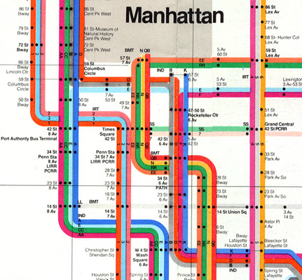
But the attempt to reconcile the tube’s course to that of the river may have been a question of epistemic orientation by the 1930s, as a new geometry of the Underground first proposed by Beck in 1931 redefined the space of the underground. Beck used a geometry of 45 degree angles and diamonds to illustrate interchanges and stations that invite observers to reorient themselves to urban space free from the river’s course–indeed to focus their orientation to the network of tubes on which public transit ran. The map conceals massive effort of labor of building an underground infrastructure where immigrants laid track and dug ditches beneath the city, but the infrastructure soon became far more prominent for many Londoners in future generation than the map of the city’s landmarks, and was intended as an icon of British engineering if not the urban metropole.
The Sound Survey Map of waterways offered a sonic counter-map on in online form, as an attempt to reverse the building of anthropogenic space, by examining the sonic sites where the river returns to audible presence. In orientng its users to the presence of the Thames over the urban hubbub that defines London today, it shifts atteniotn from the anthropogenic built space, providing auditory evidence of the presence of the water that the Beck map overlooked. If the oval emblem that served as the key in the circuit-like map at forty-five degree angles that cast interchanges as diamongs and stations as notches was proposed to shock and consternation, remapping the built city for users of public transit in utopic ways in then following years–
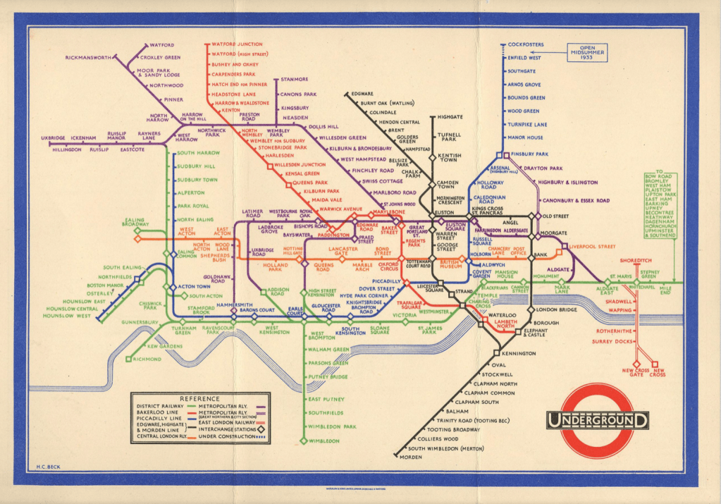
Harry Beck, Tube map (1933; designed 1931)
–now akin to a Union Jack as an emblem of pride in English engineering ability to provide the smoothing of space in an infrastructure of smooth movement, both to escape urban congestion and arrive across the city in record times for work, as the lithograph by Zero–Hans Schlegel–affirmed in stark modernist terms in 1935. The promotion of the Tube as affording (and promoting) a modern form of urban space suggested a revision of all earlier urban maps–“All that is solid melts into air . . . “–as the known form of the city melted into the geometry of a circuit map, untangling the tangled streetpaths of modern London in crisp terms readily navigated by its perfectly symmetrical and smooth routes, a technological progress that was a sort of symbolic metaphor of the smooth modernity of the smooth ride that the Tube offered its passengers. (The aptness of the visual metaphor made the form so much more effective, promoting the Tube as offering a new way to move through urban space, in ways that the Sound Survey Map–and we will come to it soon!–seems to seek to pull back for its users, uncovering the lost sounds that the built city plant sought to erase.)
The images of the Underground break form the alluvial settlement of the expanding city from its past in definitively modern ways. While in a day when the London Transportation Authority offer City Mapper, an the ability to track one’s place on the London Underground on handheld devices, without every really needing a map, the smoothing of space has been accentuated–even as the actual lines of transit infrastructure has become considerably more complicated and tangled, both with the exponential expansion of the city that sets new standards for urban growth and neoliberalism. Perhaps the greatest sign of neoliberal achievement is that the map devolves onto our handhelds, as if consigning paper to the past; but the old pocket transit maps are given new life in the web maps that folks as the London Sound Survey have devised to bring the river before our ears, and invite us to reconsider the benefits and losses of mapping urban space.
Of course, the point of such interactive maps is to orient us as urban residents to the surroundings that the built infrastructure has long elided, and increasingly threatens to obscure. There is something remediative and restorative in a map of London’s everpresent river, that reorients us to the river of the riverside city. The Sound Survey Map asks us to use our ears to acknowledge the iconic map’s utopic nature, as it asks us to reorient our sense to the river waterway that the tube replaced, by excavating the sounds of buried waterways. Indeed, wherea pocket guides to the London Underground sold by UER before Beck’s design were startlingly sinuous, as in 1908, displacing the river from attention, in favor of an alternative infrastructure of railways–

–but almosty investing the tubes of the Underground Railways with a sinuous aspect of its own, respecting urban topography, if acknowledging the new transit web lay beneath, apart from, if ancillary to urban streets.
Whereas Beck’s iconic map promoted the primacy of the drafting table and the engineer, a form of engineering that might have well seemed overly radical and ecxessive in the lived environment of pre-war London, the web-based map is a sensorial register reminding us of the presence of water that the underground displaced.
In the Sound Survey, all “transit” lines are shown in their entirety, as if to return tthe river to a prominence it long held in London’s plant. Indeed, save the District line which is only shown as far as Mile End, the rest of the stat image offers an apt way to invite viewers to excavate audible aspects of the city absent from a drawn map, in a truly phenomenological map of the circuit of hidden waters beneath London. If subways are often noisy, the sounds that the Survey has compiled offers a somewhat synesthetic compilation of the hidden waterways that might be seen as corresponding to metro stations, less as a disembodied circuit–as Beck’ map–than as the subsurface lying underneath the engineered world. Beck’s map sanitized the subways in streamlined fashion to attract Londoners to the Underground, readers are asked to explore the waterways that emerge only in its parks, bridges, and channels linked to watery paths which we rarely see which run under and about its surface before they enter the central artery of the Thames.
Rather than by mapping the city’s space in reference to its individual streets or intersections, but by placing the rivers of the Survey maps waterways’ sounds in ways that recuperate their perhaps forgotten presence. Wood remapped the lived community of Boylan Heights so that is not only as a place in Raleigh, North Carolina, but charting the “metabolism” of the community in maps of the light street lamps cast, lit jack o’ lanterns placed on porches at Halloween, paper routes Wood ran with a tightly knit cohort in his youth, or “squirrel highways” of aerial wires, which collectively serve to unpack the often invisible ways of “how it works.”
One might compare to this set of maps the ways in which maps in the London Sound Survey invites readers to enter an overpowering pointillist accumulation of local details, and similarly serve to map a setting in which everything sings–or at least we can enter its audible surface at distinct points.
Continue reading
