
On a smaller scale than Robert Kaplan’s pre-determined predictions of the fate of worldly empires, the damages and deaths caused by the floods brought by Hurricane Sandy revealed the revenge of geography on specific regions and neighborhoods: particularly to the square mile near Staten Island’s eastern shoreline in a topographic “bowl” became the most dangerous place to be during the storm.
With the ocean level rising at a rate as rapid as two feet every hour, an elevation of 2-4 feet made this area victim to a flash-flooding of almost biblical proportions, all too familiar from the low-lying regions of New Orleans: shortly after breaching the boardwalk and running over the Boulevard at 6:30 p.m. in the evening, waters poured into the square mile area filled with former beach houses–located beneath Father Capodanno Blvd. and roughly between Midland and Dorp Beach–in a truly scary revenge of geography on its inhabitants. Ocean waters breached the beachfront road, ran over the Boulevard, and filled the ‘bowl’ of some 2,000 houses in minutes. Several inhabitants, either ignoring or not giving heed to the imperatives to evacuate low-lying areas, or just not expecting the rush of waters to be so intense, were trapped in the rushing tidal flood, and 11 people drowned, ages 2 to 85, as the natural strorm drainage system couldn’t come with the huge influx of ocean water.

The catastrophic proportions of the natural disaster are difficult to map, partly because mapping implies a disinterested relation to space that still seems difficult to process in the face of tragedy, and partly because the map is not an adequate map of the intersection of these lives with the storm. WNYC’s map of the relation between low-lying areas and the deaths is pretty clear. But one wishes one could have provided a better warning system while one reads this interactive map–what were John K. and John C. Filpowicz doing in their basement? When they ran downstairs to avoid gale-force winds, did they imagine it was watertight? Can we somehow turn back the clock?
These demographic data in this small sample conform to a broader perspective, as they echo the intersection of two groups. Of the hundred deaths attributed to Hurricane Sandy, over half were older that 65, according to the New York Times, and a considerable majority occurred in Staten Island or Queens; many inland tragedies that occurred in the mainland attributed to fallen trees, due to the wind that were the source of that exaggerated ocean tide, but were most often far less clustered. The individual narratives are the most meaningful level at which to understand the course of the Hurricane, but one can’t help returning for some sense of meaning to the larger maps.
For the maps provide some sense of a healing in relation to the event as well. It is true, the tragedy isn’t one of the settlement of the area, or even of the lure of the beach, but lay in something of a denial of geography. One would have hoped that cartography could have assisted in the evacuation, but in the end, the inrush of waters created a tragedy for which few folks were adequately prepared. Tragic deaths occurred mostly on the margins of the lowest-lying regions, where the need to evacuate was perhaps most easy to discount, as if there, the strength of the storm somehow easiest to ignore.
To view the map in an interactive format, and read individual names of those who died, gloss your cursor over the same view of the Staten Island coast at this page, where this particularly grisly sort of tragedy is mapped.
In order to distance this tragedy, and to situate or frame it in an understandable context, it’s a help to compare this local map, and its street-by-street topography, to a broader regional map of the toll associated with the hurricane, and perhaps then to pivot to map of the entire city, against which the tragedy in the Staten Island shore might be placed–or mapped–in contextual perspective. For this, we descend into the symbols and anonymity of GoogleMaps, with its sanitized view of the devastation:
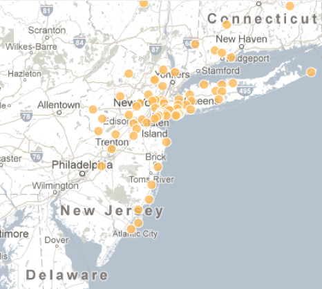
We don’t need to maps to tell us that the densest records of mortality occurred in New York City, or to follow the distribution along the Jersey coast. And its hard to know that this map is satisfying, each yellow glob masking its own narrative of the end of a life. When I look at this map, not so oddly, however, I miss the narrative that is provided for the Staten Island beachfront. For the above large-scale map has the authoritative remove of a historical map, in some sense, and puts me at too much of a remove from the scene to comprehend the natural disaster–translated as it is to a generic Google Maps template, with the cost of the loss of human life erased, if not sanitized, in a dense clustering of a multiplicity of yellow suns.
And I go back to the map of New York, using the program to zero in, where the clustering of orange blobs is striking, and leads me back to the Staten Island neighborhood with a calmer mind, trying to balance their stories with the other lives that intersected with the storm:

There is limited comfort in this somewhat antiseptically muted map, and I might prefer a set of sequential weather maps of the region. But it’s still something that I linger over, trying to press meaning from, before going back to the grittier map of that low-lying Staten Island Beach.

