
Has racism reared its ugly head in the debate over healthcare? Dr. Atul Gawande likened attempts of conservatives to reject health care exchanges as “advice that no responsible parent would ever give to a child.” For it seems a deeply obstructionist tactic that recalls in so many senses the resistance to integrating schools after Brown v. Board of Education under the misnomer “freedom of choice.” Gawande noted with real disbelief that courts had to intervene to prevent such retroactive obstructions, much as the Voting Rights Act had been designed to allow courts to intervene in obstructions of the right to vote in similar regions. While Gawande was not alone in finding that the mantra “defund Obamacare” tsponsored by “almost exclusively white members” elected to represent “bright red districts” to be fueled by racist hatred or be a cover for deeply racist fears, or be a cover for the sense that poorer parts of the society should not be covered by the wealthier, or by the middle class–and a deep dissatisfaction of the apparent redistribution of wealth that this created, as if this constituted an unwanted interference of the government in individual choice.
Not only do we live in a landscape of quite jarring disproportions of health-care and access to health providers, but of deeply disturbing shifts in life expectancies, that undoubtedly are influenced by a truly terrifyingly inequality in access to health care–which may offer the sort of data visualization from which to begin debate on health care.

Inequalities in Life Expectancy among US Counties, 1980 to 2010/Dwyer-Lindgren, Bertozzi-Villa, Stubbs, et al./FiveThirtyEight
Filtered by a color ramp that less sharply conveys sharp ruptures, the inequities between in life expectancy among individual counties suggests some quite sharp differences that are apparent in the landscape whose populations we may have decided that we’re less interested in working to ensure of up to a decade:
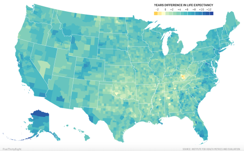
The sharper and perhaps more surprising decline of women’s life expectancy during the decade between 1997 and 2007–the first time of such widespread setbacks in longevity in recent memory–betrays a shockingly similar concentration throughout Oklahoma and Kentucky and West Virginia, as well as Nevada, that mirrors the discontinuity in life expectancy nation-wide to the above snapshot, in ways that might suggest a health crisis, and may well mirror the doubling of those classified as obese between 1980 and 2010–and something as simple as widespread dietary change, as well as habits like smoking, contributing to high blood pressure and obesity in an almost national epidemic. The dismay with which Dr. Christopher Murray, direction of the Institute for Health Metrics and Evaluation at the University of Washington, noted in 2011 that “there are just lots of places where things are getting worse” seems echoed in the infographics above and below, where the sharp discrepancies of an unexpected decline in health and life expectancy mirrors the increasing inequality and economic divide in America, in ways that seem to distinguish the United States, according to the chair of a 2011 National Academies panel on life expectancies, unlike other countries, that effectively pegs health care to income levels. The decline of life expectancies in Appalachia and the Deep South is not, perhaps, surprising, but speaks to a bizarre division of the nation, especially as many welathier coastal areas in California and the Northeast, as well as Florida, have seen a rise in life expectancy of both women and men.

The absence of similar geographic disparities in life expectancy on a very local if not granular level is absent from Great Britain, Canada and Japan, but suggests the growing demographics of inequity that threaten to be only reinforced by the absence of a comprehensive plan for national health care. It is a terrifying truth that the majority of poor uninsured reside in 114 of 3,000 counties in the nation, of which 52–just under half–have actually adopted or imposed increasing obstacles to access to adequate national health care for their residents as an unwanted federal intervention.
Such discrepancies are not new, and are readily visible in the US Census, a precious record of national discrepancies and continuities that is now increasingly important to determine the allocation of public resources. But they were strikingly similar in 2012, in ways deserving to send a shock through the nation because of the inequities it exposed:
 Kelly Johnston, University of Virginia Library Scholars’ Lab (2011)
The historical decline in life expectancies particularly among rural America–a region that even when adjusted for race shows a huge historical divide that demands drilling down very deeply, as it cannot be reduced to a single cause.

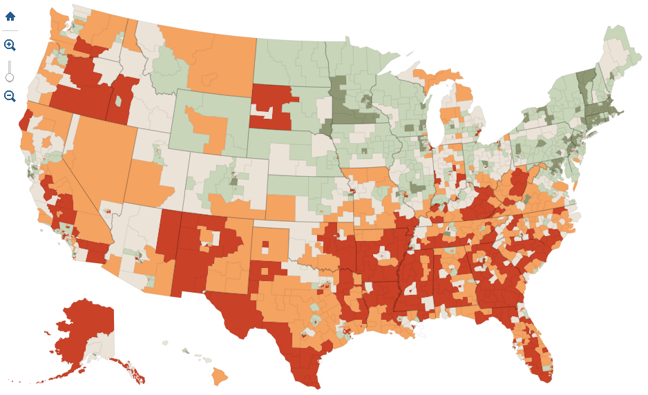
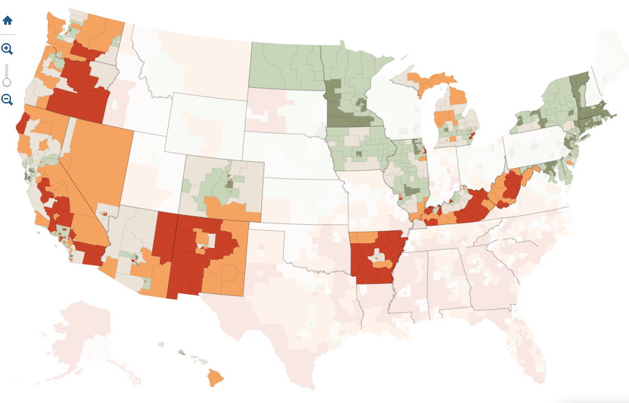
Given the extent of these painful discrepancies, it is telling that almost half of the counties with uninsured populations lie in states that have not accepted the expansion of health care under the Affordable Care Act: from Texas to South Carolina, state legislatures have created obstacles to its adoption or implementation, rejecting funds needed to expand Medicaid programs–as have twenty-five states–or even to sponsor health exchanges in their states to make programs available as options for health insurance through the Affordable Care Act. Both such runarounds do disservice to their populations, as are the attempts of other states to limit the possibilities of access to health-care “navigators” who assist people with enrolling at local health-care centers: states have independently set up obstacles mandating criminal background checks, fees, exams, or additional course work to sabotage folks from selecting health insurance, and in so doing perversely perpetuate the gaping pockets of inequalities in the current status quo which a map divided by the percentage of populations receiving Supplemental Nutrition Assistance Programs (SNAP)–one important indexed of the uninsured–reveals.

The divides within the southern states of America, where a consistently large proportion of the numbers of uninsured reside, suggests something link a deep valley deeply entrenched within the national landscape but rarely appreciated or explicitly mapped. When Sabrina Tavernise and Robet Gebeloff examined the results by mapping the refusal to accept an expansion of insurance or even Medicaid against census numbers of poor and uninsured in The New York Times; the coincidence between lack of insurance with refusals of government funds for health care was so frightening that it merited a follow-up editorial on the injustice of blocking health reform–asking how we can accept placing at risk the most vulnerable in our society, including uninsured single mothers, children living below the poverty line, and uninsured low-wage earners, according to data also coming from the Kaiser Foundation.
The interactive four-color map used estimates provided by the 2011 Census Bureau‘s American Community Survey to reveal how the twenty-six states refusing federal funds (through Medicaid or assistance to buy policies) are also distinguished by terrifyingly high levels of poor or uninsured:


As the Times noted, this includes all the Deep South save Arkansas. The twenty-six states, whose governors or legislatures have intentionally hampered the implementation of the Affordable Care Act, have seceded from federal health care reform, by taking advantage of the Supreme Court’s decision that the expansion of health reform was optional, and not able to be federally mandated.
It scarily mirrors the states whose populations of uninsured exceed 8% of their total populations, or where suffering from poverty and inadequate heath care is most intense:
To be sure, much of the arguments against the ACA are rooted in the fear that the act will be a nail in the coffin of the United States as we know it and lead to an insurmountable increase of national debt: but the paranoiac fear that its perpetration is so short-sighted that it is intended to prevent a return to smaller government has deeper roots.
The depth of local opposition to the ACA follows a deeply disturbing map of national disparities. Indeed, the refusal to implement the law reflects disturbing ties to the sort of census data on large numbers of African American populations, if one compares the distribution of this refusal to the one-to-one mapping of our population provided in the “Racial Dot Map” designed by the statistical demographer Dustin Cable, who used data of racial populations across national census blocks as measured in the 2010 Census to provide a “snapshot” of the national population. The map assigns each inhabitant a single dot, colored by a collapsed category of racial self-identification. Mapping the same data on racial classification alone, using a more simplified classification of racial identity than the census itself, reveals an eery echo of deep segregation among those regions rebuffing the plan for national health care:
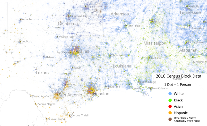
The disturbing nature of this coincidence, while not measuring to poverty or to low wage earnings, reveal a scary image of the very regions that are ready to spurn federal assistance for the uninsured members of their populations.
Indeed, a focus on the Deep South in Cable’s map, here presented with place-names to render it more legible, reminds us of the relatively clear boundaries in many of these regions among areas which are populated by “whites” or by “Blacks” and “Hispanics”, and a focus on the Deep South reveals the striking nature of the lack of integration in counties that single-mindedly stubbornly refused to expand health care.

There are, to be sure, serious criticisms that can be leveled against the categories retained by the census or instantiated within Cable’s map. But the esthetically appealing rendering of census data in the Racial Dot Map reveals some deep divides in our nation’s fabric which may well lie at the heart of the refusal of accepting a mandate for health insurance, even though the refusal is regularly framed as an issue of states’ rights or resistance to federally imposed exchanges of health care.
Indeed, even when stripped of place-names, the distributions that the demographer Cable extracted from the data in 2010 Census blocks creates something of a graphic counter-prompt to the assertion of states’ rights that justifies for such recalcitrant and obstructionist refusing to expand health care:

Although the Racial Dot Map is not an exact tool, and randomly redistributes an average of individual color points within census blocks, we might compare the gross level of integration, which only generalize racial characteristics of a population, to urban areas on the Eastern seaboard:
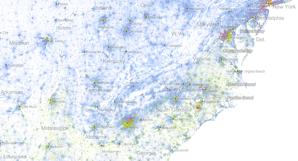
While gross data, and hardly refined as an image of how we live, the contrast with the clearly segregated boundaries of isolated cities suggest a topography of not only racial, but social distancing, and one in which one might imagine anger directed toward the devotion of federal monies to those in need.
Of course, the story is not all bad–even if the crafty recalcitrance of these twenty-six states threatens to erode its ability to reach the most needy among us. For the profiles of counties within states that have accepted the expansion of course contain uninsured who can be expected to benefit greatly from it–most notably in Arkansas, the one state in the Deep South to accept the ACA–and New Mexico, as well as the more rural areas of California’s central valley, rural Virginia, and the Northwest.
The government shutdown from the start of the fiscal year has prevented many Americans from enrolling for health care online, as was long expected to be possible. Many will, as a result, rely on filling out paper long forms when seeking to enroll in the program most suitable to them. But the government shutdown may be a smokescreen meant to cover the obstructionism that the expansion of healthcare, as well as a tactic to delay its final implementation–both since the attention to shutdown has absorbed the 24 hour news cycle, and detracts attention from obstacles to the ACA’s effective implementation. The shutdown seems to appeal not only as a stunt, but as a final line of resistance to providing universal health care, for a contingent convinced that it will be actually impossible to repeal “Obamacare” once it is enacted and goes into effect.
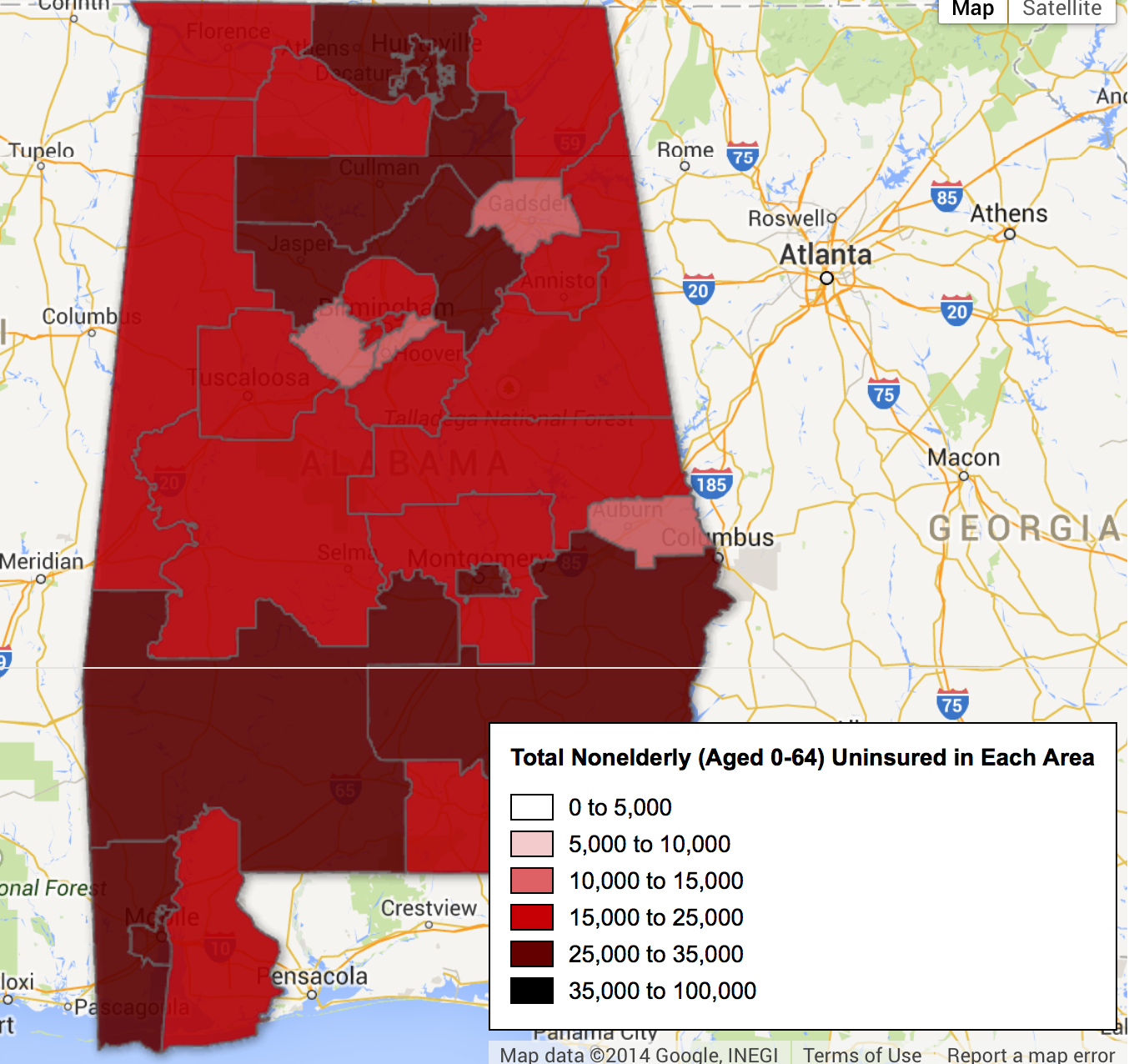
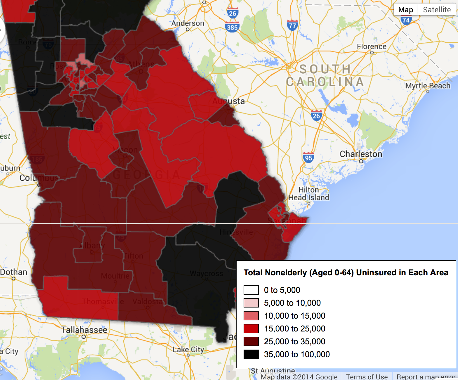
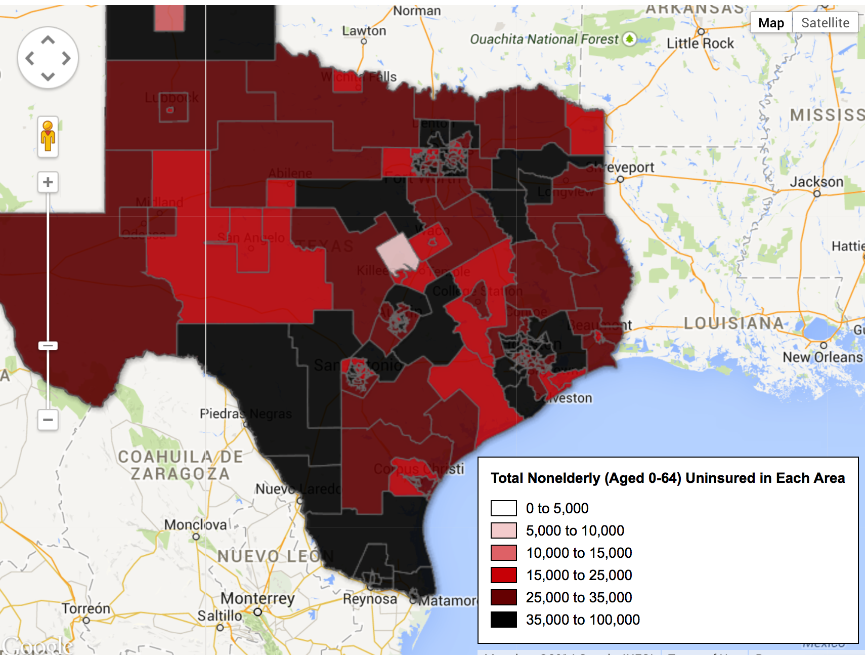
The mean-spirited nature of this obstructionism is revealed once one examines who will be hurt by a refusal to put the ACA into full effect. Indeed, a state-by-state examination of the distribution of non-elderly uninsured across the nation offers a somewhat terrifying profile of troughs of national inequities with which we have yet to contend. Take, for example, the deep pockets of an absence of insurance among populations in South Carolina:

Or, even more scarily, perhaps, the deep trough in much of central Florida and the panhandle:

While the entire state suggests a massive picture of uninsured, the central region is dominated by huge numbers of uninsured, which the governor stubbornly refuses federal insurance:

An even more grave disparity of access to health care is revealed in Alabama as a belt across its more rural areas:
The divisions in Arkansas are almost a belt around Little Rock:

Or a dismaying divide within the rural areas of Georgia, where Atlanta seems something like an island of access to insurance only in its best neighborhoods, but swamp-like regions of uninsured spread out at its northwest and southeastern edges:
And, in a particularly terrifyingly unethical mosaic, the disparities between rural and urban Texas appear particularly strikingly stark, and reveal a deeply historical artifact of income disparities and economic livelihoods across the state:
One could continue almost ad infinitum, covering the ground of the United States as if it were a map coextensive with the nation, but one doesn’t have to struggle much to grasp the depth of disparities and the dangerousness of perpetuating such deep divides in access to adequate health care.
When one speaks of two nations in America, divides between red states and blue states mask the depth of divisions between the uninsured and insured, and reveal the increasing difficulty of the blindness of one population to the other. Discounting populations whose lack of adequate health insurance is, in essence, naturalized as part of the status quo may provide the clearest illustration of the persistence of racism in America.

