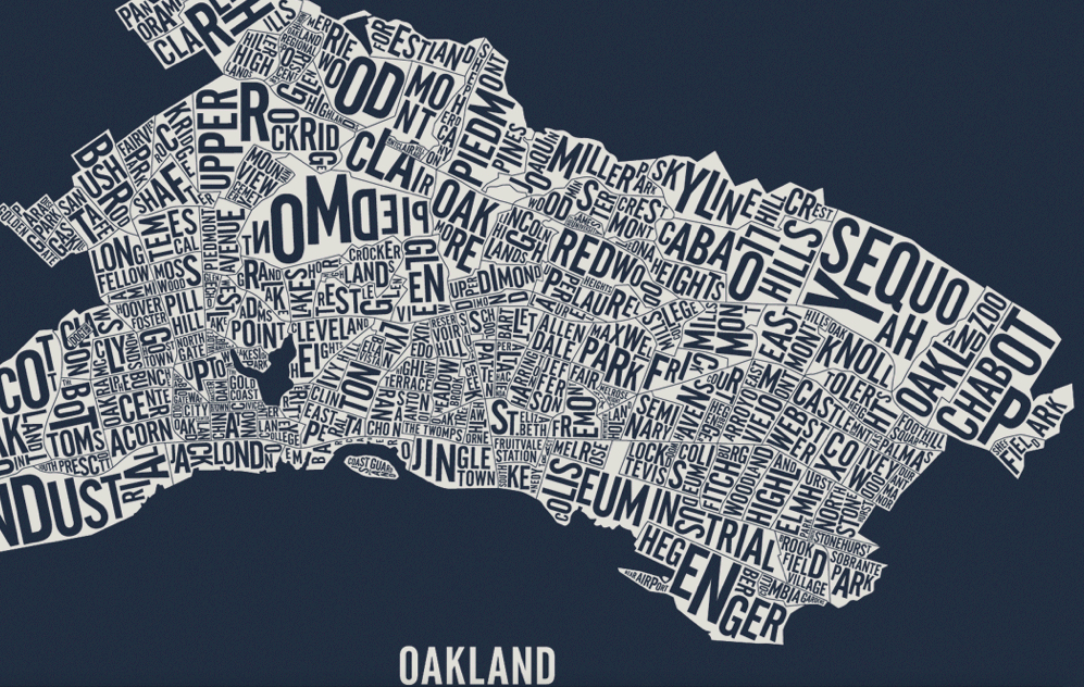
Maps have long been described or conceived as windows–analogous in ways to pictorial perspective–that invite viewers to look into a space in new ways. But both word maps as the above, made of the names of Oakland’s almost 150 different neighborhoods, or more statistically derived data visualizations of the city are mirrors that present a less homogeneous or continuous image of the city that we want to see: if the roughly type-set image above suggest a make-do approach of the somewhat scruffy post-industrial port city with big loading docks, but erase its dirt or drastically depressed areas with lively type.
Data visualizations offer mirrors of the city’s inhabitants and shifting neighborhoods that are both dependent on the source-data that they use, and how they obtained it, but also on the dynamic layers that digital mapping allows us to place as overlays on the base-map of the city’s mountains and shores. While these maps are only as good as the data that they use, they reflect back some of the divisions in the city that we might not otherwise notice or want to see.
And while not based in prose in the same manner as the Ozan Berke’s word-map that nicely knit together the city’s 146 vastly different neighborhoods, they offer ways of reading the city’s multiple divides. The increased data that is available from Open Oakland and other sources will doubtless offer further–and far more refined–images of the city’s deep differences and their bridging, and can serve as better and more detailed maps of its populations. But in the meantime, the sorts of mirrors these maps offer can also provide ways to imagine paths toward a future for Oakland, and better understand ways forward in its public policies. Many of them draw from the American Community Survey, created by the US Census and discussed in earlier posts, but all seek to focus attention on the city and to serve, as mirrors, to show differently refracted visions of its divides, in the hope that few distort Oakland’s diverse populations.
A famous image of the distinctly uneven distributions of Oakland’s inhabitants is clear in a recent mashup of maps of the Bay Area Rapid Transit system’s public transport map–or, more simply, BART map–with the very zip codes that the American Community Survey mapped, which offers a condensation of the remarkable disparities and differences between income, education, child health and life expectancy at separate stations on the same public transport lines:
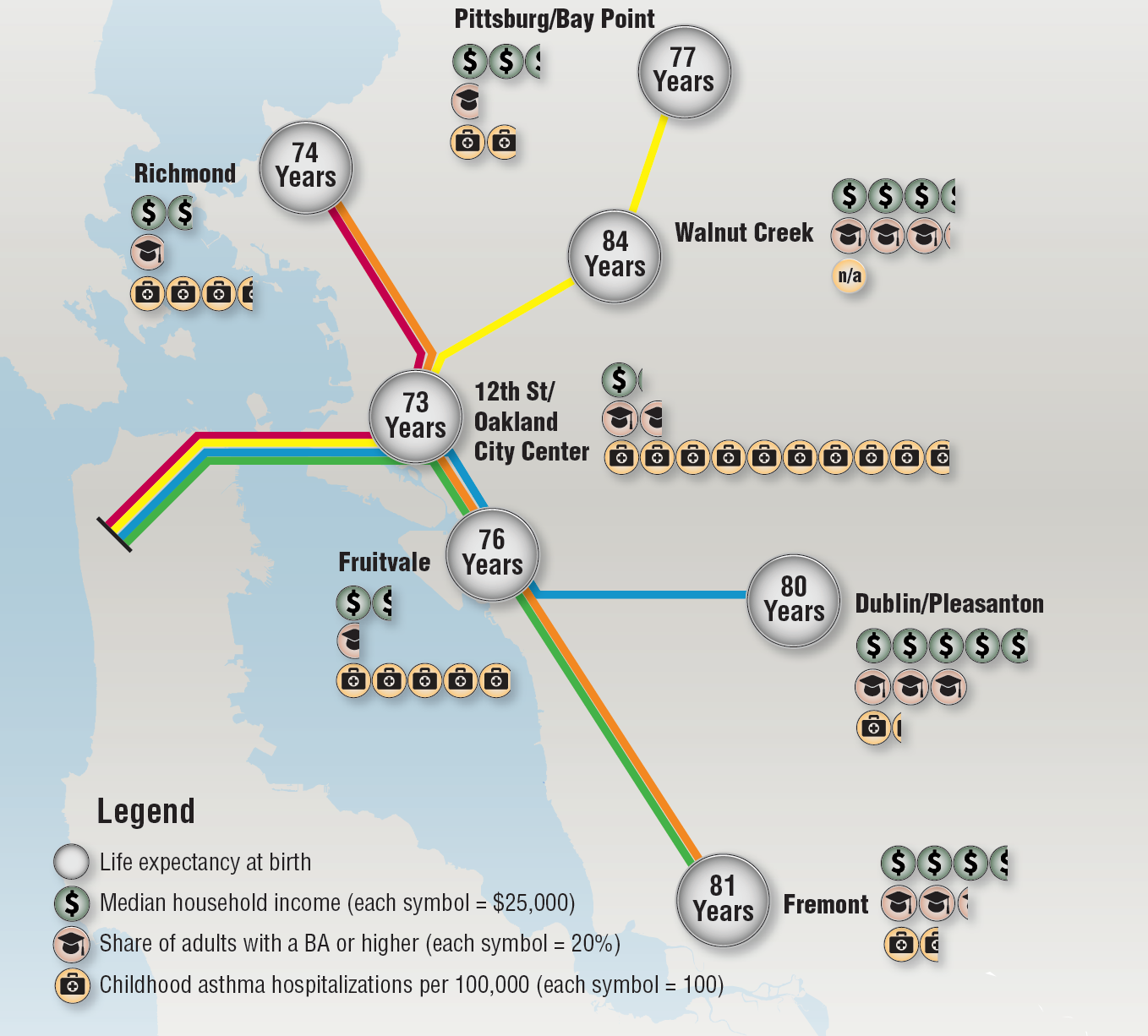
While, to be sure, the system includes suburbs such as Walnut Creek or Fremont, its focus on the East Bay immediately indicates the deep divisions in a city where a BART stop can take one between areas of over ten years difference in life expectancy, and two more stops down either line sees life expectancy rise by seven or eight years once again. The huge rise in childhood hospitalizations because of asthma in the City Center–far greater than in Fruitvale–suggests the unique pollution habits of a city whose air quality is still shaped by its proximity to a port.
The image of the diverse city whose neighborhoods are bound together as one unit starts to reveal fissures when one examines its ethnic and voting distribution at a somewhat finer grain, adding to the historical variations in the picture of the city summarized and surveyed in an earlier post. The problem of mapping those populations adequately, both to reveal the ongoing inequalities and spatial injustice within the city, is not inherent in the city’s structure or divisions, but something that compels visualization in a myriad of ways, and in which we can look for different understandings of the shifting nature of the city’s socioeconomic (and sociocultural) divides. As well as mapping the lay of the land, mapping the habitation of space creates even more of a “mirror” on the organization of th eplace.

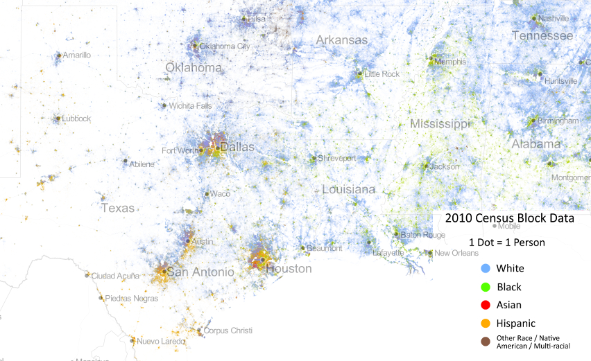
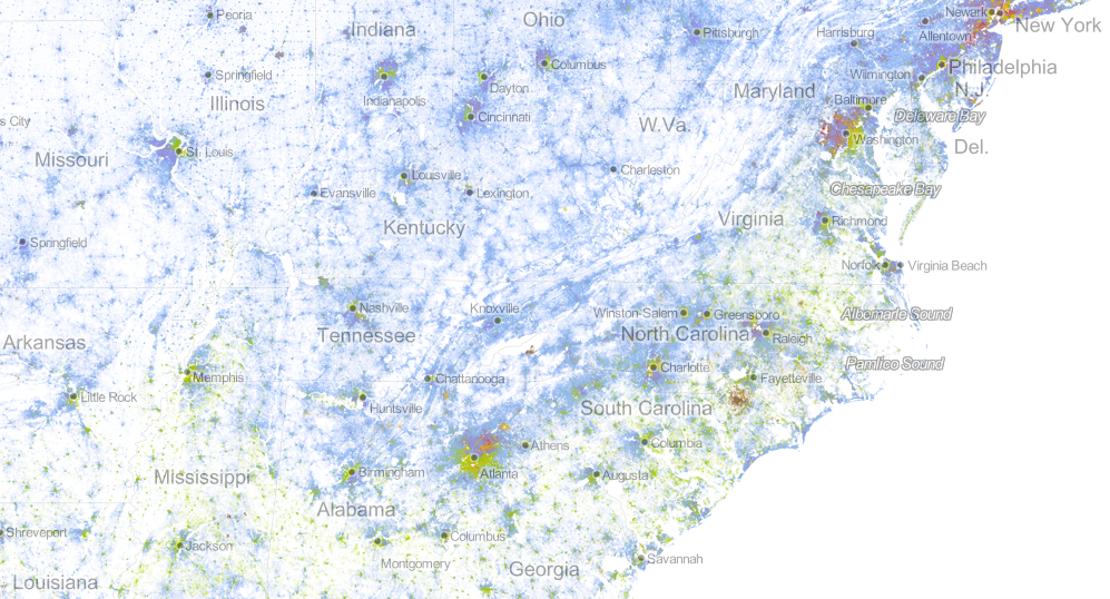
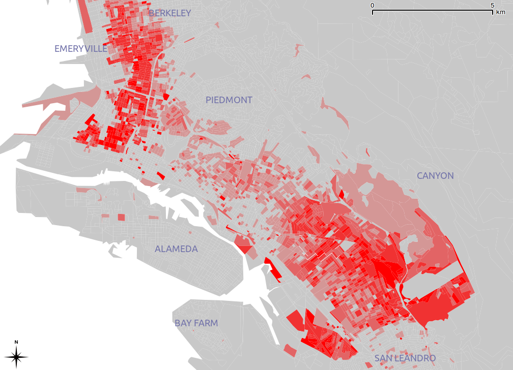
The census mosaic only shows part of the inhabitants’ picture. Indeed, perhaps a “racial dot” map can be rehabilitated, rendering one dot/twenty-five people, to create a rough distribution Bay Area-wide that respects the looser definition of “neighborhoods,” and does not impose strict racial segregation, as in this image by Eric Fischer, using red dots representing whites, blue representing blacks, green representing Asian and orange Latino populations, in trying to prevent overlapping and blending of color-points, and better to define neighborhoods as an ethnic or racial enclave:
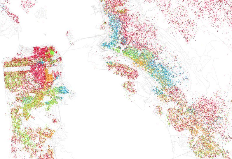
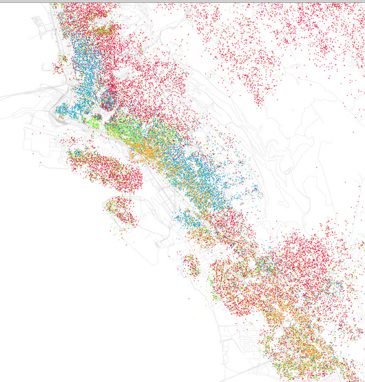
Fischer seeks to respect Bill Rankin’s cautionary words that boundaries of neighborhoods are never so stark as on informational graphics, and that a cartographical index of one dot for twenty-five people is better able to allow “transitions also [to] take place [registered] through gradients and gaps” in the map’s surface, suggesting an urban geography without clear boundary lines, clear spatial differentials clearly emerge across the neighborhoods of Oakland, CA:
And while the city was once historically predominantly black, or African American, in its population, one still found clearly define enclaves of blacks that are, sadly, starkly isolated in census blocks, based on results of the 2005-9 U.S. Census:
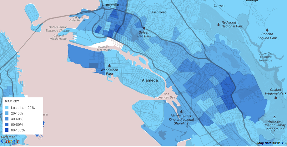
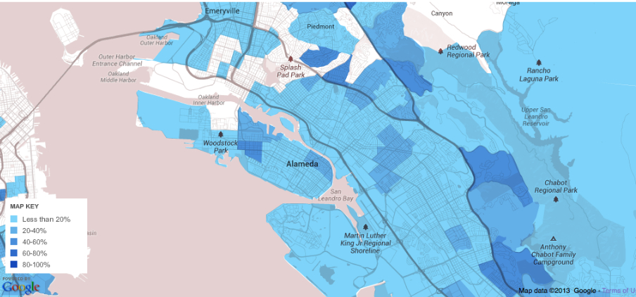
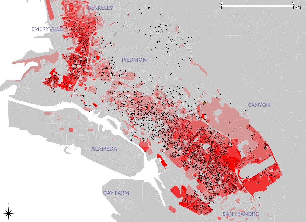
One can map, in relation to the racial composition of the city, the relative percentages of kids in public schools, one index of its community, and the stark dividing lines created by some of its highways and major roads, which divide the regions of the hills from the flats, where few kids attend private schools.
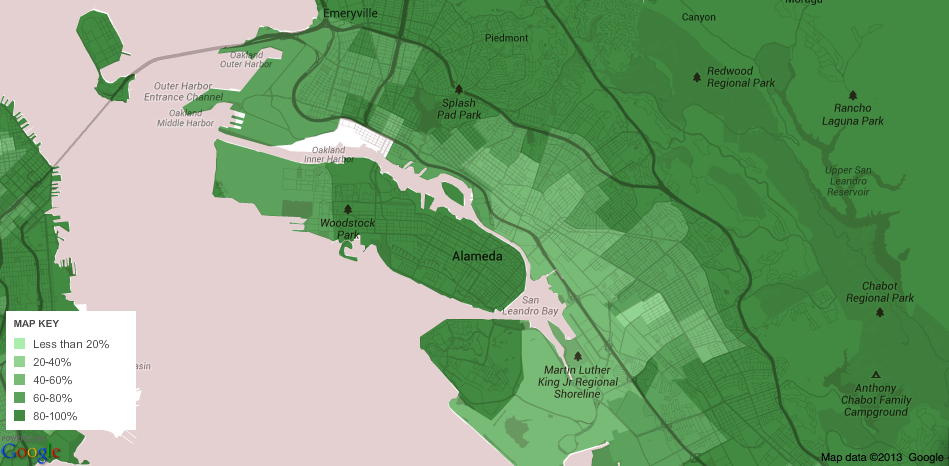
This is given much further definition by the map of those who have completed high school, already used in in my earlier post in a slightly different version, which suggests a chasm between cultures of neighborhood far deeper than race alone.
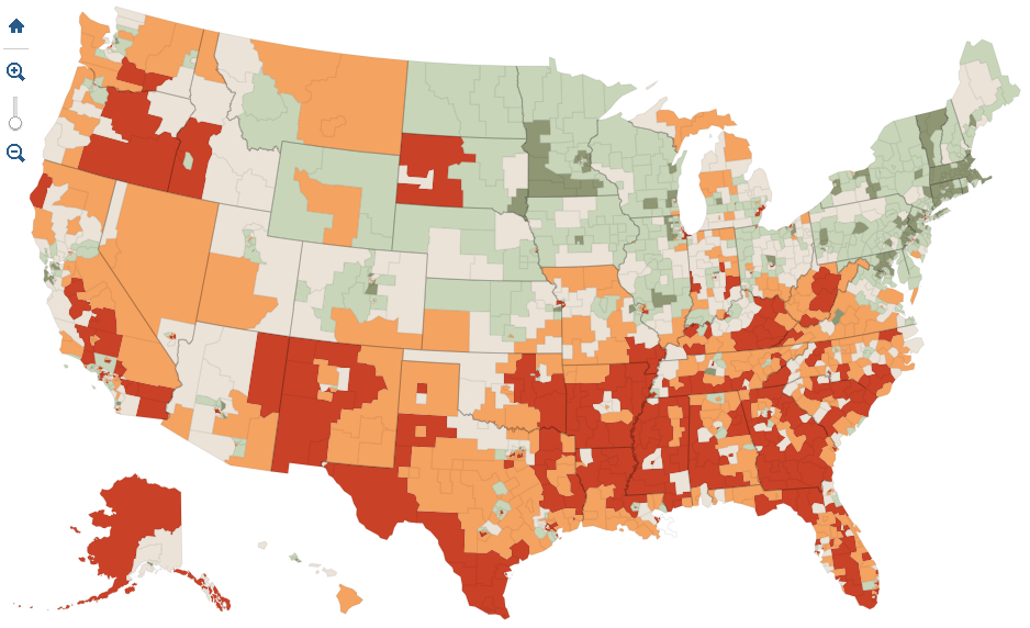
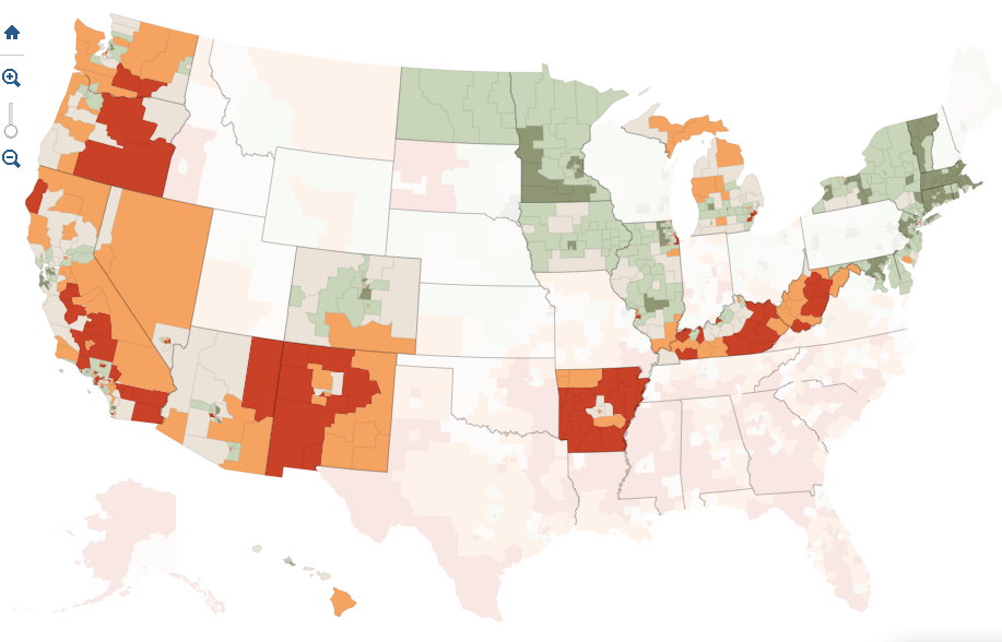
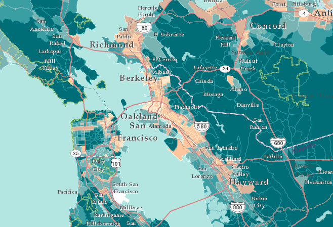
Perhaps the starkest underpinnings of this cultural divide is a map using the 2010 Census to define an ESRI visualization, of the city’s divide in income levels in the city and outlying areas:
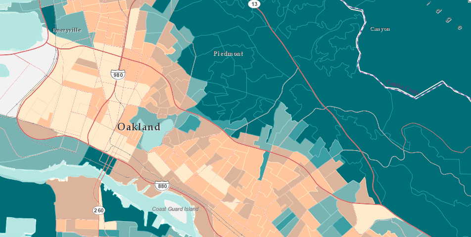
Which one can zoom into for the City of Oakland, revealing a clearer divide in incomes around Highway 24, still using Census Blocks, that again reveals some intermingling albeit with sharp divergences in Oakland that stand in sharp contrast to the larger Bay area:
To track a deep change in the population of the city that occurred in only recent years, Pietro Calogero tracked racial displacement from many neighborhoods that illuminate this divide in incomes, around the aftermath o California’s housing crisis. The map of foreclosed real estate in west and southeast Oakland, the former “industrial areas,” which stand in sharp contrast to wealthier areas in the hills, to illuminate an economic ravaging of the city that shows up in no other way in a simple map–and indeed masks innumerable individual stories of foreclosure and moving out:
Although perhaps the map of foreclosed houses is difficult to tie to race, Calogero comes closest to revealing stories with a map in choosing to map how African American families were in fact disproportionately effected by foreclosures, and how former African American neighborhoods were gutted from the inside out as residence became unsustainable:
The effective narrative of racial displacement that these dynamic maps isolate and present is not only compelling, but raises questions of social justice–and perhaps of social justice and urban mapping. Despite the broad interpretation of displacement, both when occupied by owner or purchased as an investment, the clear overlap between categories of race and foreclosure seems not only unjust, but a deep crisis, underscoring and mirroring the deep segregation that continues in so many American cities.
And the repercussions of this sort of segregation are evident in the apparent disenfranchisement of despair, revealed in this simple map of voter participation that Ofurhe Igbinedion so astutely thought to create from Alameda County electoral data, which shows a valley of voter absenteeism in an area where the 2010 voting held low potential or positive prospect:
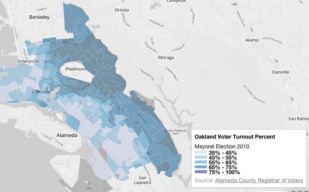
(Igbinedion’s striking–and dismaying–map, reduced in size above, may be viewed in far greater detail here, and will be posted in full with a commentary at http://www.infoalamedacounty.org).
The huge fall-off in turnout among the same population of a territory of disclosure suggests a political disconnect scary in its dimensions, if sadly typical for most American inner cities. But the cavities of voter turnout in an election for which turnout was itself particularly high–or just short of 75% (74.52%)–suggests a sense of a politics of abandonment. What, indeed, did the election accomplish for a large percentage of the city? What resonance did the candidates even hold, or could they hold? The topography of disenfranchisement is arresting if not puncturing of a vision of a city united in its neighborhoods, and sort of undoes the unity of its own mapping of continuity.
It is a sort of inversion of density. Mapping the density of population in Oakland by census blocks reveals not only clear neighborhood divides but a uniquely geographic dispersal of demographics, most dense between the freeways and thinning out to the hills and the flats:

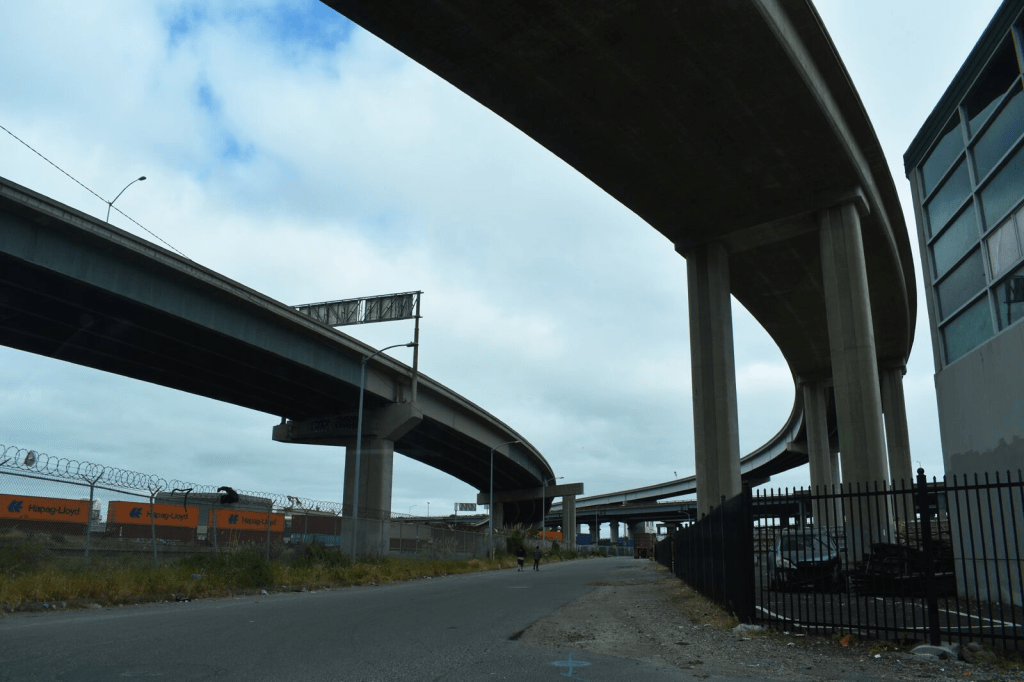
There may be real reasons for not living by the shore below the freeway: the area is not only late-industrial, but the ships spewing sulfur dioxide and pollutants exceeding standards for vehicles that are registered in the United States create a spew of particulate matter over the downtown area not confined to West Oakland, but reaching in to Chinatown, Emeryville and the Downtown area, areas downwind of the port, in this truly terrifying map, posted in 2013 by Sarah Brady and Alfred Twu, and charting the sulfur dioxide and particulate emissions of ships, using the Port of Oakland Emissions Inventory:
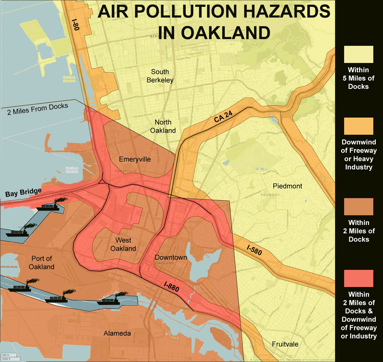
The map reveals regions with air pollution up to 10 times the national average a couple of miles from the port, but whose effects increase risks of cancer and asthma extending twenty miles inland, creating a poorly-known map of particulate matter as an argument to raise pollution standards in Oakland’s port. Notwithstanding the much-vaunted clean-up of the Port of Oakland, which were aimed primarily at legal safeguards at the level of diesel particulate emissions–emissions that have been largely blamed for sever respiratory problems among local residents–which have indeed decreased from 261 tons to some 77 tons in seven years. (If this was a reduction of 70%, the stated goal of the Port is to further reduce the emissions by 80% by 2020; since July 2009, ships have been required to use low-sulfur fuels within twenty-five miles of the coast, however, and the sulfur-dioxide emissions tied to asthma are not likely to decrease.). And a clearer drilling down of this data–for long, but one station for monitoring air quality even exiusted in Oakland, on Grand Avenue and Poplar, revealing how a stream of heavy trucks with diesel engines that power through the industrial region, and emit particulate matter to Chinatown and Fruitvale:
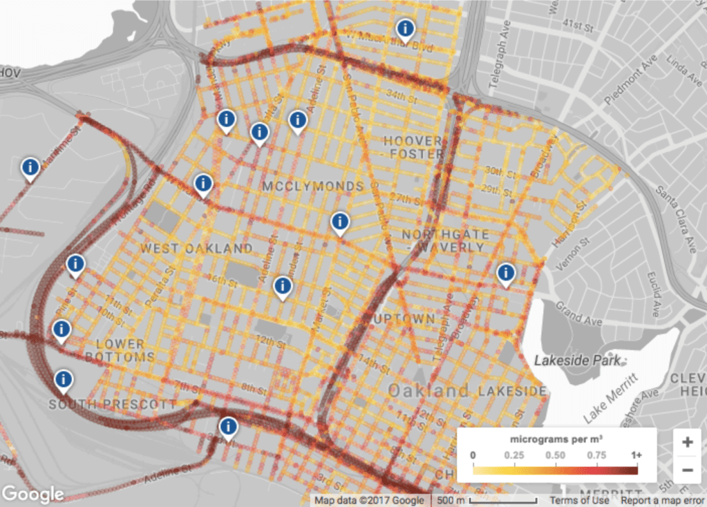
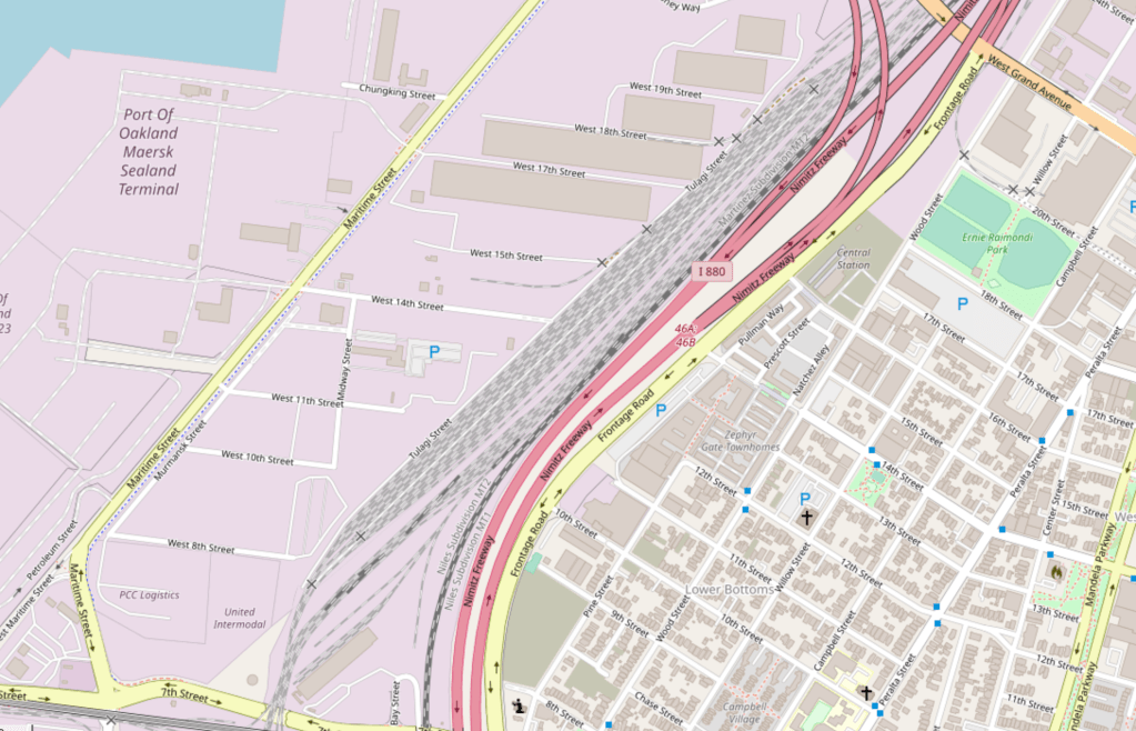
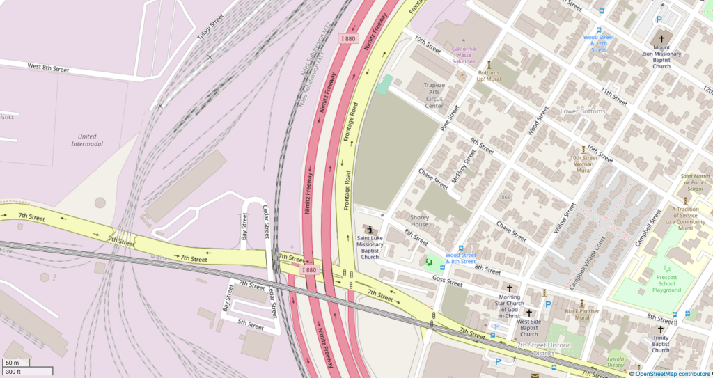
The data visualization of micrograms of particulate matter per cubic m suggests how much this “tale of two freeways” needs to be examined in detail, and how many questions of environmental justice that the unregulated emission of particulate matter deisel engines disseminates across urban streets: the citizen science group West Oakland Environmental Indicators Project (WOEIP) is currently engaged in a more detailed study and analysis of West Oakland air quality which the Environmental Defense Fund has helped fund, and they will parrtner with UC Berkeley, to create a clearer distribution of particulate matter of different levels–including ultra fine particulate that can cross the blood/brain barrier–in different regions, with special attention to the possible impact of ultra fine in the exhaust entering West Oakland and other neighborhoods from the 880 freeway and McArthur Maze–emitting some 22 known carcinogens in the urban environment. Both traffic arteries move dangerously high levels of particulate matter through sensitive communities including schools, hospitals, clinics, and childcare centers, in what Emeryville City Council members have come to call a “Carpocalypse.”
Despite the suspiciously long silencing of interrogating the clear environmental quandaries of living near freeways, and silence about the impact of the heavy trucking tied to the Port of Oakland on the nearby poorer industrial neighborhood, would the release of such an array of carcinogenic matter be tolerated in other neighborhoods? The demand to use the rail lines to transport coal through Oakland’s Emeryville and West Oakland to the revitalized Port could be placed on the back burner of future city planners and cargo terminal directors in decisive fashion if levels of particulate matter to which residents are exposed is found to reveal: although the Oakland City Council barred proposed handling and storage of coal and petroleum coke at the Port for Oakland Bulk and Oversized Terminal LLC at a parcel the Army abandoned in 1999 that is new the harbor, a ban supported strongly by the Sierra Club and San Francisco Baykeeper. (Any port workers with prolonged exposure would be exposed to even greater health risks.)
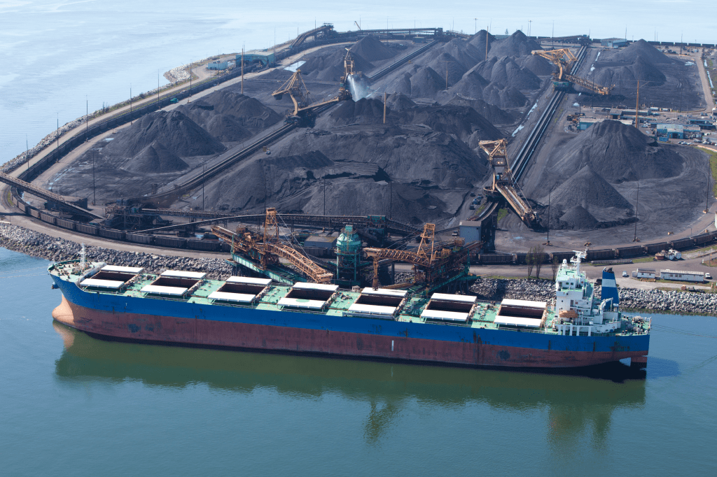
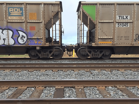
The ban is argued to constrain foreign and interstate commerce on which the Port depends, and the city cannot regulate or restrict; coal transit was only banned after the land parcel was purchased and local jurisdiction over rail-borne coal shipments are unclear, despite its potentially aggravating environmental effects: the city has only lost the suit, indeed, as the effects of coal trains have not been studied as a vector of air pollution, despite fears that coal dust could blow off the open-topped cars able to lose up to one ton of dust between mines and port, and release 60,000 pounds of toxic fine particulate matter, on top of the diesel fumes emitted by their locomotives.
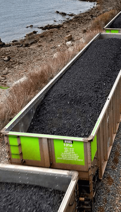
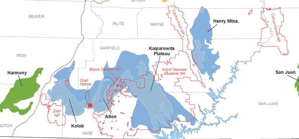
Can maps prove that the open-air transport of coal, designed for export, indeed pose a significant public health danger for Oakland residents? Although adding further diesel fumes and coal dust to Bay Area air–especially the dust of bitumenous coal mined in Utah, which has been encouraged by the Trump administration, lifting restrictions on strip mining and extraction of coal that would travel through Oakland, for which the Utah Transportation Commission has been instrumental in negotiating export rights at Oakland’s terminal, without any consultation or contributions of Oakland city council or residents–in April 2015, or before the first hearings in Oakland to study the health effects of the transport of coal and coke, and a broad–over three quarters of Oaklanders–opposition to the transport of coal on railway lines increasingly close to city residences cheek by jowl and often running along I-880–adding significantly to already dangerous levels of particulate matter by diesel engines and open-air cars bearing coal to the Port of Oakland that is in many ways emblematic of the city’s old industrial zone. After a downturn in Utah coal production in 2009, and hopes located the expansion of opening new areas of mining and new mines in 2011, opening the former Grand Staircase Escalante National Monument was long on the front burner of the coal industry–long before Trump told supporters in Salt Lake that “very distant bureaucrats . . . don’t know your land, truly, and don’t care for your land like you do,” and technically oened the regions to coal extraction–even if few corporations have undertaken to negotiate with the BLM for exploring old mines to operate in coalfields that the state had mapped, as if to entice speculation back in 2008.
Although local jurisdictions are with limited authority over the goods shipped by rail companies like BNSF, but do have authority over marine export. However, most existing studies on coal transport examine different grades of coal through rural areas and populations,–not large cities already possessing dangerously high levels of particulate matter that are densely inhabited. (Oakland has in response terminated construction on the old Army base, but is currently faces suit again.). The question of rail lines that would carry coal-bearing freight in close proximity to schools, churches, parks, and residences in downtown Oakland–a site of commercial revitalization–may raise attention to environmental hazards that West Oakland would even face far more.
The data visualization of micrograms of particulate matter per cubic m suggests how much this “tale of two freeways” needs to be examined in detail, and how many questions of environmental justice that the unregulated emission of particulate matter deisel engines disseminates across urban streets: the citizen science group Woing its own study of West Oakland air quality in partnership with UC Berkeley, with funding from EDF, to create a better visualization of how environmental toxins are released in high-traffic corridors, and create new demand for remediation and social justice.
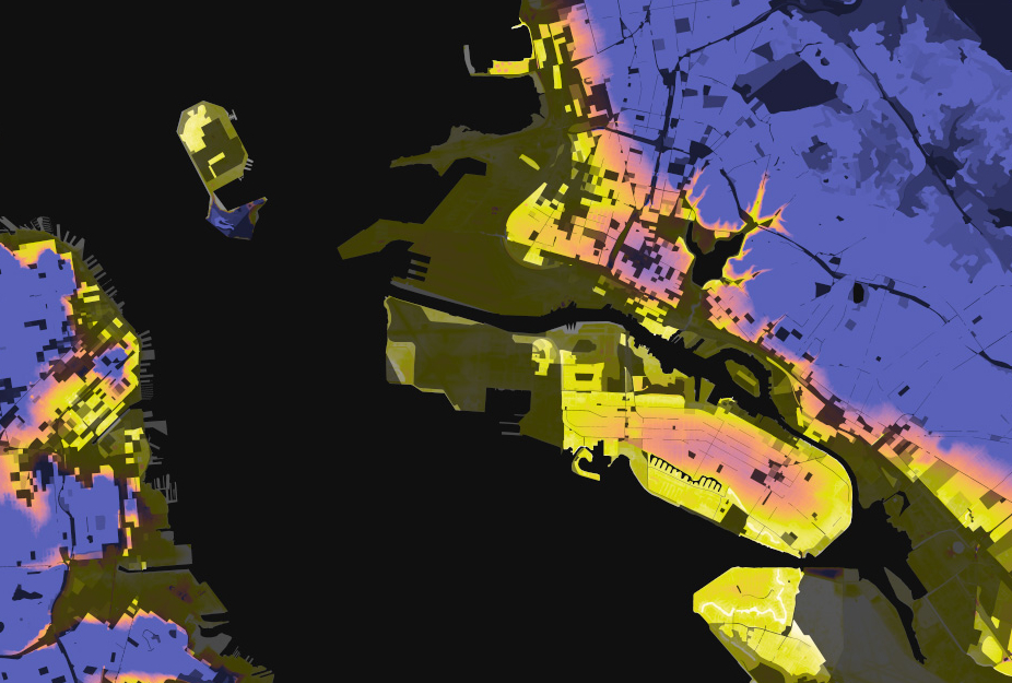
It’s not uncommon to value (and inhabit) property away from the shoreline. Examining relations between elevation and population density in the wake of the shifting consciousness of the relation between water-elevation and land-use after Hurricane Sandy, Stephen von Worley offered the following interesting alternative visualization mapping elevation and population density on a spectrum moving from white to yellow to orange to blue, to show the sharp divide between hills and flats in the East Bay:
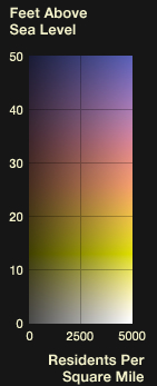
A nice register of how this space is actually used or perceived, and, equally important, moved through, based on a collation of the adjustments to Open Street Maps of the city, suggests the well-travelled nature of Oakland’s major arteries and downtown roads. How might this be registered in the surface of the map? is a question that is nicely resolved in this map of Oakland’s self-mapping of its major roadways.
Alan McConchie–Stamen design
The Open Street Map view of Oakland, rendered so distinctively by Alan McConchie, tells a perfect story of the inhabitation of Oakland’s space by its routes of mobility, recalling the sort of GPS-derived maps increasingly common from artists like Jeremy Wood, who practiced “drawing with GPS” as a line of work: it would be interesting to be able to map street-use at different times of the day, if possible, though deriving data of the abandonment of downtown Oakland when dark is undoubtedly difficult.
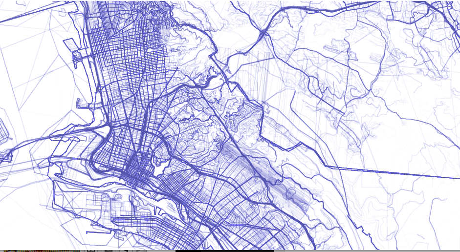
The divergence of nighttime and daytime is evoked, if not measured, in Michal Migurski’s brilliant layering of a “heat map” of crime–based on police visits per unit of time–over an OSM template, both layered with a semitransparent streets that interact smoothly with the underlaid data; the combination of layers effectively allowed Migurski to adapt a heat-map of crime to downtown Oakland, using police visits per unit of time as a metric as part of his active and for its time particularly innovative Oakland Crimespotting, in the hope that the HeatMap APIs won’t obscure either context or specifics, and provide a legible text.
One could argue that this mapping of hot-spots excessively illuminates those areas of BART stops, where more police calls would tend to occur–and, in the case of 12th street and downtown, more street folks congregate. But the increased number of calls provides a basis to register local attention to crime and property protection, or how the city sees itself.
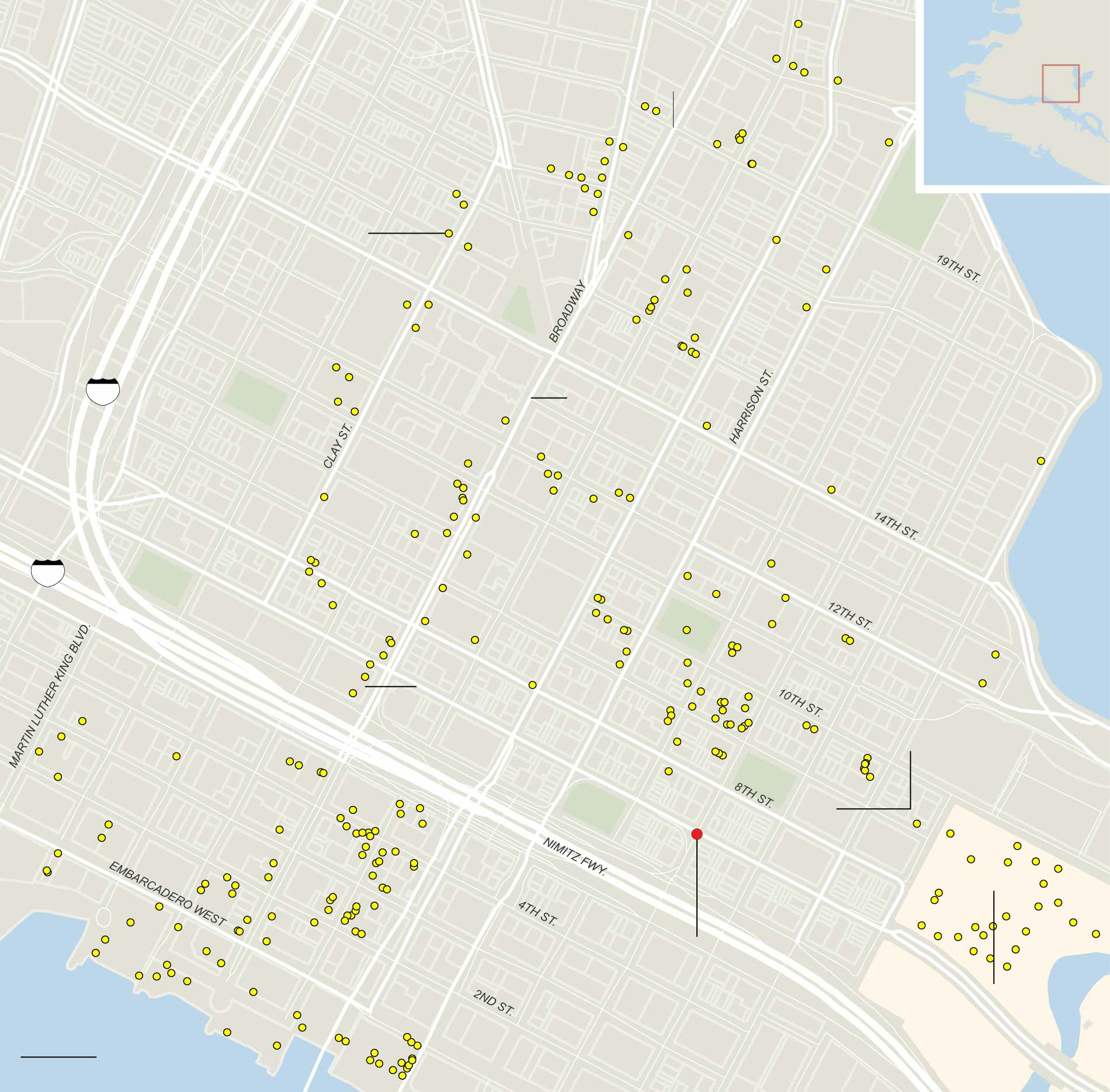
And how Oakland maps its own crime, or tends to monitor its own possessions, is foregrounded in this striking map of the downtown density of security cameras, often placed in response to fears as much as evidence. This final map of the installation of security cameras downtown points up the increased anxieties of its safety, almost in response to and the perceived need to monitor public life, and registers the odd dynamic of a downtown business zone that has few residents, and whose topography of suspicion vastly changes as one moves from daytime into night–when downtown is increasingly abandoned by workers or street populations.
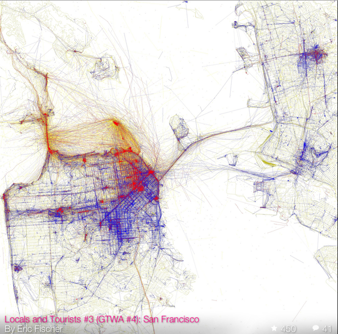
We’re clearly fascinated by the different images of the city’s different composition and divides, and in understanding how best to work within them, or to heal them as best we can. The mapping of security cameras–if focussed in the downtown area–reveals a sense of deep divides, and a perceived in security, no doubt partly voiced as inadequate police coverage among businesses, as much as the city’s residents. This map, also a mirror, in part doubtlessly contributes to the image Oakland projects, an image that is underscored by deep divide Eric Fischer revealed in his remarkable ‘Bay Area’ map of photographs uploaded by “tourists” v. “locals,” red v. blue, in a database that charts a tale of the visual interest of two cities:
There are many other, more positive maps of the city’s populations, no doubt, and other mirrors that reveal great changes in the city’s diverse communities. But only by understanding the lay of the land, as it were, and situation of these communities, can we hope to understand the unique challenges that the city faces.
The ambitious investment by a generous benefactor of a whopping $34 million in Oakland’s job-training and education efforts in the summer of 2015 may be the start of a broader investment in what the city has to offer. The distribution of needed resources by the San Francisco Foundation seems both brave and smartly apportioned: the decision to focus on specific neighborhoods, and improve the access of those regions to both in-school training and potentially productive housing to public health and from public instruction to community arts groups seems a good one, and breaks down along lines that the city could use, with East Oakland getting an important and much-needed injection:
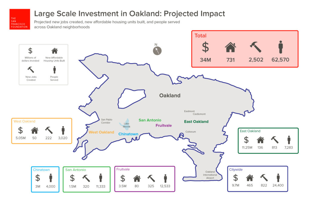
If many public services are lacking in Oakland–and the poor fit between local economy and job-training has been endemic to much of the city–this seems at least to be a fortunate and very well-intentioned start.
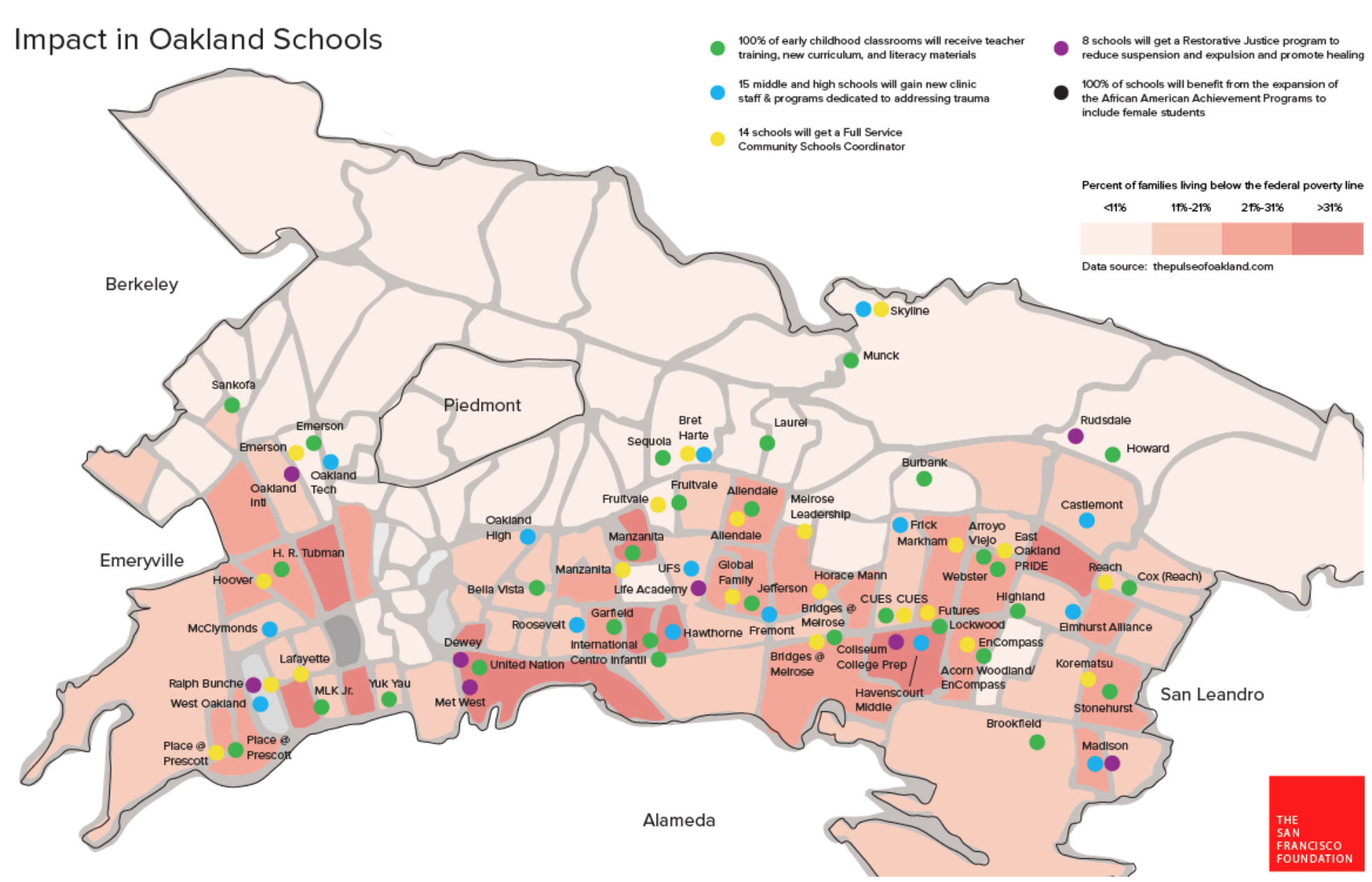
The huge impact on introducing training and resources for early childhood education, trauma and health specialities, and, in part, conflict resolution, provides an important start to break from the deep divisions that have long been present in public education, and the lack of needed resources for many public schools not located in neighborhoods that are able to subsidize or assist needed programs.


 Kelly Johnston, University of Virginia Library