
What happens when part of a meteorite lands in Chelyabinsk? We use maps to give meaning to the event, marking the site of impact in readable visual terms, and to try to place it in our comprehension through familiar mapping tools.
There are multiple ways to map the path of the meteorite that fragmented into pieces as it fell to earth, evading atmospheric or satellite sensors and causing explosions that injured over 1200 people, as well as its site of collision. Perhaps the rush to map the event compensates for the fact that we never detected it as it entered our atmosphere, on account of its small diameter. There is a paradox that in an age of detailed world-mapping, the mapping of such a terrifying event was improvised from a range of readily-generated cartographic resources, and provided a limited view of the human side of the natural disaster-an aspect that was, perhaps understandably more often reserved for video rather than cartographic media. The range of maps that popped up in actual news sources suggested a sort of fumbling for meaning, however, or an improvised making sense of what happened, without much imagination or clarification.
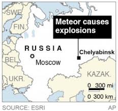
The most vulgar is undoubtedly a graphic reminder this happened in a place known as Russia, and that still has a vaguely pink hue that has adhered from its Cold War past and the image-bank that era has bequeathed us:

Slightly more acceptable, but excessively abstract, is the “Google Earth” solution of noting a pinpoint, instead of the collision, and using a surfeit of detail in the surrounding region, essentially an imported backdrop from a computer file from Google Earth:

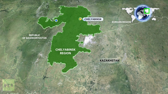
Huh? Only slightly more semiotically refined is the following accusatory blame of where the meteor caused such tragedy, but focussing on the basic information about its distance from Moscow:
Meaningful mapping is approached by the following, if somewhat whimsical, combination of a political map and world-wide view: but the whimsical tone undermines the tragedy, the detail to dense, and the region just too green:
More impressive is mapping the fact that its impact could have happened at any point during the meteorite’s arc through the earth’s atmosphere:
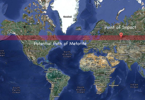
What’s sacrificed here, of course, is the specific–what one would expect from mapping techniques–as the map is simply a screen on which to chart the progress of the meteor, with limited explanatory force. Most of these ‘maps’ employ existing maps as backgrounds, fields, or templates familiar from other computer-generated media, rather than mapping the site of impact in relation to regions of settlement or natural resources.
Perhaps most striking is the perfect circle that part of the meteorite made, as if a cartoon outline of its form, on the icy surface of this frozen lake, as locals try to understand what happened–not a ‘map’, but a good visual expression of awe as well as a human-sized outline of what the actual scale of the meteoric fragment on impact was:

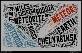
Of course, this lacks many tools of orientation. But perhaps it is as effective as to dispenses with geographic points of reference and indices, in a word map:
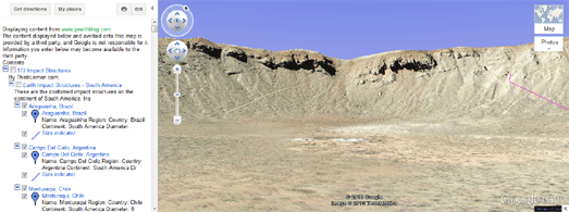
For the cartographically obsessive, a Google Earth blog maps all sites of meteor craters created by previous impacts,
Google Maps Mania has been quick to create a plug-in for Google Earth browser (via Google Maps) for those interested in comparing the craters.
Wow:
http://googlemapsmania.blogspot.com/2013/02/meteor-impact-sites-on-google-maps.html


charming post!
Thanks!