We are all perhaps forced carry our very own hells with us, even keeping their maps and the routes of access to get their in our heads. If the location of Hell has been mapped and re-mapped as a personal experience since the Renaissance, defining fixed locations of Hell projects something of a state of mind to the world’s physical geography. If, to quote Marlowe’s Mephistopheles, “Hell hath no limits, nor is circumscrib’d/ In one self place; but where we are is hell,/ And where hell is, there must we ever be,” the places Hell resides is almost a practice of mapping that reflects a culture’s cartographical imagination, hell has proliferated in the age of genocide on an unknown scale, as the atrocities of Armenia, Cambodia, Argentina, Bosnia, Iraq and Rwanda have created new landscapes from hell that have proliferated in the world as real places of a level of trauma that transcends any normalcy, including the normalcy of a map. And the appearance of worldly hells over much of the world may have its rhetorical apotheosis in the fondness Donald Trump had for mapping hell on earth–the cities of America that are now “crime ridden hell holes” and the “hell holes” that are the origin of immigrants who cross the US-America border–even if the hell-hole that might be a prototype was in Guantanamo, not Mexico.’
In antiquity, it was easy for the son of Anchises, Pious Aeneas, founder of Rome, able”to descend into Avernus” directly since for him “Death’s dark door stands open day and night,” with the dire foreknowledge that “to retrace your steps and get back to upper air,/That is the task, that is the undertaking./Only a few have prevailed.” If it was possible to be ferried across the River Styx and “to explore the dark abyss/ . . . in the pathless/Shadowy valleys” where fate had called him, few would know if they would return, as the abyss was not that easy to leave even if one knew the entry-point. There was a time, lest we forget, when entrances to worldly hells lay confined to the walls of churches, in the threatening death panel paintings of the Last Judgement,–
–or lay safely at the foot of the manuscript pages of Dante’s Inferno–just under the terra fima poetic text–
Inferno manuscript of the Third Quarter of the Fourteen Century, MS. Holkham misc. 48/Courtesy Bodleian Library
At the time of the war of the Holy League against the Turks, the painter El Greco seemed to have outdone Dante, or remapped the landscape of hell one had read in his poems, in new ways, as a precipice toward which Europe was about to hurtle, seen through the gaping mouth of a shark, as a worldly incarnation of the diabolic, that the pact between the Pope, Rulers of France, Spain, and Venice were able to expel from the world, leading troops to beat back the Turks from the Mediterranean, as if to affirm the sacrality of Europe against outsiders.
The maws of hell in El Greco’s terrifying piece, long kept in the Spanish monarch’s personal royal collections, suggested that the monarch had averted hell from entering into the modern world, keeping it at bay in ways that had only grown increasingly problematic and perhaps apparent over the divide of Christianity in the sixteenth century, an era when the jaws of Hell became more broadly apparent across Europe.
It may be that we carry around our personal hells with us. But the mapping of worldly entrances to hell came back with a fully secularized vengeance in the Second World War and long before. For the problems of these atrocities challenges on an ethical and moral scale the commensurability of our conventions of mapping, and with it any commensurability itself. Perhaps the muted colors and odd grey zones by which earlier concentration camps in the Nazi era suggest that they are zones “off of the map,” indeterminate spaces ringed by green fields, all but exempts them from conventions of mapping, their primitive barracks, gates, transports, mess halls, work fields, ditches and crematoria all outside of “normal” space, and unmapped, left to strain credibility–even if they were viewed from space by reconaissance flights, these spaces and their modern proliferation cannot be adequately morally mapped in ways we know the world.
This sense of places out of the normal, hardly part of humanity, has perhaps led to the proliferation of maps of hell online. The problem of proliferating hells is a one good way to describe modernity. From Samantha Powers’ attempt to map “problems from Hell” as eventualities the United States government will be condemned to face to the problems of mapping atrocities that recurred in the terrifying landscapes of Hades, Argentina, worldly hells have proliferated in the world from Nazi concentration camps to sites of disappearing that ask us to map the presence of hell in the world, in a grim geography of devasttion that challenged pallettes and iconography to describe adequately.
aBefore these maps of spaces of dehumanization and devastation, we are really looking into hellish worlds we had not been able to see before. But even these dots cannot capture the scale of the hellscapes that emerged for the accelerated loss of life within the industrialization of death that proceeded from Heinrich Himmler’s order of 19 July 1942 stated that unleashed mass-killings from bullets, fire, and gas extermination to fullifll the demand that by the end of December 1942, all Jews, gypsied in Greater Germany be killed, leading to an unprecedented intensity of rates of mass-killings almost impossible to map on paper or by a graph, challenging as the spatial dynamics of the three-month long burst of killings is poorly documented–intentionally–and indicate a terrifying challenge to the world of the data vis that challenges the imagination to even attempt to “map” in the over 40,000 camps of imprisonment and mass-killing that were built between 1933 and 1945, dedicated to imprisonment, forced labor, or mass killing sites dedicated to exterminating Jews, Sinti, Roma, Communists, and so-called “enemies of the state.”
There is a sense of the utter inadequacy of an aerial view–or indeed even Google maps–to map the horrors of sites commensurate to their moral and ethical existence, as if they lay resolutely and stubbornly outside the known world and could not be assimilated to the categories by which we map it.
Aerial Reconnoissance Flight over Auschwitz-Birkenau, April 4, 1944
It’s perhaps not a surprise that every culture seems to have its own notion of Hell but of where the location of hell and its entrance is. If one can pinpoint and map it in an image of the known world, perhaps one can escape its presence in one’s own mind. The poet Czeslaw Miłosz wondered, in a very late poem of 2003, “Have we really lost our faith in that other space?/ Have they vanished forever, Heaven and Hell?/ . . . And where will the damned find suitable quarters?” and bemoaned almost tearfully the unimaginable proportions of the “enormity of the loss,” but there is considerable existential comfort in being able to map Hell with security, and indeed to map the intersection between hell and the world that seems normal, as if the presence of Hell demands of expressibility that elicit stubborn difficulties in placing recurring reappearances of Hell on the relative poverty of conventions we use in a global map of human settlement. The problem of mapping hell was perhaps long a part of humanity, as much as the evils of genocide stupefy in their excess, and raise questions of how to map not only people and places but souls in the world. Mapping hell is, indeed, something of a poetic feat.
Mapping was long about finding a place for the soul in the world, however, as much as ordering spaces or offering way-finding. You know the lay of the land, and the parts you want to avoid. As if consciously and quite intentionally one-upping Christopher Marlowe, on seeing the efflux of modern industry afflicting London, Percy Bysshe Shelley imagined “Hell is a city much like London— A populous and a smoky city,” to comment on the transformation of England; his belief that “It is not necessary to consider Hell and the Devil as supernatural machinery” is uncannily similar to the many maps that pinpoint Hell’s multiple worldly entrances for those eager to read them. It has long been far more satisfying if one can try to pinpoint the entrance points in informed fashion, using some sort of knowledge or evidence to buttress the choice. The location of “Hell” or the underworld was, of course, pre-Christian, even if it is now colored by Christian sources; Hell is a pre-Christian mental geography that was mediated by Christianity and its own specific notions of suffering and remorse, but also is a place that we all know exists, and are eager to find–although not to go there ourselves. Is it any surprise that the dominance of point-based mapping, with its comprehensive tally of location, raises the fundamental moral question of mapping a common relation to hell?
Perhaps it is a coincidence that the proliferation of hells began with the dominance of new national maps, and new military maps, crafted to enable us to think outside of a national frontiers, created a point-based mapping system like the Universal Transversal Mercator, that raised moral questions of where hell was, and that hell exists in the lives of most modern refugees, who live not only outside the edges of borders, but, as the unhoused, outside of geolocation systems.
But perhaps our current maps, dominated by geodata, force the question of the lack of location of a hell, at the same time as we are seeing a proliferation of global hells, all absent from the point-based maps that we treat as surrogates for reality. According scripture, Hell is located deep down in the earth, without either geographic specificity and far more figuratively evocative than precise. Hell is reality and state of mind for the Gospels and Apocalypse; it is not a precise location: it is a place where in “outer darkness: there shall be weeping and gnashing of teeth” (Matthew 25:30), whose inhabitants are “in agony in this fire” (Luke 16:24), surrounded by “the devil and his angels” (Matthew 25:41). The topography of the new camps made little sense in rational mapping systems, but as a vampiric relation to the enslavement of people, before the scale of atrocities could be imagined.
The image of perpetual burning, self-consumed bodies has been embellished with extensive pictorial detail as a place of eternal punishment, and a site of the destruction of both body and soul and of unending separation from both; it was based on the Old Testament idea of “Sheol” as an abode of the dead (Psalm 49:13-14)–or of those with no abode or place to be, but this place with no life was always seen as closely connected to our own. Hell was deeply spiritual for Dante and in his age–the appeal that we had an informant who had in fact been their to survey its complex topography and descending rings of punishments bore the satisfying sense that we knew where we are in the moral compass of life. The appeal of Dante’s map of hell is evident in the considerable care and detail which Sandro Botticelli and others used to delineate the space through which where Virgil led Dante and navigated among the inhabitants of hell’s circles–an image popular in the late fifteenth century–that could be examined with some recognition and even more amazement as a site of the afterlife.
When Dante’s Florentine editor Girolamo Benivieni’s prepared a printed edition including engraved maps, the portal to Hell was strikingly placed in explicitly modern geographic terms within the terraqueous sublunary world:
The deep comfort of this clearly mapped ontology of the afterlife is to some extent preserved today. Online, we can also navigate this image, thanks to digitization of manuscript images, on one’s very own, and explore the mind-blowing map that Sandro Botticelli drew as if confronting the page from inches away in all its gloriously imagined Dantesque details. The mapping of Hell has taken off in ways that oddly reflects a pretty secular age; sites of anguish and suffering are, it turns out, still pretty compelling to map in a geographical lens.
Compelling woodcut maps described the topography of the realm of the Dantesque afterlife with exquisite geographic care:
Hell was long an individualized affair, and rightly so, the culmination to a balance of sins physical and of mind. But the mapping of a public geography of hell–entrances to the underworld, now navigated not only but Virgil and Vulcan, or even Percy Jackson, but able to be pinpointed on a map. There seems to be somewhat of a flourishing of the addition of “Hell”-sites on the web today, in fact, something of a response to the absence of this all-too-concrete state of mind from the reaches of Google Earth–not that some folks haven’t tried. Perhaps the absence of hell’s location on Google Maps–or how Hell frustrates that portal promising ubiquitous coverage to any user–may have helped generate something like a proliferation of on-line pseudo-erudition about Hell’s possible locations, and the curiosity that it could be in fact right around the corner in some pretty familiar sites that we can arrive at by our devices.
The appeal of mapping hell–and at looking at the sites where others map hell–is a branch of the Googlish compulsion to provide a total mapping of humanity, as much as a religious ontology, and is reflected in the proliferation of models of Hell that circulate online and provide some sort of satisfaction that we known where we are.
The disorientation of “environmentally-induced” Attention Deficit Disorder is not the result only of a piling up of diagnostic categories: it is a piling up of detailed sensory stimulation, a lack of filters for hedonistic pleasures, an assault on the senses that defies information overload but approximates a disorientation of sensory overstimulation: if ADD hyperactivity made it into DSM IV, entering a Whole Foods store and not knowing which aisle to walk down, even though you have entered the pleasure palace only in search of a tooth brush or some strawberries, is a bit of an induced disorganizational phenomenon in itself. You find yourself under some sort of assault in a land of such overwhelming abundance where objects cry out as if you really need them, and sales assistants, who have the right to give away up to $20.00 of goods per day if it will boost sales, beckon with potentially enticing trays of moist carrot cake or fresh juices, all of them hard to ignore. The attention to accumulating all of these goods under one rooftop and in such an attractive display makes it difficult for one to sustain attention to the task of shopping, or getting what one needs for the menu in your hand, as the culinary details with which one is assaulted or to which one is invited to be privy lead to repeated careless mistakes about putting things into your shopping cart. Being “often needlessly distracted by external stimuli” (criteria number 8 in DSM IV) become a way of life when cruising that supermarket aisle, not to mention difficulty organizing things necessary for tasks (number 7), in this case leaving the store. (Perhaps one also encounters a difficulty awaiting its turn to enter DSM V.)
This is an odd permutation of the cult of self-identifying as a locavore, or circumscribing the terrain from which cultivated food will be consumed to a restrictive radius. As we discover the Americanterroir in our kitchens with Rowan Jacobsen, indulging in the locality of geographically specific flavors, we’re apt to wonder where we are even as we fantasize about the benefits of living off the land. It’s no doubt in part that we need to remedy this sense of dislocation–of remove from the sources of our food–that we rush headlong into sourced tastes. But there is something odd about being offered a geographic pedigree of locally farmed food and not being able to process whether you really need to relocate it into your refrigerator, or single origin beans on whose origins you can’t place a value. The collection in our high-end supermarkets of vegetables of excellence provenance, identified by agrarian footnotes beside their price tags, often seems intentionally and oddly disorienting in itself. so culturally removed is our own map of the origin of eggplants, apples, cranberries or kiwi from our sense of where we are and the reasons why we entered into this store, anyways. Is the scholarly apparatus on those placards informative or a nagging distraction? It is hard or at least a challenge to hold in one’s head the map to which objects of fixed provenance in the supermarket correspond.
But the cost is one of extreme disorientation as one enters the brightly-lit floor of the local supermarket that caters to such high-end locovoric tastes. It is one thing to have a map of terroir on the wall in a wine shop for customers; the map is a tool of identification and situation of the grape or the vine, and demand a degree of expertise (or map-literacy) to be read. There was a clear identification of provenance in an ice-cream store that boasted to use only the milk of family farms in Vermont for its super-premium blends (as did, at first, and to some extent still, Ben & Jerry’s) or the ice-cream pleasure palace in Bologna, Italy, that claims to use only milk from the Romagna (the local region surrounding the city in north-central Italy) to make its highly saturated super-rich gelato (la Sorbetteria Castiglione)–but locovoraciousness looses focus as it is staged in a setting of consummate marketing and, its counterpart, hedonistic consumption.
As if response to the criteria of sourcing vegetables from a ten-mile radius at some local farmers’ markets in the region, the folks at Whole Foods have offered to clear this up for customers in an on-line local foods map that allows us to look at what local goodies stores offer across the country–even though this can help us sort the information overload of the aisles, as we look scour the country for the locally produced goods that might be available at our own Whole Foods outlet–or develop the sort of eco-lust of a committed locovore at the foods available to other Whole Foods customers around the country, leaving one only to gaze at the mapquest image to dream of purchasing foods in other supermarkets of brighter aisles. The idea is to think local, but market nationally.
One kind of looks only at the geography of the sort of foods one wants to eat, in other words, as much as the folks that live there. A similar problem of mapping goes on in the supermarket. The question is how to map the abundance, and how to map the variety of distinctly sourced goods. That there is little seasonal variation to inform the vegetal abundance in the aisles of supermarkets increased the disorientation; one finds year-round tomatoes from Mexico or plums and berries from Chile that have organic claims. Flourescent lighting doesn’t help, and the nicely lit fruits and vegetables, often under their own miniaturized rain-showers, beckon with a take-me-home sheen as the mute locally farmed sirens of the produce aisle. A simple aisle-map won’t suffice since the sensory stimulation of the store makes it hard to not enter its labyrinth. Perhaps we’ll all be better encouraged to take Ritalin before going shopping in the future, or acquire better filters to screen out beckoning samples and signage that boasts fidelity to locally farmed goods, if one adopts a generously restrictive meaning for the term.
The disorientation is not only geographic, but sociological. Of course, when we are looking with lust at those avocados, red cabbages, plums, and apples with a sort of existential desire, it’s tempting to forget the rest of the world and its social geography, so much is the origin of the apple the prime focus of our ecological concern. Not many folks even enter into this flood-lit arena of healthy and tasty treats. Matt Iglesias’ retweet of Jarret Barrios’ division of the geography of Whole Foods v. Wal-Mart stores in the Bay Area maps a nice geography of consumption patterns, even if one allows that Wal-Mart is interested in buying cheaper real estate, in terms of the markets that each chain store caters:
At least one can see who might go into all those Whole Foods to be disoriented by their variety, or speculate on what their disposable incomes are likely to be. And one wonders at the elite charmed circle that those organic veggies seem destined to feed.
It is a far more focussing experience to focus attentiveness on the eating of sourced foods; food does belong on the plate. Now, a locally sourced hamburger from Marin farms of the sort sold at Super-Duper is a great example of “sourcing the previously unsourced,” as it were, and turning back the tide of intentional geographic anonymity. And who could resist eating beef under a map of the regions of cuts of beef? What better image for a burger joint that featured grass-fed beef from Marin county?
The medallions that map the routes taken by airplanes to the world’s metropoles on the first floor of San Francisco’s International airport offer curious artifacts of the first Jet Age, when air travel provided something of a miracle of linking the world’s cities in a vision of post-war harmony, even if they were only included in 2000. For without imagining their exhaust, fumes, or the inevitable aural disturbances that are created by flight paths in the urban spaces that they boast to connect, the eloquent maps including weather isobars of inlaid brass in the terrazzo of the International arrivals terminal show the locations and arrival routes at international airports worldwide, spanning some 12,000 square feet of floor space.
They promote a triumphal vision of global interconnection, and an image of air-space that airline companies have defined, tracing the approaches to individual airports from the air.
Today, the density of airplane flights across the world is so fantastic that the collective inscription of routes that now carry an estimated 77 million passengers a day, or a billion and half a year, placing a sizable portion of folks in the air at any given time. The range fo flight paths that serve an estimated 3.6 billion passengers in commercial flights is so dense that OpenFlights.org, an open source logging, tracking, and mapping commercial airplane flights, map online, displace the inhabited world with a curiously organic constellations of densely overlapping paths: the repo for storing flight informaiton offer ways to render flights on multiple projections, in ways that knit together space in fundamentally new ways. Does the constellation of flight paths create a new organic mode of modeling spatial relations?
Open Flights
It is quite conceptually challenging to map actual overhead flight traffic–and even to visualize routes of national air-traffic, given their complexity and difference from most forms of travel, but reliance on similar needs to correlate flight paths, heights, and plans. It is hard (and unfamiliar) to map sonic disturbances, even if it is familiar to map supersonic flight. But it is fascinating to map how flight-paths impact the ground in the course of take-offs and descents: the zones where airplanes descend over cities have only recently begun to be charted. Indeed, the multiple interests in charting airspace have only begun to be evident as airspace threatens to encroach urban space. Indeed, if it is more accurate to map the paths of flight by the distance between global airports, the distorting crutch of a Mercator projection seems to be more recognizable–even if the density between airports so intense from Europe to America as of 2012, shown below, so as to render the contours of continents illegible, and almost erase Europe from the map–but seems so much more immediately satisfying as a way to show spatial linkages on formal grounds–if only since its curves suggest the terrestrial globe’s curvature–perhaps even more when the routes are rendered is drawn without satellite imagery of earth cover–or indeed any base layer, and focussing on airports locations alone.
Both suggest the increasing warping and shrinkage of space, but do so in ways that are oddly abstracted, given the range of data that they marshal, from the interests at stake in mapping flight paths–or in rendering the unique perspective that being in flight offers.
The very terminology we use to map flight patterns in the liminal landing areas around air strips reveal competing interests at stake in their definition, and might expose the lack of clear terminology to express the different interests of mapping flight from the position of the ground: “fly-over” areas precede landing paths near airports; “overlay zones” around airports try to regulate the relation buildings near airports, establishing limits for building inhabited space; “noise contour maps” map impact and impingement of sound; “overflight zones” animal sanctuaries’ exposure to flight-paths. The “fly over zone” oddly suggests the remove of the airplane to lived space, even as such maps map the impact that flight landings have on residential areas. We used to refer to the “fly-over zone” in dismissive tones as the area between the coasts led them to hop between New York, Los Angeles, San Francisco, Seattle or Boston with little contact with those areas between–but also to conceal some anxiety at the limits of this constrained geographic awareness–increased density of air-traffic that threatens to max out runways make overlay zones into potentially contested areas in need of mapping.
The interests are at stake in the commercial expansion of airports and the determining the criteria for the limits of acceptable levels of environmental noise and pollution. While maps locate specific sites of population in a universal matrix, the impact of the descent and take-off of airplanes on urban space suggest a troubling overlap of navigable airspace, a wooly and capacious category that conceals its overcrowded nature, and inhabitable land, focussing on the grey zone on the margins of the airport. To get our heads around airspace, whose considerable scale is almost unfathomable, let’s try to examine the impact of its contours on urban space in this post. The sociologist Henri Lefebvre drew a distinction between the production of representations of space, of social spaces, and of individual mental representations of space in The Production of Space, when he sought to capture the diversity of spatial production within the city’s everyday life: Lefebvre argued relations between the production of social, the representation of space, and the space individuals represent to themselves demanded attention as distinct tools or “spatializing practices” in urban space, if not the political character of the social production of urban space.
But Lefebvre didn’t consider airspace within this constellation–a space that exists outside but on the margins of social space–but it is a qualitatively different image of a commercial space that has been increasingly imposed upon lived space or inhabited space without much planning or regulation–particularly when it comes to take-offs and descents, the main focus of this post. The mapping of the incursion of airspace on lived space It’s perhaps not only a coincidence that since Lefebvre’s book appeared in the early 1970s, inter-city airline travel has boomed as a social sphere, if not a space in and of its own right, often removed from urban space but on its margins.
And paths of flight have only begun to be mapped in their diversity. The density of air-traffic indeed may have even changed our perception of space in complicated ways, with both the rise of faster planes and long-distance flights and the common nature of air travel and of plane arrivals as common ways of entering cities or departing from them. And landings and departures, from commercial airline travel or air transit to air transport to unmanned flights, has begun to impinge in increasingly perceptible ways on lived space. The lived space below the webs of air travel, take-offs, and landings suggests a persistence of place in a geography of flight, as in places that are crisscrossed with air routes, airplane flight is too often naturalized as white noise. “[The noise] bothered me until I realized that, when I hear the planes, it’s always a reminder that there is life out there, and people are traveling, and traveling is a big part of me,” noted a Turkish immigrant living by the San Diego International Airport with some stoicism in 2005, trying to look at the upside of this rumbling that then punctuated her day in 15 second interruptions, coming roughly often every minute and a half. “So even if I can’t go home to Turkey and visit my family,” she reasoned, “I know that there’s this possibility that one of them could get on a plane or that I could get on a plane and go back.” Most flight travel in the United States are primarily supervised not by localities, but the Federal Aviation Administration. The legal status of restriction to these paths is limited or constrained by the fact that no general policy seems to exist–indeed, the FAA is slightly compromised in its interested in fostering commerce, as much as protecting the safety of urban space or local rights, and has limited ability as a national organization to mediate between local residents’ desires as it negotiates the interests in maintaining commercial hubs to foster the expansion of commercial national airspace.
When I was in San Diego last weekend, the close proximity of the airport to the harbor and marina made me think of the huge growth in airspace in past decades, and difficulties of mapping airspace in American cities. The huge expansion in air traffic since the initial growth of airports in the 1950s, combined with recent growth in belts around cities and in formerly extra-urban areas have led to a common phenomenon of living in or on the margins of an overlay zone, in cities like San Diego. Although issues of noise were not a problem in the early age of airports in the United States, dominated by smaller-sized planes and far fewer flights, since the expansion of non-stop nation-wide flights in the 1960s, commercial cargo services have created a new geography of air flights and air use, and an increased intensity of air travel at hubs, as well as the consequent expansion of a huge web of air travel, with attendant plane landings and take-offs, that create a virtual web of crisscrossing flight-paths across the country. Mapping the navigation of individual routes is far more direct.
Yet the image of a nation bound by flight-paths of different carriers already seems to wrap itself in a serpentine fashion around the geographic map. Basing his work on a mine of FAA data, Aaron Koblin’s “Flight Patterns” uses data to track flight-paths to map of our active airspace–an image of which we are rarely conscious and constitute a maze difficult to spatially comprehend, but whose ghostly network exists around nodes of airline hubs and links arcs of aerial paths. (This is a hard balancing act: NASA indeed predicted in 2007 that allowing computer software such as Terminal Sequencing and Spacing to remotely coordinate the flights of the aircraft that simultaneously course across the skies would not only increase the regularity of landings and take-offs at airports but allow airplane companies–perish the thought!–to be a blue to manage an increased density up to twenty percent by utterly banishing human controllers from the scene.
In a finding appealing to cost-cutters, NASA forecast that the combination of more autonomous planes and increasingly automizing traffic control would bring a significant savings to airplane companies; the prospect of switching to automated copilots alone might reduce labor costs in passenger aircraft by some billions of dollars every year.) The wonderfully organic image of the flight paths across the country seem to render something like an Indonesian stick map.
Our awareness of the rapidly growing density of flight paths may be masked by the mental images we receive from personalized in-flight tracking maps, which perpetuate an illusion of navigating the airways or wile away hours by mapping progress to a destination one rarely registered consciousness of traveling toward, sitting in an isolated cocoon at 60,000 feet, as if we were pilgrims bravely undertaking a cross-country trek, accentuating our experience by wildly magnifying the plane out of any relation to the map on which it is super-imposed.
This map has a wonderful ability to place us in a sort of relation to a local environment: we are the bright green moving icon, launched on a dotted line across the country, as we try to equate our perspective with the projected flight path over the screen of a static map. Contrast this, say, to the sort of snapshot that Anthony took at the National Air and Space Museum in Washington of the planes in flight above the country at a moment in 2006, that led him to “imagine the pressure of Airport control conductors . . . at major airports” as they managed flights’ course:
Of course, the icons of individual planes, which seem about the size only slightly smaller that seen by observers on the ground, wildly out of scale in relation to the background map of the United States, so that they seem to crowd the skies like buzzing flies. It is somewhat reassuring that there are directional corridors of national travel across the country, we can see in a map of flight paths; the density of the lines boggle the mind even when we distinguish flight paths at over 30.00 feet, and we face only a ghostly spider’s web of blue and green streams that designate the arcs of inter-city flight paths:
Even looking at the Bay Area alone, it’s hard to get one’s mind around the inhabitation of the sky above 30,000 feet, marked as they are by streaks, and contrary to the idea of inhabitation as well as covering a space greater than most can intellectually comprehend:
Given the need to maintain protection for wildlife sanctuaries, there is a considerable body of maps regulating overflight altitude above protected populations of marine species.
Such maps don’t address urban space, but they do suggest the problems of defining similar overflight regulations of areas human residents inhabit.
It’s less hard to comprehend crisscrossing paths of air-travel from outside the passenger seat. We can imagine and track the divergence of commercial airspace from a ground-bound perspective as it impacts a city’s social space. The government-sponsored expansion of airspace has in many ways created an odd and un-natural urban geography between pathways of flight and urban residences: fly-over zones are mapped over and on top of social space, and airspace as mapped over lived space. The relation of fly zones to personal is not only figurative; fly-over zones impinge in concrete sensory ways on the mental space of the individual, which is now permeable to the unnatural rumble of the turbines overhead.
What’s it like to live under a flight path? The protection of airspace by the FAA makes it not the best government agency to represent how planes impinge on the ground: the mapping and protection of flight paths creates a bit of a super-jurisdictional commercial space with limited attention to how flights permeate the mental space of nearby residents. As if some would naturalize the rumble of a nearby volcano, a sandstorm, or the Santa Ana winds, there’s the knowing acknowledgement, with a shrug, at the convergence of the airplanes overhead. (This is a soundscape that is worth recording in its entirety, of which the YouTube video below offer a more condensed time-stop spliced condensation that doesn’t really capture the improbable regularity with which cruises intrude on the sunny street-scene.) Let’s examine the ways airspace is mapped. Indeed, the FAA has recently been required to publish a set of “noise exposure maps” or NEMs for public notice, as the 1969 National Environmental Policy Act omits airplane noise. They hope to provide an open forum or acknowledge public input to the environmental impact of increased air traffic, responded to local resistance to the adverse environmental effects of expanding airports in Wisconsin, Florida, Toronto, Charlotte, Arizona, Sacramento, and elsewhere, given the conflict of interest for the FAA in negotiating local noise regulations and improve commerce through air traffic as they seek to prevent the expansion of commercial areas around airports that are increasingly becoming engulfed in extra-urban space. But it is the impacting of areas of inhabitation with air-space that creates perhaps the stickiest situation for mapping flight travel for the FAA, and poses the deepest problems of how we expand our airspace at the same time as curtail the impact of that airspace on something we might call quality of life, but has much larger consequences and implications than that numinous and intentionally generic term implies. Fly-over zones near San Diego exemplify air-traffic appears about to max out , as expanding airspace impacts residential space. The frequent the flights at San Diego International Airport over residential space at a distance as close as 400 feet does not seem a great feat of modern urban planning: nestled near the port of Coronado, right by Highway 5, the airport is a stone’s thrown away from the city’s Marina and three miles from the Pacific. Perhaps this relates to the fact that the city is a long-time base for the military, with it’s own frequent air-shows and culture of naval and air-force bases. But the expansion of the city around the town of Coronado has paralleled a transformation of the former Lindberg Airport to a three-terminal sprawling cluster of buildings, maximizing its use in response to economic development of the city, apparently naturalized within the coursing freeways that surround it, while dealing with only two runway zones.
Planes fly overhead at a distance that seems roughly equal to a football field. In a manner that provides limited negotiation between local inhabitants and the regulation of airspace, we find only the most general stipulation in Part 91, Title 14 in the Code of Federal Regulations about maintaining a minimum altitude of 1,000 feet for air travel over “congested areas,” which is waived in the event of take-off or landing. And any restriction on airport use or control of flight paths depend on the approval of the FAA, according to the Airport Noise and Capacity Act of 1990 (ANCA), an approval that must rest on demonstrating that any restriction isn’t a curb or impediment to interstate commerce and is “not inconsistent” with “safe and efficient use” of “navigable” airspace:
The airport restricts or “disallows” take-offs in the wee hours of the night between 11:30 pm and 6:30 am but with over 600 departures and arrivals each day and growing, the distinctive combination of a rumble and high-pitched reedy whine from planes that literally fly over apartments at a distance of as close as 400 feet create an inescapable part of the aural environment of urban spaces–with noise levels averaging 150 dB at 100 feet. The delineation of precise paths of approach airplanes must take to the runway creates the working framework to descend over six-lane freeways to enter the area ringed by palm trees right by San Diego Bay and the old Marina. It all seems pretty disordered when one enters on commuter plane, but the pathways of arrival are mapped in detail, allowing one to enter along the following elevations, which seem designed to encourage a slow approach from the ocean or inland into the two runways, avoiding the City of San Diego or Mission Bay area, for which landing would require a far more precipitous route of descent, and would anyway be discouraged by the orientation of the field’s two major runways:
These points of entry overhead are in a sense defined. But the dramatically rising number of flights that land or take off to the East create a sizable amount of traffic, rumbling as they do. While the restriction of the heights of buildings in the pathways of flights are legislated to be no taller than forty feet, there seem to be a way to guarantee safety by not impinging on residential areas in region where 10,000 houses and over 20,000 residents are packed, in a combination of rental apartments and condos. Of course, most residential areas in California are made up of houses of less than forty feet, anyways, so while this dedicated to the safety around airports and clear runway views for pilots, the restrictions on elevations in the above map–a sort of contour map of the minimum elevation of flight paths–try to map the boundaries that determine relations of airspace and lived space. Overlay zones protect the more verdant Mission Bay area, the more desirable ocean residence, the mid-century area around the city of Coronado–now a suburb whose harbor just getting its first restoration of buildings ringed by palms–creates the backdrop for approaching flights whose entry zones offers an eery aural backdrop oddly incongruous with a harbor populated with small boats sailing at full sail. The approach of large airplanes over the bay is encouraged, with access from the west, over the Pacific, while restrictions limit flights over San Diego itself. Guidelines of air travel encourage pilots to descend from the Pacific or over the harbor by two routes of approach, avoiding low travel over the protected Mission Bay area and making convenient two access lanes:
But Lindberg was expected to exceed its capacity for air travel by 2015, and there is now no clear alternative to remapping flight density or flight paths in sight. The mapping of air travel around the city, as it were, reflects the constitution of layover zones where flights are restricted over more inhabited areas. In such maps, routes of flight are granted near-legal precedence over the priorities of folks who live under flight-paths, since commerce must be protected over all. (This might include, for example, the importation of high-grade Sushi from Japan, on its way with JAL cargo jets for consumption in high-end restaurants in Las Vegas, or a slew of FedEx planes ready to depart, as well as all those commuter flights to Los Angeles.) While privileging commercial needs seems reasonable, one would not of course expect landings or take-offs to occur in densely inhabited areas anyway, so the stipulation seems bureaucratic legalese, with limited ramifications. Yet since “neither the City of San Diego nor the State of California can regulate the altitude, speed, location or direction of aircraft in flight,” the road is literally open to free market expansion of flight routes, especially if market forces dictate the creation of airstrips situated cheek by jowl beside residential areas. In much of the nation, the original sites of airports built and constructed some fifty to seventy years ago were planned in areas then outside of the city limits, outside of settled zones.
The expansion of the airport as a hub has led to further construction of buildings in the seventies and eighties, even as their location is increasingly taken over by urban sprawl to such a degree that they’ve been swallowed up in the city itself–if still not in what constitutes its most “congested areas.” Since it was legally stipulated no buildings be constructed within fifty feet of FAA-established approach paths to the airport, with the exception of those less than 40 feet in height, a large number of relatively short buildings cluster around the flight approach paths at San Diego International Airport’s Lindberg Field. In other areas of the country, the FAA has turned its attention to the impingement of “development creep” around airports formerly located at a remove from populated areas, but now more ringed by malls and housing developments and residences, creating a need to impose overlay zones to protect “public investment in airports,” as much as safety–several airports less economically important have been forced to be closed because of development creep. The FAA, meanwhile, has been legally required to make public limits of permitted airport noise on the internet in a set of “sound contour maps,” to map the neighborhoods and residential areas impinged by airport noise, as this map of the area around LAX, which restricts approaches to from the east and west, in an attempt to reduce noise pollution in more affluent areas whose property value could be compromised, and only marginally create intrusive noise pollution from residential inhabitants, cast here as if the mitigation of noise exposure imitated the orientation of runways, and conveniently sidestepping issues of noise pollution below the approach corridors of most flights in poorer neighborhoods:
The desire to “make [available] noise exposure and land use information from such noise exposure maps [prepared under 14 CFR part 150] . . . in an appropriate format” created a neat set of contour maps for Oakland in 2006, which took advantage of the planning of the airport along the Bay over which it places the greatest square footage of noise, and effectively removes anything over 70 dB–the sound of a car engine from fifty feet away–from all but a few inhabitants:
Yet is the distribution of noise is difficult to steer from urban areas, mapping the impact of noise impingement has led to some dramatic improvements in levels of airline noise in some residential areas, as around Midway Airport, a small one to be sure, which suggests a considerable reduction over time of the level as of fly-over noise from planes in Chicago:
The selection of maps raise questions about the monitoring, measurement, and dissemination of models of noise-reduction, to be sure. The FAA seems to clearly desire to project an image of making these maps available for easy download and consultation, as if to give a sense of transparency to the problem of noise pollution in overhead flights, and to convey a degree of public trust. But there is a countervailing tendency to naturalize the map, and to naturalize the overhead flight zone, which stacks the cards against any attempt to effectively monitor the impingement of flight zones in areas of urban life, or prevent an idea of the importance of reducing ambient sounds from the social space of urban areas. Once the threshold is established, to be sure, acceptance is on the way. Unclear local means of redress exist, despite the availability of maps online, and we still haven’t assessed acceptable limits for airport noise or the elevation of overhead flights. Sure, in San Diego there’s a lot of pleasure in seeing the planes enter the urban airspace for some air shows– –that echoes how my mother was taken by her parents in the 1940s to watch the planes land and take off at La Guardia Airport on the Flushing Bay waterfront in Queens New York, then the New York Municipal Airfield. But there’s a danger we naturalize airport noise not in the environment, among the quite variegated sound map of urban life from motorcycles to tow trucks and diesel trucks.
And, more deeply, there’s the criteria question of whether one means sounds, or the potential other effects of airplanes flying close overhead, and entering inhabited residential areas that are filling up the areas around extra-urban areas. Isolated motorcycle sounds are the greatest dB count on Saturday morning in the mission, and the neighborhood is spared the sonic intrusion of flight paths. The effects of that much noise pollution around LAX or SAN have already been removed from the table, perhaps as demand for airspace remove public input for the design of a map of urban airspace off the map. Such planned flight paths that skirt the crowded or more affluent areas of urban residence doesn’t, of course, even start to take into account the density of a map of unmanned flights across the country. At the risk of caving into the fears of the right wingers, the pleasure many CIA operatives took in their use of drone flights as a relatively error-free incursion into foreign airspace seems an odd extension of the resolution of problems of mapping air flights by legitimizing rising air traffic over residential areas. There are, of course, entirely other way of raising questions about the pretty clouded ethical issues of occupation of airspace by unmanned objects–but the uses of attack planes to arrive at positions that cel phones or GPS locates suggest an expansion of their coverage of airspace.
Remotely piloted aircraft are so densely flown over the country, if this chart is to be believed, that one can’t but wonder about the ways that our current process of mapping flight “overlay” zones around airports relates to the bartering for access to foreign airspace–or the legal wrestling with the notion that a government can barter or grant off rights for sending unmanned drones into populated areas. We have coerced the ISI into agreements that all drone flights over Pakistan operate under covert US authority, in other words, and silence be preserved over the invasive nature of their entry into foreign airspace with a mission to kill. In the process, we’ve ceased to defend or see as legitimate a process of open local negotiation about the organization of airspace, even though many of the casualties are nearby residents in the wrong place at the wrong time; the Central Intelligence Agency presumes or assumes airspace rights and flight zones as legitimate tools to target individual inhabitants, in ways that would have little legal justification fifteen years ago. There seems some parallel in the trade-offs with which we’ve decided, rather than boost the local economy, to protect increased commercial traffic, and to legislate permissible zones of approach, and let the residential market take its own path. To do so may map an inevitable collision course between airspace and lived space by affirming the exposure or vulnerability of our spatial situation in the face of air traffic above.
Marcel Proust imagined that he accessed memories by chance encounters with sensations that conjured the associations of a specific moment identified with his childhood with a shudder that passed throughout his entire body. In a precursor to the sensory cortex map, Proust–whose father Adrien Proust was not only a physician but had studied neurasthenia and diagnoses of stroke and hysteria, as well as being a professor of Hygiene, and introduced his son Marcel, after Marcel was diagnosed with neurasthenia, to the neurologist Edouard Brissot, in hopes to help his son’s conditions of asthma and poor sleep. Proust opted on Bristol’s advice to seek the cure and clinic of Paul Solliers, whose expertise in emotional memory provided something of a model for Proust’s own exploration of the deep ties he felt to his mother, immediately after her death, in the cork-lined room where he withdrew to write what would become an early map of involuntary memories, and their ties to the sensory motor cortex, best known as À la recherche du temps perdu.
Proust’s detailed and vividly focussed explorations of the depth of his emotional memories offer a sort of counter-model to the diagnosis of neurasthenia, and to the neurological mapping of hysteria and neurasthenia on the ventricles or sectors of brain. His extended meditation on the origins of memory and their sense-based nature of such deeply emotional and cognitive ties that he had developed–or failed to develop–with different members of his tightly-knit family, as a therapy of remapping of past emotions by found memories. The Proustian shudder at the immediate recovery and recognition of the past from unexpected stimulation recalls how the neurologist Penfield later believed that a memory could be activated or stimulated electrically, based on his own stimulations of sites in the brain; for Proust,, the associations of a taste or smell would bring with them not only the object in question, but the emotionally rich quality of where it was first consumed, and the setting with which it was associated: the primal memory of sharing tea was triggered by the madeleine once more, an argument that was so persuasive that Patricia Wells even sought to map the availability of these madeleines in Paris for readers of the New York Times, as if they would carry similar meanings even for those who didn’t eat them in childhood. But Proust’s meditation on the sense-based nature of involuntary memories that suddenly unfolded for the mind proved less of a record of lived geography–or edible geography–than an introspective examination of the links of pathways in the brain. Yet for Proust, the madeleine was most important, of course, as a key to keeping her memory alive.
Because Proust described with exquisite richness how he was flooded, upon that unmistakable taste, not only with the memory of eating them but the memories that the biscuit could produce, so that he was suddenly in contact with the “immense edifice” of the past, there must be some curiosity for just how specific that taste was. The madeleine was not only a taste, but served as if a stand-in for conjuring scenes of his lost childhood on the page in the small cork-lined room where he retired to write each night. Proust clearly theorized, as the son of a close associate of the neurologist Charcot, how memories opened reluctantly but almost spontaneously to the mind, prompted by connections to taste or smell, as if the senses provided an entrance to a sort of map to time past, able to well up and immerse oneself in recovered events of a lost time, as if ready to be once more witnessed, even though the same events long seemed dead. Both Renaissance and Enlightenment physicians had long mapped the neurological stimuli that the brain processed through the ganglia and pathways that branched off of the spinal column, to affirm the importance of the brain as a site for processing how the soul inhabited the body, but for Proust, the triggering of the pathways that were evoked by recognizable sensations provided the pathways that his writing of the depths of memories traced.
Bartholomew Eustachi, Spinal Column, engraved by Giulio de’ Musi (1552; rep. by Lancisi, 1714)
Proust famously took the sense-based nature of involuntary memories as the nervous stimuli to trace the deep emotional associations of a past that was in danger of fading in the years immediately following the death of his mother, Jeanne Clémence Weil, so deeply was he preoccupied by fears he would lose emotional touch with her or worse actually be complicit in allowing her love to fade or disappear. Was there another map that we can trace of the excavation of these memories? With the online publication of the manuscript pages of these notebooks, recently seen as evidence of an extensive editing of which future manuscripts may not bear traces, one can see the active construction of a sort of mental map by which his revisions, cancellations, and additions themselves constructed the chain of associations he described, amassing further details and memories on the page to better capture the mental images by which he reveled in being overpowered–and was so committed to rediscovering and keeping alive by allowing himself to map his memories of her through the recalling of sensations that transported him to his past.
The opening up of lost memories was, for Proust, almost natural–and almost physiological. As befits describing a process that is almost natural, at the end of the opening chapter of Swann’s Way, Proust used the extended metaphor of the unfurling of life-like leaves and flowers in a parlor game of watching Japanese folded papers ineluctably expand in a bowl of water–an import of the late nineteenth century mode of Japonaiserie–to describe the embodied nature that his memories came to take in his mind and by extension on the page. The device of paper flowers that expanded in a life-like way, as if in stop-action photography, was something like a microcosm of the materializing of Combray, the childhood home which the second chapter returns to in more topographically fleshed out detail, whose church, bakeries, city streets, former inhabitants and of gardens materialized before his eyes as if in spontaneous fashion, and on which he leads readers on the most privileged sort of tour.
The concrete metaphor of an expanding paper garden of folded flowers prepare readers for the unfolding of a map of associations that conjures up material beings and places for his mind’s eye, transporting Proust toward a chain of further associations tied to a sudden realization that he has returned to a specific place not available to “the memory of the intelligence,” but waiting to be born in a deeper region of his mind, rooted in instinctual familiarity with a privileged taste.
The taste of a madeleine with his tea becomes a metaphor for how the act of writing opens a previously inaccessible perceptions of the past materialized in his mind that had seemed lost to memory, that are now recovered in exquisite detail: even if “the information it gives about the past preserves nothing of the past itself,” leading him on a sort of mental road map of associations that opened concretely tactile forms that open which had been lost to his senses once again, in the manner the Japanese folded papers that could not be seen to suggest forms expand to take form when immersed in sitting water; out of forgotten ghostly forms, figures and places “assume colors and distinctive shapes,” and a population emerges of the past as he suddenly acknowledges “flowers, houses, human figures, firm and recognizable” that previously seemed effectively unknown. The evocation of the place seems the recovery of a mental map, a mysterious communion with oneself that re-creates tactile images of a lost Combray. But when one looks at the pages of his notebooks, the illusion of such a passive unfolding–an idealistic image of something like a moment of grace or mystical communion–is shown as tightly bound up in the writing process of filling those notebooks with ideas and then fuller versions recollections that were augmented as he wrote them out.
Proust was of course engaged in the problem of summoning up that past every night as he entered his private cork-lined writing chamber in his quilted bathrobe, to immerse himself in a task of recalling “lost time” in his five-volume À la recherche du temps perdu. In an isolated fashion, Proust dedicated himself to the very processes of mental associations that he recorded for posterity in the manuscript notebooks that mapped his account of the past by revisions, additions and associations that might occur on a second glance. The cork-lined quasi-monastic sound-proof cellula–a room he fashioned after a monastic cel, lined with cork as a site to eliminate the outside world–created a private space for expansively investigating memories, where he could dedicate himself to dilating upon them to follow them on a map of the past as it unfolded– and on which the past unfolded with material detail in the manner water saturated those paper flowers and led them to assume new shape, color, and vivid detail. This was a rhetorical trick. But it depended on making a sort of map by which he allowed readers to enter into the past that was so vivid to him, so that they appeared to do so at the very time that he explored it.
The notebooks reveal the extent of associations that Proust followed as he wrote and re-read, as if adding new converging memories to those existing and actively revising descriptions of the first, and allowing, as it were, the flowers to unfold, as does the landscape around Combray and the town itself. These are mental creations, but they unfolded on the page.
An inveterate archeologist of the emotions, Proust described how he hoped to recover the subjects of childhood that are almost alive, “palpitating deep inside me,” as a “visual memory which is attached to this taste and is trying to follow it to me,” but is “struggling” to “reach the clear surface of my consciousness” and “to rise up from the deepest part of me.” The intensity of his writing is suggested in the pages stored in the Bibliothèque National de France‘s collections. He described, more poetically, the mapping of associations, intense memories, and deep personal bonds as opening, almost passively, as the Japanese paper gardens unfolded in water, but were excavated with great care from his memories as he followed their associations to their end.
We now openly discuss mapping the neurology of the physical mind in far more concrete terms than Proust, and indeed use maps to clarify the sort of truth-claims we like to make about specific individual minds. Mapping the mind is a felicitous phrase recent interest in neurological explanations and diagnoses. The figure of the map both because suggests a new frontier, able to be charted and understood by new cartographers, and gives such clear epistemic or diagnostic powers to the brain-visualizations that MRI’s and other media produce. This mind is less of a thing in which we are in control, but something that is more likely to control us in ways we can’t fully ever actually apprehend. In place of the poetic “My mind to me a kingdome is/Such present joyes therein I find,” the question “Is it Me or My Mind?” dominates internet chatrooms and online discussion. One of the classic images that maps the body onto its primary motor cortex has been recently called into question as brain maps have provided an increasingly complex maps of the motor cortex were drawn; even as it is abandoned, this textbook image suggests an initial map that modeled the mind’s motor cortex by the gross proportions of motor nerves dedicated to sense-perceptions and motion: the mind is concerned here not as being the site of memories, as for Penfield, but a site where we can map the nerve endings that go to our body parts, in a way that might tell us something about what it is to be human: look not only at that prehensile thumb, but that huge gaping mouth, opening wide as if to expect a tongue depressor, that shows how refined are our abilities for speech, among other things.
The efforts in the last two decades to create a far more detailed neurologically map of the brain have far surpassed the homunculus of the motor cortex, rendering it outdated and rudimentary. Whereas the familiar homunculus was gloriously embodied, we now map by embodying the brain. We are all increasingly familiar encountering images of brains that make claims of scientific description, brain-images that “make claims on us because they portray kinds of brains,” as Joseph Dumit has recently observed, that raise questions about the mapping the normality of a brain. The brain image has come to offer an image of the “objective self,” indeed, against which we can fashion or shape new objective selves; while some of these afflictions definitely have biological origins, the mapped image becomes a bit of a objectified talisman of one’s identity.
The essentialization of different kinds of brains is encouraged by the very imaging techniques that are used to distinguish one brain from another, and in an era that places a premium on neurological meaning, the mapping of the mind by a PET scan or an MRI is readily believed to promise a diagnosis of schizophrenia, depression, ADD, Alzheimer’s or even normalcy. We cannot tell exactly what is going on in these brains, but they do look different, or “map” differently. Objective truth lies, of course, in the map. Images of the mind, Dumit argues, serve as forms that unconsciously persuade us of their rightness as facts, and then to move from the identification of a “categorical difference between two types of humans that corresponds naturally to the two different kinds of brains.” For Dumit argues that the resulting brain image puts us face-to-face with the question of our own normalcy, in ways we wouldn’t have considered earlier, by inviting us to map our minds in relation to a mapped normal.
“How do we know,” Wittgenstein famously asked, “that we have a brain, if we have never seen it?” Proust saw the mind and saw the process of recollection on the written page. In our more neurologically obsessed culture, a culture also obsessed with mapping, an MRI will illuminate the ‘connective tracts’ in the brain and “the resulting map may allow a better understanding of what drives the disorder” and allow us to seek treatments from Deep Brain Stimulation (DBS) as “needed to tweak this circuitry,” David Dobbs put it. High-dimensional brain mapping of the hippocampus can offer new insights of the location of depression and of its state. These visualizations of the brain itself provides a basis for identification that are, comfortingly or discomfortingly (your pick), readily available online:
(One may perhaps even map, with enough screening of brains, what states have more citizens who are depressed:
I cannot vouch for the accuracy of this reporting, though the map is perhaps more telling for what regions have no data available.) But, cautions the Financial Times, “for anyone daunted by a map of the London underground, with nearly 300 stations on its maze of lines, it is probably best not to try to visualize a chart of the human brain” and its 100 billion neurons. There is the attempt to do so, however, in the stupendous Brain Activity Map, which looks a lot like something that could have come from a 3D printer, and on which hopes have been pinned to inaugurate a “new golden age of brain research” to the tune of 3 billion dollars:
Back to Combray. Proust used notebooks to unearth his own memories in something like a material record of their excavation, as he followed, intuitively and to some extent impulsively, memories that expands to reveal something like another map, or a record, if not of Combray– of which he was convinced nothing in fact “subsists”–his own personal experiences there; he is sure “all the flowers in our garden and in M. Swann’s park, and the water lilies of Vivonne, and the good people of the village and their little dwellings, and the church and all of Combray and its surroundings, all of this . . . is acquiring form and solidity,” and “emerged, town and garden alike, from my cup of tea.” If the familiarity of taste is able to bear the “immense edifice of memory” as they “rejoined his consciousness” for his ready inspection and enjoyment and exploration, the act of recording these memories provide a map of his own explorations of the past. Even if “everything had come apart” and “nothing survived” of these recollections that were “abandoned so long outside my memory,” he discovered a map of recollection, addition and associations.
Part of this map was in the practice of writing itself, we see, when the long, baroque, interminable sentences provided prompts to their own further and subsequent investigation of what could be elicited to rejoin his consciousness through the very act of their description: the immersive act of writing seems a chase for images of “recollections abandoned so long outside my memory,” rematerializing them on the page, much as the material topographic prompts on maps can provide a sudden recognition of site and location, and place.
If smell and taste persist even “when nothing subsists of an old past,” “waiting, hoping upon the ruins of all the rest, like lost souls,” the recovery of the emotional map of where he lived under the neglectful eye of his aunt Léonie, and so longed for his mother, provided the tools to create a mental topography he could actively re-inhabit at night. The topography was an emotional one, to be sure, rather than bearing the objective descriptive qualities of a “map.” It was as if, Proust wrote, in his mind the family country house he described “consisted only of two floors connected by a slender staircase and as though it had always been seven o’clock in the evening there.” He knew that the place existed objectively. “But since what I recalled would have been supplied to me only by my voluntary memory, the memory of intelligence, and since the information it give about the past preserves nothing of the past itself, I would never have had any desire to think about the rest of Combray,” he allowed, before acknowledging that there might be some spark that an accidental encounter would expose to him again.
The fear of loss and disappearance was a source of trouble, he admitted: “Will [the past fragmented memory] reach the clear surface of my consciousness—this memory, this old moment which the attraction of an identical moment has come from so far to invite, to move, to raise up from the deepest part of me?” And then it appeared. Bent over his own map of his mind–and of his memories–that he was remaking and refashioning by the process of his writing.
But the project of mapping such a newly comprehensive visualization of the brain just might jump-start the economy.
Few maps rely entirely on self-reported measurements today: the data-rich basis of maps make poor controls on data an early modern throwback. But the ability to transmit datasets to the internet from local devices has changed all that. The recent proliferation of radioactivity maps are based on the open sourcing of self-reported measurements to form a new picture, placing information taken with Geiger counters into a framework analogous to a template borrowed from Google Maps. Although the only instrument to register radiation’s presence is a Geiger counter, and no standards have been developed for representing the rises in radiation counts in different regions–or indeed the limits of danger to personal health–the provision of such a map is crucial to disseminating any information about a potential future disaster. Even if the recent earthquakes continue to cause fears of tsunami encouraged comical spectacles of geographic and oceanographic ignorance and DIY cartography to make one wish that everyone didn’t have a handheld device–
July 31, 2025
–the benefits of crowd-sourced maps by more savvy folks overseas who are able to register the dangers of nuclear fallout and more practiced with the catastrophic consequences of tsunami have encouraged a public safety vigilante cartography that we would do well to encourage and retain as a model as we face worldwide environmental dangers and natural disaster catastrophes stand to pose disruptions to the energy industry. While the frames of cel phones may be a cause for geographic ignorance among those who forget the world is a curved sphere, or a pseudo-sphere, the value of reporting local conditions, and geocoded observations to alert folks to the consequences catastrophic conditions should stand as a model practice of citizen science of continued value.
While the three reactor that released radiation in the Fukushima meltdown created the largest release of radiation into the atmosphere, the mapping of this release of 300 tons of radioactive waste reported to be spewing from the reactors as they cooled into the Pacific Ocean may have slipped off the radar of daily news, but on the internet may have become the greatest environmental disaster we’ve encountered, increasing the demand and need to map it, and raising questions of its relation to the massive die-offs of Pacific starfish, herring,
By using the internet to upload and broadcast shifting radiation levels, the flexibility of maps of radiation levels gain a new flexibility and readability through the platform of Google Maps can instantaneously register ambient radiation in air, earth, water, or rainfall, as well as the radioactivity of food, in striking visualizations of geographic space. This came to a head in the maps that were made to respond to the threats of the Fukushima Daiichi nuclear disaster that occurred on March 2011, and the spread of radiation from the explosion across the Pacific that remind us of how wind and the medium of ocean waters distributed plumes of radioactive waste over time, as radioactive materials from the meltdown of three reactors were falsely imagined to have spread across most all of the Pacific rapidly–
Hoax Projection of radioactive plume from Fusushima Daichi Plant
–and even extending into parts of the Atlantic ocean, in ways that generated considerable panic as a density of radioactive waste moved toward the bucolic seas of Hawai’i–as if to create a sense of the terror of the contamination of the natural setting by radioactive plumes.
There was a sense that the natural disaster could be recorded in real-time, reflecting the extent to which Google Maps had changed our expectations for the mappability of global phenomena, and the visibility of fears of global contamination that could be registered and recorded as a real-time apocalypse as everyone could be their own prophet of the end of times on the platform that it allowed.
The news ecology itself seem to have shifted, indeed, as what was undeniably an environmental disaster with potential global import if not an event with potentially massive environmental consequences was played down in the mainstream media and by science reporting agencies, in ways that led alternative media to promulgate all the more alarmist narratives of radioactive fish off the United States, die-offs of seafood, and radiations on beaches in California and Oregon and the image that the pristine seawaters of Hawai’i had become a sort of epicenter where all radioactive waste had accumulated and come to rest, as if to confirm the extent of technological disaster.
The maps suggested a sense of atmospheric proximity revealed in radioactive plumes, to be sure, that generated multiple fake maps, designed as forms of fear-mongering to accentuate the proximity of radiation in the environment, using an undated map with the NOAA seal to suggest the spread of something from Japan–and folks assumed it was radioactive, given the climate online–although it was in fact a map measuring effects of a March 11 2011 tsunami, provoked by the Tohoku earthquake on wave height and he communication of wave-energy across the Pacific–perhaps more of interest to surfers than those fearing fallout.
For the explosion created huge challenges for mapping a sense of global radiological risk, far transcending any place or the site of its explosion: the greatest levels of radiation were far removed from the site of the disaster, at the same time as the contamination on the ground, where radioactive deposits were far more intense in relation to geographical proximity. Despite the far broader time-lapse required for the radioactive plume to travel by ocean currents across the Pacific–here shown after two and a half years–based on water samples taken in 2013, which, if far lower than limits in drinking water at 1 Becquerels/cubic meter, were projected to peak to 5 in 2015-16–far less than you might eat in a banana, or experience in a dental x-ray.
—
Discontinuities trumped continuities, however, in the levels of Cesium 134–the isotope that was the fingerprint of the Dai-ichi explosion–confirmed the extent of the diffusion of radioactive isotopes linked to the Fukushima reactor, by 2015, contaminated not only Canadian salmon, as tracked at the University of Victoria, but spread across much of the Pacific ocean, leaving an incredible intensity of the fingerprint isotope linked to Fukushima Dai-ichi–Cesium-134–in offshore waters, which perhaps recirculated in the Alaskan gyre, and the radioactive plume was projected to reach American shores some 1,742 days after it was released.
If still detectable in shellfish sampling as well as salmon, in 2015, the dispersion of radiation made a delayed landfall to the Pacific coast in late 2016, much as the arrival of isotopes across the Pacific was recorded–raising questions of the travel by water of Cesium across the Pacific.
The air dosages of radiation immediately around Fukushima Daiichi suggest a dangerous level of radiation on the mainland, however, apparently confirmed in the growth of thyroid cancer, especially in children, birth defects, and the retention of Cesium 134 in power station workers who show an incidence of leukemia–
and a rise in thyroid cancer in California that follow no distinct geographical pattern–but may be due to pesticides, agricultural contamination, or other waste.
An assembly of multiple static and dynamic maps might assemble an otherwise ‘hidden map’ of local levels of radiation, however, and to reveal or expose otherwise hidden local dangers populations face from radiation leaks. The notion of a shared database in cases of eventual emergency that can be regularly updated online suggested a way of monitoring and reacting to panic levels of the dispersion of radiation from the nuclear explosion, and indeed to measure the unclear relation between proximity to a blast and the intensity of remaining radiation and radioactive dangers.
Although the measurements of danger are debated by some, mapping radiation levels provides a crucial means to confront meltdowns, the breaching of chambers’ walls, or leaks, and to define limits of danger in different regions. Interestingly, the map stands in inverse relation to the usual mapping of human inhabitation: rath er than map sites of habitation or note, it tracks or measures an invisible site of danger as it travels under varied environmental influences in ways hard to predict or track. Although the notion of what such a disaster would be like to map has been hypothetical–and is, to an extent, in datasets like the National Radiation Map, which use the Google Earth platform or available GIS templates to diffuse information not easily accessible. This is a huge improvement over the poor state of information at the time of the threatened rupture of the containment structure of the Three Mile Island in Harrisburg PA in 1978, when no sources had a clear of what radius to evacuate residents around the plant, or how to best serve health risks: if a radius of 10 miles was chosen in 1978, the Chernobyl disaster required a radius of over the double. The clean up of the plant went on from 1980 to 1993; within a 10 mile radius, high radiation levels continued in Harrisburg today.
The larger zones that were closed around the more serious and tragic Chernobyl Nuclear Power Plant that in fact exploded in April 1986 led to a clear Zone of alienation that was evacuated three days after the explosion, and considerable fear of the diffusion of radioactive clouds born in the environment to Europe and North America. The irregular boundary of immediate contamination, including pockets of radiation hotspots not only in Belarus, but in Russia and the Ukraine suggest limited knowledge of the vectors of contamination, and imprecise measurements.
This raised a pressing question: how to render what resists registration or simple representation–and even consensus–on a map? And is this in any way commensurate with the sorts of risks that maps might actually try to measure?
The tragic occurrence of the 2011 Fukushima meltdown raised similar questions, but converged with a new basis to define an internet-based map of the region. If the incident provided a case-in-point instance of ready demand for maps, the availability of a large number of online access in the region led to a considerable improvisation with the value of a crowd-sourced map not defined the local government or nuclear authorities, but by the inhabitants of the region who demanded such a map. The accident that resulted from the tsunami no doubt contributed to a resurgence and perfecting of the crowd-sourced map both in the United States and, in a more flexible way, Japan, as websites try to refine the informative nature carried in radiation maps to create an informative response by open-access maps that can quickly register the consequences of nuclear disaster–or indeed detect such a leak or structural compromise–in the age of the internet, and offer a reassuring image (or a cautionary image) adequate to meet with the invisible and intangible diffusion of radiation in the local or regional environment.
Demand for such online databases reveal and feed upon deeper fears of an official failure to share such data. Indeed, the drive to create a map of some authority has dramatically grown in the light of recent radiation disasters that have not been mapped earlier, in part because of liability issues and because of fears that government protection of the nuclear industry has compromised their own responsibility. If the growth of online sites is a sensible and effective use of data-sourcing on an open platform created by internet providers, it is also one no doubt fed by a paranoid streak in the American character stoked most heavily these days by folks on the Right. I’ve decided to look at two examples of these maps below, both to reflect on the nature of a crowd-sourced map and to suggest the plusses and minuses of their use of a GIS framework to visualize data.
The emphasis on the map as a shared database and resource to monitor and publicize the sensitive information about radiation levels has unsurprisingly increased by the recent threat of contaminated waters that breached the containing walls during the meltdown of the Daichi-Fukushima reactor in March 2011, and also of the difficulties that providing a reliable map of radiation creates: although reactors are licensed by governments and monitored by government agencies, debates about the public dangers that reactors pose concern both the danger levels of radiation and the ability to collect exact data about their spatial distribution, and communication through waters, air, and other environmental vectors. The ability to upload such measurements directly to data-sharing platforms provides a new access for the relatively low-cost creation of maps that can be shared online among a large group of people in regularly updated formats. Given the low-cost of accumulating a large data-set, Safecast concentrated on devising a variety of models to visualize distributions along roads or by interpolating variations in existing maps.
The group-sourced website showing regional and local fluctuations are not visually or cartographically inventive, but pose questions about using data feeds to reveal a hidden topography, as it were, of radiation across the country or landscape–as if to remedy the absence of an open-access trustworthy source of this information local governments would sponsor or collate. Against a field that notes the sites of reactors by standard hazard-signs that designate active reactors, viewers can consult fluctuating readings in circled arabic numbers to compare the relative intensity measured at each reporting monitor station. While rudimentary, and without adjustments or standardized measurements, this is an idea with legs: the Safecast Project proposes to take mapping radiation in the environment along a crowd-sourced model–an example of either a pluralization of radical cartography or a radical cartography that has morphed into a crowd-sourced or “vigilante” form of mapping radiation levels.
Safecast wants to create a “global sensor network” with the end of “collecting and sharing radiation measurements to empower people with data about their environments.” Its implicit if unspoken message of “Cartography to the People!” echoes a strain in American skepticism, if not paranoia, about information access, and fear of potential radioactive leaks–in a counter-mapping of USGS topographic surveys, the movement to generate such composite maps on the internet is both an exciting dimension of crowd-sourced cartographical information, and a potentially destabilizing moment of the authority of the map, or a subversion of its authority as an image produced by a single state.
The interesting balance between authority and cartography is in a sense built into the crowd-sourced model that is implied the “global sensor network” that Safecast corporation wants to construct: while not readily available in maps on access to government-sponsored sites, those interested in obtaining a cartographical record of daily shifting relative radioactive danger can take things into their own hands with a handy App.
The specific “National Radiation Map” at RadiationNetwork.com aims at “depicting environmental radiation levels across the USA, updated in real-time every minute.” They boast: “This is the first web site where the average citizen (or anyone in the world) can see what radiation levels are anywhere in the USA at any time.” As impressive are the numbers of reactors that dot the countryside, many concentrated on the US-Canadian border by the Great Lakes, as in Tennessee or by Lake Michigan. Although a credible alert level is 100, it’s nice to think that each circle represents some guy with a Geiger counter, looking out for the greater good of his country. The attraction of this DIY cartography of inserting measurements that are absent from your everyday Google Map or from the Weather Channel is clear: self-reporting gives a picture of the true lay of the radioactive land, one could say. This is a Jeffersonian individual responsibility of the citizen in the age of uploading one’s own GPS-determined measurements; rather than depending on surveying instruments, however, readings from one’s own counters are uploaded to the ether from coordinates that are geotagged for public consumption.
Of course, there’s little level of standard measurements here, as these are all self-reported based on different models and designs–they list the fifteen acceptable models on the site–in order to broadcast their own data-measurements or “raw radiation counts,” which makes the map of limited scientific reliability and few controls. So while the literally home-made nature of the map has elements of a paranoid conspiracy–as most any map of nuclear reactors across the country would seem to–the juxtaposition of trefoil radiation hazard signs against the bucolic green backdrop oddly renders it charmingly neutral at the same time: the reactors are less the point of the map than the radiations levels around them.
But the subject that is mapped is anything but reassuring. When we focus on one region, the density of self-reported sites gains a finer grain in the Northeast, we can see the concentration of hazard signs noting reactors clustering around larger inhabited areas, oddly, like the ring around New Jersey, just removed from New York, the nuclear reactors in the triangle of Tennessee and Virginia, or those outside of Chicago and in Iowa, and one sees a somewhat high reading near Harrisburg PA. But it’s reassuring that a substantial number of folks were using their Geiger counters at that moment, and inputting data into this potentially useful but probably also potentially paranoid site. I hope they do interview them beforehand, given the very divergent readings at some awfully proximate sites.
If we go to a similarly dense network on the West Coast, the folks at Mineralab offer a similar broad spread among those informants, and the odd location of so many reactors alongside rivers–no doubt using their waters for cooling, but posing potential risks of downriver contamination at the same time.
Although the view of Southern California is perhaps still more scary, and reminds us that the maps have not taken time to denote centers of population:
And there’s a charming globalism to this project. Things aren’t particularly worse off in the USA in terms of the reliance on reactors, if we go to Europe, where reporters are similarly standing vigilant with Geiger counters at the ready given the density of those familiar trefoil hazard signs in the local landscape:
The truly scary aspect of that map is the sheer distribution of reactors, no doubt, whose hazard signs that dot the countryside like scary windmills or danger signs. And, just to put in perspective the recent tsunami that leaked radioactive waste and waters from the Fukushima reactor whose walls it breached, sending material waste and leaching radioactive waters to California’s shores, consider Japan. An impressive range of reactors dot the countryside, and but one vigilant reporter in Sapporo notes the very low levels of radiation that reach his counter:
Withe a week after the March 11, 2011 earthquake hit Japan, the greatest to ever hit Japan, Safecast was born as a volunteer group dedicated to open-platform radiation monitoring in the country and worldwide; in addition to over 15880 dead in the Tsunami and quake, the tsunami caused level 7meltdowns at three reactors in the Fukushima Daiichi Nuclear Power Plant complex, necessitating evacuating hundreds of thousands of residents, as at least three nuclear reactors exploded due to hydrogen gas that breached outer containment buildings after cooling system failure. When residents were asked to evacuate who dwelled within a 20 km radius of the Fukushima Daiichi Nuclear Power Plant, the United States government urged American citizens evacuate who lived within a radius up to 80 km (50 mi) of the plant to evacuate. This rose questions about the dispersal of radiation from the plant, and deeper questions arose about the safety of returning within a set zone, or the need to demarcate an no-entry zone around the closed plant.
The rapid measurement of radiation distributions not only gained wide demand but provided as of July 2012, Safecast includes some 3,500,000 data points that collect radiation levels, and provided a new mode of sharing information about dangerous levels of radiation. In ways that capitalize on how the internet allows a massive amount of data to be uploaded from numerous points around the world, Safecast exploits a model of data-sharing on its open platform, offering different models to visualize their relation to each other: Safecast allows the possibility to visualize the maps against a road-map, topographic map, and map of local population distributions, so that they can better understand their relation to the readings that they’ve collated on line.
The process of massing data is what makes Safecast such a pioneer in creating a large range of readings that can promise a more comprehensive picture of radiation distribution than the uneven distributions that isolated readers might allow. The Safecast team hopes and promises to improve upon their readings by designing and promoting a new Geiger counter, and has made available the handy workhorse bGeigie, although the cost of $1000/apiece and the time-consuming nature of their assembly is a major obstacle they’re trying to confront. The smaller and handier Geigier Nano Kit creates a dandy device you can easily carry, affix to your car, and whose measurements are easily uploaded to the Safecast website:
The DIY glee of presenting the tool to measure radiation levels with one’s own mini-Geiger is part of the excitement with which Safecast promises to provide a new map of Japan’s safely habitable land. The excitement also derives from a belief in the possibility of “empowering” people to measure and compile data about their environments, rather than trust a map that is assembled by “experts” or official sources who have not been that forthcoming with data-measurements by themselves. The above smile also reflects the vertiginous success of Safecast in distributing its bGeigei, and the boast to have amassed an open-sourced database for open access.
This seems the new key to revealing knowledge in the multiple visualizations that Safecast offers for viewers: with the enthusiasm of great marketing, their website announces with some satisfaction: “attach it to your car and drive around collecting geo-tagged radiation data easily uploaded to Safecast via our API upload page.” This suggest a whole other idea of a road trip, or even of a vacation, in the multiple ‘road-maps’ that volunteers have uploaded for approval on the Safecast site, with over 10,000 data points deriving from bGeigei imports, that Safecast can readily convert to a map:
This is also quite serious stuff, taking crowd-sourced cartography to a new degree: with some 4,000,000 radiation points detected by the Safecast team, the website is able to assemble a comprehensive map of relatively uniform readings, complimenting the sites of radioactivity assembled and culled by the Japanese government with their own independent data from an impressive range of aggregate feeds of environmental data from several NGOs and individual observers across Japan’s coast:
The image of such aggregate data feeds allowed Yahoo! Japan to build their own map displaying the static sensor data of Safecast:
Kailin Kozhuharov has created a detailed map to visualize the distribution of radiation levels in the island through the Safecast database:
The coverage is truly impressive, and multiplication of data points technically unlimited and potentially comprehensive. While divergent readings may be entered every so often as a Geiger counter wears down or malfunctions, controls are built into the system. An example of the coverage in Japan, again the focus of mapping radioactivity in the wake of the recent Fukushima disaster, where Safecast is based, using locally obtained data once again:
The widespread appeal of this device, even more than the Radiation Network, reveals the widespread nature of a belief or suspicion–no doubt with some grounds or justification–that a true map of the dangers or levels of radiation is in fact never already provided or available to citizens, and that the failure of governments of communicating an accurate mapping of radiation demands a privatized response. And with its partnership with Keio University, developed after Fukushima, Safeguard has developed the “Scanning the Earth” (STE) project that maps the historical data of radiation readings across the globe. With the Fukushima prefecture, Safecast has also issued a comprehensive global mapping of the dispersal of high levels of radioaction from Fukushima from its own massive database to chart the impact of the environmental disaster over time:
Although this map reflect the ties to the MIT Media Lab, it is informed by a dramatically new local awareness of the importance to create a map flexible enough to incorporated locally uploaded data measurements for open access. It is also a great example of how an event can create, provoke, or help to generate a new sense of how maps can process the relation of local phenomenon to the global in a variety of readily viewable formats. The demand for creating this world map clearly proceeded from the local event of the 2011 Tsunami, Safecast was at a position to observe the importance of maintaining an open-sourced database (now including some 2,500,000 readings) that offer an unprecedented basis for developing a platform of data-sharing that is readily available online. In working with the same databases, they also offer some cool visualizations of the data that they collect to illustrate differentials radiation levels in readable ways linked to potential dangers to individual health:
The new facility that the internet has created in the ability to upload, share, and compile information from diverse and multiple sites without considerable costs has meant so lowered the cost of collaboration that it can occur without any reference or dependence on a central governmental authority. This has allowed the compilation of an immense amount of simultaneous data to be regularly uploaded and stored with almost no extra cost from a group of volunteers and to be available in transparent ways on an open-access platform. (Late in updating this post, I came across an earlier PBS NewsHour episode on Safecast’s interest in data-collection in the wake of the disaster, and the demand of local residents in Japan for further data, given the silence of official government sources on the disaster and its dangers:
(The episode offers great data on using Geiger counters to detect radiation levels at multiple sites near the exclusion zone that rings the reactor, including a restaurant parking lot.)
The means for offering locally contributions to a world map of radiation level distributions reveal an expanded ability to share information in a map the relation of place to environmental disasters. Indeed, the map itself foregrounds new graphical forms of information-sharing. There are clear problems with the Safecast model that Japan, in fact, is likely to be an exception to: Japan was a place providing access to large numbers of its population already in 2003, offering free wi-fi in trains, airports, and cafés or tea houses. In comparison, the far more limited numbers of the population have access to wi-fi or online resources in rural American towns, or even in urban areas, would make access questions less possible in the United States, where a similar movement has failed to expand not only because of the lack of a disaster of similar proportions. There is the danger that the “freedom of information” they champion is in the end not as openly accessible as one would wish: if roughly one quarter of hotspots worldwide are in the United States, it shared with China and Italy the lowest number of hotspots per person, at lower than 3 per person as of 2007, while Japan had nearly 30 million 3G connections. This creates a significant obstacle to the expansion of the internet as a universal access service outside urban areas with municipal wireless networks, despite the significant plans to expand internet access on interstates. Despite plans to expand free service zones in Asia, Canada, and parts of the Americas, the broadcasting of regional variations in a natural disaster would be limited.
There may be something oddly scary that Safecast has had its own corporate profile and successful Kickstarter campaign, marking the privatization of the sort of public traditions of cartography formerly undertaken by states for their own populations to devolve to the private sphere. For whereas we have in the past treated cartographical records as an accepted public good, there is limited acceptance of accessible data collection and synthesis. As a result, one seems more dependent on the active participation in one’s construction of a more accurate of radiation levels, or upon a network of vigilant vigilante cartographers who can upload data from wi-fi zones. Is there the risk of a disenfranchisement of a larger population, or is data-sharing the best available option?
An alternative model for mapping radiation might be proposed in the compelling map of the oceanic travel of radiation (probably in contaminated waters, but also in physical debris) that has been suggested by vividly compelling cartographical simulations of the dispersalof the long-term dispersal of Cesium 137 (137CS) from waters surrounding the Fukushima reactor. Although the map is indeed terrifyingly compelling, in relying only on oceanic currents to trace the slow-decaying tracer across the Pacific, the video map seems to arrogate capacities of measuring the dispersal over the next ten years of radioactive material in ocean waters with a degree of empiricism that it does not in fact have. How ethical is that?
For all the beauty of the color-spectrum map of a plume of radiation expanding across ocean waters–and the value of its rhetorical impact of strikingly linking us directly to the reactor’s meltdown–its projected charting of the plume of contaminated waters due to reach the waters of the United States during 2014, if normal currents continue, is far less accurate or communicative than it would seem. To be sure, as the Principal Investigator and oceanographer Vincent Rossi, a post-doctoral researcher at the Institute for Cross-Disciplinary Physics and Complex Systems in Spain, “In 20 years’ time, we could go out, grab measurements everywhere in the Pacific and compare them to our model.” But for now, this expanding miasma offers an eery reminder of the threat of widespread circulation of radioactive materials worldwide.
Indeed, the charts that project the spread of radiation over a period of five years, benefitting from the power of computer simulations to map by tracer images the diffusion of radioactive discharge along clear contour lines in the Atlantic, provide a compelling chart of how we might want to look and measure the levels of radioactivity in our national waters.
We read more maps than ever before, and rely on maps to process and embody information that seems increasingly intangible by nature. But we define coherence in maps all too readily, without the skepticism that might be offered by an ethics of reading maps that we all to readily consult and devour. Paradoxically, the map, which long established a centering means to understand geographical information, has become regarded uncritically. As we rely on maps to organize our changing relation to space, do we need to be more conscious of how they preset information? While it is meant to be entertaining, this blog examines the construction of map as an argument, and proposition, to explore what the ethics of mapping might be. It's a labor of love; any support readers can offer is appreciated!


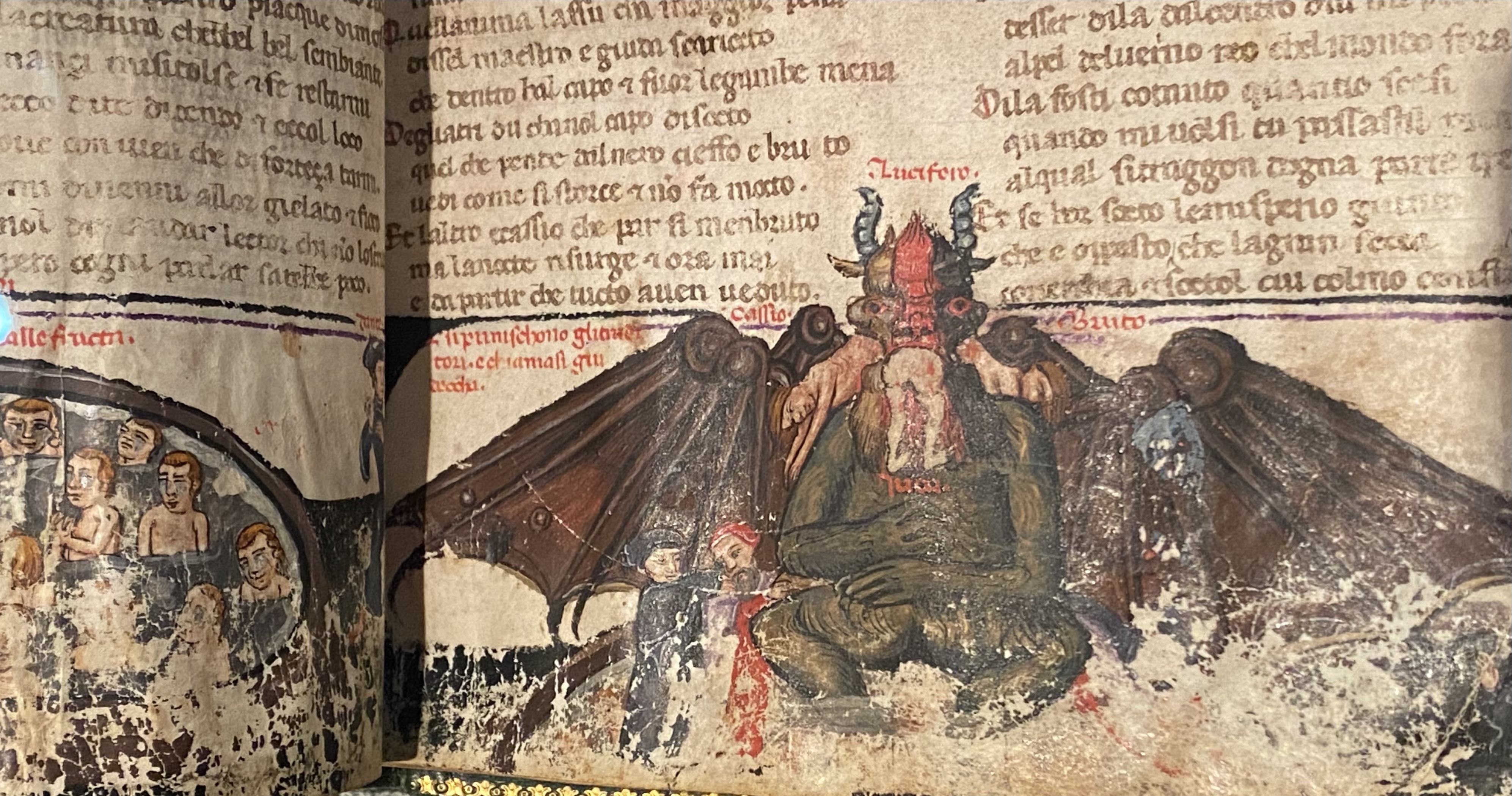


 aBefore these maps of spaces of dehumanization and devastation, we are really looking into hellish worlds we had not been able to see before. But even these dots cannot capture the scale of the hellscapes that emerged for the accelerated loss of life within the industrialization of death that proceeded from Heinrich Himmler’s order of 19 July 1942 stated that unleashed mass-killings from bullets, fire, and gas extermination to fullifll the demand that by the end of December 1942, all Jews, gypsied in Greater Germany be killed, leading to an unprecedented intensity of rates of mass-killings almost impossible to map on paper or by a graph, challenging as the spatial dynamics of the three-month long burst of killings is poorly documented–intentionally–and indicate a terrifying challenge to the world of the data vis that challenges the imagination to even attempt to “map” in the over 40,000 camps of imprisonment and mass-killing that were built between 1933 and 1945, dedicated to imprisonment, forced labor, or mass killing sites dedicated to exterminating Jews, Sinti, Roma, Communists, and so-called “enemies of the state.”
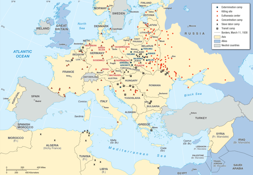

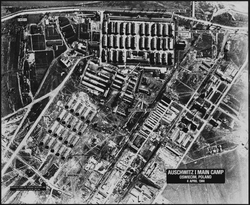


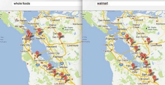


 Open Flights
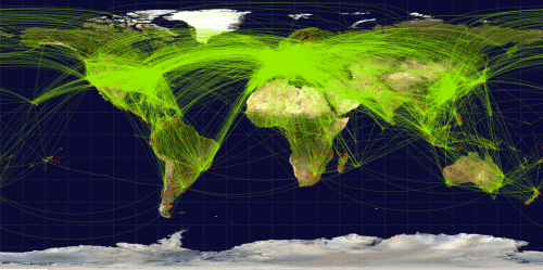
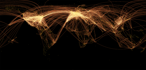

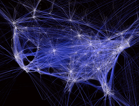


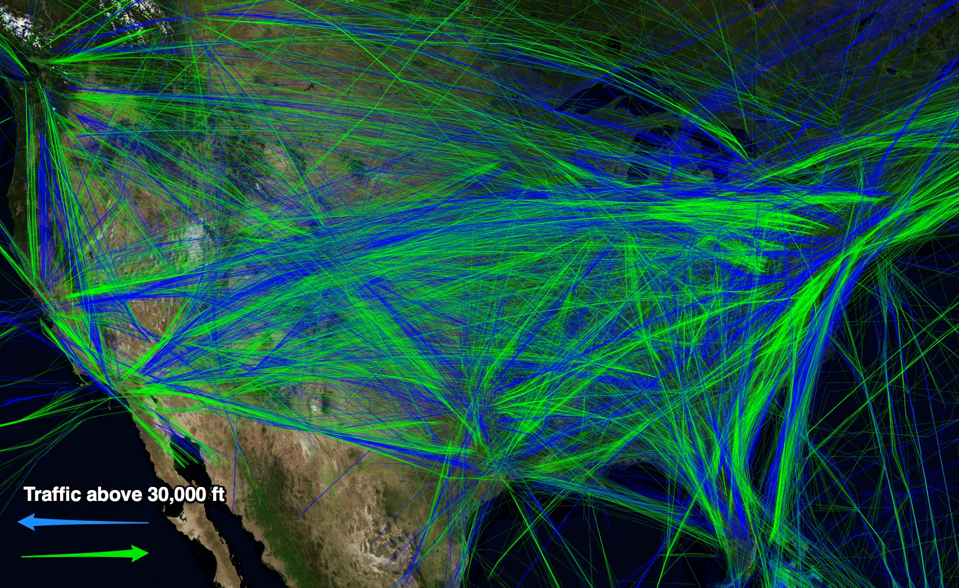
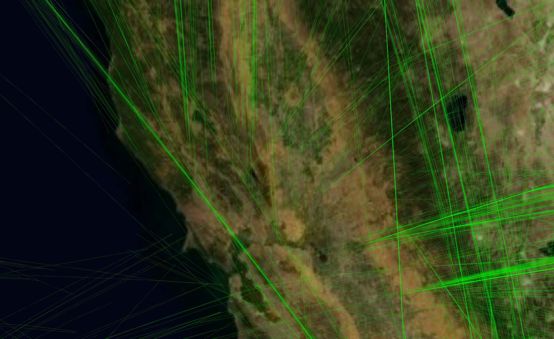
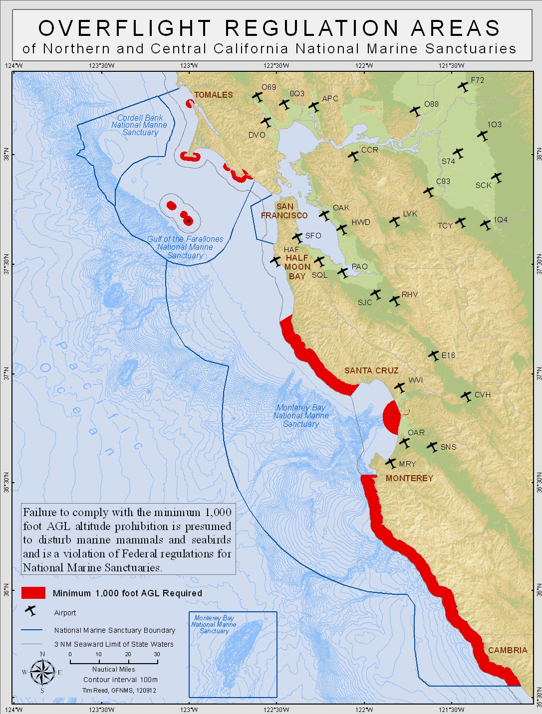

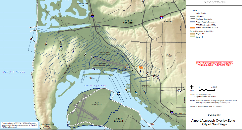

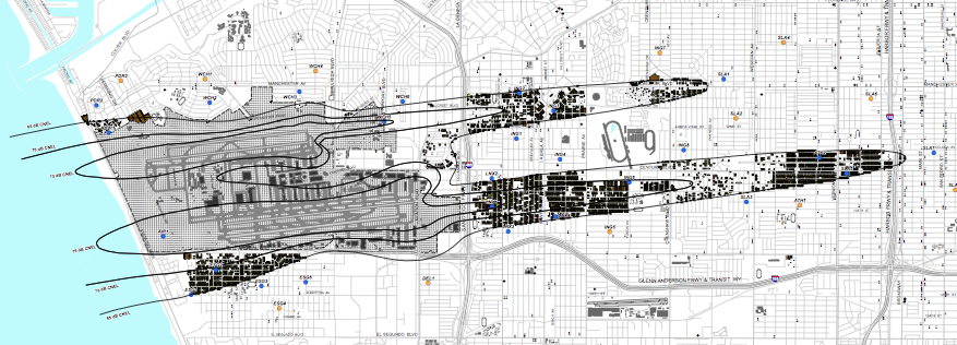


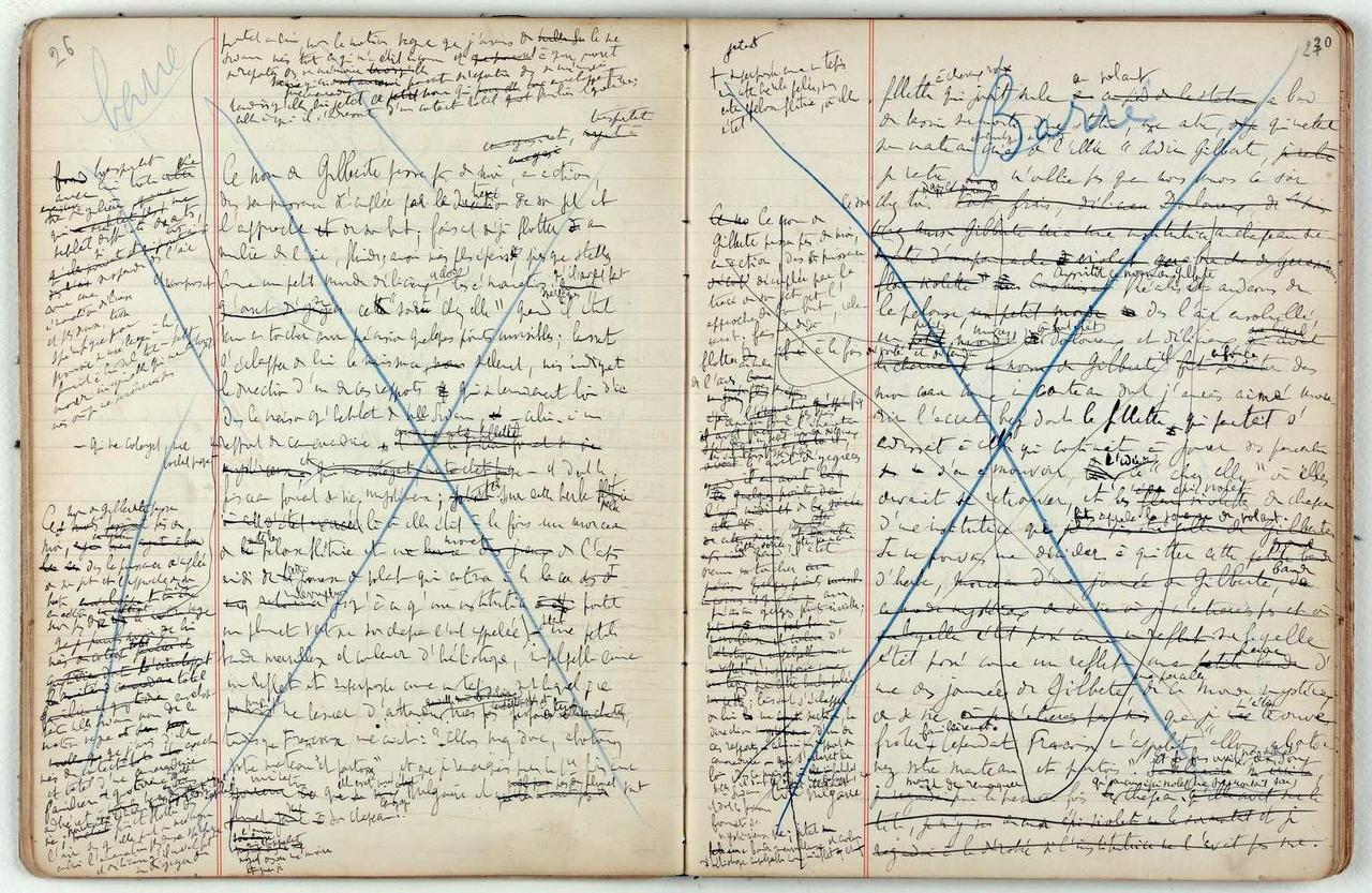
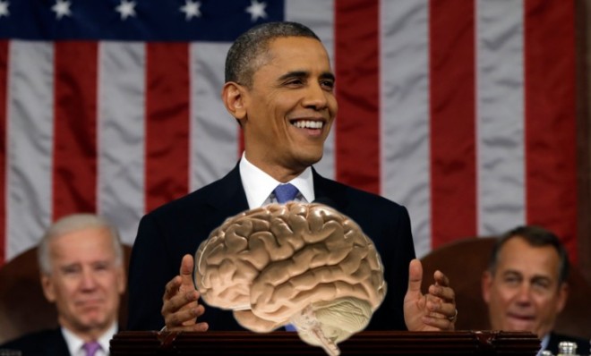

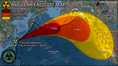

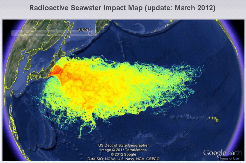


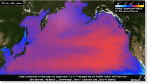

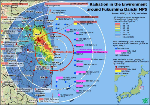
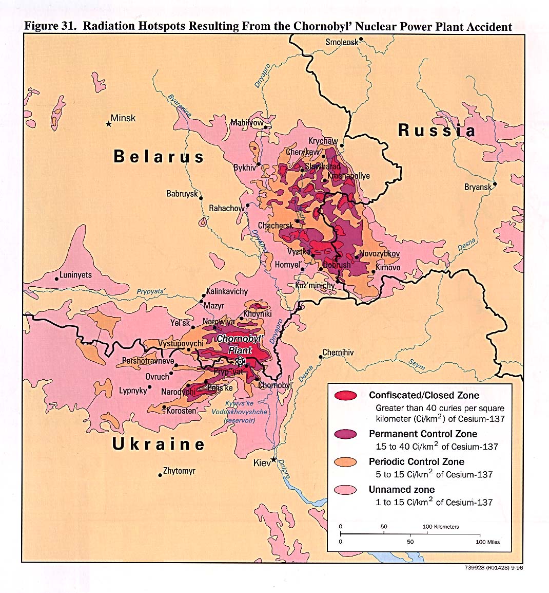
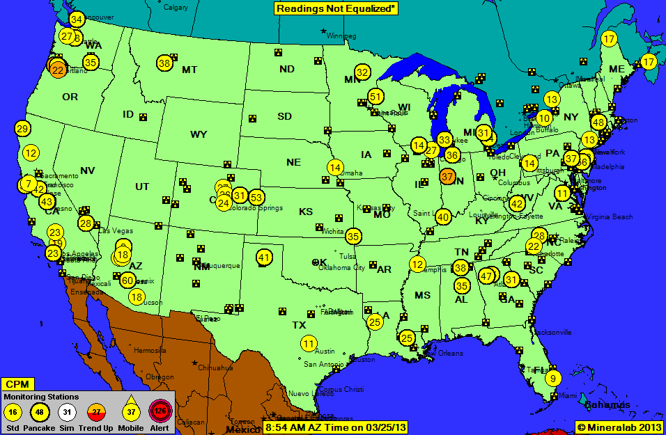

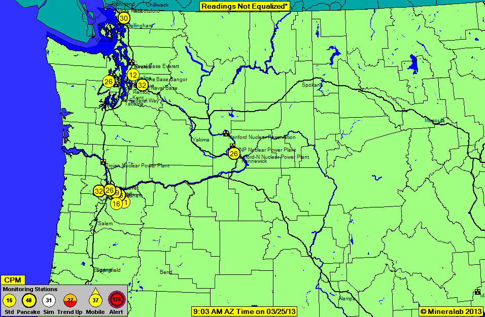
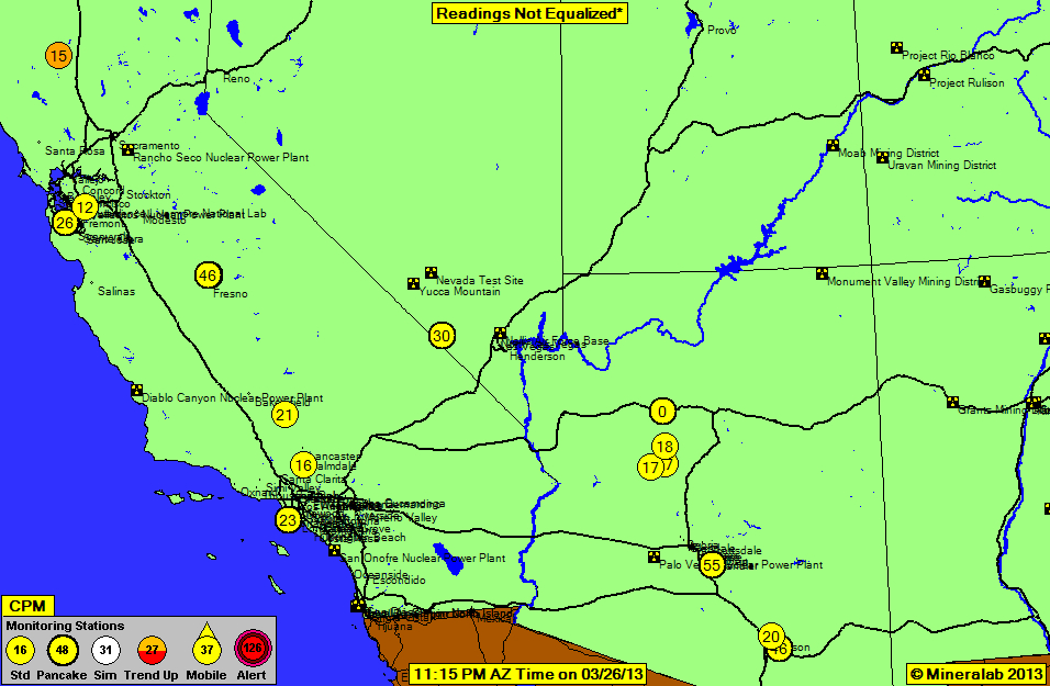
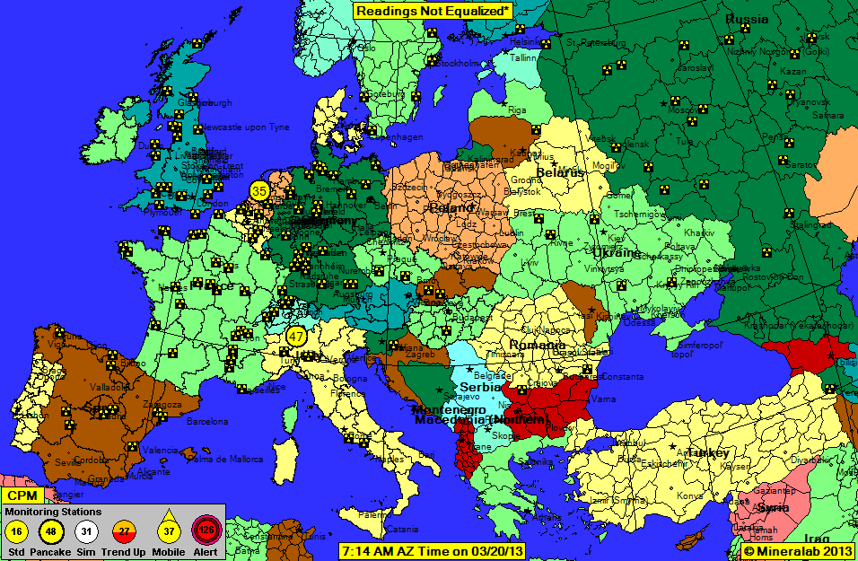


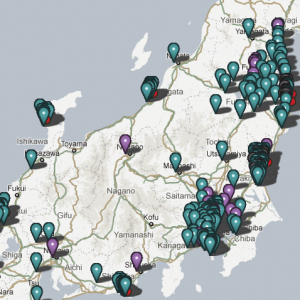

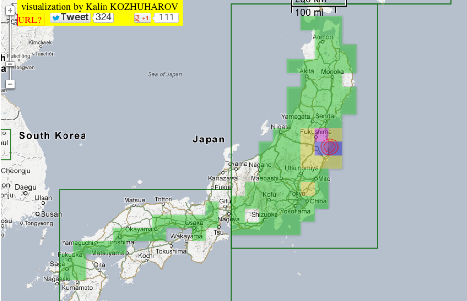
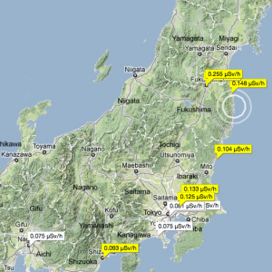


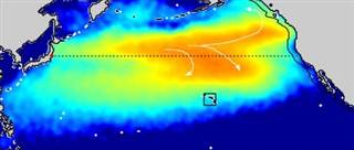
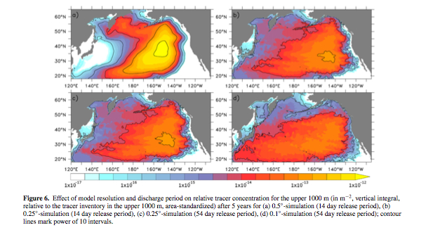


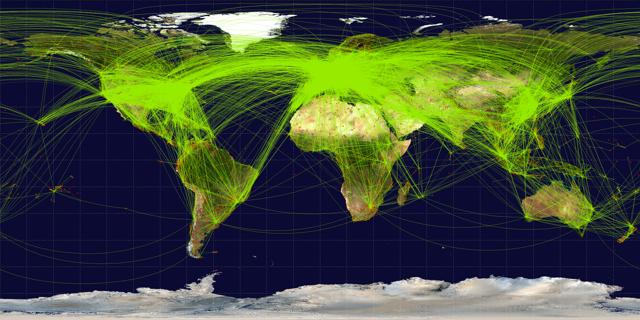