Cartographic Selectivity and the “Objectivity Question”

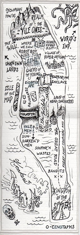
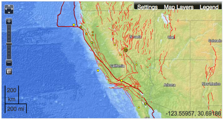
The comments elicited by readers of the imagined maps of Manhattan island  that I discussed in my last post were so interesting because they mistook the selective criteria of mapping for their objectivity.  The personalized maps featured in the Magazine of this past Sunday’s New York Times appropriated cartographical tools to  render personal spaces in the anonymous city, recalling the way we map the neighborhoods we live in and how they change with time.  But readers of the online version blamed them for offering limited perspectives of the city.  This was especially true of those posted by former city-dwellers who didn’t recognize the city as it existed in their own minds–or maps, and felt that their own mental maps were under-represented or neglected and just, sadly, not there.  We all have subjective maps that divide social space in our minds, that don’t line up at all with judging the accuracy or objectivity of maps.  As Becky Cooper, the curator of these maps, puts it:  “I’m really, really bad at geography. But I think it helped me to see maps more as biography.”  Cooper’s collection of maps are very different from, say, Cohen and Augustyn’s volume Maps of Manhattan that Tony Hiss introduced.  And they only gesture to what Henry James called the city’s “primal topographic curse”–its street grid–or the many neighborhoods that can be mapped and were mapped in the island.

Some blame might be assigned the limited demographic range of those invited to map their memories of the city, or map their memories of particular sites in a far more diverse city:  the selective criteria that each adopts might just as well be read as an invitation (or opportunity) to map your own image of the city, and otherwise unremarkable sites that you remember in identical cartographical outlines.  These maps transfigured existing maps of the inhabited island, mapping the island as inhabited by you, mapping individual memories, objectivity be damned and cartography full speed ahead:  rather than erase the role of the cartographer, behind the veil of objectivity, the cartographer becomes you.

The practice of selective notation of what qualify as a prominent site fits an age when AAA sells Trip Tik Guides that pride themselves as  accurate routing maps for trips, consciously designed as counterparts to comprehensive road maps of a region.  Trip Tik Guides hearken to medieval route-maps, providing a very selective guide–if a comfortingly narrow guide–to a world where we may all too often suffer from information overload:  they winnow the basics from the maps, a service that the AAA folks are proud to offer for any twelve destinations from any zip code.  AAA meets ADD, in other words:  these maps can help us decide what to pay attention to, or allow us to read a map when we might be too easily distracted by its contents to navigate effectively with them, or be tempted to stray off course by the inviting name of a region or a coastline that can’t fit our itineraries, or just help us plan an itinerary for our entire weekend trip.

Objectivity or the rhetoric of objectivity are central to the market for terrestrial maps.  But that rhetoric should not conceal that all maps are not only selective, but use selective criteria to make sense of space.  The  sharpness of contrasts of their selectivity as records that orient us to space–and the mental ties their selective criteria create in space–is a measure of the usefulness of maps as tools to think about a space that seems a dauntingly undifferentiated expanse before we’ve been there to visit and make it our own.

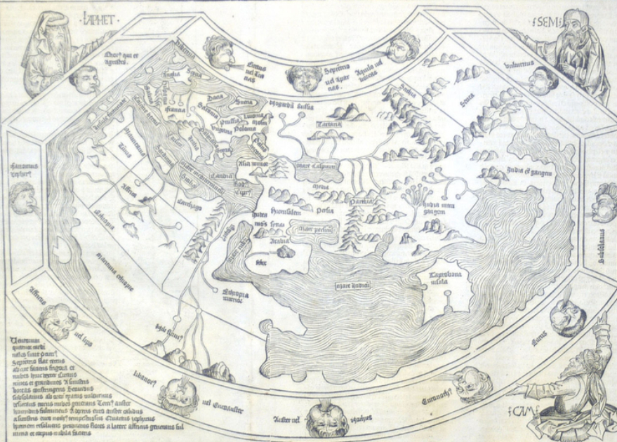
In the medieval maps known as “mappaemundi,” or maps that represent the world, “the religious importance of towns . . . determined their location and their prominence,” as John Gillis put it, rather than their location or size.  There seems some comfort in not plotting a sense of space, and of privileging Jerusalem’s position  in how medieval T-in-O maps, and the early printed world maps that retain the Holy City as their center, for the very reason that not many places even needed to be named other than Jerusalem in a map of global space.    The divisions of space in this 1485 world map suggests less interest in comprehensively identifying places or dividing space to scale than describing the configuration of lands around the city called “hierusa” and Holy Land, even as it claims to “lay everything before our eyes,” including the origins of our oceans, including “the sources of the Red Sea and the Indian Ocean”:


macrobian_1483

Most of the map, including the “terra incognita” of the mythical Antipodes, is blank.  Before the increasing

population of space, terrestrial expanse was still more or less undifferentiated in 1493, when sites worthy of memory were few, and maps’ contents were not read by audiences familiar with few places or sites.

Regional identifications were few, and confined to known landmarks and major rivers, all of which are less detailed than the sons of Noah, Shem, Japheth, and Ham, who hold the planisphere by its corners, as if it were a tablecloth, or the puffed cheeks of the nine curly-headed winds who float in the intermediate frame:


Schedel map small


So we might ask what are the criteria that we use to differentiate space, as much as wonder about the accuracy with which we denote place.  The new emphasis in maps of ordering place by terrestrial coordinates of location defined a model for reading space in quantifiable or measurable terms, in which a graticule of parallels and meridians offered terms for the viewer to judge distance and scale.

The selective criteria of later maps reflected not only knowledge of toponymy, or discovery an abundance of place-names, previously unknown, but the cartographical ability to delineate meanings in space.  Successful criteria of selectivity allow maps to make space available to the viewers, and cartography provides a sort of public ‘good’ to understand public space.

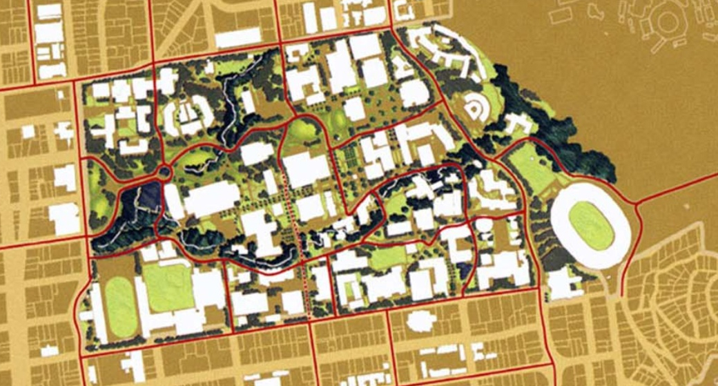
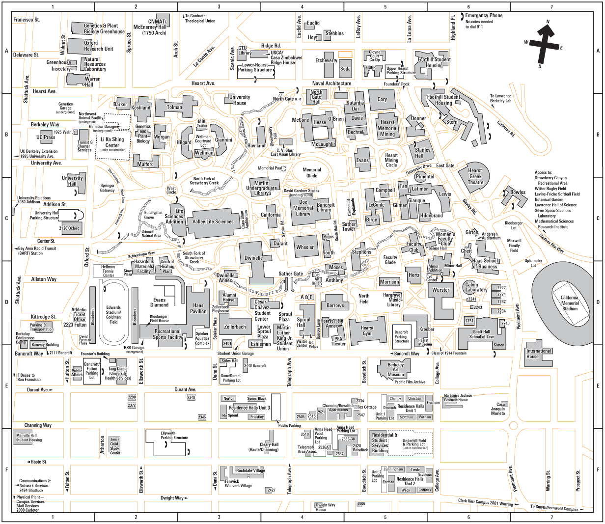
Although this sort of juxtaposition would not be possible to most, precise urban surveys allow maps of provocative maps of overlays, presenting maps less as sources of information than a sort of resource to “think about” space and imagine public space, particularly advantageous to urban planners.  I had hoped to include different maps of the UC Berkeley campus, one that construed spatial relations on directions, another by mapping creeks, and the last highlighting in blue routes lanes of wheelchair accessibility.  Each differently privileges information for different readers–and offers multiple views of the very same ‘space’–one concerned with routes of access and travel, another with spatial orientation to finding the individual buildings for university classes.


wc accessile campus routes ucb


large_campus_map


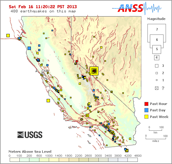
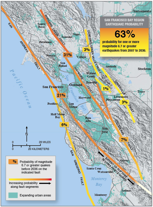
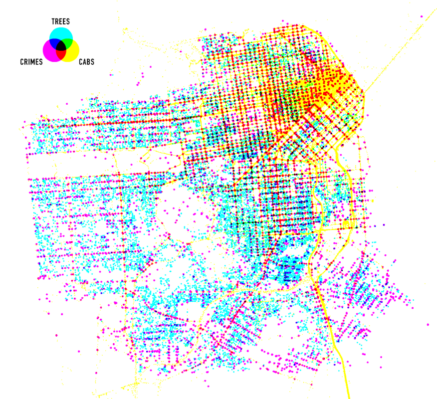
Let’s turn to San Francisco’s space, however–more challenging to map and more recognizable, and offering examples more semantically complex.  The below maps explicitly construe relations that are hidden to observers, although with considerable spatial precision, as this visualization that performs a layover between crime, trees, and cabs in San Francisco, overlapping three data sets to  visualize a Venn diagram. This is not a simple visualization of data, but a unique topography based on selective criteria:  the concentration downtown of cabs (and hence potential witnesses or bystanders) do not lessen crime more effectively than the planting of trees; though it’s hard to see trees as an active crime-deterrent, the overlay tells us about how we construct our neighborhoods as living spaces.  Or, as the man who made the map, Shawn Allen, put it, “I’m still not sure if it’s significant, or even interesting, but here it is.


cabs, crimes, trees in sf.


The versatility and value of the selectivity mapping techniques depends on the readiness of the cartographer to perfect a legible iconography–as well as its ability to surprise and invite viewers to reconsider space by revisiting the socio-economic differentiation of a space that we might already daily move through.

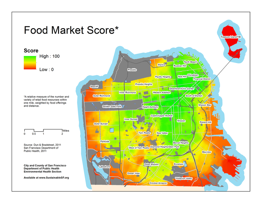
The mapping of food access is a good case in point of how maps make space look different.  Although this map includes no toponyms or place-names, the synthesis of data into a tricolor spectrum of a data overlap creates a topography of food choices available in each neighborhood.  It poses questions of how food constitutes a neighborhood’s attraction and the constraints its inhabitants face, or consider how these choices arose.  Another map employs a color-drenched spectrum, glowing in flourescent hues that denote relative access to food markets across the city:  the spectrum dominates names of the city neighborhoods, to reveal a topography of food that underlies their divisions.

FoodMarketScore


One might better understand the constraints its inhabitants face by a more traditional map of retail stores–both in terms of different regions’ quality of life, as well as real public health risks.  This alternate data visualization is at a finer grain, identifying seven varieties of sites of retail food stores of different colors, with liquor and convenience stores noted by a simple dot of black.  This makes the map both more detailed and less easily readable for some, but provides a meaningful view of the city’s urban space.


Retail foods SF


Successfully selective criteria can help create a map that is a better public resource.  To craft these maps of neighborhoods better, we’ve even begun to push against the preference for the visual, in maps poised to break sense-based walls as well as esthetic boundaries to register an aural dimension:


Sound Map of Missionjpg

3 Comments

Filed under Food Maps, Mapping Manhattan, San Francisco, sound maps, Stamen design, T-in-O, UC Berkeley Campus Map

Self Made Maps

Many online responses to the arto-carto project of Mapping Manhattan remind us of how the biggest challenge of any cartographic totalistic idealized view is to record local details with fine grain: it’s no coincidence the chorus of posted responses to the maps in today’s New York Times often complain about the loss or absence of specific individual neighborhoods, or the absence of economic diversity (and ethnic diversity) in the beautiful colored maps.  As an exercise of collective map-making, the project that Becky Cooper ideated and planned, “Map Your Memories,” provoked each cartographer to record their own view of that island, rendering it as inscribed with memories of their own.  This open call perhaps provoked the deep-seated nature of responses it has met, evident in the energetic nature of good-hearted responses Mapping Manhattan has elicited from online readers over the past few days.

map_2

The call to “Map your Memories” asked a range of writers, artists and other would-be cartographers to record individual memories in the outlines of a map of Manhattan island of vague north-south orientation.  The book stands on its head maps’ implied claims of objectivity, by treating media as a screen to project memories, whose individual design reveals their topography to be imprinted with haphazard collections of personal associations or reminiscences.  The white upper-class basis for these mapped perspectives  is implicit in their subjects– lost gloves, volumes of Proust, chick-lit, cups of non-Starbucks-brand coffee, lovely one bedroom apartments, or stages of urban fear; the maps are something like open invitations to play Proust.

They are rightly, and also wrongly, criticized as upper-class white bourgeois artifacts, since that is what they openly are–no one would presume to credit them or mistake them from objectivity.  (That might not be the audience that the New York Times wants to address, but is after all the audience of Abrams, the art-book publisher.)  The playfulness of some of the maps clearly perpetuate these myths playfully transform Manhattan to echo something like a medieval zone-map, where torrid zones of uninhabitability, and in fact are divided by zones where the mapmaker would never set foot or know:

map_5

In quite a few, boundaries of class are visually thematized and reified with a certainty familiar from  the medieval “here lie monsters,” or Odyssean sea-monsters, or an edge of the earth from which one might easily be able to fall . . .

tumblr_mibz79u24w1qzbevlo1_500

These maps celebrate the artifice of cartographical fiction-making, reading more like the maps of Jules Feiffer and Norton Juster, or of the sensibility of that great medievalist JRR Tolkein.

I prefer to read other maps as a range of responses of common DIY creative reactions to the plague or deluge in most of our big media of weather maps, visualizations of databases via GIS creations or simulations, where detail provided by surveying is lost or filtered out for a schematic view of the whole, reactions that are apparent in their sheer cartographical abundance or ecstasy of naming with which each cartographer is offering a map of their own.   I see a sort of reaction to the dramatic diminution of the art of the cartographer in Google Earth or the Weather Channel, where big color-drenched screens, sometimes over-saturated with details or more often just clotted by hues to signify climactic variations or cloud-cover, replaced the selective criteria of mediating topography or settlement via cartographical art. Such a diminution of the act of creative cartography is, after all, an imaginative failure, as much as a shift in cartographical media.  Contrast the abstraction characteristic of many GIS-generated maps to the abundance of local meanings that distinguish the series of maps that Cooper has assembled.  There is a joy of celebrating the individual that has led so many of the online comments to beg for their own memories to be inscribed in the maps, as well as those of the authors.

This is evident in the visual celebration of the mapmaker’s art in the lovely watercolor map submitted by Markley Boyer, one of the few historical imaginations, of the imagined bucolic past of Manhattan as a field of green, surrounded by a sea of blue.  This map most reminds me of the impact of the tools that our cartographers use, as much as their level of artifice.

map_0

In this material remapping Manhattan as a lost Eden, the author of Manahatta: A Natural History of New York City, has reclaimed the artifice of map making in richly saturated colors and applied sponge.  This Manhattan of the mind is mapped at several degrees removed from the actual inhabited island–as are all the maps in this volume–but the degree of artifice by which it stands at a remove from the island reminds us how much all mapping records the relative richness of a vision of self.

5 Comments

Filed under Becky Cooper, Feiffer Map, Manahatta, Mapping Manhattan, mapping memories, Markley Boyer, Proust

Russian Rocks

What happens when part of a meteorite lands in Chelyabinsk? We use maps to give meaning to the event, marking the site of impact in readable visual terms, and to try to place it in our comprehension through familiar mapping tools.

There are multiple ways to map the path of the meteorite that fragmented into pieces as it fell to earth, evading atmospheric or satellite sensors and causing explosions that injured over 1200 people, as well as its site of collision.  Perhaps the rush to map the event compensates for the fact that we never detected it as it entered our atmosphere, on account of its small diameter.  There is a paradox that in an age of detailed world-mapping, the mapping of such a terrifying event was improvised from a range of readily-generated cartographic resources, and provided a limited view of the human side of the natural disaster-an aspect that was, perhaps understandably more often reserved for video rather than cartographic media. The range of maps that popped up in actual news sources suggested a sort of fumbling for meaning, however, or an improvised making sense of what happened, without much imagination or clarification.

The most vulgar is undoubtedly a graphic reminder this happened in a place known as Russia, and that still has a vaguely pink hue that has adhered from its Cold War past and the image-bank that era has bequeathed us:

map-of-russia

Slightly more acceptable, but excessively abstract, is the “Google Earth” solution of noting a pinpoint, instead of the collision, and using a surfeit of detail in the surrounding region, essentially an imported backdrop from a computer file from Google Earth:
russia-map

Huh?  Only slightly more semiotically refined is the following accusatory blame of where the meteor caused such tragedy, but focussing on the basic information about its distance from Moscow:

images-2

Meaningful mapping is approached by the following, if somewhat whimsical, combination of a political map and world-wide view:  but the whimsical tone undermines the tragedy, the detail to dense, and the region just too green:

map

More impressive is mapping the fact that its impact could have happened at any point during the meteorite’s arc through the earth’s atmosphere:
path-of-meteorite-that-hit-russia

What’s sacrificed here, of course, is the specific–what one would expect from mapping techniques–as the map is simply a screen on which to chart the progress of the meteor, with limited explanatory force.  Most of these ‘maps’ employ existing maps as backgrounds, fields, or templates familiar from other computer-generated media, rather than mapping the site of impact in relation to regions of settlement or natural resources.

Perhaps most striking is the perfect circle that part of the meteorite made, as if a cartoon outline of its form, on the icy surface of this frozen lake, as locals try to understand what happened–not a ‘map’, but a good visual expression of awe as well as a human-sized outline of what the actual scale of the meteoric fragment on impact was:

russia-meteor-strike-lake_64337_610x343

Of course, this lacks many tools of orientation.  But perhaps it is as effective as to dispenses with geographic points of reference and indices, in a word map:

images

For the cartographically obsessive, a Google Earth blog maps all sites of meteor craters created by previous impacts,

Meteor Craters on Earth

Google Maps Mania has been quick to create a plug-in for Google Earth browser (via Google Maps) for those interested in comparing the craters.

Wow:

mapsmania

http://googlemapsmania.blogspot.com/2013/02/meteor-impact-sites-on-google-maps.html

2 Comments

Filed under Chelyabinsk, Cold War, Google Earth, meteorites, Uncategorized

Mapping Fault-Lines in Earthquake Maps

Fracking–it is increasingly feared–invites irreparably contaminating our largest aquifers, and by extension drinking supplies–in Brooklyn, someone formed a group to protect the water of locally sourced beers–as well as devastate prairies and old agricultural lands, where land is cheap, by horizontal drilling.  Recent arguments compellingly link the drilling multiple “injection wells” of wastewater that seem to have activated previously non-active faults in regions that rarely experienced tremors in the past, and where the USGS did not find evidence of registered earthquakes.

As massive amounts of wastewater generated to access for natural gasses are forcefully re-injected into the earth, as if swept under a carpet, opening fissures in underlying beds of Shale or Sandstone.  Horizontal drilling operations have dated to 2008, mining areas by pumping vast amounts of sand into ancient shale formations in prairies and regions of declining agriculture to release methane and natural gasses.  Hydraulic fracking has used tons of water to force trapped gasses out of old rock formations.  Before 2009, in fact, earthquakes were rarely registered in the USGS surveys of lands where seismic activity has accompanied the injection of water into “injection wells”:  in these the shifting weight that the injected water that presses against rocks open old fissures, causing a buckling of underground rock formations, the fear is, as massive amounts of soupy, contaminated wastewater is injected back into the earth.  The “earthquake swarms” monitored nearby injection wells in Arkansas, Montana, Texas, Ohio or Oklahoma that barely registered seismic activity  from 1972 – 2008, has given new significance to–and created new fear around–a set of fault lines unknown to inhabitants, blamed as if active by an industry that rejects the accusations that they created sources for tremors inhabitants fear.   Indeed, the proliferation of earthquakes registered in the state of Oklahoma alone from 2001-15 reveals, according to the data from the Leonard Geophysical Observatory, a persistent increase in the tremor-like disturbances with the rise of underground wastewater dispersal, and a strikingly sharp increase in quakes of magnitude of three or higher in hears after 2010.


QUakes in OK, 2001-15.png


The increase seems closely tied to the absorption of wastewater back into rock layers whose weight is so altered by the injection of fluids, causing quakes that have rocked up to a fifth of the state, but have also increased land values for speculative fracking, in ways that may have concealed some interest in exploring the correlation–especially in a state where, due to geomorphological accident, water injected to reach deep-lying shale deposits send increasing amounts of wastewater underground, often to be absorbed by highly porous limestone that expands, but lies deep underground beside highly stressed layers of rock.  The result seems to create something like a combustive effect akin to the popping of kernels of corn, and has led many state officials to preemptively adopt prohibitions on local bans on regulating oil or gas wells in their jurisdictions, and insistence that the resurgence of quakes in fault zones is more able to be explained as an “act of nature that is nobody’s fault” not effected by human agency; the rejection of a relation to human activity comes from state legislatures fearful of the employment rises brought by gas and oil corporations from being scared away from the state.    But the geological record of apparently induced quakes in Oklahoma and their close proximity to existing injection wells.


ok.png

The fear of such tremors has a recent prehistory of three or so years.  An early tremor whose epicenter lay near Richmond, Virginia, of 5.8 magnitude, just below 6, but that sent shocks to North Carolina and Canada.  The event raised questions about the role of fracking in 2011 for Tim McDonnell and Aaron Ross, described in an earlier article in Mother Jones that directed attention to fracking’s consequences.  But the persuasive nature of recent USGS time-lapse maps of the same state–

The dangers of fracking echoes Jonathan Franzen’s early if compelling 1992 novel Strong Motion, in which mysteriously recurring earthquakes are pinpointed at the unlikely site of Boston, Massachusetts, a rare location of seismic activity.  But whereas Franzen’s protagonist, Renée Seitcheck, believed “that these earthquakes are the byproduct of industrial drilling” by a  petrochemical firm whose agents attempt to assassinate a beautiful rebel seismologist, for her mining of top-secret data from computers, the causes of the “swarms” seem to lie less in drilling than in injecting waste-water.  Was the novel remarkably prescient in unveiling a concealed impact of post-industrial geocaching?  It surely doesn’t seem so paranoid in its view of an industrial conspiracy to conceal geological findings, or to imagine the role of the rogue geographer in the seismically sensitive landscape that the search for underground sources of oil and gas can create.

But now it’s no longer isolated individuals who research the papers of top-secret labs.  There are upwards of 40,000 disposal wells actually active in the United States, some tunneling 13,000 feet under the earth, and “injection induced seismicity” is now a field, as the pressure exerted by the displacement of water able to move rock layers has provoked widespread academic interest and industrial concern:  “There are faults most everywhere,” noted Cliff Frohlich of the Institute for Geophysics at the University of Texas-Austin, suggesting how fracking can ‘reactivate’ fault lines which were never known; “Most of them are stuck, because rock on rock is pretty sticky.  But if you pump a fluid in there to reduce the friction, they can slip.”  “Water does not like to be squeezed,” Scott Ausbrooks of the Arkansas Geological Survey put it with some empathy.   And while Franzen’s character pored over reams of secret data to understand the relations of seismic activity to big oil’s search for underground pools of oil, such relations are now the focus of conferences and are amply documented in data maps.

The best known faults the USGS has mapped are well-known.  But, as Mark Zoback, a professor of geophysics at Stanford explained in a recent article by Michael Behar in Mother Jones, echoing Frohlich, “there are faults everywhere, and some are too small to be seen.”  Faults are widely known if often forgotten by those living in California, where fracking may begin, despite growing opposition.  Indeed the range of fault-lines throughout the California-Nevada region are so multiple that the possibility of hydraulic fracking in the region of southern California threatens to  imbalance a rather threatening constellation of seismic activity that already exists in much of the region, and is more widely mapped than the most familiar lines of the San Andreas, Calaveras, or Hayward faults.  The visibility of these fault-lines is available on an up-to-the-minute-map of regional seismic activity, part of a set of maps that record seismic activity by irregular bright red computer-generated lines, often proximate to cities:

California in USGS map of Faultlines

The nervously drawn red lines of seismic activity furrowing the green plains in these maps are ‘underground views’ mapping the range of pressure below the earth’s surface.  A more striking map of seismic activity of the past few weeks and days pieces together a narrative of fault-lines and tectonic plates that accentuate the daily deep divisions that course under the earth of our westernmost states:

California_Nevada-1

The stark legend suggests the huge growth in a magnitude the scale of “6.”  The prominent indexing of fault-lines in another USGS map of seismic activity, with less attention to topographic or climactic variation, shows the volatility of the region’s multiple faults in a similar if starker image of seismic frequency:

indexfault_map


More locally, and limited to faults active in the past week of a magnitude above 2.5,
California in USGS map of Faultlines


For more focus on recent seismic occurrence, link your browser to: http://earthquake.usgs.gov/earthquakes/map/

Despite the evidence of terrifyingly active fault lines, the active movement ‘Stop Fracking in California‘ has its back against the wall, even if they are growing in local Southern California chapters.

Yet the volatility of the region cannot be ignored–take this map of the Simi Valley and Los Angeles area, posted on Saturday, February 16, where fault-lines course unseen beneath the landscape, moving from inland to the coast at multiple points and through metropolitan Los Angeles:

Los Angeles earthquake faults

This interest to frack in California–an oddly post-modern verb–is scariest given maps approximating the future likelihood, as calculated by the USGS, that the regional fault-lines in the Bay Area will experience seismic activity at a magnitude greater than 6.7 before 2036.

2008probabilities-lrg

By how much would active injection wells multiply increase these already quite sizable odds?  Given the proximity of these lines to expanding urban areas, often growing between the Hayward and San Andreas fault, can fracking in California be a safe investment for the future?

This is not a map that is in the heads of most native Californians or residents.  The readability of these maps offers a base-line for future seismic activity, and grounds for concern about hydraulic fracking in seismically active regions.

It is good news that the USGS has expanded its clickable interactive image of global fault lines, in which the record of seismic activity is updated every minute, and on which viewers can scale in to investigate on their own:

USGS Global Earthquake Map

While the occurrence of faults and tremors will always shock, its legibility not only offers a lesson in continental drift.  Many of these jerky lines reminiscent of an etch-a-sketch lie underwater, but the points of greatest activity–in California, Indonesia, and Central America–cannot be ignored or lost sight of for underground engineers.

2 Comments

Filed under data visualizations, Earthquake Probability, Earthquake swarms, earthquakes, Fracking

Mapping News Flows

The rise of internet news sources may have threatened printed news outlets.  With diminishing number of news desks and reporters, the story goes, the reduction has qualitatively changed both the variety and sort of news that is consumed–and a dependence on a far narrower range of streaming news.  The political volatility or extremism of news outlets has either further diminished the spectrum of news stories, or is a symptom of a shrinking pot of funds that is devoted to news.

The news has long co-opted the global map as an emblem of its comprehensive integration of news stories from the entire world:

        images         Unknown-1           Unknown

Or, more directly overlapping the globe with the corporate news logo for TV:

world news.

Is the global coverage of the news more exaggerated than such emblems would suggest, as is suggested by a focus on Europe or an Anglo-American Atlantic?  Perhaps a better image is suggested by this other news icon, suggesting a relay of privileged sites of information that is synthesized in newscasts.

images-2

A recent map that’s been getting considerable attention reveals another side of this story: the increasing number of regions in the world where news reporting, and journalists are restricted for reporting, censored, imprisoned or attacked, based on this map of the regions where journalism was suppressed in 2012.  Despite the limited informational value of the map as a visualization of data, it reveals the increasing global reach of attacks on journalism.

Journalists under Attack.

The constraints that local political regimes have come to place upon their own local reporters has, inadvertently for some, restrained the global claims of a news media that relies on local informants and news sources.  And the result is a shrinking of what one could best call the known world.  According to the Committee to Protect Journalists, who provide some of the fullest documentation of attacks on journalists worldwide, at

http://cpj.org/2013/02/attacks-on-the-press-in-2012.php

the imprisonment of journalists has reached a record high in 2012, which is a concern for global concern.  How can we continue to map news sources if we must blot out an accurate picture of the entire map?  According to their site, “Large-scale imprisonments in TurkeyIran, and China helped lift the global tally to its highest point since CPJ began conducting worldwide surveys in 1990, surpassing the previous record of 185 in 1996,” often on “anti-state charges such as terrorism, treason, and subversion.”  In countries as Eritrea and Syria, there has been a virtual black-out of some news sources, with record numbers of journalists jailed without anything resembling due process.  The blackout continued across the globe in a scary manner: “VietnamAzerbaijanEthiopiaUzbekistan, and Saudi Arabiarounded out the 10 worst jailers. In two of those nations, Azerbaijan and Uzbekistan, the authorities used retaliatory charges such as hooliganism and drug possession to jail critical reporters and editors.”  In Turkey, Mehmet Ali Birand, the editor of Istanbul-based Kanal D, noted that tatutes “make no distinction between journalists exercising freedom of expression and [individuals] aiding terrorism,” said Mehmet Ali Birand,tatutes “make no distinction between journalists exercising freedom of expression and [individuals] aiding terrorism.”  Iran has jailed 45 journalists outright since the lack of certainty as to the results of the 2009 presidential elections.   Eritrea holds the fourth highest total of journalists worldwide in jail, none of whom were ever charged with a crime.  The virtual criminalization of journalism that led to an increase of imprisonment of journalists of 23.4% in 2010-11 has climbed to further 29.6% in 2012.  Despite significant numbers of the imprisoned being online journalists, print journalists constituted the second largest group of those imprisoned worldwide.

To be sure, the worldwide number of journalists who were killed since 1992–a more extreme retaliation–are more narrowly distributed world wide.

Deaths.

One can see echoes of the detainment of journalists in Eritrea and Syria But the growing number of pockets–and indeed larger regions that are identified with legitimate states–where the news is blacked out or not accessible is perhaps one of the most dire threats to comprehensive coverage.  Perhaps a better metric is the startling rise of the number of journalists imprisoned worldwide.

imprisoned journalists

The areas that have imprisoned large numbers of journalists might be likened to news swamps, where news is filtered or obscured, or never reaches the light of day.  These nations, with the greatest offenders colored red and sized to fit  the scope of their silencing of news reporters, are

Place-Map

This is one map to pay attention to when reading the news.

Leave a comment

Filed under ABC Nightly News, Committee to Protect Journalists, Imprisoned Journalists, News Media