
Many online responses to the arto-carto project of Mapping Manhattan remind us of how the biggest challenge of any cartographic totalistic idealized view is to record local details with fine grain: it’s no coincidence the chorus of posted responses to the maps in today’s New York Times often complain about the loss or absence of specific individual neighborhoods, or the absence of economic diversity (and ethnic diversity) in the beautiful colored maps. As an exercise of collective map-making, the project that Becky Cooper ideated and planned, “Map Your Memories,” provoked each cartographer to record their own view of that island, rendering it as inscribed with memories of their own. This open call perhaps provoked the deep-seated nature of responses it has met, evident in the energetic nature of good-hearted responses Mapping Manhattan has elicited from online readers over the past few days.

The call to “Map your Memories” asked a range of writers, artists and other would-be cartographers to record individual memories in the outlines of a map of Manhattan island of vague north-south orientation. The book stands on its head maps’ implied claims of objectivity, by treating media as a screen to project memories, whose individual design reveals their topography to be imprinted with haphazard collections of personal associations or reminiscences. The white upper-class basis for these mapped perspectives is implicit in their subjects– lost gloves, volumes of Proust, chick-lit, cups of non-Starbucks-brand coffee, lovely one bedroom apartments, or stages of urban fear; the maps are something like open invitations to play Proust.
They are rightly, and also wrongly, criticized as upper-class white bourgeois artifacts, since that is what they openly are–no one would presume to credit them or mistake them from objectivity. (That might not be the audience that the New York Times wants to address, but is after all the audience of Abrams, the art-book publisher.) The playfulness of some of the maps clearly perpetuate these myths playfully transform Manhattan to echo something like a medieval zone-map, where torrid zones of uninhabitability, and in fact are divided by zones where the mapmaker would never set foot or know:

In quite a few, boundaries of class are visually thematized and reified with a certainty familiar from the medieval “here lie monsters,” or Odyssean sea-monsters, or an edge of the earth from which one might easily be able to fall . . .
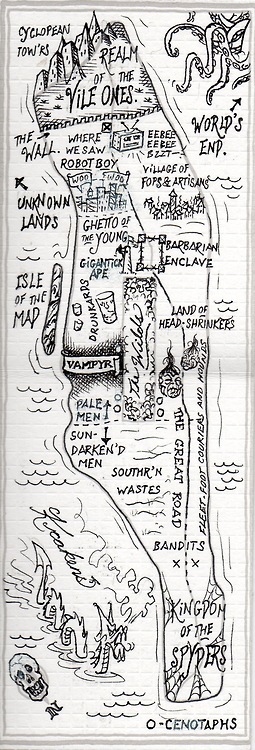
These maps celebrate the artifice of cartographical fiction-making, reading more like the maps of Jules Feiffer and Norton Juster, or of the sensibility of that great medievalist JRR Tolkein.
I prefer to read other maps as a range of responses of common DIY creative reactions to the plague or deluge in most of our big media of weather maps, visualizations of databases via GIS creations or simulations, where detail provided by surveying is lost or filtered out for a schematic view of the whole, reactions that are apparent in their sheer cartographical abundance or ecstasy of naming with which each cartographer is offering a map of their own. I see a sort of reaction to the dramatic diminution of the art of the cartographer in Google Earth or the Weather Channel, where big color-drenched screens, sometimes over-saturated with details or more often just clotted by hues to signify climactic variations or cloud-cover, replaced the selective criteria of mediating topography or settlement via cartographical art. Such a diminution of the act of creative cartography is, after all, an imaginative failure, as much as a shift in cartographical media. Contrast the abstraction characteristic of many GIS-generated maps to the abundance of local meanings that distinguish the series of maps that Cooper has assembled. There is a joy of celebrating the individual that has led so many of the online comments to beg for their own memories to be inscribed in the maps, as well as those of the authors.
This is evident in the visual celebration of the mapmaker’s art in the lovely watercolor map submitted by Markley Boyer, one of the few historical imaginations, of the imagined bucolic past of Manhattan as a field of green, surrounded by a sea of blue. This map most reminds me of the impact of the tools that our cartographers use, as much as their level of artifice.
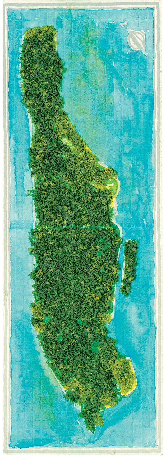
In this material remapping Manhattan as a lost Eden, the author of Manahatta: A Natural History of New York City, has reclaimed the artifice of map making in richly saturated colors and applied sponge. This Manhattan of the mind is mapped at several degrees removed from the actual inhabited island–as are all the maps in this volume–but the degree of artifice by which it stands at a remove from the island reminds us how much all mapping records the relative richness of a vision of self.


Like this post very much. .. but then I like the All. Just cant comment At length on this stupid iPhone.
What about musing on maps of changing coastlines of the planet, pace J. Gillis. ????
Sent from my iPhone
Nice idea!
How does Rebecca Solnit’s book of mapping and remapping San Francisco fit among the mapping genealogies and types you outline in this telling and timely post?
Definitely it is in a similar genre! The maps that I remember the book are a bit more reliant on the conventions of cartography, however, because they are less personal. Some maps that are great examples of the use of mapping symbols and icons to create a new relation to space, similar to the maps Solnit included in that cartographic anthology, were published in MISSION: POSSIBLE by my friend Darin Jensen, which really exploits the notion of a neighborhood atlas, revealing the juxtapositions unique to urban space: http://missionpossiblesf.org/
Darin’s group used actual surveys to map airways, parking spots, coffee shops, underground sites, concealed creeks, urban sounds, diy shops, and housing needs, workout centers and burial grounds, offered a creative iconography to map different topographies into a fixed space, to show the possibilities and range of meanings it held, as well as to provide a snapshot of urban planning. ONe of my favorites is a mapping of gangs and cupcakes. Stamen design came up with their own map of San Francisco, also exploiting the uses of cartographic iconography to highlight connections an inventive manner, by cross-mapping trees, cabs, and crime in the city, http://www.flickr.com/photos/shazbot/3282821808/
I hope to discuss these in later posts!
Nice post. Await your views on that nytimes world map of countries that do and don’t have child care leave …