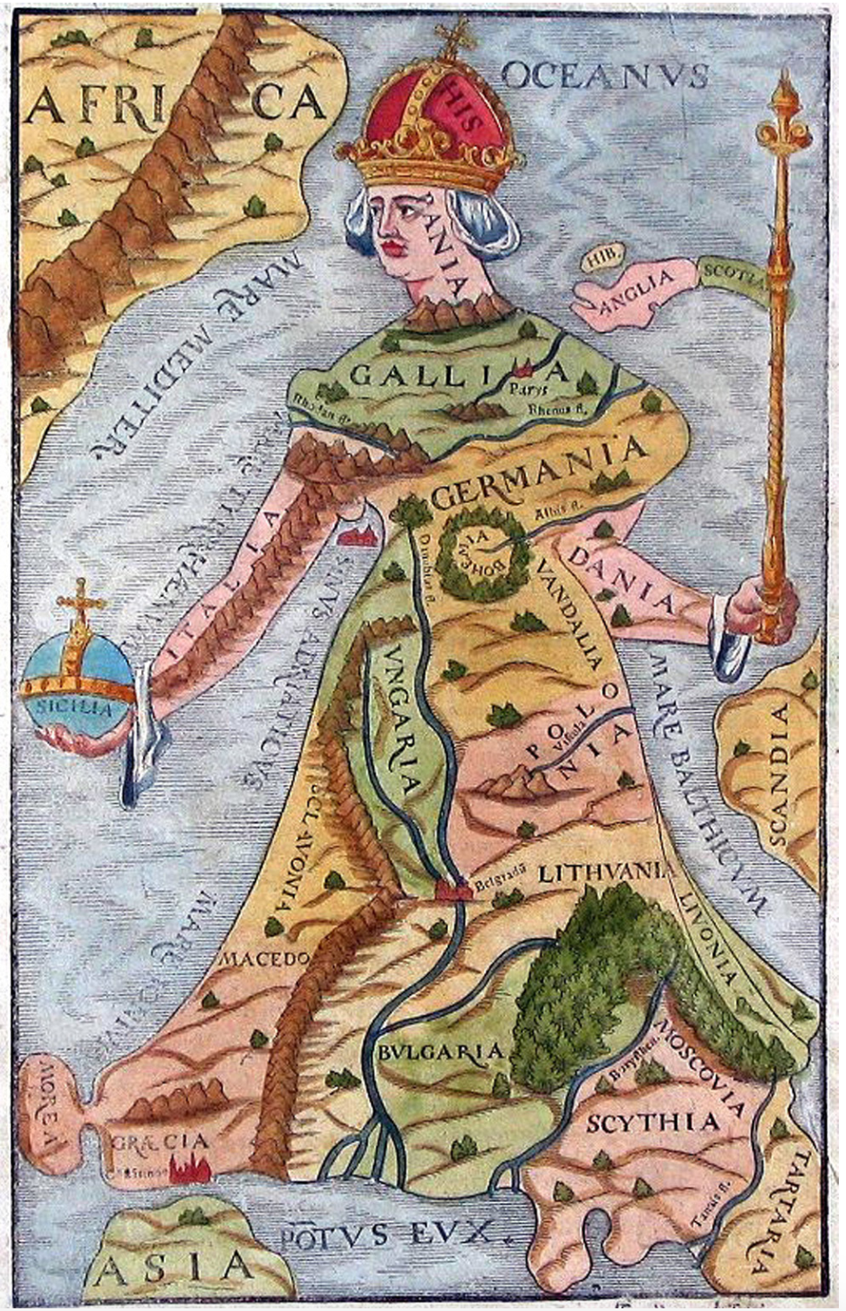
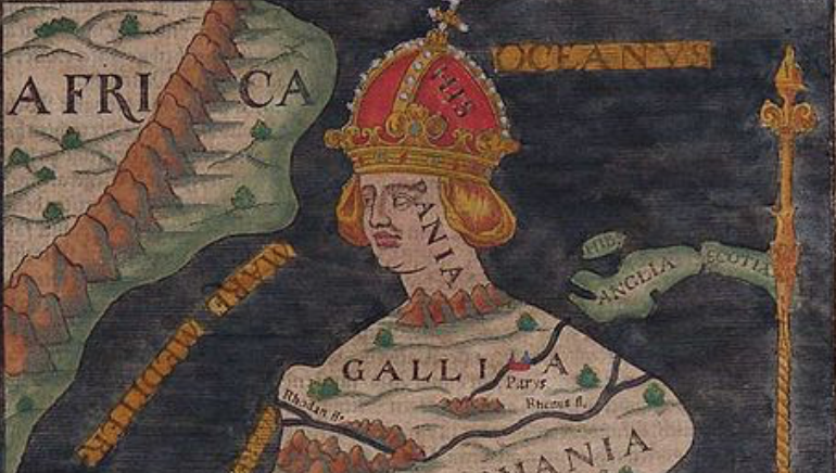
The cartographical personification of Europe as a regal figure is not only figurative: the woman whose golden gown extends across the region, hemmed along the Danube helped personifies the integrity of the new relation of the Habsburg court to Europe. Indeed the situation of her imperial crown in Spain, suggests the investment of the house of Habsburg the head of the Christian world, her right arm holding an orb rooted in Sicily and her left scepter at the same time as European expansion brought the first age of globalism. While comprehending all Europe, and bridging its confessions divides in an image of sovereign unity, the map celebrated the European continent as a community in an oddly retrograde if deeply evocative symbolic form–transposing the region to a single and continuous regal body, flourishing in imperial garb, apart from an increasingly interconnected global world.
The proud personification was not mapped as a continent, but in more qualitative than quantitative ways asserted its regional unity in figural terms. In contrast to the inhabited world mapped according to the recently rediscovered techniques proscribed by the ancient Claudius Ptolemy, the engraving provided an artistic rendering and a chorographic image analogous of Europe as if removed from a spatial continuum of surprisingly long-lasting currency and purchase as a map. Analogously to the legible rendering of national toponyms of European states as a cohesive whole, removed from Turkish dominion and as a Christian world, if not in anthropomorphic form, the continent is symbolically removed from Asia and Africa with an oddly powerful autonomy that has persisted to attract visual interest and engage map-readers. Indeed, if John Eliot has argued that in discovering the Americas, Europe rediscovered itself–and lent greater coherence to its cultural and religious unity as opposed to other worlds, the mapping of a triumphant figure of Europa Regina openly celebrated Europe in a coherent body, apart form two other regions of the old tripartite world–opposed to Africa and Asia–as opposed to the insularity that was characteristics of individual towns with their separate charters, constitutions and rulers or laws.
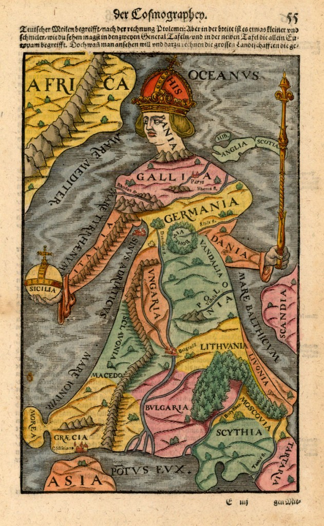
The collective community of Europe, united in the inherited political theology of a body, but now a female body of the Phoenician queen Europa, was an image that gave coherence to what was seen as a separate region of the world, bound, as Martin Waldseemüller had put it, as is “bounded on the western side by the Atlantic Ocean, on the northern side by the British Ocean, on the eastern side by the river Tanais [] ,” but shown as if it composing a good part of the inhabited world. Sebastian Münster chose to map the insularity of Europe in his popular 1540 Cosmographia as one region–at the same time he had mapped “new islands [Novae Insulae]” of North and South Americas on a page, when he mapped Europe as a complementary large island.

from Sebastian Münster, Cosmographia” (1540)
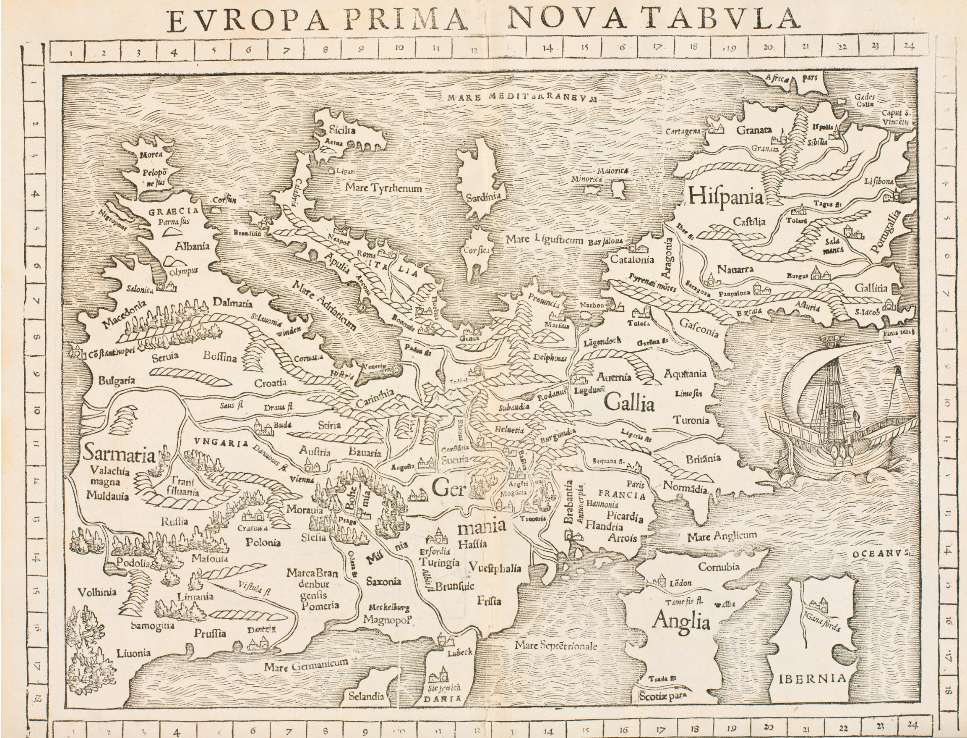
contrasted with the prominent centrality of the place that Europe occupied in the pioneering 1507 map Waldseemüller and the school of St. Die produced in a detailed world map, using a Ptolemaic projection to expand the prominence of Europe and allow it to be densely filled with a rich modern toponymy as a densely legible text.

Museo Galileo, Firenze/Institute and Museum of the History of Science
Waldseemüller, as a good humanist writing for a circle of European humanists, described how the region that “includes Spain, Gaul, Germany, Raetia, Italy, Greece, and Sarmatia . . . is named after Europa, the daughter of King Agenor” who was “believed to have been carried off by Jupiter, who assumed the character of a snow-white bull” before “while riding on his back and he gave her name to land lying opposite that island” in his Cosmographiae introductio (1507). In curiously post-Ptolemaic ways, “Europa Regina” similarly foregrounded the community of Europe, but as the image was transmitted and adapted in the course of the sixteenth century–and most particularly from 1580, if it compellingly obscured national boundaries, it persisted in maintaining the centrality of Europe, in ways that almost polemically distinguished the content of a ‘chorographic’ map of a community–or choros. The ancient goegrapher had described chorographic, rather than geographic, maps as proper to artists, from the crafting of geographical maps whose terrestrial purview designed by geographers. The peculiarity with which the woodcut exploited the encomiastic function of such local images by incorporating multiple city views within a newly unified community. In an age of geographic mapping of the continents, the image however seemed both a gesture to an older, medieval mode of mapping the globe over the body of Christ, as a “corpus Christianorum,” and a deeply figural proclamation of geographical harmony–in ways that dispensed with the criterial to map terrestrial position by exact mathematical criteria of positions.
The harmonious organization of the continent of Europe as an isolated standing figure–almost an island–suggested the triumph of a region of the world during the mapping of terrestrial relations when the above image appeared in the early 1580s, as if a resolution of the religious wars in a figure of European clothes, customs, and models of imperial authority as much as of rulership and sovereignty understood in terms of nations or the mapping of religious difference onto sovereign lines of division. For the image that later widely circulated as Europe as a Woman [Europa prima pars Terrae in form Virgo]” was a powerful symbolic–if post-Ptolemaic–early exercise in imperial metageography. While retaining a symbolic role rooted in emblematic traditions of an image of sovereign integrity, the inventive powers of such a plastic if composed image of “Europa” as a graceful figure gained purchase as an illustration able to resolve questions of cultural identity and integrity in a globalized world. The dynamic integration of textual passages, landscape, and cartographic forms was pioneered in the Ortelian atlas, but the map Europa regina as provides a parallel story of the qualitative and symbolic figural mapping of Europe as a region which maintained its centrality in the inhabited world.
For if Europa regina emerged as a poetic conceit of the newfound coherence of Europe in the light of Turkish incursions–and the assertion of imperial authority–the popularity of the new figuration of Europe and its anthropomorphic embodiment that paralleled the recognition of its increasingly diminished prominence in the newly mapped world. Indeed, if the region of “Europe” was placed front and center in this map of the continent, whose frame privileges the presence of its expanse at the expense of neighboring continents of Africa and Asia in the 1540 edition of Sebastian Münster’s Cosmographia–at a remove from the specter of Turkish domination– “Turcica ditione“–of increased presence after the close of the Ottoman Siege of Vienna. If the fear of “Turcica ditione” was feared on the borderlands of Hungarian nation and the margins of Ottoman rule–even if part of Hungary, although not in the Habsburg point of view, was in fact under Turkish dominion–the specter had evoked the first mapping of Europe’s integrity and coherence. But by investing a European landscape with a geographic integrity, if without anthropomorphic unity, the region was emphasized as having cultural and historical insularity, as a large, oversized island, from the Atlantic and the Don, whose vastness ran from Spain to Constantinople, above Africa, seemed ringed by seas, cut off from Asia.
 Sebastian Münster, Cosmographia (Basel, 1550)
Although the prototype for the rendering of this map of Europe is unclear, the rich riverine landscape distinguished its fertility in geographically informative ways and celebrated it as a chosen place, or locus amoenus for cultivation, as if a new bucolic region, far from war. The place that Europe’s anthropomorphic figuration gained decades after it was first designed, in the image known variously as Europa regina or Europa triumphans represented not only a triumphal image of the region, belying its imperial character, but retained the image of Europe’s relation to Asia and Africa–a heritage of medieval T-in-O mappaemondi–an image of far more celebratory character, whose iconic content and text existed in dynamic relation to a figural form.
The fear or Turkish dominion gave new impetus to the separate figuration of “Europa” in Münster’s work, investing it with a false integrity through the aura of imperial rule. The image may well have derived form the Bucius had dedicated to Ferdinand, “King of the Romans, Hungary, and Bohemia, and Arch-Duke of Austria,” an image of Europa as a woman that Putsch brought to Paris to be printed, but was also credited to the Sicilian historiographer to Charles V, Claudio Maria Arezzo, from Syracuse; they may have jointly presented the map, which seems a condensation of Ptolemaic geography in a new symbolic form, to Charles V in Sicily during the summer of 1535, as it redefined the distribution of places and nations in Europe as united in a distinctively Habsburg perspective–in which Spain, Hungary, and Muscovy are pictured as part of Europe, discretely removed from Ottoman or Tartar presence–with the elegance fitting a royal court. Showing a model of sovereignty that transcended borders, and encompassed continents, the scope and scale of the map exceeded Ptolemaic maps–the so-called “tablae modernae” of contemporary regions were added to amplify editions of the Geography popular in the European book trade. Hungary was rarely dedicated its own table by Ptolemy or Renaissance commentators: it was part of Sarmatia, in Munster’s Ptolemaic geography, located in the fifth map of Europe on Europe’s porous eastern border.
While the region or state of Hungary was absent from such modern maps, and the scale of previous recent maps of parts of the empire, such as the elegant “Tabula Hungariae” attributed to one Georg Tanstetter, based on the maps of Peter Apian, that situated “Hungary” amidst Moldavia, Poland, Austria, Stiria and Slavonia for Ferdinand I, who had ascended to the throne as the King of Hungary, Bohemia and Croatia in 1526, two years before its publication, and sought to make them the center of the Hapsburg monarchy as his bother, Charles V, acted as Holy Roman Emperor: elected by the Parliaments of Hungary and Bohemia to be sovereign, Ferdinand was proclaimed King of Hungary in November, 1527. The map of “Hungary” showing clearly defined boundaries, roads linking towns, and parts of neighboring counties left blank, may have provided a sort of cartographic variation of the established genre of a Mirror of Princes, published to mark an auspicious start to Ferdinand’s arrival in Central Europe, perhaps one designed with elegance despite his limited linguistic proficiency. He was chosen King to provide security to a prosperous kingdom, and to secure its continued autonomy of defined borders.

Yet if the office of the Hungarian monarchy was a key strategy of preventing the advance of the Ottoman Empire into Europe and into Central Europe in particular, Ferdinand–who knew no German as a child–demanded illustrations of the expanded realm he gained, or was elected to lead, by the Bohemian Diet and Hungarian gentry, and Croatian nobility, but just before the Ottomans claimed the eastern part of Hungarian lands the following year, forcing Ferdinand I to flee to Bohemia.
1. The origins of a Habsburg view of history in Europa regina reflected the remapping of European integrity in the court of Charles V, in the years before the Ottoman invasion’s success. The tension between insularity and expanse presented to the recently coronated Holy Roman Emperor by a former member of the retinue of Ferdinand I, who had studied in Italy and traveled widely to the empire’s eastern margins in Hungarian lands–the royal counsel had served as “in Hungaria secretarius.” In presenting the map to Charles V in Sicily–the old Hohenstaufen seat–it makes sense he would choose to distinguished in the map as the seat of an imperial orb, giving it clear local resonance, to proclaim an image of imperial sovereignty . In visually transposing the legend of the Phoenician princess, Europa, whose carrying across the waves by Jove to Crete was to found a new monarchy, recounted by the poet Ovid in the Metamorphoses, the print celebrated and marked the movement of the seat of the Holy Roman Empire Charles V would unite to Spain. Whereas Ovid described Europa as mounting the back of the God transformed to a bull, “innocent of on whom she sat” who carrier her across the seas against full tide to Crete, the figure of Europe is far more poised and composed than one might imagine Europa born across the waves.
The poised figure with her crowed head in Iberian peninsula figured Europa promise the unity of a Christianized continent, as well as a concise geopolitical statement of imperial concern: as well as recognizing the changed political constitution of the Holy Roman Empire in its new geographical form, the courtly conceit of the image first engraved in Paris in 1537, after the imperial 1530 coronation by the Roman pontiff in Italy, and soon after Charles V had united the Habsburg territories with his native Spain, relocating the imperial capital in ways that expanded the initial core of Habsburg lands, even while cradling the imperial orb in Sicily, her body upright. The re-imagining of Europa from a Habsburg point of view is attributed to the court counsellor and humanistically educated poet Johann Putsch, of Innsbruck, who presented the map to Charles V in the Sicilian city of Palermo, which was visited by the Holy Emperor, unlike his predecessors, as he sought to fortify its coasts and defend the Mediterranean against Turkish incursions in the Mediterranean. For the occasion of the imperial visit, Putsch designed a map–now lost in its original, and only surviving as a woodcut–imbued with symbolic status, invested with the poetic conceits as much as cartographic skill, as if celebrating the confirmation that Sicilian residence bestowed on an emperor uniting the Habsburg lands and Kingdom of Naples with the Spanish throne with the Kingdom of Naples: for rather than recall Europa as a victim of rape, her regal figure stood tall, in ways the images reprinted during the 1580s foreground. Yet as well triumphal vision, the map, when paired with Putsch’s poetic anthropomorphic apostrophe, Europa lamentans, addressing Charles V to lamenting the new suffering of Europe before dangers from the Turks and Tartars, and from England as well, for being left unprotected–and exposed to violation–save in the German-speaking regions that constituted an ancestral core of the Habsburg lands of Erbland and Vorbland.
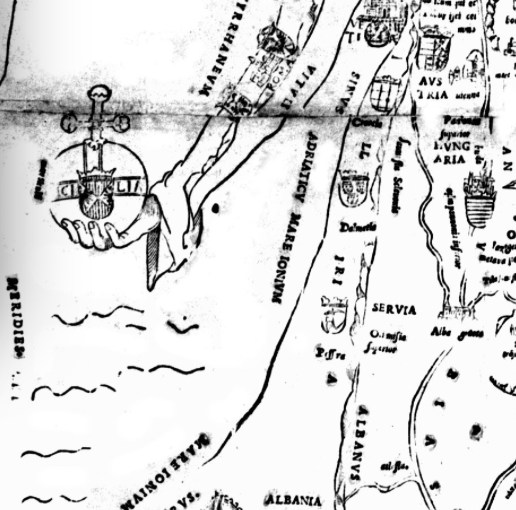
While the map of 1537 advanced the promise of its future unity, assured of holding an orb symbolized by Sicily, the image of a delicate patchwork of crests united by a regal presence: if Crete stands in synecdochal relation to the world, for Ovid, where Europa’s son Minos was its first king and inaugurated a dynasty, at Knossos, the figure of Europa derives imperial orb in Sicily and crown from Spain–and rather than being raped, rules with a composure: if Renaissance poets had described the abducted Europa as pained if “lovely and warm” carried on the back of a bull to Crete, her face paralyzed by fear and terrified, the composure of Europa is strikingly harmonious in the map transmitted from woodblock to copperplate over the century, her crowned looking downward at her terrestrial expanse from Spain, or at the imperial orb situated in Sicily.

Paris, 1537/Basel 1580
Despite its strongly symbolic form, the arrangement of texts, emblems and expanse allow one to read the collective choreography of the empire as recording a shifting geopolitics of the relation of Emperor Charles V to Europe: as the new emperor would effectively unite the Habsburg lands even after the transposition or migration of the seat of empire to his native Spain, the bodily unity of the region created an auspicious cartographical representation of the coronation of the new Holy Roman Emperor. In Putsch’s organization of the map, the site of Ferdinand I’s empire in Prague appears as the pendant of a necklace, if not the heart of Europa, and the river of the the Danube doubles as Europa’s gown’s fold, or an image of the vena cava within the body politic of the Christian empire, and the Iberian peninsula the crowned head of empire symbolized a new image of Imperial integrity. The encomiastic image was informed by Putsch’s classical studies in Italy, as an encomiastic rewriting of pan-European unity that embodied hopes for an integral mainland.
If the later iterations of the engraving from the later sixteenth century continued a similar poetics of unity which persisted in representing hopes for imperial unity during the wars of religion. If the notion of the insularity of Europe echoed the image of Crete where Europa, mother of Minos, would dwell–“my world, my island, grove of the God Jove”–the depiction of a Europe rich with rivers suggested both a sense of insularity in such maps served as ways to process space and spatial unity, as they came to provide an image of a Europa triumphans in the face of wider geographical discoveries that dethroned the centrality of “Europe” from the inhabited ecumene. The image was less of a satyrical map than a somewhat polemic affirmation of the continued integrity and centrality of Europe as a community–and European manner–while a distinctly different qualitative picture of global customs, dress and globalism emerged, and might be seen as a sort of symbolic resistance as such–much as “Europa” cartographically crystallized as a unit as if in response to fears of Ottoman advance.
2. When Europe was first mapped in the Cosmographia of Sebastian Münster from 1550 in an anthropomorphic form, Münster had already imported the poetic metaphor to define Europe apart in editions of 1542, 1544 and 1548, perhaps deriving from Putsch’s map, which lent considerable discursive identity to the coherence of the region of “Europe”: the anthropomorphic image sought to symbolize its sustained unity as a basis for the cartographic self-representation that processed the first mapping of Europe as a region in the early sixteenth century school of St. Die, as a wall map–and, subsequently, as a region securely removed from Turkish dominion. What Waldseemüller had described as “bounded on the western side by the Atlantic ocean, on the northern side by the British ocean, and on the eastern side by the river Tanais” was shown as cartographic unity defined by oceanic landmarks, as it was re-interpreted in graphic form at a remove from scientific or mathematical cartography.
 Cosmographia (1542)
 Cosmographia (1542)
Cosmographia (1542)
 Cosmographia (Basel, 1552)
The addition of an elegant map of anthropomorphic design effectively embodied the conceit of an expansive peninsula unified by the Habsburg dynasty, whose performance of European identity only expanded as its inventive form of some degree of expressive plasticity that complemented the accommodation of cultural otherness in increasing regions of the inhabited world. The original map, which Peter Meurer has convincingly idenfied as presented to Charles V during his visit of state to Sicily in the fall of 1535, where the depiction of the continent holding the imperial orb located in Sicily, where Putsch travelled in the imperial retinue of Ferdinand I, based in Bohemia in Prague, effectively linking the Hohensatufen seat of power to the vision of the body politic of empire that reflected his own migration in the imperial court from Prague to Hungary to Spain, creating a cartographic poetics of imperial power later printed in a format of two sheets as a decorative map and statement of power that was able to be hung on a wall. While the map presented to Charles V in Palermo does not survive in its original form, the questions of the relations between cartographic invention, embodiment, and engraving and how maps process space.
In what was to become an exquisitely inventive image in the burins of other engravers and cartographers who embodied Europe to lend greater coherence to its amalgams of toponyms, the ancient legend of Europa was re-embodied and modernized in new ways to describe the European continent whose head located in Spain, glancing down toward the regions of Greece and the Peloponnese that now lie at the hem of her skirt and across the Mediterranean to Africa, in ways that seemed to register the shifting needs to imagine the place of Europe in a remapped world. The processing of a broad geographical expanse within a single legible emblematic form gained a distinctly elegant afterlife in generations after its 1537 Paris edition as a colored print of a less openly political, and broader cultural relevance that paralleled the expansion of images of increasing cartographical exactitude but whose choreographic form seems to have become less removed from a courtly discourse on emblematics as it was prepared for a market of cartographical prints, in which Europe’s body was as it were fleshed out in a new symbolic figurative form.
If the relations between the Bucius map to the constitution of the European Union were noted in the blogosphere and on Reddit–mostly in relation to the remove of Britain in our own post-Brexit world–the fraught tensions over the relation of modern Turkey to Europe persist, as if informed by longstanding symbolic separation of Turkey and the imagined autonomy of a European World–Turkey after all remains a candidate, as Hungary and Bulgaria potential candidates–as fears of violation by Turkish presence remains a powerful symbolic among groups that seek to animate much xenophobic resistance to Turkey’s presence in the European Union today.

3. A fault line with Turkish role was indeed far more prominent in the mental geography of map-readers than the divide between Old and New worlds. The transformation of Europe to a new form of the imperial house offered a compellingly popular as an emblem that promoted the peace of the Habsburg dynasty, after the 1530 coronation of Charles V as Holy Roman Empire: the reconstitution of the House of Habsburg of a new sovereign body was praised and promoted through the collection of towns and town views that distinguished what was once referred to as “the continent,” in ways that recall the poetic conceit of the map as a reinvention of space–and a symbolic model to frame and enshrine the distribution of power across space–as much as a transcription of spatial relations. Re-engraved with qualitative alterations in 1564, 1581, 1582, and 1586, whose clever anthropomorphism appealed as an icon of political integrity. As it was reprinted in ways that parallel and seem to accommodate the growing literacy in quantitative cartographical tools, the emblem of a unified Europe that engravers continued to qualitatively embellish an image that transposed a poetic conceit fist framed in the years after the rebuff of Ottoman siege of Vienna and the separation of Henry VIII from the house of Aragon.
For the Tryolean humanist and court poet Putsch, who had travelled to the ends of the same Europe in Ferdinand I’s court as royal counselor, effectively rehabilitated the form of Europa to embody the political unity and coherence of Habsburg lands by a female form, as historian of cartography Peter Meurer has so convincingly argued, by symbolizing the integrity of Habsburg Europe’s new boundaries, but created a newly legible map as a body that granted them newfound poetic legitimacy by its anthropomorphic form. As much as an abstract conceit, the original 1537 map reflects a search for a poetics of coherence and integrity that took advantage of a map in service to powerful poetic claims. The plastic form of the map gained a new integrity in prints, rooted in courtly poetry, but expanding the expressive value of the the political and jurisdictional landscape of the new body of Europa, which appears primarily as a cartographical invention, studded with the emblems of houses of rule. The highly legible surface of the 1537 map, presented a puzzle of or rebus of the ordering of local sovereignty, in which the letters “E,” “U,” “R” knit together symbolic unity across divided terrestrial sovereign expanse, and almost no attention is given to detailing the surrounding waters: as if Europa is content as a separate continent.

Tiroler Landesmuseum Ferdinandeum, Innsbruck (detail of upper half of map)
To be sure, the map celebrated newfound imperial coherence of lands set off from the invading Turk and with its principal court and capital removed to Spain, site of the female figure’s crowned head from which she seems to admire her own newly emerged body, as an imagined conceit reborn in the courtly circle of Ferdinand I from the island of Crete–home of Europa–to the extent of a body riddled by political divisions. Johann Putsch cast the somewhat melancholy image as a counterpart to the Europa lamentans that the new Europa ventriloquized an only half hopeful address to both the newly coronated Holy Roman Emperor Charles V and Ferdinand, his brother, King of the Romans. Europa rhetorically asked readers, “What is going to be my destiny, which fate will put an end to the immense distress, the cruel vicissitudes and forces of providence? Which divine ordinance will finally restore a first glimmer of hope for our fallen planet?” From a narrative of feared violation, the performance of Europe’s female body suggested new narratives of composure, containment, and triumph over the course of the century, as it seemed to unify confessional divides and defined Europe’s own integrity through her posture and decorum that belies these strains of lamentation in particularly assertive ways.
The image of Europa as triumphant increasingly distanced itself from the Petrarchan topoi of bodily violation–Europa’s rape–or the absence of protections foregrounded in how a personification of Europa addressed herself to the recently coronated Holy Roman Emperor. The image came to connote a clear divide of cultural autonomy and regal stability, separated from the sense of distress that Putsch accentuated. The narrative of past loss of integrity in a riven body politic of which Europa complained gained cartographical resolution in the somewhat crude map of the continent, the later transmission of the image strove for a sense of integrity in the new House of Habsburg. For the poet Putsch invested Europa with a long colorful address, as if in an appeal for help, as much as encomiastic form. For even as “the fertility of my soil is a handicap which attracts enemies from abroad” and even as “my head sways, oppressed by the cruel English, and the right arm which has suffered exceedingly under the Roman tyrants drops down towards earth, while the veins lose their vigor,” Europa voices hopes for a new future, and a restoration of integrity, while bemoaning the “many attacks and wars I have suffered” and “many bloody fights I did see” from the massacres of the Goths, the devastations of Gauls, and “violent rages of furious Attila,” and Ottonians before the more recent invasions of the Turks, as the Tyrolean court poet seemed particularly practiced in appropriating familiar neo-Petrarchan topoi of bodily violation from Italia mia–“che le plague mortali/che nel bel corps tuo si spesse veggio . . . . che fan qui tante pellegrine spade? perche’l verde terreno/del barbarico sangue si depinga?”–as poetic license for cartographically rendering the fears of the violence of Ottoman violation. The Petrarchan strains seem implicit, but earlier fears of lost green fields recolored red by barbarian blood, by a “diluvio raccolto/ . . . per inondar i nostri dolci campi” was replaced by the vitality of the body of Europe, resistant to any of the “foreign swords” Petrarch saw as a curse to the country beloved by heaven.
As if in a counterpart to the lamentation off in Putsch’s poem that hopes for less distracted rulers, even as “we are threatened by more actions on the battlefield, to be fought with the sword” and many within Europe seem poised to “break the peace,” the map seems to offer a potential resolution of formal integrity for the region’s inhabitants. Even if Europa lamentans voices ears for launching new wars and a ‘ “rush headlong into a new war,” heralding signs of stability from the Habsburg House, it praises the presence of “faithful and mighty Germany alone, in the centre of my body, has energetically armed herself,” even though the seat of monarchy has moved to Spain, as the “strongest protector of [my] absolute chastity,” to face threats “by the treacherous Turk, the Arab or even the Tatar.” The presentation of a Europe who is most protected in Germany, but not bloodied at all by incursions, is suggested to be nourished by its prominent riverine courses, many analogous–as the Danube, subject of a lost poem that Putsch had earlier penned–to the veins of the body, the Danube in striking correspondence to the vena cava and aorta already current in anatomical images of the human body’s hidden internal structures, much as Prague, seat of the court of Ferdinand I, King of the Romans, stands at Europa’s heart.
The hope for inaugurating a new “Golden Age” under the Empire overseen by Charles V provided Putsch with hopes to “curb the infatuation with war and the threat of the arms,” and would have not only symbolized the extent of the Holy Roman Empire, but heralded hopes to “give frightened humanity a lasting peace, and quietude to the inhabitants.” This stands in contrast to the cartographical remove that the anthropomorphic map later gained as a playful conceit of the integrity of European identity, whose organization suggests the fear of the disruption of the vital lifeline of the Danube or the danger of violation from beneath a composed Europa’s skirts from the East. The geographical expanse of Europe was an implicit theme of the map that gained new afterlife as a summary of cities and cartographical catalogue. Putsch had not only travelled to the edges of the same Europe in the retinue of Ferdinand I, where he served as royal councilor in the Hungarian campaign of the Habsburg ruler, but wrote a poetic epic about the Danube, now lost, and the complementary geographic poems that so elegantly embodied Europe, which the map translated to compellingly embodied cartographical form.
5. Perhaps the way that the mathematical geographer Ptolemy distinguished local or chorographic maps that showed the organization of place or site as the charge of a painter provided a brief for painters recognized by humanistically educated audiences. The colored woodcut of Europe as a woman foregrounded the region’s formal integrity even in the midst of confessional divides. The bridging of topographic divides as rivers, mountain ranges, or coasts in one bodily costume, set against a stippled sea not only naturalize a precursor of the post-Brexit European Union; the image of a regal woman, a “virgo” with her magnificently coronated head lying in Spain was an encomiastic form, as much orientational tool, comprehending the diversity and unity of Europe in the middle of the sixteenth century: the figure of Europa embodied the hierarchy of major urban cities–situating imperial cities of Prague, Magdeburg, Vienna, Buda, Constantinople, Naples in one form. At a time of a profusion of maps, when the continent had been fully mapped at multiple scales and modes, a new symbolic representation and iconography of its sacro-political unity among a geographically disparate community of towns.
Indeed, rather than depict terrestrial continuity, it proclaimed territorial integrity within the relation of ruler to the region the ruler embodied in particularly elegant terms, bridging the Pyrenees that served as the basis for her ruff, and with her heart still beating in Bohemia. The staid comportment of the crowned queen embodied clear control over local civil constitutions by the 1580s, when it was more widely reprinted, as if in a condensation of the civilizing process that seemed to conclude the religious wars.

The image gained a large audience among the regional maps of cities in Sebastian Münster’s Cosmographia from the 1550s, and is not known to have circulated earlier, as did most of the maps within the volume. More an image of delight than precision, the image was less an “upward displacement” of one’s point of view than a symbolization of the integrity of an imagined landscape.
Situated between “AFRICA” and “ASIA,” the image constituted something of a rehabilitation of the tripartite T-in-O maps centered at Jerusalem, but magnified Europe as a formed body at its center–a relation heightened by describing Europa as the “foremost region of the earth [prima pars Terrae],” gesturing to the inhabited earth’s division in medieval mappaemundi.
In an age of an abundance of world maps, indeed, the feminized figure affirmed the continuity and symbolic integrity of Europe, endowed with its own symbolic continuity and crowned with regality separate from the papacy lending prominence to the imperial cities of central Europe in its body, in ways that might be seen as an iconic polemic against a geographical map of global purview, and a new map of European empire and Christian community of a distinctly imperial pedigree. Even as it gestured to and rehabilitated the juridical concept of the two bodies of the king’s two bodies, the imperial body of Europe crowned by Spain constituted a powerful if miniaturized political polemic about European identity in emblematic form, wresting claims for political universality from Rome’s pontiff.

The crown positioned in Spain studded with jewels presented an implicit rebuke to the papal tiara, as the coverage of the European landscape reminded viewers that the pontiff had invested imperial authority with a new sacred role, as much as an emblem of worldly leadership, which Philip II had hoped to claim as the premier leader able to unify the continent in an age of religious dissensus that the Roman pope no longer afforded and could no longer provide. The assertion of the preeminence of the regal figure sought a new level of unity in the figure of the emperor–condensing a conceit of imperial succession and derived from the search for a new emblematics of rulership if not of imperial agency in the imperial court of Ferdinand I: the tiara-like crown of “Europa in forma virginis [Europe in the Form of a Maiden]” increasingly effectively coopted the tradition of papal emblematics as it won currency in the mid- to late sixteenth century, moreover, as the figure of the Queen Europa assumed an imperial crown that substituted for a papal tiara.
The tiara-wearing figure of Europe, elegantly poised and standing tall, coopted the image of Christian integrity that the Roman pontiff had in recent years increasingly assumed as a reflection of worldly authority and magnificence.
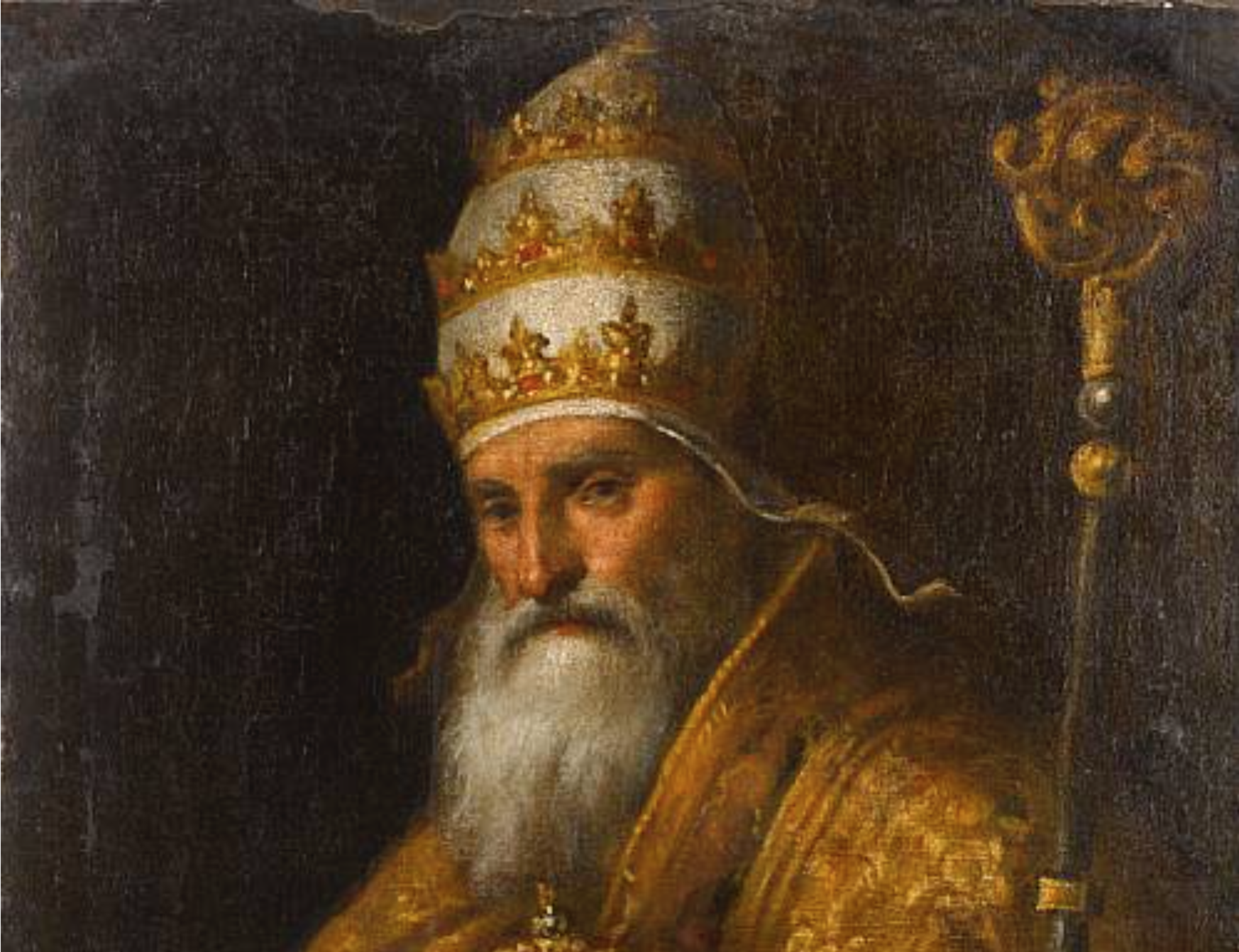 Palma il Giovane, Pius V wearing full regalia and papal tiara


Paul III (reigned 1519-49)
The encomiastic chorography mapped “Europa” as a unity, even in a time of religious dissensus. The map might be seen as tantamount to an investment in unity, as the Habsburg court sought to place itself as the head of Catholic Europe, even as the Wars of Religion continued in France. Mapping provided a new mode of displaying and celebrating unity of wha might be considered a region, united by a scare-imperial authority as a space. By placing the regal head of spaces the seat of the Habsburg throne so prominently, the map ordered the body of landscape of Europe in decisive ways that were not only an amusement or a satyrical map, unless satire is understood as adopting a set of formal conventions in new way and to new ends: the powerful symbolic image of terrestrial and imperial unity in a time of changing and expanding geographical horizons, and an identification of the two-court Habsburg lineage as drawing together Europe’s variety in a single body–a body celebrated as a Virgin Queen, whose heart seem to lie in Germany and Bohemia, but the variety of whose contents extended to encompass the European cities that Sebastian Münster had fairly included c. 1550 in the compilation of maps of his best-selling German-language Cosmographia, reflecting its predominant concentration on chorographic images of German-language cities, if taking Italy and Denmark as two arms, respectively holding imperial orb and scepter, as if to affirm its integrity.
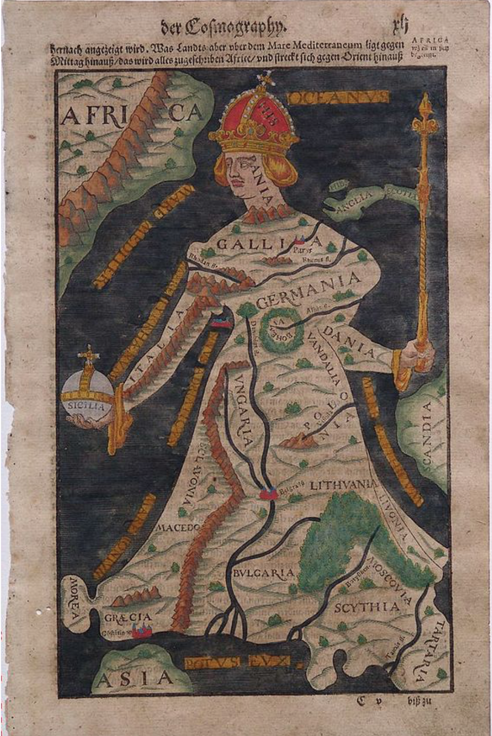 “Europe” personified as a woman from Münster (1550)
6. The hand-colored image echoes how the ancient geographer had described the mapping of communities as the work fitting for an artist, not a geographer. Removed from scale, coordinates, or even the pretense of cartographical precision and accuracy, the gendered map was a grander form of the genre of chorography–described in early modern treatises of geography as a qualitative rather than quantitative the map of a place or community. The collective choreography earned national boundaries, but invested a powerful figural coherence to a landscape map that echoed choreographic as much as geographic conventions of landscape.
The image of Europe could double as a chorogaphical rendering by the 1580s, when the image more broadly circulated than after its initial 1537 creation, redesigned as a powerful image of symbolic as much as spatial unity in 1581 by the theological commentator Heinrich Bünting in his Itinerarium Sacrae Scriptura, and again in the imperial city of Magdeburg in 1585, shown below. The image of Europe as an embodied image now identified as female was autonomous if legless, curiously separated from northern lands of Norway, England, Scotland, Denmark or Sweden–which floated almost globularly above, clothed by the landscape and cities of the mainland was a solidly embodied regal form, crown supported by the houses of Aragon and Navarre, facing down Africa–no longer a clear continent–and removed from Asia.

The cartographical embodiment of the body politic dispensed with the conventions of geographical mapping, as an embodiment it became a powerful symbolic image of the coherence of the empire, “head” in Spain, seat of the Habsburg empire, where Philip II had transferred the seat of empire to the Escorial palace, and, since 1581 ruled Portugal as well, and confirmed the transferral of power to the Iberian peninsula. The snapshot of political power revealed the monarch had by 1583 “completed” rule over the continent–its “chest” now in France, early seat of empire and of the imperial regalia, its “body” composed of Germans from whom the Habsburg house hailed and derived, as whose right arm was made of Italy, holding the Imperial orb in Sicily where the empire once lay, but ruled from Spain: such was the snapshot of European rule, if one that elided or turned a blind eye to the Dutch revolt.
The map affirmed the newfound political unity of the continent, in ways that transcended his person or the Habsburg house, but provided a powerful trope of cartographical embodiment of the body politic or of a body politic dotted with cities, and of which the Danube runs down to her dress’s hem.
 British Library (detail of 1585 Magdeburg impression)
What sort of unity did viewers see in the imagend the engraver Johannes Putsch, or, as he latinized his name for humanist readers, Johannes Bucius, present to readers? While not a ‘satyrical’ map of humorous design, it was clearly metageographical in a new sense in Europe, and built on the increased literacy in cartographic symbolic forms as a model for illustrating and demonstrating the power of unifying political rule. Bucius’ map was itself re-engraved and reproduced in Sebastian Munster’s wildly popular Cosmographia from its 1570 edition, as the first personification of the continent in its new imperial guise to be widely disseminated in Europe, and a regeneration of the social body. The history of the reception of its cartographic form offered a popular image of European identity, more broadly than the Hapsburg court.
The embodying of Europe was a powerful metaphor to link to a crowned figure for the Spanish Habsburgs, by the time it reappeared in the 1585 Magdeburg engraving, converting the edges of the Iberian peninsula to a regal tiara or crown, as if to symbolically map the imperial network of an empire whose symbolical center had migrated, if the place of Bohemia as a pendant, and Vienna as a principal city, long remained, and Sicily became an orb, and Rome perhaps an extravagant adornment on her wrist. Indeed, the adornment of the queen-continent seemed an occasion to map Europe’s extreme abundance, and distinguish it as such less in an exact than in an elegant symbolic form.
7. The repetition of an identical motif of mapping from the first third of the sixteenth century, when it was first engraved as a woodcut, to a more iconic representation of imperial identity constituted an early modern imperial icon of European unity: “Yurp,” much as Peter Sellars put it in the first days of the EU, emerged as a regal figure, imperial orb in Sicily, head in Spain (Hispania) and Hispanic in character, but heart in Bohemia–and (no doubt to the chagrin of the English), the islands reduced to a flying banner of the scepter that she holds, lending it regal attributes in its dress and crown. The performance of such an allegorical personification is both a protection against otherness, and an image of the imperial identity of the continent’s identity. The map suggests not only a medieval tradition of figurative geography or symbolic mapping, but a deeply allegorical reading of how Ptolemaic cartography used the correspondence of place in a uniformly continuous distribution to fashion a “community” in chorographic maps. Indeed, despite the proliferation of various ‘chorographical’ maps of regions, often nation-states such as France, England, Switzerland, or the Netherlands by the early 16th century, the image of Europe’s imperial identity foregrounded the specific role of each place within that unity–from Iberia at its head to Bohemia at its heart to Italy as the arm holding an imperial orb. It served as something of a hierarchical relationship of the individual European regions, and something like a memory-emblem to record the relationship within the Holy Roman Empire of varied European states.
As such, it was often re-written–or re-mapped–as a symbol of authority, the primacy alternating between European cities and counties that were centers of imperial residence. The image is often described as “map-like,” but provides a map, if one less concerned with spatial orientation of its observer or individual reader than the coherence and unity of one specific region in an expanding ecumene. Johannes Putsch (or Bucius) designed the original map that he entitled “Europa in forma virginis” (in the form of a maiden) have often been argued to represent an embodied leader, such as Charles V’s wife Isabella, whose progeny would unite the region that the Hapsburgs tried to effect the notion of unity with considerable popularity, but dedicated to the brother of Charles V, Ferdinand I, as a sort of allegorical land map of strikingly more schematic nature when compared to later, more life-like images. This 1537 woodcut of two plates created an early prototype for the mapping of imperial identity, printed in Paris, and includes the elements of crown, scepter and imperial orb, all of which are presented with more detail than the quite schematic linear map, suggesting only a notional image of England or the African continent and coast–if in a far more schematic form of less clear embodiment–even if it may have existed in colored copies.
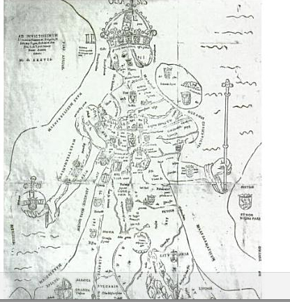
The point was less to map terrestrial borders, continuity, or shorelines with any accuracy than to provide a figuration of European unity that addressed audiences skilled in map-reading, or with reading the distribution of a land-map. The popularity of its figuration of Europe lead to re-engravings and reproductions, often colored in the form of many manuscript maps–leading to their elaborations within later reproductions, as in this image at the Comenius crypt in Garden, that attests to its particular staying power as a representation of Bohemian identity, as much as European unity.

Wikimedia
Europe is shown in the map as a continent, opposed to Asia and Africa, as a new rendering of the T-in-O map, now centered not in Jerusalem, however, but based in the forest around Bohemia, stretching from Spain to Hungary, with Greece, Bulgaria, Scythia and Tartar lands at her skirt. This image is not only far more ‘fleshed out,’ but reveals a clearer image of a landscape map, suggesting that its engraver emulated the Ortelian integration of landscape engraving and cartographical iconography with text: prominent textual markers indeed distinguish the continent’s (or queen’s) bodily zones, even as the rectitude of the female figuration of the continent is reflected in her grave aspect and imperial regalia.
The essential dynamic of unity within and overcoming sovereign divisions is underscored in this map, which if previously an independent flysheet was re-used within the context of a popular printed book, together with multiple maps of varied provenance that were mostly characterized by their striking pictorial design. Although broken into colored sectors of national zones, this anthropomorphization of space enobled the image of Europe, staring at Cadiz and the African coast, in ways that eerily prefigure a Europe gazing over an imaginary mountain range.
Striking strings of conical mountains are a wonderful visual metaphor in the map that appear transformed to decorative forms, as the colors national divides seem a decorative quilt: the Pyrenees appear as a regal necklace, rather than a dividing line, decorating the worldly majesty. After a 1587 reprinting of the image, by Matthias Quad, a cartographer of Köln who would later publish an atlas of Europe, and printed by Jan Bussemaker, now titled simply “Europae descriptio,” leading to the inclusion of another variation of the map in Münster’s best-selling Cosmographia, among a collection of maps of Europe, Africa, Asia and the New World.
The maping of European unity is often linked, as by Wiebke Franken, to the somewhat more mystical anthropomorphic mapping in 1337 of the relations of the continents of Africa and Europe by the medieval monk Opicino de’ Canistris, whose exposure to nautical charts in the north Italian city of Pavia led him to lend it a distinctly figurative form. The image Opicino created of Europe caught in a moment of intimacy with the continent of Africa–represented by the figure of a monk, perhaps a self-portrait?–who gazed with supreme confidence at the figure of Europe. The map seems to have been drafted while the monk was at the papal palace in Avignon, where he designed the medieval cartographic hack as a hopeful image of future congress or harmony, depicting the African continent as a humble, stoic spectator of an alluring Europe possessing ornately flowing hair.

Opicino’s remapping of Europe offered a mapping of Christian unity, a pictorial representation of two continental figures barely removed from one another–perhaps echoing the church’s remove from Rome. Although some copies of the map made it a sort of medieval mandala, rich with symbolic interpretation, then genders, dress, and appearance of continents varied, but were shown in a form of partnership that suggested a global balance, distinct from the symbolic early world maps of the Middle Ages centered on Jerusalem, represented as subject to a macrocosmic interpretation.
The restoration of a united body of the feminized monarch that became invested with royal attributes as Europa Regina was a powerful statement of political unity and customs, and invested with full regalia. The map of a supremely regal Habsburg Europe occupying center-stage and surrounded by oceanic waters focussed attention on the instruments of imperial power–the orb; the crown; the scepter, in an alternative trinity–by mapping the ascendancy of imperial power even in an age of confessional divides. By 1590, the supremacy of Europe, of which England, Scotland, and Ireland now stood as a banner fluttering in the imagined breeze as it flew from Europe’s scepter, seemed invested with bravery, comprehending now all of the page, staring down Africa, comprehending Muscovy and Tartar lands, and with Asia reduced to something of a stub.