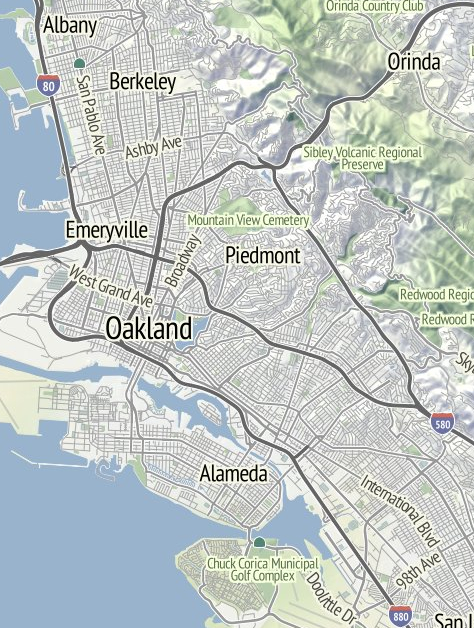
The range of ‘open’ online data that is available for a city such as San Francisco showcases the city’s clear definition of a public space. Although there are plenty of spaces of local meaning and importance in Oakland, from the site of Occupy near the mayor’s office to nearby Chinatown and Lake Merritt, or from Fruitvale Station to west Oakland urban farms and on to Alameda, the fragmented nature of public space is difficult to map coherently.
When it comes to public space, the East Bay and Oakland–despite a rich variety of parks, an estuary, and increasing vitality of Jack London Square–is a polycentric sprawl, its former downtown interrupted by freeways, and open boulevards dotted with closed commercial centers, beauty supply zones, or dense interchanges. This is in part due to how little the diverse areas and neighborhoods of the city know themselves. How to map the inhabitants of Oakland, CA, given the considerable diversity across neighborhoods? Does it exist as a unified social space, or what image of the city emerges? By looking at some of the census maps of the city, and mining the range of information compiled in them by displaying their data in mapped form, we can process and digest the complexly variegated nature to view its population’s profile. (Indeed, the problems of politically representing the complex composition of a somewhat divided city were revealed in the most recent mayoral election of 2014.)
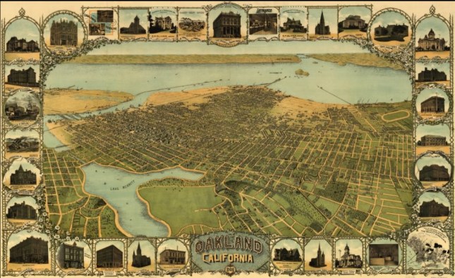
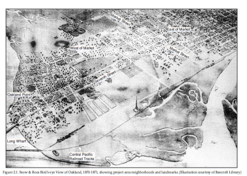
The sprawling city challenges the abilities of the social cartographer as much as the post-modern space of Los Angeles, even in this real-estate view. Maps of any scale organize social space by relevance, preparing a selective record of its inhabitation and revealing networks for ready consultation. Maps of any scale create a simulacrum or construct of social reality, as much as simply orient their readers: the city’s salient features highlighted and network of organization explained, omitting other spaces and residents. We might start by acknowledging how the below bird’s-eye view of Oakland from c. 1900, of unknown origin, celebrating the city’s settlement and early Bay Area Real Estate: the engraving showcases an open urban grid as an area becoming future realtors to its shores: if mostly green and largely uninhabited, presents a prospective view of the city-port as a commercial center, showcasing notable houses of prosperous residents that distinguished Oakland’s built environment, and beckoning viewers to its estuary and the man-made shores of its new Lake as if to shift our attention from the city of San Francisco.
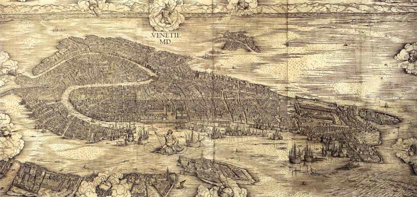
Elevated or “bird’s eye” views praising urban identity and architecture such as this anonymous print had a long tradition. Such imagined constructions that gained currency as encomiastic forms, often complemented by poetic paens to their social harmony. If the artist who engraved and designed the elevated map is not known, the presentation of the city’s growing physical plant and street structure echoed the architectural elegance of earlier urban views, as the visual encomia to the elegance of architectonic form of Venice in the virtuosic perspective designed by Jacopo de’ Barbari circa 1500 of his own creation. De’ Barbari exploited skills of perspective to craft a graphic and pictorial encomia to his native city’s architecture and burgeoning wealth to trumpet its social distinction; an earlier elevated view of Florence, sold by the cartographer and engraver Francesco Rosselli similarly celebrated and displayed the architecture of his native city. De Barbari famously employed to evoke the harmonious order of his city, also lying in close proximity to surrounding wetlands, by displaying its distinctive harmony–vaunting its delicate socio-political balance figuratively by deploying his mastery of creating a previously unimaginable perspective to considerable effect, showing the density of its architecture in the watery surroundings.
Even if much of present Oakland seems a bit of a blank slate, whose territory expands from its port and the man-made lake built to beautify its urban estuary, the print of c. 1900 divides plots and settled acreage, as the surrounding images of buildings that testify. This is not only a pictorial space, but an attempt–as the Rosselli and de’ Barbari maps–to show the social space as harmoniously mapped to a pictorial space of representation, and distinguish the city as a microcosm of the world. Both maps offer sophisticated visual glosses on the ancient notion of a “chorography” or qualitative view of a community, elegantly overlaying and equating their imaginary perspectival space with he social spaces of each city.
Can we create a modern chorography of Oakland that both displays and comprehends its dynamic heterogeneity, or would the city split into social divides? Google Maps clearly fails to do so, but what would a comparable mapping of Oakland’s populations look like, perhaps mapped from the ground up–in the manner that Jacopo labored to achieve?
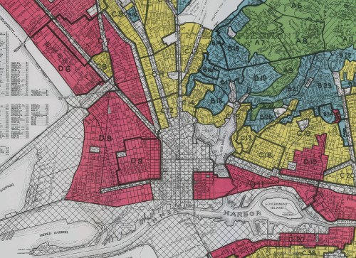
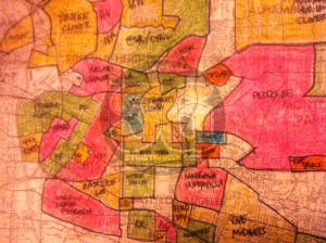
There was clear redlining of much of the East Bay’s residential areas in real estate maps for the East Bay cities dating from the Depression, in which Home Owners Loan Corporation rated neighborhoods for the refinancing of mortgages that amounts to a reflection of the value of property in the East Bay, and reveal an odd mosaic of the city that privileged some regions, but also include a clear redlining of those regions by the Bay and the main arteries of transportation that continue to define Oakland’s port. The red-lining of the city’s residential areas in the New Deal structured the city’s social geography in imaginary construction ofways that reflect the continued exclusion of African Americans and blacks from the market of legitimate home mortgage in much of America through the 1960s, described so compellingly by Ta- Nehisi Coates, and in Oakland not only reflect the deep divides in residential ownership but created social disparities but record scars that make the city’s future harmony particularly difficult to re-imagine. The zones of imbalanced opportunities for home ownership that long existed in the city created perpetuated deep social divides among its residents, often left without the chances of refinancing that were available to many other residents from the 1930s in the United States, as its port and low-lying areas became victims to a classic image of “blight” with roots in its deep abandonment by the public good in ways not yet overcome.
From the first settling after the San Francisco earthquake of the Oakland hills, the demographic divides Oakland’s settlement seem to have been reflected in the value of residential ownership in its neighborhoods in ways revealed in the fractures lines of the map of the Home Owners’ Loan Corporation, and which have continued to divide its neighborhoods even after a period of urban growth. The absence of clear neighborhoods or community organizations around the major traffic arteries that Oakland has long been defined by at its port and older shipping canals created something like a social divide not only in this early HOLC map, but that has been perpetuated within the socioeconomic divisions that were so starkly reflected in the “red-lining” of urban real estate.
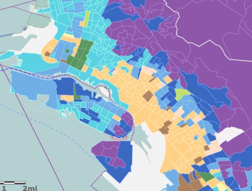
Even if Oakland has been billed a “livable city,” the “split personality” is revealed in the divides starkly illuminated by a map of social lifestyles generated by an ESRI tapestry charting dominant lifestyles–purple noting High Society; blue “upscale avenues;” teal “Metropolis;” light bright blue “metro trendsetters;” green “seniors;” and tan and brown “inner city,” “highrise,” or “up and coming.”
The map shows the city’s split personality:
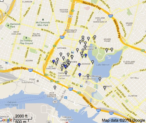
In a year that boasted crowd-sourced mapping of the San Francisco Bay, organizing the demographic divides that continue to shape Oakland deserves our sustained attention–and the varieties of viewing the divisions and distributions in the settlement of Oakland’s space. Unlike San Francisco, dominated by some 359 skyscrapers in its downtown and other regions, Oakland is far more geographically disperse and diffuse, with only a small number of buildings over fifty meters all clustered by Lake Merritt–including those noted in blue, under consideration or construction.
The recent ambitious and brave investment intended to equalize these clear socioeconomic divisions and to prevent them from being perpetuated by public services from schooling to economic opportunity is a step in the right direction and, based on a back-of-the-envelop calculation, seems to have its priorities and direction of resources fairly straight in how it has decided to invest in Oakland’s neighborhoods’ futures.
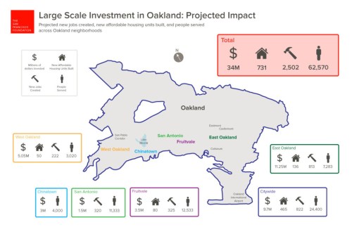 Distribution of San Francisco Foundation’s Investment in Oakland
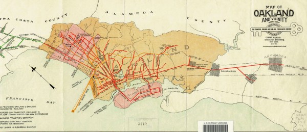
But how to frame and orient the viewer of a map of the city’s demographic divisions is fraught, given the difficulty of uniting Oakland as a whole, or even in abstracting an analogously unified image that connects its disparate inhabitants. The network that bounds the city was advanced rather optimistically in a map that elegantly promoted the lost or abandoned system of Key Cars whose web linked downtown Oakland to the Temescal and Alameda–the infrastructure for the local economy that it did up until its complete dismantling by 1959.
The serviced networks that any map foregrounds, even one of transit routes, engage their readers by networks of inter-relationships. The above map affirms a network of transportation for their rider, suggesting the ways that the infrastructure by which the Key-Car systems united downtown Oakland and the vicinity–much in the manner current BART maps promise to link everywhere in the East Bay in a radius to Point Richmond, Brentwood, and San Jose. The current BART network may link the Bay Area, indeed, as Oakland seems to be forsaken as being the economic it was by transit authorities and Bay Area residents.
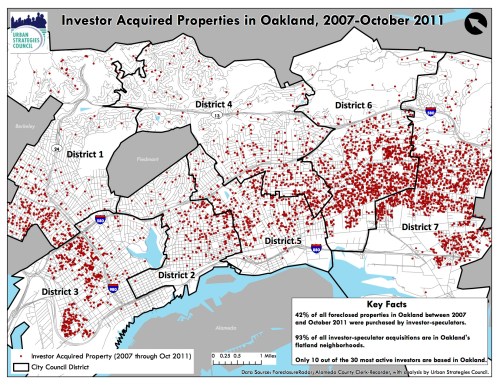
But Oakland is also a city whose social space was long both divided and eviscerated, as the network of streetcar transit was dismantled, the railroad stations that centered the town from the 1880s declined or closed, preparing for the razing of the West Oakland residences of many porters for the MacArthur maze, long before the collapse of the I-880 Cypress Freeway in the 1989 Loma Prieta earthquake–and the subsequent massive shifts in home-ownership as a large number of houses went underwater after 2007 led to a wave of foreclosures that was almost distributed across the city, and which redefined its social space once again.
The divides and diversity in Oakland make the mapping of the city of particular interest as tools to understand its social reality. In a society where we are regularly mapped and surrounded by maps, the critical of reading maps is recognized as an important tool to negotiate and mediate lived social space. What sorts of divides and continuities emerge in a city like Oakland, historically defined by considerable racial diversity and income disparity? How to map so many variations in one place?
When Denis Wood and John Fels described the map as an ideological construction of space or territory, they took time to examine the surrounding ‘paratext’ to maps as keys or markers that revealed the ideological construction of the space within the “nature” of the map, created by interpretive legends and iconography, as well as the semiotic conventions of the map itself: yet interactive urban maps provide much more of a creative cartographical conventions and treat the map as something like an open text.
In their critical examination of the authority inherent in the medium of the map, The Nature of Maps, Wood and Fels argue that the relation between a map and territory exists through how cartography–as much as cartographers–“constructs the natural world” in relation to other sign systems, construing the relation of a ‘map’ to ‘territory’ by how maps inescapably make their subject ideological. Taking as their case in point maps of nature, they argue the order of maps demand assent from readers through what they call the ‘postings’ and the relays that the map creates to the world it ostensibly depicts, and the new understandings of space it creates. Wood and Fels argue “relays” in maps, tied to the texts inherent in them or positioning in books or paratexts, which uniquely promote the construction of meaning, effectively organizing complex mental spaces to understand nature in maps, whose structure demands assent to create truth-claims about nature, and transform the space of the natural world into a structure by which nature is spatialized as known. The Barbari and Rosselli views assert an ideology of the local, spatializing the city as it is best viewed and encomiastically celebrated as a microcosm, even though the “paratexts” by which one reads a map are left tacit for their viewers.
Yet the map does not begin from an empty space, so much as it is rooted in a space that is inhabited: it indeed tracks multiple networks of inhabitation.
Tempting as it is to argue that social space fills in the empty space of a geographic region, the maps of Oakland’s inhabitants suggest a remaking of the city’s social space–and present an image of the remaking of that space viewed from the ground up. For rather than providing a fixed or authoritative transcription of space that promotes “a standard scientific model” that creates a “mirror of nature . . . through geometry and measurement,” as Harley wrote was endemic to the discipline of cartography, or invest authority in a single map, the variety of Google Maps templates to plot data from the US Census for the years 2005-9 create a set of multiple maps in themselves each provisional, which they invite viewers to act by ordering their content. It is perhaps no surprise that, in an age when maps proliferate, and we are both regularly mapped and surrounded by maps, the appeal of the website is that it provides tools to select variables and determine geographic parameters about the city that we can know: indeed, their interactive nature provide a shifting notion of a map as a graphic fixity. Wood and Fells primarily examined the organization of space within the printed map, critically reading map’s insertion in printed texts and their relation to the semiotics of written legends.
The compilations of maps based on census data offer, at a far greater granularity than other maps, to divide space by variable criteria of income, race, or level of education to offer what might be treated as elements of a composite picture of the city’s inhabitants–from the ground up–rather than demanding assent to a given cartographical record. In a sense, the interactive maps below start a discussion about the nature of mapped space from which one can begin to examine the city’s social space. The interactive map creates an open text whose variables and criteria users can create.
They provide a basis to question, critique and re-evaluate question the dominance of stereotypical categories of local violence or gangs as relevant descriptors of the city, but provide a bit more complex picture of its social composition. For the interest of these maps lie in how viewers map them as simulacra against their mental maps, rather than in their mimetic claims: ‘simulacra’ since all maps are both filters of information that parse the relevance of social space and embody a coherent order of space, providing deeply social tools for reading. Rather assigning integrity to the map as a unique document, we can understand its ‘social life’ through how each creates and constitutes its own social reality for readers: the Google Maps templates offer a basis to refract socio-economic distributions in the city, rather than fetishize the authority of the given map as a form that commands assent; the familiar templates increase the improvised nature of the comparative mapping exercise. But Matthew Block, Shan Carter, and Alan Maclean are also particularly inventive graphic artists in how they use of Google Maps–especially in comparison to how it is usually used by others.
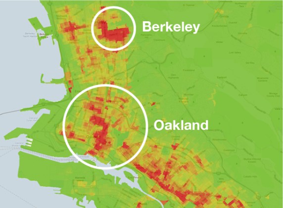
The interactive maps created from the Census Bureau’s American Community Survey provide tools to track social realities across the nation, and filters to view specific variables in each zip-code and neighborhood. I’m interested how maps embody Oakland as a coherent entity, and in Oakland a test-case to examine maps as embodiments of space and to illustrate spatial divides, as well as to filter different aspects of social space. The interactive maps devised by Block, Carter, and Maclean employ Google Maps templates to invite viewers to process the coherence and divides within data from the US Census in spatial terms, using data for the years 2005-9 to create multiple maps, generated on demand, that refract or mediate statistical realities in visual formats which provide compelling ways to embody and understand social realities from the ground up. The statistical “maps” map at stunningly finer grain that reality–by “Mapping America: Every City, Every Block,” as they boast–that use tools of mapping creative interventions to analyze the Bay Area and its inhabited landscape; the mapping forms offer tools more than vehicles to demonstrate variables of race, income, education, or presence of recent immigrants, offering alternative models by which the region might both be mapped and, by extension, surrogate realities by which its composition might be known. As much as surrogate realities, they refract pieces of that reality that we must juggle and assemble for ourselves, less attentive to the semantics of the Google Maps frame than their content. One might compare them to conventional maps based on skimpier data, to which their detail and agility provide a sort of foil–starting from the graphic charting crime-density in the Bay Area based on the police blotter.
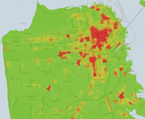
The map is surprising for how the area immediately around the campus is a thick blotch of indelible red, bleeding into its nearby areas and along Telegraph Avenue like indelible ink. Most of this “crime” is based on calls to the Police Dept., including a significant number of calls about problems of noise around fraternity row: the impermeable barrier both around campus can be explained by the different policing agency that supervises the university’s campus, and the boundary of the Berkeley Hills to the East. Crime is mapped not only indiscriminately, but distributed to reflect the contours of public complaints, as much as actual crimes. Although the red splotches and streaks around much of Oakland and focused in its downtown seems in keeping with the difficulty of maintaining control over the dispersive city, while around UC Berkeley are dense stains of intense crimson that corresponds to the frequency of calls that the local police receive near campus. It is interesting to contrast the map to that of San Francisco–where a huge amount of crime is clustered in the downtown, near the Embarcadero, Tenderloin, and Mission and some pockets around Van Ness–in a broad field of relatively crime-free green.
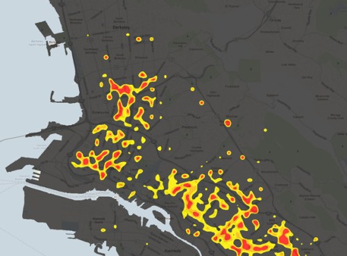
And so, if we shift mapping forms to a sort of heat-sensitive map of the violence committed and reported, the hot-spots of Oakland are more readily apparent–almost as a diffuse miasma of violence spread over neighborhoods like a viral form whose trajectory is difficult to explain or track: heat-sensitivity is an apt cartographical metaphor of the subject charted:
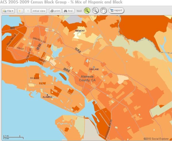
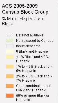
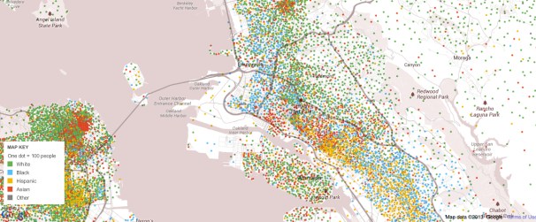
The map of hot-spots of violent crime provides a different picture, if a tragic one, extending along the city’s major streets deep into East Oakland. One might ask how this maps onto the city’s racial diversity. Given common predispositions, it might make sense to reflect on the city’s composition with greater granularity. Does violence correlates to the complex ethnic or racial distribution of the city? or to income? or to gangs, as often suggested? The interest of the interactive maps lies how viewers map these simulacra against their own individual mental maps, as much as in their mimetic claims: ‘simulacra’ since all maps are both filters of information that parse the relevance of social space, providing deeply social tools for reading. Rather assigning integrity to the map as a unique document, we can understand its ‘social life’ through how each creates and constitutes its own social reality for readers. Aside from the heat-spots in West Oakland, race is not a determining factor in a clear a way at all, although the ethnic diversity of Oakland–a historically African American city with a rapidly shrinking number of areas dominated by African American populations. It’s in fact striking that the greatest mix of black and hispanic Oaklanders in any neighborhood occurs on the edges of Oakland: and that the island of Piedmont is the only area that’s white.
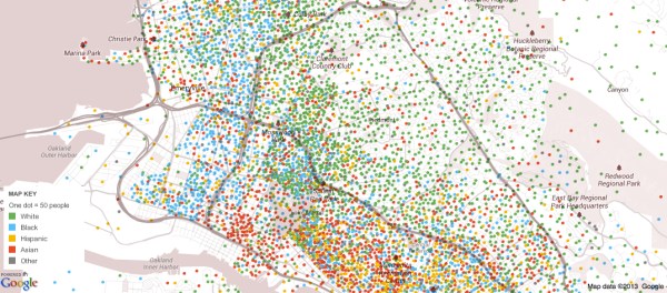
The same data can readily be re-mapped to present a distinctly different picture of the city, emphasizing urban diversity, by using the US Census Bureau’s data from 2005-9, using the American Community Survey. Block, Carter and Maclean exploit the Google Maps platform to embed Census data in color-coded terms, which shows small pockets of African American concentration by light blue, but relative integration with the greatest concentration of Asians near Chinatown downtown. The below aggregates units of fifty people, rather than proportional composition, to provide finer granularity of the population and of each neighborhood in Oakland, if in a less than dynamic manner:
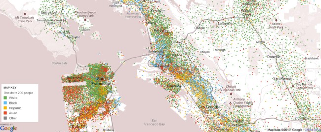
Oakland’s complex diversity might well be compared to the clearer clustering in other urban regions of the Bay Area, where whites are more concentrated in clearly bound neighborhoods, and Asians similarly concentrated in areas around Golden Gate park (Inner and Outer Sunset)–if with considerable overlap of Asian and Hispanic populations in the Mission:
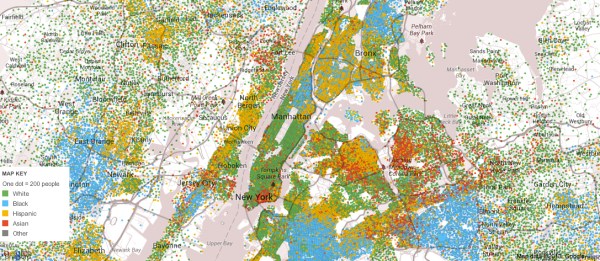
Far more sharply defined geographies of racial separation define New York City, where property values create the starkly demarcated racial composition of Manhattan, and concentrations of blacks in outlying peripheries in the Bronx, New Jersey, Queens, and Brooklyn, as well as part of Harlem:
We see a different picture of Oakland if we look at outside racial self-identification, but examine economic diversity at a finer grain in its neighborhoods.
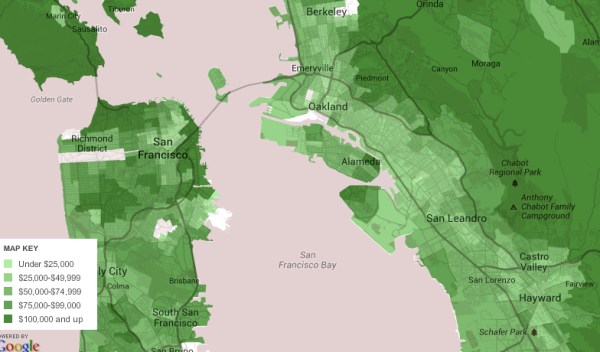
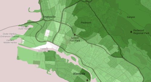
Back to the Bay Area, stark income divides define the landscape of Oakland in this map of median family incomes in the same dataset, more than race:
More specifically, the map reveals clear divides and income troughs where median incomes have sunk below $25,000, often reflecting food deserts and islands of an evil toxic brew of desperation, hungry desire, and distraction:
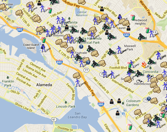
For Oakland, the website Spotcrime employs catchy icons to track arrests (handcuffs); arson (flames); assaults (fists); burglaries (masked faces under hats); robberies (men running with money-bags); shootings (cross-hairs); thefts (purple silhouettes of men running); and vandalisms (green cans of spray paint spraying red), creating a detailed map to set off mental alarms in the name of a call to “know your neighborhood’s dangers”:
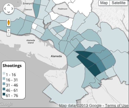
Even if the violence and theft are predominantly in low-income areas, where the map dutifully foregrounds these impressive icons, doesn’t it remove a lot about what good happens in the same low-income areas? After counting 1, 077 shooting incidents in Oakland in 2011 with 1, 594 victims of guns–the largest category among which (140) belonged to minors, and the greatest sub-group 16-year-olds (40) and 17-year-olds (38)–John Osborne used Google Maps to represent in a fairly schematic way the urban distribution of fatal shootings by neighborhood:
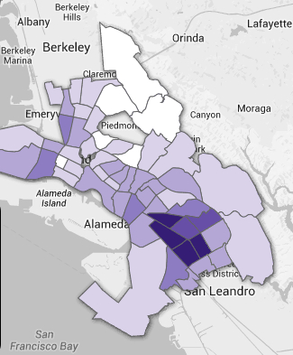
The terrifying concentration of aggregates off International Boulevard, a major thoroughfare in East Oakland, past Fruitvale Avenue, the overwhelming majority of whose suspects are male. In abstracting each as discrete, of course, the map is less successful underlying ties to both prostitution rings or drug deals, so much as a platform to make claims about gangs or organized crime. The following map of victims of shootings reveals an even somewhat scarier density in the identical area of West Oakland:
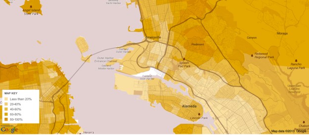
What kind of image of Oakland emerges? It’s difficult to map it clearly. One striking effect of the greater scale and definition of the maps based on the 2010 census is that the considerable proportion of resident immigrants in the city, which reveals a considerably high percentage–often more than half and up to 70% if not almost 80% in West Oakland, across from Alameda–of foreign-born residents, which demonstrates a considerable geographic mobility among residents that seems specific to the area: Oakland has long been a cosmopolitan center that attracted the displaced to its margins.
Immigration is not criminality, but suggests the margins of the city are where the displaced arrive: displacement might be something of a thread in Oakland’s history, from the arrival of (far more wealthy) San Franciscans after the 1906 earthquake in Piedmont to the Chinese-American railroad laborers who settled downtown, the railway porters whose families created a large community in West Oakland from the 1880s, and workers for the shipyards, or rich communities of Eritreans, Africans, Native Americans (Lakota or Dakota), Hispanic, Hmong, Vietnamese, Somalians and Congolese who most live in cheaper housing and are likely to be taken advantage of in varied ways. As of 2004, Oakland somehow ranked tenth in the US for the largest number of immigrants, according to the 2006 Census, despite a less vigorous local economy, and almost 30% of its entire population is foreign-born. The margins of the city somehow remain greater and far larger than its center.
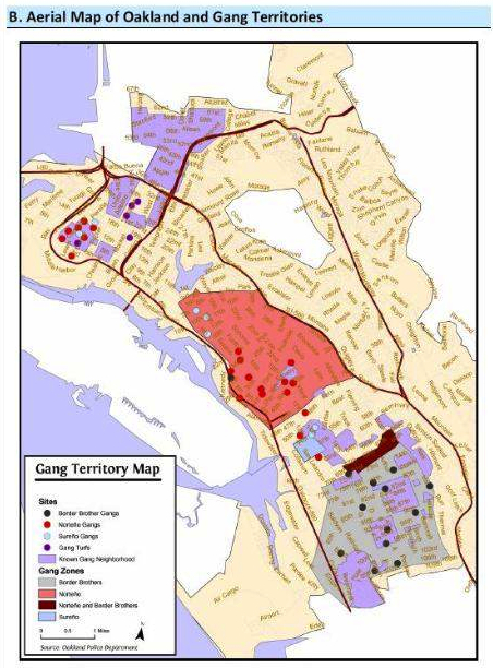
But Oakland remains known, despite this mobility, despite the presence of city gangs, a more deep-seated and almost endemic presence and prime descriptor of the city. One can–and many do–blame gang-violence, or the competition for turf; but the violence is difficult to separate from prostitution and drug-related crime, not necessarily competition between gangs or gang-related activities, even though gangs do suggest a culture of violence.
Gangs are difficult to measure, although the intensity of turf-wars would seem to make it easy to use the map as an indicator of violence.
Yet if one looks at a broader map of “gangs,” the variables seem impossible to keep constant, even in a hand-drawn map of gangs in East LA from 1978 purporting to decode ‘insider knowledge’ about a topography of violence, but provides only the sketchiest of tools:
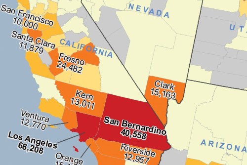
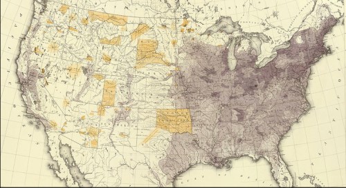
The difficulty of attributing meaning to the mapping of gangs is more apparent if one notes their widespread presence, given this–perhaps unreliable–map taken off of a “National Gang Map” which reveals a dramatic concentration of gangs and gang members in the Westernmost states:
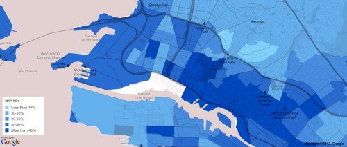
Perhaps their presence itself reveals an attempt to make meaning from life or to carve it out of one’s social terrain to the greatest extent that is possible. One compelling map maps educational attainment–with the brightest yellow indicating an inability or difficulty to complete High School at 70%–with less than high school completion hovering around 40% among families.
In the Bay Area at large, the failure of education in the Foothill-International area is striking, and is doubtless also some degree of failure in socialization if not of public education, and maps a continuing challenge for the city’s School Board and public schools.
And a corresponding map of college-educated Oakland reveals a bounded drop in below 20%, more roughly characterized at 5-14% with a BA, with large numbers of closely bordering districts hovering between 5-8%: this might be one measure of the cultural insulation and isolation of the region, if not a clear barrier to what is often described as an ‘achievement gap.’
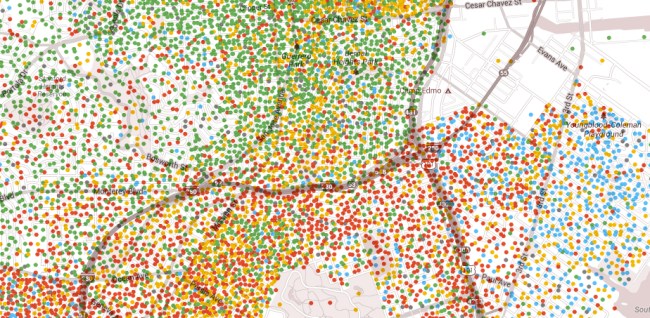
Those empty tan regions are a measure of the difficulty of shifting a divide between different Oaklands, because it maps a cross-generational or at least temporal divide in the given area over time. The heterogeneity of Oakland is nonetheless striking even in its inequalities, to turn back to map racial diversity of Bay Area generated in bright colors on the NYT website of Block, Carter and McLean, since it suggests a picture of considerable promise.
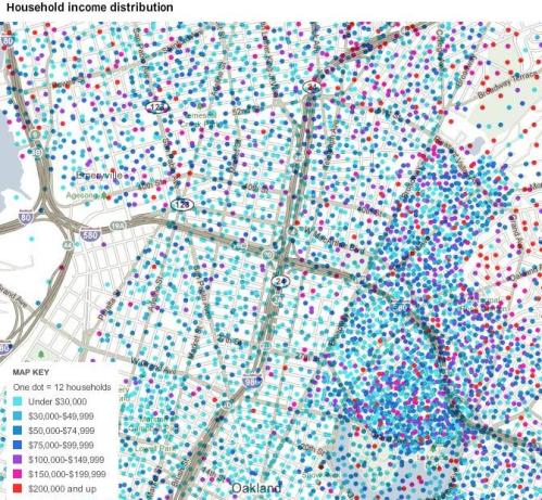
But of course a map is not a picture. It is a picture of variability, which can shift depending on one’s chosen criteria. In the distribution of income levels in North Oakland, aggregating incomes of twelve families reveals a telling integration of an income-mix more striking and apparent than the in the above demographic models: despite a scattering of upper-income levels across this North Oakland area from Emeryville, across San Pablo, and up to Broadway Terrace and Grand Avenue, lower income levels are present virtually throughout the region, with the exception of East of Broadway, although Broadway provides a clear dividing line of high incomes and lower ones, and the 880 corridor below MacArthur dotted with light blue markers.
The color-coded map of relative incomes provides us with some possibly meaningful correspondences to the hot-spots in crime. But I wouldn’t advance the sort of argument that maps crime–or gun-violence–onto variations in household income. The pictures of the city offer limited tools that suggest possible sites of research that might help to connect these dots. But they offer useful, ground-up mappings of the city’s inhabitants.
Processing the relations among inhabitants of Oakland offers a way to renegotiate your relation to the city as a whole. Mapping is about navigating, as well as processing, a surfeit of information, and about making the connections among it, grosso modo, that exist. The fine grain of the census maps provides both a corrective to our preconceptions, and the start of something like a more fair–and illuminating–map of the city’s social space.

