
If the nineteenth century America has been often described as an era of geographic integration, perhaps no one more than the ambitious statistician Francis Amasa Walker created a new way of seeing the nation that foregrounded both the local differences that continued to divide the nation, but staked out the challenges for integration that the country faced in geographical terms. His extremely influential 1874 Statistical Atlas, based on the unprecedented 1870 US Census that he directly supervised and made the case before Congress about the undeniable need for funding, whose maps created an image of the challenges of national unity that remained in the republic in the wake of the Civil War in which he had fought: the Statistical Atlas extends the enterprise of the expanded Census, validating how statistics present a synoptic picture of the political economy–illustrating relations of the local to the polity across continuous United States as if processing part of a mental effort of consolidation.
Even before the unprecedentedly bitter electoral divide of 1876, Walker advanced maps as providing a new way to embody the polity through the visual records derived from statistical aggregates. Although Walker’s subsequent tabulation of the data on immigrants in the late nineteenth century led him to fear their arrival as threatening the nation’s productivity, based on his perception of the depth of racial differences to the national polity, and encouraged others to do so, he advanced the embodiment of statistics in geographic maps, in ways no doubt influenced by his close collaboration with his father, the economist Amasa Walker. In ways that prepared a basis for his use of maps to express the contested electoral results of 1876, Walker treated maps as coherent statements about the nation’s divides otherwise not able to be articulated, as a basis to start debate about the well-being of its political economy. (His maps were so convincing, indeed, in framing a question of geographical organization, that they may have encouraged a narrative of continental integration only recently challenged by investigations into local and regional geographies.)
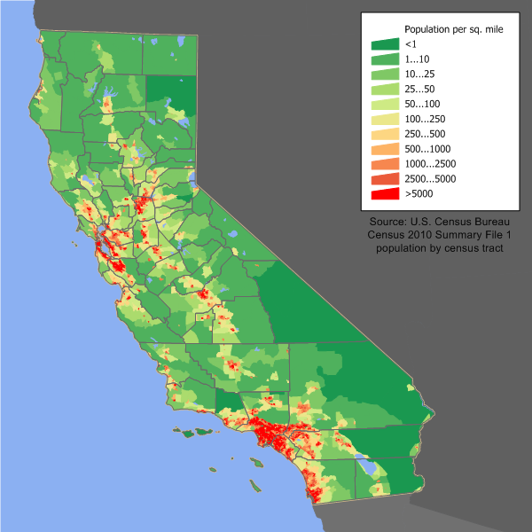
 Mapping Population Density in the US, 1870 (Francis Amasa Walker)
Susan Schulten has recently advanced the quite compelling argument that Walker’s innovations constituted gave the “invention of the infographic” distinctly American roots. Her argument spoke appositely to the almost obsessive return in recent elections to infographics that suggested the likely tendencies of voters, and indeed often reframed a narrative of division into “red” and “blue” states–and even designated some “purple”–in ways that revealed an undeniable undercurrent that verged on obsession of questions of national unity and division that were of the very sort that Walker had similarly sought to address when he undertook the reformation of the decennial Census in 1869 at an amazingly young age of twenty-nine–no doubt with insight as to the ability to advance and illustrate the distinct distribution of space that the nation occupied.
Even as a staggering proliferation of maps of electoral zones flooded airwaves, newswires and web during the 2012 election, Schulten traced the invention of the American infographic to the innovative visualizations of data and government statics by an enterprising statistical mapper who after working to organize the 1870 Census, not only drew up a comprehensive reform of the census but treated its findings to create a “statistical survey” that came to embody the nation’s political and economic unity. While earlier Censuses were strikingly unscientific, Walker advanced issues of political economy in maps as an extension of his expansion of the decennial census, organizing the tabulation of population, agriculture, mortality and manufacturing data on 39 million Americans, and placing prime importance on geographically orienting statistics as tools to better visualize the nature of social and economic divisions after the Civil War in which he had fought and been grievously injured.
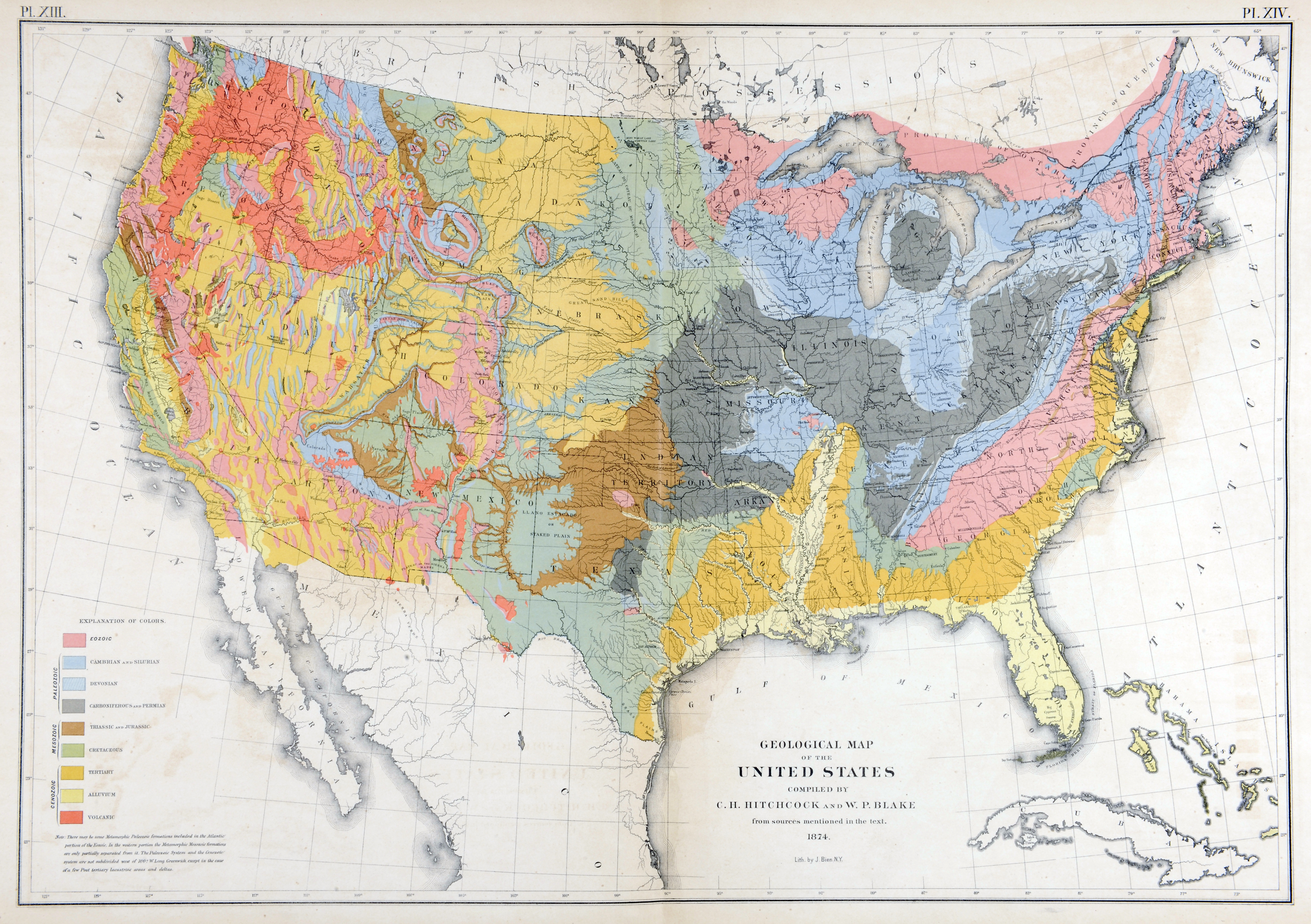
Walker’s maps framed the issue of integration in legible fashion–and produced them to allow the fate of the nation’s unity and division to be processed for a wider audience than would have otherwise confronted them–they did so since they readily processed statistics that went far beyond physical phenomena to chart the racial composite by which the national economy could be understood, moving beyond existing models of its physical geology–which he also included in the Statistical Atlas—
 Princeton University (from Statistical Atlas, 1874)
–to attempts to embody the composition of its human inhabitants whose aggregates were earlier not clearly understood, in what was indeed the first public census to count African Americans who were former slaves as part of the nation’s fabric.
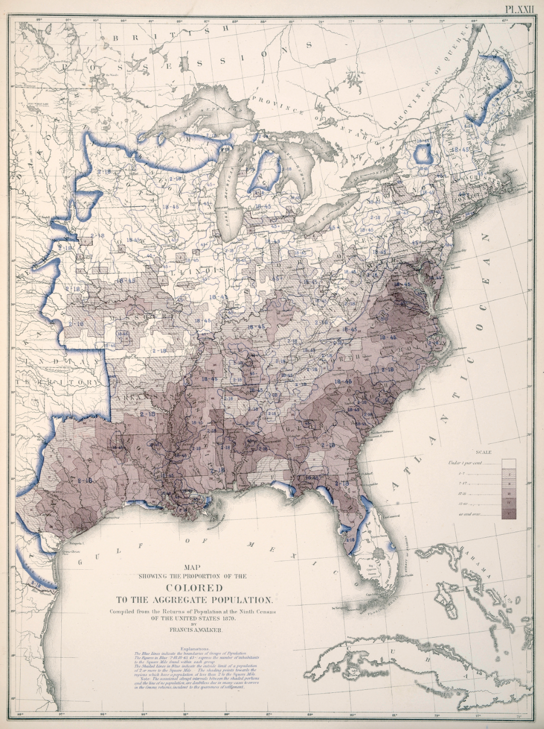
Colored Populations in the United States (1874) (Courtesy of Princeton University Library)
Walker’s advocacy of such choreographic statistical maps as snapshots of the political economy led to an invitation to join the editorial board of the New York Times–which he declined, probably since he continued publishing in competitors from Scribners’ Monthly to Harpers’ New Monthly, emerging as a public intellectual of originally progressive bent. For Walker had convinced the US Congress to adopt a variety of projects that used recent lithographic techniques and statistical correlations to use the results of the 1870 US Census map an coherently compelling image of the nation’s situation for public debate. If all maps reflect both the character and competency of their makers, Walker’s maps reflect the excitement and tenacity of mining data from the Ninth US Census of 1870 that he had compiled with congressional authority, compiling, correlating, and refining the image of the distribution of wealth, illness, and health to a degree that had not ever been earlier achieved.
He engaged in mapmaking in print as a form of public discourse that elevated the statistical map as a tool for envisioning the nation as an aggregate. Walker’s early involvement with late nineteenth-century newspapers like the Springfield Republican Newspaper as well, from the late 1860s, at the Atlantic Monthly, in fact no doubt encouraged his trust in the power of such organs of public debate–and the power of printed supplements based on the US Census, several of which he published for Harpers’ New Monthly, as well as in Scribner’s Monthly, The Century and North American Quarterly, in ways that no doubt led to his conviction in the infographic as a way to shape public debate on political economy, population density, home servitude, and the working classes. Walker’s position as Chief of the Bureau of Statistics and Taxes may have helped him use his position as Superintendent of the fifth US Census at just twenty-nine to present the project of the first Statistical Atlas of the country, a project which he expanded in the 1880 Census, whose unprecedented twenty-two volumes collected an even greater range of information than ever previously collated and greatly refined the unscientific nature of previous decennial censuses.
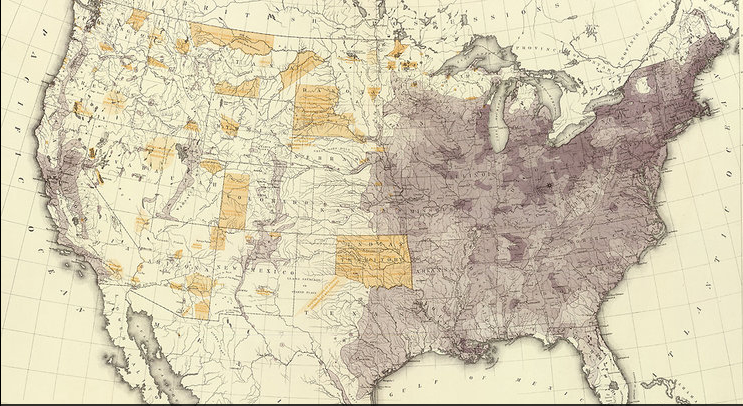
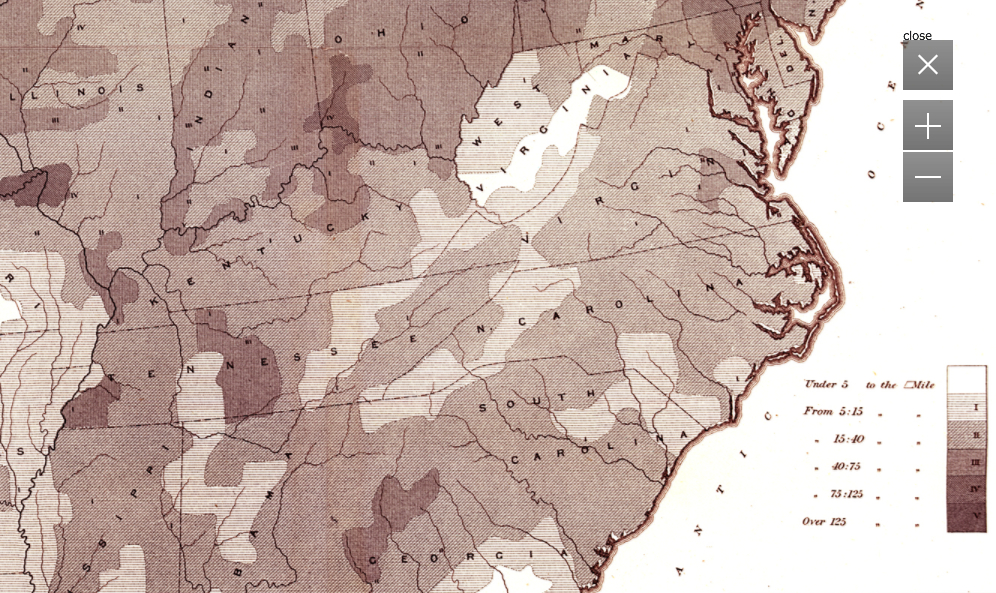
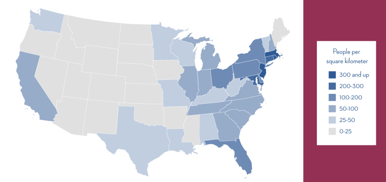
Francis Amasa Walker saw the U.S. Census not only as a way to view populations of states, but to expand the vision of and the likeness of the nation by the more arduous measure of density per square mile, and to then use that image to chart the distribution of the national population as a demographic tool. He worked with the census to conceive of the map as a measure for mapping complementary sets of data, by mapping relations between density and select quantifiable variables, mapping population density against wealth distribution, literacy, childbirth rates and disease–but not voting preference–in maps that created a legible record of the country, whose public good he convinced the US Congress to fund Atlases in 1872 and 1873. By transferring statistical observations into a detailed picture of the nation, he began from a base layer of the contours by which its population was distributed, without focussing on jurisdictional bounds, in ways that effectively augmented the independent authority of maps as media of sociological investigation and public communication to an extent that had never before been the case, but established a central place for detailed choropleths in the American Grain.
The maps are stunning choropleths that exploit lithographic techniques to picture the national population in great detail. Walker started from the initial map of density, using the census of 1870, of which he was superintendent at the age of 29, and whose possibility for converting into cartographical form he seems to have readily perceived. The plans led to the publication in 1874 of the Census’ data, in an initial atlas that totaled just fifty-six pages, each map of which has a degree of detail never seen as a visual embodiment of the nation, but emphasized its distribution of population and industry to an extent never realized–and, at least among its readership, posited questions of national coherence that concretize concerns for the country’s political economy:

Density of Population in 1870–including African-Americans as well as Whites
Things got more complicated and more exciting when Walker mapped the distribution of wealth among these densities of population, in ways that helped reveal the uneven distribution of incomes across the post-war nation, and revealed a conspicuous ongoing divide between northern and southern states that related to industry but also to the extreme impoverishment of much of the population in the southern states that would continue to be a contradiction and difficult conundrum in the nation:
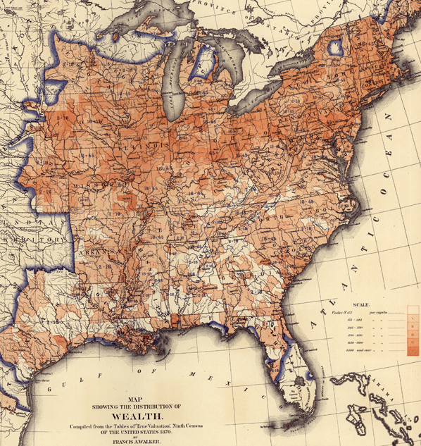
The sort of graduated shaded in maps that Walker created provided something of a counter-map to the symbolic uses of mapping as a way to envision national unity, and pinpointed questions of the intractable nature of differentials of wealth. If pockets of wealth extended deep West into Iowa and Kansas, and lit up Illinois, Ohio, and Pennsylvania in deep auburn hues, the Mason Dixon line was a divide in how wealth was distributed whose light ochre and pockets of white were rarely interrupted by redoubts of wealth, almost entirely along the coast or select segments of the Mississippi River. His maps adopted the recent precision of mapping population density against its distribution that had been pioneered by Alexander Bache’s compelling visualization of the records of the 1860 Census with the German emmigre engraver Edwin Hergesheimer.
The detailed cross-tabulation of population and wealth seems a bit of an odd ancestor of the modern infographic, although their kinship is clearly recognized. For the image of Walker demanded the sort of detailed attention as a picture of the nation to which the compacting of information or metadata in the range of infographics generated by GIS programs rarely provide. If Walker anticipated GIS in a fashion, the rapidity of generating the infographic that synthesized metadata with amazing facility and rapidity rarely demands the sort of attention that Walker’s images command. In part, the lithographic medium habituated viewers to the parsing of refined distinctions in the economic landscape that variations of shading revealed: the starkest of our blue/red maps with some pink or light blue question marks are removed from the fine-toothed sort of distinctions drawn in the census, or from a similar statistical subtlety.
But the proliferation of the infographic so readily produced and tabulated provides less of a reference tool than an attempt to hold onto the permanence of a snapshot provides within the rapidly shifting and changing landscape that often seems adrift in the electoral sea. The questions that Walker asked–distribution of wealth, literacy, disease rates–are rarely raised in the infographics we see most frequently, even excepting Fox News’ proclivity for the infographics that perpetuate stark divisions. The ‘mediazation’ of the modern infographic as a labor saving device not for observers, but whose construction demanded a more limited investment of detailed attention, has created a new assembly-line production of images of limited refinement, whose authority rests on their mapping substrates, rather than on the measurements they mediate and encode.
The limited subtlety of the infographic suggests not only their ideological points, but a shift in what might be called, with the late Michael Baxandall, a “period eye” to express the tastes of interpreting images from media to the viewing map–the habitual practices by which we look to maps in an age of the rapid-fire production of new infographics each day for broad consumption and, also, ratings appeal–or how infographics snappily process an argument in a bottom-line nature, rather than approach the social topography whose complexities we’d maybe rather not want to detect or explore at close range:
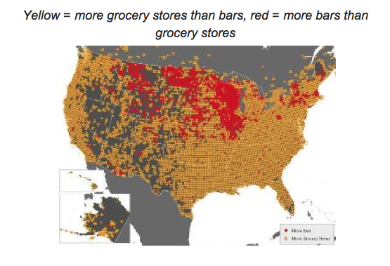
Most items that bear the name of infographics might not be data visualizations, or even use the map as a tool to construct the meaning of its contents, since the map is so often and so readily abstracted from the territory. Maybe a map might even suggest what we might want to keep distance from, rather than to consider up-close:
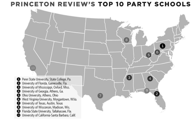
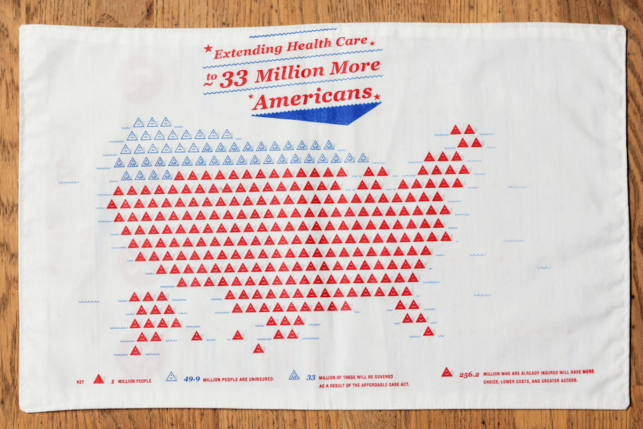
These pilfered objects are a bit extreme, but their divorce from any sense of geographic meaning is somehow telling. Sure, these are something like visual jokes, but they make the point I want to make about the liabilities and deceptiveness that the using maps to organize contemporary infographics reveal that adopt maps to bolster their suasive abilities as much as frame a problem. The mock-maps–the second based on an episode of Ira Glass’s “This American Life” by E. J. Fox, from a series he titles “This American Infographic”– illustrate the problem of the need that cartographical infographics fill, of both adopting the authority of the map (without containing much geographic information) and of using it to display the ready access to metadata that most images of GPS presume–or, in the most banal but most common case, the weather maps on the Weather Channel–and that most folks expect. Data-mining becomes replaced by graphic design tools imported from the world of advertising, and the maps are a blunt instrument to make blunt arguments, or present an image of the status quo: the big parties happen at big state universities.
Maps are especially powerful tools to process information for viewers. Some less ridiculous examples of infographics reveal some surprisingly similar attempts at using mapping forms or mapping syntax to preserve an illusion of omniscience and often to illuminate or make a comment about national unity. But they also often use maps in ways that, unlike the maps derived from government censuses that Walker examined with considerable care to demographic variables, conceals an absence of analytically meaningful argument. They treat the map as a form of metadata that reduces analytic specificity–from a map of the “battleground states” that effectively uses a format of mapping in order to suggest either the limited support for the Democratic party in the nation (by using a shade of yellow closer to red than blue) or indicate the deeply flawed nature of the democratic process to their viewers.
Recall the sort of maps that were all the rage when Schulten described Walker’s innovative practice, if you can bear it. Rather than resting on numeracy or the tabulation of relative measures of difference by a statistical model, the map foregrounds the indeterminate nature of places where polling was within a margin of error, rooted less in mathematical literacy but in pollsters’ relative ability of prediction. The mediazation of the map is removed from a mathematics of mapping or an expectation of refinement, for it is almost more of a symbolization of a politics of stasis or an electoral divide:

The greater refinement of other maps that shaded “tending towards” in lighter colors foregrounded the unpredictable nature of voters’ preferences, more than the composition of the electorate, as they seem to table the question of national coherence or cohesiveness as a whole other issue.
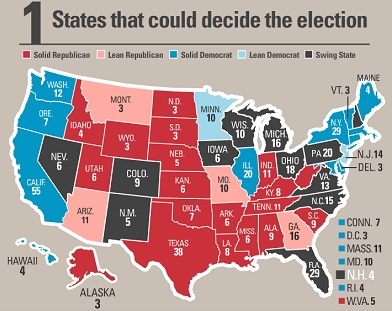
In each of these admittedly varied cases, mapping indicates an aura of accuracy or invests a sense of stability in the face of indeterminate data. The map is a totem by virtue of its processing of information from varied diverse sources, but the map blunts potentially far more precise tools that seem to divide the polity and focusses on electoral results. The questions of numeracy that divide the nation are less based in a tabulation of data or statistical familiarity; the block-hues of states mute meaning analysis.
Blocks of red in the map seem possible of being emptied of geographic meaning. One famous FOX infographic purported to identify a strategy for Republican victory, but undermined the very legitimacy of this potential scenario for the attentive few by mislabeling the states it purported to count with accuracy–as well as deceptively reinterpreting polling trends:

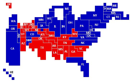
The absence of an expectation of reading measurements beyond numerical addition are evident in a map more reminiscent of the refined criteria of a jigsaw puzzle than in puzzling questions of national unity or ideological difference:

In part, ideological differences are just not that pronounced, and the maps are oriented to processing polling numbers that were changing like a stock-market ticker-tape, rather than providing a firm basis for a national portrait. But the father of the infographic would most certainly not be pleased. The adoption and diffusion of mapping forms in infographics provide metadata constructions perhaps most significant for how they quash related questions or discussions, by ordering a massive amount of data whose impression of preponderance is more likely to take away one’s breath than pose a question, and is almost always likely to conceal an argument.
To some extent, of course, the new elevation of infographics is the creation of the new media economy. There’s an odd dynamic of devaluing of the analytic power of the map at the same time as elevating its explanatory power. The map, in an age of reduced news content, seems to substitute for the strength of an analytic news story, as a GPS program produces a snappy infographic that seems both content-heavy and a pleasing amuse-bouche. The need to process different news sources or on-the-ground informants might be both excused and avoided, where we can come up with a symbolic rendering of what happened, even if we don’t need to look so closely at what its causes or its actual ramifications were. The absence of analytics in the infographic–which presents, as with the weather, the state of things as they are as an actuality that does not need further analysis or attention to local variation–is perhaps its most pernicious feature as a medium. They stand at a remove from the maps that the great nineteenth century statistical geographer Francis A. Walker so valuably labored to design.
We develop infographics such as the following by crunching some obtainable numbers–in an image that unsurprisingly perhaps uses the residue of a weather map as its base–to tell a story that collapses multiple different narratives into a single set of information that the viewer can quickly process. The iconic map that was diffused after the last election was less about fault lines or divisions in the nation, than a cartogram of the new image of alliances in the nation, where the entire midwest stood as a block of blue with the Western states:
That is not to say that infographics can tell a subtler story of similarly chorographic proportions, to describe the image of unemployment in 2003, for example in the country:
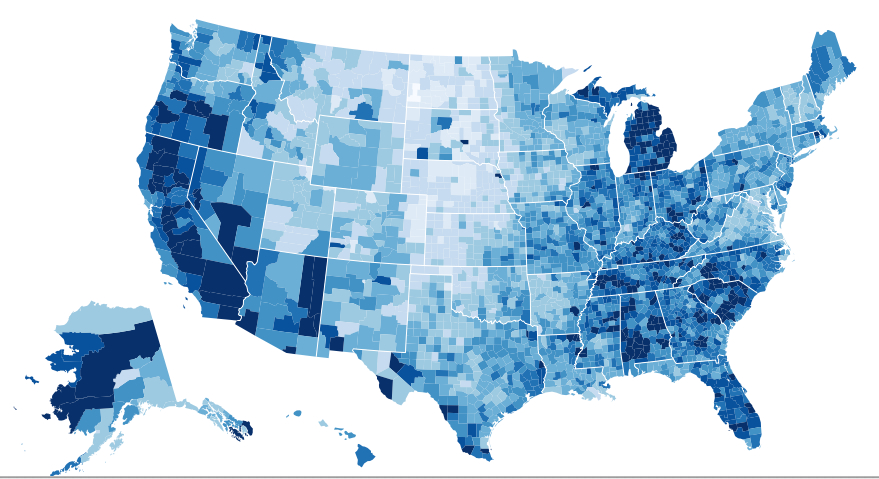
But at what cost? Choropleths such as the below seem to remove individual experience from their comprehensive picture–and provide a “big picture” that is actually difficult if to comprehend for all the metadata they synthesize. And they present an intractable image of a social divide whose dark bands of dark blue reveal a density of those out of work that only grew by 2008 in the very same areas:

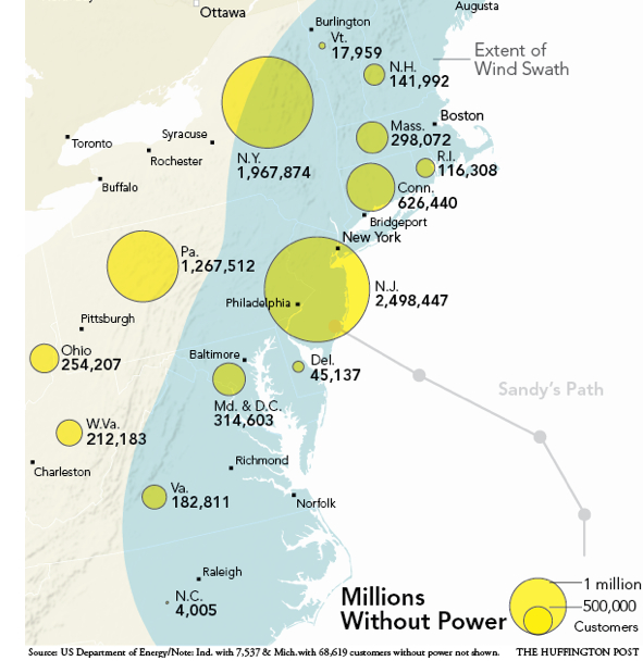
There was a similar crunching of numbers at a remove from individual experience of tragedy in a map of electric outages suffered as a result of Hurricane Sandy, providing a purview of outages from Augusta to Raleigh. The map is powerful and striking, but also elided the stories of its destructions or narrative of its meteorology with an easy infographic of a sort of least common denominator to everyone can easily relate of the lights going out.
These maps erase their inhabitants. So what, then, we might ask, is the territory?
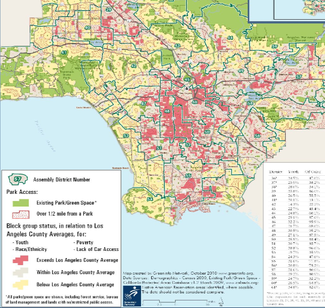
The ghost of Walker, and continued prestige of his aesthetics, have led Nathan Yau of Flowing Data to provide a comparable set of visualizations that embody our national territory, based on the ongoing statistical surveys of the American Community Survey of 2010, to “revive” the project of a Statistical Survey in the footsteps of his august predecessor, noting with some evident pain the absence of any plans by the US government’s Census Bureau to produce one after 2000, perhaps due to the high costs of the Census itself–and the recent Republican-led effort to even claim that the decennial Survey is an unconstitutional invasion of privacy–even though it provides the best basis for the apportionment of government funds, and one of the clearest demographic portraits of the country–that tarred the survey in no uncertain terms as “intrud[ing] on people’s lives, just like the Environmental Protection Agency or the bank regulators,” according to Daniel Webster, an inspiringly named first-term Republican congressman from Florida, who questioned the random nature of the survey as illustrating its “unscientific” value, despite its assessment of over three million American households in considerable demographic detail about their occupations, housing, literacy, languages spoken at home and at work, and levels of education, as well as their approximate computer use.
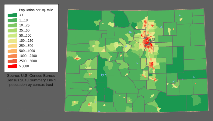
Perhaps with some premonition of the dangers of resting our democracy on the thin infographics consumed by watchers of television news, the self-published Survey Yau published online imitated the august elegance and clarity of Walker’s maps to point up the absence of needed visualization of the data that the Census compiles. The images–able to be bought individually as posters–suggest the deep presence of Walker’s idiom of visualization within our current media circus, when the proliferation of news maps from various outlets and Graphics Depts. seem dislodged from the interest of the public good. Yau’s project was may seem to have obviated need for an impartial assessment of all the data that the Census compiled. Indeed, while the Times, which once offered Walker a seat on its editorial board, created a brilliantly colored set of interactive visualizations based on data from 2005-9, Yau offered nostalgic images that embodied the images of the nation that the government has puzzlingly withheld, with climatological and agricultural data that provide a similarly detailed atlas of the coterminous United States which, in an age overflowing with data visualizations, remind us of the need to preserve a picture of the nation to ensure we keep the public informed.
The detail of the maps, set in a sepia background with shadings that somewhat approximate the exacting palette of Hergesheimer’s half-tones, provide a set of gradations of population as revealed in the data of the 2013 ACS,

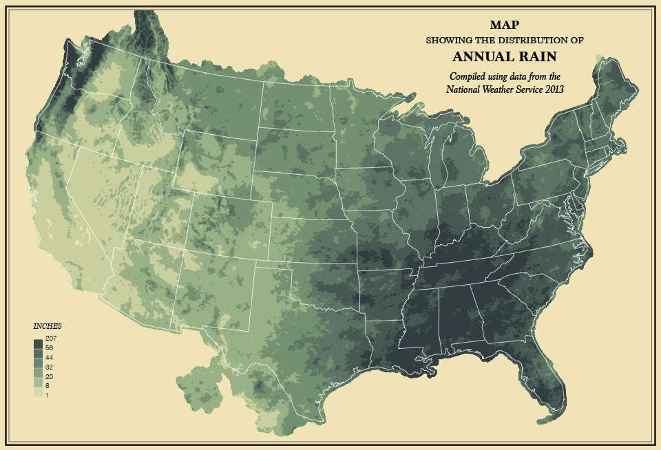
Or, to depart from the demographic and verge into the statistics of the environment, the distribution of levels of rainfall,
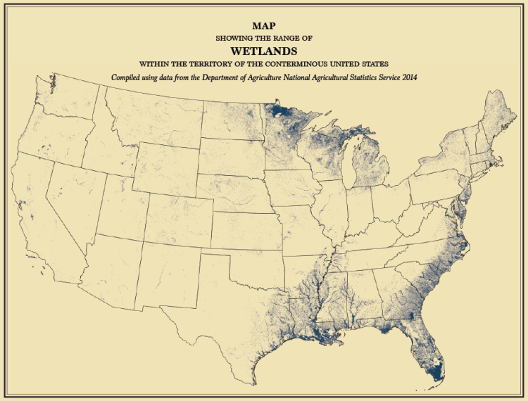
wetlands
 FlowingData
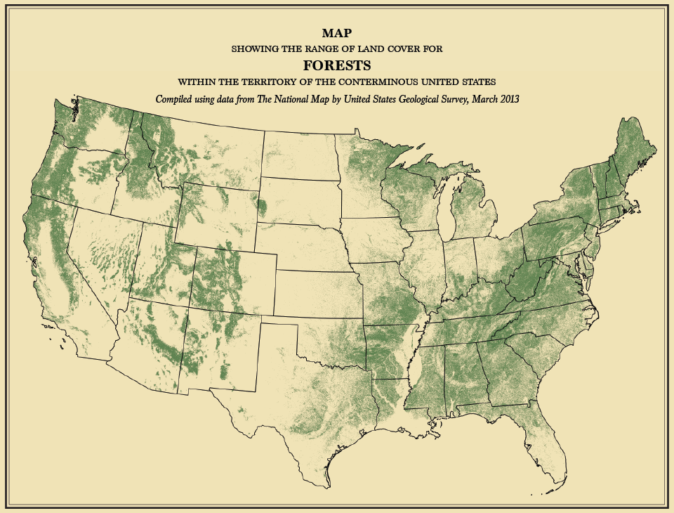
or landcover:
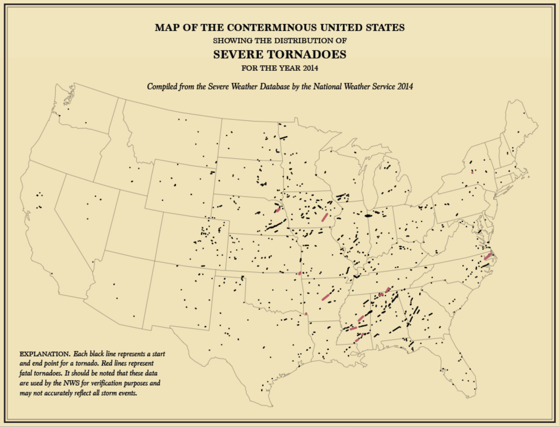
The data waits to be visualized, and the simple monocular visualizations capture its complexion with quite understated elegance. While less rooted in concerns of political economy, the visualization hearkens back to a unified choreography that we often seem to lack–even if it only pictures tornadoes–in ways that go beyond the existential qualities of weather maps as records of the present day.
To be sure, the political economy of the nation has become so fragmented that it is hard to visualize by such clearcut lines or shadings, even though the Times’ visualization of the American Community Survey similarly uses the map as a surface on which to throw the composition of the nation–and the nation’s cities–into relief, here drawing on the Survey to present the complexity of the population of an actually quite segregated New York:
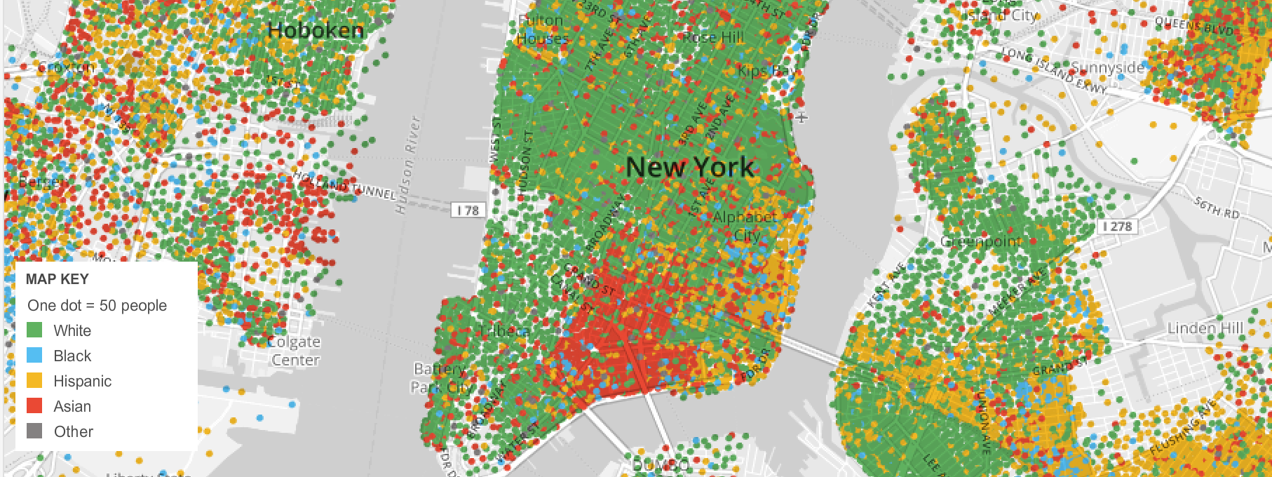
from New York Times–“Mapping America: Every City, Every Block“
Should such mages serve to whet your appetite for better visualizations that embody an accurate image of the nation, folks based in the Bay Area might want to check out how the students at UC Berkeley’s I-School stack up against Fox News, Huffington Post, the New York Times, and even Francis A. Walker, by looking at the results that are now showcased at http://www.ischool.berkeley.edu/newsandevents/events/finalprojects2013. (The website promises to present recent graphic charts of Changing Behaviors, Enhancing Information Systems, and Information Organization and Tools that have been refined over the last three years.)
![Desnity of Population [of US]](https://dabrownstein.com/wp-content/uploads/2013/04/desnity-of-population-of-us.jpg)

