Category Archives: statistics

The Cognitive Clouding of Global Warming: Paris and Pittsburgh; Creditors and Debtors

The argument of America First seems to have been extended to its logical conclusion as the apparently selected President of the United States has single-handedly subtracted the nation from a map of climate change.  By denying the place of the United States in the Paris Climate Accords, President Trump seems, in the most charitable interpretation, to have acted on his own instincts for what was the benefit that accrued to the country in the very short term, and after looking at the balance books of the United States government for what might have been the first time, decided that America had no real part in the map of the future of a warming world.  Rather than outright denying global warming or climate change, Trump decided that the conventions established to contain it by the world’s nations had no immediate advantage for the United States.  

The result wasn’t really to subtract the United States from the ecumene, but from the phenomenon or at least the collective reaction of the world to climate change, and openly declare the supremacy of his own personal opinion–as if by executive fiat–on the matter. The personal position which he advanced was so personal, perhaps, to be presented in terms of his own clouded thinking on the matter, or at least by seizing it to create what he saw as a wedge between national consistencies, and to use wildly incommensurate forms of data to create the impression of his own expertise on the issue–and to mislead the nation.  For Donald Trump took advantage of his having Presidential podium to diss the Paris Accords by a torrent of alliteration developed by a clever speechwriter as resting on a “cornucopia of dystopian, dishonest and discredited data.”  Even if one wants to admire the mesmerizingly deceptive excess of alliteration, the notion of rooting an initial response to planetary climate change in the perspective of one nation–the United States of America–which produced the lion’s share of greenhouse gasses–is only designed to distort.  

By pretending to unmask the Paris Accords as in fact a bum economic deal for the United States, as if it were solely designed to “handicap” one national economy, set a sad standard for the values of public office.  For as Trump dismissed data on climate change as discredited with mock-rage, and vowed that the entire affair had been designed by foreign groups who had already “collectively cost America trillions of dollars through tough trade practices” and were desiring to continue to inflict similar damage.

But the large future on trade imbalances–which he treated as the bottom line–he staged a spectacle of being aggrieved that seemed to take on the problems of the nation, with little sense of what was at stake.  Trump’s televised live speech was preeminently designed only to distract from the data on which the Accords had been based.  And even as Trump sought to pound his chest by describing the Accord as a “bad deal for Americans,” that in truth “to the exclusive benefit of other countries.”  By turning attention to an America First perspective on global warming, Trump sought to replace the international scope of the challenge–and intent of the much-negotiated Climate Accords–by suggesting that it obscured American interests, even if it only took America’s good will for granted.  As if explaining to his televised audience that the agreement only “disadvantages the United States in relation to other countries,” with the result of “leaving American workers–who [sic] I love–. . . to absorb the cost in terms of lost jobs [and] lower wages,” he concealed the actual economics of withdrawing from the Accords were buried beneath boasts to have secured “350 billion of military and economic development for the US” and to help American businesses, workers, taxpayers, and citizens.  

In continuing to dismiss the data out of hand about the expanded production of greenhouse gasses, Trump seems to seek to overturn the deceptions of data visualizations that have alerted the United States and world about the consequences of unrestrained or unbridled climate change. Trump ridiculed the true target of the nearly universally approved Accords, scoffing at the abilities to reduce global temperatures; instead, he concentrated on broad figures of lost jobs in manufacturing and industries that are in fact small sectors of the national economy, and incommensurable with the dangers of ignoring global warming and climate change, or the exigencies of taking steps to counter its recent growth.

global warming
Increased Likelihood of Temperature Surpassing Previous Records by 2050 and 2080

oceanic-warming
Sea Surface Temperatures against a Historical Baseline of a Century Ago/Climate Central

As if years of accumulated data of earth observation could be dismissed as deceptive out of hand by executive authority, independent of an accurate judgement of its measurement, Trump dismissed expert opinion with the air of a true populist whose heart lay in the defense of the American people and their well-being–as if they could be abstracted and prioritized above the world’s  Trump’s largely rambling if gravely delivered comments in the Rose Garden press conference that painted himself as daily fighting for the country cemented the alliance of populism and a war on science by its odd substitution of bad economic data for good scientific data.  

The switch is one in which his administration has specialized.  His address certainly culminated an outright dismissal of scientific conclusions based on a distorted America First picture of the world, where a stolid declaration that “the United States will withdraw from the Paris Climate Accords” made sense as form of national defense–despite the potential global catastrophe that rising global temperatures and sea surface temperatures threaten. Is the technique of juxtaposing statistics and muddying data an attempt to undermine evidence, or an illustration of his insecurity with giving authority to data, or to scientific authority, the mirrors his concern about concealing “his profound illiteracy,” or his insecurity about illiteracy, that linguist Geoffrey Nunberg argues not only distance his own speech from words, and discredits their currency, but an insecurity of having to rely on language and linguistic skills alone, in ways that might be well seen as analogues to his plentiful use of all caps on social media, as stepping outside of the language of public life to a medium more direct and complicit with his audience, if outside the usage standards of a written language.

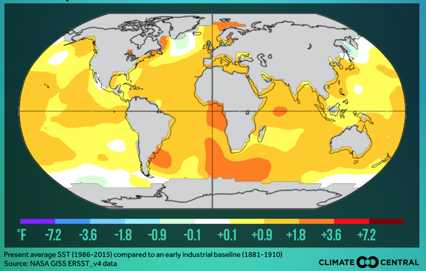
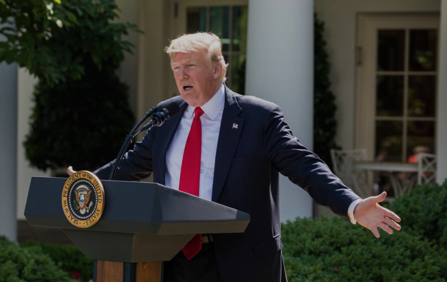
The catastrophes were minimized by being argued to be based on “discredited data” in a bizarre flourish designed to dismiss scientific concensus  Trump conspicuously faulted not only the “discredited” but distracting nature of data  in the speech he gave in the Rose Garden on June 1, 2017 that supposedly justified his announcement of withdrawing from the Paris Climate Accords in 2015 to limit heat-trapping emissions of carbon fuels that have been tied to observed climate change.  Rather than foreground the international nature of the accords among agreed upon by almost 200 nations, trump advanced the need to heed local interests, perversely, but even more perversely argued that the Accords resulted from disinformation.  He spoke to the world to chastise their recognition of scientific observations, in so doing destabilizing not only global alliances but undermining a long-negotiated climate policy by pulling the rug out from long accepted consensus not only of climate scientists but a role of national leadership that sought to remedy the failure of the Kyoto Protocol of 1997.  Trump turned his back on the Climate Accords on how to curb greenhouse gas emissions  by proclaiming their unfairness to American interests, and attacking unwanted constraints on American industry, through his own deployment of data that was even more discredited as an excuse to walk away from the prospect of a greener world.

Exiting the Green.png  Al Drago/New York Times

1. If Trump steered the nation away from green energy and into darkness, Vladimir Putin seemed to mock Trump’s rationale for the withdrawal when he mused, jokingly but ever so darkly, that “maybe the current [U.S.] president thinks they are not fully thought-through,” making open fun of Donald Trump’s image of global leadership by wryly noting in ways that echoed the absurdity of Trump’s defense of the local in place of the global.  “We don’t feel here that the temperature is going hotter here, . . . I hear they are saying it snowed in Moscow today and its raining here, very cold,” Putin noted, as if relishing undermining long-established trends in climate data by invoking a populist championing of local knowledge as if it trumped the advantages of earth observation that satellite observation has long provided.   Populism trumped expertise and Putin laughed at the possibility that the Accords might soon fail as a result.

Given the longstanding desire of Moscow to be released from constraints on exploring the billions of tons of Arctic oil on which Russia has chosen to gamble, Trump’s almost purposive blindness to a changing environmental politics of the global economy astounds for its parochialism, and its championing of place to dismiss undeniable effects of climate change that seems closely tied to carbon emissions.  For with a false populism that championed the limited perspective of one place in the world–or one’s own personal experience–Trump dismissed the maps and projections of climate change, on the basis that the “deal” was simply “BAD.”  And as a man who views everything as yet another deal, while he pronounced readiness to “renegotiate” an accord he sought to cast as a failure of President Obama to represent America’s interests, the rebuke fell flatly as the accord was never designed to be renegotiable.

Putin’s remarks were met by scattered laughter of recognition, and some smirks at the decision of the American president to withdraw form a long-negotiated set of accords to the collective dismay of our military and environmental allies, and its implicit endorsement of deniers of climate change.  The potential “axis of mass destruction” France’s climate minister has cautioned against might indeed be one of mass distraction.  For in dismissing and indeed disdaining the historical accords to limit carbon emissions, Trump sought a soundbite sufficient to stoke suspicions the climate treaty.  He sought to cast it as yet another deeply rigged system of which he had taken to compulsively warning Americans.  Such a metaphor of bounty was jarring to reconcile with onerous economic burdens cited as the prime motivations for deciding to reject the Paris Accords on Climate Change.  The jarring cognitive coinage seemed to connote its negative by a disorienting litotes; but perhaps the most striking element of the entire news conference was that Trump offered no data that backed up his own pronouncements and appearance of steadfast or only obstinate personal resolve.

Before the coherence of the embodiment of climate change in maps, Trumps jarringly juxtaposed radically different sorts of statistic to snow the nation–and the world–by disorienting his audience, on which Trump turned to a litany of complaints and perceived offenses striking for providing no data of any sort, save several bits of false data.  As much as Trump betrayed uneven command over the data on climate change, as if embedding discrete numbers in unclear fashion that supported a self-evident argument, as if they addressed one of the most carefully documented changes in the atmosphere of the world.  By juxtaposing a threat that “could cost Americans as much as 2.7 million lost jobs by 2025“–a number described as extreme but decontextualized to exaggerate its effect, framed by the dismissive statement  “Believe me, this is not what we need!“– with a projected small temperature decrease of two tenths of a degree Celsius–“Think of that!  This much”–as if to indicate the minuscule return that the “deal” offered to the United States that would have made it worthy accepting its costs–

sub-buzz-27555-1496436714-1

The gesture seemed designed to juxtapose the honesty of direct communication with the deceit of the experts.   Trump’s notion of direct communication concealed the surreal enjambment of disproportionate numbers more striking by the difference of their scale than their meaning.  Of a piece with his citation of partial statistics that exaggerate his points, from “95 Million not in the U.S. labor force” as if to imply they are all unsuccessfully looking for work, targeting some 8 million immigrants as “illegal aliens”ready for deportation, or how immigrants coast American taxpayers “billions of dollars a year.”   Such large figures deploy discredited data difficult to process to conjure fears by overwhelming audience, distracting from specific problems with large numbers that communicate an illusion of expertise, or even overwhelm their judgment by talking points disseminated in deeply questionable media sources.

If the power of this juxtaposition of unrelated numbers gained their effectiveness because of a lack of numeracy–Trump’s claim of 100 million social media followers lumps his followers on Twitter, Facebook and Instagram, many of whom may be the same people, and other fake persona —the numbers seem to exist for their rhetorical effect alone, as if to awe by their size and dismiss by the miniscule benefits they might provide. The point of contrasting such large and small statistics was to suggest the poor priorities of the previous administration, and dilute form the consensus reached on the modeling of climate change.  To be sure, the Trump administration also barters in fake facts on Fox News Sunday. inflating the number of jobs in coal industries, that show a misleading sense of the government’s relation to the national economy, generating a range of falsehoods that disable fact-checking, obscuring the fact that the global marketplace increasingly gives preference to cleaner energy and clean energy jobs more quickly others sectors of our national economy beyond energy industries.  The ties of Trump’s administration to fossil fuels–from the Secretary of State to the Secretary of Energy to the Secretary of the Interior down–employ the obsfuscating tactics of fossil fuel industries to obscure benefits of low-carbon fuels.  Indeed, the inability to “renegotiate” a deal where each nation set its own levels of energy usage rendered Trump’s promise of the prospect of renegotiation meaningless and unclear, even if it was intended to create the appearance of him sounding reasonable and amiable enough on nightly television news.

Broad hands.png
Cheriss May/Spia via AP

Another point of the citation of false data was to evoke a sense of false populism, by asking how the Accords could ever add up.  In isolating foregrounded statistics great and small, tightly juxtaposed for rhetorical effect, the intent seems consciously to bombard the audience to disorienting effect.  We know Trump has disdain for expertise, and indeed the intersection between a sense of populism with disdain or rejection of science may be endemic:  in formulating responses to a global question like climate change that he has had no familiarity with save in terms of margins of profits and regulations.  Rather than consulting experts, the President has prepared for public statements by consulting sympathetic FOX media figures like Kimberly Guilfoyle who pander by endorsing the notion of a climate conspiracy–not experts, who use data as obscuring foils, suggesting an ecology of information originating from pro-fossil fuel industry groups.

Continue reading

Leave a comment

Filed under data visualization, data visualizations, Donald J. Trump, Global Warming, statistics

Infographics in America

If the nineteenth century America has been often described as an era of geographic integration, perhaps no one more than the ambitious statistician Francis Amasa Walker created a new way of seeing the nation that foregrounded both the local differences that continued to divide the nation, but staked out the challenges for integration that the country faced in geographical terms.  His extremely influential 1874 Statistical Atlas, based on the unprecedented 1870 US Census that he directly supervised and made the case before Congress about the undeniable need for funding, whose maps created an image of the challenges of national unity that remained in the republic in the wake of the Civil War in which he had fought:  the Statistical Atlas extends the enterprise of the expanded Census, validating how statistics present a synoptic picture of the political economy–illustrating relations of the local to the polity across continuous United States as if processing part of a mental effort of consolidation.

Even before the unprecedentedly bitter electoral divide of 1876, Walker advanced maps as providing a new way to embody the polity through the visual records derived from statistical aggregates.  Although Walker’s subsequent tabulation of the data on immigrants in the late nineteenth century led him to fear their arrival as threatening the nation’s productivity, based on his perception of the depth of racial differences to the national polity, and encouraged others to do so, he advanced the embodiment of statistics in geographic maps, in ways no doubt influenced by his close collaboration with his father, the economist Amasa Walker.  In ways that prepared a basis for his use of maps to express the contested electoral results of 1876, Walker treated maps as coherent statements about the nation’s divides otherwise not able to be articulated, as a basis to start debate about the well-being of its political economy.  (His maps were so convincing, indeed, in framing a question of geographical organization, that they may have encouraged a narrative of continental integration only recently challenged by investigations into local and regional geographies.)


Walker's Image of the Nation's PopulationMapping Population Density in the US, 1870 (Francis Amasa Walker)


Susan Schulten has recently advanced the quite compelling argument that Walker’s innovations constituted gave the “invention of the infographic” distinctly American roots.  Her argument spoke appositely to the almost obsessive return in recent elections to infographics that suggested the likely tendencies of voters, and indeed often reframed a narrative of division into “red” and “blue” states–and even designated some “purple”–in ways that revealed an undeniable undercurrent that verged on obsession of questions of national unity and division that were of the very sort that Walker had similarly sought to address when he undertook the reformation of the decennial Census in 1869 at an amazingly young age of twenty-nine–no doubt with insight as to the ability to advance and illustrate the distinct distribution of space that the nation occupied.

Even as a staggering proliferation of maps of electoral zones flooded airwaves, newswires and web during the 2012 election, Schulten traced the invention of the American infographic to the innovative visualizations of data and government statics by an enterprising statistical mapper who after working to organize the 1870 Census, not only drew up a comprehensive reform of the census but treated its findings to create a “statistical survey” that came to  embody the nation’s political and economic unity.  While earlier Censuses were strikingly unscientific, Walker advanced issues of political economy in maps as an extension of his expansion of the decennial census, organizing the tabulation of population, agriculture, mortality and manufacturing data on 39 million Americans, and placing prime importance on geographically orienting statistics as tools to better visualize the nature of social and economic divisions after the Civil War in which he had fought and been grievously injured.

Walker’s maps framed the issue of integration in legible fashion–and produced them to allow the fate of the nation’s unity and division to be processed for a wider audience than would have otherwise confronted them–they did so since they readily processed statistics that went far beyond physical phenomena to chart the racial composite by which the national economy could be understood, moving beyond existing models of its physical geology–which he also included in the Statistical Atlas

walker-map-geologyPrinceton University (from Statistical Atlas, 1874)

–to attempts to embody the composition of its human inhabitants whose aggregates were earlier not clearly understood, in what was indeed the first public census to count African Americans who were former slaves as part of the nation’s fabric.

Colored in Aggregate

Colored Populations in the United States (1874) (Courtesy of Princeton University Library)

Walker’s advocacy of such choreographic statistical maps as snapshots of the political economy led to an invitation to join the editorial board of the New York Times–which he declined, probably since he continued publishing in competitors from Scribners’ Monthly to Harpers’ New Monthly, emerging as a public intellectual of originally progressive bent.  For Walker had convinced the US Congress to adopt a variety of projects that used recent lithographic techniques and statistical correlations to use the results of the 1870 US Census map an coherently compelling image of the nation’s situation for public debate.  If all maps reflect both the character and competency of their makers, Walker’s maps reflect the excitement and tenacity of mining data from the Ninth US Census of 1870 that he had compiled with congressional authority, compiling, correlating, and refining the image of the distribution of wealth, illness, and health to a degree that had not ever been earlier achieved.

He engaged in mapmaking in print as a form of public discourse that elevated the statistical map as a tool for envisioning the nation as an aggregate.  Walker’s early involvement with late nineteenth-century newspapers like the Springfield Republican Newspaper as well, from the late 1860s, at the Atlantic Monthly, in fact no doubt encouraged his trust in the power of such organs of public debate–and the power of printed supplements based on the US Census, several of which he published for Harpers’ New Monthly, as well as in Scribner’s Monthly, The Century and North American Quarterly, in ways that no doubt led to his conviction in the infographic as a way to shape public debate on political economy, population density, home servitude, and the working classes.  Walker’s position as Chief of the Bureau of Statistics and Taxes may have helped him use his position as Superintendent of the fifth US Census at just twenty-nine to present the project of the first Statistical Atlas of the country, a project which he expanded in the 1880 Census, whose unprecedented twenty-two volumes collected an even greater range of information than ever previously collated and greatly refined the unscientific nature of previous decennial censuses.

Francis Amasa Walker saw the U.S. Census not only as a way to view populations of states, but to expand the vision of and the likeness of the nation by the more arduous measure of density per square mile, and to then use that image to chart the distribution of the national population as a demographic tool.  He worked with the census to conceive of the map as a measure for mapping complementary sets of data, by mapping relations between density and select quantifiable variables, mapping population density against wealth distribution, literacy, childbirth rates and disease–but not voting preference–in maps that created a legible record of the country, whose public good he convinced the US Congress to fund Atlases in 1872 and 1873.  By transferring statistical observations into a detailed picture of the nation, he began from a base layer of the contours by which its population was distributed, without focussing on jurisdictional bounds, in ways that effectively augmented the independent authority of maps as media of sociological investigation and public communication to an extent that had never before been the case, but established a central place for detailed choropleths in the American Grain.

Walker's Image of the Nation's Population

The maps are stunning choropleths that exploit lithographic techniques to picture the national population in great detail.  Walker started from the initial map of density, using the census of 1870, of which he was superintendent at the age of 29, and whose possibility for converting into cartographical form he seems to have readily perceived.  The plans led to the publication in 1874 of the Census’ data, in an initial atlas that totaled just fifty-six pages, each map of which has a degree of detail never seen as a visual embodiment of the nation, but emphasized its distribution of population and industry to an extent never realized–and, at least among its readership, posited questions of national coherence that concretize concerns for the country’s political economy:

Mapping Density in US

Density of Population in 1870–including African-Americans as well as Whites

For the first time, they also offer a mode to integrate African-American former slaves within a national economy, and posit a detailed, comprehensive and analytic image of population density across the north and south that suggest the value not only of statistics but of imaging the nation and its divisions in a decennial census.  The embodiment of issues formed as Assistant Secretary of the Treasury placed issues of political economy before the eyes of their readers in especially effective ways.
The fine grain of variations provided a new way to look at the nation, as the compelling lithographic choropleths of Alexander Bache, by using line-engraving to chart the population rather than topography as their concern, or coastlines or hydrography, than the shifts that the 1870 census revealed.  If riverine paths were noted, the South looked distinct when one saw the vast “gaps” or absences of population in much of the rural areas of Kentucky, Tennessee, and Georgia, and indeed the concentration of the population most entirely along rivers where agricultural trade grew.
Population Distribution chloropleth
The image of population density dramatically grew in Ohio, Indiana, and Illinois, in ways that charted the new image of the nation, and must have posed questions of how  population density mapped onto the distribution of wealth, or, an extension of it, childbirth rates, in order to refine and better understand the picture of national population it put forth.
Virginia to Georgia Chloropleth

Things got more complicated and more exciting when Walker mapped the distribution of wealth among these densities of population, in ways that helped reveal the uneven distribution of incomes across the post-war nation, and revealed a conspicuous ongoing divide between northern and southern states that related to industry but also to the extreme impoverishment of much of the population in the southern states that would continue to be a contradiction and difficult conundrum in the nation:

Mapping the Distribution of Wealth

The sort of graduated shaded in maps that Walker created provided something of a counter-map to the symbolic uses of mapping as a way to envision national unity, and pinpointed questions of the intractable nature of differentials of wealth.  If pockets of wealth extended deep West into Iowa and Kansas, and lit up Illinois, Ohio, and Pennsylvania in deep auburn hues, the Mason Dixon line was a divide in how wealth was distributed whose light ochre and pockets of white were rarely interrupted by redoubts of wealth, almost entirely along the coast or select segments of the Mississippi River.  His maps adopted the recent precision of mapping population density against its distribution that had been pioneered by Alexander Bache’s compelling visualization of the records of the 1860 Census with the German emmigre engraver Edwin Hergesheimer

The detailed cross-tabulation of population and wealth seems a bit of an odd ancestor of the modern infographic, although their kinship is clearly recognized.  For the image of Walker demanded the sort of detailed attention as a picture of the nation to which the compacting of information or metadata in the range of infographics generated by GIS programs rarely provide.  If Walker anticipated GIS in a fashion, the rapidity of generating the infographic that synthesized metadata with amazing facility and rapidity rarely demands the sort of attention that Walker’s images command.  In part, the lithographic medium habituated viewers to the parsing of refined distinctions in the economic landscape that variations of shading revealed:  the starkest of our blue/red maps with some pink or light blue question marks are removed from the fine-toothed sort of distinctions drawn in the census, or from a similar statistical subtlety.

But the proliferation of the infographic so readily produced and tabulated provides less of a reference tool than an attempt to hold onto the permanence of a snapshot provides within the rapidly shifting and changing landscape that often seems adrift in the electoral sea.  The questions that Walker asked–distribution of wealth, literacy, disease rates–are rarely raised in the infographics we see most frequently, even excepting Fox News’ proclivity for the infographics that perpetuate stark divisions.  The ‘mediazation’ of the modern infographic as a labor saving device not for observers, but whose construction demanded a more limited investment of detailed attention, has created a new assembly-line production of images of limited refinement, whose authority rests on their mapping substrates, rather than on the measurements they mediate and encode.

The limited subtlety of the infographic suggests not only their ideological points, but a shift in what might be called, with the late Michael Baxandall, a “period eye” to express the tastes of interpreting images from media to the viewing map–the habitual practices by which we look to maps in an age of the rapid-fire production of new infographics each day for broad consumption and, also, ratings appeal–or how infographics snappily  process an argument in a bottom-line nature, rather than approach the social topography whose complexities we’d maybe rather not want to detect or explore at close range:

Affordable-Care-Act-1-C5918

Most items that bear the name of infographics might not be data visualizations, or even use the map as a tool to construct the meaning of its contents, since the map is so often and so readily abstracted from the territory. Maybe a map might even suggest what we might want to keep distance from, rather than to consider up-close:

Top Party Schools

These pilfered objects are a bit extreme, but their divorce from any sense of geographic meaning is somehow telling.  Sure, these are something like visual jokes, but they make the point I want to make about the liabilities and deceptiveness that the using maps to organize contemporary infographics reveal that adopt maps to bolster their suasive abilities as much as frame a problem.  The mock-maps–the second based on an episode of Ira Glass’s “This American Life” by E. J. Fox, from a series he titles “This American Infographic”– illustrate the problem of the need that cartographical infographics fill, of both adopting the authority of the map (without containing much geographic information) and of using it to display the ready access to metadata that most images of GPS presume–or, in the most banal but most common case, the weather maps on the Weather Channel–and that most folks expect.  Data-mining becomes replaced by graphic design tools imported from the world of advertising, and the maps are a blunt instrument to make blunt arguments, or present an image of the status quo:  the big parties happen at big state universities.

Maps are especially powerful tools to process information for viewers.   Some less ridiculous examples of infographics reveal some surprisingly similar attempts at using mapping forms or mapping syntax to preserve an illusion of omniscience and often to illuminate or make a comment about national unity.  But they also often use maps in ways that, unlike the maps  derived from government censuses that Walker examined with considerable care to demographic variables, conceals an absence of  analytically meaningful argument.  They treat the map as a form of metadata that reduces analytic specificity–from a map of the “battleground states” that effectively uses a format of mapping in order to suggest either the limited support for the Democratic party in the nation (by using a shade of yellow closer to red than blue) or indicate the deeply flawed nature of the democratic process to their viewers.

Recall the sort of maps that were all the rage when Schulten described Walker’s innovative practice, if you can bear it.  Rather than resting on numeracy or the tabulation of relative measures of difference by a statistical model, the map foregrounds the indeterminate nature of places where polling was within a margin of error, rooted less in mathematical literacy but in pollsters’ relative ability of prediction.  The mediazation of the map is removed from a mathematics of mapping or an expectation of refinement, for it is almost more of a symbolization of a politics of stasis or an electoral divide:

photo

The greater refinement of other maps that shaded “tending towards” in lighter colors foregrounded the unpredictable nature of voters’ preferences, more than the composition of the electorate, as they seem to table the question of national coherence or cohesiveness as a whole other issue.

2012-swing-state-map

In each of these admittedly varied cases, mapping indicates an aura of accuracy or invests a sense of stability in the face of indeterminate data.  The map is a totem by virtue of its processing of information from varied diverse sources, but the map blunts potentially far more precise tools that seem to divide the polity and focusses on electoral results.   The questions of numeracy that divide the nation are less based in a tabulation of data or statistical familiarity; the block-hues of states mute meaning analysis.

Blocks of red in the map seem possible of being emptied of geographic meaning.  One famous FOX infographic purported to identify a strategy for Republican victory, but undermined the very legitimacy of this potential scenario for the attentive few by mislabeling the states it purported to count with accuracy–as well as deceptively reinterpreting polling trends:

%22Western Path%22

The absence of an expectation of reading measurements beyond numerical addition are evident in a map more reminiscent of the refined criteria of a jigsaw puzzle than in puzzling questions of national unity or ideological difference:

electoral colors map

In part, ideological differences are just not that pronounced, and the maps are oriented to processing polling numbers that were changing like a stock-market ticker-tape, rather than providing a firm basis for a national portrait.  But the father of the infographic would most certainly not be pleased.  The adoption and diffusion of mapping forms in infographics provide metadata constructions perhaps most significant for how they quash related questions or discussions, by ordering a massive amount of data whose impression of preponderance is more likely to take away one’s breath than pose a question, and is almost always likely to conceal an argument.

To some extent, of course, the new elevation of infographics is the creation of the new media economy.  There’s an odd dynamic of devaluing of the analytic power of the map at the same time as elevating its explanatory power.  The map, in an age of reduced news content, seems to substitute for the strength of an analytic news story, as a GPS program produces a snappy infographic that seems both content-heavy and a pleasing amuse-bouche.  The need to process different news sources or on-the-ground informants might be both excused and avoided, where we can come up with a symbolic rendering of what happened, even if we don’t need to look so closely at what its causes or its actual ramifications were.  The absence of analytics in the infographic–which presents, as with the weather, the state of things as they are as an actuality that does not need further analysis or attention to local variation–is perhaps its most pernicious feature as a medium.  They stand at a remove from the maps that the great nineteenth century statistical geographer Francis A. Walker so valuably labored to design.

We develop infographics such as the following by crunching some obtainable numbers–in an image that unsurprisingly perhaps uses the residue of a weather map as its base–to tell a story that collapses multiple different narratives into a single set of information that the viewer can quickly process.  The iconic map that was diffused after the last election was less about fault lines or divisions in the nation, than a cartogram of the new image of alliances in the nation, where the entire midwest stood as a block of blue with the Western states:

Final_2008_electoral_cartogram

That is not to say that infographics can tell a subtler story of similarly chorographic proportions, to describe the image of unemployment in 2003, for example in the country:

choropleth of unemployment in US 2003

But at what cost?  Choropleths such as the below seem to remove individual experience from their comprehensive picture–and provide a “big picture” that is actually difficult if  to comprehend for all the metadata they synthesize.  And they present an intractable image of a social divide whose dark bands of dark blue reveal a density of those out of work that only grew by 2008 in the very same areas:

choropleth of unemployment in US 2008

There was a similar crunching of numbers at a remove from individual experience of tragedy in a map of electric outages suffered as a result of Hurricane Sandy, providing a purview of outages from Augusta to Raleigh.  The map is powerful and striking, but also elided the stories of its destructions or narrative of its meteorology with an easy infographic of a sort of least common denominator to everyone can easily relate of the lights going out.

infographic on power outages from Sandy

These maps erase their inhabitants. So what, then, we might ask, is the territory?

The ghost of Walker, and continued prestige of his aesthetics, have led Nathan Yau of Flowing Data to provide a comparable set of visualizations that embody our national territory, based on the ongoing statistical surveys of the American Community Survey of 2010, to “revive” the project of a Statistical Survey in the footsteps of his august predecessor, noting with some evident pain the absence of any plans by the US government’s Census Bureau to produce one after 2000, perhaps due to the high costs of the Census itself–and the recent Republican-led effort to even claim that the decennial Survey is an unconstitutional invasion of privacy–even though it provides the best basis for the apportionment of government funds, and one of the clearest demographic portraits of the country–that tarred the survey in no uncertain terms as “intrud[ing] on people’s lives, just like the Environmental Protection Agency or the bank regulators,” according to Daniel Webster, an inspiringly named first-term Republican congressman from Florida, who questioned the random nature of the survey as illustrating its “unscientific” value, despite its assessment of over three million American households in considerable demographic detail about their occupations, housing, literacy, languages spoken at home and at work, and levels of education, as well as their approximate computer use.

Perhaps with some premonition of the dangers of resting our democracy on the thin infographics consumed by watchers of television news, the self-published Survey Yau published online imitated the august elegance and clarity of Walker’s maps to point up the absence of needed visualization of the data that the Census compiles.  The images–able to be bought individually as posters–suggest the deep presence of Walker’s idiom of visualization within our current media circus, when the proliferation of news maps from various outlets and Graphics Depts. seem dislodged from the interest of the public good.  Yau’s project was may seem to have obviated need for an impartial assessment of all the data that the Census compiled.  Indeed, while the Times, which once offered Walker a seat on its editorial board, created a brilliantly colored set of interactive visualizations based on data from 2005-9, Yau offered nostalgic images that embodied the images of the nation that the government has puzzlingly withheld, with climatological and agricultural data that provide a similarly detailed atlas of the coterminous United States which, in an age overflowing with data visualizations, remind us of the need to preserve a picture of the nation to ensure we keep the public informed.

Yau

FlowingData

The detail of the maps, set in a sepia background with shadings that somewhat approximate the exacting palette of Hergesheimer’s half-tones, provide a set of gradations of population as revealed in the data of the 2013 ACS,

population-density

FlowingData

Or, to depart from the demographic and verge into the statistics of the environment, the distribution of levels of rainfall,

weather-rain

FlowingData

wetlands
water-landcover-wetlands1FlowingData

or landcover:

landcover-forest1

The data waits to be visualized, and the simple monocular visualizations capture its complexion with quite understated elegance.  While less rooted in concerns of political economy, the visualization hearkens back to a unified choreography that we often seem to lack–even if it only pictures tornadoes–in ways that go beyond the existential qualities of weather maps as records of the present day.

Tornadoes

FlowingData

To be sure, the political economy of the nation has become so fragmented that it is hard to visualize by such clearcut lines or shadings, even though the Times’ visualization of the American Community Survey similarly uses the map as a surface on which to throw the composition of the nation–and the nation’s cities–into relief, here drawing on the Survey to present the complexity of the population of an actually quite segregated New York:

ACS 2005?

from New York Times–“Mapping America: Every City, Every Block

Should such mages serve to whet your appetite for better visualizations that embody an accurate image of the nation, folks based in the Bay Area might want to check out how the students at UC Berkeley’s I-School stack up against Fox News, Huffington Post, the New York Times, and even Francis A. Walker, by looking at the results that are now showcased at http://www.ischool.berkeley.edu/newsandevents/events/finalprojects2013.  (The website promises to present recent graphic charts of Changing BehaviorsEnhancing Information Systems, and Information Organization and Tools that have been refined over the last three years.)

Leave a comment

Filed under data visualizations, GIS, infographics, political economy, statistics