
The iconography by which maps address their viewers might be framed in productive ways within historically situated economies of visual attention with interesting results. For as much as they reflect practices of production, the ways that maps have engaged viewers who struggled with new ways to grasp expanse reveal a dialectic between graphic invention and a larger marketplace images, despite the tendency of those who style themselves historians of cartography to focus on their formal qualities or the mathematics of geographic production. From their insertion at conspicuous places within some of the earliest printed world histories, mapmakers actively courted readers’ attention by crafting increasingly persuasive claims in aesthetically challenging ways, and by raising the stakes of their abilities to process expanse. The promise to crafting a satisfying harmony of comprehensive global coverage has long existed in uneasy balance with their narratives.
The success by which cartography and art communicate globalism might benefit from tracing the ways in which globes have long tried to engage their viewers’ attention. The woodcut of a world map below, designed circa 1490, defined a global purview for readers in ways intended to be cognitively satisfying, promising to orient them to unseen regions by scattered rivers and landmarks, even if they did so by using means that seem antiquated, being both of restricted scope and mediated by inherited ideologies of empire, Christocentric beliefs, and specifically Eurocentric models. But the promise of expanding horizons led this bold two-page map to be prominently placed in a universal history to mark the recession of waters in a post-diluvian world, suspended in the hands of Noah’s three sons–Shem, Japheth, and Ham–serves as a blank slate to inscribe a global history that proceeds to span across generations to the Resurrection of Christ.
If the map of the world is crude by what we think of as modern standards, and possesses no clear spatial indices, the symbolic power of a planisphere of clearly Ptolemaic origins was modern: the engraved schema provides ways of orienting viewers to the lavishly illustrated book’s s expansive content as a comprehensive condensation of collective histories about the world’s regions–making good on the recent authority of such projections along latitude and longitude to reveal an aggregate history charging the growth of worldly and ecclesiastical power over the emergent consciousness of a global expanse, centered roughly on Jerusalem, inscribing a succession of empires over terrestrial space. Indeed, the discoveries of the New Worlds that were mentioned in the 1493 Nuremberg Chronicle (a compilation of universal history of somewhat scholastic origins known as the Liber chronicarum or “Book of Chronicles”) occupy small place in the service of describing the chronology of a succession of imperial ages that culminated in the ascension of the Holy Roman Emperor Maximilian I. The early world map that seems to have derived from a Florentine archetype was used to describe the recession of waters after the Noahic flood in ways whose power existed to set the stage for the rise of Greek and European empires, rather than the discoveries.
 Nuremberg Chronicle (1491); fol. 13 (Anton Koberger, Nuremberg)
If maps no longer convey such a stable sense of narrative progress, and such an engraving would no longer seem a marvel, most maps do considerable work in engaging an economy of visual attention. The world is with fewer open spaces than it was for Noah’s three sons, and global history resists linear narratives, despite the resilience of similarly terrifying apocalyptic notes, at times fed by a rage for biblical prophecy that generated sufficient demand for tracking daily fluctuations of a Rapture Index available for online consultation.
Globalization demands adequate expression by a visual image that can engage its viewers, hopefully by more than the material underside of the interlinked–perhaps a map more fully revealing of the shifting nature of individuals’ relation to the inhabited world. At a time when the earth is crisscrossed with media systems whose signals are relayed along 6,300 tonnes of satellites–and over 8,000 physical objects that orbit its surface and will outlast its inhabitants as a necklace of debris–we lack maps of how we inhabit the world or have remade our relation to it.
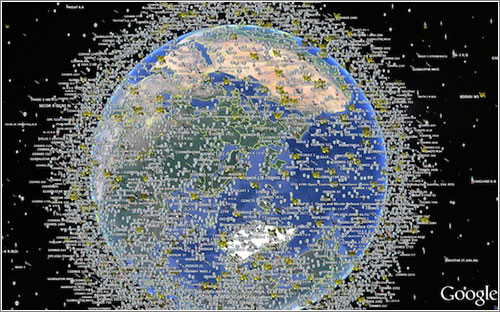

Such computer-generated visualizations offer the chance to visualize the satellites that track our changing global positions and information flows, relaying media world-wide over a multiplicity of interconnections: the image reveals what lies outside our visual abilities or comprehension–and which we would be otherwise all too apt to forget otherwise– by using government data to allow us to visualize the multiple layers at which satellites orbit our planet, even if they make it hard to track the wide array of signals that they transmit, intercept or surveil. But they were absent from the multiple covers that served to catch readers’ attention in the global-themed relaunch issue of the New York Times Magazine, a striking photograph of a suspended glowing globe, shot in a studio setting with an exposure that disorientingly overlaps the toponyms of Africa and South America, whose equatorial line seems to cut the globe in an unfamiliar place.
The maps offer an angle to contemplate the stunning long-exposure image of a rotating globe editors of the Magazine recently commissioned from photographer Matthew Pillsbury as a cover illustrating the rapidly changing world for a relaunch issue. The lit globe seeks to communicate both “the idea of chaos in the world, and how this is something we have all learned to deal with,” the design director observed. But the cover of the New York Times Magazine designed by Pillsbury demands attention both for how it holds the viewer’s interest and renders the globe as its ostensible subject. The photograph is an artistic interpretation, and compelling illustration that reveals multiple relations between art and cartography, as much as it describes the relations between nature and culture or between news media and globalization. But if the image was intended to convey the “speed at which our world is changing” to readers, and presumably represent the news covered in its pages, it gives pause–even as an image that reflects on current quandaries of abilities to sustain the successful illusion of a promise of comprehensive news coverage in an ever-changing world.
1. The almost transient shadow toponymy in the globe as Pillsbury managed to photograph so that the names of Venezuela, Bolivia, and Brazil congregate in a ghostly region off the shore of Africa, and Europe is suitably displaced to its upper regions, suggests the shifting focus of the news, and even questions the familiarity of reading the globe though that most conventional didactic of mapping forms, a globe of the sort one might have encountered in a schoolroom when learning about world geography for the first time: the apparent overlapping of continents and blurring of the northern hemisphere destabilize our surety of global geography in an intriguing way, set, disembodied, above the words “HELLO, WORLD,” ask we re-examine the map we thought we knew.
The five-color globe that appears in the header to this post is, in fact, while a welcome departure from the templates of Google Maps, similarly opaque in the very inscrutability of the very glittering image of earlier attempts to map the earth that it offers. Pillsbury’s long-exposure photograph of a spinning lit globe deserves interest as an advertisement of how the newspaper of record mediates news from a perspective that narrates a version of world news increasingly interlinked and less stable through a strikingly retro medium of mapping as a glowing globe. The photograph addresses how the shifting of what once seemed immovable territorial boundaries circa 1989 have not only been redrawn but shift with an unforeseen fluidity challenging to comprehend. Yet more than inviting us to interrogate relations, or the mobility of global populations and goods, the image almost aesthetically distances the spinning globe from viewer as much as it reveals levels of entanglement of places to one another and intensified contesting of sovereignty. The blurred five-color surface of the spinning globe seems to abstract mapping from human geography. It not only suggests the opacity of its ostensible subject; indeed, it almost asks the observer to throw up their hands in something passing for marvel at the illegibility of a large area of familiar regions, and at the increasing entanglement of current events. It almost revels in being intentionally opaque, however, as if to say that the old indices of orientation just won’t work or clearly be commensurate to the take on current events that it will describe.
2. To be sure, in an age of the proliferation of maps on multiple platforms and hand-held devices, it’s refreshing to rehabilitate the schoolroom globe, and almost ask us about our current world’s distance from it. Oddly, however, Pillsbury’s cover employs an almost antiquated didactic object, a school map, relinquishing interactive mapping tools, to suggest the quick-changing world. By spinning a schoolroom globe at high velocity to craft a visual pun to illustrate global change, the cover raises as many questions as it answers. What seems a conservative cartographical format-if here used somewhat tongue in cheek–as an icon of cartographical authority is almost prosaic. The sheen of the surface takes advantage of the conventional five-color globe of the world to seem to suggest a surface whose very colors and hues are so blurred to render them and all surface toponymy illegible, as much as an image of totality of global relations. As may befit the newspaper of record, the globe is steadfastly traditional in its familiar five-color design: it suggests a space by no means fixed, where boundaries around countries are redrawn and surfaces blurred for all practical purposes, but only tweaks the most standard image of the global coverage to suggest a disorienting sense in which we might lose familiarity in its geographical contours, rather than promise truly comprehensive coverage.
For the globe’s illegibly blurred surface almost erases the considerable varieties of mapping by which we’ve come increasingly to understand and orient ourselves to the world, and almost relinquishes hopes for a new ethics of a world view, but just suggest the inadequacy of imagining the ideas of terrestrial location, proximity and geopolitics as received from earlier school globes.

Is it that the idea of boundaries of knowledge are just not so clearly fixed after all, or that the problem of providing a single authoritative viewpoint is being explicitly acknowledged? What does it seek to illuminate?

More troubling, Pillsbury’s photograph of a glowing globe offers us no place to decipher almost a single word: the effect is almost to see words swimming across its ghostly surface, unlike the transient figures that inhabit urban spaces in his stunning body of photographs of urban spaces. The notion of a commission from the photographer to create an image of global coverage might be misplaced. For Pillsbury has worked primarily in cities like New York, Paris, Venice, or London, using his knowledge of the local to much advantage, as well as Japan, more recently, where he’s taken advantage of a Guggenheim Fellowship to turn his lens toward explorations of Tokyo’s public spaces. His subjects have been less global than relentlessly cosmopolitan in scope. Pillsbury’s recognizable style is more than a sign that the Times seeks to cultivate readers as the hip newspaper of record by the image in this post’s header, as much as suggest an actual global purview of different spaces. The picture is almost a way of conveying just how difficult the job of the news is to convey all that’s fit to print, in a time when the world seems spinning faster than ever before.
3. As an artist who has investigated the relations of crowds to urban space the spaces in New York that he knows well, often working to illuminate the “performance” of identity in interior or cavernous public spaces where individuals and crowds congregate, Pillsbury has cleverly employed extended exposure to blur the boundaries among individuals in urban space and place. The result is to question the relation of the individual to settings that might be otherwise familiar. The extended exposure of the globe is less of a site for staging events or a setting, than a surface just out of contact with the viewer’s eye. Despite the suitability of Pillsbury’s medium to observations of the interaction between individuals and images, or crowds visiting museums, such images are effective as encouraging ongoing visual investigations by expanding time in exposures from a few minutes to an hour that is collapsed into a single image. They indicate the changing “geographic imagination” by which we all inhabit different spaces. The spinning globe is photographed less to offer a record of lived space than an almost fetishized surface as an object, more than inviting viewers to consider the spaces that they inhabit; if the urban spaces can never be stopped or reduced to a purely static form, the globe is always in motion and hard to perceive save by the brightly lit sheen it presents. It recalls a past legibility of space, rather than propose a prospect of continued legibility.
The photograph on the cover of the Times Magazine, despite its candy colors, contains a clear note of melancholy of the absence of hopes for adopting a clear relation to space, even as it radiates contentedness in that realization. The photograph is perhaps best taken as a meta-observation on the success with which maps can continue to command interest in a changing world. The candy-colored globe is an icon of cosmopolitanism, not primarily oriented toward coverage, blurring the notion of one-to-one signification, and almost attesting to its own inadequacy. That is not, however, the most confident self-image for journalism to project. And it hardly helps that we have to wade through about fifty pages of full-color advertisements for high-level commodities and financial services, speckled with small articles, until we find articles about the world in the Times‘ recent “Global Issue” that meet the promise its title posed, but raise some of the issues about which we might want to learn if we could better distinguish its spinning surface after all.
 New York Times Magazine
4. The photograph interstingly contrasts to how Pillsbury regularly runs long exposures to pose topics of visual interest that invite us to look at how spaces are inhabited in new ways, raising compelling questions about the construction of space and how we live in it, the globe’s familiar surface offers more of an elusive object of desire and a commodity–and not provide a space that invites us into it, and whose business invites us to sort outs its contradictions. For if the issue doesn’t really invite us to look at the world, so much as the advertisements suggest the globalized economy it serves, the sort of select writing that we have to wade through glossy ads to find is a deserved reward, but hardly a point of entrance.
Another of Pillsbury’s images of a strikingly similar color palette suggests the pronounced permeability of place to humans, and explores a living geography defined by human interaction in ways static maps can rarely either work to successfully register.
 © Matthew Pillsbury / Courtesy of Benrubi Gallery, NYC
But the ghostly presence of the illegible globe almost suggests a world that can’t be grasped, about which we are as mesmerized as challenged to process information. Rather than invite the reader to interpret global space, the image seems a farewell to geography as a matrix of information, rather than the promise of global coverage made by most earlier symbolic maps in newspaper mast-heads or the animated backdrops of nightly news television shows.
 New York Times
One senses that there is less interest in the history of an icon of spatial inter-relations, and networks of relationships, than an insider knowledge of how far we have come from the sorts of globes we used to use in school. The photograph seems to gesture, however, to a long history in the twentieth century that takes the globe as a promise of the coverage that the news–or a news channel–could offer, if its iconic role seems to have considerably atrophied as it grew increasingly antiquated in current news graphics, which cultivate far more dynamic modes of visual engagement.
5. The iconic marquis of De Lauer’s News Stand in Oakland, CA, whose range of international papers made it a mecca of the hard-to-find remains a survivor of the on-line. The globe of its marquis dates from the Cuban Missile Crisis, as is perhaps evident in its charmingly corny magnification of the United States. The globe so prominent behind the name “De Lauer’s” in the marquis provides a notable predecessor of the symbolic promise of mediating global information, and the purchase of the authority of the globe as a promise of the delivery of objective information to a shifting readership of news; even if the prominence of the United States on the map belies the fact of the range of international news it continues to sell, the marquis illustrated the inter-connected nature of the world delivered in print daily to the door of an Oakland news stand.
 Oakland, CA
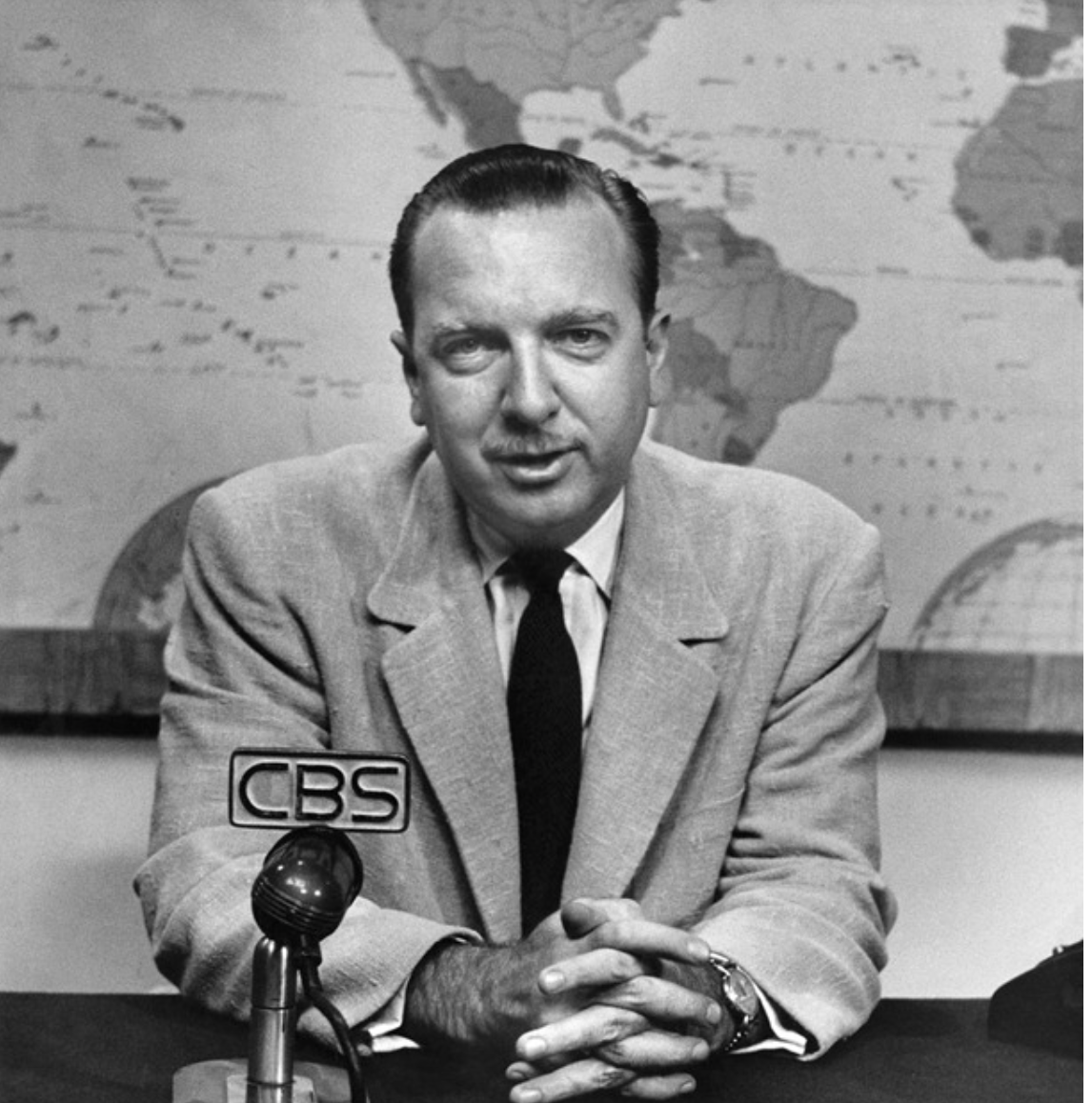
The image of the newscaster reading the globe was easily transposed to early television news for some years as an authoritative setting of addressing a public audience of viewers, back when news was of a considerably more univocal enterprise. What now seems too a tired template for breaking news has retreated to a background of increasingly schematic form, no longer the authoritative site of enunciation from a position of expertise it was for Walter Cronkite’s newsroom, even as the studio backdrop map was recently reinstated for current newscasts. The map in front of which Cronkite spoke was something of the objective correlative of the reliability of the individual newscaster, or a sign promising continued confidence in his pronouncements, and was updated in the famous equal area Goode homolosine projection that was adopted for CBS Evening News.


Walter Cronkite (c. 1968)
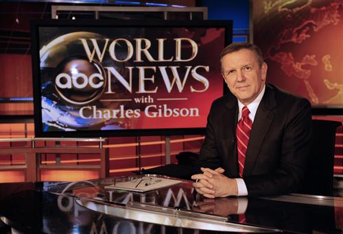
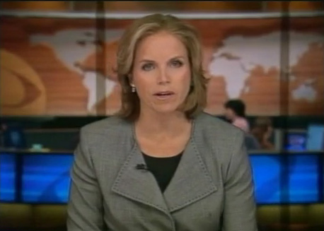
It’s unclear if this is still the case, even if the network has recently resurrected the same backdrop, it seems to lack comparable authority.

The stability of the globe has atrophied in network news, receding to a backdrop with strikingly less signifying power. The globe has become a glyph of reduced prominence and authority–not only because of compelling graphics, but as its meaningfulness seems increasingly worn and holds less promise or stages a narrative of global coverage not clearly attached to a somewhat overly tired symbol. No longer corresponding to the omnipresence of proliferating online maps in our worlds and on our other screens, the world map seems a superadded surplus, almost an older piece of mental furniture pressed into new service.
The world map is often pressed into service as a supporting graphic rather than an authoritative point of reference:


It’s hard to say how much a static map can pose the pretense of authoritatively describing a terrain that seems so rapidly shifting and whose dynamics of power it could hardly capture. It is difficult to assert the globe’s a promise of comprehensive coverage, or successful a medium to hold the viewer’s attention.
6. To be sure, the continued promise that the globe makes is not truly able to be taken so seriously, as well, given the multiplicity of news sources that we tend to presume, and the difficulty of assuming that one source would credibly count as a fount for universal coverage. Although global coverage remains an icon of authority, the geographical distribution of news items printed in the Boston Globe, MIT’s Center for Civic Media‘s project “Mapping the Globe” demonstrates, by showing the return on the promise of global purview promised in the newspaper’s masthead against its stories–demonstrating a predictably skewed coverage in 2011-15. If reflective of recent global “hot-spots” in Egypt, Syria, Pakistan, and Iraq in that period, the skewed nature of their current coverage directs attention to and mediates a picture of global politics to its readers which one can easily re-imagine as distorting actual its proportions in response to proportions of the paper’s coverage:
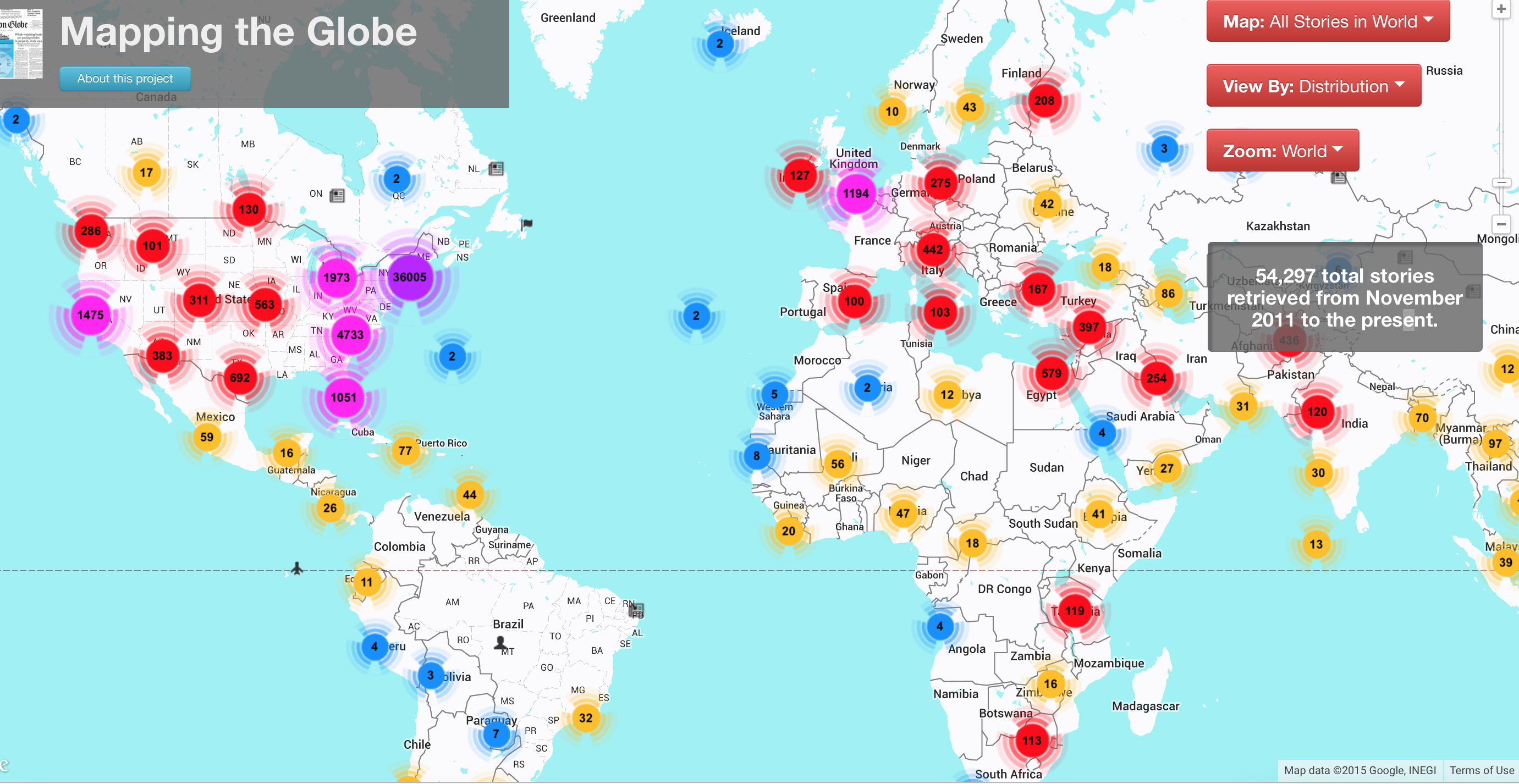
While this partly depends on the paper’s distribution, and putting news on the table that will grab attention–and this interactive map will allow viewers to investigate the map at much further depth, below its surface, by hyperlinks to the exact stories about each region that they can scroll through, as if by a toponymical indexing of the newspaper’s coverage of recent events:


It raises questions of the picture of the world that we see refracted in the news stories that the Globe prints, and what it effectively filters out of the mix to provide its coverage of news.

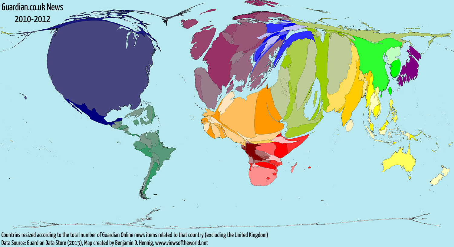
The result, based on a morphing of the world map by data about stories related to countries in the Guardian newspaper, 2010-2012, was remapped accordingly by the energetic and enterprising cartographer Benjamin Hennig, in a cartogram that reveals the distortion of hemispheric privileging of space in the newspaper’s coverage, while maintaining the actual land/water ratio: the result instructively magnifies the mideast, US, and Europe, echoing of distortions of the Mercator globe, while magnifying the AfPak region and Iraq, much of the Middle East, and both Japan and the Koreas:
Even without actually drawing an proportional cartogram of global areas covered in stories that reach print, such as that created by developers of Worldmapper, from Hennig to Danny Dorling, which rescale the size of nations in proportion to how often it is mentioned in online news items, or to create metrics of places corresponding to the size of articles newspapers devote attention to them–and perhaps have retained active bureaus–newspapers hard-wire our brains to a global map or worldview we all too readily internalize. The worldview leads us to expect stories from regions of the world, and to suddenly make space for others–Ukraine; Liberia; Nigeria–aware that they may suddenly may disappear. This might be called the world we bring to the paper, as we first click on its homepage or physically open its pages, as much as the world that the paper covers. But the blurred world of shifting toponymy that Pillsbury preserves is more often one that lies just out of reach.
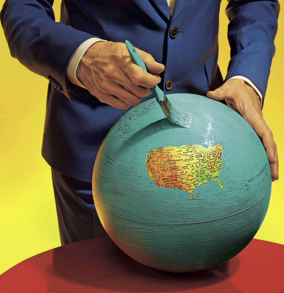
In terms of the acknowledgement of the blinders by which the world’s news is actually mediated, it’s nice to close with the combined tension of peace and violence created by the coexistence of obliteration of information and an ideal of harmony refigured by far more ironical image created by Maurizio Cattelan and Pier Paolo Ferrari for the same Magazine. Cattelan and Ferrari provocatively painted of a repainting of the globe’s surface that both conveys a suggestion of blissed-out harmony of the island of the lower forty-eight states, and a terror of obliterating all existing toponymy save that in the forty-eight states between the Atlantic and Pacific oceans, save the partly obscured lettering noting both oceans. This masking of a map shows an optimistically if terrifyingly blinkered news, a sense that the world is best in our hands when we’ve obliterated most all that is outside our immediate purview, prepared by what seems a man in a dark blue serge suit, who is calmly and decisively moving a brush studiously to conceal most of the surface of the inhabited world with baby blue paint, in a sort of Brave New World image of preparing What We Want To See as much as ‘All the News that’s Fit to Print’–and wonder if its consequences are so pure–and who is the suitably anonymous man in the blue serge suit who is doing the overpainting, anyways. (It echoes the rendition of a perpetually sunny scenery in Google Maps, though even Google is more forthright in offering geographical coverage. But it would be hard to offer less than shown below.)
 Cattelan/Ferrari
The multi-media image of a painted-over globe seems to record the censoring of what we need to know, and what is to be seen–and presents us with the manicured image of what we know best if not a view of the world where censorship is the new norm. In the post-Snowden world, we cannot help but think about NSA’s efforts to infiltrate internet carriers and compromise global telecommunications networks without concern for international law–or treatises with the sovereignty of neighboring countries in the Caribbean: in this globe there is “an equal measure of terror and peace,” although the peace lies in obscuring of the world outside of the United States by blanketing the entire world with coats of light turquoise latex paint.
 Cattelan/Ferrari (detail)
Both images provoke us to consider the ways that the image provide commentaries on news as a space for learning around the world, or to orient ourselves to the dynamics by which we describe and are invited to investigate the world.
The mediated nature of news is, of course, not so tacitly commented on by the image of the editorial team that assembled the updated Magazine, young folks huddled around a large-screen Apple monitor of pretty similar ethnic identity and economic background, preparing the image of the world that will be soon ready to be consumed. Has the screen replaced the globe?
 New York Times

