
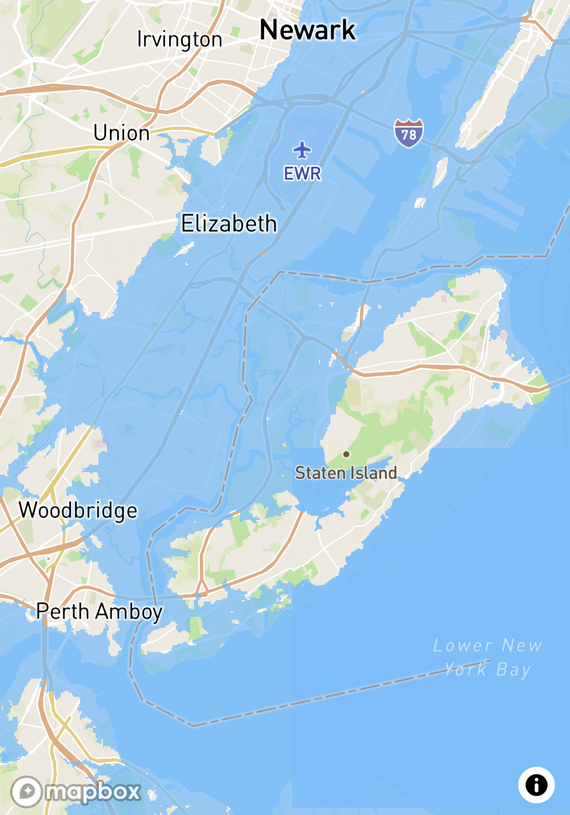
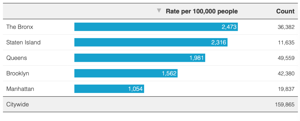
The counter-intuitive answer is not only “yes,”–but by over twice as much, as the early navigators of New York Harbor would have had no time negotiating, especially if you considered its large submerged underwater land mass that dwarves other boroughs. Rising sea-levels may mean that sea levels many parts of the reduced or shrunken shoreline of a future Staten Island will lie underwater by 2050, ending the integrity of Staten Island as an island, would reduce “Staten Island” to a tortured archipelago, covering its beautiful beaches by tidal waters able to submerge shoreline of coastal neighborhoods–whose remaining islets and sand bars would be about as large as Manhattan. But the heightened insularity of Staten Island that global warming may well bring offer a picture of inhabited land that is far different than the borough’s continuity presents residents. If the forested greenbelt of Staten Island makes it one of the largest urban parks in the city, the Island has too often been mapped in reduced form, as if it were not part of urban space.

Anticipated Reduction of Staten Island after Projected Seas Level Rise
To be sure, anticipated sea-level rise would reduce Staten Island’s geographic expanse. But it already occupies a less prominent place in the current cartographic rendering of the five boroughs. Due to an act of somewhat irresponsible cartographic persuasion that has infiltrated the spatial imaginaries of most New Yorkers riding public transit, and rarely visiting the island’s shores.
The cartographic contraction of New York harbor in the current subway maps compartmentalize Staten Island as an inset that reduces its apparent size in the metropole for many New Yorkers who may not visit the borough, or visitors to the city. Even at a rise of two meters, the Staten Island would be not much reduced–
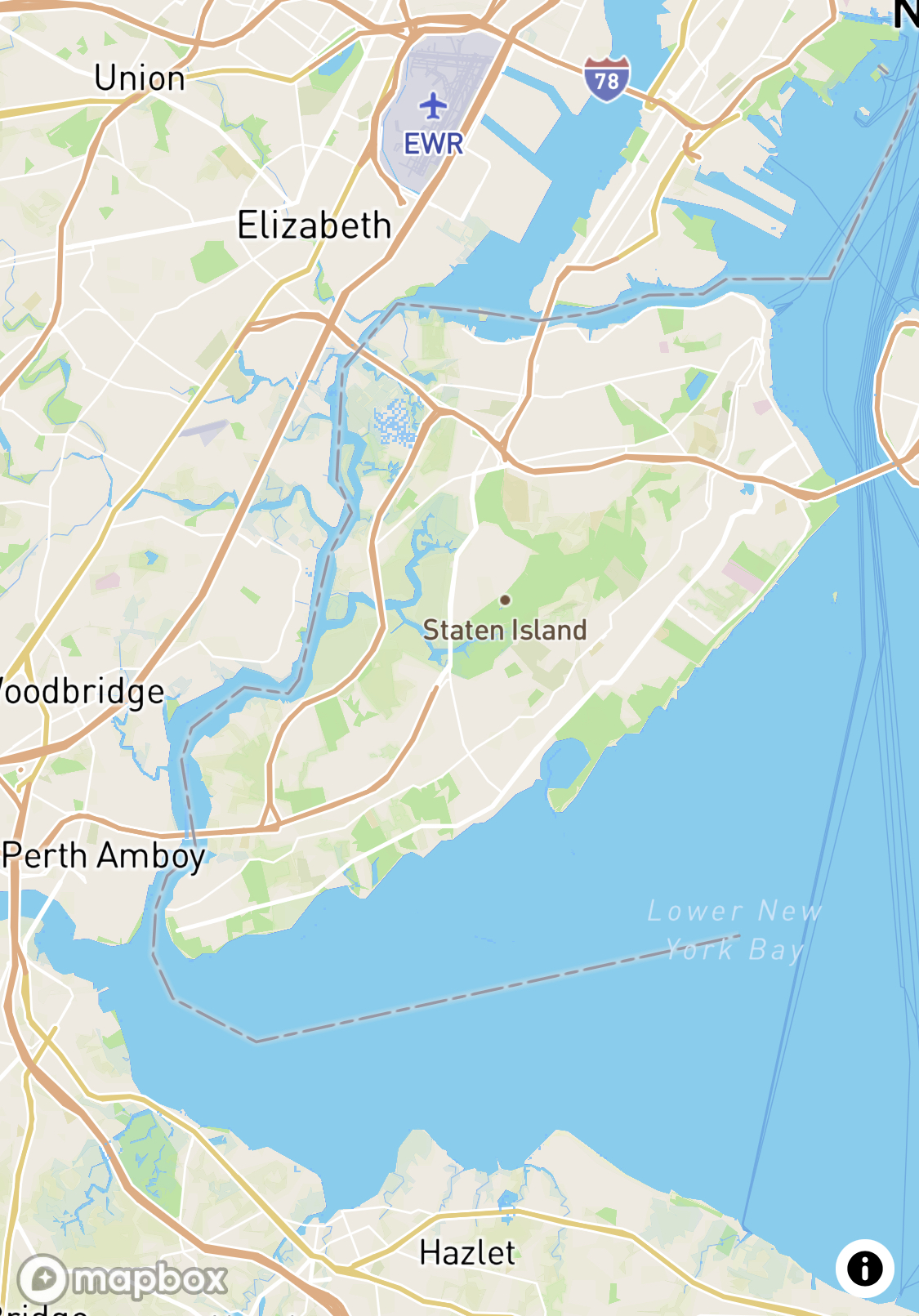
–if an incredibly rise of thirteen meters shrinks the sizable borough, if one uses the slider bar on a recent glorious rasters of an interactive map–
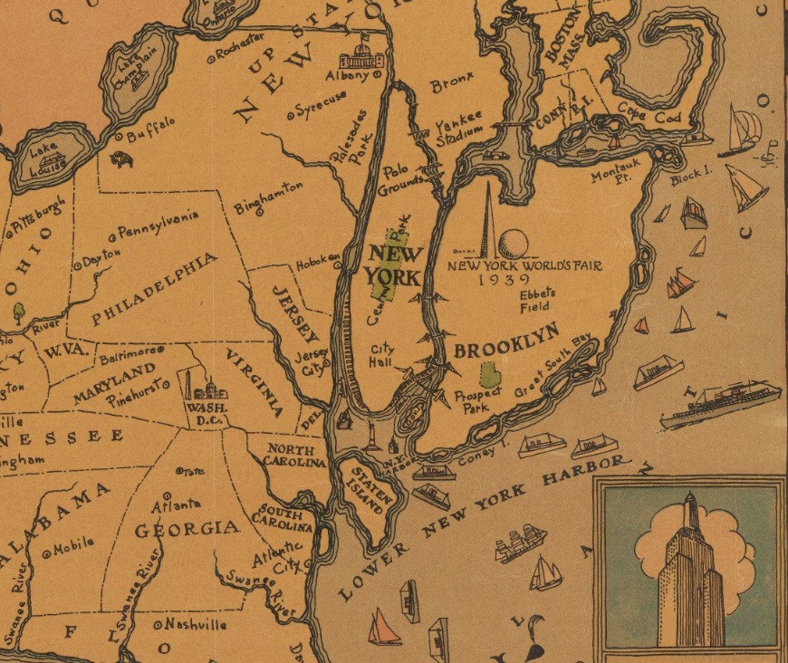
To focus on one “island” contrasts with the future borough’s prominent place in a coastal cartography of islands, mapped after the Revolutionary War–Staten Island featured prominently in a rich coastal cartography–Rhode Island; Block Island; Martin’s Vineyard Island, and Long Island–at the Peace of 1783–since obscured.
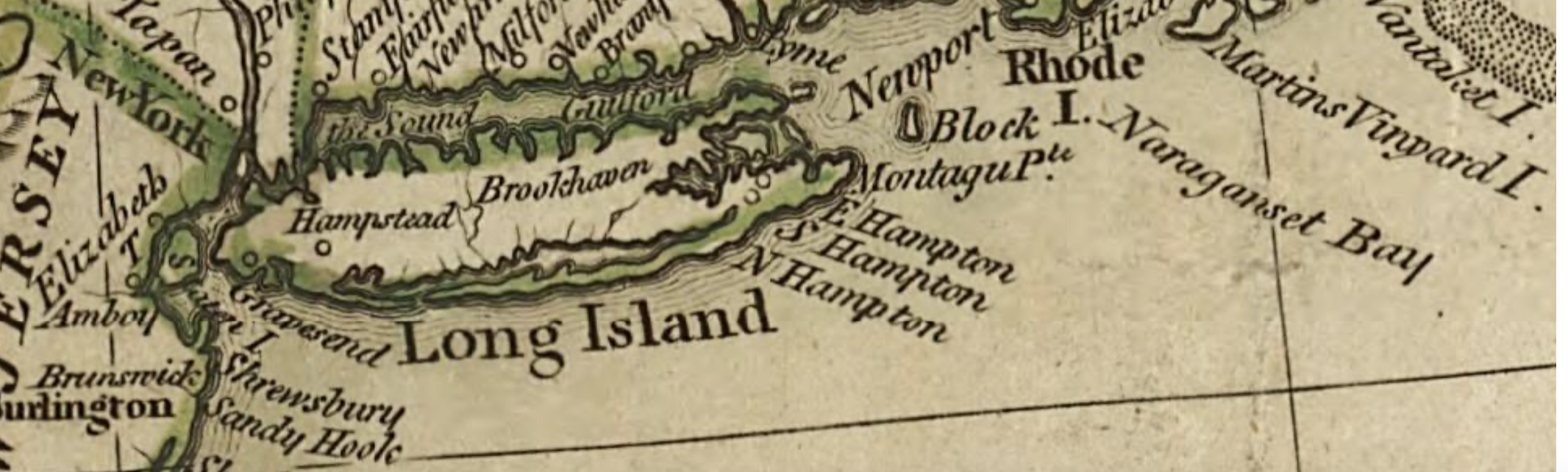
The United States Laid Down from the Best Authorities, agreeable to the Peace of 1783
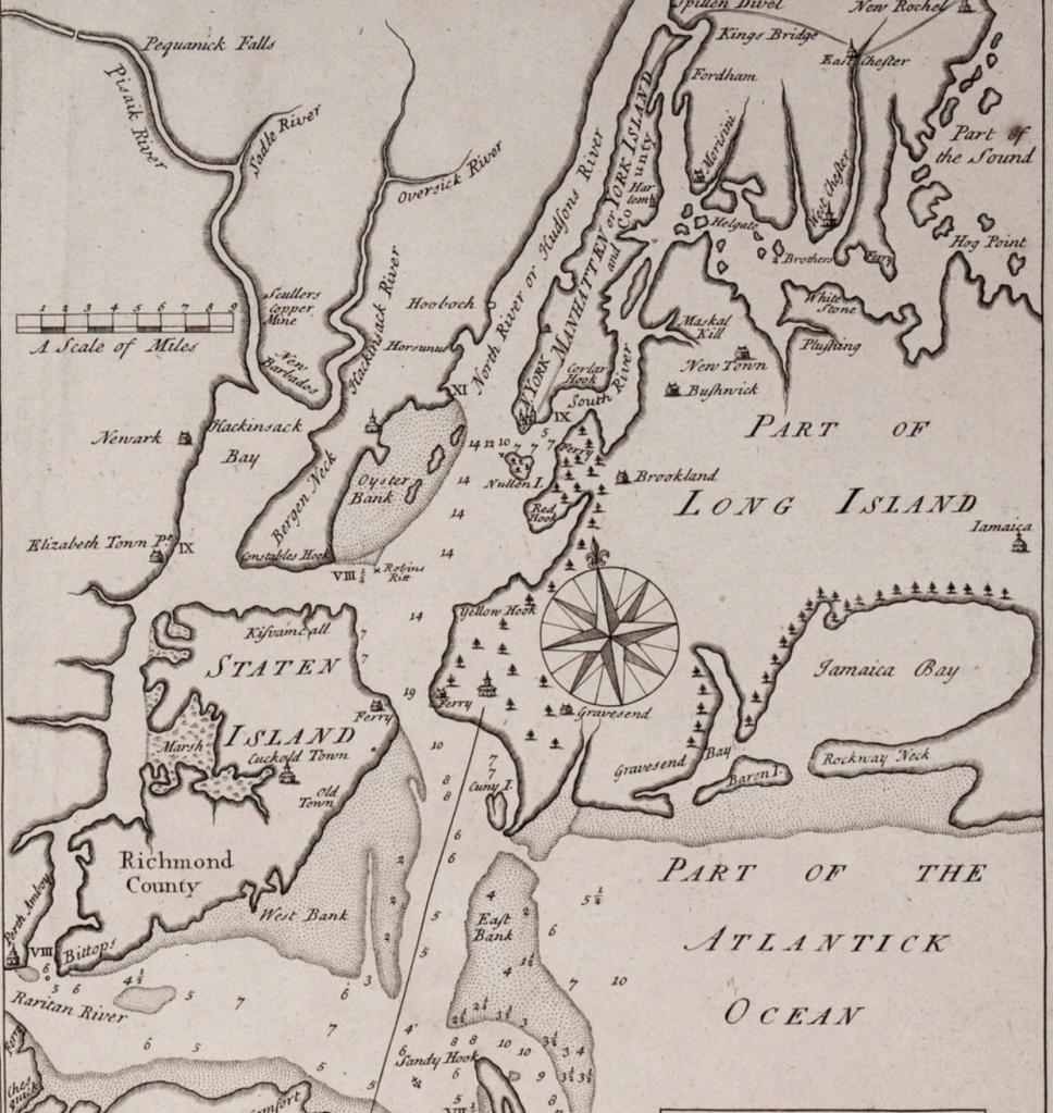
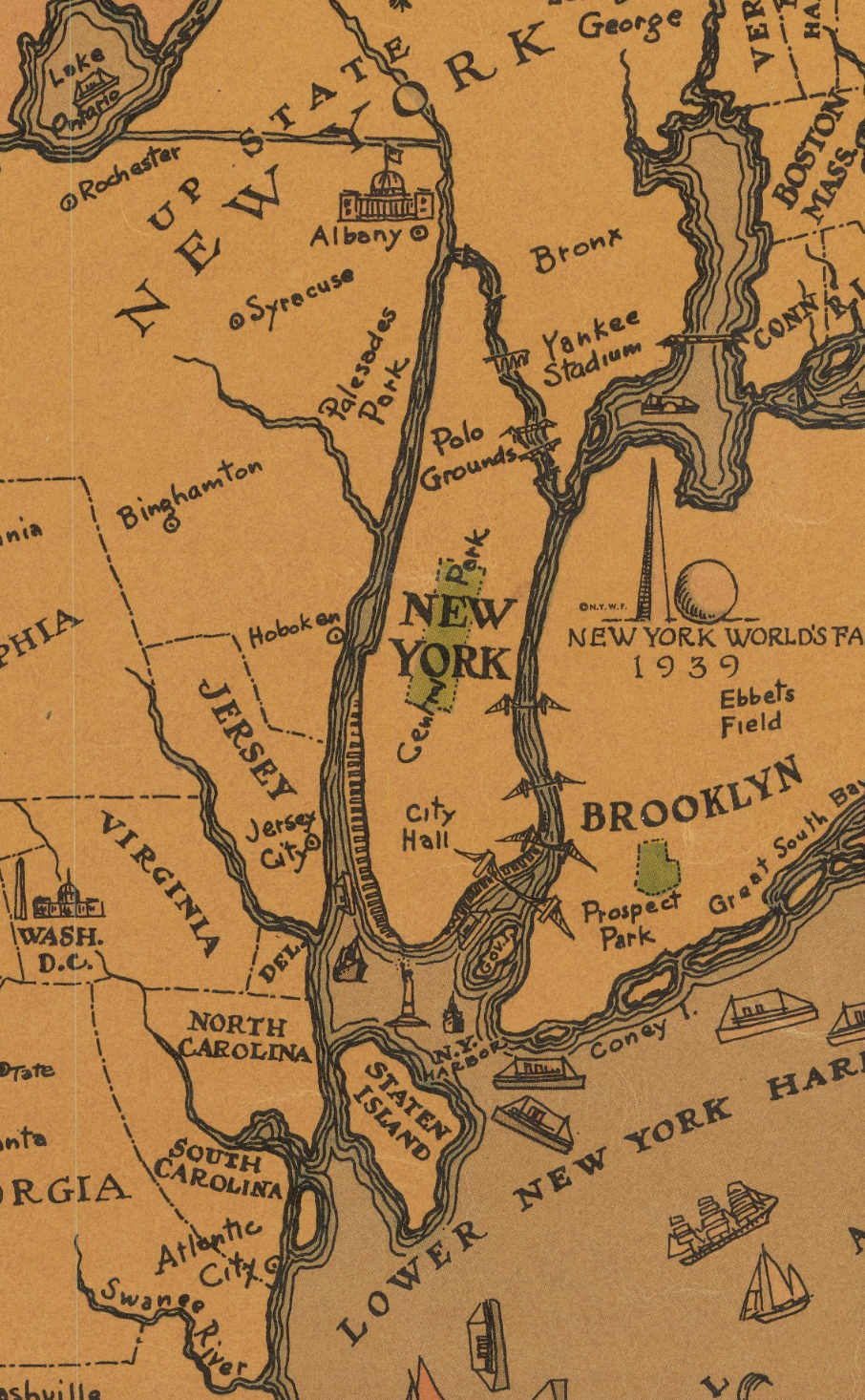
Familiar coastal continuities have been increasingly displaced and erased by a geography of transit, and the overpopulation of the other four boroughs of New York. The greater weight given to the density of different boroughs in current maps suggest how far removed in time and space from a time when “Manhattan” could be called “York Island,” in this 1740 harbor map–one of the first to naming the Hudson River that traced the shores of the marshes that once covered part of the island and its shallows with considerable care, centrality in the harbor north of the Raritan River and south of what was boasted as New Jersey’s richest oyster bed.
For although few early mappers would have neglected the size of Staten Island, that perhaps neglected borough of an otherwise racially diverse metropolis, its actual landmass–58.69 square miles to Manhattan’s mere 22– Staten Island indeed almost approaches the size of the sprawling borough of Brooklyn, but remains the least inhabited by far, with fewer than 500,000 residents, and seems at times epistemically as well as politically removed from other boroughs.
Is the low density of its habitation part of the reason that it has for so long held a lesser role in the spatial imaginary of most New Yorkers, and indeed the spatial imaginary that is projected to the nation and to much of the world? Even if it has been amplified by landfill, and lost its marsh, the larger size has been radically reduced, in the spatial imaginary of Manhattan residents.
Wikimedia
The growth of Staten Island’s current far more suburban character makes it the least populated–and the whitest–of all of New York City’s boroughs, as well as the last of the boroughs to be incorporated in the city–as the island was not only joined with Richmond County, but known as Richmond long after the city’s incorporation in 1898, and only changed its name in 1975. The cultural distance that existed between the boroughs was such that when Leontyne Price sang the first notes of Anthony and Cleopatra in the new Metropolitan Opera stage in Lincoln Center in 1966, “determined to do her country proud,” she confessed to being overcome from the very first note she sung by the “thought I was singing to Staten Island,” the amplifying acoustics of the concert hall seeming to amplify her voice across a cultural divide: Staten Island evoked the huge distance the new opera hall might have even allowed her voice to travel.
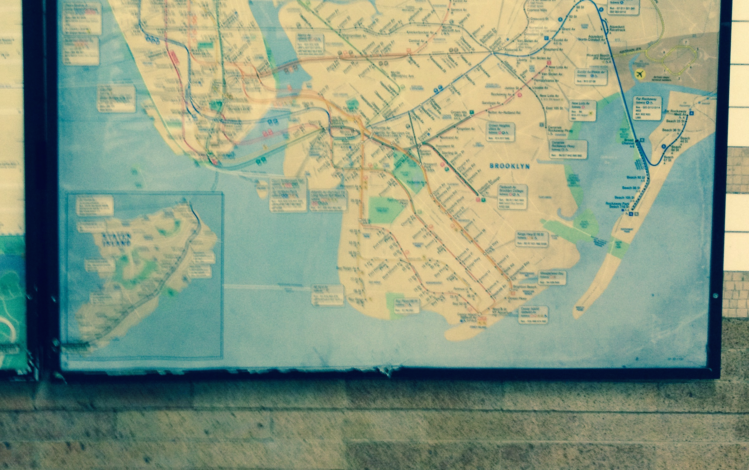
Was the overpowering nature of bridging a divide mere cultural elitism? Not at all–removed in politics from much of New York because of its distinct demography, the perceived image of Staten Island was reduced in the mental geography of most New Yorkers–as it is in the geography of mass transit that is perpetuated by New York City’s MTA, that common proxy arbiter of transit distance, despite its obvious distortions. For the universal authority of this symbolic map of the New York subway system, one of the most-read maps in the city, even if it has been often redesigned, distorted the relative size of the boroughs to increase the legibility of the network of trains. If Vignelli’s 198=70 subway map privileged forty-five degree angles and sleek likes of public transit that suggested the speed of local travel in a modernist image of space on eight pastels and grey, the vision that beat out local engineers and Brooklyn natives was due for a geographic update in 1979, and has long exercised a distorting power over our spatial imaginaries–even if the current pocket map is far more accurate a reflection of lived space than the earlier system diagram that left Staten Island entirely off the map.
New York Subway Guide (1972), courtesy New York Transit Museum Collection
Even the reduction of Staten Island to an inset map of radically different scale is the result of the far reduced presence of the MTA on the island, of course–and, perhaps, a reflection of the fewer sense of “cultural sites of note” on the island, whose history is rather opaque and whose lack of diversity is pronounced. An outcast of the five boroughs, in some sense, the Island is removed from the city, about as much as Long Island, in fact, an outer province of habitation that is quite worth visiting, and with a far more walkable if not richer colonial past than Manhattan–but is without the major museums and “cultural sites” to which attract tourists and to which holiday crowds regularly flock.
The recent Tableau datavis from Open Street Map data is only the most recent image of New York City that suggest the distortion bequeathed by Massimo Vignelli’s iconic five-tone subway map of the 1970s, a modernist vision of a public transit system and city then on shaky legs, bequeathing a luster and needed boost to the creaky noisy cars of the city subway now iconic: navy blue dots on the shore of Staten Island suggest the slim trail of permanent public art Bianca Ng mapped in a recent 2024 MTA challenge on transversals however render the island at far better scale–suggesting, in doing so, a starting point and an initial answer to the question this blog answers by tracing distorting power of the idea of Staten Island as a cartographic and geographic imaginary.
Bianca Ng, The Museum of Transversal Art/2024 MTA Open Data Challenge/MapBox/OSM
Is Staten Island less worth making the voyage by ferry as a pilgrimage? It is if you tire of urban canyons and noisy crowds. For this former refuge of French Huguenots, if joined to the city’s 1898 incorporation, was long mapped–shown here a decade prior to the incorporation of the boroughs, in 1889, as something belonging also vaguely to the offshore, but contains both far less congestion and more rural views. Not only are ts streets far less urban, or defined by a fixed north-south street grid as other boroughs, still dotted with small settlements on its shores, it offers some of the best pizza that can be found in New York–an interesting distinction. If early map titled “Staten Island,” the few place-names on the map’s face, that are running largely along the interior of its southernmost shore. When the great Concord naturalist, Henry David Thoreau, was a Staten Island resident back in 1843, tutoring Emerson’s son for the summer, he wrote the Sage of Concord of the beach with with great affection, even if professing to miss both Concord and the Walden Woods.
The island offered a sort of point of transcendence over New York harbor, akin to what John Gillis has called an “island of the mind,” long before Thoreau set up house outside of Concord on the shore of Walden Pond on Emerson’s old wood lot. Thoreau reassured the Sage of Concord in a letter from Staten Island that he would always “carry Concord ground in my boots and in my hat,” even if he rather convincingly claimed to his mother that “the sea-beach [of Staten Island] is the best thing I have ever seen,” a solitary shore where “you only remember New York occasionally,” however chafing it might be to have your “dwelling place . . . only considered a neighborhood to a great city,” tied together by a boat that left Staten Island five to six times a day as he visited local publishers to print his work. The sense of apartness from the city in Staten Island was something of a happy medium for the budding writer, set apart from the bustle of urban life. Was it a premonition of the retreat to Walden as an imagined island from which to observe the world?
While Thoreau was deeply dismayed by the problems locusts caused to the island’s forests and fruit trees, worrying about the locust eggs that would lie in the trees until they made their reappearance in 1860, he was dismayed at a din that could be heard from offshore sailors off its coasts, and it seemed a world apart from urban sounds of other boroughs. He was content to remain there for stretches of three weeks at time, without leaving the island’s shores, observing the local dogs, cats, and fowl that seemed to live on the locusts fallen from trees. If he loved the crabs and horse-shoes “dancing like sea-fowl on the surf,” the common onion that filled the island’s fields so fully regularly “spoils the cream and butter for the market, as the cows like it very much,” he told his sister Sophia, hinting that of the two schools on the island, one for girls, might provide a place Helen might work, and promised to “keep my ears open for her in such directions,” as if he might readily move there.
Thoreau was “living seven and a half miles from New York” in Castleton, the site of the Military Hospital and public health quarantine grounds, an edge of the United States, indeed, and convincingly boasted that living on the south shore convinced him to commit to “I must live along the beach,” before he moved to Walden, awed at the ability to “see what that great parade of [ocean] water means, that dashes and roars” in ways he had never seen as a New England mainlander, years before he lived at Walden, as the river pilot had never seen the ocean, which made him fell that the busy wooden sidewalks of Wall Street were much farther than seven miles. Was there any chance that Walden might have been Staten Island?
The later real estate development of the region where he used to climb the highest hill and feel as if a lookout on the edge of America, watching the Narrows “through which vessels bound to and from all parts of the world chiefly pass,–Sandy Hook and the Highlands of Neversink (part of the coast of New Jersey)–and, by going still farther up the hill, the Kill van Kill, and Newark Bay” as he watched sloops go up the Hudson, “which seemed going over the edge of the earth . . . “
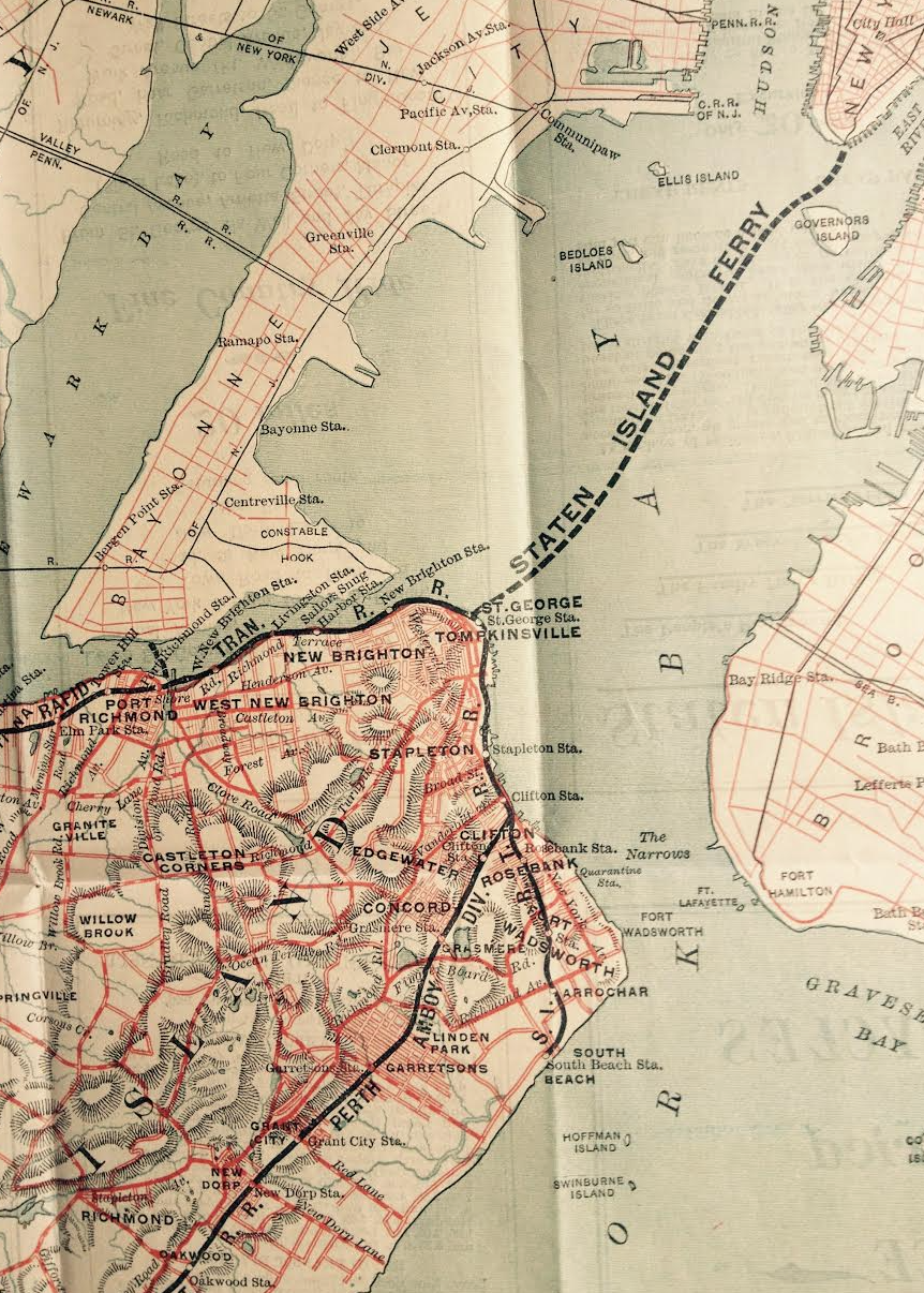
 Richmond County (1889), New York Public Library-Digital Collections
Years before the Metropolitan Transit Agency relegated Staten Island to the status of a cartographic inset of reduced scale, Daniel Wellingford’s 1930 pictorial map, A New Yorker’s Idea of the United States of America, sought to capture the distorted geographic imaginary reflecting the over-inflation urban Manhattanites gave their metropole. The disproportionate size of Manhattan seemed to fit the hubris of designating it as the site of the 1939 World’s Fair to be reprinted that year, when the Trylon and Perisphere seemed cast as a monument to American progress as great as state’s capitol–or indeed most other cities in the New Yorker’s own urban imagination.
Daniel Wallingford designed the striking pictorial map prior to the city’s purchase of the elevated tacks of the IRT that created the interborough transit system joining Manhattan with the Bronx and Queens in a single system, apart fromStaten Island; the map relegated a reduced Staten Island to the Deep South, intentionally casting it as the smallest borough, dwarfed by the island of Manhattan, Queens, Brooklyn, or the Bronx–figuring it as about four times the size of Prospect Park, as if it were an afterthought below the Statue of Liberty, as a region few visitors of “the City” would think to explore, lying in the lower harbor, removed from the cosmopolitan vision of the other boroughs.
The novelty map contemporary to the World’s Fair allows one’s eye to rest on Central Park and the all caps font of NEW YORK that dominates the eastern seaboard, as the Trylon and Perisphere command attention in a Long Island that seems a counterweight to all of western New York. The map may mock the global identity of New York City assumed, magnifying all boroughs save Staten Island as large coastal islands along the seaboard from Albany to North Carolina, but relegated the fifth borough, Staten Island, without attractions and apart of inter-borough transit, off the coast of North Carolina–as if the Lower New York Harbor lay at the lay near Savannah, Georgia. It called New York City a “nation within a NATION” of some 7.000.000 inhabitants, “known as New Yorkers,” collecting a “composite of NEW YORKERS’ ideas concerning the UNITED STATES” deriving from the “patient research” long before Saul Steinberg’s View from Ninth Avenue exaggerated its cosmopolitan provincialism on the cover of a eponymous magazine, eliminating Staten Island or other boroughs.
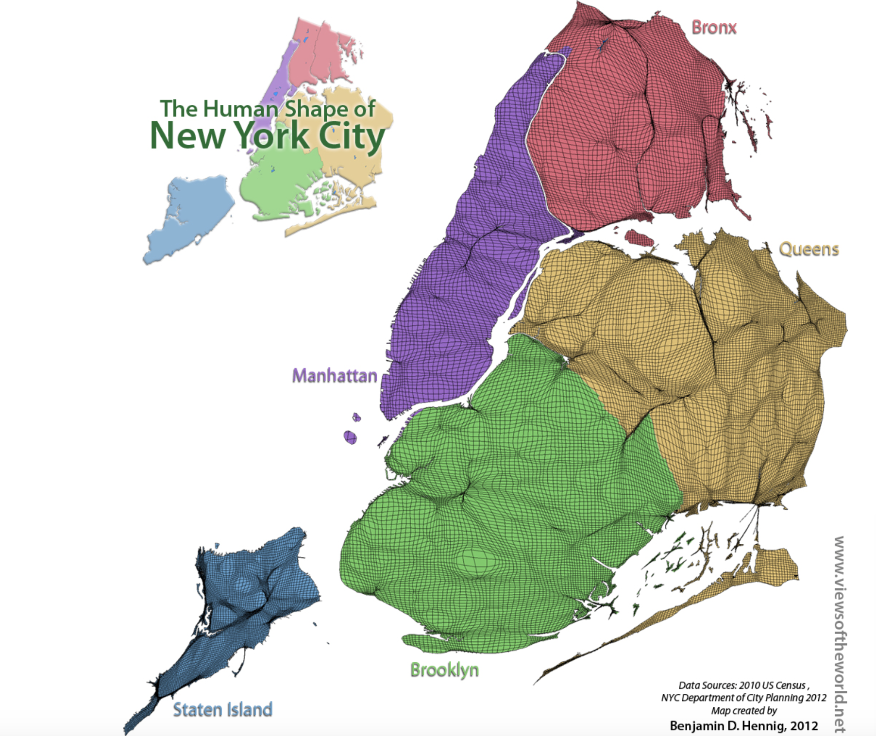
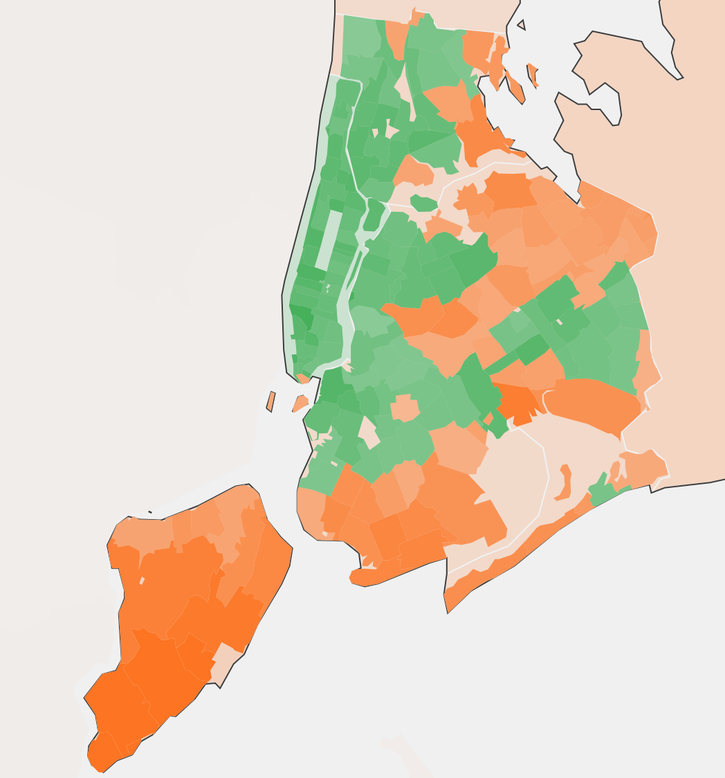
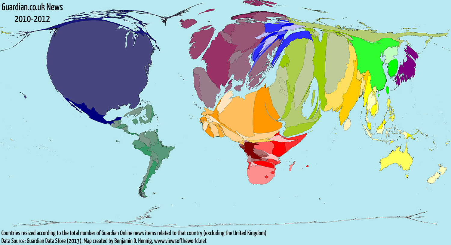
If the Steinbergian cartography of 1976 was indeed a Manhattanites view of the world, or perhaps that of the reader of the eponymous magazine, the question of Staten Island’s relative size is not only a quiz show. The current borough’s actual geographical size is such a surprise due to the longstanding cartographic distortion of its boroughs, and not only on the transit map. The borough remains less populated, to be sure, and mapped by the proportion of the city’s residents, using data from the 2010 US Census, as revealed in one of Ben Hennig’s cartogrammic warpings of space, here shrinking each borough in proportion to its population–which both illustrates and shows by re-rendering the borough’s size to correspond with its number of permanent residents.
But the counter-intuitive nature of question may also be based, to cite Streetsblog, that the quite pastoral area to which one often arrives by ferry on one of the few remaining free pleasure-rides, offering an easy opportunity for photo ops in the New York Harbor beside the statue of Liberty, is also among the “least walkable” of areas in the city, and despite its interestingly old architecture and churches, often finds passengers boarding the next ferry to return, rather than explore the less densely populated site of residence that they reach by taking the sole remaining remnant of the ferry system that once connected residents of boroughs in an era before such bridges as the Verrazano or Triborough were erected.
More surprisingly, hence, Staten Island’s population produces considerably more garbage and waste in comparison to other boroughs–at least to judge by the mapping of some 274,000 tons of trash that New Yorkers generated in five boroughs in September of 2011. The tally of collective trash, made before the dispersal of urban refuse to such far-flung sites in Ohio, Pennsylvania, Virginia and South Carolina, found that some 99.4 lbs. of trash and recycling combined were generated by its residents per person–over twice what Harlem’s 11th district generates, illustrating a stark citywide difference in patterns of consumption. As well as being considerably larger, the scope of garbage generated in the city’s borough reveals a disproportionate increase in the amount of trash–recyclable and not–coming out of the less populated expanse of Staten Island.
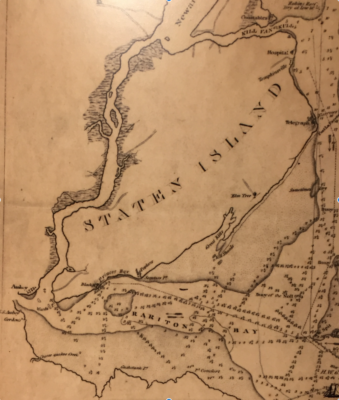
And if the island is not the largest of the boroughs, by any means, if one includes the large if submerged sand bars that form part of its landmass–if they are rarely registered on most land maps—the extent of “sandy Staten Island,” whose sandy Raritan Bay was a site for oyster cultivation, rich with shellfish, is both of greater expanse than many other boroughs, but a considerably greater geomorphological presence in the region–as early nineteenth-century nautical maps of the arrival in New York Harbor reveal–at a time when the Island was far more sparsely settled on its shores.
Despite the size of the island, the cognitive dissonance of Staten Island’s considerable actual expanse seems echoed in its relatively diminished size in current metro transit maps, across multiple iterations since the 1970s, that have offered one of the most famous urban symbolic visualizations of spatial relations in the city, and the most widely encountered.
Such maps perpetuate a deeply distorted view of Staten Island as limited to the Upper Bay, and excluding the regions nearest to New Jersey or the Jersey shore, may have been all too easily falsified by the spatially disproportionate coverage of the five boroughs in the MTA subway map, which marginalizes the sizable island–which lacks major lines of subway service–out of scale, by showing it at a reduced size in the lower corner of a map where a hypertrophied Manhattan occupies and expands across its center. For the talismanic transit map is a document of the spatial imaginaries transit-goers citywide, after all, in the most widely consulted guide to spatial orientation in the five boroughs.
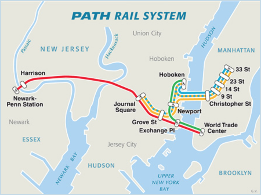
To be sure, the PATH map suggests a similar slighting of the borough’s expanse, in entirely omitting its very existence:
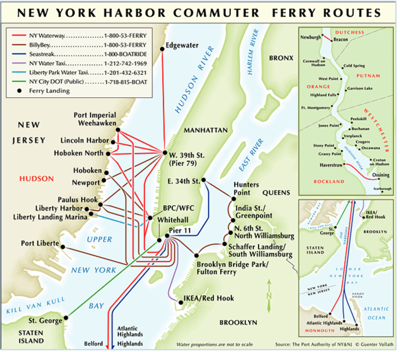
And the ferry map is not gracious to Staten Island outside of and apart from St. George:
But the disproportionate coverage of the inset view of the borough in the MTA transit map on the tiled wall of each and every subway stop in New York City which distorts Staten Island’s size most profoundly to confuse the spatial imaginaries of all subway riders, as it brackets Staten Island as a world apart, in an inset hardly noting its own shift to a different scale.
However, this was not always the case: in fact, the lure of Staten Island was indeed rendered more pronounced in one of the early maps of the Statin Island Rapid Transit Railroad Co., of 1893, which adopted quite the reverse strategy in depicting the topography of the sizable island as a destination of pleasure and unparalleled scenery–at least, as the promotional pamphlet announced, “the Most Beautiful Scenery within a hundred miles of the Metropolis,” and the “Finest Bicycle Roads of any suburb of new York,” making it well worth the excursion to future borough that was suggestively promoted as “the Wage-Earner’s Paradise,” “The Family Man’s Refuge,” and “The Married Man’s Friend.”
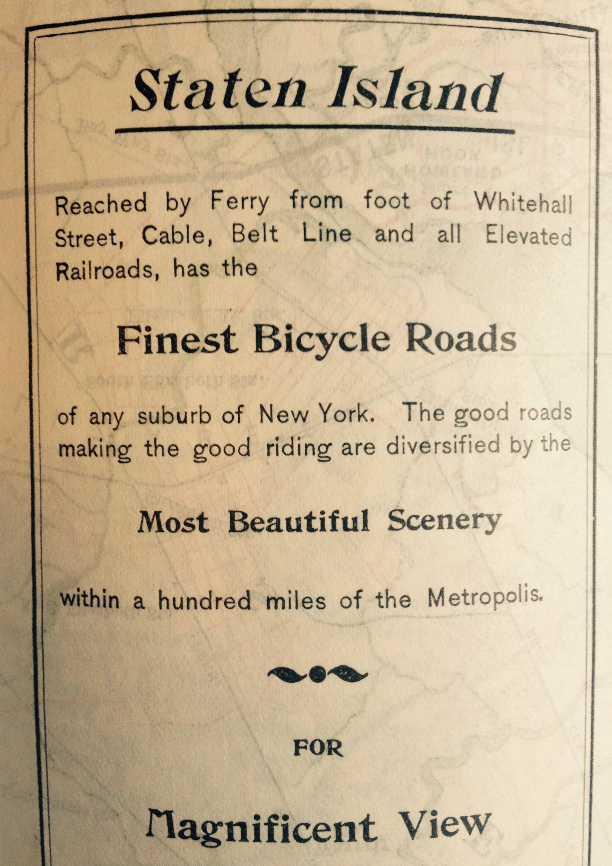
Boasting the “Finest Marine View in the country [sic],” the map that these legends beckoned one to unfold portrayed an island of compellingly detailed topography, inviting readers to take the cruise to the “People’s Playground” and “Greatest of all Summer Resorts” offering “Exquisite Views,” if not the “Beautiful Cloud Effects” that could be witnessed from “Excellent Roads” suitable for “Easy Riding” of up to some twenty miles round-trip distance:
Whereas the boroughs of Manhattan, Jersey City, and Brooklyn are two-dimensional street plans, Staten Island unfolds for the viewer in full glorious shaded relief, using shading to suggest impressively dramatic changes in elevation of hilly terrain in oblique fashion: the mountainous topogrpahy of Staten Island is rendered in detail by shading their slopes by hachures to give presence to sloping hills of the borough showing them in a tactile elegant relief, complimented by the streams that run to its beaches, as if to conjure a clearer landscape for the map-reader’s eye. The detailed landscape appears almost rural, as if to compel city-dwellers to voyage to the island that is shown with such greater topographic concreteness than other boroughs.
While the one-time Staten Island Rapid Transit Company pushed a different sort of pleasure tour as an itinerary than most contemporary MTA maps, which boast continuous coverage of four boroughs, the separate transit system of the other island borough in the late nineteenth century suggested the unique terrain that it sought to offer for all New Yorkers, in a truly democratic medium of leisure. Since then, the marginalization of transit-systems to a rubric of spatial inter-connection has led Staten Island to be reduced to the position of an inset view in the MTA transit map–reducing the sense that it is both actually so close to Coney Island, and creating a false spatial imaginary for many New Yorkers until they take the Ferry ride. But the distinct demographic, lifestyle, and voting preferences of the borough force it to stand apart, perhaps distanced from the city as a whole, and maybe bearing less attentive observation within the city’s melting pot.
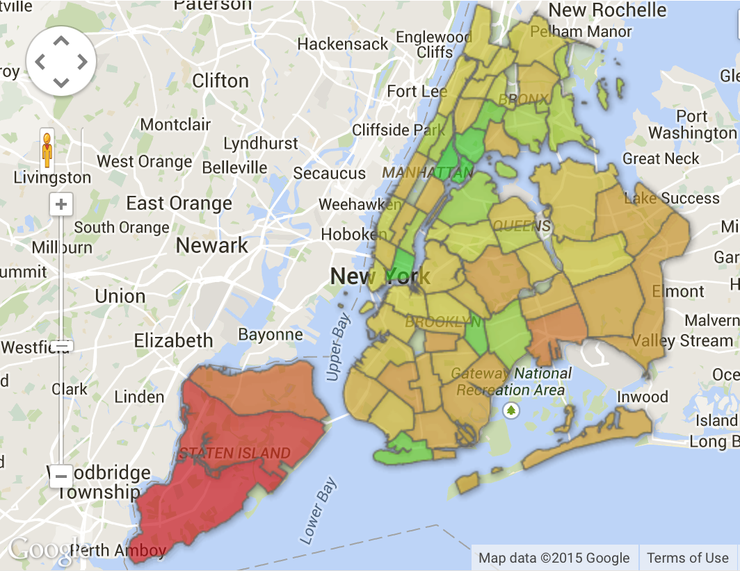
Indeed, this 538 mapping of Facebook likes of the Presidential primary of 2016–here, Clinton in Green and Trump in Tan–suggests the Democratic/Republican fault lines that seem to plague the calculation of a Staten Island v. Manhattan divide, and somehow spatially distort the relation yet once again–and, perhaps, another reason for distancing the proximity of such highly contrasting political preferences within the electorate. Indeed, in terms of its voting patterns, Staten Island–as many of the outer areas of the boroughs–stands apart and at a decisive remove from the more densely populated boroughs of New York City, and is perhaps all the more mentally distant from city politics.
The great equalizer is, of course, death, and the binding together of the city in the face of COVID-19 has, perhaps, been a striking equalizer, proving that even a non-living virus knows no boundaries between space or time, although not even the decreased population density of Staten Island has saved the rate at which the novel coronavirus has infected inhabitants, even if the island long seemed so spatially removed.


 Cattelan/Ferrari (detail)


