Category Archives: news graphics

The New Cold Warrior in the Triangle of Terror

When addressing the new Latin American policy in Miami’s Freedom Tower in late 2018, the new National Security Advisor John Bolton targeted Nicaragua and Venezuela in a striking geographic metaphor. He offered a new metaphor for described the dangers of a “triangle of terror stretching from Havana to Caracas to Managua,” in November 1, 2018, demonizing Latin America and the island of Cuba in terms that suggested possible plans for “taking direct action against all three regimes to defend the rule of law, liberty and basic human decency in our region.” As if to displace attention from the Northern Triangle from which so many asylum seekers have fled to the United States in recent years, including unaccompanied minors, and where civil society is overwhelmed by drug trafficking, gang violence, and police corruption, the new triangle Bolton seeks to shift attention is a target.

So it may have been no surprise that when attacking the legitimacy of Socialist Nicolás Maduro of Venezuela by imposing expansive sanctions ton Venezuelan oil and gas, Bolton seemed to tip the cards of power. Upping the ante from defining the Socialist regime of Venezuela as an apex in a triangle, in previous saber-rattling that committed the United States to striking a blow at a “triangle of terror” tied to the Socialist heritage of Hugo Chavez and to Raúl Castro, Bolton “appeared to disclose confidential notes written on a yellow pad” to reposition military troops to Venezuela’s border, standing before a global map the divided the globe in no uncertain terms, as if announcing a new configuration of power in his role as National Security Advisor for Donald J. Trump. The “triangle of terror” Bolton warned of in November 2018 seemed to essentialize the fundamentally dangerous notion a Latin American region ripe for instability. But it may have also been sheer coincidence that alliterative force of a rather pointless if powerful polygon was a powerful cartographic conjuring of a strategy of national defense, not located in the Northern Triangle, or the former Triangle of Terror where ISIS cultivated troops, but a new borderless triangle of even allegedly even greater danger–a triangle with a rich political genealogy from the Cold War.

Bolton’s adoption of the rare tired stock term of a triangle seemed to shift attention from the other Triangle of Terror, located when it was most recently in the news on the Afghan-Pakistan border, the very site from which negotiations have been announced to start to withdraw American troops. It may have been sheer coincidence, but Bolton seemed to shift attention from a triangle in the Middle East where American troops had been long stationed and that had been a hide-out of Osama bin Laden and Taliban fighters, as if by the powerful abilities of the friction-free nature of GPS–

–to a triangle that was closer to America’s own sphere of influence from the triangle of Peshawar, Quetta, and Kabul, from which the US was busy extricating itself. Bolton’s November speech was quickly taken, one might remember, as defining the intent of team Trump in relation to focus on a new Axis of Evil, adopting a hard line in Central America as sphere ripe for intervention–“This is not a time to look away. It’s a time to increase pressure, not reduce it,” Bolton announced–and the recent exercise of economic muscle to bolster American refusal to recognize the self-declared electoral victory of Nicolás Maduro, and to declare the legitimacy of Juan Guaidó as President of the nation, demanded a map to concretize the global geopolitical stakes that Bolton and Trump were ready to commit to Venezuela, although the map before with Bolton spoke revealed few of the roots for the focus on this new Triangle, but rooted confrontation with Maduro’s claims to legitimacy in the defense of democratic liberties.

Bolton cast the region as a geopolitical battleground for American interests in stark and rhetorically powerful alliterative terms. He openly opposed the United States to a “Troika of Tyranny”–a term that lexically hinted at a vehicle driven by Russia, but wasn’t the 2016 Presidential election–and almost openly evoked the chills or breezes of a new Cold War, with its division of the world to spheres of recognizing two possible Presidents in Venezuela in ways that expanded an electoral map of one nation to spheres of geopolitical influence–if not alliances–expanding in bizarre terms an electoral map to the world to show that it had global consequences–as if global power dynamics were as simple as an electoral map.

The infographic seems to advertise how much “other countries” had at stake in who was Venezuelan President, keeping mum as to why they did. It helped that Bolton looked the part of an inveterate Cold Warrior. And one could not but recall the openly proprietorial terms of last November, when he announced “Cuban military and intelligence agencies must not disproportionately profit from the United States, its people, its travelers, or its businesses” but pointedly attacked Venezuela by imposing sanctions on its gold, and attacking the “triangle of terror” or “troika of tyranny” perhaps metaphorically tied to a Bermuda Triangle, redolent with weirdly alchemical associations of unknown dangers near islands on the high seas–

–as if one could pretend that the declaration was about the rocky shoals of securing needed democratic reform and less to do with oil revenues and resources, as with the defense of democracy.

The transposition of the polygon of a triangle from Afghanistan to the hemisphere was close to a notion of hemispheric dominance, if it also turned attention from a long war in Afghanistan to a closer, seemingly more surgical, winnable military confrontation. The map affirmed the need for using economic muscle by seizing income from oil as a way to undermined as a Socialist dictator, however, whose socialist government was corrupt and based on cronyism, linked in the global map to authoritarian governments in Turkey, China, Russia, and Iran, and their allies, linking an argument of hemispheric dominance to broad geopolitical warning of the consequences of failing to recognize Guaidó as being Venezuela’s legitimate President in American eyes.

Bolton Declares Sanctions on Venezuela’s national oil and gas company at White House Press Briefing/january 28, 2019
Evan Vucci/AP

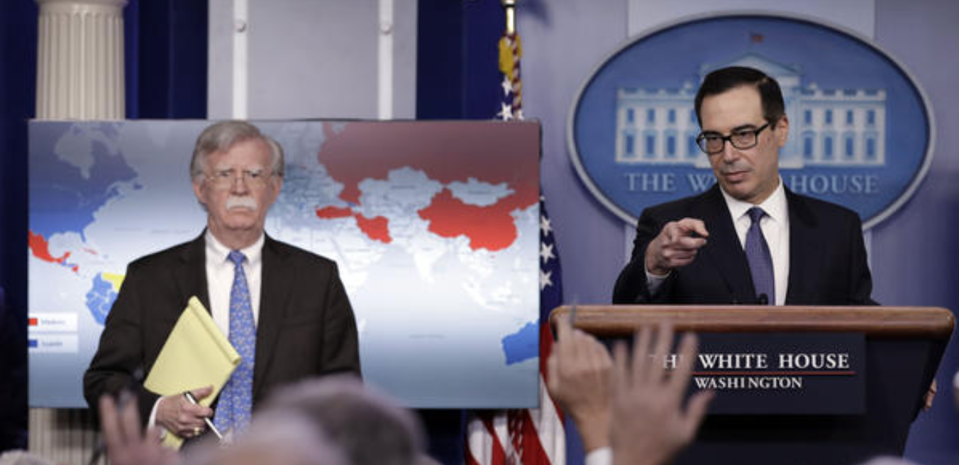
Maps often lie, as do infographics: but the international magnification of the lack of legitimacy Bolton had been preparing to declare for some time came not only with trappings of objectivity, but with a not so coded message, that might be the true legend of the global divisions in the infographic, and was the major social media take away: a proposed movement of US troops whose removal from the Syrian and Afghan military theaters was in the process of being negotiated by the Secretary of State: the image, unintentional or not, immediately raised fears and concerns about American military plans and sent a shudder in global media.

While it may have been sheer coincidence that the metaphorical migration of the triangle of terror from one theater of global confrontation to the next was occurring in Bolton’s rhetoric and was mirrored in the imagined frictionless switch in deployment of soldiers in the legal pad Bolton displayed to television cameras–

NSA Advisor Bolton’s Yellow Pad

The mobility of the metaphor and the military seemed to echo the new logic of the Universal Transverse Mercator map, where territorial boundaries and sovereignty have far less prominence than specific sites of dispersed geographic location, and imagined transfers of military power could be a frictionless motion in space.

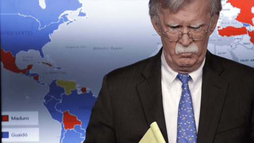
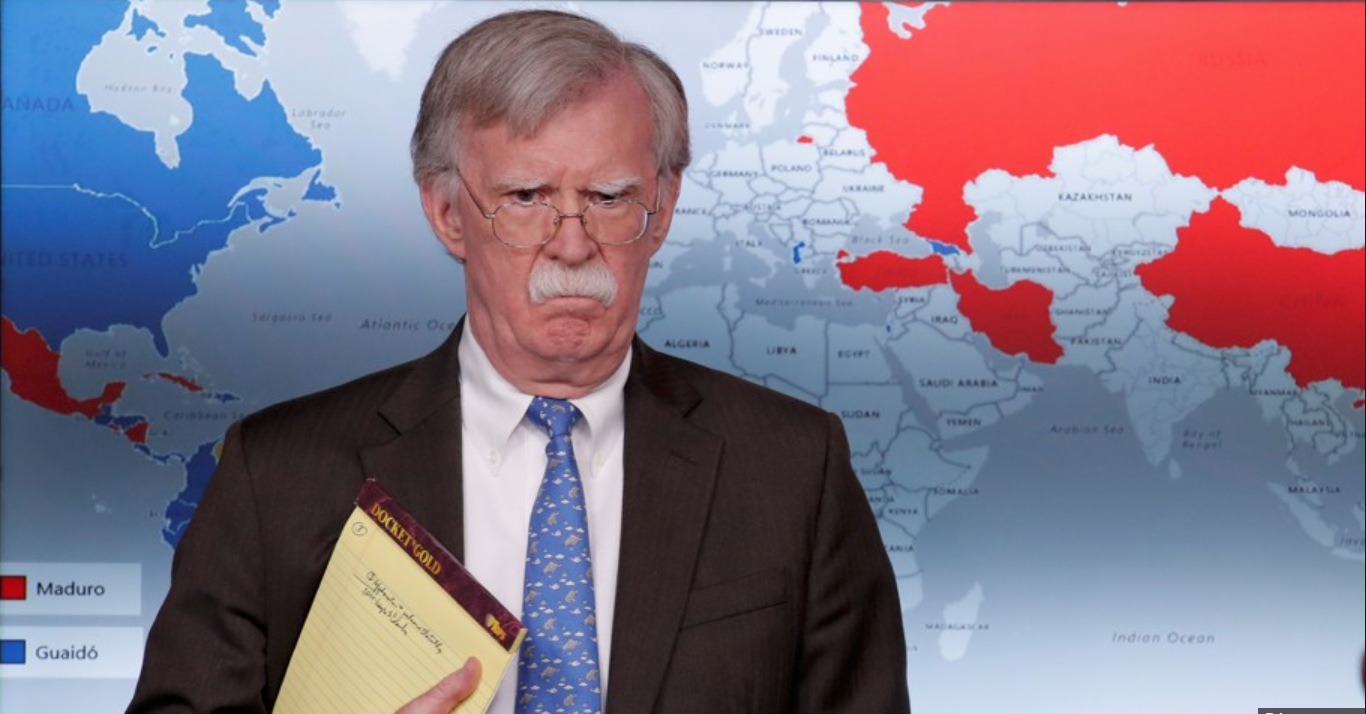
The infographic provided a sort of parallel world carved up and divided by entrenched political interests but whose alliances helped sovereign boundaries to recede similarly. The global two-color map almost made it difficult to understand that he addressed Venezuela–the topic of his Press Briefing in January, 2019–save by the legend identifying red as “Maduro” and blue as “Guaidó”, elevating each man who had claimed the presidency as holding a global constituency, and dividing the globe to magnifying the geopolitical centrality of the Venezuelan election. In the early February State of the Union, Donald Trump elevated–behind the rubric “Abortion”–the pressing concern of Venezuela immediately after “National Security” and “North Korea,” in ways that similarly monumentalized the question of recognition of the future president of the nation, under the rubric of “never apologize for advancing America’s interest, moved from the Border to “National Security” and withdrawal from the Intermediate-Range Nuclear Forces Treaty, a historic arms control accord of forty years in standing–with the commitment to “outspend and out-innovate” all other nations in weaponry–to North Korea and Venezuela, regions that were almost designated as areas of future combat.

Trump’s pledged to the union in a mid-February address to “stand with the Venezuelan people in their quest for freedom” against unspecified enemies, but targeted dictators tinged with Socialism. The gripping evocation of a struggle against “the brutality of the Maduro regime, whose socialist policies have turned that nation . . . into a state of abject poverty” may have foregrounded the prominence of Trump’s interest in targeting Bernie Sanders and Alexandria Occasion-Cortez as Socialists, in order to taint the Democratic party. But it was also a crisis that recalled how John Bolton, his new National Security Advisor, had conjured a new danger for the United States’ geopolitical position, independently of nuclear disarmament treaties, but which evoked our historical need for intermediate-range missiles to protect domestic interests.

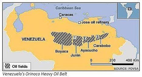
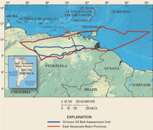
The role of Maduro in Venezuela has been disastrous for its citizens, to be sure, and mismanagement of natural resources by the state demands attention: But much as Trump distorted actual policies by targeting the “Socialist regime” of Venezuela in a speech marked by excessive flag-waving, patriotism, and rally-like chants of “USA, USA,” the prominent place of map before which Bolton spoke distorted the situation, by literally taking our eyes off of the ground. The map obscured the flows of refugees from Venezuela and the humanitarian crisis in South America, as well as access to the vast oil reserves lying beneath the Orinoco River basin’s Belt. The extensive reserves to which America has limited access is mapped by USGS, but was left tacit in the American declaration of sanctions, but motivating an abrupt change in returning attention to the Western hemisphere for the National Security Advisor. And the assumption of Venezuela as OPEC Presidency, as much as the defense of democratic principles, made the clear ties of National Security to the preservation of access to and production from the Orinoco Reserves–shown below by PDVSA–and the truly globalized investment in the fields shown below, estimated to include three hundred billion barrels of bitumen–the black, viscous, organic “sludge” that contains petroleum–in what are estimated to be the largest reserve on earth, involving multiple international players–from Statoil of Norway to ExxonMobil to Chevron to BP, but also CNPC of China and TOTAL of France, as well as even if the private ownership in the Orinoco Belt was ended in 2007 by Hugo Chávez, whose Presidency haunts the current crisis. But although nationalized in name, the project of oil extraction are only majority owned by he vast majority of bitumen remains too deeply buried for surface mining–some 88-92%–by Petróleos de Venezuela (PDVSA)–creating a site that was used by Chávez to finance social reforms and projects, and created revenues of $30 billion annually in 2011, making Venezuela a sort of bit of an economic bubble in a globalized world, tied to international markets for carbon and oil, and making Venezuela a “hidden” global petroleum power, estimated to have hundreds of billions of barrels of oil.

Petróleos de Venezuela (PDVSA)

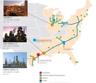
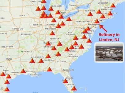
The international ties to projects of extracting bitumen and refining oil in Venezuela–which produced about 2 millions of barrels a day in 2015–estimated to have far more technologically accessible reserves. The decision to amplify the level of rhetoric used to isolate Maduro and acknowledge Guaidó as President surely has close ties to the assumption of increasing attempts of national oil and gas company to reroute its oil supplies to Europe and Asia, as members of the Maduro regime told the Russian news agency Sputnik, not only responded to the sanctions, but undercut the Venezuelan crude that usually flowed to CITGO refineries in Texas, Louisiana, New Jersey, and Illinois which made access to crude that lay in Venezuelan territory a national security question–as Oil Minister Eulogio del Pino tweeted hopes to “continue consolidating strategic alliances between PDVSA and Rosneft” in November, disturbing images of hemispheric dominance, as well as undermining American energy security.

.

USGS has estimated 513 billion barrels lying in the Orinoco Oil Belt, without determining or publishing the proportion technologically or economically able to be extracted
Venezuela Oil Holdings – Deep Resource
CITGO’s Petroleum Terminals in USA/CITGO

Bolton’s–and Trump’s–description of Venezuela as an ideological struggle is all one sees in the two-color division of the globe that almost heralded hopes for a return to a Cold War where maps were understood primarily as a global battleground, recalling the days at which a vertiginous sense of power in postwar Europe led us to map exchanges of nuclear missiles, and imagine apocalyptic scenarios where the world was divided by global war–but a global war that seemed to really be about American interests on access to energy reserves, hiding behind the scrim of a ratcheted up rhetoric of democratic legitimacy.

The economic crisis in Venezuela is both tragic, and an acute crisis of humanitarian scope. But the global map seemed to reduce it into a global confrontation of two blocks, if not a crisis of global consensus about representation and political legitimacy, that seemed to hollow out the term of democracy of its content: despite national sovereign division in South American, the sharp divisions of the blue of North America and most South and Central American nations described inexistent international blocks of consensus. What seemed a legitimate record of global divisions about the crisis the legitimacy of the Venezuelan government to lay claims to Venezuela’s rich reserves of oil. Without acknowledging the political or economic actualities in the South American nation, the map hinted at a global crisis, its stark red v. blue color-scheme reflecting the offers of Russia to restructure the debt of Venezuela’s oil and gas companies, and China to lay claim to a stake in Venezuela’s oil, by asserting the reserves to lie within America’s hemispheric interests, and equating those interests as lying with America’s National Security.

As if to bolster Guaidó’s claim that he is backed by the democracies of the world–in ways that nothing better than an infogram can attest–

Just 25% of the world’s governments have publically recognised Guaido as President; the remainder recognise Maduro’s election
(Paul Dobson / Infogram.com/February 6, 2019

The map before which Bolton spoke has become a topic of recurrent interest, as the nature of the global divide has been parsed and examined. The divide, this post argues, was less an informative one–deisgned to generate debate–than to paper over the situation in Venezuela’s political crisis as a question of alternative candidates for President, treating the contest as an election, and using the colors of an electoral map to suggest that the election was conclusive, and the legitimacy of Guaidó reseted on clearly ideological foundations.

Bolton spoke at the White House briefing before a map revealing a broad global divide ostensibly about recognizing Maduro’s legitimacy as Venezuela’s President but that hauntingly recalled the geopolitical divide that was firmer than many since the Cold War. It provided an image of the Cold War as it was seen from Washington, in some way, as if ideological divides that are clearcut still maintain legitimacy in a globalized world. The infographic on two screens seemed to affirm the broad global consensus of questions of the legitimacy of Maduro’s government, as if this justified the decision to block access to all property located in the United States of the national oil and natural gas company, Petróleos de Venezuela, S.A. (PDVSA), place its assets in escrow, and prohibit American citizens from paying the company directly for access to unrefined or refined oil assets. But the “press briefing” was also a transformation of the White House into a new newsroom of sorts, that exposed the illegitimacy of the Maduro government through a map that tied the United States to the defense of democratic principles–coded in blue, with other democratic allies, in opposition to “reds” linked to Socialism or Communism–China, and Russia, even if it was not Soviet, but also some questionable allies–that reinstated the for-us or against-us global space to make a point. The disclosure before this map of a threat of sensitive statement that echoed a bespectacled Bolton’s assertion that “all options are on the table” provided a powerful infographic that tied Washington to an image of legitimacy, even if the awfully crude map lacked legitimacy to orient American viewers to global affairs.

The new global imaginary that Bolton promoted as he stood beside U.S. Treasury Secretary Steven Mnuchin painted a global schism as the consequence of Maduro’s declaration of his victory in a second term as President, as a violation of that nation’s constitution–and as standing in violation of the Venezuela’s constitutional elections–but was as much a response to the defense of a restatement of American economic sovereignty in the Western hemisphere, a phrase going back to the turn of the last century, if not the Monroe Doctrine, but which gained new currency in the Cold War as issuing from the Dept. of State, and as a question of national security rather foreign affairs, by tactically magnifying the geostrategic role of the Venezuelan election, rather than offering evidence of a constitutional argument about sovereign legitimacy. The question of sovereignty seemed intentionally blurred, as the Secretary of the U.S. Treasury took questions about sanctions against a foreign state-owned oil company, currently OPEC chair, whose assets were being frozen to promote democratic legitimacy, but in fact to strengthen America’s hemispheric dominance.

This time, the map–whose stark divisions into blue and red blocks suggested a map of American alliances, echoing an imaginary of detente, rather than legal rights–seemed to place the defense of denying the flow of economic goods from American territory as a globalist argument, by reframng the issue of constitutional rights or legality in globalist terms that preserved an image of American dominance within the color scheme that it divided the world.

And National Security Advisor John Bolton, who in less than a year in the Trump administration has become an advocate for military interventions in both Iraq and Iran, used the briefing before a map to raise rather openly the possibility of a military resolution of the crisis over the Venezuelan Presidency, as the Commander of US Southern Command, General Mark Stammer, is set to meet the Ministry of Defense of Venezuela’s neighbor Colombia, and Maduro has conjured fears of a “coup” driven from the United States. But the fear that the invitation of American oil companies to organize the refining and extraction of Venezuela’s abundant crude reserves after the January 23, 1958 Democratic uprising, just before the Cuban revolution, sent shock waves into the United States, pushing the Trump administration rather precipitously into a search for infographics that could substantiate dangers of infringement of its hemispheric interests and geopolitical dominance, and to convince the world of the danger of Maduro’s disenfranchisement of elected members of the Congress, and the lack of legitimacy of a regional vote that supported Maduro’s government against a fractured opposition–and led to the invitation from Russia to restructure the state-owned oil and gas company’s massive debt, recasting the struggle about the government’s legitimacy into new global terms.

The colors on the global map reflect, to be sure, the contested results of elections in Venezuela, where compromised elections had produced the heavily disputed endorsement of Maduro’s Presidency just last May. After an offer from Russia to restructure the massive national debt in November, 2017, Maduro declared new elections in May 2018, which the opposition decided not to recognize, and which polls suggested he wouldn’t win, but in which he was victorious–coincidentally at the same time thatJohn Bolton gains the portfolio as director of the Trump NSA.

October, 2017 AP/A. Cubillos
2017 Regional Elections of State Governors in Argentina
Distribution of votes for Maduro in the election whose low turnout led its legitimacy to be quickly questioned by the EU, US, and OAS

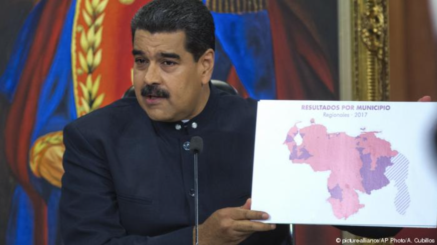
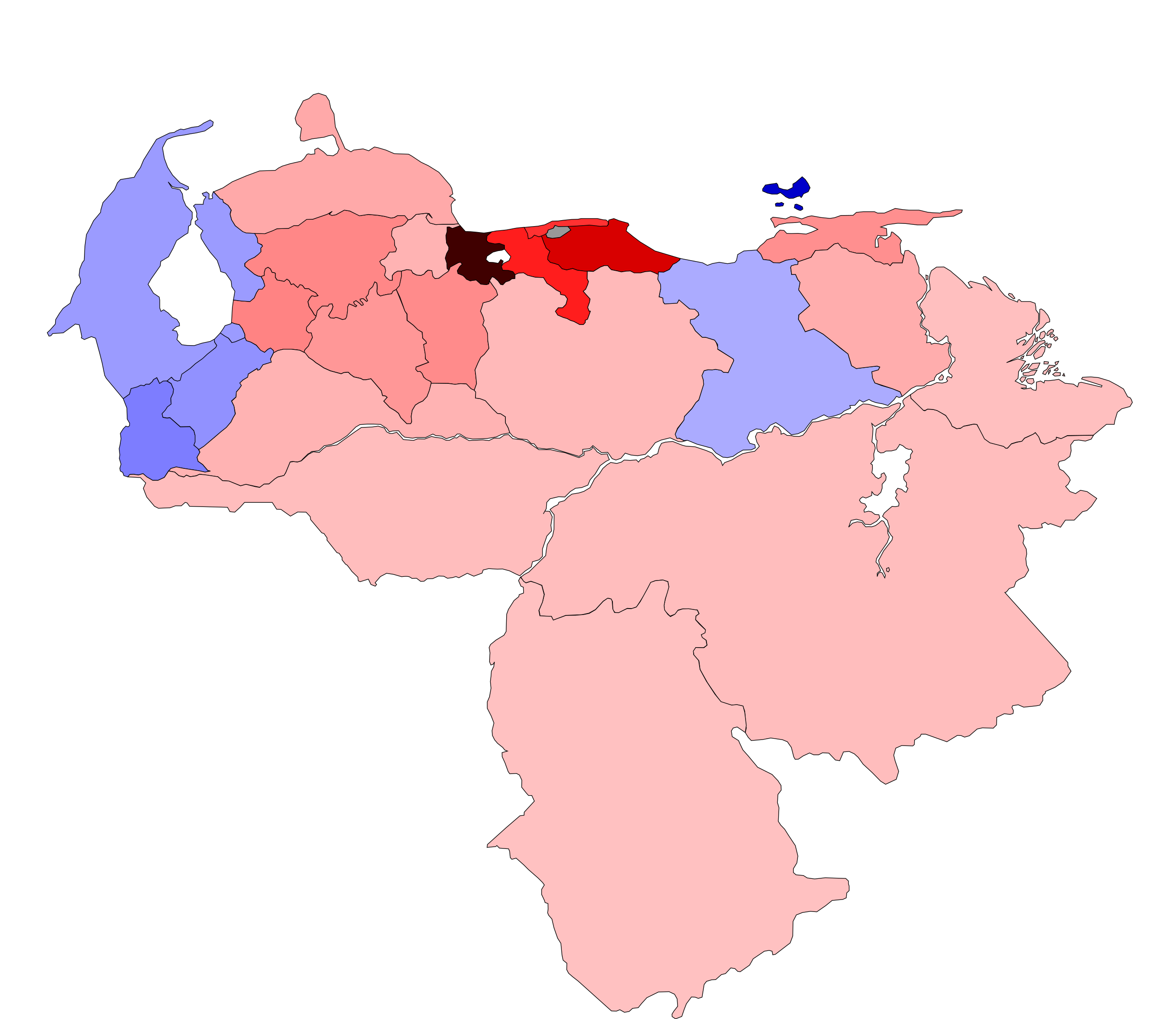
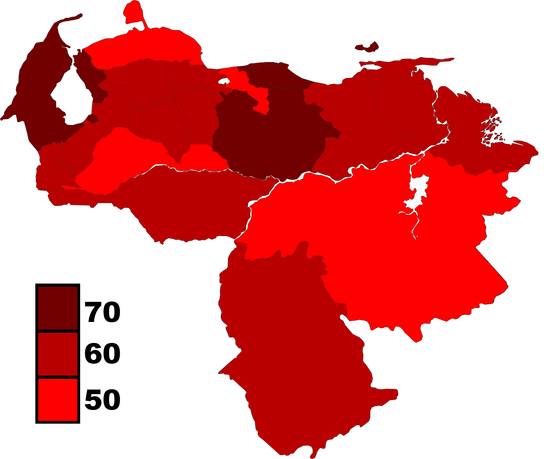
Familiar blue v. red electoral maps were used to describe the votes of the Great Patriotic Pole and opposition  Coalition for Democratic Unity that were recast suddenly in global terms in late January in Washington. Socialist Maduro affirmed independence in his inauguration, and in rebuke Parliamentary President Guaidó won immediate support from Donald Trump after he declared himself Interim President and leader of the nation and of oil company, precipitating a powerful infographic to be devised in Washington that oriented audiences to an electoral map in global terms. But for Trump–and for Bolton, who cast the election as a question of National Security–the global divisions in globally strategic terms.

Trump’s segue in his February 7 State of the Union from the INF to Venezuela, included a transition about North Korea, but suggested global imbalances that any obscure the question of access to petroleum reserves in Venezuela, and the deep, implicit question of whether the American military should or would be used to guarantee access to Venezuelan oil. In ways that must have crossed Bolton’s radar, but have faded from most public comments, Maduro when he pledged to decouple the pricing of Venezuelan crude from the dollar, use of non-dollar currencies as the Chinese Yen for Venezuelan oil, and seeking to cut oil production to “stabilize” oil prices–and entertaining the cryptocurrency Petro, based on the five billion barrels of oil found in Field No. 1 of the Orinoco Oil Belt–possibly less than a quarter of Veneuela’s considerable total oil and gas reserves, whose accessibility to the American economy has suddenly become increasingly tenuous.

PDVSA

The events tied to the assumption of the Presidency of OPEC led to ‘slow coup’ of January 23–the anniversary of the overthrow of the Jiminez dictatorship by Venezuelans in 1958–as opposition politico Juan Guaido auto-invested himself with the presidency with broad American support, followed by a chorus of right-wing governments in Latin America, including Brazil’s Jair Bolsonaro.

The result was to pretend that the elections which the opposition party had boycotted last May could be cast again as an electoral map, this time not involving Venezuelan votes–or the self-determination of the nation–but symbolically recasting the election in terms of a global map. Even as Maduro offered to negotiate, he bristled “The presidential elections in Venezuela took place, and if the imperialists want new elections, let them wait until 2025,” perhaps reacting to the provocative recasting of the national elections, whose legitimacy has been questioned by observers, in ways that led Bolton to take to Twitter to threaten “serious consequences for those who attempt to subvert democracy and harm Guaidó”–as if he were the victor of an election. Bolton had escalated attacks on the “legitimacy” of Maduro from mid-January and the “illegitimate claims to power” of the Venezuelan “dictator” as abrogating the “a government duly elected by the Venezuelan people” and democratic practice. But the stark divide of the global map seemed to resist any discussion of negotiations and affirm the United States’ ability to shift troops from Afghanistan to Venezuela’s border immanently–while preserving something of the illusion that the “blue” votes for Guaidó would be affirmed by American muscle.

Win McNamee/Getty Images, off CBC

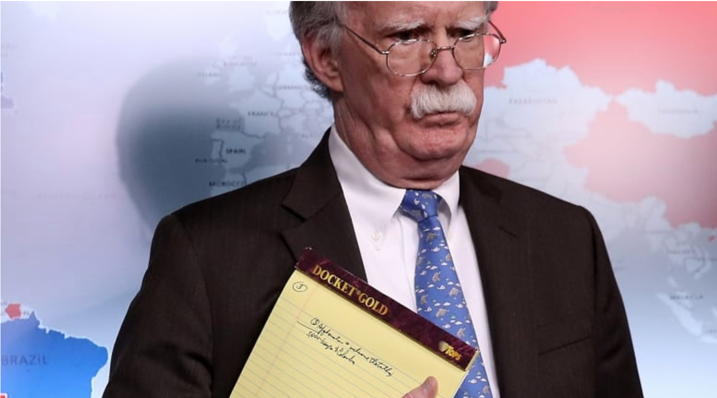
The gruff determination and stoniness that registers in Bolton’s face as he sought to communicate the divisions of the world that potentially lay in the failure to affirm America’s recognition of Guaidó bled far beyond the defense of democratic principles, and seems to have threatened to cast more than a shadow over Europe. Bolton’s slightly veiled message of national security seemed, in classic America First style, to cast a shadow over European allies, here symbolized by the actual shadow that his pensive head cast on the United States’ traditional NATO allies.

Was Bolton in the act of forging global divisions of a new Cold War, military detente and hemispheric dominance, sneakingly if all too familiarly tied to defense and affirmation of democratic principles?

Continue reading

Leave a comment

Filed under geopolitics, latin America, national security, news graphics, Venezuela

Mega-Regions, Super-States, Micro-States, Islands

Like a patient rising from bed to look in the mirror for superficial signs of illness  or searching for visual evidence of clouded thoughts after a hangover, we compulsively turn to data visualizations for bearings on our body politic, preoccupied by its bruised appearance and searching for visual distillations that tell the story of its apparent fracturing into red and blue.  Anyone reading this blog is compelled by the search for a rendering in iconic form of this sharp chromatic divide by which we seem beset, as if to mute its edges and suggest that a possible contexts of such stark political divides.  But how one can provide an account of the map–or map the meaning of these divides–has created a cottage industry of visualizations, images that serve both as glosses and counter-documents, against which to gainsay the meaning of the impasse of the most current electoral divide of 2016.

We seem to search for a sign of meaning in our body politic, if not  in our representational institutions, and to understand political divides less as signs that all isn’t *quite* all right, and the coherence can be found in how the democratic process balances local interest.  But most importantly, we seem to try to process deep concerns that the electoral map lied:  for if the electoral map is in some sense a powerful measure of our coherence as a community, it seems important to affirm where that coherence lies, if it does indeed still exist–and can be detected in a map.

And in the long aftermath of the 2016 Presidential election, it is not surprising, somehow, that we are still eager to understand or imagine what that “new America” is or what a new map might reveal.  Uncertain in our ability to question our representational institutions, we are pressed to ask how our electoral predictions “lied,” and whether the electoral map itself “lied” by serving to magnify the political voice and agency of a demographically diminishing region.  At a distance of two and a half years from Donald Trump’s surprising election as U.S. President, we continue to seek more refined district-by-distict distributions to pore over the stark chromatic divides, reading them as tea leaves for some sign of what will happen with the 2018 midterms, or as entrails to divine what to look for in our nation’s future.  And then we try to reframe the issue, and see what we can salvage about our actual divisions.


Come to termsNew York Times/Mapbox


Skilled at reading maps, and at detecting their distortions, we also seek to recuperate a sense that maps do not lie.   We pore over data vis to restore a sense of unity in an era when it seems we’re saliently divided by race, class, and religion, but are compelled to locate a sense of home in those divide, and seek a sense of balance and objectivity that can distill the intense rhetoric of deep-lying divisions.  For rather than suggesting or asking how an electoral map may lie  in ways that balanced a widespread sense of shock with a skepticism that that was our map.

And the continued skepticism and uncertainty in the meaning of the divisions of the electoral map lead us to try to dissect and parse their meaning, filtering and sifting their data within other data vis to illuminate, by new granularity and spectra, a broader spread of variables, in hopes to unlock the questions and overcome the challenges that our representational system pose.  We peek deeper into its red heart, as if in hopes to find the coherence or possibility for change in its red center, as if in a form of national introspection performed on the most superficial of registers, whose “truth” cannot even be gainsaid, hoping that it lies there, perhaps in the heightened distortion of electoral votes that distilled from district maps.


Red Center?.pngDetail of above


Do electoral maps lie more than other maps?  Any is something less like a reflection of actuality, than a puzzle, in which we can uncover not only telling traces among electoral divides  But the new configuration of space that the 2016 election bode, as well as the greater sensitivity that we like to think we’ve gained at measuring spatial configurations in meaningful terms.  The attractiveness of remapping the voter distribution may be a bit of a red herring and distraction from the magnification of divides elaborated in internet chatrooms from 4chan to 8chan, as much as above ground, but the searching for new signs in the entrails of the voter maps–a post-mortem on the body politic–carries as much sense as the foreboding that the representational institutions of states, counties, and other traditional geographic units might make less sense as a basis for structuring a truly representational democracy.

Seeking to stabilize current fears of a crisis of our democracy, we keep on returning to maps, insistently and repeatedly, as if out of trust for grasping how politics is shaped by deep-seated divides by finding a new way space is configured–as if that would help us understand the appearance of our divides.  And so, in hopes to digest the dilemma of representational democracy in we look for cartographical terms, to provide it with some grounding or objectivity, that offer some sense of purchase, other than by affirming the intensity of our divisions and to see that the institutions of political representation we’ve long trusted might make sense with the migration of populations to urbanized areas or the recasting of politics discourse in dissatisfaction with the status quo.

Perhaps, convinced of our increasing savviness to read the display of information in a colored sheet, we try to grasp the distributions of data as a configuration of space by which to grasp what happened in the 2016 election,  What is shown to lie in the deep splintering–does this take many by surprise?–across a body politic and economy afflicted by a politics of intense opposition seems suddenly normalized and explained by maps that normalize our divisions, and set them before our eyes.  But we have been poring over maps of the nation for years–or at least multiple election cycles–to be able to better process the tensions between regionalism and federalism in ways we might be able to come to terms with or effectively digest as presenting–and representing–an actual record of the status quo that is not so fragile.


imageColin Woodward (2013)


The representational system is oddly sidestepped, of course, by placing the divisions of a fractured electoral map in terms that see it as a lay of the land. The questioning of the fifty-state primary system–or whether our version of representational democracy best accommodates local interests in a fifty-state system–are not seen as being able to be adjusted  to balance regional interests or economic needs better, but reflect a lay of the land.  So much is suggested in by the growth of tribal senses of belonging that provide affective ties that lack in the state or even region, and span space in ways that online groups and news sharing seem to have filled an increasingly pronounced need for meaningful political involvement, in ways television once afforded a social glue.  The deep uncertainty and sense of social dislocation that defined the 2016 Presidential Election in the United States, manifested in the mistakenly salvific power of social media memes seem to have gained as a substitute for other forms of belonging, seems to find a resolution in the power of maps.

Of course, this was the third election cycle that we were divided by maps, and electoral projections, a division that Trump–and his allies, whoever they may be–only sought to exploit and reflect, or unleash with greater intensity by playing them for whatever they were worth in broad circulation.  Maps provided a form to counter that dislocation.  The rage for maps to comprehend an icon of the spatial promise of a United States has led, empowered by GIS, to an intense search for a more meaningful system of maps than that of counties, states, or congressional districts that the economic realty of the metropolis can no longer afford.  The role of GIS here is less instrumental than a sense at grasping for straws to identify the meaningful regions on the map, puzzling the potential for future unity in a terrain whose political processes and practices map poorly onto its divisions.

We were compelled just not to make sense in a fundamental way of the coherence of the political map, if it existed,  but to process what it means for a rearrangement of political constituencies.  If any map presents a puzzle that can be read for its argument, we compulsively returned to the past-time of glossing the electoral map as a way to find resolution.  We returned to data visualizations, especially if paradoxically, as a trusted form of post-traumatic healing, and continue to look to them to try to embody and diagnose our deepest divides, if not overcome those seemingly salient divisions.  Faced by a feeling of fragmentation we turn to maps to better grasp where these divides lie and to try to bridge their fractures.  We turn to maps, to prevent a sense of loss, or prevent the foreboding of a lost unity, and deep-seated fragmentation.

Whether maps can do so much reparative work is open to question, as is the power of maps to explain the deep discomfort at our social divides.  Since they are so salient, and oppressive, the thought goes, they must be able to be mapped.  The relatively recent re-imagining of the nature by which the United States are united led, during the heat of the last election, to a proposal of ordering districts around the metropoles that were foreign to if linked with them–Seattle, San Francisco/Bay Area, and Los Angeles and San Diego were his in this cartography of mega-regions where urban corridors defined the map’s meaning, as much as the regions in which they were nestled or situated, emphasising a metro-cartography of political identity keeping with the times.


image.png


Dissatisfied with the state as a parsing or unit that was forward-looking, we accepted new geographical units as “megalopolis” to designate the sites that have superseded the city in this cosmopolite model of America, reflecting hubs where the large bulk of the GDP is located, and economic interests increasingly located, although this may neglect the extent to which GDP is linked not only to abstract able figures of income generated, but urban snarls, pollution, garbage production, and greenhouse gases and other forms of waste, using a variation on a five-color map to suggest the units of productive regional planning that might be able to better connect localities–or local needs and economic interests–with a federal government perceived as distant and removed.


1.  The notion of using the map to reaffirm a connectivity and continuity that seemed lacking provided a new way to ramp up our 2-D cartographical concerns less to foreground fractures than meaningful commonalities which could be acted upon as the borders between states seemed far less meaningful to suggest  economic connectedness, and indeed national borders seem less profitable fictions to provide possibilities for future economic growth–and indeed the state university structure provided a far less practical basis for public education, despite its value, as public universities seem more removed from educational opportunities or research funds, and others are somewhat vengefully recast as public employees, teaching mission be damned.

The map affords a prospect of tangibility and coherence, particularly compelling in its abandonment of the “state” or “county” as a unit of the polity, and appealing in its potential encouragement of a new sense of infrastructure–a term that provided such an appealing keyword way back in the midst of the  2016 American Presidential election–even if the New Map for America was presented for the lower forty-eight as a sort of forward-looking economic blueprint before the General Election, as if to orient us to a vision of the pastels of a future less brash than the red vs. blue electoral map, its regions far more recognizable, and decisively upbeat, from Cascade through the Great Lakes and Texas Triangle to the Southeast Manufacturing Belt.  The hope is to respond to a sense of dislocation by more meaningful economic units, and indeed an agenda to move forward advanced in Connectography: Mapping the Future of Global Civilizationa hopeful manifesto to shift debate from territorial units and semantics to a vigorous statement of economic power.


New York Times/Parag Khanna


The shifting of attention to the divides in our electoral map to a the sorts of channels of connectedness Parag Khanna proposed were not to be–or aren’t yet, so strong was the localist and isolationist tide against them.  The cartographical intervention was a view of globalization that was sunny–and with an emphasis on affirming possibilities of connectivity, as opposed to the terrifying sense of an exposure of unraveling and intransigence that the formation of a Trump Train–rather than the sort of proposed High Speed Rail lines–were proposed to create as a new economic infrastructure for a nation that seems increasingly unsettled, and seems increasingly unsettled, and might be hoped to be healed by a remapping of its economic interconnectivity, rather than its divides–an image of interconnectivity that the election erased.

To be sure, the use of the map to affirm needed connectivity (and continuity beyond proximity) among states was long realized to lie in the potential of the map to create further connective lines of communication and economic development.  The promotion of surveying projects, from the railroad lines by Abraham Lincoln through areas of Appalachia in Kentucky and Tennessee, where the President realized the possible vitality of an economy not rooted or based on enslavement of populations provided a basis to encourage unionism.  Walt Whitman saw, in 1860, the nation as a great nation “of many nations,”  and Lincoln argued to survey the region to increase its connection, and offer a new basis to integrate the economic complexities of a union divided on an apparently intractable political debate.  The notion of mega-regions and economic corridors is not, in this sense, so new at all;  fostering economic interests has long been tied to the need to try to envision future possibilities in maps–a need that the 2016 Presidential election has undoubtedly necessitated, although the Trump administration seems dedicated to obscure that need.


2.  But if the model was conceived in the midst of a tense primary season that saw political splintering and a large fear of depression in a search for a politics of meaning, the fears of a distance from Washington, DC became the victors of the 2016 Presidential election, as we saw a new and apparently heightened red-blue division imposed on the nation that we have been still trying to wrestle or digest and place in political or historical context, and to parse meaning from a map that seems all too neatly clean-cut after all–unless the fracture lines were indeed that strong that the nation might once again divide, as if reporting on the electoral results were a sort of performance art.


Sea of Red


Blue America or Red America?


The fissures of red and blue reappeared again as what seemed a safe bet of a Clinton majority victory repeated, although newscasters and talking heads found it hard to say anything interesting about it, just three days from the 2016 Presidential election.  But the confidence of these electoral projections that seemed to give a fragile if solid coherence to a Clinton electoral victory, if one that would hardly unify the nation–


–but contain its increasingly evidence divides, rather abruptly ceded to a sea of red, where alternate projections failed to alter the depths of a geographic solidity of those voting for Trump, even if a majority of them seemed resigned that the election would not make a substantive difference.  As multiple electoral night watch parties disbanded with disillusionment, we were resigned to accept these divides, not knowing whether the geographical cleavages had either surfaced or crystallized in the actual electoral map, but suggested a somewhat surprising rejection of the status quo, and an eery sense of a red state continuity, as though we were divided regional blocks after all–


–and so we pored over visualizations of the nation’s new voting patterns that were increasingly and perhaps over-generously provided to stunned media viewers with a sense of collective trauma, to be processed only by reviewing endless cartographical parsings of the deep reds of the adjusted choropleth of 2016 revealed the coasts could hardly understand the intensity of the interior, seeming to reveal a convincing record of a deep-set urban-rural divide in a map of county-by-county voting trends.

The map of electoral votes was just as widely championed by Trump himself, of course, who not only seemed to have installed it in the White House, but to present his candidacy as victory over the interests that he proclaimed had “rigged” the election, as if it provided a demonstration that the process not so rigged.  (For Trump followers,  the championed results, in which the President “elect” exulted, might have in the “Fake News” of predictions of his electoral defeat, and the false predictions of their marginalization from the country.)  In an election when “rigged” seemed to have defined the 2016 Presidential election as it was used to invest emotions by different candidates, Trump had exulted in what applied equally to the economy, political process, and judicial inquiry as if applied to a “system” that he seemed to disdain, if only to recognize that the “hot term” he used became a basis to showcase his alleged outsider status.  But the electoral map provided, for all its distortion of population, an argument that the “rigged” nature of the vote and “system” was undermined by the electoral system–the same system that he may have called “rigged” at one time.  Trump’s claims for having “introduced the term”–“I’m the one that brought that word up!’–was in fact suggested to him by Roger Stone, who argued within two months after Trump descended his escalator to announce his candidacy, and recommend he base his candidacy on claims ‘the system is rigged against the citizens’ and that he is the lone candidate–did this offer any ideas to Bernie Sanders?–‘who cannot be bought.’”  Trump didn’t immediately adopt the term, but by the Spring of 2016, the term became used to insert himself into a corrupt system of which he could be the savior.

Trump ran so insistently and deftly with the idea to make it his own, treating it as a term to cathecting with his rallies.  He soon began to inveigh against the whole “rigged, disgusting, dirty [political] system” as being rigged, first the Republican primary and then the Democratic, discrediting the electoral process as a “rigged, crooked system that’s designed so the bosses can pick whoever they want” that revealed itself to be during the primaries to be “totally rigged to keep incumbents in power.”   Arguing that the word was his intellectual property, as he had used it before Bernie Sanders or Hillary Clinton adopted the term he claimed to merit authorship for having introduced into  the election, it cemented new constituencies in an age of increased income inequality, playing very well to an anti-establishment crowd as a new language of empowerment–so that the electoral map seemed to some a populist victory.


After insisting and bemoaning the extent to which the voting process was “rigged” during the primaries and into the general election by parties and elites, openly fostering distrust in the political process, the narrative suddenly switched when the electoral map–that map that so shocked the nation–was presented as a true victory that rather preposterously confirmed the success with which Trump had presented himself as not beholden to outside interests to a specific audience, as if it was a record of reality.  Enamored of the map of electoral votes’ distribution, Trump presented the electoral map as confirming a populist victory that occurred against all odds., at the same time as his skill at gaming a system of electoral votes.   He wanted the Washington Post to display the map on its front page, as if to announce it as a new reality, a hundred days into his administration, in a bizzarro illustration of his desires to run the press, asking reporters Aren’t you impressed by this map?¨–and regaling reporters with copies of the map as a testimony of reaching a broad audience of voters, as a source of pride and a deeply personal accomplishment of which he was the author, as well as a form of evidence he wanted the entire nation to be entranced–whose stark divisions he even had framed for the White House, as a confirmation of the extent of his appeal outside of coastal media elites.


imageThe Hill


The electoral map showed a defeat of the so-called “elites” on both coasts.  The majority of voters’ opinion mattered less than how divided we had become, over the next year and a half.  It was hardly a surprise to find these divisions, but their salience seemed a strong shift in political decorum.  As Trump’s Presidency continued, we mapped rise of hate crimes inspired by Trump, as if to conjure the sense his Presidency and rhetoric had changed the nation, and suggested a new meaning of the term “red state” based not on majority voting but confirming a sense of deep-seated anger against an “other” embraced by a good share of the nation, as if tolerance for violence not acceptable elsewhere.


The crisis in belonging seemed, in this red-hued preoccupation, almost about blood, and innate differences, and an anger that had been unleashed either on the campaign trail or its social media spin-offs and detritus, where suddenly the most marginal of voices, rarely recognized in print, began to circulate, and reached a large and strikingly contiguous electorate, from which “we” were actually removed.


image


3.  Which brings us to the deeper crisis of understanding how much of the nation seemed to rally around the idea of a need to garrison and fortify a southwestern border long left intentionally open, as if this would somehow Make American Great Again, and affirm its aging economy, persuaded they had been huckstered by international trade accords, as protection of the border gained greater reality than the civil liberties and rights of due process by which the nation was, for an actual strict constructionist, long defined.

The demand to think “beyond states”–plus ultra!–has been conceived not as a possibility of growing connectivity, but as resigning ourselves to deep divisions as if they were embedded in the territory in the revival of what were argued somewhat misleadingly to be “southern interests” or heritages, and accommodate and instantiate in a map that Colin Woodward has long argued reflects the dynamics of their original settlement–rather than economic development and local political cultures–as if to accommodate the “local cultures” of politics, such as they are, as fundamentally distinct economic patterns that transcend the division of states or economic development.

Possibilities of new sorts of economic interconnectedness be damned, Woodward would have us recognize the long shadows attitudes toward work and not toward race, education, gender, or religion cast across the political fracturing of the once United States, as if to suggest that the notion of being united was itself a bit of a big fraud, or a pretense needed to unite what were long fundamentally different regions, in a new fracturing that reflects eighteenth-century precedents as if to trace the differentiation of ethnic or racial stock in ways that he claims effectively map on our own political divides, and offer new tools to help us understand different points of view that even a Continental Congress was foolhardy to pretend they could ever adequately reconcile, so steeply do they haunt the current polity.

The oracle of Freeport, ME reminds us that “regional cultures” have existed since the era of the continent’s first colonization in ways that command attention, despite the burning issue of apparently recent hot-button concerns from terrorism or immigration, despite their salience in the political debate and their prominence in motivating sectarian hostility.  In a sense, the map may consolingly remind us that Trump has not appealed to “Make America Great Again,” but festered its deepest historical divisions and divides; its commanding division into colors of distinct hues a refutation of the idea that we are living in an era without intersectionality, where divisions deriving from historical priority trump any of the effects of economic inequalities and disparities of income.  It indeed seems to naturalize race relations that have gained ugly  prominence in recent years as being a world that must be accepted as “modeled after the slave societies of the ancient world,” where “democracy is the privilege of the few,” as if this were a tenable cultural position but demands to be appreciated as such.  Rather than describe racism, or race relations, Woodward lets us know that “black people confronted” dominant cultural norms, a formulation that strips them of much agency indeed–or denies it altogether, more accurately.

The quite flat five-color schema of 2013 was recycled in the news, perhaps, because of how it seems to erase the far more finely grained visualizations of the election that appeared in late July 2018 in the newspaper of record, five days previous, as if the precinct-by-precinct map of Ryne Rhola could be made to disappear beneath the far flatter overlays of Colin Woodward’s breakdown.


National Precinct Map.pngRyne Rhola/Mapbox


For Woodward’s map viewed the United States not as a composite of populated blue islands in a sea of chromatic shades of red that slid to scarlet expanse, but rather crisp lines whose constitution was defined in the eighteenth century, and perpetuated in the self-sorting machine that the United States has become, arguing that the affinities of each place attract their own political brand–a notion that Woodward emphasized in the new iteration of this map that adheres more closely to the national boundaries of the lower forty-eight.


New York Times/Colin Woodward (2018)


Forget any preconceived ideas of geographical mobility or migration, Woodward enjoins:  the map suggests the computational shape-sorter that the deep circuits of the United States’ history has defined.

That such divisions inform the breaking lines of the new “partisan landscape” hardly require a five-color map.  But Although meant to displace a divide between urban and rural, they may remind us that we are in fact living in an age that might be as easily cast–and we’ll return to this–as a trumping of the local, where states have faded away with the accentuation of local interests.  In ways that are filtered and refracted though the relative homogeneity of media markets and the traditions of certain areas of the nation where immigrants are indeed less openly welcomed or accepted may tend to the slogans of America First championed by Trump, and lines of gender are differently drawn.  Such regions might be less likely to be sympathetic in a deep way with a woman who reminded them, rightly or wrongly, of coastal elites, and accepting of the very caricatures of coastal elites that Trump, in a canny exercise of deflection and personal rebranding, managed to project on her–palling with Goldman Sachs; attending as Secretary of State to foreign relations and not the American worker–that the more removed regions would accept.

The divisions in the “partisan landscape” of the nation that Woodward presented are considerable and are economic–


Partisan landscape.pngNew York Times/Colin Woodward (2018)


–but curiously suggest the deep red remove of the very region of Appalachia that President Lincoln once sought to integrate better both economically and infrastructurally in the United States, but has sadly lagged further behind, and felt further removed from Washington.

And not only from Washington, DC, but from the complex of the news that is so demonized by President Trump as being an “enemy of the people” today.  For though it is never made precise who this collective is–“the people”–it is not the folks who read newspapers or watch the nightly news, but those who feel far less represented in them, and by them, and less familiar with them to less present to them–for the known density of reporters and correspondents appears an odd echo of the parsing of the lower forty-eight into “Yankeedom,” “Tidewater,” “Greater Appalachia,” “Far West.” and “Left Coast,” as not only different media markets, and different areas that are represented in the news–


local qotient reportersDept. of Labor, Bureau of Labor Statistics/Occupational Employment Statistics


employment correspondents 2017Dept. of Labor, Bureau of Labor Statistics/Occupational Employment Statistics


–but that feel alienated from its constitution of reality, because that stands at a remove from their lives and regions.  The existence of pronounced “news deserts” in areas as Appalachia suggest a fragmentation of our news economy that weakens local solidarity and opinion, and creates large voting blocks that are terrifyingly coincident with the paucity of local news sources, as Chisolm’s below burnt red interactive Carto data vis rather scarily reveals, as it invites and allows one to explore in even more fine-grained from over the lower forty eight.  The blanked-out regions of lightly hued regions reflect areas aggrieved areas by the absence of a diversity of local newspapers–institutions long identified with reflection on local political institutions and practices.  They are, in other words, afflicted with the absence of a plurality of avenues for the shaping of public opinion and political debate, and bound to rely one less active political debate.


Carto-News Deserts


The striking thinning out in many regions of Appalachia as well as the south of so-called “news deserts” is not a longstanding historical divide–the death of the local newspaper is


Appalachia News Deserts multipleAmerica’s Growing News Deserts/Columbia Journalism Review (2017)


–in which limited investigative reporting on local issues, discussion generated by print, and indeed informed local political decisions and checks on local power seems to create a vacuum into which rushes a new tribalism of largely symbolic issues.


The difference between these regions is not necessarily so continuous, or suggestive of nations, despite the startling continuity in “news deserts” and areas of the low level of occupational employment of journalists or correspondents that is its correlate.  Deep divides of terrifying continuity are at basis economically driven, and seem impossible to reduce only to cultural divides–or reduced to existing historical divides, so much as an erosion of local institutions designed to foster reflection on political institutions and discourse.

The increasing gaps in sites where only one newspaper–or no local news–exists will be made up for in new ways, but the growth of News Deserts from 2016 marks a change in the information economy, and a change in which the role of newspapers in constituting and encouraging the community long existed.  The rise of digital news outlets that have taken up the nourishing role traditionally and long played by journalism is promising, but the attack on the few remaining news sources that exist and on which folks rely stands as a new challenge, with the number of reporters covering local news having dropped in half since 2004, and some 1,800 newspapers–many venerable institutions in communities that helped make new communities–having folded in the same time, leaving all the tanned out regions with one newspaper, and the burnt siena dots counties with no local newspaper at all–areas reliant on other news sources and online information, according to Penelope Muse Abernathy of UNC’s Center for Innovation and Sustainability in Local Media, which points more deeply at the need for a new business model for local news, but also the increasing vulnerability of many counties–and many individuals–to the older, less educated, and poorer, farther from metropolitan areas in parts of Texas, the Dakotas, Alabama, Florida and Georgia, where our democracy may fracture.


Abernathy, 2018


The problems of an engaged citizenship through newspapers is not, of course, the only line of fracturing in the social body.

The increased divergence of the age at which women have a first child in different regions of the United States suggests a huge difference in life-perspective–or “life style”–which is clearly identified with those areas of denser presence of reporters, correspondents, and news reporting, suggesting a huge difference–and deep divergence–among the priorities, and negotiation of labor markets.  Although the different preferences for childbirth in the United States’ regions are not a big surprise for many women, the strikingly different age of women at birth maps onto the “regionalism” and regions of the United States in striking ways, unsurprising in an era when birth control and abortion are seen as the “issues” that define political divides–both around appointments to the Supreme Court and around what makes up privacy, personhood, and rights.  The pronounced oscillation around the age of a mother at her first birth is striking, not only in its divergence but the large span of the nation where birth is defined at twenty-four years of age, and what this mans for families and women’s work–and of female experience at the same time as the first female candidate became nominated by a major party–and the huge gaps this created.


Motehrs age at birth


New York Times: Birth Age Gap in the USA (2016)New York Times: Birth Age Gap in the USA (2016)


Does the puzzle fit together better now, looking at the relative number of reporters and correspondents employed and stationed in areas of the United States, and the remove of many regions–either apparent or real–from the media markets that exist, and the sense of alienation and remove of those areas  from actualities reported in the “news”?

Woodward’s “map”–updating or revisiting the divisions he had in fact foretold in 2013, just after President Obama’s second election as President, reprised for readers always hungry for a good data vis, that distilled confusion to stark lines of a 2-D paper map, called less “nations” (as he previously had) than “regions” which transmitted through the ages the spirits of their respective colonizers, in a complete revision of the image of the nation as a melting pot, economic integration and disparities of wealth be damned.

Rather than a melting pot having ever existed, the oracle of Freeport has it, distinctions between a Puritan legacy with assimilates others by championing a common good, the multicultural materialism of Dutch founders, the manorial society of the British gentry, quakers and pluralistic protestants of the midlands, and rigorous independence of the Scots Appalachians abut slave-holding southerners from the Barbados and Spanish-American periphery, shaping the nation’s fractured political present:  aside from some limited intersection of these realms, the melting pot not only never existed, but “deep cultural” values provided an optic that refracted every political event of the twentieth and twenty-first century, as if a deep memory of the mind that we will not escape.  The rigorous and purposive historical flatness of Woodward’s “map” seems a point of pride.

The schematic map recalls a study sheet for  high school U.S. history, claiming to reveal a landscape that lets scales fall from its viewers’ eyes.  Such radical essentialism–or deeply conservatory if not reactionary cartography–reminds us with considerable offhand pluck that we’re in fact far less mobile than we would like to think.  Rather than dig into the data in any depth, the map “shows” that we remain dominated by almost essential cultures that have been perpetuated by local institutions for all our championing of free will; we are, yes, really cultures, but cultures that no person can actually make.  Indeed, Woodward had originally cast the divides as separate “nations” that were both in evidence “today,” but revealed a deep geography of eleven nations in a 2013 map first published in the fall of 2013 as a guide to the “deep differences” into who he argued people in the nation sort themselves, as if into political preferences.  If a degree of self-determination surely remains, geography has the commanding upper hand, Woodward seeks to let us know, but his argument verges on an environmental conditioning by which the continent’s settlement runs against the idea of any  easy arrival at consensus:  indeed, “to understand violence or practically any other divisive issue, you need to understand historical settlement patterns” that defined the matrix.


Washington Post/Colin Woodward (2013)


Woodward responded to the stark fragmentation of the electoral map in 2012, to be sure, but has reprised his divisions again to explain the Trump phenomenon, and effectively raise questions about the midterm elections as if to suggest that no real deviation from a foretold story will occur.  And it is no surprise that the area of Greater Appalachia he has mapped, colored bright red in the image of 2013, which consciously riffed on the red state/blue state divide, without mentioning it.  Indeed, those “eleven nations” break into what look like voting blocks,–even if they are meant to remind readers that “lasting cultural fissures” were established by  “Euro-American cultures [that] developed in isolation from one another,” reflecting how “the American colonies were [first] settled by people from distinct regions of the British Isles” who we shouldn’t confuse.  Woodward presented his map as evidence of deep roots for the sectarianism we think of as modern, and “there has never been an America, but rather several Americas,” even if we all share one legal code.  Deadlock is natural on gun control or other issues,–but to appreciate that you “need to understand history” that political debate cannot alter.

When Woodward revived the twelve nations as divides as tools to explain a sense of regional divides to replace the truism of thinking about America in a rural/urban dichotomy, he wanted to go deeper than the big data of a district-by-district map and its information overload.  But leaving aside that his geographic divisions handily capture some of the largest cities and urban areas in the “Left Coast” and “New Netherland” region, the map seems deeply flawed in its use of voting preferences in an era when voter turnout is notoriously low–voter turn-out was not substantially lower than in other years, but hovered about 58%–and the areas where Trump surprisingly outperformed the previous Republican Presidential candidate in a majority of states–


image.png


The divisions map most precisely on regions that perceived their economic remove from the coastal elites with whom the Democrats have been wrongly identified.  Indeed, it is not surprising that the Greater Appalachia region that Woodward’s original 2013 map cast as bright red assumes a pretty monochrome hue when chopped out of the elegant Mapbox visualization, suggesting that that region played a large outsized role in the last election, or as much as Purple America, and occupies the heart of the area where Trump outperformed Romney in the 2016 election, reconfiguring the red-blue divide.  The deep crimson area, with scattered islands of blue to the east and north, where Greater Appalachia ends, suggests less a new nation than a remoteness,


Greater Appalachia.png
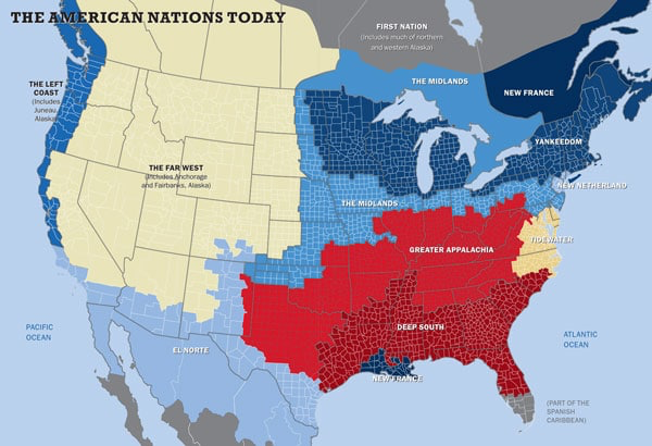
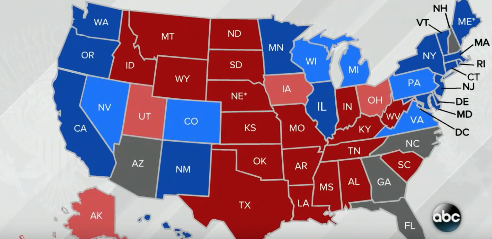
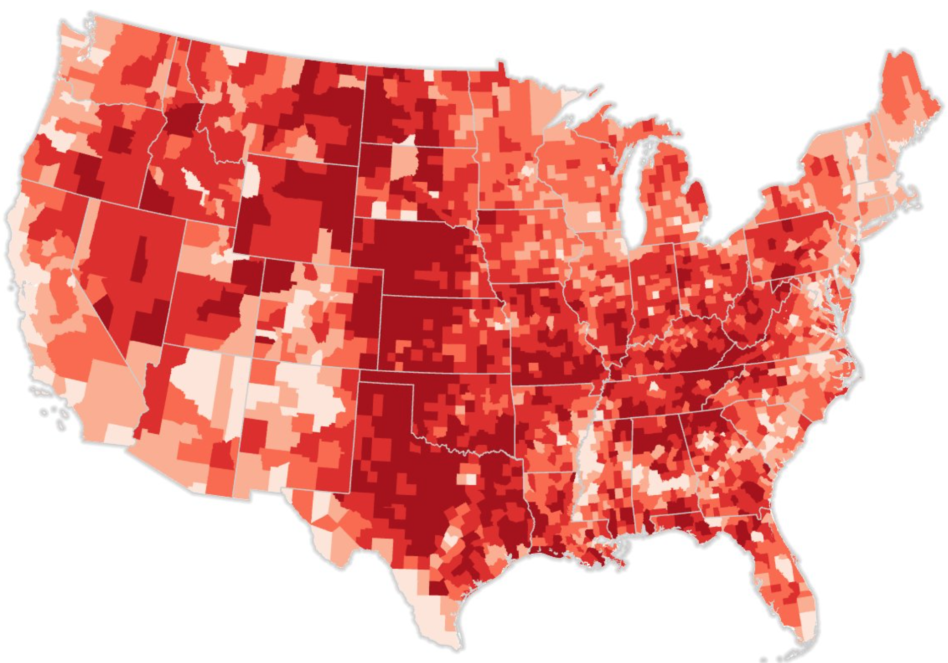
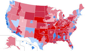
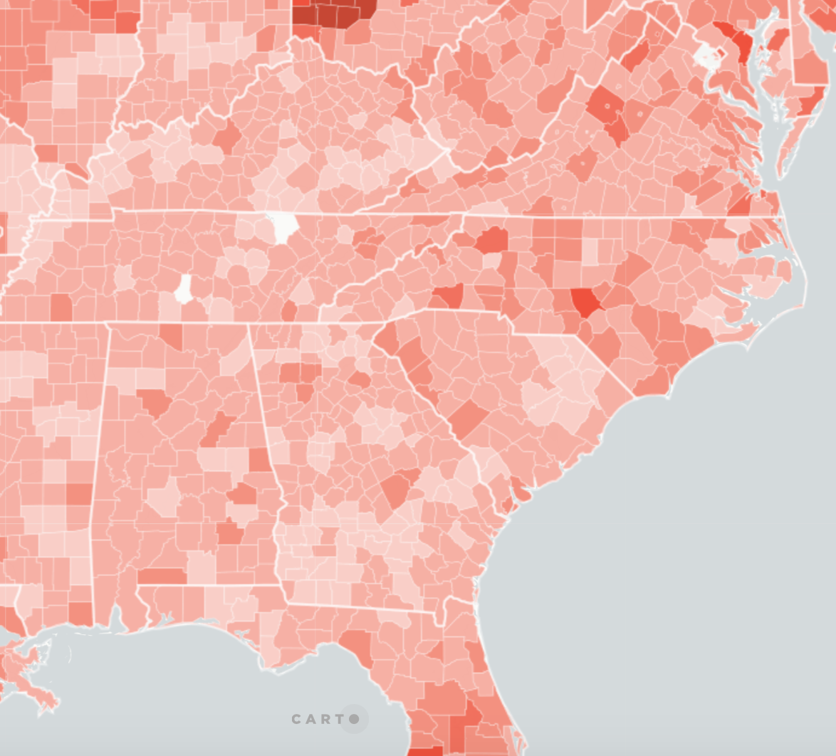
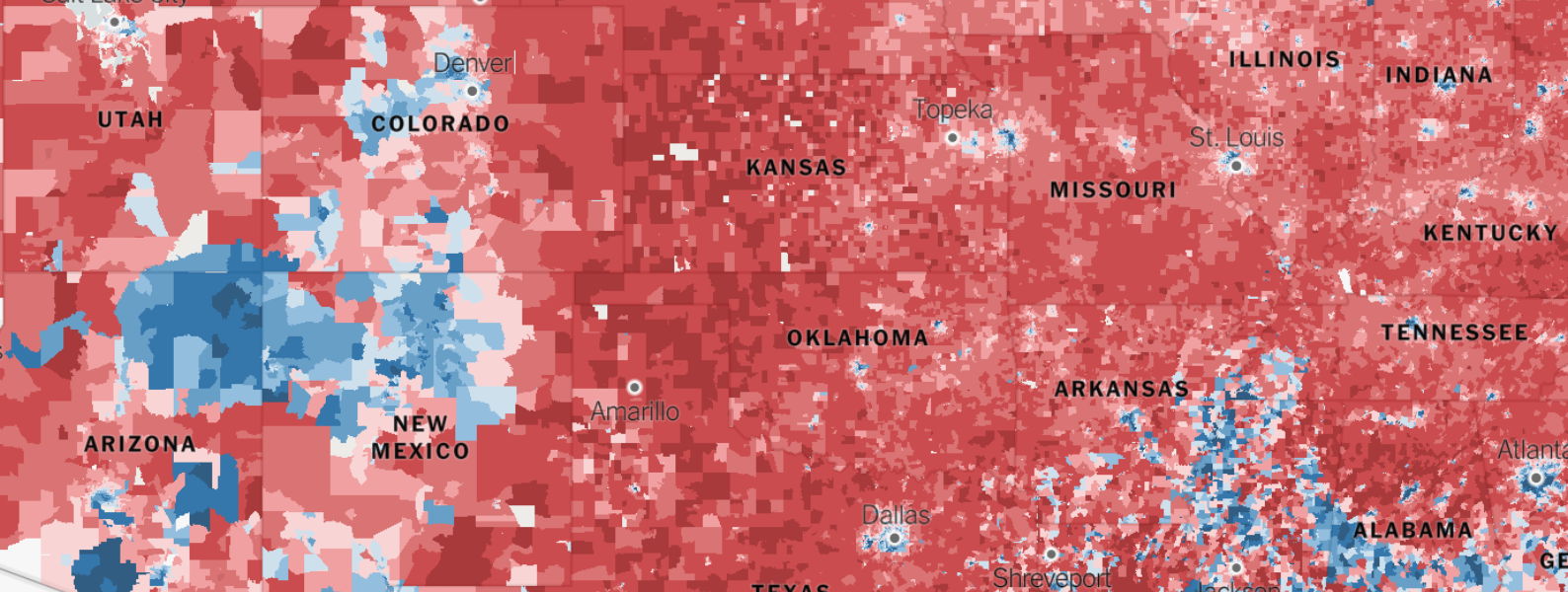
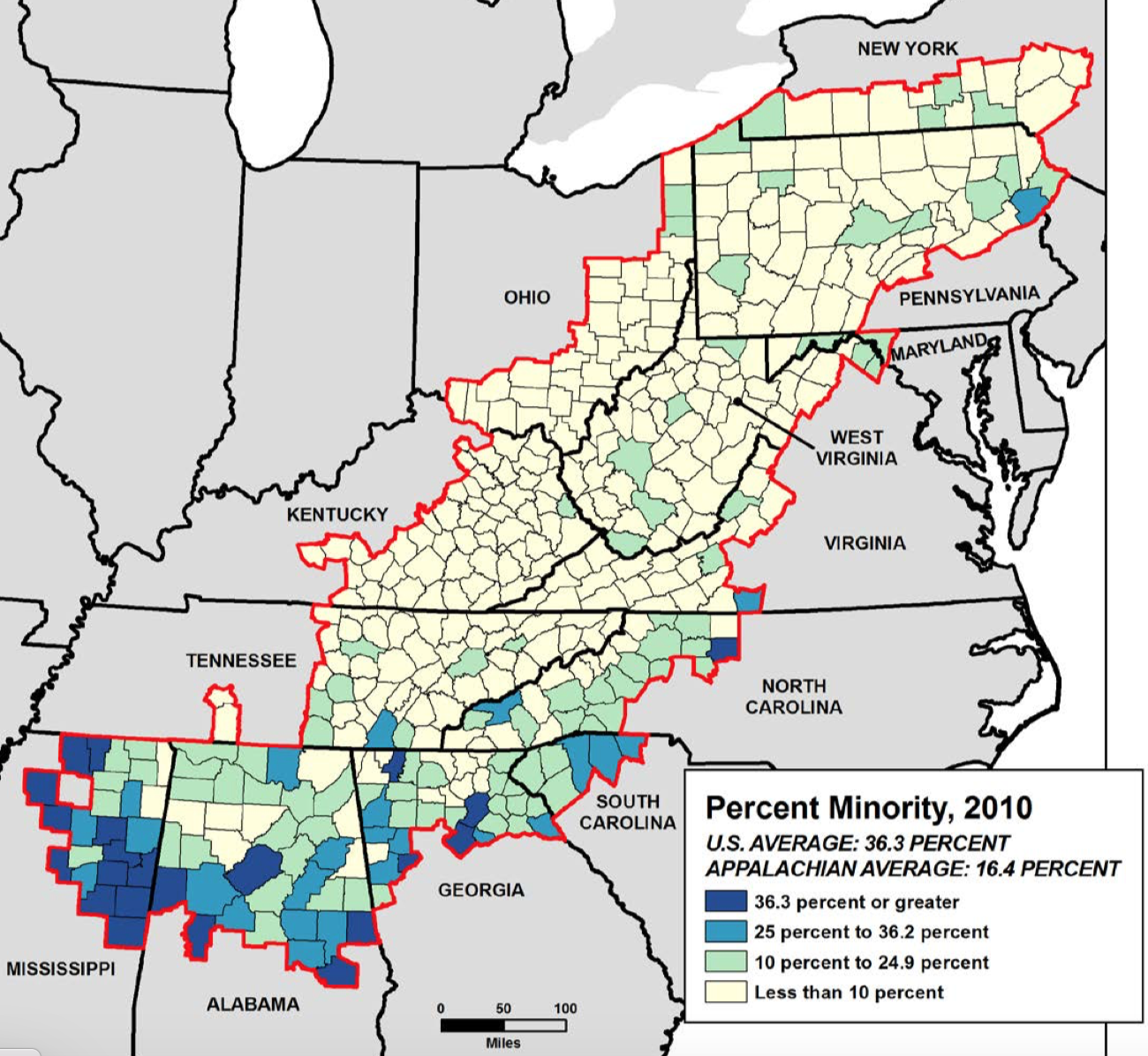
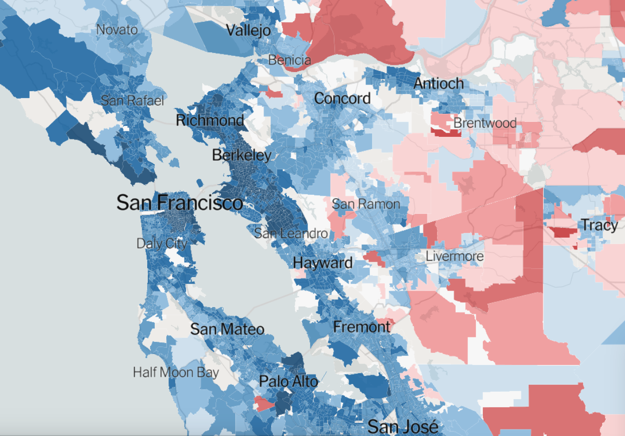
Area roughly corresponding to Greater Appalachia/Mapbox/New York Times


not only removed from broadband or access to health care, but relative per capita income rates in relation to the United States average, completion of high school, ethnic diversity, and women in the workforce and unemployment among young men–in short, a nation apart from the nation, less exposed to racial diversity and who the federal government had let down in its priorities.


Women in Worksplace, below average in tan.png

New York Times (2015), tan counties from below average; violet (above average)t


This was just the sort of area where Hillary Clinton would have the hardest time with her message, and possessed striking insularity.


Minority presence Appalachian Avg 2010U.S. Census Chartbook, 2010 (2011)


The trap of thinking in states may distort the above map, but the increased number of votes  seem rooted in “Yankeedom,” as well as “Greater Appalachia” and “Midlands,” than the logic of Woodard’s map would have us believe.  Of course, Woodward’s map might be more convincingly read not as a divide between rural and urban, but a heightening of the local, and a collapse of cross-regional collectives that once animated our politics and were known as parties, or groups that bargained for collective interests as unions.

For it surely takes into account the deep crisis in our democracy of a disconnect that many feel compelled to seek affective ties that are deeper than the remove they feel from Washington, and hard to find in a map.  It is saying something that even a year and a half from Trump’s inauguration as President, we continue to return, as if to find more information, to even more detailed parsings of the political map that might allow us to explore and, more importantly, come to terms with the extent of fracturing in our political landscape, where urban “voter islands” in Denver, Minneapolis, St. Louis, Chicago, Washington DC, Atlanta, Miami, Houston, Phoenix, San Francisco, Seattle, Boston and New York are so strikingly pronounced–and try to understand what that heightened insularity can mean.


Ryne Rhola/Mapbox (2018)


We are asked to use the map to avoid being in a “political bubble,” and to explore the area that you “know”–no doubt where you reside, where everyone first turns in a map–as if to measure what you expected that you knew against the “extremely detailed map” of our political divisions, courtesy of Mapbox, where even the divisions in a reliably “blue state”–as where I live, California–can be parsed in greater detail, as if to gain intelligence of the political lay of the land, in time for the mid-terms, and to learn what districts you might to go to canvas or contribute to a political campaign, as possible on many partisan apps,


California.png
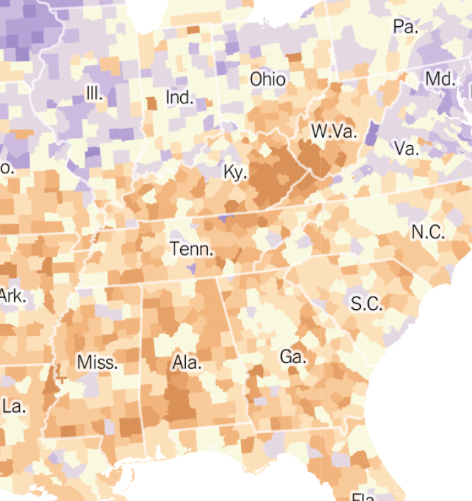
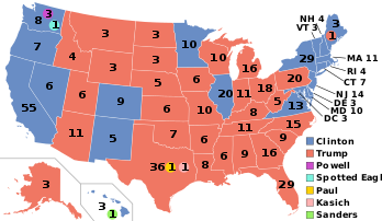
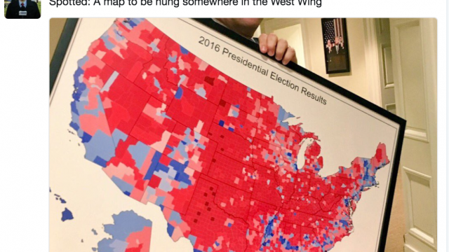
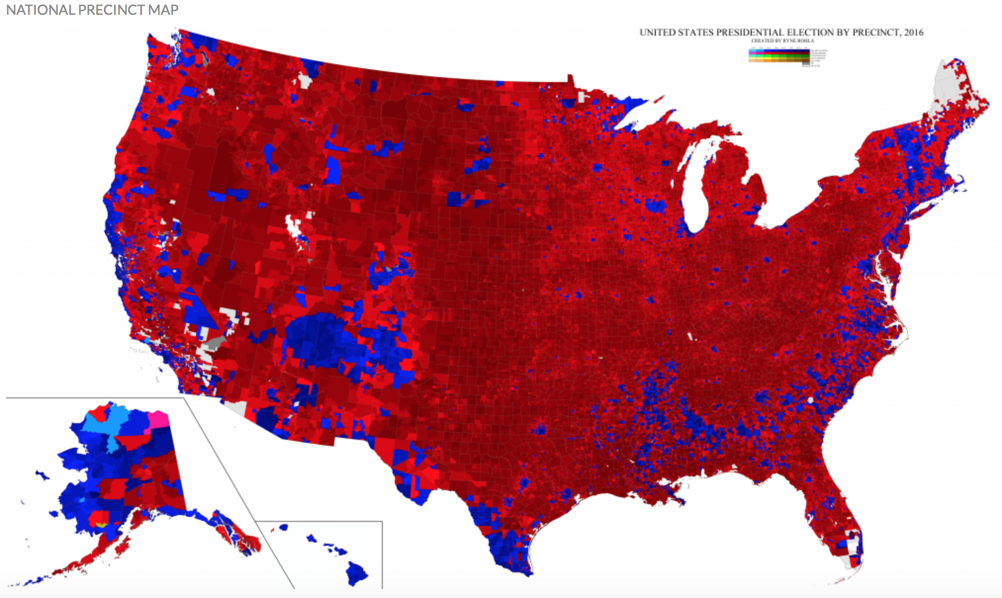
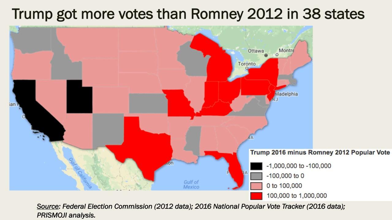
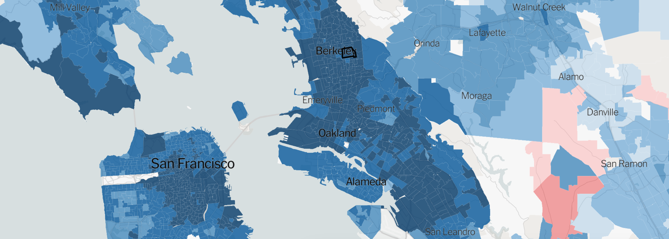
Ryne Rhola/Mapbox (2018), 2016 US Presidential Election


The divisions in political or electoral preference seems hardly surprising, but the divides show up as stubbornly sharp in the Bay Area, whose insularity is long supposed and often championed, but where the directive to “explore” an area you “know” to see if you live in a political bubble seems all too apt.


Bay area


east bay alone with Danville


For the “areas you know” still seem ones that you can’t quite get your head around, too much like bubbles than regions, where fault lines of political opposition are located a bit more inland, but seem sadly inscribed on the land.


The maps remind us that, rather than live in nations, we seem to live in tribes.

Leave a comment

Filed under data visualization, infographics, news graphics, political geography, political preferences

Fit to Print?

The iconography by which maps address their viewers might be framed in productive ways within historically situated economies of visual attention with interesting results.  For as much as they reflect practices of production, the ways that maps have engaged viewers who struggled with new ways to grasp expanse reveal a dialectic between graphic invention and a larger marketplace images, despite the tendency of those who style themselves historians of cartography to focus on their formal qualities or the mathematics of geographic production.  From their insertion at conspicuous places within some of the earliest printed world histories, mapmakers actively courted readers’ attention by crafting increasingly persuasive claims in aesthetically challenging ways, and by raising the stakes of their abilities to process expanse.  The promise to crafting a satisfying harmony of comprehensive global coverage has long existed in uneasy balance with their narratives.

The success by which cartography and art communicate globalism might benefit from tracing the ways in which globes have long tried to engage their viewers’ attention.  The woodcut of a world map below, designed circa 1490, defined a global purview for readers in ways intended to be cognitively satisfying, promising to orient them to unseen regions by scattered rivers and landmarks, even if they did so by using means that seem antiquated, being both of restricted scope and mediated by inherited ideologies of empire, Christocentric beliefs, and specifically Eurocentric models.  But the promise of expanding horizons led this bold two-page map to be prominently placed in a universal history to mark the recession of waters in a post-diluvian world, suspended in the hands of Noah’s three sons–Shem, Japheth, and Ham–serves as a blank slate to inscribe a global history that proceeds to span across generations to the Resurrection of Christ.

If the map of the world is crude by what we think of as modern standards, and possesses no clear spatial indices, the symbolic power of a planisphere of clearly Ptolemaic origins was modern:  the engraved schema provides ways of orienting viewers to the lavishly illustrated book’s s expansive content as a comprehensive condensation of collective histories about the world’s regions–making good on the recent authority of such projections along latitude and longitude to reveal an aggregate history charging the growth of worldly and ecclesiastical power over the emergent consciousness of a global expanse, centered roughly on Jerusalem, inscribing a succession of empires over terrestrial space.  Indeed, the discoveries of the New Worlds that were mentioned in the 1493 Nuremberg Chronicle (a compilation of universal history of somewhat scholastic origins known as the Liber chronicarum or “Book of Chronicles”) occupy small place in the service of describing the chronology of a succession of imperial ages that culminated in the ascension of the Holy Roman Emperor Maximilian I.  The early world map that seems to have derived from a Florentine archetype was used to describe the recession of waters after the Noahic flood in ways whose power existed to set the stage for the rise of Greek and European empires, rather than the discoveries.


world chronNuremberg Chronicle (1491); fol. 13 (Anton Koberger, Nuremberg)


If maps no longer convey such a stable sense of narrative progress, and such an engraving would no longer seem a marvel, most maps do considerable work in engaging an economy of visual attention.  The world is with fewer open spaces than it was for Noah’s three sons, and global history resists linear narratives, despite the resilience of similarly terrifying apocalyptic notes, at times fed by a rage for biblical prophecy that generated sufficient demand for tracking daily fluctuations of a Rapture Index available for online consultation.

Globalization demands adequate expression by a visual image that can engage its viewers, hopefully by more than the material underside of the interlinked–perhaps a map more fully revealing of the shifting nature of individuals’ relation to the inhabited world.  At a time when the earth is crisscrossed with media systems whose signals are relayed along 6,300 tonnes of satellites–and over 8,000 physical objects that orbit its surface and will outlast its inhabitants as a necklace of debris–we lack maps of how we inhabit the world or have remade our relation to it.

satelites-espacio-google world view

f52b92777d7ed50b6fe40c82165a2476

Such computer-generated visualizations offer the chance to visualize the satellites that track our changing global positions and information flows, relaying media world-wide over a multiplicity of interconnections:  the image reveals what lies outside our visual abilities or comprehension–and which we would be otherwise all too apt to forget otherwise– by using government data to allow us to visualize the multiple layers at which satellites orbit our planet, even if they make it hard to track the wide array of signals that they transmit, intercept or surveil.  But they were absent from the multiple covers that served to catch readers’ attention in the global-themed relaunch issue of the New York Times Magazine, a striking photograph of a suspended glowing globe, shot in a studio setting with an exposure that disorientingly overlaps the toponyms of Africa and South America, whose equatorial line seems to cut the globe in an unfamiliar place.

The maps offer an angle to contemplate the stunning long-exposure image of a rotating globe editors of the Magazine recently commissioned from photographer Matthew Pillsbury as a cover illustrating the rapidly changing world for a relaunch issue.  The lit globe seeks to communicate both “the idea of chaos in the world, and how this is something we have all learned to deal with,” the design director observed.  But the cover of the New York Times Magazine designed by Pillsbury demands attention both for how it holds the viewer’s interest and renders the globe as its ostensible subject.  The photograph is an artistic interpretation, and compelling illustration that reveals multiple relations between art and cartography, as much as it describes the relations between nature and culture or between news media and globalization.  But if the image was intended to convey the “speed at which our world is changing” to readers, and presumably represent the news covered in its pages, it gives pause–even as an image that reflects on current quandaries of abilities to sustain the successful illusion of a promise of comprehensive news coverage in an ever-changing world.


1.  The almost transient shadow toponymy in the globe as Pillsbury managed to photograph so that the names of Venezuela, Bolivia, and Brazil congregate in a ghostly region off the shore of Africa, and Europe is suitably displaced to its upper regions, suggests the shifting focus of the news, and even questions the familiarity of reading the globe though that most conventional didactic of mapping forms, a globe of the sort one might have encountered in a schoolroom when learning about world geography for the first time:  the apparent overlapping of continents and blurring of the northern hemisphere destabilize our surety of global geography in an intriguing way, set, disembodied, above the words “HELLO, WORLD,” ask we re-examine the map we thought we knew.

The five-color globe that appears in the header to this post is, in fact, while a welcome departure from the templates of Google Maps, similarly opaque in the very inscrutability of the very glittering image of earlier attempts to map the earth that it offers.  Pillsbury’s long-exposure photograph of a spinning lit globe deserves interest as an advertisement of how the newspaper of record mediates news from a perspective that narrates a version of world news increasingly interlinked and less stable through a strikingly retro medium of mapping as a glowing globe.  The photograph addresses how the shifting of what once seemed immovable territorial boundaries circa 1989 have not only been redrawn but shift with an unforeseen fluidity challenging to comprehend.  Yet more than inviting us to interrogate relations, or the mobility of global populations and goods, the image almost aesthetically distances the spinning globe from viewer as much as it reveals levels of entanglement of places to one another and intensified contesting of sovereignty.  The blurred five-color surface of the spinning globe seems to abstract mapping from human geography.  It not only suggests the opacity of its ostensible subject; indeed, it almost asks the observer to throw up their hands in something passing for marvel at the illegibility of a large area of familiar regions, and at the increasing entanglement of current events.  It almost revels in being intentionally opaque, however, as if to say that the old indices of orientation just won’t work or clearly be commensurate to the take on current events that it will describe.


2.  To be sure, in an age of the proliferation of maps on multiple platforms and hand-held devices, it’s refreshing to rehabilitate the schoolroom globe, and almost ask us about our current world’s distance from it.  Oddly, however, Pillsbury’s cover employs an almost antiquated didactic object, a school map, relinquishing interactive mapping tools, to suggest the quick-changing world.  By spinning a schoolroom globe at high velocity to craft a visual pun to illustrate global change, the cover raises as many questions as it answers.  What seems a conservative cartographical format-if here used somewhat tongue in cheek–as an icon of cartographical authority is almost prosaic.  The sheen of the surface takes advantage of the conventional five-color globe of the world to seem to suggest a surface whose very colors and hues are so blurred to render them and all surface toponymy illegible, as much as an image of totality of global relations.  As may befit the newspaper of record, the globe is steadfastly traditional in its familiar five-color design:  it suggests a space by no means fixed, where boundaries around countries are redrawn and surfaces blurred for all practical purposes, but only tweaks the most standard image of the global coverage to suggest a disorienting sense in which we might lose familiarity in its geographical contours, rather than promise truly comprehensive coverage.  

For the globe’s illegibly blurred surface almost erases the considerable varieties of mapping by which we’ve come increasingly to understand and orient ourselves to the world, and almost relinquishes hopes for a new ethics of a world view, but just suggest the inadequacy of imagining the ideas of terrestrial location, proximity and geopolitics as received from earlier school globes.

RP-30501-2

Is it that the idea of boundaries of knowledge are just not so clearly fixed after all, or that the problem of providing a single authoritative viewpoint is being explicitly acknowledged?  What does it seek to illuminate?

12-Raised-Relief-Ocean-Adventurer--pTRU1-2910038dt

More troubling, Pillsbury’s photograph of a glowing globe offers us no place to decipher almost a single word:  the effect is almost to see words swimming across its ghostly surface, unlike the transient figures that inhabit urban spaces in his stunning body of photographs of urban spaces.  The notion of a commission from the photographer to create an image of global coverage might be misplaced.  For Pillsbury has worked primarily in cities like New York, Paris, Venice, or London, using his knowledge of the local to much advantage, as well as Japan, more recently, where he’s taken advantage of a Guggenheim Fellowship to  turn his lens toward explorations of Tokyo’s public spaces.  His subjects have been less global than relentlessly cosmopolitan in scope.  Pillsbury’s recognizable style is more than a sign that the Times seeks to cultivate readers as the hip newspaper of record by the image in this post’s header, as much as suggest an actual global purview of different spaces.  The picture is almost a way of conveying just how difficult the job of the news is to convey all that’s fit to print, in a time when the world seems spinning faster than ever before.


3.  As an artist who has investigated the relations of crowds to urban space the spaces in New York that he knows well, often working to illuminate the “performance” of identity in interior or cavernous public spaces where individuals and crowds congregate, Pillsbury has cleverly employed extended exposure to blur the boundaries among individuals  in urban space and place.  The result is to question the relation of the individual to settings that might be otherwise familiar.  The extended exposure of the globe is less of a site for staging events or a setting, than a surface just out of contact with the viewer’s eye.  Despite the suitability of Pillsbury’s medium to observations of the interaction between individuals and images, or crowds visiting museums, such images are effective as encouraging ongoing visual investigations by expanding time in exposures from a few minutes to an hour that is collapsed into a single image.  They indicate the changing “geographic imagination” by which we all inhabit different spaces.  The spinning globe is photographed less to offer a record of lived space than an almost fetishized surface as an object, more than inviting viewers to consider the spaces that they inhabit; if the urban spaces can never be stopped or reduced to a purely static form, the globe is always in motion and hard to perceive save by the brightly lit sheen it presents.  It recalls a past legibility of space, rather than propose a prospect of continued legibility.

The photograph on the cover of the Times Magazine, despite its candy colors, contains a clear note of melancholy of the absence of hopes for adopting a clear relation to space, even as it radiates contentedness in that realization.  The photograph is perhaps best taken as a meta-observation on the success with which maps can continue to command interest in a changing world.  The candy-colored globe is an icon of cosmopolitanism, not primarily oriented toward coverage, blurring the notion of one-to-one signification, and almost attesting to its own inadequacy.  That is not, however, the most confident self-image for journalism to project.  And it hardly helps that we have to wade through about fifty pages of full-color advertisements for high-level commodities and financial services, speckled with small articles, until we find articles about the world in the Times‘ recent “Global Issue” that meet the promise its title posed, but raise some of the issues about which we might want to learn if we could better distinguish its spinning surface after all.


Spinning a Globe to show speedNew York Times Magazine


4.  The photograph interstingly contrasts to how Pillsbury regularly runs long exposures to pose topics of visual interest that invite us to look at how spaces are inhabited in new ways, raising compelling questions about the construction of space and how we live in it, the globe’s familiar surface offers more of an elusive object of desire and a commodity–and not provide a space that invites us into it, and whose business invites us to sort outs its contradictions.  For if the issue doesn’t really invite us to look at the world, so much as the advertisements suggest the globalized economy it serves, the sort of select writing that we have to wade through glossy ads to find is a deserved reward, but hardly a point of entrance.

Another of Pillsbury’s images of a strikingly similar color palette suggests the pronounced permeability of place to humans, and explores a living geography defined by human interaction in ways static maps can rarely either work to successfully register.

Pillsbury_Matthew_RobotRestaurantTokyoTV14628_2014_0© Matthew Pillsbury / Courtesy of Benrubi Gallery, NYC


But the ghostly presence of the illegible globe almost suggests a world that can’t be grasped, about which we are as mesmerized as challenged to process information.  Rather than invite the reader to interpret global space, the image seems a farewell to geography as a matrix of information, rather than the promise of global coverage made by most earlier symbolic maps in newspaper mast-heads or the animated backdrops of nightly news television shows.


globe by paraidesNew York Times


One senses that there is less interest in the history of an icon of spatial inter-relations, and networks of relationships, than an insider knowledge of how far we have come from the sorts of globes we used to use in school.  The photograph seems to gesture, however, to a long history in the twentieth century that takes the globe as a promise of the coverage that the news–or a news channel–could offer, if its iconic role seems to have considerably atrophied as it grew increasingly antiquated in current news graphics, which cultivate far more dynamic modes of visual engagement.


5.  The iconic marquis of De Lauer’s News Stand in Oakland, CA, whose range of international papers made it a mecca of the hard-to-find remains a survivor of the on-line.  The globe of its marquis dates from the Cuban Missile Crisis, as is perhaps evident in its charmingly corny magnification of the United States.  The globe so prominent behind the name “De Lauer’s” in the marquis provides a notable predecessor of the symbolic promise of mediating global information, and the purchase of the authority of the globe as a promise of the delivery of objective information to a shifting readership of news; even if the prominence of the United States on the map belies the fact of the range of international news it continues to sell, the marquis illustrated the inter-connected nature of the world delivered in print daily to the door of an Oakland news stand.


DeLauer's StorefrontOakland, CA

The image of the newscaster reading the globe was easily transposed to early television news for some years as an authoritative setting of addressing a public audience of viewers, back when news was of a considerably more univocal enterprise.  What now seems too a tired template for breaking news has retreated to a background of increasingly schematic form, no longer the authoritative site of enunciation from a position of expertise it was for Walter Cronkite’s newsroom, even as the studio backdrop map was recently reinstated for current newscasts.  The map in front of which Cronkite spoke was something of the objective correlative of  the reliability of the individual newscaster, or a sign promising continued confidence in his pronouncements, and was updated in the famous equal area Goode homolosine projection that was adopted for CBS Evening News.


cronkite

Cronkite sd

cronkite wall map

 Walter Cronkite (c. 1968)

It’s unclear if this is still the case, even if the network has recently resurrected the same backdrop, it seems to lack comparable authority.

r-SCOTT-PELLEY-large570

The stability of the globe has atrophied in network news, receding to a backdrop with strikingly less signifying power.  The globe has become a glyph of reduced prominence and authority–not only because of compelling graphics, but as its meaningfulness seems increasingly worn and holds less promise or stages a narrative of global coverage not clearly attached to a somewhat overly tired symbol.  No longer corresponding to the omnipresence of proliferating online maps in our worlds and on our other screens, the world map seems a superadded surplus, almost an older piece of mental furniture pressed into new service.

abc

The world map is often pressed into service as a supporting graphic rather than an authoritative point of reference:

world news.

cbs4

15_after_effects_news_template

2

It’s hard to say how much a static map can pose the pretense of authoritatively describing a terrain that seems so rapidly shifting and whose dynamics of power it could hardly capture.  It is difficult to assert  the globe’s a promise of comprehensive coverage, or successful a medium to hold the viewer’s attention.


6.  To be sure, the continued promise that the globe makes is not truly able to be taken so seriously, as well, given the multiplicity of news sources that we tend to presume, and the difficulty of assuming that one source would credibly count as a fount for universal coverage.  Although global coverage remains an icon of authority, the geographical distribution of news items printed in the Boston Globe, MIT’s Center for Civic Media‘s project “Mapping the Globe” demonstrates, by showing the return on the promise of global purview promised in the newspaper’s masthead against its stories–demonstrating a predictably skewed coverage in 2011-15.  If reflective of recent global “hot-spots” in Egypt, Syria, Pakistan, and Iraq in that period, the skewed nature of their current coverage directs attention to and mediates a picture of global politics to its readers which one can easily re-imagine as distorting actual its proportions in response to proportions of the paper’s coverage:

boston globe:world

While this partly depends on the paper’s distribution, and putting news on the table that will grab attention–and this interactive map will allow viewers to investigate the map at much further depth, below its surface, by hyperlinks to the exact stories about each region that they can scroll through, as if by a toponymical indexing of the newspaper’s coverage of recent events:

boston globe news

Articles per capita MA

It raises questions of the picture of the world that we see refracted in the news stories that the Globe prints, and what it effectively filters out of the mix to provide its coverage of news.

glboal map

The result, based on a morphing of the world map by data about stories related to countries in the Guardian newspaper, 2010-2012, was remapped accordingly by the energetic and enterprising cartographer Benjamin Hennig, in a cartogram that reveals the distortion of hemispheric privileging of space in the newspaper’s coverage, while maintaining the actual land/water ratio:  the result instructively magnifies the mideast, US, and Europe, echoing of distortions of the Mercator globe, while magnifying the AfPak region and Iraq, much of the Middle East, and both Japan and the Koreas:

GuardianNewsWithoutUK2010to2012_AllStories

Even without actually drawing an proportional cartogram of global areas covered in stories that reach print, such as that created by developers of Worldmapper, from Hennig to Danny Dorling, which rescale the size of nations in proportion to how often it is mentioned in online news items, or to create metrics of places corresponding to the size of articles newspapers devote attention to them–and perhaps have retained active bureaus–newspapers hard-wire our brains to a global map or worldview we all too readily internalize.  The worldview leads us to expect stories from regions of the world, and to suddenly make space for others–Ukraine; Liberia; Nigeria–aware that they may suddenly may disappear.  This might be called the world we bring to the paper, as we first click on its homepage or physically open its pages, as much as the world that the paper covers.  But the blurred world of shifting toponymy that Pillsbury preserves is more often one that lies just out of reach.

In terms of the acknowledgement of the blinders by which the world’s news is actually mediated, it’s nice to close with the combined tension of peace and violence created by the coexistence of obliteration of information and an ideal of harmony refigured by far more ironical image created by Maurizio Cattelan and Pier Paolo Ferrari for the same Magazine.  Cattelan and Ferrari provocatively painted of a repainting of the globe’s surface that both conveys a suggestion of blissed-out harmony of the island of the lower forty-eight states, and a terror of obliterating all existing toponymy save that in the forty-eight states between the Atlantic and Pacific oceans, save the partly obscured lettering noting both oceans.  This masking of a map shows an optimistically if terrifyingly blinkered news, a sense that the world is best in our hands when we’ve obliterated most all that is outside our immediate purview, prepared by what seems a man in a dark blue serge suit, who is calmly and decisively moving a brush studiously to conceal most of the surface of the inhabited world with baby blue paint, in a sort of Brave New World image of preparing What We Want To See as much as ‘All the News that’s Fit to Print’–and wonder if its consequences are so pure–and who is the suitably anonymous man in the blue serge suit who is doing the overpainting, anyways.   (It echoes the rendition of a perpetually sunny scenery in Google Maps, though even Google is more forthright in offering geographical coverage.  But it would be hard to offer less than shown below.)

Cattelan DetailCattelan/Ferrari

The multi-media image of a painted-over globe seems to record the censoring of what we need to know, and what is to be seen–and presents us with the manicured image of what we know best if not a view of the world where censorship is the new norm.  In the post-Snowden world, we cannot help but think about NSA’s efforts to infiltrate internet carriers and compromise global telecommunications networks without concern for international law–or treatises with the sovereignty of neighboring countries in the Caribbean:  in this globe there is “an equal measure of terror and peace,” although  the peace lies in obscuring of the world outside of the United States by blanketing the entire world with coats of light turquoise latex paint.

Cattelan's US 48
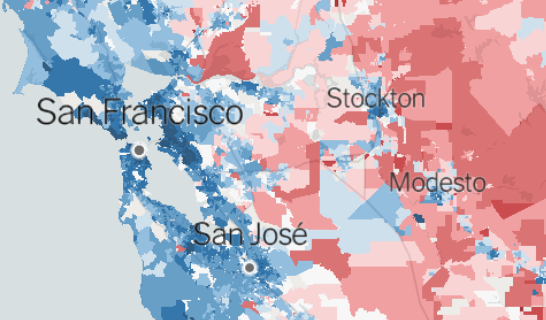
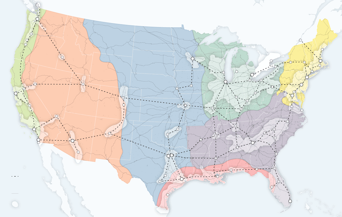
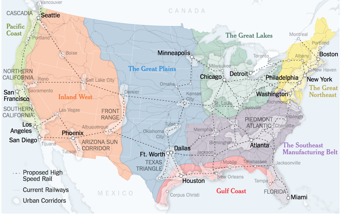
Cattelan/Ferrari (detail)

Both images provoke us to consider the ways that the image provide commentaries on news as a space for learning around the world, or to orient ourselves to the dynamics by which we describe and are invited to investigate the world.

The mediated nature of news is, of course, not so tacitly commented on by the image of the editorial team that assembled the updated Magazine, young folks huddled around a large-screen Apple monitor of pretty similar ethnic identity and economic background, preparing the image of the world that will be soon ready to be consumed.  Has the screen replaced the globe?

22edlet_ss-slide-U7WL-articleLargeNew York Times

Leave a comment

Filed under Art and Cartography, globalization, news coverage, news graphics, News Maps