
D3 images, or data-driven maps, shift with the content that they seek to display. They in other words provide tools of spatial analysis unlike static maps or terrestrial projections: for rather than reflecting or arranging data in a static form, by analogy to a window, such maps reveal the changing data that drives their design. Such maps lend themselves in timely ways as tools able to chart a changeable terrain–or the shifting configuration of a distribution–which often are tied to data feeds, rather than employing a fixed dataset.
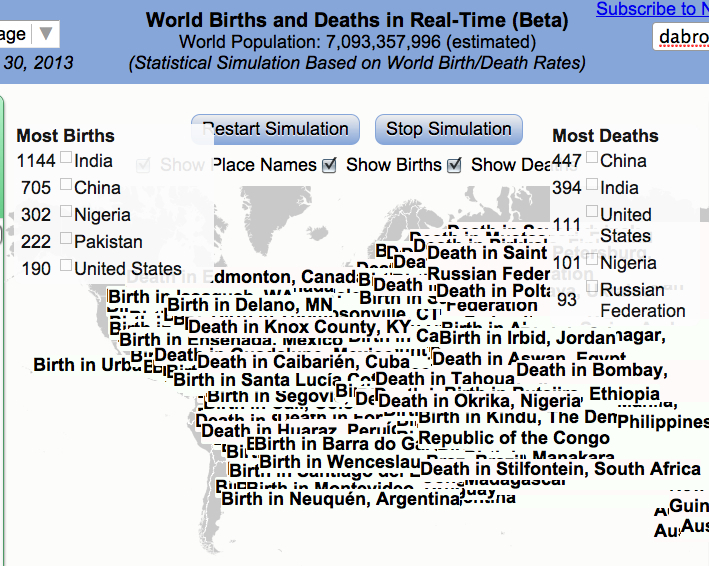
Since D3 maps are often able to take advantage of their mutable forms by being incorporating new data, using it to determine the rendering of a shifting actual space or set of inter-relations. So the mapping growth of population in the world’s countries is a classic example of a D3 tools of visualization, determined by the growth of residents in each country: although the base-map of the recent simulation of world birth/death rates by software developer Brad Lyon is a familiar grey projection of the continents, the constant data feed that shapes the map, locating individual births and death in specific places, and tabulating the greatest numbers of births in individual countries, is also a visualization of Tobler’s first Law of Geography: that “Everything is related to everything else, but near things are more related to distant things.” For the changes in global population are understood in the unit of the entire inhabited earth in this very catholic map, rather than as able to be confined to the borders of individual countries.
Among the benefits of using D3 visualizations to chart the rhythms and rates of births and deaths is a channelling of immense amount of information that is both a tremendous ramping up of cartographical omniscience that the viewer can often barely process or register in its totality–for the edges or contours of the map can be changing constantly, rather than the map being designed to reflect a stable dataset. The popular new map of changing numbers of birth and deaths in the global population provides a neat visual example of using maps to geo-tagged births and deaths to part of a nation, offering, in either simple screen or beta-version simulation, something that would not be possible in a static or simple paper map. In a visualization of the drumroll of births and deaths, the resulting map creates a record of the inhabited world that is “eerily omniscient” as James Hamblin aptly put it in The Atlantic, and God-like in its observation of births and deaths everywhere: as the map’s odometer-like upper panel trucks past the 7 billion, 93 million mark, we are asked to face the challenges of comprehending on individual terms what truly approaches, if only asymptotically, something close to a God-like perspective on mankind.
By visualizing an approximate record of “world births and deaths in real-time,” in a map that extends to its literal meaning the notion of the “inhabited world,” the content of this map challenges not the borders of maps, as do so many D3 projections, but the viewer’s own boundary of self, or the meaning of this endless tabulation of the appearance and disappearance of lives on the planet and the regions of their greatest increase. This single frame of the ongoing graphic portraying a record of world populations over the globe’s surface, in what might be called, with more than a wink, a truly existential map of the place of humanity in the world:

Never mind that the countries are only light grey outlines, and the subject of geography is secondary to the map’s shifting contents. At issue is not how we inhabit the space, and not the centers of population or their distribution, but a statistical ping of each birth and a death that can be easily geo-located, blips of text that overwhelm and even detract attention from a grey base-map that seems to recede below each announcement, until they entirely bury the map, no doubt as our population will bury our world if its numbers proceed to grow by a further 44 percent by 2050.
There is no need to ask where these people will live or how they will be fed in this visualization: we can wonder that all we like as the number of births proceed unimpeded, always far in the lead of the counting off of individually tragic deaths. But in their collectivity, the amassing of these numbers is difficult to comprehend or register–and not only because of the relative objectivity of the simulation. As one looks at the data visualization and the so rapidly increasing numbers of its statistical simulation, it starts to become evident that the perspective it offers is just not tenable for a viewer to start to process; its numbers perform an odd if awesome balancing act between concrete actuality and abstraction impossible to really comprehend, and we wonder where this data flow derives, as its ticker-tape pop-ups jerkily transport us to half-familiar or unfamiliar cities as it notches population growth, and the map is buried by textual banners–much as their viewer is buried by an unweildly surplus of information.
Software developer Brad Lyon used some ideas and concepts of Mike Bostock’s D3 maps in order to create a real-time register of births and deaths worldwide–or a simulation of them–that the viewer could gape at in wonder, and view almost as the objective correlative of the bulging population of the world. As was recently reported in The Atlantic, this digitize simulation charts the contours of the inhabited world, expanding the use Lyons made of United States Census data in his popular simulation map, designed with Bill Sneebold, to create a visual readable interactive map of the country’s population.
The overwhelming effect is immeasurably more dizzying than looking at a paper or static map. But perhaps this also conveys some share of the immensity that must have overwhelmed classical viewers, unlikely to have ever been able to process information of far-off lands, in early images of the classical concept of the bounded ecumene. The cartographical canvas is both familiar and disorienting, if only because of the size at which every birth and death appears, generating banner toponyms rapid-fire progression that one can allow oneself to imagine reflects the actual swelling of population numbers across the world in real time. The immensity with which the momentary geo-markings of this tally invests new claims in a pretty standard projection of the planisphere; highlighting specific places in what almost seems a random-generator makes its surface a field that is entirely disorienting in its surplus of detail: as soon as one finds ‘news’ of a death here, in Khasakstan, there is a birth in Bolivia, and two more in Punje, so that numbers Starting from the very moment that you open it up, and continuing until the screen becomes completely illegible as ticker tape birth and death announcements utterly obscure its surface–
or until you get in a hazy-headed stupor and realize that you’ve been watching the register doing its’ job for too long, and just have to leave the room since you can’t really keep up with all this–is an real-time image of the inhabited world, and a reminder we may have just have access to too much data.
The visual register in the screen image not only announces each and every birth and death with a punctual precision that is always eery, but keeps a tally of the totals and their distributions in each country, and they all cause one to be reminded relentlessly that births always outstrip deaths.
In ways that mapping the boundaries of mapping the world challenges the boundaries of self, the popping of up sites of individual birth and death on the simulation, which occurs below a population counter of the high velocity of our course of global overcrowding, the map is mind-blowing because it challenges the boundaries of what the viewer can hold in her or his head, as much as because of its terrestrial coverage–there is a sort of hortatory “look here!” “no, here!” “here goes again!”–that calls one’s eye back to the day-to-day nature of lived experience that is so often outside the horizon of maps, and rooting them in an ostensibly exact record of the transit of time: from 5:10:26 p.m. to about 5:30 on October 30, births occurred at a rate of 4.2 per second, as 4,210 lives began, a large number (about a sixth) in India and a fourth in India and China, compared to 1,879 reported deaths during the same interval: the explosion of population is captured nicely in that chunk of less than twenty minutes.
And indeed it seems, at first, that the number of births in China and India dominate the map overwhelmingly, as they also form by far the greatest percentage of births world-wide, according to the data feed, as text appears that clutters the expanse of the terrestrial world, as if to provide a dizzying counter-map to the stability of terrestrial contours, that will eventually obliterate the map itself:
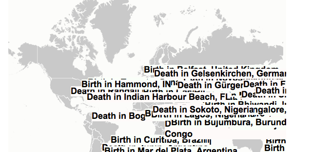
But then one realizes that this is a conceit of the format of the map, or its display of geo-tags, which oddly cluster over the area of Eurasia as they are generated by incoming data, even if they are from cities in the midwest of the United States.
Of course, it’s not like you never knew that folks were regularly born and died in this world, even in places that you’d never been or will ever visit, but this almost “odometric perspective” of individual lives clicking by, new ones popping up in places and others vanishing elsewhere, could either be a Buddhist envisioning of the ephemerality of being or a worrying sign of just how quickly things are crowding up.
Take a look at the beta version in Google Drive:
https://googledrive.com/host/0B2GQktu-wcTicEI5VUZaYnM1emM/
The post-modernity of this form of D3 mapping takes the ancient idea of the expanse of the ecumene, but turns it on its head: the population takes over, swallows, and erases whatever qualitative content was on the map, as the base-map starts descends to irrelevance, and, illegible, is unable to offer us any bearings at all. As much as offering a material subject, the D3 map unwittingly charts the ephemerality of the ecumene.

