Tag Archives: news maps

Locating the Lost Moo Pah Soccer Team

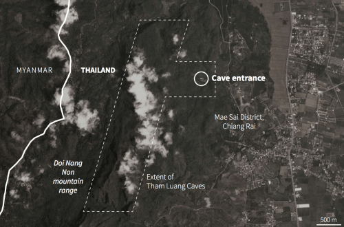
We followed with intense interest and hope the gripping story of the teenage soccer team who had entered the dangerous complex of narrow caves in North Thailand.  We focussed on the possibilities for their rescue as we watched the narrow entry ways into the remote complex where they were stranded on rocky shoals, over two miles into the Tham Luang complex and over a mile underground.  Before the maps of the narrowing cave, we could only imagine the excitement of their entrance into the cavernous passage where they left bikes, and to imagine the conditions where the U-16 team waited with their committed Assistant Coach, as we tried to get our heads around the dangers  the team faced in the darkness, licking water from its walls over two weeks.

The deeply compelling story of the “lost” team attracted the global attention from their sudden disappearance, discovery by two divers, to their rescue gained huge interest and dramatic power, as we tried to move into the narrow confines of the cave themselves.  Despite the immense power of the human story, and the endurance of each team member of the Moo Pah, or “Wild Boars,” the global scale of attempts to locate the team so remotely stranded were as historic, as we all tried to place the “Lost Thai Cave Boys”–all of whom nineteen divers have now thankfully rescued or extracted from the torturously narrow cave, whose cavernous opening narrows into one of the most labyrinthine of complexes of as one progresses into its passage ways.  Lost both to sight, above ground tracking, and to global attention, the small group of soccer players compelled attention of the entire global media.  The intense bond that existed for the team–who practiced with their coach who understood the sort of haven he was offering to them all too well–created the sense of solidarity that, in the end, trumped the dangers of being “lost” to a state or to public view.

As they were lost to tracking, GPS, or other means of geolocation, the drama became one of the inability to map in an era when mapping technologies seem to have expanded throughout our lives.  While the lack of GPS or wifi made navigation or consultation of instruments used in mapping of little value, cross-sections of the deep cave from forty years ago provided only the roughest of guides to the torturous paths of often slippery ground that threatened to fill from southwest monsoon rains–sudden rains already pressed the team deeper into the caves.   As the teenage team was removed from all contact with the world, or abilities of geolocation, the rest of the world depended on maps to imagine the possibility of contact with the kids who were suddenly known, in a bizarre trending topic, as the ‘lost cave boys’ as if to foreground the increasingly uneven global distribution of technical expertise.

We needed maps to keep them in sight, as it were, and to imagine the very possibility of their survival:  even the most schematic maps of the caves’ dimensions, abstract cross-sections drafted thirty years ago, offered a sense of contact with the team that was removed from GPS, so far removed to be out of contact, for over two weeks over a mile underground.


29 coupessTham Luang cross-sections, Association Pyrénéenne de Spéléologie, Expeditions Thai 87 – 88


While the multi-national effort helped to guarantee the rescue effort was miraculous, it is also a testament to the sheer force of globalization that the former Buddhist monk who led twelve teenage soccer players–several of whom were stateless ethnic minors–became a compelling focus of international attention after being tragically  trapped while exploring a cave complex.  The young team, stranded two miles into a six-mile long complex, with limited food and air, were almost abandoned, until the surprising accidental discovery that the teenage members of the Moo Pa team–the “Wild Boars”–were all found alive with their Assistant Coach by a group of British underwater divers, apparently on holiday, exploring another branch of the vast flooded cave complex, who first photographed the team, smiling at having contact after ten days.  If not for the fortuitous sighting and discovery–and perhaps if not for the lit photograph the divers managed to take of them in the cave’s depths, they may well have tragically perished.  But what else is more emblematic of the globalization of the media than the ability to turn all attention to one spot in the world, that suddenly seems the only spot that cannot be otherwise mapped?

The happenstance discovery that was made a week and a half–ten full days–after the team members had after they disappeared was relayed around the globe, more a miracle of endurance as much as of modern technology, though the two were conflated.  Able to capture them by cel phones, the image of their survival in the darkness underground survival mapped an odd snapshot of globalization.  While the cave was visited several times by the Thai Prime Minister Prayuth Chan-ocha, the statelessness of the players or assistant coach who helped found the Moo Pa team was not mentioned.  As global attention turned to the cave, and divers arrive from the United States, Britain, Australia, Finland, and Canada, the search almost became almost a spectacle of state theater, as the Royal Thai Army undertook to map and track the location of the “lost cave boys” in the mountainous remote province, as global attention shifted to the Tham Luang caves, newly prominent in international headlines as an engrossing topic of social media.


s095716743June 28, 2018


M5SFALUCC4I6ROCRKMM4BD345Y.jpgJuly 7, 2018 (Rungroj Yongrit/EPA-EFE/Rex/Shutterstock)


The complex of caves in which the team members were stranded was abstracted from what was an area of widespread statelessness, divided between different warring factions, the possibilities of their rescue the focus of global attention.  Such a heroic narrative was able to conclude, for one, in a far more satisfactory way than a focus on borderline events, or the fate of the stateless along the Thai border.


1. The efforts to discovery the team had already attracted help  While U.S. Pacific Command had sent a rescue team to help in the search for the twelve players between twelve and sixteen and their coach, searching with Thai military using remotely operated underwater vehicles and heat-seeking drone, the absence of any indications in the complex Tham Luang Nang Non caves was puzzling.  The mystery of their apparent disappearance was broken by an unexpected image of the smiling soccer team, on a ledge deep into the cavernous complex of caves, taking refuge from rising waters, far beyond the gear and cycles they deposited near its entrance, and indeed beyond the “beach” where those exploring this branch of the complex pause to rest, some four km into the cave.  The flooded waters that had already begun to rise with the arrival of the monsoons that fill the cave annually, further imperiling the group.  (The rains may have been a bit early this year, due to climate change.)

As the Thai army worked hard to locate the group for two weeks, the embodied problem of achieving the remote extraction of the soccer players focussed global attention; being trapped on a ledge in darkness by rising water when you don’t know how to swim was the stuff of universal nightmares.  But the graphics of their rescue through the caves, now lit by lamps and accompanied by divers with head lamps and oxygen, provided a miraculous rescue narrative leading to their emergence.


rescue contact 1.pngReuters, Hope for the 13 (January 9, 2018)


The image of the smiling teens taken by British divers became something of a clarion call to expand  technologies and tools for their rescue.  While what is paramountly important is that the “Thai Cave Boys” are coming to light and to their families, even as the rains are beginning to fall heavily, the global spread of the news of their disappearance and accidental spotting and the massive media response that both triggered helped coordinate a rescue effort up to a thousand meters underground with oxygen tanks, headlights, a team of divers, ropes to allow steep uphill climbs of wet caves, once drained but in need of more pumping before monsoon rains intensify, and time for the team to take a crash course in diving; Dawn Cai successfully stitched together an elegant GIF of the trek to recovery that captures the confines of the remote cave, and the deeply embodied ways we all struggled to imagine the scenario we replayed in our minds, but this time casting the focus on the tools of rescue, from the position of rescue cable to the waiting helicopter and ambulances at the cave’s entrance to ferry the kids to safety.


The nail-biting drama of the survival of the boys for two weeks in the narrow Tham Luang Caves, two and a half miles deep into their interior and 800-1000 meters deep underground, attached global attention first as what a feared tragedy, resolved only with difficulty.  What became a nail-biting drama of the “cave boys”‘ fate was the focus of global media; the gripping difficulties of the teenagers suddenly involved multiple states, directing more attention than ever to a remote cave in North Thailand.

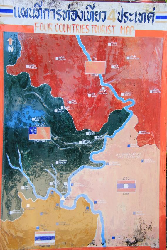
Looking at maps of the cave, the weird sense that we had in following the story that this could be a site anywhere–a cave that often seemed eerily disembodied from its environment or a specificity of place, or its location in the mountains near its border with Myanmar, site of thousands of the over 400,000 stateless refugees, displaced ethic minorities, stateless not yet granted asylum by Thailand, an area beset by drug trafficking, human trafficking, and malarial outbreaks.  The relatively retrorgade region of the Golden Triangle divided between the Shan State North and South and United Wa–has become a site for high-tech mapping, however, as if to affirm the unity and control of a region divided by different local internal conflicts–and contested boundaries the had created refugee flows.  The fact that it was normal for most children in the region to be stateless–as many of the soccer players were–made it all the more paradoxical and complex that the appellation of the team as “Thai”–and the involvement of the Thai military–were assigned a dominant role in mapping and locating the team in global media, as if the responsibility to track and locate them devolved around the nearest state to claim responsibility over the area–even if the players themselves lacked nationality.  The


5.-Myanmar-Fragile-Link-Conflict-Map

contested boundaries.pngAsia Times (Chiang Rai province divided by United Wa and Shan state armies)


–which were determined the stories of the lives of the Assistant Coach and his charges.  Ethnic strife was obscured by the tools of tracking the boys’ location and safety.   The shift of global media attention to the lost boys seems to have led to efforts of the Thai Royal Army to create the impression that the team was safe–and the situation in Chiang Rai province controlled.


north-thailand-july-2011222


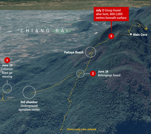
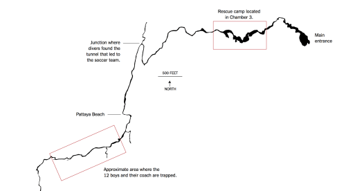
2.  The first sightings of the team fed a range of credible attempts to locate and extract the twelve kids from deep in the cave, past a rocky shoal known as “Pattaya Beach” and through its narrow openings, was planned:  we only had a sense of the depth of their location in the cave complex after the first sighting of the team that occurred ten days after their disappearance into the dark cave’s mouth.
Cave Entrace in BorderlandsPlanet Labs

alternate vis reuters caveReuters, Hope for the 13 (January 9, 2018)


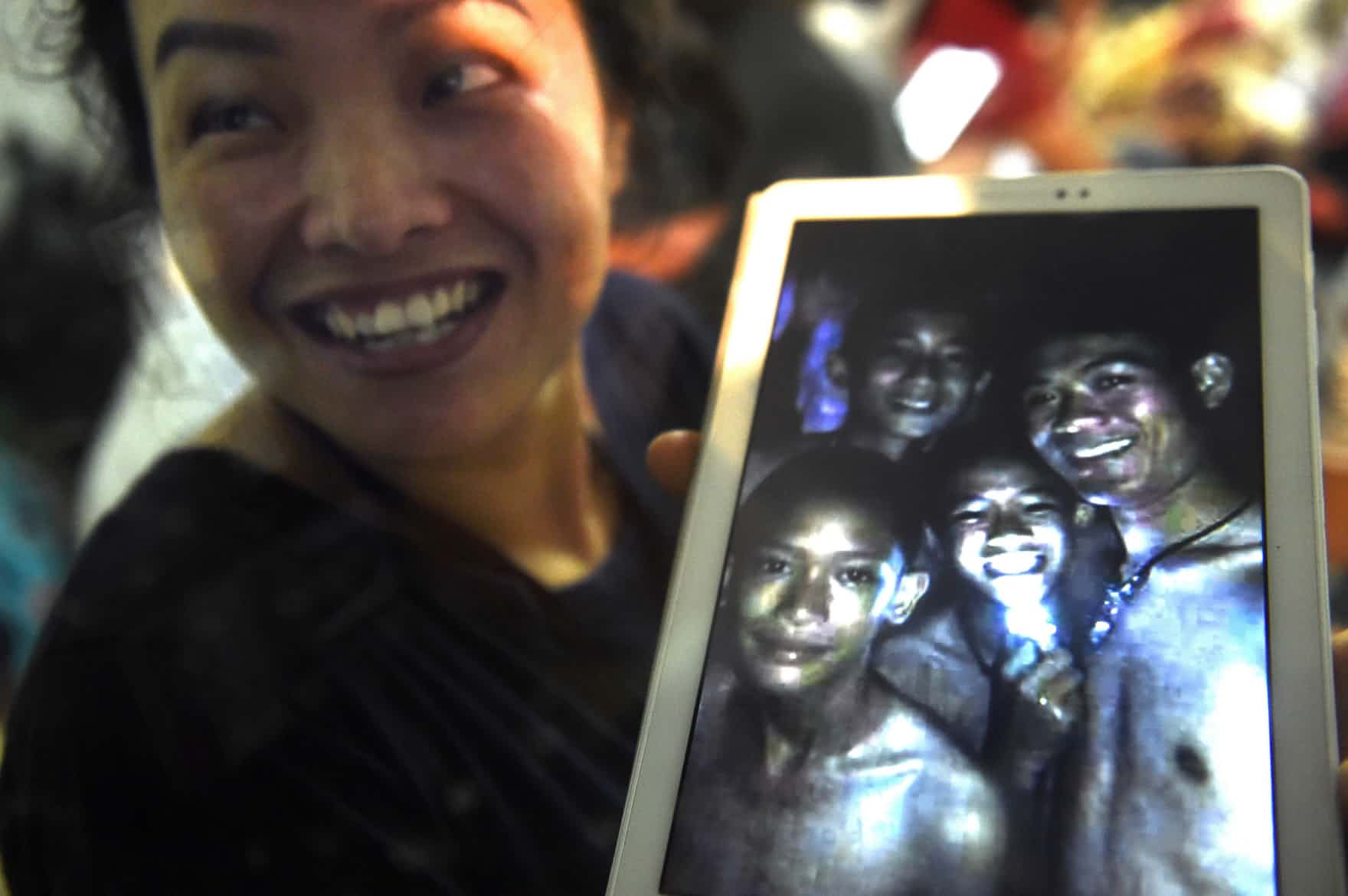
The news of contact and communication  made global headlines, and served to reorient global attention immediately to humanitarian offers to assist in rescue efforts in an age when humanitarian impulses appear globally in short supply; the image of twelve young members of the Moo Pah team, wearing brightly colored jerseys, on a perch on a rocky ledge deep underground, relayed around the world, seems a partial miracle of the ability to capture imagery in almost all places, as well as a reminder of the challenge of ever locating them on the map.  If the terrifying nature of finding no response on your teen’s cell phone has long ceased to be purely a First World Problem, the alarm of loosing any contact with one’s teen seemed to foreground the terror of how quickly any trace of their presence had disappeared.

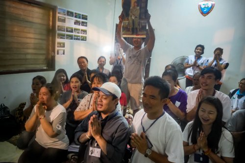
Despite the miracle rescue by which they were “found safe” inside the complex, as the monsoon rains were just about to begin, the mapping, and tracking the young Moo Pa team was a drama hard to get one’s head around that gripped the world, and lead to a huge exultation at the emergence of the first six players from the cave complex became a cause for global celebration, even as the former monk, the valiant Aekkopol Chanthawong who is their Assistant Coach, remains trapped with the rest of his charge and team, teaching them the virtues of stoicism and patience as well as techniques of breathing and meditation that had more than anything else to survive, presumably, kept them in good spirits and alive for over two weeks.  Helped in part by the recession of the waters, but also by the shallow breathing techniques that allowed survival in an oxygen-depleted caves, the dedication of Aekkopol to the boys he trained not only in soccer, but to dwell in the dark stands out.  The coach was practiced in long meditation retrains, and  arrived  as an orphan at the War Phra Thet Doi Wao monastery, only leaving training to be a monk after ten years.  Where his own advice about meditation and calmness a crucial importance to reducing the team’s panic, as well as the trust he had gained?

(Is the broadcast of plans to ordain eleven of the boys as monks as novices and their coach as a monk occurred after their rescue, lighting candles at Wat Phra That Doi Wao monastery, consolidating and combining the international broadcast of their rescue with a traditional Buddhist coming of age ceremony?)


beautiful-fine-artWat Phra Tat Doi Wao monastery, Chiang Mae province in Golden Triangle


The techniques of meditation and focus that he used, no doubt developed on meditation retreats with little food or water in the forests surrounding the monastery, were obscured by the focus on the range of technologies that were imagined to perform a rescue operation able to bring the boys from the cave.  While knowledge of the possibility of their rescue, the survival of the team fed their survival past ten days, their survival was the other story that was masked by the amassing of international efforts, helicopters, diving equipment and cables to find and extract members of the team from the cave complex, equipped with oxygen canisters and lights. What is celebrated as a high tech adventure rescue depends on the focus of the former monk who, despite his statelessness, has become something of a national hero–but also for the techniques of survival he imparted, more important than the anti-anxiety medications that the multinational team of divers brought when rescuing them.

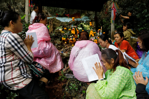
The unfolding involvement of a global commitments to locate and extract the thirteen teens seems a modern counterpart to the myth of Princess Jao Mae Nan Nong who fled her parents with her love to the complex of caves after their forbidden love was discovered, and still serves as its protector.  Princess Jao Mae was said to have stabbed herself in the complex of caves where she had fled her parents with her lover, after he was killed by soldiers her father sent in pursuit, and her blood forms the waters that fill the caves, providing a powerful link between the caves and the afterlife.  The Princess’s spirit still is venerated as protecting those who enter the cave complex in the Mae Sai district of Chiang Rai province; indeed the altar of the pink-robed Princess after the boys disappeared attracted attracted many offerings, incense, and candles with other offerings as raining and flooding slowed the search, and her role as a powerful bridge between the living and the dead and guardian of the caves in northern Tahailand gained power as a focus for hope of intercession.

The story of the fate of the “lost boys” became a parallel tale of the turning of global attention turning to the caves in Northern Thailand, to provide a different form of intercession as rescue efforts grew   The stories of Jao Mae shifted, to be sure, to new mapping technologies as the members of the team were located and found, as if in response to the efforts of collective prayer, and a variety of possible new schemes for locating and saving the lost team became a truly international affair, unexpectedly turning all attention to Northern Thailand for evidence of reasons to hope.  To be sure, the rise of an emphasis on technologies of tracking and mapping the caves may have displaced the prominence of breathing techniques and meditation practices that played a large role in the Wild Boars’ team’s survival underground for ten days.  “In the cave,” deep beneath the surface of the ground, as military soldiers combed the mountainside with maps, remembered the head coach Nopparat Khanthawong, the assistant coach had “taught the boys how to meditate so that they could pass the time without stress,” as they waited in the darkness, without food or any sense of the passage of time for ten days, in ways that “helped save their lives” by techniques learned asa novice fat Phra that doi wao temple where he arrived as a refugee orphan from Myanmar.  Aekkopol often meditated with monks of the temple and the surrounding forest for days at a time with only a small reserve of food.   And he was the last to leave the cave, shortly before the pumping apparatus that had drained the caves of rainwater failed.   Yet the entire affair and rescue was shown and described most often as an instance of modernization, supervised by the Prime Minister, in which the Royal Thai Army played a major role in securing the area, developing strategic approaches, as well as draining the cave.


3.  Tracking the site of the lost team had riveted global attention and indeed become a project of global mapping over the week plus since the tragedy of their June 20 disappearance unfolded in the news, from the first incredulous attempts to track their location in the torturous complex of underground caves to the more recent imagining of rescue attempts by diving, drilling, or any other means of extraction, as the under sixteen soccer team learned new techniques of breathing, meditation, and perseverance from their dedicated Assistant Coach.  We collectively communed with them, and contemplated their chances for rescue as we south to orient ourselves to the unfolding development of what we didn’t want to imagine was another human tragedy through our maps.  As we needed to believe they were alive–as they thankfully were–maps were an affirmation of their existence, and a logic of collective action.

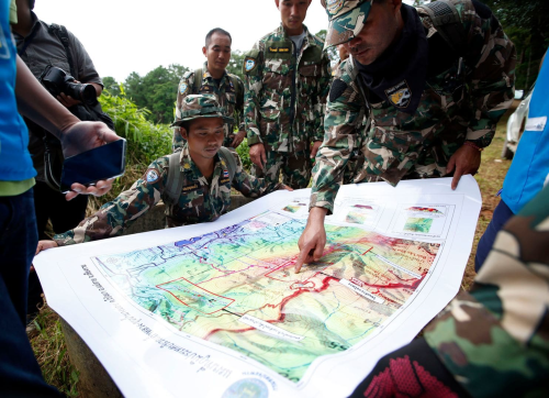
Paper maps provided a surprisingly important point of reference above ground, as the position of the boys was considered and contemplated in previous days, as if to preserve or imagine a virtual tie to their remote location.

4728Pongmonat Tasiri/EPA

Despite the diminishing hopes of teenager’s survival after the first week they went missing, their survival of the children has become something of a test-case to find if there is any area of the world that cannot be mapped–and for rescue technologies, as well as a drama of locating hope underground in a darkening above-ground world.  For global attention to the video taken by British divers of the group of teenagers who were trapped by unexpected rains while exploring the complex with their Assistant Coach after practice, and the possibilities of international cooperations to locate the small group was nourished on social media, if it had already electrified much of the nation.  What was already a state concern of Thailand’s prime minister, Prayut Chan-O-Cha, the often unspoken if unseemly question of whether Thai soldiers and policemen had the necessary technology or skill to locate the lost team, as hope at their discovery gave way to fears of how to extract them from the cave, or return them through underwater passages,–either by drilling into the soil or squirreling them through often narrow caves.  But the fears of altering the structure of caves were balanced with the difficulty of navigating within its dark, narrow passage-ways.

What became a local exercise that the boys to explore the cave complex that the rising of the waters suddenly trapped them became an international affair, as the the world wide web focussed global attention on images of their fate, as a grainy photograph of a few smiling team members on a tablet became a cause for unexpected jubilation and offered a sort of technological reassurance even as their fate was unclear.  Images of relatives praying near the caves’ entrance with offerings of incense, garlands, and an eventual altar were balanced with images of high-tech mapping of the paths that the team took.  The utter joy one parent showed at the arrival of the image of team members on a tablet triggered a global effort to locate and save the team members believed lost, who truly seem to have shown more resilience than the rest of the world.  The sudden burst after the confirmation of their survival was a sort of miracle—they seemed healthy and even well-off while deep underground!–but the sense of a miracle was conflated with technology of the image relayed above ground.

The sudden alarm at loosing contact with one’s teen’s cell phone would have perhaps set off alarm world wide, even if the team was not found to be located at such a remote remove.  Is it a coincidence that in an era when few children are encouraged to wander far from home, or explore their local ravines and neighborhoods without worry, that the attention of the world was turned on the team stranded in the cave?  Most on the internet wondered what in God’s name the team was ever doing in the cave, or on the warning sign posted at its entrance cautioning about entering as monsoon rains approached.  The flooding of the cave where the team members were stranded was glossed as a tragedy, a race against time, and as an international challenge for sustaining hope, as the former monk became a true hero, teaching his team techniques of shallow breathing, meditation, and focus with self-sacrifice that gave them strength and perseverance in the face of terrifying danger.  He was the last to leave the cave, and soon after his departure the pumping apparatus that had drained the flooded caves broke.


Phra Rathet Doi TempleWat Phra That Doi Monastery, norhtern Thailand


The complex of caves in northern Thailand became something of a final site for nature, and struggling against natural forces, without wifi or GPS, even as the sense of why a team would go exploring the network alternated with worries rising waters complicated their rescue.   As an international effort grew, as new technologies were mapped onto the essentially quite human, all too human effort to locate and save the under-sixteen team and its dedicated Assistant Coach beneath the mountainous terrain.


Chiang  Rae.png

Hope transformed to preventing a terrible tragedy as possible rescue missions are contemplated or planned, and attempts to map their fate.  The difficulties of their extraction riveted global viewers to the fate of teenagers hailing from borderlands of Myanmar and Thailand, who were chosen for their interest in soccer, as forces from the Thai Army to Elon Musk to the former Navy SEAL diver who died in doing so have tried to understand how to extract safely, in what a real-life drama that dramatically surpassed the World Cup, and offered a narrative of international cooperation to save the teenagers feared lost, who were themselves stateless, as their relatives continued to bring offerings to the Jao Mae shrine venerated as able to bridge the cave and otherworld.  The story of the post-practice exploration of the complex by twelve U-16 teenagers aged twelve to sixteen–the age of my daughter–seems one of the technically difficult of situations processes, but most unfair as the story of a lost school group has grown as posted photographs of the twelve kids has provided a ray of hope, despite fears of future flooding of the caves by rains, and the perpetual threat of diminishing oxygen.

The complex’s narrow walls and rather torturous network provided what seemed the only remaining thread by which they could be saved or captured, and the specific difficulties of negotiating a rescue in the cave, after multiple divers had already tried to move along narrow passages to explore the caves, and unsuccessfully attempted to drain them with pumps, as the team was found farther into the complex–and up the hill–from where soldiers had earlier searched, and consideration of the place of Pattaya Beach–near where they were found, but in a delicate and narrow section of the caves.–and around the sections of the hill that soldiers examined above ground as they discussed the possible routes of their rescue.

_102289763_maptahi2-nc


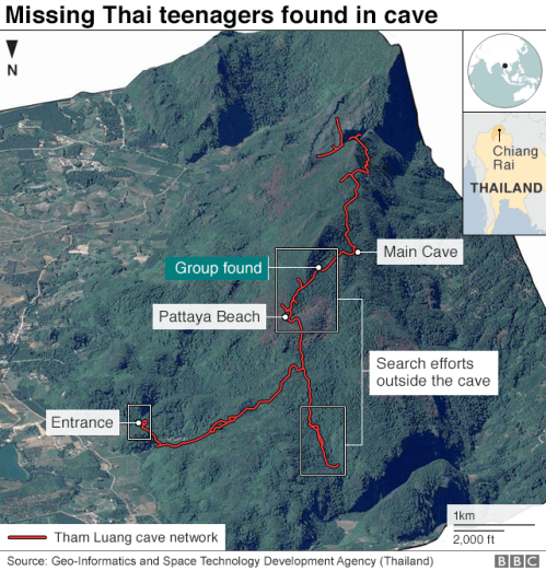
4.  While the cave entrance remained large fairly deep after its entrance, the problem of following and mapping the progress of the boys into its sections grew more concrete after it was discovered how deeply in they had travelled, just past the raised area known as Pettaya Beach.  And so we turned to the most apparent exact records of the openings of the torturous cave complex where the team and their Assistant Coach were stranded, to imagine our proximity to them in a time of need.


tunnel leading to team

THuam Luang spelExpeditions Thai 87 – 88


Tracked by the latest mapping technologies and relayed on media circuits since the news of their discovery erupted, the plight of members of  the Moo Pa Thai soccer team trapped in the six-mile long Tham Luang cave complex has been a focus of global attention and mapping efforts.   The mapping and remapping of the site is of course both a testament to the dire nature of the situation of a group trapped deep within the cave, with limited oxygen, as well as food, buoyed by the miracle of their discovery after nine days and were stranded after they began exploring the cave and the difficulty of drilling from above-ground or navigating the dark cave itself to locate the team of teenagers trapped within, suffering the stuff of nightmares, as well as the problem of extorting them while negotiating narrow often underwater passage-ways.  Despite their actual inaccuracy, the apparent exactitude of the cross-sections created an imagined tie to this otherwise multiply removed area of the world, neither satisfactory mapped or governed.

As rising waters threatened to fill the narrowest of cave walls, unable to accommodate air tanks, and attempts to pump water from the complex failed, mapping truly seemed the least of it as the extraction of the team faced the pressures of rising waters, malnourishment, and oxygen lack.  (Elon Musk boosted hopes by tweeting his team was developing a narrow child-sized submarine pod able to navigate the hairpin turns in the cave complex, as if the pod would quite miraculously be able to be constructed and arrive on time–and even travelled himself to the cave system, seeking to promote the value of his oxygen engine to the Thai team.)  The collective ensemble of efforts, spurred by the problems of locating a group of boys who didn’t know how to swim or dive as the waters ran into the cave complex, was a logical problem, in many ways, that demanded resolving problems of entering the cave underwater, illuminating the passage way, and guiding the boys out, as well, it seemed, as draining the water that had already entered from growing rains.

But the challenges of mapping their location, and the sense that they had traveled to a place so remote where they were not able to be mapped and tracked.  The problem in part created a level of tension that riveted the world.  The human drama of the young members of the Moo Pa team, became a subject nand symbol of national as much as provincial pride, as the problems of skills required to achieve their rescue became debated.  The discussion and debate seemed a parallel story in itself, even if the possibly deadly adventure of the group of teens was intensely involving.  The Thai Army that sought to ascertain routes of their rescue looked over maps of the cave’s veins that snaked under the mountain ranges, as if to plan the underground rescue–focussing on the cave complex they knew so well, but with less of a sense of how to extract the kids trapped within by drilling from above ground.


image.pngRungroj Yongrit/EPA-EFE/Rex/Shutterstock

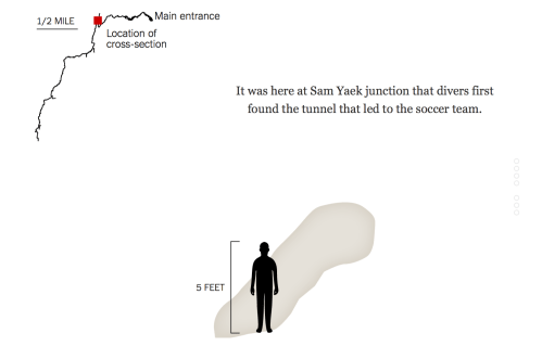
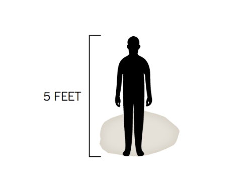
Despite the actual insufficiency of maps, we have tried to map the incredibly narrow contours of the cave complex, as if to puzzle over how they might be located and saved, and somehow track their course along the narrowing width of the complex from its opening–as if to map the difficulty of the job to the scale of a five-foot tall teen–to craft a more experiential record of speleological cross-sections of the mines through which the teens had traveled. based on the first surveys of the cave of 1987 of its narrowing cross-sections, now assembled in a more interactive form, as if in a flip-book–

Cave Oening.png

Cave map.png

tunnel leading to teamNew York Times Interactive

29 coupessExpeditions Thai 87 – 88

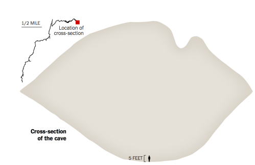
–that helped to embody the experience of being trapped in such narrow confines so deep underground where they were trapped.  The apparent accuracy of these speleological cross-sections was suddenly enlisted to create a sense of imaginary connections to the team whose fate we could not imagine, as if the insertion of a five-foot tall surrogate teenage icon helped capture the embodied experience of surviving in the cave and calibrate the difficulties of their rescue.

fit boy in cave

Images borrowed from the largely structural maps of cavers who had explored the narrow Tham Luang complex–and from the exact field of speleology–the visualization sought to pose the options for rescuing the team members in the narrow caves where they were stranded, learning how to negotiate with limited oxygen and rising water.  The interactive map in the Taimes  invites observers to imagine their narrowness, but minimized the  complications of locating the team within the cave,–it elicited wonder at how the team had managed to climb so deeply into the complex as the water rose.


5.  But the “map” reamined oddly abstracted form crucial information about the underground setting–failing to  suggest the real problem of rising water and ground conditions, as while tracing the path of complex with accuracy, it strips a 2D sense of location from the  context of rising waters and difficult ground conditions in a cave from which water needs to be pumped.  But perhaps the point was to capture the compelling embodied experience of their in the remote cave.  The Interactive graphics nicely reproduced the difficulties of moving along and negotiating the narrow turns, some requiring kneeling, swimming horizontally, or crouching to pass  as if to experience the narrowing of its amazingly twisty course, as if in a video game, tracking the tortuously narrow course of the caves, through which the team progressed to try to avoid rising waters, in a nightmarish situation with all to real consequences.

But we were linked through the miracle of interactive mapping to pray for the futures of the teenagers, with their schoolmates and Buddhist monks who assembled at its entrance, as if to restore them to a map.  Even as we cringed at the near-impossibility of establishing their location, after already one diver who attempted to locate them lost his life, contemplating the entrance into the narrowing passageways of the caves and the team’s itinerary as well as the possibilities of their future rescue.


alternate vis reuters caveReuters, Hope for the 13 (January 9, 2018)

While watching forecasts for raises that can boost the already rising floodwaters, teams of divers have contemplated maps, and the rescue camp locate near the mouth of the cave provided only a possible site of salvation, in hopes that they could be moved there.  Is the cave’s mount a more apt site of prayer, or of recovery?

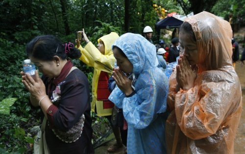
The misfortune of the soccer team had converted the mouth of the cave to the site of an altar that was sort of shrine, and a site of prayer for divine intervention, as worries  turned to what thin, depleted oxygen the team members might still have access during the two weeks after they disappeared, their bicycles found, partly washed away, near the cave entrance, while the classmates of the team-members participated in large collective prayers, and Buddhist monks gathered near the Tham Luang caves, juxtaposing the science of mapping their location with a perhaps more credible collective prayer.


image.png

800.jpeg

merlin_140671041_ecac7fca-853e-4b04-a1d3-7b92ed0b7eb0-superJumbo

Were the major efforts in mapping not serving as their own sort of prayers, if of a modernist variety, and hopes for a miracle of intercession before the waters rose and the oxygen depleted in the stretch of the rocky cave complex?  While the maps did show the human story of the position to which the teens had arrived, and posit and frame the problems of their rescue, thankfully underway, the maps seemed as important as framing, sustaining, and affirming a sort of tenuous empathy to their fate, allowing access to the remote cave system.  If they created the possibility of the necessary conditions for their rescue they also became a kind of guiding light for those of us who followed the spectacle so intensely from our own backlit screens.

Leave a comment

Filed under #ThaiCaveBoys, cave complexes, data visualization, monsoon rains, Thailand,

Saturated Shores in Southeastern Texas

There is almost no trace of the human, or of the extreme overurbanization of the Texas coast, in most of the maps that were created of the extreme flooding and intense winter rains that hit Galveston and Houston TX with the windfall of Hurricane Harvey.  While maps serve to orient humans to the world–and orient us to human processes and events in a “human world,” as J.B. Harley and David Woodward put it, the confused nature of relations between the human and natural world, is increasingly in danger of being mipmapped.  Data visualizations of extreme weather that erase the modification of coastal environments provide a particularly challenging means of orientation, as news maps are suspended between registering the shock of actual events–and trying to contain the natural emergencies that events of extreme weather create–and the demand for graphics that register natural calamities and the ethics of showing such calamities as “natural”–or even what the category of the natural is in coastal regions that so heavily modified to modify actual weather events.

The ethics of orienting viewers to the rainfall levels that fell in Houston after the landfall Hurricane Harvey Part of the huge difficulties lies in adequately orienting viewers in ways that register a changing natural world–how we are mapping rainfall, for example, or the approach of hurricanes, or are rather mapping the new relation of rain to built surfaces and landcover change that lack permeability for water, facilitating flooding by storms whose potency is changed by the greater atmospheric content of a warming Gulf of Mexico, which the ground cover of Houston, Galveston, and the Texas shore are less able to absorb and return to the Gulf. The area is, itself, something of an epicenter of the increased number of hemispheric tropical cyclones–which demand warm water temperatures above 80 80°F / 27°C and a cooling atmosphere and low wind shear–often led to the Gulf coast.

NASA Earth Observatory/Tropical Cyclones through 2006

–those that come ashore at Galveston hit a seashore that is eminently unprepared to accommodate an influx of water that the paved surface has rendered all but impermeable. If the problem of global cyclones that can become hurricanes is truly global–

NASA Earth Observatory/150 years of Tropical Cyclones

–the intersection between cyclones and areas of paved ground cover is problematic to the southwestern states, and most of all to Texas, Louisiana, and Florida, where water absorption has been anthropogenically reduced in recent decades. At the same time, few other areas of the inhabited world are so widely “tracked” as the destination of tropical cyclone formation..

NWS JetStream Online School)

The problem is partly evident in the choice of new color ramps that transcend the rainbow spectrum of measuring the intensity of rainfall in the recent arrival or ground fall of Hurricane Harvey, which condenses the great difficulty of using old cartographical categories and conventions in order to capture or communicate increasingly extreme weather conditions. in an era of climate change.  But the cartographic problem goes farther:  for it lies in the difficulty of registering the changes in relations f how rain dropped meets the ground, mapping relations between complex processes of warming and atmospheric warmth that lead to greater humidity across the gulf region to ground cover permeability that leaves regions increasingly exposed to flooding.

The relentless logic of data visualizations based on and deriving primarily from remote sensing are striking for rendering less of a human world than the threat of allegedly “natural” processes to that world.  Perhaps because of the recent season of extreme weather we have experienced, weather maps may be among the most widely consulted visualizations in our over-mediated world, if they were already widely viewed as the essential forms of orientation.  But the pointillist logic of weather maps may fail to orient us well to extreme events as the hurricane that dumped a huge amount of water on overbuilt areas to include the human–or the human world–seem a tacit denial of the role of humans in the complex phenemona of global warming that have, with the warming waters of the Gulf of Mexico and ever-increasing ozone over much of the overbuilt southeastern Texas shore, created a perfect storm for their arrival.

This failure to include this role haunts the limited content of the weather map; including the role of humans in maps of extreme weather events indeed remains among the most important challenges of weather maps and data visualization, with the human experience of the disasters we still call natural.  And although the subject is daunting, in the spirit of this blog, we will both look at the communicative dilemmas and difficulties of eye-catching color ramps and their deceptiveness, and poetic difficulties of orienting oneself to shores.  For as the disaster of Harvey is depressing, it compels raising questions of the orientation to the shifting shore, around the national epicenter of Galveston, where the landfall of Hurricane Harvey focussed our attention on August 27, 2017–

90-7
wpc-5day-0Z-8.28.17

–and the meaning of place in an saturated shoreline, where the sea is somehow part of the land, and the land-sea divide blurs with a specificity that seems as if it may well be increasingly true in an approaching era of climate change.  And as we depend on the ready generation of maps based on remote sensing whose relentless logic is based on points, we risk looking sight of the role of place in determining the relations of rainfall to shoreline in maps of coastal flooding that remove remote observations from the built environment that flooding so drastically changes, challenges and affects, in ways that may elide specificities of place.

At a time when we are having and will be destined to have increased problems in orienting ourselves to our shores through digital maps of rainfall, the unclear shorelines of Galveston sent me to the bearings that a poet of an earlier age took her bearings on the mapped shorelines of the place where she had been born, and how she was struck by a bathymetric map to gauge her personal relation to place, and saw place in how the changing shoreline of the northern Atlantic were mapped in the maritimes, in a retrograde form of print mapping in a time of war.  For the way the mapped shore became a means by which Elizabeth Bishop gained bearings on shores through a printed map of coastal bathymetry to access the spatiality of the shore–how “land lies in water” and the blurred relation of land and water that the bathymetric map charts–in an age when the materiality of the map was changing, with the introduction of aerial composite maps from the early 1930s, as the rise of aerial composite maps removed the hand of the mapmaker from the map in an early instance of remote sensing–

5852167

Cartography Associates/David Ramsey: Historical Map Collection: Composite of 164 Aerial Views of San Francisco by Harrison Ryker/Oakland, 1938, 1:2000

–in a medium of aerial photography that focussed on land to the exclusion of water, and that all but erased the relation between water and shore just a few years after Bishop quickly wrote her poem in Christmas 1935 about coastal “edges” of land and sea.  Ryker, who developed techniques of aerial photography used in the mapping of the shores of Puerto Rico for the Fairchild Aerial Camera Company, as well as photographs of the devastating Berkeley Fire of 1923, went into business in 1938–the year of his map–as a map publisher, with a patent for the stereoscope used to interpret aerial imagery,  and must have performed the massively detailed mapping of San Francisco in one hundred and sixty for images taken from airplanes from 1937-38 as a sort of calling card, soon after Bishop wrote her poem, before manufacturing a range of stereoscopes of pocket and desktop versions for military ends that were widely used in World War II by the US Army.

Before war broke out, but in ways that anticipated the coming war, the printed bathymetric map must have resonated as a new reflection on the impersonality of the aerial view; Bishop was suddenly struck when she encountered the materiality of a print map on Christmas 1938 as the art of cartography was already changing, responding to the drawn map under glass of the Atlantic as a way to recuperate the personal impact of place.  Her poem powerfully examined the logic of drawn maps utterly absent from the digitized space of rainfall maps of a flood plain, deriving from data at the cost of human inhabitation of place–and in envisioning data to come to terms with the catastrophic event of flooding distancing or removing the craft of mapmaking from the observer in dangerously deceptive ways.  And so after wrestling with the problems of cartographic representation using remote sensing, while recognizing the value of these readily produced maps of rainfall and the disasters they create,

1.  For weather maps are also among the most misleading points to orient oneself to global warming and climate change, as they privilege the individual moment, removed from a broader context of long-term change or the human alteration of landscape.  They provide endless fascination by synthesizing an encapsulated view of weather conditions, but also  suggest a confounding form of media to orient audiences to long-term change or to the cascading relations of the complex phenomenon of climate change and our relation to the environment, as they privilege a moment in isolation from any broader context, and a sense of nature removed from either landscape modification or human intervention in the environment, in an area were atmospheric warming has shifted sea-surface temperatures.  The effects on the coast is presented in data visualizations that trace the hurricane’s “impact” as if its arrival were quite isolated from external events, and from the effects of human habitations on the coast.  The image of extreme flooding is recorded as a layer atop a map, removing the catastrophic effects of the flooding from the overpaved land of the megacities of southeastern Texas, and the rapid paving over of local landcover of its shores.

90-7

.

Such visualizations preserve a clear line between land and sea, but treat the arrival of the rains on land as isolated from the Consuming such events of global warming in color-spectrum maps.  The data of rainfall translate data into somewhat goofy designs represents a deep alienation from the environment, distancing viewers in dangerous ways from the very complexity of global warming that Gulf coast states encountered.

Such data visualizations seem dangerously removed notion of how we have changed our own environment, by describing a notion of “nature” that is immediately legible, as if it were removed from any human trace or of the impact of modification of the land, and by imaging events in isolation from one another–often showing a background in terrain view as if it has no relation to the events that the map describes.  Although weather maps and AccuWeather forecasts are sources of continual fascination, and indeed orientation, they are are also among the most confounding media to orient viewers to the world’s rapidly changing climate–and perhaps among the most compromised.  For they imply a remove of the viewer from space-and from the man-made nature of the environment or the effects of human activity form the weather systems whose changes we increasingly register.  By reifying weather data as a record of an actuality removed from human presence at one place in time, they present a status quo which it is necessary to try to peel off layers, and excavate a deeper dynamic, and indeed excavate the effects of human presence in the landscape or geography that is shown in the map.  We are drawn to tracking and interpret visualizations of data from satellite feeds in such weather maps–or by what is known as “remote sensing,” placed at an increased remove from the human habitation of a region, and indeed in a dangerously disembodied manner.

Visualizations resulting from remote observation demand taken as a starting point to be related to from the human remaking of a region’s landscape that has often increasingly left many sites increasingly vulnerable to climate change.  But the abstract rendering of their data in isolation from a global picture–or on the ground knowledge of place–may render them quite critically incomplete.  The remove of such maps may even suggest a deep sense of alienation form the environment, so removed is the content of the data visualization form human presence, and perhaps from any sense of the ability to change weather-related events, or perceive the devastating nature of their effects on human inhabitants:   their stories are about weather, removed form human lives, as they create realities that gain their own identity in images, separate from a man-made world, at a time when weather increasingly intersects with and is changed by human presence.  While throwing into relief the areas hit by flooding near to the southeastern Texas shore at multiple scales based on highly accurate geospatial data, much of which is able to be put to useful humanitarian uses–

Harvey flooding_1.jpg

Dartmouth Flood Observatory/University of Colorado at Boulder, August 29. 2017

1504094467hurricane-harvey-flood-map.gif

Maps of the World

–the reduction of floods to data points creates a distorted image of space renders their occurrence distant from the perspective of folks on the ground, and places their content at a considerable remove from the complex causality of a warming Gulf of Mexico, or the problems of flood drainage by which Galveston and Houston were beset.  Indeed, the multiple images of that report rainfall as an overlay in a rainbow spectrum, at a remove from the reasons for Houston’s vulnerability to flooding and the limits the region faces of flood control, in broadcast Accuweather images of total rainfall in inches advance a metric that conceals the cognitive remove from the dangers of flooding, ora human relation to the landscape that the hurricane so catastrophically affected.  Can we peel under the layers of the data visualization, and create better images that appreciate the human level on which the landscape stands to be devastated by hurricane rains, as much as tracking the intensity of the growth of rainfall over time?

90-5.jpeg

AccuWeather, Rainfall levels by Thursday

90

AccuWeather, Friday to Monday

Such layers of green, meant to suggest the intensity of rainfall that fell over land, reveal the concentration of water in areas closes to the Gulf of Mexico.  Even the most precise geographical records of the dangers of flooding in the floodplain of southeastern Texas with little reference to the historical modification of the region by inhabitants–

Harvey flooding_1

Dartmouth Flood Observatory at University of Colorado, Boulder/August 29, 2017

–and conceal the extent to which the landscape’s limited ground cover permeability has left the region far more susceptible to flooding, and elevated the risks of the emergency.  The problem of reading any signs of human presence into these “images” of precipitation provoke problems of disentangling remote sensing data from knowledge of the region’s recent urban growth and the consequent shift in local landcover.

The perspective of our relation to these events is often as fleeting and as existential as they flood us with data, which we viewers have little perspective or tools to process fully.  The onrush of recent remote sensing maps batter us with an array of data, so much as to lead many to throw up their hands at their coherence.  Even as we are  still trying to calculate the intensity of damages in Puerto Rico–where electricity is so slowly returning that even even after four months, almost a third of its 1.5 million electricity customers still lack power–and the cost of fires in southern California.  We look at maps, hoping to piece together evidence of extensive collateral damage of global warming.  Yet we’ve still to come to terms with the intensity of rainstorms that hit southeastern Texas–deluging the coast with rainfall surpassing the standard meteorological chromatic scale that so misleadingly seems to offer a transparent record of the catastrophe, but omits and masks the experiences of people on the ground, digesting swaths of remotely sensed data that take the place of their perception and experience, and offering little critical perspective on the hurricane’s origin.

The rapidity with which rain challenged ground cover permeability provides both a challenge for mapping as a symptom of global warming and landscape modification:   the mapping of “natural” levels of rainfall blurs the pressing problem of how shifting landcover has created an impermeability to heightened rains, and indeed how the new patterns of habitation challenge the ability of the coast of the Gulf of Mexico to absorb the prospect of increased rain in the face of decreasing groundcover permeability, and the extreme modification of the coastline that increasingly impeded run-off to the Gulf.

2.  Across much of southeastern Texas, a region whose growth was fed by the hopes of employment in extractive industries, real estate demand and over-paving have unfortunately intersected with extreme weather in southeastern Texas in ways which dat visualizations have had trouble exposing, but which raise a curtain on the coming crises of a failure of ability to accommodate increased levels of rainfall  If the lack of precedent for the intense rainfall in Galveston Bay generated debate about introducing a new color that went beyond the rainbow scale employed in weather charts, what seemed a problem of the cartographic color-spectrum suggested a problem of governability and indeed government response to extreme weather conditions.  How to register the dangers of rainfall that goes of the scale or standards of measurement?

One must consider how to orient viewers to the intensity of consequent flooding, and to its consequences and better prepare ourselves for the arrival of deluging rains without falling back on the over-freighted metaphor of rains of biblical scope.  How many more hurricanes of increasing intensity can continue to pound the shores, by whipping precipitation from increasingly warming waters and humid air?  The cumulative pounding of tropical cyclones in the Gulf stands to create a significantly larger proportion of lands lying underwater–temporarily submerged lands–with radically reduced possibilities of drainage, as hurricanes carry increased amounts of evaporated water from the humid air of the warming gulf across its increasingly overbuilt shores. in ways that have changed how the many tropical cyclones that have crossed the land-sea threshold since NOAA began tracking their transit (in 1851) poses a new threat to the southeastern coast of Texas, and will force us to map the shifting relation between land and water not only in terms of the arrival of hurricanes, or cyclonic storms–

–but the ability of an increasingly overbuilt landscape to lie underwater as the quantity of the Gulf coast rainfall stands to grow, overwhelming the overbuilt nature of the coast.

Most maps that chart the arrival and impact of hurricanes seem a form of climate denial, as much as they account for climate change, locating the hurricanes as aggressive forces outside the climate, against a said backdrop of blue seas, as if they  are the disconnect.  Months after the hurricane season ended, the damage for hurricanes caused have hardly been assessed in what has been one of the most costly and greatest storm damage since 1980 in the United States,–including the year of Hurricane Katrina–we have only begun to sense the damage of extreme weather stands to bring to the national infrastructure.  The comparison to the costs of storm damage in previous years were not even close.

But distracted by the immediacy of data visualizations, and impressed by the urgency of the immediate, we risk being increasingly unable to synthesize the broader patterns of increased sea surface temperatures and hurricane generations, or the relations between extremely destructive weather events, overwhelmed by the excessive destruction of each, and distracted from raising questions about the extremely poor preparation of most overbuilt regions for their arrival, and indeed the extent to which regional over-building that did not take the possibility of extreme weather into account–paving large areas without adequate drainage structures or any areas of arable land–left inhabitants more vulnerable to intense rains.  For in expanding the image of the city without bounds, elasticity, or margins for sea-level rise, the increasingly brittle cityscapes of Galveston and much of the southeastern Texas shoreline were left incredibly unprepared for the arrival of hurricanes or intense rains.  Despite the buzz of an increased density of hurricanes to have hit the region,

1851_2013_mjrhurr2

the questions of how to absorb hurricanes of the future, and to absorb the increased probability of rainfall from hurricanes in the Gulf of Mexico and its shores, suggests questions of risk, danger, and preparation that we have no ability to map.  What, indeed, occurs, as hurricanes themselves destroy the very means of transmitting on the ground information and sensing weather, and we rely exclusively on remote sensing?

Destroyed satellite dishes after Hurricane Maria hit Humacao, Puerto Rico  REUTERS/Alvin Baez

To characterize or bracket these phenomena as “natural” is, of course, to overlook complex interaction between extreme weather patterns and our increasingly overbuilt environments that have both transformed the nature of the Southeastern Texas coast and have made the region both an area of huge economic growth over time, and have paved over much of the floodplain–as well as elevated the potential risks that are associated with coastal flooding in the Gulf Coast.  To be sure, any discussion of the Gulf of Mexico must begin from the increasingly unclear nature of much of our infrastructure across land and sea, evident in the range of pipelines of gas and oil that snake along a once more clearly defined shore charted by ProPublica in 2012, revealed the scope of the manmade environment that has both changed the relation of the coastal communities to the Gulf of Mexico, and has been such a huge spur to ground cover change.

The expansive armature of lines that snake from the region across the nation–

pipeline_line_map

ProPublica, Pipeline Safety Tracker/Hazardous liquid pipelines are noted in red; gas in blue

-and whose tangle of oil pipelines that extend from the very site of Galveston to the Louisiana coast is almost unable to be defined as “offshore” save as a fiction, so highly constructed is much of the national waters in submerged lands in the Gulf of Mexico–

gulfofmexicopipelines

ProPublica, Pipeline Safety Tracker/Hazardous liquid pipelines are noted in red

They indeed seem something of an extension of the land, and a redefinition of the shore, and reveal a huge investment of the offshore extractive industries that stand to change much of the risk that hurricanes pose to the region, as well as the complex relation of our energy industries to the warming seas.  Yet weather maps, ostensibly made for the public good, rarely reveal the overbuilt nature of these submerged lands or of the Gulf’s waters.

Despite the dangers that such an extensive network of hazardous liquid lines along the Gulf of Mexico, the confusion between mapping a defined line between land and water, and visualizing relations of extreme weather disturbances as hurricanes in the Gulf of Mexico and local infrastructure haunts the extremely thin nature of the sort of data visualizations that are generated about the dangers of hurricanes and their landfall in the region.  For all too often, they presume a stable land/sea divide, removed from the experience of inhabitants of the region and how we have remade the shore.

3.  How can we better integrate both a human perspective on weather changes, and the role of human-caused conditions in maps of extreme weather?  How can we do better by going beneath the data visualizations of record-breaking rainfall, to map the human impact of such storms?  How could we do better to chart the infrastructural stresses and the extent to which we are ill-prepared for such extreme weather systems whose impact multiplies because of the increased impermeability of the land, unable to absorb excessive rainfall, and beds of lakes and reservoirs that cannot accommodate increased accumulation of rainfall that  stand to become the new normal?  The current spate of news maps that provoke panic by visualizing the extremes of individual cases may only inspire a sort of data vis-induced ADD, distracting from infrastructural inadequacies to the effects of global warming–and leaving us at a loss to guarantee the best structures of governability and environmental readiness.

Indeed, the absence of accurately mapping the impact and relation between landcover, storm intensity, rainfall, flooding, and drainage abilities increases the dangers of lack of good governance.  There need not be any need for a reminder of how quickly inadequate mapping of coastal disasters turns into an emblem of bad governance.  There is the danger that, overwhelmed by the existential relation to each storm, we fail to put them together with one another; compelled to follow patterns of extreme weather, we risk being distracted from not only the costs but the human-generated nature of such shifts in seasons between extremes of hot and cold.  For as we focus on each event, we fail to integrate a more persuasive image of how rising temperatures stand to create an ever-shifting relation between water and land.

Provoked by the rhetoric of emergency, we may need to learn to distance ourselves better from the aerial views that synthesize intense precipitation, tally hurricane impacts, or snowfall levels, and view them less as individual “strikes” or events and better orient ourselves to a broader picture which put us in a less existential relation to extreme weather.

2017-four-us-hur-landfalls_3

The Weather Channel

We surely need to establish distance to process syntheses of data in staggering aerial views on cloud swirl, intense precipitation, and snowfall, and work to peel back their striking colors and bright shades of rainbow spectra, to force ourselves to focus not only on their human costs, or their costs of human life, but their relation to a warming planet, and the role of extreme of weather in a rapidly changing global climate, as much as track the “direct strikes” of hurricanes of individual names, as if they were marauders of our shores:  their creation is as much tied to the changing nature of our shores and warming sea-surface temperatures, and in trying to create a striking visualization, we deprive ourselves from detecting broader patterns offering better purchase on weather changes.

direct-strikes

The Weather Channel

If patterns of weather maps epitomized by Accuweather forecast and projections suggest an exhilaratingly Apollonian view on global and regional weather patterns, they also  shift attention form a broader human perspective in quite deeply pernicious ways.  Such maps provided the only format for grasping the impact of what happened as the hurricane made landfall, but provided little sense of the scale of inundations that shifted, blurred and threatened the coast of the Gulf of Mexico.  They provide a format for viewing floods that are disjoined from victims, and seem to naturalize the quite unnatural occurrence of extreme weather systems.  Given the huge interest in grasping the transformation of Hurricane Harvey from a tropical storm to a Category Four hurricane, and the huge impact a spate of Category Four hurricanes have created in the Gulf of Mexico, it’s no surprise that the adequacy of the maps of Hurricane Harvey have been interrogated as hieroglyphs or runes of a huge weather change:  we sift through them for a human story which often left opaque behind bright neon overlays, whose intensity offer only an inkling of a personal perspective of the space or scale of their destruction on the ground:  while data maps provide a snapshot of the intensity of rain-levels or wind strength at specific sites, it is difficult if important to remember that their concentration on sites provide a limited picture of causation or complexity.

All too often, such maps fail to offer an adequately coherent image of disasters and their consequences, and indeed to parse the human contributions to their occurrence.  This post might be defined into multiple subsections.  The first actions suggest the problems of mapping hurricanes in the Gulf of Mexico in relation to flooding in data visualizations of the weather and the overbuilt region; the middle of the post turns to an earlier poetic model for considering the relation between land and sea that visualizations all too easily obscure, and the meaning that the poet Elizabeth Bishop found in viewing relations between land and sea in a printed map of the Atlantic; after returning to the question of the overbuilt shore compounds problems of visualizing the Texas coast, the final section, perhaps its most provocative, returns to Bishop’s reading of a map of the Atlantic coast.

What such new weather maps would look like is a huge concern.  Indeed, as we depend on weather maps to orient us to place ourselves in the inter-relations of climate change, sea-level, surface temperatures, and rain, whether maps cease to orient us to place, but when best constructed help to describe the changing texture of weather patterns in ways that can help familiarize us not only to weather conditions, but needed responses to climate change.  For  three months after the hurricanes of the Gulf of Mexico caused such destruction and panic on the ground, it is striking not only that few funds have arrived to cover costs of rebuilding or insurance claims, but the judgement or understanding of the chances for future flooding have almost left our radar–perhaps pushed rightly aside by the firestorms of northern and southern California, but in ways that troublingly seem to forget to assess or fail to assess the extent of floods and groundwater impermeability  along the Texas and Louisiana coast.  The problems that preparation for future coastal hurricanes off the Gulf of Mexico raise problems of hurricane control and disaster response that seem linked to problems of mapping their arrival–amd framing the response to the increasing rains that are dumped along the entire Gulf Coast.

Indeed, the chromatic foregrounding of place in such rainbow color ramps based on GPS obscure other maps.   Satellite data of rainfall are removed from local conditions, and serve to help erase complex relations between land and water or the experience of flooding on the ground–by suggesting a clear border between land and sea, and indeed mapping the Gulf of Mexico as a surface as if it were unrelated to the increased flooding around Houston, in maps prepared from satellite imagery, despite the uneasy echoes of anthropogenic causes for the arrival of ten hurricanes in ten weeks, in ways that suggest how warming waters contributed to the extreme inundation of the Gulf Coast.  Despite NOAA  predictions of a 45% likelihood of ‘above-normal’ activity for the 2017 Atlantic hurricane season, with, a 70% likelihood of storms that could transform into hurricanes, the images of inundated lands seem both apocalyptic and carefully removed from the anthropogenic changes either to the ocean or land that intensified their occurrence so dramatically on the ground.

Dartmouth Flood Observatory Flooding Harvey

 Dartmouth Flood Observatory

Harvey flooding_0.jpg

Dartmouth Flood Observatory/August 29, 2017

Is it possible to recuperate the loss of individual experience in such data maps, or at least acknowledge their limitations as records of the complexity of a changing climate and the consequences of more frequent storm surges and such inundations of rainfall?  As we seek better to understand the disaster relief efforts through real-time maps of effects of Hurricane Harvey as it moved inland from the Gulf of Mexico, shifting from Category 4 Hurricane from a tropical storm, we tried to grasp levels of rainfall that spun out of 115-mile-an-hour winds across southeastern Texas that damaged crops, flooded fields, ruined houses, and submerged cars, we scan stories in hope of clues to assess our position in relation to increasingly dangerous weather systems whose occurrence they may well forebode.  At a time of increased attention to extreme weather has long developed, the gross negligence of climate change denial is increasingly evident:  it recalls the earlier denial of any relation between hurricanes and climate change, when increased hurricanes were cast as “the cycle of nature,” rather than as consequences whose effects have in fact been broadly intensified by human activity.

Current attempts to map the toll of record-smashing hurricanes focused almost exclusively on point-based data view rainstorms largely as land-based records; even as they intend to monitor the effects of Harvey’s landfall by microwave censors, they risk seeming to isolate real-time rainfall levels from the mechanics warmer air and sea-surface temperatures which result from human-caused global warming, not relating increased storm surges or inundations to achanges in coastal environments or climate change.  To render such changes as natural–or only land-based–is irresponsible in an age of reckless levels of climate denial.  Indeed, faced by the proliferation of data visualizations, part of the journalistic difficulty or quandary is to integrate humanistic or individual perspectives on the arrival of storms, rendered in stark colors in the increasingly curtailed ecosystems of newsrooms which seek simplified visualizations of satellite data on the disaster, which fail to note the human contributions to the travails that are often reserved for photographs, which increasingly afford opportunities of disaster tourism in the news, emphasizing the spectator’s position before disasters, by images that underscore the difficulties in processing or interpreting the proliferation of data from MODIS satellite feeds:  we can show the ability to measure the arrival of torrential rains, but in offering few legends, save the date and scale, but offering few keys o interpret the scale of the disaster.

The looming portent of human-made climate change, however, underlies the poor predictions that NOAA offered of perhaps 2-4 major hurricanes this Spring, and the lack of a new director for NOAA–on which local and state agencies depend to monitor the nations shores and fisheries–suggested the, from June to September, which left states on their own to make decisions and plan for disaster mitigation programs and better flood maps.  (The danger of appointing a newly nominated director, Barry Myers, who is a strong supporter of the privitization of weather maps and an executive at the private Accuweather mapping service, suggests the difficulty of determining the public-private divide in an era of neoliberalism, and a free market of weather maps that were once seen as central to national security and standards of safety.)   There are two hidden scales on which we read these opaque maps of global warming and globalization and local inundation are triply frustrating.   For all the precision and data richness of such point-maps of largely land-based rainfall, local temperature, or flooding, the biases of such instantaneous measurements seem to fit our current governing atmosphere of climate change denial, and dangerous in erasing how such storms are informed by long-term consequences of man-made climate change.  (As the mapping tools of coastal weather seem destined to change, what sort of change in direction for NOAA coastal maps do we want:  the appointment suggests the terrifying possibility of a return to the Bush-era proposal nominee Myers supported that prohibiting the agency from producing any maps already available in the private sector then threatened federal weather lines to go dark–lest they literally compete with ad-supported websites private providers–and shift federal information offline?)

For making moves toward the future readability of weather maps may well be at stake in critically important ways.  The 2005 proposal that Myers backed would have eliminated the National Weather Service, even while exempting those forecasts needed to preserve “life and property,” would in essence have returned the weather services to a pre-internet era, even as the most active hurricane season including a record breaking fifteen hurricanes and twenty-eight storms began in the gulf coast, including the infamous hurricane Katrina.  The proposed bill would have prevented NOAA from posting open data, and not only readily available to researchers and policymakers, in ad-free formats, free of popup screens, but allow them to make their own maps on the fly–ending good practices of posting climate data would work quite dangersously to prevent development of tools of data visualization outside commercial models of rendering storms and hurricanes as if environmentally isolated.

2005-tracks-update.jpg
direct-strikes

A deeper problem of providing such limited weather maps of tropical storms may be the subtexts about the relation of human causes to weather they convey, and the absence of a greater narrative of the transformation of a global ecology or of the ecology of the Gulf Coast.  The curtailed images of “nature” they present by symbolizing rains, winds, floods, or submerged regions in appealing hues as natural–raise questions of the odd simplicity of the absent storylines:  cheery colors erase or bracket complex questions of climate change, the human contribution to extreme weather events, or the human experience of suffering on the ground:  Rita, Cindy, Katrina, Dennis, and Wilma seem not part of the environment, epiphenomenal interlopers moving across a static deep blue sea, in an apparent dumbing down of the mechanics of hurricane or storm formation in a rainbow spectrum removed from a human-made environment.

Continue reading

Leave a comment

Filed under anthropogenic change, climate change, coastlines, ecological disasters, gulf coast

Mapping Armageddon Again?

The rush to make a graphic point by mistakenly overlaying concentric circles atop a Web Mercator projection helps to render increasing fears of the range of North Korea’s powerful ballistic missiles.  As much as suggest the global import of the confrontation about North Korean missiles through their violent potential to target overseas lands, the effect is to abstract the peculiar stand-ff of a divided country that is a remnant disfigured by the Cold War as if it can be isolated from the division of the peninsula, and viewed as a focus of global attention.  But is the isolation of North Korea that they effectively underscore in such cartographically dramatic terms also not a cause for concern?  How can the intentions of the opaque government of Pyongyang even be understood save in a close focus on the local dynamics of the Korean peninsula?  If North Korea is increasingly effectively a proxy of China–cast as an enabler of the North Korean state, together with Russia–the country is shown, isolated, as if the Democratic Peoples’ Republic of Korea, DPRK, were the last remaining  theater for conducting the cold war in a post-Cold War world.  A familiar geography of generals suddenly migrated to the media as the confrontation with North Korea was begun to be processed in maps.

The current migration of this mapping of a global vision of generals to the media presents a problem of the survival of a mental imaginary, able to compromise the pragmatics of a real problem of international relations in dangerous ways.  For by magnifying the isolation and marginality of the DPRK in relation to the globe, the maps urge us to focus on the risks that the development of intercontinental missiles pose to world peace.  To be sure, they also risk reflecting the very barbed rhetoric of triumphalism and destruction of Pyongyang–a regime that has expressed its eagerness to deliver prophesies of “a merciless sledgehammer blow to U.S. imperialists.”   The threats of Kim Jong-un are especially embodied by the creation and possession of his country, for the first time, of Intercontinental Ballistic Missile, and seems to create a narrative less motivated by actual actors, but a drama of atomic, nuclear, or ICBM strikes that is driven by disembodied geopolitical exigencies in a political theater that we don’t know where it will end, but ramps up an all too familiar cartography of fear.

These maps resurrect and resonate with the invocation of previous threats of war during the Cold War–when the fear of atomic attack was widely diffused by the U.S. Government as a basis to justify an arms race.  Indeed, by rehabilitating a Cold War imaginary of impending conflict able to escalate into nuclear war, maps seem to activate a similar mental imaginary of polarity–albeit disproportionate one, between North Korea and the United States–that reflect one of the few areas in the world where that rhetoric is still alive of identifying the role of the state in promoting nuclear war–leading Kim to praise the “thermonuclear weapon with super explosive power” as made entirely “”by our own efforts and technology and designed to exceed the atomic bomb dropped at Hiroshima.  In this context,  the fear of a “global threat” can be rehabilitated as destabilizing global balances of power.

The first scenario of an attack on the United States–cast in fearful and unresolved terms–was diffused in terrifying detail shortly after the bombing of Hiroshima and Nagasaki in 1945, as if in a surge of guilt, by the emigre Hungarian graphic artist Aleksander Leydenfrost, in a bifold spread that appeared in the extremely popular Life magazine, perhaps asking readers to feel a sense of guilt at the destruction caused by dropping two powerful atomic bombs in the Pacific theater of war, that illustrated a memorandum that the commander of the Air Force in the Pacific Theater, Harold “Hap” Arnold, in a “Report to the Army” he wrote in the late summer of 1945.  Arnold cautioned against the next war as an episode that would last but thirty-six hours, and for which the United States military must begin to prepare itself, if not to confront the unprecedented scale of destruction that the United States landscape–which war had of course not touched, thankfully–must now take time to prepare itself to face.  And the sustained campaign of firebombing Japanese cities after the massive destruction of the second atomic bomb, Fat Man, that was roapped on the port city of Nagasaki unleashed a level of violence that had followed the instant incineration in that city alone of 70,000 had created a landscape of destruction that Leydenfrost’s somber image led Americans to imagine as inflicted on the major cities of the United States, not by the delivery of airborne bombs but the arrival of intercontinental ballistic missiles–what we now call ICBM’s–launched without pilots, akin to German V-2 rockets, but able to reach across the Atlantic, in ways that would redefine what we know as a “theater of war” in globalized terms for the first time.  The nightmare of unmanned missiles, viewed from the empyrean heights above the Pacific, seemed to seek o terrify viewers to suggest how quickly and silently an attack could arrive.


Atom Bombs Descend on US LIFE 1945


The resurrection of what might be called a map designed by generals such as Harold “Hap” Arnold filled a new need to map the power of destruction that the atom bomb unleashed, and represented both a sort of spin as well as a notion of the stewardship of public debate.  Arnold wrote in a context where seemingly responsible “scientific men” were entrusted by the US government to explain to the public the scope of the horrific new power that the atomic bomb unleashed, and to rationalize the devastation of the total destruction of a city destroyed to devastating effects unprecedented in their violence as a decision of the nation, men like James Conant or Vannevar Bush, trusted to create consensus about the use of atomic bombs and the pragmatic basis for atomic policy in a postwar world, at the same time as the popular press quickly predicted the conduct of future wars which minimized all human agency, and perhaps responsibility, by pilotless “robot planes” able to span transoceanic distances and increase the vulnerability of all American cities and industry in the very manner of Japan from a “hail of atomic charges” in 1945.

Leydenfrost’s image, designed for a public announcement of Arnold’s letter, captured this anxiety.   It reveals, in a futuristic manner akin to H.G. Wells or recent science fiction, how close to the surface it was as an image of future destruction, able to be harnessed for clear ends as a narrative of imminent fear, even if one that lacked any clear narrative finality as a story which we could ever see as having clear winners.  The  “revolution in warfare” Conant detected after the destruction of Hiroshima and obliteration of many of the buildings of Nagasaki brought strategies of management of threats in a new global imaginary.  Conant quickly acknowledged that there was no real possibility of defense against such a “surprise attack by atomic bombs,” as he dryly put it.  Yet the government tried to reorient attention to the immediate problem of survival of the fearful eventuality of an atomic attack.  “We are living in a very different world since the explosion of the A-bomb,” Conant began, addressing the problem of what could be done in the event “much of our present civilization” was threatened with extinction.   Conant pondered with incredible detachment pondered how “much of our present civilization” was threatened after Hiroshima and Nagasaki, nd to contemplate ways to save the achievements of the United States against such imminent destruction by buried repositories of microfilm,–as if such a parallel responsibility were adequate to the development of the atom bomb.  In contrast, Arnold’s “Report to the Army” emphasized the need of responding to a remote atomic strike in ways that created an image of vulnerability to missile strikes that quickly burned into our collective unconscious.  Its inheritance might well be reexamined in the light of the fears of global threat of strike from North Korea that has emerged in the very first months of the Presidential administration of Donald J. Trump.

The power of the ICBM warheads that North Korea has developed have, rather eerily, just achieved the level of power of the atom bomb dropped on Hiroshima, enabling exactly the sort of scenario Aleksander Leydenfrost, no doubt with editorial help, was able to so concretely map from a position over the Pacific, which oddly renders North America as an island-like target, as if it could echoe the many flights of United States bombers over Japan.  These unmanned rockets, shot from an unspecified country in Africa where the rocket launchers of a nemesis were placed, described the phantasm of the or mental image of the next stage in warfare, rather than an actual map.  But the concreteness of the map allowed readers to envision the proximity of a potential strike in particularly powerful ways.  And they have been triggered again in the azimuthal equidistant projections that project North Korea at their center, and map the ability of powerful missiles to strike the more populated cities of the United States.

Bull's Eye Range

1. Although graphics that render the potentiality of newly powerful missiles developed by Pyongyang  work to grab viewers’ attention, they draw attention to the danger of North Korea as if from a general’s point of view.  The rush to map the striking range of North Korean missiles, as in the header to this post, often were created by overlays so quickly to perpetuate a sense of a flat earth–particularly embarrassing in an age of web-based maps and spatial tracking.  The egregious mis-mapping of a nuclear threat occasioned a volley of objections to the distortions of maps that foreground their danger, and the innocent position of many who are endangered by their missiles, while mismapping their true range.  In order to come to terms with the global  import of Korea’s generation of ballistic missiles’ of ever greater striking range, web Mercator may irresponsibly effectively shrink the distances missiles travel, with geopolitical consequences, but the mapping of the range of missiles privileges a narrative of overweening nuclear ambitions and aggressive acts that runs the risk of magnifying the military threat posed by Pyongyang, and giving an opportunity for Kim Jong-un to magnify his own sense of grandiosity on a global stage, even in ways that seek to justify the need for a pre-emptive military strike against a North Korean threat.  The focus on the hypothetical expansion of missile range and the eagerness to trumpet the new status of North Korean military as able to launch an intercontinental ballistic missile and nuclear strike–long desired by Pyongyang as a sort of metric of global respectability and renown–is a danger but one that repeated exaggerated mipmapping can only magnify.

For in suggesting the blameless nature of other nations before this threat, they direct focus on the aberrant nature of North Korea and its leaders as needing to be contained, and many indeed justify the importance of a “preventive” pre-emptive nuclear strike.  The maps open a possibility of alternative narratives, some particularly deadly and undesirable in the extreme, of an immediate launch of warheads not only at American military stationed in South Korea, Japan (especially in Okinawa) or Guam but at the United States as as never before.  Indeed, the public statements and postures that Kim Jong-un is “begging for war” seems to map the need for a nuclear confrontation, filled with the frustrated saber-rattling that while “war is never something the United States wants” the “outrageous” testing of a hydrogen bomb only tests its “limited” patience, as North Korea vows its ability to perform a “surprise launch of an ICBM in any place and region at any time,” seeking to prove that “the whole US mainland is within the firing range of DPRK missiles,” as the national news agency KCNA has affirmed.

The recent explosion of a bomb with the explosive power of the atomic bomb dropped on Hiroshima by North Korea on the eve its independence celebration provides an illustration of Kim Jong-un’s leadership, even if it is doubted that what seems a thermonuclear device would be able to be attached to a ballistic missile with any reliability.  But the expansion of maps of intercontinental range in the global press seems to magnify the threat of immanent attack or aggression from North Korea, as if in a presence to justify what would be an utterly irresponsible decision to launch a military exercise of any limited sort.  All too widely reproduced images of the growing range of North Korean missile strikes create an all too real cartography of fear that seem to escalate the danger of a threat and the need for an aggressive military response.

As the actions of Pyongyang have been repeatedly cast as a “global threat” by the Trump administration, from Steven Miller to  Rex Tillerson, provoking not so veiled threats of the need to respond with a “precision strike” missiles into nearby waters off the east coast of the peninsula or to strike at the missile test sites, maps of the n this game shifting estimates of the outermost reaches of NK missile strikes by the Democratic People’s Republic of North Korea have provided something of a basis to reveal exactly what the states of that provocation would be and proof of the global threat that North Korea’s missile pose over the unsuspecting and innocent inhabitants of multiple continents.  Although the outermost reach of the radius of missile firing is openly acknowledged in the BBC graphic below to be not operational, the claims to have created an ICBM able of intercontinental strikes would place North Korean arms far closer to the United States citizens–as well as to United sates troops stationed in South Korea or Guam–in ways that have been a long aspiration of North Korean governments.


The new justifications of nuclear attack in the aftermath of the apparent explosion of a hydrogen bomb by Pyongyang–and the unrestrained bullying of the North Koreans that “they only understand one thing!”–have pushed the problem of military confrontation to the front pages, with Trump warning of the possibility of a “massive military response” and suggesting if not indeed mapping a targeted nuclear strike of North Korea’s nuclear and missiles sites, as if their destruction could occur without any harm to the world.  The threat that Kim Jong-un poses is being cast as a potentially aggressive act–needing to be met with immediate and massive force–even without mapping what his intentions or strategy–as the explosion of a fusion bomb of comparable size to that dropped on Hiroshima is increasingly mapped as a potentially aggressive strike on American cities.  The appearance of these charts in the global media no doubt give huge satisfaction to Kim Jong-un, whose dream of seeing his nation as a global power has been realized, as his country suddenly occupies the position of a major threat that the Soviet Union, no less, had occupied in the Cold War.

Indeed, as President Trump responds to questions of his military intentions with North Korea with a shrug intended to be menacing–“We’ll see!”–in a particularly troubling lack of restraint, he seems to be inviting audiences to map the danger signs emanating from North Korea, rather than to establish the security of his own political restraint, by perpetuating myths of the aggressive nature of North Korea.  As headlines such as “North Korea Raises the Stakes” have repeated since early July, if not from the first announcement of improving missile technology to complete the construction of an actual ICBM–intercontinental missile–of the sort it has long sought, as if to escape its isolated status, even as South Korea cautioned a proclivity for overstatement of achievement of re-entry technologies, the tenor of recent claims that North Korea raises the stakes may have shifted the metaphor of this test of wills from over thought moves in a game of chess to a contest of truth or dare or to a global game of Russian roulette.


2.  Although the maps raise red alarms as they show long-range missiles able to strike the United States, the rush to use a tool plagued with distortions on a global scale is bound to create distortions or suggest the persistence to flat-earth thinking, rather than warp the striking range to acknowledge the spatial distortions of the earth’s surface within theMercator projection.  But the readiness to map the ranges of newly tested missiles–and even missiles in development–suggest a rush to affirm a “direct threat to the United States”–as former CIA analyst Bruce Klingner puts it–that threaten to extend the missile range of missiles in development to beyond 13,000 km, which would place the entire United States within its striking range and endanger all who live in the expanded radius.  In facing such often unsourced if impressive figures deriving from Japanese news outlets or South Korea, the interests of the maps that derive from such figures demand critical review; ties alleged between military contractors and agencies that create such maps not only terrify, but trigger a powerful memory theater of rapid strikes of an increasingly broad array of long-range missiles, reminiscent of a cartography of fear tracking missiles’ arrival in United States territory from the  Cold War.

As North Korea continues to profess  commitment to a nuclear deterrent in the face of American bases in South Korea and Guam, charging “persistent moves to launch a nuclear war on the Korean peninsula,” and indeed the precareity of North Korea to American strikes, many visualizations of the growth based on fired missiles public South Korean statements provide a basis to foreground global tensions with an alleged objectivity that invest missiles’ striking range with an unprecedented of accuracy.  They may lack such accuracy–despite their imminent danger–but the cartography of fear that they create surely seems to escalate their threat and the rapidity of their possible arrival–even if they may well exaggerate the likelihood of their striking range, without noting how operational even the most recent Hwasong-12 medium long-range missile is.


4911e8e09afe2d26cf64865bae00f322-2.png

April 26, 2017


3.  But in mapping the extent of such “striking range” to cover most–or indeed almost all–of the United States, such graphics manufacture an all too real danger by cartographic artifice alone, given the range of missile strikes a reality that they may well not be able to achieve in terms of either atmospheric re-entry or precision targeting, although this is an objection which we surely don’t want to have to test to find out.

The implied danger of provoking such a strike–or allowing such a strike not to be defended against–has in fact undoubtedly interested the Heritage Foundation, a conservative educational institution once prominent in setting the agenda for the nation in the Reagan administration, and now eager to bill itself again as an institution able to “transform America” by being at the forefront of conservative thinking, from the curtailing of “excessive” environmental regulations, to the use of tax reform to “grow” the economy, to the end of universal health insurance, to the distribution of military gear to local police.  The interest of increasing the military budget in the Trump years is promoted through the mapping of an impending and immanent nuclear threat from North Korea–


HeritageNorthKorea.pngFebruary 11 and 16, 2016; December 2, 2016


–that is abstracted from the military presence of the United States in the Korean peninsula, or indeed the political dynamics of the peninsula itself and the region, in particularly dangerous and short-sighted ways.  The notions of a nuclear terror that such images accentuate–ignoring the question of whenter such missiles are perpetuate all too familiar  narratives of the victimhood of those whose lives are endangered by the growing reach of bombs are particularly canny in their use of the objective rhetoric of cartography to make an unsubtle point, and suggest a sense of inevitability in the expanding ranges that North Korean missiles are able to target cities.  The sense of such strikes–and the narratives of inevitability and a needed response that they trigger–have a long history, even if they are meant to describe actualities.  For they have worked to help rationalize such a pre-emptive nuclear strike, as FOX experts speculated if “it may be time for a preemptive strike” if America should “risk Los Angeles,” imagining the waves of regret if a missile approaching the United States should a missile interceptors located at US bases not work in the thirty minutes before it arrives, in a landscape we have seen evoked before.

It did not, in fact, take long at all from the dropping of atomic bombs on Hiroshima and Nagasaki for the General leading the American Air Force to imagine the new landscape of mutually assured destruction that defined the landscape of fear of the Cold War.   Even though intercontinental ballistic missiles did not yet exist, save as imagined threats, or on the drawing board, the vision of strike from atom bombs arriving from overseas was presented an immediate fear to Americans, and enlisted as a compelling basis for justifying the expansion of the post-war military budget–and even equipping the nation with underground silos for storing and firing missiles able to respond to impending missile attacks.  Within months after the destruction of Hiroshima and Nagasaki, when the ICBM’s that haunt the current global landscape–Intercontinental Ballistic Missiles–did not actually exist, save as imagined threats, the powerful images of destruction in what was assured to be a coming “Thirty-Six Hour War” begun by atomic bombs descending on the United States engraved a fearsome image of the danger of the first unprovoked first strike of the atomic age.

The mapping of an atomic threat to the United States invited Americans to envision the possibility of attack.  A similar spatial imaginary seems, indeed, resurgent in the nuclear standoff with North Korea, cannot help but recall the imminent arrival of those arcs of already fired atomic warheads or bombs, which smoothly move toward American cities through the night sky to target an unsuspecting population lying in bed at night, even if the projections of missile ranges of the missiles being tested by the North Korean army and their leader, Kim Jong-un, do not arc so elegantly over a landscape.  The same landscape haunts both images.  If the escalation of tensions between North Korea–N.K.–and the U.S. is mapped to process the threat of the increasing power of rockets carrying nuclear warheads, the maps advance threats of a nuclear strike on the United States in the header to this post that mirror those designed to instill panic and escalate defenses shortly after World War II, and are an odd throwback to the Cold War imaginary.  But it seems to have reignited a Cold War imagery of threatened attacks on cities of North America, all too reminiscent of Cold War maps of missile range strikes.


While it is terrifying to not know the intentions of Pyongyang, or the ever-smiling Kim Jong-un, the image of a Cold War spatial imaginary seems to mediate Donald Trump’s geopolitics, and the increased fear that Trump may not disavow a nuclear first strike, not so long ago condemned by Republicans as revealing liberal naiveté on issues of national defense–even if agreement against first-use of nuclear arms has been broad world-wide and recently won broad endorsement as a needed means of controlling nuclear weapons.  It is important to note that the map of impending missile strikes far more conditioned the United States than the North Korean government’s response.  But the spatial imaginary of missile threats has helped enable a rhetoric of confrontation and saber-rattling that Donald Trump has enjoyed effectively conjuring the threat of an immanent nuclear conflict more than Pyongyang, although the sense that an over-sensitive North Korea was only saber rattling may have been overestimated.  The odd symbolic form used for mapping of the range of NK missiles as a target centered on Pyongyang in public media sources, however, keyed o the Nodong, Taepodong-1, Musudan, and Taepodong-2 missiles, suggests the two-fold message of such maps, even more than the maps from Graphiq, which similarly placed Alaska in rapid striking range.

Bull's Eye Range

Although these maps tend to fail to distinguish clearly between missiles that have been observed or are in development–as most of the ICBM’s capable of striking the United States were believed to be–the range of US military bases within striking distance of NK missiles are both increasingly aggressive, and seem almost desperate attempts to come to terms with the rapid growth of their rockets’ power.   Images that hypothesize the expanded ranges of rockets register the shock of North Korea’s creation of intercontinental missiles and process fears of impending missile strikes from its expanded nuclear arsenal.  Such fears were of course foregrounded in North Korean media’s showcasing of Kim Jong-un’s apparent delight in the use of maps to suggest the range of those missiles he has developed at considerable sacrifices for his country–


kim-jong-un-north-korea-missile-nuclear-icbm-planet-satellite
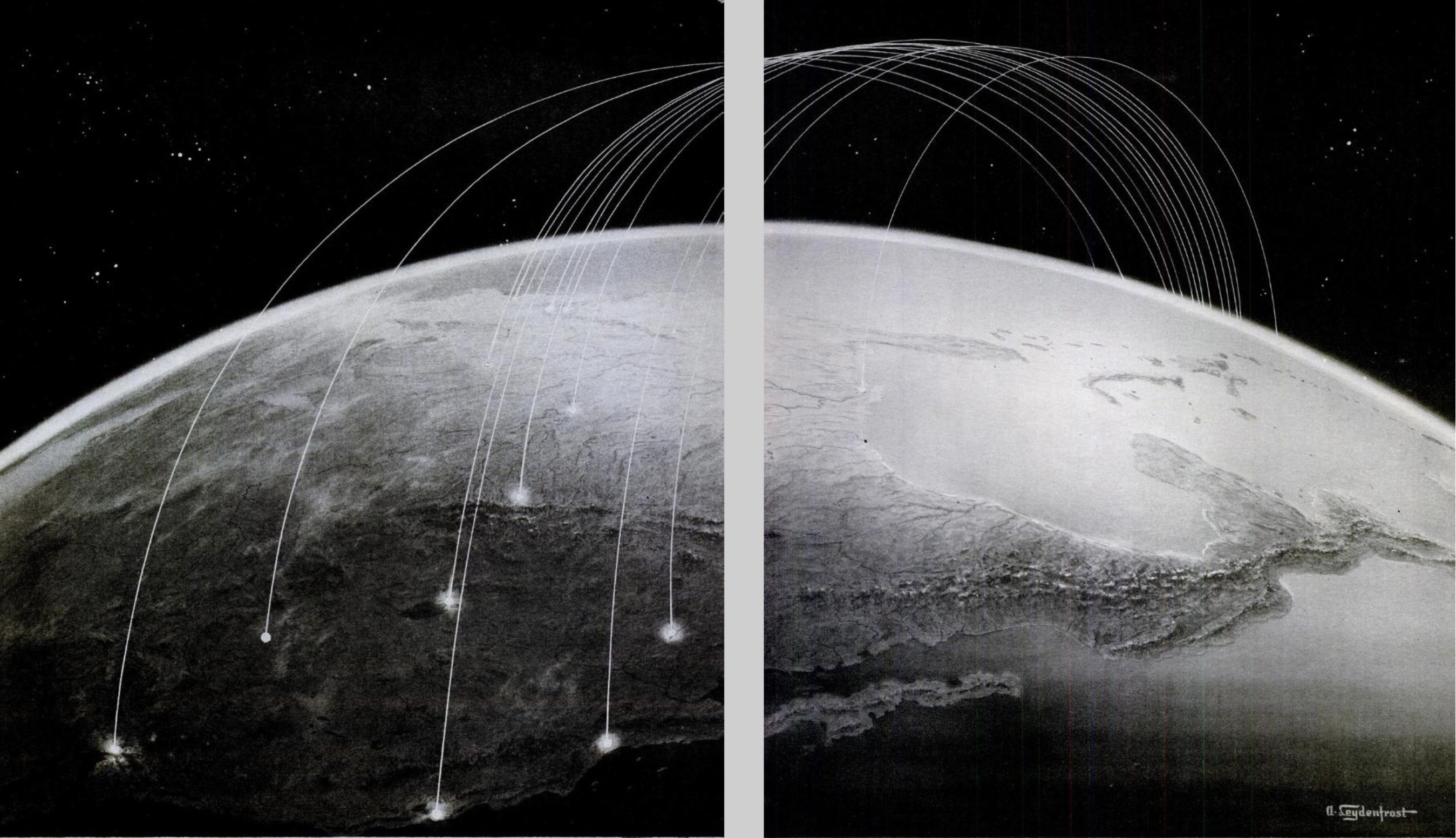
Kim Jong-un studying the flight of the Hwasong-12, which reached an altitude of 1,312 feet Reuters/KCNA  (May 14, 2017)

Continue reading

Leave a comment

Filed under arms control, ballistic missiles, Donald Trump, North Korea, nuclear threat

Mapping Trump

As news anchors stared directly at the camera on Election Day 2016, they might gesture mutely to the apparent dominance of Donald Trump’s presidential victory, shown the blanket of bright red polygons that took the viewer’s breath away by their sheer continuity affirmed that the people had spoken definitively.  The map was a bit of a total surprise, evidence of the disproportionate appeal of Trump across most states other than the coasts.  And it is an icon with which Trump has taken to celebrate in an almost proprietorial way as the result of his labors and his own hard work that he tried to celebrate in addressing the Boy Scouts’ annual jamboree this year.  Casting a now-forgotten moment of compact between himself as Presidential candidate and the nation, incarnated in a map, and presenting it as a personal triumph, he recalled the electoral map as a definitive rebuttal of a “dishonest” press and media, urging we all “remember that incredible night with the maps and the Republicans are red and the Democrats are blue; that map was so red, it was unbelievable,” and rhapsodizing how the map struck so many dumb with disbelief so that “they didn’t know what to say?”  The electoral map, for Trump, provided the ultimate confirmation for a “dishonest press” and “dishonest media,” but just how honest was that map, anyway?


Trump at Jamboree.png


The map seemed to show a dramatically lopsided margin of victory, but it of course concealed just as much.  It seemed to celebrate red nation, indeed, until one considered the concentration of population, and drilled deeper down into population distributions than an electoral map can reveal.  The map however remained so cognitively powerful that the geodemographics of the 2016 Presidential election seems to mark the return of a landscape of blue vs. red states, and a sense of the self-evident nature of a newly redivided republic.  The promise of national maps to parse the division of the popular vote–a conceit fundamental to the electoral college–however creates a false sense of the breadth of support or the links between an individual candidate and the land–distilling the distribution of the vote into a false if compelling continuity of a sea of bright red.  And it is not a surprise that the map has become a favorite demonstration of the extent of Trump’s popularity, and the myth of a landslide victory not seen in earlier years.  Even if its geodemographic illusion demands to be unpacked, the scale immediately gave rise to the magnification of a margin of victory that is entirely to be expected from Trump.

But for a national figure who has convinced what seem continuous swaths of the nation’s so-called heartland he could speak for their interests, it is striking that despite some considerable variations among voting patterns, the intensity of that red block so clearly endured.  The distribution illustrated the intensity of the affective relation to the candidate, or rather the failure of achieving any deep to Clinton as a candidate–but became a symbolic icon of Trump’s claim to represent the nation’s ‘heartland.’

reference-mapBen Hennig, from results of 2016 US Presidential Election

The geodemographic conceit was not much evidence that he actually did.  Despite the strength of such affective ties, Trump has only slim familiarity with that heartland–and rarely showed much tie to it.  Despite the compelling nature of the geodemographics that suggest Trump’s close tie to the nation’s center, the region Candidate Trump convinced was ignored by the media and press alike was largely avoided by Candidate Trump.  And few of its interests can be said to have been sustained by the President we now have, whose electoral success in the upper midwest will be hard to measure with a feared decline in health care subsidies, should the Affordable Care Act be repealed and Medicare gutted, leaving older working class voters in the cold, as a new tax code does little comfort.

But was Trump ever so tied to the band of red running vertically down the country?  For the region that voted for him is increasingly becoming disaffected, as he qualifies his opposition to NAFTA and his assurances about the need to construct a border wall, in ways that raise questions about his strong showing across middle-America and his identification with the people’s will.  Yet the iconic map itself may have provided for Trump himself a bit of a mirror illusion–as if to trigger a sense of recognition of his identification with the entire nation in ways that came as something as a surprise, it also effectively validated his long-time aspirations to the presidency, not only for the media, but for himself.  To be sure, the notion of a “heartland victory” reflected the growth of a tendency to shift Republican on a county-by-county level, which reflected a targeting of the midwestern states that seem to have been conducted below the eyes of team Clinton in the 2016 US Presidential election; Trump’s vote share substantially grew in Ohio, West Virginia, Iowa, Michigan, Wisconsin, Minnesota and Missouri.


Republican Blush.png


By normalizing the same choropleth of Trump votes, or using a color ramp that will foreground the percentages of voting intensity, a recommendation for all future voting maps Kenneth Field rightly suggests, the deep intensity of reds are brought out better, focussed almost in targeted sites in ways that might merit more retrospective scrutiny.


Trump votes normalized choropleth.png

Kenneth Field

But the deep reds of the electoral map were the most compelling to The Donald, and continue to lead him to retreat into rhapsodies, some eight months after the election, in Cedar Rapids IA, about how “Those electoral maps, they were all red, beautiful red.” As much as Trump has seemed to be processing the legitimacy of his victory well past the first hundred days of his term, a framed version of the electoral map infographic is rumored to have been hung, framed, as an icon in the Trump White House for visitors, to which he can point only to ask, as if in desperation,  ‘Aren’t you impressed by this map?’”  The map has become something of a calling card to which Trump seems both boastful and still gleefully processing, perhaps precisely because it was so often broadcast on TV.  The image transformed to a wall-map seems a needed confirmation of the areas that sent him to the White House, and has become a distributed visual for news interviews, as if its presence reminds interviewers that they are engaging with the representative of the real country.


C_kshitVoAE0vfh.jpg


Why post the map on the wall?  The infographic presumably captures those areas of the US where Trump must continue to address outside Washington–and of the disempowerment of the mainstream media–as if to remind him of his ongoing sources of strength.   Trump cannot conceal his pleasure to continue to crow, reveling in his unexpected ability to cathect with voters across so much of the northern midwest if not the silent majority of the national interior, and the map confirms a moment of joy:   the map of a “sea of deep crimson” offered credible needed visual confirmation of the legitimacy his newfound power that responds to continued crises, and a sort of symbolic consolation:  Trump, as if planning a billboard to the nation, requested no one less than the Washington Post run the image on his hundredth day in office, perhaps in hopes to brainwash the nation by the repetition of that apparent sea of deep, deep red.  It reveals, moreover, the very silent majority that Trump had long evoked:  Trump’s skill at resuscitating the Nixonian conceit of a “silent majority” supporting the Vietnam war and rejection counter-culture became a bulwark of sorts against the press; it  was particularly pleasurable as it re-appeared within the very news maps that the media produced which were broadcast on television screens, in ways Trump himself wants to continue to broadcast.  Trump not only holds TV in famously high regard–even if he did not mostly watch television for all of election night–it is almost credible that the iconic electoral map was framed for the White House walls, if distorting , offered a recollection of the magnitude of his margin of victory that must be comforting to show guests.

The considerable shock of the electoral results led many readers to recognize the reduction of support for the Democratic candidate, so well-qualified, to isolated regions near the more diverse and reliably Democratic coasts.  The visualization of disembodied counties for Clinton registers an immediate anxiety in projecting the angst of isolation from the same heartland, as if to show what seem only pockets of Clinton supporters in a very tenuous archipelago with outposts hewing predominantly to the nation’s coasts, as the outliers of the vision of America that Trump was able to propose.  As much as showing the lack of contact of Clinton’s messaging to so many counties in the in-between “forgotten heartland” that the Trump vote seemed so successfully to invest coherence in, the image shows a heartland that is almost abandoned by Clinton voters who seem not to have migrated from the country, but seem exiled from an increasingly fractured nation, in their own filter-bubbles, in which their own place has been rendered up for grabs.


clinton_v2-Artboard_6.pngTim Wallace/New York Times

The geodemographic illusion of such fracturing however belies the sharp dissonance that a deeply provincial figure long resident in one of the nation’s largest metropoles felt to much of the country and the nation that he so convincingly claimed he was able to represent.  Trump’s ability to have convinced much of the country he could guarantee their continued safety lies in contrast with the limited presence Trump ever remained in many of the regions that the force of his Presidential campaign so solidly and deeply colored red.  The clear divisions in the country that emerged in the 2016 Presidential election revealed a clearly widening set of divides between islands of populated blue and regions that trusted different news sources, more suggestive of a divide driven by eduction than wealth, using available census data on education from the Data Observatory in a CARTO visualization of the lower forty-eight, to create a more finely-grained record of the distribution of votes that allows the chromatic vacation to pop–

Carto Trump.pngMichelle Ho‘s Carto Blog

While the “split” between “heartland” and “blue islands” pops out better in the above courtesy the Carto dashboard, the surface of a flat map can conceal the extent to which the vote broke among more and less populated counties, as the following sizing of counties by votes received by Clinton (blue) or Trump (red).

Coutnies.png Carto

The thin distribution of red dots calls into question the existence of “heartland” in the nation, and how much the notion of a coherent heartland is the creation of a map, suggests the extreme oddity of an election where votes so clearly broke with electoral votes.   Notwithstanding the visualization of Alexis Egoshin being picked up on right-wing sites as a basis to argue for the need to continue the electoral college to represent the mass of land, pictured as a plateau, with which Trump won decisively, and could be called “TrumpLand” as it was so solidly voting in his favor–

trumpland-1.png

–the thinly stretched archipelago of Tim Wallace might defy geographical explanation, and be rooted as much in media bubbles, fractured politics, anti-immigrant sentiment as it can be said to be geographically determined, and perhaps the tendency that we have to believe that there could be a geographic explanation at the root of the Trump victory, or a definable “Trump” community or constituency might be more tied to the contingency of information economies than anything as easily mappable in purely objective terms.

1.  Trump’s own overly inflated claims to represent the red expanse of the rust belt was, for one, most strikingly undermined, however, by his regular return flights on his Boeing jet to his New York penthouse while on the campaign trail.  For as he campaigned, Trump maintained a remove from much of the country, even as he evoked the “rusted-out factories scattered like tombstones across the landscape of our nation,” and excoriated the policies that he claimed created them, urging voters to “take our country back again.”

While we are still trying to understand what he meant by “American carnage” save as a way to conjure fear, and a landscape beset by violence and “drugs pouring into our country and poisoning our youth,” within an “environment of lawless chaos,” the exaggerations of specters of social threats that proliferate from Trump’s mouth seem to be as emotionally figurative as they reflect actuality, and more a reflection of the America on television news than statistics.  The call to “shake off the rust” appealed, however, by binding themselves to the possibilities of “wistful time travel” that Donald Trump’s candidacy seemed to promise voters, as Zadie Smith has keenly observed.  Who better, in fact, to convince most of the country that he could bring it out of the shadow of threats of terrorist attacks that 9/11 has continued to cast across much of the nation, as if creating a bond of reassurance that stood in for any other tool of manufacturing consent.

And the tie was reified in maps.  A land map magnifying the extent of Trump’s 2016 US election results in the electoral tally was widely trumpeted by right-wing news sites, as well as the nightly news, to proclaim Trump’s was a landslide victory–even though the differences in popular voting was not only decisive, but Trump’s own relation to the nation he now leads is poorly understood.

Trump can be claimed to have converted more far more Republicans to his candidacy than recent Presidential candidates, but Trump was long an outsider.  And Trump’s imaginary tie to nation seems just that, despite some considerable crowing over Trump’s close relation to the American heartland that he claims as deeply tied to and to be the territory that he best represents–

electoral-trump

–although these stark divisions in the distribution of voting patterns disappear in the district-by-district electoral votes map posted by Mark E. J. Newman in clearly contrasting stretches of red and isolated islands of blue with only the occasional all-blue state.

county-map-2016University of Michigan/M.E.J. Newman

But the map of the distribution of electoral votes is only the start of the attenuated relation Trump has to the country.  Trump’s insistence on an alleged “mandate” or a “massive landslide” seems designed to provoke collective amnesia by its repetition–Trump’s own convictions seem born from the illusion of democracy displayed in broadcast electoral maps on TV news.  For the vagaries of the current electoral system meant that a shift of four counties from one state to a neighboring state, data scientist Kevin Hayes Wilson pointed out, would have redrawn the map of the election, and our picture of the nation to a more comforting baby blue–although this tantalizing alternate reality is not to have been, but is in fact not so far away at all:

imrs-1.php.pngKevin Hayes Wilson/Redraw the States

Yet the victory of a continuous stretch of red is so iconic that the mapping of votes by counties is taken as an affirmation of regions of deep scarlet, as if the county is a meaningful unit for displaying voting tendencies:

United_States_presidential_election_results_by_county,_2016.svg

The image of “red” states or counties is so potent, however, that the image is taken as evidence of the appeal of Trump’s promise to “Make America Great Again”–as if the slogan spoke to the heartland–that converting the map of counties to a cartogram which sized counties by population and voter size seems to be a weaponized warping of the nation for polemical intent, in which the center of the heartland has been stretched into a skein of thing red strands that slighted the region by stripping it of its political voice, as if created by a leftist cartographer who polemically diminished the heartland by rendering it as so much connective tissue in contrast to the prominence of blue cities.

Stretched thing

vote share.pngBenjamin Hennig (detail of Hennig’s cartogram of 2016 US Presidential election)

The rendering of the heartland as a stretched skein of what seem ruts in the American landscape seems the polemic of a leftist cartographer from a metropole, to many, ready to slight the heartland in favor of the magnified cities whose names appear on the map.

hennig skein

To be sure, the tea leaves of county voting patterns do parse voter populations:  to be sure, Trump did almost twice as well as Clinton in those counties that were at least 85% white, rural (fewer than 20,000 inhabitants), and won huge preponderance of the votes–70%–where less than 20 percent of the population has a college degree.  But the continutiy that one can translate into spatial terms is much less clear, and the county is not the clearest organization or translation of a voting bloc, despite the clearly greater diversity of the cities, and the dominance that Trump exercised in counties that were predominantly–85%–white, in ways that may have single-handedly overturned the electoral map, and were the audiences to whom the visions of prosperity Trump promised most appealed, and where the Democratic candidate’s losses in comparison to Barack Obama were big–and where Trump won almost twice as much of the counties.

80%white.png

Bloomberg, “The Voters Who Gave Us Trump” (Nov. 9, 2016)

But, by and large, the rhetoric of the red intensity of maps perhaps have originated as pollsters talking among themselves, and against each others’ expectations, as much as the distribution of a close connection to the candidate; the intensity of the red appeared in a contrast of the predictions of the popular vote distribution against the actuality, even if it seemed within a margin of error, as the final actual distribution–

2016-presidential-elections-actual-county-level-results-map-e1484740439135

Beta News

–broke ever so slighty, but so definitively and so strikingly, from their expectations:

The-final-2016-presidential-election-app-county-level-predictions-e1484740495640

Beta News

2.  Trump’s claims for a personal relation to the nation is far less apparent.  It demands to be scrutinized, as it only seems demonstrated in electoral maps.  Even though seven out of ten Republicans voiced expressed a preference for America of the 1950s rather than that of today, and Trump’s candidacy both entertained and invited such acts of willed nostalgia, it’s hard to believe Trump’s own proximity to the nation’s heartland is based on “lived” experience.  The surprising story of Trump’s campaign may be the alchemy by which he cemented a bond among evangelicals, with the help of his only nominally Catholic running mate, Mike Pence, paired with the poorly thought-out strategy of Hillary Clinton to focus on cities, rather than rural areas or the economically depressed areas that reject the effects of globalization, which could have spread those blues out along the map with far greater surety–a need that the map of Hayes Wilson reveals by the washed out areas of even the states whose delegates she won.

For while growing the share of Republican voters across several states presumed to vote Democratic, including many in the so-called “rust belt”–here colored dark red–

trump-increases-republican-votesBBC

–President Donald Trump seems himself to be quite alienated from the very folks whose economic interests he persuaded he would strongly defend, and less than ready to spend time there, save in his Florida estate, the new Winter Palace, Mar-a-Lago, ensconced as if forever a foreigner to much of the nation.

3.  The familiarity that Trump created with the nation seems rooted in an imaginary, built on the lifestyle of the Trump brand–even though his election leaves us with a shrinking horizon of expectations.  To say Trump ever knew much of the country is not only an exaggeration, but an outright deception that was willfully perpetrated if not orchestrated by his campaign.  Despite the broad appeal of a Trump lifestyle, Trump seems to have little connection for the man in the street or his job.  But his keen sense of playing the salesman for his brand, which promises to be a central part of his Presidency, led him to have so much practice at delivering people’s fantasies and recasting the art of promising anything but the greatest product ever to “innocent . . . exaggeration.”

For his policies betray little familiarity with the nation, beyond empty sloganeering, evident the belief that a repeal of the ACA would help the nation–when it would most likely, as Paul Krugman noted, “send the numbers right back up—[after] 18 million newly uninsured in just the first year.”  And the imposition of punitive measures against American companies who chose to locate their production overseas or in Mexico, and even more punitive tariffs against foreign competitors demand to be called out as instances of economic bullying, rather than anything like a realistic economic policy or plan.  And the notion of a 20% import tax would be passed on not to the Mexican government, but to heartland consumers who would pay for it in their purchases.  And ending the American Care Act would put almost a half a million aging folks off of health care, in ways we cannot yet fully map, but will have deep consequences for the very deep red “heartland” that Trump champions.  And as Anwar al-Awlaki, the radical Islamic American-born al-Qaeda preacher, foretold that the “West will eventually turn against its Muslim citizens,” Trump has successfully made his prophecy an actuality.  (“You were a nation of ease,” al-Awlaki had addressed the United States ominously, inviting a similar sort of time, but “imperial hubris is leading America to its fate.”)

Although Trump claimed to speak for the country, he was most famous for retreating to the confines of Trump Tower:  he was, confessed long-time political operative Roger Stone, something of a homebody.  His attachment to owning properties in Manhattan and his estate in Mar-a-Lago were so great to start rumors Trump declined to make the White House his regular residence as President.  And when Trump regularly returned to New York City or Mar a Lago, he always kept most of New York at a remove while sequestered in Trump Tower.   While totaling some 276,000 miles in the air by late September since announcing his candidacy for the U.S. Presidency  on June 16, 2015, Trump traveled over half of the days since announcing his candidacy, even while visiting far fewer places than other Republican candidates and fewer than his Democratic opponent, Hillary Clinton.  And if one is to judge his familiarity with the country in terms of the cities where he chose to build and promote hotels as evidence for the sites he earlier visited, it is striking that the sites of Trump’s North American properties are located on its coasts, or outside of the very areas where his campaign was so wildly and only perhaps improbably successful.

North Am Trum Properties.png

For on the campaign trail, Trump buzzed about the country to create the sense of direct contact with constituents even without spending that much time in a single place, but regularly returned to New York, he may have visited places like Brooklyn, where Clinton’s campaign was based, far less frequently–and spending a considerable amount of time on the campaign trail sleeping in Trump Tower, if not resting in the large bed stationed in his 757; tweets from sites on the campaign trail conveyed his endless motion, but many began “just returned from . . .” in multiple tweets during the early days of the primary.

Were the steady accusations of his opponents’ tiredness but projections of his own somnolence or power naps?

Somnolence.png

Trump was regularly cast by ABC news as Palm Beach’s Most High-Profile Homebody by the year’s end.  Trump was no doubt tired out by the extensive campaign where he projected his exhaustion first onto Jeb Bush and then, more dramatically, Hillary Clinton:  for two weeks in December, rather than assemble his incoming cabinet, the PEOTUS remained in the sumptuous Mar-a-Lago, rarely leaving the estate for golf and dinner at the Trump International Golf Club, or Christmas Eve mass, and meeting with his transition team just “a stone’s throw from the croquet garden,” before returning to Trump Tower in January to assemble the rest of his incoming cabinet in the nineteen days before his inauguration–and expressed reluctance in leaving his aerie in Manhattan for periods of a week after assuming the Presidency, proposing frequent returns to his three-story penthouse on the 58th floor of Trump Tower for family time during his Presidency.

4.  Even if he has warmed to the White House’ decor and furniture soon after moving in, Trump is a man who has stayed put in his lavish multi-floor apartment for much of the last three decades, and it has provided the perspective from which he looked at the United States–and may offer a perspective from which the strong opinions of his policies were formed.  For a candidate who saw the sumptuous quarters designed in Louis XIV style as a tribute to his creation of his own self-image, was his creation of a time-frame also particularly revealing?  Did his identification with an apartment decorated in 24-karat gold and marble and furniture and tapestries  in Louis XIV style with a Tiepolo ceiling put him in ideal place as a candidate to promise a project of time travel to Americans seduced by his timeless lifestyle–

15trumpwomen-ivanacomp-master675

so effectively isolated as he was from the changes in the external world over the past twenty to thirty years?  (And doesn’t being called a “homebody” mean quite a different thing for such a home?)  For a man who grown up in a house with four white columns that were adorned with a confected crest and coat of arms and white columns, as a palace set apart from Queens, N.Y., with twenty-five rooms and nine bathrooms, the palatial abodes that he has continued to created for himself and his family similarly stepped outside of time.

The series of luxury hotels with which Trump’s name has been synonymous promote lifestyle packages promote pastiches of European luxury that are, after all, the tricks of the trade of a master hotelier–whose expertise is to offer an escape to a new comfort zone.  Since winning an election for United States President seems to provide only an extension of the art of escapism he has already refined in the political sphere that can translate to the trade of the hotelier, it seems no surprise that recent publicity even integrated the image of the White House facade to a promise of escapism at Trump International located in Washington, DC–even if this reveals something of a conflict of interest or confusion of jobs, or rather imagines the sort of “Suite Escape” in which Trump Hotels specialize the possibility of looking at the photoshopped blanched federal Environmental Protection Agency  through drape-graced windows in utmost Trump luxury, even if it does, as Philip Bump noted keenly, capture the “mess of conflicts of interest” that Trump is now likely to himself face far beyond that hotel.

c3i8vuhwcaa5x5e

c3kmsa4wyaavo2z-jpg-large

5.  For it seems that a large part of the promise of Trump Hotels is to offer to assemble for their eager visitors pastiches of the “finer things of life,” such as the guesthouse in the Blue Ridge foothills, combining a Georgian-style mansion with old-world elegance from Waterford crystal chandeliers, oil paintings, and statuary in surroundings recalling the Tuscan countryside; every one of his Trump International hotels or Trump Hotels is prized for its own thematic program of interior decoration that offer to their visitors.  This is distilled in the utterly escapist residence Trump loves in Trump Tower, whose time-shifting decor to transport one to an idyllic past, free from social consequences or concerns, that might be the emblem of the escape he offers the country.

inside-trump-tower

The notion of Trump sequestered, as a self-made Rip van Winkle, is somewhat appealing.  Donald Trump rarely travels, and seems something of a homebody, flying home regularly while he was on the campaign trail on his private jet–and asking the Secret Service to follow him home, on an air company he owns.  To the tune of $1.6 million, agents accompanied him on regular return flights on TAG Air, on which he logged some $6 million personally, boasting “I could be the first presidential candidate to run and make money on it,” as he walked to the bank, even outfitting his own ostentatious Boeing 757 jet at a cost of $1 million that situated his own name prominently in red, white, and blue. Trump often made late night trips back to New York during the Presidential campaign, to sleep in his own living quarters, according to the New York Times.  (The cost of outfitting his plane in suitable luxury may have given Trump grounds to criticize current government contracts with Boeing for the real Air Force One of $4 billion–“Cancel the order!“–although the mechanics of what was entailed in that plane were probably not in his grasp.)

trump0715-force-one.jpg

All those daily flights home on “Trump Force One” to sleep in Trump Tower during the Iowa Caucuses were at first feared to cost him some votes across the midwest.  Trump had regularly returned to his morning view of Central Park and his lavish home quarters, however, and seemed to relish returning with regularity during the campaign.  He didn’t allow any press members to accompany him on these flights, though the staff grew.  But he didn’t hesitate to outfit the luxury jet which was a frequent backdrop for news conferences and televised appearances, at a cost of an extra cost within the 3.8 million taxpayers payed to Tag Air, Inc., to operate the jet which approximated his personal quarters in Trump Tower, from a master bedroom approximated with silk wall coverings, mohair couch that converts to a bed, 57-inch television, home theater, shower and gold-plated toilet on this fuel-inefficient plane–all the while insisting on returning to his penthouse in Trump Tower almost each and every night.  (Trump claimed his flights were funded by checks he wrote to his own campaign, and the sale of MAGA hats and souvenirs at rallies, but the $27,000-$36,000 increase in daily operating costs of such regular flights home–the result of a deep resistance to overnighting outside his home long noted on the campaign trail–left the Secret Service sending a tidy check of $1.6 million for much of 2016 to Trump’s own airplane company.)

6.  The web of financial ties to Trump are far-flung in their nodes, and their ties to members of the incoming Trump cabinet–including Betsy “Ah, Betsy; Education, Right?” DeVos–and seem to stretch to areas only begging to be fully mapped, but which extend far, far beyond the properties of the Trump Organization.

Trump Mafia.png

–in a virtual web of business connections, many concealed within his tax statements.  The ties to much of the nation and newfound legitimacy and recognition of the Trump brand seems undeniable–even if Donald Trump, Jr. dismissed the idea that Donald, now that “he’s got real stuff he’s got to deal with” and “real people’s lives,” is anything but occupied with his governmental duties or realizes the extent to which hid new platform of recognition might encourage the expansion of a luxury hotel chain to new regions of the country.   While scoffing at the “notion that [President Trump] is still running the business from the White House is just insane,” however, the network of hotel chains he has administered provide something like the template for Trump’s notion of his relation to space, as the deals he brokered with construction firms, cities, and property taxes have provided him with the basic tools by which he seems destined to project Presidential authority.  Even as Trump sons Eric and Donald, Jr., the surrogates of his hotel empire, claim “There are lines that we would never cross, and that’s mixing business with anything government,” the inescapable confusion is one from which they will benefit.

Indeed, the range of hotel properties Trump owns are wide-ranging, although notably removed form the African continent or Australia, not to mention an almost entire absence in Asia, restricting interest in South America to the tourist destination of Rio and a planned residential development in Uruguay; and with no properties in continental Europe outside Istanbul–and an avoidance of Mexico which, for the owner of a chain of luxury hotels and hotelier, seems almost to be rooted in something like a deep personal dislike–

48d41a986339f80a89695e2609f368fd71dc0653-1

The selective seats of Trump International perhaps befits an entity long styled as “real estate super-brand” and linked to the lifestyle it marketed.   But the absence of Trump’s ability to market the Trump lifestyle and brand of hotel destinations in Europe, save the recent and requisite golf courses in Scotland Ireland, may reveal a long ambivalent attitude to Europe and NATO countries, given the absence of Trump interests outside golf courses in Aberdeen, Tunberry and Doonbeg.  (Indeed, Trump took no time after assuming the Presidency to rail against the EU based on his own experiences from “another world” of business–based on the firm refusal  of the EU to resist a proposed seawall on the dunes of Trump International Golf Links and Hotel in Doonbeg, Ireland, on the grounds of the environmental protection for endangered animals.  Trump was forced to curtail his planned seawall, the basis for the objection–an endangered snail–post-dates his aversion to expanding Trump International in Europe.

But is emblematic of the disproportionate scale with which Trump seems to view the world.  While mocking local disturbances faced by his building projects as annoying disturbances, he promotes his vision of a single way of life cobbled together from historical periods, providing residents a view from Mumbai at the Park at a remove from the poverty of homeless families who sleep on cardboard on Mumbai’s streets–in an image long suspected to be photoshopped.

58681cd31500002f00e9ddcc.jpegPaul Needham (2014)

The withdrawal of Trump Tower is the opposite of global engagement, but is the site to which Trump seems to invite us all to retreat in an age of global refugees.  Is it any coincidence that the self-confessed germaphobe so fearful of contamination from crowds is most inclined to adopt metaphors as floods, swarms, or infectious to describe the experience of refugees as threats to the social body, metaphorically re-framing their plight at a remove from social, politics or economics–and insisting on our need for better self-protection?  The distorted view from Trump Towers elides the experience of many through the distorting lens of real estate.

7.  Indeed, Trump’s gift for getting his name put on every empty surface known to man–including Trump-themed fiction–seems to have been taken as an excuse for his interest in political representation, which it is not.  But it is no secret that business interactions have most importantly shaped and helped formed Trump’s world view.  And the somewhat striking absence of Trump hotels in much of Eurasia–save residential developments in Seoul, and some under construction in Mumbai, Pune and the Philippines–raises questions not only of the appeal of the version of Trump glitz that they offer, but also of the place of these actual locations in Trump’s current mental map; the distance of the Trump brand entirely from the neighboring state of Mexico is more than clear, and may derive from personal distaste.

The presence of properties under construction in Uruguay, India, and Makati may indicate constraints of the Trump lifestyle, whose limited truck in Europe is not destined to grow in the future.  The relative absence of Trump’s presence in Asia–save Baku–suggests not only a compromised notion of geography for Trump, but an untimely withdrawal from international markets that analyses of the previous administration suggested place millions of jobs at risk.  How can we collectively trust a man with so compromised a notion of geography to can the Trans-Pacific Partnership?  The punitive measures proposed to be taken against companies making products overseas suggest a deeply skewed notion of the place of the American workplace in the global economy, and punitive measures against foreign competitors, suggest a limited and deeply narcissistic notion of global economic transactions, distant from and out of touch with the distribution of global populations.

populous nations.png

The remove of a spatial imaginary of real estate was long prominent in Trump’s mind.  The sharply concentrated and geographically small circuit of properties Trump owns in New York suggests not only a limited knowledge of the huge diversity of New York City but define the notion of the Trump lifestyle he has sold to America as an outer borough boy.  It betrays his narrow range of interest in coveted properties around Midtown and Trump Tower, revealing Trump’s longstanding interest in focussing his sights on Manhattan, despite his father Fred’s disinterest in the far fancier borough–and his open discouragement to Donald for chasing such properties from a firm that had roots from the Verrazano Bridge to the Long Island border, and offered middle-class housing, for hubris in reaching beyond his Brooklyn roots.  Is the focussed expansion of Trump Properties into Midtown, by now long naturalized by its epicenter at Trump Tower, a form of inter-borough envy with roots in the class conflicts of New York City’s urban geography?

Such inter-borough rivalry seem to have guided not only the expansion of Trump properties as it expanded to the area around the future Trump Tower, site of the tony area of Tiffany’s, the Plaza Hotel and Central Park South–

Trump NYC.png

–but the position in which he sees himself in relation to the world, and the caricature of the populist millionaire that became the conceit of The Apprentice and since become a basis for Trump to sell himself and his brand to the country.

Indeed, the eagerness of Donald to move to the toniest areas Fred Trump disdained, by casting himself from the “streetwise son of Brooklyn’s largest apartment builder,” allowed him to expand his stylized image as a colossus of Manhattan, but to disdain the outer boroughs of New York City as a place to plant the gold-plated image of his name.

Fred and Donald.png

In staking claims to building in such a restricted area of Manhattan, Trump may have used midtown as a sort of arena or performance space to broadcast his identity with such well-polished sheen that it served as a launching pad for Reality TV, long before declaring his Presidency.

8.  More scarily, however, is that the quite limited previous experience Trump gained with world affairs from his perch in New York seems destined to shape the judgements that he shapes on issues of global consequence:  as being in Queens and looking at Manhattan defined Donald’s appreciation and interest in power, the very tactics of aggression that worked for him to launch his brand in New York has become generalized in the trademark launching of hotel facades, and the confrontational bullying of world leaders seems to be the chosen metier of foreign policy, as cultivating allies and personal rapports; divisions between personal space and national destiny seem far closer than in the past, who seems to see foreign policy as conducted in confidence and in tête-a-tête rapports; foreign non-immigrant workers of HB-1 visas are viewed as “cut-rate” bargains, analogous to foreign construction workers; constant commentary on foreign affairs in Twitter permitted; brinksmanship is a working strategy; market negotiations as a primary means of statecraft with overseas partners and adversaries alike.

Trump’s deep need to impress world leaders takes precedence over policy or statements of national interest; tax-cuts are for corporations, whose rate is cut to 15 percent, and tax brackets collapsed from seven to three–while omitting how the US government would be able to afford the cuts.  Trump works on small-scale corporate deals with companies about aircraft, but the big picture seems to slip away.

For Trump’s apparently unremitting focus on staking claims to what he considered higher status in New York City’s real estate market, and to promote his name in doing so, developed with an intensity that led him to continue to stake claims to that status for new arenas.  This began in New York City, greedily and relentlessly, from the West Side Highway where his promise of a waterfront apartment building led the city to permanently close an exit ramp, to Soho, to Wall Street.  This apparent search seeming to chase an image of prestige in the mirror of his own gold-plated marquee, combining deep desire with disinterest in much of the external world, almost desiring only to look in the mirror of the gold reflective surfaces naming the multi-billion dollar towers to which the developer lends his name and the status they take pains to create.  Trump indeed boasted to a biographer Harry Hurt III, back in 1993, about having the best living room view in all of New York City, by virtue of being able to see from his Trump Tower apartment his own name on all sides:  beside the Hudson River in the West Side Yards; on Third Avenue, atop the thirty-nine story Trump Plaza or the fifty-five story Trump Palace.  Hurt compared it all to a child-like fantasy: mirrored in miniature on the ultimate stage of self-indulgent fantasy, as Trump’s name is branded not only on buildings but also “on a Monopoly-tyle board game branded ‘Trump'”, in a sort of ubiquity that needs its own constant affirmation, and itself engenders a desperate need for confirmation of loyalty and admiration.

For Trump seems to have lived in an extended or protracted mirror stage, where the materials of building provide themselves the foil for revealing the “I” that the builder seeks to cultivate, forged in a pre-linguistic stage but continuing as a distorting monumentalization of selfhood that desires to obscure if not obliterates the very map across which it spreads, disorienting the viewer.  The reality of the Trump presidency seems retaining the sheen on the name that seems to gain a greater aura the more that it is reproduced.

Gold reflective.png

Trump Tower

tower.png

lv-trump-t

But how long can that last?  While Trump boasted that his ability to have “added show business to the real estate business” is an apt characterization as “a positive for my properties and in my life,” is the nation able to be defined as his property, or is he able to fulfill the fantasies of his constituents through inflated promises and empty patina?

Rather than build such bold pronouncements of self without oversight in Washington, DC, Trump seems to offer the nation new ideas of the landscape of governmental authority.  For rather than seeing the role of the Presidency as representing the nation, Trump seems to have relentlessly presented the function of the Presidency as expanding own his personal enrichment at the cost of the nation–and indeed at the cost of the Presidency’s historical prestige.

c3ejxivwaaaytfr

Comments Off on Mapping Trump

Filed under American Politics, data visualization, Donald Trump, electoral maps, real estate

The World Once in Oakland

There are multiple layers of nostalgia in the antique map once found in the familiar marquee of De Lauer’s Super News Stand in downtown Oakland, California.  The sign was long an emblem a comprehensive range of world news sources and foreign newspapers, the dated map as a relic of an old sense of news. The map that so dramatically foregrounded the prominence of the United States in such an exaggerated fashion is both heavy with nostalgia of a past sense of the global centrality of north America in world news, and also of a time when the news was able to be mapped or derived from different fixed news bureaus, and bridged places otherwise removed from one another as proudly displayed on its magnificent if quite intentionally geographically distorted marque.

De Lauer's Globe

The black and white marquee of De Lauer’s Super News Stand seems a time-capsule of an earlier sense of Oakland as news entrepot, and of an era when newsprint provided a primary sense of immediate access to the wider world.  Amidst fluted pairs of caste-bronze gas street lamps in downtown Oakland, a kitschy illuminated globe marks a site of pilgrimage for newsprint, founded by a family who sold newspapers from pushcarts since 1907–both a mecca of the printed word and monument to past empires of print.  The intentionally distorted globe on Broadway carries maps, but uses the image of the US-as-world to boast of the breadth of its array of some three-hundred plus American and foreign newspapers and some 6000 magazines was a paradise of crumbling paper and glossy picture magazines, from fashion to crafts to hunting arts, complemented by comic books, triangular sandwiches and an array of cigarettes and cigars.  The magazines that often seem dog-eared from use are encyclopedic in variety, and extend back to the roped-off adults only area in the back, and are flanked by paperbacks.  (Rumors has it that incense from nearby Chinatown was burned regularly to disperse the smell of newsprint.)

The 24-hour round-the-clock schedule, before the news cycle contracted, doesn’t help the slightly worn appearance and feel of the store that might be at odds with its boast for such comprehensive news coverage.  But it symbolized a sense of easy access to news sources in an earlier era of print, as a venue to which anyone could obtain to at virtually any time of day.

delauers with papers at hand

Beside Oakland’s Tribune Tower, between 13th and 14th on Broadway, De Lauer’s Super Newsstand boasts a range of papers from round the world, and a wide selection of foreign magazines whose scope its patrons boasted did not exist west of Chicago.  Laid out in the sort of space usually reserved for a small supermarket or bookstore, its deep interior has the spaciousness of a sort of library and proud arcade of the quotidian, linking “your home town paper” to the world, back when newsprint linked the world.  And where else to buy books of superheroes than a super newsstand?

news marquis

Built beside the line of old streetcar lines and trolleys that formed an extended network across the city until 1958, De Lauer’s was a destination and a site of the distribution of news, whose papers from the Tribune Building next door spread across the East Bay–the dense business in the downtown area is evident in this Key Car Map of the old city center around the Broadway line and nearby Feeding Point by the Lake:

Oakland Key Car System

The site described as the best site of its sort west of Chicago was a survivor of downtown Oakland, whose own map had changed so much from the bustling department stores of the 1960s.  It was the site for comic books, foreign news, fashion magazines, and more, before gossip, cooking and craft magazines dominated the press.   The luminescent globe on its marquee carries the sense of global news coverage and the optimism of the early 1960s–before the 1968 riots or 1964 Free Speech Movement–that placed North America triumphantly stretched across and filling its parallels and meridians beneath the banner of the one-of-a-kind newsstand itself:  De Lauer’s Brings You the World, it still boasts, with a grandiosity of a world’s fair under a single roof, even in an age when newswires are readily accessed on the internet, and print seems a charmingly antiquated medium ill-fitted to the 24-hour news cycle.

But what about that map?  The globe on its axis is illuminated as something of a relic from an age of the Magazine Emporium; the marquee of the Super News Stand on 13th Street charmingly symbolizes the illusion of comprehensive coverage in an era of world news mediated by print, that occasioned the marked distortion of the prominence it gave North America:

De Lauer's

The prominence is more than a slight distortion of the prominence of America on the globe–

globe map

–but echoed the centrality of news that affirmed the connected place of America in the world, as well as the profusion of newspapers and sources in the United States.

The emblem of news funneling from all over the world into one newsstand was the premise not only of De Lauer’s, but of the world of print media that it nourished, now sadly an artifact quickly receded with the advance of on-line news, where we are less focussed on the global importance of American news, or, for that matter, the authority of one site to present world news.

cronkite

The ostensible focus on the world and actual depiction of North America on the marquee is not meant as a cartographical argument, but echoes the limited concern with other regions or territories in this uncredited map showing the “dependent territories” of the United States, from a classic 1904 manual of American history, which similarly foregrounds the United States as central to a global context and obscures other national boundaries in a uniform gray:

Uniteed States and Dependent Territories

But geographic knowledge was not the point of the De Lauer’s logo or marquee, so much as the comprehensiveness of their stock; De Lauer’s concentrated on all the nation’s newspapers, if it also expanded to include a range of those world-wide, in a gesture of cosmopolitanism of the city, and a complement to the grandeur of the Tribune tower, constructed in 1923 after Renaissance Venice’s bell tower of St. Mark’s–as UC Berkeley’s Campanile–as if to echo the grandiosity of claims to empire on the sea, and is inflected with a distinctive Moorish style.  But the grandiosity of the terra cotta apex of the Tribune Tower suggests the bold design of the storefronts of older buildings in Oakland’s once-grand downtown, several buildings of which are adorned by arte nouveau reliefs.

Tribune Tower

(The sense of Oakland as news entrepot was even more evident in the previous if less majestic tower on the building that resembled a transmission tower and recalled the early role of radio, long before broadcast news:

before

The subsequent expansion of the 20-story tower added to the building in 1923 reflected gave it a more elegant sense of keeping time for downtown.)

The newspaper store had grown rom a single outdoors newsstand, first moving into the Tribune Press building on 12th Street, the expanded 1301 Broadway store housed a wide range of papers and magazines, complemented by books, postcards, school supplies, maps, cigarettes, energy drinks and souvenirs, a repository of the news and arcade of daily communications from the newswires more than a 5 & dime store. De Lauer’s oddly became a bit of an intellectual hangout by the 1970s as a site of leftist magazines.  From the 1970s to 1980s, the illuminated marquee on Broadway was a sort of beacon of world-wide news sources and foreign magazines within Old Oakland’s downtown–where newspaper offices are still clustered in the city, encompassing the world’s news and leftist reviews, and, before the accessibility of world-wide news sources in online form, selling to a wide range of folks and providing a sense of open-ness which perhaps later led the store to permit homeless to camp out by its windows’ permanent 24-hour glow.

Newspaperman Charles DeLauer had worked tirelessly at the stand seven days a week until his tragic death at age 91–committed to providing out-of-town newspapers, racing forms, and foreign as well as national magazines twenty four hours a day, even weathering a declining market for news and the rise of cable news, and, back in the past, the rise of USA TODAY, which featured its own newspaper kiosks and dispensaries on American sidewalks, looking like a familiar television set as a trusted news source. If the market for many were killed by the internet, the building consolidated in downtown Oakland a family business that had once represented some forty newsstands and wagons across the Bay Area–a Bay Area far reduced in size from the present. It has long earned praise for surviving an era of news streams and digital feeds, as well as latching its revenues to glosser magazines and a source for hard-to-locate newspapers for migrants, although its now better known for illuminating the transsexual prostitutes who stand beneath the bright lights of a distinctive gleam, after the downtown neighborhood seems to shut down.

222751882_d43825178e_m

The landmark was rumored to be threatened with closure in 2008.  It was saved for a reprieve by an Oakland non-profit, but by he had reached his nineties the aging De Lauer was overwhelmed with fears that the time had come to close the curtains on a store from which over three hundred papers once circulated:  “This is a business that time is passing by because everybody has a computer,” he observed stoically, fearing the end of viability of his Catholic commitment to print.  As rumors circulating it was shuttered and provoked an outpour of support, just a month before the already retired De Lauer died of lymphoma and leukemia, the shop stocking 300 newspapers was bought by Citrine Advisors, and the store remains afloat, doing a brisk business of not only cigarettes but triangular cello-wrapped tuna fish sandwiches and soft drinks, energy drinks, adult magazines, paperbacks on world history–and range of local and state maps.

The wonderfully retro imprecise confident cartographical crest De Lauer’s long boasted illuminated Broadway twenty four hours a day, by the Civic Center BART, was never so much an actual map. It was an emblem that celebrated the promise of an all-embracing information center of the world before the world wide web, content stored not online but in the magazine racks of the old print arcade; the sign declares the United States to be the information center of the world, and the world as existing and refracted through the United States American Press Corps–contemporary to the Pan Am logo, the global map, designed just before the Cuban Missile Crisis, as an image of global dominion punctured by panic about Soviet missiles once about to be located on that island–an island notably absent from the map on the Super News Stand’s storefront.

The departure of that map, once so central to the store’s public image, in recent years has removed it to a lost Oakland, and left the place once adorned by its the map, now sadly stripped of marquee and only an abandoned wall–the store’s name appearing only as a decal on the window–

sripped-of-marquee

–reduced to geometric shapes, as if yet another casualty of the internet economy, which has transformed the storefront into only a Mecca for glossy magazines.

marqee-facade
It was, after all, only the range of magazines stocked gave a new sense to the global map that hangs outside the store.
It was long a hub from which newspapers once flowed through the East  Bay, and from which you can obtain all seven papers distributed by the Alameda News Group, as well as a range of out-of-town newspapers that are hard to obtain from the few vending boxes that still dot the streets.  The illuminated-globe logo of this 1960s emporium announced  a cross between a library and entrepot of world news, and the store, still surviving in the digital era, now survives by selling food and porn, like a steadfast guardian of the printed word and random convenience store.  It remained more than an icon, but an active center:  open in the 2010 riots at the same time that all other Oakland stores were boarded up, and doing  brisk business at the same time as the 2011 Occupy movement led to more shuttering of stores in July and August, when the store provided Occupy protesters with an unending supply of sandwiches, power drinks and cigarettes as they made headlines in the news.  Yet after years of running in the black, the store now run and by Fasil Lemma, who had long helped De Lauer keep the business afloat, with his partner Abdo Shrooh for over four years, is feared to have found a new tenant–and a 7-Eleven had already leased the site in 2011, although their permit was still awaiting pending city review.
neon

Leave a comment

Filed under History of Oakalnd, maps and advertising, News Maps, nostalgia and maps, Oakland