Rarely has a political convention focussed so strongly on distracting attention from current actualities and reconstituting a disparate party as the 2020 Republican Convention that met to nominate Donald J. Trump. The mood was tense, and the nation as desperate for a powerful political icon. While the country had been counting COVID mortality rates and lamenting police violence and the injustice of health inequalities across the nation, a balloon of good news was levitated, a roly poly elephant leaping to the stars. Rarely has an animal assumed so much iconographic power and significance as the in the field of vision of spectators as the monochrome red elephant that the RNC adopted, seeking a needed sense of purity to the circus animal that was a longstanding symbol of the party. Amidst numerous bona fides to Trump’s character that were paraded from the platform in place of a platform, the tacit claim to “Support President Trump to Keep America Great” was captured by the almost floating icon of an elephant rising, lifting its trunk regally, unveiled in 2019 as moment marked by newly invigorated partisan identity, if not a reassuring rebranding.
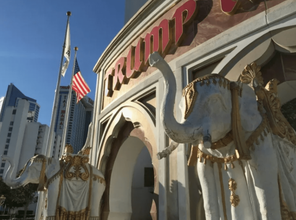
The rising elephant aspired to the monumental scale of an already anointed candidate’s victory; more than a mirror and a map, its shiny surface akin to those shiny reflective gold plates on the latest skyscrapers adorned by “TRUMP,” was an emblem off which history slid, less as a future map than a monolith blending partisan confidence with revisionist history. Revisionist history was historical fabulation for Donald J. Trump, of course, who had adopted the elephant as something of a mascot for Trump Taj Mahal, one of the three casinos built on the New Jersey coastal resort town in the 1980s–before it went bankrupt in 1991, and Trump Casinos and Resorts filed for bankruptcy in 2004, but the elephants that adorned the Taj Mahal added a weirdly nostalgic glitz akin to a Crystal Palace for the fin de siècle, disguising the value of the property by sheer investments after the city decided to legalize gaming in a bid to rescue a sagging economy, that Trump could not resist as a scheme to make money at three new casinos, the centerpiece still remembered as decorated by gaudy elephants–in what might, in an alternative universe, have been the end of the story.
Trump Taj Mahal, Entrance, Atlantic City, New Jersey
The saddled elephant raring its trunk in orientalist garb might have been from the Crystal Palace’s East India Company’s exhibit. The striking image of luxury promised a new venture for the construction magnate, and the reburnishing of the party mascot of the elephant seemed to disguise the absence of any clear political platform, debates, business meetings, or slates of candidates at the Charlotte, NC convention–only speeches vouching for the candidate’s credibility despite all evidence to the contrary. The new elephant that had a complex racial history of proving the purity of. the party when it was introduced at the same period that P.T. Barnum had introduced to his circus the first “white elephant”–a Burmese beast, publicized as a “sacred elephant” to complement his crew of African Grey’s, as a sign. of the purity of their party. Some four years and one election cycle after the circus Barnum & Bailey had retired elephants from their show, after 145 years, the iconic raised trunk of circus animals entered the Republican party that Trump now adopted, the circus having complied to state and local laws that prohibit the use of bullhooks trainers long used to train the animals for their gaudy performances.

May, 2016 Final Performance of Trained Elephants at Ringling Bros., Barnum and Bailey Circus
In retrospect, the affidavits of credibility assembled at the 2020 Republican Convention were a rogue’s gallery anticipating the absence of unity or direction in the party with Trump at its helm. Herschel Walker took the stage with black Republican representative Tim Scott to vouch for Trump’s absence of racism. The revisionary history “honoring the great American story” as much as history minimized the place of race or white supremacy in the past or current party; while the convention occasioned no change in a political platform boasted to remain unchanged, the convention featured affidavits that Trump’s “actions” illustrated just “how much he cares about social justice and the Black community,” all evidence to the contrary. Before the red elephant that sought to celebrate the party’s integrity and honesty, perhaps Hershel Walker, Tim Scott, Vernon Jones and Nikki Haley all protested too much, their eyes on the elusive “black vote” in the general election, more than the politics the circus elephant embodied. The speakers bent backwards to minimize Trump’s place in America’s racial politics, claiming “free minds” in “a large and growing segment of the Black community who are independent thinkers . . . believe that Donald Trump is the President that America needs to lead us forward;” Jones vouched that Democrats no longer served “Black Americans’ interests” in the manner they might claim.
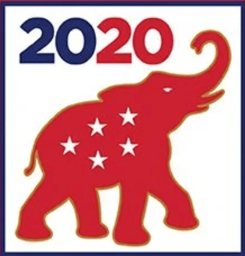
Yet the orange-tinged weightless elephant that raised its trunk victoriously behind each speaker seemed a form of cross-messaging in recuperating an icon of tinged origins. The “great American story” offered lip service to racial harmony from Walker–prompted to oppose the first African American senator from Georgia, Raphael Warnock–Scott, and Nikki Haley filled four nights of testimonials black voters would support Trump by testimonials that denied Trump’s open appeal to white supremacists in the election. Audiences may have been assured by the solidly red beast, branded with five stars in a ‘W’ semaphoring victory, that the party was Trump’s, and the platform always the same, and racism had no place in it. But as Haley vouched that “America is not a racist country,” the hopes to levitate the elephant behind the podium told another story, its slick surface resisting the archeology that this blogpost will attempt.
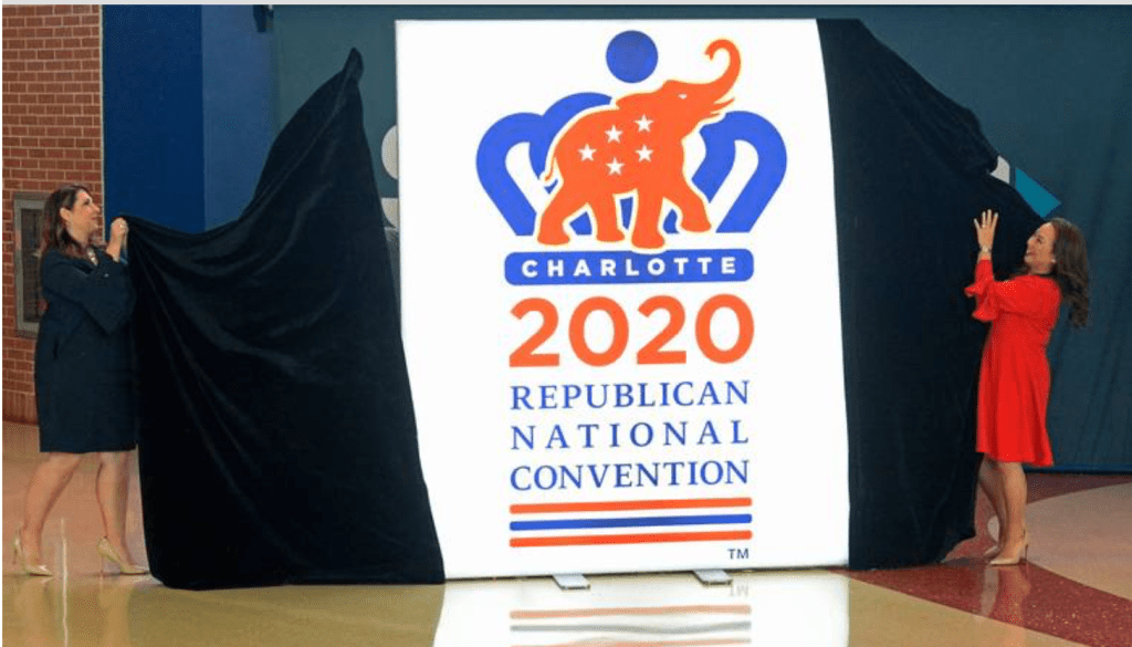
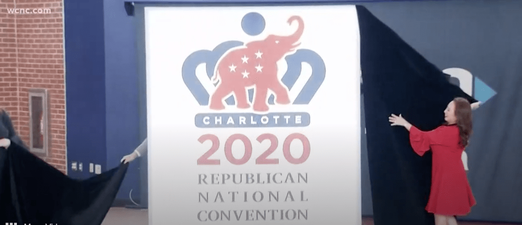
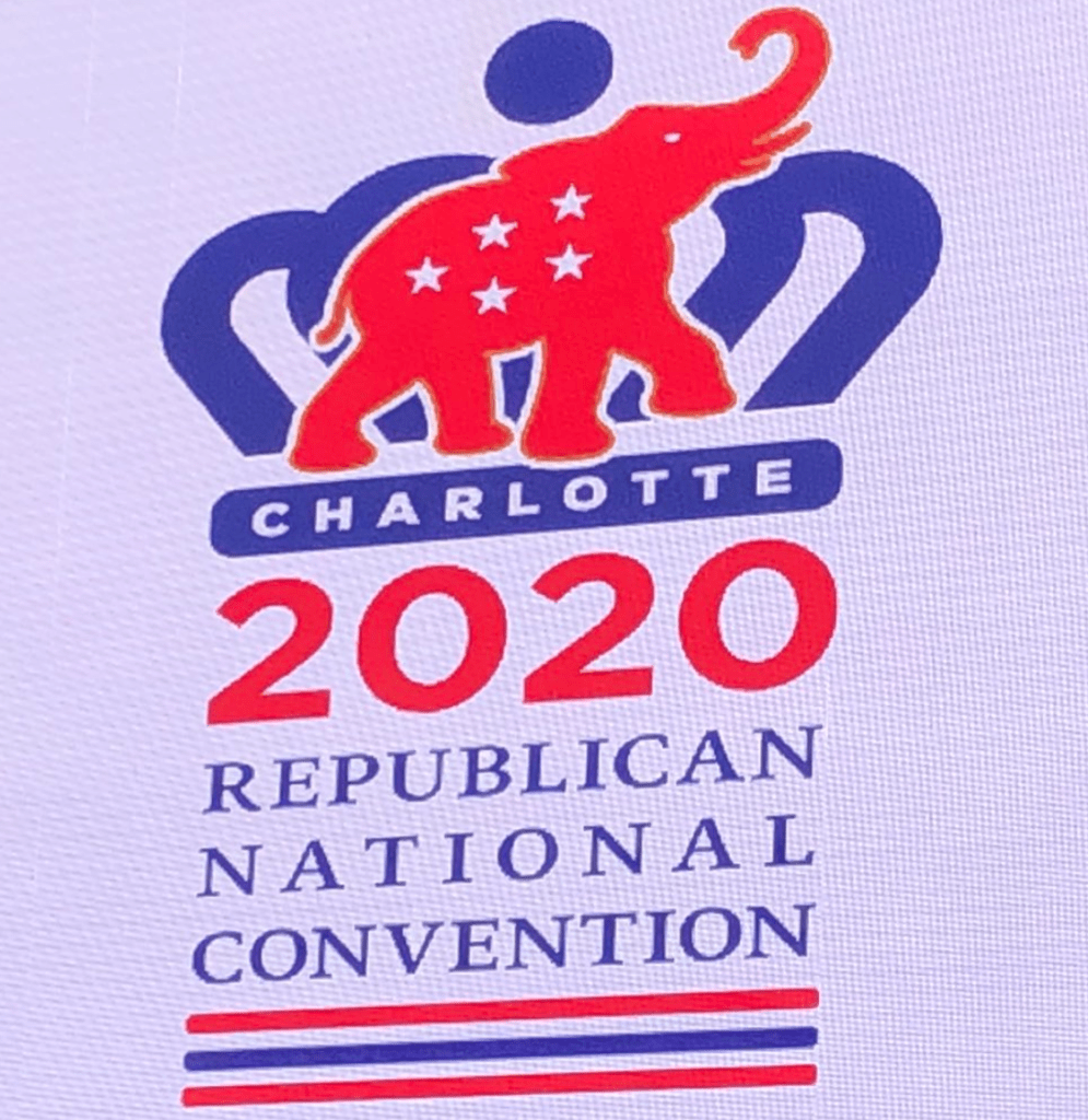
Unveiling the New Logo of the 2020 Republican National Convention, Charlotte, NC, 2019
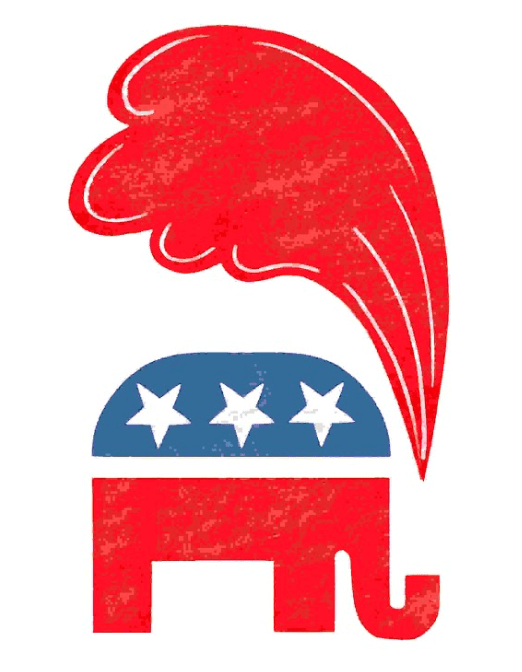
Racial politics held centerstage of sorts in the new partisan icon. The mascot of a bloated elephant of wide torso not only coronated “The Donald” as the candidate of the party’s future but celebrated the purity of the party’s coalescing about the cult of a the other great elephant who was onstage in everyone’s minds. The rebranding was puprosely thin on any history, which it seemed to deflect off its shiny surface, but pregnant extravagant symbolism–predictably over-the-top, over-determined, gold-rimmed, and also, despite including the crown of Charlotte, SC. cheap. It may have also indicated the beginning of an end of cultivating an image of victory amidst mismanagement, self-inflicted crises, and deep social unrest. But it is more: the flat nature of this circus elephant, apparently returned to the ring after sojourning as a symbol of the party, unlike the abstract GOP elephant of just four years ago, seemed historically flat, bulked up and red hued, five stars seemingly blazoned in a W-shaped constellation as if an augur for electoral “victory,” was seemingly unveiled to celebrate its own utter obliviousness to its sense of past.
Perhaps this was a trick of gigantism: for by transforming what was once a circus animal to a monolith of “red states” and uniformity, used to suggest not a “big tent” politics, but, rather, an immobile and inflexible set of positions, values, and national identity, increasingly elided with the fears of allegations of electoral integrity to the need for a rambunctious, beyond normal political practice, and outside of its performance. The new vitality that was given to the elephant as a sleek, emoji-like character was an attempt to be forward-looking, as if incarnating the false “red wave” that only disguised the advantage among votes cast on election day–rather than those that arrived by early voting or absentee ballots.
Did the elephant symbolize the assembly of a new coalition of red states behind the all-but-presumed Republican nominee? The “red mirage,” or a red wave waiting to happen, was not after all a message of rallying an army of patriots to Save America in 2020–the partisan gains of a “red wave” fizzled in 2020 even more than it would again 2022. But the arrival of a bloated elephant seemed design to promote it, and to do so in coded ways. And in the adoption of the emblem of a ‘star-studded elephant’ standing before a navy blue crown was described in 2019 by RNC chairwoman Ronna McDaniel as incarnating in cartoon form the “traditions of the Republican Party” as much as a common sense of purpose that would fill the bill for a call to “Support the Elephant Heard,” one always suspected that it carried with it a sense not only of gigantism but dung. But was the rebranding of the red elephant not just a ground-plan for electoral victory in a future electoral map, that offered naught but a uniform red field, or a mirror of a monumental vision of a groundswell for a red dynamo of partisan strength–but a terrifyingly coded image? The resurrection of this old emblem of partisan unity as rearing on its feet, uniformly red, broadcast an. icon of consensus to the MAGA crowd with dark roots deep in American history.
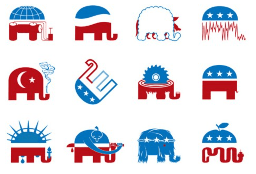
But who could doubt that the distinct smell of copious dung all along? And the recent online sharing of an elephant encoding subtly placed KKK imagery, as if a game of seeing as, on the webpage of the Alabama GOP, may have only helped to unmask the “hidden content” and “hidden figures” for which the new county chair of the Lawrence County GOP apologized–as if without knowledge that the image derived from graphics commission by Mother Jones for an article in which David Corn observed how Trump persisted to foreground a politics of personal grievance to make a case for four, as if gaslighting the nation by evading the mismanagement of the real coronavirus crisis he had cast as a border crisis in new guise, and arguing that they party was appealing to white supremacists–and the currency of the adopted emblem in a GOP event in Arizona to promote a local candidate for law enforcement suggested that the image had traction in the party far beyond copyright infringement or accidental internet searches. Is it possible the graphic of hooded figures peering from conical pointed hoods from between the elephant’s column-like red legs was proudly appropriated as an in-the-know icon by party members?
Woody Harrington, Mother Jones (August, 2020)
The droppings of the upward-rearing circus elephant raising trunk on cue from an unseen circus-master were concealed in the three klansmen figures staring out from the Facebook page of Lawrence County’s Republican Party, but eerily conjured a past that few wanted to advertise. The graphic designed by Woody Harrington, newly adopted to announce the retirement of the former county chair and thank him for his service, suggested that the dung was not only always there all along–the graphic was first from an article that described how white supremacy was taking over the Grand Old Party–but its racist provenance. For as much as deriving from cut and paste–or accidental misuse–the original adoption of the elephant as a partisan icon was steeped in an iconography of steeped in a segregationist past.
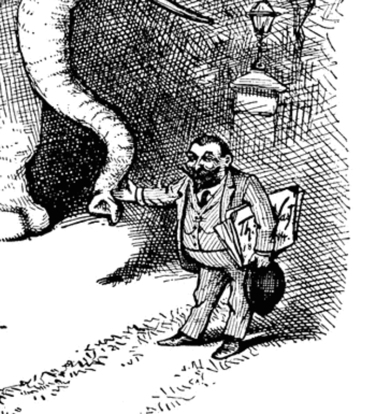
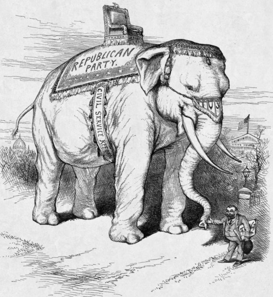
The Facebook post, claimed incoming chair Shanon Terry, who made it, used an image that the incoming party chair claimed derived from a Google search engine, to have no hidden meaning, and to be without malice, in a “deep and sincere apology” such “hidden images that do not represent the views or belief of the Lawrence County Republican party,” responding to calls he resign from his role. But he may well have protested too much. In unveiling of a new red elephant as RNC mascot, the Republican Party elided the racially coded origins of the pachyderm were quite obscured by the red hued elephant rearing its trunk, the introduction of the emblem was an uncanny recuperation of the original radicalized intent of the circus elephant that recalled the racist connotations of circus elephants that were imported from Africa by P.T. Barnum for his circus when it was adopted as a partisan icon in 1884, or as the southern states emerged from Reconstruction without expanding the popular franchise, or inequities of enslavement, over a century ago, even if, as Terry claimed, “I did not properly review a cut and paste image used in that post from an internet search for a ‘GOP elephant.'” Yet as much as an accident, the Thomas Nast cartoon promoting the arrival in Barnum’s circus of an elephant of pure white skin not as “Towering Monarch of his Mighty Race” but akin to the white Burmese elephant that Barnum had purchased to expand his menagerie of African Greys.
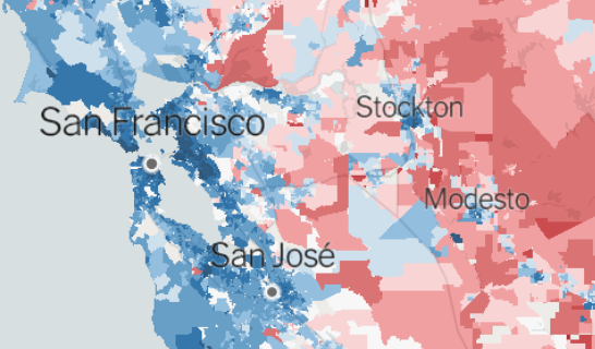
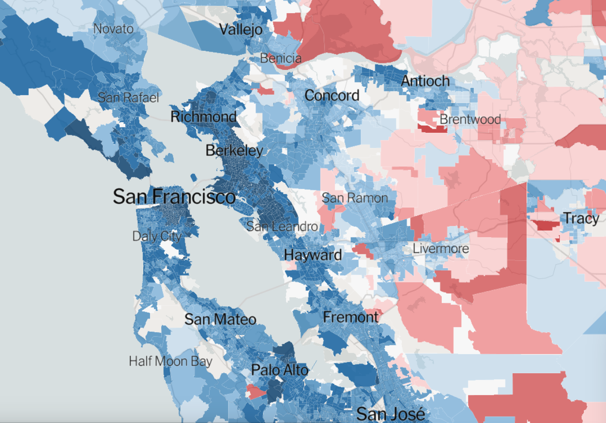
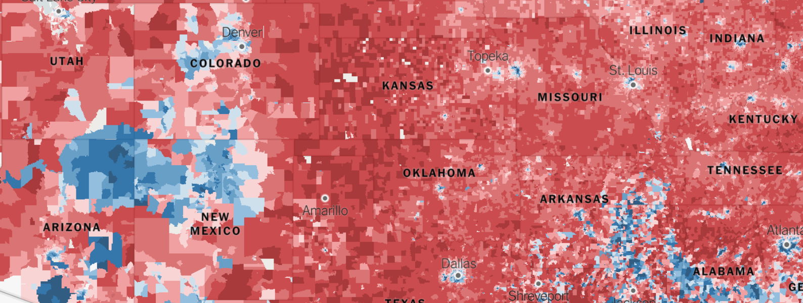
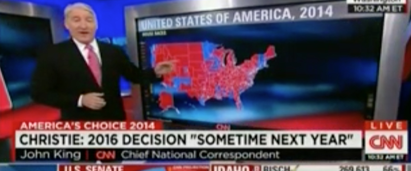
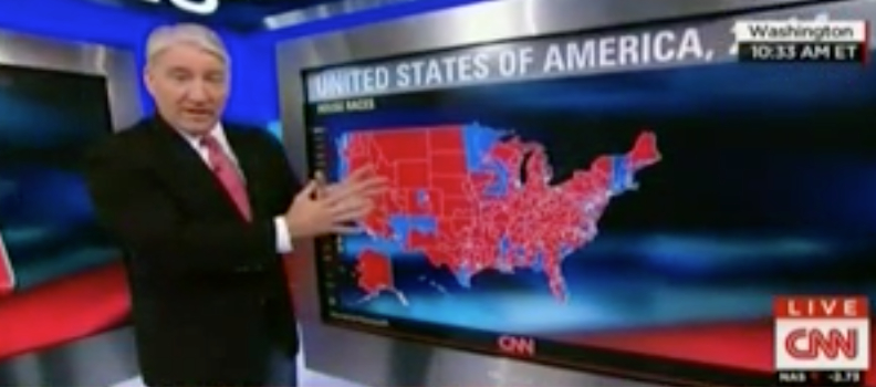
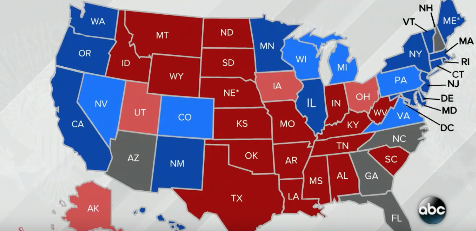
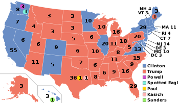
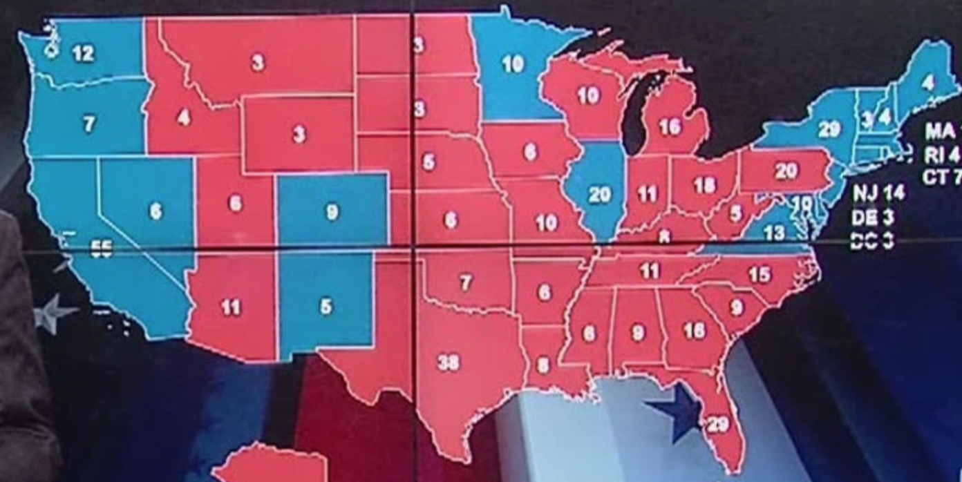
Yet was the importance of the new emblem under-appreciated as a form of branding for 2020? Indeed the revision of the anthropomorphic emblem seems to hearken to the circus elephant that first inspired the logo of the Republican party, transforming a famous cartoon of American history into a partisan icon. The apparent solidity of an electoral “landslide” of 2016 in the sparsely populated “red states” was enlivened by appeal to white supremacy that went unacknowledged: to disguise his far fewer votes, he displayed the electoral map as a victory map, blue regions confined to its coasts and inland seas.
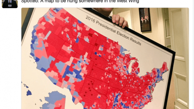
The elephantization of the political party conjured an invisible army of belonging with deep roots in the mumbo jumbo of circus performing–and, indeed, close ties to the popular circus animal, Jumbo, whose size may to some have incarnated the monumental scale of the Republic hopes. If the prestige of the elephant was coopted in England as a “traditional” symbol of divinity in the empire–and India–in the stuffed pachyderm bearing an imperial carriage displayed by the East India Co. of the Crystal Palace, in 1855, in full regalia, in the “Company Room,” just five years before Phineas T. Barnum brought the beast to his menagerie. The new circus elephant, as if to signal that Trump was a new political animal, not in the mold of the Grand Old Party of the past, but a future icon of red hope, seemed to pronounce itself as propelling enough red ink against the map to flood the nation a deep shade of crimson, unlike the more jig-saw like coloration of lighter reds, pinks, sky blues, or powder blues of electoral maps past.
Did Trump not imagine himself not only as a new political beast, whose public performance was able to paint the map red more fully than it had long been seen? The new elephant may have conjured similar aspirations and was a new sort of political symbol for a new candidate–if not a new party, in a variation of an old political icon for new partisan ends.
This was itself a sort of circus trick. It may be no surprise that the origins of the party’s icon of an elephant drew upon the anthropomorphic partisan emblem designed by American cartoonist Thomas Nast, and adapted from the advertisements and publicity that circus impresario and entrepreneur; Barnum was the first circus in America to focus a menagerie on elephants, in the reconstruction era, by tacit references to race and the geographic origins in an American vein: Jumbo, the first Bush Elephant in the circus, captured in Sudan by a game hunter in 1860, left Paris’ Jardin des Plantes for Barnum’s menagerie twenty-six years later, was such a crowd pleaser in New York’s Madison Square Garden in 1882 that two weeks’ ticket sales fully recuperated Barnum’s costs for purchase and transport overseas.

The elephant featured as the centerpiece of the “Greatest Show on Earth” was long tied to showmanship, and claims of grandiosity, inflating the spectacle offered circus-goers by skillful messaging and marketing that the Republican Party’s 2020 convention seemed eager to evoke to its own paying customers. If the nation needed a circus, the elephant seemed to occupy center Barnum displayed the elephant to paying audiences as the “Towering Monarch of his Mighty Race“–openly invoking racial ideals as an attraction–at the centerstage of his traveling menagerie, promoting it as the largest elephant held in captivity became a focus of mass communication. In future years, Jumbo was replaced by “sacred white elephant” of Burma, as a new centerpiece for currying racial fascination that, soon after it was presented as a new attraction in Barnum’s menagerie, become, mutatis mutandi, now the mascot and icon of the Republican party in the pen of the cartoonist Thomas Nast, he of father Christmas fame. From the appearance of the November, 1884 political cartoon used the purity of the white elephant assumed to cast the Republican vote as a group of voters scared by the prospects of a Democratic President of dictatorial pretenses remaining in office.
The progression or symbolic conversion from Barnum the skilled impresario to Nast’s cartoon came full circle in disturbing ways in Trump’s 2020 “coronation” as the Republican candidate for President in a convention that featured no contest of securing a nomination–but was a coronation of a victor, before the election. Barnum’s eager hocking of a hoax–a trickster “hocus pocus” redirecting his audience’s attention to concerns that were latent in the display of the menagerie, of detecting racial difference, were converted into showmanship in the circus he promoted, in ways that might be profitably compared to the disguise of racial anxieties and feelings of persecution or economic compromises within the identification of “hoaxes” that Trump pointed out to the electorate in his candidacy.
As Trump’s career as a real estate promoter eerily paralleled Barnum in his promotion of size, immensity, and over-awing over-the-top gilt grandeur–he was a promoter more than an actual expert in construction, and skilled in transforming his boardroom to a television set before the White House became one as well. His promotion of multiple hoaxes and slogans fed a candidacy as they generated new attention in which he based as a candidate, working with similar television set designers. And it comes as no surprise, in effect, that the introduction of a new symbol for the Republican party, a “red elephant” rearing with five stars featured on his body, seemed to embody the tradition of hoaxes and promotions that the use of the elephant as an icon for the Republican party had long enjoyed, since it was introduced by cartoonist Thomas Nast in the era of Reconstruction. But the white elephant–who Nast introduced in the press as a new symbol of partisan purity in 1884 as proudly possessing dignity unlike the beast fleeing from a gun–invested the President with over-sized jumbo value even as he was overstepping his office; the elephant as a trope recast the corruption-free party as a sacred beast as Barnum billed the latest circus attraction of pure skin color as a “Sacred Elephant” in not subtly racially coded terms–terms on which Thomas Nast seized, clever cartoonist as he was, as a braggadocio illustration of the Republican party’s new purity.
Trump, in adopting Nast’s clever cartoon, seemed more akin to a circus promoter even as the RNC promoted red elephant promoted as a new partisan brand. America was more than ever in recent memory haunted by blackness in the summer of 2020, as racial justice movements exploded across the nation in the wake of George Floyd’s killing and the cancer of the racist Trump Presidency: the RNC was proud of re-introducing the Red Elephant as an icon of redemption in 2020, a new symbol of the reborn party that would revitalize the nation, and, in an evocation of the associations of the elephant and memory, restore national traditions, poised as if newly resurgent over threats to the social body, a gold-limned red elephant, with a as if tattooed with an auspicious constellation of pentagonal stars across its side telegraphing a sign of victory.
Was this the elephant securing borders, defining the new edges of the polity, promoting those who were part of it and trampling no the rights of the undocumented, the underprivileged, and the unemployed?
The bush elephant Jumbo had indeed moved or been trafficked across borders to reach the London Zoo, and, more recently, been outfitted with a cage of its own bespoke design for transoceanic transport to New York, where it was first billed as an attraction of The Greatest Show on Earth: trafficked across the Mediterranean by a network of animal traders, first to the German traveling Menagerie Kreuzberg, Paris’ Jardin des Plantes, and London Zoo had featured “Jumbo” to impress audiences with his enormity, where “mumbo Jumbo” was a true crowd pleaser who delighted children and audiences alike. P.T. Barnum had renamed the elephant he bought for public display from the term of endearment,”Mumbo Jumbo” Londoners used to indicate its African origins, referencing to the masked male west African dancer, in Mandinka “Maamajomboo”, to promote its exoticism as a pagan idol, to foreground its size alone. If Mumbo Jumbo was a fallen idol of the imperial periphery become a popular attraction for London children to exercise imperialist imaginations, however, he felt it less reciprocal, and increasingly succumbed to increasing fits of rage. The showman Barnum did not curry religious hokum, but shortened the name of the elephant to bolster claims of gargantuan size that fit the Greatest Show on Earth; its iconic image gained center stage on promotional posters plastered towns he toured–long before the elephant was adopted as the emblem of the GOP, Barnum strikingly made the elephant into a curiosity of openly racial intent.
The arrival of the “white” albino elephant during the era of American reconstruction after Jumbo’s death, Toung Taloung, was promoted as a gentler and more civilized version of the African Bush, and indeed of a different race, to delight popular circus-going audiences with the notion of an elephant from a different corner of the world by clear analogy to the debates of blood-purity and skin color that were dominating America, as has been argued: the white elephant was not only an exotic beast, but Barnum’s celebration of its “white” constitution could be understood by white circus-goers as a response to the tensions around racial tensions in Reconstruction America. While the introduction of a red elephant as a revised emblem of a partisan icon was by no means referring to race as explicitly as had P.T. Barnum in displaying African or Burmese pachyderms, the partisan icon of a red elephant–invoking the size of the red states in the electoral map, channeled connotations of race for American audiences. Is it a coincidence that the red elephant was trotted out in 2020 as a purified elephant–now entirely red!–to meet the tastes of the Party of Trump? The large size of the elephant seemed capacious enough to contain the many hoaxes that Trump had promoted from before announcing his Presidency, in order to create a political movement rooted in promotion and promoting the sense of rugged stalwart isolation before the dangers of a rigged world.
The introduction of the red elephant as a party emblem boasted the chromic homogeneity of the GOP in ways that almost seemed to revive the long forgotten fascination in elephants as a nativist symbol. If the cartoonist Thomas Nast famously assigned the dignity, probity, and size of the popular central figure of the circus menagerie as an aspiration of how claims to dignity that might allow his party to win the White House once again, Trump consciously chose the beast of a uniformity of color to express aspirations of recreating the red map in the 2020 Presidential election, in selecting it as the new emblem of a party that had grown increasingly identified with his person, casting the new red elephant as a bold statement of partisan aspirations that may have bracketed race–but channeled the deeply racialized character of the white elephant of Reconstruction. While the story of Nast’s invention of the anthropomorphic icon has been often recited, the use of an elephant to incarnated the current capaciousness of a desired electoral victory echoed the rhetoric of securing the presidency by replicating the same margin of victory in red states alone, in the victorious image of a rearing, martial elephant, as if auguring a rise of red states in 2020 as staging a cartographic reconfiguration of the electoral map.
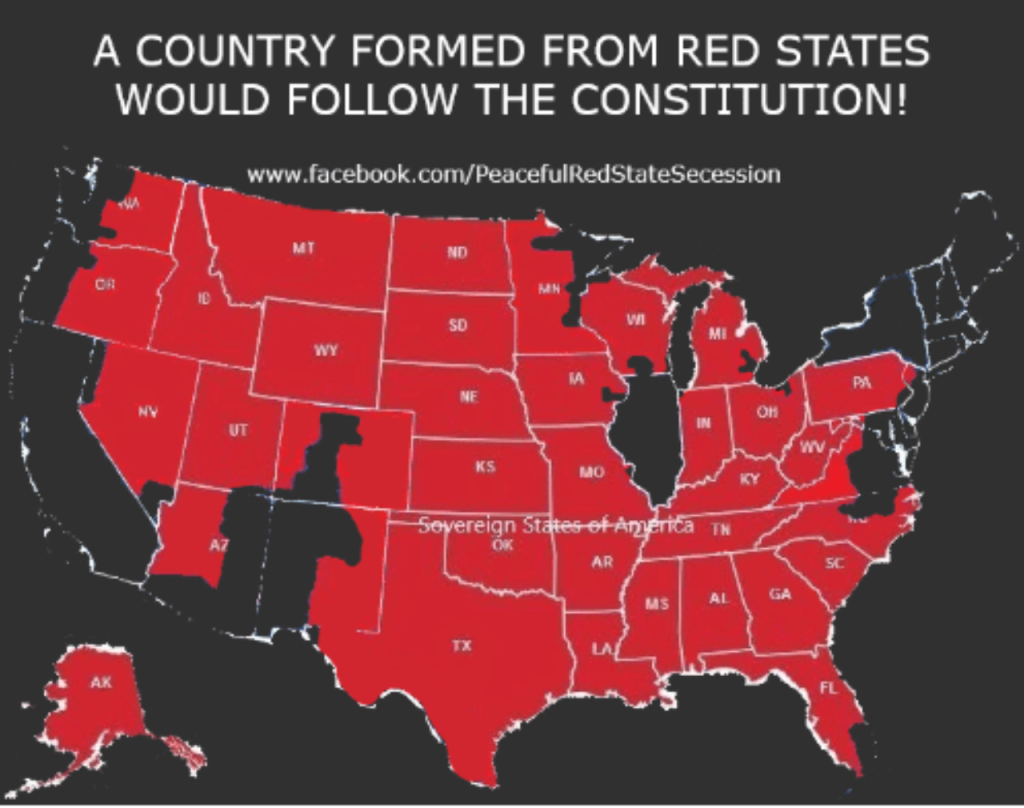
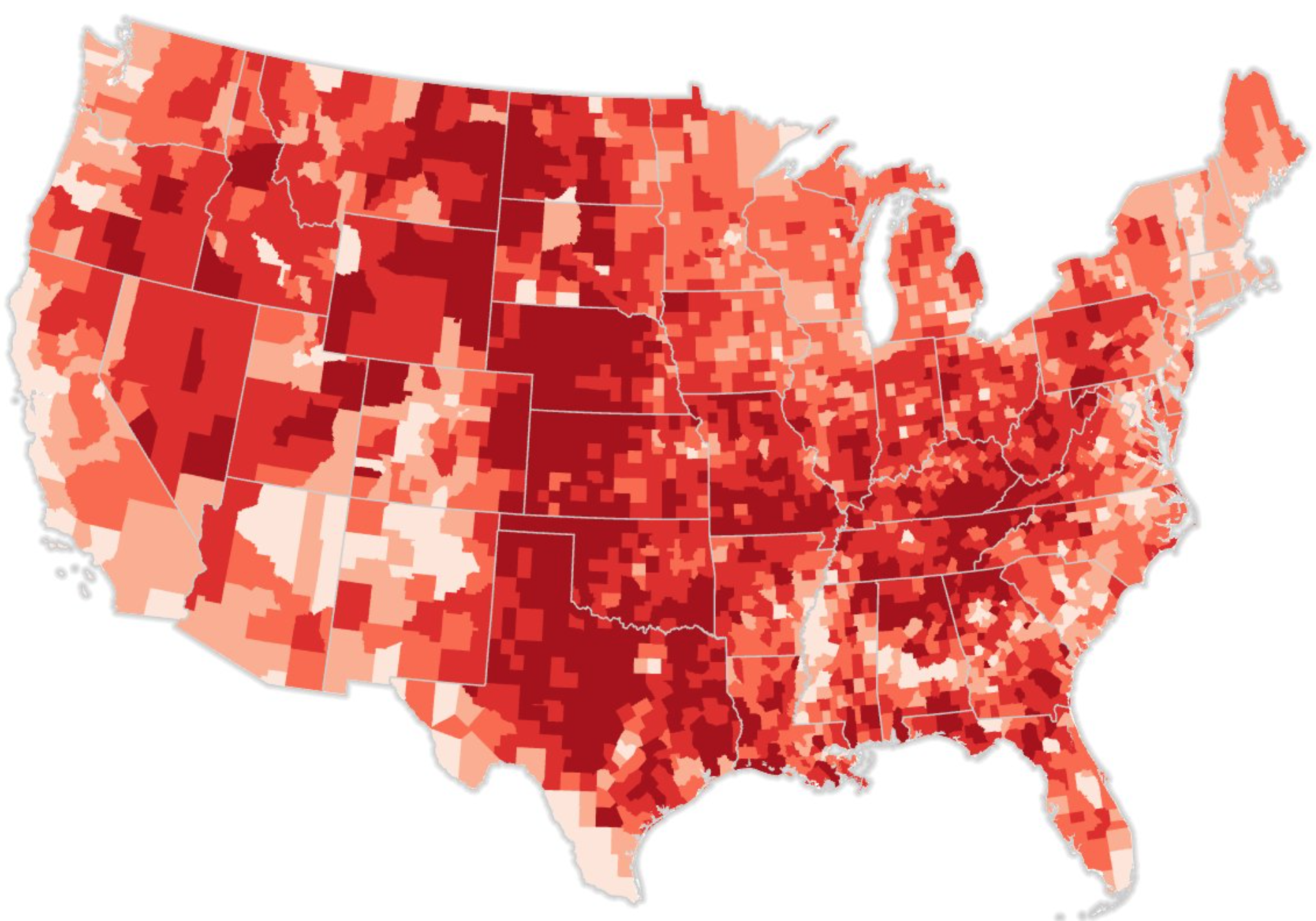
The elephant was an emblem of the go-it-alone spirit of the party, repurposing the animal affirm the capaciousness of a secessionist nation that echoed a Manichaean gloss of “sovereignty” RedStateSecession.org had extended across all of North America by 2019. The image of a “peaceful red state secession” was by no means mainstream in the political party, or a part of its platform, that no platform was ever devised for Trump’s renomination courted the broad worries of the dilution of a white majority nation filled with “illegal aliens” and foreigners Republicans had often mapped onto blue states–and echoed the strength that a “country formed from red states” might provide, in substitution for the internationalist commitments of a non-white majority nation that the actual United States held–promising the rebirth of a “country formed from Red States” alone, in a 2018 Facebook meme might generate a form of national renewal adhering to the U.S. Constitution. The pseudo-map, which circulated on social media and the internet, rather than in printed form, was itself a hoax–to use the terms Barnum claimed–using the smoke and mirrors of data visualization to crop the counties of an electoral map as if they would provide the new borders of a “new country formed from Red States” as if it was more faithful to the spirit of America–while leaving little question in the mind of viewers that the verb “follow” meant adhering to the politics of national renewal that were tied to a closure of national borders, embrace of white-majority culture, and refusal of “socialist” health care.
The pseudo-map existed only as a derivative copied form of the distribution of Republican voters in recent elections, but it was powerful and strong as an image of common like-minded ideological preferences and political cultures, a sort of resegregation of the nation that might reveal the enlargement of the old south, not suggesting only white-majority areas, but areas where conservative voters had won since 2018. While the bizarre image of the “Sovereign States of America” took the logic of rewriting sovereignty of clear borders to an extreme, in its explicit adoption of an electoral map, omitting Broward and Miami-Dade counties in Florida, omitting much of the Northeast, Illinois–home of Barack Obama–and Southern Wisconsin, as well as California and most all of Arizona, the monochrome icon seemed to willfully dispense with California, New York, and Washington out of hand, with a vitriol that only grew in the year of social justice movements of 2020.
The emblem of the big red elephant referenced a notion of a nation created from a congeries of conservative-dominant counties, disdaining “blue states” as compromises not worthy of inclusion, lest they sacrificed ideals of America’s purity in light of the danger of immigration by creating new borders for the nation as a nation. The elevation of the monochrome pachyderm became a floating signifier of the ideals of red purity on which the party would base itself in a new image of sovereignty, often asserting economic independence by the addition of oil- and gas-rich provinces within a “Sovereign States of America” of the like-minded social media bubbles, echoed in the attacks directed to “globalists” on Canada-based alt right networks like Rebel Media, that proposed a repurposing of nation as a concept and conceit, and would be mapped onto the new sacred collectivity of a purely red beast that threw earlier Republican’s red, white, and blue elephants out as relics of RINO’s–those “Republican in Name Only,” and to map a scrappy new collectivity which hewed to one geopolitical agenda and moral script. Did the “fantasy map” not only push the logic of extreme federalism to its ends, but in juxtapose the “Sovereign States of America” with a far-fetched notion of energy independence, dismissing the allegedly “internationalist” regions of the US-Mexico border, the northeast, and Pacific rim as an internationalist “Bluetopia”–by remapping the Keystone XL and other crude pipelines as in line with American economic interests located entirely on sovereign soil.

To be clear, the map was a bit of a “hoax,” or the logic of the hoax–a term deriving from “hocus pocus,” the claim of a magician or juggler, and itself the sham-Latin perversion of the sacramental claim that the host present the body of Jesus Christ–an etymological origin for “hoax” that was oddly appropriate to the re-presentation of the nation as another beast, and the rewriting of sovereign allegiance to an underlying fabric of America in red states alone, a blood and soil doctrine that mapped energy extraction to allegiance to the political party representing the nation.
The red elephant rising echoed the glee of remapping of national sovereignty as if sovereignty were lines of affect–ties to the true interest of the nation, evident in the preservation of racial hierarchies, preserved, in the circus, by the in If Trumpism depended on a new “red nation,” RedStateSecession.org materialized a cartographic rewriting of the nation and national sovereignty, often privileging energy independence and clear borders, and imposing those borders on a map, but affirming the elephant as an image of its capacious quality–adding the petroleum reserves of Alaska and shale deposits across Saskatchewan, Alberta, and Manitoba as if to make up for the absence of the wealth of California, the northwest, and the northeast from a “sovereign” map that would end culture wars. Revising the “Jesusland” map of 2004 to include shale deposits in the north integrated a network of petroleum pipelines from like-minded “red states” north of the border, imagining a “United States of America” of radically redrawn borders embracing Calgary, Regina, Edmonton and Saskatoon as its own endless reserve of energy and national wealth–a new fantasy of national “belonging” that denied the actually lopsided nature of the America’s population and wealth.
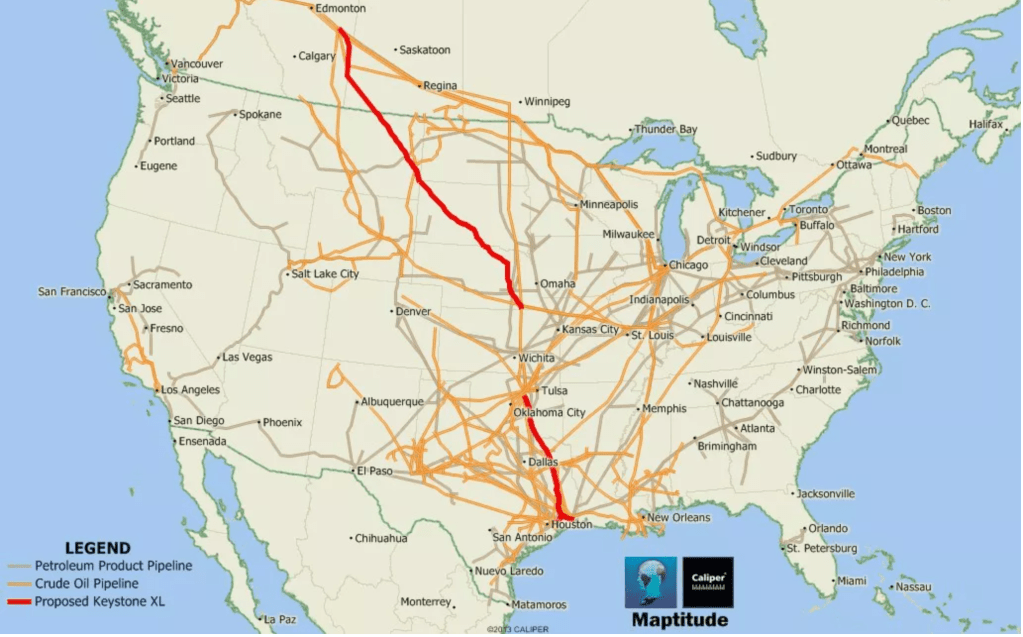
The fear of globalism was a steeped in internationalist rhetoric of “open borders,” disguising a disdain for national culture and America First, in its promotion of open borders, was deemed a dismantling of the nation as we know it. The map of “red America” was a rewriting of NAFTA, and a rewriting of the secessionist Civil War, imagining the Mason-Dixon line elevated to embrace all Pennsylvania, imagining the survey that defined the border disputes between Maryland, West Virginia and Delaware as a basis to expand the division between two “United States,” one blue and one red, a spectacle of sorts that engaged observers in the image of a remapped red United States, as if imagining the old northern border of the confederacy to be hiked to include the swing state of Pennsylvania, even above the “West Line” Charles Mason surveyed between Pennsylvania and Maryland in 1768, to create a mythic country of 2020 that expanded upon Trump’s surprising 2016 electoral victory, as if re-imagining the boundary line that became a division of slave states and free states as a division between Americans and internationalists. Indeed the determination of the new “boundary” able to preserve American integrity was cast as natural, but included the area along which the Keystone XL was planned to transport crude and Canadian shale reserves as well within the United States of America–arriving at an economic integrity that the Confederate States of America had lacked.
Such a realization of economic imperatives transcended the use of lines of latitude as a dividing line; the inclusion of the land where the Keystone ran within the “new nation” gave it an integrity often lacking in the division of the nation by political affiliations or voting patterns–

–but sought to prevent the fluid Geography_of_Gilead, in which “where the edges are we aren’t sure . . . they vary, according to the attacks and counter-attacks,” but try to preserve an image of American integrity as if it were “natural,” by incorporating the petroleum pipelines and the shale reserves from which they carry crude sludge to realize the adoption in the 2016 Republican Party platform of promoting the Keystone XL within a vision of “North American energy independence” as if the Bluetopian environmentalists of the previous Democratic administration had strayed from such ideals. The map realized an actual division that seemed economically viable, if it would indeed “Support #CALEXIT!” as the “Tale of Two Countries” meme suggested.
If the electoral map has become. a spectacle of repeated glossing, fetishizing, and analysis since 2008, often wrestling with an imagined discrepancy between the appearance of greater sovereign acreage of a party with fewer votes, essentializing “redness” lay in the eye of the observer, and the old partisan mascot served to embody the identity of a party that trumped reality, as if the continuity of red counties might gain sovereign status of its own.

There was something almost Barnum-esque, as much as Alt Right, in the prominence with which Trump raised th hoax of globalism to expose as a conspiracy of “globalist elites” as a threat to the nation in almost existential terms. P. T. Barnum had hewed the cultivation of hoaxes as a means to attract his audiences in the first age of mass-printing, viewing the “hoax” Barnum viewed as a part of the spectacle and business plan for the circus that he pioneered: from the display of mermaids to human freaks, Barnum promoted illusions to attract the complicity of spectators in “hoaxes” in ways surprisingly akin to the centrality of “hoaxes” as hooks able to attract and to consolidate support for Trump’s Presidency and presidential campaign. If some hoaxes served to distract attention of collusion of the Trump campaign and Russian government, Trump had long reserved ire for the allegedly internationalist “hoax” of global warming and climate change he had disdained revealed in 2015, before announcing his candidacy, through casting the coronavirus pandemic as “their new hoax” in the final year of his Presidency, from February to March of 2020, adopting the term “hoax news” later dropped to the damning “fake news” to suggest the extent of an information society that was rigged.
Trump’s labeling of “hoaxes” is not only an echo of QANON, but used the identification of hoaxes engaged in a “plot the destruction of U.S. sovereignty” to attracted many supporters by seeing economic integration, internationalism, much as Barnum promoted hoaxes (if he didn’t call them that in announcements) as a way to attract audiences. For Trump, hoaxes served to stoke popular anger by unmasking how his opponents disrespected the nation’s integrity: Trump attacked “global warming hoaxsters” of scheming to raise higher taxes in January 2014, and labeling a “hoax provided a powerful way to rally his base before a new sense of the nation, freed from the allegedly pernicious logic of “open borders,” globalist elites, digital media and internationalism–the very same specters he decried on January 6, 2021.
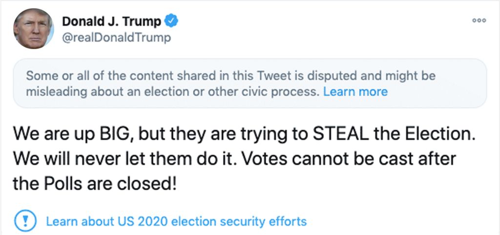
If “hoax” was not at first among the preferred words of rage to use in his social media accounts, it grew as a way of voicing collective rage. A text analysis of Trump’s tweets charts how he grew aligned with political discourse as a way to vent his anger and direct the rage of his constituents, as his use of social media morphed from personal attacks promoting the bogus “birther” theory about Barack Obama’s birthplace–a primal hoax–to the calling out of hoaxes more quickly than they might be mapped, processed, or charted, as he alternated schoolyard insults to channel a paranoid persecution of describing hoaxes with greater traction as he ridiculed investigation into the Russian ties of his campaign and cabinet. The twittersphere encouraged Trump to act as a border guard, identifying “hoaxes” with illusory clarity on a medium that encouraged the retweeting falsehoods; as Trump attacked Fake News, his public statements included an increased number of falsehoods, according to Factba.se’s tracing, rising with his social media presence, calling out hoaxes became a broader truth game that extending to questioning the accuracy of voting machines of the 2020 Presidential election, allegedly both owned and operated from overseas. And as claims of a stolen election seem set to be relaunched in debates about voting integrity, the fierce urgency of identifying a hoax may loose momentum as they are increasingly evidently about race. The candidates’s visibly vertiginous delight in discerning of globalist hoaxes only came back to bite him only as he persisted casting the spread of COVID-19 not as a pandemic, but just another liberal hoax–stretching credibility in the face of cognitive dissonance of rising mortality rates of coronavirus and Trump claiming people’s surprise . . .
Claims of hoaxes–or fake news–had mutated into claims that the candidate alone understood or got global politics. The red elephant introduced in the 2020 Convention afforded a new image of the nation that was the inverse of the hoax. It was a statement of the credulity of the party and the party line, as well as an identity for partisan unity–channeling a mental imaginary rooted not in continuity or federalism, but a uniformity of consensus in Trump’s own words. Trump’s attachment to “hoaxes” as compelling fighting words defined much of his presidency, as much as his social media presence. But the identification of hoaxes as objects of scorn, and insults to the nation, found a counterpart in the newly triumphant icon of decorous anger Ronna McDaniel unveiled in 2019, in hopes to consolidate or conjure a new alliance of red states to promote the Republican hopes for victory in 2020.
One could detect a sense of the circus when political strategist Ronna McDaniel took it on herself to channel Vanna White and middle America, revealing a reinvigorated elephant as a new logo for the Grand Old Party for 2020, her flowing red dress underscoring to the new monochrome of icon. Having been named to lead the RNC by Donald Trump after she had served as a delegate from Michigan who supported Trump in 2016, as the vacancy opened, with Rience Priebus becoming Chief of Staff, with the only precondition dropping her maiden name to erase any hint she had supported her uncle Mitt Romney’s 2012 campaign, McDaniel was elevated to be the chair of the Party, ensured that she could be counted on for her allegiance to Trump’s agenda and to promote his brand–demonstrating allegiance by imitating Trumps’s own warnings of voter fraud before the 2020 election and warning widespread fraud had led to the electoral loss of the man she trumpeted as as a “moral leader” while using her zealous defense of Trump as a cover to steer RNC funds to companies run by family members or as a quid pro quo for donations.
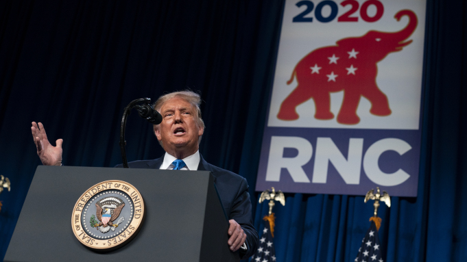
(AP Photo/Evan Vucci)
Could not one say that the use of the red elephant by Trump, a man widely known to delight in manipulating details of his public image, and indeed his brand, channeled P.T. Barnum in re-presenting the red elephant as a party emblem to the 2020 Republican Convention in Charlotte, NC? The elephant that was displayed in the political convention that was located proudly in a southern state without explanation by RNC Chairwoman Ronna McDaniel in 2019, as an icon of partisan purity by 2020. Was the red elephant not a recuperation of the spectacle of the elephant as a refraction of America’s still fraught racial politics? Barnum was a master of public relations, and used the magnificence of the elephant as a centerpiece for his show, and an elephant seemed to incarnate hopes for an augur of victory in the next Presidential election, in the memes and media circus of unveiling of an icon of partisan identity. The symbol of the 2020 Republican Convention was unveiled to bridge novelty and tradition within the Republican party, but invoked performative rituals of circus-going as a spectacle about race, whiteness, privilege, and spectatorship–as much as a new mascot. Its political symbolism might be placed in a volume of Circus Studies or political symbolism, a regal pachyderm that recalled the Monarch of Illusions by invoking the partisan remapping of American politics as a swath of red states. The energetic red elephant proposed as a new symbol of partisan identity seemed an attempt to reenergize the party headed and embodied by the circus-master Donald J. Trump.
Was not Barnum, a showman who had perfected the arts of mass communication in the Gilded Age, gliding from popular entertainments to mass spectacles with unprecedented ease, able to transform the circus into an economic machine and public spectacle in ways eerily akin to how Trump has changed the political process of the United States? As much as changing Free Speech, Trump has exploited anxieties by offering what audiences “wanted to see” in a new regime of politics and political performance, continuing a Barnum tradition of combining minstrelsy, freak shows, entertainers, collections of menageries, and clowns in a “big tent” of the profitable economy of the circus show. Barnum was not only an orchestrater who expanded the circus as an institution of modern life and mass culture, converting spectacles into profits by promising to transport audiences into the fantastic, but was a promoter who insistently promised “good faith” to his audiences even as this strained credibility.
Barnum was the great American creator of ‘hoaxes’ central to capturing public attention and framing public opinion. Although the “Sacred Elephant” he later displayed to extend anxieties of the determination of racial difference to the animal kingdom was not white, promotion of the elephant that was appropriated by Thomas Nast as an icon of the Republican party prominently triggered fears of the identity of racial characteristics by universalizing them to the ostensibly pleasurable arena of the circus. Hoaxes were there from the very start of Barnum’s career as a promoter of the fantastic and curious wonder for audience’s pleasure: Barnum’s career began with his purchase of a slave he exhibited as George Washington’s own Mammy–a figure able to cross racial lines, peddling racial stereotypes in a spectacle of servility. Barnum promoted the woman, Joice Heth, as a sideshow curiosity, importing the plantation economy into vaudeville, as the allegedly hundred and sixty one year old Mammy of the first president entertained white audiences with barely credible stories of how she had nursed George Washington, that promoted the social dynamic of a plantation as the American narrative, as he deployed race and racial anxieties in a human museum, in the American Museum in downtown New York from 1842: as improbably as the White Elephant he imported from Burma gained crowds as an alleged education on racial difference, Barnum began from exploiting desires, fears and boundaries of normalcy; mass advertising in printed flyers attracted audiences’ interest to freak shows, promising “prices reduced to suit all classes” and boasting of his own populism, offering audiences primarily “instruction and happiness” while pursuing financial gain. The show begged complicity with the master-showman–Barnum boasted at combining “smoke and mirrors” with “a little ‘clap-trap’ occasionally, in the way of transparencies, flags, exaggerated pictures, and puffing advertisements” in “the wildness of wonderfully instructive and amusing realities,” that set their own criteria of truthfulness.
Was prominent billing of a long-lived manny as a “natural and national curiosity” a template for inviting audiences to witness the contrast the “sacred” elephant to darker African elephants, shipped to America at Barnum’s expense?
P.T. Barnum had arrived at the use of the elephant as a focus on entertainment and moral instruction followed how his American Museum suggested a welcome traffic with and blurring of knowledge and science in the name of compelling illusions and pleasure. And after the Museum burned down in 1865, rather than being the end of his career, he promoted “P.T. Barnum’s Traveling Museum, Menagerie, Caravan, and Circus” as a road show, publicizing its contents for audiences across the nation. He returned to New York by 1877, promising to cater to all audiences’ pleasures by featuring the new addition of “$500,000 worth of Foreign Features” with assurance of “prices reduced to suit all classes,” emphasizing his egalitarianism. If Barnum boasted “the largest, finest, and best menagerie and circus in the world” he cast himself not as a promoter but as acting “to my countrymen and countrywomen as a minister of instruction and happiness, while pursuing my primary purpose of making money.” The arrival of a Bush Elephant purchased in 1882 from London Zoo as the central exhibit in the menagerie displayed in Madison Square Garden, promoted widely as “the largest elephant in captivity,” whose prominent billing and attracted such massive crowds to recoup costs of transport and purchase in just four days; Jumbo’s later 1885 death in a train accident led the elephant to be replaced him with the commanding attraction of a Burmese albino elephant, shipped to New York, to replace the bush elephant’s center stage in his menagerie. Barnum long exploited print advertising, and promoted the “sacred” Burmese, Toung Taloung, imported from the Near East, as a “white elephant” whose different stock than elephants of African origin was morally instructive, Barnum, as if its white skin denoted a different race, courting popular fascination with miscegenation and shades of skin color in Reconstruction America.
The hoax, as so often in recent years, was part of the point. Even if the display of the white elephant was more about race than exoticism, the shift from the size of the elephant Barnum promoted fit the times of Reconstruction, but tapped into the display of race and racial difference within Barnum’s promotion of a carefully curated image of Americana. Barnum featured exploitation of race in his showmanship in 1835 by exhibiting former slave Joice Heth to paying audiences, as the mammy of George Washington as a national curiosity in New York’s Niblo’s Garden. The hoax who delighted audiences by promising stories of raising “little George” for the Washington family, Barnum adeptly exploited the place of enslavement held in the national fabric of America led directly to his subsequent exploitation of an elephant in the racial politics of reconstruction America by 1884, when he had promoted the purity and probity of an albino “white elephant” before it arrived in New York by ship from London as an animal possessing greater distinct characteristics from the African Grey he had featured in his menagerie and traveling show–a probity featured as Nast used the pachyderm as an anthropomorphic icon of the Republican party that very year.

Who else but a zealot and convert to the cause of a candidate obsessed with political promotion and image would realize the critical importance of rebranding of the party in anticipation for the 2020 election, to take time to promote and announce the roll-out of a new political iconography of the elephant–a red elephant–with purity of purpose? While Trump’s commitment to steer the party to victory in 2018 midterms had failed to translate unprecedented advantages in fundraising McDaniel had ensured to a margin of victory, the largest elephant in the room of animating the electorate for the Presidential election.
Was it at all surprising Trump felt the party needed rebranding? The elephant would be a potent signifier of the purity of red states to those who wanted it, inviting images of a domestication of wildness, a channeling of white anger, and a sense of bucking tradition and loosening of decorum, all rolled into a rearing beast.
The redesigned “red elephant” was perhaps a white elephant of political iconography, but a new regime of truth for the political party. For in abandoning the red, white and blue to promote a uniformity of purpose and single mindedness that echoed the “sacred elephant” cartoonist Thomas Nast had adopted to represent the Republican party’s nobility by anthropomorphizing Barnum’s new exotic addition to his famed menagerie–a “white elephant,” nobler and more kind and docile than its African cousin–in ways that would consciously play to the consciousness of race among circus-goers in post-Reconstruction America. Was the new red elephant, distinctive in its chromatic design, a color that might not only signal rage, or anger at the declining moral standards and protection of liberties, but a conformity around an image, in ways that Trump, a master of the image, must have found appealing as a new branding of the political party under his own imprint?

While the elephant was long red, white, and blue, the new monochrome elephant projected an imaginary of a unified party, no doubt composed of “red” states, purified and poised to advance into the 2020 Presidential election as a united front, long before the social justice protests of 2020 that reacted in shock to George Floyd’s brutal murder by white police, head forced to the ground in Minneapolis by local police before a crowd of onlookers, and the social reckoning these protests bought by the convention itself. Having spent party funds on covering all legal fees related to defending the sitting President from charges of Russian interference in the 2016 Presidential campaign, McDaniel seemed to seek to make a fresh start for Trump’s campaign for reelection, adopting a logo of chromatic conformity for a campaign that would not adopt or issue a party platform, but that revolved around the new leader of the party.
How the party would map onto the country was a question that was on the front plate of many separatist groups by the summer of 2019, when the question of how a non-nation rightly secedes to create a ‘country’ prompted many cartographic fantasies rooted in the appeal that “nation” was an ethno-linguistic group of common customs, and the alleged principle that all states have the right to secede from the union: “red states” did not really follow state lines, but could be carved from electoral districts and drawn by software in a loopy map of alleged unity, not without appeal to many white supremacist ideals, avoiding most coastal regions, and larger cities outside Texas and Georgia. While this internet map originated from a political fringe, the fantasy of a monochrome elephant foretold a red coalition’s coming victory, as in inviting readers to contemplate the legal justification that might exist for eastern Texas, western Louisiana, or the western panhandle of Florida to secede from the nation.
Redesigning the very republic as if in DIY drawing of electoral districts, in an inelegant from of gerrymandering that dropped sections of Florida, Wisconsin, Michigan, Ohio, Arizona, Colorado and Virginia and a strip of Nevada that echo the demand to “do your own research” to recognize your allies. The oppositional politics of the map of almost Manichean design was best met by a uniformly red elephant as its emblem. Perhaps the deep fantasy of cartographic excision was less based on the secession of the Civil War, than the Looney Tunes logic of separating Florida from the United States to the Atlantic with a saw in 1949, with the cry “that does it–South America, take it away!” to redraw the nation in the Red State Secession by cutting Broward, Palm Beach, and Miami-Dade counties from the Union, in a hardly convincing map of states that “follow the Constitution”–derived from electoral maps. The almost comic cohesion of a red elephant might enjoy suggests a regime of stagecraft and suggestion, that openly showed little but gestured to a rich history of political iconography far deeper than its crude cartography suggests.

The fantasy of the monochrome elephant might be sufficient to accommodate all local interests in a buoyant beast of even larger girth was hardly new. The image of a monochrome elephant s party logo began with the introduction of the animal by Republican cartoonist Thomas Nast, who took the image of an albino elephant–the first “white elephant” of allegedly greater purity than its African cousin–at the height of reconstruction to appeal to Republican’s adherence to greater dignity in their own party’s principled platform of reform. By the time that the convention to anoint Donald J. Trump as nominee for a party without a platform got underway, as if to tell us we had been watching dangerous performances all summer long in social justice protests spread across America, the remodeled red elephant that hearkened back to Thomas Nast’s pioneering use of the bull elephant to champion the vigor and capaciousness of a party to which he belonged as an image of the nation and the purity of its leadership. The recuperation of what Nast saw as an image of nobility and purity of purpose in Barnum’s new addition to the traveling menagerie boasting moral instruction was also in ways a return of the repressed, tapping into the racial anxieties that were projected onto the African elephant as an emblem of the domestication of the savage beast.
For elimination of all tricolor in the new brand of the President’s party recycled the very racial insensitivity and unsavoriness that the exhibition of circus elephants had long signaled. When circus entrepreneur P.T. Barnum extolled the purity of the exhibited albino “white” elephant he purchased to introduce to American audiences as a nobler alternative to African Greys, he desired to please circus-going audiences in Reconstruction America. Unlike the darker “cousin” Jumbo, who after being captured in Abyssinia in 1861, was sold by animal traders to the Jardin des Plantes as the largest elephant in captivity, and who Barnum had brought to America by boat from London as a centerpiece for his traveling show, Barnum promoted the albino elephant as a gentler, nobler, and more docile breed. The creature, described as of different cast and moral status than other elephants who had toured the nation, became a media sensation whose claims to purity Nast had channeled. While the cartoonist hoped to communicate the new moral character of the Republican party, in the very costume Barnum outfitted and exhibited the Burmese beast, the racial anxieties he tapped were eerily akin to those Trump stoked at the 2020 Convention. Barnum had promoted a beast not captured from Africa, but from Burma’s court, where it was regularly serenaded and invested with sacred character, suggested the subject removed from “blackness” and slavery, a different stock and perhaps race of elephant, in ways that the audiences of Barnum’s circus could not fail to appreciate and discern. Was the watered-down eugenics of Barnum’s beast not implicit in the “white elephant” by which Nast embodied his own political party?
The vaunted new red elephant was a new embodiment of the party, but mapped it onto red states. The new logo keyed into a color line, in ways that may hint at the future meaning of the semiotic weight of the party logo for generations who may only know the political animal and not the living beast. To be sure, whatever future semantic properties of the pachyderm as a symbol of political party were raised in 2010–as the animal’s significance seemed remote from then-current political debates–
–found an unexpected response as the Party of Trump reclaimed the elephant in ways that reclaimed its spectacularity in a circus, as the jumbotron in Charlotte, NC, unveiled the spectacle of the pachyderm, devoting far more attention as the party leaders who planed the meeting wanted to discuss the “new logo” combining the iconic elephant and the city’s crown, describing the city they claimed to be far more concerned with business and development of the city. The logo’s unveiling followed President Trump’s disgraceful call for members of the U.S. Congress to “go back to the countries from which they came” in a city viewed as “business-first, not politics-first,” calling the first order of the day being “the unveiling”–a term often associated with commemoration than politics.
The Republican Party unveiled a sleek lines of a new red elephant in preparation for the 2020 Republican Convention recuperated the performative origins of the once-sturdy quadruped as it appeared on the jumbotron, whose very size communicated how much air the presence of Donald J. Trump had sucked out of Charlotte’s Convention Center.
What the party billed as a rejuvenation of the vitality of the old elephant staged a rebirth of the party at a time when its ties to the nation had been increasingly tenuous, and seemed to mask the deep fragmentation that the politics of divisive opposition had been stoked by the shock jock tactics of a President over his first term.
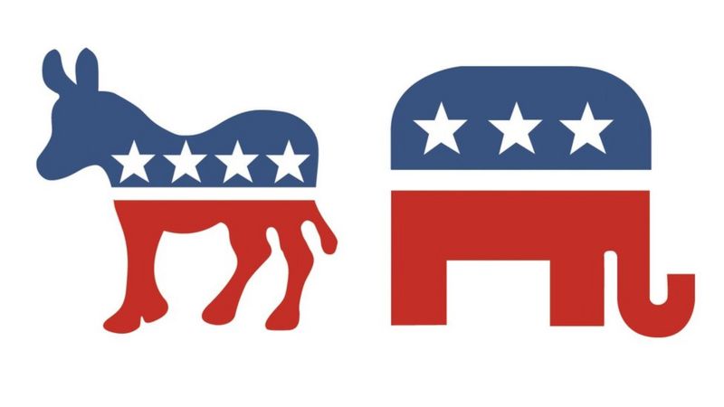
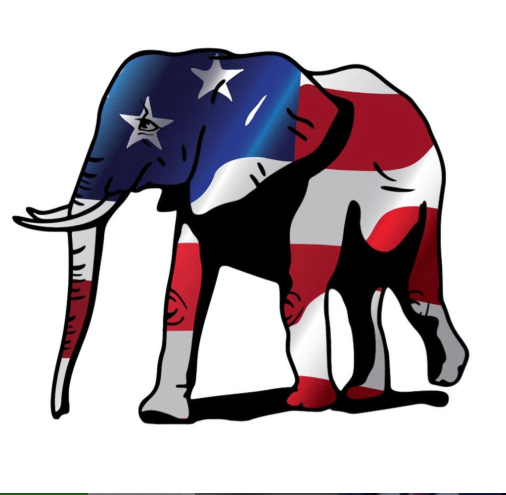
The GOP elephant had by the 1970s and 1980s retained its stability in abstract form, but seemed an unassailable image of the party’s security, its sleek form a clear contrast to the far more fluid, and perhaps mutable, Democratic donkey–and, when the streamlined icon emerged int he late 1970s, to assert its modernity.
The new “red elephant” was not only a logo to be used at the 2020 Republican Convention, but a branding of the party that had arisen on social media, akin to the new emblems of patriotic devotion that were first engraved by the U.S. Mint on national currency to offer evidence of the piety of the after the Civil War, when Secretary of the Treasury Salmon P. Chase received letters from ministers beseeching him to include adequate “ recognition of the Almighty God in some form on our coins,” and imploring him “What if our Republic were not shattered beyond reconstruction? Would not the antiquaries of succeeding centuries rightly reason from our past that we were a heathen nation?,” leading Chase to impress upon the Director of the Philadelphia Mint the need of a device able to depict “the trust of our people in God . . . on our national coins” by a device and motto proclaiming national recognization of God, reasoning that it was evident that “no nation can be strong except in the strength of God, or safe except in His defense.” Facebook groups Red Elephant media launched March 5, 2017 or The Red Elephant–a FB group and twitter handle, @redelephantt–founded April 9, 2018–suggested the new hue of the populist party of Donald J. Trump , an aggregator and amplifier of tweets by folks like Rep. Jim Jordan, Rep. Matt Gaetz, Gov. Ron De Santis and Marjorie Taylor Greene, a new republican Party that issued the post-inaugural proclamation to be back in other form.
Donald Trump’s party may not have known how sharp his focus on Law & Order would be in 2019. But the focus on a red-state party, which commanded consensus as much as presented a platform, used the traditional party logo as an “proud and strong symbol” of–pardon the pun–a deeply truncated party, which might have been indeed a stuffed beast, eviscerated of any vital principles, and more of a symbolic avatar of fealty to a new ideal type of red states. The Republican elephant of 2020 unveiled in Charlotte, North Carolina, attempted to invest strengthened unity for a party that had changed its identity, in ways that threatened its resilience. The proverbial four blind men who came to describe an elephant might not detect the chromatic shift, but the seismic shift in partisan identity was huge in a party whose sense of identity was being strong-armed by the sitting President. The prime political parties of American politics were defined since the late nineteenth century were symbolized by animals in ways that reveal the dominance of the popular press and editorial cartooning of Harpers magazine, where cartoonist Thomas Nast elevated the elephant to a symbol of party, embodying the collective vote in less that laudatory ways, have become potent signifiers their partisans invested with positive qualities to define their affinities, invested in tricolor mascots imbued with patriotism, the elephant associated with memory, probity, and intelligence bearing three stars, and the donkey, populist, dedicated, and stubborn in holding its ground, emblazoned with four, no longer the American flag that the GOP had once pretended to incarnate for its members, but far more akin to the image of capaciousness and stolidity of tradition, known sufficiently embodied only by red states.
Continue reading





 Detail of above
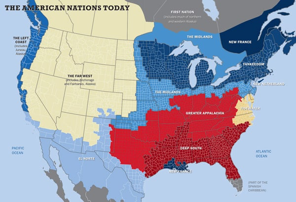
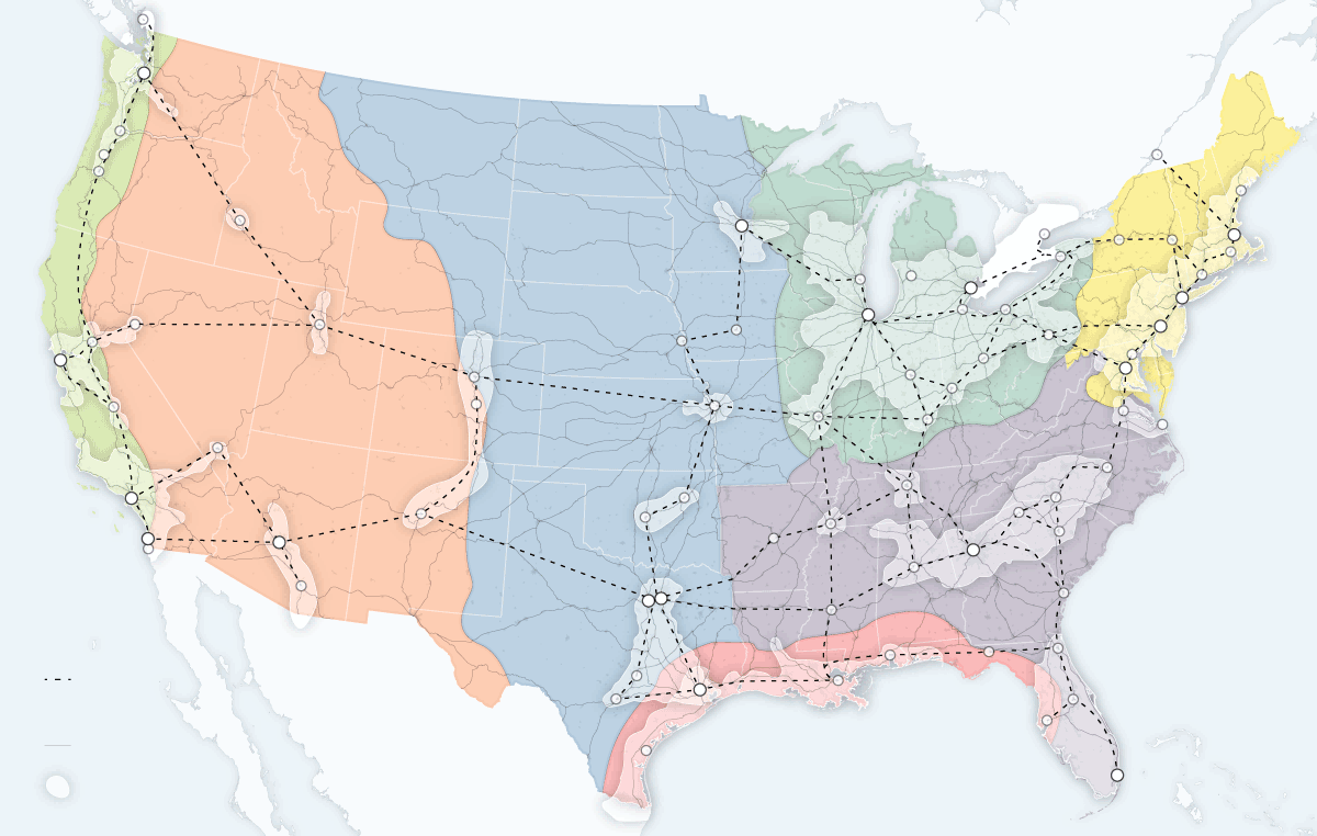
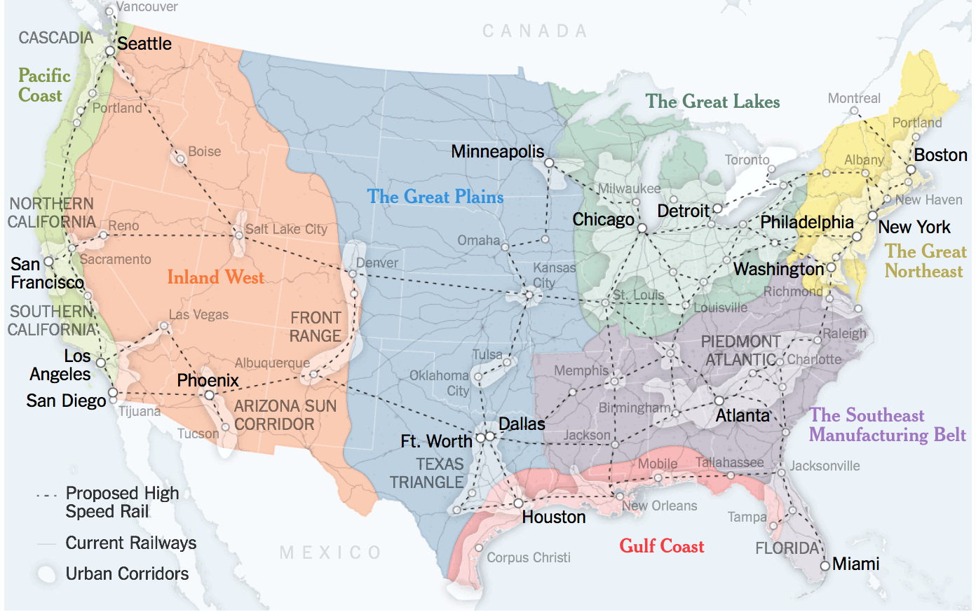

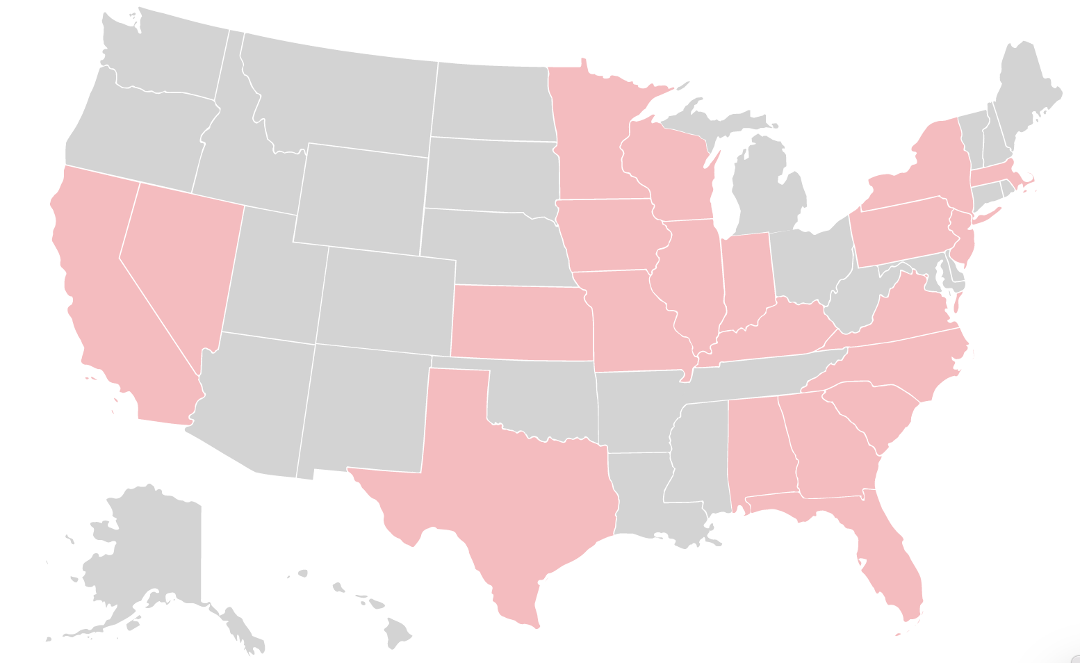
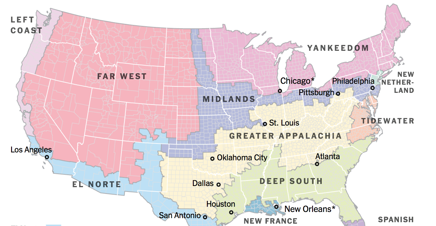
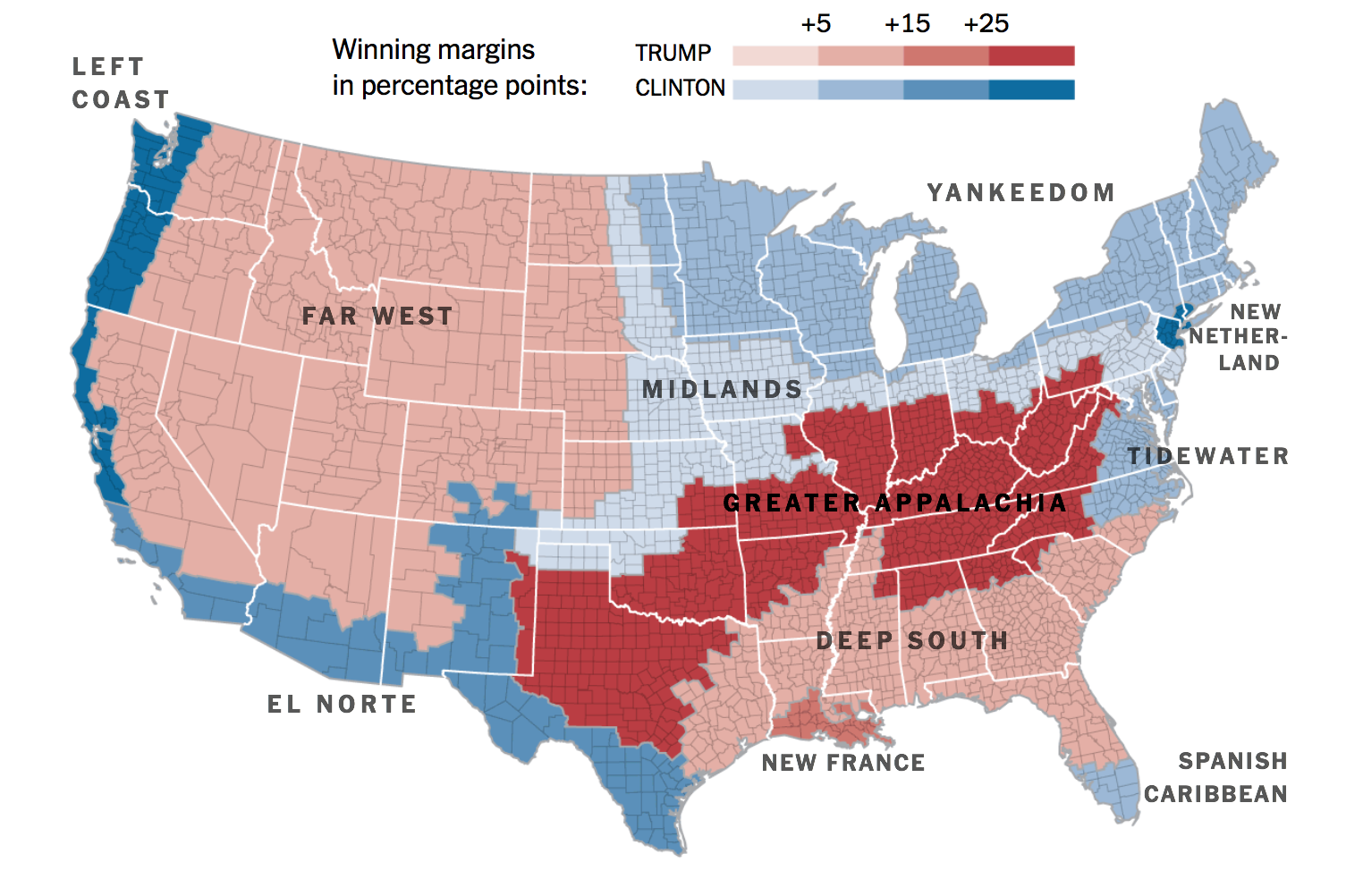
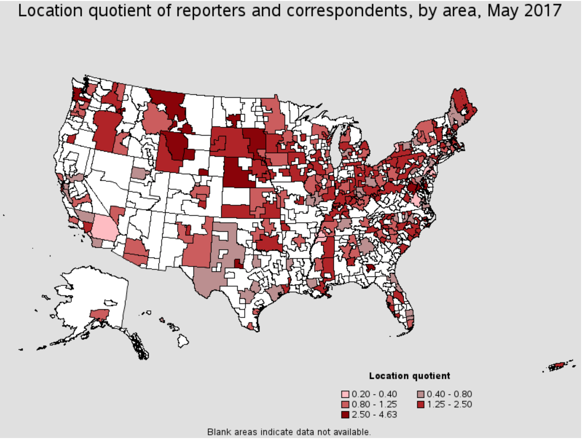
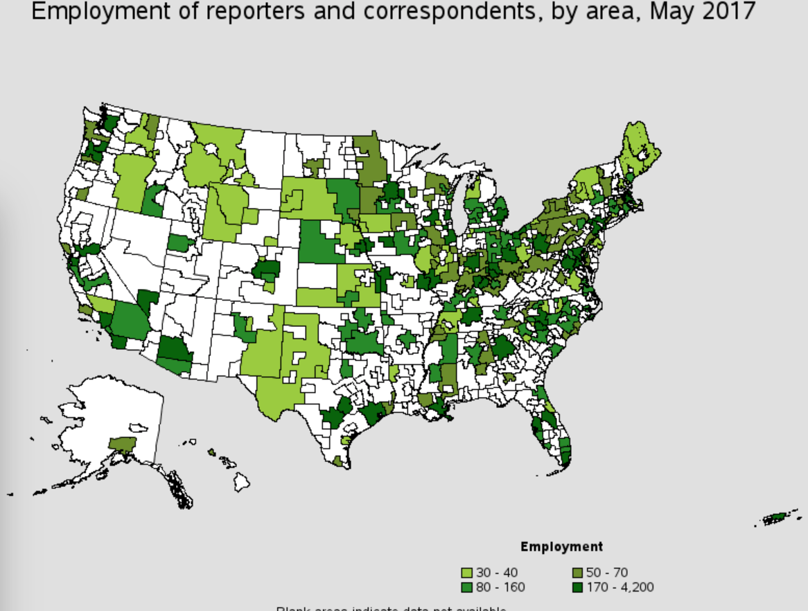

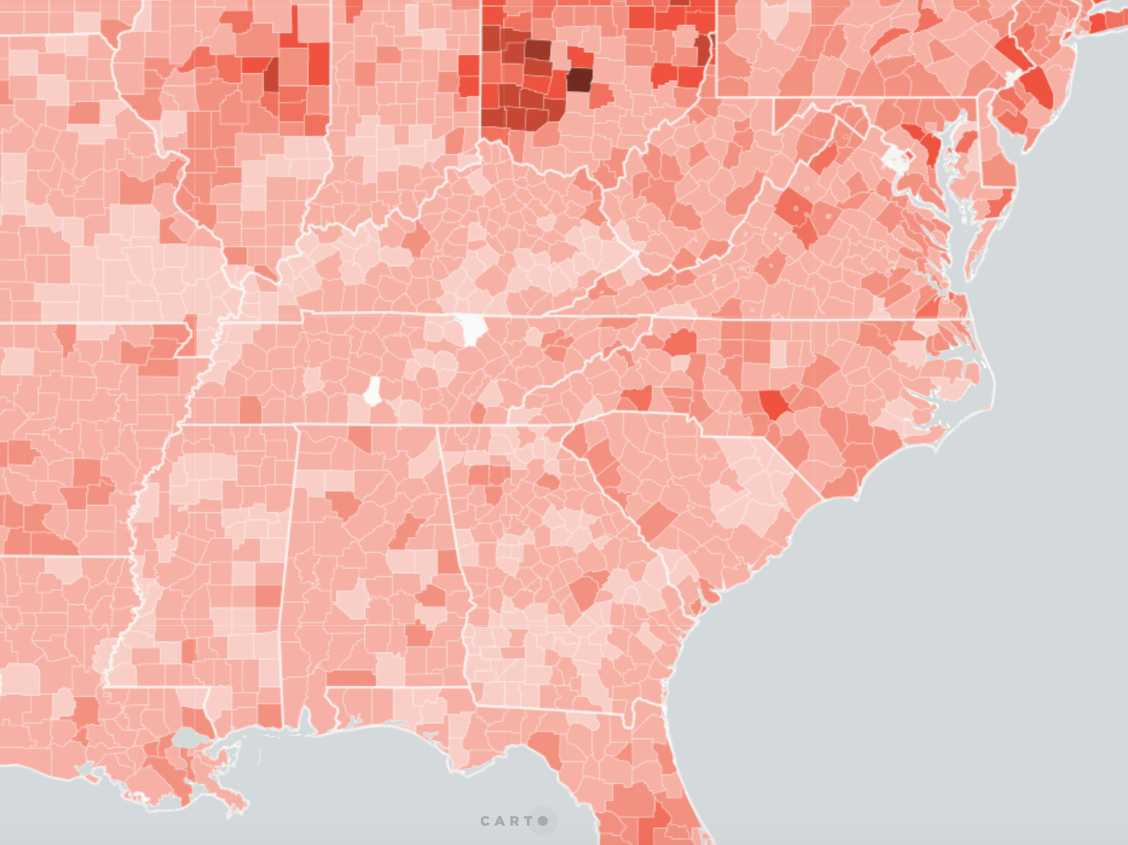
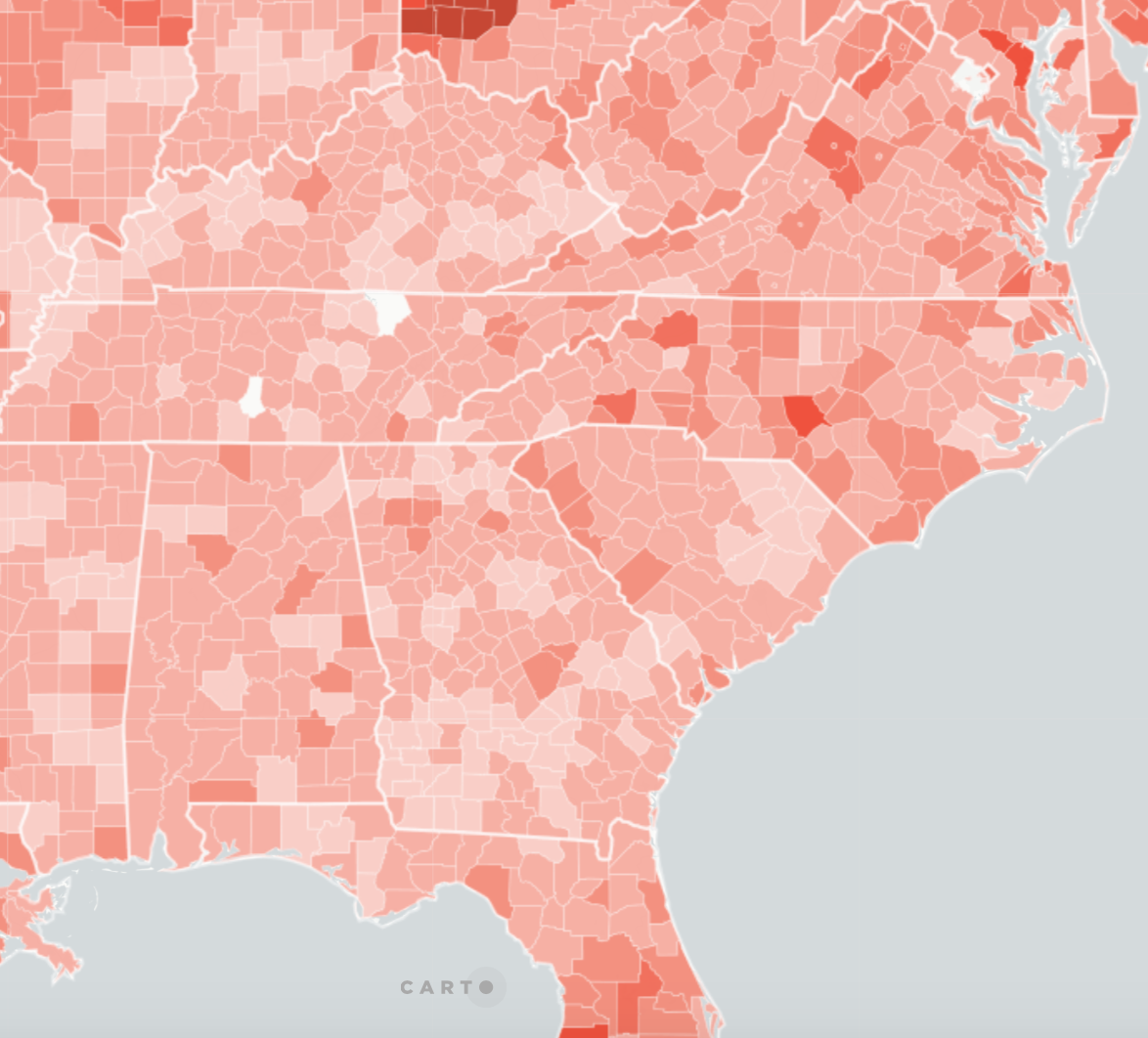
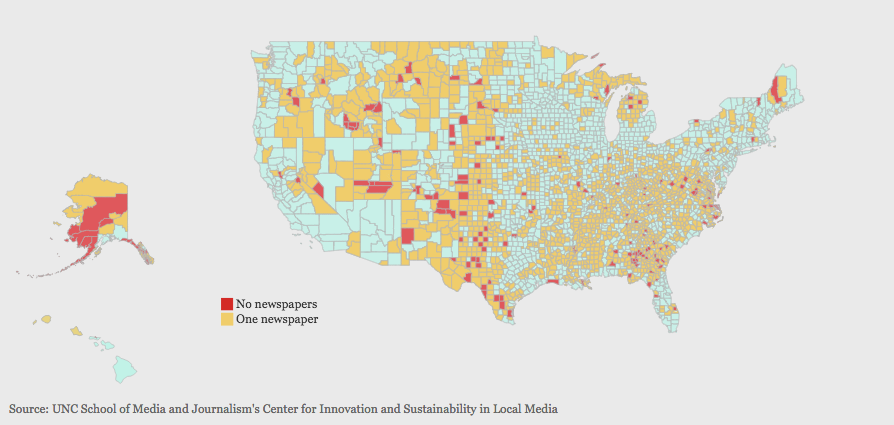

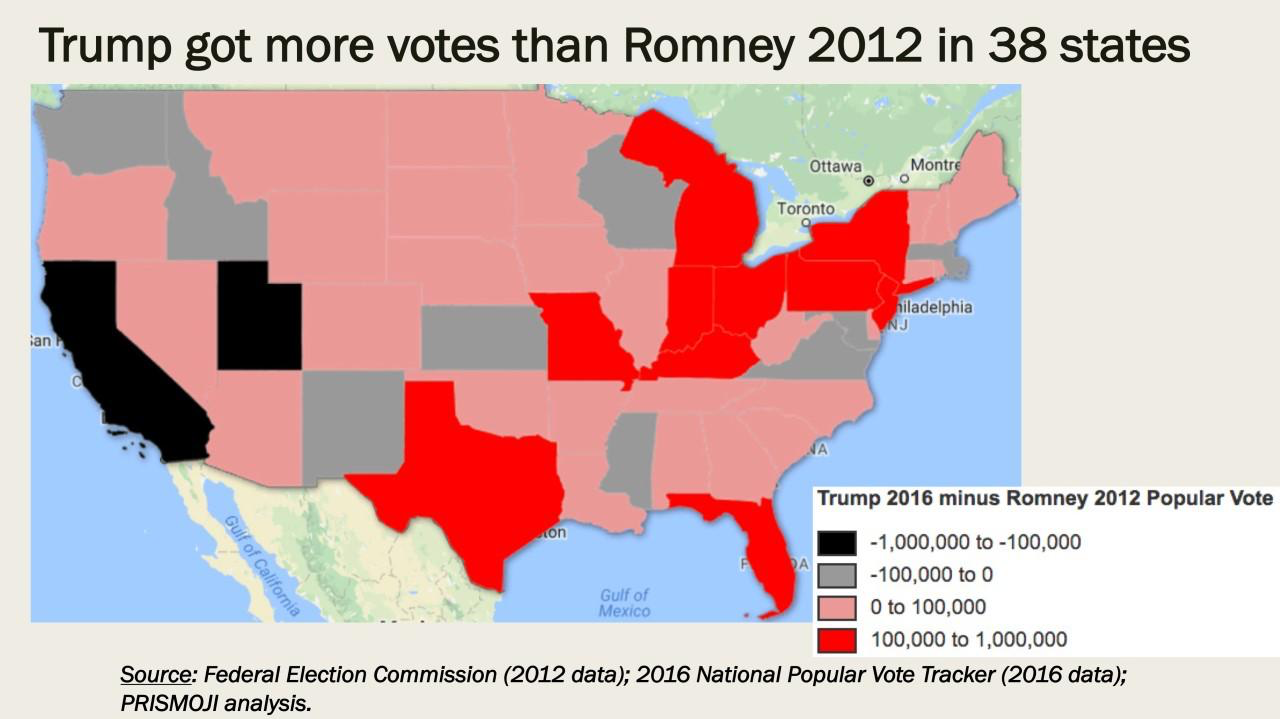
 Area roughly corresponding to Greater Appalachia/Mapbox/New York Times
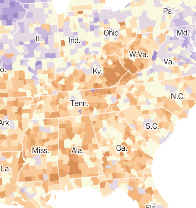
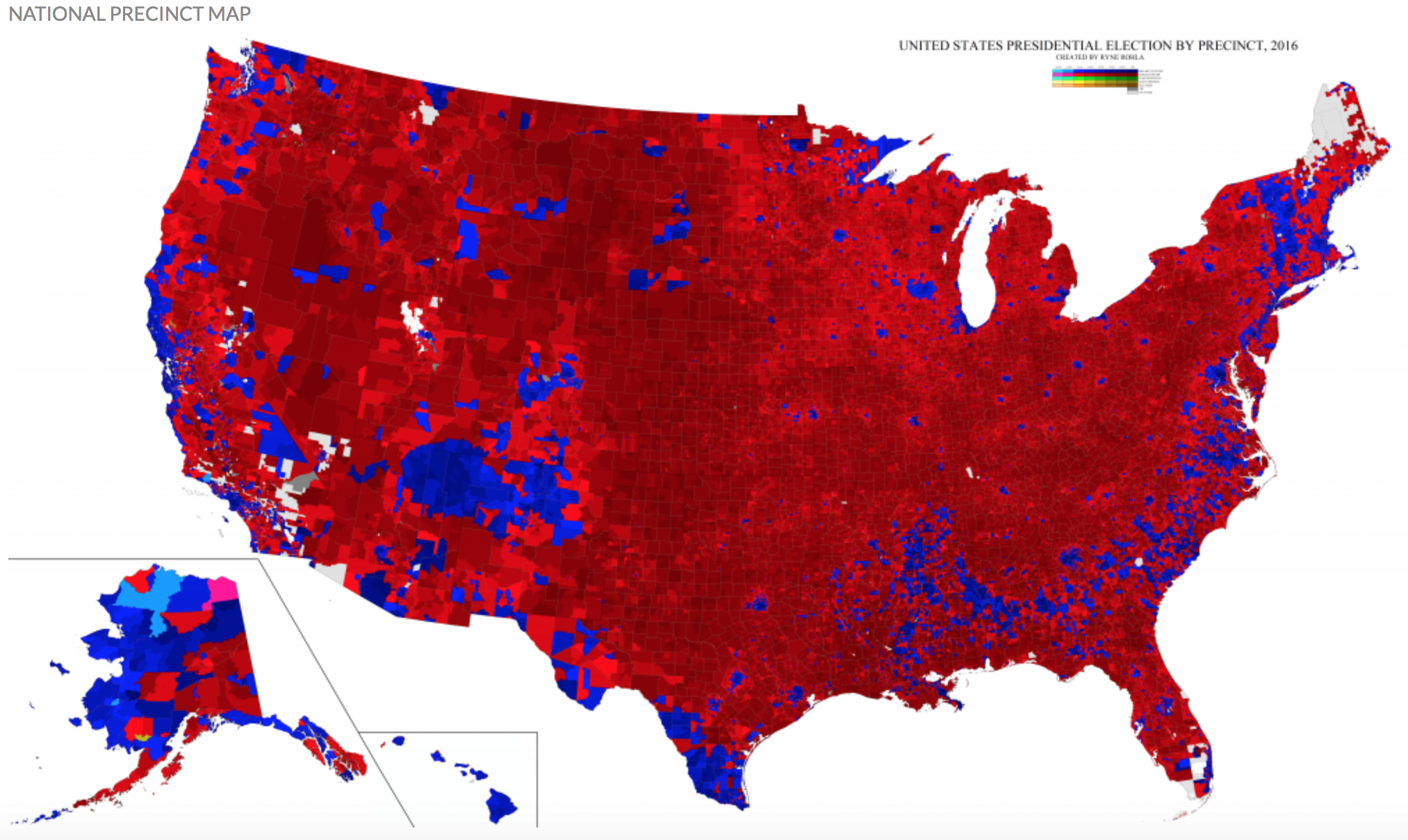
 Ryne Rhola/Mapbox (2018), 2016 US Presidential Election