The novelist Edward St.-Aubyn offers a moving description of the existential torture in-flight maps inflict on his hero. St.-Aubyn captures indeterminate relation we all feel as passengers suspended before the sheer toponymic abundance displayed on monitors during air travel, which offer handy metaphors for one’s own suspended relation to space. The in-flight maps are often as disorienting as orienting, and might trigger a moment of panic, even as they seek to pacify by providing a clearer pathway to one’s destination than one could imagine in air. Especially for Robert: “Robert switched channels to the map. It showed the airplane hovering near Cork. Then it expanded to show London and Paris and the Bay of Biscay. The next scale included Casablanca and Djibouti and Warsaw. How long was this informational feast going to go on? Where were they in relation to the moon? The only thing anyone wanted to know finally came up: 52 minutes to arrival. They were flying through seven fat hours, pumped full of darkening time zones. . . . They told you everything, except the local time on the plane.”
While these in-flight pixellated screens are over-abundant when it comes to information, the relative dryness of it makes scrutinizing them for meaning as much a masochistic form of torture as the lighting of the inflight cabin itself.

There was far less information on this flight monitor, which by a fluke wasn’t working. It didn’t communicate the anticipation of arrival, or give the sense of the snail’s pace of the plan crawling across the video screen.

But it provoked a musing. Because of the presence of maps in so many areas of our daily lives, this may be yet another context in wich we’ve come to devalue the map, and lowered expectations for its use at all. Up in the air, the sort of orienting map we’re given is often of little use anyways: this seems to be an assurance that the trip will take a long time, more than even to offer a sense of how long remains in flight. If it used to offer a sort of minor visual diversion (of whose accuracy we were never so sure) or a sort of punishment inflicted for not buying access to the in-flight film, the in-flight monitor has been marginalized as a flight-tracker map by the deluge of mediated maps of flight paths, like the maps at websites like “Flight Aware.” The huge amount of metadata–and vastly superior user-interface–these websites deliver to travelers must have diminished expectations for in-flight monitors, if not bring a certain healthy skepticism about the level of accuracy or trust such maps could promise their readers.
![]()
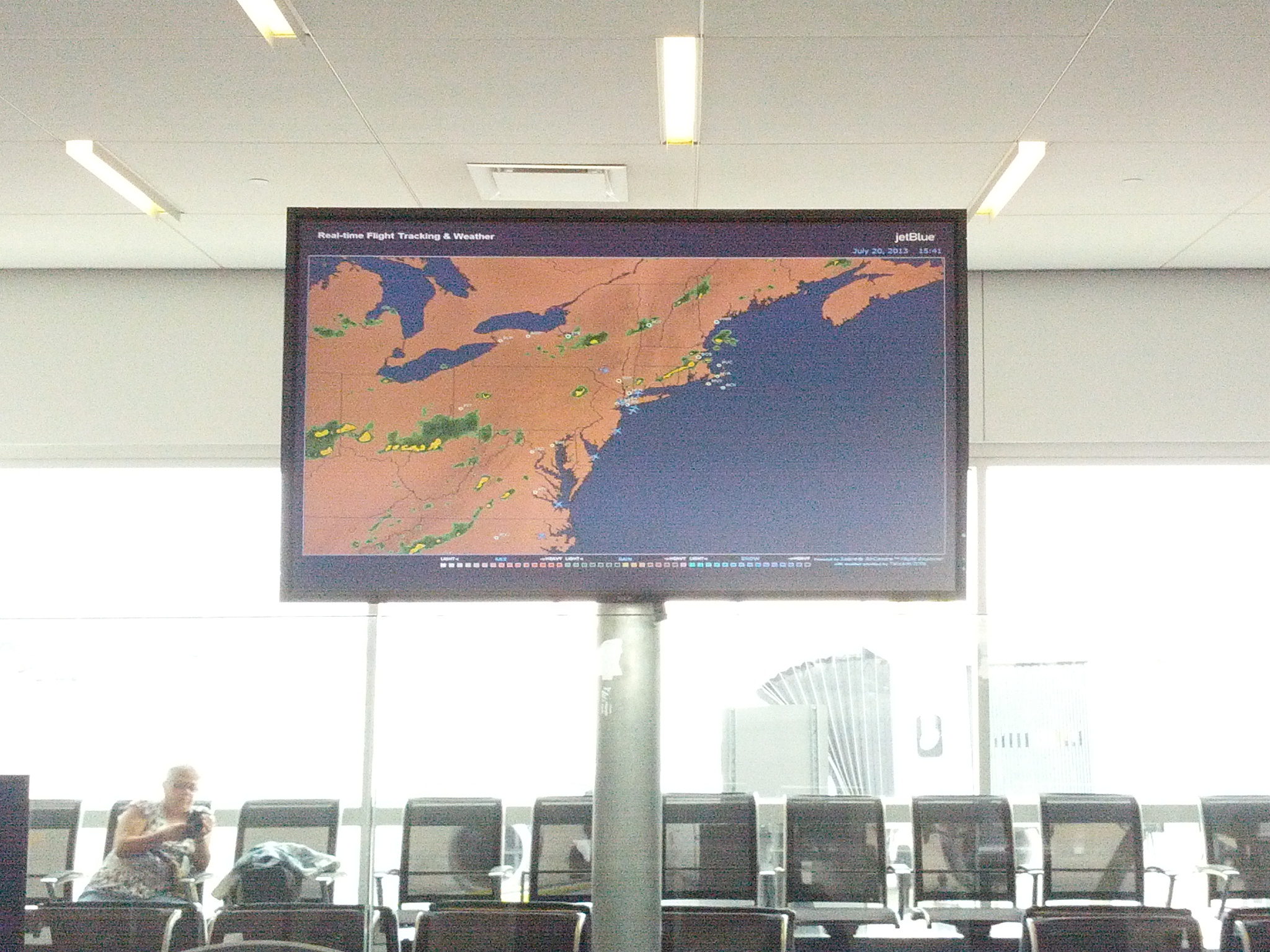
Who doesn’t feel empowered by their newfound ability to track weather formations nation-wide, courtesy CNN or the Weather Channel. In the maps of FlightAware, the mere addition of the generic swirls of cloud-cover that move across the flat screen add a realist touch from the weather map to an otherwise stagnant and static symbolic form:
![]()
Thanks to the resources of FlightAware, otherwise bored passengers, who forgot to bring novels onboard or have finished their newspapers, can browse flight conditions in different areas, and track the density of airplane travel in screens in ways that have all the symbolic characteristics of an antiquated video game:
![]()
The sort of assent that the in-flight tracking screen once commanded has, it almost seems, been eroded by the proliferation of maps in media like FlightAware, so that they have become an antiquated relic still built into most passenger planes, but rarely consulted for information in the sort of user-friendly ways of the recent past. The erosion of their authority might be mirrored in the very sort of in-fight hard-copy maps we find in facing seat-pockets, which foreground the cities/airports that the airplanes serve–more to communicate that they’ve got the map covered and to advertise future flight possibilities, than to orient the viewer to space: the service map is surrogate for the nation, which takes second-seat to the aerial triangulation of air-hubs in Boston, JFK, Orlando, Fort Lauderdale, San Juan, and Long Beach, sites of airports that constitute a sort of ring around its physical expanse–of course, the map is clickable on their site, but it looks like an uninteractive screen in its paper form.

I use that to imagine potential future routes by electing plugin destinations once I get home:

But it didn’t serve as much more than an advertisement for future travel plans in its paper form. The lack of content or topographic variation in the flyer, as well as a lack of interface without wifi, making the image above the stowed tray-table disconcerting. The Google map format offers a map randomly framed and without a marker to trace the itinerary of the flight path, although with stretches of interesting stagnant greenery whose narrow ornamental in character makes one ponder what it signifies–remaining underlying greenery? old forest growth? cloud cover? remaining wild areas? There seems much more of it in Canada.

This seems mapping in the age of NAFTA, or at least driven by specific economic needs and a monopoly on the quality of cartographical information that can be delivered to passengers after the seat-belt buckle is fully inserted and snapped, and one faces monitor of reduced size. Then again, the monopoly on the quality and range of automated delivery of readily constructed cartographical information that continues to be provided even after we deplane, where the airline provides numbers of maps in monitors that seem to seek to prove that they are up-to-date with models of commanding assent to their content–usually by referencing weather maps. (Are such low-res video maps programmed for sequenced delivery to passengers, one often wonders, or do they indeed reflect real time travels of the airplane in which one sits?)
Despite the clear elitism that is on view at this library, and the stability of a relation to place that this globe in the city of Fermo suggests, the difference in the viewer’s relation to the terrestrial surface is a huge difference in time, and in how one moves through space.

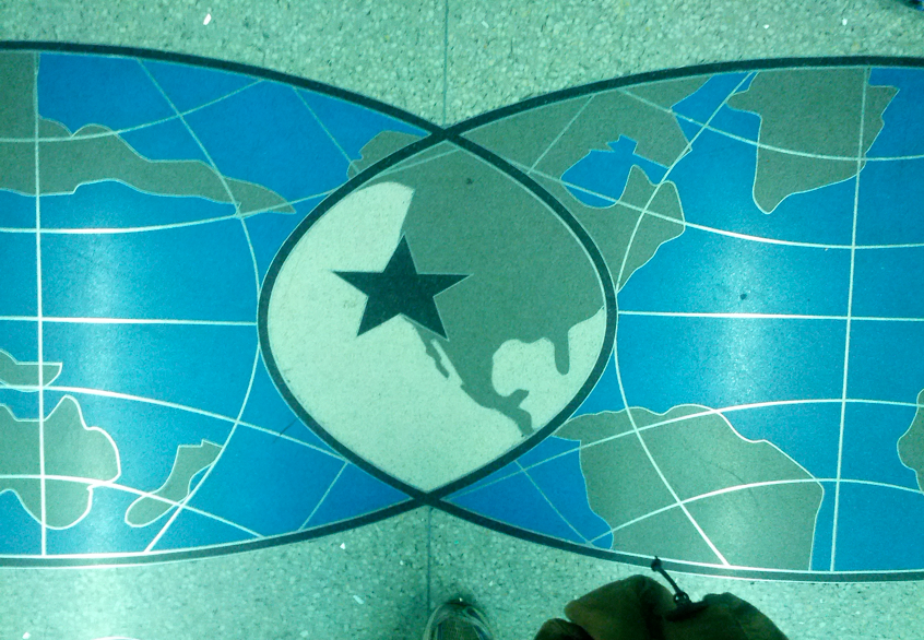
There was a nice irony by which these cartographical eras met and overlapped in the Burlington airport, where several of the multiple maps that Samuel Champlain designed of the area and nearby lake that bears his name are displayed on banners for anyone who would like to see. Or the map inlaid in the pavement of Oakland airport’s baggage claim: it declares to all arrivals with blunt finality that they have at last arrived, adopting the iconography of the Robertson projection once used by Pan-American airlines to trumpet the position of Oakland in the world, marking it by an outsized start that violates the principles of scale and precision, but that returns the tired traveller’s back to the place where s/he has arrived, no longer coasting over the meridians of the globe, but now having arrived at the imagined center of the intersection of two hemispheres–an intersection coincident, here, with the United States.