Classical terrestrial world maps–either the detailed terrestrial world projections that associated with the atlas-makers Mercator and Abraham Ortelius or those terrestrial planispheres noting cities and ancient monuments of Ptolemaic design–were based on a need to find a solution to how to transfer the curved surface of the world to a flat surface. When we are talking about global events–from warming to El Niño–we need to synthesize global variations in a spectrum of a set of surface temperatures that only a satellite can assemble, and to read them as inscribed on a global surface. The virtual image of weather changes depend on information removed from actual landscape, or inhabited land–but rests on the persuasive power of a compelling image of the earth’s curved surface in the synthesis of a coherent image of ocean temperatures over a continuous expanse of the earth’s surface: although undoubtedly provoked by the world’s inhabitants, and a revealing record of the anthopocene, the mapping of oceanic temperature is something of a record of climatological impact and of the increasing need to come to comprehend shifting temperatures of the word’s oceans in truly globalized terms.
Is this map more powerful because it recalls a familiar globe, and because it promises to mediate record of the ocean’s equator that would be otherwise totally unable to be visualized in a coherent visual form? The global visualization creates a compelling record to understand the odd embodiment of a shifting pattern of climate prediction, even if the synthesis lacks reference to a cartographical model or a set of scribal practices. The map provides a way of detecting (and indeed predicting) unusually warm ocean temperatures that create El Niño, in ways that trace the preconditions to create a cascade of climactic changes provoked ocean surface topography through a visual syntax akin to a weather map: the virtual globe deploys digital media to map movement across and motion through oceans, tracing shifts in subsurface ocean temperatures over space that would be otherwise concealed from sight: the silhouettes of the continental masses not only displace attention from the land, but subordinate land weather patterns to the irregularities changes in atmospheric pressure and sea temperatures that they foreground in a strikingly technicolor map whose hues mirror heat-sensitive readings, rather than areas of settlement. (Continents are only present as ghostly images in these maps that direct our attention and interest to the phenomena sensed in ocean waters.)
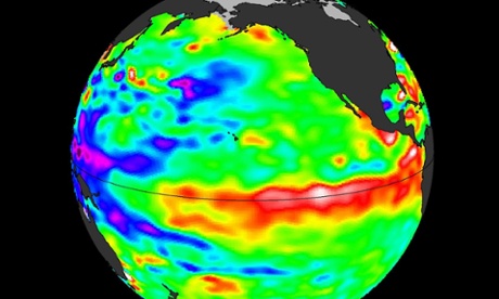
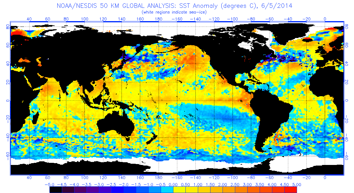
The satellite thermal map of the swelling of seawater around the equator, generated by NASA’s Jet Propulsion Lab, tracks the temperatures beneath the swelling of oceanic waters to forecast El Niño oscillations this summer and fall. By tracking significant sea surface temperature anomalies, they trace changes to gauge the possibilities of potential future major weather disruption of the globe, and to try to comprehend the shifts in temperature that might change weather systems in so drastic a way to impact food chains, agricultural economies, and climactic experiences in similarly out of the ordinary ways, exposing the otherwise hidden shifts in ocean temperatures by catchy chromatic spectrum of colors around the equator.
Rather than only trace migrations, the map marks pronounced sea surface temperature rise across the Pacific is suggested by the surface’s deep crimson reds, extending from the islands off Singapore. The Google Earth satellite view contrast to the arboreal distribution of the topography more evident, as if to embody the threat that it poses to the landmasses that are the usual focus of world atlases.

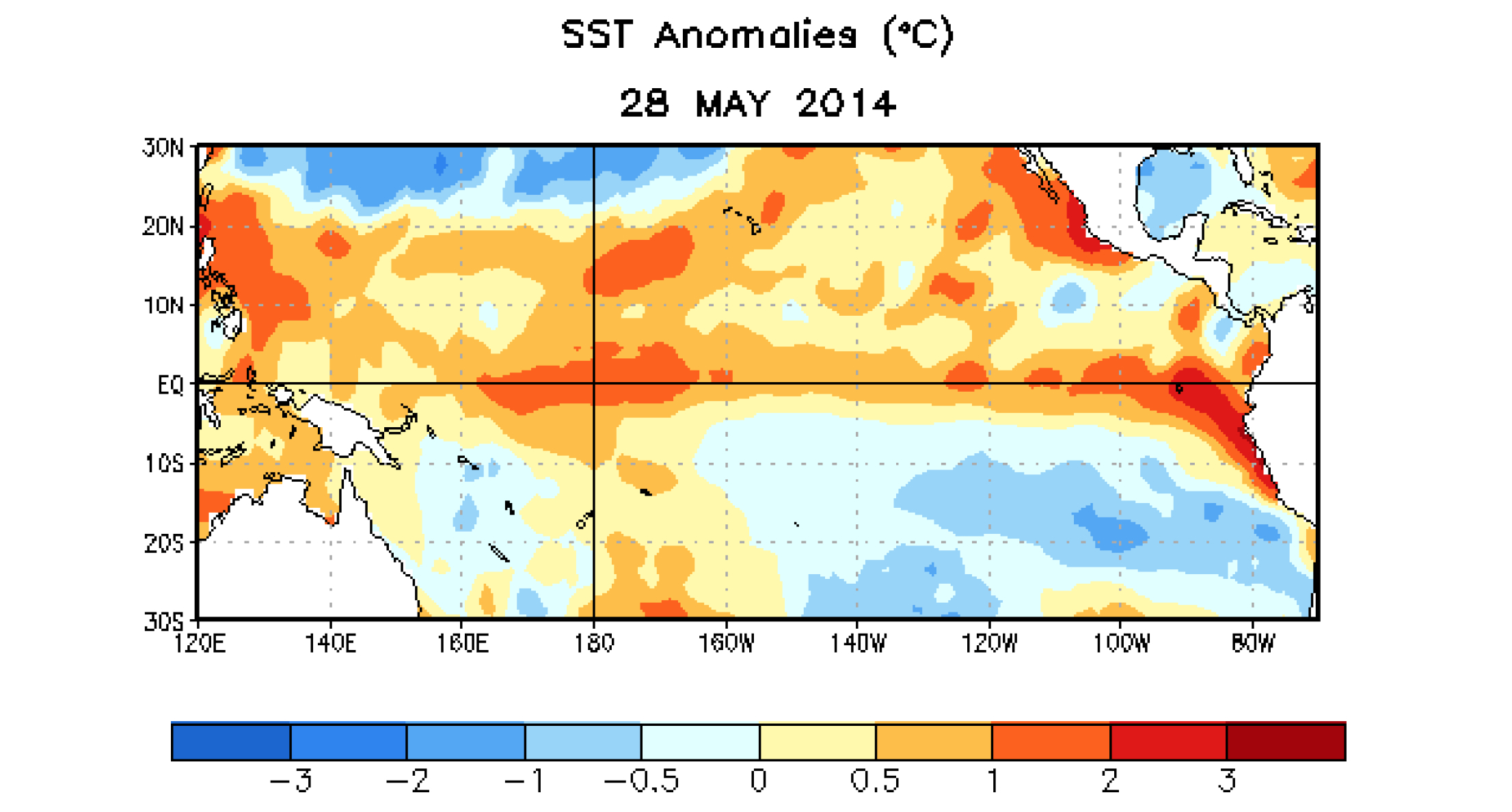
The spread of warm waters across the Pacific indicated in such maps echo the famous charting of sea-temperature anomalies of 1997-98 El Niño, which La Niña followed, when the end of trade winds led warm waters to slosh Eastward, pushing cooler water down from the surface, and interrupting the feeding habitats of fish and aquatic environments and interrupting the local marine food web. The map traces shifts in surface temperatures by tracking of anomalies in the below video to suggest an advancing augmenting of surface temperatures across the equatorial Pacific.
http://earthguide.ucsd.edu/images/enso/swf/sst_97-98.html
The anomaly of equatorial sea-temperatures across the Pacific is most easily pictured by mapping the greatest warmth in red: the visualization of global variations across the ocean surface suggests sustained pattens of temperature rise, mapping not only temperatures but their divergence the form the median, and tracing patterns in their variability over time–far more meaningful in the global ecosystem than the relations between surface temperatures tout court.
The result is a new globalist map, tracking not countries and border lines or borderlands, but that “other ecumene”–that other inhabited world–of oceans and ocean life:
At least the hope is to start to direct attention to it, and to an area of the world’s temperatures that are not often mapped. The above visualization rests on an ability to synthesize a coherent constellation of multiple factors–prepared in a cogently digested form–but proves a guide to local imbalances and deviations, in the hope that we can grasp the global impact of these increases in the collective image that results, offering considering subtlety to register local shifts across space that help reveal the whirls, eddies, flows and sloshes across the ocean seas, even if it might require far more learning to interpret in its consequences than the more familiar sorts of weather maps that we are used to access on line. While not a globe or a sphere that earlier globe-makers might recognize, the elegantly articulated silhouetted continents suggest contre-jour qualities of the map, as if demanding that we start to try to pay attention to the deeper temperature changes in the seas that will reveal how shifts in atmospheric pressure create temperature shifts that will lead to a redistribution of nutrients in the ocean created by the consequent shift in upwelling and alter rainfall patterns worldwide or create droughts or typhoons as the result of an unusual warming of waters just below the ocean’s surface.
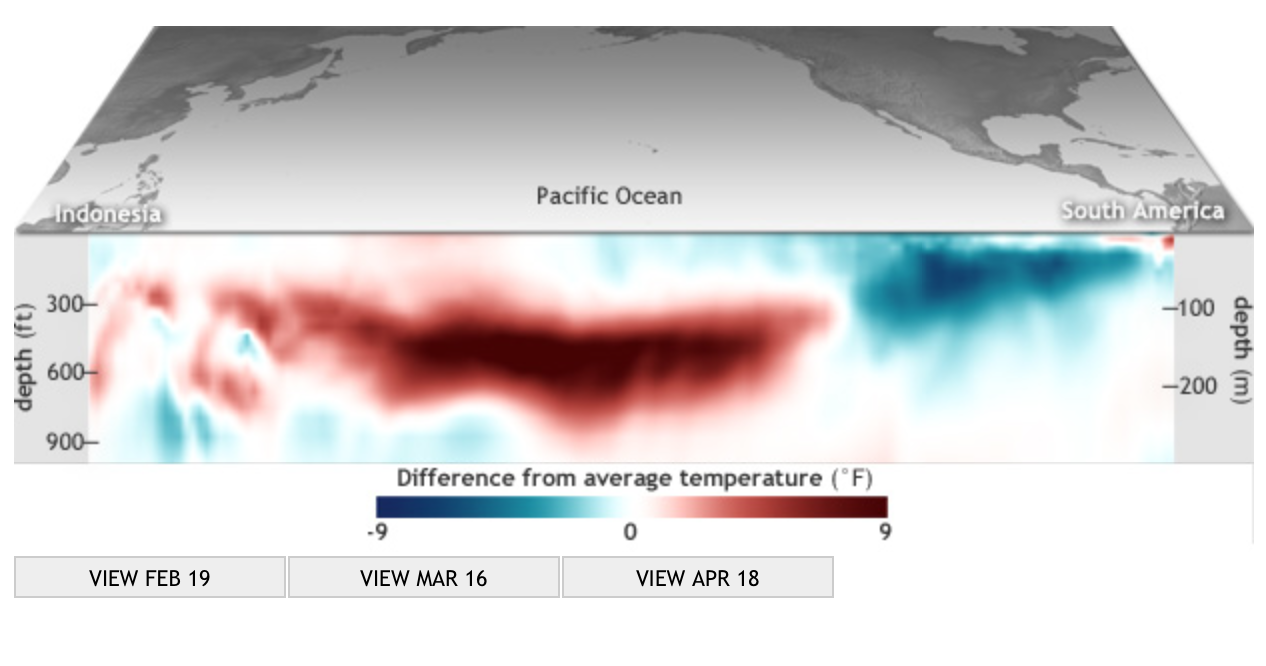
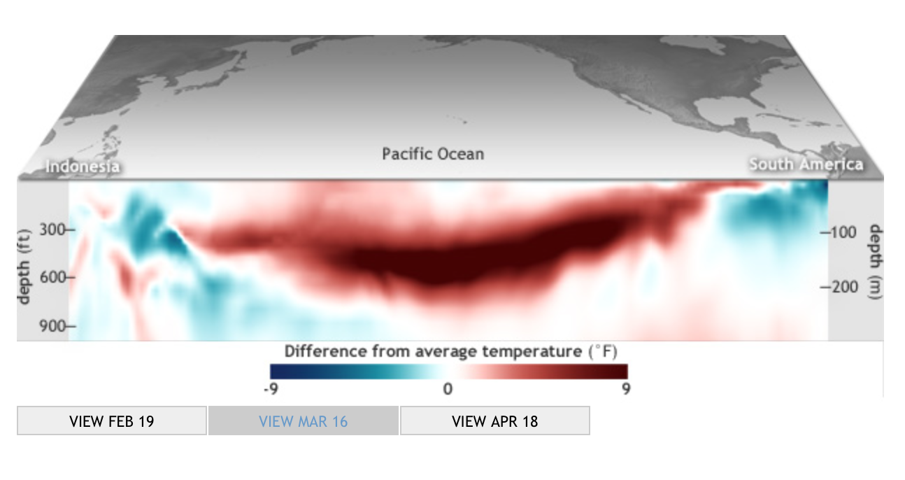
The dazzling image of the surrounding medium that conditions and prepares the climactic variations of the unmapped land to which they are so deeply linked, create an image of a global weather system we are only slightly prepared to come to understand. The map’s comprehensive coverage of ocean temperatures is a shocker of a visualization, employing a rainbow of gradations of color to striking effect that combines both the exactitude of pinpoint images and the tools of digital visualization. It is a sort of learning experience or primer on the immensity of global climate change, creating several deeply intractable pockets of climate change all closely located offshore, scarily noting the surprising relative proximity of the warmest areas to those regions, shown in white, which designate the remaining regions of polar ice, at the same time as the change in temperature seems embodied at an odd remove from the viewer or the surrounding shores. Similarly generated maps created from remote sensing constitute some of the greatest emblems of the environmental disasters of our time. Other options used by NOAA to chart the swell in temperatures in the upper 300 meters of the Pacific ocean in 2014 track a growing swell of something like an oceanic monster that grows in swells beneath its surface, evoking something of a large-scale sea monster that gradually began to reach across the Pacific toward the shores of South America, against the easterly winds that usually send surface water west across the Pacific.
The progress of waters beneath the ocean’s surface seem to track an animated entity in this set of subsurface charts, which capture the progress of the slosh of water magnifying the subsurface temperatures across the Pacific out of actual proportions to increase the visibility of temperature changes that seem to flow as if they were submerged underwater almost biomorphic forms resembling monstrous worms or undersea tornadoes that channel currents of churning heat that span the pacific, deep below the ocean’s surface:
 mid-February, 2014
 mid-March, 2014
  mid-April, 2014
In a Kelvin wave, pushing from the warm waters of Indonesia to South America, the slosh of ocean waters can prompt the cascade of atmospheric events. The bounded parameters of the visualization are limited to the ocean, but are meant to provoke a similar imagining of the potential events that such a swell might trigger, and provided one of the first indications of a probability of possible climactic shifts over the months to come. Despite the specificity of readings that it can coherently synthesize, the chromatic blending of these measurements in a real ‘heat map’ of ocean temperatures create a false demarcation of categories, by removing the temperature changes from their effects in magnifying their deviation from the norm. Mapping the ocean as a surface of travel or site of navigation has long challenged the categories of visualization employed in land maps, if only because of the fact that the notion of oceanic space challenged the categories that were developed to visualize surface topographies.
The synthesis of mapping temperatures at different depths track migrations of water in the medium of the ocean is perforce removed from the specificities of place transcribed and tried to be pinpointed in earlier engraved maps, that tried to render legible the currents, routes, currents and eddies of the sea, or to record the variations in the underlying ocean floor. The globalist maps of the ocean’s temperatures that result offer something more like an animated graphic, instead of an objective form, because they lack clear contour lines or fixity that were the basis by which so many earlier ocean maps tried to calibrate currents, negotiate sea-routes, track winds, or map the topography of the ocean’s floor.
The embodiment of the expanding biomorphic swell in subsurface temperatures, mapped as extending across the Pacific, renders the shift in temperature as gliding contra corrente. They offer a major change in the claims and abilities of totalistic mapping of the oceans, and in the attribution of embodied characteristics to the ocean–which emerges now, if in ways that seem metaphorically misleading, as somewhat organic, as if it were something of a separate living entity from the land, which almost gained its own context, rather than appearing as either a surface for viewing nautical travel–
 Rumsey Associates
–or the result of an array of bathymetric bearings of submarine topographies by collating depth-soundings taken by sailors on weighted lines.

Of course, the topic of the maps–global climate change–is itself removed from the precision to mapping nautical location to calibrate calculated routes, path, or place as marked by means of a line, and understand risks of nautical travel, and a concept of travel rooted to the ocean’s superficies. The maps of oceanic temperatures not only reflect the transferral of maps from paper to the far more heavily pixellated medium of the screen, but a search for visual formats of embodying shifting temperatures that were often elusive as subjects of global mapping in earlier charting traditions.
As such, they suggest, in the rhetoric of uncovering hidden changes detected by satellite, both the need to try to process global shifts in temperature in tactile terms, an eery remove at which the changes in oceanic temperature lie from the viewer, hinting ominously and only by extension about the likely possibility of future risks of global climate change to which the world’s inhabitants are now, as if suddenly, finding themselves to be subject.
The new premium on taking stock of mapping temperature change is about learning to visualize the migration of ocean temperatures as if by analogy to a weather chart–and indeed the resemblance to the images of cold fronts on the Weather Channel seems striking–but in ways that take into consideration how these movements in temperature migrate in currents and swells through and across the ocean’s own watery medium, and cannot only be considered in the localized perspectives of the individual points of a depth-charge. For the mapping of oceanic temperatures are not only a way of mapping the communication of heat, or the rising temperatures of the world and its atmosphere, but the newly inter-related concept of what it means to be warm.