
In the age of the globalized compass of GPS, where the world is ringed by thirty-two satellites that download continuous feeds to our mobile devices as if monitoring our every move, it’s hard to imagine how we can get lost. Yet the ease with which AirAsia flight QZ8501 disappeared, as its pilot lost contact and communication with ground control over the waters of the Indonesian archipelago, poses problems of how a direct flight suddenly vanished from the monitors of controllers, as much as how contact was lost, in an era when we mostly imagine flight paths as discrete itineraries.

Gone seem the days when weather systems led ships went astray, and the merchant steamship Archimedes driven wildly off of its course in the summer of 1929, when it was swept wildly off course for four days, overloaded with goods, inside the vortex of hurricane winds while preparing for a tobacco run to China. The drama that Richard Hughes narrates in In Hazard about the event that prompted Joseph Conrad to write Typhoon described the limits of modern engineering–a challenge between engineering and the environment–as the modern steamship, aptly named the Archimedes, lost all of its forward thrust in the high winds of a hurricane while it was laden with goods. Such meteorological challenges seem anachronistically removed, despite the still compelling nature of the narrative of the struggle to send steam to pumps to right a sloping deck, an impossible challenge in the eye of the storm for even the finest engineers on the ship.
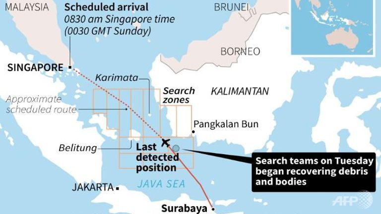
The struggles of being swept off course described in In Hazard resonate with the unexpected disappearance of AirAsia flight QZ8501, however, which somehow disappeared near Borneo after it lost contact with air traffic controllers while carrying 162 on route to Singapore. So do the problems of its loss of all propulsion and, apparently, orientation due to possible electromagnetic interference in a fateful–in this case, also tragically fatal–storm. The crash of the Airbus airplane into the sea provoked a range of fears about the possible causes for its captain and co-pilot’s sudden disorientation, but rather than pose problems of engineering, the loss of the plane in severe thunderstorms raised questions of how it disappeared from the map. Even given very limited radar coverage over so large an expanse of water prevents adequate tracking of the plane’s actual position by radar over the South China Seas, the loss of contact in an increasingly interconnected world may pose problems both of communication and of envisioning overcrowded flight paths on a map. The increased crowding of flights over the archipelago in recent years poses problems of allowing safe passage over ocean waters, and indeed across the high winds of an inter-tropical convergence zone, long known for unpredictable weather systems but, we must ask, perhaps inadequately accounted for in the increasingly crowded flight corridors around Indonesian airspace.
How could the plane have gotten lost? Airlines do not stream geolocation data in real time, partly since they use voice-to-voice communication, but no doubt because the notion that the plane would be “lost at sea” seems so small a possibility or likelihood: yet the difficulties in establishing communication with the plane are puzzling in an area of apparently continuous monitoring. It is especially eerie since no actual witness’s voice survives to narrate what happened after it lost all contact with air traffic controllers shortly after having requested to change course. After having vanished from radar screens quite suddenly, and exiting the map of monitors, the interrupted path of AirAsia 8501 is difficult to explain: no “black box” has survived or may be ever found. It seems the airbus carrying 162 people vanished at a time when we rarely if ever leave the map, however: the mystery of how it did strains common credulity, but some answers seem to lie in the maps of the crowded scene in which the pilots charted their plane’s actually otherwise ordinary path. Even as dozens of bodies have been recovered, none wearing life jackets, we are left to imagine the complete panic that ensued as the plane went off its course, only to plummet and be engulfed in the sea below. Is it possible that the tragedy of losing contact with air traffic controllers over ocean seas might be more important to map than the point at which the flight mysteriously abandoned its planned flight path?
 New York Times
The shocking density of the air traffic levels among different flights is closely tied to rapidly increasing air-traffic off the coast of Indonesia. Several aircraft were in close vicinity of the airbus when its signal was suddenly lost. The refusal of a request from its captain, Iryanto, to ascend course from 32,000 to 38,000 feet to avoid worrisome weather conditions from AirAsia QZ8501 was not quickly granted to the captain, we suspect, partly on account of the difficulty of balancing how many flights were in transit in the crowded airspace flying to Singapore or easterly through Indonesia. Exactly what happened to the plane’s flight path is not clear, but it seems the pilots’ orientation or sense of what the flight path was seems to have been lost as their plane was steered into the clouds they sought to avoid, and their own navigational systems and magnetic compasses seem to have been disabled or adversely affected as a result–perhaps by a lightning storm in the vicinity. The request air of traffic controls at Soekarno-Hatta Airport was sent to Indonesia’s Changi Airport and approved, but was asked to only ascend to 34,000 feet; when the pilot was notified at 6:14 a.m., no reply was ever received. Jakarta’s air traffic control, AirNav Indonesia, contacted flight control in Singapore, in an attempt to accommodate the request: “It took us around 2 to 3 minutes to communicate with Singapore. We agreed to allow the plane to increase its height but only to 34,000 feet, because at that time AirAsia flight QZ8502 was flying at 38,000 feet,” explained the state navigation operator, Wisnu Darjono, but the limited space allowed did not meet the pilot’s request. (The recent announcement by Indonesia’s transportation ministry that AirAsia QZ8501 in fact flew on a schedule that was unauthorized reveals an additional possible reason for this delay, but has not been confirmed.)
Was the apparent hesitation of response due to the appearance of an otherwise unscheduled flight within the increasingly crowded corridors of flights over the South China Seas, or to the difficulty to predict weather systems in rerouting of flight paths? The challenges of mapping air traffic seem considerable, as are challenges of using judgment to offer pilots with the quick responses that they require: the returning flight seems to have already obtained the increased elevation that Iryanto had requested.
 New York Times; flight path data from FlightRadar24, rendered by Gregor Asch
Iryanto did not specify the reasons for the change in path. But the region was dense with cumulonimbus clouds, associated with heavy precipitation, if not thunderstorms: both the pilot and copilot are presumed to have become disoriented in what may have been severe thunderstorms–as would be typical for such a “convergence” region, it seems, where tropical trade winds from two hemispheres regularly intersect and create poor conditions for navigating not only ships but airplanes. News Agencies and television networks have faulted poor weather conditions and thunderstorms in the area, weather systems explain only part of the mechanics of the terrible failure; but the ability to avoid such storms by a margins of twenty miles depends on a system of clear communication with air controllers after leaving Surubaya.
The sense of ‘getting lost’ is hard to communicate on the map, and few further stories will probably be told, like Conrad or Hughes, about the Airbus A302 jet and its 162 passengers and crew. The young, low-cost airline, which flies some rightly planes across South Asia, is, according to the Times, operates more Airbus A 320’s than most firms in the world and large providers of flights in the region; the plain was. ominously, piloted by a captain and first officer may have had relatively few flying hours–some report that it amounted to only 8, 375 between them, as AirAsia earlier noted in a press release, although Tony Fernandes, the AirAsia CEO, claimed considerably more for the pilot (20,500)–7,000 with AirAsia for him alone. Both lost contact with ground control, as the plane suddenly vanished–hours of fuel in its engine some forty-five minutes after take-off, in ways that left folks staring blankly into a map, as they would when monitoring search efforts. While news networks invoke unforeseen weather conditions, is that even a satisfying or responsible answer? The possibility that AirAsia was potentially regularly flying aircraft that had not been cleared for permission with Indonesia raises the fears of sort of vigilante flying to meet market demand one would rather not consider.
 Darren Whiteside/Reuters
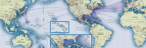
There are many such narratives in maps suggesting increasing congestion of airline flights above the South China Seas. If, as first suggested in a tweet by Archie Tse, #AirAsia8501, and seems increasingly likely, the airplane’s disappearance was preceded by how local air traffic control prevented the plane from changing not only its flight path but altitude as requested in the face of changing meteorological conditions, responsibility may largely lie in poor preparation for an increasingly over-crowded density of flight paths. For the ability to get lost in unexpected weather systems is greatly intensified in an area where the rerouting of flight-paths might be so problematically constrained–and where air traffic has recently so intensified that its paths are not easily rerouted in to accommodate the need to avoid or circumvent volatile weather systems, and where the plotting of a clear flight path might more accurately perceived from the cockpit–and needing to be adjusted through clear communication with local airports. In such conditions, monitoring and mapping air traffic seems especially fraught. An image of those planes run by AirAsia by FlightTracker on January 2 reveals the increased expansion of flights across the archipelago–
 Flight Aware’s live Flight Tracker, Jan 2 11:41 a.m.
And when the request from the airplane not only to ascend an additional 6,000 feet to avoid terrifyingly dense cloud cover was denied by air traffic controllers, the Indonesian newspaper Kompas reported, “because of air traffic,” the liabilities of readily plotting safe courses of travel in an area where air traffic has rapidly expanded with a proliferation of low-cost airlines–along a business model with which we are today unfortunately all too familiar for most Americans, AirAsia adopted the “no-frills” model of customer relations, charging for luggage, snacks, and choice seating, that paralleled a threefold expansion from 2003-11 of unfettered growth in the density of air traffic above the archipelago, already a region of increasing unstructured expansion and transportation congestion. The seven years of uninterrupted growth of domestic airlines in the skies above Indonesia rapidly accelerated in recent years, meeting a growing demand for local and international travel in a region that is expected to see a huge and unchecked growth in urban expansion by 2030, at steep economic and ecological costs of growing carbon emissions across the region that is the fourth densest population in the world, or only shortly behind the United States.
 Source: Innovate weekly average April 2013; Anna Aero
In the ambit of air travel, the unstructured expansion of flights around the Indonesian archipelago seems to have become particularly acute in recent years as the region is served by networks of cheap flights across the Indonesian archipelago, including such growing airlines such as Citilink, Tigerair, and Valuair. For these airlines, whom the problem of mapping congested travel parallels better known problem of airlines pushing pilots to run repeated flights on no rest, asking air traffic controllers to work for low pay, and adopting practices of poor overall management inadequate to expanding congestion of airways over one of the most inhabited areas of the world, as the archipelago’s oceanic expanse is increasingly covered by a web of short- or long-distance commercial flights.

The apparent failure to chart routes among planes adequately–and provide a communication infrastructure to map the course of planes to map routes in a way sufficiently flexible to allow pilots to avoid weather systems like thunderstorms, from which planes are required to maintain a distance of at least twenty miles, must have become intensified as AirAsia alone rapidly expanded service in the Archipelago and to India and Japan–intensifying air traffic by a huge degree in a region where radar often works poorly to track planes with precision, and communication between airports may lag. The flat blue field over which so many miniature plans of different sizes swarm conceals the weather systems and winds that tragically interrupted the expected trajectory of the AirAsia plane as it passed Southern Sumatra, where it lost all contact with air controllers. Imagine flying an unannounced plane within such crowded skies and being surprised by dangerous weather conditions.
 Flight path and last known position of AirAsia Flight 8501/www.flightradar24.com
Was the airplane in fact lost because it was not granted permission to ascend, and was hemmed in by the existing flight paths of other planes? That rather terrifying possibility would show the difficulties of accommodating the explosion of air travel in the region, and the need to create a more comprehensive system of mapping air travel across the region’s skies. If our own air-travel experience seems increasingly suggests a market-driven decrease in quality-of-flying experience that has stratified the experience of flying with surcharges galore, the expanding free-market of the friendly skies in South Asia that led air traffic controllers to refuse to grant the possibility of climbing 6,000 feet “because of traffic” is revealed in the map of the density of air-traffic that Flight 8501 needed to navigate at the time of its disappearance, and to whom it had to offer each other adequate berth, and the reluctance of granting climbing such a height may reflect the difficulties of negotiating multiple flight paths stacked and superimposed upon one another. (It is striking that the South China Seas were a notoriously dangerous area for maritime travel, especially in the particularly unpredictable area near the equator of an ‘intertropical convergence zone’ (ITCZ) where trade winds of both hemispheres intersect–as was well-known to sailors in the same region over a century ago.
Have we actually forgotten to adequately integrate meteorological conditions in the very maps of charting and planning airline routes on which we now increasingly rely?) Since even at a low altitude, the plane was probably flying through clouds containing ice or supercooled water, the need to chart such shifting weather conditions in maps seems particularly complicated by questions of overly crowded skies.
 New York Times; flight path data from FlightRadar24, rendered by Gregor Aitch
The flight seems to have landed in the water but two miles from the site of having lost contact with the AirNav controller, as the plane’s forced entry into storm clouds provoked an icing of the engine that led the Airbus A320-200 plane with 162 people aboard to crash into the Java Sea.

Although the comparisons between two recently disappeared planes which took off from the same region of the world seem inevitable, the proliferation of news maps in the media about the lost Air Malaysia Flight 370 that departed from Kuala Lumpur, with a destination of Beijing, only to take a U-turn in the South China Sea, is different from the mapping of the flight path or trajectory of the lost AirAsia Airbus A302–and not only because the path of the former could not be traced by pings, while the airbus took the path of flight that had been planned. But the sudden disappearance of AirAsia 8501 seems especially tragic because of the record of the pilot’s apparent failure to avoid the meteorological disturbances and potential thunderstorms in which the flight may have lost orientation and been lost.
The map of the AirAsia flight also reveals the intense crowding of skies, no doubt prioritizing profit and driven by a free-market, to create the most economically efficient process for filling the skies with flights, without allowing space for variations in meteorological conditions, that seems oddly similar to the noted decline in attention to passengers or consumers in a near-monopoly of merged airlines in the United States in its discounting of the experience of the quality of the passenger or preparation of the plane for flight. Independently from the navigational experience of the pilots at hand, the incredible lack of attention to planning paths of flight or airspace in a region where flight has so markedly expanded in recent years suggests that market forces in and of themselves are not so easily or clearly guided by the proverbial invisible hand. In the case of an approaching lightning storm, the invisible hand might be more likely to pluck a passing airliner and its up to 200 passengers from the sky some two hours and ten minutes after take-off.
 New York Times
The ability to get lost in weather systems is dependent on experience, to be sure, but increasingly on incomplete or inaccurate communication–and on the difficulties of accommodating to weather–in ways that can become an unspeakable if not incomprehensible tragedy for all. One cannot ask what might have been, but must untangle the liabilities of our increasingly crowded airspace.
When Malaysia’s Chief of Navy tweeted an image of the surface sectors that are still being searched for the plane effective as of 30 December, he seemed to acknowledge the broad reasons that are in need of patrolling for signs of the plane that seems now, sadly, to lie beneath the ocean waters.

The commonalities between the painful interrogation of air flight maps in the search and that for the Air Malaysia 340 flight and the AirAsia 8501 disaster lie in the déjà vu quality of viewers’ complete disempowerment before the map of air travel, and the unknown worries that the devastating disaster provoked. And as governments are beset by the need to respond to increasing preoccupation of the dangers of air flight, we need to calm our own sense of air safety, a deep need to try to resolve the reasons for the tragic death of so many people echoes as we scurry to see how such a catastrophic outcome of an air freight might be explained. It is in fact unclear what maps will tell us about the search for the plane at this point. But given that airplanes are required to stay some twenty miles from thunderstorms, it seems incumbent to ensure that all flight paths can be granted the necessary latitude to be rerouted to guarantee that planes safely maintain such precautionary distances from one another.
The hurry to grant available flight pathways in a particularly crowded corridor of flight-paths seems likely to leave many staring, without hope of clear answers, at the actually quite limited information about flight conditions in given locations that can be presented in a paper map. The delayed response–the wrenching grieving–only leads us back, uncomprehendingly, to contemplate the mute maps of the flight paths.

The tragedy provokes a reflection on problems of engineering and extreme weather with an unexpected twist: for rather than presenting a story of being blown off course, showing nature challenging the best practices of engineering, as symbolized by the very name of the steamship Archimedes, the AirAsia flight less faced the limits of engineering, than problems of communication and planning: it may be that problems of re-routing the airbus were forestalled because of broken off communication and inadequate of coordinated planning to oversee congested air-corridors or most flexibly coordinate the supervision of regional flight paths. Rather than being caught in a drama of problems of mechanical engineering, like the passengers of the Archimedes, the 162 passengers and crew seem to have suffered from inadequate oversight of an almost unfettered expansion of the marketplace for air travel in the region. In fact, despite well-founded calls airlines uniformly adopt “real-time” tracking of their aircraft, such as the system that is sold by the Canadian company Flyht, this would be more helpful in locating the plane, rather than maintaining the security of flight paths, although the equipment would stream cockpit voice recordings and flight data in ways that would primarily be to help investigators understand the causes of the aircraft’s loss and determine where it is located.
The problem may well lie in how we collectively continue to envision flight paths as discrete ones. In an age when we too often imagine the itineraries of air-travel to be disembodied, point-to-point trips plotted in isolation from their surroundings, we might do well to reconsider the imaginary construction by which we map airplane flights for passengers, and its possibilities of almost intentional obfuscation of isolated images of travel shown over the face of the globe.
Many basic questions still demand to be answered. But itineraries are preserved in the images of mapped routes that we still use as a basis for understanding airplane travel, and indeed for planning the routes of travel that we make in increasingly crowded skies. Yet do they allow us to describe the shifting experience of flown space, in an era when the relations between flights seem as important to map as the relation between points of departure and a destination?
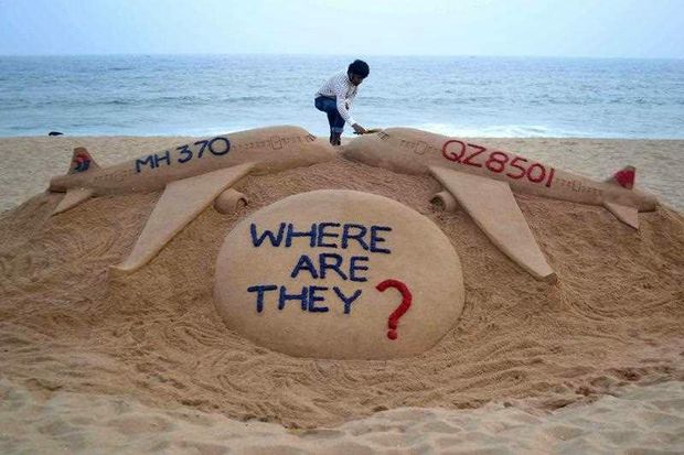
Indian sand artist Sudarsan Pattnaik completing his sculpture of the two missing jet aircraft, the AirAsia airbus QZ8501 and the lost aircraft Malaysia Airlines MH370, on the Golden Sea Beach at Puri (India) on December 29, 2014
The questioning view from the shoreline doesn’t understand the crowded itineraries of the sky, but in rendering two jets, whose upward-tilting noses ascend as if through the clouds, above the colored interogative emblazoned on Pattnaik’s sand sculpture links the paths of two flights, asking how their automatic pilots could have led them to be lost. If the apparently ephemeral construction of the sand sculpture, despite the false solidity of its sharply smoothed edges, seems an apt medium to describe the loss, the poignant question below the image of a possible aeronautical collision seems an apt response to the tragedy of the sudden inexplicable loss of both aircraft at sea and improvised monument to the inexplicable deaths of their passengers.
Pattnaik’s laborious work has acquired increasing public function with almost editorial qualities of collective shaming of great poignancy to commemorate deaths at sea.


