
Terrestrial mapping has long represented the inhabited world and its limits. The rich tradition of medieval map making testifies to the variety of place and distribution of human populations over climates and outside torrid or uninhabited zones; the post-Renaissance or post-Ortelian tradition invited their readers to explore and trace limits of the inhabited world for educated audiences, as well as providing tools to move within it. In ways that reflect the problem of mapping the over-inhabitation of a globalized world, the variety of recent cartograms of Benamin D. Hennig–digitized cartograms that pose the problem of mapping over-inhabitation–suggest the problems of mapping human inhabitation in a globalized world. While these images are not actual projections of space, they stage “para”-cartographical arguments by searching for new solutions to visualize the inhabited world.
The models of “geo-visualization” that Hennig created over the past decade seem to take the notion of the mapping of an ecumene or inhabited world seriously, by organizing visual argument about the shifting settlement of a global space that challenge familiar models for mapping space or the primacy of orienting viewers to accurately demarcating a record of inhabited expanse.

Of course, the familiar spherical projection offers viewers an easy way to internalize their understanding both of the globe, and the place of the US in it–and an icon of geography, as much as a map per se.
But is it accurate? What does it really tell us that we don’t know? The popularity and currency of Hennig’s cartograms suggest different models of geovisualizing that reflect the contraction of space and terrestrial distance in understanding human relations. If these maps are less concerned with economic inequalities, or capital relations, they suggest how population trumps space as a useful way of ordering global relationships, and raise questions of the relation between legibility and maps in provocative ways.
Much as the projection popularized by the journalist Arno Peters of Bremen boasted an equal-area distribution on the surface of a global projection, by adopting the mathematical projection much earlier devised by the complex Scottish clergyman who was himself a popularizer of astronomy, James Gall, to stage a popular polemic about cartographical bias. Gall’s interest in the stars led him to note the alternative of an equal-area projection as an alternative tool to order the curved surface of the world, but UNESCO adopted Peters’ projection in 1968 out of the conviction that it provided a more equitable–and less occidentally biased–record of relationships, and a corrective to an implicit bias that Peters argued permeated the cartographical record.
The global projection bearing Peters’ name is unlike projections named after the men who devised mathematical solutions to visualize expanse, since it was not devised by him: it rather aimed to query the faithfulness of the coverage of other world maps; rather than present himself as a cartographer, Peters acted more as a cultural critic of maps whose work heralded the expanding field of cartographical ethics. Peters invested Gall’s map with a new argument by re-presenting it as a polemic response to an ideology of mapping that privileged Europe and the United States by pointing to how Mercator’s model of global projection was often favored because it had so strongly privileged the size of specific regions of the world where it had been devised, expanding their presence as it dramatically reduced the expanse of Africa and creating a massive Greenland that concealed its relatively few square acreage.
The resulting image was so popular as a corrective revisionist map to sold and hung aa a hipster shower curtain by the 1970s and 1980s–similar to the one currently available from Urban Outfitters has abandoned Peters’ form:

While a novelty, the image is suggestive because Peters would argue for the pernicious nature by which the above map proposed a transparent record of global expanse by perpetuating a litany of geographic falsehoods in the actual distribution of terrestrial expanse. He advanced the equal-area projection as a more legibility record, faithful to actualities, not because of its precision but because of his deep concerns for the persuasive effects of maps’ arguments. Peters worked as a journalist, but received his doctorate as a historian concerned with political propaganda, and the persuasive uses of images led him to champion its faithfulness to area as a corrective to the historic distortion of relative land sizes, adjusting meridians to show the actual relative sizes of countries in an equal-area projection that inaugurated a broad interest in cartographical ethics that was refined by Brian Harley’s later work. The result was a compelling counter-icon to Mercator’s model:

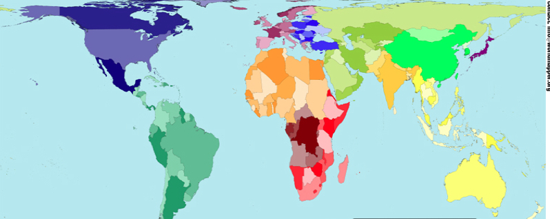
Hennig’s cartograms are in many ways the heir to the Peters projection. In contrast to addressing the discrepancies of land-mass size, Hennig’s Worldmapper offers a variety of models for ordering space to reflect its actual inhabitation–or density of dwellers–rather than their bounds–by the permutation of the globe to a cartogram whose distribution provides nothing like a model to travel through space, but a model for mapping the distribution of human occupation of space on a grid or graticule that denoted a measured expanse; Henning explains its construction in a useful slide show on his methods of data visualization. Although each of the cartograms he devised are not visualizations of expanse, they explore the flexibility of maps as arguments in similarly dynamic ways.
The below cartogram visualizes the human occupation of space, revealing a record of the occupation of expanse not yet available in shower-curtain form, to reflect the surpassing of 7 billion in 2013:

The wispy lines at the extremities of landmasses in the above image is less striking than the bloating of India and China, or ballooning of Japan, or the butterfly formation of South America–all of which remove the subject of space from the map. Does space even matter on the human planet, where spaces are often less relevant than how people have filled space, Hennig asked, and might it not make sense to describe “the living space of humankind” as an ocean-free “population planet” in a modern mappamondo for the globalized age that registers space only by regions’ relative habitation, but represents our own post-Ortelian perception of the contraction of the interconnected nature of how we now inhabit an inhabited expanse:
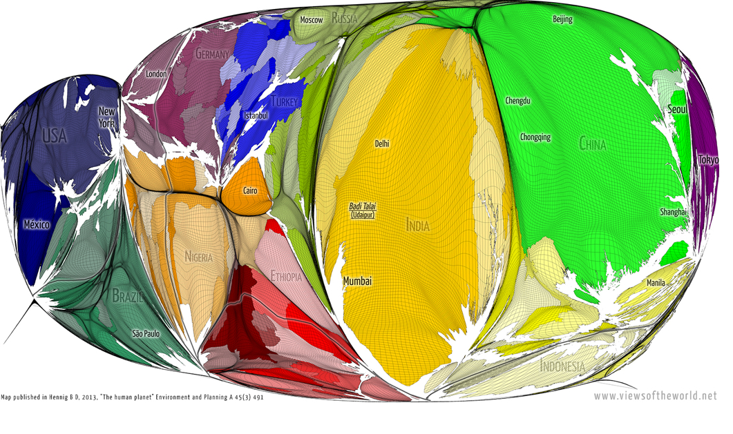
If the mappaemondi of the middle ages were compelling representations of terrestrial expanse before nautical charts gained wide currency, and when tools of surveying were not linked to the preparation of a uniform visualization of expanse, Hennig has specialized in fabricating new tools and formats of gridded cartograms by which to visualize the inhabitation of terrestrial expanse. “Nature” is not the subject of the Hennig population-based projections, so much as something like cultural distortions of space, and the mediation of space in his rendering of his digitized map of the “population planet” provide as exact a mode of dividing the inhabited world as we might have, despite its distortion of terrestrial relations and land-size.
The deeper question Hennig’s map poses is the primacy of space as a dominant analytic category for drafting maps. A self-styled expert in the formats of “geovisualizing in the age of globalization,” Hennig provides formats for visualizing inhabitation more radical than Peters by adopting the techniques of digitization to rethink the prioritization of “space” in how we discuss or conceive of the inhabited world or ecumene, and indeed expanding the possible formats for digitizing global projections in an era when space might no longer be a determining factor to measure or even primarily understand its inhabitation. If the ecumene has been the project of world cartography from the ancient western world, Hennig expands the visual argument of the map dramatically in response to the shifting experience of space in the Worldmapper project as a whole.
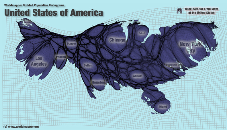
Hennig’s geovisualization provides a clearly radical mode of re-figuring expanse when focussed only on the United States’ expanse: if not suggesting the inadequacy of an electoral college to represent the nation, given the bloating of urban areas’ density in relation to the entire country, the cartogram suggests how the nation’s population occupies its frontiers:
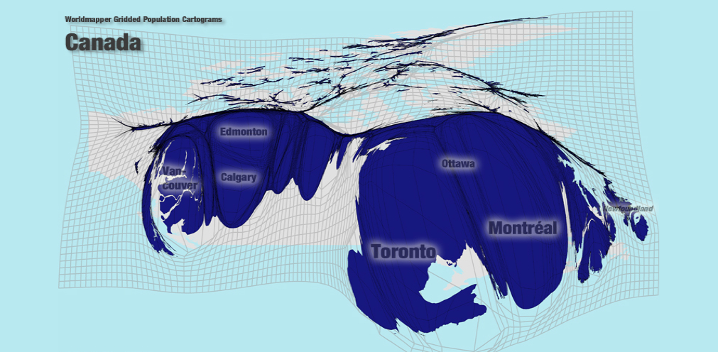
We might see this cartogram as a record of the relative inefficiency with which we occupy national space, without attending in concerted ways to local resources or density of settlement. Even without including questions of economic activity or of the revenues generated by local businesses, a similar geovisualization of Canada raises similar questions of how the inhabitation of a region distorts our experience of expanse and provides keys by which that expanse might more accurately be represented to complement traditional images of terrestrial geography:
The explosion of urban populations raises numerous questions about the effectiveness of land-use, also raised in this earlier post.

Hennig also offers the chance to visualize hot-spots by shifting the norms of the five-color map:
Hennig has in one case expanded the notion of the cartogram that extends the ability to map inhabitation, and present a mapped region as a record of how space is actually occupied. The cartogram began from a new set of techniques to achieve an alternate visualization of population in real-time, recording the areas lit during night-time in a composite photo from a NASA satellite, using techniques based on recording permanent light sources, to map the illumination of night-time areas, and foregrounds urban areas in new ways by their constant illumination: New York’s metropolitan areas is something of a blinding flash in this image created from data derived from the United States’ Defense Meteorological Satellite Program. The composite effectively maps the location of the distribution of illuminated areas, sketching blotches of urban areas and skeins of the lattice of highways, and locating regions permanently illuminated by electric lights, providing something of a reverse-record of the starry sky in the new artificially illuminated world we have made:

The map is a record of the expenditure of man-made energy, and of illuminated settlements, rather than habitability. The digitization creates the illusion of a geosynchronous illumination of regions at night that effectively synthesize, a map of urbanization and that maps the global surface by one alternative index of settlement: nocturnal illumination. The result view suggests huge stretches of illumination that contrast to how many areas it reveals as dark, but suggests just how much of our world is permanently lit:
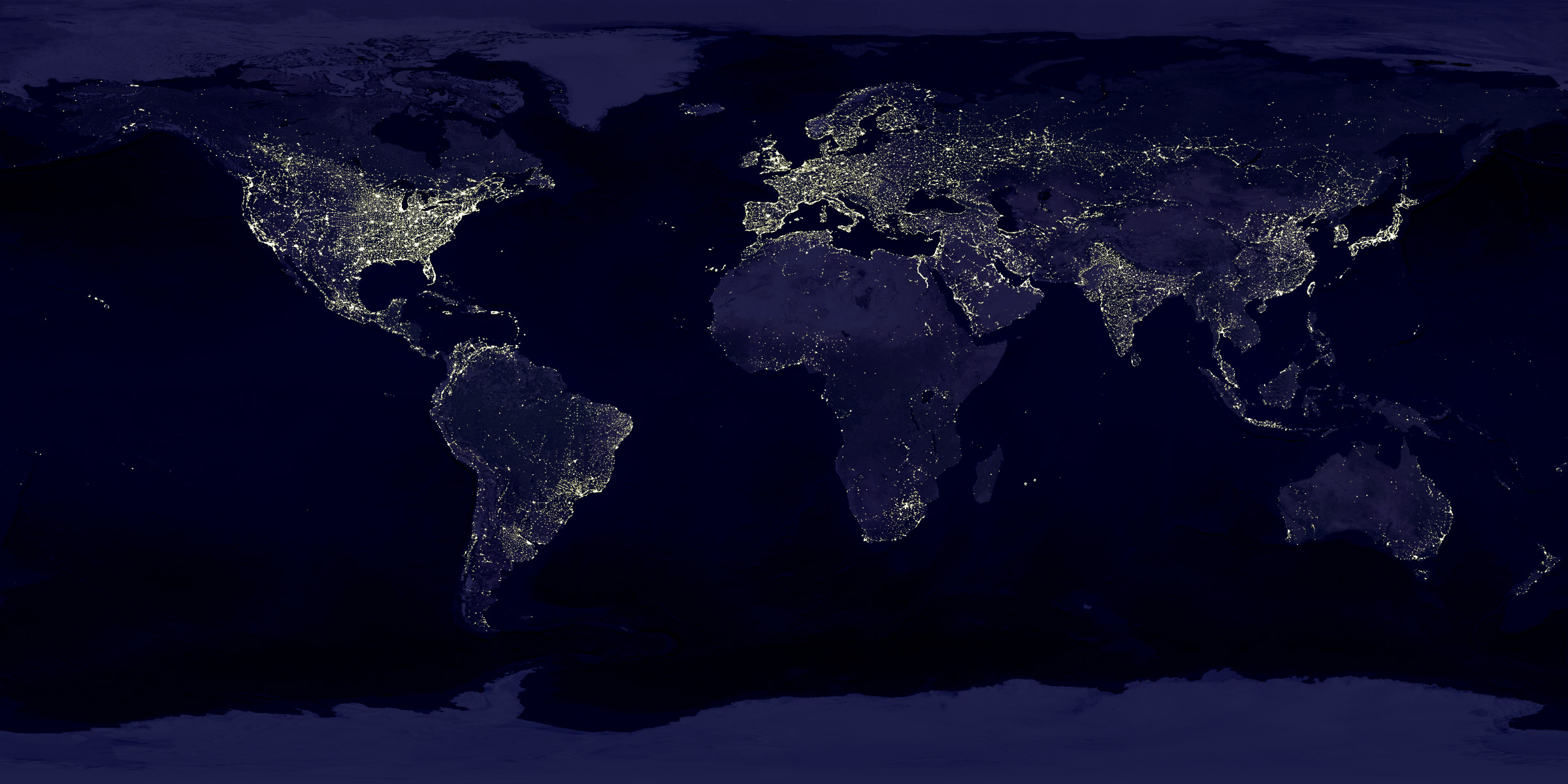
The same projection of illumination was recently placed in global context by Hennig. His inventive combination of the distribution of night-time illumination against the distribution of population as an alternate index of global inhabitation, and of the remaking of inhabited environments. The lopsided nature of much of the inhabited world’s nocturnal light is striking for how it reveals how accustomed we are to live with permanent streetlights: although Hennig is write to note that it is only from a Western perspective that we might confuse permanent illumination with inhabitation, the map that results does suggest the density of centers of illuminated inhabitation at only select regions of the map, and the concentration of areas of illumination to one another in the equal area projection Hennig created in 2010, the “Real World at Night” in 2010.

But one senses Hennig’s “Real World at Night” presents illumination of nocturnal expanse is a record of a different sort of inhabitation.
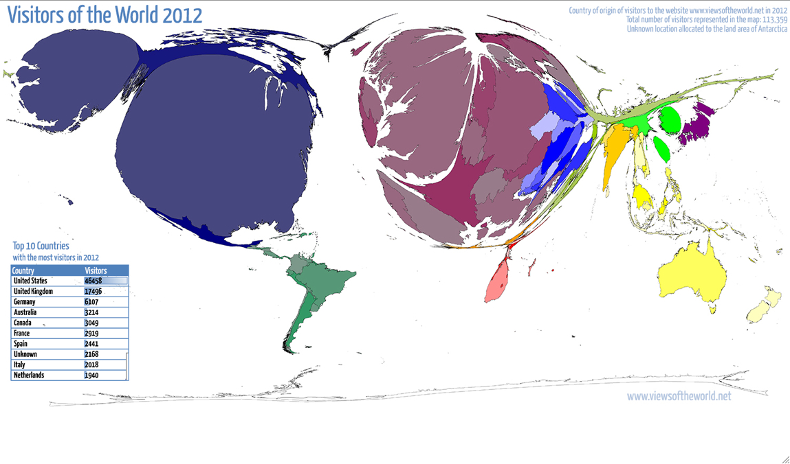
The cartogrametric revisualization of the globe’s inhabitation creates questions of whether other forms of world-mapping are sufficient tools to understand expanse. They raise questions of the validity of tools of projection as records of inhabited space. Hennig has used similar tools of digitized global visualization to make points about visits to his own website, in the manner of Google charts, to reveals the limitations of access to the internet, but also familiarity with mapping tools–which it makes sense to include as a screen–and suggests a demand for re-envisioning the ecumene:

Or, in a more legible image that tracks the breakdown of visitors to the site in order to remap the proportional size of regions across the globe:
 Hennig went on to map nations’ proportional expenditure on military needs, independent of their population, in a stunning image of global priorities, or of the distorting nature of expenditures on military engagement in the West:

Given concerns of the Western cartographical traditions with “inhabitation” and its limits, perhaps Hennig’s most adventurous statistical cartogram traces the remoteness of places from a city or urban area, using distance from cities or urban areas as a way to magnify those places that are less accessible by car or road along a similar grid, allowing us to read inhabitation distinct from population density:

Scrutiny of a segment of the gridded map of relative isolation reveals discrepancies even more pronounced in specific locations, as the expansion of the cartographical grid denotes and signifies the relative isolation of mapped spaces in relation to nearby inhabited cities or towns:


