Tag Archives: United States

The Built World

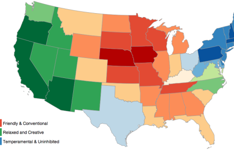
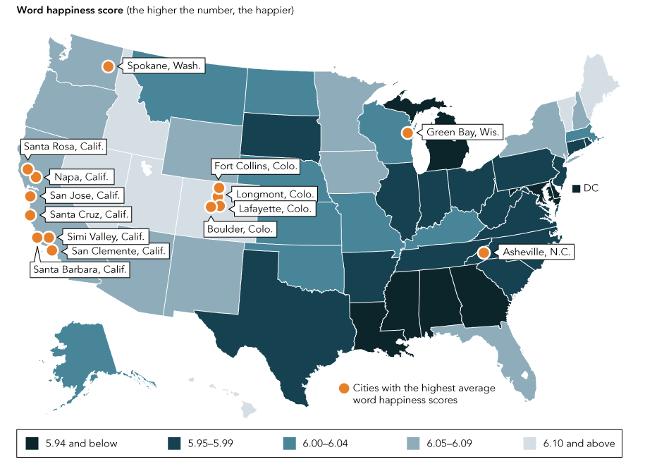
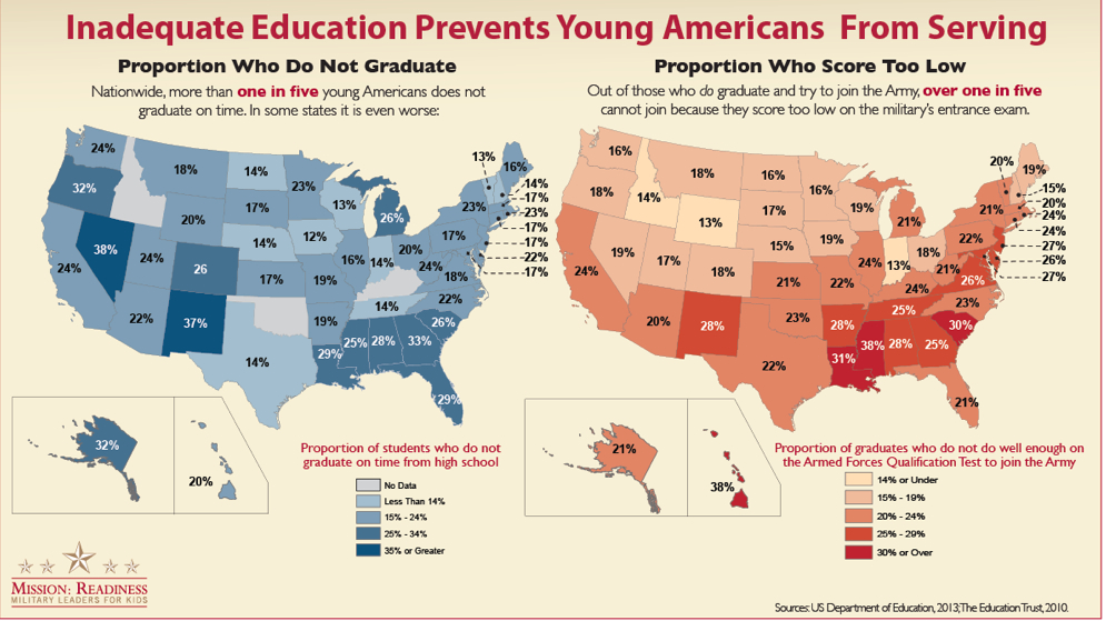
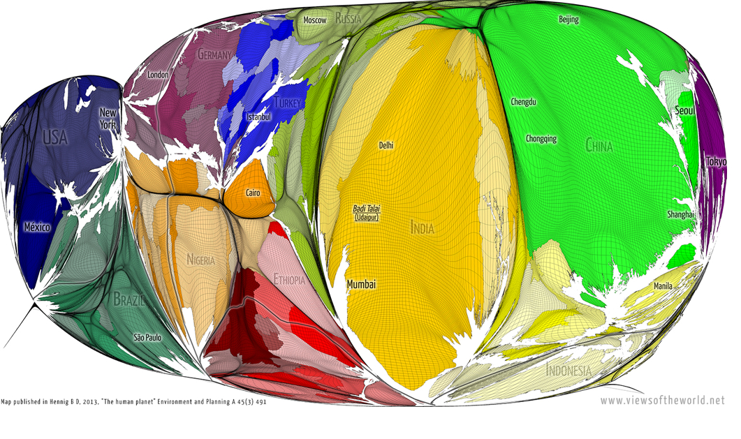
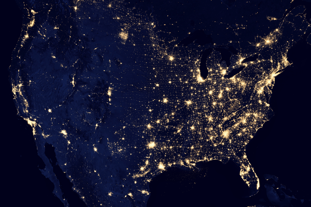
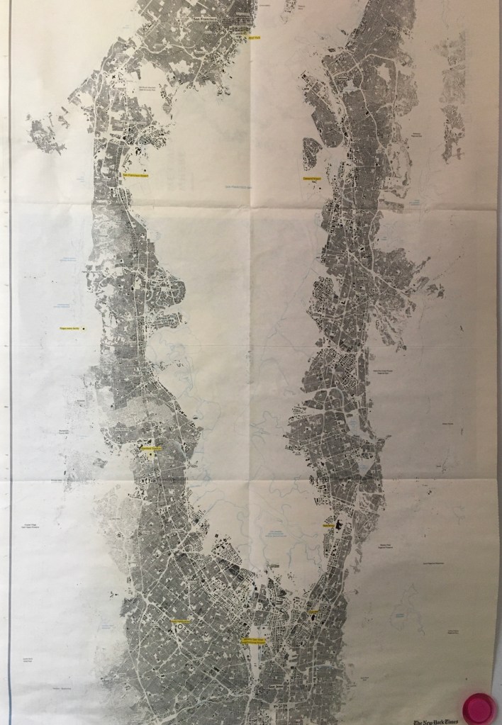
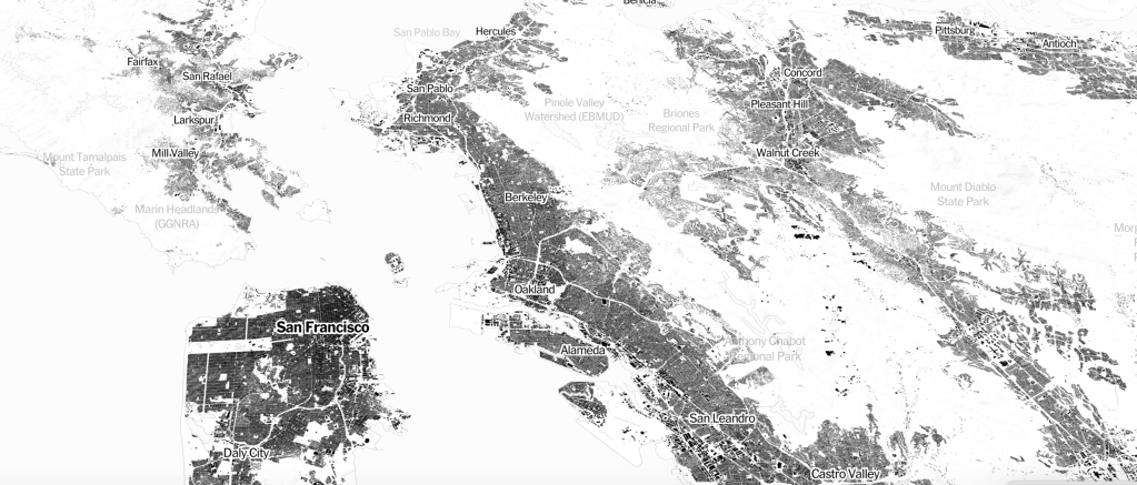
Walking the streets in my now apparently abandoned neighborhood for an errand after a few weeks of sheltering in place in Oakland, I had the eery experience of navigating and inhabiting empty city. While I knew the pavement, I almost felt no longer familiar with the streets that afternoon. There was the sense that no one knew the state of affairs about reopening, and many were just puzzled about how to proceed: as a few young kids skateboarded up Shattuck Avenue, profiting from the lack of cars, some odd improvised bicyclists were on the sidewalk. The absence of interaction was a weird pause indeed, giving an eery sense of the timelessness of space, as if the time/space fabric by which I had long seen the neighborhood was suddenly out of whack. While no visible destruction had happened or occurred, the disembodied nature of the inhabited world was drained, even as it was filled with sunlight and birds, giving me the eery sense I had had when I looked at the machine-read maps of building footprints, “Every Building in the United States,” whose section situating Bay Area buildings hung on our refrigerator wall, like a scary map of the archeological ruins of a future Baedecker Guide to the ruins of San Francsico.

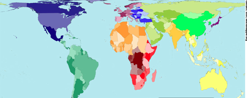
Had the designers of te interactive webmap of machine-readable imagery Microsoft had assembled intended the eery effect of describing the inhabited world as a ghostly ruin of lived life? The relegation to place-names to a very secondary status in the image of the overbuilt landscape seems to lie on the edges of the black blocks of built space that is was the basis for the AI map distilled from aerial photographs, and parsed as black and white data. If its form seems oddly ghostly, the reduction of the monochrome paper map reveals shades of grey that fade into rare open spaces, where one’s visual attention seems at first drawn, before one returns, with hopes for some sense of recognition, to the built spaces that one knows, and the congestion of black that marks urban agglomerations. The black boxes of settlement reveals the crowding of our coasts, the density of much urban housing and indeed of the area of the East Bay where I live, but is also an eerily image of an inhabited landscape selectively organized to omit any sign of living presence–either of “wilderness” or habitat, but anthropocentrically maps the anthropogenic world as if for posterity. For is not the black boxes of building footprints something like a record of the anthropogenic imprint on the world, by now extended across the globe. The building footprint map derived from AI is a rewriting of the ancient notion of the ecumene–the “habitable” more than “inhabited world”–or οἰκουμένη, which sought to encapsulate the inhabited regions as the ones that entered human comprehension: is it a removal of the humanist object of the map, now mediated through machine learning?

If the ancient geographers discussed the οἰκουμένη as the “habitable world” from the frozen north to the scalding sub-equatorial lands that seemed to “balance” the inhabited regions, as if what merited human attention and contemplation was that region that permitted settlement: the turn to a record of imperial administration in the Roman Empire–and of religious unity in a ‘civilized’ world–introduced the governmentality of the control over the inhabited world, that by the Renaissance had become an enticing image of national incorporation and political ties, that became intellectually articulated in the post-Cold War as a global ecumene of imperial cultural dominance and integration incarnated in European inheritance of political institutions, science, technology, and economic forms as a world system: the association of a global integration whose exponent in historical texts was perhaps William McNeill’s Rise of the West (1963) had withered away by the time of the data-driven map of inhabitation, as we have become increasingly aware of mapping the human impact on the world–an image in which the building footprint map might be placed.

It is hard to discuss intentions in a map that was organized by AI, but the ledger size newsprint that covered almost a full side of the refrigerator, hanging on magnets, assembled a flyover of the ruins of a future world, a snapshot of each and every building in the area. The result is a poor excuse for a “wall-map” of the region of Northern California. It seems more of a memento mori of the prosperity Silicon Valley once enjoyed from a future world, registering the intense economic growth that fueled the housing bubble along the San Francisco Bay, in an unintentional snapshot of the explosion of paved space and housing across the coastal margins of what was once one of the more “edgy” areas of the United States: entertaining the imagined future might have created the perverse pleasure of hanging it in my kitchen, long before COVID-19 struck, a celebratory if slightly morose record of the world in which we once lived.

But the sidewalks were empty and sun intense; storefronts often boarded up. The streets were no longer places for salutation or recognition, even if I greeted a familiar mailman on my way home: as if no time for social niceties remained I walked down the sidewalks and into empty streets, rarely negotiating margins of safety, or distancing with a few folks on foot, noticing with a cringe the large number of homeless who stood out against the stark streets, closed storefronts, and empty stores.

They were, as it were, always there. I had been cutting myself off from the surroundings, as I never thought I would. As I had been sheltering, thoughts going global as I was following updates about the pandemic, this was a stone’s through from my home, so many had none. Looking down Adeline Street, at the still tents of homeless encampments that may have multiplied, I felt new distance gaping between us, as the very streets I had walked down regularly seemed to have been forgotten while sheltering indoors, the stores now empty, their windows recently boarded, few driving in the streets where one might walk without danger. The eery absence of population was a scene from The Last Man, momentarily interrupted by an isolated airplane, the first seen in days, flew overhead: I felt like I was on a filmset, more than where I lived, a tracing of life past.

If we were sheltering, what was place, anyways?, I wondered with the footprint map in mind. Empty streets looked like nothing more than an apocalyptic reimagining of the neighborhood, drained of inhabitants, save the apparently increasing cluster of homeless tents, looking far more embattled, and more survivalist than ever. If the building footprint map was restricted to spaces where people lived and work, the ghostly anthropogenic substrate seemed to have an eery counterpart in the homeless encampments near my house. The survivalism was evident in the homeless settlement that had in recent years overflowed, expanding to fill in the island of trees where how Steve Gillman’s 2011 public sculpture marked the interurban divide. The public sculpture elegantly if snidely punned on the allegedly dismissive pity saying ascribed to an icon of modernity about her native home–“There’s no There there“–as an entertainment for motorists, or BART passengers, as much as a public art for pedestrian passersby–by broadcasting a literary reference in greenery.

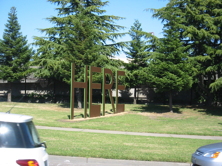
The two words marked the Oakland-Berkeley border by two words, now rusted fifteen years later, as relics of an earlier epoch themselves: the homeless encampment blurred both sides of the dividing line between the cities which had long since melded indistinguishably in the increasingly gentrifying area where I had lived for twenty-odd years.

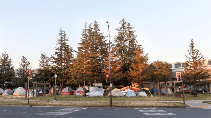
The erasure of a sense of “here” that was promoted by the public sculpture seemed erased in the AI map, that reduced space to built houses, even as the homeless were the only residents in sight as I walked around the tensely empty neighborhood. I’d long appreciated, if a bit begrudgingly, how the Gateway_Project defined the edge of Berkeley CA took Gertrude Stein’s saying and liberalized it in hight-foot tall powder-coated steel letters, where the BART tracks go underground, intended as “a literary and whimsical welcoming to Berkeley,” where they supposedly read not only Stein’s poetry, but where so many poets had lived–and was a “here” worth commemorating by sculptured letters, a new Fons et origo of the Beat Generation, perhaps, or a dynasty of mid-twentieth century poets–Kenneth Rexroth; Czeslaw Milosz; Allen Ginsberg; Gary Snyder; Frank Whalen; Thom Gunn; Robert Hass–by 2002 recognized as a literary patrimony. Designed primarily for passing motorists, as if few could be imagined to walk nearby, the site built to commemorate a “sense of place” had become a cluster of encampments, as if that was the only place that existed at a time when all remained shuttered indoors–if in 2010, just ten years ago, one letter was covered, by a group of Oakland knitters, to transform it to “HERE/HERE,” peacefully protesting the work as barely concealing an agenda of gentrification.

Jill Posener, on Jill Rants and Raves/June 1, 2010

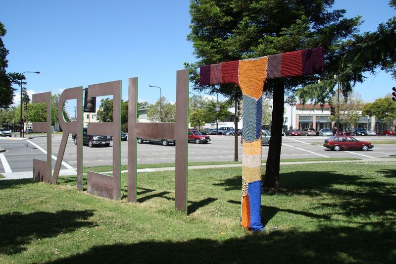
The collective of knitters who had covered the “T” as if to object to the tired trope with which Oakland was long saddled was the result of a. relatively calm tussle, cast as a border war against gentrification. But the global pandemic had subsumed any distinction of “here” and “there” in a new global: the AI map seemed to be indeed a snapshot of the scale of habitation before the pandemic, a ghostly picture of an earlier time.

As I walked through it, at least, the same North Oakland neighborhood was suddenly, if maybe temporary, rendered ghostly: the built landscape that I was inhabiting was the same world, with fewer inhabitants, and less secure attachment to palce–as if the artificial interruption of indoors life shifted my relation to built space, made it harder to navigate, and shifted the security of place, and indeed removed any sense of recognizability from the built landscape, almost to ask what the civilization was that led to the building of all this paved space.

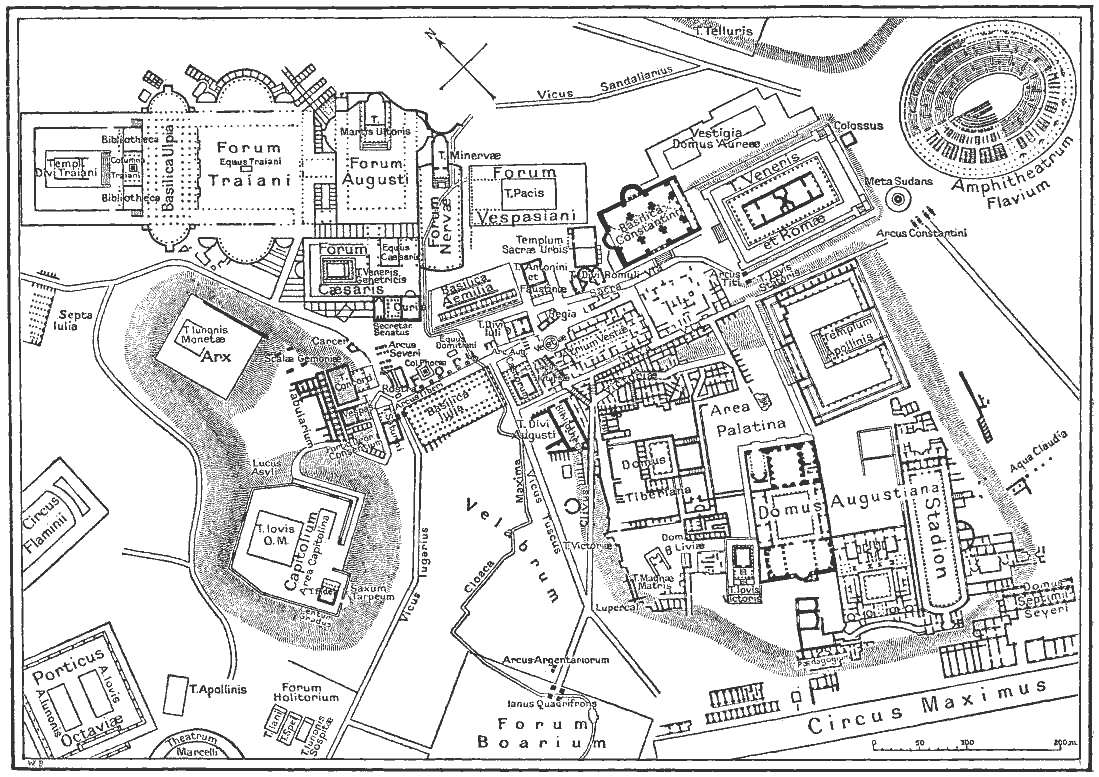
The unmooring from physical presence was like being dropped, I imagined in a flight of fantasy, to that Microsoft map, so akin as a snapshot to the sort of map of archeological ruins future generations might trace as guidelines of orientation to a lost past, when what was the greatest “here” of antiquity–the city of Rome–was etched by nineteenth century archeologists and antiquarians by the physical plant of what once stood on the site of the ancient Roman forum, only perceptible to the eyes of tourists if they had trained themselves on the map to imagine the ghost-like presence of architectural monuments that had once affirmed the place of Rome at the center of the world at a far earlier time.

Where was here, now, on the AI map? Was the tie I was drawing between the map and the uninhabited neighborhood only the depressive meanderings of a middle-aged crisis? Or was it a global one? West Berkeley and North Oakland had been certainly rendered quite a different place, quite suddenly, and not a comfortable one–still inhabited by ghosts. Stripped of my points of reference or familiarity with my neighborhood, a few dispossessed in the sidewalks, of what wasn’t a nice area of town, I was reminded rather urgently of ongoing part of urban life no longer framed by sounds of traffic, public transport, open businesses and pedestrian sounds, that continued while I was indoors. The degree zero of urban life reminded me of the empty landscape of building footprints that, in a detailed satellite overview that recalled nothing more than the outline of an archeological dig of ancient city, as if drained of motion, and filled with apprehension, in a damn eery way. Was this a pause or a new landscape?

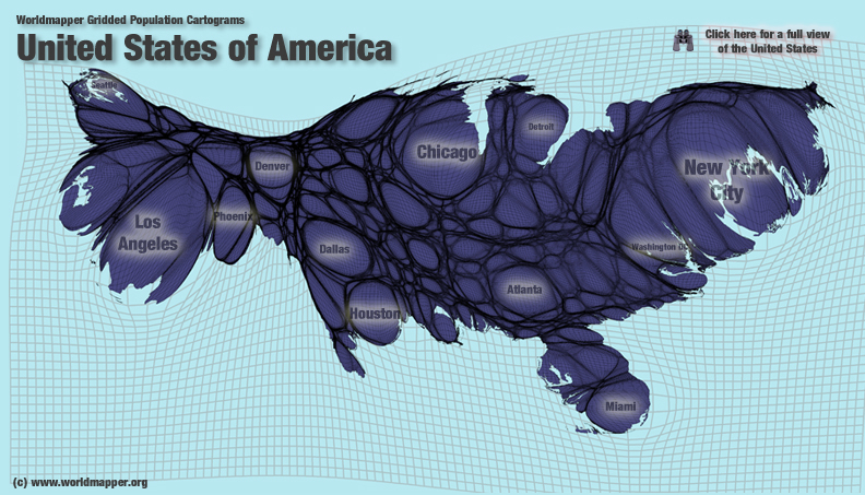
I had only recently been navigating the 2018 building footprint map, “Every Building in the United States,” and aout a year ago, hung the section of the houses of the Bay Area onto our refrigerator wall. The creation of Microsoft that was removed as one might imagine from the ancient notion of an “inhabited world,” comprised of building outlines, a distanced description of the world a declination of mapping human settlements, mediated through what seemed the iconography of an archeological map of a removed time, rather than the actual lay of the land–or, better yet, it seemed to exist in two planes more than ever, and both as a historical record of a snapshot of built space across America, and of actuality. The interactive website of the machine-readable result of aerial imagery that invites one to zoom closely not on landscapes, but a black and white rendering of built space, recalled nothing more than a flyover of the ruins of a future world.

The aerial snapshot of each and every building in its current position had a sci-fi aspect of a record of space drained of nature, biodiversity, non-anthropogenic environments, and life–distilling selectively the extent of built spaces across an otherwise quiet and otherwise uninhabited world: as if the perfect document of the anthropocene, this was the built landscape, removed from and detached from a natural world. This was the built landscape of the region, divorced from the lay of the land, as if a perfection of the GPS contents of street view, without any street traffic or greenspace at all. The stark interactive map of 2018 seemed to be newly present to the space I was negotiating in my mind, even more stripped to its bare bones and evacuate of inhabitants.

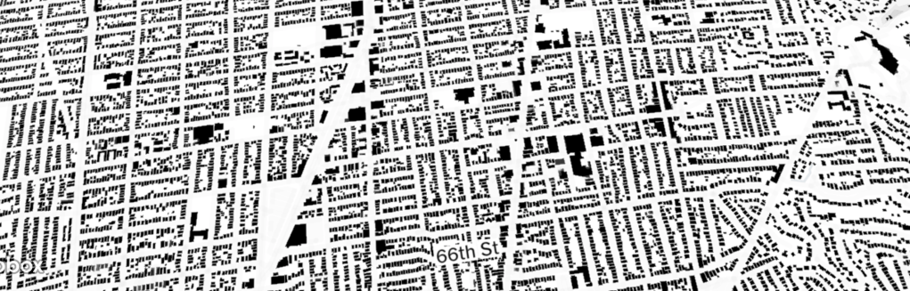
The vertiginously uninhabited interactive map peered at onscreen allowed one to look at the nation and soon to whatever spot on the map, suddenly panning and focussing into crisp detail, but lacking all sign of inhabitants, save the names on each street or place. The sense of exploring a neighborhood I once knew may have been an accelerated arrival in late middle age. But the spatially empty landscape of building footprints encountered I opened in 2018, “Map of Every Building in the United States,”was filled with a sense of dread and of testing my own geographical knowledge, scanning to familiar neighborhoods and structure, and matching abilities to recognize the flattened forms against the material structures with which they correlate.  There is no sense of the amount of chemical waste and diesel pollutants in the nation’s largest port, Long Beach, pictured in the header to this post, where pollution has caused ongoing health problem for residents.  

Continue reading

2 Comments

Filed under Bay Area, data visualization, interactive maps, satellite surveillance, virtual space

Data Creep

The relative onslaught of poor data visualizations so plaguing much of the news media may derive from a hope to attract new audiences as budgets shrink and bureaus decline:  by boiling down a “story” by dispensing with those bothersome words, they seek to make immediate impact on an audience by a powerful (and eye-catching) graphic.  Based on the self-reported responses to the “Big Five” personality test questionnaire that was developed in the 1970s, but recently used to aggregate responses via Facebook, which posits “five dimensions of personality” to distinguish personality types, based on the odd belief that, rather than reflecting individual character, one could detect “different regions of the U.S. have different personalities.” The self-reported rankings of attitude (curiosity, energy-level, tenseness, quarrelsomeness, forgiveness), efficiency (reliability, laziness, perseverance, efficiency), and character (shyness, moodiness, distractibility, sociability, rudeness) are values with little possible quantifiable relationship among themselves, which translate into a data-distributions of limited legibility or credibility after they’ve crept into a map.  Projected onto a map the colorful choropleth offers a “mood-ring for the nation” whose choice of hues communicates little intuitively:

state-map-personality-test

Unimaginative data overlays like this  lie somewhere between video games, a MacPaint program, and an adult coloring book approached with Prismacolor markers–more a diagram than a map, they serve to carve the nation into clear blocks as if this would clarify anything about national unity or collective networks:  such visualizations take pride in how they disrupt continuity in a search for a narrative about the national divides that are revealed in our political process, and do so with varying degrees of precision.   Their production seems to be driven creep of data into overlays atop base maps, as if to awkwardly digest the familiarity with data–and make all feel like they have access to truly “big data”–by using an image of the nation to bequeath authority even to miniscule data samplings by treating them as images able to visualize datasets:  this is an insidious format makes us thirsty for more of the same, as we seek to grasp divides and parse divisions with the apparent exactitude of a surgical scalpel.

The recently widely retweeted but fairly facetious map of “America’s Moods”, an interactive graphic mapping emotions titled “America’s Mood Map,” has circulated online with considerable popularity but is able to be blamed on Time magazine’s website.  The data visualization has just the right mixture of declarative insouciance and light-heartedness make it a meme and bane of online journalism, and a typical illustration of this dilemma.  The distribution of data that results deflect scrutiny from the very data that they’re employed to embody.  The interactive blocks of color in what seems a choropleth distribution are a bit compelling, until one asks what state-lines have to do with emotions after all, or if this just was a nifty way of converting data to visual form.

What sort of embodiment of data is going on here, one might well wonder, and question what the mosaic of colors communicate or signify.  Not to mention the map’s confusion of a question of individual psychology and gross geographic regions–especially such abstractly construed categories as the legal boundaries of forty-eight individual states’ authority in our nation’s union.

The interactive ‘map’ demonstrates the recent discovery that responses to the great American greeting, “How you doing?,” differ starkly across state lines in the lower forty-eight:  if in benign fashion, the result proclaims divisions and splintering that trump the continuity of territorial maps, and perhaps map an explanation for all the differences we already know.


America's Mood Map


Why “friendliness” is signified by red, “temperamental and uninhibited” by blue is as problematic as the lack of any continuity among these personality types, and the relative subjectivity of judgment:  it turns out that these are self-classifications, anyway, rather than determined by objective criteria–as if values like these could be objectively assessed.

The lack of material references in such ‘maps’ almost winks to viewers not to take them too seriously.  Yet the relative ease of converting statistics into overlays on base-maps in web-based formats, seems the rationale for their popularity as interactive media in on-line news publications.   Forget the actual map that orients its viewer to the lay of the land:  this is immersion in the map as interactive data environment.

The deepest difficulty of this data visualization may lie in how it confounds the empiricism of a map with pretty relative–and pretty vaguely construed–psychological categories. Although Time magazine science editor Jeffrey Kluger seems to have fun downplaying is meaning at the same time as he promotes it, “America’s Mood Map” is the most popular in the section “Science and Space” among readers of Time this past week, and a success by journalistic standards, is the interactive map of emotions across the United States, across which one can glide one’s cursor to reveal a virtual version (and modernization) of the early modern Carte de Tendre over which you can mouse about to find a place that “matches your personality”:  but rather than visualize material renderings of feelings or emotions, as that topography of amorous practices, the imaginary topography over which we mouse to find the ranks of each state’s inhabitants reveals clear divides rather than a detailed qualitative record.  Data has crept into this map’s bright mosaic of colors can’t help but engage other data-vis maps, with which its full-spectrum color schema stands in such stark contrast.


Moood Map of US

Although the color blocks are arranged in something like a spectrum of friendliness to temperamental, the actual values on which they are based provides something of a map of mental constitutions, as much as emotions, and one can range of neurotic to extroverted, with open-ness thrown into the mix.  The explorer of the map can find themselves, for example, in “agreeable, conscientious and open Tennessee;” we all know a few who fit the description:


Conscientious Tenessee


The ranking of each state surely increased its popularity, as the map becomes yet another tabulation of characteristics after one mouses around a bit on its surface.  California, predictably, is both relaxed and open (#2 nation wide!) and low in neurotics (#43; agreeable Utah lies at the bottom of the heap at #49), and New Yorkers are temperamental but ranked as among the most open (#3).  (Such classifications based on a sampling of 30,000 must conceal the detailed nature of the questionnaire.) Who would have thought that largely rural Wisconsin, a state with one large city, possessed the most extroverted population in the country? Or that Maine stood near the nation-wise apex of neuroticism?  New York gets pretty low marks for “agreeableness,” whatever that means (#48 in the nation), if it is also pretty high in “openness.”

There might be some problems with the data pool.  Perhaps the map’s very lack of materiality makes it difficult take seriously, even if the pleasure of using moods to divide the country seems a relief from dividing the nation by ideological divisions.  (The next step that this map seems to invite is no doubt for carto-data-crunchers or map-readers to map the moods of the nation onto those political divisions:  how better to easily explain the ideological divisions that grip our media on the eve of the Affordable Care Act and the morning after the Government Shutdown?)   Indeed, the interest in the “mood map” among Time‘s readers might been generated in part by hits from all those readers, long subjugated to an onslaught of data visualizations, who want to explore their own states in the mirror of their own states of mind or who want to try to map the now-tacit maps of national division onto the far more innocuous (and un-ideological) question of moods.  Indeed, this stepping out of the recently emerged graphic lexicon of ideological division and splintering is somehow reassuring, as, much as the article announced, maybe its mistake  this country “features the word United in its name,” since “we splinter along fault lines of income, education, religion, race, hyphenated origin, age and politics.”

Maybe it does really all boil down to constitution and emotions, all those earlier data distributions be damned.  The end-product is something of a polemic rebuttal to the authority of earlier data visualizations in the news, to be sure, of a very tongue-in-cheek sort of very, very muted irony.  The text’s injunction to find where you belong in the map–by your mood, not by where you actually are–invites you to glide your mouse over a map with the authority of a spatial distribution of the rainbow colors of a mood ring, in a pretty abstracted state of mind, so unlike the ways in which, say, a detailed topographical map registers the measurement of physical elevations by exquisitely exact orographical detail.

The survey employed was based on a sample of under 30,000 respondents, but passes itself off as a pretext for self-examination or -understanding, complete with the assurance that results won’t be reported or stored by Time is respectful of your privacy (perhaps to marketers of antidepressants?).  Whether it is able to map such stark divisions of “mood”-tendency beyond statistical error is unclear, although the almost spectroscopic division of the nation into stereotypes seems somewhat persuasive:  the center of the country, if not so large a swath as the “red-states” of Bush years, is proudly “conventional and friendly,” unlike the creative types on both coasts:  the mapmakers permit little constitutional overlap among these categories, or multiple combinations of them, so much as render one of the three criteria for each state, and allow little overlap among them; the cartographical “paratext” to the map placed above its panels invite its readers to take a short test so that one might place your personal constitution where it really belongs, and suggests that these three metrics are rigidly exclusive from one another.


Moood Map of US

The result is a new portrait of the dis-united states, several of which are already in widely circulation–and some even so widely internalized as ideological divides that one can’t make associations between this “map” of emotions to more familiar political and social divisions.  The data visualization may be taken as a pretty light-hearted response to our dramatically increased geographical mobility, or our obsession with data-visualization maps.  But Kluger and co-author Chris Wilson use the data of fellow-American Jason Rentfrow, obtained at Cambridge by a multinational think-tank created data by a psychological survey of their own device, and the map is presented in the rubric of the “Science” section of the magazine’s website.  The data that was used to inform the visualization, under the name of science, claims to reflect the salient divisions of what “for a country that features the word United so prominently in its name, the U.S. is a pretty fractious place,” as if it might be a more credible set of criteria to ascertain relative depths of fractiousness and their causes–despite its odd metric for measuring “emotional” divisions.

And its interactive features create at least half of the fun for its readers.  The notion of locating diversity in our moods is a lot more appealing than finding it elsewhere; the mirror of the interactive map is no doubt a partial reason for its popularity.  Indeed the invitation to guide oneself to one’s own and one’s nation’s emotions might be hard to pass up, if it suggests quite a lack of complexity in the terrain revealed by introspection, which seems, here, to be equivalent to the completion of a modular form, rather than offering a topography that might be worthy of future qualitative detail.

There is a more authoritative, and perhaps more familiar, map of which the map dissected above might be called the comic repetition.  The study of state-specific variations in happiness (one emotion–that’s a better concept already) was the result of a study based at UVM of geotagged tweets, published in the online journal PLoS ONE, whose tabulators ranked over 10,000 words on a graduated scale to score some millions of tweets across the country, irrespective of their context, to reveal significant differences in sadness and happiness across the nation, perhaps better translating what might be called a set of emotional divides:


Happiness Score in One Map


Indeed, the clear “sadness belt” marked so appropriately in such sombre black hues, and casting a deep shadow over our southern states which curls up to the economically depressed areas of the midwest, suggest something like a meaningful map, with the noting of neat exceptions of particularly happy cities, Asheville and Green Bay.   The weighing of these cities as exceptions lends a credence to the overall distribution of tweets the researchers collated in their data visualization, and the depth of data on which they relied.  The substantive study collated tweets over several years, even tracing computable variations in daily happiness averages that could be mapped to contemporary events, creating a set of stunning data visualizations in this “hedonometric” visualization from 2008 to the present whose units of days are suitably color-coded for weekday, allowing one to register how daily variations are effected by workdays and weekends.  The “hedonometer” seeks to provide the most accurately parsed chart of “happiness” based on daily counts of the tweeted words of happiness–the most common five words of happiness used each day suddenly appear when the day is hovered over.  The  graph is great fun to investigate, and can be tied to news events that impacted the nation’s overall index, from the Newtown shootings to inauguration days or holidays:  note the nation-wide spike on events like Christmas, which, since we still seem to all celebrate or at least note in some fashion, always reliable produces incalculable tweets.

If the first map from Time is a descendant and comedic successor to the UVM map of happiest states, both seem to rehabilitate the paper map in digital form as something like a response to the need for a “GPS for the soul,” an unfortunate mash-up if there ever was one.  Such maps exist in the big data-visualization echo chamber that has dominated our abilities to envision our country.  This echo chamber has existed ever since we came to believe that the country could be meaningfully cut up in meaningful ways for ready consumption.  If it could lie in the easy access to maps and data visualizations, it seems to respond to an unquenchable the thirst for images explaining regional differences that underly such a dichotomously divided status quo, since the division has roots that cannot be purely ideological in nature.

The single spectre that haunts the rise of even the most banal of data visualizations in media news in recent years may be maps of electoral results, especially from the Bush-Kerry 2004 election, in which that large red expanse of the middle of the country created a contrast to a close electoral contest of 296 to 242, which could have been upset by a single state.

Bush 296 - Kerry 242

The map haunted because it was almost repeated in 2008, with a key variation, only to be beaten back in recent years.

Obama:Biden McCain:Palin

These images seem to be seared into viewers’ minds, or at least into the unconscious of data visualizers.  Data of all sorts has since seeped into the map of the contiguous forty-eight.

Of course, the mother of all data-visualization maps is the most spectral, which still resonates with what some still consider the death-toll of democracy that at least one justice has come to regret:


ElectoralCollege2000


The contrast between that map and the popular vote led to something of a polemic exchange that was based on peering into data visualization maps to parse the vote, we might have forgotten, that familiarized everyone with data distributions:


County by County Bush v. Gore


The mapping of the country’s population has gained increased symbolic currency as a sort of transparent rendering of national opinions, only dreamed of in the early days of NORC’s General Social Survey, and far more easily visualized.  The creeping of data into such visualizations of the nation as “America’s Mood Map” has, after all, lent new authority to a visualization both more colorful and less depressing than the dichotomous division of the nation into “Red” and “Blue” states of almost Manichean terms.

And they are also much, much less depressing than the sort of heavy-handed Google Map divisions of the country into those regions that are ready to relinquish pre-K funding or subsidies, an idea that seems to undermine our national interest, as well as of those states that refuse the expansion of Medicaid, all in the name of undue federal influence.  To start with the first, we can view it two ways in news media, but both ways to illustrate the difficulty of ever arriving at consensus:  the below interactive (and informative) map that explores the educational opportunities in the Southern states of the US illuminates differences in pre-K funding (click on the above to explore funding changes in each state from 2009 to 2011, since the color-scheme is not self-evident).


SATELLITE VIEW-PRE-K FUNDING CITS


Below is a far more austere and stark way to visualize the data on how low many states rank kids less than four years of age, in which depression about care for pre-schools increases for the viewer in inverse relation to darkening of states’ hues.

PRE-K US 2005

In the colors of the data visualization blender, where data undermines map, there seems no consensus at all, and a pronounced fraying of the country’s diverse demographic.

One can always cut up the country in different ways, and the preferred way seems less based on splinters than blocks.  But some of the choropleths are striking and scary, as the refusal to expand health subsidies in the American Care Act, to which we’ll return.  The proliferation of these visualizations of difference may arise from the rise of the mythic “sea of red” in the general election of 2000 election through the Obama victory of 2008 may have left us barraged by the cutting up of the nation into camps.  The rise of new data visualizations seek to address these divides, but often seem to lie in the data visualization echo-chamber–as in the case of the “map of emotions”–as much as

But then there are those who reject either the Common Core standards or Affordable Care Act alike as forms of undue federal interference.


REJECTING COMMON CORE


Rejection of the ACA reveals a similar fragmentation, despite some serious number-crunching that went on to illustrate the high proportion of poor, uninsured and low wage-earning residents in may those very same blocks of states:


legend- Poor and Uninsured Americans

8% poor and uninsured

This is an odd echo, as I’ve elsewhere noted, between the very regions which outright refuse government expansion of Medicare and those with lack of insurance and large numbers of low-wage earners and some of the same states that refused to accept clearance by the Dept. of Justice before they changed voting procedures as an instance of undue federal interference.


Clearance Required


It’s nicer just to think that it all boils down to individual moods, which the scientific status of ““America’s Mood Map” nicely parse along clearly defined state-lines–even if its end results may have the scientific status of a mood-ring.  The chromatic variations are at least attractive, and able to be read easily, removed from political dissensus.  And it’s certainly more fun to imagine that we might be able to find a sense of constitutional differences inherent in the atmosphere of a region, and mirrored in lines of state sovereignty, that somehow miraculously reflect an almost Hippocratic sensibility of the shifting humoral constitutions of residents of different climates, rather than political or sociocultural (and socio-economic) differences.

But it’s hard to make any sense of the visualization, largely since the very values that it depicts do not lie on a continuum in the manner of most polls or degrees of gradual difference, but seem qualitatively distinct, and even, often, judgment calls.  The state-by-state map of personal constitutions hearkens back to an early modern notion of how place and season inform the humors, or regional climates color the mind.

It is perhaps not a far stretch to include a data visualization of a state-by-state map of obesity trends (and no doubt diet)–


OBESITY 2010–although such a map seems to isolate the deep south and its southern neighbors from Texarkana to New Mexico.

A vague overlap of data seems to exist similarly sized region, sadly, is plagued by lack of completing High School–although this has little relation to body-size, and there is little evidence of a relation between them, even if it does speak to the difficulty of valuing educational reforms like Common Core.

The difficulties created by “inadequate education” does seem to divide the country, however, as this choropleth reveals, and not only among those able to complete High School, but even in those who, having completed High School education, were not allowed to be part of the Army corps–a truly shocking statistic that effectively does divide the nation.


GRADUATION OF HS


Perhaps the only visualization that communicates unity is one of  cell-phone coverage, which customers, after all, desire–


Verizon-4G-LTE-Map-e1370794274644-540x327


By way of contrast, and a lightening of humors in how our country sees itself, “America’s Mood Map” shows a diversity around that one red block at its center, oddly located at Iowa–and whose deep red oddly seems to signify conventionality and friendliness–a quality the color does not suggest.

America's Mood Map

Other blocks of states are similarly lumped in oddly generic categories of states of mind–states of mind with limited relation to one another.  Hence, California, following, perhaps, conventional stereotype, is both open (if not that extroverted at all, particularly), and the among the least neurotic of the entire bunch.


Open and Un-neurotic California


In the most charitable reading permitted by the aggregation of data, the map would be an exercise in empathetic understanding of one’s neighbors limitations.   If one can permits an excursus, contrast it to the varied topography in the historic early modern “Carte de Tendre,” whose richly varied landscape suggests dangerous sites of delay or lack of clarity that the unaware and unsuspecting traveler may chance across by means of its locally detailed variations.


Carte de Tendre


These elegant enterprising travelers with cockades are gallant explorers of the outdoors, of course, rather than perched behind their screens.  Both the material and metaphorical nature of the data-visualization map are absent:  for in these cartographical transpositions, the data poses irreconcilable and absolute divides, and blocks any consensus from emerging.

“America’s Mood Map” is an artifact that serves as something of a mirror to make sense of our divided polity.  If one can given it a generous reading as an amusement, however, it may merit being taken seriously.  The eerily radical conceit of the data-visualization is not only that we are not “United” at all, but that one can naturalize states’ rights arguments in the radically different constitutions of their inhabitants, as if separate nations:  hence, conscientious Tennessee lies beside irascible Kentucky; open New York nearby to closed New Hampshire, and far from neurotic Maine; agreeable and conscientious North Carolina beside a Virginia that lags behind in both categories.  The authority that data is conceded in this visualization in fact erases mappable divides between rural and urban differences, socioeconomic distinctions, and patterns of wealth or any qualitative detail, taking the blocks of the electoral college as something like a national phrenological map.  The notion of an absolute difference in constitution as lying in direct relation to those state boundaries creates a particularly insidious illusion of differences that essentializes state lines–rather than following the idea of national character–that echoes one of the deepest presuppositions of what might be called Tea Party doctrine.  For the diversity depicted in data visualizations is always one engraved in hues of essentialization, rooting regions dispositions as fixed in a spectrum as different wavelengths, and empties the map of any continuity or local detail with those flat color blocks of distinctly defined individual “moods.”

How are you feeling?

Leave a comment

Filed under America, America's Mood Map, Care de tendre, choropleth maps, data visualizations, Google Maps, Hippocrates, Hippocratic humors, Jeffrey Kluger, MacPaint, mapping national divides, pre-K funding, Red states v. Blue States, Tea Party, Twitter map

Geo-Visualizing an Over-Inhabited World

Terrestrial mapping has long represented the inhabited world and its limits.  The rich tradition of medieval map making testifies to the variety of place and distribution of human populations over climates and outside torrid or uninhabited zones; the post-Renaissance or post-Ortelian tradition invited their readers to explore and trace limits of the inhabited world for educated audiences, as well as providing tools to move within it.  In ways that reflect the problem of mapping the over-inhabitation of a globalized world, the variety of recent cartograms of Benamin D. Hennig–digitized cartograms that pose the problem of mapping over-inhabitation–suggest the problems of mapping human inhabitation in a globalized world.  While these images are not actual projections of space, they stage “para”-cartographical arguments by searching for new solutions to visualize the inhabited world.

The models of “geo-visualization” that Hennig created over the past decade seem to take the notion of the mapping of an ecumene or inhabited world seriously, by organizing visual argument about the shifting settlement of a global space that challenge familiar models for mapping space or the primacy of orienting viewers to accurately demarcating a record of inhabited expanse.

globe map

Of course, the familiar spherical projection offers viewers an easy way to internalize their understanding both of the globe, and the place of the US in it–and an icon of geography, as much as a map per se.

But is it accurate?  What does it really tell us that we don’t know?  The popularity and currency of Hennig’s cartograms suggest different models of geovisualizing that reflect the contraction of space and terrestrial distance in understanding human relations.  If these maps are less concerned with economic inequalities, or capital relations, they suggest how population trumps space as a useful way of ordering global relationships, and raise questions of the relation between legibility and maps in provocative ways.

Much as the projection popularized by the journalist Arno Peters of Bremen boasted an equal-area distribution on the surface of a global projection, by adopting the mathematical projection much earlier devised by the complex Scottish clergyman who was himself a popularizer of astronomy, James Gall, to stage a popular polemic about cartographical bias.  Gall’s interest in the stars led him to note the alternative of an equal-area projection as an alternative tool to order the curved surface of the world, but UNESCO adopted Peters’ projection in 1968 out of the conviction that it provided a more equitable–and less occidentally biased–record of relationships, and a corrective to an implicit bias that Peters argued permeated the cartographical record.

The global projection bearing Peters’ name is unlike projections named after the men who devised mathematical solutions to visualize expanse, since it was not devised by him:  it rather aimed to query the faithfulness of the coverage of other world maps; rather than present himself as a cartographer, Peters acted more as a cultural critic of maps whose work heralded the expanding field of cartographical ethics.  Peters invested Gall’s map with a new argument by re-presenting it as a polemic response to an ideology of mapping that privileged Europe and the United States by pointing to how Mercator’s model of global projection was often favored because it had so strongly privileged the size of specific regions of the world where it had been devised, expanding their presence as it dramatically reduced the expanse of Africa and creating a massive Greenland that concealed its relatively few square acreage.

The resulting image was so popular as a corrective revisionist map to sold and hung aa a hipster shower curtain by the 1970s and 1980s–similar to the one currently available from Urban Outfitters has abandoned Peters’ form:

ba2ed96338ebe708156572de71e75153


While a novelty, the image is suggestive because Peters would argue for the pernicious nature by which the above map proposed a transparent record of global expanse by perpetuating a litany of geographic falsehoods in the actual distribution of terrestrial expanse.  He advanced the equal-area projection as a more legibility record, faithful to actualities, not because of its precision but because of his deep concerns for the persuasive effects of maps’ arguments.  Peters worked as a journalist, but received his doctorate as a historian concerned with political propaganda, and the persuasive uses of images led him to champion its faithfulness to area as a corrective to the historic distortion of relative land sizes, adjusting meridians to show the actual relative sizes of countries in an equal-area projection that inaugurated a broad interest in cartographical ethics that was refined by Brian Harley’s later work.  The result was  a compelling counter-icon to Mercator’s model:

Peters BW
Hennig’s cartograms are in many ways the heir to the Peters projection.  In contrast to addressing the discrepancies of land-mass size, Hennig’s Worldmapper offers a variety of models for ordering space to reflect its actual inhabitation–or density of dwellers–rather than their bounds–by the permutation of the globe to a cartogram whose distribution provides nothing like a model to travel through space, but a model for mapping the distribution of human occupation of space on a grid or graticule that denoted  a measured expanse; Henning explains its construction in a useful slide show on his methods of data visualization.  Although each of the cartograms he devised are not visualizations of expanse, they explore the flexibility of maps as arguments in similarly dynamic ways.

The below cartogram visualizes the human occupation of space, revealing a record of the occupation of expanse not yet available in shower-curtain form, to reflect the surpassing of 7 billion in 2013:

Wrold Mapper Gridded Pop Cartogram

The wispy lines at the extremities of landmasses in the above image is less striking than the bloating of India and China, or ballooning of Japan, or the butterfly formation of South America–all of which remove the subject of space from the map.  Does space even matter on the human planet, where spaces are often less relevant than how people have filled space, Hennig asked, and might it not make sense to describe “the living space of humankind” as an ocean-free “population planet” in a modern mappamondo for the globalized age that registers space only by regions’ relative habitation, but represents our own post-Ortelian perception of the contraction of the interconnected nature of how we now inhabit an inhabited expanse:

%22Human Planet%22 by Hennig

If the mappaemondi of the middle ages were compelling representations of terrestrial expanse before nautical charts gained wide currency, and when tools of surveying were not linked to the preparation of a uniform visualization of expanse, Hennig has specialized in fabricating new tools and formats of gridded cartograms by which to visualize the inhabitation of terrestrial expanse.  “Nature” is not the subject of the Hennig population-based projections, so much as something like cultural distortions of space, and the mediation of space in his rendering of his digitized map of the “population planet” provide as exact a mode of dividing the inhabited world as we might have, despite its distortion of terrestrial relations and land-size.

The deeper question Hennig’s map poses is the primacy of space as a dominant analytic category for drafting maps.  A self-styled expert in the formats of “geovisualizing in the age of globalization,” Hennig provides formats for visualizing inhabitation more radical than Peters by adopting the techniques of digitization to rethink the prioritization of “space” in how we discuss or conceive of the inhabited world or ecumene, and indeed expanding the possible formats for digitizing global projections in an era when space might no longer be a determining factor to measure or even primarily understand its inhabitation.   If the ecumene has been the project of world cartography from the ancient western world, Hennig expands the visual argument of the map dramatically in response to the shifting experience of space in the Worldmapper project as a whole.

Hennig’s geovisualization provides a clearly radical mode of re-figuring  expanse when focussed only on the United States’ expanse:  if not suggesting the inadequacy of an electoral college to represent the nation, given the bloating of urban areas’ density in relation to the entire country, the cartogram suggests how the nation’s population occupies its frontiers:
Cartogram of US popation on grid

We might see this cartogram as a record of the relative inefficiency with which we occupy national space, without attending in concerted ways to local resources or density of settlement.  Even without including questions of economic activity or of the revenues generated by local businesses, a similar geovisualization of Canada raises similar questions of how the inhabitation of a region distorts our experience of expanse and provides keys by which that expanse might more accurately be represented to complement traditional images of terrestrial geography:
Worldmapper, Canada

The explosion of urban populations raises numerous questions about the effectiveness of land-use, also raised in this earlier post.

ind

Hennig also offers the chance to visualize hot-spots by shifting the norms of the five-color map:

Untitled 9

Hennig has in one case expanded the notion of the cartogram that extends the ability to map inhabitation, and present a mapped region as a record of how space is actually occupied.  The cartogram began from a new set of techniques to achieve an alternate visualization of population in real-time, recording the areas lit during night-time in a composite photo from a NASA satellite, using techniques based on recording permanent light sources, to map the illumination of night-time areas, and foregrounds urban areas in new ways by their constant illumination:  New York’s metropolitan areas is something of a blinding flash in this image created from data derived from the United States’ Defense Meteorological Satellite Program.  The composite effectively maps the location of the distribution of illuminated areas, sketching blotches of urban areas and skeins of the lattice of highways, and locating regions permanently illuminated by electric lights, providing something of a reverse-record of the starry sky in the new artificially illuminated world we have made:

US Illuminated from Space
The map is a record of the expenditure of man-made energy, and of illuminated settlements, rather than habitability.  The digitization creates the illusion of a geosynchronous illumination of regions at night that effectively synthesize, a map of urbanization and that maps the global surface by one alternative index of settlement:  nocturnal illumination.  The result view suggests huge stretches of illumination that contrast to how many areas it reveals as dark, but suggests just how much of our world is permanently lit:

earth_lights_lrg

The same projection of illumination was recently placed in global context by Hennig.  His inventive combination of the distribution of night-time illumination against the distribution of population as an alternate index of global inhabitation, and of the remaking of inhabited environments.  The lopsided  nature of much of the inhabited world’s nocturnal light is striking for how it reveals how accustomed we are to live with permanent streetlights:  although Hennig is write to note that it is only from a Western perspective that we might confuse permanent illumination with inhabitation, the map that results does suggest the density of centers of illuminated inhabitation at only select regions of the map, and the concentration of areas of illumination to one another in the equal area projection Hennig created in 2010, the “Real World at Night” in 2010.

Earth at Night--NASA photo and equal-pop projection

But one senses Hennig’s  “Real World at Night” presents illumination of nocturnal expanse is a record of a different sort of inhabitation.

The cartogrametric revisualization of the globe’s inhabitation creates questions of whether other forms of world-mapping are sufficient tools to understand expanse.  They raise questions of the validity of tools of projection as records of inhabited space.  Hennig has used similar tools of digitized global visualization to make points about visits to his own website, in the manner of Google charts, to reveals the limitations of access to the internet, but also familiarity with mapping tools–which it makes sense to include as a screen–and suggests a demand for re-envisioning the ecumene:

Hennig's Visitors

Or, in a more legible image that tracks the breakdown of visitors to the site in order to remap the proportional size of regions across the globe:

Hennig's Maps' Online Visitors 2012 Hennig went on to map nations’ proportional expenditure on military needs, independent of their population, in a stunning image of global priorities, or of the distorting nature of expenditures on military engagement in the West:

Mapping Military Expenditures

Given concerns of the Western cartographical traditions with “inhabitation”  and its limits, perhaps Hennig’s most adventurous statistical cartogram traces the remoteness of places from a city or urban area, using distance from cities or urban areas as a way to magnify those places that are less accessible by car or road along a similar grid, allowing us to read inhabitation distinct from population density:

MapOfLonelyPlanet

Scrutiny of a segment of the gridded map of relative isolation reveals discrepancies even more pronounced in specific locations, as the expansion of the cartographical grid denotes and signifies the relative isolation of mapped spaces in relation to nearby inhabited cities or towns:

A Lonely Map detail

The result is a quasi-map of how we occupy space that extends some of the themes of Hennig’s cartograms, but provides an even more challenging way to revisit the mapped surface of the inhabited world in ways that reveal patterns within its inhabitation, or the way that the map is, in fact, less a true or accurate marker by which to measure the territory’s inhabitants.  The odd shrinking of distance in our inhabited world by the expansion of areas of greater remove is not definitive, but suggests both by the huge shrinkage of Europe and the United States something of a new Peters Projection:  by recording the shrinkage of terrestrial distances automobile traffic, as much as air-traffic, has allowed, the map of the remove of places from easy access is a record of over-inhabitation, and of an inhabitation that insists on the ready transversal of distance upon demand, and discrepancies of the perception of space within an allegedly uniform expanse.
To be sure, Hennig’s maps are anthropocentric, as much as the medieval mappaemondi of climactic zones.  But what maps are not?  Analogous cartograms suggest eloquent counter-arguments of how space is inhabited, and how populations are distributed unevenly across an inhabited expanse.

Leave a comment

Filed under Ecumene, equal area projection, geovisualizing, James Gall, over-inhabitation, Peters Projection, Real World at Night, United States Defence Meteorological Satellite Program, Worldmapper