
A somewhat celebratory survey of the recent rage for manually designed maps affords a veritable visual smörgåsbord of aesthetic pleasure and innovative graphical design. It is interesting and tempting to compare them to the craftsmanship of manuscript maps, a subject discussed in an early post in this blog. But the survey oddly makes little reference to the notion of the ‘counter-map’ that resists the omnipresence of the digitized map, and the manner we have come to be immersed in the traffic and generation of digitized maps. To be sure, these are images suitable for framing. But the appeal is in part a knee-jerk reaction to the satellite photo or the schematic land view.
In mediating a more fully stylized map of first-hand knowledge of urban areas clearly reacts to the increased hegemony of Google Maps–add your own business here! map your way to work! note your favorite coffee shop or restaurant near work!–as a plastic form of collective memory. And, of course, a data resource on which Google can draw in its own work. The hand-drawn map is the map stripped of metadata and made without surveying instruments. For the self-made map re-invests the format of mapping with a vibrancy and immediacy to enliven inhabited space once more–and indeed enliven the medium of the map that seems to slip out of our grasp as it turns up on our hand-helds, and even tracks our own habits of shopping, physical movement, data usage and cel phone use. When we see the self-made map–and we buy them because of this–on Etsy or in the house of hipsters, we re-recognize places, and subscribe to how they define our emotional relation to space in ways that many other web-based maps make us feel more alientated.
If our memories are recorded in our maps, which note centers of interest, sites of pilgrimage, historical buildings, or public parks, the processing of how we track places worldwide in Google Maps is not somehow wrong or diminished, but has the sad effect of erasing any sense of specificity. There is a display value of the map that is diminished from its reappearance on a tablet or smart phone, but also a dramatically reduced range of semantics or iconography: it’s hard to imagine Charles Sanders Pierce, who enjoyed his spell of work on the conventions of map making and determination of spatial coordinates for the US Geodetic Survey, dressed in a neon shirt emblazoned with a corporate logo, using his expertise to boast of the benefits of Google Maps in tutorials. The semantics of the Google Maps project is geared not toward innovation, but streamlined synthesis and ready access, after all.
And there is something of an erosion of display-value of the digitized map approximating Walter Benjamin’s concept of aura, since the refinement of data in digitized form approximates a concept of disembodied mechanical reproduction: the emotional tie to the map is in a sense severed, the trace of the hand absent, the physical touching of the map’s surface gone. These maps provide the clues and signs to reconstruct a mental map of place in one’s mind’s eye, rather than synthesizing the authoritative satellite composites whose clicks release downloaded data, but draw fewer associations from synaptic ties. The focus of enriching the map’s metadata removes any trace of the hand.
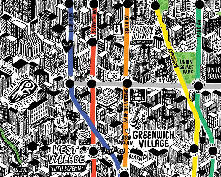
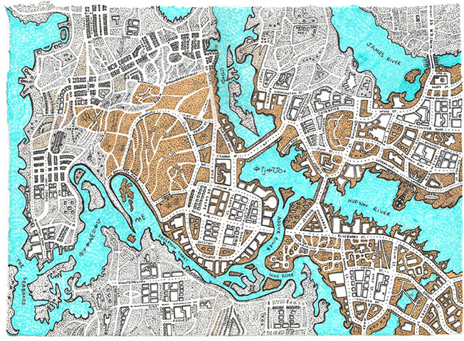
Mapmakers like the artist Jenny Sparks set out to recuperate the specificity in place that still exists and see the map as a medium to invite the viewer to explore. While there’s a tendency to map a uniform green, Sparks’ comprehensive imaginary but copiously detailed ichnographic stark rendering of the collective architecture of elevated skyscrapers in New York in 3D, in ways that collapse street-view into a crisp crowding of built boxes. The map, interspersed with memories and words, includes Bob Dylan on 4th Street; Beatniks in Greenwich Village’s Washington Square; and the Farmer’s Market on Astor Place, and is interactively enriched with text. Sparks winks at the zoom function of Google in the elevated buildings of Manhattan, each carefully drawn, and words that unpack the cornucopia of memories that the built space of the city holds, as some sort of metonymy for its residents.
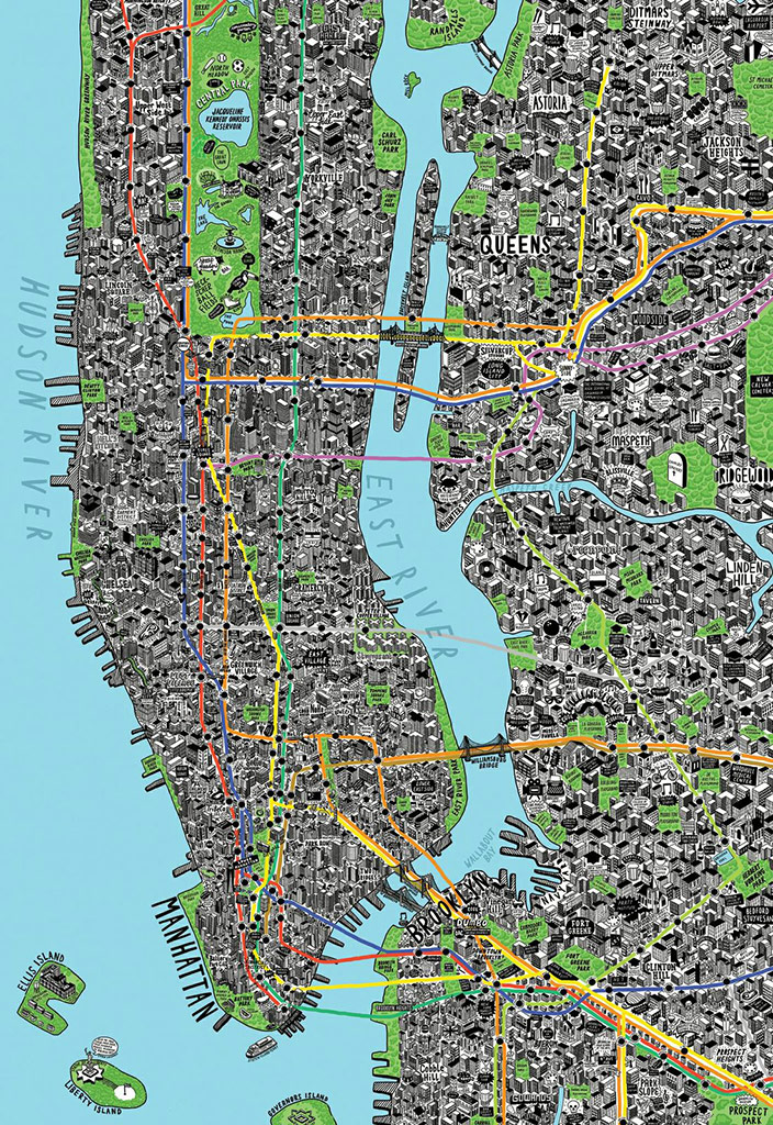
The pop-up three dimensionality of the map plays with the flattened two-dimensional view of maps, but suggests a bird’s eye view into which viewers can peer. A few close-up details of Sparks’ self-made map of reveal how the skilled placement of words among 3-D buildings in her imagined elevated view draws you into a space linked or bound by the colored avenues of underground subway lines, peering into its so densely cluttered detail:
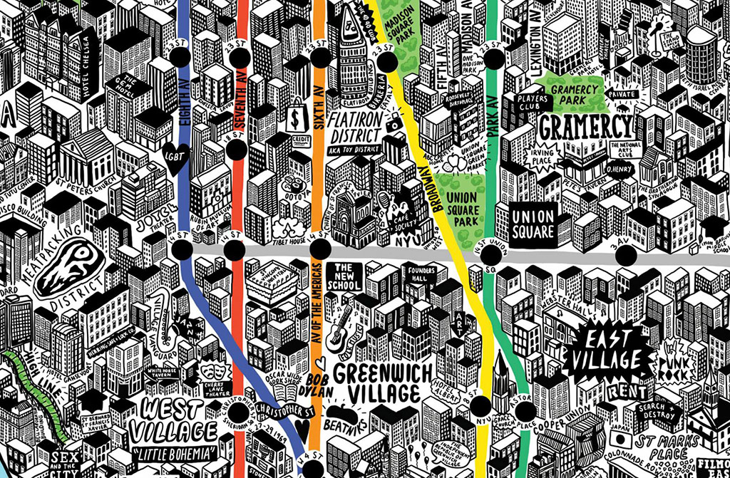
The closer one looks, the easier to see an image of place saturated with the visual interest that Google Maps just fail to afford, as one falls into the map in order to get to know its neighborhoods, suggesting a unique zoom-in function that the clumsy navigability of Street View only approximates:
The rise of the hand-drawn map not only is a testament to design or a rebirth of a craft, but uses precepts of design to counter the vagaries of digitization Google so actively promotes, in championing the synthetic properties of a register of businesses, places, and personal routes. I’ve written elsewhere, earlier in the year, about Becky Cooper’s recent anthology of the recent efflorescence of maps that personalize one’s relation to place, almost a collection of tools to encode personal meanings for a broader audience. These images recuperate the aura of the map and its materiality, its hand-made status and both the physical practices of encoding place and decoding space.
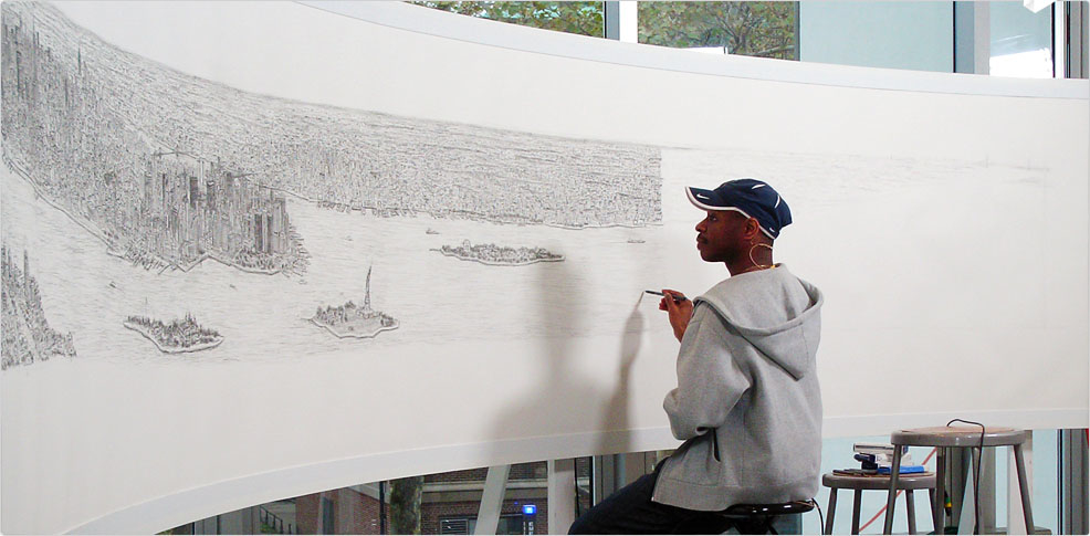
Something similar is going on in how Stephen Wiltshire draws Manhattan’s skyline from memory, lovingly attending the scale, proportions, and perspective views of each of the many skyscrapers whose sight so impressed Wiltshire on his first trip out of England that he promised to move to New York “in the future,” and claimed to have already designed his Park Avenue penthouse. Wiltshire’s retention of and fascination with urban environments has been discussed by Oliver Sacks, and is the subject of Cities (1989) or Floating Cities (1991). But his drawings are the intuitive opposite of a map’s abstraction of place by selectivity and spatial remove.
Unlike Wiltshire’s intuitive renderings of urban space, the abstraction of space of a place underlies these hand-made maps, which sketch something like a hierarchy of relevance within their totality. There’s a huge appeal in reclaiming the map as an intimate record of place, as well as an art of encoding meanings that encourage further examination, as this “mash-up map” based on the personal experience of Shawn Watts, and might be best described as his spatial experience of a long-distance relationship, compiling the places they had been together not only in his native Montreal, but in Athens, Washington, DC, and Philadelphia, as well as Montesquieu, France, and reflects his own deep pleasure in “hiding secrets in maps” as opposed to publishing information, and a pleasure in using the map’s form to map or be the surrogate for an interior emotional state:
For Watts, the density of meaning in maps becomes a way to unravel and eloquently express one’s own state of mind in public form, and to invite the viewer to partake in the pleasure of decoding its contents.
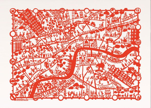
This somewhat but only partly legible hand-made silkscreen map of London comes in varied colors, populating areas with figures and words to approximate a paper cut-out hanging as much as a map:
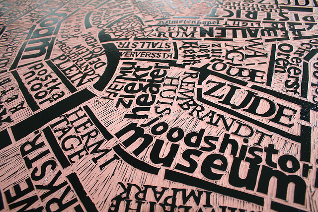
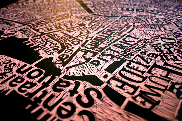
If these maps treat the map as an artwork, the trace of the hand on the map is even more present in the medium of linotype map, recalling Renaissance single-point engravings or woodblocks. The linotype word-map Marc Webber designed of Amsterdam, a historical center or clearing-house for engraved maps, places front and center the words often absent from Google Earth or many digitized maps to use them to fashion a sculpted cityscape, whose linotype words offer something of an alternate surface to see the city in one’s mind’s eye:
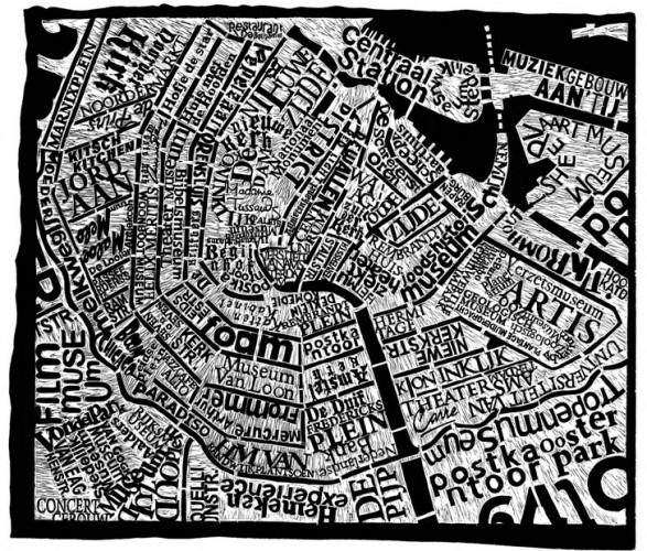
In Webber’s ‘map’ of Amsterdam, the written landscape becomes a site to explore and its very surface a sight to ponder; the texture of its woodblock words gains new textural richness as it is seen from different angles, from which the materiality of place-names on its linoleum-like surface increases in impact:
Moving in to examine details more closely, the map assumes status as a surrogate for the world, as if the one-to-one map of which Borges dreamed or described is suddenly translated to words that substitute for things, as well as to the notion of a word-map:
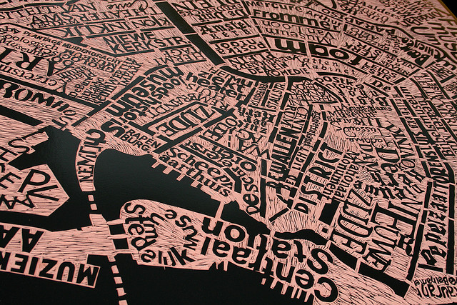
The Central Station assumes a newfound concrete prominence that transcends its place-name, without the curled Stedelijk Museum beside it, from a distorted view of this mapped space:
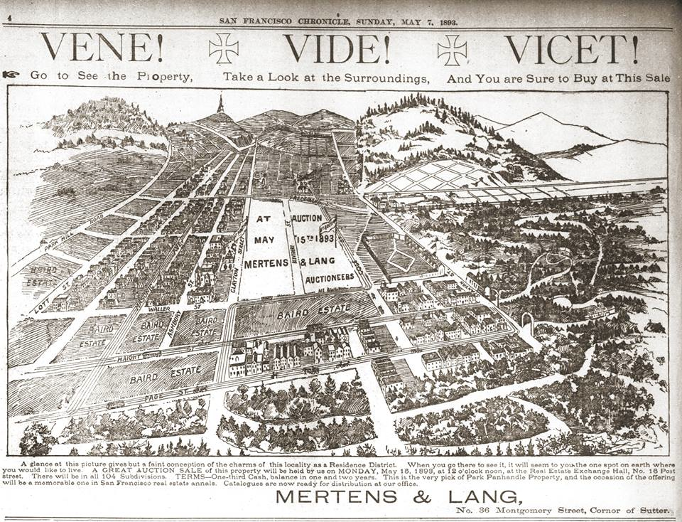
Somwhat more derivative or second-generation forms of manual mapping already exist on the market, as the sort of silkscreen word-maps popular in New York that maps the city’s neighborhoods, many of which are as much destinations as the city itself–and might provide a tourist map of realty. If it is meant to evoke neighborhoods, it oddly recalls real estate, even as its cartographical transcendence of space seeks to create something like a cascade of memories whose every words might serve as triggers, rooted within lived experience.
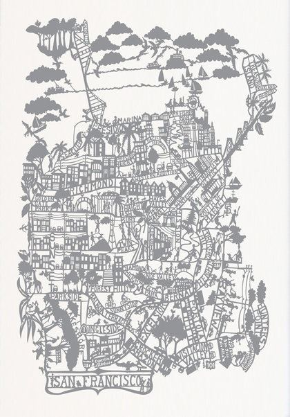
If the map seems a bit of a bare-bones realty map to the uninitiated in New York life, it is far less elegant and inviting than pictorial perspective views realtors employed of San Francisco to enjoin viewers to become settlers.
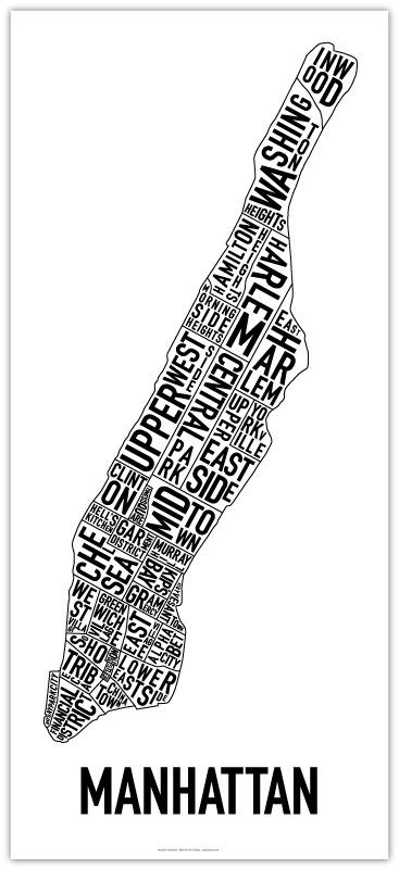
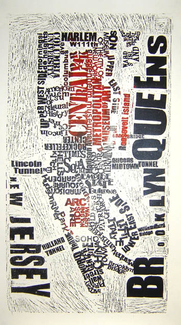
There’s far more detail in a linotype word-map of New York City. The silkscreened map plays with the legibility with which maps use words to arrange space by surrounding Manhattan island with big, looming, isolated blocked fonts–inserting recognizable neighborhoods and cultural monuments in an what seems a more improvised mish-mosh of fonts from a printer’s tray, rather than from a pull-down menu, arranging the text to replicate what might better correspond to the place of regions within our mental geography, all the while emphasizing the extremeley crowded nature of inhabited space in New York boroughs:
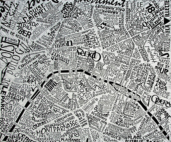
Sensitive as always to the particularity of place, Marc Webber’s quirkily detailed ‘word-map’ of Paris is more elegantly artisanal in how it fills the surface of the map, exploiting a range of fonts to arrange historical layers and tiers of class and style from the staid if impressive Opera to the lounging letters of Montparnasse, moving rangily down large streets.
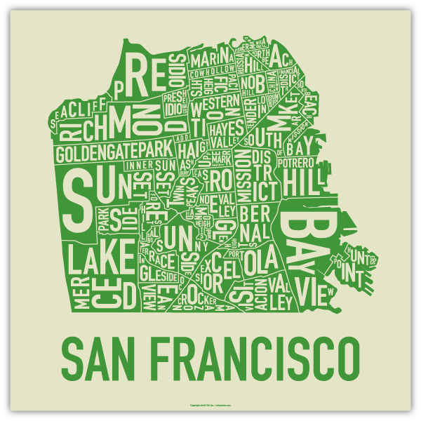
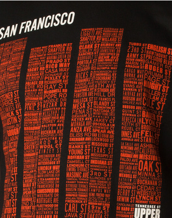
The written city is more demanding of a mastery of fonts, to be sure, since it also depends on the arts of assemblage; the word maps sold in the Bay Area provide a nice counterpart since its patchwork of its complicated topography is so impressively dense, and the only area of uniformity seem the Presidio or the landfill regions of Bayview:
An alternative to this sort of mapping, illuminating the micro level of street-names, graces the design of one of Upper Playground’s t-shirts, suggesting the relative size of individual streets by their prominence in a list of names, that lends currency to the idea of the wearable “map”:
The diversity and unity of nearby Oakland is aptly captured in this patchwork roughly-hewn word map by Oakland native Ozan Berke of its 146 neighborhoods: the jumbled density is almost rendered illegible by crowding, but with such dexterity that the artist/mapmaker uses to capture its diversity. The density of some neighborhoods balance the urban intensity of some areas with the far more light settlement of the hills (Montclair, Sequoia; Claremont Hills; Skyline; Joaquin Miller):
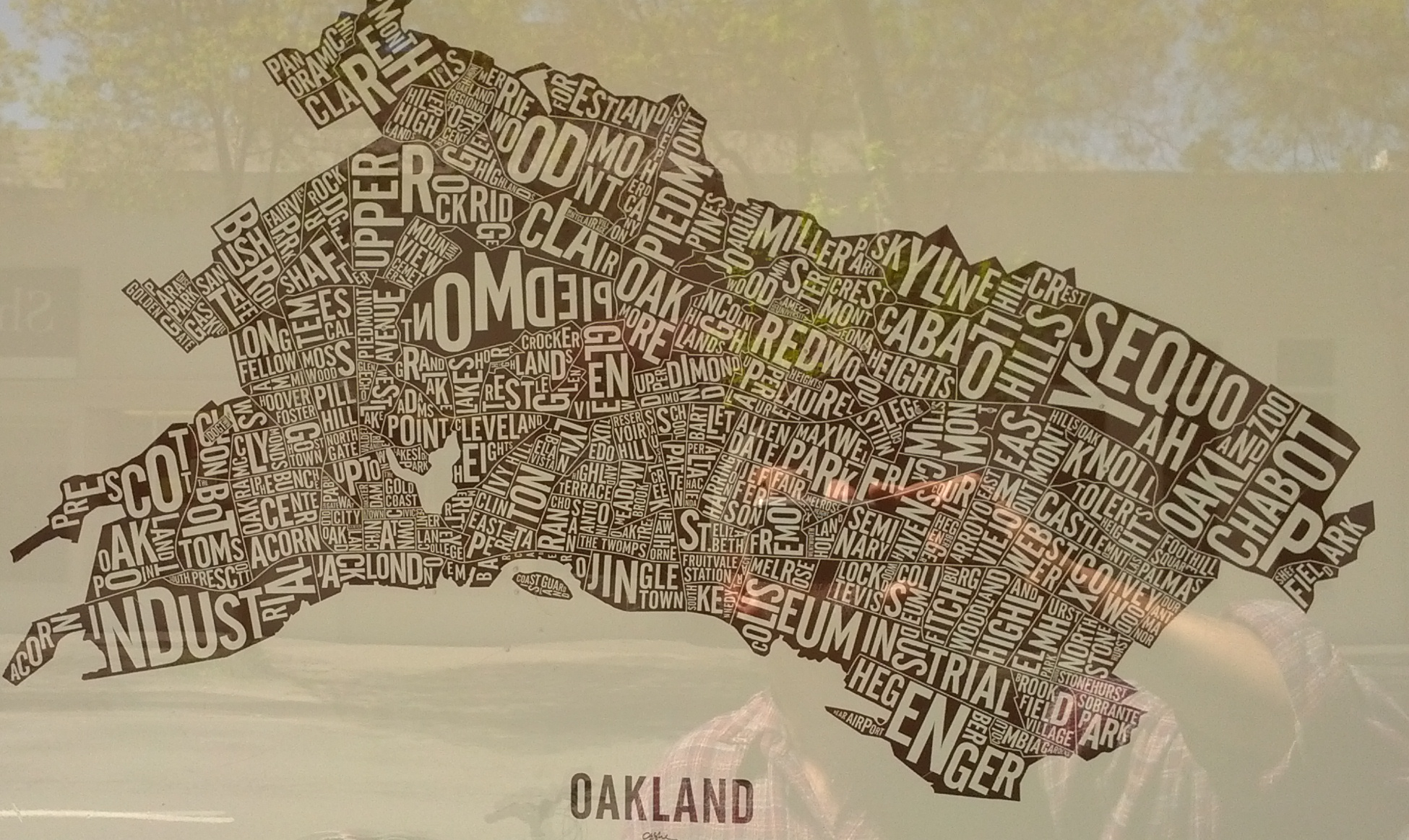
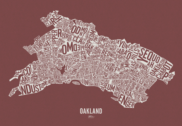
Writing the unity of the city in a sequence of place-names reconstitute the whole in a new form, as if by magical transmutation or an alchemy of type: this artist adroitly resolves the absence of the seceded largely ‘white’ village Piedmont from the city with the contribution that this town-within-a-city continues to make, writing its “name” as a neighborhood in mirror-writing, the “OMD” among the largest and most eye-catching in the map.
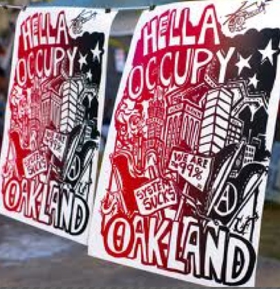
The declarative blending of words with place resonate with the politics of remapping popularized in the urgent signs displayed in the recent Occupy Movement outside Oakland’s downtown City Hall in Frank Ogawa Plaza to the iconography of the protest movement–mapping the helicopters that whirled overhead, but minimalizing their police surveillance to the upper corner of the map, and giving prominence to the placards that protesters held in front of City Hall–the scene at which these maps were sold:
It is fitting to contrast the map to the elegance of San Francisco should be captured in the distinct media of a paper-cutting map, adapting the Chinese art of Jianzhi (剪纸):
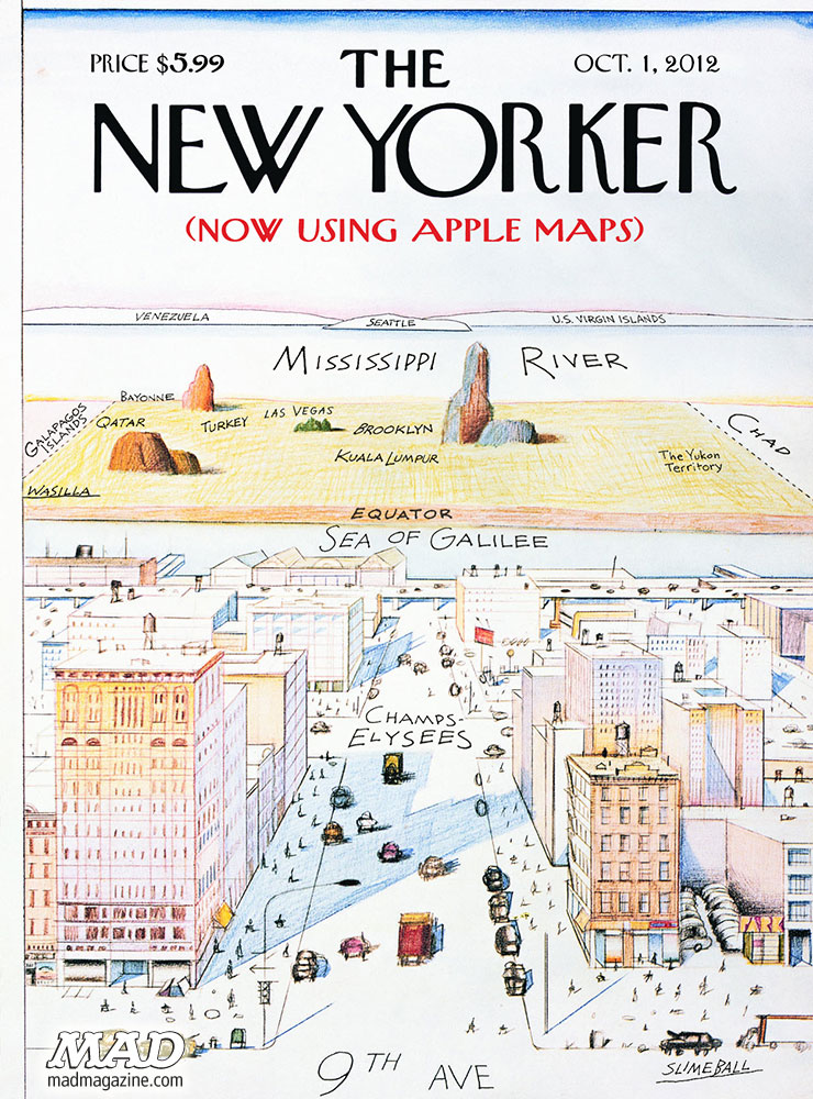
The remove that all place cartographical practice from digital media or design is central, I would argue: the artist reclaims their own synthesis of a unified whole as the subject of the map. All evoke the late Saul Steinberg’s over-reproduced map of New York, famous as a poster and originally a New Yorker cover, used to suggest the limited global perspectives of its residents or the centrality of the city in a mental map of the world. That map has its response in the recent satire of Mad magazine’s “Slimeball” mismapping mediated by and poking fun at the recent failures of Apple Maps. The revision of the classic Steinberg view of the New Yorker’s View of the World plays with the spate of failures that app by calling attention to the radical disconnect between even a familair place and digitally mediated map, as if to suggest the depths at which we’ve been had!
The growth of such a range of hand-drawn maps seems to me a reclaiming of place–as well as of mapping skills–that has come to gain a special niche of its own in the craft economy. We are discontent with the proliferation of maps from which we are increasingly alienated–and which abstract information in ways confined to, say, only three viewing preferences.
There is still a possibility of changing less the digitized reconstruction of space than the notion of what Google defines as information, of course: and perhaps the range of hand-drawn maps suggests some ways that this might be done. The above view of New York, or rather its prototype, makes me wonder about maps that reprioritize the structure of information imposed on the templates of Google Maps: a map, say, that would not note the Russian Tea Room or Trump Center and Empire State, but create historical layers of Automats, bodegas, Chock Full o’ Nuts, and 5-and-10 stores or the shifting confines of invisible ethnic neighborhoods in the city, and the impact of waves of migration. This falls back on a map of memories. And then, after all, it probably wouldn’t be hand drawn any more.


Thanks for writing this great post, and for including my Oakland neighborhood map. Designing it was certainly a challenge, and I broke half of my self-imposed layout rules in making it work. With 146 neighborhoods and 2,121 letters, Oakland is certainly very dense.
One correction though; the transposition of Piedmont is no error. Piedmont is not an Oakland neighborhood, rather it’s a small city surrounded by Oakland. I felt it would have been an injustice to Oaklanders to include Piedmont in an Oakland neighborhood map.
Still, I couldn’t exclude it, or leave it blank; it’d look like another lake. Reversing the ink would have drawn all the viewer’s initial attention to Piedmont—something I wanted to avoid in an Oakland map. Mirroring it was my stroke of genius.
Thanks for sharing your thoughts about vpn bittorrent.
Regards