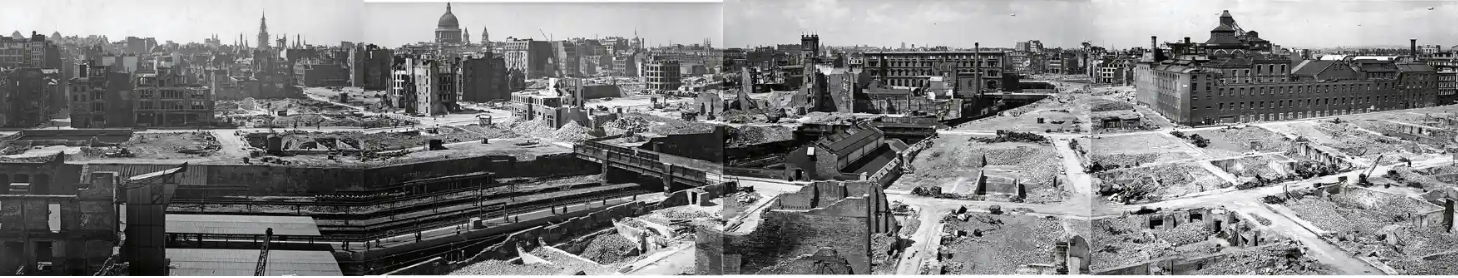
When the Germain army declared, in April of 1942, as accelerating violence of global war brought the arrival of the British bombing of German towns, the wartime Nazi government boasted that they would use native maps in the public domain to destroy valued buildings in England with impunity. over 20,000 bombs fell on the city of London, destroying beyond repair 116,000 buildings, they left a bombed out landscape that has been forgotten with time, but increasingly offers an eery reflection of the twenty-first century’s bombed out landscapes created by saturation bombing raids that the precision strikes of GPS-enabled missiles allows. The bomb sites persisted long after World War II ended, scarring the urban landscape as it was dramatically overbuilt in n unheard of density unforeseen in wartime years, so that it has increasingly faded from our collective memory, even as we try to prevent the bombed out landscapes of recent memory becoming a terrifyingly blur.
In blood-curdling claims that prefigure the American threat to violate international law by targeting of historical sights in Iran, the bombardment of Syrian cities by Iranian supplied forces, the bombing of cities in Ukraine, or the Israeli bombardment of Gaza by precision strikes, the V-2 bombing of London began from the declarative Teutonic bast of a boast,’We shall go out and bomb every building in Britain marked with three stars in the Baedeker Guide.” The conversion of a tourist map to a map of targets may suggest slippage between German fetishization of precision in tourist maps tied to cultural formation to a German Luftwaffe’s determination for an arial blitzkrieg determined to destroy historical sites. The precise strikes of flattening a landscape by V-1 bombs and V-2 rockets blanketed England with a “Vergeltungswaffe” of vengeance weapons, an air-launched arsenal designed to destroy whatever had once been celebrated on the map, with a destruction that was poorly processed in literary terms as it was hardly able to be understood.
A screaming comes across the sky . . . it has happened before, but there is nothing to compare it to now.” There was no precedent for the destruction of the London Blitz, and the experience of a bombed out landscape was hard to distance oneself from–and all but impossible to map. If Thomas Pynchon invited us to imagine the progressive targeting of the city–writing in a time when many bombed out areas of London were still fenced off, some still not benefitting from the Lend Lease act of government financing, and some still present in the 1970s, when I visited the city as a child, the bombed out landscape is impossible to imagine in real time, perhaps, as the front lines of war blurred with the home front. During the blitz, Graham Greene gave it his Eton best, chiding Anthony Powell how the bombing raids made London “extraordinarily pleasant these days with all the new spaces” as rocket bombs had torn through buildings: Greene distanced himself from violence by affecting admiration for the “rather Mexican effect of ruined churches.” He was not only being picturesque, but looking back on the hatred he felt for the Mexican landscape whose ruins he had officially visited in 1937-8, while investigating Socialist outlawing of Catholicism in Mexico; the dark sarcasm no doubt concealed fears rockets rendered the capitol akin to the landscape he saw as a periphery whose poverty and dishonesty he loathed as “a state of mind” without morals, economic precarity, bad food and drink, and bad faith.
The bombing of London followed the escalation of raids launched on Germany from seven airfields built for the purpose in East Anglia, after 1940, which had dropped seven hundred and thirty-two thousand tons of bombs on German cities by the new strategy of “carpet bombing,” creating firestorms in German cities from Cologne to Bremen, from Würzburg to Stuttgart, and many more, creating landscapes of instant ruins in a form of psychological warfare that seems to effective to be almost omitted from German postwar literature. Whatever churches Greene saw in Tabasco and Chiapas were empty of ritual or priests by state decree, secret Masses confined to private houses by priests who register with civil authorities after agrarian and land reforms stripped the church of property. If Mexico seemed a periphery, London seemed in danger of becoming one, as Britain’s bombardment by Germans hoped to reduce England’s capitol to ruins; he disdained American superiority to Mexico whose wealth they had extracted, and thought little of the “cold, snarky chambers” of Mexican ruins in the seventh century Mayan city of Palenque, but the bombing of London by “vengeance weapons” threatened rapidly to reduce the metropole by a Third Reich that hoped to triumph over Britain by consigning it to the past to bring to a close an early historical epoch.
If Mexico was “a country to die in and leave ruins behind,” the specter of silent, majestic ruins may have been hard to map onto London, but the Bomb Damage map undertaken by surveying the buildings damaged and destroyed by German bombs provide a fascinating attempt to maintain equilibrium in a time of devastation. The evocation of a ruins was telling at a time in the almost exactly eight month bombing campaign from October 1940 to early June 1941. V-2 “vengeance weapons”–or simply “revenge weapons”–were unlike earlier types of war, definitively shifting military hostilities to a home front. If Graham Greene had imagined Mexico as the glamour site of the adventures of Pancho Villa in his childhood, the dangerous landscape of wartime suggested , the start of a campaign whose targets were chosen from a travel guide was a metaphor of how bomb strikes might close a historical epoch by sheer application of force, confirming the imperial destiny claimed for the Third Reich, and reduce London to the material traces of a past Germans long studied of Rome’s Empire and ancient Greece.
It must have been quite hard to watch the raids at the stoic remove it demanded, but the British were up to it. The emigre bookseller and intellectual historian Chimen Abramsky tied to wacth at close hand London’s bombing unfold by binoculars from the roof of his Highgate residence, scanning the urban landscape for the sight or sound of bombs’ inevitable before joining fire brigades to rush to the scene to mitigate flare-ups in urban neighborhoods, stunned “London was on fire, burning from four sides,” as if the Nazi invasion of Poland, Belarus and Russia had followed him and his father refuge. The V-2 bombs were perhaps only a rehearsal for the aggressive carpet bombing of the Siege of Stalingrad of late August 1942 they preceded; the utter destruction of those air raids challenged novelist Vasily Grossman’s points of reference–“Everything burned down. Hot walls of buildings, like the bodies of people who have died in the terrible heat and not yet cooled down . . . miraculously standing–amid thousands of vast stone buildings now burnt down or half-destroyed,” he wrote in his notebooks. Stalingrad became a landscape of historical ruins, “like Pompeii, caught by destruction in the fullness of life.”
Is it an an oddly English response to try to map this destruction in poignant pastels, as in the header to this post? The elegant maps of the destruction of buildings that were tallied with care during the Blitz cartographically process the bombs’ arrival in an array of watercolors, as if to hold at distance the violence done to place with which each writer–Greene; Abramsky; Grossman–struggle to frame in a language of ruins that suggest historical breaks. They affirm the continuity of the landscape, rather valiantly, against Ordnance Maps, as if to chart hopes for rebuilding.
They are far leess abstracted than recent dense collection of red datapoints of where bombs hit in the recent webmap “Bombsight” charts, which illustrate the overpowering reach of the rockets but makes it hard to comprehend the scale of their effects by the density of these crowded datapoints on a Google Maps base map–even if one zooms in on closeups on individual neighborhoods against the muted generic landscape of a base map. The unprecedented intensity on London, temporally collapsed, challenges the viewer to process the impact of eight months of rockets in totality. The preservation of a set of hand-painted Bomb Damage Maps created to assess the rockets’ devastation in real time offer keys to navigate that experience, as records of the cartographic reaction to the modern violence they wrecked and the transformed urban landscapes that so many Londoners continued to inhabit.

Bombsight
As the destruction of these cities fades from collective memory, the online sources of like “Bombsight” that aggregate actual geodata placing the density with which all rockets and bombs dropped on the city in individual time frames offer something like a slider bar to view the violence, without the fire and death, remotely on our screens. But how to describe or take stock of the scale of such devastation, let alone to do so in a map, or to make contemporary maps and accounts to be embodied in an adequate spatial form? For the journalist Grossman, bombs that fell amidst the flames of burning houses over Stalingrad redefined the place as it had been known from maps, and redefined the lived space of the city that were unable to take stock of by a single observer. “It was no longer a matter of individual explosions; all space was now filled by a single dense, protracted sound” of the howls of bombs, air cloudy with white dust and smoke, the characters of his novel search for images of Pompeii, wondering if any one will remember them, the thunder of explosions and crack of anti-aircraft guns marking time against the howl of a bomb that grew in volume, altering one’s sense of time as “howling seconds, each composed of hundreds of infinitely long or entirely distinct fractions of seconds,” erased desire, memories, or “anything except the echoes of this blind iron howl.”
Whether referencing the obliteration of space by the Baedecker guides was a conceit of historical migration of empires or conflated cartographical superiority of touristic guides with the precision of aerial bombardment suggests the crossing of categories of bombarding civilian populations. The obliteration of clearly demarcated lines haunted Stalingrad’s bombardment included modern incendiary bombs, for Grossman, as tens of thousands of which small canisters that could tumble out of in containers of thirty-six filled the air with a distinct screeching unlike the whistles of high explosives, a screeching that echoed the screeching of the V-2 bombs that Thomas Pynchon employed as the arresting auditory perception of the mesmerizing opening sentence of Gravity’s Rainbow focusses on the “new sound” then unknown of “A screeching came across the sky” . . . Grossman focussed on the “new sound” bombs made in Stalingrad as unlike the whistle of hunters of high-explosive bombs, but “penetrated every living being [from the] hearts of those about to die [to the] hearts of those who survived–all hearts clenched in tight anguish,” so that “there was no one who did not hear it as they plunged into the city, rendering “building after building joined in a single blaze and whole burning streets fused into a single, living, moving wall . . . as if a new city of fire had appeared over Stalingrad,” introduced by the distinct sounds that follow the arrival of “planes coming from north, west, east and south [that] met over Stalingrad,” whose descent on the scientific “seemed to be the sky itself that was descending–sagging, as if under dark, heavy storm clouds, under the vast weight of metal and explosives.”
To register the new city rendered by daily destruction, lest the earlier city by lost, the London City Council undertook in a valiant act of cartographic preservation during the air attacks from September, 1940, just after the Germans had planned to invade Russia, to 1941, and amplified with the attacks of V-2 rockets by 1944, to ensure a level of destruction more sudden and more terrifying than the incendiary bombing of Stalingrad. The ways that the British Army mapped the destruction that V-2 rockets of terrifying precision were able to carve out of the city of London had been long lost, but the recovery of these map provides an eery echo of the historical models and precedents of civilian targeting of historical sites that haunts the contemporary world. For he scars of ethanol-fueled V-2 rockets that speedily struck wartime London seventy years ago are a good place as any to start to map the systematic bombing of civilian spaces. As if mapping the liquid-fueled fantasies of destruction of Wernher von Braun, the V-1 and then, subsequently, V-2 bombs silently arrived to create a psychologically searing topography of death that transformed the city, immersing civilians to new topographies of fear.

The contemporary graphic tabulations of damages in recently published Bomb Damage Maps orient one in chilling ways to the progress and degree of bombing wartime London in purples, violets, oranges, and light blue on London’s familiar plan. The pastels are disarmingly tranquil if not placid in tenor, but seem to conceal within a Benjamin Moore-like in their variety, which seem to reveal a of destruction wonderfully measured concealment resistance of a British culture of grim-faced exactitude to the horrific episode of wartime destruction, generations away from the bombardment of images of bombed out landscapes in Beirut, Syria, or so much of the Middle East and Libya today. If these pencilled sketches seem oddly antiquated and removed, the poignant attempt to come to terms with the radically escalation of destruction in the devastatingly regular tempo of accelerating bombardment that is known as the London Blitz–even if they cannot capture the panic, commotion, terrified screams or chaos, in the muted pastels in an aerial perspective that affirm the organic city that once existed in a still alive past. The three weeks of airstrikes on Gaza that have focussed on obliterating a density of buildings and underground tunnels in Gaza City to drive an underground terrorist cells form the region are only the latest of focussed campaigns; can their experience be better understood by guides to process aerial bombing raids in the past?

The images of community that they preserve in a time of the compacting of time and space stand in a bizarre psychological counterpoint to the terror of the Blitz, an attempt to maintain level-headedness perhaps in the methodical taking of stock of the sites that were apparently be turned into Baedekers of a future lost world. The bombs that clustered on London in the Blitz are not only preserved, but collated, in a stunning overpowering overlay that suggests a puncturing of space if not obliteration–in a collation of the sites of all German bombs dropped on London in the Blitz, September 1940-June 1941, courtesy “Bombsight“, embracing a massive repository of spatial information aggregating locations of all bombs dropped on the city.
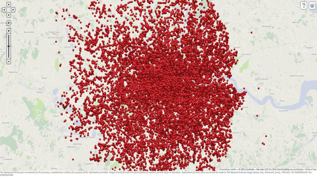
The data is so overwhelming, of course, that the viewer is vertiginously unable to process the extent of detail it aggregates, in what might be better known as a Cartofail. The multiple maps that were made by the Bomb Damage Maps tend in the reverse: they preserve the underlying street network and sites of all buildings in the city, preserving a palimpsest that survives in the face of aerial bombardment that attempted to efface any sign of human habitation; the result is a valiant basis for the recreation of the future of London in a dark period, and a particularly healthy and plucky form of cartographic resistance, of sorts, running against the collapsing of time and space in a time of total war, by trying to retain and train attention on what exists in the city that can be preserved lest it be forgotten. In the face of total war, it is a resistance of exactitude.
The maps recall those colored glossy stars pasted, in the manner of pins, at the sites of explosions in London, which “cover the available spectrum” from silver to green, gold, red, blue, and a surprising preponderance in certain areas of violets whose locations seem to coincide with bomb strikes, but are so suspiciously marked with the names of women, the silver ones labelled “Darlene,” others Alice, Delores, Shirley, Sally, amidst Carolines, Marias, Annes, Susans and Elizabeths. The disjunction between names and places map the interior experience of Lt. Slothrop against the city that became a canvass of war, but the placid colorings of the map hues suggest a deeper disjunction between mapmaking and violence.
The maps capture an attempt to take measure of the scale of destruction, from black areas bombed out beyond repair to more lightly damaged areas in yellow, as if to process the unprecedented scale of disaster in the precision of the Ordnance Survey Maps. In ways that seemed to try to contain the violence of the bombs that killed over 9,000 by a coloring the sites that were hit by the daily assessment of bomb damages, Bomb Damage Charts drafted by the London City Council tried to process the daily destruction that took the toll of 9,000 in what Germans portrayed as revenge for allied bombers suggest an English tabulation of the ethanol-fueled violence, called as retribution for allied bombing of German cities, that revealed fingerprints of the fantasy of Wernher von Braun, the rocket scientist who was driven by truly stratospheric aspirations to reach the moon.

And they reflect, as such an attempt to map the devastation Thomas Pynchon so famously began Gravity’s Rainbow by suggesting the sudden arrival of an ethanol-fueled V-2 rocket that struck the zero Greenwich meridian around 1967, by describing a volley of ballistic missiles whose targeted strikes and explosions brought to life something like a new world, and a terrible one that is punctuated in a senseless sequence of devastating strikes. And as Pynchon famously used the Matthausen testimonies to describe the horrors of the bombs’ production during the war by the remain side, the bomb damage maps would have provided powerful means to elaborate the destruction of the city came to map the fictionalized if troubled ever-idiosyncratic psyche of Tyrone Slothrop. The rooftop observations of the arrival of V-2’s that arrive, arching short of the land and arriving on London, tracked by a group of Yanks, stationed at the Allied Clearing House, Technical Unites, Northern Germany (ACHTUNG), a paper warren filled with black typewriters that pose as grave markers, removed from the war but close to its violence.
As much as orient one to the destruction of bricks and mortar buildings, they suggest a way to complete the terrifying topographies of the wartime city, as familiar cityscapes suddenly vanished, taking human lives in a chaos difficult to psychologically sustain. If Stephen Spender described how in “destroyed German towns one often feels haunted by the ghost of a tremendous noise” as it “is impossible not to imagine the rocking explosions, the hammering of the sky upon the earth, which must have caused all this,‟ evoking the inability to grasp or orient oneself to the ineffability of the sensory barrage of modern destruction with particular eloquence. Pynchon was particularly attentive to transpose the complicated topographies of what were otherwise blank space by recourse to the “old Baedeker trick” not limited to that genre of travel books alone, but pillaging from WPA guides and other maps, in ways that make it more than likely that something like the Bomb Damage Maps provided a similar basis to orient his readers to imagining the new topography of war in which his characters sought to navigate as best they could, and the tourist maps of post-war London which rendered the continued effects of bombed out areas light green offered an effective palimpsest as any to recover the psychological trauma of the destruction of the psychic network of place and society–

–itself a mirror image to the German Schadenskarten created to document the parallel six years of trauma inflicted on cities in the Nazi state.
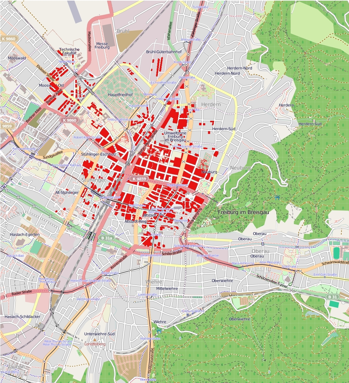
 Stadtarchiv Freiburg, destruction of Freiburg sometime after or during Summer of 1945