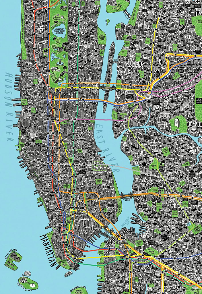
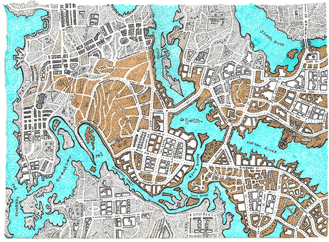
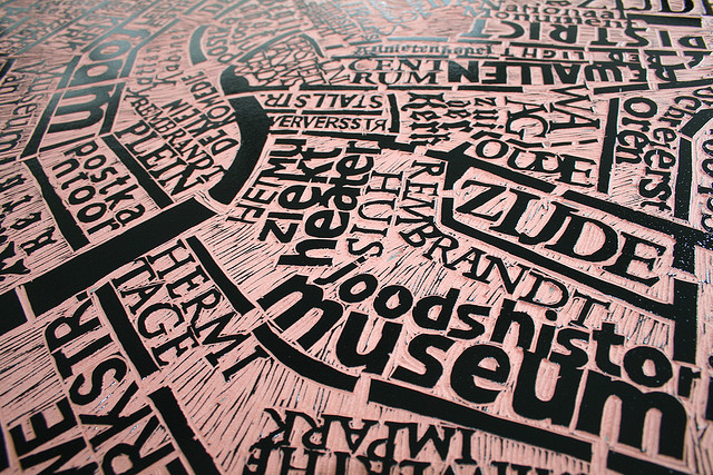
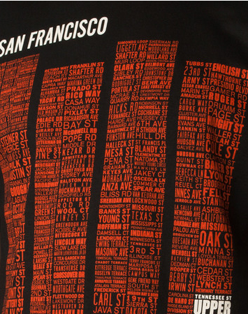
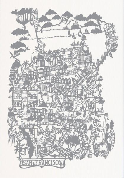
We’re familiar with considering “art” as a way to further or accentuate the representational qualities of cartography, and treating the map as if it were a system of perception–rather than viewing each as separate but analogous representational systems. This shifts, however, when we use art to naturalize mis-perceptions of global relations. We are accustomed to describe the relations between cartography and art as if they were separate disciplines, rather than congruent tools, barely touching, inventing a new sort of landscape to be inhabited and seen. The addition via photoshop of satellite photographs of the earth’s surface to the hand-drawn world projections that Michigan high school student Zack Ziebell solicited from folks he encountered on the University of Michigan’s campus create a striking global distribution: although the data sample from which he collected is ridiculously small by statistical samples–and wouldn’t be something that any respectable sort of crowd-sourced map would consider credible or worthy of attention–Ziebell’s creative map has attracted significant world wide attention because of the compelling image that he was able to craft from it. Indeed, our recognition of the eerily photoshopped composite reveals our familiarity with the manipulation of cartographical tools and media, as much as a restricted sense of geographic knowledge.
The artifice of a cartographical flattening the world’s surface seems totally removed from a sense of accurate representation in the on-the-fly images resulting from requests Zeibell made of a group of folks on the U of M campus to map the world’s continents as best they could, without the aid of rulers or model, and without looking at an actual printed map. The below image of the world revealed the blurred forms of their collective conceptions of mapped space, and is oddly emptied of content and place-names. The ghostly outlines of these imagined continents resemble a Rorschach test more than a map, although the smoky apparent ink-blots, rather than invite interpretation, record the multiple prejudices and omissions of the limited geographic horizons of participants who responded to Zeibell’s particular request. The resulting synthesis reveals the divergences and variations between how a randomized group of individuals in Michigan mapped the contours of the inhabited world as best they could, without the benefit of consulting any sources, reveal a loose attitude to the map as a repository of data to say the least:

If world maps have long been refined as composites of knowledge, whose permutations might be described as “trading zones” of knowledge from different orders of expertise, the outlines of these uncannily nebulous continents offer a record of cartographical authority in crisis.
The ghostly outlines of continents that are a composite synthesized 30 hand-drawn maps that subjects constructed from memory and on the fly–twenty-nine, to be exact, with one by its creator, the high-school student Ziebell, who created it as an art project. The folks he stopped and invited to draw maps on a blank sheet of paper weren’t perhaps focussing on summoning their geographic knowledge, but also didn’t seem to think that the task was that relevant, evidently, to their own competencies, and are easy to take as evidence of a familiarity with the fact that maps are, in our society, more apt to be downloaded than drawn, and directions for travel given by phones, rather than described with reference to a printed maps. For as much as leading us to blame Google Maps or geographic literacy, we can also recognize how much rarer it is to draw maps–or indeed to read them–as something other than as purely symbolic forms.
Few are accurate freehand cartographers, to be sure, and few of the respondents could claim to be skilled cartographers. But they adopted a strikingly lax attitude to the notion of mapped space. Although the statistical sample was not at all randomized or representative, and shows little close to a scientifically significant result, one can’t help but wonder if it reflects on an age of downloadable maps, and a time in which the drawn line has become less of a unit of geographic meaning than pixellated screen, resulting in a distinctly different period eye. The images are pretty shocking for how they suggest blinders on the geographic horizons of map-users: in most, Japan oddly melds to the Asiatic blur; the gulf of Mexico is bridged; Anatolia is absent; much of the Middle East is melded with Africa; the insularity of England fades; and, indeed, the South Asian sub-continent either disappears or is melded with Asia. As each tries their hand at flattening the world’s surface to a plan, the result caricatures Americans’ knowledge about the greater world illiterate and the limits of Americans’ geographic literacy, provoking incredulous reactions of disdain from around the world, from Turkish newspapers–who lamented the absence of their country, “Bu haritada Türkiye yok!” [There is no Turkey!]–to the sanguine observation of Mexican television stations, who noted with some disdain how “India was glued to Africa and Saudi Arabia” in the final composite, while remaining silent on whether it was a plus or minus that their own country was expanded and melded into a radially reduced South American continent.
Analyzing the map is beside the point, perhaps. But the individual items, as much as the composites, suggest a devaluation of the drawn line as a unit of meaning in maps, perhaps tied to limited familiarity with reading mapped space or low expectations for cartographical detail or clear boundary lines. And since being placed by Ziebell on Reddit, despite the small sample on which it was based, the composite made rounds world-wide as an illustration of geographic disinformation of a country that still prides itself on being a global superpower. For the composite almost seems, in fact, about as accurate and as formalized and symbolic as “T-in-O” mappaemondi that depicted the inhabited world in the first printed maps before the discovery of America: whatever sense of referentiality that the world map may have enjoyed, it seems to vanish if one looks at the mapping abilities of the folks Ziebell invited to map the earth’s surface among those he encounger on the U of M campus for his personal project for a pre-college program in fine arts. In ways that suggest a neat cartographic collaboration, Zeibell scanned and combined he twenty-nine images drawn by pen with an image of his own creation, which he took as the basis to remold a NASA LandSat image of the world’s surface, by using Photoshop to fill the contours of received wisdom to see what sort of landmass would result within “the new forms of the continents” that resulted from his questionnaire. In contrast the the blurry Rorschachs, the redistribution of satellite photography wierdly seems to invite us to inhabit what can only be described as a newly invented and radically reconfigured land, which, for viewers now familiar with futuristic maps of global warming, suddenly gains a sense of potential plausibility–until we realize its photoshopped nature:
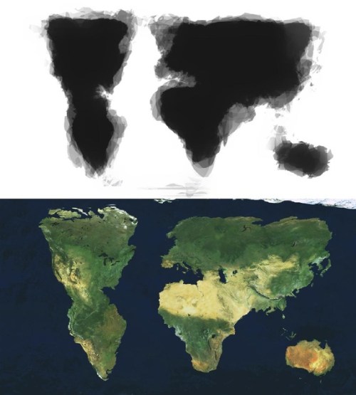
Thankfully, this image is inventing a landscape that we can only be inhabited for a short time; once posted on Reddit, the flattened projection is not of the earth’s continents or surface, but more is compelling as a projection suddenly talismanic of the deformed geographical sensibilities of folks in the United States. But its photoshopped topographic realism offers a perverse echo of how the Renaissance artist Stradanus’ fantasia of Amerigo Vespucci, pendant astrolabe in hand, inviting viewers to survey the luscious woods of a new continent and its bestiary, having debarked from his wind-pushed galleon to awaken an imaginary sleeping Amerindian, as he invited readers to enter the lush landscape of a newly discovered continent.

As an art project, the resulting map suggests the wide availability of cartographical media at our disposal as well as it also illustrates an odd flattening of cartographical significance. While these maps were surely not drawn by world travelers, or for the end of travel, they seem to empty the map of data in striking ways: despite the somewhat detailed coherence of the continent of Australia, elision of the Persian Gulf or disappearance of South Asia is jarring, if perhaps less striking than the disappearance of Florida and apparent reappearance of the island of California. The new land that viewers are asked to consider in the final composite eerily redraws the shorelines of the familiar world to a futuristic landscape of receding waters, contracted continents, and inflated landmasses, all betraying a striking lack of surety–as if divorcing data from the format of a map.
The off-the-cuff nature of world-mapping as a practice indeed suggests something of an anti-Ortelian populism in Ziebell’s synthesis of what seem numerous cartographical proposals of folks, to be sure, approached without any interest in their relative reliability–indeed Zeibell’s seems the one map that rooted his collection of map-images in something approaching a sense of cartographical accuracy–especially when it is comparison to the slap-dash doodles that many invited offered when asked to execute an image of the world map as best they were able by freehand, before leaving the High School student with a pretty sketchy world map in hand:

Most striking might be the limited sense of points of interest on which to tether or ground the map, or any clear sense of the map as a bearer of any information: if there is an obligatory notation of Atlantic islands above, the map seems a formalized image free of variables, and seems without informative content of its own. (One can almost see the expressions on the faces of the multiple cartographers, wondering why in the world Zack would be asking them to draw such a thing of limited utility or meaning.) The almost entire absence of few indices or bearings suggests a virtual absence of data in the map as a record and little authority for the map as a document.
“It is easier to have a map that is spelt right than one that has information in it,” Mark Twain wrote in his account of his world travels in the aptly-titled Following the Equator, when he sought to explain the arrival of the Maori in New Zealand from the region of modern Polynesia. In describing how the first Maori might have reported news of their arrival in New Zealand, he pondered the route by which he communicated the route of discovery to his people so that they might successfully return to the new land of New Zealand: “He told where he came from, but he couldn’t spell well, so one can’t find the place on the map, because people who cold spell better than he could, spelt the resemblance all out of it when they made them map.” There is no equatorial line in the maps that Ziebel collected, or in the map he photoshopped from satellite photographs. In a world where mapping one’s origins in space are of less clear value, is it possible that we have begun to map the resemblance of regions from the maps we make up?