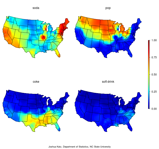
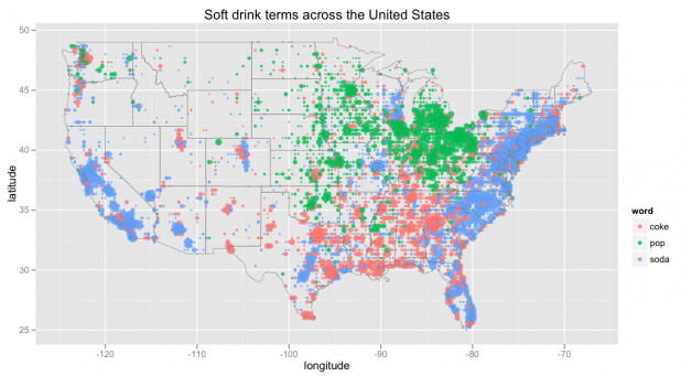
We’ve become increasingly accustomed to how data visualizations divide the nation. But the proliferation of such visualizations almost carries the danger of introducing multiple metrics of diminishing effect. While we have become so used to how they divide the nation into groups, their multiplication tends to erase the past that lies beneath them, and creates something like a parlor game of contemplating explanatory bases for divides, even indulging the visual pleasure of parsing the nation that obscures the public good. In cultivating a period eye of the infographic, a somewhat terrifying occurrence perpetuated now by federalist states’ rights, whose genealogy extends back to efforts to oppose desegregation, we readily consume such rapidly produced images of the nation’s divides.
Organizing the overlooked role nonprofits play across the country create an extremely sensitive marker of how we inhabit the nation, and the varied micro-cultures and economies it retains, even in an age of globalization. The value of such a map lies less in the image that it presents of the nation as a mirror of a status quo than as a stimulus to reflection and self-examination, as well as an interrogation to the benefits that nonprofits continue to bestow on the public good at the same time as the ongoing and impending contraction of the public sector of government fails to meet those needs. For the place of the nonprofit in our society provides a way of thinking about their relation to public needs not often met and productive ways of reshaping the status quo. The very unevenness of the distributions of employment at nonprofits suggests questions of levels of education and legal or financial training, to be sure, as well as necessary capital for forming boards, to make us reflect on the uneven existence and acceptance of nonprofits’ roles in public life.
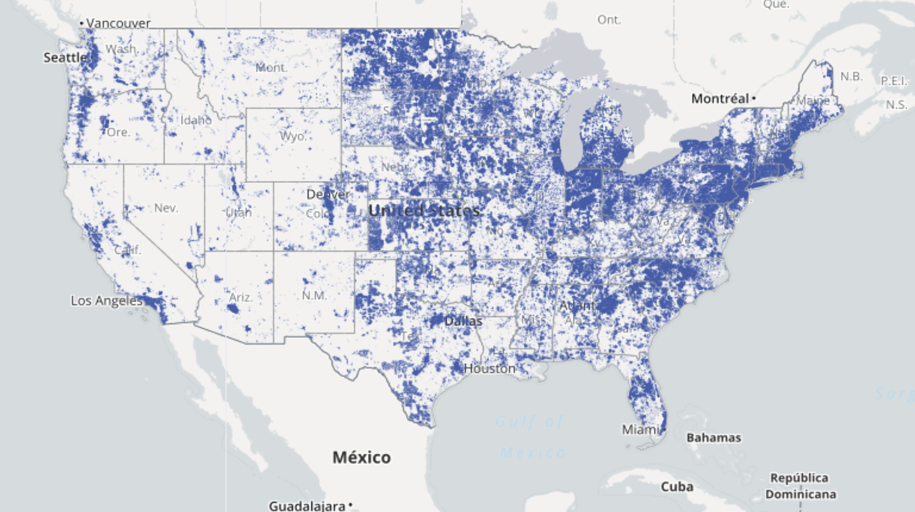
But if the reasons for such an uneven distribution of nonprofits across the country are unclear–as is the proportional number of positions that nonprofits hire in private-sector employment–it seems especially rewarding to parse and challenging to unpack: for while the environments that help nonprofits remains a topic for sociological research and scholarly inquiry, the demonstrably different economies and cultures of charitable giving that encourage nonprofits suggest divides in a range of services across the nation–as does the strength of belief in the worthiness and need for the attention of nonprofits to specific issues. The economic needs of nonprofits presents an image of the national economy that prompts more investigation of the lay of the land–and the national economy’s variegated landscape, that cut to the heart of how maps illustrate spatial divides, far more effectively than the often untrustworthy distributions of votes or political affiliations. If we have come to privilege difference and map national divides, the landscape of nonprofits demands close scrutiny for what it tells us about the uneven nature of how nonprofits play a public role across the nation–roles with indeed might be encouraged by something as simple as the availability of both open-access on-line data, which still widely varies across America, and indeed the availability of broadband. (The uneven distribution of the first is pictured in the header to this post.)
A quick initial compare-and-contrast between the most recent snapshot of the percentage of employment in nonprofits of all total employment to the recent metrics of “Where Men Aren’t Working” across the country suggests an almost inverse relation between employment and the landscape of employment in nonprofits–which, with local exceptions, reveal increased economic health. But the nonprofit landscape in America is more than that, and cannot be reduced to a healthy economy alone. The reduced presence of the nonprofit across many states mapped below must no doubt have provoked a deeper rippling effect in local and regional economies, which we will be increasingly feeling over time.

1. The multiple socioeconomic factors lead to such steep variations in employment at nonprofits are unclear, and can’t be reduced to single metrics since they are based on synergies. But the uneven nature of their distribution seem to respond partly to the culture of the availability of a trained demographic, allowing possible professional donation of time, and a distinctly well-trained workforce, as well as either charitable giving–although boards are clearly important–and social needs. The presence of nonprofits themselves also clearly impact the environments that encourage and allow the vitally important roles that they play in the local society, and generate clusters of nonprofits, with experts and legal teams, that greatly facilitate their growth in ways that meet important local needs–as well, often, as the existence of a number of trained individuals (from former teachers to health-care professionals) able to service the functioning of the nonprofit and its specific needs–a number of which were created during the recent Recession. The importance of mapping this human geography of the public sector seems especially important in the face persistent attempts to parse, and effectively essentialize the country’s apparent political divides. Indeed, the topography of the nonprofit provides an interesting way of illustrating differences across the nation–and the map of the spatial distribution of nonprofits addresses interesting questions of how maps illustrate spatial and cultural divides.
The uneven geography of non-profits partly responds to the uneven familiarity with the varied roles nonprofits can fill in local economies–and the existence of evidence of the benefits a nonprofit can bring to local communities. Clear inequalities within the employment nonprofit organizations can offer mapping of the economic inequities and inequalities of public life. The role of nonprofits in America is primarily understood as meeting a large and needed social good that would otherwise not be served–and providing a legal infrastructure for private investment to flow in ways that will benefit the public good, extending from preserving the untrammeled nature of public spaces to the effectiveness of our health needs, schools, parks, and the large artistic communities that our nation is able to foster, as well as the monitoring of the continued safety of drinking water or protection of its coasts.
The multiple roles of nonprofits deserve special consideration and hold particular import as an index of social health. But nonprofits can also be understood as providing some 11.4 million jobs in America, according to the U.S. Dept. of Labor’s recent measurement. Clearly, a culture of non-profits tends to reinforce itself, and give needed momentum for the expansion of further boards, endowments, and dedication–in ways that permit a culture of nonprofit organizations or 501(c)3’s to gain legitimacy as a source of employment and indeed an effective public actor in a region. But telling divides are evident among regions of the United States in a map that discriminates between those states that foster nonprofit activity in the country–both as a means of distributing local wealth and directing public attention to public needs. How much does this divide show a shifting awareness of the role that nonprofits can play within the economy–not only in purely economic terms, and by providing some 5.5% of the GDP and employing some 13.7 million people, or, in 2010, about 10% of the workforce, distributed over a range of business areas including health, education, human services, environmental groups, and international affairs, as well as varied public society benefits, in 2010 and 2011–with most being quite small. While about 2/3 the income of nonprofits came from private sources in 2010, they offer a crucial role in identifying sites for charitable giving and areas for volunteer work, as well as tax-deductible contributions. Even despite the recession, giving grew considerably from 2000 to 2009, by 32%, but the geography of the growth in employment was considerably segregated between north and south, in ways that suggest a distinct shift among two qualitatively different sorts of economies, given the sizable contributions that nonprofits are poised to make to local economies.
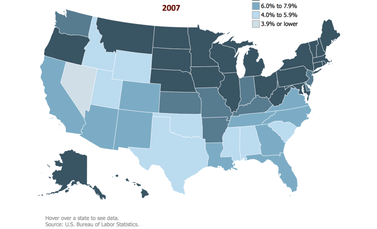
2. A clear divide had emerged by 2007, when the majority of employment at nonprofits were based largely in the northeast, it seems, as well as in the less-densely populated states of the midwest, in ways that oddly mirror a North-South divide which inexplicably extents the Mason-Dixon line across the lower forty-eight before the Recession began:
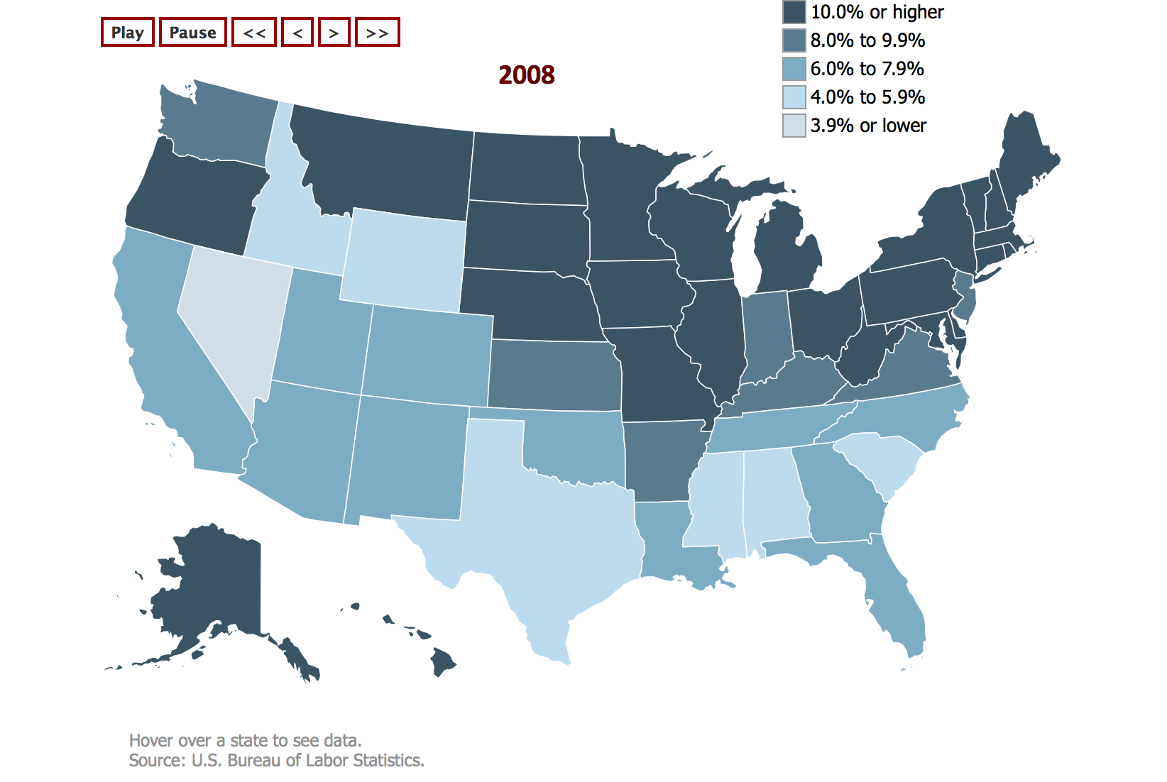
Perhaps revealing a Scandinavian influence of Minnesota and social conscience of Wisconsonians that has begun to migrate across the country, the northern states not only have a huge edge on non-profits that employ a large number, but a different effect on local societies where they’ve grown.The percentage of non-profits has clearly solidified in the central US during the following year, which revealed something of a sizable growth of states employing over 10% in nonprofits in the year that the Recession began:
What’s striking in the statistical distribution released by the US Department of Labor is its difference from the map of the over two million in the nonprofit universe among the disaggregated states in which they exist, which dismembers the nonprofit from the territory in ways that rank those states possessing the largest aggregates of nonprofits–shown here in a rainbow spectrum–without discriminating relative size.
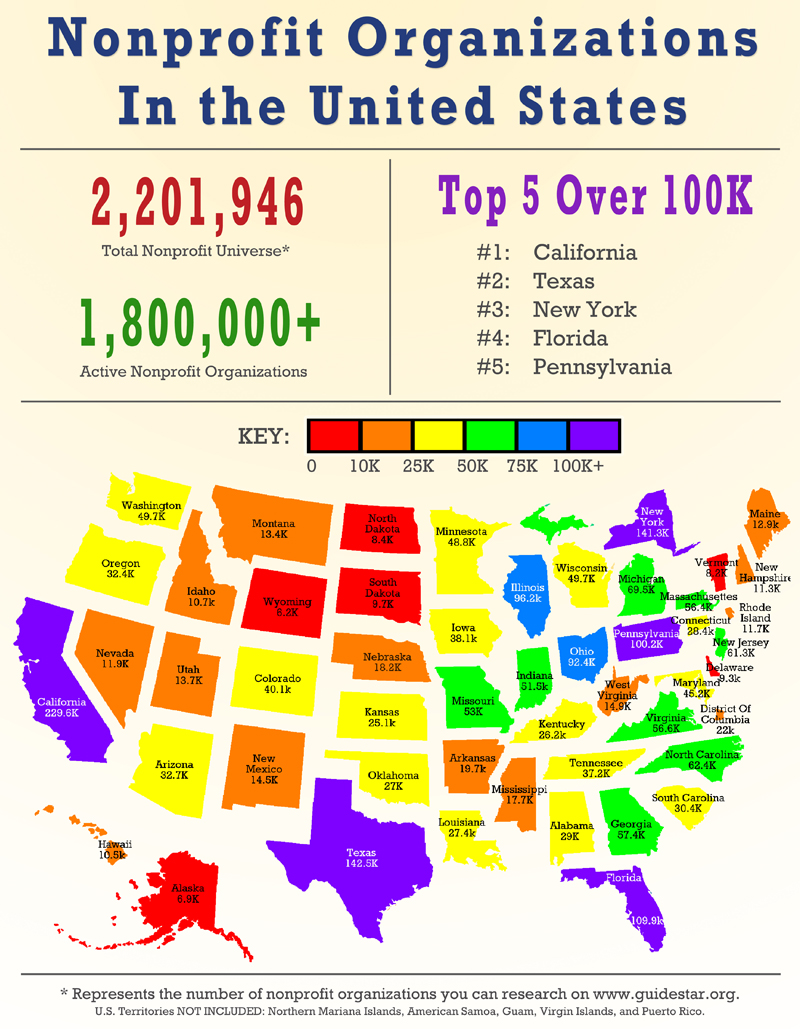
This “pro-performance map” crafted by Guidestar in 2014 tracks the number of nonprofits alone as if this was meaningful. To be sure, it shows a somewhat important picture of the “nonprofit universe,” which warms at the coasts, but whose topography betrays noted dip in wealth in North Dakota, South Dakota and Wyoming, somewhat able to be reconciled with the above, but a huge number of nonprofits in Texas and Florida, as well as New York, Pennsylvania, and California, in a far more disparate topography, but little sense of its topology. The view that it affords of on the ground of the terrains in which nonprofits operate seems intentionally rendered opaque and misleading; it is perhaps designed to be more celebratory or illustrative of variations than deeply informative.
The high number of nonprofits based in both Texas and Florida, however, inversely reflects the relatively small number of employees in nonprofits in either state compared, say, to New York–which hosts a similar number of non-profits–or to California–though the huge number of nonprofits in that state greatly exceeds that of Texas. But true variations exist on a more local level. The numbers of nonprofits are not ranked by population density, or nonprofits’ size and volume of business or effectiveness, although the nature of this funny animal–the nonprofit–also seems to resist clear classification enough that grouping their number in aggregate may be of questionable value save for tax reasons.
3. However, the deep disparities among regions where nonprofits might meet compelling social needs–witness the wide trough of bright yellow in the deep south, or the orange of Arkansas, Mississippi, and Idaho, more than a decreased degree of available capital, needed boards, or philanthropy. The map of philanthropy in America interestingly reveals that the decrease in the presence of nonprofits is not necessarily in clear correlation with giving alone: indeed, according to a recent study in the Chronicle of Philanthropy, the proportion of income that wealthy Americans gave to charity as a whole steadily declined as the recession began to lift from 2012, even as middle class Americans, interestingly, gave more readily to charities, as did the poor, either as they seem to have more disposable income and cash, or as they developed more empathy–the generosity of giving among those earning $200,000 or more declined some 4.6% from 2006-12, while those earning below $100,000 annually increased the share of their income given to charity by 4.5%–creating a sizable spread–and meaning that charities and nonprofits are by no means looking only to the wealthy for support. Moreover, the map of giving across the country revealed some truly striking differences–with greater generosity existing throughout many states where somewhat fewer numbers of nonprofits tend to exist, including Alabama, Arkansas, Colorado and parts of Arizona and Nevada, as well as North Dakota and South Dakota; Georgia experienced a huge growth in its giving ration. (Strikingly low records of giving exist in New York, measured in this way, as well as California.)

Such an image of the “Giving Ratio” across the nation–and the sharp declines that it reveals in charitable giving in New York, Los Angeles, and Philadelphia–as well as the generosity that it reveals in cities across the Sun Belt from Memphis to Birmingham–conceals that wide variations in economic wealth across the country, as well as the variations in the local presence and intensity of poverty or topology of need. It also does not unpack what the charitable giving was destined to do.
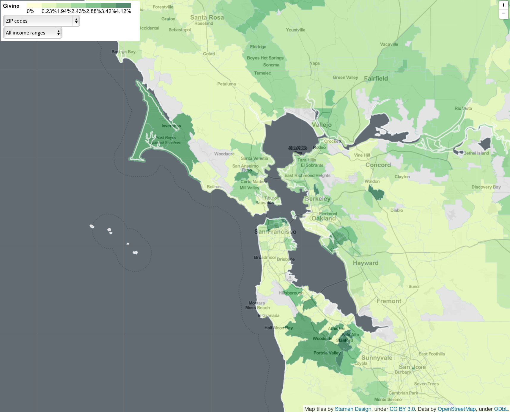
It is also true that local variations in giving are difficult to classify by state alone, however, and have, as this map of Giving in the Bay Area reveals, a distinctively varied topology.
Nonprofits depend on defining one’s vision and values, as well as the cash-flow so fundamental to making a nonprofit organization work–or attracting the needed funding and board needed to clarify philanthropic goals as the Recession lifted. The ties to an audience before whom one is able to define both specific goals and best practices are especially critical. The issue of employment within nonprofits might be placed in the context of total private employment (excluding federal, county, or local jobs, in other words). But it seems to have most strikingly and stably grown in the northern states through 2012, even in the Recession–which is fundamentally a very good thing. But the absence of a larger than 6% employment in non-profits within the private sector in a number of needy states or states with large income disparities–first and foremost, Texas–is however striking. What makes the difficulty in defining the goals of nonprofits seems deeply tied to the sorts of settings where philanthropic projects can be effectively sold.
The proportion of those employed in nonprofits continued to grow steadily during 2012 both in Virginia and North Carolina, as in California–at which time as such employment stagnated in states like Wyoming, Texas, Alabama and South Carolina, the few without a sizable number of nonprofit employment; states in the SouthWest like New Mexico and Arizona, in ways that suggest the changing political temperatures of those regions, at the same time as Indiana grew larger in the number it had of jobs with nonprofit organizations.
The national landscape of nonprofits seems decisively tilted to the north and Blue states, or at least to exclude Texas, Wyoming, and much of the Deep South, as well as a few Red states such as Idaho and Arizona. These are places where few would ever go to work for a nonprofit organization, and probably one couldn’t imagine a well-paying job with a nonprofit, given the lesser amount of money in circulation for the public good.
4. Shifts in employment in nonprofits charted in the above maps from the U.S. Bureau of Labor suggests several hypotheses that demand to be investigated in the future. The data visualizations clearly show, it seems, the increasing growth and consolidation of the viable employments among nonprofits in those areas where a critical mass of non-profit works exists and circulates, informed in both best practices and opportune models of structuring of such valuable public entities, to fulfill roles not provided by government services. To be sure, they also show the local consolidation of nonprofits’ advisory boards–not geographically limited, to be sure, but greatly informing the viability of a nonprofit community, matching congruent interests. But they also reveal the consolidation of a perhaps incremental awareness over time of the visible results non-profits play, and the supplemental benefits that the community can draw from them: and it is this final factor that seems most dismaying in the maps of the U.S. Bureau of Labor Statistics, because we are approaching–or seem to be–a nation in which the divided perception of the role played by non-profits might be becoming naturalized in ways that run against all of our better interests.
While one wouldn’t want to suggest that specific areas have an over-abundance of the nonprofit, there are increasing deserted stretches of the absence of employment by nonprofits, “nonprofit wastelands” where the possible public roles that such entities could play are absent from public debate. Although the differentiation of the country is increasingly isolating the same southern states for which the Voting Rights Act stipulated “pre-clearance” for changes in electoral laws or practices in order to mitigate segregation from political involvement, the map that results suggests a distinct business culture, less directed to joining boards, providing public involvement, or being encouraged to foster communities of giving across much of the Old South. This suggests, more than anything, a shifting topography of those states where there primarily don’t seem to be evident social concerns that command attention, or where organizations such as credit unions are needed, and the most dramatic disparities in wealth can not only be found. One could associate these distributions in interesting ways to areas where there is less hope–both because of persistent poverty, divided here into metropolitan and non-metropolitan areas, and less interest in investment or giving back–that seem endemic to Alabama, Mississippi, and sectors of Texas and South Dakota. What is at stake is not only those areas where one can best communicate one’s vision, but where the pitch for philanthropy can be sufficiently effective to gain a sufficiently broad body of a workforce to attract works to one’s cause. And in many sites of more persistent poverty, the requisite sort of cash flow might have dried up if it existed in recent times.

(Looking at the distribution of non metro poverty across the south, we might re-evaluate Rand Paul’s ill-spirited observation in Time magazine that “The failure of the war on poverty has created a culture of violence” in Ferguson MO that put police “in a nearly impossible situation”: a population no longer feeling itself served by a system of justice seems the result of a persistent disenfranchisement, as much as poverty: instead of blaming “moral codes that have slowly eroded and left us empty with despair” on politicians who have betrayed trust by encouraging the “poverty trap,” we might do well to look at the deeper causes for neglect of social inequalities. Deeply ingrained questions of unemployment are clear in tabulating the geographic distribution of folks with income lying below the poverty level state-by-state, using the American Community Survey of 2010, a synthesis from disparities in economic wealth synthesized in censuses from 1980 to 2011.
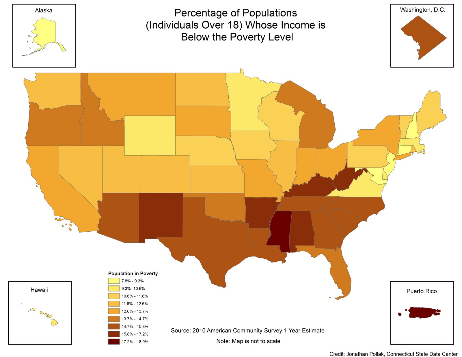
Although Wyoming does not appear a site of significant populations below the poverty level, and only a fairly conspicuous region of large non-metro poverty rates–

the 2010 Census revealed Wyoming’s three counties with high poverty rates, removed from a swaths of green.

The inverse relation can be expressed by charting the degree of income inequality at the county-by-county level, using the Gini index, which provides a far more finely grained view of inequality. By organizing the distributions along different quintiles of income-equality, where a zero value expressed full or complete income equality or parity, the persistence of gaps in income inequality–and increase in need–can be mapped county-by-county.
To be sure, only a small range of the nation approaches much above .6, but such peaks of inequality are, somewhat terrifyingly, not only clustered contiguously, but quite clearly localized and concentrated in several specific areas of the nation’s landscape, from the tip of the Florida coast to the deep souther sates to ares in the Dakotas to rural West Virginia:

The very areas of the south and southwest where income inequality is most pronounced int he 2011 American Community Survey suggests a distinct social topography, one where the incomes of workers at nonprofits are unlikely to congregate or be as visible parts of the local economy, creating the precedents and models for nonprofit action in public life. Not only are non-profits less likely to have as high or elevated a social profile, but the sorts of jobs done by the nonprofits and services that they render, often designed to supplement the shrinking presence of federal government in public life or engagement in venues from public education to the environment, invisible or rarely present. What sort of map would be devised to better illustrate this uneven topography of the nonprofit? Perhaps a map of the layers of individual sort of nonprofits across counties, that would comprehend the variations in the range of causes that nonprofits might address–which would better show the lacuna or absences of the work of nonprofits, from hospitals to credit unions to afterschool groups to environmental watchdogs, that fill increasingly needed roles across the country.
Does this relate to the distribution of nonprofits, those engines of the redistribution of capital and distributors of benefits of social wealth? The goods and services that nonprofits generate would be made more visible, in short, integrated into the sort of OpenStreetMap template to chart the relative dearth or multiplication of nonprofits as the very services that nonprofits provide society–often not only supplementary but complementary to the services available in a purely for-profit firms and contractual arrangements, as Hansmann suggested (Hansmann 1980) but also, as economists David Easely and Maureen O’Hara classically argued, as providing activities not offered or able to be contracted in a purely for-profit economy. Illustrating the diverse ranges that their services fill across the country would be a start to generate a picture of the topography of the needs filled by and goods contracted through nonprofits that individual state statutes allow. If such a map could be correlated with the local topographic variations across the country’s landscape reveals the varied constraints that nonprofits face and encounter in providing these needs, the different cultures that are created by nonprofits, as much as that nonprofits simply reflect, might be mapped.
The improvement of social welfare that are often among the outcomes of nonprofits might be evened out or at least comprehended as a result, rather than be naturalized or written off as part of the status quo, and the shifting rules in which nonprofits work better understood. Indeed, working toward the articulation of a clear vision and mission depend on a possibility of finding a believable middle ground which may not readily exist in several states. They make us want to start to ask what sort of society in which we want to live, and how we might best attend to the severity of the range of economic inequalities and inequities of access to education that persist across the country. In an era of increasingly uneven access to technology–and the areas of technological expertise from which nonprofits can benefit–we are, moreover, increasingly in danger of perpetuating the uneven distribution of opportunities for nonprofit employment across the land. Which would be not only a shame, but have deep consequences for the country’s future political debate.
For while we pretend that the political space of the country is uniform, it is not, and the unequal basis of national infrastructures starts from the basic inequalities in access to broadband, still mostly concentrated in the northeast and region around Lake Michigan, as well as the larger megacities on the west coast from Los Angeles and San Diego to San Francisco and Seattle, with Denver thrown in. An attempt at evening the ground for the development of nonprofits in different areas might be to reduce extreme variations in the maximum advertised speed and availability of broadband across areas of the country, 3 – 6 Mbps to 1 Gbps+–evident in the near-absence of high-speed broadband in a state like Wyoming–
or the troughs evident in the number of broadband providers available across different regions, and the clustering this creates, not to mention the deserts in Arkansas:
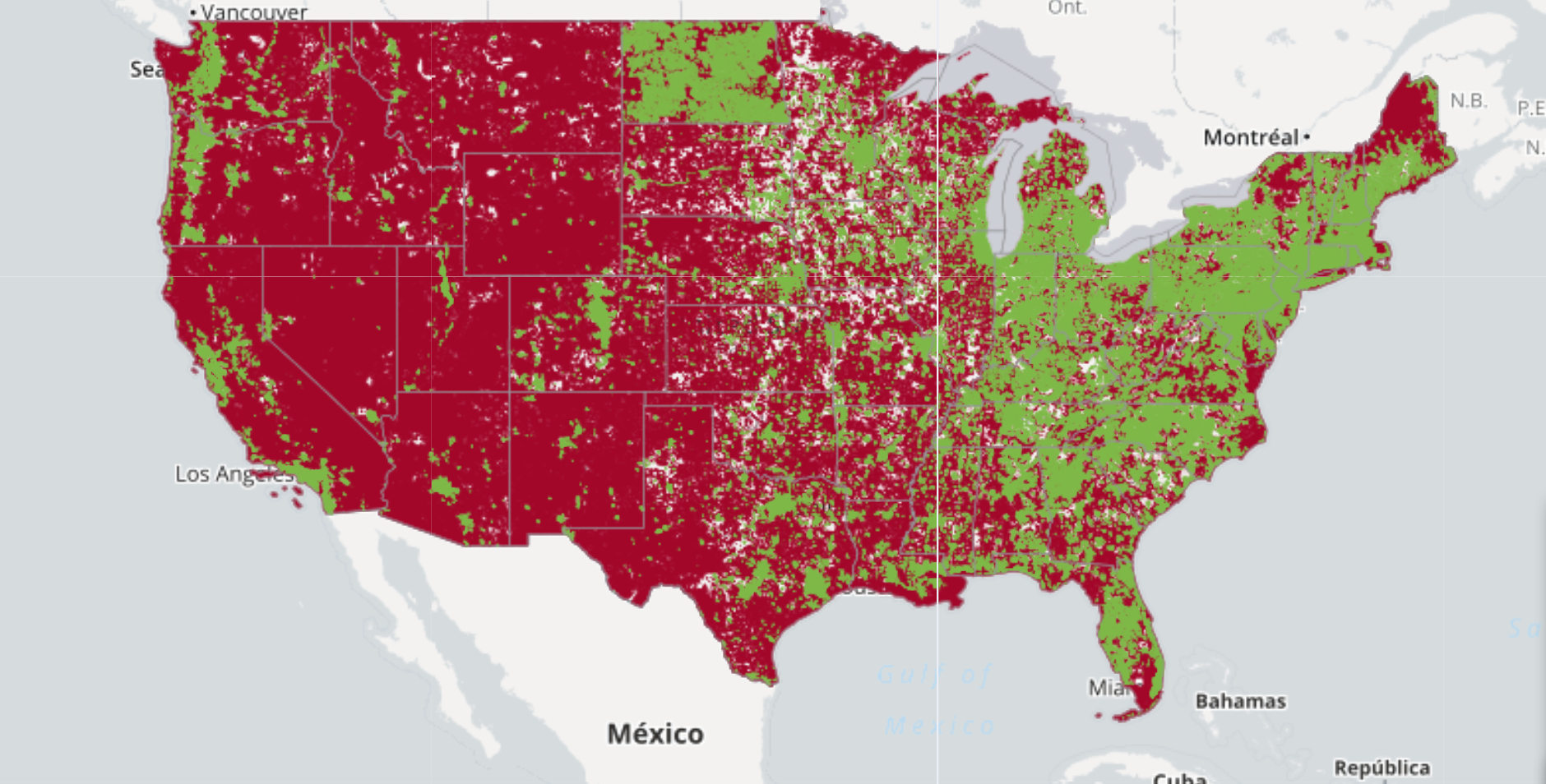
or the numbers of providers offering broadband access

or national variations in typical download speeds:

![]()
The relative lack of broadband providers in high Gini coefficient regions of persistent poverty unsurprisingly align with those where relative opportunities nonprofit employment is lowest–if the roles that nonprofits might play perhaps most prominent.
While such maps, available for further scrutiny at far greater local detail courtesy the Federal Communications Commission’s interactive Broadband Map, may seem far removed from the differences in non-profits, high-speed downloads and access provides one of the crucial channels to jumpstart nonprofits’ activities and provide something of a level playing field in which–pardon the laissez faire rhetoric–nonprofits can grow. Recent debates about ensuring national net neutrality allow an equality of broadband access that is the basis for preventing further divides from becoming more exacerbated–with deep consequences for the future of political debate and discussion in the United States, as well as institutions of social welfare, in the immediate future. Allowing corporations to gain privileged possession of a “fast lane”–and shunting all others into a “slow lane”–would leave the country with a two-tier system of access to and availability of resources that are not only individual, but would effectively discourage the growth of nonprofit work in many areas that need it most, and have to deal, as a result, with the lacuna that are embedded in a purely for-profit marketplace.
The crowd-sourced responses of FCC Consumer Broadband Test reveals where the ISP speed was regarded as insufficient used responses to a deeply relative question, but compellingly shows–in a map where red is used to note a negative, and green a positive, a mixed message about the availability of services in some of the areas where it is perhaps most needed to exist as a framework for needed social services:

The FCC’s Consumer Broadband Test informatively measured reported download speed-tests for broadband across the same regions, with those at the lower end of the spectrum indicating the lower speeds of delivery in ways that indicate a typical for poorer regions of the country. Doing the best to increase internet service to level these uneven levels of service provides a needed corrective to the relative absence of nonprofit entities.
![]()
One might profitably measure not only the speed of downloads, however, but the vitality of open access data across the United States, however, to arrive at a better metric for the data-sharing that is not only necessary but important to conduct business for non-profits–and measures the culture of open data across the land.
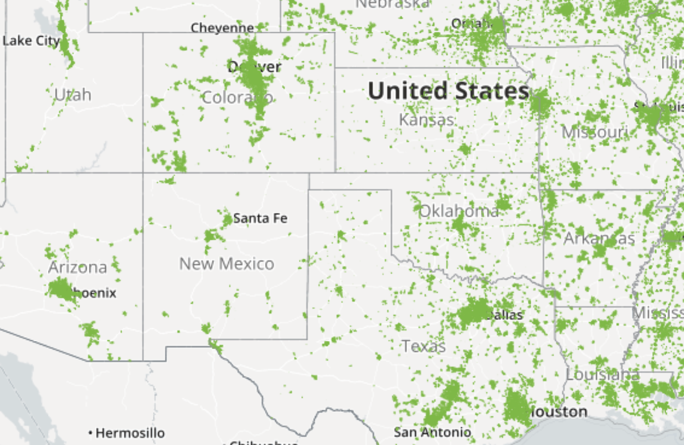
The image of the repository of open source addresses Michal Migurski compiled provides a neat map of those places where municipal governmental data is online and available in the US, creating a database which folks can readily use and build off of in their work:

While this rendering can include state-mandated municipalities and not be that illuminating of some regions without open data online, available open data provides a basis for the work of many nonprofits on a large scale, and is conspicuous by its absence save for around fifteen points of light in a large region of the south where markedly lower numbers are employed in non-profits–as a reverse-color illumination maps reveals.
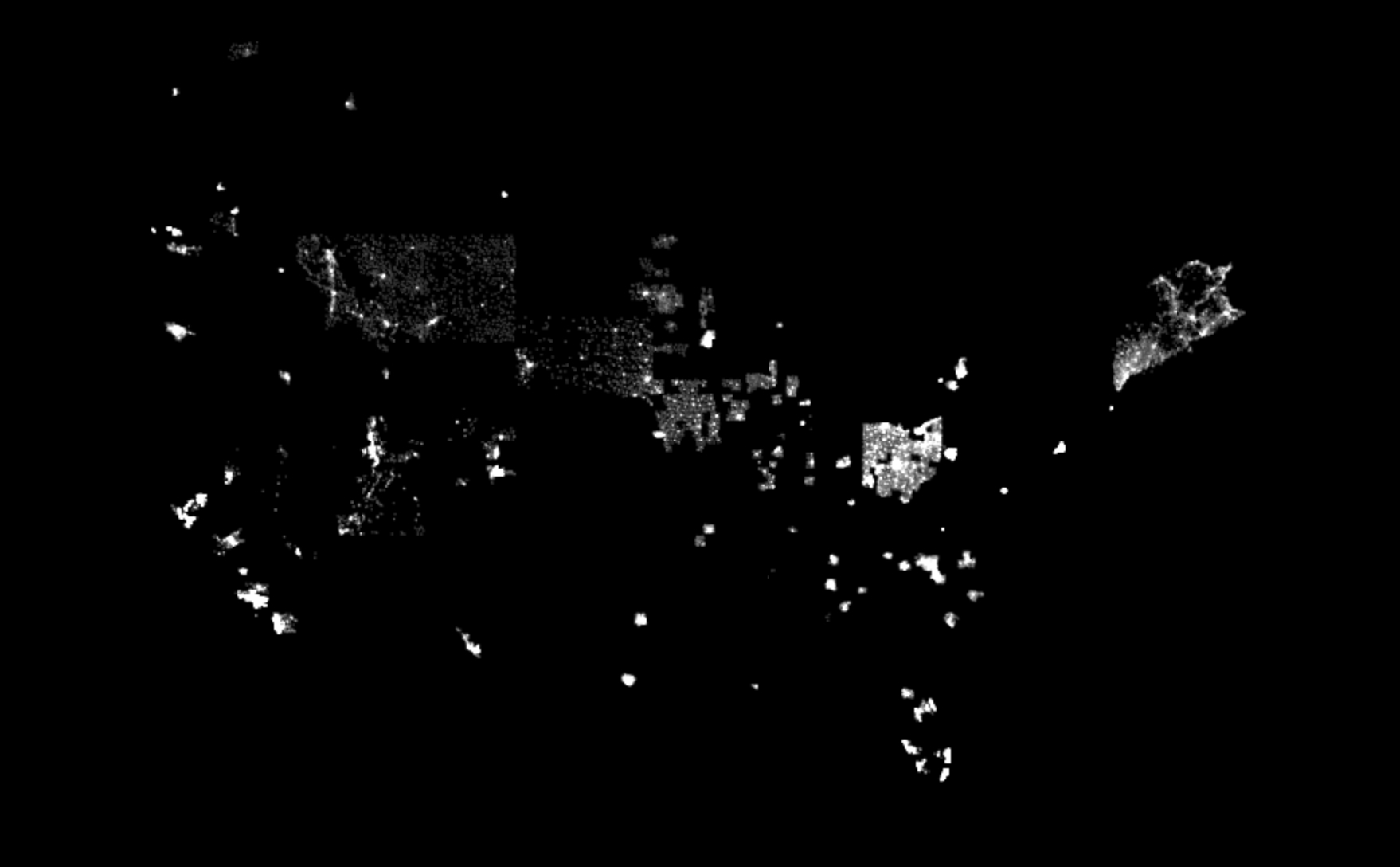
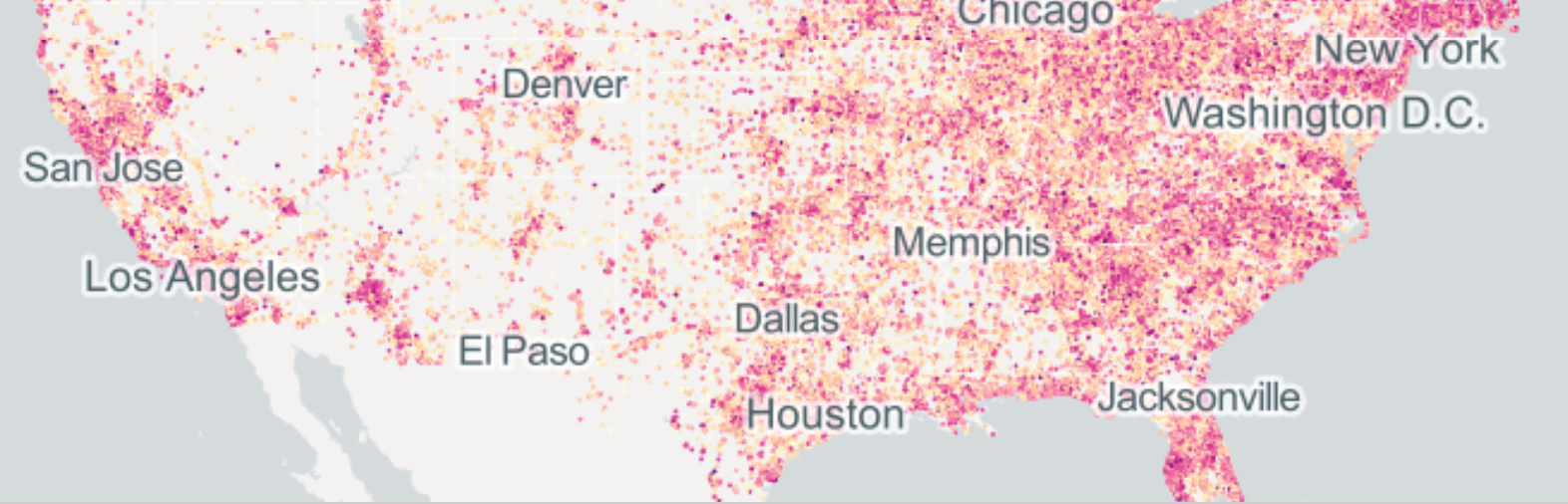
While we usually use the metaphor of the “shadow economy” to describe the black market, and we have come to refer to “black sites,” since the administration of George W. Bush, as those secret sites at which the National Security Council of the Bush presidency permitted the CIA to build, in order to torture those suspected of ties to terrorist organizations. But the true areas of the economy that must remain ensconced in shadows are the areas without nonprofits, where the service due sectors of the economy is absent or less actively attended. This reverse-color mapping is meant to suggest the dark that is left in nonprofits’ void. To be sure, many centers of nonprofits attend to areas and regions outside of their immediate vicinity: they serve forests, or legal services, or open waters. But there is a lack of a sense of that service in areas which remain in the shadows in the above map. There is, in ways that suggest a deep divide needing to be remedied, that persists in the new Deep South, where one looses one’s orientation on much of the land between Houston and Atlanta, or Dallas, Memphis, and Jacksonville:

The dense bursts of light that cluster around the coastlines of California and hug the shore cede to a vast open expanse, it seems, in the Western states, with stretches of empty space between, as one moves from a concentration dense with nonprofit works to stretches where this would be poorly understood as a line of work–or maybe even as a set of services that goes unmet.
The dark spots and even more dark regions across the nation map a desert of non-profits, where social services go unmet, water safety less monitored, literacy tutoring in low profile, after schooling limited, hope diminished, parks untended, and wildlife not preserved. The critical role of nonprofits in the economy is absent, and both the economy and the society feels the deeply deleterious effects.