Tag Archives: mapping agricultural run-off

A New Other Green World? Mapping Algae Populations and Tracking Harmful Algae Blooms

Access to pure freshwater seems an innate right, and freshwater lakes conjure pristine landscapes.  But the twinned threats of global warming and industrial farms threaten to alter the geography of watery world in an apparently definitive fashion, as rivers, ponds, and lakes across America–and the world–have been found to be teeming with toxic algae.   In what seems to be a brazen photoshopping of photographs of the Great Lakes, the apparent aquatic “greening” of formerly fresh waters in fact carries quite sinister associations.  The abundant algal blooms in the Great Lakes recall the modern miracle of the annual greening of the Chicago River each St. Patrick’s Day, but are of much more anthropogenic origin.  Appearing at regular times and places, they raise a corner on a changing relation to the worldly environment.

But they are also–in the manner of all “offshore” events–both particularly challenging to chart or to measure by fixed or clearly demarcated lines so often employed in terrestrial maps.  Rather than being photoshoppped, the satellite maps make points difficult to interpret or decode, even if they trigger immediate danger signs of the dawn of a different world, and a quite different national map of the extent of our potable water.  They prompts questions of how to map man’s impact on the shifting environment of the Great Lakes.

lake-erie-habs

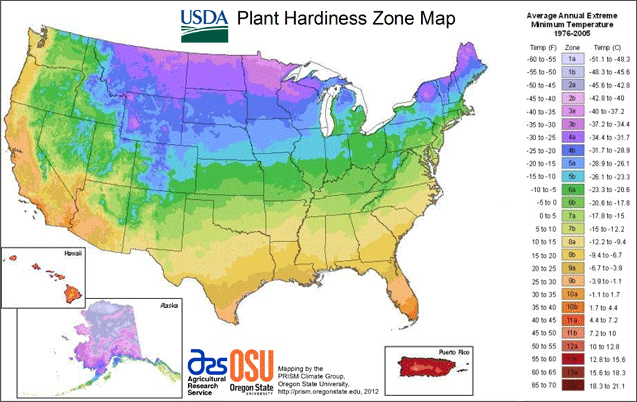
Populations of algae move with the currents of local waters, as the blooms of pools enter rivers and rush down streams, as a weirdly alien presence in water supplies that have impacted fish in many ways, and stand to impact humans as well.  As we start to chart our relation to their presence, their emergence in select spots of the US and other countries demands to be connected to one another, or placed in a causative web geographic as much as environmental.  The nature of this greening suggests a new presence of the bacteria in the world.  For Northrop Frye, the “green worlds” in Shakespeare’s plays connoted a pivot scene of action–an extra-urban environment producing to reflective individual insight of a personal nature but also a setting to overcome natural challenges that stood for inner obstacles.  The argument that Frye formulated in 1957 paralleled the earliest ecological movement–one thinks of the founding of the Nature Conservancy (1951), as well as the Wilderness Society (1935) and Defenders of Wildlife (1947), but also of the success of blocking the damming of the Colorado River at the entrance to the Grand Canyon National Park, and the fruits of many volunteers in the Civil Conservation Corps that, before the war, put many men to work on conservation projects.  The critical moment of the appearance of green algae in waters across midwestern America suggest not only an environmental challenge, which in 2011 cloaked one-sixth of Lake Erie’s surface, but prompt needed reflection on both a local and a global struggle with environmental change–linked not only to rising temperatures, but to the increasing over-saturation of nitrate-rich fertilizer in agricultural run-off.

Algae populations are not usually mapped as the populations, but the recent spread of algae in what was once called American freshwater lakes and rivers has not only generated significant media attention and concern.  For it posed problems of locally mapping of algal growth in compelling ways–not only for fishing or swimmers, but for communities and regarding the potability of water piped into public circulation.  While algal blooms are the concern of environmental studies or marine biologists, more than geographers, their inescapability as part of the impact of humans on the environment force us to include them within our spatial experience and  geographic horizons:  it is as if the very bucolic settings we had known are being reconfigured as nature, and dramatically scenographically redesigned, and their origins remain ineffectively mapped, even if they are often bounded by vague warning signs.  Where did these blooms arise, and can we relate their inland flourishing to the mapping of their marine migration?  Can they be placed, more importantly, not only in a given set of waters that are polluted, but within a web of land-use that unintentionally geographically redistributes nitrates and phosphorous so that they tip the crucial quotient of algal populations and bacteria in the waters that lie in rural areas, near to farmlands?  The abundant greening caused by rural pollutants pose a major ecological imbalance still neither comprehensively acknowledged nor assessed.

Ages before online memes circulated about dating of the anthropocene in the guise of critical thought, George Perkins Marsh declaimed the widespread environmental changes effected by human actions as anthropogenic in scope.  Back in 1860, Marsh bemoaned dangers posed to mountaintops and  deforestation and evoked the losses that were the result of dried water channels, reducing meadows to parched infertile stretches and creating sand- or silt-obstructed streams where irrigation occurred, poetically lamenting the shifting ecology which “converted thousands of leagues of shallow sea and fertile lowland into unproductive and miasmatic morasses”:  Marsh’s 1874  The Earth as Modified by Human Action was written in the hope “to suggest the possibility and the importance of the restoration of disturbed harmonies and the material improvement of waste and exhausted regions.”   It set the template for Paul Crutzen’s later dating the “anthropocene” and its diffusion as a critical concept and a form of global introspection about our environment:  and as that impact becomes ever more apparent, the recent appearance of toxic algal blooms.  Algae blooms offer one measure for mapping the advent of anthropocene.  Can one map the dawn of the anthropogenic in cartographical terms?  Actively mapping such population in freshwater and marine bodies of water are as visually striking an index as any of the impact of poorly agricultural planning and practices on living geography.  In a sort of stunning irony or counterpoint to the nosedive of the worldwide algal mass by 40% over the past sixty-five years, a huge reduction of biodiversity of marine ecosystems altering the marine food web, the appearance of algal blooms is less linked to human impact on the environment.  Could expansion of the ozone hole, and global warming, be easier to render compellingly in a graphic map, and toxic algae harder to register in compelling cartographical forms?  Or is the appearance of blooms just too overwhelmingly entangled in multiple circumstantial factors that already assume inevitability–from global warming to chemical fertilizer–that the map seems a fait accompli?

Marsh was also an active champion, of course, of a more custodial relation to the water, forest, and the land.  The problem of mapping algal blooms in a coherent or compelling manner is problematic, even though the data is there, and the visualizations in snapshots of lakeside scenes arresting.  The recent rise of “toxic algae” are, while apparently visible to Google Earth, difficult to decipher on maps, or even in satellite images, which carry ominous signs of a changing global geography with immense impacts to human and animal life alike–the effects of whose shifting bacterial populations radiate out from local ecosystems to human disease, but are rooted in a deep uncertainty that something in our bodies of water is either just out of kilter or deeply wrong.  But the hardest question is how to compel attention to these maps, which provide a basic charge for understanding and communicating how the blooms spread, as well as the networks of causation that contribute to such strikingly hued waterborne algal populations.

Cwall99_lg

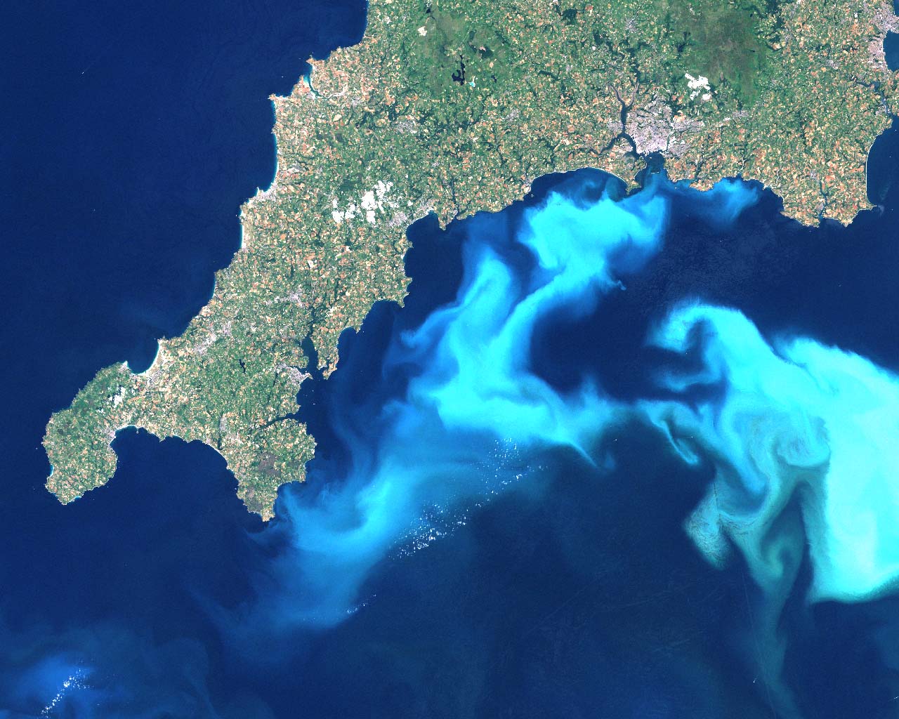
This 1999 image of algal blooms off the southern coast of Devon provides a visualization of the spread of harmful blooms of toxic algae that have hurt the whales and dolphins who have ingested them, as other fish.  Dissecting data visualizations of the prominence of such toxic algae or “harmful algal blooms” in oceans or inland raises pressing questions about their nature and causation, and about the salient mechanics that might be revealed in how such blooms might be better or more clearly mapped in web-based platforms.  In an age of the omnipresence of Google Earth, or satellite views of significantly high resolution, as well as MODIS, as well as the imaging spectrometer MODIS aqua of high resolution launched in 2002, the measurement of water populations should not be difficult to define:  but the presence of algal blooms requires increasing introduction of data layers based on local detection, in ways that the surface appearance of all aquatic environments just cannot register alone.  Algae provides a case for looking at the unmapped, and mapping the sort of rapidly reproducing migrant bacterial populations in aquatic environments that are otherwise particularly difficult to detect by superficial observation–until they have already rapidly progressed or bloomed.

Algae’s presence in lakes was rarely a mapped population or identified as a species until the spread of toxic “harmful algae blooms” (HAB’s) and alarms over cyanobacteria:   algal populations have recently gone off the charts, and the explosion of their accumulated biomass has created huge alterations both in food web dynamics–and sucking off most of the oxygen in waters on which fish depend–as well as increasing the growth of bacteria that themselves pose dangers to human life, best known in the bacterial spread of the so-called “Red Tide” of Karenia brevis that flourished in ocean waters off the coast of Florida during the late 1970s–but more terrifying, and considerably more difficult to track, across the freshwater lakes, ponds, and rivers that are often sources of drinking water.  Mapping and charting the presence of bacteria in waters is notoriously difficult, born as they are by currents, weather, water-depth and amount of refuse that locally enters waters, and the alarming visuals of chromatic variations caused by algal presences in aquatic environments poses practical challenges to visually represent in maps that combine dispassionate distance and analytic engagement.

hab

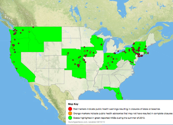
These maps are less fun or enjoyable to read, if only because they so often bear bad news.  The adverse effects of algal blooms on local animal populations and food webs are even more difficult to track along clear analytics, although a varied range of metrics and maps–from MODIS satellite views of remote sensing to GIS plotting of specific readings to Google Earth views and aerial photographs.  Even as folks are downing Spirulina and eating Kelp, the pernicious cyanobacteria of green-blue algae blooms, The effectiveness of the beauty of mapping algae is difficult to effectively use as compelling narratives, however, whether about that danger, or in ways that overcome the difficult distaste of the un-kelp-like sludge of algal blooms, about the alarming spread of Harmful Algal Blooms (HAB’s) either off the shores of the United States or as effectively clogging food webs in its lakes.  As of 2013, health authorities issued advisories and warnings on algal blooms at 147 different sites and untold cost and environmental impact due to such harmful blooms, of which no systematic collation seems to exist.

Mapping the presence of such HAB’s is not only a question of reporting locations of efflorescence, but of mapping both the causative webs by which they seem to emerge with the deposits of phosphorous-rich fertilizer and waste in rivers and runoff, as well as mapping the impact of blooms within food webs and food-cycles, although it is often discussed primarily or solely in regard to its potential dangers to humans–given the neurotoxins that it has produced in rivers, lakes, and even waterfalls in Minnesota, as well as Michigan, Illinois, Kentucky, Pennsylvania, Vermont, Ontario, Ohio, and even the Sacramento River delta, in addition, most famously, to Lake Erie–whose shallow waters encourage algae blooms, and where locals of recently sought a joint US-Canadian agency called for the immediate imposition of fixed limits on local fertilizer use.   If over 140 sites of algal blooms are present in the bays, ponds, and lakes of New York State alone, and in many lakes across the world, the widespread occurrence of such blooms have been tied to fertilizer runoff, but their endemic presence in so many freshwater lakes have only relatively recently been systematically tied to outbreaks of disease.

Hand of HAB

Only now is the huge efflorescence of algae blooms being linked both to the production and broadcast dispersion of industrial fertilizers.  One back story that demands to be mapped is the effect of the longstanding encouragement that farmers in the United States have received to  minimize plowing of their lands, less the huge carbon mass that regularly tilled lands release not only erodes the atmosphere but degrades the soil itself; tilling costs more to pursue in a systematic way, and, especially in large farms, has been discarded as farms have shifted their equipment for tilling to a program of “no-till planting” that uses machinery to drill seeds into undisturbed soil, and scatter fertilizer atop in prepared pellet form that needn’t be entered into the soil by tilling machines–even though such pellets depend on rains to enter the soil, and up to 1.1 pounds of fertilizer per farmed acre enter rivers directly in rainwater, as a result, rather than serving to fertilize the soil, working to effectively unbalance ecosystems far beyond the bounds of farmed lands.

Harmful algae blooms’ explosive off the charts growth responds to a confluence both of high usage of fertilizer in crops and lawns, intensified by rapidly rising temperatures that foment their spread in freshwater and seawater alike:  the expansive growth of algae seems something of a by-product of our current global warming trends, as the increased summer heat provides an optimum occasion for spurts of algal growth, nourished by streamed-in phosphorous and other animal wastes, in ways that change the microbial populations of freshwater lakes.  And the world of rapidly growing algae has deep consequences for public health.  For rather than the edible sorts of seaweed, the toxicity of algae in freshwater systems is all too likely to foster bacteria-levels in human drinking water and fish that are not usually seen, making the mapping of stagnant water algae of increasing concern in much of the midwest and northeast–especially nearby sites of large-scale or industrial agriculture.  What are the best ways that algae can be mapped, or that the mapping of algae can be a proactive safeguard on the responsible stewardship of the toxicity of agricultural and lawn run-off?

The blaming of substandard practices of fertilizing soil and huge expansion of chemical fertilizers with phosphorous, combined with the increased problems of storing waste, create a new geography of pollution that renders human impact salient by the spread of an algae bloom crisis around the Great Lakes, which since 1995 have emerged in the Maumee River that feeds the Great Lakes and runs through many factory farms in these inland lakes:  increasingly, Kansas is reporting widespread algae blooms in lakes, as well as Pennsylvania and Kentucky, according to the Kentucky Department for Environmental Protection blog and which the Courier Journal describe as the first cases beyond the lower Midwest.

Screen-Shot-2013-09-24-at-11.17.56-AM

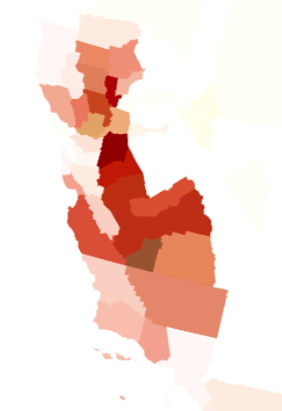
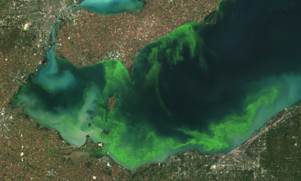
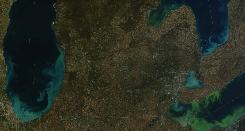
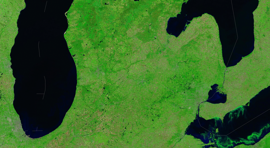
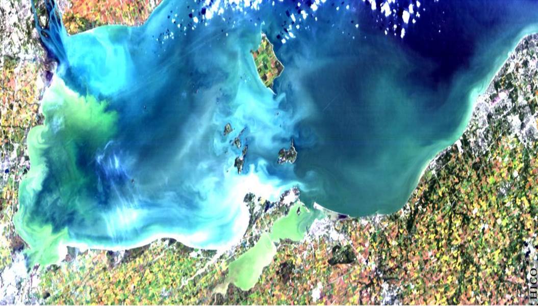
Even when not toxic in nature, the problem of uncontrolled algae blooms lies in their absorption of all oxygen from the body of water in question.  The predictive maps of expansive algal blooms specifically in Lake Erie, where aerial photographic visualizations recorded the  record levels of 2011, warn of the spread of toxic blue-green algae–a harmful algal bloom (HAB), focussed on the lake’s western basin, based on the careful reading of the nutrients that flow into the lake.  The new levels of algae that have steadily increased in recent years, hark back to the algal blooms of the 1960s and 1970s in the same region of the lake.  But the blooms have recurred with a new intensity, spurred by hot weather and an increased amount of phosphorous, sewage, and manure into Ohio lakes and streams, boosting the blue-green cyanobacteria to new levels last summer that more than doubled previous years–increased by the accepted practices of broadcasting fertilizer on fields without tilling, and the reluctance of the Environmental Protection Agency to issue any warning on cyanobacteria in these waters–even after the algal blooms broke previous records in the summer of 2011–although we know that colorless odorless carcinogens like microcystins can linger long after the blooms have left.   Mapping the blooms proses a problem of going beyond geo-visualizations or aerial photography as a way of mapping the flow of bacteria and subsequent algae blooms that deoxygenate waters in an easily legible form, or linking the toxicity of blooms to set intensities.

Are we even close to cultivating the ability to read the levels of toxic agents like microcystins in algae blooms, or able to find reliable ways of transcribing their potential harmful side-effects? The specific case of Lake Erie, specific both since it is one of the densest sites of such blooms and on account of its low water-level, may itself be predictive of the danger of algal blooms in future years.

lake-erie-habs

The 2011 bloom was rapid and sudden, as is apparent in two aerial photographs of the lake snapped just five months apart, between June 1 2011 and October 5, which illustrates the blossoming of the algae under the summer’s sweltering sun:

0315-nat-ERIE_webNew York Times; source: NOAA Centers for Coastal Ocean Science; data from NASA MODIS sensor

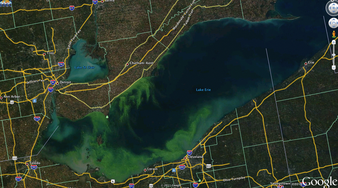
If not a map, the green coloration of the algae highlighted the frontiers of its expansion so effectively as if to isolate that one feature within the aerial photograph.  Such local photographic “mapping” of the density of toxic algae blooms is perhaps the most compelling chart of their impact.  But the expansion of algal blooms, if similar to that covering 300 square miles in 2003,  now threatens to spread across the entire southern shore, has been closely tied to new levels of toxicity, producing liver and nerve toxins, and creating a dead-zone of oxygen-depleted fish.  If not as severe as it was in 2011, when remotely imaged by MODIS satellite revealed a particularly disturbing concentration of cyanobacteria close to Detroit and along several spots of the lake’s shore, before extending from Toledo to Cleveland in 2011.

erie-forecast-art-gmqnkink-10703gfx-erie-forecast-compare-eps MODIS Cyanobacterial

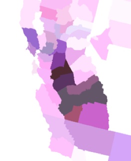
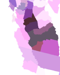
The existence of sediment in the Great Lakes revealed a distribution of particularly thick portions of algal spread, no doubt particularly notorious due to its low average depth of just 62 feet.  At the same time as Western Lake Erie continues to experience a fairly unprecedented resurgence of toxic algal blooms,  health advisories and “do not drink” orders have been issued by the state of Ohio, although Michigan, which lacks a formal monitoring program to monitor waters’ purity, has not issued any:  the current debate on the Farm Bill has led to a jeopardized program of Conservation Stewardship and fails to include controls to encourage farmer’s to monitor their effects on water quality–or even to set uniform standards for the toxicity of HAB’s to drinking water, local ecosystems, or lake life.

Algal Blooms 2012 true

Modis Green Erie

The spread of their population in the lake was visible on Google Earth:

Algea on Google Earth

The intense concentrations of algal blooms can be likewise revealed due to remote sensing of the absorption of light in the lake’s water, to image the toxicity of the most polluted of the Great Lakes. based on data from the International Space Station.

Lake Erie satellite image

Looking at lake Erie provides something of a well-mapped test case of algal blooms.  Most of the blooms are typical of the over 200 toxic blooms in the United States, due to run-off of fertilizer and manure in rivers and lakes, often carried by heavy rains, often confined to the northwest, but spreading throughout the high farming regions of the midwest, where phosphorous no doubt increasingly leaches to water supplies–leading to public health warnings and closures of lakes or beaches.  Rainfall has increased the flow of agricultural run-off and nutrient-rich storm water into rivers and lakes, providing food for algae to grow to toxic levels.  Indeed, the National Oceanic and Atmospheric Administration has developed an early detection and forecasting system for the Gulf of Mexico by using remotely sensed data to monitor harmful algal blooms beyond the Great Lakes and Chesapeake Bay–some of the largest repositories of freshwater in the United States–and in over one hundred and forty sites as of the summer of 2013.  And the clean-up of many Minnesota lakes has led to a call for reducing the use of nitrogen-rich and phosphorous-based fertilizers by some 45%, although no realistic ways for achieving the goal–which might not even be as high needed to reduce algal blooms–has been defined. The difficulty that occurred when a satellite photograph of Lake Ontario suggested a similar efflorescence of blue green algae blooms of cyanobacteria in that large body of water led an overwrought panic-attack to be voiced on Twitter, as the photograph that ostensibly boded the local arrival of an onslaught of heptatoxins, already problematic in Hamilton Bay, to have metastasized to the lake as a whole.

L-Ont-bloom-580x386

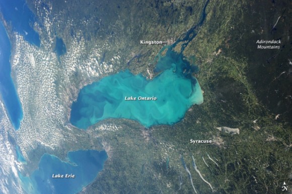
But the “bloom” was a boom of plankton–mostly plankton like diatoms, and chrysophytes, dinoflagellates, in other words, which are often mistaken for blue green algae in remote sensing, although blue green algae blooms just a small amount of it, and little cyanobacteria–was an optical illusion.  The apparent errors in the imaging of algal blooms suggest a greater difficulty in its accurate mapping, and makes us rely on self-observations by water-sampling for certitude.

This is not to minimize the danger.  But only to warn of the limitations of tracing by superficial observation.  The actual potential for the sudden spread of HAB’s in the continental United States is in fact quite serious, however, as is the need for ensuring water-quality standards in many rural regions–from questions of potability to the eventuality of die-offs of fish.

blooms across USA

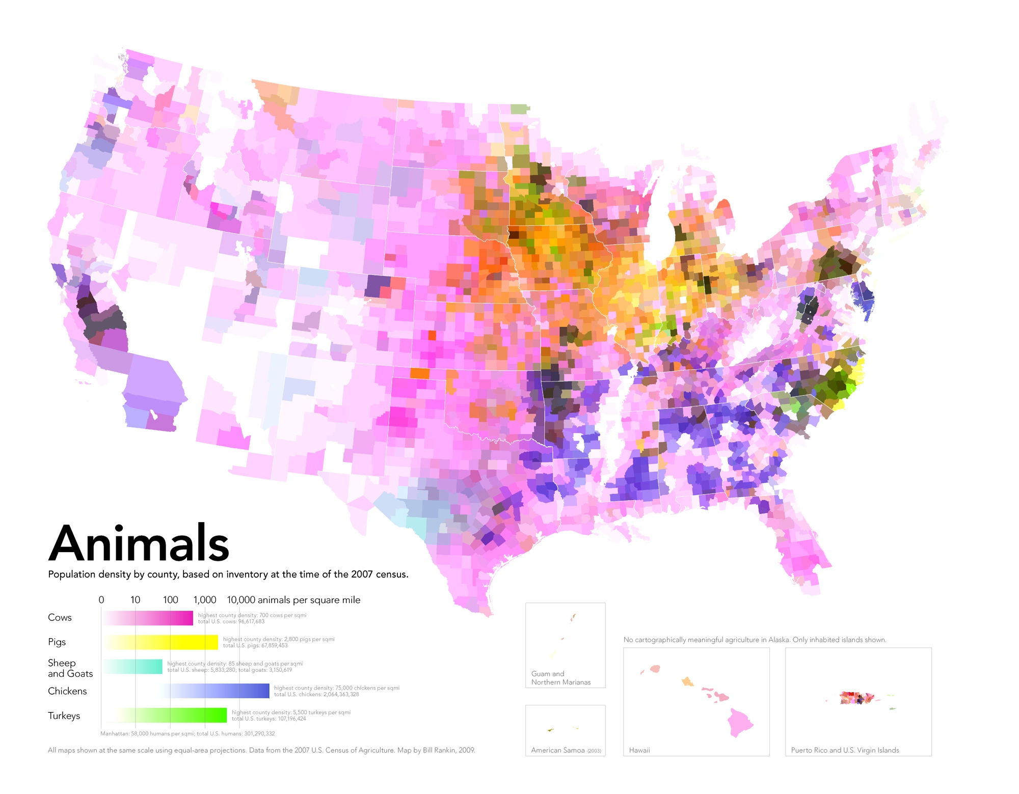
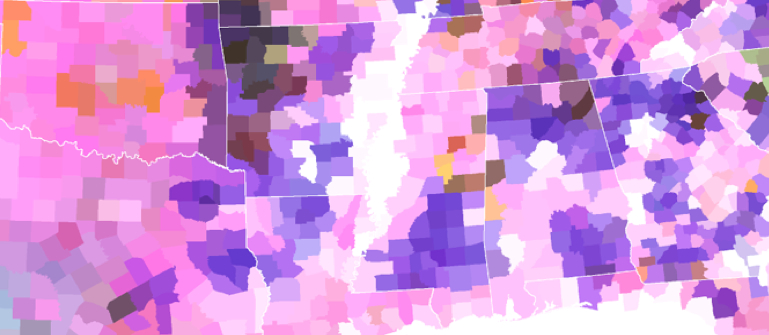
The interest of this very broad-scale map is the proximity of blooms to large-scale farms raising cows and pigs:  such  concentrated animal feeding operations (CAFOs) generate unduly concentrated amounts of livestock waste in precise locations–termed “liquid lagoons”–thee liners of whose storage tanks regularly leak in heavier rainstorms, creating a manure run-off from poorly regulated sites into lakes.  The EPA estimates that over half do not have Clean Water Act permits, creating deep problems of local stewardship that becomes evident in the efflorescence of toxic algae blooms–but only long after the fact–in ways that reveal the ingrown nature of poor standards of agrarian stewardship.  Living in the right town, we might see such headlines as Citizens of the Town of Lincoln, Kewaunee County are concerned that the Kinnard Farms Inc. plan to manage 70 million gallons of untreated animal waste doesn’t protect groundwater from contamination, or How Big Meat is taking over the Midwest, describing the widespread multiplication of permits for such “poo lagoons” in the landscape to hold the refuse of the 19.7 million pigs raised annually in that state alone, and the return of a booming industry in 2011.

Factory Farms Focus on Iowa?

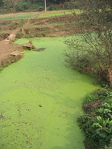
Lying down water of such overflowing containers of animal feces creates a possibility of toxic contamination that is particularly difficult to contain–especially when fueled by an unnatural abundance of phosphorous and nitrates that has all too often been insufficiently or ineffectively tilled into agrarian lands.  The contamination of so many of Minnesota’s lakes offers a sad case in point.  The striking case of green waterfalls in Minnesota suggests something like a direct inversion of the rural picturesque–and a compelling need for new standards of river pollution or run-off, as well as intensive attention to the tilling of fertilizer so that it remains buried as much as possible underground.

Operation-Downspout-Logo

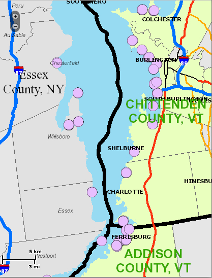
Somewhat more ecologically conscientious states, like Vermont, removed from the landscape of the factory farms, have begun to provide interactive local maps to measure and track the intensity of algal blooms, of “blue green algae tracking,” as this map recording the blossoming of green by the shores of Lake Champlain–a tourist destination–that are considerably interactive and detailed, as well as allow a considerable fine-grained detail of local reporting that are incorporated into visual overlays for ready consultation each day.

Algae by Burlington

Others, like Florida’s inland waters, have seen massive toxic algae outbreaks that have killed manatees, fish, and birds, as well as dolphins in the Indian River Lagoon, where fluorescent green slime filled the river this past summer, leading to widespread health warnings.  Of course, such a menace is not only localized:  the actual specter that is haunting the mapping of algae comes from China–where, coincidentally, few controls exist on fertilizer or greenhouse gasses, and algal blooms fill large, slow-moving rivers like the Sichuan.

220px-River_algae_Sichuan

In the course of preparation for the 2008 Olympics that the Chinese government pulled some 1,000,000 tons of green algae from the Yellow River, famously, relying on some 10,000 soldiers in the project to remove the waste, leading folks to just negotiate with algal blooms as they appear, and their relative toxicity not to be tested.

green-algae-bloom-china-lake-wading_37797_600x450

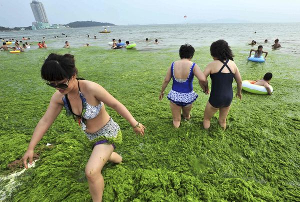
The disquiet conveyed by the images of raking algic scums off the Yellow River, or of swimmers happily standing waste-deep in the light green blankets of what looks less like fresh parsley than artificial coloring can only be viewed with the alarm that Bartholomew Cubbins witnessed the arrival of Oobleck in the Kingdom of Didd.  (We might reconsider the assumption that the last printed work in the Dr. Seuss corpus, The Lorax, was the one most directly about the physical environmental.)  Indeed, the comparisons of Oobleck to HAB’s seem unavoidable given their sudden ubiquity across so many of the changing climates of the United States and world.

220px-Oobleck_Cover

Mapping something as imaginary as Oobleck might be an apt association, if intentionally slightly ridiculous if evocative comparison, but the odd appearance of green toxic slime in freshwater deposits evokes the sudden omnipresence Oobleck quickly acquired in all Didd.

oobleck in act

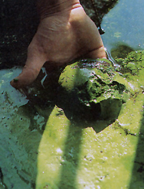
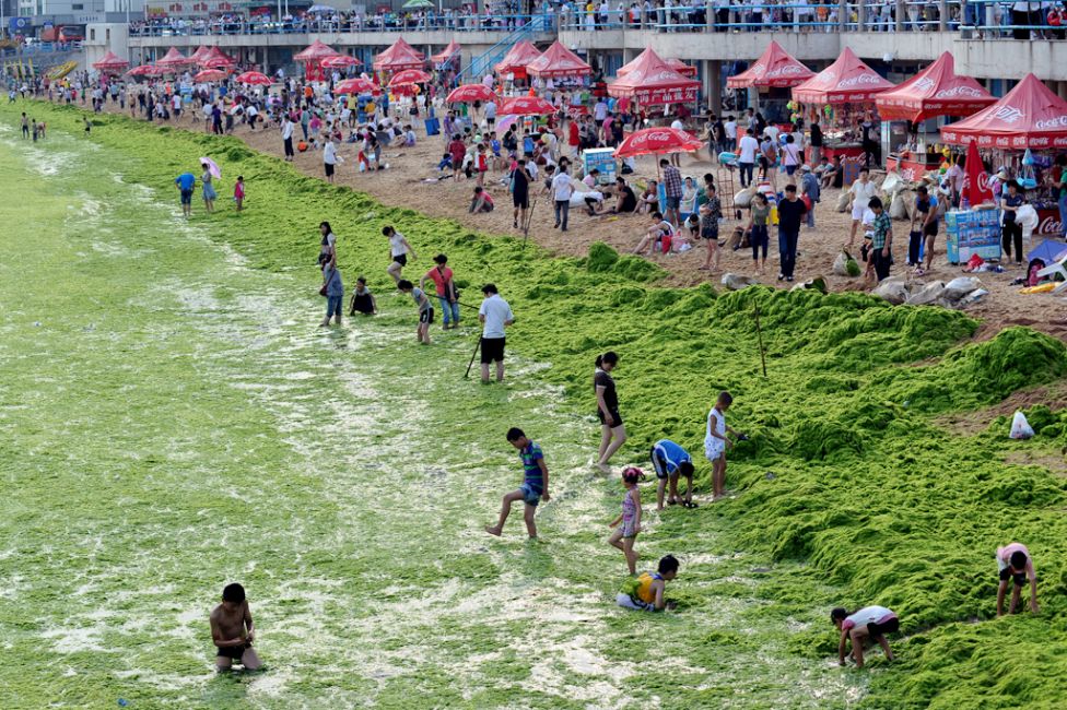
The fear of self-generated Oobleck seems implicit in much literature.  Indeed, Qingdao’s 2013 summer scourge of “surf like turf” meant the arrival of what locals called “sea lettuce.”   Perhaps from the farms of Nori on Japan’s Jiangsu coast, or from irresponsible farming in China itself, the consequence of a massive failure of marine stewardship created currents of harmless-to-humans algae running toward the center of the Yellow Sea.   The blooms, given the run-off of nitrate-rich fertilizers from farms and industry, didn’t seem to threaten beaches often used as centers of tourism, but created an odd sight of bathers luxuriating in the aquatic lettuce they were told had not toxicity.  The algae are often regarded as harmless to humans.  But harmless to fish they are not:  the algae serves as a ravaging of the aquatic ecosystem:  bright green beds of algae were deemed a “large-scale algae disaster” by the Shandong province, and 19,800 tons of it cleared as it started to decompose, releasing noxious fumes of toxic hydrogen sulfide gas, at a cost of over $30 million.  The relation between harmful algae and the local ecosystem or food chain has not been fully explored to map, despite the wide ramifications of its impact on the greater food chain.

floraison-massive-algues-vertes-chine

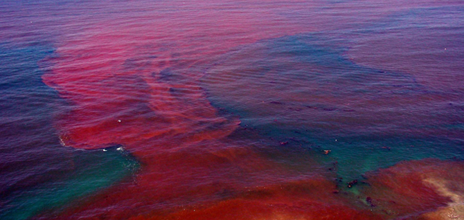
The explosion of algae blooms has been linked to the rise of the so-called red tides in the Gulf of Mexico, has already hit our coasts as well:  southern California coast and Florida have both placed a new premium on mapping the density of algae that flourish in these warm ocean waters, which have long been worried to disrupt local ecosystems and food chains, before the toxicity of fertilizer-fueled algal blooms started to appear inland.  These tides have largely been treated as dangers to marine life, and specifically to the shellfish regularly harvested there, however, and were consequently charted and mapped in relation to water currents, salinity, and winds, to get a picture on their sources of origins of these concentrations of  dinoflagellates of reddish hue that so rapidly accumulated along the Florida coasts from purple to pink, and which seem–despite their name–to be entirely independent of tidal flows, but were toxic to birds, fish, and mammals, and potentially harmful to human beings when consumed in shellfish.  The awareness of this vector of transmission has led to the monitoring of these early HAB’s, which have disrupted fisheries along the Atlantic as far north as Maine, and, according to some were witnessed in Canada as early as 1793 in British Columbia:  but far more recent measurement of red tides in northern California, where they created a massive die-off of shellfish, the Gulf of Mexico, the Southwest Florida coast, Malaysia, Maine, and Massachusetts, killing fish, manatees, and shellfish like abalone, has led to increased NOAA alerts and concerns of respiratory irritations at beach shores.

Is such efflorescence due not only to lower rainwater that flushes the system of oceans, and increased warming, but also to the nitrate-rich outflow of fertilizer from Florida plains, and indeed the Mississippi?  The lack of tilling in larger farms, driven by the needs to produce more crops in their growing seasons, has encouraged the dispersion of high-grade fertilizer across the Midwest, most of whose runoff enters the same waters. Indeed, the inland growth of HAB’s echoes historical documentation of the approach of “red tides” that endangered shellfish and fish living along Florida’s western coast in recent decades.

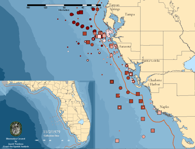
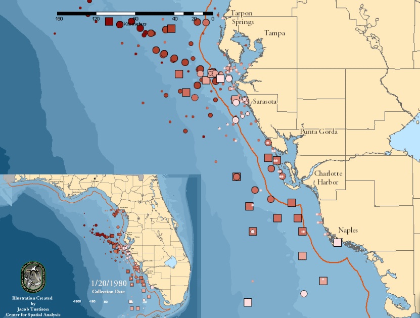
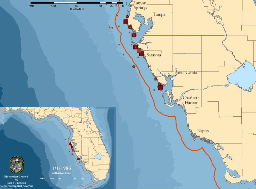
The ability to survey the massive growth of Karenia brevis organisms in the warm shallow waters of Florida’s western coast, and the dangers that they posed to local fish and marine life, benefit from the extension of data and record-keeping along the Florida waters since 1954 by multiple agencies.  The data creates a context for data visualizations of the expansion of the “red tide” of HAB’s in ocean waters near to an exceptionally rich and endangered ecosystem, but also one huge stretches of whose coast falls under environmental protections for endangered species, and whose waterfront economy enjoys far greater protection than most inland lakes.  By exploiting the largest continuously recorded database of Harmful Algal Blooms in the United States–and world–we can examine the spread of sites of the Red Tide of 1979 in relation to ocean currents, which appear, based on data from Florida Marine, clearly clustered in shallower waters by the ocean coast:  maps track the abundance, intensity, and duration of growth of Karenia brevis by color, switching to rectangles for the largest, and the extent of their presence by shape-size, based on data collected on November 1979, Christmas 1979, December 20, and January 20, 1980.  They reveal the algal spreads as moving quite rapidly from being concentrated around Tampa Bay along the coast to Naples in dense brightly colored blooms that flourished for the longest time near bays, often in the shallower waters sometimes within the red line marking a distance of 18 kilometers off the coast, where they have most contact with shellfish.  The evolution of these animated static maps provides a temporary solution, based on intensive compilation of water data by the Florida Coastal Commission, but provides an exception of the degree of successful visualizations of algal presences in aquatic environments.

Nov 2 1979--Florida Marine

FLorida Marine 1979 Red Tide

Florida marine Dec 30 1979

Red Tide Expands 1979 Florida Marine

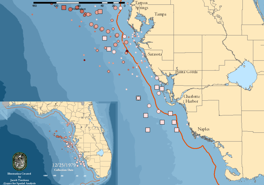
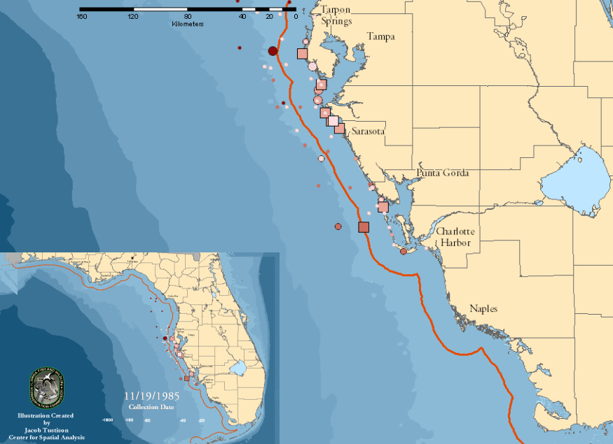
The “tide” returned in 1985 to the shallow waters off the beaches and coastal inlets of western Florida, pictured with a key of the local density of blooms which is also applicable to reading the above images, and the increased presence of blooms on New Year’s Day 1986:

Florida Marine carina 1995

Florida Marine Key

new year's day 1986

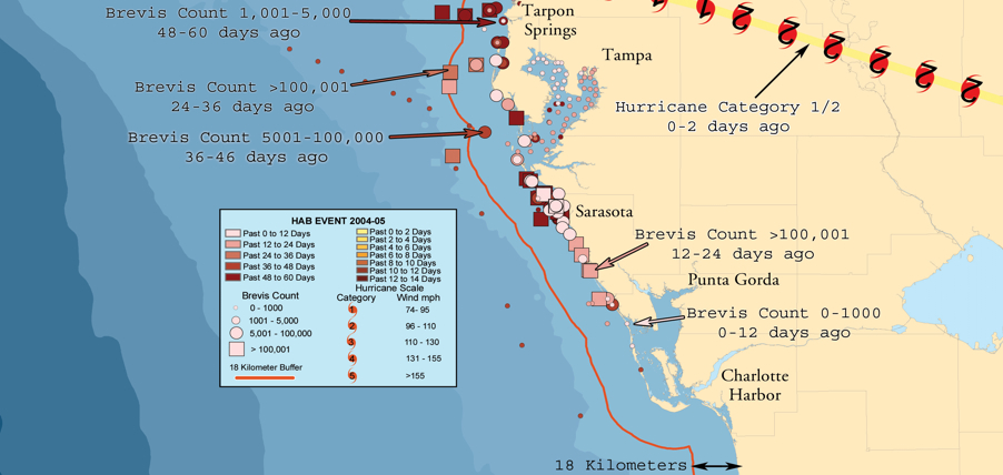
More recently, Florida’s Fish & Wildlife Research Institute charted the same coastal waters of its coasts.  By using readings that were based data for the NOAA Ocean Service and Satellite Information Service, who registered high levels of marine chlorophyll by MODIS Aqua imagery, bacteria clearly hovered especially, when present, around the Floridan shores and coves in which they multiply.  Does this suggest that they are specific to shallower, warmer waters, or more likely densest at the very point when they enter the seawater in such high concentration from the land?  Commonly known as “red tides,” these off-coastal aggregations of algae, again Karenia brevisseem largely in decline on Florida’s southwest coastal waters for the present, but had long flourished on its relative shallow ocean shelves.

Florida Fish and Wildlife HAB

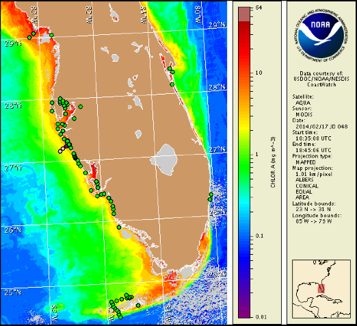
Or, in October 2013,

October 2013 Florida Fish and Wildlife RI

But the bacteria and algae are focussed not so much offshore–notwithstanding the so-called Red Tides–but rather in the very estuaries and inlets where freshwater leaches out into the surrounding seas, evident in this self-reported data of algae via Google Maps, where sightings were crowded upstream the inlet of the St. Lucie St. Park Preserve, with a congestion that travelled up the course of its river.

Google Maps St. Lucie River, 2013

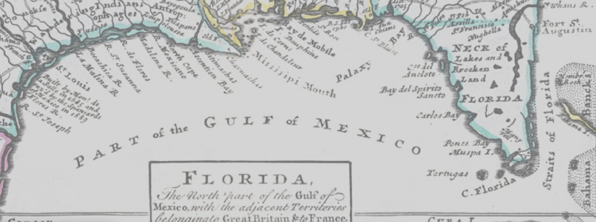
Indeed, the particular porousness of these offshore waters in the below engraved map, which shows a region characterized and distinguished by circulation of rivers in wetlands and estuaries, so long characteristic of Florida and much of the American south, struck early cartographers as so distinct by its density of estuaries.  The map, in the context of this blog, provides a striking contrast as Ooblek-free, even if its territory was far more submerged and coasts follow far more irregular lines.  This early eighteenth-century map–possibly 1720-30–this version courtesy of the expanding on-line collections of David Rumsey, offers the start of something like a cartographical archeology of the region, whose coves and inlets evoke a pristine Gulf of Mexico, fed by multiple rivers from the southern plains still inhabited by Native American Peoples:

Florida--part of America

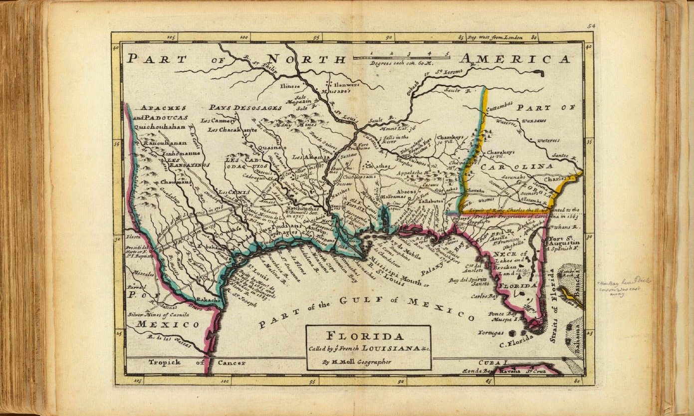
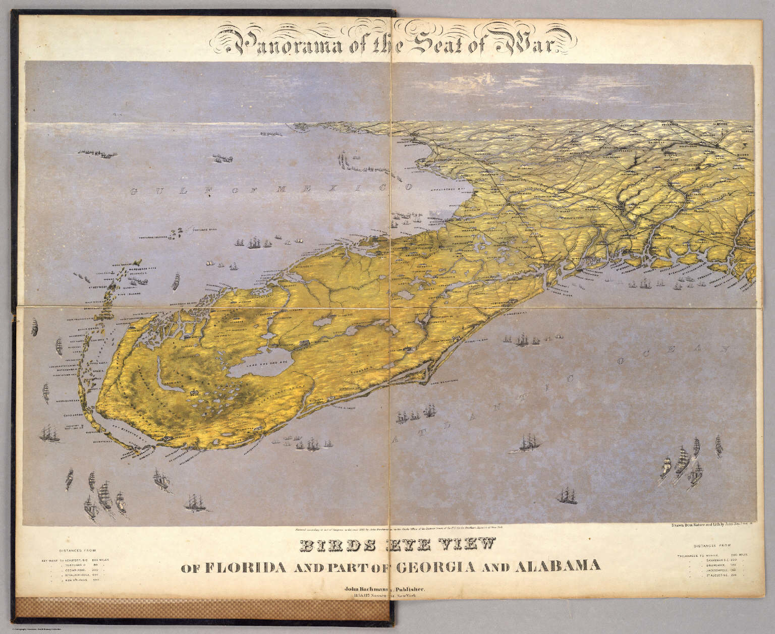
Florida at that time was described by the cartographer as a “Neck of Lakes and Broken Land, surrounded by man-eating Indians, whose Straits were nourished by streams, before being included in Herman Moll’s Atlas, with its rendering of glorious irregular shorelines, inlets, and islands that suggest a Florida before the expansion of landfill and filling in of much of the southern state.   There is something akin to a raining of Oobleck in Florida, the sudden and widespread appearance of HAB’s in modern maps of different states offers a point of entry into how the map can be taken as a rendering and record of man’s impact on and relation to the land, or of how our maps of human knowledge provoke questions of how to map man’s own relation to the remaking of the environment, less by setting the benchmark of a given date, but by how  it slowly started to be filled up with lots of sorts of shit, all of human origin or introduction.  To look at the elegant bird’s eye map that John Bachmann designed of Florida, among his many images of the southern states of America of 1861, printed as a collective “Theater of War,” the mapping of the water surrounding the peninsula shows a much more clearly integrated web of land and water.  In the panorama the peninsula is colored a light green oddly reminiscent of the algal blooms, but the green land, fertile with rivers crisscrossed with estuaries and permeated by lakes where brackish waters surrounded archipelagoes of islands, each its own flourishing ecosystem, and shipping docks, suggest an interpenetration of green land and water in a settled land.

Panorama of Florida

Northrop Frye coined he notion of travel in and to the Green World as a dramatic device evoking a crucial passage, which the protagonists must survive in order to restore balance to the actual world and to the plot.  One could argue that travel to old maps, rather than being only a form of antiquarian indulgence, provides and affords something of a parallel site of reflection on our environment.  The Green World that they present is an “other world,” and a world that seems increasingly distant as our own bodies of water are polluted, and we might look back to maps to see the lived environments we are in danger of loosing–and loosing sight of.  Viewing old maps like that in Moll’s Atlas after reviewing the above data visualizations and overlays is chastening and ethical, in ways, something like returning to a site of meditation on a relation to a world we have lost, and perhaps a way to turn back the tide of inevitability that informs our relation to the mapping of algal blooms.  Whether we can restore balance to our world may seem another story, assembling a coherent map of toxic blooms of algae that recur around the world, we can map its distance to the world we knew, and ask what sort of balance lies in our own.

Straits of Florida 1720

But it is the “other world” of blooms of green algae that the run-off of industrial agriculture appears to have bequeathed that is the world that seems, for the moment, far more likely to be left with us.  Without mapping the growth of such recurrent aglal blooms, and tracking their mechanisms of causation and varying intensity–feared only to increase in an age of global warming–the other world will become our own.

3 Comments

Filed under algae blooms, coastlines, Environmental Pollution, Florida coast, global warming, Great Lakes

The Way We Eat Now: the City and the Farms

The impacts of radical over-specialization of agricultural lands in the United States on our food supplies is only beginning to be mapped with the critical eye that it deserves.  With the intense expansion of ‘mega-farms’ jumping some 20% just in the years 2005-7, their expansion of subsidies, and an intensification of the quarter of vegetable production for animal feed, the notion of agricultural stewardship has been replaced by an artificial market and explosion of selective crops.  Is the notion of an agrarian space indeed itself a casualty of this new use of farming in a land of the death of the family farm?  Is this the end of an ideal of cultivable space, or does it push us to seek to imagine a new relation to the land?  It is indeed striking that until fairly recently, the ancient term ecumene or oikumene described the inhabited (or inhabitable) world with reference to those lands able to be used for agriculture or pasturage. 

The extreme “specialization of the agrarian landscape” William Rankin recently mapped offers visualization of data from the 2007 Census of US Agriculture:  the maps charts variations in crops and animal pasturage in each county of the country, each of which are colored by the gradations of four to five major crops or farmed livestock in the United States.   The selectivity of farmland use it reveals captures the effects of this expansion and maps the consequence of that dramatic expansion of mega-farming in the Bush presidency of those years, in response to selective subsidies of corn and soy:   the color-coding of individual crops provide a snapshot of the proportion of land devoted to each subsidized crop (soy; wheat; corn; cotton; vegetables and fruits or nuts) that  raise to raise big questions about our limited foodscape and suggest the degree to which farm subsidies inform land-use in desirable ways.

Even more striking than the limited regions of land used for farming in Rankin’s data visualization is the creation of the zones of land dedicated to wheat, soybeans, silage and corn that rarely if at all overlap, where over 50% of county land is dedicated to soy, a solid 40+% is dedicated to wheat, or over 60% to corn.  This is not only a map of agrarian distributions, but a the creation of a new attitude to agricultural space:  indeed, Rankin’s map helps us see the distribution of croplands in the country less as something that occurs on a flat surface, but in itself creates a new familiarity with space, and a relation of our food supplies to space, as much as a form of “geographic” knowledge of how events occur on the map.  For the sequence of maps chart a shift in the American foodscape, where we revise how we imagine agricultural space, and as creating a new notion of our agrarian space, rather than as changes that can be mapped or occur on the two-dimensional distribution of mapped space.

Rankin’s set of three maps of the national foodscape are not historical per se, but suggest a metageographical narrative of how attitudes to land have changed in their spectrum of such scattered colors.  They chart an extraordinary degree of remove from local intake, distribution or demand.  The distortion in this agrarian landscape is of course enabled by a huge transport industry, moving the wheat grown in the central band of the US from Iowa or Nebraska to Oklahoma, corn from Wisconsin to Iowa, to the soybeans so densely grown across South Dakota and Iowa to Indiana and Ohio.  Although continuity and coherence as the central properties of terrestrial maps, an absence of continuity in the concentrations of crop cultivation suggest a skewed relation to the land–the maps undermine the very notions of continuity and coherence that defined maps of national territories–using maps to raise questions about food supplies.  All the silage in across the Eastern seaboard in the country seems to derive from the local profitability of livestock products, show a nation almost drained of agricultural productivity, and relocates fruits and vegetables to ribbons on both coasts.

The consequent de-coupling of food markets from growing habits inverts Thomas Jefferson’s ideal of a yeoman farmer who planted crops for his own needs, out of the conviction that those “who labor in the earth are the chosen people by God.”  The Jeffersonian ideal of stewardship,rooted in a contractual relation of a responsible servicing of the land, rested on “good practices” of land management through rational skills of crop rotation, terracing to prevent soil erosion, promoting the diversification of varied crops, and surveying of land, from advocating a regular seven-year cycle of regular crop rotation that follow corn and wheat with a variety of crops, including turnips, clover, vetch and buckwheat.  He pioneered innovations that would increase the conservation of resources as well as crop yeild, including deep contour plowing, turning the ground far beneath the topsoil, and terracing to prevent soil erosion.  And his quest for variety and diversity for the agriculturalist no doubt encouraged him to introduce eggplants, brussels sprouts, rice, chestnuts, cauliflower, nuts and olive plants to the country–Jefferson imported 170 different fruits and 330 vegetables in the period from 1767 to 1824 to diversify the nation’s agriculture.  Jefferson was vigilant in advocacy of agricultural stewardship and famously wrote Washington with dismay in 1793 that “we can buy an acre of new land cheaper than we can manure an old one.”

William Rankin’s three data visualizations map the remove of what we eat from where we grow, or where we grow and what food we buy, suggests the imposition of an artificial remove of growing and husbandry from urban life–creating a gap between the country and the city so great that we cannot say where the country is.  In mapping the geographical remove of crops from cities–and of cultivation and animal husbandry from centers of population, Rankin has charted the results of a dysfunctional division of land-use, in which the map transforms the territory, and almost precedes it, as the areas zoned for harvesting by agribusiness divorce local needs of populations from the large-scale farming and animal husbandry, not only fostering a lack of a uniform food-harvesting mosaic, but a super-regional specialization, as this map of the crops that are grown in individual counties reveal:  the disorienting nature of individual to food, and individual to agriculture, that results removes the production of crops from local demand or a topography of need.  Indeed, there seems little clear integration of the sites of growing vegetables or crops to a national market in local terms, as questions of national demand and pricing drive the redistribution of crops into what seem “hot-spots” of production, whose intensity of cultivation tries to keep up with the national need with an intensity that their concentration is unable to effectively sustain in the future.

The pronounced discontinuities in the maps of food specialization reveal a deep disconnect between food production and consumption, and the limited understanding of how reliant we’ve become on an unequally pronounced distribution of such basic needs as growing crops or raising chickens.

Rankin's Map of Crops

In this map, Jefferson seems to meet Baudrillard:  the maps does not simulate a world of rending to the land with clear coherence, uniformity, or indeed boundaries, but visualizes a range of databases that reveal the imbalance by which we try to create the illusion of a land of plenty in an era of few farms.  This map undermines the security of a healthy nation, beyond reconsidering the pathways or quality of food, to force one to ask how the foodstuffs produced in these spaces could be high quality.  Reading the map will salutarily ward of any temptation to naturalize this self-evidently artificial division of land-use, or naturalize the imbalances of select crops in regions– the six colors used in the map are, indeed, almost always distinct from one another in the above map charting variations in degrees of crop specialization.  The map is a  metadata visualization, and absence of any attention to continuity in the agrarian structuring of the land, disrupts the continuity of the iconic image of the map.

Like Jasper Johns’ 1961 Map, which re-inscribes the encaustic splattering of primary colors that distance the map from its iconic status:  the surface of Rankin’s maps distance observers from the nation, rendering unrecognizable the form of the territory, abstracting the surface of the map by revealing an uneven uniformity instead of a united whole and focussing attention on the unwarranted density of selective agricultural concentration on specific crops.

800px-Jasper_Johns's_'Map',_1961

If maps don’t define and distinguish national sovereignty, but are a range of widely diffused simulations, we need an actively deconstructive map to assemble our disjointed foodscapes.  The dramatic isolation of foci of planting of wheat, soy, and three intense pockets of cotton, the absence of vegetables from most crops across the nation is a reminder of the separation of how we inhabit the nation from agrarian land-use:  citizenship is disconnected from stewardship, or the illusion of stewardship is no longer possible to perpetuate in relation to the land that no longer exists as a coherent territorial entity.  The remove of crops from local use, and the injection of subsidies to promote specific crops in Midwestern states, but also in the Northwest and South, created intense pockets of over-intensification that with the growth of megafarms has produced, despite the temperate nature of the continent.

2012-hardiness-zone-map

Perhaps these distortions of agrarian landscapes is an effect of the markets being driven by international prices, or if a radical specialization is striking for its remove from what we eat, even if not all have heads of leafy lettuce and arugula salads on their tables:  crops like wheat and soy are farmed in mass in select places for massive milling and repackaging; local food needs are met by importing across the nation, if not scattered boutique farms or “farmers’ markets” that are not run by farmers but franchised, or run by men who drive hundreds of miles with diesel gas in order to perpetuate the illusion of a close relation to the fruits of the land to folks living on asphalt pavement and tar.  We use food to create our own illusions, drawing from mythologies of agrarian responsibility that history provides.

Thomas Jefferson rooted democracy in the relation of the citizen-farmer and his land, metaphorically equating that relation to the fabric of the nation:  “the greatest service rendered any country is to add a useful plant to its culture,” he argued, equating individual agricultural stewardship as a “service to the nation” that is “worth more to them than all the victories of all the most splendid pages of their histories.”   When Jefferson preached the gospel of the agriculturalist, farmers were central to a nation’s needs both for feeding the nation and as stewards of the nation’s agrarian wealth, rather than white-color workers or professionals.  And so he valued agriculturalists’ expertise in crop rotation, fertilizers, and agronomy as remedies to the perils of land-abuse and erosion of lands, and located the preservation of the wealth in the countryside and the value of good, arable land.  The concern that led Jefferson to increase the diversification of vegetables as fundamental to the nation’s health led the horticulturist Luther Burbank in the early twentieth century to perfect crops able to sustain disease and blight, by hybridizing fruits, vegetables, and legumes by cross-pollination in strains of increased tolerance–if not genetic diversity.

When Burbank redefined performance of crops by their productivity and survival rates, he redefined plants and vegetables as a malleable resource subservient to man, though without encouraging an over-specialization similar to what we see in today’s foodscape.  Burbank’s shift in the significance of the vegetable in the world underlies, in some fashion, the metageography of the current over-specialization spatial distribution of crops Rankin maps, as it removed proximity of the place of cultivation from the growing of crops, and removed crops from the local market place.  Rankin’s beautifully detailed land-use maps chart the radically uneven nature of the specialization of our agrarian landscape’s distinct fracture lines.  To judge by the deep pockets of specialization in Rankin’s maps by the variations in anima populations in individual counties, the thinning of farms extends not only over the deserts, but across most populated regions.  This over-mapping of different types of husbandry reveals a virtual segregation of chicken, sheep, and cattle, with other areas left curiously blank, in need as much of importing foodstuffs across county lines, despite the thin distribution of cows for pasture, and a large welling across the midwest and southern Eastern seaboard of pigs.

The image suggests a set of deep imbalances and a surprising disconnect between areas and a patchwork redistricting to meet and accommodate national demand in specific regions.  The thin distributions of light violet colors conceals pockets of intense specialization with a clustering of pigs and turkeys, but suggests the extremely rare grouping of a variety of meats by mapping the ranges of density in practices of animal husbandry across the nation.

animals2007_medTogether with other maps which were solicited and edited by Darin Jensen in FOOD: An Atlas, a project broadly discussed in two earlier blogposts, Rankin’s metageography is oriented to imagining relations between food and the land.  The maps discussed in earlier blogs were data visualizations, and less informed by GIS, and bore the trace of the cartographer’s hand.  But this map is in no ways removed from being an intervention on cartography as an art, if it is based on “big data” as a structural metadata visualization of variations in local databases.

The data distribution of crops, animal livestock, and the profits of farming registered in the Census of Agriculture reveals not only strikingly constrained areas for active agriculture, but the geographic remove at which farming stands from food needs.  It presents  a clear-eyed critical view of the benefits of locally sourcing food by inviting us to shift our relation to the currently lopsided nature of national practices of cultivated space, but also suggests the distorted nature of food map created by the limited intense cultivation of crops and husbandry of animals in select areas.  I’m interested in both the maps and the questions of human geography that the distribution of food in them raises:   during the growth of agribusiness and consequent pronounced localization of livestock, slaughterhouses, and tending of animals, and map an increased remove from the sources of our food.  With a lack of available local food, indeed, food is not only less nutritious, but removed from place in the manner that Jefferson had insisted.  In such a landscape of specialization, “No major city could ever source all of its food from local farms–not even those close to major agricultural areas.”  Not only are few farms profitable, but those areas farmed are farmed with an intensity of agribusinesses more market-driven than linked to local economies.

Indeed, the apparently unprecedented concentration of mono-crops–wheat and soybeans; corn; cotton–creates a disjointed landscape both removed from local needs and plugged into a national (and international) market and in which much feed goes to livestock–though, as we’ll see, in which livestock is not so profitable.  This maps reflect on the consequences of how constrained farmlands shape a collective geography that leaves consumption curiously disconnected from production, which faces markets that the individual farmer cannot understand, and indeed are more subject to international prices and agricultural protectionism than to actual needs.  The regional saturation of essentially businesses of food production reflects not only a death of local agrarian farms, but the impossibility of local crop variation in a landscape of regional concentration for foreign markets, animal feed, and available land.

These attitudes might change, if we accept how Rankin’s radical cartographies reveal the narrow divisions we’ve imposed on our agrarian landscape.  But they delineate deep challenges of our national foodscape from even Burbank’s era of a range of resistant potatoes, peas, corn, and various pitted-fruits, including plums.  No longer does agricultural needs of a territory shape the contents of the foodscape, and maps lose their reference to a fixed territory, but map a disconnect:  Baudrillard would note that the notion of a territory does not in fact survive the map.  The map might suggests some links between our distorted agrarian landscape to the political landscape, and not only in the government subsidies that many crops receive to grow at a distance from urban populations, or the diversion of water to allows intense crop cultivation of regions like the central valley.  From a nation of farmer-citizens in a Jeffersonian mold, our “red” v. “blue” state electoral topography may mask deeply market-driven divisions in agrarian resources.

The data visualizations suggests the little attention we dedicated as a society to the role of land to food, or to the path from farm to table; the intense cultivation of crops, vegetables, and pastured meat to restricted pockets of the country practically ensures the remove of our food from a provenance or site of origin.  Rankin’s maps provoke us to map our own individual relations to the origins of our food, and trace their path back from sites of cultivation to our tables.  His maps delineate the broader challenges of our national foodscape;  maps may enjoy limited authority or exclusive purchase to represent or contain such abstractions as the nation, state, or nationality, but provide a way to disrupt a world of simulations, where the territory does not precede the map.  Jean Baudrillard famously asked pointedly whether the nation’s authority can survive that of the map:  the coherence of the United States as a food-producing nation can’t easily functionally survive the unsustainable practices agribusiness has dictated, even if the market can sustain it for now.

The objective disassembly of a national space raises questions of the compatibility of current practices of land use are even compatible with a national space.  Indeed, rather than map the relation of food to population, one could argue that the map mirrors one of uneven agricultural subsidies, as much as food demand or land cost, and illustrates the bloated landscape those subsidies are creating in place of agricutlural variety:

indemnity by county

This can also be illustrated in relation to animal husbandry by mapping the local density of factory farms across the nation:

20101202-factory-farms-US

Rankin’s maps are of land-use reveal the effects of such subsidies for large farms in their “disjointed and lumpy space[s] of specialization;” they reveal a surface of farming where “few areas where different commodities are grown side by side” and radical concentration of cattle and livestock in specific areas, despite their thin distribution in the country as a whole.  The rather lopsided topography of sourcing meat and centering husbandry in massive compound farms suggests a sort of anonymity of their origins, less than healthy and less than nutritious, and suggests a mental familiarity with erasing the origin of foods, rather than considering the relation of food as a “good.”  The economic intense over-specialization to some extent ensures the virtual anonymity of  paths most foods take from where they grow to the table or the supermarket aisle.  This notion of food whose path from farm to table is devoid of specificity raises questions about as knowledge of the ability to distinguish food, as well as how its freshness is radically reduced in a system reliant upon quick transport. 

As agribusiness replaces the good household practices of individual agriculturalist moving foods from limited sectors of over-cultivation, subsidies define circumscribed areas of crops and animals–here mapped by the specialization of crops or the density of livestock in each county–and limit their profitability.  With the exception of some crops in the Midwest located near to cities or towns, in fact, a radical concentration of agriculture removes the individual’s dining room table from growing practices. Take, for example, the location of soybeans, marked by red, in some regions of the Midwest, that define a relation to the commodity outside the food that is actually consumed:

red crops--tghe sites of soy

The dramatic disruption between farms to urban foods and divide between local food-supplies and consumers to reveal a deep shift in our connection to the land.

While fundamentally data constructions, these maps give new sense to the materiality of the map, by providing a visualization not of expanse but suggesting some of the ill-effects of our own division of land-use.  Lest we naturalize the divisions created by this specialization of land-use, they map the stark divisions of  the origins of the food we eat poses compelling (and pressing) questions about the best way we might provide nutritious food to urban populations, and if we can economically sustain the current landscape of intense specialization of agricultural work.  One irony of this division of the agrarian functions is the illusion we are  healthy to invest one or two crops to one expansive region.  Indeed, this illusion masks dangers in segregating crops in the landscape and a fracturing of our relation to our food.  The widespread naturalization of one state or region as the center of corn or wheat, potatoes, vegetables, nuts, or cheese conceals an implicit consent to the current culture of specialization has segregated the production of meats, wheat, corn, cotton or grains in only place, in ways that effectively naturalize an impoverished practice of agricultural rotation:  by imagining certain states as lands of corn, wheat, or soy–as if crops were indigenous to a landscape–that erases the natural variety of an ecosystem by rendering it unrecognizable.

No clear sense of a landscape that provides nourishment for the nation remains, as agricultural “space” is itself dismantled as a uniform concept in relation to the nation.  Rankin’s cartographies map the extreme variations in the dedication of land to the intense cultivation of foods, plant and animal, and we might re-examine the silent segregation of an agrarian landscape through its consequent perils.  The database from the USDA that he has used reveal a concentration on crop monocultures and an agrarian centralization, à la Charles Taylor, of crop production.  Hopefully, we can use them to take stock of whether this is healthiest way to feed our cities and urban populations–to segregate or actually remove most cropland from sites of urban population.  As agribusinesses have concentrated the cultivation of wheat in a band in the central states stretching in regions colored bright green,  corn and soybeans in the yellow and red northern midwest, and fruits and nuts, the result is an increase in the remove from which our cities are nourished.  Populations stand at a remove not only from the sources of food, but of the most nutritious choices of food.

The high degree of scary fragmentation of US agriculture reveals a heightened specialization of food-sources between corn, wheat, soy, and nuts or vegetables.  The isolation of pockets of food production reveal an intensity of artificial over-specialization often removed from a national demand:   the segregation of centers dedicated to agricultural production from centers of urban life suggests a divide between city and farm.  Even more significantly, perhaps, than the divide mapped in electoral-map chloropleths between ‘red’ and ‘blue’ states, the severely localized distribution of crops maps a huge divide in expectations among Americans for freshly grown food possible of being sustained, and to the landscape of food-availability; while the food landscape cannot provide a deterministic explanation of party affiliation or patterns of registration, the distribution may map populations’ selective distribution in areas with greater access to locally grown food supplies–or their resistance to the  remove and distance from crops and an agrarian economy.

That is no doubt perhaps overly optimistic, given the huge role of agribusiness in structuring the landscape of food use, together with the subsidies of foods that they receive:  the monocrop concentration of corn, wheat or soybeans is conducive to bulk harvesting for sugars or bread, and shipping, if not to their redistribution from select centers of packaging.

Unknown

But the sad (unhealthy) result is a remove of most populations, or at least huge proportions of them, from the sources of their food. The existence of such a selective resettlement is less clear than the dysfunctional image it suggests of a fractured relation to the agrarian landscape about which it’s hard to wax poetic.  The rare concentration of fruits, nuts and vegetables in California, densest in the Central Valley and farmlands of Northern California, are the only dense areas of their dense cultivation, save Southern Florida, based less on climate or topography than on their remove from coastal cities, and seem to provide the only dense region of vegetable harvesting in much of the nation.

What does this tell us about the state of California?

How can one imagine this disjuncture of agrarian space from the national space?  The classical poet Virgil idealized the relation of Rome to its landscape and countryside in the era of Augustus, providing a topos of the idealization of landscape’s tranquility as the result of harmonious good government.  And it’s helpful to cite Virgil’s praise of the wealth of agrarian diversity in the Italian peninsula, too, because they provided a model of the metaphorical cultivation of a proto-national space.  When one looks at Rankin’s weird maps of a disrupted foodscape, where over half the country is without crops and blank whitespace; they’re as removed from Virgil’s bucolic agrarian ideal as they are from Jefferson’s–indeed, those two are far closer to one another than we can see in how we’ve divided the nation into zones of soybeans, silage, and wheat that only occasionally overlap.  There’s a huge contrast the dissonances in the food landscapes that Rankin mapped above to Virgil’s famous encomia of the productivity of the Italic landscape in his Augustan Georgics, where he evoked the transformation of a rocky Italic landscape through the benefit of Senatorial edicts and decrees to a land of “abundantly growing crops” and “sacred home of the olive groves,” now dotted with “many wondrous cities,/That so much toil has built” whose crops were “abundantly rich;”  the land, tended by the best techniques of animal husbandry and of agricultural practices, provided the ground to cultivate wheat, barley, spelt and vetch in alteration with Egyptian lentils “in accordance with the Gods.”

That bucolic image of the productivity of the land that is fostered by Senatorial decrees and oversight of a diverse but homogenous space stand in sharp contrast to the segmentation of pockets of subsidized divisions in an agrarian landscape subject to intense monocultivation that is to large extent both largely sponsored by agribusiness, and largely removed urban areas or demand.  Tending the Italic landscape drove wealth to the “tot egregias urbes,” so remarkably diverse and bountiful, of the recently united peninsula Augustus ruled–and whose relative riches outshone any other region in the world.  The current landscape of specialization has so narrowly concentrated to focus agrarian productivity into scattered agrarian blocks of a zoned farming industry that dramatically disconnected itself from urban areas–and reveals a disconnect of city and farm so stark one could scarcely imagine a tie between the two.

Agrarian diversity?  Well, the new space is just complicated to manage or understand.  We know it’s unwise to concentrate corn and wheat in one area with soybeans, as if they were a large monocrop, because this exposes them to disease; the concentration of fruit and nuts in pockets of the entire country is even more irrational.  The placement of production of crops at a remove from populations produces less nutritious food, and generates more waste.  Equally difficult to sustain is the containment concentrations of livestock animals in select pockets of beef for slaughter, whose concentration is likewise removed from areas of urban concentration.  Despite small areas of cows lightly scattered for use in pasture for milking across most of the country, concentrated centers of butchery define the country’s food map.  Something like one-third of arable crops are given to land animals, but the segregation of high-density livestock farming from local agriculture suggest a challenging foodscape which might be considered more creatively, even if there is never much animal harvesting in the desert:

Drive down Highway 5 to Los Angeles past centers of slaughter and beef production.  The extreme variation is stunning when one approaches the cattle farms in California’s Central Valley, and even more scary is how characteristic this is in our agrarian landscape, rather than an  extreme fragmentation of land-use for livestock:

Califronia Animal Density

Consider the localization of livestock in deep purple gradations in Rankin’s  chlorpleth reveal a national segregation of zones of butchery limiting availability of freshly butchered meat:

Central Valley animal production

What does this say about our relation to space?  Let’s look at the crazy topography of intense pockets of “cattle compounds” and “chicken farming” that might not be called husbandry which make a broad mosaic of meat processing centers in the poorer counties of the American South:

American South

This snippet is barely recognizable as a map, of course, or a record of space. Remember the pretty staggering numbers that the deep purples reveal in this key:

Animals-Legend

Mass-farming of course unprecedentedly removes food from its consumer, and removes the very idea that this need not be the case.  The inhumanity of concentrating chickens in the Southern United States is one concern; the remove of chicken farms from urban areas or human consumption is poignant: it finds counterparts in the chicken-farms of the Central Valley and Imperial Valley in California, which are something like a hub in the West Coast save from those in the northwest.  But at their highest points of concentration, we have managed to concentrate an amazing 70,000/sq mile.  (Cattle are densest in the Midwest, where we find 700 cows/sq mile at the densest parts; fewer turkeys are raised, but the greatest concentrations of 5,500/sq mile seems downright unhealthy.)   Leaving aside ethical morality, the map posits questions of food safety:  intense centralization of animals and consequently of feed supplies increase risks of contamination as well as exposing them to greater threats of disease.  With the trends to global warming, the dangers of locating agriculture in fixed areas of intense over-cultivation are even more pronounced.

Such data visualizations offer a database which easily slips from the eye.  While these maps don’t overlap, they suggest a joint-access data visualization that might offer a useful planning device.  They reveal mono-crop cultivation and intense concentration of the value of animal or agricultural products that impoverish the project of agriculture in much of the country and seem to reduce the value of either crops or the production of animal products in most US counties in the absence of their intensification.  More striking, perhaps, is the small degree which farming maps to value across the entire nation, uniting both animal and vegetable products, and the huge wholes of agricultural profitability in over one-third of the nation.  We supplement these gaps through the massive importation of foods, vegetables, and produced foods.  But the fact that it is rare for vegetable-growing to bring in a profit through most of the northeast suggests a topography of agriculture that few wold suspect; the profits are limited to the rich green areas dominated by the crops of soybeans and corn, as well as wheat, that are similarly scarily removed from many population centers. Despite the comforting green that leeches down the path of the Mississippi River, ; meat seems only profitable in Oklahoma and parts of the old South, sites of large concentrations of cattle- and chicken-farming.

Agricultural Value Map.rankin

The washed-out nature of large areas of this map suggests the low aggregate market value of product made in those regions; there is a surprising density in few counties where animal products provide profitable earnings.  This is, to be sure, but one sector of the economy; but it maps an important one:  the divides Rankin maps not only poses questions of how we see our land, or use resources but of how we imagine the remove of farmed land to a vital urban space–and indeed how economically removed agrarian practices have become from urban consumers across most of America.
crops2007
The lopsided  geography of land value creates an uneven distribution we all tacitly know but don’t acknowledge.  It is also a basis of land-use that is not economically sustainable.  One take away from Rankin’s series of visualizations of the discrepant distribution of agriculture is that at a time when we dedicate increasing attention to the construction and planning of urban space, rural agriculture might be better planned in concert with urban concentrations, and not only for reasons of health but as a matter of public policy.  We often need a map to reveal the artificial nature of what we naturalize.  All three data visualizations suggest that we’ve left agriculture to market forces alone, in ways that might not plan for future development; imagine the maps as overlapping public access databases we might use to orient ourselves not only to space, but to a more sustainable relation to the agrarian use of the land.  The needs for such a shift in orientation are not only for health, but economic:  it’s not possible to prognosticate from a map, but we can use the visualizations to raise questions about what would be the effects of climate change on districting agricultural land-use to specific sectors and types of crops;  the concentration of corn strains in one area, moreover, raises possibilities of adverse influences in the food chain of GMO strains, much as the concentration of both animal livestock feeding raises specters of tainted meat supplies.
The limitations and constraints of agribusiness are imposing, if familiar.  There has been some local pushback.  Discomfort with these constraints undoubtedly informs the recent retrenchment of urban gardening and even urban rooftop gardening across the urban United States.  Much as the growth of farmers markets may have encouraged or initiated widespread interest in centers of urban agricultural use within an urban landscape, as if to react to the marked remove of food-availability–as much as fresh food–from urban space, and the poor nutritional qualities of food that result.
What can we make of the local attempts to bridge the town and the country, either in the preserves of the new spaces in cities created at farmers’ markets, or the growth of urban agriculture?  I’ve gestured to the attempts to map both in Oakland in some previous posts.  Around New York City, a previously isolated urban space is surprisingly permeated by active green space.  The Parks Department in fact only owns less than half of the almost 500 community gardens measured by GROW NYC and Green Thumb in 2009, with sites to volunteer noted in blue beside urban greenspaces:
Community Gardens NYC region
How many are open to cultivation?  Over 20% of those highlighted in yellow are dedicated to edible plants:
over 20%
Or the similar emergence of community gardens in Portland:
portland gardens

The growth of San Francisco’s roof-top gardens, which was so quick in 2008-11 that the city changed its entire zoning code to permit urban agriculture from expanding in all neighborhoods of the city, led to a Renaissance of urban gardening, despite the relatively close access of the neighborhood and city to fresh food markets, not to mention an insatiable demand for local food:

Mapping the economy of rural-urban relations is a big project for the future, but perhaps it is even more difficult to plan to do so given the investment in a model of land-use that cannot yeild many positive long-term returns.

Leave a comment

Filed under Big Agra, croplands, Cultivable Land, data visualization, factory farms