
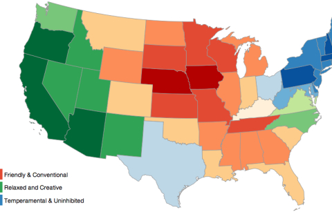
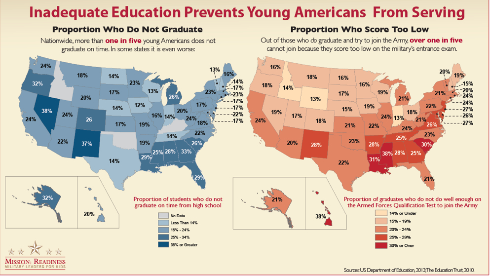
The relative onslaught of poor data visualizations so plaguing much of the news media may derive from a hope to attract new audiences as budgets shrink and bureaus decline: by boiling down a “story” by dispensing with those bothersome words, they seek to make immediate impact on an audience by a powerful (and eye-catching) graphic. Based on the self-reported responses to the “Big Five” personality test questionnaire that was developed in the 1970s, but recently used to aggregate responses via Facebook, which posits “five dimensions of personality” to distinguish personality types, based on the odd belief that, rather than reflecting individual character, one could detect “different regions of the U.S. have different personalities.” The self-reported rankings of attitude (curiosity, energy-level, tenseness, quarrelsomeness, forgiveness), efficiency (reliability, laziness, perseverance, efficiency), and character (shyness, moodiness, distractibility, sociability, rudeness) are values with little possible quantifiable relationship among themselves, which translate into a data-distributions of limited legibility or credibility after they’ve crept into a map. Projected onto a map the colorful choropleth offers a “mood-ring for the nation” whose choice of hues communicates little intuitively:
Unimaginative data overlays like this lie somewhere between video games, a MacPaint program, and an adult coloring book approached with Prismacolor markers–more a diagram than a map, they serve to carve the nation into clear blocks as if this would clarify anything about national unity or collective networks: such visualizations take pride in how they disrupt continuity in a search for a narrative about the national divides that are revealed in our political process, and do so with varying degrees of precision. Their production seems to be driven creep of data into overlays atop base maps, as if to awkwardly digest the familiarity with data–and make all feel like they have access to truly “big data”–by using an image of the nation to bequeath authority even to miniscule data samplings by treating them as images able to visualize datasets: this is an insidious format makes us thirsty for more of the same, as we seek to grasp divides and parse divisions with the apparent exactitude of a surgical scalpel.
The recently widely retweeted but fairly facetious map of “America’s Moods”, an interactive graphic mapping emotions titled “America’s Mood Map,” has circulated online with considerable popularity but is able to be blamed on Time magazine’s website. The data visualization has just the right mixture of declarative insouciance and light-heartedness make it a meme and bane of online journalism, and a typical illustration of this dilemma. The distribution of data that results deflect scrutiny from the very data that they’re employed to embody. The interactive blocks of color in what seems a choropleth distribution are a bit compelling, until one asks what state-lines have to do with emotions after all, or if this just was a nifty way of converting data to visual form.
What sort of embodiment of data is going on here, one might well wonder, and question what the mosaic of colors communicate or signify. Not to mention the map’s confusion of a question of individual psychology and gross geographic regions–especially such abstractly construed categories as the legal boundaries of forty-eight individual states’ authority in our nation’s union.
The interactive ‘map’ demonstrates the recent discovery that responses to the great American greeting, “How you doing?,” differ starkly across state lines in the lower forty-eight: if in benign fashion, the result proclaims divisions and splintering that trump the continuity of territorial maps, and perhaps map an explanation for all the differences we already know.
Why “friendliness” is signified by red, “temperamental and uninhibited” by blue is as problematic as the lack of any continuity among these personality types, and the relative subjectivity of judgment: it turns out that these are self-classifications, anyway, rather than determined by objective criteria–as if values like these could be objectively assessed.
The lack of material references in such ‘maps’ almost winks to viewers not to take them too seriously. Yet the relative ease of converting statistics into overlays on base-maps in web-based formats, seems the rationale for their popularity as interactive media in on-line news publications. Forget the actual map that orients its viewer to the lay of the land: this is immersion in the map as interactive data environment.
The deepest difficulty of this data visualization may lie in how it confounds the empiricism of a map with pretty relative–and pretty vaguely construed–psychological categories. Although Time magazine science editor Jeffrey Kluger seems to have fun downplaying is meaning at the same time as he promotes it, “America’s Mood Map” is the most popular in the section “Science and Space” among readers of Time this past week, and a success by journalistic standards, is the interactive map of emotions across the United States, across which one can glide one’s cursor to reveal a virtual version (and modernization) of the early modern Carte de Tendre over which you can mouse about to find a place that “matches your personality”: but rather than visualize material renderings of feelings or emotions, as that topography of amorous practices, the imaginary topography over which we mouse to find the ranks of each state’s inhabitants reveals clear divides rather than a detailed qualitative record. Data has crept into this map’s bright mosaic of colors can’t help but engage other data-vis maps, with which its full-spectrum color schema stands in such stark contrast.
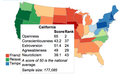
Although the color blocks are arranged in something like a spectrum of friendliness to temperamental, the actual values on which they are based provides something of a map of mental constitutions, as much as emotions, and one can range of neurotic to extroverted, with open-ness thrown into the mix. The explorer of the map can find themselves, for example, in “agreeable, conscientious and open Tennessee;” we all know a few who fit the description:
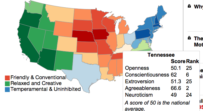
The ranking of each state surely increased its popularity, as the map becomes yet another tabulation of characteristics after one mouses around a bit on its surface. California, predictably, is both relaxed and open (#2 nation wide!) and low in neurotics (#43; agreeable Utah lies at the bottom of the heap at #49), and New Yorkers are temperamental but ranked as among the most open (#3). (Such classifications based on a sampling of 30,000 must conceal the detailed nature of the questionnaire.) Who would have thought that largely rural Wisconsin, a state with one large city, possessed the most extroverted population in the country? Or that Maine stood near the nation-wise apex of neuroticism? New York gets pretty low marks for “agreeableness,” whatever that means (#48 in the nation), if it is also pretty high in “openness.”
There might be some problems with the data pool. Perhaps the map’s very lack of materiality makes it difficult take seriously, even if the pleasure of using moods to divide the country seems a relief from dividing the nation by ideological divisions. (The next step that this map seems to invite is no doubt for carto-data-crunchers or map-readers to map the moods of the nation onto those political divisions: how better to easily explain the ideological divisions that grip our media on the eve of the Affordable Care Act and the morning after the Government Shutdown?) Indeed, the interest in the “mood map” among Time‘s readers might been generated in part by hits from all those readers, long subjugated to an onslaught of data visualizations, who want to explore their own states in the mirror of their own states of mind or who want to try to map the now-tacit maps of national division onto the far more innocuous (and un-ideological) question of moods. Indeed, this stepping out of the recently emerged graphic lexicon of ideological division and splintering is somehow reassuring, as, much as the article announced, maybe its mistake this country “features the word United in its name,” since “we splinter along fault lines of income, education, religion, race, hyphenated origin, age and politics.”
Maybe it does really all boil down to constitution and emotions, all those earlier data distributions be damned. The end-product is something of a polemic rebuttal to the authority of earlier data visualizations in the news, to be sure, of a very tongue-in-cheek sort of very, very muted irony. The text’s injunction to find where you belong in the map–by your mood, not by where you actually are–invites you to glide your mouse over a map with the authority of a spatial distribution of the rainbow colors of a mood ring, in a pretty abstracted state of mind, so unlike the ways in which, say, a detailed topographical map registers the measurement of physical elevations by exquisitely exact orographical detail.
The survey employed was based on a sample of under 30,000 respondents, but passes itself off as a pretext for self-examination or -understanding, complete with the assurance that results won’t be reported or stored by Time is respectful of your privacy (perhaps to marketers of antidepressants?). Whether it is able to map such stark divisions of “mood”-tendency beyond statistical error is unclear, although the almost spectroscopic division of the nation into stereotypes seems somewhat persuasive: the center of the country, if not so large a swath as the “red-states” of Bush years, is proudly “conventional and friendly,” unlike the creative types on both coasts: the mapmakers permit little constitutional overlap among these categories, or multiple combinations of them, so much as render one of the three criteria for each state, and allow little overlap among them; the cartographical “paratext” to the map placed above its panels invite its readers to take a short test so that one might place your personal constitution where it really belongs, and suggests that these three metrics are rigidly exclusive from one another.
The result is a new portrait of the dis-united states, several of which are already in widely circulation–and some even so widely internalized as ideological divides that one can’t make associations between this “map” of emotions to more familiar political and social divisions. The data visualization may be taken as a pretty light-hearted response to our dramatically increased geographical mobility, or our obsession with data-visualization maps. But Kluger and co-author Chris Wilson use the data of fellow-American Jason Rentfrow, obtained at Cambridge by a multinational think-tank created data by a psychological survey of their own device, and the map is presented in the rubric of the “Science” section of the magazine’s website. The data that was used to inform the visualization, under the name of science, claims to reflect the salient divisions of what “for a country that features the word United so prominently in its name, the U.S. is a pretty fractious place,” as if it might be a more credible set of criteria to ascertain relative depths of fractiousness and their causes–despite its odd metric for measuring “emotional” divisions.
And its interactive features create at least half of the fun for its readers. The notion of locating diversity in our moods is a lot more appealing than finding it elsewhere; the mirror of the interactive map is no doubt a partial reason for its popularity. Indeed the invitation to guide oneself to one’s own and one’s nation’s emotions might be hard to pass up, if it suggests quite a lack of complexity in the terrain revealed by introspection, which seems, here, to be equivalent to the completion of a modular form, rather than offering a topography that might be worthy of future qualitative detail.
There is a more authoritative, and perhaps more familiar, map of which the map dissected above might be called the comic repetition. The study of state-specific variations in happiness (one emotion–that’s a better concept already) was the result of a study based at UVM of geotagged tweets, published in the online journal PLoS ONE, whose tabulators ranked over 10,000 words on a graduated scale to score some millions of tweets across the country, irrespective of their context, to reveal significant differences in sadness and happiness across the nation, perhaps better translating what might be called a set of emotional divides:
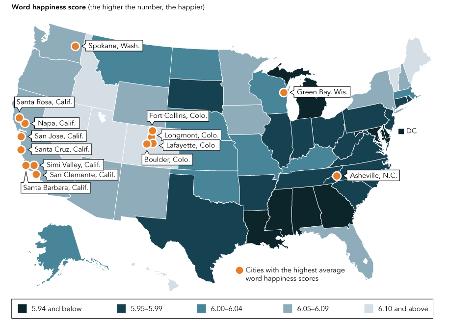
Indeed, the clear “sadness belt” marked so appropriately in such sombre black hues, and casting a deep shadow over our southern states which curls up to the economically depressed areas of the midwest, suggest something like a meaningful map, with the noting of neat exceptions of particularly happy cities, Asheville and Green Bay. The weighing of these cities as exceptions lends a credence to the overall distribution of tweets the researchers collated in their data visualization, and the depth of data on which they relied. The substantive study collated tweets over several years, even tracing computable variations in daily happiness averages that could be mapped to contemporary events, creating a set of stunning data visualizations in this “hedonometric” visualization from 2008 to the present whose units of days are suitably color-coded for weekday, allowing one to register how daily variations are effected by workdays and weekends. The “hedonometer” seeks to provide the most accurately parsed chart of “happiness” based on daily counts of the tweeted words of happiness–the most common five words of happiness used each day suddenly appear when the day is hovered over. The graph is great fun to investigate, and can be tied to news events that impacted the nation’s overall index, from the Newtown shootings to inauguration days or holidays: note the nation-wide spike on events like Christmas, which, since we still seem to all celebrate or at least note in some fashion, always reliable produces incalculable tweets.
If the first map from Time is a descendant and comedic successor to the UVM map of happiest states, both seem to rehabilitate the paper map in digital form as something like a response to the need for a “GPS for the soul,” an unfortunate mash-up if there ever was one. Such maps exist in the big data-visualization echo chamber that has dominated our abilities to envision our country. This echo chamber has existed ever since we came to believe that the country could be meaningfully cut up in meaningful ways for ready consumption. If it could lie in the easy access to maps and data visualizations, it seems to respond to an unquenchable the thirst for images explaining regional differences that underly such a dichotomously divided status quo, since the division has roots that cannot be purely ideological in nature.
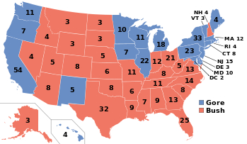
The single spectre that haunts the rise of even the most banal of data visualizations in media news in recent years may be maps of electoral results, especially from the Bush-Kerry 2004 election, in which that large red expanse of the middle of the country created a contrast to a close electoral contest of 296 to 242, which could have been upset by a single state.

The map haunted because it was almost repeated in 2008, with a key variation, only to be beaten back in recent years.
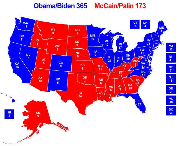
These images seem to be seared into viewers’ minds, or at least into the unconscious of data visualizers. Data of all sorts has since seeped into the map of the contiguous forty-eight.
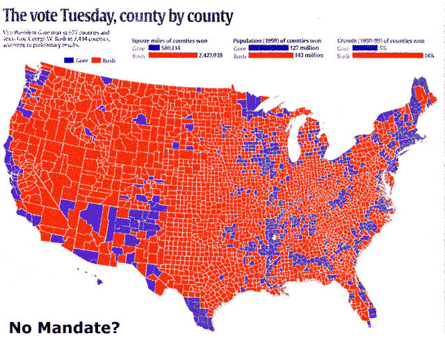
Of course, the mother of all data-visualization maps is the most spectral, which still resonates with what some still consider the death-toll of democracy that at least one justice has come to regret:
The contrast between that map and the popular vote led to something of a polemic exchange that was based on peering into data visualization maps to parse the vote, we might have forgotten, that familiarized everyone with data distributions:
The mapping of the country’s population has gained increased symbolic currency as a sort of transparent rendering of national opinions, only dreamed of in the early days of NORC’s General Social Survey, and far more easily visualized. The creeping of data into such visualizations of the nation as “America’s Mood Map” has, after all, lent new authority to a visualization both more colorful and less depressing than the dichotomous division of the nation into “Red” and “Blue” states of almost Manichean terms.
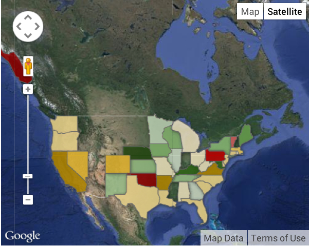
And they are also much, much less depressing than the sort of heavy-handed Google Map divisions of the country into those regions that are ready to relinquish pre-K funding or subsidies, an idea that seems to undermine our national interest, as well as of those states that refuse the expansion of Medicaid, all in the name of undue federal influence. To start with the first, we can view it two ways in news media, but both ways to illustrate the difficulty of ever arriving at consensus: the below interactive (and informative) map that explores the educational opportunities in the Southern states of the US illuminates differences in pre-K funding (click on the above to explore funding changes in each state from 2009 to 2011, since the color-scheme is not self-evident).
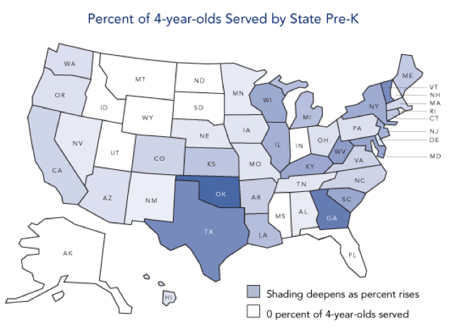
Below is a far more austere and stark way to visualize the data on how low many states rank kids less than four years of age, in which depression about care for pre-schools increases for the viewer in inverse relation to darkening of states’ hues.
In the colors of the data visualization blender, where data undermines map, there seems no consensus at all, and a pronounced fraying of the country’s diverse demographic.
One can always cut up the country in different ways, and the preferred way seems less based on splinters than blocks. But some of the choropleths are striking and scary, as the refusal to expand health subsidies in the American Care Act, to which we’ll return. The proliferation of these visualizations of difference may arise from the rise of the mythic “sea of red” in the general election of 2000 election through the Obama victory of 2008 may have left us barraged by the cutting up of the nation into camps. The rise of new data visualizations seek to address these divides, but often seem to lie in the data visualization echo-chamber–as in the case of the “map of emotions”–as much as
But then there are those who reject either the Common Core standards or Affordable Care Act alike as forms of undue federal interference.
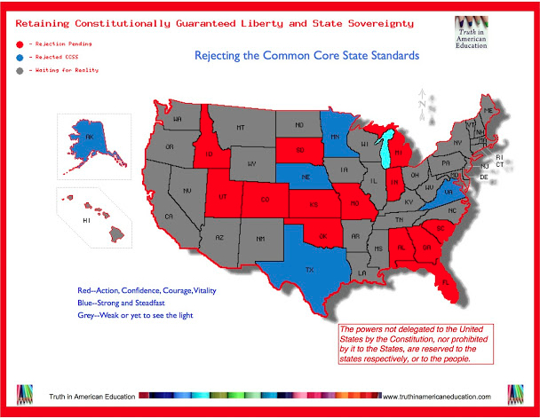
Rejection of the ACA reveals a similar fragmentation, despite some serious number-crunching that went on to illustrate the high proportion of poor, uninsured and low wage-earning residents in may those very same blocks of states:

This is an odd echo, as I’ve elsewhere noted, between the very regions which outright refuse government expansion of Medicare and those with lack of insurance and large numbers of low-wage earners and some of the same states that refused to accept clearance by the Dept. of Justice before they changed voting procedures as an instance of undue federal interference.

It’s nicer just to think that it all boils down to individual moods, which the scientific status of ““America’s Mood Map” nicely parse along clearly defined state-lines–even if its end results may have the scientific status of a mood-ring. The chromatic variations are at least attractive, and able to be read easily, removed from political dissensus. And it’s certainly more fun to imagine that we might be able to find a sense of constitutional differences inherent in the atmosphere of a region, and mirrored in lines of state sovereignty, that somehow miraculously reflect an almost Hippocratic sensibility of the shifting humoral constitutions of residents of different climates, rather than political or sociocultural (and socio-economic) differences.
But it’s hard to make any sense of the visualization, largely since the very values that it depicts do not lie on a continuum in the manner of most polls or degrees of gradual difference, but seem qualitatively distinct, and even, often, judgment calls. The state-by-state map of personal constitutions hearkens back to an early modern notion of how place and season inform the humors, or regional climates color the mind.
It is perhaps not a far stretch to include a data visualization of a state-by-state map of obesity trends (and no doubt diet)–
 –although such a map seems to isolate the deep south and its southern neighbors from Texarkana to New Mexico.
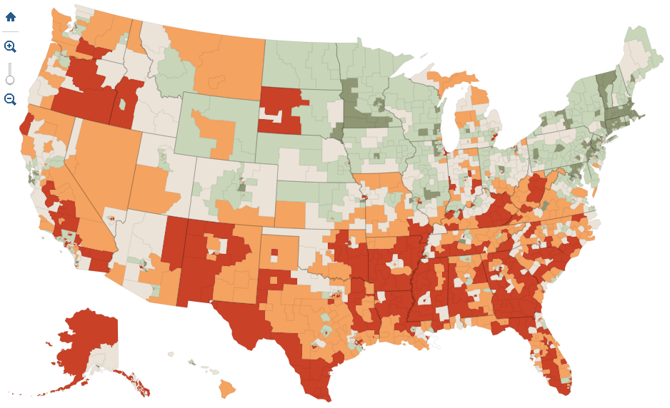
A vague overlap of data seems to exist similarly sized region, sadly, is plagued by lack of completing High School–although this has little relation to body-size, and there is little evidence of a relation between them, even if it does speak to the difficulty of valuing educational reforms like Common Core.
The difficulties created by “inadequate education” does seem to divide the country, however, as this choropleth reveals, and not only among those able to complete High School, but even in those who, having completed High School education, were not allowed to be part of the Army corps–a truly shocking statistic that effectively does divide the nation.
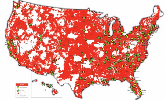
Perhaps the only visualization that communicates unity is one of cell-phone coverage, which customers, after all, desire–
By way of contrast, and a lightening of humors in how our country sees itself, “America’s Mood Map” shows a diversity around that one red block at its center, oddly located at Iowa–and whose deep red oddly seems to signify conventionality and friendliness–a quality the color does not suggest.
Other blocks of states are similarly lumped in oddly generic categories of states of mind–states of mind with limited relation to one another. Hence, California, following, perhaps, conventional stereotype, is both open (if not that extroverted at all, particularly), and the among the least neurotic of the entire bunch.
In the most charitable reading permitted by the aggregation of data, the map would be an exercise in empathetic understanding of one’s neighbors limitations. If one can permits an excursus, contrast it to the varied topography in the historic early modern “Carte de Tendre,” whose richly varied landscape suggests dangerous sites of delay or lack of clarity that the unaware and unsuspecting traveler may chance across by means of its locally detailed variations.
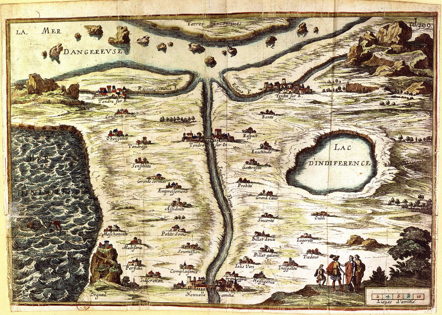
These elegant enterprising travelers with cockades are gallant explorers of the outdoors, of course, rather than perched behind their screens. Both the material and metaphorical nature of the data-visualization map are absent: for in these cartographical transpositions, the data poses irreconcilable and absolute divides, and blocks any consensus from emerging.
“America’s Mood Map” is an artifact that serves as something of a mirror to make sense of our divided polity. If one can given it a generous reading as an amusement, however, it may merit being taken seriously. The eerily radical conceit of the data-visualization is not only that we are not “United” at all, but that one can naturalize states’ rights arguments in the radically different constitutions of their inhabitants, as if separate nations: hence, conscientious Tennessee lies beside irascible Kentucky; open New York nearby to closed New Hampshire, and far from neurotic Maine; agreeable and conscientious North Carolina beside a Virginia that lags behind in both categories. The authority that data is conceded in this visualization in fact erases mappable divides between rural and urban differences, socioeconomic distinctions, and patterns of wealth or any qualitative detail, taking the blocks of the electoral college as something like a national phrenological map. The notion of an absolute difference in constitution as lying in direct relation to those state boundaries creates a particularly insidious illusion of differences that essentializes state lines–rather than following the idea of national character–that echoes one of the deepest presuppositions of what might be called Tea Party doctrine. For the diversity depicted in data visualizations is always one engraved in hues of essentialization, rooting regions dispositions as fixed in a spectrum as different wavelengths, and empties the map of any continuity or local detail with those flat color blocks of distinctly defined individual “moods.”
How are you feeling?

