“In Ukraine, there are no problems,” I was reprimanded a customs agent in Stockholm’s spotless Arlandia airport. Hearing she had left Kiev over twenty years ago, I had ventured to ask about her native country, after she had gamely asked us five questions about our favorite Swedish foods, before asking why we had just arrived in Stockholm. In response, it was evident she had been barraged by the question: “Problems are on border, . . . across border, where they always are.” Across the border lay the large petrostate of Russia, increasingly dependent on the sale of buried gas and oil reserves, which had given a new strategic value to Ukraine, once the site of many nuclear ground-launched ICBM’s directed toward the west, and now a site for easy overland and underground transit of the buried wealth on which the future Russian state depended to the wealthier markets and countries lying to the west.
But what are the borders of Ukraine, and where exactly does over the border lie? Regional maps of Ukraine–and of the region of Crimea–are inevitably filled with their own narratives, most usually of the ethnic and cultural division of the region. Maps of the region’s populations implicitly pose the question of where the region’s unity in fact lies, or from where derives, as if to question the validity that the post-Soviet nation could ever gain, even under the best of circumstances. The map of Ukraine’s population becomes a mirror of disunity, by mapping the linguistic and ethnic groups in the region, although such a division of Ukraine is only using the results of long-term plans of Russification that were designed to promote an image of national unity for Russians that is manufactured as a retroactive justification for invasion. For although such images of ethnic regional fracturing recall the multiple maps of national divides with which we’ve been inundated, the veneer of democratically determined ethnocentric or linguistic parcels that they create are a false mapping of the regional divides or sovereign boundaries of a state.
The increasing number of visualizations mapping ethnicity and political preference mirror the disunity of the region in ways that have an oddly libertarian undertone–and is particularly pernicious to the sovereign unity of a state. Even if they don’t all explicitly advocate or question secession, the explicit fracturing of Ukrainian unity, such as it is, exploits the importance of ethnic-regionalism in ways that are harmful if not toxic to democratic practices. Indeed, Ukraine provided something of a start for Vladimir Putin’s regime to stoke separatists and racialists in annual conferences since 2014, under the aegis of the Anti-Globalization Movement of Russia, headed by Alexander V. Ionov, under the fraudulent title of a The Dialogue of Nations. The Right of Peoples to Self-Determination and Building of the Multipolar World. For although term “deglobalization” has gained currency as a critical tool against international business and multi-nationals, the “Dialogue of Nations” promoted at the conference is less of a critique of global capital than a championing of ethnic divisions among parties who hold positions that are deeply undemocratic in tenor, and less promote the stated goal of “sovereignty for small nations around the world,” than to question nations’ existing borders and independent sovereignty, inviting and promoting such groups as the Texas Nationalist Movement, the anti-Iranian Talyish Revival Movement, or National Sovereign State of Borinken. Such hopes to champion regional interests under the banner “self-determination” constitute a sustained subversive regional nationalism seeking to divide liberal consensus, in ways that have provided something of a deep precedent for Russian sponsorship of Donald J. Trump and Russian Ukraine, or Novorossiya, in addition to the Brexit movement.
For if the sponsorship of such meetings stands in odd contrast to the themes of Russonationalism, and includes members of the smaller states outside the boundaries of the Russian Federation, including Ukraine, Georgia, Moldova, Azerbaijan and Armenia, who it keeps in its orbit effectively by increasingly stoking their own divides. And although Russionationalism is often invoked to justify the invasion of Ukraine, and the overturning of a democratically elected President, returning to maps of ethnic division muddies questions of the military invasion of Ukraine occurred, and offer seizure of Crimea unwarranted and unwanted justifications.
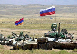
The steady cross-border entrance of support for the separatist pro-Russian rebels over the summer of 2014 proceeded largely from military bases located on the border, as a stream of military support to rebels in Ukraine undermined the question of its national sovereignty in particularly disrespectful ways. Russia made its military presence increasingly known to Ukraine, in an openly bullying manner of shooting jets, supplying separatists arms, and crossing the Ukrainian border at several undefended sites. Questions of what are the actual “true” borders of Ukraine may ignore the question of its tactical importance as an area of contesting global energy flows. Indeed, as much as there existed any enmity or opposition for many to Ukraine as a political entity, the crucial place the region occupied in the energy reserves that Russian held may have made it increasingly desired as a site of political control, in ways that the debate over Ukraine’s politics seem to have served as a smokescreen to conceal. For the manufactured war against Ukrainian independence seems to proceed less from the protection of ethnic Russians, or the survival of the Russian language and cultural groups whose dominance in Ukraine was encouraged in the Soviet Union, than the cold economic interests of securing a continuous pipeline for oil transport on the ground.
The redrawn boundaries of Ukraine might take into account where the Ukraine actually lies, but to understand their contestation one might do better to map the global ties that have reconfigured not only the place, but the political and economic stakes that have directed new global attention to that region. How might the global dynamics that have invested Ukraine with compelling global interests be best mapped? The stakes are great. So much seems increasingly important as, despite the UN’s declarations that the internationally recognized boundaries of Ukraine must be respected, the precedents for those borders and boundaries turn out to be messier and more unclear than one would expect–and the hold of the Ukrainian government over these borders become difficult to assert, with several of Kiev’s border posts physically abandoned by soldiers and undefended. Increasingly, Ukrainian border checkpoints became porous to Russian troops. With the borders being wiped off the actual map as the result of outright intimidation, what, one is tempted to ask, is Ukraine–and where does it exist?
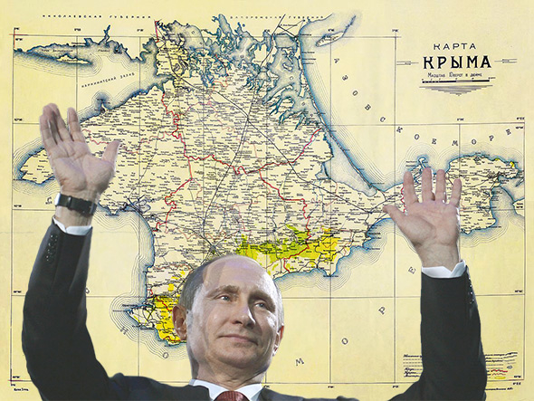
From the point of view of Vladimir Putin, her poised in his Palace in 2006, the Crimea is presented as native “Russian land.” Its 2014 annexation was promoted as reclaiming a region long part of a Russian Empire-and not only as inhabited by linguistic or ethnic Russians, whose scarlet boundaries seem to place its entire topography beneath his eyes: and in ways that prefaced the Russian role in the eastern Mediterranean and Syria, expanding its ties to warmer seas through its extended intervention in Syria’s Civil War, the importance that Putin’s Kremlin has placed on Syria’s prominence as a point of entry into the Middle East’s geopolitical landscape was prefaced by the warm sea outposts that Crimea–and Ukraine with it–offered the Russian military both to delegitimize a democratically elected government, and secure its ownership of gas pipelines through Ukrainian soil, not pictured in the below map.
 Vladimir Putin before Map of Russia in his Novo-Ogaryovo Residence, 2006/KremlinRU
The bleeding crimson boundaries of the Russian Federation are indeed more prominently highlighted than any city, region, or old soviet state, as if to insist on the naturalization of the integrity of its borders, and erase any other borders–quite tellingly–from the map. Putin has demonstrated considerable affection to romancing the map as a fiction of state boundaries, recently presenting Moldova’s President, Igor Doyon, with a late eighteenth century map of Moldova drawn during the Russian-Ottoman War by Italian cartographer Bartolomeo Borghi in 1791, which he noted to his Moldovan hosts showed the undeniable truth that “Half of today’s Romania is actually Moldavia”–to the considerable annoyance and consternation of many in Bucharest, who bristled at the apparent disinterest Putin showed for Romania’s territorial integrity. (The gift was successful in its effect: Dodon viewed it as an occasion to lament that the Russian Empire, back in 1812, had annexed what was then Bessarabia, but stopped short of the Carpathian mountains at the Prut River, and later announced before Putin left that his party, should it gain the majority, was committed to shifting his country away from EU ties.) And when the single mother Yekaterina Vologzhenova decided the she would repost a cartoon showing a Putin lookalike looking at a map of the Ukraine, focussed on the city of Donbas while holding a large knife Putin poring over a map of Donbas, knife in hand; the single mother was sentenced to 350 hours of community service for “internet extremism” for sharing an image that suggested that Russian forces were behind the loss of much of the Southeastern Ukraine’s territory, and suggesting President’s mania for maps; the government ordered her lap-top computer to be destroyed.
The image of the President before the map suggested a sense of restoration of past borders, and a sense of romancing territorial integrity as if it were removed from state interests or personal advantage–using the map as a mask, similar to Putin’s caution that the anger of the Ukrainian government at Russia for its loss of Donbas in the southeast were related to Moscow, lest they “take a stand-off between Ukraine and russia to a higher level”–since “no one needs an armed conflict” on Europe’s edges.
 Detail of above map, on Black Sea
But the claims for Russian ties to Crimea and Ukraine–and illustration of Russian military might in the Ukraine’s invasion–used assertions of ethnic nationalism as a basis to place Russia in a position of strength in the national news, and assert its relation to Chechen and Crimean neighbors, and parade the strength of military hardware in so doing.

In so doing, the Putin government is remapping the Crime as part of an expanded Russia, using Russonationalism to deny or ignore the Budapest Memorandum of 1994 to “respect the independence and sovereignty of the existing borders of Ukraine,” but remapping the region on Russia Today as lying in the boundaries of an expanded Russia whose military might is right–as a decision of local ethnic Russians–in the hope to assure a continued tie to the shipping and piping of oil outside of its borders. The scrim of a Russia Today set showed the new configuration of the Crimea as a part of Russia once again, joined to its expanse of yellow in ways that left room open for the continued violation of Ukrainian sovereignty under the illusion of a false democracy of a referendum to rejoin the Russian Federation: the vote, which offered the possibility of independence or integration with Putin’s Russia, in response to the ouster of Ukrainian President Viktor Yanukovych was immediately remapped as an expansion of Russian territory by popular demand, even as the plebiscite was held as Russian soldiers occupied the peninsula.

1. Putin’s tie to the prominent topographic map that is displayed in his residence–a map that seems to naturalize political boundaries, and is oddly without any clearly visible names, but includes striking national borders, provides a site before which he seems eager to be photographed–as if to suggest his keen study of the geography East of the Urals, as much as his care to the Russian nation. The relation of Ukraine to the Russian Empire and nation is complex–and goes back to the secession during the Revolution, when the region claimed an independence that has become far less clear in its national or linguistic autonomy. But the enmity between Russia and Ukraine is over-exaggerated. While the Ukrainian Republic that seceded from the Russian Empire was greater than the now seceded region–the area had been significantly “Russified” as a Soviet Socialist Republic, whose ethnic or linguistic autonomy was attempted to be erased–if not denied–to integrate the region into the Russian historical lands, as if to erase the scars of the splintering of Ukraine from the Soviet state and from “European Russia” after the 1917 Revolution. Despite the importance of this historical legacy, the spatial importance of Ukraine to Putin’s government has much to do with the geography of energy and oil pipelines for Gazprom and the Russian state–to recover national claims of Russia to the region are tried to be magnified more than are seen as a part of Russia’s identity.
 “Dismembered Russia–Some of its Fragments,” New York Times (1918)
Yet the remapping of the region is often cast as an integral whole. And so when Putin gazes quite icily if somewhat longingly at the regions that extend to the Black Sea, but exclude Crimea, in the large topographic wall maps of his Presidential Palace outside of Moscow, it is pressing to consider what sort of region he saw, and what continued Russian presence–cultural or linguistic–existed in the region he was so ready to invade.
 REUTERS/ITAR-TASS/PRESIDENTIAL PRESS SERVICE (RUSSIA) – RTR1GAL3/August 11, 2006
The creation of a newly independent Ukraine more closely tied to the European Union would be so close to Moscow evoke a Cuban Missile crisis like setting, reviving deep Cold War fears–even as it would reaffirm the cultural independence of the region, the image of a repeated division of Ukraine from Russian state seemed to undo its longstanding Sovietization, and to return to an image of Russification that was first cultivated by Peter the Great, or cultural assimilation of non-Russian minorities in a fictive map, and can be traced as far back as to the sixteenth-century Russification of the newly conquered Tartar Khanate of Kazan (which included the former Volga Bulgaria) and extended to become a state policy, and was most present in the marginalization of non-Russian languages, the use of Russian as the sole language of government, and Christianization, but included the marginalization of local memory, which increased the large number of endangered languages in the current Russian Federation, as well as the effective persecution of indigenous minorities in ways that intensified in the Soviet Era: forgotten languages of Komi, Mordvins, Volgic Finnic peoples, Belarusians, and Lithuanians were reduced to symptoms of its implementation–and in Ukraine led Peter the Great of Russia to issue a blanket decree in 1720 designed to expurgate any evidence of Ukrainian language or theological treatises from typographical houses in the region, making ethnic nationality virtually supervise; Catherine the Great similarly ordered a program of rigorous Russification for Ukraine, Livonia, and Finland–allegedly using light-handed methods, and remapping Ukraine as “Novorossia” to indicate its subordinate nature of its possession. The renaming of the region not only absorbed Ukraine as a territory, but tired to erase Ukraine’s cultural memory.
2. Even if much as it is tempting to see Russian invasion of Ukraine through the lenses of a Cold War, as Putin seems to want to suggest, and a deep desire of Moscow to keep ties to former Soviet military bases as a sort of buffer zone, it seems in fact the renewed economic importance of the region’s stability to the transport of gas and oil that has produced the increased insistence on the integrity to Russia. For the fraudulent claims to ethnic protection conceals the emergence of a new global geography of the energy market, where boundaries are less based on the demarcation of united ethnic units or political bodies than the ways that gas has increased the value of those and adjacent lands. Mapping the region of Ukraine and nearby lands demands situating the region’s boundaries in a global context of economic value, where economic transactions and activity are often bound up in the growing value of the gas pipelines that ran across its territory. Rather than to fall back into categories of the Cold War, or inherently Russian qualities of regions of the post-Soviet state, even if these might line up with recent politics, we might do well to explore other reasons for interest in its redefinition on a map.
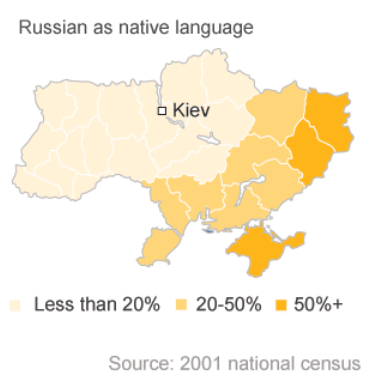
To be sure, the geographic distribution of Russian-speakers in the country appears relatively confined to regional divide which are both linguistic–

–and reflect the political divisions of its landscape of the supporters of Timoshenko and Yanukovich, a basic fault line across the region’s terrain that seems to threaten its integrity and division in separate blocks.

But the clear lines that are drawn between dominating parties and political persuasions in these choropleths draw far clearer divisions in the integrity of the region than might be useful as tools of analysis, and they might be better taken as starting points than as coherent projections of data. These maps place their viewers at a distance and remove from the increasing strategic importance of Ukraine’s boundaries in a post-Cold War world, which is perhaps more defined by the circulation of regional capital and energy from the growing number of gas fields and already built pipelines than the positioning of military material. Indeed, these maps of regional divisions oversimplify the potential actual reasons for military invasion, as do analyses that seem to privilege fears of Russian deployment of ICBM’s within a Cold War scenario, in which the placement of tactical weapons lead to the escalation of a war of conventional aggression into nuclear weaponry, by removing the region from the new reasons for the tensions surrounding its coherence in a growing market for natural gas, and relying on recycled narratives of the Cold War. The annexation of Ukrainian land is striking since not really about geography, or territory, in ways that are able to be quickly reduced to the surface of a map. And although Russia’s Federal Border Guard Service continues to insist that it allows no one to enter Ukraine illegally, with the Ukrainian post sitting some two miles within the official border, the apparently porous boundary between the two states–as the boundary between Ukraine and Belarus–is far less clearly defined than the boundaries appear to be on the map.
3. To effectively carve up a country in a delicate balance of power and global economy is exceptionally dangerous. The variety of choropleth maps that depict the ethnic, linguistic, and electoral divides across Ukraine in our national news as “the data visualization needed to understand the political situation in Ukraine” have, no doubt, distracted us from the situation on the ground and the geographic questions that underlie the political crisis. In fact, the country’s geopolitical situation may be far better mapped explain its emergence as a somewhat unlikely theater for playing out scenarios from an old Cold War, although for reasons more tied to natural resources: for the webs of pipelines, as much as the ethnic and linguistic divisions of the region, provide a the economic networks of the breakaway former Soviet. Although we’ve become accustomed to posit deep divides within our electoral politics and to grasp political divides by handy data visualizations, as if they both synthesized and decoded compelling sociological explanations, the data visualization seems to replace real reporting with stories of deeply set national fracture-lines, our love of infographics might become a form of disinformation that migrate from the television screen across the internet. For the infographics define and restrict the questions that might be asked about the situation, dangerously removing the issue of Ukraine’s sovereignty or politics from a globalized context of financial capital.
Infographics create particularly problematic in representing news about the Russian Federation’s recent annexation of Ukraine: they obscure the variety of more informative maps that have been drawn about the region, and the dilemmas of mapping the value of Ukraine as a region, or the specific value that its individual parts have gained. With the closure of many US news agencies abroad, and the shrinking of foreign bureaus, mapping Ukraine is an increasingly important means for grasping the political effects of shocks in a global inter-connected economy, where transactions are as important as the demographic composition of inhabitants, but the range of already generated and accessible data, readily processed into data visualizations, is in danger of drowning the real story of a narrative of global economics. For the projection of strategic value in Ukraine is replaced by images leaving viewers dumbfounded at the messiness of mapping electoral or demographic divisions or synthetic charts that compress a complex historical narrative that only make us wonder on what basis that country came to exist.
The narrative needs to be recuperated in a broader map, perhaps one synthesizing less information on its surface. Perhaps even a clearer visualization of the place of Ukraine within the continuity of a spectrum of corruption and authoritarianism in post-Soviet republics can tell more of a story than one that carves up the country into distinct sectors. The so-called ‘civil war’ in Ukraine is clearly exacerbated by the increased eagerness of Russia’s interference with the nation’s sovereignty than divisions lying within its populace, in ways that the charting of the area as a longstanding “geopolitical prize” might reveal. We might need to look at the shifting ways that geopolitics have changed to make propitious the recent return from the dead of the Tsarist geographical construction of Novorossiya as a category that has suddenly acquired a rehabilitated geopolitical meaning in a globalized world: the surprising re-introduction of a construction of Tsarist geographers to refer to the Eastern Ukraine has the primary goal of rehabilitating a Ukraine primarily oriented to Russia–instead of its current government–that nicely lends itself to Putin’s pan-Russian (or anti-russophile) rhetoric.
To understand what makes this particularly advantageous, we might begin from remapping Ukraine less in terms of ethnic divisions than pathways of transit of gas and other natural products; for these pathways might show what issues are at stake in Russia’s contesting boundaries of the region, and the reason’s for Putin’s odd re-use of a long dead name to hide his quite pragmatic interests in making it part of Russia once more. For the discovery of a range of gas fields in the country, and the inherited gas lines that run underground through Ukraine, have shifted the geopolitical meaning of the frontiers by which the country is mapped, as much as the mapping of its different ethnic inhabitants.
4. Ukraine’s contested sovereignty–or rights to sovereignty–can maybe be succinctly mapped by a variety of quite simple tension lines that exist in the region crisscrossed by a dense network of pipelines of natural gas. Indeed, the control over the pipelines speaks volumes about the mobilization of military forces along the borders of this relatively recent country than the ethnic divisions which can cause many Americans to raise their hands and shrug their shoulders as they try to grasp the volley of double-speak around the protection of Russian minorities. Andrew Barry has revealed the degree to which the pipelines of gas created a rapid shift in pricing the value of lands in the Caucasus in ways that are utterly incommensurable with the economies of its inhabitants; the value of the land for laying pipes and creating new sources of multinational investment have suddenly involved globalized economies in regions that were, until incredibly recently, rarely considered of value or easily on the map by international agencies, who are now increasingly involved in their use to a degree that local inhabitants have difficulty grasping. The new constellations of interests appear to be configured around the Ukraine in ways that questions of political annexation cannot come to terms with.
The explosion of Ukraine as a sudden hotspot of the global map might be explained by maps of its status as a nexus of economic networks that many current infographics fail to register, since they are foreign to most of our cartographies of social or political division. The concealed motivations for militarization in Ukraine seem to reflect the pipelines that are concealed underground or just above its surface–and the projected value that Gazprom identifies with their flow–in ways that have little to do with local sovereignty in ways that it is often considered, and are often removed from its inhabited lands. And it may well be that in mapping divisions in Ukraine as if condemned to irresolvable quagmires of disunion and political dissent, we obscure how its geopolitical situation reflects the rising stock of the region’s value for economic resources. Infographics that parse space by either ethnicity or electoral divides conceal and bury the geopolitical interest of Ukraine beneath data as if to mask the global strategies being played out on the ground. Have we fallen into a blind acceptance of the Ukraine as divided by diverse constituencies?
Putin branded Ukraine’s government as a “junta” and announced cryptic “consequences” should the actual government–whose authority he denied– purportedly “threaten Russian lives“, the rhetoric of Russia jumped borders. What Putin duplicitously presented as a defense of human liberties or civil rights denied the sovereign bounds of a nation to defend ethnic Russians, playing a high stakes odd game with maps, in which the place of a mythical unity of “Russia” echoed the geographers of Peter the Great. For Putin has elegantly balanced his threats with the double-speak accusation that places direct responsibility at the United States–“for causing the demon of fascism to once raise its head in Europe, [while] Europe and the international community are for the most part silent and are instead engaged in a frenzied irrational campaign to demonize Russia”–barely concealing his own frustration that the world did not recognize by consensus the “treaty” or “Independence Bill” annexing Crimea unilaterally signed on March 18, 2014.
The readily redrawn map must not be so readily given common currency. The motives for its radical redrawing cannot be so easily attributed a purported desire to protect human rights, since the redrawn boundaries to forge new networks that would meet economic aims and guarantee a monopoly on gas. Indeed, Russia’s open contesting of the sovereign independence of Ukraine is not so much about political sovereignty or the sorts of claims of economic dominance that are supported by shifting globalized economy, which cuts across boundary lines, and works with the facilitation of the extraction and flow of natural resources across land, and which dispenses with questions of political sovereignty. Putin’s openly Machiavellian rhetoric intentionally creates confusions between sovereign identity, national divides, and the strategic value of political control. The problem may lie in how Putin maps Ukraine, how many news maps map Ukraine in the US and world media, and the obstructions that both maps create in understanding what is at stake. We are, perhaps, in danger in assuming identities and divisions are synthesized and captured in maps, since they also easily package the rehabilitation of the rhetoric of the Cold War that Putin’s government seems to expect we’ll accept as credible.
The new geography of Ukraine might, it is true, not be so readily understood, or its strategic importance incompletely grasped. As much as offer a port on the Black Sea, or a market for Russian gas, the status of Ukraine as a border into which the EU or NATO appears ready to poach invites this projected image of inevitable ethnic or linguistic divides in Ukraine that are ready lead to inevitable lines of national fracturing that would reflect its geographical position on the edge of Europe, defined by the Dnieper, Dniester and Bug rivers that run through it to the Black Sea.

WaPo’s Max Fisher stoked the news-wires as he chose to illuminate the potential for an inevitable dissensus across the map, as if the point the country to inevitable social fragmentation of the sort Fisher has delineated in the past–as if a nation were ethnically determined in its constitution. One can, for example, map the linguistic divisions of Russian as linguistic and demographic fault lines in a sequence of three-color choropleths of the country:
Or find the tensions in the electoral divisions of the landscape, in ways that naturalize the focus of government protests by arguing that these regions weren’t the ones that wanted Viktor Yanukovich to win, anyways, as if this would explain the rightful secession of “red” states from the USA, as a sort of reflection of national preferences and easily comprehended data visualization of civic divisions that foregrounds the spectrum of its political lines of division:

And yet–what do these visualizations even describe, save the inevitability of regional divisions? Is this all window-dressing of the deeper divisions of economic value and the inheritance of international investments in built pipeline that threaten to increasingly paralyze a Western response to Russian aggression, as much as motivate it? Is it possible that in those areas where the pro-European party won, and which directly abutted pro-Yanukovych regions, the amount of protests were fewer than in those which bordered on Russia? Can the election between Yanukovich and Tymoshenko be understood by analogy to the rifts and fault lines among political parties in our own country? How could they not be informed by the economic, as well as the ethnic, complexion of different regions of the country, and local pressures of self-definition of a region that had an unclear sense of identity before 1991? And aren’t these divisions now clearly based on economic interests, and the changing economic ties that have created a different calculus of value for folks in different regions of the country? Even as many pro-Russian nationalists exist in Ukraine who imagine a “Transcarpathian People’s Republic,” the geopolitics of the region have been eager to imagine the region’s incorporation into the Russian Federation for reasons far removed from ethnicity.
In an era where “Ukraine” means many things, most reports have been oddly silent about the webs of international traffic that run across Ukraine, tying it to a larger picture of economic transactions that are as determinant of Russian attitudes to the region as the internal composition of the country. For s much as a nation of different areas of linguistic dominance, which evokes neo-Whorffian notions of linguistic-formation, the crucial fact of the presence both of gas fields in much of Ukraine that borders the East and Crimea key routes for the transit of Russian gas, and potential areas of future exploration, outweigh the geopolitical or ethnic considerations most often invoked in news media. (This surely seems more relevant to the current crisis than the survey of 300 years of Crimea’s history in a sequence of maps that chart its shifting boundaries and relative autonomy–despite the healthy volley of exchanges that post elicited.) But the most recent contention of Ukraine’s sovereignty or boundaries seem driven by the shifting relation of a network of gas pipelines–and the traffic in gas–to the policing and control over its frontiers: the map of key pipelines that underlie the nation’s territory might be the clearest indication of the redrawing of this region as two geobodies, and the pronounced pressures placed on its continued cohesion.
For the rapidly rising stock of the Eastern Ukraine with the discovery of a relative abundance of a range of potentially valuable gas fields has both created new ties and conduits between Ukraine and the EU, and Russian Gazprom’s reliance on transmitting gas to the EU in ways that have dramatically shifted attitudes to the regional landscape and its geographic significance, as it would also allow European gas to “reverse-flow” to Ukraine, separating the region from a dependence on Russian gas. The situation of active gas pipelines–and potential or recently discovered gas fields–has shifted international focus to a region, in ways that reveal how the presence of pipelines have mediated the strategic importance of Eastern Ukraine, in ways poorly understood or represented by maps of lines of ethnic division or of linguistic groupings, and that might determine how the region has become a site for the investment of global capital:
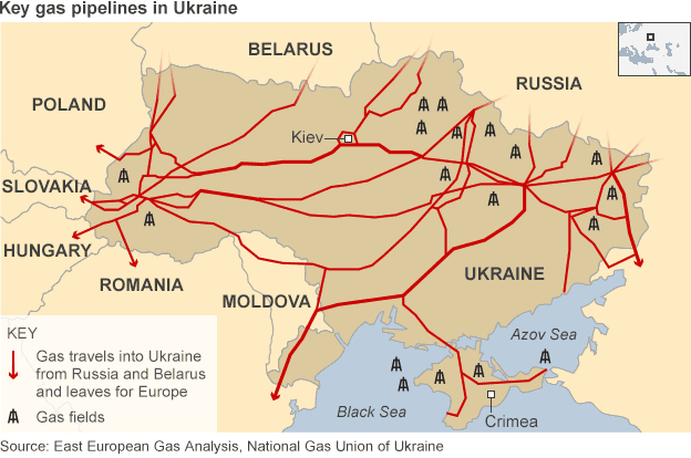 BBC News; source: National Gas Union of Ukraine
The recent mid-June decision of Russian CEO Alexei Miller to cut off gas shipments to Kiev and Ukraine–“Gazprom has decreased deliveries of gas to zero,” reads the public statement, seems the latest elevation of a declaration of real war, following months of negotiation, in which Russia seems confident that it can continue to funnel gas to the EU through Ukraine, the company which it mostly (50.1%) owned by the Russian government announced an act of economic aggression that seems to realize the true stakes over which the conflict had occurred. Although the territorial boundary line between Ukraine and Belarus, and Ukraine and the Russian Federation, does not seem to have been formally negotiated after 1991, the decision to cease gas imports to Ukraine challenge the region’s autonomy–and significance–as much as the surreptitious transport of tanks and military material across its recognize national borders: for cutting off gas supplies would achieve a similarly interventionist means to challenge the legitimacy of the government, just after the election of Prime Minister Arseniy Yatsenyuk in June 2014. With Gazprom insisting that Kiev has been pumping gas deliveries from Russia into underground storage tanks, without advancing adequate payments, Yatsenyuk observed that the decision “is not about gas,” but rather “a general plan for the destruction of Ukraine.” Ethnic rights of return seem less the point than controlling both oil reserves in the Black Sea and shipping lanes for valuable exports.
If Ukraine has been long been said to have been loosing control over a tenuously drawn border with Russia, what is Ukraine save a territory needed to grow the Russian economy, and a region over which “threat[s] to the lives and health of the local population” are less relevant than restoring energy revenues? Perhaps the ethnic Russian groups encouraged the fostering of economic ties to specific regions. But for all of Putin’s rhetoric of cultural and linguistic nationalism–and the spectre of Russian persecution–the wells in the Crimea and Black Sea and in the shale sands of Eastern Ukraine have determined the value of the region’s annexation–and the rehabilitation “back from the Dead” of “Novorossiya” [New Russia], even if anti-Russian sentiment is strong in the “ethnically Ukrainian” western regions of the country, as if to prompt the increased federalization of the country.
The investment of European banks informed the reluctance of banks to impose sanctions on Russia’s annexation. If the space occupied by Novorossiya was located historically by the Black Sea and Crimea–rather than the steppes–the areas that guarantee the future flow of secure gas to travel through Ukraine as it leaves for Europe constitute a central prize for Russians. (Although there is some suggestion that the term might augur a basis for claims for local independence of the region, separated from Russia, the term floated long before in the Russian press.)

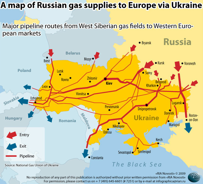
The constellation of pipelines situate Ukraine in a global energy market, revealing a web of ties linking Russia to Ukraine, and linking Russia to Europe through Ukraine–and indeed through several of the cities in the new entity, from Dnipropetrovsk and Lugansk, both of which lie on significant pipelines that route supplies from Siberian gas fields to the West–and the strength, as we have seen, that Russia could end Crimea’s gas supplies.
And the emergence of new maps of the region of Novorossiya as a part of the Russian Federation, predating the annexation of Ukraine, mirror an imagined image of the region’s appearance by the year 2035 in a set of maps attributed to high-level report by Russian security and policy experts on what Europe’s borders would probably look like in 2035, an ultra-nationalist vision that imagined an expanded Romania and a Ukraine surrounded by a newly enlarged Russian Federation including a Carpathian Ruthenian Republic from Ukraine’s oblast, and around the former Czechoslovakia, and an independent Galician state taking part of the western Ukraine, while Bukovina amalgamates with Romania in the Chernivtsi oblast, dismembering Ukraine at the same time as Russia encompassed the area by the Black Sea, while, the same report predicted, Europe balkanized. We see a large region of Belarus beside a landlocked Ukraine in this fantastic futurology, where the regional name “Novorossiya” is already emblazoned on the map’s face, apparently sharing borders with the named region of Crimea, both apparent states, with Transnistria, within the Russian Federation:
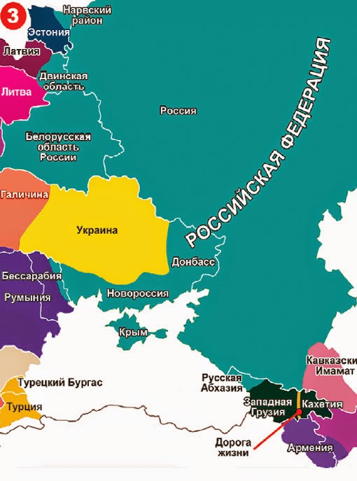
5. The futurology allegedly based on CIA information and geopolitical experts in the USA predicted both a division of Scotland from England, the separation of the Basque region, division of Italy and emergence of Wallonia and Lorraine, as if to deflate the image of NATO and comfort any fears of the coherence the EU might have ever possessed–at the same time as Germany incorporated Poland and emerged as the only power worthy of consideration in the region. The premise of Russian “rights” to these lands may mask a deeper sense of the continued economic coherence that they present to Putin’s revision of Russia’s economical relations to the perhaps-to-be-soon-disolved European Union.
Charting routes of gas flows across the region and the central points of entrance and exit from the country, within the Crimea and in its eastern regions, suggests how intense the region has been for new investment of global capital in ways that make the Russian government particularly concerned: the economic consequences of pushing large quantities of gas to Eastern and Central Europe, potentially destined for expansion with the discovery of oilfields in the Black Sea and Sea of Azov, could both make Ukraine less dependent on imports of gas, boost Ukrainian exports of gas, or create a bonanza for Gazprom suppliers of the EU. (Since most of Russian gas going to Europe passes through Ukraine, the potential energy independence of Ukraine could pose a deep threat to the marketing of Russian gas, as the decision for such pipelines to be raised levies or used less widely, raising the spectre of a blow to Russian imports and balance of trade on the global energy market.) The increased involvement of European banks to the expansion of investments in pipelines across Ukraine has also inflected the ability to coordinate any national response–or the response of the European Union–to the very question of respecting national sovereignty, and made delicate questions of how Ukraine could be mapped: only the fear of Crimean nationalization of natural gas-fields in the Black Sea has led to potential ban on banks’ financial ties to Crimea, now a center of Russian finance. Lack of stability has been a source of banks’ continued concerns and increased financial concern of the energy industry.
Despite aspirations for future expansion of the matrix to funnel gas to the EU, the pipelines already illuminate the increasingly central role that Ukraine plays both as a conduit and by its fields of future exploration for shale gas, increased interests for the United States as well as nurturing Ukrainian energy independence, may be superseded by new pipelines. The plans to expand the network of gas pipelines outside Ukraine–through which over half of this gas now passes in pipelines–would alter the configuration of the region to wean Russia from its dependence on Ukrainian pipelines, and expand a range of alternative energy pipelines, most significantly from northern gas fields into the EU, built with funds from German and European corporations and governments eager to underwrite the importation of gas from new fields at a relatively cheap price:
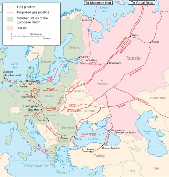
The planned Nord Stream and South Stream pipelines would allow Gazprom to avoid dependence on conduits in Ukrainian lands–and draw from the Shtokman and Yamal fields and Central Asia–is not yet on the horizon, and And so when Putin threatens that negotiations must begin with Russo-philic “real representatives” of the so-called Russian-speaking rebels of the Eastern Ukraine, who Putin has insisted should manage their own political affairs–and promote their “own” ties to Russia: by belittling the “utter nonsense” that Russian troops were in fact sent into eastern Ukraine, they are allowed to bemoan the “grave crime” of Ukrainian soldiers being sent to Eastern Ukraine.
At the same time, the recent annexation of Crimea continues to play out quite uneasily on the ground and local politics. With looming bureaucratic disasters of the integration with Russian government growing increasingly troubling and apparent, even if “Crimea has always been an integral part of Russia in the hearts and minds of its people,” the annexation of Crimea within a month after the February 21 collapse of Yanukovich’s government on March 18 seem to have greater risks than alleged hopes to protect a population tied to Mother Russia and facing alleged persecution by a constellation of “russophobes” and “neo-Nazis.” The actual interests involved in this power game are so removed from those of local inhabitants or a hope for ethnic tranquillity, and seem more guided to restore harmony in a balance of the gas trade–or allow its manipulation and orchestration by Russian businesses.
 Wired: Map Time
Indeed, the emergence of maps that projected the future remapping of the region helped to create its coherence.
6. The confirmation in the face of Russian denial that “separatists” who stoked unrest across Eastern Ukraine were Russian military and defense forces–based on systematic photographs of individuals and descriptions that the Obama administration confirms, indicating that subversive agents were placed into the country’s borders by the Russian military, drawing from a KGB playbook of fomenting local civil unrest in foreign states, at the same time as increasing military operations were staged near the Eastern border of Ukraine, in ways that seem to mirror the very points of entry into Ukraine of significant pipelines of natural gas. It may make sense to ask whether Max Fisher was duped by data of social divides–in suggesting that the above infographics of social divisions among groups favoring integration with the EU and those who seek, for ethnic or political reasons, to “draw the country closer to Russia,” reflect the dividing lines in recent electoral results–claimed to mirror linguistic divides between Russian and Ukrainian, but is actually less of a divide based on whether Ukraine will face Russia or Europe–and rather something like a ghost of Cold War rearing its head in Ukraine.
 New York Times; source: IHS Janes
The opportune clustering of Russian forces to the East–at the entrance of gas pipelines that enter Europe–almost seem to respond the Soviet-era placement of military arms in Ukraine to the far West, where tanks and mechanized infantry were intended to serve as an effective balance to NATO–with airforce and navy in and near the Crimea.

How is the right of Russia to “protect” Sevastapol and Crimea repeatedly evoked as a basis for a “just” war? The odd evocation of all of Southeastern Ukraine by the old term of “New Russia” or “Novorossiya,” evoking an imperial term and eighteenth century legacy to designate the lands that the Empire conquered, north of the Black Sea, after which “God knows” why it rejoined Ukraine. While the area was widely colonized by Russians, particularly in its urban centers, after being taken from the Ottomans, and nineteenth-century Novorossiya centered at Odessa, the sparsely populated region included a plurality of ethnic groups, and Russian became the language of its cities–with Yiddish–while Ukrainian dominated the countryside, but was resettled and developed after huge population losses by famine and in World War II by Soviets, leading to some unease that the former “New Russia” became part of the Ukraine in 1991. However, the adoption of the term by protesters in Donetsk who sought independence from Ukraine–and perhaps to rejoin Russia, and perhaps backed by Russia in a coordinated plan to federalize the region–was mirrored in Putin’s rehabilitation of this old toponymy, as if the reversion of lands away from Russia was a devolution of a former satellite of the late nineteenth century, was voiced on the region’s current website–and had circulated in the region ever since the region became part of Ukraine with the fall of the USSR.

7. Putin promoted an inflected Newspeak of the Cold War to argue that although Russia had the “right” to invade the province, Russia also “hoped” that such an unwanted act would be unnecessary–recasting regional boundaries that had existed from 1764 as a natural right to areas north of the Black Sea or Sea of Azov. By reclaiming sovereignty over an area of Tsarist heritage (rehabilitated as a Soviet) as a “natural right,” the invocation of “Novorossiya” re-brands a borderland in ways invoking how Catherine the Great invited Europeans to settle and over which Prince Grigori Potemkin presided, but largely to prevent it from sustained incursions of Cossacks and Tartars.
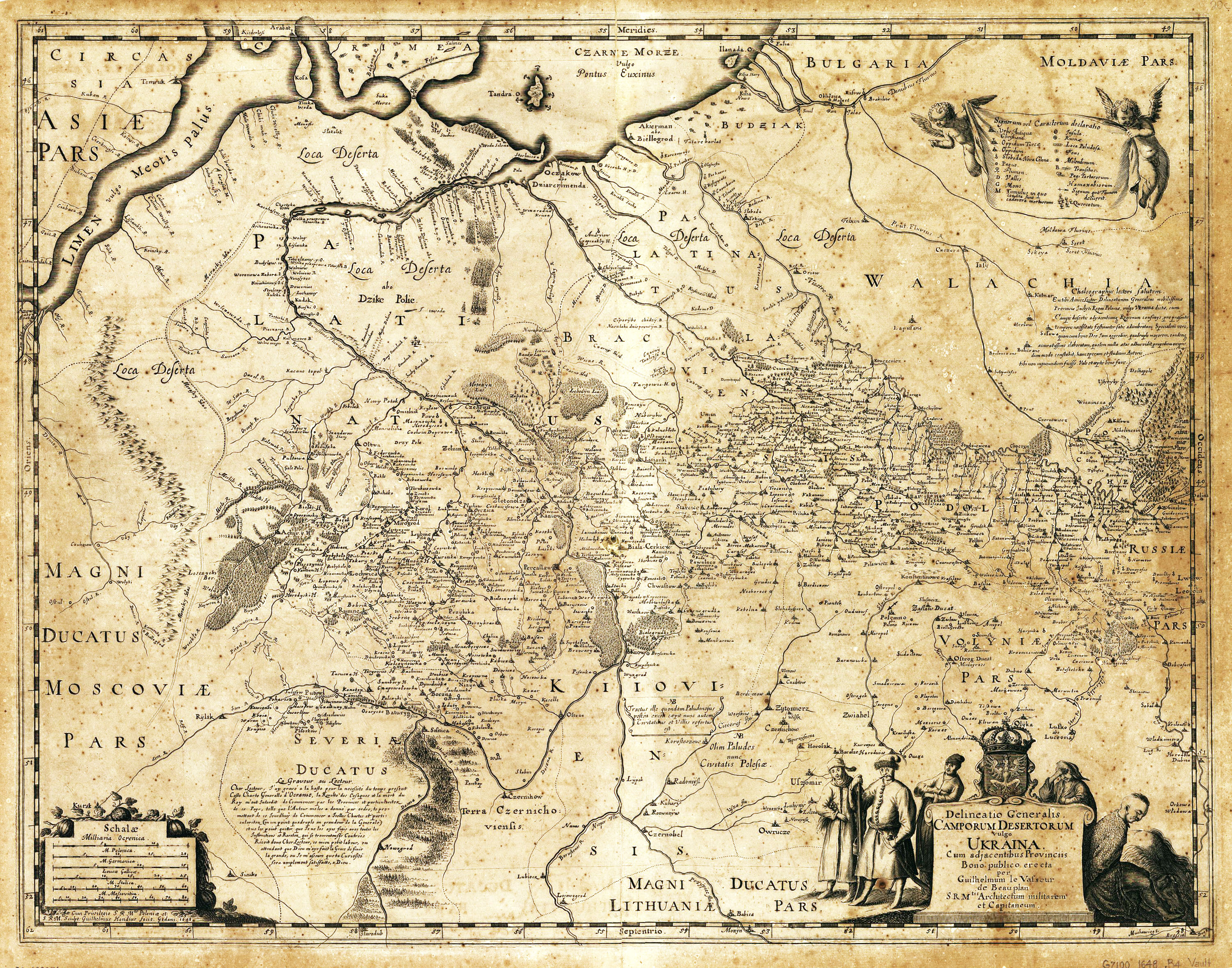
But the rebirth of the geobody that Putin wants to redefine has, bizarrely, served as a sort of screen on which to project new identities in maps. For the densely inhabited regions between the Dniester and the Dnieper rivers were settled by towns, but surrounded by steppes, former swamps and peaty plains of Polesia, in a triangle of Brest, Mogilev on the Dnieper and Kiev, or the region of Lithuania, Wallachia, Bulgaria, Lithuania and Poland and Muscovy, whose heterogeneously inhabited cities and “deserted fields,” long part of the Ottoman Empire , where divided, and shown, quite disorientingly, as East of Asia, if the inhabitants of these once-swampy area also seemed to be poised between sparsely settled lands of Walachia an Muscovy, as if poised between East and West, and populated by amiable-looking traders of sorts: if the late seventeenth century sought to divide “Europe” from “Asia” along such rivers as the Volga, Don, Kama, and Ob, only by the eighteenth century did Philip Johan von Strahlenberg define the geographic divisions between Europe and Asia along the Ural Mountains, in a proposal Peter the Great’s program of Westernization adopted–and which Peter’s commander, the cartographer and future historian of Russia Vassily Nikitich Tatishchev claimed as his own, redefining Russia as European, and reclassifying Siberia as lying at an Asiatic remove.

Although the Urals gained dominance as a geospatial division, and the Ural River’s entrance in the Caspian Sea became a borderline, the question became less clear as one approached the Black Sea, but was less clear in the continually contested “vanquished areas [loca deserta]” that faced tartar incursions to the north, or the wilderness of the steppes, later settled by Russian nobility, but also by a range of Serbs, Poles, Armenians, Bulgarians, and Tartars to populate the historical wild lands of the steppes:

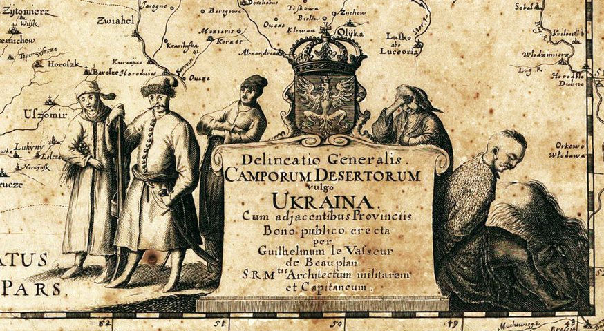
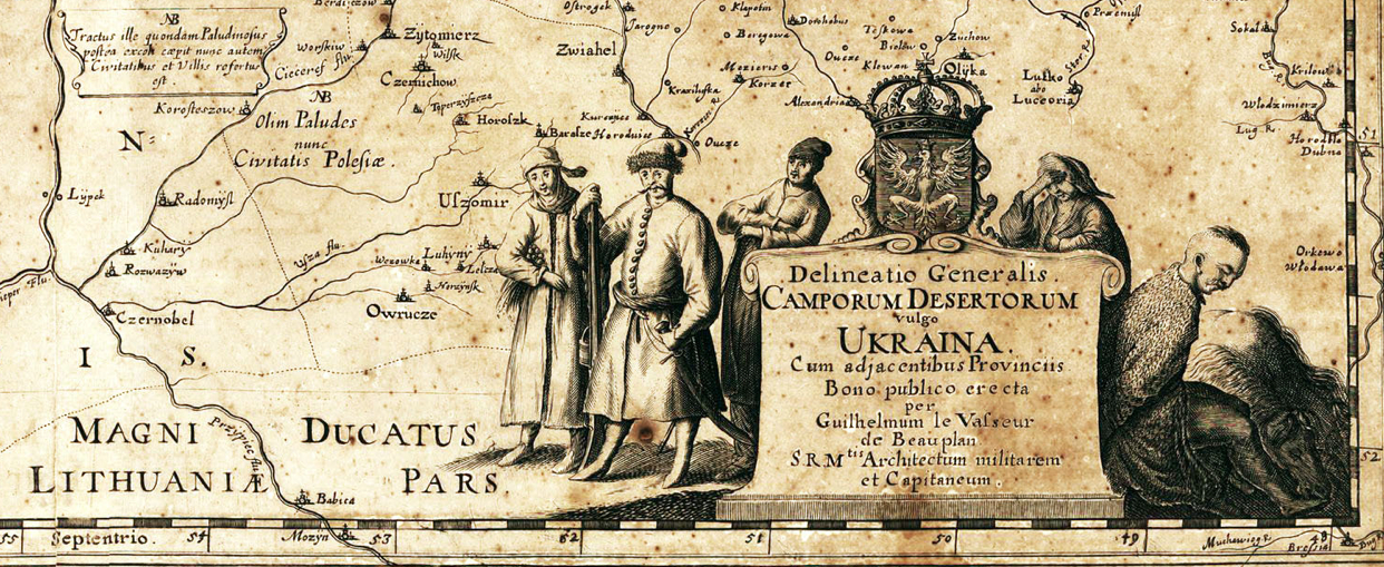
The addition of qualitative images of local inhabitants at the base of the map, around its cartouche, in the tradition of illustrating the variety of local costume and habits in maps of foreign region that Abraham Ortelius expanded in his Theatrum Orbis Terrarum to amplify the truly scenographical functions of the map as a description, serve both to supplement the erasure of any inhabitants in terrestrial maps, and expand the descriptive qualities and enargaeic power of maps to make a region present before readers’ eyes: pensive inhabitants stand about the cartouche in varied local dress who seem trustworthy traders and businessmen, expressive, not only of sartorial variety their headgear and buttoned-up shirts, but sympathetic characters current maps erase by shoehorning into demographic divides, unlike this delineation of the shifting ethnic constellation of “Ukraina cum adjacentibus Provinciis“:
That is not that political divisions do not exist, but that the attentiveness to dividing the region into its constituent parts may go back to the positivistic origins of regional geography that hoped to grasp a coherent and legible picture of the region, rather than to capture the variety of forces that have now poised around its borders.
Long hopes for creating a clear picture of the region is something of a geographic dream of clarifying the ethnic divisions of the region, if it is now presented not in the division between Christian and Islamic (Turkish) towns, and Cossack so much as political parties that seem all too rooted in ethnic divides. For a generation of Enlightenment geographers obsessed with delineating state frontiers and classifying continental divides, this area, not clearly on either side of the Ural Mountains, Ukraine posed problems of liminality, partly in Asia and partly in Europe, like Poland, and peopled by groups without frontiers, or whose relations were particularly hard to determine and would be even harder to determine during the ever-shifting regional geopolitics from Cossack resistance to Ottoman forces to the of Russo-Turkish wars over much of the late seventeenth and eighteenth century that would, in the end, grant Russia access to the Black Sea and a sense of entitlement to the region: the inhabitants of Ukrainian lands were situated in relation to other regions, rather than as a region, and Turkish and Christian cities on both sides of the Dnieper distinguished on the map–which noted continued incursions of Cossack and Tartar tribes.
The unexpected recent rehabilitation of the mythic-historical construct “Novorossiya” as being not a myth, but rather defining “a country of twenty million people, with industry, with resources,” may in fact conceal that the resources are what military intervention would allow the Russian government access and the ability to control.
The newly resurrected language of borders created an alternative nation-state. It has provided a basis to shift the denial Ukrainian autonomy into an actual excuse for military invasion: the assertion of the imaginary region of Novorossiya has effectively denied the boundaries renegotiated with the fall of the Soviet Union, as if they perpetuated a swindling that shortchanged Russian collective memory, and offered cover to deep-set fears the West would actually reclaim Ukraine; Putin has from April 17 re-described greater Crimea as if it were Russian, beyond having ethnic Russian residents. There is little coincidence that the wealth of Eastern Ukraine in its many coal fields and iron ore beside the Donetz River would itself make the region such a profitable site of resources. The region’s considerable wealth seems to have solidified the deep ties of the region to Soviet Russia, so that it is in practice impossible to extricate Russian desires for control over the region from trade in its natural resources or actual mineral wealth. So is his land grab a pragmatic one, or is Putin shadow-boxing both with Soviet collectivization and imagined NATO-expansion to Russia’s frontiers by resurrecting the historical confines of Novorossiya, over a century after its demise?
 New York Times, from Friesen, Rural Revolutions in Southern Ukraine; Magocsi, Ukraine: A Historical Atlas
8. The reclaiming of this region that existed in a historical imaginary alone–but whose frontiers were far larger than the region where Yanukovych had won a large share of the popular vote–suggests the invocation of an imaginary heritage of a past frontier to disguise the protection of economic resources in an age of globalization. Indeed, Putin seems intent on enlarging the historical boundaries of Novorossiyain his current land grab. Putin was quite open about his true target of concern: “Needless to say, first and foremost we wanted to support the residents of Crimea. But we also followed certain logic: if we don’t do anything, Ukraine will be drawn into NATO sometime in the future. We’ll be told, ‘This doesn’t concern you’ and NATO ships will dock in Sevastopol, the city of Russia’s naval glory.” Mapmakers might do well to engage this redefining of the Ukraine’s sovereign bounds, and to consider the region less as a bounded territory in the manner it is so often mapped, but of crucial importance not only on account of the access that it offers to the Black Sea, but for the access that it allows to burgeoning gas fields in the Black Sea and the Sea of Azov, and to the network of pipelines Gazprom long ago laid across the region’s current actual boundaries.
The situation of these pipelines no doubt offer a considerably persuasive rational for backing and sustaining claims to Crimea’s alleged regional sovereignty, and its integrity to the Russia’s economy and state. Google Maps quickly caved to repeatedly recarving of the map of Ukraine that the invasion created, when it opted to reflect user preferences or the path of least resistance. The decision to go ahead and allow the peninsula of Crimea appear part of Russia for its Russian users was in part an abdication of responsibility in mapping–and an attempt to remove the map from politics, by making it one of the disinterested provision of information, and offering two different maps to two sets of map-users. But in claiming agnosticism on its decision to air this boundary line–as if to boost its page views, more than adopt a position of clarity, while continuing to retain place names in Crimea as part of Ukraine (see Simferopol, Crimea, Ukraine). Google’s not-so-Solomonic option seems to mirror the announcement by the politician Anatoly Sidyakin that Bing, Google, and others to imitate how the Russian search engine “Yandex . . . shows Russian users that Crimea is part of Russia, while showing it as part of Ukraine to Ukrainians,” as if in a sleight of hand, and leaving its spokesperson Svetlana Anurova only to remark with taciturnity that “In relevant cases the borders of disputed areas are marked in a special way. In countries where we have a localized version of our service, we follow local laws on representing borders and use of landmark names.”
Is the actual vociferous denial of any contested territories in the map itself a Solomonic judgment, or a weirdly back-handed denial of the power of the imagined maps and boundary lines that seem so important to Putin’s own created image of himself as the protector and defender of Russophiles, and his manipulation of the situation to booster a flagging Russian nationalism?
Or are we just punting, as the National Review‘s Alec Torres worried about National Geographic‘s decision to quickly recognize Russian annexation of the region, and Wikipedia’s hemming and hawing about how to acknowledge the disputed relationship between Crimea and Russia in its maps.

In announcing the “historic reunification treaty” as expected to be ratified by the Russian parliament, somewhat gleefully noted that “Experts at the Washington-based National Geographic Society have announced plans to redraw the world map to show Crimea as part of Russia after the Ukrainian breakaway region’s reunification with Moscow is finalized,” as if it were but one step away from formal recognition by the UN. (There seems to be a clear conflict here between demands for 24-7 news and the difficulty of shifting the boundaries on a map to reflect a shifting situation on the ground; Rand McNally’s Amy Krouse promised its prospective readers that in mapping the region, “we take our direction from the [United States’] State Department,” which, of course, has not recognized the annexation, leading to a kerfuffle about the drawing of maps that did little to clarify news information, as it amounted to flag-waving.)
9. WaPo’s Monkey Cage jumped into this confusion of drawing boundary lines, by asking how much these maps even reflected geographic knowledge. The creative blog featured a widely popular map questioning, in a lamentational vein, taking knowledge of the Ukraine’s geographical location “as a proxy for overall knowledge and news consumption” about events in Ukraine. The post explores how much Americans’ know about the geographic position of Ukraine. Despite the reported pseudo-statistic that over two thirds of Americans are following the situation on the ground at least “somewhat closely,” the Monkey Cage punchline is that the least understood about it geographical location, the readier folks are to advocate military intervention by the US as a solution to a problem they are unlikely to have understood: only one in six were able to place Ukraine on a world map, let alone a regional map of Europe, and the failure to locate Ukraine extended to some 77% of American college graduates, most placing it 1,800 miles away from its actual location, based on a poll of Survey Sampling International. Most are removed from the imaginary geography of Novorossiya that Putin invoked: the spread of locations identified in the sampling use blue dots to show places most widely varying from Ukraine’s actual geographic location, in a map whose methodology and relative relevance was later elaborated in depth:
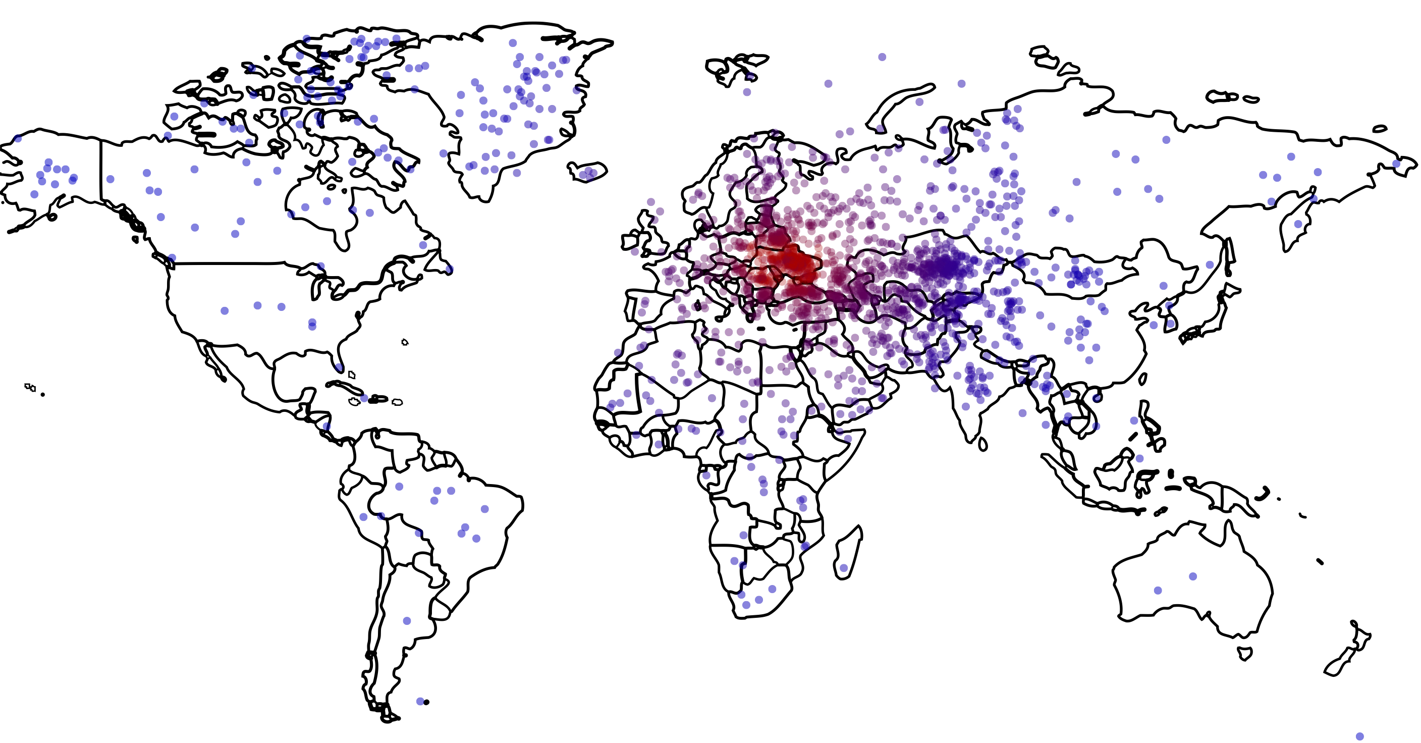
Stephen Colbert present the map while he wondered about odd clusterings of imagined notional Ukraines in South Asia, Greenland or Canada, and one response near Iowa–as if the move suggested the belief of one polled respondent that in invading Ukraine, Putin might be entering himself in the next Iowa straw poll. Doubtlessly, the notion that Russia might be fighting a war far from its borders is somehow a part of the odd mental baggage most Americans have about being stationed in Iraq or Afghanistan–an uneasiness informing the recent toponymic mutation of “Chiraq” to describe the surge of violence in the city in the Midwest. But the point is that unless we return Ukraine to a sense of geographic place, our understanding of the situation that has led to the crisis.
Where is Ukraine, anyway? Definitely on a map, and in many heads, but you might do well to take care to map the dynamic to understand how its frontiers are in danger of being redrawn.