Tag Archives: ecotones

Mapping Water’s Presence and Absence Across Land: Maps of Aridity and Drought

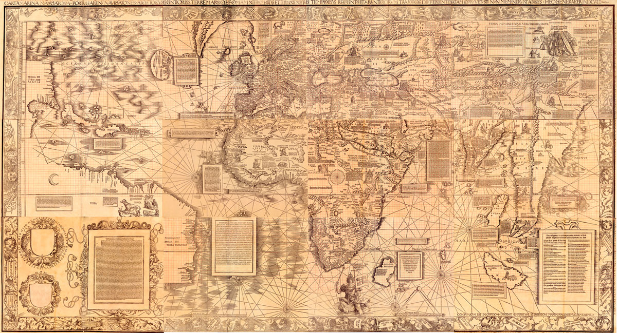
Maps can potentially provide quite supple tools to draw the distribution of a variations among land and water, and to reflect on the local variations of the specific landscapes they represent.  Yet the conventional of land-mapping do not clearly lend themselves to describe the presence of water in the land–and all too often presume a clear boundary between land and sea, a fiction known as the coast, one of the clearest inventions of cartographers.  We struggle to describe the relation between land and water–whether in our imagery of drought, which has become particularly popular with increasing evidence of climate change and global warming, or in describing the levels of groundwater loss across the land.  Hence, even as we confront the potential collapse of aquifers, and a rapidly shrinking supply of underground water, we don’t have a clear iconography of how to render the very dilemma–even if the problem of groundwater depletion stands to only increase.

The recent findings of such deletion of groundwater sources in much of the United States since 1900 is big news, but the means to illustrate the rates of its increasing disappearance–or indeed the potential losses that such groundwater losses imply in much of the country–pose problems of cartographical rendering, as much as environmental catastrophe:  the two seem far more closely intertwined than has been argued.  Take, for example, a recent and particularly valuable USGS study of the levels of groundwater depletion that historically increasing removal of subsurface groundwater from the lower forty-eight states, in terms of a combination of levels of subsidence, drainage, and water-flow, that mirrors the central regions of agricultural production and farming in the United States since 1900, but which primarily depends on modeling aquifers’ depletion:

Groundwater Depletion, 1900-2008

Groundwater Depletion, cubic km

USGS:  Leonard Konikow, “Groundwater Depletion in the United States (1900–2008)” 

We are similarly deeply challenged, in representing the drama of increasing drought.

The syntax of terrestrial mapping does not lend itself easily to the mapping of drought, or indeed to mapping the presence and absence of water in our worlds, or the role that water plays in the landscape.  For the very mobility and fluidity of water across environments is, as the current drought has revealed, not easily able to be naturalized into the landscape, or fixed in a map, and the interaction of water with our agrarian and rural landscapes in face difficult to map.  Cartographers all too often rely only on ruled lines to organize land maps, and the syntax that was developed to draw divisions and preserve boundary lines, and indeed bound territories and nations have the disadvantage of instantiating divisions as if they were natural, and part of the landscape that we see.

Rather than bounding the regions of land and water by sharp lines as if to differentiate them, web-based maps that sense degrees of the relative presence of water provide a new and almost dynamic format to frame questions that depend on visualizing the presence of water on which even landlocked regions depend.

The map brings into being new entities to visible form that we could not otherwise see in a material form, and allow us to better contemplate and reflect upon the different sort of water-levels on which the fertility and richness, but even the usability, of land depends.  The two-fold qualities of how the map brings things into existence and offer tools to think exist as two sides of the same sheet of paper, both present in how we inscribe space in a map as a way to  view space in the definition of their contents.  Whereas informative content lies inscribed according to indices on the map’s surface, maps also project meanings lying beneath:  on their obverse lies their take-away value, or the picture of the world that they shape in our minds. The symbolic conventions of maps are to be judged both by the accuracy of their design and their communicative value.  But while lines are useful tools to define and bound territorial space for viewers, they are far more limited as tools to describe the presence of water in the land, much as notoriously neglect or efface the areas where land and water interact, or the fluctuation of the boundaries between land and sea, and even harder to map the absence of water in the land–either in terms of its severity or the gradations that can be drawn in conditions of drought.

Despite the compelling nature of our mapping of the California drought–and the prospect of regions sensitive to increasing water stressors and drought worldwide–maps of drought raises compelling questions the conventions of its mapping and the take-away of maps of drought and aridity.  And the picture that emerges of the recent three-year California drought in one’s mind seems of utmost important to its understanding:  one can think of the hugely valuable perspective that Michael Bostock has recently compiled, using data from the National Climatic Data Center, charting regional climactic variations in drought across the United States since 1880–in addition to a more qualitatively detailed set of visualizations of the drought’s local effect on specific crops–with truly dizzying results. How to best orient readers to the shifting boundaries and relatively recent advances of drought in the American West, without falling into dangers of historical relativism?  How to both appreciate the current drought’s significance and present it to readers?

We’ve perhaps only begun to consider drought as a mapped concept, but the complex interaction between aquifers, land-water, snowfall, rainfall, and ambient temperature due to global warming–all difficult enough to visualize on their own, let alone in relation to each other–are particularly difficult to map in a cogent but dynamic form.  Does the most recent map of the Drought Monitor, authored by Richard Tinker for the USDA, disarm viewers by a heat map to show basic gradations of drought across the entire state–where black designates exceptional drought (“D4”), and red extreme drought (“D3”), mapping the reach of parched land as terrestrial expanse.  But despite its impressive impact, is this image a communicator of the scope of drought or its effects, even as it charts relative aridity across California’s counties?  This both invites reflection on the economic future of the region’s farms , but threatens to naturalize the very subject that it also maps.

January 21, 2014

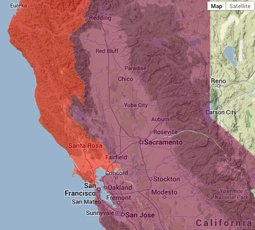
Although we demand to be able to use the syntax of the line in maps to define territories, a similar syntax is less able to be borrowed to map water or map drought. Indeed, the lines that are present in the above drought map to shade regions to acknowledge drought severity are hard to reconcile with the same lines that bound the  state, or that divide its counties, since they are of course less sharply indicated by a line, or approximated by the broad classifications used in a heat-map, whose lines are more porous and approximate as much as definitive–and overly suggestive of clear boundary lines.  This is more clear in some of the interactive drought maps that ostensibly image drought conditions in and around the Central Valley, a center of produce and agriculture, here oddly superimposed on a Google Earth satellite view:

SF and Central Valley by Satellite View

Drought can be mapped, at the same website of interactive drought conditions, as distinguishing drought severity superimposed as filters on a base map of the state of Google Earth provenance, to divide red “severe drought” in the north coast and the “extreme drought” in the northeast interior basin of the state:

California Interactive Drougth Conditions

Sure, the subjects of states and drought are apples and oranges:  mapping tools don’t lend themselves easily to such a data visualization, both by drawing false equivalents and distracting from the nature of drought and the mapping of its momentous effects–if not offering an instantiation the condition of drought as if a fait accompli and natural event–rather than one that emerged because of the uniquely opportune mechanisms of water redistribution in the state that have left it so open and vulnerable to the drought’s occurrence.

If paleoclimatologists doubt that a drought of comparable severity has not only not existed in the recorded history of rainfall in California of the past one hundred and sixty-three years, but past ‘megadroughts’ from 850 to 1090 AD and from 1140 AD to 1320, and has already been drier than any time in the past 434 years, due to the perfect storm of water diversion and agricultural intensification.  And the lack of a clear map of drought leave us without any clear sense how long the drought will last, and no sense of how urban demand for–and ability to pay for–water will be resolved with a limited supply.

We’re not used to or well-equipped mapping oceans or bodies of water that overlap with lands.  Even when we include oceans in land maps to define their edges or describe their coasts, the syntax of much mapping of territories ends at the water’s front.  And much as we need new modes to map the interface and exchange of habitats on estuaries or shores, the mapping gradations of moisture or aridity are difficult to inscribe in the surface of the map–even as we demand to map the limits of groundwater and the prospect of draught.  The exclusion of water from most land maps reflects our limited abilities to map and the limitations of liabilities are increasingly evident.

The two spheres needed to be mapped–under and above water–are seen as incommensurate with each other and we map them by lines in different and distinct ways:   we map limits and frontiers by rings or lines, or note fixed routes of travel or topographic elevations by fixed lines, the conventions of the line seems less suited to the blurring of gradations in groundwater, levels of drought, and the levels of water lying in the land–or of the diminution of both rivers and aquifers. And the presence of water in a region, or in the levels of soil and subsoil–and aquifers–that lie beneath the land’s surface, is particularly difficult to map by the syntax of a land map, because its conditions are multiple.

The syntax of the heat map may seem appropriate in its cognitive associations, but is far less supple or sensitive as a map of environmental impact, let alone as a tool to conceive of drought.  Indeed, any “ecotones“–a word coined to direct attention to those regions where bordering ecosystems meet and intersect–are  difficult to map both because they are so difficult to demarcate and because it is difficult to establish a single perspective on the intersection of worlds often assessed by different criteria.  The shoreline, such as, as the meeting place between land and sea, has long been notoriously difficult to map, and not only because of its fluidity.  We map a stable topography, mountains, rivers, and lakes, where the quotient between land and sea is fixed:  and mapping rarely extends out to the surrounding waters, or boundaries of blurred, shifting, or overlapping lines:  a problem of increasing notice in those endangered areas where habitats of land and water overlap and intersect, making clear boundaries less able to be defined.  This is especially true in drought, where we must consider relations between groundwater storage, aquifers, and surface water, and the different sources and flow of water through agrarian and to urban landscapes. This problem of cartographical representation is as pronounced in the mapping of drought.  The  mapping of the absence of water is indeed a particularly apt problem for cartographical design in a heating-up world, as revealed in the maps we use to track, analyze, and understand drought. Bay Area to Modesto and Monterrey Mapping the shifting dryness of the land–and the drying up of resources–presses the conventions of cartographical inscription.  And all too often, we have only mapped land–not water, or even dryness–save in the limits of the desert lands.  And the two sides of mapping the presence or absence of water offer complementary images, in ways that might often make it difficult to assess or chart the meanings and impact that the drying out of regions and habitats might have–or, indeed, to “embody” the meaning of or spread of drought and dryness in a legible manner.  What would it mean to make drought a part of mapping that would be readable?  How, in other words, to give legibility to what it means to subtract water from the environment? Indeed, we demand a dynamic form of mapping over time that charts the qualitative shifts in their presence in the land.

Whereas resources like water have been long assumed to be abundant and not in need of mapping in space, as they were taken to be part of the land, the increasing disappearance of water from regions like much of California–the first subject of this post–raise challenges both of conceiving drought as a condition by embodying the phenomenon, and by using graphic conventions to trace levels of water in the ground.  In the case of the recent California drought, the compounded effects of an absence of winter rains, which would normally provide the groundwater for many plants throughout the year, feeding rivers and more importantly serving to replenish  groundwater basins, but has decreased for the past three years at the same time that the snowfalls over the Sierra Nevada, whose melting provides much of the state with running water–and on which the Owens Valley and Southern California depend–have also dried up, leading to a decrease in the snowpack of a shockingly huge 80%.  At the same time as both these sources of water have declined, the drying up of the Colorado River, on whose water much of the western US depend, have curtailed the availability of another source of water on which it has long depended.   How to map the effects and ramifications of historical drought levels or impending dryness over time that synthesize data in the most meaningful ways?

These are questions both of cartographical design, and of transferring data about the relative presence of water in the land to a dynamically legible form, at the same time as retaining its shock content.  The pressing need to map the current and impending lack of water in the world raise these questions about how to map the growing threat of an expanding drought and the implications that drought has on our land-use.  The question with deep ramifications about its inhabitation and inhabitability, but not a question whose multiple variables lead themselves to be easily mapped in a static graphic form.  And yet, the impact of drought on a region–as Thomas Friedman has got around to observing in the case of Syria, both in regard to the failure of the government to respond to drought that devastated the agricultural sector and that swelled cities in a veritable ecological disaster zone–offers a subject that threatens to shake the local economy.   And what will animals–both grazing animals and local wildlife alike, including salmon–make of the lack of river water, much coming from the Sierra Nevada, or the residents of the multiple regional delta across the state? Friedman’s analysis may seek to translate the political divisions in Syria into the scissors of the Annales school–he advocates the importance that dedicating funds to disaster relief have already been proven to be central in foreign relations as well as in a region’s political instability, as if to table the question of the content of a political struggle.  But the impact of rising aridity on agricultural societies is perhaps not so much lesser than its impact on agricultural industry.

Rather than offer metrics to indicate social unrest–although political consequences will surely ensue–the rise of water maps show shifting patterns that will probably be reflected most in a tremendous growth of legal questions about the nature of “water-use rights,” however, and the possible restriction or curtailing of a commodity often viewed as ever-plentiful and entirely available for personal use, as well as a potential shift in food prices, eating habits, and a dramatic decrease–at least potentially–in access to freshly grown food across much of the United States, if not the sort of massive out-migration from rural areas that occurred in Syria. Michael Bostock’s current mapping of drought’s local effect on specific crops provides a compelling record of the complex questions that mapping the data about the presence of water in the land might be able to resolve.  For the main source of much produce in the US, with the California drought, seem drying up, if we consider dry America’s considerable heavily subsidized acreage of agricultural production.

CaliforniaCommodity Agriculture urban design lab

But we are in the very early stages of making clear the legibility of a map of dryness and draught, or of doing so to communicate the consequences of its effects. The interest in mapping our planet’s dryness is a compelling problem of environmental policy, but of cartographical practice.  Maps of drought and dryness are often econometric projections, related as they are to interlaced systems of agricultural production, resources, and prices of food costs, and based on estimates or climactic measures. But they are powerful tools to bring dryness into our consciousness in new ways–ways that have not often been mapped–or integrated within maps of drought’s local effect on specific national crops.  Perhaps the familiarity with understanding our climate through weather maps has created or diffused a new understanding of climactic changes, forming, as they do, visual surrogates by which to understand complex and potentially irresolvable topics into inevitable complex public debates, and indeed understand our shifting place in the world’s changing environment.

The recent severity of the current California drought–the greatest in measured history, and actually extending far into much of the West– and the parallel drought in the central United States creates a unique mapping of drought severity across a broad swathe of the country that raises problems not only in our agricultural prices, but in much of the almonds, lettuce, and strawberries that derive from California.  The drought is not limited to the confines of the state, although the intense reliance of California farmers on irrigation–some 65% of state crop lands are irrigated, mostly in the Central Valley, where they depend on the viaducts to carry water from the Sierra’s snowfall to farmlands–makes it stand out in a map of the drought’s severity.  (One might return here to Bostock’s powerful visualization of drought’s local effect on specific crops.)

The map of the absence of water in these regions is, however, difficult to get one’s mind around as if it were a property or an accurate map of a territory:  the measurement of its severity is indeed difficult to understand only as a status quo of current meteorological events, for it poses the potential triggers for never before seen changes in agricultural markets and lifestyle.  How can one map the effects of what seems to be the driest in perhaps 434 years, as UC Berkeley paleoclimatologist Lynn Ingram has argued? Both raise the specter of global warming more concretely than we have seen, but are oddly difficult to place into public discussion outside the purely local terms in which they are long conceived:  the drought is not only the problem of Governor Jerry Brown, perhaps personally haunted by the drought of 1977, but the news stories on the issue–as one from which this map was reproduced used in the New York Times to illustrate the drought’s scope, and to hint at the severity of its consequences as much as the expanse of the drought itself, that combines all three aforementioned sites of drought–the Sierra Nevada snowfall; winter rains; Colorado river–in one powerful graphic that reveals the effects of drought on the entire western United States, as if it was a fixed or invading miasma, the vectors of whose spread are less known: ‘ Drought Severity--California

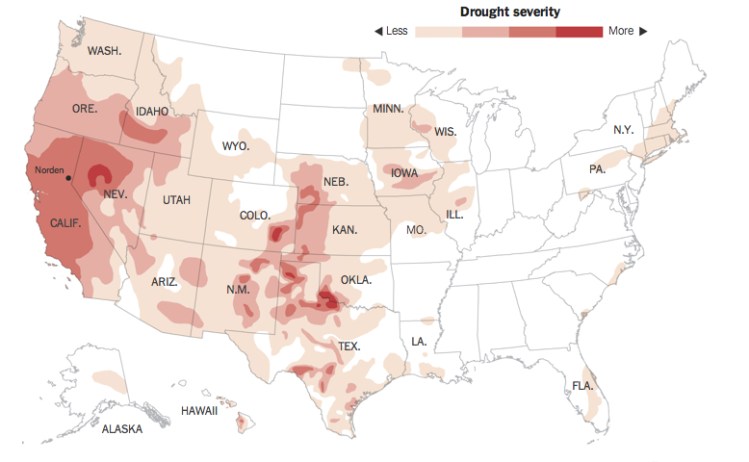
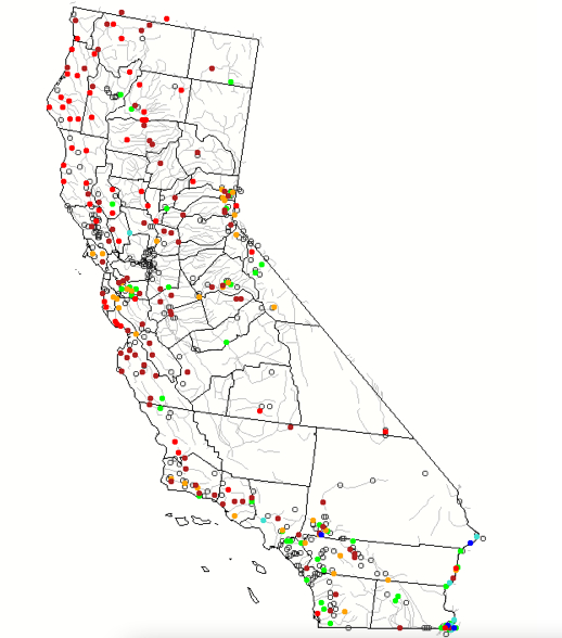
Max Whittaker’s quite eery photograph captures the resurfacing of an abandoned ghost town in Folsom Lake, now suddenly able to be seen with declining water levels of a marina now at a mere 17% capacity, is a striking image of water’s absence in one specific region of the state:

DROUGHT-master675Max Whittaker/NY Times

Other lakes on which much of the southern half of the state depends, like Owens Lake, have shrunk to a visible extent:

la-ol-nudity-and-other-watersaving-tips-in-an--001

How can we adequately map this shift in liquid resources?  To make the graphic palpable, an animated stop-action map of dryness–both historical and projected–could express a useful and compelling record of the mechanics of draught and global drying out might illuminate a perspective on the shifting relation to water we are condemned to live with.

The global shifts in water, from regional water-tables to rainfall to ocean levels, and the mixtures of saline and freshwater they will create, suggests a broader calculus of hydrographic mapping and potable water, the likes of which were never conceived just forty years ago–or, perhaps, just twenty years past.  As a start, such a map might begin from the shifts in a resource like snow, whose absence has caused not only many Californians to cancel trips to Tahoe or to ruin their skis on the slopes, but to face an economic crisis in water’s availability, evident by a comparison of aerial photographs showing the ecosystems of levels snowfall in the Sierra on successive January 13’s just one year apart which reveal dramatically different appearances of identical terrain:

January 13, a year apart

Far more shocking than a map, in many ways, the two images effectively register and embody a shift in how the landscape exists, even if it only implicitly suggests the ecological impact that the absence of that huge snowfall has on its nearby regions:  the absence of green in the adjoining basin, now a dust bowl, suggests a radical transformation in landscape and ecosystem. How can one show the shifting water-table, rainfall level, against the rivers that provide water to the land and its several delta?

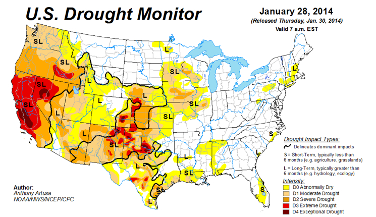
A ‘better’ map would help get one’s mind around the dramatically different notion of the usage and circulation of water in and across space–as much as the regions of dryness or low water-levels in the state.  Both NOAA and NASA determined that last year was tied for the fourth place as the warmest year globally since record-keeping began in 1880 with the year 2003:  probably due to increased use of coal, raising the temperature 1.78 degrees Farenheit above the average for the twentieth century, but also creating specific problems in the form of an off-coast high-pressure ridge that has created a barrier that has blocked winter storms, perhaps due to the increased cold in Antarctica on top of the decline in water that descends, melted, from the Sierra’s icepack–leading to an increased reliance on groundwater that will continue for the foreseeable future. The current USGS map of the drought today–January 21, 2014–notes severe conditions of drought in dark brown, and moderate drought conditions in orange, placed above a base-map of dryness across a visible network of riverine paths each and every day: Today's Drougth

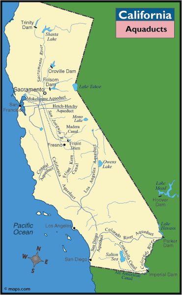
Yet the variations of coloration can’t fully communicate the consequences desiccation of the land.  The “moderate” drought in the central valley–surrounded by conditions of severe drought–reflects the limited amount of water brought by aqueducts to the region, rather than a reprieve from national conditions, and roughly correspond to the paths of the California Aqueduct and San Joaquin river:

CALAQU

Perhaps a better model for mapping drought exists, but questions of how best to unify empirical measurements with the availability of water–and the consequences of its absence–are questions for data visualization that have not been fully met.  The ways that USGS maps real-time stream flow in comparison to historical conditions for that day provides a pointillist snapshot of dryness–but using the red to suggest “low” and crimson “much below normal,” as measured in percentile–and yellow “below normal”–the scientificity of the map gives it limited rhetorical power, and limited conceptual power as a basis to assess the expansive effects of drought or extrapolate the critical readings of water across that network in ways easy to visualize.

Streamflow Conditions in CA--Jan 21

The USGS Waterwatch offers an even better metric–if with minimal visual shock–in mapping the areas of severe hydrologic drought in crimson and a new low of drought levels in bright red, in its map of stream flows over a 7-day period, which suggests the range of lows throughout the region’s hydrographic water-stations and across the clear majority of its extensive riverine web, and indeed the relative parching of the land in sensitive regions as the northern coast, Sierra, and parts of the central valley, as well as the rivers around San Francisco and Los Angeles:

New Lows in Riverine Flow

These maps seem to omit or elide human agency on the rapidly changing landscape.  Despite the frequent vaunting of the purity of the water carried from the snows of the Sierra, deep problems with the California water supply–problems caused by its inhabitation and industrial agriculture– become more apparent when one considers the impurity of the groundwater table.  This map, based on domestic wells of water withdrawal, offers a sobering image of what sort of water remains;  although the most southern sector of the state is clearly most dependent on groundwater withdrawals of some 30-80 millions of gallons/day, significant sites of the withdrawn groundwater from within the Central Valley Aquifer, extending just inland from and south of San Francisco, and at select sites on the coast, contain surprisingly high nitrate contamination due to fertilizer runoff or septic tanks–measured against a threshold for having a negative effect on individuals’ health.

Groundwater in State

The closer one looks at the maps of how the state has begun to dry up over time, the further peculiarities seem to emerge of California’s geography and its relation to water–and indeed the sort of water-exchanges of three-card monte that seem to characterize the state–that are to an extend compacted by the dependence of much of coastal California on the extended winter rains that provide enough water for most plants to store.  (The absence of water in much of Northern and Central California now means that the leaves of maples and many other trees are turning bright red, due to their dryness and the bright winter sun, in ways rarely seen.) We might do well to compare some of the other means of tracking drought.  The US Drought Monitor suggests that conditions in current California dry spell differ dramatically from just two years ago–at a time, just two year ago, when Texas seemed a far more likely candidate for ongoing drought.

hnsvxl

While the image is not able to be easily accessed in animated form, a contrast to a recent reading of drought from this year reveals the striking expanse of extreme and exceptional drought in California’s Central Valley and much of the entire state, to compare the above to two more recent drought maps:

US Drought Monitor Jan 21

Drought Monitor Jan 28 2014

Yet the concentration on broad scale changes in the regions that it maps offers somewhat limited sensitivity to the variations of water-depth.  The map moreover suggests a somewhat superficial appreciation of the drought’s expanse and the nature of its boundaries.  But the greater sensitivity of satellite readings offers a more multi-leveled–and indeed both a thicker and a deeper reading of underlying factors of the local or regional drought in the American West.  The upgrading of drought–or the degradation of local conditions–in only one week is striking, and effects precisely those regions most sensitive to river irrigation that were effected by the failure of arrival of a melted snowpack, the effects of which seem destined to intensify.

One Week Shift

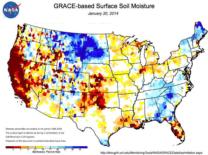
The twin satellites that measure the distribution of groundwater offer an other point of view of the local variations of drought.  The record of hydrological health, known as the  Gravity Recovery and Climate Experiment, whose paired satellites use two sensors spaced some 220 km apart as a means to detect a shift in the ongoing redistribution of water on the earth’s surface, offering a comprehensive indexing of their remotely-sensed measurements by longitude and latitude.

Satellite NASA

The extracted data is combined with an existing meteorological dataset, in order to create a record sensitive to variations of but one-centimeter in groundwater level.  Although not registering the depletion of aquifers, and primarily climactic in nature, the portrait that emerges from specific shifts in gravity suggested by water’s lower mass effectively track water’s presence with considerable precision on exact coordinates, creating a composite image of national drought that suggest the different variations in the presence of groundwater, by integrating groundwater and soil moisture from surface moisture of their remotely sensed data with actual meteorological changes observed from land and space to create a comprehensive picture of water storage at different levels in the earth.

GRACE mechanics

GRACE has aimed to map the shifts in groundwater levels over time:  the result suggests in surprising ways some relative stability between 1948 and 2009, to generate “a continuous record of soil moisture and groundwater that stretches back to as a way of indexing moisture levels in the soil at different strata.  The striking change in such levels in relation to data of 1948 is an especially striking record of the contrast between just 2012 and 2014.  By creating a map based on the composition of underground water storage as remotely sensed via two satellites orbiting earth, the measurement of ground water retained in the land is a crucially informative record of gradations of aridity, and levels of drought, allowing us to discriminate between ground water and soil moisture–and indeed to understand their relationships in an easily viewable manner, translating satellite measurements into a format easy to compare as a mosaic of local levels of aridity and regional differences that demand to be cross-referenced with agricultural production and across time.

Groundwater Storage 19489-2014

The map of ground-water storage suggests strong contrasts of the relative surplus of waters within the irrigated Central Valley and the relative aridity or dryness of land in much of the Lost Coast in California and deep south.  The “change in perspective” resulting in two years shifts attention to shifts in the amount of groundwater measured, processing data of water stored in the earth that has the potential to analyze the relative irrigation of expanse in easily viewed fashion.

Within just two years, or course, this picture of ground water storage had dramatically and radically changed whose impact we are only beginning to assess, and done so in ways that show no signs of ending.

Ground-Water Storage 1948-20089

To be sure, the wetness percentile of areas near the land of lakes and central United States seems a striking contrast in this image of ground water storage, in this image deriving from the University of Nebraska, which reveals itself to be a particularly rich area of soil storage of groundwater, in, significantly, an area without much surface soil moisture based on Soil Moisture Study.  But the deep pockets of wetness decline by far–both in storage and in soil moisture, based on the draining of aquifers and increased aridity or desertification–present a bleak picture in some strong crop-producing regions of the south and southwest, as much as California–and an even more terrifying story when the moisture of its soil suffer dryness–the excessive aridity specific to California relative to the nation is far more starkly revealed.

Soil Moisture on Surface

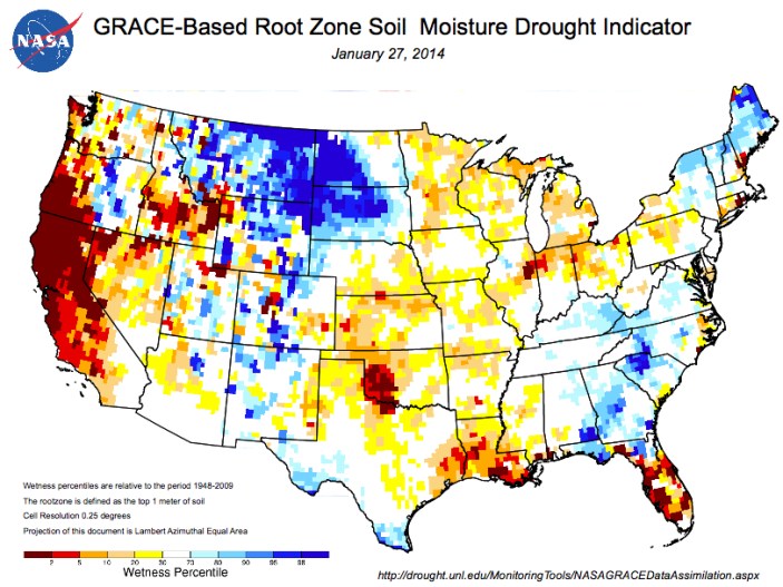
The registration of surface soil moisture and groundwater suggests a dynamic tiling of national space that we can use to map wetness over time, and extrapolate the effects of increased aridity on farm-lands and regions that will no doubt shift the prices of water, as well as the costs of agricultural production and livestock.  The mapping of specific water available for root systems across the nation, based on satellite data coded to specific longitudes and latitudes, provides a third level of analysis based on the levels of water available to root systems across the nation–and reveals the even more concentrated effects of drought within the region that depend on water from the California Sierra that will no longer arrive in the Central Valley this year:  more concentrated than the earlier image of ground water storage, that reveals the amount of water available to the root systems presents a picture even more closely related to agricultural constraints created by three years of drought.

Root Zone Moisture

The remote sensing of such levels of moisture and groundwater affords a model of mapping that can be keyed directly to the questions of specific crops in ways that can be eventually used to make prognostics of the impact of drought on the local economy.  If California’s conditions seem to be due to meteorological particularities of low snowfall and few winter rains, held off the shore due to a high pressure ridge of air related to dramatic cooling in Antarctica, the problems that underpin the mapping of the local of integrating layers of data from different sources are repeated.  They reveal magnified risks in ways comparable to the more speculative tools of forecasting used to  assess the multiple water stresses that shape the environmental pressures on population in different areas of the world.

The following sequence of global projections of aridity are often rooted in the possibility–or near-eventuality–of rising temperature worldwide, and the pressures that these stand to place on water usage. The projection of what these water stressors will be seem to synthesize the data of rainwater levels, water tables, and ocean levels to depict the collective constraints facing agricultural communities across the world–and raising questions of what effect they might have–that will no doubt endanger rising political instability and economic hardships world-wide, in ways difficult to conceive.  The problems that underpin the mapping of the local are repeated, if with magnified risks, when trying to synthesize the data of rainwater levels, water tables, and ocean levels as a collective set of water stresses that are facing agricultural communities across the world. If California’s conditions seem due to low snowfall and few winter rains, held off the shore due to a high pressure ridge of air that seem related to the dramatic cooling of Antarctica, projections of aridity are often rooted in the possibility–or near-eventuality–of rising temperature worldwide.

The remarkably and relatively suddenly increased stresses on water-supplies world-wide are now better mapped as futures–which they indeed offer, by the World Resources Institute, a sort of barometer on the shifting dynamics of water availability in the world.  In the below charging of water stressors prospectively through 2025, based on the prospect of a world warmer by three degrees centigrade, we are pointed to the particular hot-spots in the globe.  These include the central US, which extend in arcs of desiccation poses particularly pernicious threats through much of Anatolia, Central (equatorial) Africa, and South Asia.  Specific water stressors that are projected in the map are due to the combined pressures of growing use of a limited supply of waters that higher temperatures will bring; the global map of the impact of rising temperatures poses particular problems for populations in India and China, two centers of pronounced population growth where markets where food distribution will clearly feel stresses in increasingly pronounced ways.

Crop Yield with Climate Change World Map

The pronounced pressures on fertility rates are expected to stay strong in Asia, as well as the United States, according to the below bar graph, developed by the World Resources Institute.

Fertility Rates Mapped

The areas in which the World Resources Institute predicts the most negative effects on crop production reflects the relative impact of water stresses due to projected climate change alone–revealing a far more broad impact throughout South America, northern Africa, Arabia, and Pakistan, as well as much of Australia.  (Similarly, a certain pronounced growth occurs across much of Canada–aside from Ontario–Scandinavia, and Russia, and parts of Asia, but one hardly considers these as large producers in a world that has warmed by some three degrees centigrade.)  But the highly inefficient nature of water-use–both in response to population growth and to a lack of re-use or recycling of water as a commodity and in agriculture–creates a unique heat-map, for the World Resource Institute, that will be bound to increase water stressors where much of the most highly populated and driest areas intersect.

 Water Stress Map

The rise of the temperatures is prospective, but also difficult to map in its full consequences for how it threatens the experience of the lived–or inhabited–world to the degree that it surely does.  (Indeed, how the habitable world–the ancient notion of a habitable “ecumene,” to rehabilitate the classical concept of the inhabited world and its climactic bounds by torrid zones–would change seems a scenario more clearly imagined by screenwriters of the Twilight Zone or of science fiction novels than cartographers or data visualizations.)  If we focus on the band of the hardest-hit regions alone, one can start to appreciate the magnitude of the change of restricted access to water and its restricted availability in centers of population:  the map suggests not only a decline by half of crop yields around equatorial regions, but stressors on local economies and rural areas. It staggers the mind to imagine the resulting limitations on world agriculture in this prospective map, which offers something of an admonitory function for future food and agricultural policy, and indeed international relations:

Band of hardest Hit

The shifting pressures on resources that we have too long taken for granted is sharply starting to grow.  The stressors on water will direct attention to the importance of new patterns and habits of land use, and of the potential usability or reconversion of dry lands, to compensate for these declines.  Indeed, the mapping of available water provides a crucial constraint on understanding of the inhabited–and inhabitable–world, or how we might be able to understand its habitability, bringing the resources that we have for visualizing data in ways that we might bring to bear on the world in which we want to live, or how we can best describe and envision the effects of drought as an actor in the world. Such huge qualitative shifts are difficult to capture when reduced to variations that are charted in a simple heat-map.

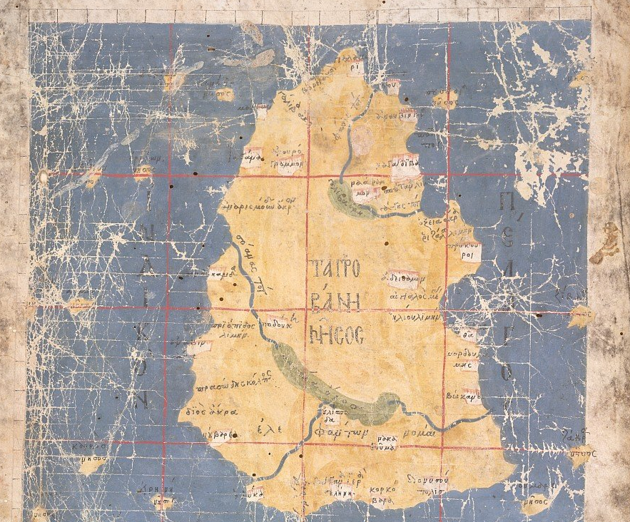
In a way, the constraint of water was more clearly and palpably envisioned within the earliest maps of California from the middle of seventeenth century than it is in our vision of a land that is always green, and nourished by mountain waters all along its Pacific rim.  Indeed, this image of an imagined green island of California, surrounded by waters and beside a green mainland nourished by rivers and lakes, seems extremely powerful as a mental image of the region that is increasingly remote as the water resources of the region begin to evaporate.

California Island

4 Comments

Filed under agriculture in america, aquifers, Climate Change, drought, mapping climate change

Mapping Land and Sea in Venice (and Elsewhere), ca. 1500

The medium of single-line engraving provided an expressive medium for organizing the continuity synthetic maps of land and sea long before trans-Atlantic travel was available to most.  Mapping beyond one’s place or region is a specific area of expertise; it is not surprising that it is a difficult competency to define.  It’s long been observed that the manner in which engraving produced an exactly replicable visual statement brought a variety of levels of expertise to bear on the map, both as a repository of collective visual memory and a coherent visual statement designed to orient readers to the notion of a uniform space.  But it’s interesting to consider the local differences in how a coextensive notion of space was understood to be composed of mapping the integration of land and sea:  and the understanding of the political power of the Serenissima–and the authority of the Venetian senate–as extending “onto the salted waters [sopra le acque salse]”–suggested a unique model of imagining worldly rule that uniquely inflected the construction of a cartographical space.

The transmission of the concept of a map of uniform coverage–one first expressed by the second-century Greek astrologer and mathematician Claudios Ptolemaios [Κλαύδιος Πτολεμαῖος], bequeathed to us as simply Ptolemy, provided a template to illustrate the expanded edges of the inhabited world in the editions successively translated in early modern Europe considerably before maps of land were fully integrated with maps of sea.  Translation of the forms by which Ptolemy mapped an inhabited terrestrial expanse not only to superseded the inhabited world as Ptolemy had described it and imagined it, but broached a different model of continuity within visual form:  epistemologically distinct spaces of travel that corresponded to different forms of mapping were joined in a Ptolemaic planisphere, as were the distinct competencies of mapping, in what might be profitably examined and studied as a ‘trading zone’ of varied forms of technical skill.  In Venice, perhaps, more than in other sites, the city offered a site connected by sea to other regions, and was a bit of an active trading zone of linking maps of water and land as Ptolemaic maps attempted, less constrained by territorial bounds, and more attentive to unifying the different metrics and scales of global mapping than many other engravers of global maps.

The image of the Venetian ties to the Mediterranean world and Gulf of Venice were rearticulated in maps, ordering a relation to a global expanse by nautical charts that had enjoyed broad currency in the city, and provided a cosmographic authority to articulate Ptolemy’s authority as a description of a terraqueous expanse.


1.  Mapping Land and Sea

Techniques of artistic engraving offered a matrix in which to synthesize mapping forms from the fifteenth century, and the medium increased a synthesis of formats of mapping, as well as a the demand for maps as reproducable forms.  As much as benefiting from Ivins’ useful characterization of the innovative ways that print afforded “exactly reproducable graphic statement,” engravers’ skills provided a way to transmit the map as a graphic form.

The Dutch engraver and cartographer Mercator in 1569 described his map as a synthesis of geographical maps and nautical charts:  in so doing, he modernized the projection of the map’s surface as a continuous surface.  In a unique and inventive way, Mercator assembled a record of terraqueous expanse on parallels and meridians to address a large audience of readers by boasting of his ability to bridge the distinct media of nautical charts of the ocean with geographic maps–whereas the Ortelian “Typus Orbis Terrarum” of 1570 directly below displayed traveling ships, riverine networks, and maritime expanse on curved meridians, Mercator’s projection distributes an inhabited expanse on perpendicularly intersecting meridians and parallels.  But both maps advance cartographical expertise as preparing a surface that could be uniformly scanned by viewers as a proportional and uniform distribution of the inhabited world.

OrteliusWorldMap1570

Mercator Close-Up


Mercator did not explain the mathematics of a uniformly mapped space.   But the unique projection he devised gained broad authority by the seventeenth century as a means to visualize global relations.  Although the Mercator projection ensured that the loxodromic lines of nautical travel, denoted in charts by rhumb lines, would perfectly intersect with meridians, the straight parallels construed “ad Usum Navigantium Emandate Accomodate” was not adopted for sailing or for plotting voyages until the ability to measure longitude at sea–partly since he did not explain his method for calculating the “true course” on straight lines, but also since the media of terrestrial maps were so distinct from nautical or navigational carts.  But the combination of registers for noting nautical and terrestrial space, or imagining expanse on ship and on land, provided a major shift in maps’ graphic design and epistemological claims.

The gradual supersession of the autonomy of  sea-charts facilitated increased claims of realistic representation–or reality effect of mapping land and sea in a continuous frame of reference.  The combination of geographic and nautical charts to record of the known world in ways shifted how the world is known depended on acceptance of the descriptive potential of maps, as much as their accuracy or the use-value they gained to navigate in an era when calculation of latitude at sea depended on the sighting the altitude of the sun above the horizon and due course rarely achieved.  But the Mercator projection integrates land charts and marine charts to provide totality of global expanse.  This was the first age of globalism, and it could be readily understood.  The cognitive basis of maps as vehicles seems concealed in Cornelius de Jode’s presentation of Mercator’s projection as a “Totius orbis cogniti Universalis descriptio” or record of the known world in 1589, a decade after its appearance:  it offered tools for knowing the inhabited world as well as a record of the known world.

A similar visibility of the world’s surface was advanced in Cornelius de Jode’s later compendium of global coverage, which synthesized the conventions of nautical charts with the conventions of terrestrial mapping to create a convincing understanding of relationships between nautical travel and terrestrial expanse.

MErcator 1579

Such supersession of the conventions of mapping had to an extent previously occurred in the combination of results from different mapping formats in a unified cartographical space.  Yet even before Mercator devised this projection, sixteenth-century maps had synthesized the content nautical maps had increased the claims of realistic representation–or reality effect–in printed maps.  The graphic and pictorial detail and abundance of signifiers that was invested in Ptolemaic projections had increasingly shifted the status of the map from a schematic register which lay at remove of one from space, to a compelling synthesis of terrestrial relations for its viewer:  and the map became a surrogate able to stand in metonymic relation to a place it described, stood at the center of  modern claims of maps as forms of visual relation to space that could be inscribed with meaning.  Indeed, the combination of registers of terrestrial and nautical cartography compellingly joined areas of practice that had been kept previously separate formats of spatial descriptions, if not incommensurable registers of qualitatively different registers to chart spatial continuity.

Was this change in attitudes to the map partly enabled by the combination of registers of terrestrial and nautical cartography?   From previously separate formats of spatial descriptions, if not more significantly incommensurable registers of qualitatively different forms of space, the map’s surface became understood as a way to register motion through a uniform space and encounter places on a determined path of travel.  The use and status of the map as both a register and descriptor of expanse was already evident in the integration of nautical charts and Ptolemaic maps Bernardus Sylvanus designed in Venice after 1508, which, despite the notorious absence of coverage of North America and reduced coverage of the globe, had previously described a terraqueous unity in compelling–and readable–ways by explicitly combining what had been seen as incommensurable orders of registering expanse.

Sylvanus PLanisphere--close up

The legibility of the 1511 projection of Sylvanus was both very contingent and local in nature, despite the universalizing viewpoint it prepared of the inhabited world.  When Sylvanus, hailing from Eboli, possibly also an illuminator of erudite texts, undertook a newly illustrated printed edition of the ancient geographer Claudius Ptolemy’s  Guide to World-Mapping, known in the Renaissance simply as the Geography, he decided to create a more updated edition of comparative maps deriving from nautical charts collated by sailors and the set of maps transmitted in codices of the Ptolemy’s work of global geography.  The plans for a new Venetian edition had recently been abandoned, although several plates for it had been made and perhaps engraved by 1508, probably including a new world projection.  In confronting problems of modernizing the Ptolemaic maps, Sylvanus foregrounded the integration of islands and coastlines compiled in nautical charts in the maps transmitted in Ptolemy’s geographical treatise, translating the conventions for land-mapping into representational conventions from the graphic arts and advances of two-color typography:  the birds perched on the cornices of his map of Italy, the sixth plate of Europe, may echo the modern bird’s-eye view of the peninsula he offered, using nautical maps to present the configuration with a sense of naturalism often foreign to early printed Ptolemaic maps.

Sylvanus Italy--Europe 6

2.  Oceanic Space

The treatise that the second-century geographer titled a “handbook for drawing world maps” was both a technical guide and a compendium for drafting land maps.  But in Venice, a city of maritime trade, Ptolemy’s promise to collate and list a database of all the places in the inhabited world’s surface had potential appeal as incommensurate with the chart used to decide or compare nautical routes of travel, and posed a specific challenge to synthesize mapping forms.

These charts provided an alternate source of information that promised both to refine and expand the ancient geographer’s encyclopedic claims that led him to list names of ancient cities and noteworthy cities or rivers exceeding 10,000 in number–if the richness of Ptolemy’s text led erudite readers to consult his book with their manuscripts of Herodotus or Livy, as Bernardo Machiavelli–father of Niccolò–their elegant terrestrial maps they more often addressed learned readers and armchair travelers as surfaces often read in relation to other ancient texts, rather than graphic descriptions of expanse.  Indeed, their printers did not aim to address a larger audience of readers.  Yet even when presenting accurate place-locations in coastlines that resemble charts, the maps struggled to offer an easily readable surface.

sugar hillls in Spain

The synthesis of a more legible cartographical space was foreign to earlier cartographical traditions.  The history of the transmission of medieval maps is considerably complex–as are the techniques of varied forms of map making.  Elizabeth Edson argued information from accounts of travelers, traders, and sailors became accomodated in world-maps from the early fifteenth century, joining travelogues that both expanded the content and challenged the parameters of earlier symbolic world maps.  The inclusion of information from travel accounts and nautical charts not only expanded the surface of maps, but posed complex problems of integration on parallels and meridians–a reproducible grid–and elicited potential graphic models for spatial representation over a century after its textual translation that lent formal authority to the world map.

The alternatives for such a synthesis were not clear.  The considerable questions that surround the transmission and construction of earlier manuscript charts, often drawn on sheepskin to guarantee their preservation and illustrate their value, are raised by the unclear relations between how the maps were transmitted and copied–if not created–given the unclear questions about copyists reliance on the intersecting directional lines that seemed sketched over their content in tracing coastal shorelines and locating islands, or how the skein of lines apparently determined from compass-bearings provided guides for nautical travel.  These maps were produced predominantly in port towns, as this Mediterranean chart executed in Alexandria by Jehuda Abenzara (or ben Zara), coastlines are crowded by names of coastal ports written perpendicularly to the shore, linked by a network or web of potential sea-routes that demand close reading and intense preparation by specially trained scribes:

Jehada Abenzara

In port cities like Alexandria, chart-makers regularly synthesized and collated a sort of collective memory of varied routes of travel that might be on board any arriving ship, in the hope of piecing together these local records of coasts or island-charts to synthesize more expansive networks of trade with a degree of accuracy that minimized cartographical distortion with a precision that geodetic observations had not allowed.

The chart synthesized a form of collective memory, if the protocols by which its contents were transmitted are not clear:  the organization of a synthetic record of travels provided little more than symbolic reference to inhabited interiors, however, which in essence remained “off the map.”  Rather than a representation of terrestrial space, it primarily provided a record of the location of ports and idealized potential lines of nautical–rather than terrestrial– travel.

mostra-cartografia

The spatial mapping of coastal cities in the Mediterranean, and situation of coastlines in a broad nautical expanse–both in relation to both equinoctial lines and vertical bars of latitude however provided an alternate orientation to the network of the web of loxodromic lines of the compass rose.  The below schematic version of a portolan chart, signed by Juan de la Cosa of c. 1500, provided a distinct frame of reference and spatial indices to enumerate points of landing and prominent capes in the New World at different latitudes for its readers.

Wrote de la Cosa's c 1500 map

1500_map_by_Juan_de_la_Cosa


The parchment portolan chart stored in Madrid’s Museo Naval and made in the port city of Andalusia, Puerto de Santa María, was prepared for competencies of a restricted audience, with specific interpretive tools in mind–whether they were kept by captains, or by trading houses is unclear, as is the primary techniques they use to demonstrate relations of space.  By the fifteenth century, elegantly decorated versions became prized possessions among even landlocked elites–probably in copies that obscured or hid their own mercantile provenance and were designed to stake boundary lines of exploration or colonization in the New World, by demonstrating the boundary line of Tordesillas.  But although the competencies of mapping these documents enlist to render expanse are opaque, their synthetic construction have provoked continued investigation of their formal manipulation or symbolic construction of mapped space.

Some of the relevant underlying schema of the networks and constellations in charts have been identified, but their operative value is not known–were they of use for copyists in Salamanca, Barcelona, or Genoa, or were these keys that allowed them to be read?  The construction of scale lay in the relation among focal circles, wind roses, and loxodromic lines, as in this reading of the Cantino Chart.

800px-Compass_grid_Cantino_planisphere_(1502)

Spatial position is not much of an apparent interest, however, so much as the collation of alternative networks of travel–or, in the case of some charts presented by the Spanish or Portuguese, to illustrate the meridian that demarcated colonization of the New World at the Treaty of Tordesillas.  The image of nautical continuity was a huge attraction for the humanist geographer Martin Waldseemüller, but his 1516 “Carta Marina” based on Portuguese marine charts like the so-called Cantino chart constituted part of his broader cosmographical project, but this image, discovered only by the Jesuit Josef Fischer around 1901, constituted an alternate model of cosmographical learning to his large world map of 1507, 4.5 to 8 feet, provided a wall-map whose comprehensive character was less successful in making claims for its legibility, if it invested greater artistic skills in converting the format of nautical charting to a legible form that Waldeseemüller had the projection engraved in the same dimensions.  This map printed on high-quality hand-made rag paper was only found in one sixteenth-century bound volume, but was a complicated investment, even more so than the cosmographical map that Waldseemüller described as having been printed in 1,000 copies.

Carta-Marina-LG


Somewhat oddly, the map did not include the image of “America” surrounded by oceanic waters that distinguished the lavish cosmographic wall-map he had printed in 1507, and whose accompanying treatise described America as “an island . . . surrounded on all sides by sea,”  in his Cosmographiae Introductiomost probably because its sheets reflected the content of sea-charts–even if it superimposed an equi-angular grid that had little relation to the graticule employed in the terrestrial wall-map he had titled a Universalis Cosmographia.


Oceanus Occidenatils


The two large wall-maps produced at the University of Vosges, then in the Holy Roman Empire, both only recently acquired and restored by the Library of Congress, enshrined opposed if  incommensurable models of world-geography at the very time Sylvanus prepared his own edition of Ptolemy’s precepts of geographic map-making and study of global geography.   Did the lavishly produced “Carta Marina” offer a counterpart to the geographic theorization of expanse that Waldseemüller had advanced in his cosmographical writings?  The ordering of Venice’s position in relation to a gulf, and to the expansive genre of island books or isolari printed in Venice and in Italy, provided a new way of describing Venice’s position in the world, and global continuity at a relatively early age.


3.  Envisioning the Continuity of Terrestrial Geography

The location of geographical in the continuous coastlines of manuscript nautical charts was hastened by a demand to process the over 12000 identified sites Ptolemy specified as able to be mapped in a format  which conformed to viewers’ expectations for representing spatial continuity.  And Sylvanus seems to confront this difference shift in collating nautical charts with other mapping forms in Venice around 1510,  in what seems a uniquely local manner to read a map’s universal claims.

The detailed coverage of the world’s surface in sixteenth-century Europe increased not only the coverage or precision of maps, I would argue, so much as the claims of realistic representation–or reality effect–of maps in critical ways.  Yet changing understanding of the map as a medium, as well, provided Bernardus Sylvanus with grist to collate nautical charts in a set of new conventions that created a uniformity among data of diverse provenance previously regarded as qualitatively distinct if not incommensurable orders of spatial description.  Although his exacting transposition of ancient names into modern outlines of land-masses ran against the critical project of comparing the ancient and modern worlds, the uniform conventions of maps he made presented a distinctly uniform continuous surface in images from charts.

For charts were less concerned with describing or denoting spatial location, than determining (and collating) potential routes of travel:  the conceptual mapping of routes of travel was rarely invested with descriptive force or value; its competency reflected applied knowledge.  The growing authority of the terrestrial map as a comprehensive description, however–one of the deepest of modern claims of maps as competencies rooted in visual design, rather than nautical knowledge–arose from the combination of registers of terrestrial and nautical cartography, previously separate formats of spatial descriptions if not more significantly incommensurable registers, in a sort of a trading zones of semiotic conventions from varied areas of life, which bridged or linked hitherto incommensurable formats to denote expanse.

As the rich spatial information contained within the medium of the chart was transposed to the surface of terrestrial maps,  something like a wrestling with epistemological claims for knowing space and locations seems apparent in the maps included in treatises of global geography first translated in the fifteenth-century, most particularly in Claudius Ptolemy’s second-century Guide for Drawing Terrestrial Maps, whose maps Renaissance editors of the treatise had increasingly invested with increasingly comprehensive ends–increasingly relying on the toponymically crowded but crisply defined coastlines transmitted in charts to blend seamlessly with inland areas.  The accumulation of local and pictorial detail to combine an over-abundance of signifiers altered the distinction between the land map and nautical chart, raising truth-value claims about the chart as a representation that stood at remove of one from the world that this post can only begin to suggest:  increasingly, the map became a place that could be inscribed with meaning, or became a register from which to relate to foreign lands, if not a substitute for them.  The diminishing authority of the chart lay partly in a limited ability to determine position at sea, but also a limitation of the ability for encoding further information in its content that would satisfy its audience.  Edward Wright observed the errors of sea-charts as a basis for calculating position in 1599:

EdwardWright-CertaineErrorsinNavigation-1599

A word or two about this complex treatise, abundantly overflowing with strange toponyms that elicited readers’ curiosity even if its content were difficult to translate into the standards of eloquent expression to which many of its humanist readers were habituated–leading some to indicate Strabo as–to quote Isaac Casaubon–the “summo scriptore, quod praeter acuratissimam totius orbis nunc cogniti descriptionem, tanta doctrina, tamque varia omnium rerum scientia refertum est, ea denique arte contextum . . .

Ptolemy’s expansive catalogue of locations had long demanded to be given a visual form.  The question of their visual coherence led some of his later editors to rely on nautical charts that included places Ptolemy had not indicated, but the nautical chart provided little analogous framework of coherence by which to grasp their situation in a continuous expanse.  The geographer Angeliki Tsorlini has recently employed digital technologies to map relative locations defined by the terrestrial coordinates in Ptolemy’s treatise in ways that reveal the very compelling map of Mediterranean cities his treatise would have offered.  Most of the cities are ports, located along the shore, to be sure, but a considerable number remain inland cities located with apparent relative precision, with minimal significant distortion for much of Italy, the Adriatic, and Greece.  The copious abundance of familiar locations and interest in their clustering must have increased demand for their depiction.

Place Names from Ptolemy in Modern Map Projection

In the first codex that arrived in Rome, found by Maximous Planudes in the late fourteenth or early fifteenth century, the abstract ordering of the situation and topography did not pose an intellectual problem of viewing space (Burney 111; British Library).  Despite the formal appearance of the island of Taprobana, thought to perhaps represent Sri Lanka, the red lines of parallels of latitudes and meridians of longitude in which Ptolemy argued geographic mapmakers could usefully divide the world for readers on measured units, provided limited claims to mediate a naturalistic image of expanse.

Maximous Planoudes' Taprobana

Planoudes was careful to note the precise location of places on spatial coordinates, but the metric values of locations were not presented as lying in exact correspondence to their spatial situation.  The illustration of cartographical images that expanded later codices of Ptolemy’s treatise worked hard to provide maps that were commensurate with the over 1200 place-names–including mouths of rivers, promontories, mountains, or landmarks–contained in his geographic compendia were sought to be illustrated in authoritative form.

As the work reached a large audience in manuscript, terrestrial space was presented in schematic terms, the maps seem to wrestle with the abstraction of space, as if in ways that could not be imagined in visual or pictorial terms as a surface that could be scanned, as is evident in this map of German lands in one codex of the Geography, which enumerated towns and rivers in a new abstract form, listing inhabitants and towns as in the Ptolemaic manner, with minimal recognizable guides or explicit orientational clues about their spatial situation and topographical location, even when that region lay on the margins of the Roman world:
Magna Germania forests in Swabia

Yet the land-locked nature of these regions made the legibility of expanse less concrete.

Even in areas that claimed continuity with the ancient world, the production of Ptolemaic treatises curiously included modern views of Mediterranean cities in several deluxe of codices illuminated in Florence, as if to expand the treatise’s qualitative coverage of European cities in a rhetorically persuasive image for readers–these images had less regard for the systematic terrestrial coordinates Ptolemy proscribed than for preserving noteworthy sites in each place, or offer a ‘chorographic’ complement to Ptolemy’s explicitly geographic concern.

996179_671379542888235_530184269_n

4.  Symbolic Syntheses of Mapped Space

The question of what sort of graphic synthesis was provided in a geographic map is broadly tied to Renaissance visual culture, but posed particularly pressing questions in port cities that compared Ptolemy’s precepts with maps of nautical expanse.  Bernardus Sylvanus assembled engraved maps for his edition of Ptolemy shortly after the plans to print an edition of the treatise in Venice collapsed or failed, for reasons of skill or financing.  But a huge shift occurred in the production of maps that made such authoritative regional claims as depictions had already occurred, reflected in the preponderance of their incision, illumination, and distribution in centers of visual cultures in northern and central Italy, central Germany, and the Netherlands:  the specific forms of overlap between nautical and terrestrial methods in sites from Venice to Rome to Nuremberg created a rich repertory of maps with expansive truth-claims as forms of depiction.  His work came on the heals of an existing experimentation with combining cartographical registers of description in a universal register of mapping habitations of terrestrial space, evident in the 1507-8 world map of the Roman edition of Ptolemy, designed by the northern engraver Johannes Ruysch, and contemporary to the plans for a Venetian edition of Ptolemy’s treatise.

The manner that this 1507 world map mediated the legibility terraqueous expanse as a continuous surface might have offered a model for Sylvanus’  integrating of mapping forms:  for the Ruysch projection is in ways a restatement of cartographic expertise.

Rome 1507


The black-and-white outlines of the copperplate incision helps foreground the legibility of toponyms and textual panels alike that lie on the map’s curved meridian lines, as the stippled surface of oceanic expanse suggests the fact of its comprehension in the map–a comprehension rendered evident to viewers by the unveiling of the new form of a circumnavigable Africa and India, as well as the introduction of the newly discovered capes, rivers, and islands of the Americas:


Tolomeo-Stampa-Roma

The historian of cartography David Woodward argued that cartographical competence reveals a growing “rationalization of space” around 1492.  In ways, we have begun to remove cartography from a professional genealogy that places a premium on rationality–such a claim is concealed within the creative combination of forms of diverse sources mapmakers have long imaginatively integrated in synthetic designs.  But the limitations on the ‘rationality’ of the map–or the grounding of its authority in its rationality–demands future research for how mapmakers who amplified the local qualitative content of cartographical media.

Taking a step further backward in time, we can perhaps appreciate how the designers and illuminators of maps of maps included in manuscripts of Ptolemy’s treatise seem ambivalent in their use of parallels and meridians as a framework for defining a cognitive relation to expanse or for recording a cognitive relation to place:  for they treat the graticule of the map more as a frame of reference by which to register terrestrial position, than as an enabling format for graphic representation:  the iconic portrayal of place in early maps as clusters of houses that positioned against the blank ‘space’ framed by coordinate system or patches of forest tries to bridge Ptolemy’s ancient model for denoting a uniform abstraction of terrestrial expanse on Euclidean precepts and the ability to transcribe space.  Illuminators, few of whom are known,  invested maps with very limited mimetic qualities from the 1450s and 1470s to communicate their continuity:   the new interest in regional maps as registers lead illuminators to position clusters of houses with peaked roofs and taller towers in dense proximity to each other to distinguish areas of settlement, beside clustered areas of forest growth–as the Black Forest in Bavaria–that provided some vague reassurance of the correspondence of space.  Some of the owners of such maps added places near their own residence, or areas that they knew, omitted in the printed editions or codices they owned, as if to give the maps an expressive value that they feel they lacked.

Added cities of Hamburg and Lubek

Bohemia in 1477 Ptolemy

 
Did the second-century geographer’s “handbook for drawing world maps” have different implications in Venice, a city of maritime trade and considerable diversity, where nautical maps were more prevalent than maps of terrestrial expanse by the early sixteenth century?
 
 
4.  Back to Bernardus Sylvanus in Venice, ca. 1500
 
The shift in Venetian culture for locating place in a map’s expanse is reflected in the collation of a set of independent views of neighborhoods to create a dramatic imagined synthetic view of Venice as seen from above in a wall-map composed from six large individual woodblocks and large rag sheets.  The master of perspective Jacopo de’ Barbari designed the detailed view by taking he city’s coasts a a frame in which to distribute its built and inhabited expanse:  heads of winds of each direction frame the view, recalling the spokes of a wind-rose and the disembodied heads of putti who surround most early printed Ptolemaic maps, magnify the city’s coastlines and maritime surroundings, revealing the complexity of its physical plant as if the city were something of a microcosm of the inhabited world, and to showcase the expansive position of Venice on the Adriatic.  The view situates the “forma urbis” not only as a built space but in realtion to the surrounding sea, dotted with individual boats and a regatta:  in the distance, one sees the Alps to the north:  the city appears as a microcosm of global expanse, as the depiction of its inhabitation in each rione of Venice stands as a graphic surrogate for the mapping of a miniature world.
 
 
Jacopo_de'_Barbari_-_Plan_of_Venice_-_WGA01270
 
 
The particular detailing of a sea as continuous with coastlines and inhabited world provides the informed viewer with something of a metaphor for the unity of land and sea in world-mapping, revealed in Jacopo’s attention to both wind-heads round the city and to a regatta that braves Adriatic winds, exploiting his attention to the finely engraved lines of the wavy waters:
 
 
Barbari Regata
 
 
What sort of view did Jacopo de’ Barbari compose in this elegant multi-sheet wall map?  The view is often compared to the elevated “bird’s-eye” perspectival views of the “forma urbis” of Renaissance cities, but rests on a synthsesis of an imagiend or virtual view from individual surveys of the city:  one recent digitization of the view of “Venetia 1500” helped reveal the synthetic unity Jacopo took pains to created a uniformity of urban space from individual surveys as an illustration of considerable skill of rendering an almost planimetric space for viewers to scan as a continuous surface that extended to the surrounding oceanic sea:
 
 
Gridded view of Jacopo's Venice
 
 
The multi-sheet map, whose production required three years, exemplifies a Venetian appreciation of elevating a record of collective perceptions by combining map-making and perspective with particular virtuosity.
 
Jacopo_de'_Barbari_-_Plan_of_Venice_-_WGA01270
 
 
Each of the six sheets provided detailed records of the city in what Fortini Brown has called an “eye-witness style,” but a imported mapping records to a continuous picture-frame that pushed the cartographic metaphor of transcription to transcend a single fixed perspective.
 
 
Barbari Close-Up with Tritone
 
 
The luxury print of multiple sheets provide a surface into which the viewer can descend into specific neighborhoods or regions that are immediately recognizable:  the continuity of its content were thematized in another recent digitization of the map created by the Correr Museum:
 
But the lines of the Venetian lagoon and Adriatic suggest the clearest inclusion of a sense of maritime space in the map–an illusion that was echoed in the corpus of Sylvanus maps.  For Jacobo de’ Barbari created a model for viewing the coherence of urban space that responded to a challenge for ordering the unity of terrestrial and nautical space.  When Bernardus Sylvanus intended to expand the cartographical corpus of Ptolemy’s Geography in Venice around 1508, he consciously and proudly incorporated information from the surface of sailors’ nautical charts into the land-maps denoted by spatial coordinates in earlier editions of Ptolemy’s treatise, creating a unified legible cartographical surface and using printer’s red to place cities in a continuous landscape–if often situating ancient names of place from Ptolemy’s work within the modern coastlines of nautical charts, in ways that went against the scholarly tradition of comparing ancient and modern geography by juxtaposing “ancient” and “modern” maps, but also advanced a single cartographic record as authoritative and unique, shading coastlines to suggest the maritime field in which he placed new nautical discoveries–and limited America, famously, to the Columban islands to the ahistorical exclusion of all North America.
 

219-v1-800x600

Rather than enabling spatial travel, the world map of two sheets noted place-names in a distinctive printer’s red that stand out from rolling hills, framed by etched lines of waters on their coasts as if in imagined relief:

Sylvanus expanded Mediterranean with nuatical maps

The map’s space was treated as a continuous surface, defined by the coastlines from modern nautical charts, if the toponomy was often ancient in origin, treating the cartographical surface as a uniform register of inhabited lands:

Sylvanus Spain Coast


Little biographic information is known about the production of the maps of Bernardus Sylvanus da Ebola, though he has been possibly identified with an illuminator.  But he clearly exploited, even more than his predecessors, the semiotic synthesis that print allowed in Venice.  This is evident both in its combination of text and woodcut imagery in this two-sheet map, and the overlay of a graticule, equatorial bar, and wind-heads, combining conventions of different mapping media more explicitly than even earlier editions of the existing maps of the Ptolemaic corpus.

The introduction of islands and coastlines not in most all of the maps editors of the previous five printed editions of Ptolemy’s treatise on world-mapping (a sudden burst of editions which we can label Bologna 1477; Rome 1478; Ulm 1482; Berlinghieri 1482; and Rome 1507), presenting more clearly identified coasts and islands–as the ‘isole fortunate’ off of Africa’s western coast, although it omits the New World–but are often of limited geographic accuracy. The distinct use of type to balance the legibility of a map crowded with toponymy by two-color ink adopts the innovation of the material production of books to create a surface easily read by its customers–and he invited readers of the maps he organized as a comparison between the maps Ptolemy described and the versions corrected by modern nautical charts to “compare Ptolemy’s words with navigations themselves” and decide for themselves, using two-color printing to facilitate an intensive reading of the map’s surface, and in the attention that he gave to islands in the Mediterranean, as the Balearic islands off the coast of Spain, where the etching of lines suggest the surrounding seas that hit their rocky shores.

Balearics


The significance of the line in the medium of engraving has been argued to facilitate the conventions of uniform mapping of terrestrial expanse, allowing engravers to exploit the geometric formats of Ptolemaic mapping in graphic form in particularly expressive ways, the expressive value of the Sylvanus maps derived from their synthesis of conventions of map-making in a continuously readable form–one that created new attentiveness, indeed, to the encryption of information from the surface of the map, both in the map of the world’s surface and the individual tables editors helped prepare for Ptolemy’s treatise.

This must have responded to an increase in what might be called geographic curiosity.

The universal coverage of the maps Sylvanus prepared for Ptolemy’s manual of global geography was constructed from a very local place, and reveals the local availability of island books or isolari in Venice, as well as nautical records of the Mediterranean and Adriatic that were available in abundance in the maritime city, which were carefully integrated within the system of parallels, meridians and equinoctial lines for readers to pour over, with attention to areas like Spain’s Mediterranean coast or Greek islands in the Adriatic, depicted by a similar accuracy reminiscent of charts, as are its inlets and bays.

Greek Island Sylvanus

Sylvanus illustrated the division between Africa and Asia, the origins of the  Nile and shores of the newly-mapped Red Sea for readers to consult, probably in relation to available maps, by means of a similar etching of graphic relief:

Africa and Origins of Nile

The material surface of Bernardus’ maps synthesized a range of semiotic conventions that viewers would have been quick to recognize as a combination of a material landscape and a map:  one of his Italian readers was quick to include images of the towns in the Marches in the map of Italy and the Adriatic, depicting both the towns of Monterubbiano and Moresco i in ways comparable to the iconic perspective views of cities.

Sylvanus' Adriatic

The additions suggest a dramatic increased in the graphic materiality of the map as a pictorial register.  Print are allowed men as Bernardus or fellow-engravers and editors of maps in Florence, Rome, and Antwerp to invest the map’s surface with new claims of legibility as a reproducible record.  But it is also very possible that Bernardus’ sustained engagement with a project of printing he hoped would be far more successful derived from the prominent status maps already enjoyed in other visual media.

The interest of maps as depictions reflected a deep appropriation of Ptolemy’s instructions to his own second-century contemporaries to craft a map “ad oculorum aspectum commensurabilis“–the transmission of this precept to later mapmakers to create a surface that would appeal to their readers’ eyes, if not also the tacit presuppositions for viewing a continuous space in a detailed and harmonious form.

5.  A tradition of fifteenth-century Venetian cartographers had incorporated nautical charts to illustrative or pictorial ends in inventive ways, in attempts to give greater expressivity and comprehensiveness to the Ptolemaic planisphere or nautical chart:   a 1448 world map designed with great care by Giovanni Leardo framed by the months of the year and astrological signs (Verona, Bibl. Civ., Ms 3119); Fra Mauro’s famous circular map uniquely synthesized Portuguese charts, a unique matter given that it was in fact commissioned for Portugal’s monarch, without a graticule; it recalls an ellipsoid world map of 1457 constructed on the principles “of cosmographers” without a uniform graticule, and filled with textual legends, fanciful iconography, and perspective city views.  None privileged the geometrical order of a uniformly continuous surface or a format of projection from terrestrial cartography, however, or bridged different semantic registers in the manner of Sylvanus’ maps.

The Ptolemaic model provided an authoritative basis to fashion a surface that could be readily scanned as a uniform distribution of expanse by around 1500, and in Venice shifted the attitudes of viewers to mapped space.  By the later fifteenth century, the Venetian Senate had commissioned the repainting of territorial maps of the lagoon of Antonio de’ Leonardi from his nephew Sebastian along parallels and meridians by “Ptolemy’s doctrine” that Isabella d’Este and others Isabella d’Este sent painters to copy, marvelling at its proportions and scale.  The painted map received praise as “così perfetta nelle sue misure [so elegant and well-proportioned]” that “diversi Principi [several princes]” had commissioned copies of it for their own enjoyment and pleasure before its 1577 destruction, Sansovino boasted among his catalogue of the city’s artistic treasures.[i]

Although the map is now destroyed, and cannot be pictured, it constituted something of a model for the multiple maps now present in the Palazzo Ducale, painted to replace it, and for the maps of the Veneto that Christoforo da Sorte created in its private chambers–as well as, perhaps, Egnazio Danti’s monumental remapping of the peninsula in colored paint.  The much-admired peninsular map may have provided a model for integrating the format of nautical charts with maps of geographic content by men like Sebastian Cabot, piloto for the Casa de la Contratacion in Seville who created a new world map–or the map-engraver and engineer Giacomo Gastaldi, who from 1546 synthesized multiple elegant wall-maps that refined cartographical expertise; Gastaldi’s work with the geographer Giovan Battista Ramusio led him to design comprehensively detailed pictorial wall-maps as that of South-East Asia.

gastaldi 1548

Gastaldi-prat of Asia

But we might also start from the 1511 modern map of the peninsula that Sylvanus designed:

Sylvanus Sexta Tabula with ms addition of city views


Did this lost expansive painted map of the lagoon that extended to the Adriatic and Tyrrhenian sea, and their islands, provide a model for uniting terrestrial and nautical maps that men such as Bernardus Sylvanus sought to generalize for a larger audience in printed form?  The reader of Sylvanus’ printed maps from Fermo sought to make the text his very own, adding his own qualitative views of the cities that he knew, in ways that register a distinct relation to the map as a continuous surface. 

When the great cartographer Vincenzo Coronelli mapped the geographical situation of Venice in a broader gulf from the mid-seventeenth century, he described the place of Venice in the expanded gulf in his 1688 global atlas–placing Venice in relation across the Gulf of the Adriatic to the islands of its empire, which bordered on the expanding Ottoman by shifting boundaries, as if to affirm its own domain of the seas that opened along its shores.

Golfo di Venezia

As if overseeing an expanse that might be translated into varied scales, the dominion of Venice was defined across maritime expanse, not by territorial bounds, but in the cartouche from which the emblem of the lion of San Marco serenely oversaw its content.  From the margins of the map, the winged lion that Coronelli cleverly located in the cartouche that looked over the expanse of the Gulf, overseeing the expanse from beneath its dogal crown, beneath six bars of scale of mapping that alligned each of five standards with maritime leagues.


overseeing

[i] Gallo, “Le mappe geographiche del Palazzo Ducale di Venezia,” Archivio Veneto ser. V, 32 (1943): 47-54. Sansovino, Venetia, citta nobilissima et singolare (Venice:  Iacomo Sansovino, 1581), fol. 122, “era una tavola d’Italia così perfetta nelle sue misure, che diversi Principi ne domandarono l’essemplare.”

1 Comment

Filed under engraved maps, globalism, portolan charts, Renaissance engraving, two-color typography