Tag Archives: groundwater

The New Arid Regions of the United States

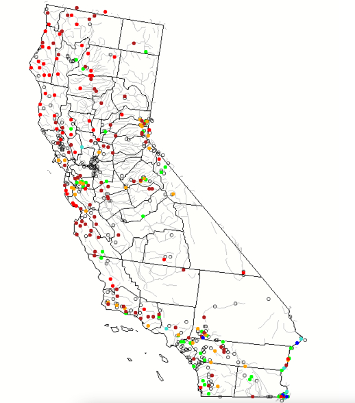
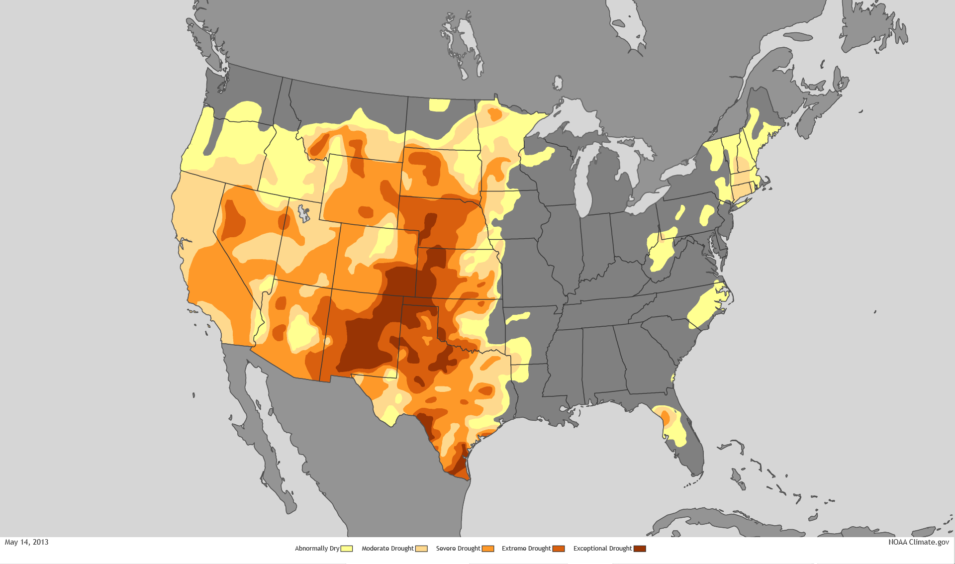
The southwest and states east of the Sierras magnify the effects of global warming in the intensity of their aridity. But global warming reveals a new relation of regions to overheating, and reveals the depths of inflexibility to accommodate water scarcity, as well as the tragedy of its effects. As aridity of the soil and reduction of groundwater reaches unprecedented scales, our passivity is accentuated as we are suspended before maps that try to visualize unprecedented aridity magnified by global warming and its magnifying effects.

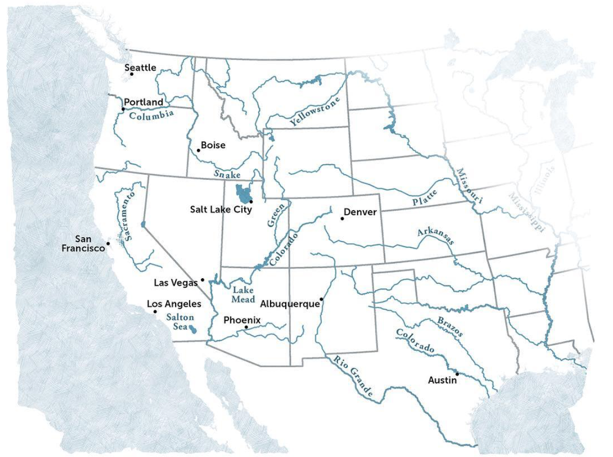
For the cascading effects of warming on the land and environment might be mapped in ways that cannot essentialize the greater “aridity” of the region, but the effects of increased aridity of soil, air moisture, and dry air on a region that we have remade into a region of food supplies, agriculture, and livestock, but, beyond, on hydropower. While the Colorado mountains long provided an effective basin to gather rainwater for western states that have been funneled to state reservoirs for agricultural irrigation, the man-made irrigation networks were drying up as the snowpack determinedly fell, and warmer temperatures evaporated what snowpack fell.

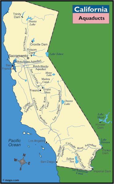
The logic of this longstanding pattern of appropriation of water from across the Colorado Basin was in a sense begun with the Hoover Dam, but was, writ large, organized by very process of appropriating water rights to redistribute water that had been enshrined in California from the turn of the century, circa 1914 and the policies of filling reservoirs to redistribute water rights. While we have considered appropriative water rights a distinct feature of how water is redistributed unique to the Golden state, the appropriation of water rights by reshuffling of water in state’s now precarious supplies how diverts over 99 million acre feet of surface water diverted along the Sacramento and San Joaquin Rivers to farmland, created a powerhouse of national agriculture. Much of the 75 million acre feet that flow from reservoirs across the state evaporates before it arrives at crops, however–far more that actually reaches the farms or cities.

–and the growing heat of the Great Plains have likewise diminished surface flow of the Colorado Basin already reduced by diminished rainfall. The increasingly warmer atmosphere of recent years has created a new “Arid Region” of the United States, of even greater aridity than when it was first mapped by John Wesley Powell in 1890, and the renewed aridity of the region not only challenges the calculus of water distribution according by appropriative rights that is structured by the Interstate Compact, but the very logic of redistributing water.

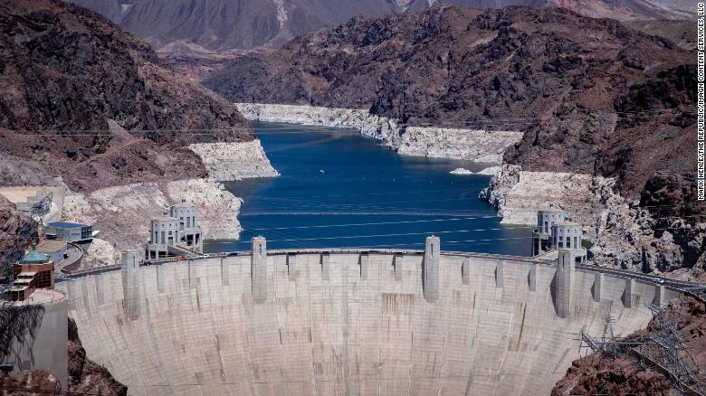
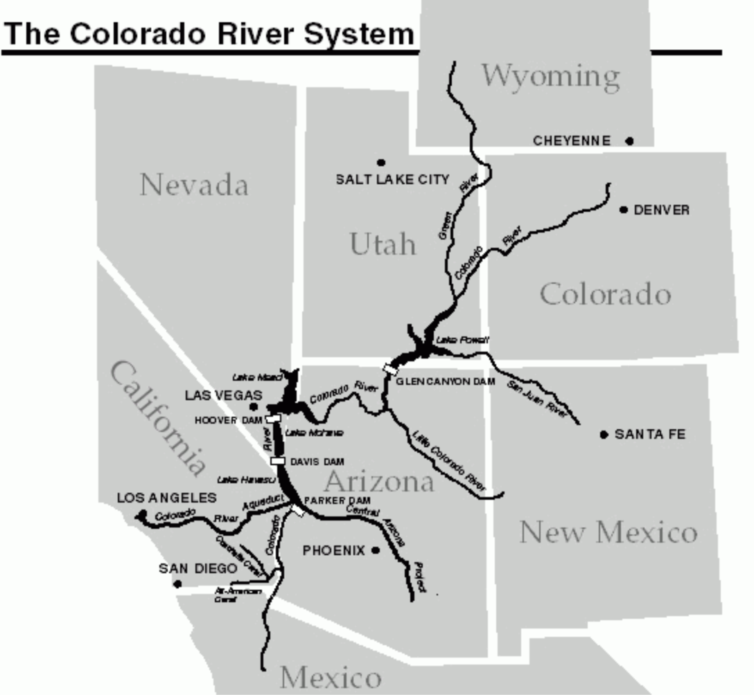
The past two decades have seen the departure of seven trillion gallons from Lake Mead, the largest reservoir on the Colorado River, holding rainflow from the Upper Basin before it crests the Hoover Dam. The drop will trigger hydrologic stresses across western states, as ever ever-increasing amounts of water are sucked up into drying out air and atmosphere, requiring more abundant irrigation of croplands and grazing grounds. This new and expanded “Arid Region” suggests a return of the repressed, returning at even greater scale and aridity to haunt the nation by a lack of groundwater again.

Evapotranspiration Rates in Colorado River Basin, Landsat 13

that is not to say it ever left. But the solutions of diversion have been undermined by the cascading effects of climate change and increasing temperatures, across an expanse of irrigated lands where water from the Upper Colorado, as from the western slopes of the Sierra Nevada, are funneled to cities, farms, and irrigation projects, and used to generate electricity. Even as Californians and westerners face the threat of further fires more destructive than any in recorded history–potentially enough to energize an implausible recall effort in the state of California–we face the problems of managing not only historic drought, mandated energy shortages, reduced water supplies. The climate crisis appears to have provoked a deep crisis in leadership, but one without easy means of resolution.

The most improbable political candidates–global warming skeptics after Donald Trump’s heart–have argued drought, wildfire, and electrical storms reveal Gavin Newsom’s lack of leadership, even as they stridently object to aggressive climate legislation aimed at emissions reduction as restraining the free market business,– preferring a free market approach for all climes that would be the laissez-faire redistribution of water to the highest bidder, monetizing a scarce resource to consolidate financial profits and gain in response to diminished water supplies.

As more water is being released from Upper Basin reservoirs to make up for the shortfall in Lake Powell, but the shortage of water in Lake Mead–the largest reservoir in the United States–to less than 40% capacity by 2022 will mean reducing water for lower basin states like Arizona of 812,000 acre-feet, Nevada–by 21,000 acre feet, and Mexico, by 80,000, that have led to the call for new “water markets” to be created across the western states. Indeed, even western states no longer carry the brunt of increased use of freshwater for irrigation–

High Country News

–the demand for conserving water in agriculture is increasingly incumbent on western states, so much so that the shift to less water-intensive crops–like California’s almonds–at a time when many crops require more irrigation, and a shift toward fewer acres of pasturage for livestock–good luck–have become a necessity. Increasing the efficiency of irrigation systems is necessary–ending customs of flooding fields, increasing drip irrigation, center-pivot irrigation, or micro-irrigation, in a New Deal for agriculture, even regulating irrigation systems before water markets price rural communities out of their accustomed access to freshwater. The increased trend toward shifting the distribution of water by “water markets” from lower- to higher-value use is dangerous for farmers, and indeed all rural areas, but also for the western ecology, as it would be the most difficult to preserve water in rural communities or farming areas less able to pay for pricing of water for higher use-value, although they currently consume over 70% of the water in the Colorado basin, or encourage sustainability in regions that are increasingly facing realities of sustained drought, if not megadrought of unprecedented intensity.

United Stated Drought Monitor for Western States, October 2021

Yet the systems of allocating water from the Colorado River by a system of dams, diversions, and canals have led to broad calls to end further projects of water diversion, as the diversion of water to western states may be drying up itself by up leads to calls for new policies of allocating water, not based on the highest bidder, as the river we have made increasingly mobile across boundaries will be divided or redivided between agriculture, urban use, indigenous Americans, and land trusts, as we are in need of redefining the working basis for conserving the redistribution of water rights beyond capture and diversion, and outside of existing water markets and appropriative water rights within states. While the Bureau of Land Reclamation has run the reservoirs, dams, canals, and hydroelectric plants and contracting with individual districts, a broad reconception of practices of regulating water markets, allocations of water, and costs of large-scale water diversion, as demand for water outstrips supply.

Yet as increased farmers are withdrawing water from the ground, or from rivers, from California’s Central Valley to the Lower Colorado River Basin, in Arizona, New Mexico, and Nevada, the need to reduce the eighty percent of water dedicated to agriculture across the west will demand new practices of conservation, beyond what John Wesley Powell mapped, in 1880, when he advocated new practices of land use, as climate change increasingly destabilizes the Basin, including the thirty sovereign Native American tribes along the river basin. The need to manage demand and riverflow that will begin with the start of the “Tier One Shortage” from 2022, will introduce new rules on water-use and supply that stand to reduce the amount of water flowing to Arizona by a third. Water diversion from the Colorado River has transformed the land west of the hundredth meridian by re-engineering its flow to make the “desert bloom.” Yet the recent dramatic reduction of rainfall, river flow, and increased aridity of the lands, leave us contemplating the viability of relying on water diversion.

John Wesley Powell, “Arid Region of the United States, showing Drainage Zones” (1880)

The new arid region is reflected in weather maps, but will be a region of radically reduced piped water and a new landscape of hydrologic diversion. If the “Arid Region” was mapped in earth-tones of clear distinction as a cautionary way by explorer and geologist John Wesley Powell, to alert the government to the distinct climate of lands west of the hundredth meridian, the recent area is both based on more detailed and specific remote sensing records, often from satellite observation, but suggests a far more complex area to manage.

For the western states are linked, both by projects of water diversion, and by hydropower, to a region where rainfall and snowpack has declined, and far less water enters into the river-flow of the rivers whose diversion allowed the expansion of agriculture and livestock across the western states. Due to global warming, the earlier “arid region” expanded, returning bigger and better than ever since it was described as extending west from the hundredth meridian by John Wesley Powell, in one of the foundational maps of climate aridity. In today’s parched California, dangerously low levels of rainfall across the central valley seem to belong to the Arid Region. But we have hardly come to terms with its new expanse or migrating edges. The “lands of the ‘Arid Region'” that Powell had hand-colored with earth-tones to communicate the dramatically falling rainfall west of the hundredth meridian long ago mapped a biting response to the eagerness of homesteaders to Go West, cautioning about constraints on water-rights that division by states–rather than drainage districts–would bring. If current rainfall maps of USDA or EPA seem to engage in dialogue with Powell’s old polemical cry, the limited traction of mapping policy against increased pressures of climate change place most maps in a sort of Scylla and Charybdis, located not in the Straits of Messina, but the scissors of decreased rainfall, rising temperatures, and lack of groundwater retention.

1. The problems of managing water rights and ensuring flow are now far greater than what Powell’s creative palette of before the fact overlays even imaged was able to depict, and was a puzzle beyond the interlocking pieces of drainage districts that he–as if akin to the first puzzle-boards composed of hand-painted maps, as this forty-nine piece puzzle map of ca. 1849, painted by Kelly & Levin, of the similar region, that curiously compressed the western United States. Was Powell’s map indicative of the difficulty of solving the puzzle of allocating water resources across arid western states?

Puzzle “Map of California, Mexico, Texas and the United States,” ca. 1849, Kelly & Levin. Boston MA

While the puzzle pieces rarely echoed the shapes of individual states, undoubtedly because o the difficulty of their cutting the contours of states, the puzzling of how the rivers of the west would align with states in this roughly contemporary 1880 Milton Bradley map-puzzle, an “Outline Map of the United States,” posed by including light blue rivers across a map with little sense of varied topography.

ca. 1860, M. H. Traubel, Lith., Philadelphia PA/American Antiquarian Society

In contrast to the resolution of assembling individual pieces of a map of fixed bounds, the expanded arid region mapped by remote sensing spans a farther territory and expanse, and raises deep questions of access to water or even soil moisture in a region that developed as an agricultural breadbasket and locus of husbandry of livestock.

The growing puzzle broached by how the water supply of the west will be reassigned is rarely faced or addressed, although it is ruminated upon as the sub-text–or super-text?–of terrifying maps of rising aridity and low rainfall across the western states, that magnify a new “arid region” with less clear suggestion of an outcome of land management but pause before the cyclically compounded effects of rising heat, low soil moisture, limited run-off, and the specter of drastic irrigation cuts.

Current remotely sensed maps use far less clearly set boundaries or edges of water-shortages, but pose similarly pressing puzzles of how to resolve the appropriative logic of water rights, as drought intensity reduces the water that once flowed from the “upper basin” of the Colorado, feeding the river and redistributed water, and even more surface water is lost to evaporation.

Snow drought is worsening the American West's water woes | The Economist

The puzzle of hydrological access to land-water has become so curtailed across western states, that increased pumping of groundwater risking depleting aquifers by draining vital aquifers, irreparably damaging rivers and riverine waters. The New Arid Region, afflicted by far more aridity and low soil moisture than at any time, parallel to increased global suffering of warming and increased heat, the persistence of private water “rights” to agrarian expanse stand increasingly on a collision course with global warming throughout the new arid West in ways we have yet to address, even as we recognize that we are facing a climate emergency of the sort without precedent in modern memory.
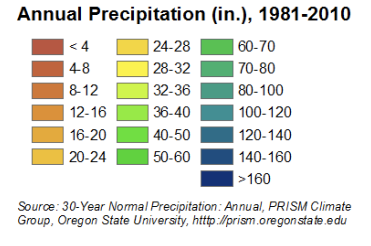
2. No single visualization can, perhaps, adequately come to terms with the unprecedented aridity of the recent years. For no visualization can fully capture the cascading and magnified effects of declining water and soil health, and their effects on ecosystems, as much as on livestock or irrigated crops: the distance from reduced irrigation and new climate specters demands an intensified map. But the terrifying nature of the intense aridity of western states in part lies in how we have seem to forgot the semi-arid nature of the region. The deeper effects of a drying out atmosphere were evident in the huge deficit in water vapor in the past decade during the “fire season” from August to September, dramatically unlike how fire fighters navigated the same terrain in previous decades, when many fire containment strategies were developed and many active firefighters had trained. The map is one that should raise immediate fears of the loss of a landscape of future irrigation, and the need for tightening agricultural belts and shifting our conceptions of food supply and water budgets–as well as the same landscape’s increased combustability and inability to manage or control by an old playbook.

Decreased Water Vapor Present in the Air in Past Decade from Two to Three Decades Previous

The previous month has brought an even more pronounced record of drought across the Upper Basin of the Colorado on which so much hydropower relies, as do other schemes of water diversion.

US Drought Monitor for Colorado River Basin, September 23 2021/Brad Rippey, USDA

The revelation of a new intensity of exceptional drought in many pockets of the Upper Basin of the Colorado River presses the bounds of how we imagine dryness, aridity, and their consequences, even as we rely on older methods of fire-fighting, and fire-prevention, and outdated models of water diversion and energy resources.

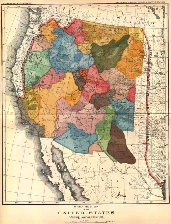
The historical denial of what John Wesley Powell had already called the “Arid Region” west of the hundredth meridian, has become a snare for ecological disaster translating into a process of the drying out of long-irrigated zones, with consequences that the nation has not been able to comprehend–and demand a New Deal of their own to replace the diversion of water and generation of energy in the Hoover Dam. Or have we forgotten the intensity of a differential of climate, soil moisture, and increased aridity that Powell long ago mapped in order to illustrate the new regime of government its unique atmospheric conditions it would require, using his uniquely designed palette to hint at the best way to organize the region of water scarcity according to the units that its drainage districts–rather than the state lines surveyed by latitude and longitude?

John Wesley Powell, “Arid Region of the United States, Showing Drainage Districts” (1890)

Powell had explored the canyons, rivers, and plains, as he addressed the Senate Select Committee on the Reclamation of Arid Lands in 1890, he crafted an eloquent seven-color map of rich earth-tones to impress readers with the sensitivity of the region’s texture and urge restraint for expanding the westward flow of homesteaders with hopes to make the desert bloom. Indeed, by circumscribing areas for which sufficient water in this “Arid Region” would be able to providently allow future settlement, Powell neatly divided areas for settlement in a region by hydrographic basins collecting sufficient rainfall for farming. Whereas rainfall maps of previous years mapped a blank spot of water scarcity, Powell hoped to direct attention by a devising a map of the region’s subdivisions that called attention to its soil quality and decreased moisture, focussing on its distinctly variegated terrain in ways foreign to Senators in Washington. Powell hoped to convince who were removed from the region to acknowledge the commanding constraints created by these drainage districts for all future agricultural development and settlement–an unpopular position that ran against the notion of allocating free land in an age of expansive homesteading. If the image of a “drainage district” was foreign to existing state lines, Powell’s image of an “arid region” long haunted the geography of the American West–and contributed in no small part to the subsequent reengineering of the waters of the Colorado River.

In light of the dramatically increased aridity now endemic to the western states, Powell’s map gains terrifying relevance as western states enter severe drought, placing the breaks on once-expanding developments across western states. Powell’s map articulated a historical vision of the limited infrastructure of water in the American west. While the technologies of irrigation that allowed such a massive project of damming and canalization only later developed, did his map inspire the need for a project of such scale as a better model of land management? The intensified aridity that afflicts the western states responds not only to low levels of rainfall. We continue to hope groundwater depletion that afflicts the lower basin won’t extend to the Upper Basin of the Colorado River that has captured water on which so many farmers rely–and thirty-five million north of the border and three million living in Mexico depend, across its Lower Basin. The escalating megadrought has created pressures across the overpopulated west that the water-sharing model Powell proposed for drainage districts cannot resolve, but the distinct forms of water management he advocated have been forgotten, as the declining water level on the Colorado River seems a time bomb as its waters have fallen so far below capacity that while the waters that drain from the Upper Colorado into Lake Mead, the largest reservoir in the western states, are only 37% full, and Lake Powell stands at 34% capacity. As less and less water enters the river system of a drying-out west, the future of the river on which so many rely for irrigation and energy is all but uncertain.

The water-level of Lake Mead, the largest reservoir in the US and a critical source of water for millions across the Southwest, has fallen 140 feet since 2000, a third of capacity.  Can we come to terms with the increased aridity across the west that the drying out of the Colorado River may bring?   The western states are haunted by the return of the "Arid Region" John Wesley Powell once mapped.
Lake Mead, May 2021

Demand for water in the upper basin and older technologies have meant far less water reaches the lower basin, but what does has been redistributed across western states–absolutely none reaches the ocean at the river’s old delta. Supplies of surface water and groundwater barely provide for the border region, as the overdraft of the basin’s aquifers have made trans-border water management a crisis often overlooked in favor of water management north of the border. As unprecedented soil aridity currently seems to run off the rails, after three summers of no rainfall have depleted soil moisture, may remind us how we have missed the lesson of Powell’s map of instilling new set attitudes toward the land, as the volume of riverflow consistently dropped as it crosses the Mexico border since the filling of the Glen Canyon Dam.

Does selective amnesia underlie how we map the drying out of the west? Most data vis of rising temperatures and low rainfall across the western states is already magnifying and escalating the effects of unprecedented heat over twenty years in a deeply melancholic vein, daunted by the scale of dryness across such an interstate expanse, and passive before an absence of atmospheric moisture that seems a modern casualty of global over-heating. If we were already “living in the future” in California’s frequent and increasingly extreme fire regimes, the multi-hued data visualizations electrify the landscape–and not with power or hydro-energy, but by the all-too familiar color ramp of the extremes of climate change we have been trying hard not to normalize. These images chart a landscape that has gotten away from us, outside seasonality changes, making the American West a cautionary case study for global climate change inspires melancholy.

The additive logic and graphic syntax of maps, long before the separate map-“layers” that accommodate information from GPS, provided a basis to define the fungibility of water and the emergence of “rights” to water across the Arid Region, enabling the idea of governing the transference of water and water “rights” across the region, that separated water from the landscape and environment. The flow of water had long been understood and reconstrued in the west by a logic of irrigation needs–and the “rights” to unpolluted water for livestock raising, pasturage, and agricultural needs of land owners–that was removed from conserving groundwater needs. The increased nature of the fungibility of water as able to be transacted across basins, state lines, and counties reflects the legal fiction of considering water as a “good” tied to the needs of property owners, that, long before global warming, had already sanctioned the removing water from the ground.

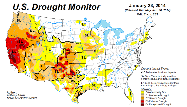
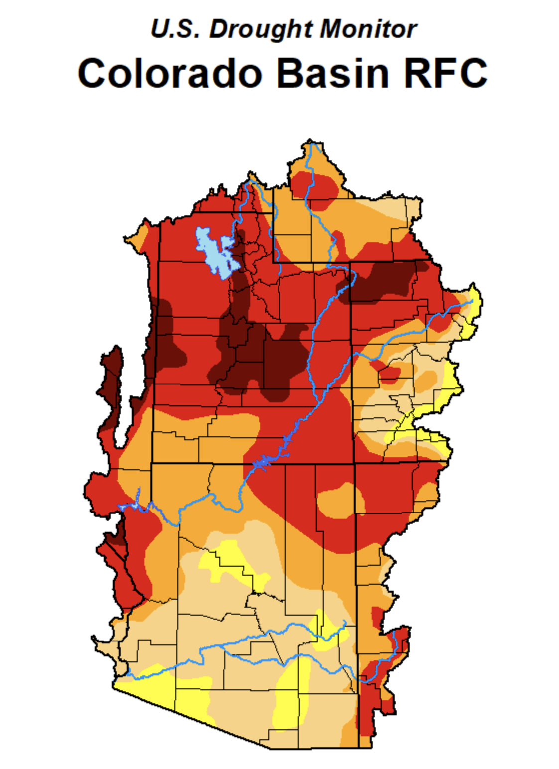
If we use metaphors rooted in temporality that try to come to scale with the new era of global warming that cut down and perhaps minimize the era of water scarcity. in which we are entering–“heat waves,” for example, that broke records in states from Washington to Idaho in June and July, breaking or matching records of hot temperatures, the levels of aridity that have allowed the ground to grow arid and degrade have not only led to a spate of western wildfires, but have changed the levels of soil moisture over the long term in ways we have difficulty to map in the scale of our weather maps, or even the maps of the U.S. Drought Monitor, as the cascading influence of such unprecedentedly dry conditions–where stresses on river water create extraction of groundwater that stresses aquifers and groundwater supplies–can be scarcely imagined, or confined to the conventions and color ramps of weather maps.

We have struggled for decades to process the cascading effects of waves of unprecedented heat that over time have produced a drying out of soil and reservoirs over the past twenty years, resulting in an expanded and far more destructive fire season and parched lands whose effects we cannot fully come to terms or comprehend, as we have not seen or experienced the extent of dryness of subsoil, soil, and low rainfall which the US Drought Monitor seems to have mapped, as drought expanded not across the entire Pacific Northwest, from Oregon to Idaho, or 86% of Idaho–by the land’s combustibility, impossible to read without premonitions of lost forests–including old growth forests–melancholic fears more than tinged by an acute sense of a lack of agency.

The sense of struggle with an absence of agency–at the same time as an almost moral urgency–reflects the difficult to process such absence of water as a landscape we have inherited from the rapidly accelerating dynamics of climate change. The history of the increased aridity is all the more poignant as a source of melancholy not only because exceptional drought was the standard before President Trump, and a national emergency before his Presidency. We have failed to register this national emergency with the same immediacy, even as the theater of the border was magnified in disproportionate ways in public discourse on migration. The sense of melancholy is compounded as the map seems haunted, if only tacitly, and perhaps without acknowledgment, by the fact that the head of the USGS in 1890 admonishingly illustrated virtually the same basins now suffering severe and moderate drought as distinguished by semi-aridity–if the current levels are nothing like those faced over a century ago, when the transition of public to private lands. We have recently mapped the substantial threat of increased aridity to the Great Plains–less than a tenth of whose croplands are irrigated–where farmers depend entirely on rainfall to grow soybeans, sunflowers, cotton, and winter wheat, the fear of greater “dry spells” as anthropogenic emissions drive decreasing rainfall and groundwater reserves–a term that tries to convince us they are not permanent–led red flags to be drawn in broad brushstrokes in those states, where extreme and exceptional ‘drought’ .

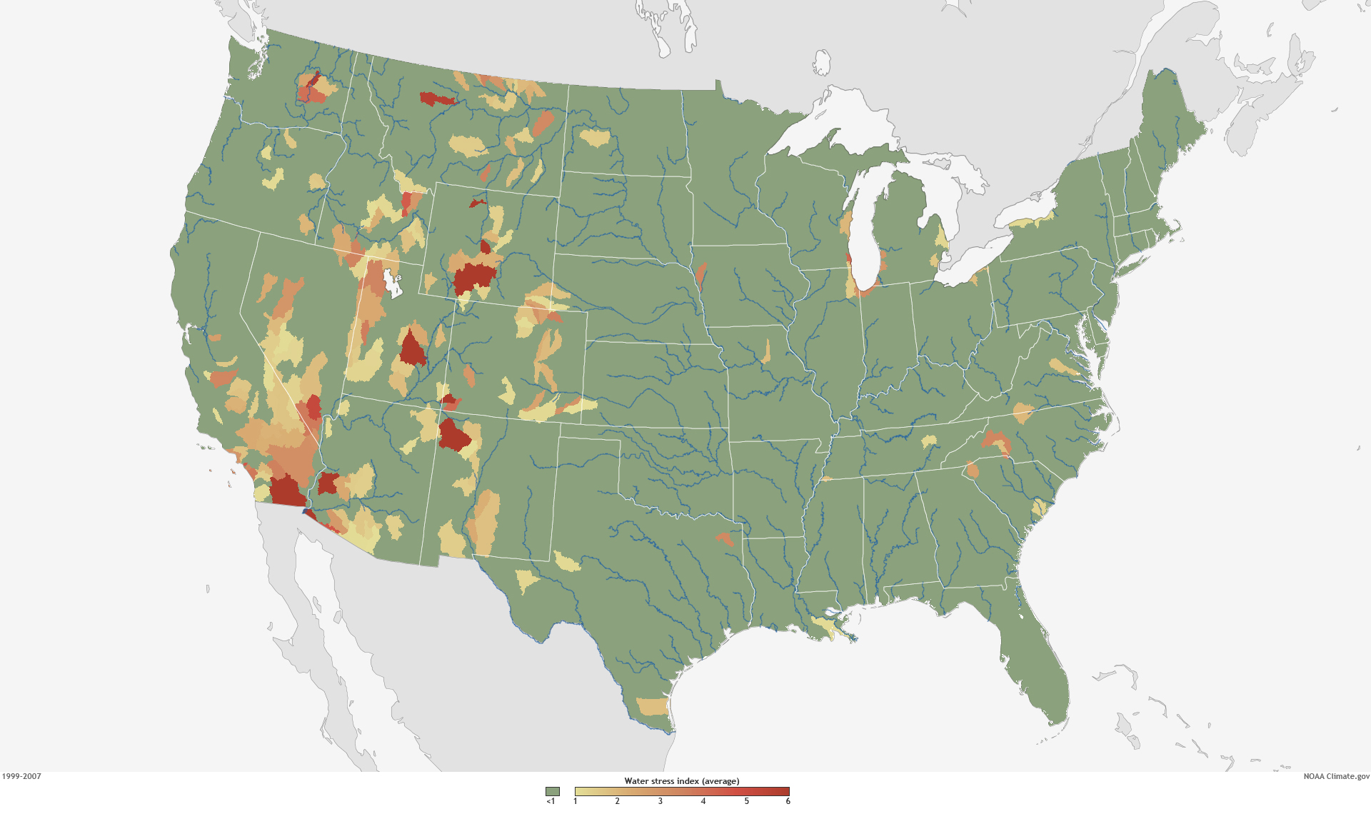
But climate change has created a new concept of “water stress”–stresses best be pictured not by the isotherms of weather maps, but the watersheds and drainage districts that were the basis of Powell’s revolutionary map, and matching the very region of the Arid Zone where the soil scientist Powell turned viewers’ attention to the crucial index of ground and soil moisture, the true determinant of the future of agrarian settlement and the future of food. The regions determined of greatest future stress were the very basins that Powell mapped, and suggest the relevance of his map, as well as his caution of the difficulties of governance in an area of severe water stress-stress being understood and indexed as a relation between supply and demand, as well as rainfall, in national watersheds.

3. The “Arid Region” of the Untied States had been austerely and admonishingly described by John Wesley Powell as a geologist to caution against the administration of its future settlement with a level of clarity that reveals his Methodist upbringing. It is hard to know how clearly we can ever parse aridity, in an age when rising temperatures have unremittingly drained soil of water. As if informed by a deep respect for the map as a clarity of record, possessing the power to reorient readers to the world by preaching a new relation to the land, Powell had placed a premium on cartographic form as a tool to re-envision local governance–and prepared his striking eight-color map of the limited rainwater that arrives west of the hundredth meridian, the eastern border of what he baptized as the Arid Region, an almost zonal construction akin to a torrid zone.

The imposing title of this reclassification of the interior of the United States revealed Powell’s own keen sense of the map as a visual record of the territory, whose transparency as a record of the quality of the land would be a basis for all discussion of settlement. Powell parlayed his own deep study of the geography of the Colorado Basin to query the value of parsing the administration of water rights by state lines in 1890, convinced of the need to oversee later apportionment outside the jurisdiction of the arbitrary boundaries of western states, but joined them to his sense of duty of preparing a legible map of striking colors to convey the constraints and difficulties for its future settlement– not only by the scarcity of the threads of rivers curled against its topography, but the few watersheds.

Powell trusted the map might mark the opening of the “Great American Desert” in order to alert the US Congress that the dry lands west of the hundredth meridian was a divide. Even if the meridian no longer marking as clear a divide of reduced rainfall, as we confront the growth with unprecedented degree of global warming of a parched west–both in terms of reduced rainfall and declining soil quality–it may serve as a model for the map we need for the future governance and administration of already contested water rights. Powell’s place in the long story of soil quality reflects how neatly the American west as a microcosm of global warming is rooted in the conversion of public lands to private ownership, into which warming has thrown such a significant wrench.

Arid Region of the United States, Showing Drainage Basins (1890)

For the Arid Region’s aridity has since been unremittingly magnified, producing a region more arid than we have ever experienced and struggle to find an adequate color ramp adequate. But we would do well to try to map the forgetfulness of that arid region, even as we confront the quandary of the stubborn continuity of sustained dryness of a megadrought enduring multiple years, compounding the aridity of the soil, and multiplying fire dangers–and the conditions of combustibility of the region–far beyond what the west has ever known or Powell imagined possible. If aridity of soils and poor land quality has spiraled out of control due to “global warming,” raising questions about the future of farms and livestock, the absence of groundwater and surface water alike, global warming demand we shift from national lenses of water shortage to beyond American territory,–but also to discuss the warping nature of national lenses on the remaking of the sediment of the west–and Colorado Basin.

The difficulties of parsing river-flow by “states” as helpful political aggregations for future settlement was rebutted by the map, which sought to direct attention to the aridity of the ground’s soils to orient its administration in a region where water was destined to remain front and center on settlers’ and residents minds for the foreseeable future. The subsequent attempt to jerry-rig the question of scarcity of water by entitlements that rely on re-apportioning unused water escaped the constraints Powell located in the basic common denominator of groundwater.

As much as the region needs to be mapped outside a national context–despite the national nature of climate tracking–the hope of revealing imbalances of the drought indeed exist across borders, and impact water-sharing agreements, much as the smoke from recent northwest fires has traveled across the Pacific northwest. National territory is as meaningless an analytic category for global warming, or water scarcity, which, this blogpost argues, exists in a global contest of migration, as the migration or transborder transit of fires’ smoke.

4. The conditions of aridity that Powell described in the Colorado Basin and its neighbors offer an oddly productive image of the dryness of the ground, in an era before irrigation, that may be useful for how we can come to terms with the fear of a suspension of irrigation across western states. But it is as if the very definition of aridity was forgotten, as infrastructures of irrigation have re-mapped the region that John Wesley Powell in 1890 mapped as an area of difficult agrarian settlement, as farmlands of agrarian fertility and wealth. Powell proposed to view the “arid region” of the United States east of the Rockies with a clarity approaching scripture in a powerful eight-color map to instructively show how limited water constrained settlement of the region after surveying the Colorado Basin.

Powell probably imagined his map in somewhat revisionary as much as rebarbative, reorienting attention to the dry nature of the soil of the semi-arid region of the Colorado Basin by parsing it in areas by which the availability of water constrainted the settlement of the “open” government lands of the west, obscuring that they were seized from indigenous, to correct the mythic geography propounded by official state-sponsored geologists. Unlike Powell, most state geologists had boosterishly endorsed a site for future pasturage, to be enriched by unknown artesian springs, and ripe for settlement by homesteaders, and Powell’s map posed a more tempered image of resettlement that would obey the laws of the availability of water in the Colorado plateaux and other regions he knew so well, cautioning against the encouragement of settlement and sale to prospective farmers in ways that have improbably made the map something of an icon of conservationist thought. Against promise of prospective bucolic lands of pasture, the dry colors chasten viewers by communicating scarcity of water of drainage basins.

The arid region that Powell correctively propounded was long inscribed in the psycho-geography of the United States to be forgotten, but the arrival of irrigation infrastructure allowing irrigation of western states continues to inform, even in our own era of global warming, the return of the boosterist sloganwhere water flows, food grows,” that is still raised in Northern California’s San Joaquin Valley, to protest “cuts to farmwater” in the recent order of an “emergency curtailment” across rivers of the Sacramento-San Joaquin Delta watershed — essentially the entire Central Valley. The recourse to an engineering “miracle” of making water flow uphill and redistributing more water from reservoirs contest calls for conservation–and only demand the further construction of dams, reservoirs, and water storage for better irrigation. The very promises that the flow of the Colorado River would irrigate lands, that made good on the promises made to homesteaders by describing the region to settlers as a New Canaan, where the growth of future streamflow and even rainfall that had never been documented, would make it suitable for the expansion of animal pasturing and farming, suggests a mythic geography of timeless bounty has replaced its actual conditions.

Friant-Kern Canal Flowing past Kern Dam/Septmeber 2020, Eric Paul Zamora, Fresno Bee

The mythic geography led to a rewriting of America’s irrigation infrastructure that in itself may be one of those pieces of infrastructure just no longer adaptable to extreme climate change. And as we face the scale of the national emergency of water shortages about to be triggered by falling reservoir levels, the crisis of using and recycling water, and the inefficiency of desalination plants of riverwater and groundwater, on which the world currently relies–and were predicted by the US Bureau of Reclamation back in 2003 to provide a “sustainable” solution to the dwindling water provided by the Colorado River, which had allowed the unexpected expansion of the settlement of western states. While desalination plants currently generate worldwide over 3.5 billion gallons daily, with 50 million gallons produced daily in Carlsbad, CA alone, desalination plants in one hundred and twenty counties, only half using sea-water, its energy expense justified as Colorado River decreased, promoted as a “sustainable and drought-proof water supply in Southern California” in an era of climate change, as if to calm our concerns at the dramatically decreased groundwater of western states.

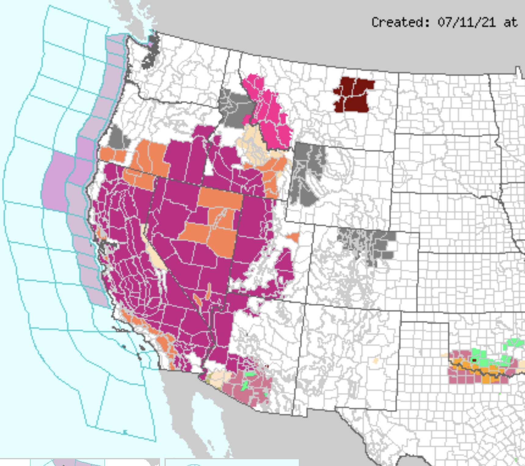
Reclamation scientists assured the nation in 2016 of future recharge in the Upper Colorado Basin would offset temperature increases in their modeling scenarios through 2099, projecting basin-wide precipitation, the fears of the persistence of a mega-drought of extreme aridity with little recharge that may last decades has left fifty-sevens million living in drought conditions across the west according to the U.S. Drought Monitor, that has brought a new era of mega-fires. The thin blue line of the Colorado River is but a crack or thread coursing through a combustible landscape in this recent map of the expansion of unprecedented extreme drought in western states from National Geographic:

For all the disturbing and disquieting elegant if terrifying spread of deep red isotherms in Riley D. Champine’s map, the consequences of such exceptionally below-average levels of precipitation and aridity are difficult to comprehend as cumulative and deep in our nation’s history, as well as the effect of man-made climate change.

The utter saturation of this data vis of growing dryness of a region where rain far below previous norms fell forces the viewer to process an undue range of measures of aridity that they must struggle to process-if the deep orange and reds approaching emergency warning to suggest that surely a climate emergency is at hand. The absence of text in the visualization invites viewers to acknowledge they stand an eery remove of familiarity with an irrevocably landscape, posing unspoken if also unanswered questions about hydrological infrastructure in the Colorado basin, and greater west, that all but erases the geopolitical formation of this landscape–interruption of a rich color ramp at the southwestern border compartmentalize the large-scale decline in precipitation apart from national categories; but the danger lies in its focus on the economically developed north, more than the global south, as if it lacked adequate resources to prudently respond to groundwater shortages, but as an emergency for the developed world.

The focus of the climate emergency is on a large scale, daunting the possibility of individual response, but focussing on prudence at a local level, even if its scale is not defined, questions whether state politics can even resolve the intensity of the dilemma of declining rainfall levels below a thirty-year norm, a deviation on so broad a scale to be impossible to process save in local terms, but that omits the way the basin has been engineered as a site where groundwater now all but fails to accumulate, increasing the basin’s deep aridity more than the color ramp reveals.

The trust that Powell placed in his maps stand in sharp contrast to the “purple” coloration of regions of extreme heat introduced across western states to suggest so many “red-flag” warnings of excessive heat. In a year already tied with 2017 for receiving “excessive heat” warnings from the National Weather Service, already in early summer at a rate that is increasingly alarming, purple designates the need for caution when leaving air-conditioned environments, and suggests the booming of electric cooling across the west: the metric of a prediction of temperatures reaching 105°F for a two-hour stretch has paralleled the debate in Washington on infrastructure spending that suggest a similar disconnect that Powell confronted when he tried to describe the need for constraints on planning settlement west of the hundredth meridian in 1890.

Four Excessive Heat Warnings issued from late May 2021 have introduced yet a new color to prominence in National Weather Service maps, the new deep purple was introduced in weather maps in 1997 as a venture of the NWS into health alerts; rarely used in other weather maps, which in recent years have shifted from urban areas to large stretches of the nation, shifting from a use of red to designate high temperatures to purple to designate risk of triple-digit temperatures, especially in man-made surfaces like asphalt (able to rise to 170°-180° Fahrenheit–territory of third-degree burns–or cars which can rise thirty degrees above air temperature.

Heat Advisories, July 11, 2021/National Weather Service

During the decade before 2003, the water-level of Lake Mead had begun to decline precipitously, inaugurating a historical decline that led it to fall to but 35% of its storage abilities. While the decline was not more precipitous than the two earlier declines in its water-levels in the reservoir from the mid-1950’s and mid-1960’s, the current decline in storage capacity of what is the largest reservoir of water in the United States has raised the unthinkable and unimaginable arrival of water cutbacks, as Arizona’s share of the Colorado River’s waters will be reduced by 7%, and Mexico–where the Colorado runs–will lose 5% of its share, in a scenario never foreseen in the dam’s history, but that reflects the increased aridity of the watershed from which the Colorado River draws. The decline to 1,075 feet in the reservoir’s depth that triggered the Tier 1 reductions in flow may only be a harbinger of the arrival of future Tier 2 reductions, should Lake Mead drop to 1,065 feet, as is expected in 2023, and raises the fear of a Tear 3 reduction, should the lake level fall below 1,025 feet, reducing the water allocated to western cities. In ways that the infrastructure of irrigating the Arid District of the United States could never have foreseen, the arrival of the driest period that the basin has ever experienced in 1200 years has brought longer periods of drier weather without rainfall that have reduced the riverwater that fills the reservoir.

The declining level of Lake Mead plunged below average lake elevation of 1173 feet, by 2003, in ways that should have sent alarms across the west, were we not consumed by a war against terror. The Bush administration’s attacks on global warming grew, questioning the science of global warming and the dangers of increasing aridity. But the disconnect between the expectation for irrigation by the farming industry and farming states was dismissed, with global warming and climate change, as temporary shifts that wouldn’t alter the landscape of irrigation or river flow.

Robert Simmon, based on data provided by the U.S. Bureau of Reclamation

Continue reading

Leave a comment

Filed under border studies, climate change, data visualization, Global Warming, mapping global warming

The Arid Region of the United States and its Afterlife: Beyond the 100th Meridian

The map may not be the territory.  But it shapes one’s relation to the territory–and to the presence of water in the land, as well as the land itself.  John Wesley Powell had a clear idea of the importance of mapping the sustainability of his audience’s relation to the new nature of the aridity of the plains states and western territories in the 1870s, when he used his deep knowledge of plants and foliage of the region that was distinguished by a deeply fragile economy of water to try to convince the U.S. Congress of re-organizing the region’s settlement, in the face of increasing hopes for its development:   by bounding the area beyond the hundredth meridian west as the “Arid Region,” as if it were a truly unknown land, not subject to the practices of surveying rectilinear boundary lines that the had extended west along the Mason-Dixon line, Powell sought to convey a better understanding of the permanence of drainage zones of the region as the best possible ways of understanding and planning its process of settlement in the way that would be most helpful to future residents, boosterism of the importance of young men going west to find futures notwithstanding.

Indeed, the mapping of how the “Arid Region” of the United States could be settled by John Wesley Powell created as the second Director of the United States Geological Survey, a post he held from 1881–1894, but which he had first expansively described in 1878.  The United States Congress followed Powell’s recommendation to consolidate the western surveys into the new U.S. Geological Survey, and he long sought to create a map capturing the fragile water ecology of the American West.  The completion of his classic report on the region first suggested a new relation to the distribution of water in the region in ways that would best serve all of its residents, and in his later map, he tried to articulate so clear a relation to the region’s future settlement.  Powell’s view on the need for systematic irrigation of the region stands in almost polemic relation to the place that the western states held in the spatial imaginary of the Homesteading Era:  indeed, his insistence that led to the charge to undertake a systematic irrigation survey of lands in the public domain of the wester United States in 1888, long a topic for which he had agitated, and his map of the region reflected a demand to integrate a topographic survey, hydrographic survey, and engineering survey of the region.  Perhaps the map offered a new sense of the territory, if “territory” includes the waterways that would be able to adequately irrigate all open lands.

Arid Region of US

For the reception of Major John Wesley Powell’s attempt to map what he called the “Arid Region of the United States” reveals both he difficulty in mapping the relation of water to the land, and the appeal that a piece of paper might gain over time.  The detailed map provided something of a ground plan and register of how the arid region might be best inhabited, and of the relation to the land and landwater of a region’s inhabitants.  And it provides an early recognition of problems of water management and distribution in the western states–captured in its naming simply as the “Arid Region” as if to set it apart from the plentiful water in other regions–that later eras began to appreciate in ways that Powell’s contemporaries were less able to see in his ambitious attempt to reorganize the management of its regions around its multiple inland watersheds that he had hoped to canalize.  For Powell’s ambitious 1890 remapping of lands west of the 100° meridian in the United States tried to encompass their unique aridity and to pose a solution for its future inhabitants with special attention to its drainage districts–as discreet riverine watersheds.

Arid Lands Reservations
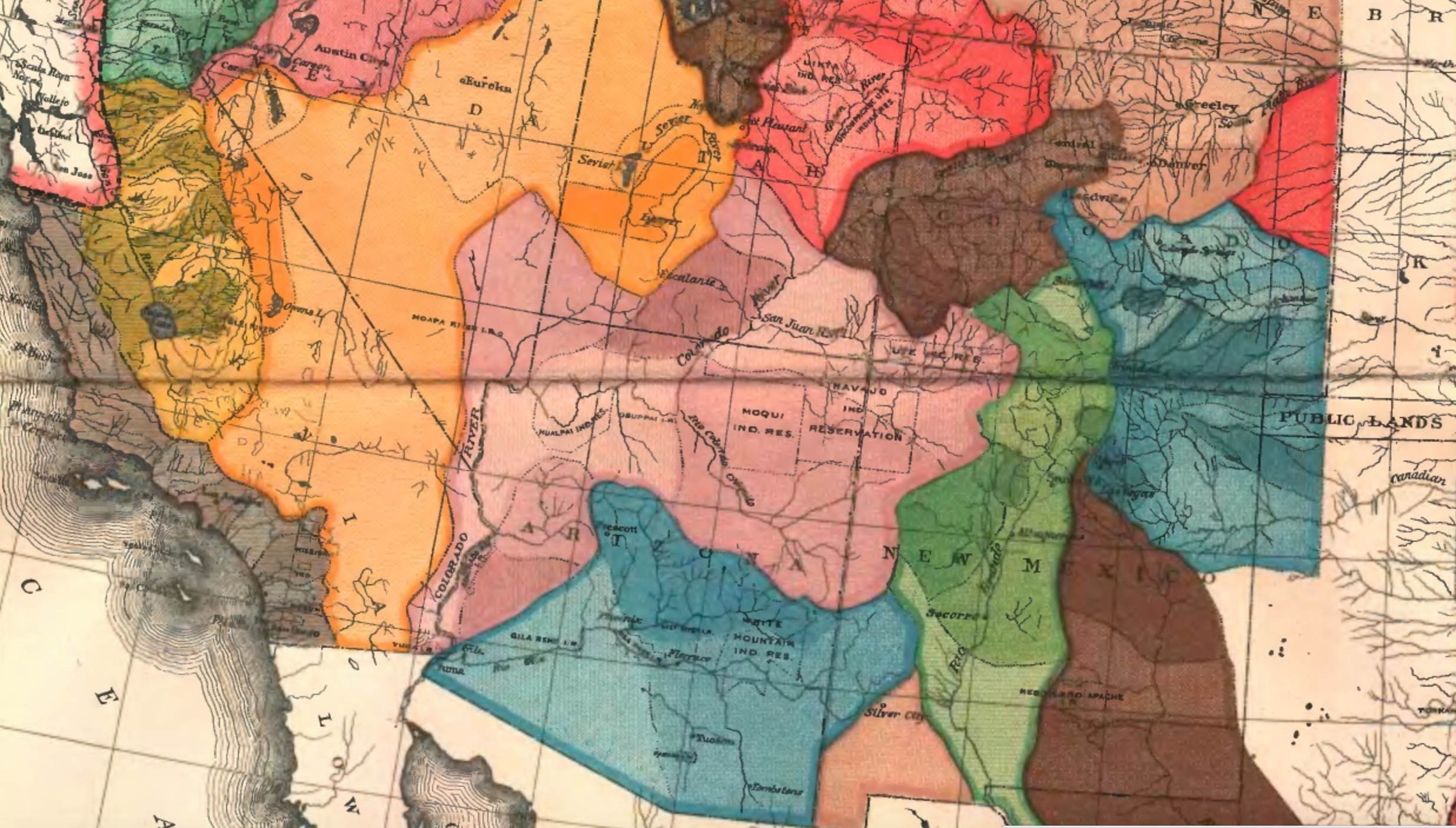
Arid Region of the United States (1890); detail

The best practices that motivated Powell’s map as a basis to orient the government to the land’s groundwater.  The distinctive scarcity of water in the western states became evident in a time of sustained drought, giving unexpected currency to how Powell’s map reoriented readers to the “Arid Region of the United States.”  The brightly colored map to which the explorer, geographer, and anthropologist not only dedicated an extreme amount of attention in his later life, and of which he became something of an evangelist, suggests a early recognition of the scarcity of water and its management, in an era when there is a specter of considerable anger around poor practices of water management in much of the western states, tempered by an expectation that groundwater would be available for farming and irrigation.

The rivers in the United States are quite widely distributed, leaving much of the western plateaux at a distance from riverine waterways–

Western Rivers.pngTim Sinott

–and the image of Virgin Land so deeply ingrained across that regions settlement that its unique character of low rainfall and widely dispersed water sources was erased in the spatial imaginary which replaced the detailed map Powell of the administration of groundwater in the western states that Powell had created with his surveying team as a guide to the region that he knew so well, and which he sought to communicate when he became second director of the United States Geographical Surveys (1881–1894).  The governmental office did not give him authority to organize , but to create a new map that might better organize the nation to the lesser rainwater in what was known as the Great American Desert.  For Powell attempted to re-orient homesteaders to the imperative of western migration through the map, by organizing water administration and the future prospect for canalization in order to grow prospects for the irrigation of the region and its future farmlands that have considerable ethical power to speak to us today.

Continue reading

1 Comment

Filed under arid region of the United States, data visualization, drought, environmental stewardship, water management

National Waters, Legal Fictions, and Rivers of Fertilizer

If drawn maps rely on distinguishing lines of property, territoriality, or even shorelines, the overlaps of more interactive web maps provide new strategies to trace the complexity of relations between land and water.  The projection of the network of rivers within the United States Jason Davies mapped above, in the header to this post, creates an entrancing web of the body of rivers less as a network, but a nourishing group of waterways.  The map’s beauty provokes us to rethink relations between land and water.  In rendering rivers, rather than territory, it suggests how a dynamic mapping of layers and overlays from directly and remotely sensed data might lead to a range of new cartographical strategies to chart the increasingly complex relationships between land and water in ways that would be less concerned to abstract the waterways or supplies of water from their surrounding environment, but to integrate water into the landscape and ecosystem which it nourishes–or the ways that the entry of pollutants into that hydrographic network might compromise local ecosystems across the country.

To be sure, the apparently pristine pathways that irrigate a disembodied nation in Davies’ map are not so static as they might seem, but his map calls attention to the need to map this body of waters as a constantly challenging collective that registers its fluidity and the changing nature of its composition:  to be sure, not only are not all waterways on the map, but despite omissions the delineation suggests a delicate ecology increasingly in need of being mapped–and increasingly challenging to be embodied.  It is no coincidence, perhaps, that even as Davies created a utopian image of an unpolluted riverine network, it is in response to the attention that the 1972 Clean Water Act gave to the “national waters” of the country that a clearer mapping of these very waters have been called to attention.  If only to stop the range of legalistic reinterpretations of “national waters,” we face increasing challenges to coherently map rivers in isolation from wide the augmentation of phosphorous and nitrogen in surrounding lands, and difficult to disentangle from numerous questions of irresponsible misuse.  No doubt Davies would admit that his data on rivers are not meant to hide the multiple sources of pollution and human diversion of the nation’s hydrography.  Even in a recent rendering of the National Hydrography Database (NHDPlus v2) by the Pacific Institute estimates the magnitude of river flows across the lower 48, show a gage-adjusted record of flow in cubic feet per second as a quite pristine blue:

Average Anual FlowMatt Heberger/Pacific Institute

But the elegance of his hydrographic map, which morphs the fragile constellation of the riverine network of national waters, challenge readers to read the magnitudes of rivers’ flow, but preserves the raster image as an elegantly designed artifact.

It almost provokes us to develop something like a truly comprehensive cartography of the “national waters” the Clean Water Act first addressed in the deep need it isolated to protect the “untrammeled” identity of national parks or woodlands.  Even as we emend the perhaps unnecessarily broad language of “national waters,” which verges on attributing a misleading uniformity to water and to only include those waters that lie on the surface of a land map–and not deep within the ground–it behooves us to work with something like a new map.  To create this map, we must exploit rich data on water diversion and water quality to create a far more dynamic set of models to register the increased impact of pollutants not only on single points of entry into above-ground water, in addition to groundwater, man-made diversion, and return water and run-off into our nation’s rivers and lakes, as we seek to develop not only a better map of water-use but of the risks of polluting significant bodies of drinking water through continued inattentive agricultural policies or policies of drilling.  The attention that a new map could compel to the fragility of the landscape, and perhaps the dynamics of water-use, is particularly relevant.

There is a deep-lying prejudice to registering only above-ground waters as part of nation’s hydrographic network, one that was perpetuated in early terrestrial cartographies, that only viewed the water from the land, and was perpetuated in the USGS surveys that focus on surface water alone.  The disembodied electric blue network in the header to this post almost recalls the fulsome praise that the French Renaissance cartographer Maurice Bouguereau dedicated in his 1594 atlas to the rivers of his native France for providing “water and ornament” to the realm and contributing to its vitality, as if to suggest the pastoral nature of his nation in neoclassical poetry.  Unlike the sinuous rivers which Bouguereau lent prominence as navigable waterways and nourishing streams by the use of his burin, both by straightening their course and increasing their prominence beyond other existing national maps, to create an atlas whose extremely detailed potomography of his whole country wen long unsurpassed, the relation between land and water that includes groundwater reserves, watersheds, and drainage must depart from seeing the hydrographic network from a landlocked point of view.

Two huge changes that have occurred in our water system since the framing of the Clean Water Act that suggest the need to reframe its coverage of national waters:  both the increasing scarcity of freshwater that is drinkable, and its decreasing amount, and the need for agrarian efficiency in diverting and recycling water, and a far more complex relation of industry to water supplies.  Whereas most stipulations of the 1972 Clean Water Act were framed from the growing danger of augmenting single-point pollution in the 1960s and 1970s, in continuing to protect the purity of our “national waters,” we are in danger of inadequately mapping rivers only as points of pollutants entry into pathways of national nourishment alone.  Whereas once industrial pollutants were discharged into water, the evolution of agribusinesses and fertilizer spreading means that we far past the era of single-point pollution of the 1970s, when threats of chemical discharge and pollutants were primarily posed by manufacturing industries.  In other words,, relying on a simple map of a system of isolated waterways as pathways open to navigation runs the risk of ignoring the greatest dangers of pollution to waters–from the levels of phosphorous in fertilizers returned to the ocean in agrarian return waters, from the entry of pollutants into diminishing groundwater reserves, or from hydraulic fracking, as well as the diffusion of pollutants into the waters from agricultural return waters.

The early modern hydrographer Bouguereau boasted he crafted an atlas to display a detailed landscape of those waters that the nourished France; we are in need of a suitably dynamic atlas which, beyond extant maps of navigable waterways, orient viewers to waters within a landscape of over-use, poor land management or drought.

French Hydrography from MB

1.  Our network of rivers is less able to be embodied than their ecological equilibria monitored for the entry of pollutants from wastewater, industry, or agricultural run-off, and as subject to diversions.  Dynamic web-based maps can orient us to the causes and effects of water scarcity rarely faced before, to allow us to chart the effects of agriculture and industry on water-use across the country, in order to document and trace the changed character of our national waters–especially in the moisture-challenged West.  We demand dynamic maps of the national waterways in our own age of water scarcity and water diversion that will try to comprehend the increasing likelihood of the absence of drinkable water in several counties of California’s Central Valley–an atlas able to map land from the point of view of its waters, and more dynamically map rivers in relation not only to landscapes but to the available data of water-use.  Indeed, the availability of such dynamic web maps provides an opportunity to synthesize a far greater range of data than Bougereau had at his disposal–he usually traced and synthesized extant maps, increasing the sinuosity or curvature of a river or stream–within a far more subtle range of map signs.

The possible atlas that we might shape of national waterways reveals a shifting relation between water and landscape, in other words, and more accurately map waters in relation to land-use.  Whereas Bouguereau sought to expand the potomography of France beyond the navigability of rivers as a hydrographic network of wealth, recognizing streams, rivers, and lakes as something akin to a national resource, the changing economy of water, a mapping that foregrounds the relative scarcity of water, the fluidity of its presence, and the instability of its purity presents more of a shifting picture of national waters no longer able to be surveyed from fixed or stable shores.  Indeed, any consideration of national waters demands not only the multiple sources of potential impurities but demands to include both the depletion of groundwater reserves as well as wetlands, and the risks of the increased diversion of waterways based on permits issued in times of far greater (relatively speaking) plenitude of water as a commodity.  Rather than focus on the plenitude and abundance of the national waters that Bouguereau took as a synecdoche for national greatness, we must encourage increasingly compelling cartographical strategies to orient the viewer to the character of the national waters in an age of their increasing absence, and meet the challenges of registering how the  diminution and pollution of waters will increase the value of those pure waters that remain.

More dynamic maps of the national waters compellingly engage debates about defining the “national waters” of the United States or that “nexus of waters”–an almost poetic circumlocution whose parsing has become both increasingly crucial and contentious in recent interpretations that revisit the 1972 Clean Water Act.  If the Act’s passage ensured the cleanliness of national waters, what constitute these waters has been increasingly questioned.  Increased parsing of the meaning and subject of “national waters”–distinct from “jurisdictional waters” of legal oversight or “territorial waters” around nations–as comprehending navigable waters and waters having a “significant nexus” to them, while compelling, provide little clear precedent.  For such waters have been left poorly clarified, overly difficult to pin down on maps, and omit groundwater as much as the impact on water-systems of granted water-rights.  Any map of waterways must, in short, recognize that the waters of any land constitute a particularly fluid subject of oversight, including data as well as maps of geographic precision to gain consensus about what the body of “national waters” constitutes.

Do “national waters” refer only to those waters that have direct entrance on navigable bodies of water, or might they indeed exclude those man-made ponds, lakes, or ditches storing agrarian waste draining to rivers, directly or indirectly, as well as the groundwater that is rarely mapped as a body of water per se, and which the CWA does not address?  While court rulings have included playa lakes, intermittent streams, prairie potholes, wetlands and watersheds, the 2006 Supreme Court ruling  Rapanos v. United States defined them as “relatively permanent, standing, or continuously flowing bodies of water ‘forming geographic features,’ that are described in ordinary parlance as ‘streams[,] . . . oceans, rivers, [and] lakes,” thereby reducing the  integrity of the nation’s waters in which the EPA must prevent point and nonpoint pollution sources, as well as providing assistance to publicly owned treatment works for the improvement of wastewater treatment.

An elegant image of our nation’s riverine paths was created by CartoDB’s senior data scientist, Andrew X. Hill, that reveals the problem and potential of maps to render the flow of water around the topographically quite variable surface of the lower forty-eight, by rendering their directionality of their flow in different shades:


rivers and directional flowAndrew X. Hill/CartoDB

The color-coding of rivers by directionality in a postGIS platform creates a tacit appreciation of the relief of the country, in ways that would make the tracking of the possible dangers of pollutants even more concrete.

1.  In a recent response to a ruling advancing a rather restrictive notion of discharges to “navigable waters” not including wetlands, the ruling limited the authority of the Army Corps of Engineers over the “national waters” by excluding waters not directly connected to navigable waters from their jurisdiction in the CWA.  Despite the appeal of the above delineated blue network of rivers as a fragile lattice of nourishment, the complexity of defining the “national waters” suggests the deep fragility of the network of waterways, flowing, standing, or somewhere in between when it is determined only by a continuous surface water connection to permanent waterbodies, so difficult is it to determine where one waterbody ends and the wetland begins.  While maps suggest one objective image of that jurisdiction–an appealing one, to judge by the image in this post’s header–the complexity of judging sources of pollution that are less likely to be less from point-source pollution to broadly dispersed pollutants in an agricultural or industrial region suggests that the entry of pollutants into a network of water is a less compelling model of regulation than when the CWA was framed.

The difficulty of managing the continued purity of the “national waters” led to a non-majority decision excluding wetlands from the “national waters” by the Supreme Court.  But the 4-4-1 decision gave ground to Justice Kennedy’s criteria of attention due to any “significant nexus” of waters that affects the physical, biological or chemical integrity of downstream navigable waters that has become something of a legal precedent.  The pragmatism of Kennedy’s elegant locution still challenges the application in maps, however, as it leaves the issue of “significance” not only open to interpretation but in need of clarification since it is difficult to consider consensus-based.  Data maps offer a basis to construe the nature of Justice Kennedy’s “significant nexus” of waters that embodies their flow.  But the challenge of focussing on a “significant nexus” as worthy of attention, as in recent years the points of entry of different sources of pollutants is often distributed widespread across a region–rather than likely to enter the waterways at one point of entrance–in ways that challenge the supervision of local pollutants.  A word map may actually provide a better form of orientation, here, than a point that posits single-point pollution, so multiple are current risks to water purity.

contamination

The locution of defining a “significant nexus” might be best understood through the potential damages that pollutants or construction might incur, in other words, rather than through the attempt to defining those geographic features that make them worthy of attention.  Unlike paper maps, or static maps, dynamic web maps can uniquely chart the fragility of the fluid nature of water-flow and water-use, expanding importantly on the “geographic features” aspect of the 2006 decision and better serve to express one’s relation to the blue expanse of water that the conventions of paper maps–which lack the signs or conventions to describe the variations and variability of water quality, pollution, or diversion and color all water a uniform light blue–may lack.  Of particular significance here is the gauging the continued permitting of point sources of pollution, parsing a “significant nexus,” and in muddying the relations of groundwater to national waterways.

More recent maps made by the USGS of watersheds that contained “impaired waters” in the United States–water bodies containing excess sediment, nitrogen, phosphorous, or pathogenic organisms–chart the extent of water-quality standards across the country.

epamap

Environmental Protection Agency (1998)

For the continued intersection of point sources with the entry of pollutants, while monitored officially by the Environmental Protection Agency (EPA) and falling in their purview, demand to be linked more clearly to the broader project of ensuring the chemical, physical, and biological integrity of the nation’s waters by preventing point and non-point pollution sources and improving wastewater treatment plants.  (Debate about the definition by which the breadth or size of streams included in the national waters suggests it is a subject of ongoing debate.)   By mapping measurements of the local contamination from industrial, agricultural, animal feedlots, and municipal governments–including the now-exempt agrarian irrigation return flows that carry fertilizer, salinity, and Nitrogen contents into waterways–web-based maps could offer, more than a static map, a necessary layer on which the new nature of the our national waters could be read in ways that might better register threats of environmental pollutants, according to the Comet Program.

Point source to non-point source pollutants


Even a static map might set a basis to imagine the data such a web map might include:


Discharged Toxins in RiversMother Jones (uncredited map)

2.  More dynamic maps might effectively both resolve questions over not only what constitute national water systems but how we might best act to protect those waters.  Such maps might help determine whether the riverine network of national waters extends to artificial ponds, lakes, or ditches that are often repositories of agrarian waste, or the relation between groundwater and the national waters–a significant question in parts of the drying-up West, where low groundwater supplies have not hampered pumping or the concession of often-wasteful water rights.  Web maps offer forms to help embody the shifting and fragmented constellation that make up our “national waters” beyond “geographic features” which are often designed to map land, rather than water–and web-based maps can chart how they have changed and will change over time.  For the need to provide a more dynamic ways to embody the “national waters”–encompassing water waste, agrarian return flows into streams and rivers, levels of pollutants, and groundwater levels–offer a sufficiently dynamic picture of an ecology of water that is in the process of change and fluid.  Although we can continue to map a disembodied riverine network, we can only embody the fluid spaces of our national waters through the continued challenges that they are poised to face, best understood as the end-product of a shifting relation to waterbodies and waterways, and not a pristine image of nourishing a Virgin Land.  The complex permits allowing water use and diversion paint a picture that is even then difficult to synthesize or comprehend.

Debates over interpreting and defining “national waters” have provoked an uncomfortable plurality of glosses not likely to be resolved in a static map.  But a web map can best orient viewers to those waters subject to government oversight, and new hydrographic maps of the United States have tried to respond to doubts raised about what exactly “national waters” include, and what sorts of waters they include.  Debate about the parameters of “national waters” is intense because it delimits what areas mandated by the 1972 Clean Water Act to be kept free of pollutants and preserved in their integrity–and to what extent the Act is an optative or enforceable model.  If the intent of the law has been interpreted as only limited to navigable bodies of water, the potential exclusion of streams, tributaries, ditches, headwaters and agrarian return flows have called into question what the body of national waters is in ways that web maps offer opportunities to measure water-use, gauge water diversion, and embody the environmental effects of water waste and of pollutants.  As much as to celebrate the aesthetic idealization of a virgin land and promise of agricultural abundance, more dynamic web maps offer something stronger than a cautionary note of how water levels and quality offer a more adequate and reliable map of how waters are adversely impacted by land use.

The evolution of mapping tools give a basis to parse whether “national waters” constitute every body of water in the country–and to distinguish what bodies of water that merit inclusion within that once self-evident but now benighted category.  The ways that maps can most dynamically render the inter-relation between water bodies to offer a more compelling picture of the effects of water management and use in an era of water’s lack?   Such a map of water management and use may most effectively and persuasively compel us to better refine how we define a legal relation to our national bodies of water:  does the below map indeed offer a comprehensive picture of the future network of our national waters?

Tile Vector map of Unfair INsularity

All of these rivers might be considered “waters,” given the deep ecologically interconnected natures of their paths; the aesthetics of the digitized projection in the header to this post, designed by Davies based on data from Michael Bostock, below, offers a landless image of a well-nourished land, irrigated by natural tributary networks discounting canals, man-made ditches, or man-altered ditches. stands as an eloquent response to the difficulty that the definition of national waters has come to face.   Debates over the real jurisdiction of these waters–and their relation to property claims or industrial use–threatens to encourage something more like despair than idealization of the celebration of riverine nourishment one feels after seeing Davies’ map of a water rich continent.  Can we better define who has rights to use their waters, or to what event they can pollute their flow, so that their tributary networks don’t exclude canals, streams, or man-made ditches?

The multiple and different claims of water-use have resulted in something of a legal quagmire of defining the “national waters” across the apparently pristine fluvial system that is embodied below:  “national waters” are more narrow than “jurisdictional waters” and clearly lie within the territorial confines of the country.  Yet the range of legally sanctioned uses of groundwater and rivers relies on claims of property ownership and industrial uses difficult to simply follow a paper map.  It is far easier to idealize the riverine network than draft maps to define “reasonable use” of groundwater or reasonable standards of cleanliness–or what makes up a rationale for the appropriation and diversion of waterways within “reasonable use.”  The pressing need to map more effectively groundwater use, overdraft, or pollutants returned to waterways is compelling, and the objective image isolating a nation that is irrigated by natural tributary networks and unmapped watersheds suggests an inadequate basis to register the complex relation of water to land pollutants and to the land, accentuated by their lack of attention to actual levels of regional groundwater reserves.

River Map of US--Bostockian, by Jason Davies

Jason Davies

The lattice-like web of bright blue riverine pathways reveals a visually compelling icon of agrarian fertility by mapping the “blue streets” that run across America.  As in any map, questions arise for cartographers of what is a river:  the Russian River is left out as a water source in California, and regional rivers in Mendocino like the Noyo or Little River seem compressed to one.  Does the map imply categories of what bodies of running water it recognizes as a river?  Such questions are of import to designing maps of national waters for the EPA, which is directly concerned with addressing the nature of the pollution of “national water” or an adjacent “nexus of waters” which the Clean Water Act has been interpreted as addressing.   The notion of an objective system of rivers seems less crucial, especially in water-challenged areas, as defining the potential entry points of pollutants or as posing the question of water bodies whose purity from pollutants demands comprehensive oversight–on account of the multiple and actually undefinable points of entrance of pollutants that such a map either glosses over or omits:  indeed, it might make more sense to spend less attention on discrete rivers than a map of the nation’s groundwater aquifers–the best template on which to judge the relative pollution of national waters and especially of drinking water, yet which the national hydrographic maps do not take into account.  Indeed, the map is only based on the best data on which it is based.  The map of riverine courses offers a form of way-finding, but not for adequate water-management.

groundwater3Mission 2012; www-atlas.usgs.gov

The issue of mapping and remapping the national waters is a major enterprise for the Environmental Protection Agency, working often in concert with the USGS.

The Environmental Protection Agency has indeed taken some heat for detailing its own maps of the waters and wetlands of each of the 50 U.S. states, defining in the last year a National Hydrographic Dataset that embraces the varied types of waters in the country, from streams and water bodies (lakes, ponds, etc.) to “adjacent waters”–in short, “the waters” of the United States themselves that the Clean Water Act’s authors concerned and addressed–in a massive act of constitutional clarification to define the limits of pollutants and maintain the integrity of the aforesaid waters in perpetuity.  Rather than only address waters that were navigable, or the question of what the traditional understanding of navigable waters is, the agency sought clarification on what such waters were outside the broader rubric of territorial seas to clarify the purview of the wages over which they have jurisdiction–and debates about whether to preserve the exempt status of waste treatment centers or converted cropland from the body of “waters of the United States.”

The resulting clarification of national hydrography traced in “Streams and Waterbodies” tried to set a standard nut was quickly feared as a posturing to seek control over private lands, but constitutes an early attempt to fashion a standard to differentiate surface water features across the United States.


Streams and Waterbodies

The remapping of these water bodies–surface water features that cast as comprehending stream water, perennial, intermittent, ephemeral, or unclassified, canals, lakes, ponds, reservoirs, playa or just “wash,” so as to comprehend them all, manmade and “natural,” within the scope of the standards for pollution that are applied to the national waters.

They range in complexity even in the Bay Area alone, viewed thanks to the considerable scale of the USGS projection, is dauntingly comprehensive, at the impressively discriminating scale of 1:63,360:


Bay Area Water Types

In a larger section of the complete map, if its shades of granularity in this intensively farmed area comprehending the Central Valley and High Sierra are less clear, the complexity of what it means to be water in the United States are tantalizingly evident.


Norhtern California

The fragility of this network of waterways has begun to be measured and mapped by public interest nonprofits whose web maps effectively distinguish the claims, ownership, or rights of water use across the country, and indeed suggest some of the standards for mapping local pollutants. Interactive web-based maps offer  interactive tools to track both rights and relation of industries to bodies of water with a level of detail never possible, directing a new level of attention and access to relations between water-use and industry by remapping the context of riverine waters in the United States to illuminate levels of chemical pollution.

The access that they offer to the landscape, and a range of stories that they both tell about it and invite viewer to zoom in to better examine at the same time as our access to a precious common need like water is increasingly challenged due to environmental change.  Maps cannot freeze or forestall changes, but offer versatile tools to track the effects that agricultural or industrial claims make upon our national waterways.   For while we are used to the legal fictions that dominate much of corporate life in contemporary America–yes, of course Amazon exists as a corporation only in Seattle, where it operates from its sole warehouse, and from which it sub-contracts to many nondescript warehouses, just as many companies base headquarters or P.O. Box offshore in the Cayman islands or elsewhere, to subvert national tax codes; Richard Branson lives on a Caribbean island Necker which he bought in 1979, purely for health reasons, we accept grudgingly, rather than to avoid paying taxes on his business empire or personal wealth of £3 billion, moving to the British Virgin Islands where tax on income is nil, even if he incorporated the British flag into his corporate logo.  He is as a result required only to pay taxes on UK income; what constitute personal earnings outside of Britain are exempt.  Similarly, the owner of airbnb himself resides at no actual address but instead regularly travels.  But one ascends new heights of legalistic terms and legal fictions to parse the undefined category of “national waters” as verbal geography in which man-made sites are absent–the prospect of such reprising is especially perilous, given that water is hardly fixed in any given location–in the manner of a town or city–and by nature circulates in space, or might reasonably be polluted at multiple points independent from its status, and such pollutants will be always carried down water.

3.  The compelling interest to discriminate varieties of water usage within a map by distinct coloration demands new inventiveness to use maps as machine to think about terrestrial and territorial space, and remap inhabited lands from the point of view of water-use.  The need for the above maps lie in creating a  precedent to track water bodies themselves not distinguished on a map–where all share the colors light blue without much variation or discrimination.  Pinning down both water usage and “water rights” on a map has been a sort of fiction which American law has long engaged, often without employing clear map signs; one result is the difficulty of using map-colors or conventions to map the effects of declines in groundwater levels or overdraft, groundwater management, squander of water, groundwater contamination, polluted agricultural return water and the effects of existing water rights on ecosystems.  Such changes in water use are especially difficult to map given its fluid nature.  But one can start to scrutinize these questions carefully through a map of granted water rights, which grant “permission to withdraw water from a river, stream, or ground water source for a ‘reasonable’ and ‘beneficial’ use” of the 250 million acre feet of water in California.

The historical concession of “water rights” within the state of California are particularly complex, tied to local agrarian industry and the water-sources and the precedent of staking claims to water rights in the Gold Rush, and rarely construed from the point of view of the best provision of future water needs.  Despite the standing rejection back in 1903 that stripped Californians of Anglo-Saxon rights of possessing waters on wells dug on lands that whose deed they own, and a consequent prohibition on unregulated pumping on any tract of land, it is striking that given the endemic scarcity of water in the state, as of now no regulations on the book prevent pumping water or diverting rivers to protect the integrity of the “national waters” from poor water-management.  The restriction on well-digging did not seem to include prevalent practices of groundwater pumping.  California has been the only state not to restrict pumping, even as the depletion of aquifers only recently compelled the state to review this all too laissez faire policy in use.

Indeed, the absolute lack of regulation on groundwater extraction that has historically encouraged California farms has created large loopholes and exceptions for the Water Resources Control Board.  The inadequate regulation of groundwater–regulations that are “sorely needed,” according to Graham Fogg a groundwater expert at UC Davis–and its waste has led directly to the eventuality of the current “chronic lowering” of aquifer levels, and created collapses of overlying lands, and increased subsidence after heavy pumping of groundwater has significantly lowered the ground level.  Even as 80% of the state lands in California has been classified as being in the highest category of drought–and reservoirs like the Almaden in San Jose virtually dry, reduced to trickles–debate on regulating water-pumping have only recently begun with the requisite seriousness.


California Reservoirs

Current legal entitlements permit diversion of water from their source allegedly to serve the public interest.  But do these entitlements constitute the best use of our national waters?  These entitlements include, unlike most of the United States, jointly by the claims of property holders for water passing their lands by riparian rights, not requiring government approval , and appropriative rights of staking claims by posting public notice, now prevalent in agricultural uses of water as well as private land ownership. The web of water use has been greatly beneficial to agriculture, but raises questions not only of the diversion of water or groundwater extraction, but of the considerable pollution agricultural return waters.  The complex web of water usage requires all uses to be “reasonable and beneficial,” but creates difficulties of affirming that a given nexus of water would fall under EPA jurisdiction, and how the multiple claims brought for the water forms a considerable challenge for the EPA to monitor effectively in ensuring their continued cleanliness or lack of significant biological or chemical pollution.  The role or status of waters that did not have a “significant nexus” to other territorial waters as lying within the “water of the United States,” and as outside the purview of the CWA.  Sanctioned access to waters as defined by existing water rights constitute something of an exception to maintaining the “chemical, physical, and biological integrity” of the “national waters of the United States,” in a patchwork of promised water rights that fragment how we understand their integrity.  Indeed, the recognition of the need to accommodate claims of owners of properties next to water while ensuring that the diversion or appropriation of water matches “reasonable and beneficial” use.

The web of different varieties of water usage in California alone is worthy of attention both because of the shortages of water that threaten the state’s economy and the variety of legal rights to water-use that the state sanctions.  Different water rights create a complex quilt of recognized access to bodies of water that suggest just how complex overseeing or managing agrarian or industrial water usage is, let alone mapping its use.  Yet increased stressors on state groundwater in California and environmental challenges to such precious resources, when combined with challenges of global warming, compel the need for increased attention to developing strategies of mapping water and water use to speak back to industry and agribusiness.  The recent revelation of permits for oil-drilling and discharge of waste into California aquifers, issued after the 1974 federal Safe Drinking Water Act set standards for clean public drinking water for all Americans, suggesting that the contamination of aquifers were at risk at some 2,553 injection wells across he state, suggests an even more troubling issue of poor and inadequate oversight within the state.  Later revelations that some 3 billion gallons of wastewater from fracking in California was illegally injected into central California drinking-water and irrigation aquifers has compelled the Environmental Protection Agency ordered a review of the waste water sites that were shut down in July 2014, when the presence of toxic fluid in the waters, including carcinogens like arsenic, thallium and nitrates, led to Health Violations to be issued by the Central Valley Regional Board.  The sustained risks that such groundwater has long faced have only come to light, it seems, in a period of risk of severe drought.

Despite recent challenges of the pollutants that enter through the exemption of waters flowing from irrigated agriculture across the state, irrigation return flows include not only selenium and sodium-rich minerals harmful to animal environments, and populations, but agricultural drainage water and return flow above and below the ground that include pollutants which can affect drinking water quality, while not constituting a discharge of “point source” pollutants that the wording of the Clean Water Act pointedly prohibits as including “any discernible, confined and discrete conveyance, including but not limited to any pipe, ditch, channel, tunnel, conduit . . .”   Notwithstanding the clear attempt at comprehensive language in CWA section 301(a), its framers did not address discharges of pollutants into wetlands or wildlife areas in return flows from agricultural irrigation–although such return flows involve pumping polluted waters in untreated irrigation return flows, often collected in culverts, channels, and ponds and then discharged.  Both salinity accumulations and nitrate contamination from fertilizer pose threats to drinking water in California in cities like Davis and Fresno, whose groundwater supplies are threatened by the presence of salts, often result of treated wastewater, and of high quantities of nitrate discharge. Such measurements provide  basis for gauging and limiting water rights, no doubt, in such moisture-challenged regions of the state.

Notwithstanding knowledge of water rights, can we start to map more responsibly the effect of agricultural return flows, both on the state’s water supplies as well as widespread stock watering (dedicating waters to livestock) across the state?  Does the stewardship of “national waters” not extend to the control over the diversion of waters for agricultural needs in much of the Sacramento and Central Valleys, and their potential effects on the land as they re-enter the water systems shown below, often increasing its salinity?


California Water Map

California Water Rights LegendCalifornia Water Atlas


The above data for the California Water Atlas, based on face amounts collected by California’s  State Water Resource Control Board together with measurements of daily stream gauge values by the United States Geographical Society, can be examined at the recent clickable webmap at California Water Rights:  the detailed synthesis provides the most comprehensive picture of water usages and availability–an especially useful map when the scarcity of water and conservation needs must be better tracked and understood.

The arrogation of claims proves even more difficult to “map” with comprehensive clarity, combining coverage by private ownership and water-use rights, difficult to join to the “waters of the United States,” given the reluctance of encompassing varied water-usages or of tracing water rights that have been granted along riverine web within a single regulatory system.  If the mapping of a distinct topography seems a gambit to “freeze” the image of national waters, at a time when increased drought challenged their availability for the future, the claims for water usage constitutes layers of different water usage that is necessary to be read with considerable care.


California Water Rights

Simulated Streams

The colorful dots gauge the wide range of reasons recognized for the diversion of water across the state, and claims for water usage along the rivers’ paths.  It’s difficult to process the plurality of rights in anything like a single comprehensive image given the range of water rights staked around the rivers running into northern California’s San Francisco Bay or from the High Sierra, or the loss of massive amounts of water diverted to irrigate the central valley; the complex mosaic of artificial canals and reservoir or diversions against the natural paths and bodies of waters suggests a wide aggregation of claims to water codified over time, whose complex map remains sadly unknown to most even in an era of state-wide drought:


W Rights in Efflux of water in Bay Area

California Water Rights LegendCalifornia Water Atlas

The veritable mosaic of distinct claims for water-rights inland of the Bay Area show a complex adjudication of water-rights around the rivers that run into the San Francisco Bay.  Their mapping maps the region’s settlement against its rivers, revealing a hidden economy of water usage that has accreted over the last century and a half, and suggesting the largest sites for the diversion of waters along a dense riverine web:

Water Use Mosaic outside East BayCalifornia Water Atlas


The crazy quilt of water-rights claimed for stock watering in the Central Valley include licensing for irrigation, fire protection, fish culture or recreational needs, as well as domestic use, begin to trace the complex variety of water use–some rights are merely “claimed” or “cancelled” no doubt made on largely local decisions, without an overall picture existing of water usage across the state–as well as several revoked water claims.  Sort of a negative map of areas of dense settlement–San Francisco is itself entirely black, since it also lacks any above ground water-source, whereas the dense outflow of water along the Central Valley and through Sonoma County meets agricultural uses.

But the agrarian regions of the state are distinguished by a broad belt of a variety of water claims.  Better monitoring of agricultural return flows in tandem  with groundwater supplies could offer the sort of necessary synthetic image of water usage that would effectively benefit the state not only as it faces an era of increasing stresses brought by drought.  Indeed, monitoring return flow from agricultural regions could direct more attention to levels of nitrate contamination from agricultural fertilizers that returns to the drinking water–which , especially as decreased steam flows have effectively decreased the amount of groundwater supplies, are increasingly salient.


Central Valley

Simulated Streams

Hydrologic Watershed


Particularly significant to this post are the multiple exemptions from the EPA’s regulation or from the regulation of the Army Corps of Engineers, the body designated with the waters’ protection by the CWA.  Indeed, they afford a somewhat terrifying loophole to original intent of the law in how we understand the need to construe their cleanliness and proscribed limits on pollutants that enter their waters.  For how can we limit the waters of farmland from the mandate to maintain the “chemical, physical, and biological integrity of the nation’s waters,” at the same time as we try to keep the riparian network clean, and recognize existing industrial uses of water as not, in fact, able to be controlled, and presuming that they do not create disturbances to that integrity that we continue to oversee?  Indeed, while groundwater use in California was approached with a misguided belief in its continued presence, while the pumping of water has drained riparian ecosystems and reduced surface supplies, agrarian discharge has effectively more highly polluted a diminishing amount of water.

All of which reminds us of the need for mapping the other side of how the irrigation of the land promised to lead to the bountiful cultivation of crops with the westward progress of Empire–and the need to develop strategies for mapping the often poorly defined presence of water in land.  We have recently learned of the increased loss of water in the state’s major reservoirs–whose startlingly low levels demand monitoring water-rights with better consideration of their impact on local groundwater levels or poorly supervised and managed usages for livestock and cropland, or municipal, domestic and industrial markets.  A map that might readily refreshed of these levels of California state reservoirs suggest the widespread depletion of reserves of waters in ways that might serve to trigger limits on groundwater use–or greater attention to limits on waters for municipal use in areas with low groundwater, low water tables, or low water in reserve.


California Reservoirs

The absence of these reserves–clearly part of our “national waters”–has been less widely remarked.  Yet even as groundwater levels have declined, the amount of available reservoir has dramatically dropped further, on would think putting more pressure to bear on water waste. But the fears of a coming mega-drought in the future of the region makes such attention to local land-use especially important–and make it incumbent to think of the need for a better road-map for the future.


_80977955_rcp8.5_soilmoisture


Needless to say, the policies of pushing water down through a system of aqueducts to nourish much of the Central Valley and Southern California demands an enormous expenditure of energy:  unlike Roman aqueducts, these are not built to flown, majestically, downhill with the sway of gravity.  So much energy is required to pump an acre-foot of water through the system of aqueducts that criss-cross the state in the State Water Project, indeed, that Heather Cooley, director of the Pacific Institute’s Water Program, notes that the energy needed to pump that acre-foot from the Delta to Southern California is itself almost equivalent and comparable to the amount of energy required to pump an acre-foot of sea water through a desalination plant–giving rise to the call to consider coastal desalination plants a useful alternative once more.  A problem seems apparent in the economic abstraction of costs of energy from the role of waters and pollutants in a broader landscape.  For those plants already springing up in the Southlands’ coastal communities to convert saltwater to drinking water would produce an dumping of brine water to the coasts that could create a destruction of a delicate offshore ecosystem from the Farallon to the Channel islands.

Such a threat to ecosystems from desalination are also present in the diversion of waters and agrarian returns, but are best exemplified in the destruction of the aquatic habitat in the Gulf waters, which the final section of this post will conclude, making due on a consideration of the mapping of the national waters of the United States.


imageCarlsbad, CA Desalination Plant


4.  As the diversion of waters has adversely affected local environments, both by agrarian return waters that bear increased traces of salinity and nitrates, the national waters of much of the Mississippi basin bear a similarly terrifying imprint of industrial farming.  Moving to the effluents deposited in rivers in the wide farmlands of middle America, one can read their prominence and density in Jeffries’ national map with new eyes.  For the annual nitrate yield from highly fertilized farmlands along the Mississippi from its start to the Gulf of Mexico in particularly striking as it heightens the pollution that enters a formerly rich agrarian land, with unclear consequences.

Recent decades have seen a startling rise in the flow of the remnants of chemical fertilizer into the Gulf.  Adding the unseen enrichment of the crop lands of the basin, active area agribusiness augmented local fertilization of lands in the decade from 1997-2006 increased the runoff of nitrogen wastes in noticeable ways, according to the non-profit Ceres, which charted the extent of nitrogen pollution across it basin, reflecting the marked increase in ethanol plants in regions of agricultural pollution that enter the broad range of interconnected waterways that contribute to the Mississippi River to which they lead.


Streamer


Their effects on the land show the increasingly compromised character of the “waters of the United States,” looking only at Nitrogen risks around the Mississippi basin and surrounding shallow groundwater.


Miss Basin average annual fertilizer

nirtogen-risk-map


We can look more closely at this striking level of shockingly widespread groundwater contamination confining ourselves to the area around ethanol plants around the Mississippi River’s basin.  In the below map, whose “red” layer registers a very high level of nitrogen pollution, plants are noted by black dots in their actual location–one can comprehensively survey in it the extend of nitrogen delivery into watersheds, in something like a secret history of local land-use suddenly made all too plain to survey:


Nitrogen Pollution of Miss WatershedsCeres

One can focus on expanse corn that surrounds and supplies these plants, here illuminated with light green bubbles, to communicate the intertwining of ethanol plants with the local agricultural economies:


Courn-sourcing Radii includedCeres


The density of sites that deliver high agricultural pollution to local waterways has created a clotting of Nitrogen pollution that stands to fundamentally alter the very notion of the national waters’ inviolability:


Watersheds of High N PollutionCERES/Google Maps


One result of such habits of land-use across such a large share of the nation is to imbue an almost radioactive glow to saturated waters that enter the Gulf of Mexico, where waste-water standard developed in the CWA in 1972 have only begun to be developed to curb the resulting “dead zone” in the oxygen-starved Gulf of Mexico, where the enforcement of the CWA obligingly turned the other cheek until quite recent years–and we still await standards for the many industrial wastewater treatment centers along the Mississippi:


stelprdb1045285

General_Collection_deadzone1

Could the dangers of the changing relations between water and landscape be more clearly mapped?  The concentration of almost half the number of fracking wells in sites where water scarcity is greatest and water stresses extreme creates a further and even more tragic wrinkle in how we view the national waters of the US as “clean.”  In such areas, 80% of allocated waters have already been allocated for existing industries, municipal, agricultural, or industrial users, leaving few real supplies available, and the risk of water contamination and pollution extremely great.  If we map a black dot for each and every site of hydraulic fracturing or fracking in the United States against a projection of variability in water stresses, the resulting graphic in almost the same area of the Mississippi basin suggest not only the availability of cheap lands ready for reconversion, but a large national landscape that stands largely depleted of water supplies across almost all of the western states, and little of an encouraging image of the dangers posed by hydraulic fracking to the ecology of the deep south.


Water Stress Dots- Shale and Hydro-FrackingCeres/Google Maps


Zooming in by enlarging the map’s scale the pronounced density of a range of hydraulically fractured oil and gas wells that are clustered around the Mississippi suggests an alternate use for water around the waters of the Mississippi, a concentration of intense water demand, rich with the potential of future pollution.  Deep concern about the future plowback of wastewater–chemically enriched waters designed to loosen up shale deposits the better to extract or free oil and gas from underwater reservoirs–into national waters.  Whether these waters enter drinking water supplies or not–their impact is not yet fully known, and under study–the apparent violation of the Clean Water Act’s provisions for the national waters has often gone unremarked.


Fracking Concentrations?


Can we ever isolate the image of a pristine web of blue waterways on a white field in the same way?


Tile Vector map of Unfair INsularityNelson’s vector tile web map of rivers across United States


These rivers do not exist, save as a selective base-map from which we must better recognize the need to watch their relation to farmlands and industry in future web maps in ways that might adequately register claims of water use, allowing continued lamination of layers onto the fluvial network that we would be wise to take as a basis to remap their relation to the surrounding lands.

3 Comments

Filed under American Rivers, clean rivers, Clean Water Act, data visualization, Fracking, megadrought, Safe Drinking Water Act, webmaps

Mapping Water’s Presence and Absence Across Land: Maps of Aridity and Drought

Maps can potentially provide quite supple tools to draw the distribution of a variations among land and water, and to reflect on the local variations of the specific landscapes they represent.  Yet the conventional of land-mapping do not clearly lend themselves to describe the presence of water in the land–and all too often presume a clear boundary between land and sea, a fiction known as the coast, one of the clearest inventions of cartographers.  We struggle to describe the relation between land and water–whether in our imagery of drought, which has become particularly popular with increasing evidence of climate change and global warming, or in describing the levels of groundwater loss across the land.  Hence, even as we confront the potential collapse of aquifers, and a rapidly shrinking supply of underground water, we don’t have a clear iconography of how to render the very dilemma–even if the problem of groundwater depletion stands to only increase.

The recent findings of such deletion of groundwater sources in much of the United States since 1900 is big news, but the means to illustrate the rates of its increasing disappearance–or indeed the potential losses that such groundwater losses imply in much of the country–pose problems of cartographical rendering, as much as environmental catastrophe:  the two seem far more closely intertwined than has been argued.  Take, for example, a recent and particularly valuable USGS study of the levels of groundwater depletion that historically increasing removal of subsurface groundwater from the lower forty-eight states, in terms of a combination of levels of subsidence, drainage, and water-flow, that mirrors the central regions of agricultural production and farming in the United States since 1900, but which primarily depends on modeling aquifers’ depletion:

Groundwater Depletion, 1900-2008

Groundwater Depletion, cubic km

USGS:  Leonard Konikow, “Groundwater Depletion in the United States (1900–2008)” 

We are similarly deeply challenged, in representing the drama of increasing drought.

The syntax of terrestrial mapping does not lend itself easily to the mapping of drought, or indeed to mapping the presence and absence of water in our worlds, or the role that water plays in the landscape.  For the very mobility and fluidity of water across environments is, as the current drought has revealed, not easily able to be naturalized into the landscape, or fixed in a map, and the interaction of water with our agrarian and rural landscapes in face difficult to map.  Cartographers all too often rely only on ruled lines to organize land maps, and the syntax that was developed to draw divisions and preserve boundary lines, and indeed bound territories and nations have the disadvantage of instantiating divisions as if they were natural, and part of the landscape that we see.

Rather than bounding the regions of land and water by sharp lines as if to differentiate them, web-based maps that sense degrees of the relative presence of water provide a new and almost dynamic format to frame questions that depend on visualizing the presence of water on which even landlocked regions depend.

The map brings into being new entities to visible form that we could not otherwise see in a material form, and allow us to better contemplate and reflect upon the different sort of water-levels on which the fertility and richness, but even the usability, of land depends.  The two-fold qualities of how the map brings things into existence and offer tools to think exist as two sides of the same sheet of paper, both present in how we inscribe space in a map as a way to  view space in the definition of their contents.  Whereas informative content lies inscribed according to indices on the map’s surface, maps also project meanings lying beneath:  on their obverse lies their take-away value, or the picture of the world that they shape in our minds. The symbolic conventions of maps are to be judged both by the accuracy of their design and their communicative value.  But while lines are useful tools to define and bound territorial space for viewers, they are far more limited as tools to describe the presence of water in the land, much as notoriously neglect or efface the areas where land and water interact, or the fluctuation of the boundaries between land and sea, and even harder to map the absence of water in the land–either in terms of its severity or the gradations that can be drawn in conditions of drought.

Despite the compelling nature of our mapping of the California drought–and the prospect of regions sensitive to increasing water stressors and drought worldwide–maps of drought raises compelling questions the conventions of its mapping and the take-away of maps of drought and aridity.  And the picture that emerges of the recent three-year California drought in one’s mind seems of utmost important to its understanding:  one can think of the hugely valuable perspective that Michael Bostock has recently compiled, using data from the National Climatic Data Center, charting regional climactic variations in drought across the United States since 1880–in addition to a more qualitatively detailed set of visualizations of the drought’s local effect on specific crops–with truly dizzying results. How to best orient readers to the shifting boundaries and relatively recent advances of drought in the American West, without falling into dangers of historical relativism?  How to both appreciate the current drought’s significance and present it to readers?

We’ve perhaps only begun to consider drought as a mapped concept, but the complex interaction between aquifers, land-water, snowfall, rainfall, and ambient temperature due to global warming–all difficult enough to visualize on their own, let alone in relation to each other–are particularly difficult to map in a cogent but dynamic form.  Does the most recent map of the Drought Monitor, authored by Richard Tinker for the USDA, disarm viewers by a heat map to show basic gradations of drought across the entire state–where black designates exceptional drought (“D4”), and red extreme drought (“D3”), mapping the reach of parched land as terrestrial expanse.  But despite its impressive impact, is this image a communicator of the scope of drought or its effects, even as it charts relative aridity across California’s counties?  This both invites reflection on the economic future of the region’s farms , but threatens to naturalize the very subject that it also maps.

January 21, 2014

Although we demand to be able to use the syntax of the line in maps to define territories, a similar syntax is less able to be borrowed to map water or map drought. Indeed, the lines that are present in the above drought map to shade regions to acknowledge drought severity are hard to reconcile with the same lines that bound the  state, or that divide its counties, since they are of course less sharply indicated by a line, or approximated by the broad classifications used in a heat-map, whose lines are more porous and approximate as much as definitive–and overly suggestive of clear boundary lines.  This is more clear in some of the interactive drought maps that ostensibly image drought conditions in and around the Central Valley, a center of produce and agriculture, here oddly superimposed on a Google Earth satellite view:

SF and Central Valley by Satellite View

Drought can be mapped, at the same website of interactive drought conditions, as distinguishing drought severity superimposed as filters on a base map of the state of Google Earth provenance, to divide red “severe drought” in the north coast and the “extreme drought” in the northeast interior basin of the state:

California Interactive Drougth Conditions

Sure, the subjects of states and drought are apples and oranges:  mapping tools don’t lend themselves easily to such a data visualization, both by drawing false equivalents and distracting from the nature of drought and the mapping of its momentous effects–if not offering an instantiation the condition of drought as if a fait accompli and natural event–rather than one that emerged because of the uniquely opportune mechanisms of water redistribution in the state that have left it so open and vulnerable to the drought’s occurrence.

If paleoclimatologists doubt that a drought of comparable severity has not only not existed in the recorded history of rainfall in California of the past one hundred and sixty-three years, but past ‘megadroughts’ from 850 to 1090 AD and from 1140 AD to 1320, and has already been drier than any time in the past 434 years, due to the perfect storm of water diversion and agricultural intensification.  And the lack of a clear map of drought leave us without any clear sense how long the drought will last, and no sense of how urban demand for–and ability to pay for–water will be resolved with a limited supply.

We’re not used to or well-equipped mapping oceans or bodies of water that overlap with lands.  Even when we include oceans in land maps to define their edges or describe their coasts, the syntax of much mapping of territories ends at the water’s front.  And much as we need new modes to map the interface and exchange of habitats on estuaries or shores, the mapping gradations of moisture or aridity are difficult to inscribe in the surface of the map–even as we demand to map the limits of groundwater and the prospect of draught.  The exclusion of water from most land maps reflects our limited abilities to map and the limitations of liabilities are increasingly evident.

The two spheres needed to be mapped–under and above water–are seen as incommensurate with each other and we map them by lines in different and distinct ways:   we map limits and frontiers by rings or lines, or note fixed routes of travel or topographic elevations by fixed lines, the conventions of the line seems less suited to the blurring of gradations in groundwater, levels of drought, and the levels of water lying in the land–or of the diminution of both rivers and aquifers. And the presence of water in a region, or in the levels of soil and subsoil–and aquifers–that lie beneath the land’s surface, is particularly difficult to map by the syntax of a land map, because its conditions are multiple.

The syntax of the heat map may seem appropriate in its cognitive associations, but is far less supple or sensitive as a map of environmental impact, let alone as a tool to conceive of drought.  Indeed, any “ecotones“–a word coined to direct attention to those regions where bordering ecosystems meet and intersect–are  difficult to map both because they are so difficult to demarcate and because it is difficult to establish a single perspective on the intersection of worlds often assessed by different criteria.  The shoreline, such as, as the meeting place between land and sea, has long been notoriously difficult to map, and not only because of its fluidity.  We map a stable topography, mountains, rivers, and lakes, where the quotient between land and sea is fixed:  and mapping rarely extends out to the surrounding waters, or boundaries of blurred, shifting, or overlapping lines:  a problem of increasing notice in those endangered areas where habitats of land and water overlap and intersect, making clear boundaries less able to be defined.  This is especially true in drought, where we must consider relations between groundwater storage, aquifers, and surface water, and the different sources and flow of water through agrarian and to urban landscapes. This problem of cartographical representation is as pronounced in the mapping of drought.  The  mapping of the absence of water is indeed a particularly apt problem for cartographical design in a heating-up world, as revealed in the maps we use to track, analyze, and understand drought. Bay Area to Modesto and Monterrey Mapping the shifting dryness of the land–and the drying up of resources–presses the conventions of cartographical inscription.  And all too often, we have only mapped land–not water, or even dryness–save in the limits of the desert lands.  And the two sides of mapping the presence or absence of water offer complementary images, in ways that might often make it difficult to assess or chart the meanings and impact that the drying out of regions and habitats might have–or, indeed, to “embody” the meaning of or spread of drought and dryness in a legible manner.  What would it mean to make drought a part of mapping that would be readable?  How, in other words, to give legibility to what it means to subtract water from the environment? Indeed, we demand a dynamic form of mapping over time that charts the qualitative shifts in their presence in the land.

Whereas resources like water have been long assumed to be abundant and not in need of mapping in space, as they were taken to be part of the land, the increasing disappearance of water from regions like much of California–the first subject of this post–raise challenges both of conceiving drought as a condition by embodying the phenomenon, and by using graphic conventions to trace levels of water in the ground.  In the case of the recent California drought, the compounded effects of an absence of winter rains, which would normally provide the groundwater for many plants throughout the year, feeding rivers and more importantly serving to replenish  groundwater basins, but has decreased for the past three years at the same time that the snowfalls over the Sierra Nevada, whose melting provides much of the state with running water–and on which the Owens Valley and Southern California depend–have also dried up, leading to a decrease in the snowpack of a shockingly huge 80%.  At the same time as both these sources of water have declined, the drying up of the Colorado River, on whose water much of the western US depend, have curtailed the availability of another source of water on which it has long depended.   How to map the effects and ramifications of historical drought levels or impending dryness over time that synthesize data in the most meaningful ways?

These are questions both of cartographical design, and of transferring data about the relative presence of water in the land to a dynamically legible form, at the same time as retaining its shock content.  The pressing need to map the current and impending lack of water in the world raise these questions about how to map the growing threat of an expanding drought and the implications that drought has on our land-use.  The question with deep ramifications about its inhabitation and inhabitability, but not a question whose multiple variables lead themselves to be easily mapped in a static graphic form.  And yet, the impact of drought on a region–as Thomas Friedman has got around to observing in the case of Syria, both in regard to the failure of the government to respond to drought that devastated the agricultural sector and that swelled cities in a veritable ecological disaster zone–offers a subject that threatens to shake the local economy.   And what will animals–both grazing animals and local wildlife alike, including salmon–make of the lack of river water, much coming from the Sierra Nevada, or the residents of the multiple regional delta across the state? Friedman’s analysis may seek to translate the political divisions in Syria into the scissors of the Annales school–he advocates the importance that dedicating funds to disaster relief have already been proven to be central in foreign relations as well as in a region’s political instability, as if to table the question of the content of a political struggle.  But the impact of rising aridity on agricultural societies is perhaps not so much lesser than its impact on agricultural industry.

Rather than offer metrics to indicate social unrest–although political consequences will surely ensue–the rise of water maps show shifting patterns that will probably be reflected most in a tremendous growth of legal questions about the nature of “water-use rights,” however, and the possible restriction or curtailing of a commodity often viewed as ever-plentiful and entirely available for personal use, as well as a potential shift in food prices, eating habits, and a dramatic decrease–at least potentially–in access to freshly grown food across much of the United States, if not the sort of massive out-migration from rural areas that occurred in Syria. Michael Bostock’s current mapping of drought’s local effect on specific crops provides a compelling record of the complex questions that mapping the data about the presence of water in the land might be able to resolve.  For the main source of much produce in the US, with the California drought, seem drying up, if we consider dry America’s considerable heavily subsidized acreage of agricultural production.

CaliforniaCommodity Agriculture urban design lab

But we are in the very early stages of making clear the legibility of a map of dryness and draught, or of doing so to communicate the consequences of its effects. The interest in mapping our planet’s dryness is a compelling problem of environmental policy, but of cartographical practice.  Maps of drought and dryness are often econometric projections, related as they are to interlaced systems of agricultural production, resources, and prices of food costs, and based on estimates or climactic measures. But they are powerful tools to bring dryness into our consciousness in new ways–ways that have not often been mapped–or integrated within maps of drought’s local effect on specific national crops.  Perhaps the familiarity with understanding our climate through weather maps has created or diffused a new understanding of climactic changes, forming, as they do, visual surrogates by which to understand complex and potentially irresolvable topics into inevitable complex public debates, and indeed understand our shifting place in the world’s changing environment.

The recent severity of the current California drought–the greatest in measured history, and actually extending far into much of the West– and the parallel drought in the central United States creates a unique mapping of drought severity across a broad swathe of the country that raises problems not only in our agricultural prices, but in much of the almonds, lettuce, and strawberries that derive from California.  The drought is not limited to the confines of the state, although the intense reliance of California farmers on irrigation–some 65% of state crop lands are irrigated, mostly in the Central Valley, where they depend on the viaducts to carry water from the Sierra’s snowfall to farmlands–makes it stand out in a map of the drought’s severity.  (One might return here to Bostock’s powerful visualization of drought’s local effect on specific crops.)

The map of the absence of water in these regions is, however, difficult to get one’s mind around as if it were a property or an accurate map of a territory:  the measurement of its severity is indeed difficult to understand only as a status quo of current meteorological events, for it poses the potential triggers for never before seen changes in agricultural markets and lifestyle.  How can one map the effects of what seems to be the driest in perhaps 434 years, as UC Berkeley paleoclimatologist Lynn Ingram has argued? Both raise the specter of global warming more concretely than we have seen, but are oddly difficult to place into public discussion outside the purely local terms in which they are long conceived:  the drought is not only the problem of Governor Jerry Brown, perhaps personally haunted by the drought of 1977, but the news stories on the issue–as one from which this map was reproduced used in the New York Times to illustrate the drought’s scope, and to hint at the severity of its consequences as much as the expanse of the drought itself, that combines all three aforementioned sites of drought–the Sierra Nevada snowfall; winter rains; Colorado river–in one powerful graphic that reveals the effects of drought on the entire western United States, as if it was a fixed or invading miasma, the vectors of whose spread are less known: ‘ Drought Severity--California

Max Whittaker’s quite eery photograph captures the resurfacing of an abandoned ghost town in Folsom Lake, now suddenly able to be seen with declining water levels of a marina now at a mere 17% capacity, is a striking image of water’s absence in one specific region of the state:

DROUGHT-master675Max Whittaker/NY Times

Other lakes on which much of the southern half of the state depends, like Owens Lake, have shrunk to a visible extent:

la-ol-nudity-and-other-watersaving-tips-in-an--001

How can we adequately map this shift in liquid resources?  To make the graphic palpable, an animated stop-action map of dryness–both historical and projected–could express a useful and compelling record of the mechanics of draught and global drying out might illuminate a perspective on the shifting relation to water we are condemned to live with.

The global shifts in water, from regional water-tables to rainfall to ocean levels, and the mixtures of saline and freshwater they will create, suggests a broader calculus of hydrographic mapping and potable water, the likes of which were never conceived just forty years ago–or, perhaps, just twenty years past.  As a start, such a map might begin from the shifts in a resource like snow, whose absence has caused not only many Californians to cancel trips to Tahoe or to ruin their skis on the slopes, but to face an economic crisis in water’s availability, evident by a comparison of aerial photographs showing the ecosystems of levels snowfall in the Sierra on successive January 13’s just one year apart which reveal dramatically different appearances of identical terrain:

January 13, a year apart

Far more shocking than a map, in many ways, the two images effectively register and embody a shift in how the landscape exists, even if it only implicitly suggests the ecological impact that the absence of that huge snowfall has on its nearby regions:  the absence of green in the adjoining basin, now a dust bowl, suggests a radical transformation in landscape and ecosystem. How can one show the shifting water-table, rainfall level, against the rivers that provide water to the land and its several delta?

A ‘better’ map would help get one’s mind around the dramatically different notion of the usage and circulation of water in and across space–as much as the regions of dryness or low water-levels in the state.  Both NOAA and NASA determined that last year was tied for the fourth place as the warmest year globally since record-keeping began in 1880 with the year 2003:  probably due to increased use of coal, raising the temperature 1.78 degrees Farenheit above the average for the twentieth century, but also creating specific problems in the form of an off-coast high-pressure ridge that has created a barrier that has blocked winter storms, perhaps due to the increased cold in Antarctica on top of the decline in water that descends, melted, from the Sierra’s icepack–leading to an increased reliance on groundwater that will continue for the foreseeable future. The current USGS map of the drought today–January 21, 2014–notes severe conditions of drought in dark brown, and moderate drought conditions in orange, placed above a base-map of dryness across a visible network of riverine paths each and every day: Today's Drougth

Yet the variations of coloration can’t fully communicate the consequences desiccation of the land.  The “moderate” drought in the central valley–surrounded by conditions of severe drought–reflects the limited amount of water brought by aqueducts to the region, rather than a reprieve from national conditions, and roughly correspond to the paths of the California Aqueduct and San Joaquin river:

CALAQU

Perhaps a better model for mapping drought exists, but questions of how best to unify empirical measurements with the availability of water–and the consequences of its absence–are questions for data visualization that have not been fully met.  The ways that USGS maps real-time stream flow in comparison to historical conditions for that day provides a pointillist snapshot of dryness–but using the red to suggest “low” and crimson “much below normal,” as measured in percentile–and yellow “below normal”–the scientificity of the map gives it limited rhetorical power, and limited conceptual power as a basis to assess the expansive effects of drought or extrapolate the critical readings of water across that network in ways easy to visualize.

Streamflow Conditions in CA--Jan 21

The USGS Waterwatch offers an even better metric–if with minimal visual shock–in mapping the areas of severe hydrologic drought in crimson and a new low of drought levels in bright red, in its map of stream flows over a 7-day period, which suggests the range of lows throughout the region’s hydrographic water-stations and across the clear majority of its extensive riverine web, and indeed the relative parching of the land in sensitive regions as the northern coast, Sierra, and parts of the central valley, as well as the rivers around San Francisco and Los Angeles:

New Lows in Riverine Flow

These maps seem to omit or elide human agency on the rapidly changing landscape.  Despite the frequent vaunting of the purity of the water carried from the snows of the Sierra, deep problems with the California water supply–problems caused by its inhabitation and industrial agriculture– become more apparent when one considers the impurity of the groundwater table.  This map, based on domestic wells of water withdrawal, offers a sobering image of what sort of water remains;  although the most southern sector of the state is clearly most dependent on groundwater withdrawals of some 30-80 millions of gallons/day, significant sites of the withdrawn groundwater from within the Central Valley Aquifer, extending just inland from and south of San Francisco, and at select sites on the coast, contain surprisingly high nitrate contamination due to fertilizer runoff or septic tanks–measured against a threshold for having a negative effect on individuals’ health.

Groundwater in State

The closer one looks at the maps of how the state has begun to dry up over time, the further peculiarities seem to emerge of California’s geography and its relation to water–and indeed the sort of water-exchanges of three-card monte that seem to characterize the state–that are to an extend compacted by the dependence of much of coastal California on the extended winter rains that provide enough water for most plants to store.  (The absence of water in much of Northern and Central California now means that the leaves of maples and many other trees are turning bright red, due to their dryness and the bright winter sun, in ways rarely seen.) We might do well to compare some of the other means of tracking drought.  The US Drought Monitor suggests that conditions in current California dry spell differ dramatically from just two years ago–at a time, just two year ago, when Texas seemed a far more likely candidate for ongoing drought.

hnsvxl

While the image is not able to be easily accessed in animated form, a contrast to a recent reading of drought from this year reveals the striking expanse of extreme and exceptional drought in California’s Central Valley and much of the entire state, to compare the above to two more recent drought maps:

US Drought Monitor Jan 21

Drought Monitor Jan 28 2014

Yet the concentration on broad scale changes in the regions that it maps offers somewhat limited sensitivity to the variations of water-depth.  The map moreover suggests a somewhat superficial appreciation of the drought’s expanse and the nature of its boundaries.  But the greater sensitivity of satellite readings offers a more multi-leveled–and indeed both a thicker and a deeper reading of underlying factors of the local or regional drought in the American West.  The upgrading of drought–or the degradation of local conditions–in only one week is striking, and effects precisely those regions most sensitive to river irrigation that were effected by the failure of arrival of a melted snowpack, the effects of which seem destined to intensify.

One Week Shift

The twin satellites that measure the distribution of groundwater offer an other point of view of the local variations of drought.  The record of hydrological health, known as the  Gravity Recovery and Climate Experiment, whose paired satellites use two sensors spaced some 220 km apart as a means to detect a shift in the ongoing redistribution of water on the earth’s surface, offering a comprehensive indexing of their remotely-sensed measurements by longitude and latitude.

Satellite NASA

The extracted data is combined with an existing meteorological dataset, in order to create a record sensitive to variations of but one-centimeter in groundwater level.  Although not registering the depletion of aquifers, and primarily climactic in nature, the portrait that emerges from specific shifts in gravity suggested by water’s lower mass effectively track water’s presence with considerable precision on exact coordinates, creating a composite image of national drought that suggest the different variations in the presence of groundwater, by integrating groundwater and soil moisture from surface moisture of their remotely sensed data with actual meteorological changes observed from land and space to create a comprehensive picture of water storage at different levels in the earth.

GRACE mechanics

GRACE has aimed to map the shifts in groundwater levels over time:  the result suggests in surprising ways some relative stability between 1948 and 2009, to generate “a continuous record of soil moisture and groundwater that stretches back to as a way of indexing moisture levels in the soil at different strata.  The striking change in such levels in relation to data of 1948 is an especially striking record of the contrast between just 2012 and 2014.  By creating a map based on the composition of underground water storage as remotely sensed via two satellites orbiting earth, the measurement of ground water retained in the land is a crucially informative record of gradations of aridity, and levels of drought, allowing us to discriminate between ground water and soil moisture–and indeed to understand their relationships in an easily viewable manner, translating satellite measurements into a format easy to compare as a mosaic of local levels of aridity and regional differences that demand to be cross-referenced with agricultural production and across time.

Groundwater Storage 19489-2014

The map of ground-water storage suggests strong contrasts of the relative surplus of waters within the irrigated Central Valley and the relative aridity or dryness of land in much of the Lost Coast in California and deep south.  The “change in perspective” resulting in two years shifts attention to shifts in the amount of groundwater measured, processing data of water stored in the earth that has the potential to analyze the relative irrigation of expanse in easily viewed fashion.

Within just two years, or course, this picture of ground water storage had dramatically and radically changed whose impact we are only beginning to assess, and done so in ways that show no signs of ending.

Ground-Water Storage 1948-20089

To be sure, the wetness percentile of areas near the land of lakes and central United States seems a striking contrast in this image of ground water storage, in this image deriving from the University of Nebraska, which reveals itself to be a particularly rich area of soil storage of groundwater, in, significantly, an area without much surface soil moisture based on Soil Moisture Study.  But the deep pockets of wetness decline by far–both in storage and in soil moisture, based on the draining of aquifers and increased aridity or desertification–present a bleak picture in some strong crop-producing regions of the south and southwest, as much as California–and an even more terrifying story when the moisture of its soil suffer dryness–the excessive aridity specific to California relative to the nation is far more starkly revealed.

Soil Moisture on Surface

The registration of surface soil moisture and groundwater suggests a dynamic tiling of national space that we can use to map wetness over time, and extrapolate the effects of increased aridity on farm-lands and regions that will no doubt shift the prices of water, as well as the costs of agricultural production and livestock.  The mapping of specific water available for root systems across the nation, based on satellite data coded to specific longitudes and latitudes, provides a third level of analysis based on the levels of water available to root systems across the nation–and reveals the even more concentrated effects of drought within the region that depend on water from the California Sierra that will no longer arrive in the Central Valley this year:  more concentrated than the earlier image of ground water storage, that reveals the amount of water available to the root systems presents a picture even more closely related to agricultural constraints created by three years of drought.

Root Zone Moisture

The remote sensing of such levels of moisture and groundwater affords a model of mapping that can be keyed directly to the questions of specific crops in ways that can be eventually used to make prognostics of the impact of drought on the local economy.  If California’s conditions seem to be due to meteorological particularities of low snowfall and few winter rains, held off the shore due to a high pressure ridge of air related to dramatic cooling in Antarctica, the problems that underpin the mapping of the local of integrating layers of data from different sources are repeated.  They reveal magnified risks in ways comparable to the more speculative tools of forecasting used to  assess the multiple water stresses that shape the environmental pressures on population in different areas of the world.

The following sequence of global projections of aridity are often rooted in the possibility–or near-eventuality–of rising temperature worldwide, and the pressures that these stand to place on water usage. The projection of what these water stressors will be seem to synthesize the data of rainwater levels, water tables, and ocean levels to depict the collective constraints facing agricultural communities across the world–and raising questions of what effect they might have–that will no doubt endanger rising political instability and economic hardships world-wide, in ways difficult to conceive.  The problems that underpin the mapping of the local are repeated, if with magnified risks, when trying to synthesize the data of rainwater levels, water tables, and ocean levels as a collective set of water stresses that are facing agricultural communities across the world. If California’s conditions seem due to low snowfall and few winter rains, held off the shore due to a high pressure ridge of air that seem related to the dramatic cooling of Antarctica, projections of aridity are often rooted in the possibility–or near-eventuality–of rising temperature worldwide.

The remarkably and relatively suddenly increased stresses on water-supplies world-wide are now better mapped as futures–which they indeed offer, by the World Resources Institute, a sort of barometer on the shifting dynamics of water availability in the world.  In the below charging of water stressors prospectively through 2025, based on the prospect of a world warmer by three degrees centigrade, we are pointed to the particular hot-spots in the globe.  These include the central US, which extend in arcs of desiccation poses particularly pernicious threats through much of Anatolia, Central (equatorial) Africa, and South Asia.  Specific water stressors that are projected in the map are due to the combined pressures of growing use of a limited supply of waters that higher temperatures will bring; the global map of the impact of rising temperatures poses particular problems for populations in India and China, two centers of pronounced population growth where markets where food distribution will clearly feel stresses in increasingly pronounced ways.

Crop Yield with Climate Change World Map

The pronounced pressures on fertility rates are expected to stay strong in Asia, as well as the United States, according to the below bar graph, developed by the World Resources Institute.

Fertility Rates Mapped

The areas in which the World Resources Institute predicts the most negative effects on crop production reflects the relative impact of water stresses due to projected climate change alone–revealing a far more broad impact throughout South America, northern Africa, Arabia, and Pakistan, as well as much of Australia.  (Similarly, a certain pronounced growth occurs across much of Canada–aside from Ontario–Scandinavia, and Russia, and parts of Asia, but one hardly considers these as large producers in a world that has warmed by some three degrees centigrade.)  But the highly inefficient nature of water-use–both in response to population growth and to a lack of re-use or recycling of water as a commodity and in agriculture–creates a unique heat-map, for the World Resource Institute, that will be bound to increase water stressors where much of the most highly populated and driest areas intersect.

 Water Stress Map

The rise of the temperatures is prospective, but also difficult to map in its full consequences for how it threatens the experience of the lived–or inhabited–world to the degree that it surely does.  (Indeed, how the habitable world–the ancient notion of a habitable “ecumene,” to rehabilitate the classical concept of the inhabited world and its climactic bounds by torrid zones–would change seems a scenario more clearly imagined by screenwriters of the Twilight Zone or of science fiction novels than cartographers or data visualizations.)  If we focus on the band of the hardest-hit regions alone, one can start to appreciate the magnitude of the change of restricted access to water and its restricted availability in centers of population:  the map suggests not only a decline by half of crop yields around equatorial regions, but stressors on local economies and rural areas. It staggers the mind to imagine the resulting limitations on world agriculture in this prospective map, which offers something of an admonitory function for future food and agricultural policy, and indeed international relations:

Band of hardest Hit

The shifting pressures on resources that we have too long taken for granted is sharply starting to grow.  The stressors on water will direct attention to the importance of new patterns and habits of land use, and of the potential usability or reconversion of dry lands, to compensate for these declines.  Indeed, the mapping of available water provides a crucial constraint on understanding of the inhabited–and inhabitable–world, or how we might be able to understand its habitability, bringing the resources that we have for visualizing data in ways that we might bring to bear on the world in which we want to live, or how we can best describe and envision the effects of drought as an actor in the world. Such huge qualitative shifts are difficult to capture when reduced to variations that are charted in a simple heat-map.

In a way, the constraint of water was more clearly and palpably envisioned within the earliest maps of California from the middle of seventeenth century than it is in our vision of a land that is always green, and nourished by mountain waters all along its Pacific rim.  Indeed, this image of an imagined green island of California, surrounded by waters and beside a green mainland nourished by rivers and lakes, seems extremely powerful as a mental image of the region that is increasingly remote as the water resources of the region begin to evaporate.

California Island

4 Comments

Filed under agriculture in america, aquifers, Climate Change, drought, mapping climate change