Maps can potentially provide quite supple tools to draw the distribution of a variations among land and water, and to reflect on the local variations of the specific landscapes they represent. Yet the conventional of land-mapping do not clearly lend themselves to describe the presence of water in the land–and all too often presume a clear boundary between land and sea, a fiction known as the coast, one of the clearest inventions of cartographers. We struggle to describe the relation between land and water–whether in our imagery of drought, which has become particularly popular with increasing evidence of climate change and global warming, or in describing the levels of groundwater loss across the land. Hence, even as we confront the potential collapse of aquifers, and a rapidly shrinking supply of underground water, we don’t have a clear iconography of how to render the very dilemma–even if the problem of groundwater depletion stands to only increase.
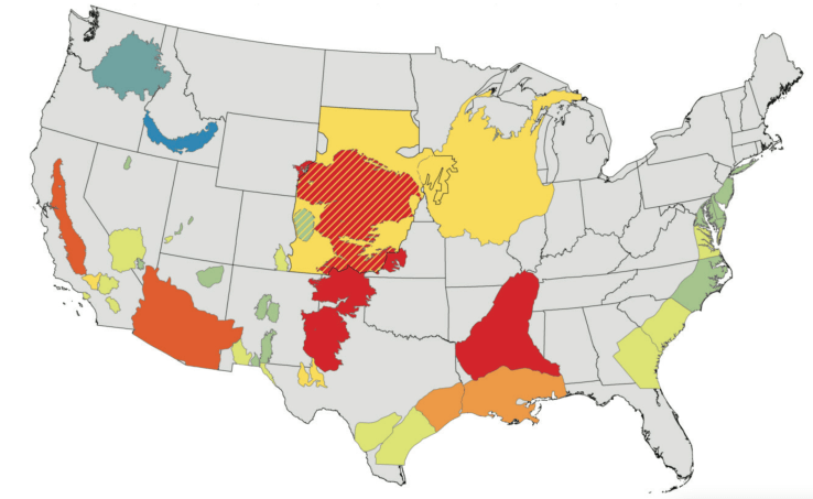
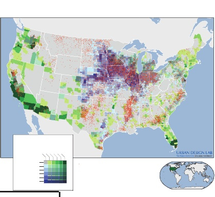
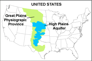
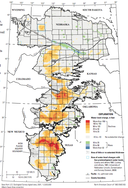
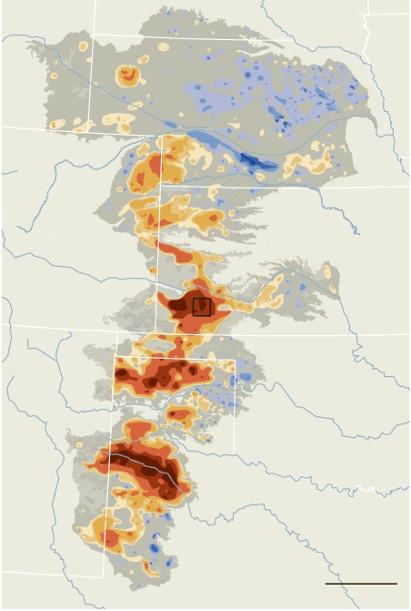
The recent findings of such deletion of groundwater sources in much of the United States since 1900 is big news, but the means to illustrate the rates of its increasing disappearance–or indeed the potential losses that such groundwater losses imply in much of the country–pose problems of cartographical rendering, as much as environmental catastrophe: the two seem far more closely intertwined than has been argued. Take, for example, a recent and particularly valuable USGS study of the levels of groundwater depletion that historically increasing removal of subsurface groundwater from the lower forty-eight states, in terms of a combination of levels of subsidence, drainage, and water-flow, that mirrors the central regions of agricultural production and farming in the United States since 1900, but which primarily depends on modeling aquifers’ depletion:


USGS: Leonard Konikow, “Groundwater Depletion in the United States (1900–2008)”
We are similarly deeply challenged, in representing the drama of increasing drought.
The syntax of terrestrial mapping does not lend itself easily to the mapping of drought, or indeed to mapping the presence and absence of water in our worlds, or the role that water plays in the landscape. For the very mobility and fluidity of water across environments is, as the current drought has revealed, not easily able to be naturalized into the landscape, or fixed in a map, and the interaction of water with our agrarian and rural landscapes in face difficult to map. Cartographers all too often rely only on ruled lines to organize land maps, and the syntax that was developed to draw divisions and preserve boundary lines, and indeed bound territories and nations have the disadvantage of instantiating divisions as if they were natural, and part of the landscape that we see.
Rather than bounding the regions of land and water by sharp lines as if to differentiate them, web-based maps that sense degrees of the relative presence of water provide a new and almost dynamic format to frame questions that depend on visualizing the presence of water on which even landlocked regions depend.
The map brings into being new entities to visible form that we could not otherwise see in a material form, and allow us to better contemplate and reflect upon the different sort of water-levels on which the fertility and richness, but even the usability, of land depends. The two-fold qualities of how the map brings things into existence and offer tools to think exist as two sides of the same sheet of paper, both present in how we inscribe space in a map as a way to view space in the definition of their contents. Whereas informative content lies inscribed according to indices on the map’s surface, maps also project meanings lying beneath: on their obverse lies their take-away value, or the picture of the world that they shape in our minds. The symbolic conventions of maps are to be judged both by the accuracy of their design and their communicative value. But while lines are useful tools to define and bound territorial space for viewers, they are far more limited as tools to describe the presence of water in the land, much as notoriously neglect or efface the areas where land and water interact, or the fluctuation of the boundaries between land and sea, and even harder to map the absence of water in the land–either in terms of its severity or the gradations that can be drawn in conditions of drought.
Despite the compelling nature of our mapping of the California drought–and the prospect of regions sensitive to increasing water stressors and drought worldwide–maps of drought raises compelling questions the conventions of its mapping and the take-away of maps of drought and aridity. And the picture that emerges of the recent three-year California drought in one’s mind seems of utmost important to its understanding: one can think of the hugely valuable perspective that Michael Bostock has recently compiled, using data from the National Climatic Data Center, charting regional climactic variations in drought across the United States since 1880–in addition to a more qualitatively detailed set of visualizations of the drought’s local effect on specific crops–with truly dizzying results. How to best orient readers to the shifting boundaries and relatively recent advances of drought in the American West, without falling into dangers of historical relativism? How to both appreciate the current drought’s significance and present it to readers?
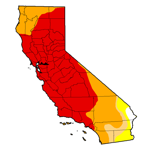
We’ve perhaps only begun to consider drought as a mapped concept, but the complex interaction between aquifers, land-water, snowfall, rainfall, and ambient temperature due to global warming–all difficult enough to visualize on their own, let alone in relation to each other–are particularly difficult to map in a cogent but dynamic form. Does the most recent map of the Drought Monitor, authored by Richard Tinker for the USDA, disarm viewers by a heat map to show basic gradations of drought across the entire state–where black designates exceptional drought (“D4”), and red extreme drought (“D3”), mapping the reach of parched land as terrestrial expanse. But despite its impressive impact, is this image a communicator of the scope of drought or its effects, even as it charts relative aridity across California’s counties? This both invites reflection on the economic future of the region’s farms , but threatens to naturalize the very subject that it also maps.

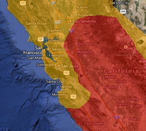
Although we demand to be able to use the syntax of the line in maps to define territories, a similar syntax is less able to be borrowed to map water or map drought. Indeed, the lines that are present in the above drought map to shade regions to acknowledge drought severity are hard to reconcile with the same lines that bound the state, or that divide its counties, since they are of course less sharply indicated by a line, or approximated by the broad classifications used in a heat-map, whose lines are more porous and approximate as much as definitive–and overly suggestive of clear boundary lines. This is more clear in some of the interactive drought maps that ostensibly image drought conditions in and around the Central Valley, a center of produce and agriculture, here oddly superimposed on a Google Earth satellite view:

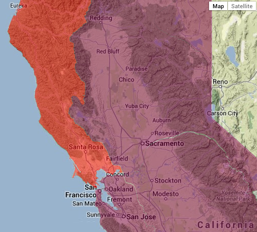
Drought can be mapped, at the same website of interactive drought conditions, as distinguishing drought severity superimposed as filters on a base map of the state of Google Earth provenance, to divide red “severe drought” in the north coast and the “extreme drought” in the northeast interior basin of the state:

Sure, the subjects of states and drought are apples and oranges: mapping tools don’t lend themselves easily to such a data visualization, both by drawing false equivalents and distracting from the nature of drought and the mapping of its momentous effects–if not offering an instantiation the condition of drought as if a fait accompli and natural event–rather than one that emerged because of the uniquely opportune mechanisms of water redistribution in the state that have left it so open and vulnerable to the drought’s occurrence.
If paleoclimatologists doubt that a drought of comparable severity has not only not existed in the recorded history of rainfall in California of the past one hundred and sixty-three years, but past ‘megadroughts’ from 850 to 1090 AD and from 1140 AD to 1320, and has already been drier than any time in the past 434 years, due to the perfect storm of water diversion and agricultural intensification. And the lack of a clear map of drought leave us without any clear sense how long the drought will last, and no sense of how urban demand for–and ability to pay for–water will be resolved with a limited supply.
We’re not used to or well-equipped mapping oceans or bodies of water that overlap with lands. Even when we include oceans in land maps to define their edges or describe their coasts, the syntax of much mapping of territories ends at the water’s front. And much as we need new modes to map the interface and exchange of habitats on estuaries or shores, the mapping gradations of moisture or aridity are difficult to inscribe in the surface of the map–even as we demand to map the limits of groundwater and the prospect of draught. The exclusion of water from most land maps reflects our limited abilities to map and the limitations of liabilities are increasingly evident.
The two spheres needed to be mapped–under and above water–are seen as incommensurate with each other and we map them by lines in different and distinct ways: we map limits and frontiers by rings or lines, or note fixed routes of travel or topographic elevations by fixed lines, the conventions of the line seems less suited to the blurring of gradations in groundwater, levels of drought, and the levels of water lying in the land–or of the diminution of both rivers and aquifers. And the presence of water in a region, or in the levels of soil and subsoil–and aquifers–that lie beneath the land’s surface, is particularly difficult to map by the syntax of a land map, because its conditions are multiple.
The syntax of the heat map may seem appropriate in its cognitive associations, but is far less supple or sensitive as a map of environmental impact, let alone as a tool to conceive of drought. Indeed, any “ecotones“–a word coined to direct attention to those regions where bordering ecosystems meet and intersect–are difficult to map both because they are so difficult to demarcate and because it is difficult to establish a single perspective on the intersection of worlds often assessed by different criteria. The shoreline, such as, as the meeting place between land and sea, has long been notoriously difficult to map, and not only because of its fluidity. We map a stable topography, mountains, rivers, and lakes, where the quotient between land and sea is fixed: and mapping rarely extends out to the surrounding waters, or boundaries of blurred, shifting, or overlapping lines: a problem of increasing notice in those endangered areas where habitats of land and water overlap and intersect, making clear boundaries less able to be defined. This is especially true in drought, where we must consider relations between groundwater storage, aquifers, and surface water, and the different sources and flow of water through agrarian and to urban landscapes. This problem of cartographical representation is as pronounced in the mapping of drought. The mapping of the absence of water is indeed a particularly apt problem for cartographical design in a heating-up world, as revealed in the maps we use to track, analyze, and understand drought.  Mapping the shifting dryness of the land–and the drying up of resources–presses the conventions of cartographical inscription. And all too often, we have only mapped land–not water, or even dryness–save in the limits of the desert lands. And the two sides of mapping the presence or absence of water offer complementary images, in ways that might often make it difficult to assess or chart the meanings and impact that the drying out of regions and habitats might have–or, indeed, to “embody” the meaning of or spread of drought and dryness in a legible manner. What would it mean to make drought a part of mapping that would be readable? How, in other words, to give legibility to what it means to subtract water from the environment? Indeed, we demand a dynamic form of mapping over time that charts the qualitative shifts in their presence in the land.
Whereas resources like water have been long assumed to be abundant and not in need of mapping in space, as they were taken to be part of the land, the increasing disappearance of water from regions like much of California–the first subject of this post–raise challenges both of conceiving drought as a condition by embodying the phenomenon, and by using graphic conventions to trace levels of water in the ground. In the case of the recent California drought, the compounded effects of an absence of winter rains, which would normally provide the groundwater for many plants throughout the year, feeding rivers and more importantly serving to replenish groundwater basins, but has decreased for the past three years at the same time that the snowfalls over the Sierra Nevada, whose melting provides much of the state with running water–and on which the Owens Valley and Southern California depend–have also dried up, leading to a decrease in the snowpack of a shockingly huge 80%. At the same time as both these sources of water have declined, the drying up of the Colorado River, on whose water much of the western US depend, have curtailed the availability of another source of water on which it has long depended. How to map the effects and ramifications of historical drought levels or impending dryness over time that synthesize data in the most meaningful ways?
These are questions both of cartographical design, and of transferring data about the relative presence of water in the land to a dynamically legible form, at the same time as retaining its shock content. The pressing need to map the current and impending lack of water in the world raise these questions about how to map the growing threat of an expanding drought and the implications that drought has on our land-use. The question with deep ramifications about its inhabitation and inhabitability, but not a question whose multiple variables lead themselves to be easily mapped in a static graphic form. And yet, the impact of drought on a region–as Thomas Friedman has got around to observing in the case of Syria, both in regard to the failure of the government to respond to drought that devastated the agricultural sector and that swelled cities in a veritable ecological disaster zone–offers a subject that threatens to shake the local economy. And what will animals–both grazing animals and local wildlife alike, including salmon–make of the lack of river water, much coming from the Sierra Nevada, or the residents of the multiple regional delta across the state? Friedman’s analysis may seek to translate the political divisions in Syria into the scissors of the Annales school–he advocates the importance that dedicating funds to disaster relief have already been proven to be central in foreign relations as well as in a region’s political instability, as if to table the question of the content of a political struggle. But the impact of rising aridity on agricultural societies is perhaps not so much lesser than its impact on agricultural industry.
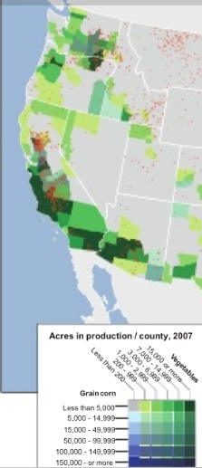
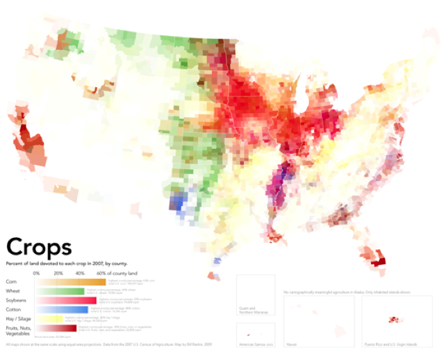
Rather than offer metrics to indicate social unrest–although political consequences will surely ensue–the rise of water maps show shifting patterns that will probably be reflected most in a tremendous growth of legal questions about the nature of “water-use rights,” however, and the possible restriction or curtailing of a commodity often viewed as ever-plentiful and entirely available for personal use, as well as a potential shift in food prices, eating habits, and a dramatic decrease–at least potentially–in access to freshly grown food across much of the United States, if not the sort of massive out-migration from rural areas that occurred in Syria. Michael Bostock’s current mapping of drought’s local effect on specific crops provides a compelling record of the complex questions that mapping the data about the presence of water in the land might be able to resolve. For the main source of much produce in the US, with the California drought, seem drying up, if we consider dry America’s considerable heavily subsidized acreage of agricultural production.


But we are in the very early stages of making clear the legibility of a map of dryness and draught, or of doing so to communicate the consequences of its effects. The interest in mapping our planet’s dryness is a compelling problem of environmental policy, but of cartographical practice. Maps of drought and dryness are often econometric projections, related as they are to interlaced systems of agricultural production, resources, and prices of food costs, and based on estimates or climactic measures. But they are powerful tools to bring dryness into our consciousness in new ways–ways that have not often been mapped–or integrated within maps of drought’s local effect on specific national crops. Perhaps the familiarity with understanding our climate through weather maps has created or diffused a new understanding of climactic changes, forming, as they do, visual surrogates by which to understand complex and potentially irresolvable topics into inevitable complex public debates, and indeed understand our shifting place in the world’s changing environment.
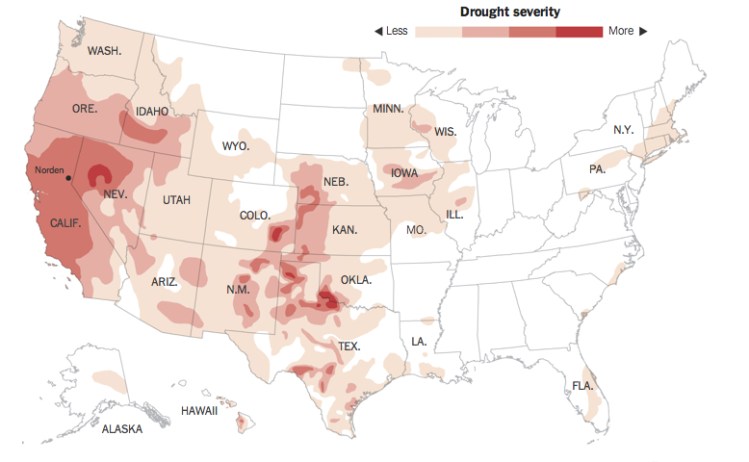
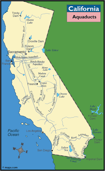
The recent severity of the current California drought–the greatest in measured history, and actually extending far into much of the West– and the parallel drought in the central United States creates a unique mapping of drought severity across a broad swathe of the country that raises problems not only in our agricultural prices, but in much of the almonds, lettuce, and strawberries that derive from California. The drought is not limited to the confines of the state, although the intense reliance of California farmers on irrigation–some 65% of state crop lands are irrigated, mostly in the Central Valley, where they depend on the viaducts to carry water from the Sierra’s snowfall to farmlands–makes it stand out in a map of the drought’s severity. (One might return here to Bostock’s powerful visualization of drought’s local effect on specific crops.)
The map of the absence of water in these regions is, however, difficult to get one’s mind around as if it were a property or an accurate map of a territory: the measurement of its severity is indeed difficult to understand only as a status quo of current meteorological events, for it poses the potential triggers for never before seen changes in agricultural markets and lifestyle. How can one map the effects of what seems to be the driest in perhaps 434 years, as UC Berkeley paleoclimatologist Lynn Ingram has argued? Both raise the specter of global warming more concretely than we have seen, but are oddly difficult to place into public discussion outside the purely local terms in which they are long conceived: the drought is not only the problem of Governor Jerry Brown, perhaps personally haunted by the drought of 1977, but the news stories on the issue–as one from which this map was reproduced used in the New York Times to illustrate the drought’s scope, and to hint at the severity of its consequences as much as the expanse of the drought itself, that combines all three aforementioned sites of drought–the Sierra Nevada snowfall; winter rains; Colorado river–in one powerful graphic that reveals the effects of drought on the entire western United States, as if it was a fixed or invading miasma, the vectors of whose spread are less known: ‘ 
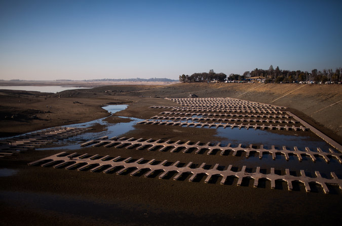
Max Whittaker’s quite eery photograph captures the resurfacing of an abandoned ghost town in Folsom Lake, now suddenly able to be seen with declining water levels of a marina now at a mere 17% capacity, is a striking image of water’s absence in one specific region of the state:
 Max Whittaker/NY Times
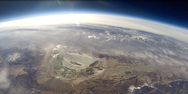
Other lakes on which much of the southern half of the state depends, like Owens Lake, have shrunk to a visible extent:

How can we adequately map this shift in liquid resources? To make the graphic palpable, an animated stop-action map of dryness–both historical and projected–could express a useful and compelling record of the mechanics of draught and global drying out might illuminate a perspective on the shifting relation to water we are condemned to live with.
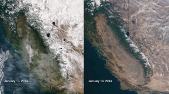
The global shifts in water, from regional water-tables to rainfall to ocean levels, and the mixtures of saline and freshwater they will create, suggests a broader calculus of hydrographic mapping and potable water, the likes of which were never conceived just forty years ago–or, perhaps, just twenty years past. As a start, such a map might begin from the shifts in a resource like snow, whose absence has caused not only many Californians to cancel trips to Tahoe or to ruin their skis on the slopes, but to face an economic crisis in water’s availability, evident by a comparison of aerial photographs showing the ecosystems of levels snowfall in the Sierra on successive January 13’s just one year apart which reveal dramatically different appearances of identical terrain:

Far more shocking than a map, in many ways, the two images effectively register and embody a shift in how the landscape exists, even if it only implicitly suggests the ecological impact that the absence of that huge snowfall has on its nearby regions: the absence of green in the adjoining basin, now a dust bowl, suggests a radical transformation in landscape and ecosystem. How can one show the shifting water-table, rainfall level, against the rivers that provide water to the land and its several delta?
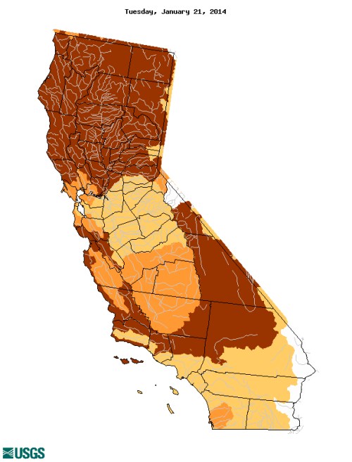
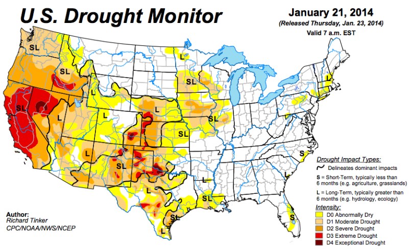
A ‘better’ map would help get one’s mind around the dramatically different notion of the usage and circulation of water in and across space–as much as the regions of dryness or low water-levels in the state. Both NOAA and NASA determined that last year was tied for the fourth place as the warmest year globally since record-keeping began in 1880 with the year 2003: probably due to increased use of coal, raising the temperature 1.78 degrees Farenheit above the average for the twentieth century, but also creating specific problems in the form of an off-coast high-pressure ridge that has created a barrier that has blocked winter storms, perhaps due to the increased cold in Antarctica on top of the decline in water that descends, melted, from the Sierra’s icepack–leading to an increased reliance on groundwater that will continue for the foreseeable future. The current USGS map of the drought today–January 21, 2014–notes severe conditions of drought in dark brown, and moderate drought conditions in orange, placed above a base-map of dryness across a visible network of riverine paths each and every day: 
Yet the variations of coloration can’t fully communicate the consequences desiccation of the land. The “moderate” drought in the central valley–surrounded by conditions of severe drought–reflects the limited amount of water brought by aqueducts to the region, rather than a reprieve from national conditions, and roughly correspond to the paths of the California Aqueduct and San Joaquin river:

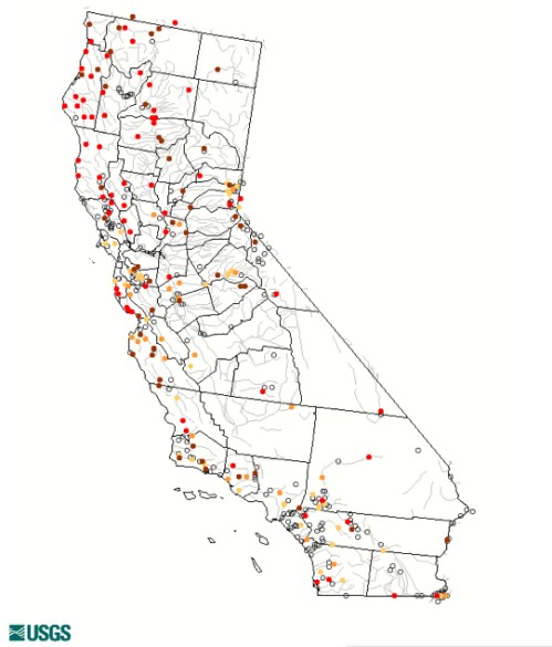
Perhaps a better model for mapping drought exists, but questions of how best to unify empirical measurements with the availability of water–and the consequences of its absence–are questions for data visualization that have not been fully met. The ways that USGS maps real-time stream flow in comparison to historical conditions for that day provides a pointillist snapshot of dryness–but using the red to suggest “low” and crimson “much below normal,” as measured in percentile–and yellow “below normal”–the scientificity of the map gives it limited rhetorical power, and limited conceptual power as a basis to assess the expansive effects of drought or extrapolate the critical readings of water across that network in ways easy to visualize.

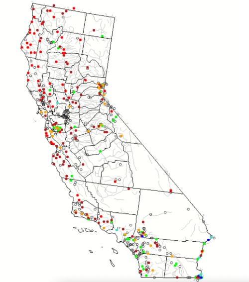
The USGS Waterwatch offers an even better metric–if with minimal visual shock–in mapping the areas of severe hydrologic drought in crimson and a new low of drought levels in bright red, in its map of stream flows over a 7-day period, which suggests the range of lows throughout the region’s hydrographic water-stations and across the clear majority of its extensive riverine web, and indeed the relative parching of the land in sensitive regions as the northern coast, Sierra, and parts of the central valley, as well as the rivers around San Francisco and Los Angeles:

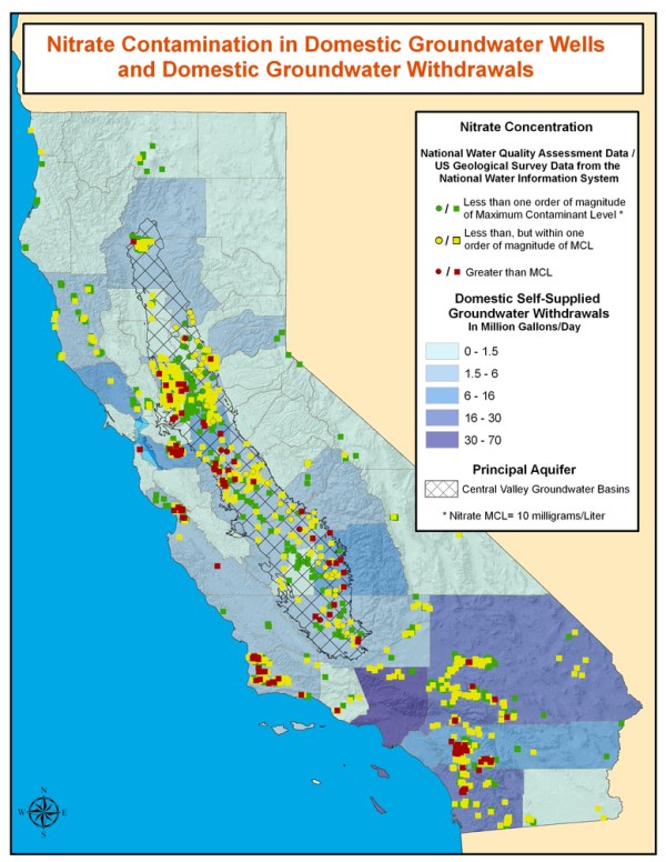
These maps seem to omit or elide human agency on the rapidly changing landscape. Despite the frequent vaunting of the purity of the water carried from the snows of the Sierra, deep problems with the California water supply–problems caused by its inhabitation and industrial agriculture– become more apparent when one considers the impurity of the groundwater table. This map, based on domestic wells of water withdrawal, offers a sobering image of what sort of water remains; although the most southern sector of the state is clearly most dependent on groundwater withdrawals of some 30-80 millions of gallons/day, significant sites of the withdrawn groundwater from within the Central Valley Aquifer, extending just inland from and south of San Francisco, and at select sites on the coast, contain surprisingly high nitrate contamination due to fertilizer runoff or septic tanks–measured against a threshold for having a negative effect on individuals’ health.

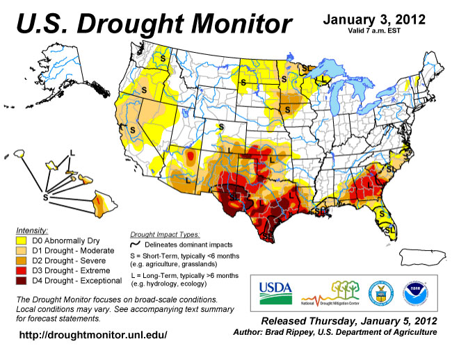
The closer one looks at the maps of how the state has begun to dry up over time, the further peculiarities seem to emerge of California’s geography and its relation to water–and indeed the sort of water-exchanges of three-card monte that seem to characterize the state–that are to an extend compacted by the dependence of much of coastal California on the extended winter rains that provide enough water for most plants to store. (The absence of water in much of Northern and Central California now means that the leaves of maples and many other trees are turning bright red, due to their dryness and the bright winter sun, in ways rarely seen.) We might do well to compare some of the other means of tracking drought. The US Drought Monitor suggests that conditions in current California dry spell differ dramatically from just two years ago–at a time, just two year ago, when Texas seemed a far more likely candidate for ongoing drought.

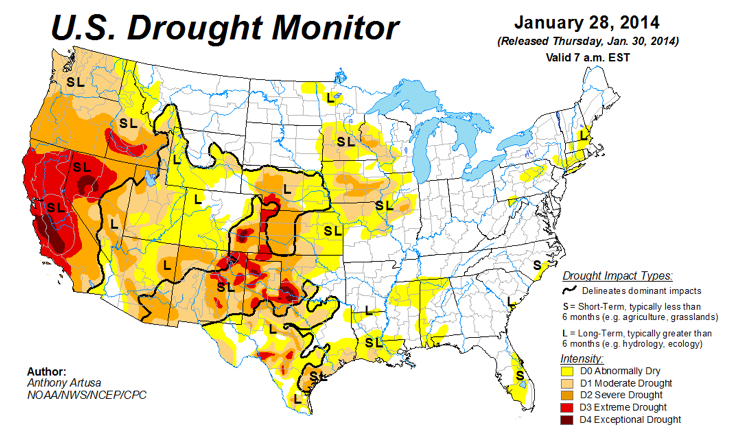
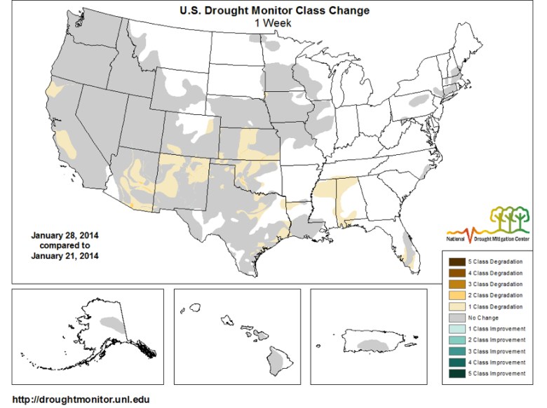
While the image is not able to be easily accessed in animated form, a contrast to a recent reading of drought from this year reveals the striking expanse of extreme and exceptional drought in California’s Central Valley and much of the entire state, to compare the above to two more recent drought maps:


Yet the concentration on broad scale changes in the regions that it maps offers somewhat limited sensitivity to the variations of water-depth. The map moreover suggests a somewhat superficial appreciation of the drought’s expanse and the nature of its boundaries. But the greater sensitivity of satellite readings offers a more multi-leveled–and indeed both a thicker and a deeper reading of underlying factors of the local or regional drought in the American West. The upgrading of drought–or the degradation of local conditions–in only one week is striking, and effects precisely those regions most sensitive to river irrigation that were effected by the failure of arrival of a melted snowpack, the effects of which seem destined to intensify.

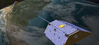
The twin satellites that measure the distribution of groundwater offer an other point of view of the local variations of drought. The record of hydrological health, known as the Gravity Recovery and Climate Experiment, whose paired satellites use two sensors spaced some 220 km apart as a means to detect a shift in the ongoing redistribution of water on the earth’s surface, offering a comprehensive indexing of their remotely-sensed measurements by longitude and latitude.

The extracted data is combined with an existing meteorological dataset, in order to create a record sensitive to variations of but one-centimeter in groundwater level. Although not registering the depletion of aquifers, and primarily climactic in nature, the portrait that emerges from specific shifts in gravity suggested by water’s lower mass effectively track water’s presence with considerable precision on exact coordinates, creating a composite image of national drought that suggest the different variations in the presence of groundwater, by integrating groundwater and soil moisture from surface moisture of their remotely sensed data with actual meteorological changes observed from land and space to create a comprehensive picture of water storage at different levels in the earth.

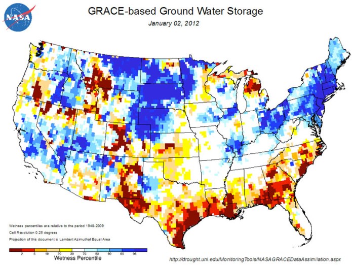
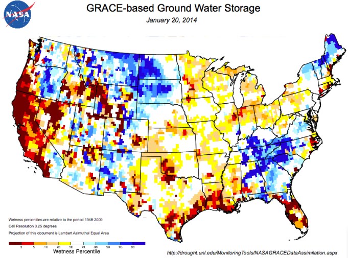
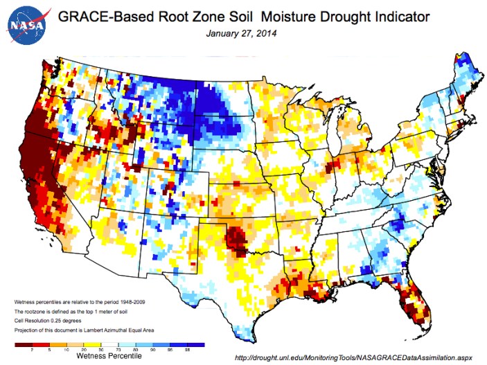
GRACE has aimed to map the shifts in groundwater levels over time: the result suggests in surprising ways some relative stability between 1948 and 2009, to generate “a continuous record of soil moisture and groundwater that stretches back to as a way of indexing moisture levels in the soil at different strata. The striking change in such levels in relation to data of 1948 is an especially striking record of the contrast between just 2012 and 2014. By creating a map based on the composition of underground water storage as remotely sensed via two satellites orbiting earth, the measurement of ground water retained in the land is a crucially informative record of gradations of aridity, and levels of drought, allowing us to discriminate between ground water and soil moisture–and indeed to understand their relationships in an easily viewable manner, translating satellite measurements into a format easy to compare as a mosaic of local levels of aridity and regional differences that demand to be cross-referenced with agricultural production and across time.

The map of ground-water storage suggests strong contrasts of the relative surplus of waters within the irrigated Central Valley and the relative aridity or dryness of land in much of the Lost Coast in California and deep south. The “change in perspective” resulting in two years shifts attention to shifts in the amount of groundwater measured, processing data of water stored in the earth that has the potential to analyze the relative irrigation of expanse in easily viewed fashion.
Within just two years, or course, this picture of ground water storage had dramatically and radically changed whose impact we are only beginning to assess, and done so in ways that show no signs of ending.

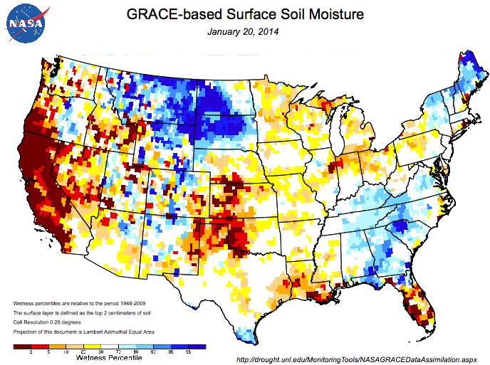
To be sure, the wetness percentile of areas near the land of lakes and central United States seems a striking contrast in this image of ground water storage, in this image deriving from the University of Nebraska, which reveals itself to be a particularly rich area of soil storage of groundwater, in, significantly, an area without much surface soil moisture based on Soil Moisture Study. But the deep pockets of wetness decline by far–both in storage and in soil moisture, based on the draining of aquifers and increased aridity or desertification–present a bleak picture in some strong crop-producing regions of the south and southwest, as much as California–and an even more terrifying story when the moisture of its soil suffer dryness–the excessive aridity specific to California relative to the nation is far more starkly revealed.

The registration of surface soil moisture and groundwater suggests a dynamic tiling of national space that we can use to map wetness over time, and extrapolate the effects of increased aridity on farm-lands and regions that will no doubt shift the prices of water, as well as the costs of agricultural production and livestock. The mapping of specific water available for root systems across the nation, based on satellite data coded to specific longitudes and latitudes, provides a third level of analysis based on the levels of water available to root systems across the nation–and reveals the even more concentrated effects of drought within the region that depend on water from the California Sierra that will no longer arrive in the Central Valley this year: more concentrated than the earlier image of ground water storage, that reveals the amount of water available to the root systems presents a picture even more closely related to agricultural constraints created by three years of drought.

The remote sensing of such levels of moisture and groundwater affords a model of mapping that can be keyed directly to the questions of specific crops in ways that can be eventually used to make prognostics of the impact of drought on the local economy. If California’s conditions seem to be due to meteorological particularities of low snowfall and few winter rains, held off the shore due to a high pressure ridge of air related to dramatic cooling in Antarctica, the problems that underpin the mapping of the local of integrating layers of data from different sources are repeated. They reveal magnified risks in ways comparable to the more speculative tools of forecasting used to assess the multiple water stresses that shape the environmental pressures on population in different areas of the world.
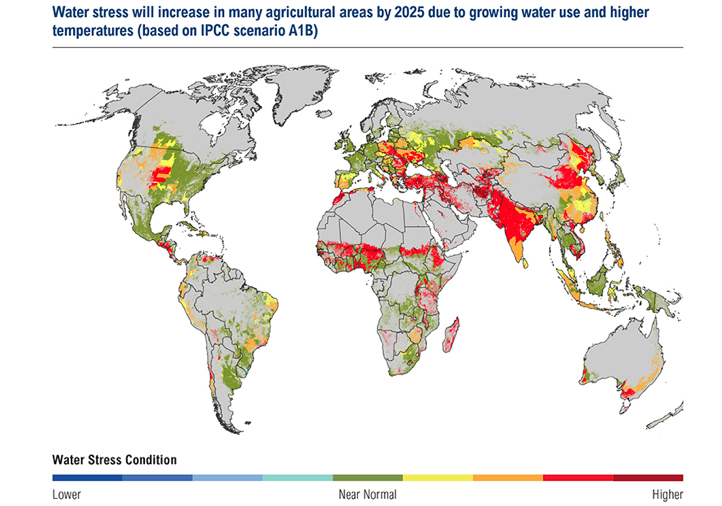
The following sequence of global projections of aridity are often rooted in the possibility–or near-eventuality–of rising temperature worldwide, and the pressures that these stand to place on water usage. The projection of what these water stressors will be seem to synthesize the data of rainwater levels, water tables, and ocean levels to depict the collective constraints facing agricultural communities across the world–and raising questions of what effect they might have–that will no doubt endanger rising political instability and economic hardships world-wide, in ways difficult to conceive. The problems that underpin the mapping of the local are repeated, if with magnified risks, when trying to synthesize the data of rainwater levels, water tables, and ocean levels as a collective set of water stresses that are facing agricultural communities across the world. If California’s conditions seem due to low snowfall and few winter rains, held off the shore due to a high pressure ridge of air that seem related to the dramatic cooling of Antarctica, projections of aridity are often rooted in the possibility–or near-eventuality–of rising temperature worldwide.
The remarkably and relatively suddenly increased stresses on water-supplies world-wide are now better mapped as futures–which they indeed offer, by the World Resources Institute, a sort of barometer on the shifting dynamics of water availability in the world. In the below charging of water stressors prospectively through 2025, based on the prospect of a world warmer by three degrees centigrade, we are pointed to the particular hot-spots in the globe. These include the central US, which extend in arcs of desiccation poses particularly pernicious threats through much of Anatolia, Central (equatorial) Africa, and South Asia. Specific water stressors that are projected in the map are due to the combined pressures of growing use of a limited supply of waters that higher temperatures will bring; the global map of the impact of rising temperatures poses particular problems for populations in India and China, two centers of pronounced population growth where markets where food distribution will clearly feel stresses in increasingly pronounced ways.

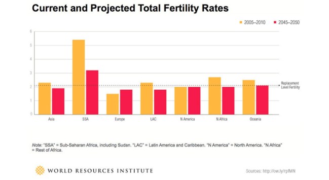
The pronounced pressures on fertility rates are expected to stay strong in Asia, as well as the United States, according to the below bar graph, developed by the World Resources Institute.

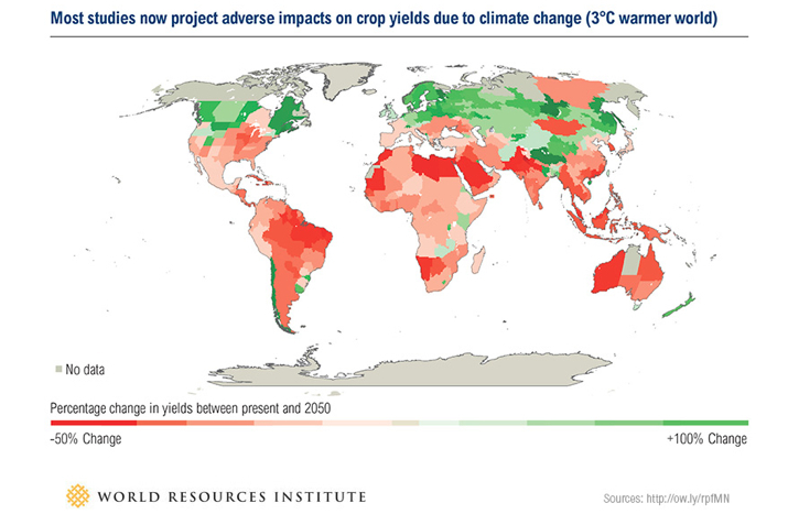
The areas in which the World Resources Institute predicts the most negative effects on crop production reflects the relative impact of water stresses due to projected climate change alone–revealing a far more broad impact throughout South America, northern Africa, Arabia, and Pakistan, as well as much of Australia. (Similarly, a certain pronounced growth occurs across much of Canada–aside from Ontario–Scandinavia, and Russia, and parts of Asia, but one hardly considers these as large producers in a world that has warmed by some three degrees centigrade.) But the highly inefficient nature of water-use–both in response to population growth and to a lack of re-use or recycling of water as a commodity and in agriculture–creates a unique heat-map, for the World Resource Institute, that will be bound to increase water stressors where much of the most highly populated and driest areas intersect.

The rise of the temperatures is prospective, but also difficult to map in its full consequences for how it threatens the experience of the lived–or inhabited–world to the degree that it surely does. (Indeed, how the habitable world–the ancient notion of a habitable “ecumene,” to rehabilitate the classical concept of the inhabited world and its climactic bounds by torrid zones–would change seems a scenario more clearly imagined by screenwriters of the Twilight Zone or of science fiction novels than cartographers or data visualizations.) If we focus on the band of the hardest-hit regions alone, one can start to appreciate the magnitude of the change of restricted access to water and its restricted availability in centers of population: the map suggests not only a decline by half of crop yields around equatorial regions, but stressors on local economies and rural areas. It staggers the mind to imagine the resulting limitations on world agriculture in this prospective map, which offers something of an admonitory function for future food and agricultural policy, and indeed international relations:

The shifting pressures on resources that we have too long taken for granted is sharply starting to grow. The stressors on water will direct attention to the importance of new patterns and habits of land use, and of the potential usability or reconversion of dry lands, to compensate for these declines. Indeed, the mapping of available water provides a crucial constraint on understanding of the inhabited–and inhabitable–world, or how we might be able to understand its habitability, bringing the resources that we have for visualizing data in ways that we might bring to bear on the world in which we want to live, or how we can best describe and envision the effects of drought as an actor in the world. Such huge qualitative shifts are difficult to capture when reduced to variations that are charted in a simple heat-map.
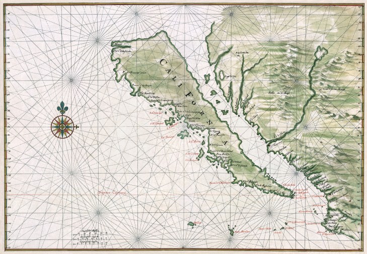
In a way, the constraint of water was more clearly and palpably envisioned within the earliest maps of California from the middle of seventeenth century than it is in our vision of a land that is always green, and nourished by mountain waters all along its Pacific rim. Indeed, this image of an imagined green island of California, surrounded by waters and beside a green mainland nourished by rivers and lakes, seems extremely powerful as a mental image of the region that is increasingly remote as the water resources of the region begin to evaporate.

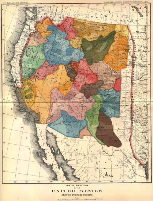
 Arid Region of the United States (1890); detail
