Tag Archives: geolocation

Coronavirus Advances

While we are increasingly deadened by data visualizations that track the infectious spread of COVID-19 across the world and country, their logic has often been implicit. As much as tracking real-time data of deaths and “hot-spots” in the world and the nation, we trust the data viz to orient us to the infectious landscape to better gain understanding of viral spread. We seek to grasp nature of the virus’ transmission, and perhaps hope that we can better grasp its spread. We depend on these daily updates to retain a sense of agency in the chaos, but realize that they are provisional, contingent, and selective snapshots, based on testing, and exist at a time delay from the virus’ actual distribution–without much predictive value. We maddeningly realize they are dependent on testing rates and reporting, and only as good as the datasets which they re-present.

On the heels of a 5% statewide positivity rate on December 5, 2020, California was declared in a state of shut down in all its counties. It almost seems that such graphics have started to fail us, as the spread of the virus overflows the boundaries of the map and permeates its space. The choropoleth renders individual counties all but indistinct, the state drowned in widespread infections, with only a few of its less populated regions as refuges. With a flood of purple overflowing the coastal counties, the delta, the Central Valley, and the entire south of the state, was there even any point in mapping the danger of viral spread beyond a state of red alert?

Dec. 5, 2020

While mapping offers little comfort in the era of saturation of heightened risk, the color-codes alert inhabitants to the danger of increased stresses on the public health system–as much as visualization challenges to translate tools of data aggregation to visualize the pandemic., as December 6 rates grew by December 19. As we shift to map a decreasingly multi-colored state by the moderate, substantial and widespread virus, and widespread cases seem to flood the state, the map offers a security of some sort of monitoring of the pandemic’s spatial spread.

The sea of purple is like Spinal Tap going raising the volume “up to eleven,” and are a sign that we are in unexplored territory that won’t be accommodated by a simple color ramp–or, indeed, a familiar cartographic iconography among our current tools of styling space. While we are used to maps embodying meaning, what the colors of the map embody–beyond risk–is unknown. To be sure, at a time when fatalities from the coronavirus in the south of the state have skyrocketed from the middle of the month, hitting records in ways terrible to even contemplate, the field of purple is a deeply human story of loss, as a surge of hospitalizations have flooded the entire healthcare community, and stretched facilities of critical care beyond anything we have known, filling half of intensive care beds in LA County at Christmas. 2020 enough to make it hard to feel any relief in the close of a calendar year, as if that unit still held any meaning, and very grim about 2021: and while the CDC allowed that there may already be a new, more contagious strain, in the nation two days before Christmas, the arrival of the more contagious strain in California and Colorado increased alarm before New Year’s.

San Francisco Chronicle, December 6 2020
SF Chronicle, December 19, 2020

How to get a handle on the novel coronavirus that we have been pressing against COVID-19 dashboards since March to grasp better, and will we able to do so in 2021?

Whatever sense agency the maps impart, it is an agency that is only as good as the compromised sense of agency that we expect in an era of geolocation, on which most maps track reports of infection. Even as we face the rather grim warning that we are waiting for the arrival of a vaccine that, in the Bay Area, rates of immunization face steep obstacles of vaccine distribution due to pragmatics of freezer space required, training of extra health care workers, and monitoring and tracking the two-stage process of vaccination, we will depend for public sanity on maintaining clear communication in maps. The actual tracking of the novel coronavirus doesn’t translate that well to a state-wide model, or a choropleth, although it is the method for public health advisories that makes most sense: we do not have small-scale public health supervision in most of the nation, although they exist at some counties. The stressed Departments of Public Health in areas are without resources to manage COVID-19 outbreaks, public health compliance, or retaliations for public health violations: and the effort to create public health councils to manage compliance and violations of public health orders may be seen by some as an unneeded bureaucracy, but will give local governments resilience in dealing with an expanding epidemic, at the same time as governmental budgets are stressed, and no body of law about COVID violations exists.

Rather than map on a national or state-wide level, we can best gain a sense of how much virus is out there and how it moves through attempts of contact tracing–even if the increasing rates of infection may have gone beyond the effectiveness of contact tracing as a methodology that was not quickly adapted by a federal government the prioritized the rush to a vaccine. The basis for such a map in LA county can reveal the broad networks of contagion, often starting in small indoor gatherings across the region, and moving along networks of spatial mobility across the city and San Fernando Valley, and help embody the disease’s vectors of transmission as we watch mortality tallies on dashboards that give us little sense of agency before rising real-time tolls.

ESRI

If such ESRI maps suggest a masterful data tracing and compilation project, the data is large, but the format a glorification of the hand-drawn maps of transmission that led to a better understanding of the progress of Ebola on the ground in 2014, used by rural clinics in western African countries like Liberia and Rwanda to stop the infectious disease’s transmission and monitor the progress of contagion to limit it–as well as to involve community members in the response to the virus’ deadly spread.

We may have lost an opportunity for the sort of learning experience that would be most critical to mitigate viral spread in the United States, as no similar public educational outreach was adopted–and schools, which might have provided an important network for diffusing health advisories to families, shifted predominantly to distance learning and providing meals, but we became painfully aware of the lack of a health infrastructure across America, as many openly resisted orders to mask or to remain indoors that they saw as unsubstantiated restrictions of liberty, not necessary measures.

Hand-Drawn Public Health Map of Ebola Transmission in Liberia (2014)

We are beyond contact tracing, however, and struggling with a level of contagion that has increased dramatically with far more indoor common spaces and geographic mobility. Yet the broad public health alerts that these “news maps” of viral spread offer readers omits, or perhaps ignores, the terrifying mechanics of its spread, and the indoor spaces in which we know the virus is predominantly acquired. The rise of newly infectious mutated strains of the novel coronavirus was in a sense inevitable, but the rising tension of what this means for the geographical distribution and danger of the coronavirus for our public health system is hard to map to assess its wide distribution, and we take refuge in mitigation strategies we can follow.

Why have we not been more vigilant earlier to adapt the many indoor spaces in which the virus circulates? It bears noting that the spread of virus in the state was undoubtedly intensified by over a hundred deaths and 10,000 cases of infection to spread in the density of a carceral network, which seems an archipelago incubating the spread of viral infections in the state. We only recently mapped the extent of viral spread across nineteen state prisons by late December 2020, tracked by the Los Angeles Times, but often omitted from public health alerts–

Coronavirus Cases Reported in Nineteen California Prisons, Dec. 21, 2020

–and the density of Long-Term Care centers of assisted living across the state, which were so tragically long centers of dangers of viral spread, as the New York Times and Mapbox alerted us as the extreme vulnerabilty of elder residents of nursing homes, skilled nursing facilities, retirement homes, assisted-living facilities, residential care homes who cannot live alone was noted across the world. The data that was not provided in the grey-out states interrupted the spread of infections among those often with chronic medical conditions was not surprising, epidemiologically, but terrifying in its escalation of the medical vulnerability of already compromised and vulnerable populations–and steep challenges that the virus posed.

unlike those greyed out states that fail to release data on deaths linked to COVID-19 infections, congregate on the California coast: while the New York Times depicted point-based data of the over 100,000 COVID-related deaths in nursing homes are a small but significant share of COVID deaths, exposure for populations with extraordinarily high probability of possessing multiple possibilities for co-morbidities is probably only a fraction of infections.

Coronavirus Deaths linked to Nursing Homes in United States, December 4, 2020

We strain to find metrics to map the risk-multipliers that might be integrated into our models for infectious spread. It seems telling to try to pin the new wave of infections in a state like California to increased contact after Thanksgiving–a collective failure of letting up on social distancing in place since March–as the basis for a post-Thanksgiving boom in many regions of the state, using purely the spatial metrics of geolocation that are most easily aggregated from cell phone data in the pointillist tracking of individual infections in aggregate.

New York Times/CueBiq Mobility Data

Based on cell-phone data of geolocation, a proxy for mobility or social clustering that offered a metric to track Americans’ social proximity and geogarphical mobility–including at shopping centers, oceanside walks in open spaces, and even take-out food curbside pickups, as well as outdoor meals and highway travel, few counties curbed aggregation as one might hope–although the fifty foot metric accepts the many outdoor congregations that occurred, well within the Cuebiq metric, wearing or without masks. A magenta California registered pronounced proximity, grosso modo, discounting any mindful innovative strategies in the state.

Increased Spatial Closeness within Fifty Feet/CueBiq/Graphic NBC News, Nigel Chiwaya and Jiachan Wu

It is stunning to have a national metric for voluntary mobility, rough as it is, to measure internalization of social distancing protocols and potential danger of a post-holiday COVID-19 bump. To be sure, we are stunned by geolocation tools to aggregate but risk neglecting the deeper infrastructures that undergird transmission, from forced immobility. While geolocation tools offer opportunities for collective aggregating whose appeal has deep historical antecedents in measuring contagion and anticipating viral transmission by vectors of spatial proximity, geospatial tools create a geolocation loop in visualizations which, however “informative” perpetuate a spatiality that may not clearly overlap with the actual spatiality of viral transmission.

Even if we demanded to map what were the novel coronavirus had “hot-spots” in mid- to late March, as if processing the enormity of the scale we didn’t know how to map, aggregating data without a sense of scale.

March 26, 2020

Across the summer, it seems best to continue to map daily numbers of cases, relying on whatever CDC or hospital data from Hopkins we had, trying to aggregate the effects of the virus that was spreading across the country whose government seemed to provide little economic or medical plan, in maps that tallied the emergence of new cases, as new hotspots appeared across the land, meriting attention difficult to direct.

We are plowing infections and mortality with abandon in a steady diet of data visualizations that purport to grasp disease spread, that were once weighted predominantly to the New York area, even as they spread throughout the nation by the end of March, but remaining in the thousands, at that point, as even that low threshold was one by which we were impressed. The tracking of the local incidence of reported cases seemed to have meaning to grasp the meaning of transmission, with a pinpoint accuracy that was assuring, even if we had no way to understand the contagion or no effective strategy to contain it. But we boasted data visualizations to do so, focussing on the nation as if to contain its spread in antiquatedly national terms, for a global pandemic, not mapping networks of infection but almost struggling to process the data itself.

After all, the John Snow’s cholera maps of John Snow are the modern exemplars foregrounded in data visualization courses as game-changing images as convincingly precise pictures of infection progressing from a water pumps in London neighborhoods is often seen as a gold standard in the social efficacy of the data visualization and information display. The elevation of the pinpoint mapping of cholera mortality in relation to a water pump from which the deadly virus was transmitted in a nineteenth-century London neighborhood:

John Snow, “Cholera Deaths in Soho”

The Snow Map so successfully embodies a convincing image of contagion that it has taken on a life of its own in data vis courses, almost fetishized as a triumphant use of the plotting of data that precisely geolocated mortality statistics allow, and can indeed be transposed onto a map of the land to reveal the clustering of death rates around the infamous Broad St. pump, that created a legible vector of the transmission of diseases in the Soho neighborhood, so convincing to be touted as a monument of the data sciences.

Open-Air Water Pumps Tainted by Cholera measured in John Snow’s Map

Snow is lauded for having effectively showed that, in ways that changed scientific practices of collective observation and public health: rather than being communicated by miasmatic infections that spread to low-lying London from the Thames, mortality rates could gain a legibility in proximity to a pump that transmitted an infectious virus, often presented as a conceptual leap of Copernican proportions (which it was, when contrasted to miasma that emanated from the Thames to low-lying areas–if it anticipated a bacteriological understanding of viral transmission). The association of danger with the water procured on errands from neighborhood pumps however replaced the noxious vapors of a polluted river, as in earlier visualizations of the miasma that lifted the noxious fumes of the polluted Thames river to unfortunate low-lying urban neighborhoods, who were condemned by urban topography to be concentrations of a density of deaths of more striking proportions and scale than had been seen in the collective memory.

Snow made his argument by data visualizations to convince audiences, but he mapped with a theory of contagion. But if Snow’s maps works on how the virus is communicated in outdoor spaces–and how a single site of transmission can provide a single focus for the aggregation of mortality cases, COVID-19 is an infection that is most commonly contracted in indoor spaces, shared airspace, and the recycled unfiltered air of close quarters. And the indoor spaces where COVID-19 appears to be most often transmitted stands at odds with the contraction in outdoor common spaces of the street and service areas of water pumps, that create the clear spacial foci of Snow’s map, and the recent remapping by Leah Meisterlin that seeks to illuminate the urban spaces of the contraction of cholera in a digital visualization as a question of intersecting spatialities.

Current visualization tools compellingly cluster a clear majority of cholera deaths in proximity to a publicly accessible pump where residents drew water where viral pathogens that had colonized its handle. But we lack, at this point, a similarly convincing theory of the transmission of the novel coronavirus SARS-CoV-2.

But the logics of COVID-19’s communication is nowhere so crisp, and difficult to translate to a register that primarily privileges spatial contiguity and proximity–it is not a locally born disease, but a virus that mutates locally across a global space: a pandemic. And although contact-tracing provides a crucial means of trying to track in aggregate who was exposed to infection, we lack any similarly clear theory to metaphorically grasp the contagion–and are increasingly becoming aware of the central role of its mutation to a virus both more infection and that spreads with greater rapidity in confronting the expansive waves of infection in the United States–as if an escalated virulence grew globally in the first months of this rapidly globalized pandemic.

Our dashboards adopted the new versions of web Mercator, perhaps unhelpfully, to offer some security in relation to the nature of viral spread, which, if they served as a way of affirming its truly global scope–

NextStrain

–also suggested that global traffic of the virus demands its own genomic map, as the virus migrates globally, outside strictly spatial indices of global coverage, and that perhaps spatial indices were not the best, in the end, for accounting for a virus that had began to develop clear variants, if not to mutate as scarily as many feared, into a more virulent form.

And it may be that a genomic map that allow the classification of viral strains of genomic variability demand their own map: for as we learn that genomic mutation and variation closely determines and affects etiology, communication of the viral strains offers yet a clearer illustration that globalization articulates any point in terrestrial space to a global network, placing it in increased proximity to arbitrary point not visible in a simple map, but trigger its own world-wide network of markedly different infectiousness or virulence.

NextStrain

From December 4 2019, indeed, we could track emergent variants of the virus best outside of a spatial scale, as much as it reminded us that the very mobility of individuals across space increased the speed and stakes of viral contagion, and the difficulty to contain viral spread, in the interconnected world where viral variation recalled a flight map, set of trade routes, or a map of the flow of financial traffic or even of arms. Mutations were understood to travel worldwide, with a globalism that a spatial map might be the background, but was indeed far removed, as we moved beyond questions of contact tracing to define different sizes of genomic mutation and modifications that we could trace by the scale of mutations, not only the actual places where the virus had arrived.

Was place and space in fact less important in communicating the nature of COVID-19’s increasing virulence?

The maps of genomic variation traced not only the globalization of the virus, but its shifting character, and perhaps etiology across some thirty variants by late April, that show both the global spread of the virus, and the distinct domination of select strains at certain locations, in way that researchers later theorized the ability to “track” mutations with increasing precision. If researchers in Bologna defined six different variants of coronavirus from almost 50,000 genomes that had been mapped globally in laboratory settings to map variants of the virus whose signatures showed little more variability than strains of the flu in June, variations of signatures seemed a manner to map the speed of coronavirus that had traveled globally from by February 202 to the lungs of the late Franco Orlandi, an eighty-three year old retired truck driver from Nembro, Italy, whose family could not place China on a map when, following diagnostic protocol, attendant physicians in Bergamo asked if Orlandi had, by chance, happen to have traveled to China recently.

NextStrain

Despite lack of serious mutation, thankfully, the data science of genomic sequencing of the COVID-19 cases triggered by genomic mutations of SARS-CoV-2 genome of just under 30,000 nucleotides, has experienced over time over 353,000 mutation events, creating a difficult standard for transmission into equivalent hot spots: some hot spots of some mutations are far more “hot” than others, if we have tried to plot infections and mortality onto race, sex, and age, it most strikingly correlates to co-morbidities, if all co-morbidities are themselves also indictors of mortality risk. While the mutations have suggested transmission networks, have the presence of different levels of mutations also constantly altered the landscape of viral transmission?

Global Distribution of Sars-CoV-2 Variants, March 15, 2020/Los Alamos National Laboratory

It makes sense that the viral variant was tracked in Great Britain, the vanguard of genomic sequencing of the novel coronavirus as a result not only of laboratory practices but the embedded nature of research in the National Health Services and the monitoring of public health and health care. Enabled by a robust program of testing, of the some 150,000 coronavirus genomes sequenced globally, England boasts half of all genomic data. Rather than being the site of mutations, Britain was as a result the site where the first viral variant was recognized and documented, allowing Eric Volz and Neil Ferguson of Imperial College London to examined nearly 2,000 genomes of the variant they judged to be roughly 50% more transmissible than other coronavirus variants, magnifying the danger of contagious spread in ways feared to unroll on our dashboards in the coming months. As teams at the London School of Hygiene and Tropical Medicine studied the variant in late 2020 in southeast England, they found it to be 56% more transmissible than other variants, and raised fears of further mutations in ways that rendered any map we had even more unstable.

The virus SARS-CoV-2 can be expected to mutate regularly and often. While England boasts about half of all global genomic data on the virus, of the 17 million cases of SARS-CoV-2 infections in the United States, only 51,000 cases of the virus were sequenced–and the failure to prioritize viral sequencing in America has exposed the nation to vulnerabilities. And although California has sequenced 5-10,000 genomes a day of the novel coronavirus samples by December, and Houston’s Methodist Hospital have mapped 15,000 sequences as it watches for new viral variants; an American Task Force on viral variants will be rolled out early in 2021, as the discovery of viral mutations haves spread across five states in the western, eastern, and northwestern United States. While it is not clear that the viral variant or mutations would be less susceptible to polyclonal vaccines, most believe variants would emerge that would evade vaccine-induced immunity.

Continue reading

Leave a comment

Filed under Coronavirus, data aggregation, data maps, data visualization, global pandemic

Bats over Urban Skylines

Thomas Nagel queried the possibility humans had to “know what it is like for a bat to be a bat” in a 1974 paper that posed pressing epistemological challenges beyond the philosophical community. Nagel was asking us to consider what was the context in which bats move, and to consider the foreign nature of propositions about the distribution of a network of flying bats to humans’ embodied experience: the winged mammals that may have inhabited the eaves of Nagel’s house in Connecticut or Vermont–I am guessing–where he rises from his desk to spend the early evening watching bats reel out at dusk as they fly in wide arcs, searching en masse to seek out meals of bugs and gnats at dusk.

Asking what it is like for a bat to be a bat suggests a new model for collective action, not bumping into one another by using spatial registers in ways we don’t really know how to map–or to even think we can.

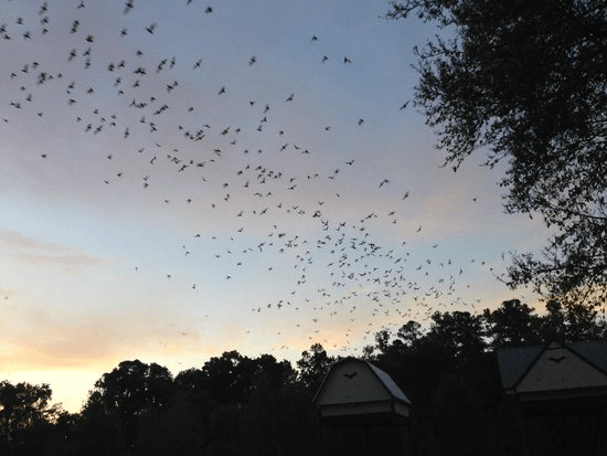
Maybe he was in Florida, near Gainsville, or Tampa Bay, where homes for bat colonies have been constructed that offer them temporary housing–

–watching a bat colony search for bugs and flies at a time when the flying mammals are losing safe natural habitat, displaced by construction and environmental saturation of electric lighting. The instant of inter-species realization that launched an epistemic earthquake might have been launched when, returning home, evening drink in hand, Nagel retired to his desk after dinner to write an article arguing we lack not language but adequate mental tools to think like a bat, or imagine the context of bat-like proposition about space, our own individually embodied experience so removed from a distributed network to imagine moving–let alone accurately navigating–like a bat, in clouds of a distributed intelligence. Are bats able to synthesize, share, and collectively process a sense of the images of the outlines of trees, skyscrapers, and blocked routes, by abilities to synthesize individual datapoints in something like a collective map map?

The philosopher performed a powerful thought experiment about human consciousness about the subjectively rooted nature of human experiences, by inviting us to consider wha the took as the vast intellectual remove of the experience of those nocturnal navigatorWe might be able to adopt “the bat’s point of view,” Nagel argued, but being like a bat escaped the conceptual tools humans have at their collective disposal.

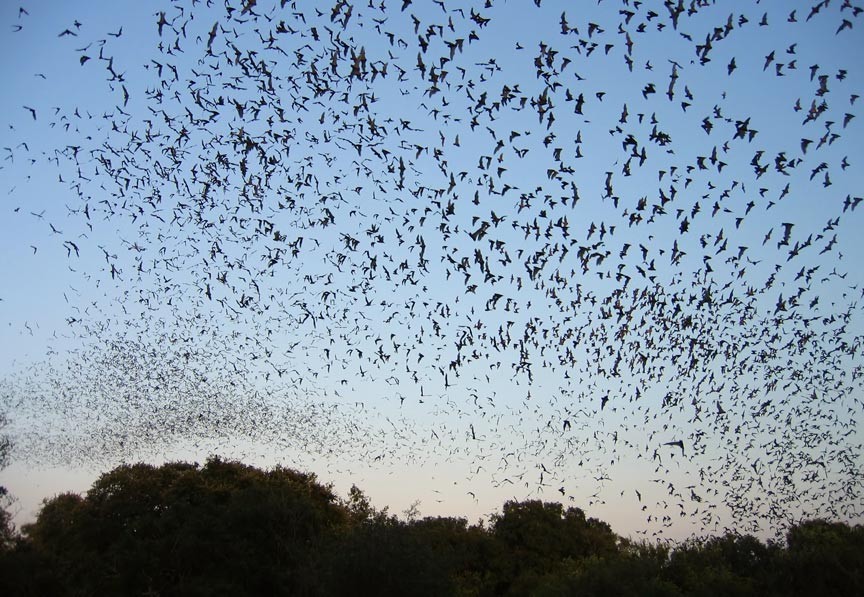
While Nagel did not necessary mean the swarm thinking that enables bats’ behavior, it is striking that the logic of the swarm of bats’ nocturnal flight paths–that employ vision, but don’t rely on it–may be providing a basis for the new “training sets” that push new horizons for AI intelligence, beyond the “training sets” used to develop computer vision that has helped “train” how computer vision might “see” and recognize facial characteristics. As echolocation helps bats track insects, not crash into each other as they fly in large groups, and navigate caves, moving by sounds, as much as visual cues, the abilities it allows–for densely flying animals to somehow not jam each others’ sounds, but fly side-by-side in large groups without touching, evading one another without audio interference, and distinguishing the recognizable pitch of one another’s individual calls–they may offer a way of being within a distributed network, sustained at over sixty miles per hour–and within underground caves from which up to half a million bats nightly emerge. This would be a form of distributed intelligence and a form of “intelligence,” Nagel’s work reminds us, removed from human ken.

Bats’ powerful bioacoustic abilities to distinguish individual echolocators without interference in crowded caves may offer a powerful model for using sonar signals to create a similar capacities of sonic recognition among the range of sensor data that self-driving cars use by emitting distinctive levels of sonar so specific not only across different makes, but individual drivers, allowing swarms of commuters to calibrate their spatial relations to other commuters by an analogous sort of distributed intelligence: might autonomous vehicles, in other words, be made to think like bats? The thought is tempting, as it would push a new basis for drone “thought” and warm thinking and movement, if it remains a bit of a pipe dream quite different from the current base-maps for self-driving cars, based on mapping roadways, directionality, and the driving cues of highway signs, turn routes, and the sort of tacit signs of how we move cars within lanes, along painted reflective dashes, to prevent or reduce automobile collisions.

Civil Maps

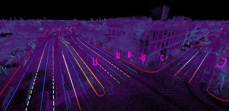
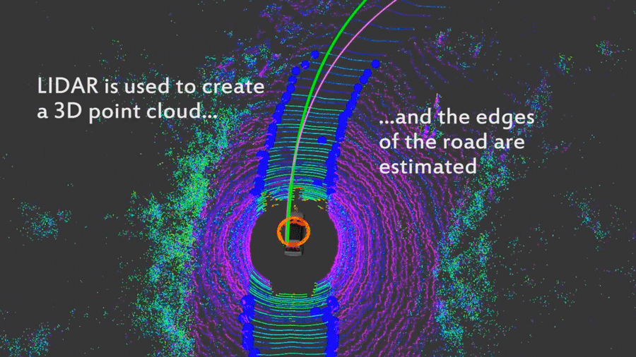
But what are the maps of bats? Could the flight paths of bats ask us to reimagine maps? The level of auditory discrimination is at basis, perhaps, a question not only of “technologies of extremely accurate localization” but bioacoustics. Much as LIDAR might create a point-cloud for areas that are lacking in many topological maps of routes to estimate the areas of roads on which autonomous vehicles might travel, is there a chance that bats move mentally among multiple scales and registers of mapping, moreover, both to navigate among one another’s flight paths while traveling in the night skies at speeds that are often up to 60 mph, and to take paths that allow them to return to the security of caves or other diurnal dwellings?

The problem was how the sort of state-of-the-art maps for autonomous vehicles that were dependent on existing maps would make sense in the dramatically changing extra-urban and rural environments on large scales, and how such rapid development of built landscapes could limit the potential positives of autonomous vehicle technologies: often, these areas were the same in which many commuters lived, and where the benefits of driverless cars would be felt, so the benefits of unmooring cars from existing maps was more than a purely academic challenge.

 Detaled Trracking of Roads in Unmapped Rural Roads/Ort, Paull, & Rus (2018)

The bioacoustics tools bats use to negotiate in swarms and on individual rest on developed abilities of acoustic recognition that might be especially important to autonomous vehicles–for which the motion between large scale maps and the mapping of fast-moving vehicles beside them remain something of a missing piece, if not a potential cartographical blind spot for modeling distributed spatial intelligence by sonic blasts.

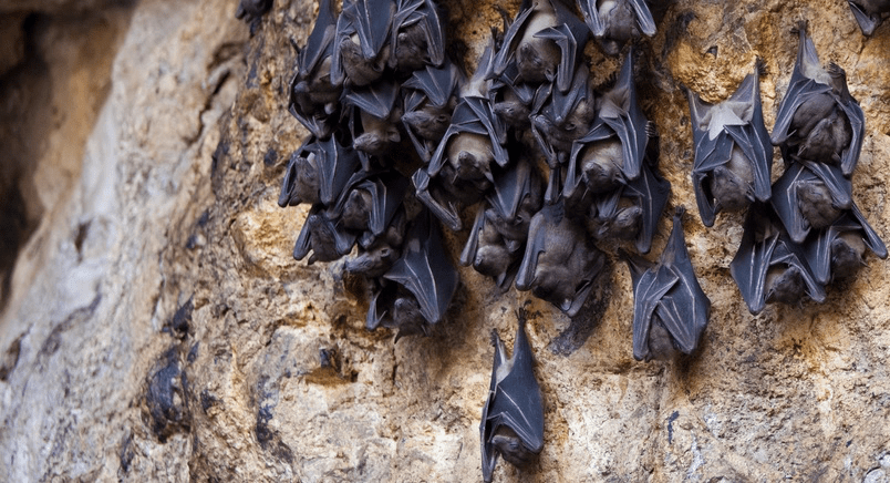
Bats may hone these auditory skills of discrimination of sonic frequencies by skills honed by preparing from departure deep underground in caverns, developing echolocation systems that allow them to capture insects while flying that are less than a centimeter in size, though the presence of a still human can confuse bats’ sonic maps for judging moving prey, while navigating swarms of over 1.5 million–15 million live in Natural Bridges underground caverns, and caves in Carlsbad NM once housed up to eight million.

Natural Bridges, TX/National Parks Service

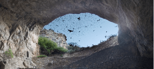
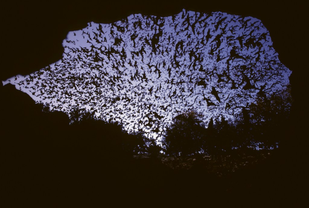
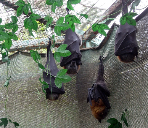
The ability to map individually and in a swarm make their ultrasonic pulses a powerful tool of acoustic discrimination of routes, but the images bats preserve in their mental maps are not nearly so existential in nature. Indeed, the colony of a million and a half Mexican free-tailed bats that live in downtown Austin, under Congress Bridge, beleived to be the largest urban bat colony in the world, is so prized by the city’s human residents that the emergency of maturing bat pups in the Central Texas night sky is advertised as a cheap thrill during fall sundown of vertiginous biophilia, the dedicated “bat hotline”–(512) 327-9721–provides visitors eager to witness the swarm with confirmation when bats are seen emerging downtown

Bat Conservation International

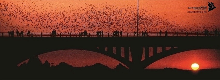
–a biophilic spectacle that highly demonstrates the intricate networks of distributed knowledge as young pups learn to fly, that is a prominent part of the Central Texas city’s ecology. Perhaps a splinter group from the nearby Bracken Cave colony–one of the densest sites of mammals on earth, just a half hour northwest, is the largest known bat colony in the world.

Inspired by the broad arcs of nightly emergence of bats from New Mexico’s Carlsbad Caverns National park as Pearl Harbor was attacked, a dentist first promoted the idea of using bats for fire bombing of Tokyo’s wooden homes. The plans for outfitting thousands of bats with explosives affixed to their little chests–treating the bats as dive bombers to create spontaneous conflagrations in Japanese cities–developed as the letter sent to President Roosevelt led to plans for a nocturnal release of thousands of bats, bearing explosives on their chests, who would roost in the structures of Japanese buildings by treating Mexican free tail bats as a squadron of blind dive bombers who, transported across the Pacific to the eaves of wooden houses in Tokyo, might provoke an incendiary attack by distributing packets of napalm–the basis of incendiary bombs–by the far greater geographic area of bats on whom chests were affixed napalm adhesive vests. Sequestering a thousand free tails hibernating in isolated chambers for trans-Pacific travel never bore fruit; optimistic simulations revealed explosive packets regularly impaired flight and “uncertain behavior of bats” glossed the failure to cooperate in destructive fantasies of using winged mammals to distribute urban conflagrations by 1944, if disastrous experiments in California created some massive explosions. Despite the failure to orchestrate a swarm of bomb-bearing bats, plans to parachute a swarm were brushed aside by OSS director William J. “Wild Bill” Donovan punctured as the “Die Fledermaus Farce,” dismissing the fantasy of costuming bats for an air raid by an Strauss operetta promoted into the operatic repertory to ridicule the strategic value of an airborne zoo –putting the cruelty of immolating flying mammals aside. The basic truth was that the bats’ flight could not be planned.

Canister Designed by Louis Fieser for Dropping Hibernating Bats on Japan

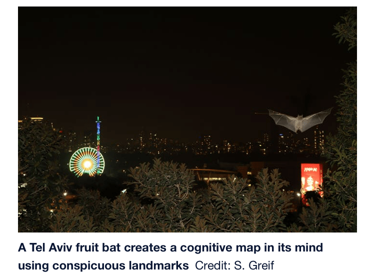
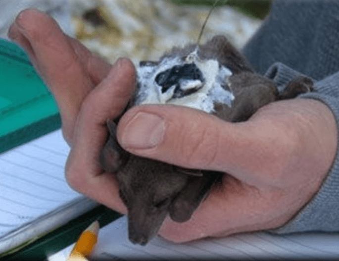
The remove of such a bomb as a way of creating winged kamikazes removed nature of hopes for the strategic deployment of bats in a global strategy from what it is like for a bat to be a bat, or how bats think. But could it be possible to approach the mental outlook that enables bats to navigate nocturnal skies at high speeds in search of fast-moving food? Perhaps Nagel’s project influenced how, since 2011, Israeli researcher Yossi Novel attempt to cross this bridge of consciousness by a colony of bats–nearly 20,000 winged mammals–that he raised from birth to maturity, and tracked their progress as they navigate Tel Aviv’s skyline, using the city lights to navigate their paths home. By fitting the small bats with the “smallest GPS [then] in existence” of about ten grams, scientists charted paths to uncover secrets of the mammals’ neural abilities of nocturnal navigation around man-made waypoints in Tel Aviv’s and the most “visible” nocturnal monuments to detect their cognitive abilities.

While perhaps not as elegant as aerial V-formations of geese, pelicans, or storks, timing their wing beats to catch eddies of air that seem to save birds some 20%-30% in energy, minimizing downdraft to an aerodynamic advantage, and flapping in phase to maximize energy by an anti-phase synchronizing of wingbeats in V-formation: bats’ far smaller wingbeats evolved fewer aerodynamic problems, and responded to fewer challenges of long-distance migration, but offer evidence of assembling spatial maps over time over a surprisingly expansive distance range. Far from a costume party of human orchestration, in a staged ball based on costuming bats, the bats’ flight was nightly tracked.

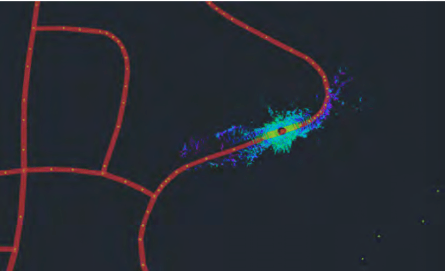
Indeed, the almost nightly expeditions of bats–some 15 million from caves north of San Antonio TX, in summer months–that show up on radar as explosions of “bioscatter,” as they emerge from caves in search of food, is so striking at large-scale that the small-scale tools of navigation by which the bats move from sundown need to be mapped in relation not only to seasonal meteorology, artificial light, and human disturbances of the environment, although it might be better to begin from more basic–still insufficiently understood–questions of how bats, all too often mischaracterized as “blind,” regularly map space. The National Weather Service mapped nocturnal emergence of bats from caves in Central Texas on its radar that appear to be explosions of meteorological imbalance, but in fact only track the nightly emergence of millions of bats, an efflorescence of cave-dwelling mammals bursting into flight from underground sites–what weather forecasters dismiss them “bioscatter” which raises immediate questions about the bats’ mapping tools, and the distributed networks of navigation that allow bats to fly across the state in search of food, without ever crashing into one another’s paths of flight.

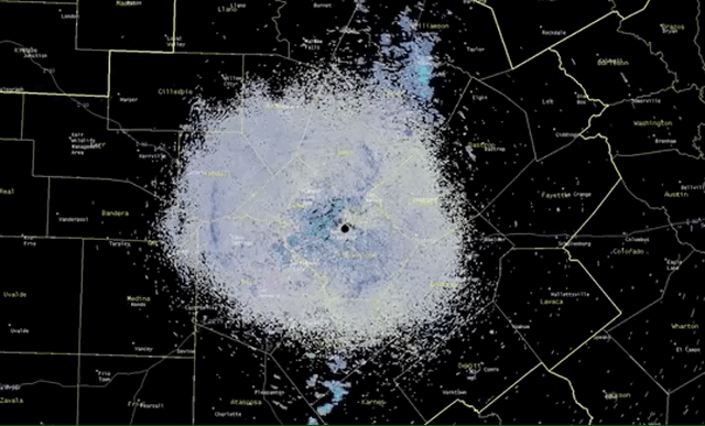
if all maps are ‘surface readings’ and of necessity exclude often crucial sensory “noise,” do those green explosions miss the miracle of bioacoustics that allow sophisticated level of auditory discrimination for bats to move with a sense of where they are going–or what to avoid and what to eat!–while registering or encoding a map to allow them to return to the caves? What are we missing in mapping those bats as mere “biostatic,” of no meteorological significance, we are now asking what sorts of sounds bats are making to one another as swarms disperse from what seem fixed points? Are the bats best mapped as swarms, or do they have individual flight paths, and, if so, what is their form of air traffic control?

Without explicitly trying to revisit Nagel’s thesis, the data gained about the bat’s spatial sense of navigation and its brain capacities provided a sense of navigation as they flew above Tel Aviv’s skyscrapers in relation to the tallest towers of the built manmade environment by a GPS of their own devise, that revealed how bats possessed uncanny navigational skills to fly in straight lines at considerable elevations of over a hundred meters, using as points of reference trees up to twenty-five meters away. Outfitted with GPS chips, they mapped the progress made from bat pups’ first exploratory flights, theorizing their abilities to encode learned flight paths to identify the best routes to locate food sources in the city at distances far beyond what sonar allowed them to navigate, to accumulate a mental map of the city that they accrue over years around visual landmarks, taking shortcuts to move across dozens of kilometers.

Israeli researchers explained without much surprise how their bats navigated elevated points on the skyline of Tel Aviv as akin to the same GPS tools that they used to navigate their commutes around the skyscrapers that provided waypoints that were, somewhat quaintly, the very same waypoints of the researcher’s own daily commute: it seemed eerily natural that bats had substituted for other landmarks that bats employ to orient themselves to a skyscape to seek their food or find their diurnal dwellings, as a basis for aerial navigation that provide orientation to the built environment. It might make sense to ask who was enabled by technology, or how technologies allowed us to think like bats: scientists interpreted their data by consulting with pilots, in order to determine what sorts of landmarks the bats released near Bersheba to guide their fairly secure paths, or what types of spatial learning bats developed over time, and how they build maps that allow them to navigate areas as expansive as 100 sq km.

The studies of bats’ neural navigation nets began in 2011 in Israel, in a sense as a casualty of war: the military engagements in Israel created huge pressures on displaced and endangered animals, peace also provided new nesting opportunities for bats, as Haaretz reported Eran Levin of Tel Aviv University’s Department of Zoology discovered species-rich bat populations nesting in long-vacated army bunkers in the Jordan Valley, abandoned since the 1994, but now repurposed by displaced bats as perfect niches that mimic caves, repurposing the bunkers abandoned by Israel Defense Forces, vacant since peace accords with Jordan, but serving as a new habitat for large colonies of Egyptian fruit bats. The fruit bat populations provide a new sample group for zoological studies, providing a unique site to study bat populations, as help from Bat Conservation International and the Ford Foundation transformed the bunkers to homes for displaced bat colonies, including plastic nets and ropes to refashion their ceilings for bats that could restart new colonies holding up to twelve different species in twenty old unused bunkers, that have welcomed bats from the Palestinian Territories, Jordan, and Israel to temporary or perhaps permanent shelters.

If bat studies progressed in the West Bank, the space of urban bats have been studied to show their ability yto navigate from the desert locations as Bersheva to urban habitats. taking them to new areas in the desert over forty kilometers from their usual habitat, finding fruit trees where they feed in the desert, 44 kilometers south of their normal range, and releasing them at dusk who had no problems finding their ways back to their favorite fruit trees, and those who were released at dawn went back to their caves. The bats seemed to use landmarks to guide their paths of flight to do so, and the bats that were released in a crater, over eighty km south of their caves, gaining the purchase to start to fly north: as they took time to exit the crater and to get oriented and needed to leave the crater to place themselves against distant landmarks to return home–waypoints, as it were, to mark their own travels that we imagined computationally checked out, grasping their internal wayfinding abilities by analogy to our own use of GPS in multiple contexts; in what risks a circular argument, bats were argued to have internalized a GPS system. Did the GPS trackers enable researchers to map a bat navigating system, or to think that they had?

The surprising lack of difficulty that the bats had in moving collectively is striking. The success with which bats learned short cuts, and indeed re-oriented themselves to space against spatially removed landmarks, seemed to suggest that they had been caught in the act of building a sophisticated mental map on which they could draw, even if it did not derive in sight, as they could indeed “see” it in their minds, that raised questions of how to describe the mental processes by which they were able to navigate after having been moved almost fifty kilometers south of their usual feeding grounds, and easily able to find their familiar sites of rest by the following day: the description of the bats as moving against buildings by their “own GPS” applied the grids we use to navigate traffic, airspace, or bike rides to the cognitive tricks of the mental operations of bats, without missing a beat.

Tel Avivi researchers recently started monitoring a colony of 20,000 bats from birth could unlock secrets of sociability that allow colonies of thousands of bats to survive over forty years, and perhaps communicate, and indeed to all use their own abilities of sonar to fly together collectively within subjective tools, by a neural map that the abilities of echolocation bats use for closer range encounters.

Such studies suggest intriguing orientational abilities of mouse-eared bats to orient themselves by magnetic fields–as if by analogy to a compass–at sunset, when they emerge, the suggest possession of considerable orientational tools. but the study of how bats can cannily navigate Tel Aviv skylines suggested an uncanny ability to internalize built landscapes, and to study their behavior that would not cause duress to any single bat.

The image of the peaceful nocturnal navigation of the Holy Land seems a collective experiment for which funding must exist in Israel, the questions of echo-recognition were hoped to find a solution to how bats map human-built space, and perhaps the surprise came when they were recently explained to built a map akin to GPS as the means that “experienced bats” move with such surety across what seems a known space, taking short-cuts around buildings to find new paths to food, in ways that indicate they have built a map of the city in their bat-minds–or to cast the bats minds not as a different embodied experience, but akin to GPS machines.

The mapping tools strapped on their backs seem to have provided terms to allow us to imagine how bats navigate as a swarm–by a version of GPS?–as if the point-based mapping system that we adopt to move through space provides a basis for understanding how to be like a bat, or how a bat navigates space–the GPS monitors seem to adopt a sort of invisible agency in the experiment, indeed, that allow us to think we can indeed, pace Nagel, enter a bat’s mind. But the astounding adoption and growth of GPS as a universal translation device seems to have been extended across species in the experiment that ties GPS monitors as tools without their own spatial logic.

Whether such monitors afford a sense of what it is like for a bat to be like a bat may be less evident than the possible expansions of imagining a neural net or distributed network by which automated cars case use GPS. There is a sort of romancing of the GPS devices as an agent, in other words, that links the bats to one another, and allow serve as universal translating machines,–a version of the instantaneous translation of TARDIS, in Dr. Who, that relies on matters of telepathic fields, or the “babel fish” that excretes translations into the auditory canal in which it is implanted like an active hearing aid in an auditory channel, as a sort of prosthetic that provides instant empathy in Hitchhiker’s Guide, or the prosthetic Microsofts that plugged into “wetware” sockets behind the ear like a chips to offer exoskeletal enhancements enabling fluency in other languages: the conceit of simultaneous translation the was tweaked by Douglas Adams and William Gibson was imagined as needed to resolve an atomic stalemate that emerged during space travel, in Murray Leinster’s First Contact, as atomic detente after the encounter of a ship of humanoid bipeds are caught in a deadlock near the Crab Nebula–and leads to a memorable conclusion as humans learn to recognize the truly universal sounds of laughter after both ships find they have proposed the same solution.

The fiction of simultaneous translation in the 1945 story would be the basis for resolving the actual fears of atomic war at the foundation of the United Nations, which from its start promised to instantaneously translate all communications under its auspices into each of six “official” languages–Arabic; Chinese; English; French; Russian; Spanish–from the 1945 San Francisco Conference that led to its formal founding; instantaneous interpretation for speeches anywhere from as long as thirty-five minutes to a full hour became a basis for world peace, if one that Preter Pyotr Avaliani compared to “driving a car that has a steering wheel but no breaks and no reverse”–as it allows no time for corrections–characterized as premised on remembering enough short-term but forgetting the words one just said.

The analogy takes us back to unidirectional routes of travel, waypoints, and the creation of a mental map without what we recognize as vision, based on the supersensitive visual perceptions of far greater distances than we’ve imagined, if a vision not dependent on color sensitivity or differentiation.

The GPS device attached to the backs of the bats provided the very tools used to track their motion would allow us to think like a bat, at least in offering a basis to interpret the how the bats navigated airspace,–and make us realize that just as we enhance our navigational abilities by placing trust in Waze and “live” GPS navigation to avoid traffic jams and plot our daily commutes–or used to–they, too, allow us to think like bats.

But the elevation of way finding tools in GPS might make us imagine we’ve found way to think like bats, as opposed to equip them with translation devices that provide a better analogy to think about how they travel.

Echolocation and geolocation are different spatial logics. But we may be in danger of assimilating bats to a system of something like a GPS-inflected AI. If the earlier model of navigation by magnetic fields at sunset posed the problem of the internal compass by which bats move after sunset by magnetic fields, the mental dominance of GPS as a grid we have internalized around waypoints, destinations, and points of primary reference provides a new model to think about how bats do think.

2 Comments

Filed under bats, bioacoustics, data visualization, distributed intelligence, GPS devices

National Security and Personal Bests

Was it only a coincidence that on the eve President Donald Trump boasted in his State of the Union address of an era “we no longer tell our enemies our plans” that the release of a live global heatmap pinpointed the location of U.S. military installations?  The release by Strava Labs of a spectacular heatmap that celebrated the routes where folks exercise worldwide suggested the flows of itineraries of physical exercise by running, biking, or skiing in stunning lines to reflect increased intensity, that appeared as if engraved on a dark OSM base map.  Indeed, the open nature of the data on military positions offered to any viewer of the heatmap seems as pernicious as culling of internet use long engaged in by the NSA, but for the state–as well as for the safety of soldiers who share their location, or fail to use security settings, as they exercise while completing military service abroad. Is this approaching a new level not only of broadcasting plans to an enemy, but failing to protect military positions in internationally sensitive zones?

While the map had been around for several years, its detailed update was so much more comprehensive than the 2015 version included–and was released in a time when internet observers scrutinize data visualizations.  The updated heatmap was a big deal for how it illuminated the world in a ways that few had seen, both in its own architecture of a spectacular network of athletes that reflected its expanded use, and the huge data included in aggregated routes for training, but illuminating clear divides between its users; but it gained even more attention foregrounding the presence of isolated groups of athletic performance abroad with an eery precision and legibility that quickly raised concerns reminiscent of the scale of unwanted intruding or monitoring of physical actives, even in an app that based its appeal in the data density of tracking it provided.  While promising individual privacy or anonymity, the benefits promised by the fitness app seemed almost a runaround of the appeal of PGP, Tor, and Privacy Badger that promised a degree of privacy by encrypting data from online trackers and privacy self-defense; rather than ensure the anonymization of the internet connections, however, the platform posted patterns of use whose legibility did not violate individual privacy, so much as state secrets.  Indeed, the surprising effects of how the Strava app made individuals suddenly legible so that they popped out of darker regions was perhaps the most striking finding of the global heatmap, as it illuminated stark discontinuities.

The newly and vastly amplified dataset included zoom functions of much greater specificity:  so richly detailed Strava was charged with betraying once secret locations of U.S. military worldwide, even if unknowingly, and creating a data vulnerability for the nation the would have global effects.  The heatmap made stunningly visible rasterized images of the aggregate activity of those sharing their locations that it gained unwanted degree of publicity months after it went live in November, 2017, for revealing the actual location and global military presence of American soldiers tracking their exercise and sharing geodata–including American and European soldiers stationed in the Middle East and Africa, and even in South Korea.  Although the California-based fitness app rendered space that seemed to celebrate the extent and intensity of physical exercise in encomiastic ways, as if the app succeeded in motivating invigorating exploration of space, and tracking one’s activity that guaranteed anonymity by blending data of its users in brightly lit zones, as for the Bay Area–


Bay Area.png


–the image that had clear implications of announcing its near-global adoption registered in the more isolated circumstances that many members of the American military increasingly find themselves.  The data set that Strava celebrated in November, 2017 as “beautiful data” on the athletic playgrounds of the world took an unexpected turn within months, as Strava came to remind all military users to opt out of sharing their geodata on the zoomable global heatmap, that aggregated shared geodata, lest secret locations of a global American military presence that extended to the Middle East and Africa be inadvertently revealed.  Whereas the California fitness app wanted to celebrate its global presence, the map revealed the spread of secret bases of the U.S. military in a globalized world.  The map of all users sharing geodata with the app were not intended to be personalized, but the global heatmap showed bright spots of soldiers stationed in several war zones.

The narrative in which the map was seen changed, in other words, as it became not a data dump of athletic performance across the world, that was able to measure and celebrated individual endurance,  but a narrative of hidden military and intelligence locations, tagging CIA operatives and overseas advisors by indelibly illuminating their exercise routes in a field of war in ways that seemed to foretell the end of military secrets in a world of widespread data-sharing. And Strava Labs for their part probably didn’t exactly help the problem when they took time to assure the public that they indeed “take the safety of our community seriously and are committed to work with military and governmental authorities to correct any sensitive areas that appear” in the web-maps,” as if to assure audiences they privileged the public interest and public safety of their users.  (But as much as addressing public safety in terms of operational security, Strava’s public statements were limited to caring for the community of users of the app, more than actual states.  The disjunction reveals very much:  when Strava labs saw their “users” or customers as the prime audience to which they were faithful, they indeed suggested that they held an obligation to users outside of loyalty to any nation-state, and indeed celebrated the geographical distribution of their own community across national frontiers.)  Indeed, the app’s heatmap disrespected national frontiers, by suggesting an alternate space of exercise that was believed and treated as it had nothing political in it.

In contrast, the landscape that American President Donald Trump presented in his first chest-thumping first State of the Union returned to the restoration of American security seemed incredibly to deny the consequences of recent availability of military geodata and indeed military base locations, in announcing that in his watch, we “no longer tell .  our enemies our plans.  For whereas President Trump boasted the return to an era of national security and guarded military secrets, the app broadcast a pinpoint record of the global dispersion of American troops, military consultants, and CIA “black” sites and annexes.  Indeed, for all the vaunted expansion of the U.S. military budget, the increased vulnerability of special operations forces has been something that the United States has poorly prepared for, although the release of the heat map prompted Gen. Jim Mattis to undertake a review of all use of social media devices within the military, so shocked was the news of the ability to plot geographical location by the exercise app. If the activities tracked and monitored in the hugely popular fitness app suggested a world taking better care for their patterns of exercise, it revealed scary patterns as a proxy to chart American presence that map the recent global expansion of the United States military in the beauty of its global picture across incandescently illuminated streams–


merlin_133062485_46769171-6f83-4438-945b-58567a1220c4-master768


–as when one zoomed down to those running in Kabul, and geolocated the movement in ways that betrayed military footprint from intelligence personnel to foreign operatives to contractors overseas.  The data harvested on its platform appears to endanger American national security–and offers new ways to combine with information culled from social media–as it seems to pinpoint the bases around which military take their daily runs.


Strava sites?Strava heatmap, Kabul
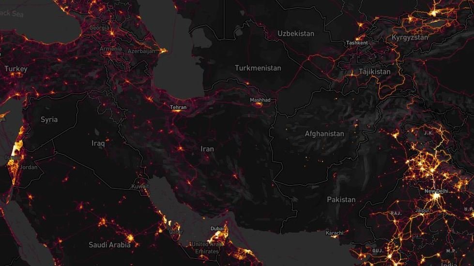
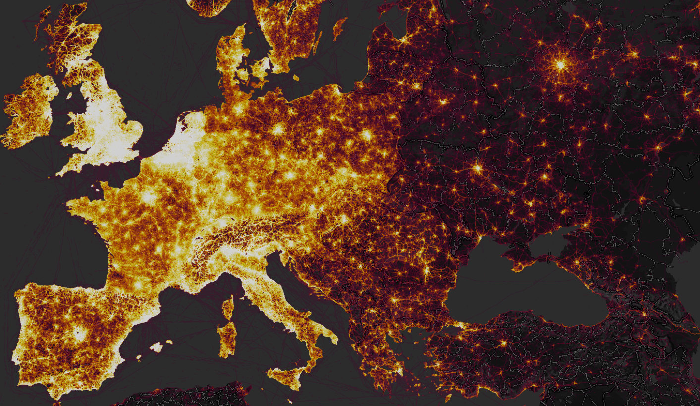
 

The recognition of the scale of personal tracking by soldiers sharing data on exercise apps grew as one exploited the heatmap’s scalability, and examined areas in which few locals were using it–or had access to the First World problem of registering how many miles one ran.  While the data was not only sourced from Americans, the anonymity of the aggregate map–which can be viewed in multiple shades–provided an image of ghostly presence that seemed particularly apt to describe concerns of security and suggest an aura of revealing secret knowledge.  The cool factor of the Strava map lit up the hidden knowledge that echoed the longstanding surveillance of the communication records of Americans in the bulk data collection that the Patriot Act allowed, although now the dragnet on data use was being done by private enterprise, suggesting an odd public-private sharing of technology, as what had been viewed as a domestic market suddenly gained new uses on an international front.  The poor data security of U.S. forces abroad reminded us that we are by no means the only actor collecting bulk data, but also the scale of digital dust that we all create as we entrust information about our geographical locations to companies even when they promote the value of doing so to be salutary.

Multiple accusatory narratives quickly spun about whether the release of the new global heatmap by Strava Labs constituted a breach in national security.  The soundbite from the State of the Union proclaiming a “new era” described changed conditions by referencing Gen. Michael Flynn’s charge, first raised during the 2016 Presidential campaign on national television news,  that the United States had sadly become “the best enemies in the world” during the Obama years, as he attacked the government of which he had been part for being itself complicit in how “our enemies love when we telegraph what we’re doing” by not maintaining secrecy in our military plans.  Flynn’s assertion became something of a meme in the campaign trail.  And President Trump sought to reference the fear of such changes of a past undermining national authority abroad when he claimed to bring closure to lax security, choosing to message that the loopholes that existed were now closed, and respect had been achieved.  The fictionalized imaginary landscape seemed to distract America from danger or unemployment in celebrating its arrival in a better economic place.  The message seemed as imaginary as the landscape of an employed America, which had arrived in a better economic and place.

General Flynn’s metaphor of telegraphing was even then quaintly outdated, as if from a different media world.  But the allegation that had become a meme on alt right social media during the campaign to discredit military competence, gaining new traction as data security became increasingly a subject of national and international news.  Since President, despite having quickly issued one of executive orders that he has been so fond of signing on cybersecurity, Trump has in fact been openly criticized for a lack of vision or of leadership in addressing  national vulnerabilities in cybersecurity.  As President, Trump has preferred to pay lip service in the executive order, by far his preferred medium of public communication, to the growing frustration of a number of cybersecurity advisors who resigned before clarifying best practices of grid security.   Broad sharing of geodata by military and intelligence raised red flags of security compromises; it would, perhaps, be better raise a clarion call about our unending readiness to aggregate and be aggregated, and the unforeseen risks of sharing data.

The patterns of tracking exercise–biking, running, swimming, windsurfing–created striking pictures in aggregate, reflecting the collective comparisons of routes and itineraries, and showing a terrain vibrant with activity.  But while the app did not specialize in tracking individual performance or local movements, the new context of many apps transformed foreign counties where military travelled to sites where their data sharing stood out.  The sense of accessing the platform was so second nature to American soldiers moved across space, in fact, ignorant of the platform on which it was aggregated and its effects–or the audiences before who it was broadcast and displayed.  The ability to detect bright spots of athletic engagement around American bases, military camps, and CIA outposts suggested an unwanted form of data-sharing, RT television newscasters proclaimed with undisguised pleasure at the ease with which soldiers could be observed in different locations across the Middle East, from Saudi Arabia to Afghanistan, to Pakistan, and crowed that Americans are so unwary about being surveilled so as to provide evidence willingly of their own global footprint’s size.


strava-map_wide-4720f2504724cf08515aa5302bb39b6e2dedea46-s1600-c85


It’s striking that government secrecy has become a public hallmark of the Trump administration.  But if Trump wanted to inaugurate the start of a fictional landscape of securing state secrets in his first State of the Union address, his words were pronounced with no acknowledgement of the release of the heatmap and the concerns of leaking security operations.  The map that Strava labs designed to celebrate the global extension of a triumphal image of the expansion of exercise in a triumphal image appeared in new guise as the latest example of breached military security secrets–suddenly made apparent at high resolution when one zoomed in at greater scale to Syria, Somalia, Niger, or Afghanistan, and even seem to be able to track the local movement of troops in active areas of war, and not only identify those bases, airfields, and secret annexes, but map their outlines that corresponded to the laps that soldiers seem to have run regularly around their perimeter while sharing their geodata publicly, or with the app.  While the app was designed to broadcast one’s personal best, as well as log one’s heart rate, sleep patterns, and performance (personal data which remained private), it collated in aggregate the patterns of activity across national borders.

For its part, Strava had only boasted it could “create the ultimate map of athlete playgrounds” by rendering “Strava’s global network of athletes” in a stunning heatmap from directly uploaded data.  If there was a sense that the “visualization of Strava’s global network of athletes” described a self-selected community, the beauty of the data set created from 13 trillion data points provided a new sense of exercise space, as if it sketched a record in aggregate of individual endurance, or a collective rendering of folks achieving personal bests.  But the illuminated “maps” of the global network of those exercising and the distribution of US military bases and sites of secret involvement raises complex issues of data-sharing, and the shock at the intersection of leisure space and military secrets–somewhat akin to the stern warning military commanders issued to years ago about using Pokemon Go! in restricted areas of military bases, mapping a comprehensive global map of military over-extension is an odd artifact of globalization.  And it was odd to see RT seize on this issue, as a way of describing the presence of the actors they id’d as “Uncle Sam” to suggest how zooming in on the global map revealed the reach of the United States in Afghanistan or Syria, as if playing a computerized game to see where clusters of forces might be illuminated, as if to exploit fears of revealing military secrets through geolocated data.

The story was pitched on RT suggested a market-driven surveillance network of which the Americans were themselves the dupes.  In its own spin on the story, RT reported of the leaks with glee, for rather than arriving from hackers, or Russian-sponsored hacking groups, military security was compromised by the very tracking devices, it was argued, that soldiers, military intelligence, and CIA officers wore.


By imposing outlines of national maps on the dynamic rasters of the web map that Strava released, the position of military forces or advisors indeed seemed able to be roughly revealed as military secrets by zooming into locations, much as RT announcers asserted, as if the “bracelets” of fitbits provided tools to geolocate soldiers as if they were manacles, reminiscent of the ankle bracelets given to many parolees, sex offenders, or prisoners, by using a GPS tracking system to monitor released inmates all the better to monitor their acitivities, in a practice that has only grown in response to overcrowding conditions in many federal and state prisons–GPS tracking systems were billed as able to save prisons up to $9,500 per inmate, or up to $25 a day; but rather than provide tools to surveil non-violent offenders, the effective monitoring of military bases and what seem CIA field stations provided a multiple security vulnerabilities of unprecedented scale.

But the real story may have been how so much data was available not only for state eyes, but for a broader public:  in an age where surveillance by the state is extending farther than ever before, and when we need, in the words of Laura Poitras, “a practical and metaphorical road map for navigating the post-9/11 landscape,” the maps of Strava have shifted the landscape of surveillance far from the state, and deflected it onto the internet.  For the far greater geographical precision and detail of a diverse user group may prefigure the future of data sharing–and the increased vulnerabilities that it creates.  The live data map broadcast not only an image of global divides, but of the striking patterns of the aggregation of geodata that reminded us of  the pressing problem of data vulnerability in the military’s extended network of secret military bases and dark sites.  Indeed, when a student at the Australian National University in Canberra, Nathan Russer, first noted that the Strata search engine created an Op-Sec catastrophe for leaking locations of US military patrols and bases, his observations unleashed a storm of pattern analysis and fears of compromised national security.  It indeed seems that the vaunted agility that allowed American forces to deploy in much of the world could now be readily observed, as we zoom into specific sites of potential military involvement to uncover the presence of Americans and assess the degree of involvement in different sites, as well as the motion through individual sites of conflict.  The spectral map that results suggests something quite close to surveillance–at time, one can scrape the place of individual users form the app’s web map–but that is dislodged from the state.

The notion of a private outsourcing of data surveillance to the public sphere is hardly new.  One can think, immediately, of Facebook’s algorithms or personal data-harvesting or those of search engines.  Although the U.S. Department of Defense has urged all active military abroad to limit their active presence in online social media, no matter where they are stationed, the news reminded us yet again of an increased intersection between political space and social media, even if this time the intersection seems more shaped like a Moebius strip.  The divisions within a global geographic visualization of Strava’s users reminded one of a usage landscape that suggested a striking degree of continuity with the Cold War–with an expanded iron curtain, save in scattered metropoles–whose stark spatial division reminded us of the different sort of lifestyles that public posts of athletic performance reveals.  As much as showing a greater openness, the heat map suggests a far greater willingness of posting on social media use:  the intersection suggests a different familiarity with space, and a proprietary value to the internet.’


strava1Strava Labs


Indeed, in only a few months to notice how American soldiers’ presence in coalition military sites suddenly popped out in the darker spaces of the Syrian Civil War, where different theaters of action of coalition forces that include American soldiers are revealed, and panning back to other theaters can indeed revealed the global presence of U.S. military and intelligence.  Against a dark field, the erasure of any sense of national frontiers in the Strata labs data map suggests the permeability of much of the world not only by interactive technologies but by the isolated groups of soldiers who deal with the stress of deployment by bike rides and runs while they are stationed in Afghanistan.


Runing In Kabul


Although the fitness app saw its aggregation as registering geodata in the relatively apolitical space of physical exercise, fears of political and national security repercussions ran pretty high.  Indeed, the tracking of running laps, cycling, and daily exercise routines revealed U.S. military bases in Syria so clearly that it proved a basis to locate and orient oneself to an archipelago of U.S. military activity abroad in the global heat map, and lit up American presence in Mosul, Tanff, north of Bagdad and around Raqqa, providing a historical map able to pinpoint airfields, outposts, and secret stations in the war against the Islamic State.  Security analysts like Tobias Schneider argued they helped track the movements and locations of troops and even extract information on individual soldiers.  In place of an image of the global contagion of tracking exercise, the patterns of performance provided a way to look at the micro-climates of exercise on a scaling that were not otherwise evident in the arcs of the impressive global heatmap.

Sissela Bok classically noted the ways that secrecy and privacy overlap and are linked in some collective groups, as the military, but the absence of privacy or secrecy on much of the Strava Labs heatmap raised questions of the increasing difficulties to maintain a sense of secrecy or privacy in an age of geographically growing war.  In an age when more and more are living under surveillance, and indeed when the surveillance of subjects has only begun to gain attention as a fact of life, the fear of broadcasting an effective surveillance of exercising soldiers seems particularly ironic–or careless.  The practices of secrecy were more than lax.  For the United States military has in fact, quite vigorously promoted Fitbit flex trackers among pilot programs at U.S. bases to lose calories, and provided devices that measure steps walked, calories burned, and health sleep as part of its Performance Triad;  Fitbit trackers were provided as part of a pilot fitness program from 2013 with few issues raised about security, and placing restrictions on American soldiers’ use of mobile phones, peripherals, or wearable technologies would limit military volunteers.  (The Pentagon has in all distributed 2,500 Fitbits as part of its anti-obesity program, in more flexible wearable form, without thinking of the information that they broadcast.)  Yet soon after the map appeared, folks noted on Twitter with irony that “Someone forgot to turn off their Fitbit,” and it became a refrain on social media by late January, as the image that tracked American military outposts not only in Kabul, but in the Sahel, Somalia, Syria and Niger all popped out of a global map–embodying the very outlines of the camps around which military run.  ‘

Although the U.S. National Counterintelligence and Security Center informed the intelligence community of dangers of being tagged by “social media postings,” the imagined privacy of exercising soldiers is far less closely monitored than should be the case–resulting in a lack of clear vigilance about publishing Strava data.


Runing In Kabul.png
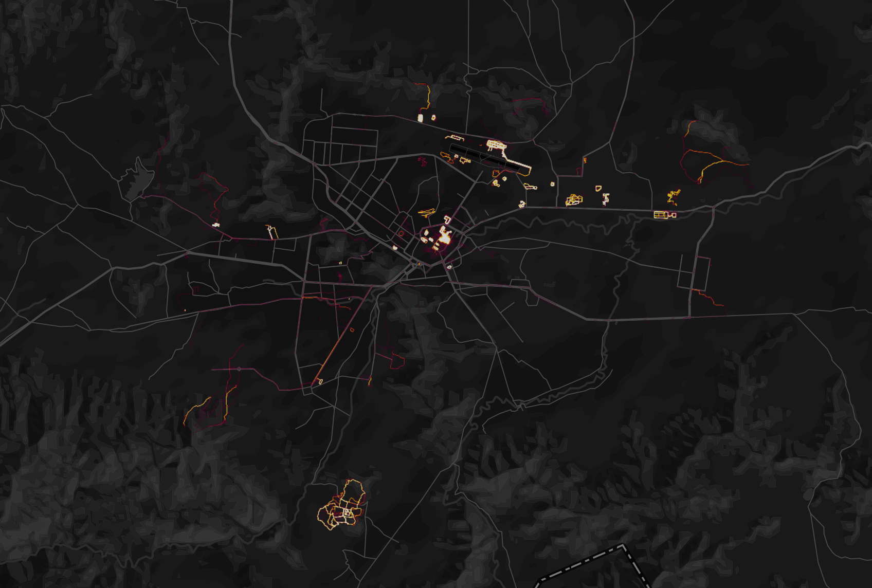
Kabul, Afghanistan, in Strava Labs global heatmap


The heat map so strongly lluminated itineraries users ran, biked, or skied, tracked in incandescently illuminated streams, and even zoom in on specific locations, where they stand out from considerably darker zones of low use of the app, that some national security officials wanted the app to take time to take the maps offline so that they could be scrubbed; worries grew that one could even to scrape the itineraries of individual soldiers who exercise on military service in the heatmaps.

But the two fold ways of reading of the map’s surface suggest that their contents were difficult to free.  The same map celebrating the app’s global use revealed deep discrepancies between the brightly illuminated areas of high-use and data input and its dark zones.  Data mapped on Strava’s website also seems to enable one to id the soldiers using the Strava app with far greater certainty than foreign governments or non-state actors had before, in ways that would create multiple potentially embarrassing problems of delicate foreign relations.  While in part the fear may have derived from the hugeness of the dataset, the fear of being compromised by data raised an increased sense of emergency of a security being risked, and fears of national vulnerability.  Partly this was because of the huge scale of geospatial data.  The updated version of the heatmap issued by Strava Labs illuminated the world in a way that few had seen, and not only because of its greater specificity:  Strava had doubled its resolution, rasterizing all activity and data directly uploaded, and optimizing rasters to ensure a far richer and more beautiful visualization, along glowing lines to reflect intensity of use that looked as if they were in fact vectors.  It made its data points quite beautiful, stretching them into bright lines, eliminating noise and static to create a super smooth image that almost seems to update the Jane Jacobs’ notions of public space and its common access–and the definition of spaces for exercise.

To some extent, the highlighting that the app did of common routes of exercise seem to mirrored the metric of walkability, the measurement of active transportation forms like walking and biking and stood as a surrogate for environmental quality.  The fitness map improved on the walkscore or its cosmopolitan variants, by involving its users to create a new map of exercising space.  The abilities to foreground individual and collective athletic performance in a readily accessible map provided what must be admitted is a pretty privileged view of the world; but the self-mapped community it revealed gained a new context just two months after it went live, as the map drew attention to the patterns it revealed of using an app to track one’s activities, as much as register work-out trails.


San Fran Strava dataset  
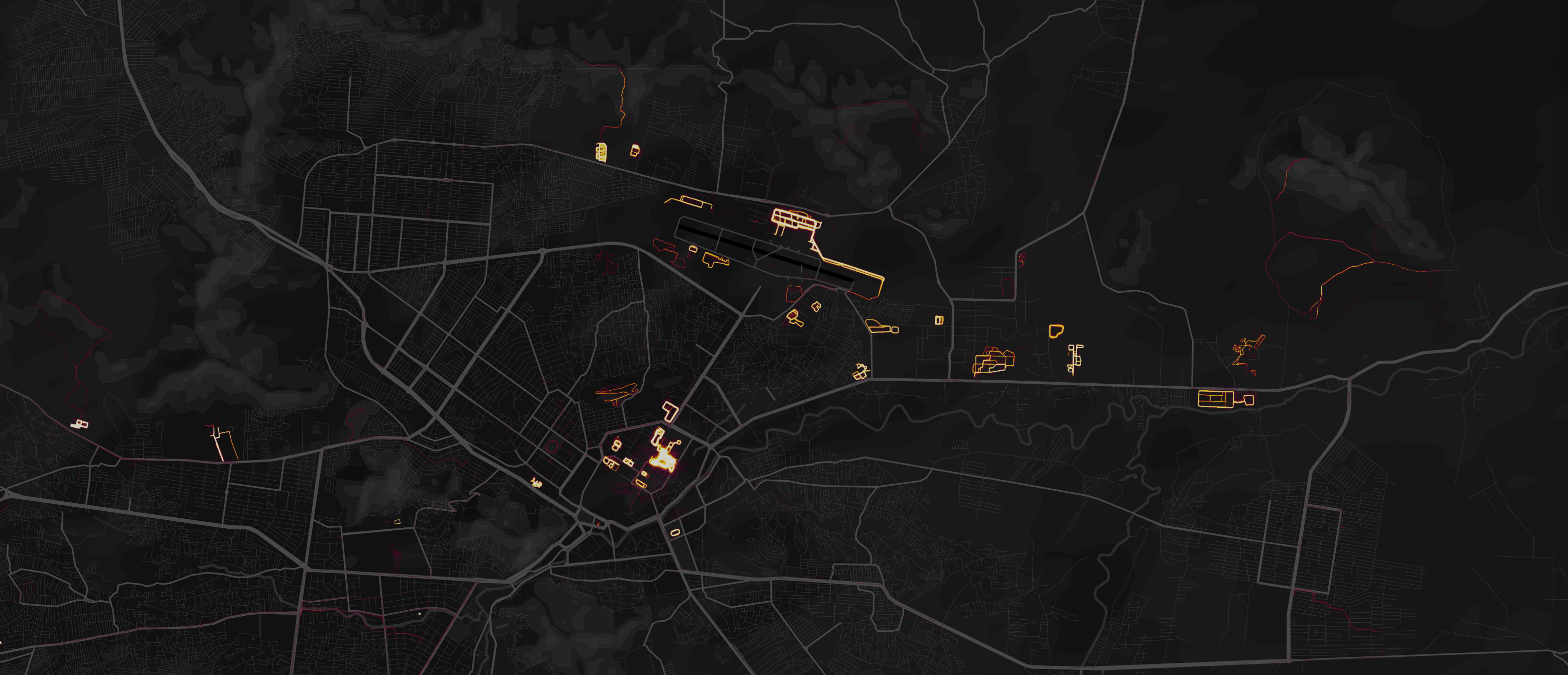
San Francisco in Strava Labs
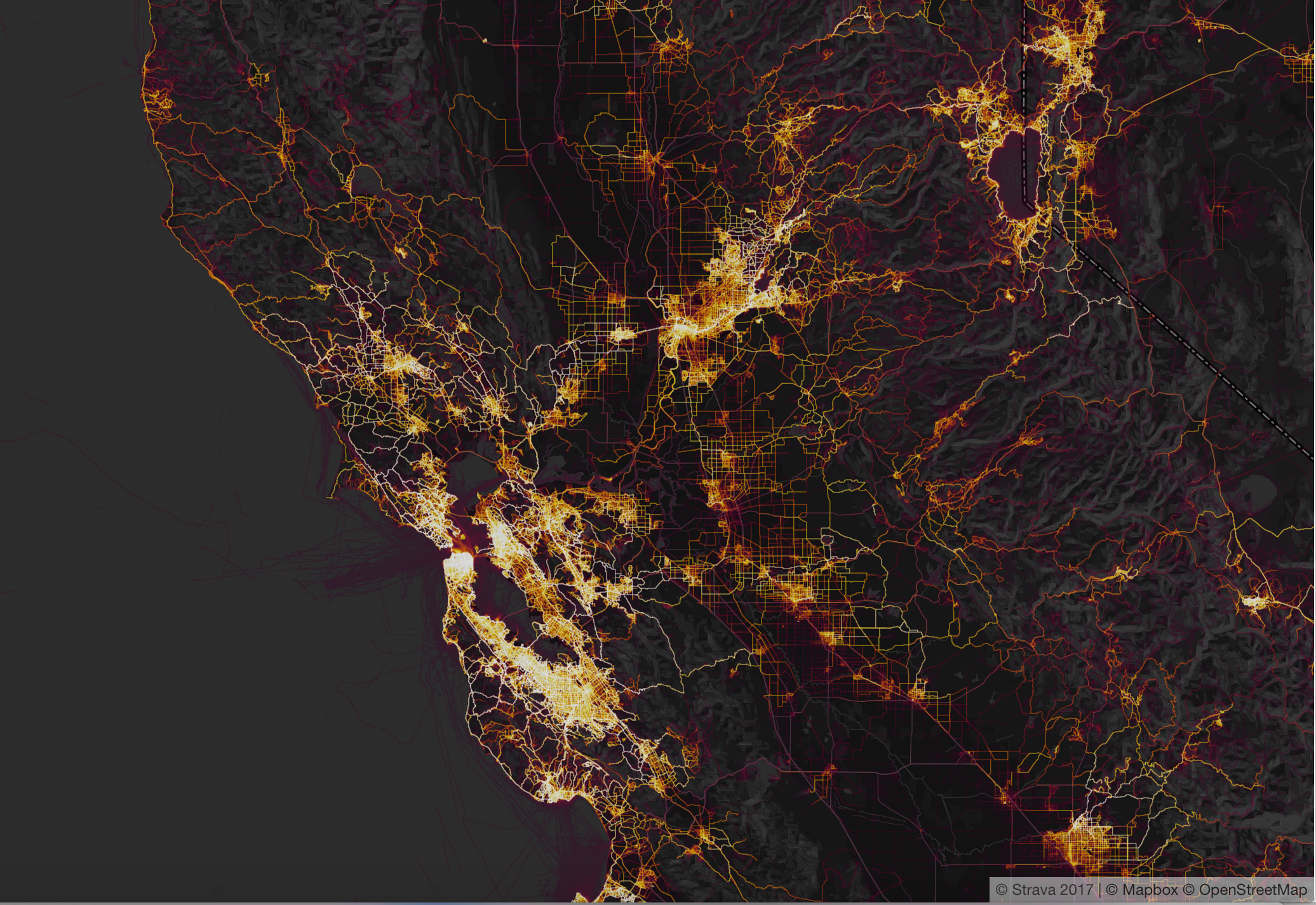
 Heatmap


The new map attracted attention not only for the fitness crowd, a self-selecting demographic, in short, but as an interesting extension of the beauty and the huge amount of datasets it uploaded and digested in a highly legible form:  indeed the legibility of the data that was able to be regularly updated online suggested a new form of consensual surveillance.  The data-rich expansion of what was the first update to the global heat map of users that Strava Labs issued since 2015 encoded over six time more data, and promised a degree of precision that was never even imagined before, notably including correction for GPS distortions and possibilities of new privacy settings, in ways that amplified its ability to be seen as a tracking device most notably in those areas where the aggregate of Strava users was not so dense, first of all those military sites where American military and operatives were stationed and perhaps secretly engaged, but gave little thought to the day sharing app installed on their Fitbits or iPhones, and may even have seen the data-sharing function as a source of comfort of belonging to a larger exercise community.

Continue reading

1 Comment

Filed under data aggregation, data maps, data visualization, information economy, state secrets